Brief
Your brief is to produce three illustrations for a series of books’ jackets, at the size of an existing travel guide, for the locations Istanbul, Helsinki and Milan.
The client would like you to create illustration in which many elements are brought together in a diagrammatic way. They would also like the type to be hand-drawn in an appropriate style.
There are an infinite number of permutations available within this brief and therefore a high degree of flexibility. Write yourself a brief that is challenging but manageable. Be aware of the processes which have so far led to your development in ideas generation, visual research, image construction, understanding contexts and media usage. Use worksheets and sketchbooks to explore the problem you set yourself and refer to examples of work which solves similar types of problems.
Provide client visuals for all three covers and a mock up for one.
Initial Research
I found the prospect of this exercise quite daunting and the open brief, requiring that I developed my own, added to this. I decided to begin the exercise by carrying out some initial research into examples of illustrated travel guides/destination artworks. I then selected the ones that appealed most to me in terms of style and design.
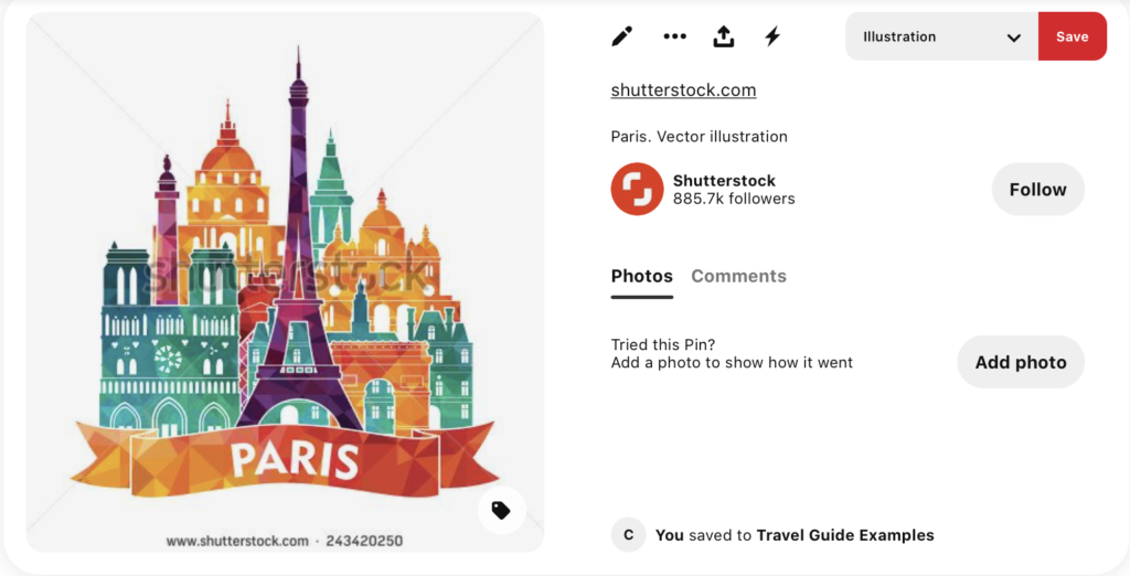
I liked the use of colour and layering in this example. The composition is nicely laid out with all the elements tucked in with one another.
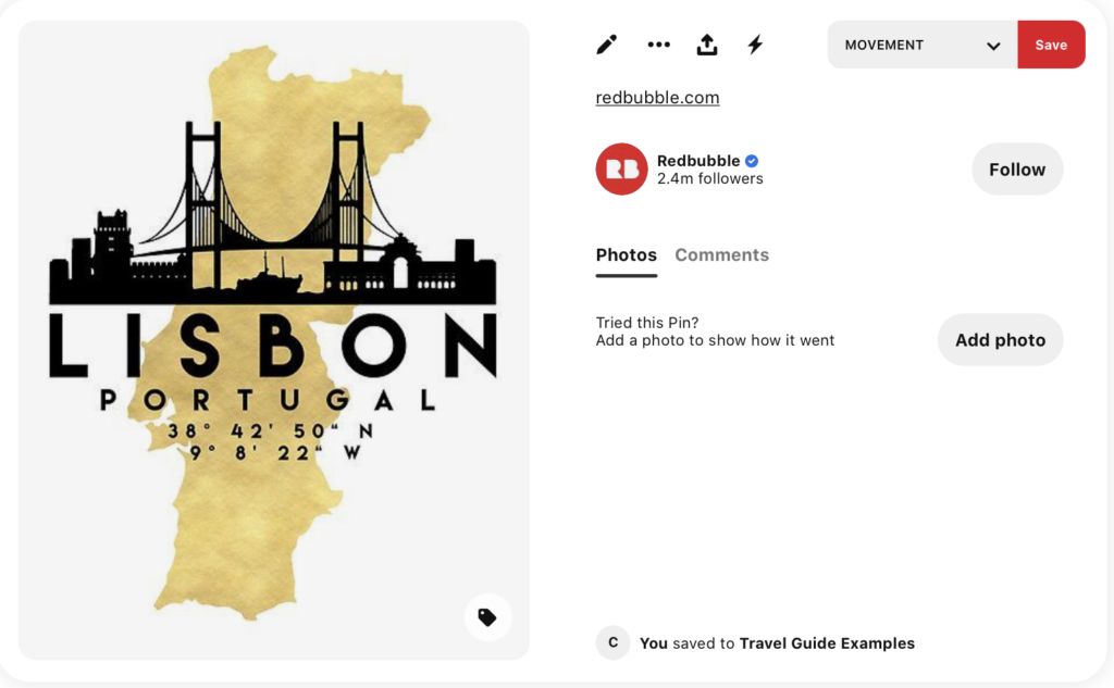
I thought the above was an eye-catching design with such a strong contrast using the black silhouette. This belongs to a series of images of the same style and each one has the map of the country that the city belongs to. I felt this was a very effective illustration.
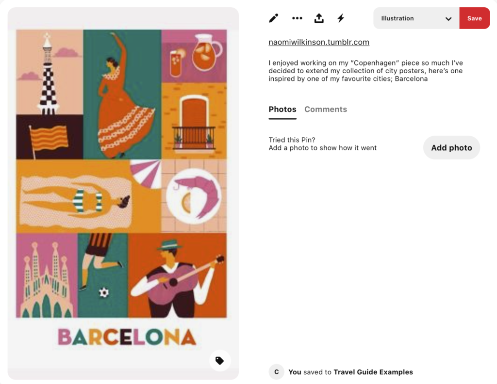
I thought this was a relevant illustration in terms of bringing together different elements of a city. I felt it gave a vivid sense of what the city has to offer. I also liked the simplified style and the limited use of buildings in the illustrations.
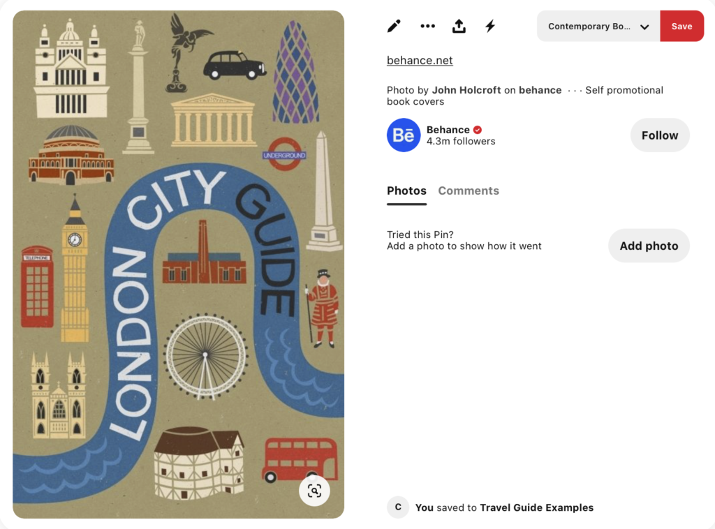
I thought the above was both a fun and educational illustration. Again, I liked the simplified style and also how each element was placed within the composition.
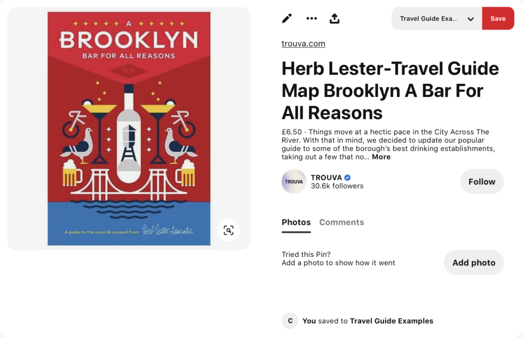
Although not strictly a travel guide, I liked the balanced composition, symmetry, colour and simplified style of the above illustration.
I also found an article with some further examples of illustrated travel guide covers. This led me to find the artist Satashi Hashimoto whose work includes illustrations of various locations. I really enjoyed his fun and loose style.
The brief also stated that the illustrations should be ‘diagrammatic’, so I created a Pinterest board for this genre.
Writing the Brief
Following on from the initial research, I moved onto writing my own brief:
Brief for Travel Guide Cover Illustrations
A series of illustrations are required for the cover of city travel guidebooks. The initial three illustrations will be for the following locations: Istanbul, Helsinki and Milan.
The illustrations should be in a diagrammatic style, with many elements brought together in the composition. The role of the illustrations, besides enticing the reader to purchase the book, will be informative. The cover will need to be visually eye-catching and make the potential reader want to select the book among competitors.
There should be a continuity in terms of layout and style across the series of covers.
The size of the illustrations will be portrait A6 (148 x 105 mm) as the travel guides are ‘pocket size’.
The style and colour of the illustrations is up to the illustrator, but should be eye-catching and relate to the city being depicted. The size of covers should also be taken into account and will require bold, uncomplicated designs.
The intended audience for the illustrations will be those looking for a light-weight (in both senses of the word) travel guide to take on a city break.
The type for title of the book should be hand-drawn in a style appropriate to the city it relates to.
The choice of tools/materials is up to the illustrator.
Further Research – City Specific
Next, I decided to do some further research specific to each city. I used Lonely Planet to learn about notable aspects attributed to them (along with other online sources) and created Pinterest boards for visual research.
- Istanbul Pinterest Board
- Istanbul Lonely Planet Guide
- Helsinki Pinterest Board
- Helsinki Lonely Planet Guide
- Milan Pinterest Board
- Milan Lonely Planet Guide
I found the amount of information available online about the different cities slightly overwhelming and was feeling very unsure how I was going to proceed. I did not know what I should include in the design and I was particularly put off by the thought of having to draw complicated buildings as I have no experience in this at all. I felt that coming up with a design for one city would be hard enough, let alone three!
Illustrators
From my research on Pinterest I found three illustrators/graphic designers who had examples of city illustrations in styles that I particularly admired:
Jitesh Patel – intricately woven compositions with limited colour palette, demonstrating how to effectively incorporate text into the illustrations.
Guillaume Kashima – use of humour, simplified style and limited colour palette.
Ingela P Arrhenius – simplicity and fun of the illustrations, but convey a great deal of information about what each city has to offer to tourists. The compositions are carefully designed so that all the elements fit together in a pleasing way. Additionally, the choice of typography has been carefully selected to represent the named city.
Finding these three artists definitely provided a boost to my confidence of what I could attempt. I particularly liked Ingela P Arrhenius’s illustrations. It need not be overly complicated in style as long as it conveyed the appropriate information to the audience. This style would also be well suited when taking the size of the cover into consideration.
Sketching Ideas
I began by sketching out some rough composition ideas based on my research. I decided to focus on creating a cover for one of the destinations, Istanbul, which could then be replicated in terms of style and design for the others. I felt this was a good way for me to not have information overload.
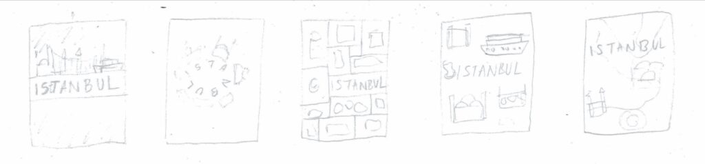
I even found coming up with a range of ideas quite challenging! After spending quite some time trying to think of worthwhile concepts, the only one that I felt had potential was having different elements illustrated on the cover in a ‘blueprint’ style.
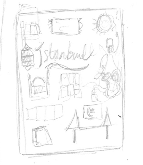
As I had already spent a great deal of time on the initial stages of this exercise, I decided to proceed with this idea.
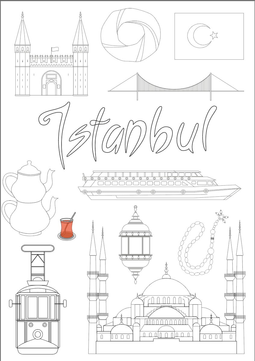
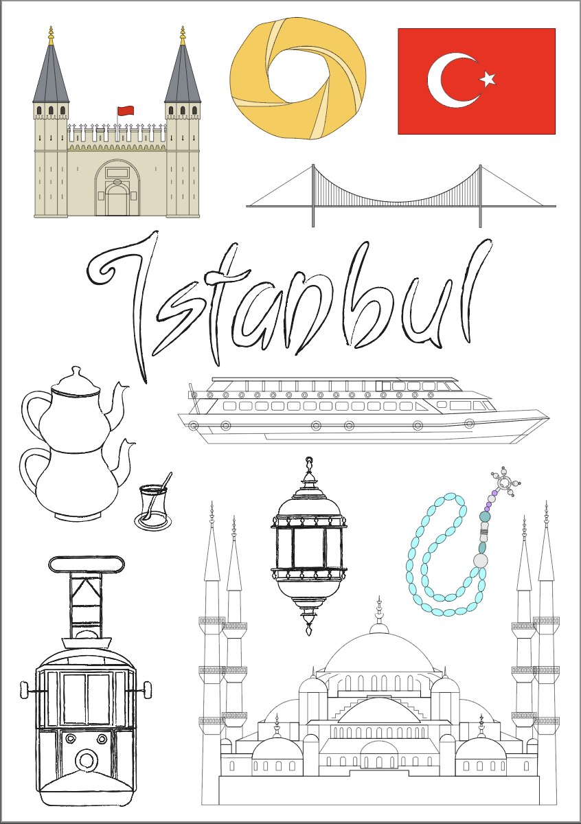
Creating the Istanbul Cover
My attempts at trying to draw any of the buildings freehand were not good enough, so I decided to work directly in Illustrator, which was much more manageable for me. I was aiming for a realistic, but not overly complicated representation of the various elements.
Using several photos from a Google Image search for reference, the first element I chose to create was Topkapi Palace.
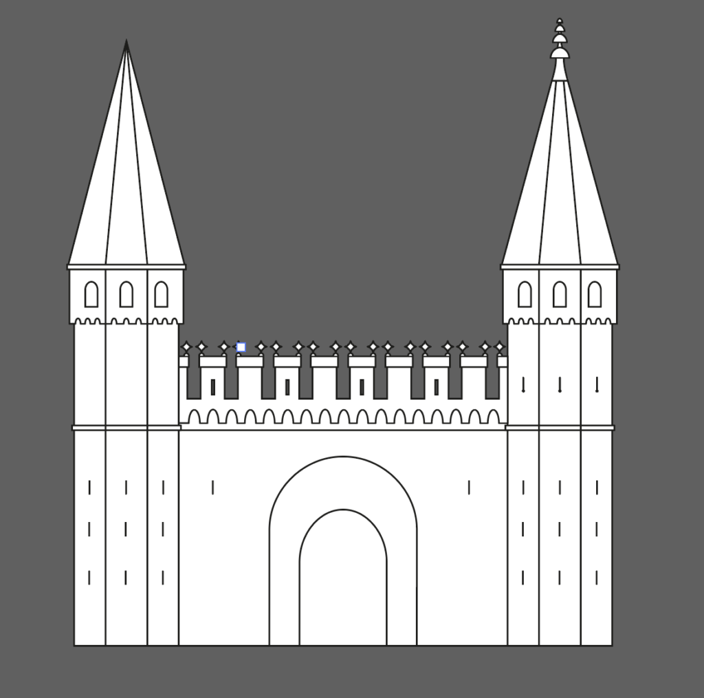
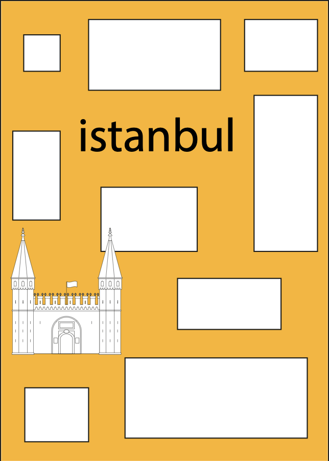
From this, I moved onto various other elements, I tried to keep in mind those that would appeal to tourists to the city.
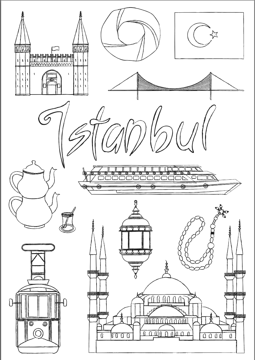
Creating the Type for the Title
At this point I decided to start considering the type for the title. I carried out some research looking at examples of Turkish style writing and fonts, which led to me drawing out various versions based on these influences. As previously stated (many times) I am not very comfortable with drawing lettering, so I was quite pleased that I managed to come up with a range of ideas.
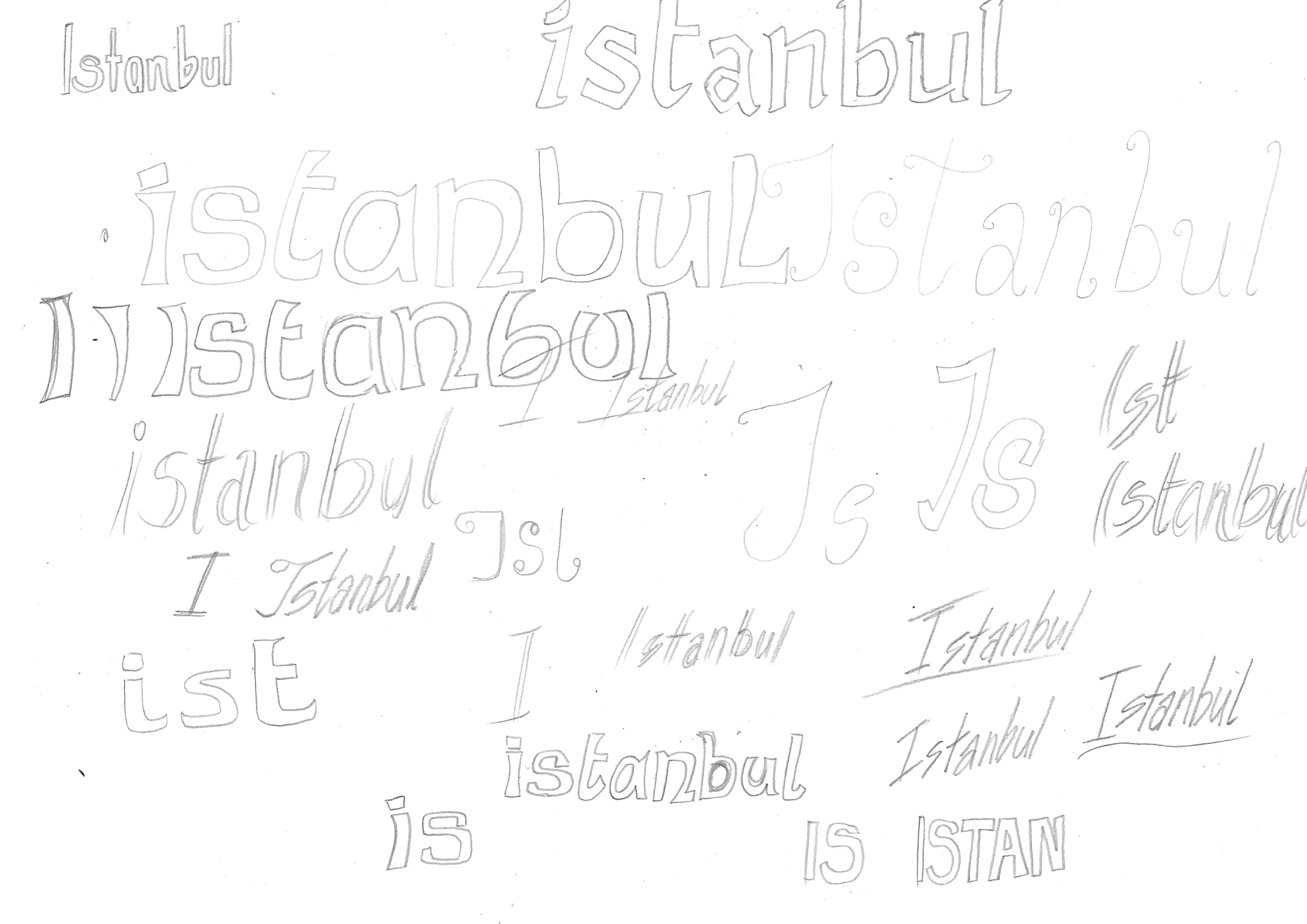
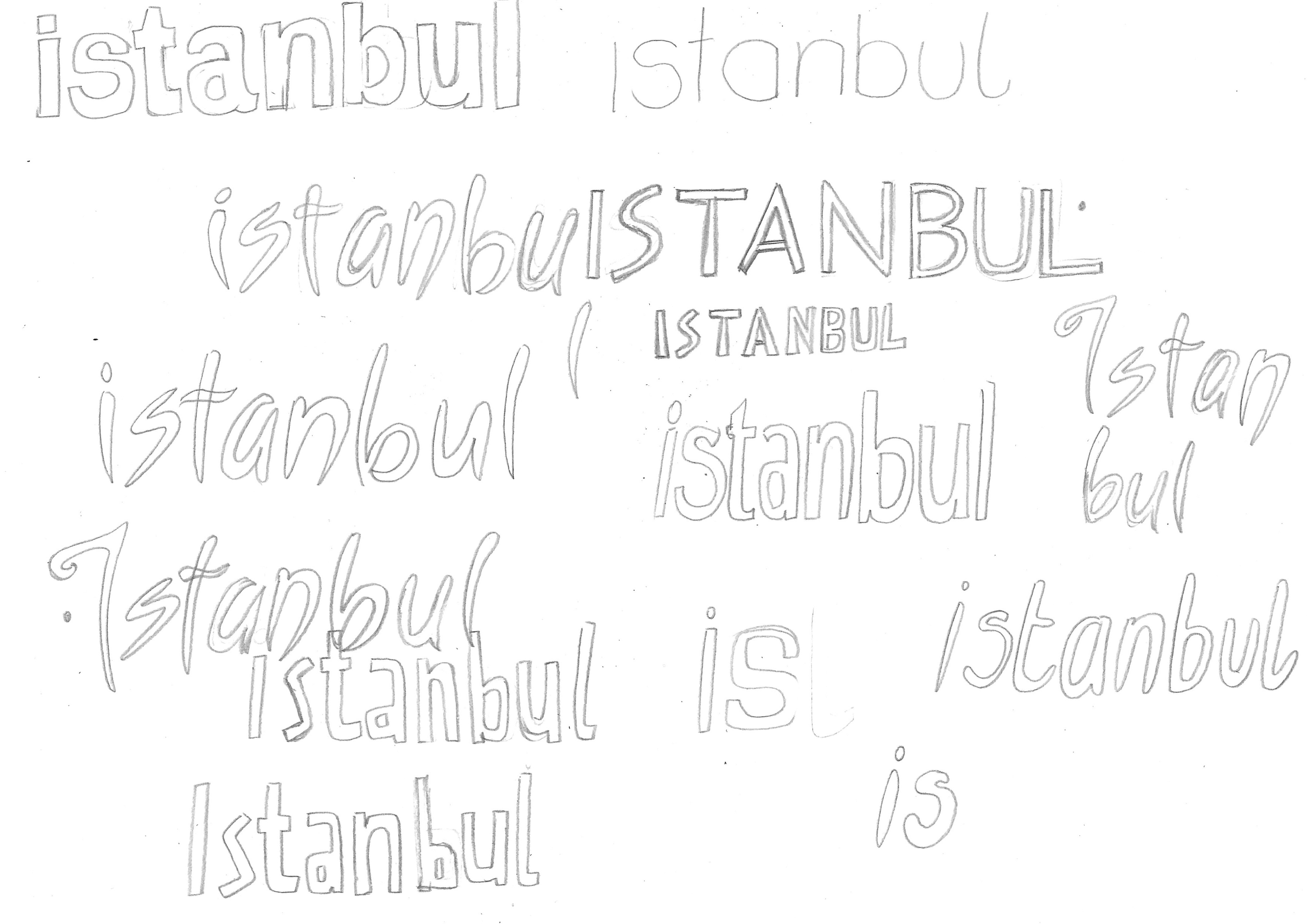
I tried a few different options for the title on the cover and settled on the one below, as I felt this best suited the character of the location.
Adding Finishing Touches to the Cover
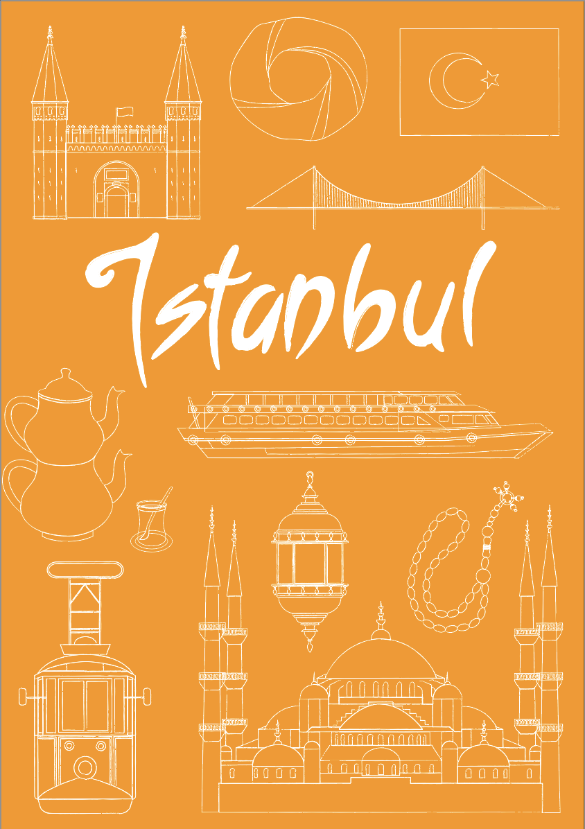
Considering that at the start of this exercise I had absolutely no idea what I was going to be able to create, I was quite surprised I had managed to come up with a reasonably professional looking concept. I decided that each destination should perhaps have a relatable background colour.
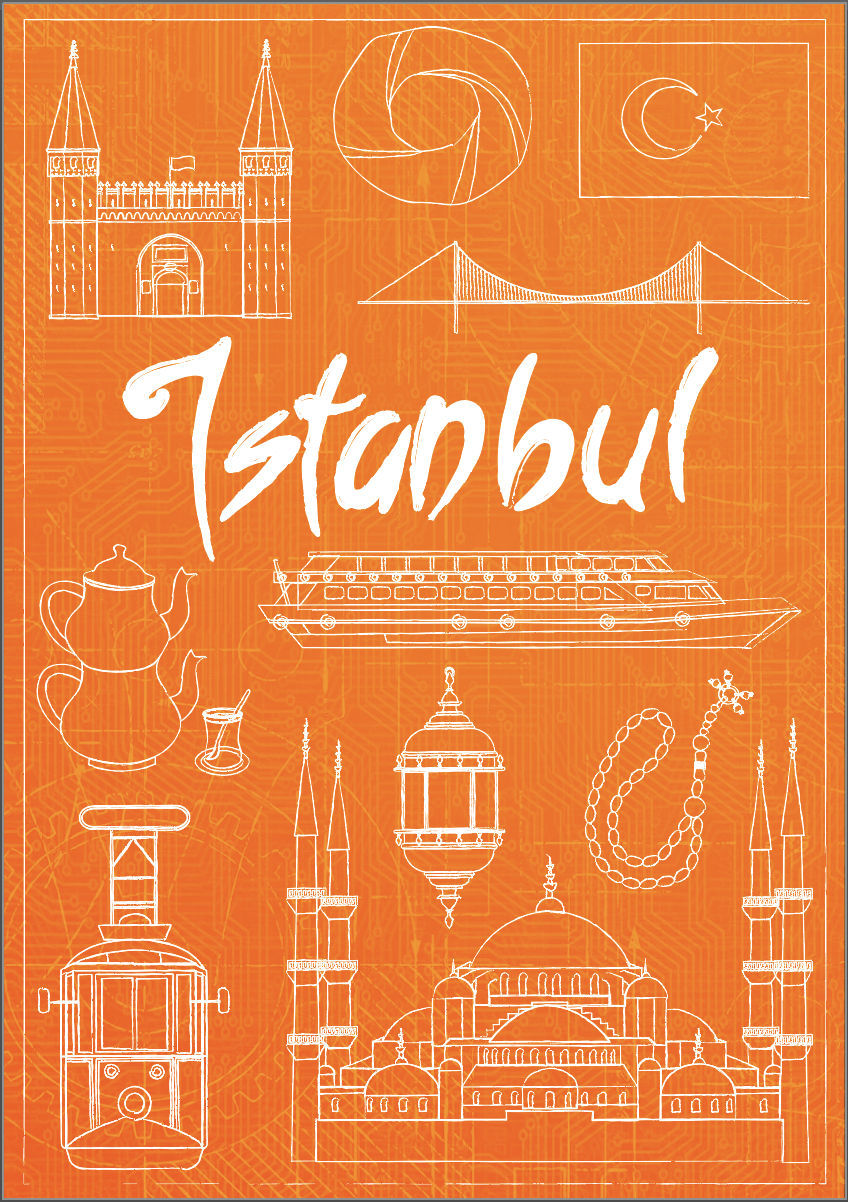
I also experimented with adding a background texture to the cover, firstly, a blueprint style, which I liked, but it did not really have any relevance to the design.
I also thought about adding colour to the individual elements, along with keeping the cover completely black and white, but decided that I preferred the single colour background.
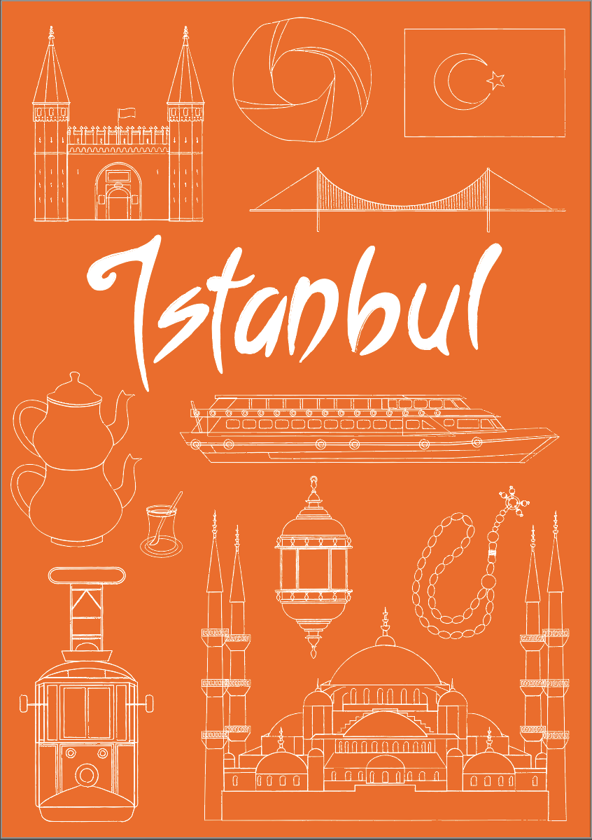
I then went back to thinking about texture and found a Turkish tiling design (after filtering permissions on the image search) that I placed in the background and used the blending tool so that it was not too dominant in the design. I also added the yellow dots as I thought this could be running theme across the series of books (these could run across the spin onto the back cover), as well as breaking up the singular colour of the cover.
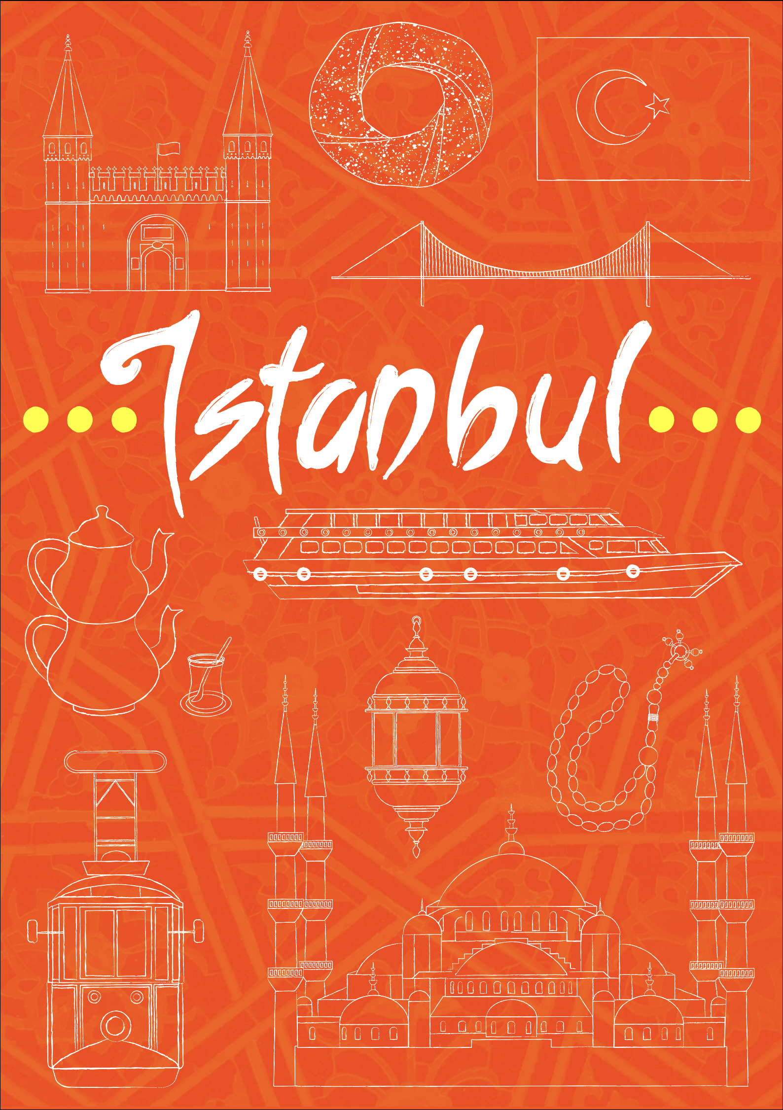
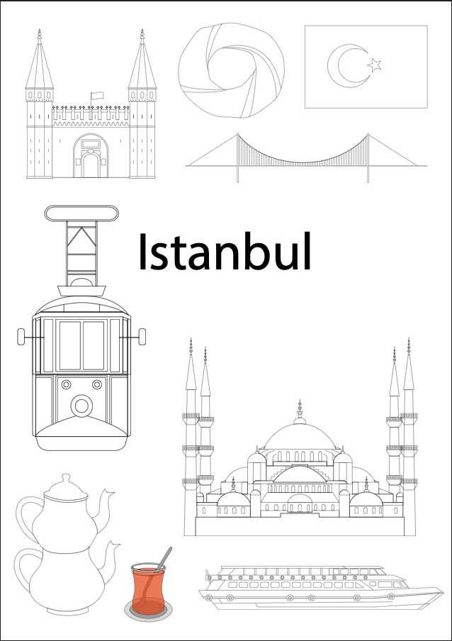
Final Istanbul Cover Design
I was happy with the design, so did a final clean up of the lines and positioning. The finished cover for Istanbul can be seen below.
Creating Visuals for Other Destinations
I had spent a lot of time on this exercise so far and gone about it in the wrong order, so I still had to create visuals for the other two destinations. I had nearly run out of steam for this exercise, so I decided to create some very rough visuals for Helsinki and Milan.
For both cities I selected some key tourist destinations/cultural aspects from my research and did some rough sketches. These would then be positioned within the composition of the covers. they would be subject to change, as with the Istanbul cover I made some additions, depending on the space. I decided that the background colour for the Helsinki guide would be a blue-green and Milan would be red-purple.
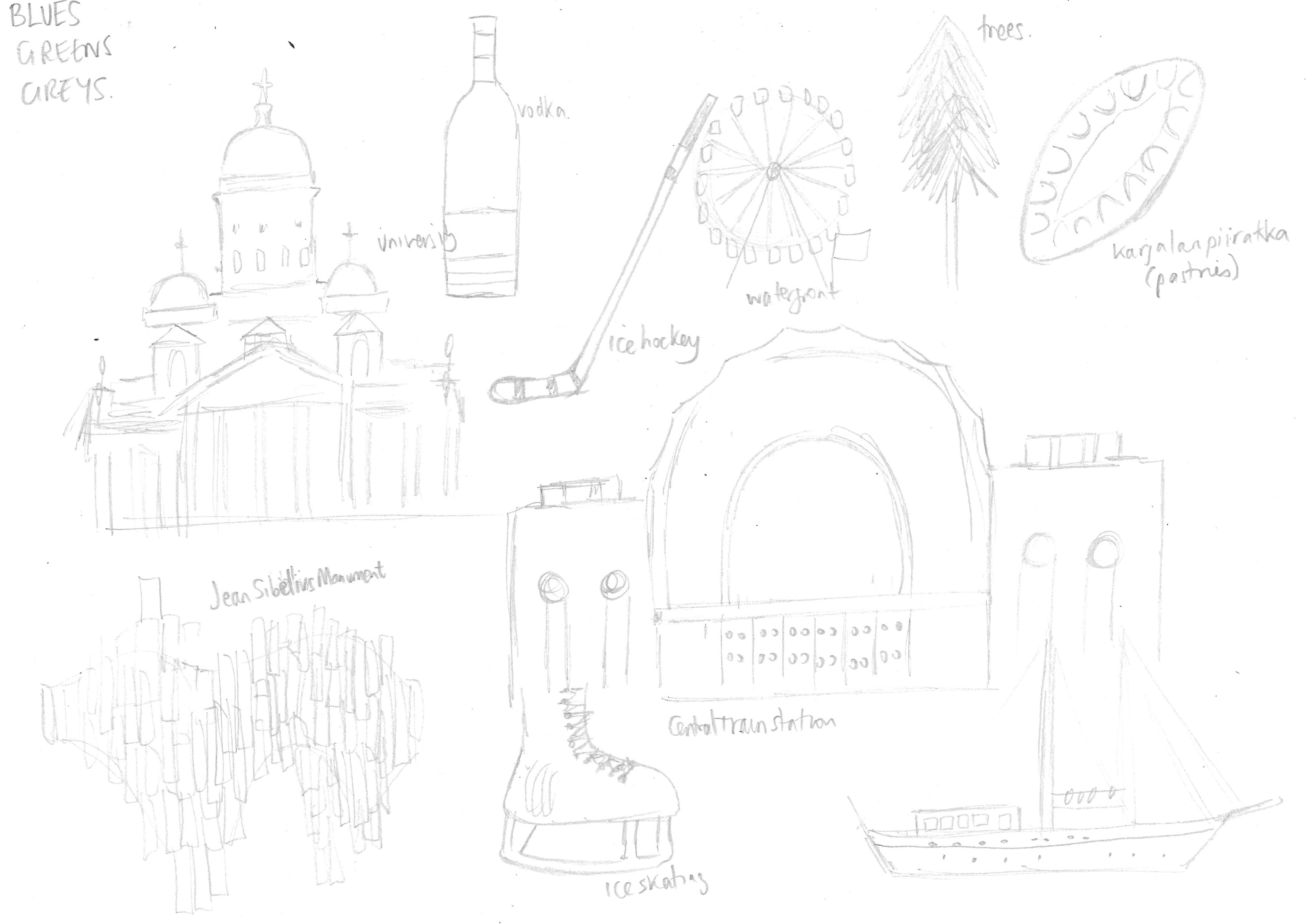
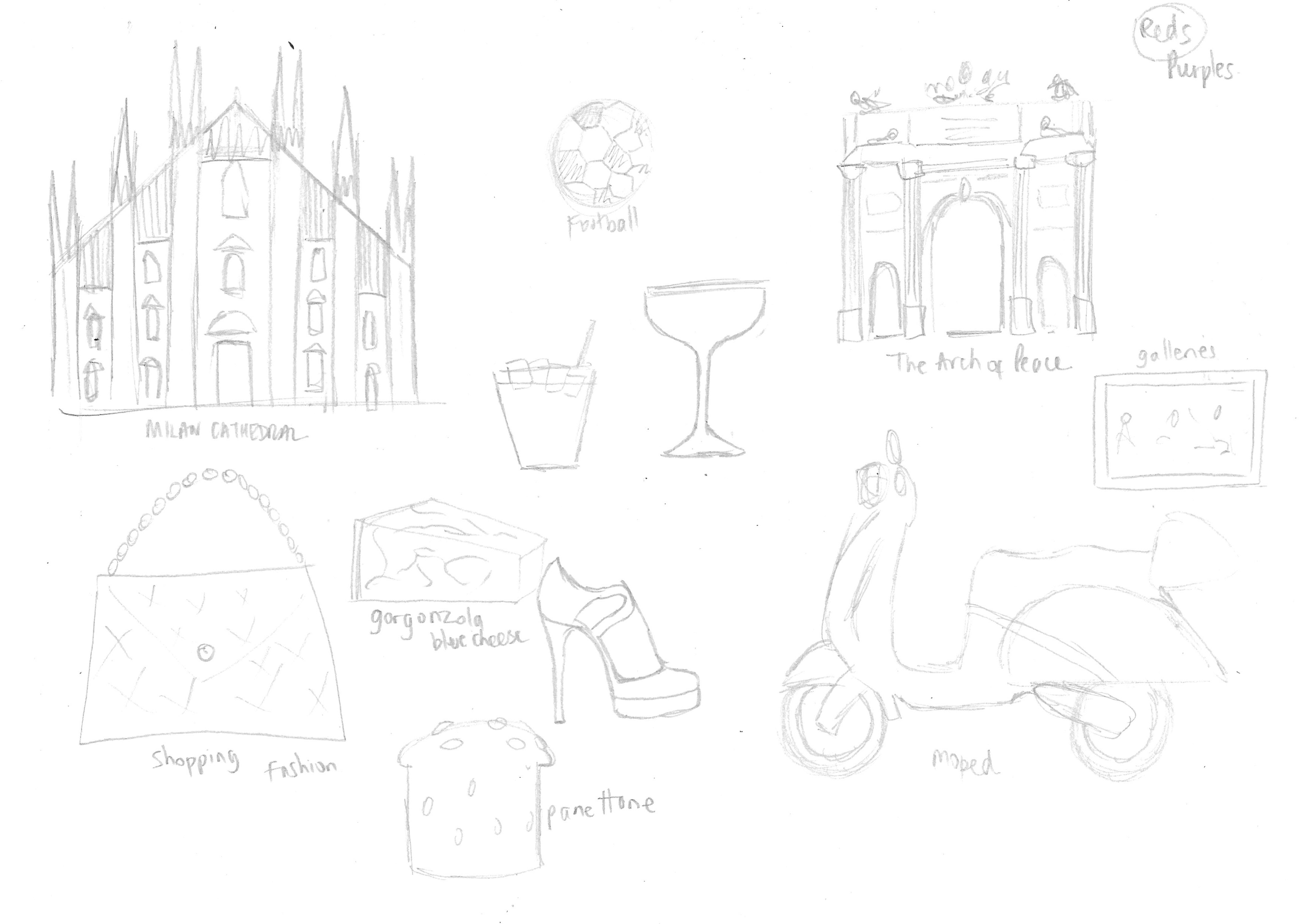
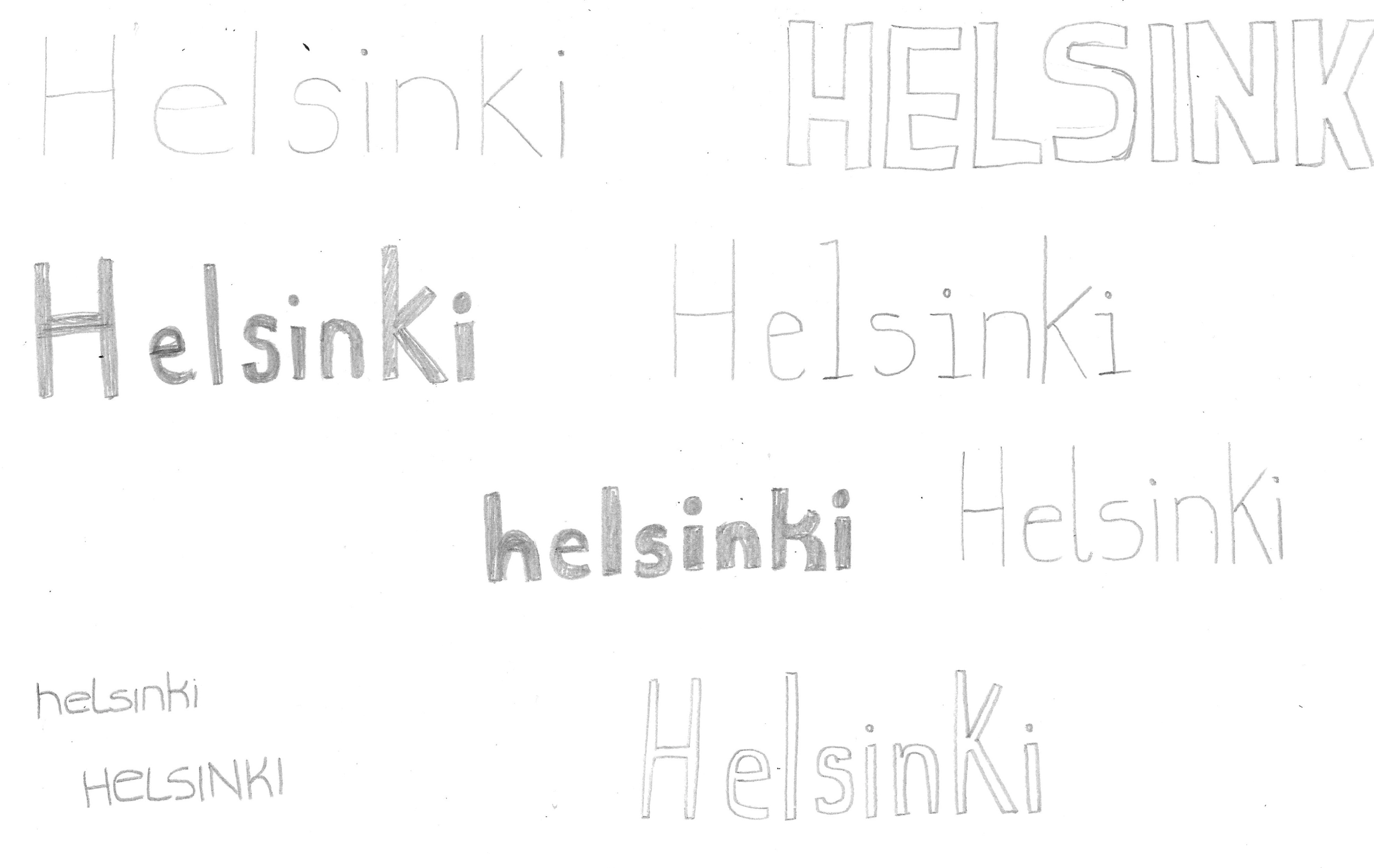
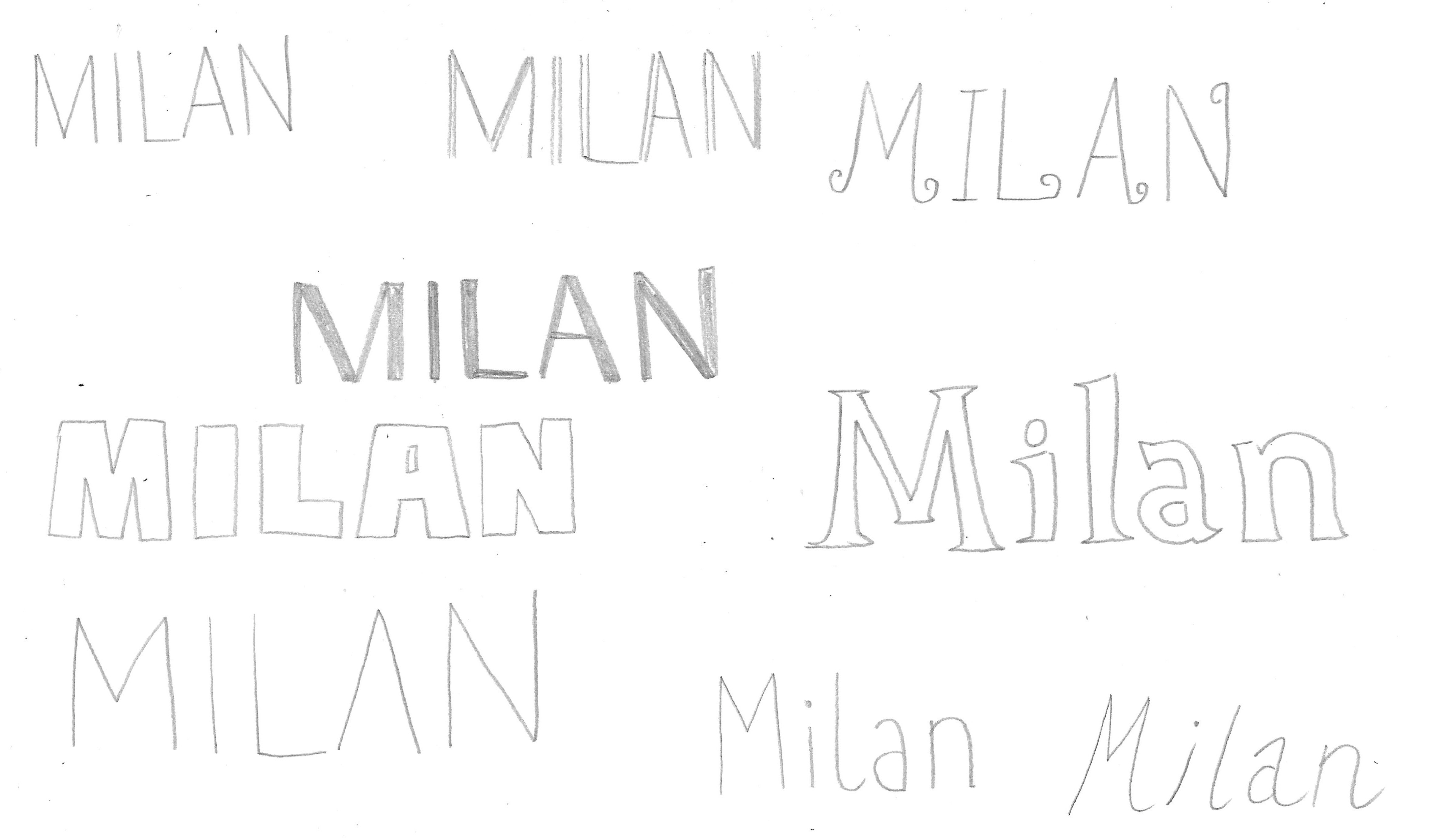
I also experimented with some different ideas of type for the two titles. I thought that Helsinki should be in a clean, modern style, whilst I found Milan harder to come up with ideas for as I thought it would need to be quite stylish and bold.
Final Thoughts
I found this exercise to be one of the most challenging so far in terms of coming up with ideas and being enthusiastic about it. This was most likely due to the very open brief and the sheer amount of information available for each destination. I was quite impressed that I managed to come up with the design for Istanbul, but I did not explore enough concepts or produce visuals of the other two locations to a high enough standard. Time permitting, I have decided to return to the latter at a later date so at least this issue can be resolved.
References
Ates, S. (n.d.). The Spice Capital Of Turkey: Spice Market (Bazaar) of Istanbul. [online] Good Istanbul Guide. Available at: https://goodistanbulguide.com/spice-market-bazaar-of-istanbul/ [Accessed 6 February 2021].
Azzarito, A. (n.d.). 10 Illustrated Travel Guides. [online] Design Sponge. Available at: https://www.designsponge.com/2014/02/10-illustrated-travel-guides.html [Accessed 5 February 2021].
Dictionary.com, (n.d.). Definition of Diagrammatic. [online] Available at: https://www.dictionary.com/browse/diagrammatic [Accessed 4 February 2021].
Go Turkey Tourism, (n.d.). Go Turkey Tourism. [online] Available at: https://www.goturkeytourism.com [Accessed 5 February 2021].
Hashimoto, S. (n.d.). The Portfolio – Illustrator Satoshi Hashimito. [online] Available at: http://s-portfolio.net/index.html [Accessed 6 February 2021].
Helsinki.com City Guide and Bookings, (n.d.). Top Places to Visit in Helsinki, Finland. [online] Available at: https://www.helsinki.com/v/sightseeing-and-landmarks/ [Accessed 5 February 2021].
Jitesh Patel Illustration, (n.d.). Jitesh Patel Illustration. [online] Available at: https://jiteshpatel.co.uk [Accessed 6 February 2021].
Kashima, G. (n.d.). CITIx60-Taipei (City Guide). [online] Guillaume Kashima. Available at: https://guillaumekashima.com/CITIx60-Taipei-City-Guide [Accessed 6 February 2021].
Lonely Planet, (n.d.). Helsinki. [online] Available at: https://www.lonelyplanet.com/finland/helsinki [Accessed 4 February 2021].
Lonely Planet, (n.d.). Istanbul. [online] Available at: https://www.lonelyplanet.com/turkey/istanbul [Accessed 4 February 2021].
Lonely Planet, (n.d.). Milan. [online] Available at: https://www.lonelyplanet.com/italy/milan [Accessed 4 February 2021].
Parrhenius, I. (2013). Search Results for “City Print”. [online] Ingela Parrhenius – Illustrator and Graphic Designer. Available at: http://www.ingelaparrhenius.com/?s=city+print [Accessed 6 February 2021].
Visit Finland (n.d.). Welcome to Helsinki. [online] Available at: https://www.visitfinland.com/helsinki/ [Accessed 22 February 2021].
Wikipedia, (n.d.). Helsinki. [online] Available at: https://en.wikipedia.org/wiki/Helsinki [Accessed 4 February 2021].
Wikipedia, (n.d.). Istanbul. [online] Available at: https://en.wikipedia.org/wiki/Istanbul [Accessed 4 February 2021].
Wikipedia, (n.d.). List of Istanbul Landmarks. [online] Available at: https://en.wikipedia.org/wiki/List_of_Istanbul_landmarks [Accessed 4 February 2021].
Wikipedia, (n.d.). Milan. [online] Available at: https://en.wikipedia.org/wiki/Milan [Accessed 4 February 2021].
Wikipedia, (n.d.). Simit. [online] Available at: https://en.wikipedia.org/wiki/Simit [Accessed 6 February 2021].
Wikipedia, (n.d.). Topkapi Palace. [online] Available at: https://en.wikipedia.org/wiki/Topkapı_Palace [Accessed 4 February 2021].