Brief
Begin by taking each pair of words in turn from the list below and writing them in your own handwriting:
- Big / Small
- Fat / Thin
- Fast / Slow
- Fun / Boring
- Calm / Mad
Now write each pair of opposites in a way that is descriptive – use the shape and size of the word and the relative position of the letters to express the meaning of the word. A fat ‘F” may look different to a thin ‘F’. Write the words in both upper case and lower case.
Turning to your computer software, scroll through the fonts and select one that suits your word. Reflect the qualities you were seeking to express when hand-drawing the word. Be conscious of the roundness or pointedness of a letter form. Note whether it is serif or sans serif. It may help to type the word several times in different fonts and make a direct comparison between them.
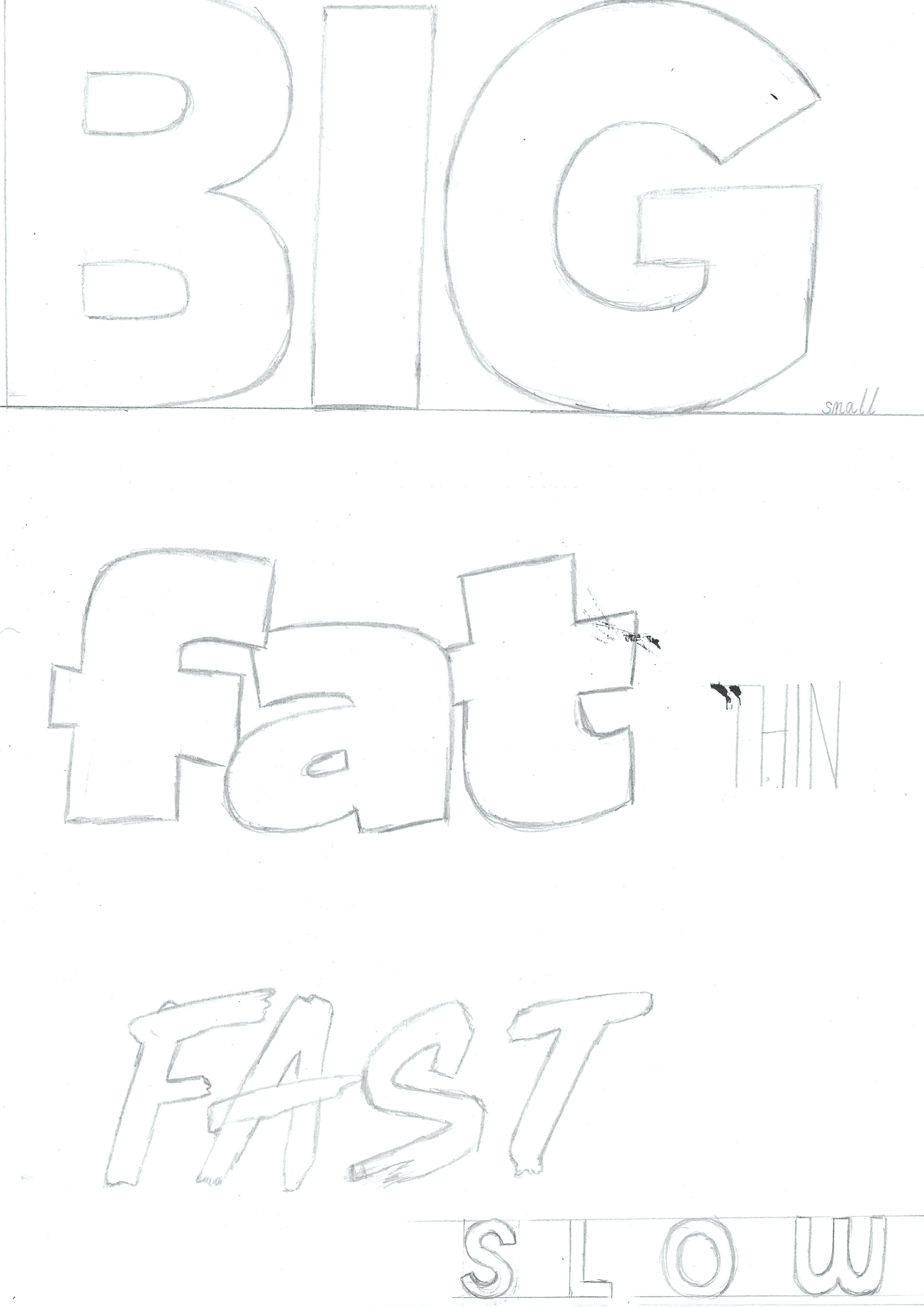
Print off the words in the typefaces you have selected in a size that reflects the meaning of each word. Your ‘fat’ word may be much larger than your ‘thin’ word, for example, and each may be in a different font.
Trace the typeface in pencil using the colour that best communicates its meaning.
Use a moodboard to explore other media qualities which communicate the meaning of your word – consider texture, line quality and colour combinations.
Draw your typed words freehand using a pencil and then render them using materials, media and colour appropriate to their meaning.
I began this exercise by writing the pairs of words in my own handwriting.
Writing the Words Descriptively
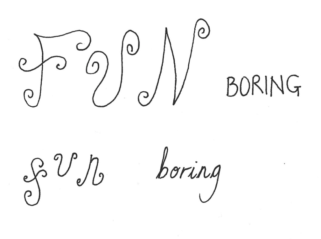
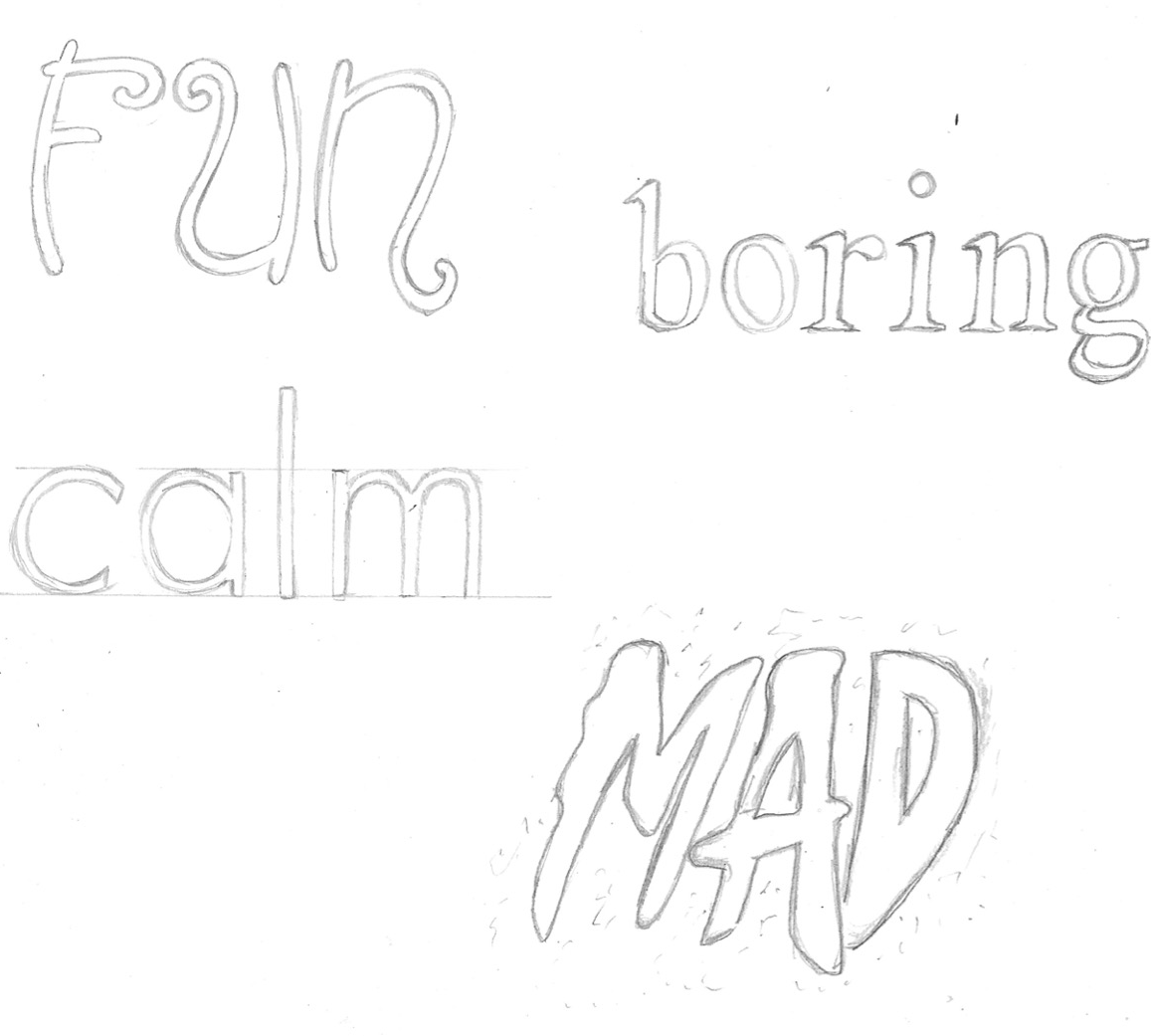
I then attempted to write each pair of words, in both upper and lower case in a way that is descriptive. I found it was much easier to think of how to depict the word ‘big’ than ‘small’ as I discovered the latter requires another element for the comparison in size to be demonstrated.
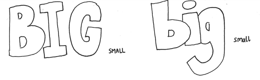
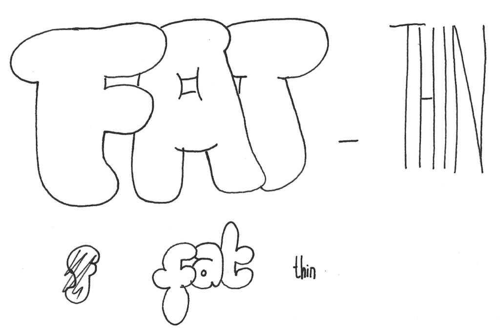
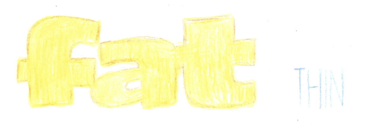
I preferred the upper case versions of ‘fat’ and ‘thin’ as I thought the contrast between the two was more striking.
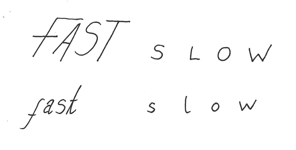
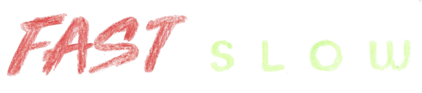
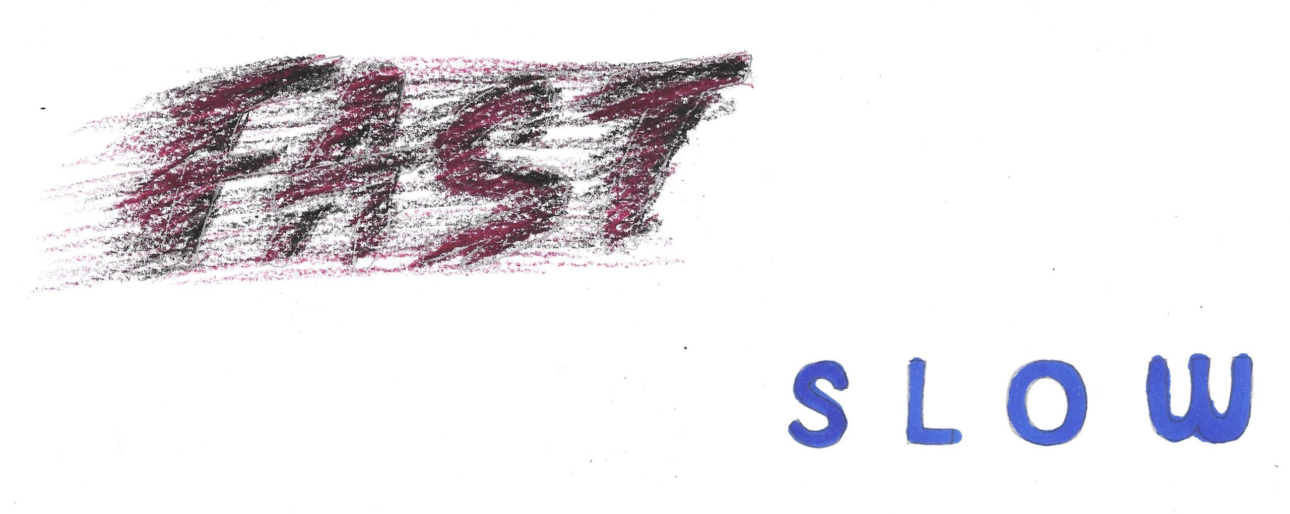
I decided that slanting letters forward was the most obvious way to suggest speed, whilst exaggerating the space between letters achieved the opposite. In hindsight, it would have therefore made sense to squash the letters in ‘fast’ closer together.
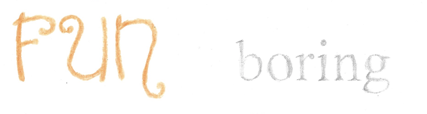
I made the letters for ‘fun’ more decorative in comparison to those for ‘boring’.
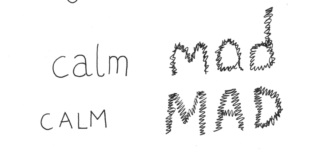
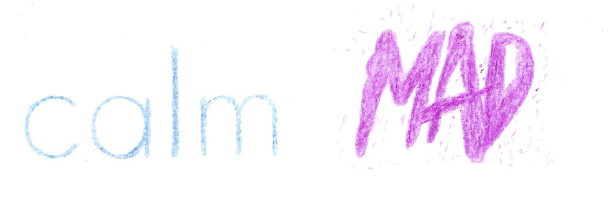
I thought ‘calm’ was best reflected by smooth, simple lines in comparison to jagged, haphazard ones for ‘mad’, although the latter probably should have been more exaggerated and not so controlled.
Finding Suitable Fonts
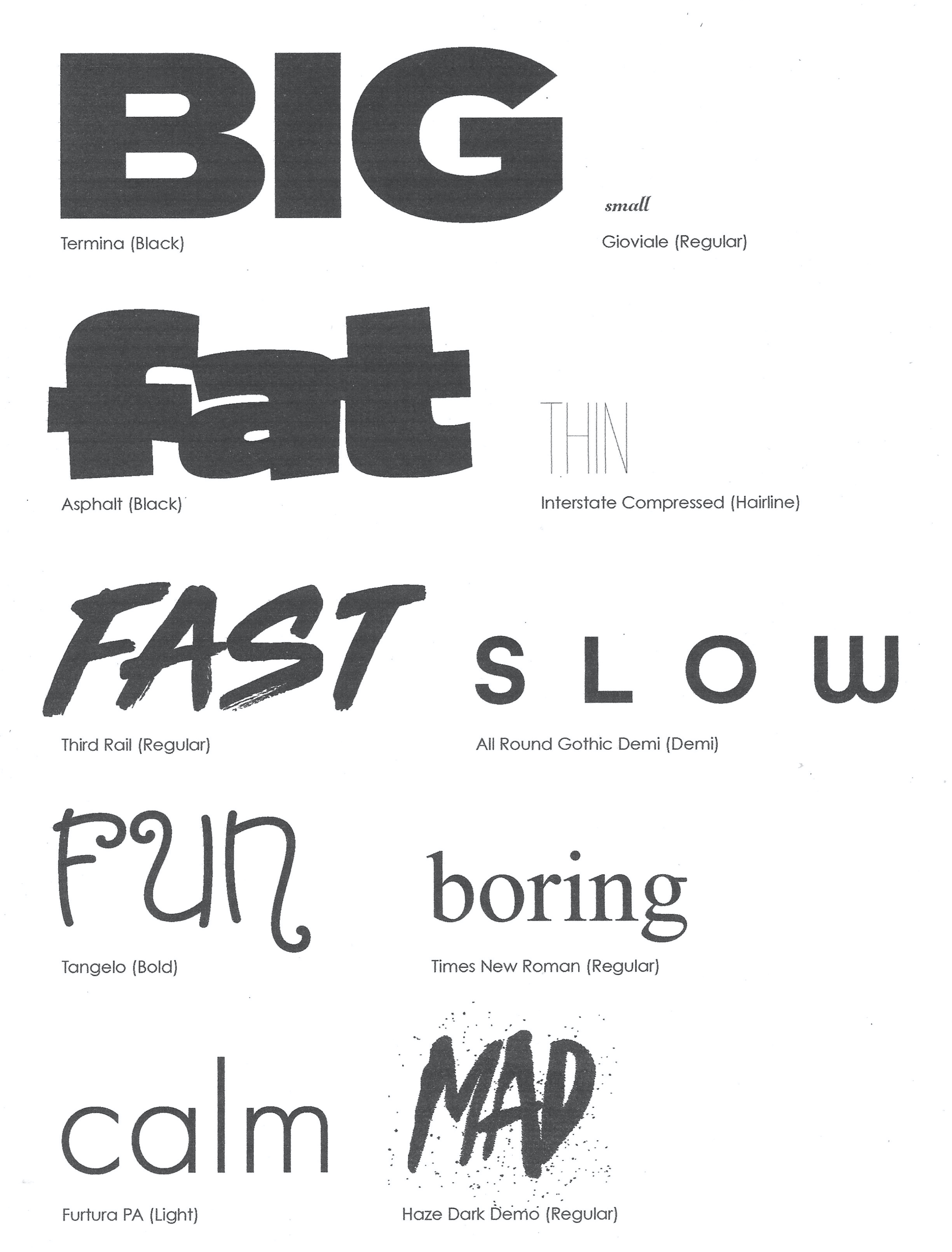
Next, I experimented with various fonts on my computer for each word and the final, printed choices can be seen below. I thought these were better suited than my hand-written attempts, although I did like my freehand version of ‘fat’.
Communicating Meaning with Colour
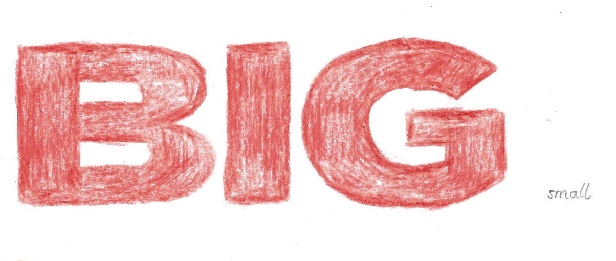
I then traced each word using a colour I felt best reflected its meaning. I chose red for ‘big’ as it is a bold and eye catching colour and contrasted this with grey for ‘small’.
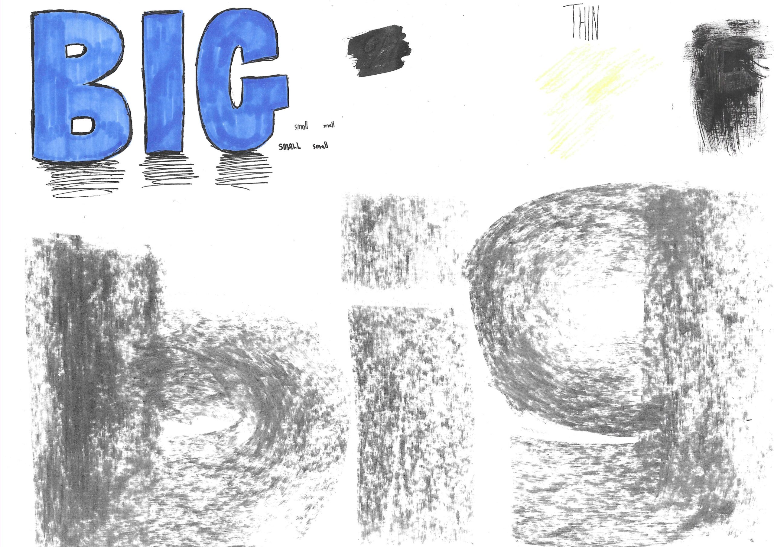
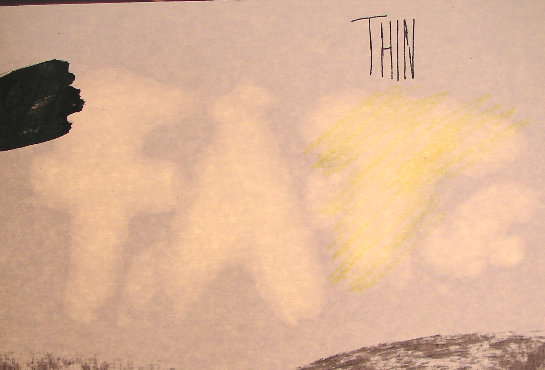
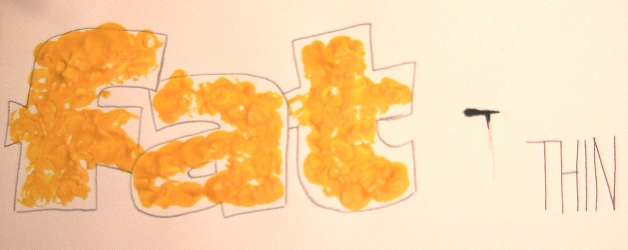
I did consider pink for the word ‘fat’, but decided to go with yellow as it a more literal representation. I used blue for ‘thin’ in reference to the fragility of ice. I also tried to apply the colour quite faintly to add to this.
I went with red for ‘fast’ in reference to ‘flashy’ red sports cars and green for ‘slow’ as it is the opposite colour and suggests calmness, I also applied the pencil softly so the edges appeared more blurry.
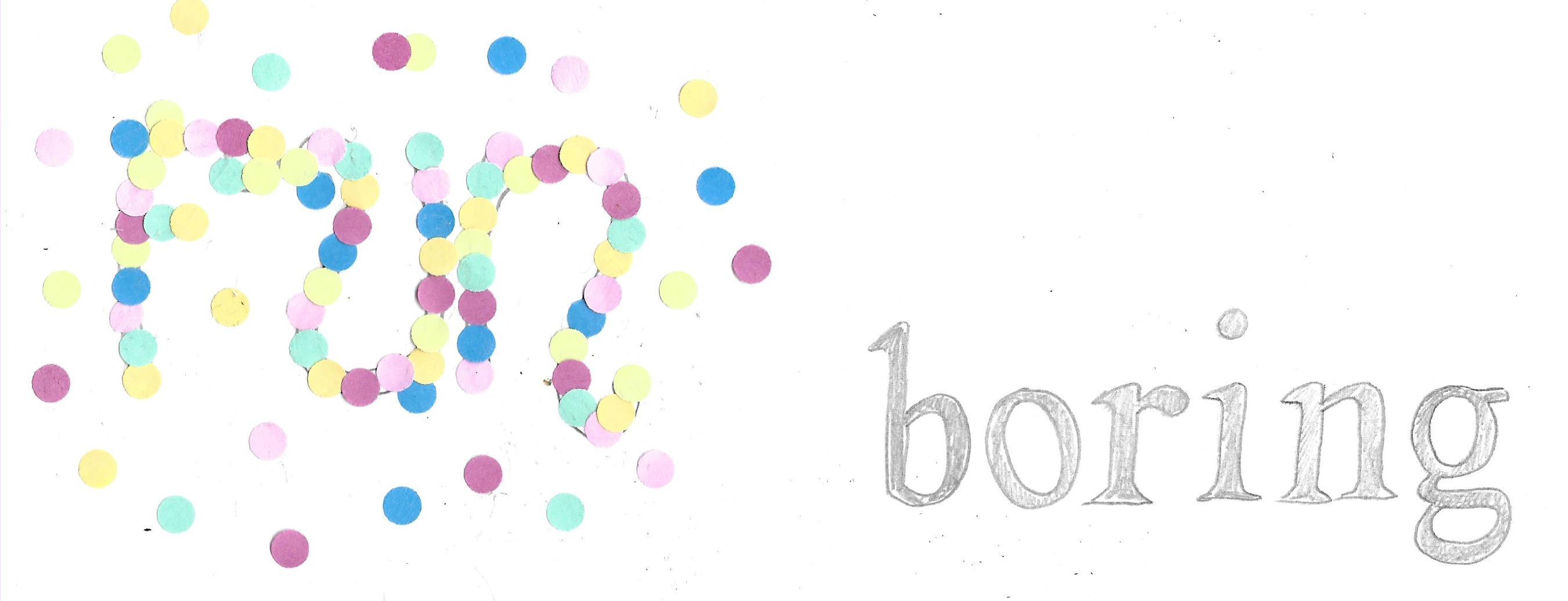
Orange is often considered a ‘happy’ colour so I thought it was well-suited for the word ‘fun’. There was no other colour I could think of other than grey to sum up the word ‘boring’.
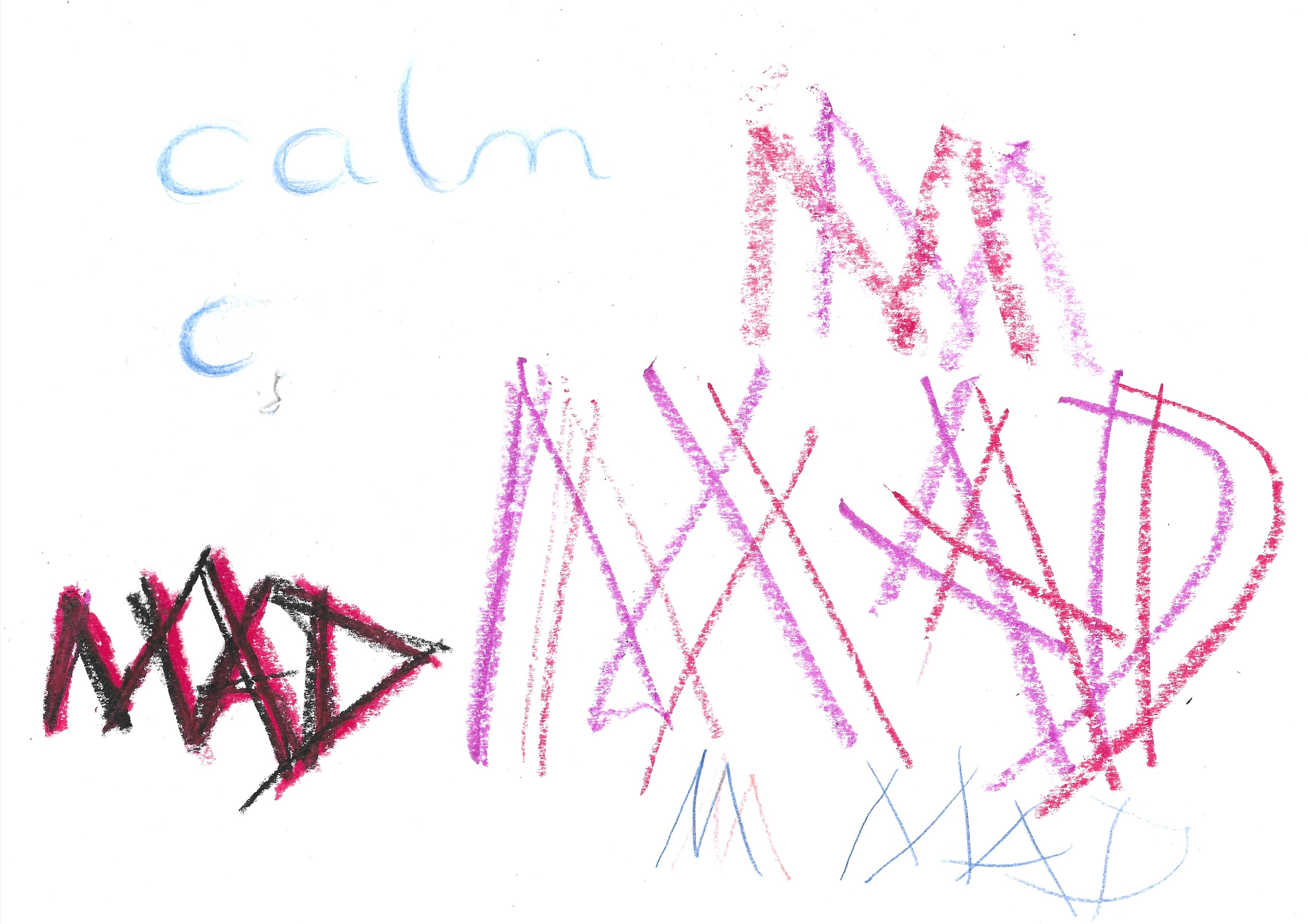
Blue was the ideal choice to me for ‘calm’ as it is serene whilst I chose purple for ‘mad’, but perhaps red would have been a better option (or multiple colours, if permitted).
Experimentation
I then experimented with a few different materials and ideas for each pair of words, some results were more successful than others.
I used coconut oil to depict the word ‘fat’, which made the paper see-through when held up to a light.
For the word ‘fast’ I smudged the charcoal/oil pastel to indicate movement whilst using very considered and precise movement for ‘slow’. For ‘boring’, I used a pencil whilst using coloured pencils for ‘fun’.

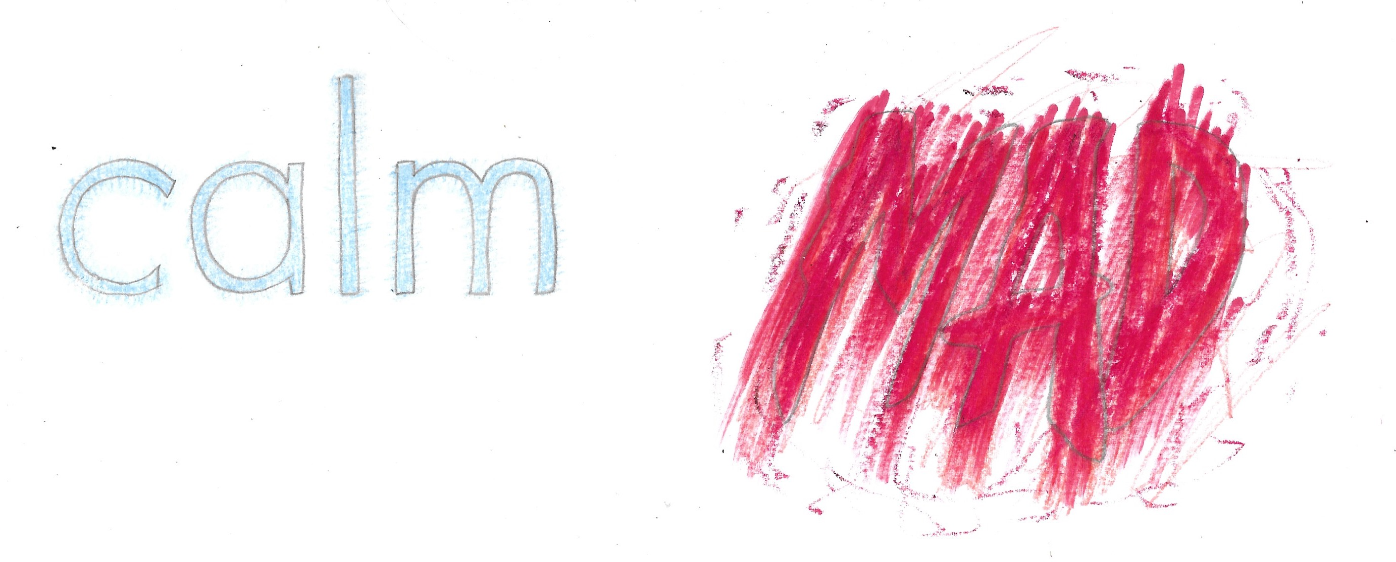
I used smooth pencil strokes for ‘calm’ in contrast to sharp, hard pastel strokes for ‘mad’.
Rendered Versions
I began the final part of this exercise by drawing the fonts freehand using just a pencil. I was quite pleased with how my reproductions turned out considering my inexperience with type.
For the word ‘big’ I used a thick paintbrush and blue acrylic paint. I tried to emphasise the size by adding shadow and placing ‘small’ on the same horizon line, using grey pencil.

For ‘fat’ I applied yellow acrylic paint directly from the tube to create a textured, globular appearance. It would have been beneficial to build it up with some other shades of yellow or white as well. In contrast I used a very thin black liner for ‘thin’.
I used a combination of red and black oil pastels for ‘fast and applied these in quick horizontal strokes to try an indicate speed/movement. I used a marker pen for ‘slow’, which I applied to the paper very deliberately.
I hole-punched a selection of different coloured post-it notes and used the circles for the word ‘fun’. For ‘boring’, I stuck with an HB pencil.
For ‘calm’ I used a blue coloured pencil, but on reflection, watercolour would have probably been the best suited to represent this word. I used a red pencil, oil pastel and felt-tip pen for ‘mad’, which I applied in rapid, random strokes. I thought this was more successful than the previous version in purple.
Final Thoughts
I felt this exercise proved to be very beneficial as it made me carefully consider how text can add to to the overall appearance of an illustration, by suggesting meaning. I thought that, even on a subconscious level, these decisions can impact and enhance the viewer’s understanding of what message is being communicating. I perhaps, should have experimented more with different materials, but this is something I am trying to improve on.