Brief
Buy a newspaper with a supplement and go through cutting out any article that contains an illustration.
Notice the heading for each article and read the text that the illustration refers to. Make a mental note about the way the illustration relates to the text, how its ideas relate to the meaning of the piece, how it extends the content of the piece.
Analyse the type of illustration – is it decorative, conceptual, informational? Does it use metaphor to convey an idea or does it have a narrative base? Is it representational, abstract or diagrammatical?
Now imagine that you have been commissioned by the paper to create an illustration. Your task is to provide a visual interpretation of one of the headings below:
- How green is your food?
- The best restaurant in town.
- Loves me, loves me not
- Throwing your money away
- The object of my desire
- Finding your family history
- An interview with Melvin Bragg
- Paris, still the best place on earth
You may find it useful either to find some text that suits the heading or write a few sentences yourself. Your interpretation can be as personal or as open as you like. For example you may decide to go and draw an object, place or situation – or you might decide to create your image in a more interpretative or conceptual way.
If you are confronted with several hundred words of text to illustrate you may find it hard to identify a key area of focus. Approach the task in a series fo stages. Start by reading the article all the way through to get a sense of its entire meaning. Try not to think about your visual interpretation at this point. You might find it useful to sum up the article in a series of short sentences.
Next, go through the article with a highlighter pen and identify sentences and words which you consider to be important aspects of the text. Be conscious of connections between these words and the way in which one aspect of the text relate to another. If you have been given a heading by an editor, that might point you in the direction of the aspects that you will need to respond to in your illustration. Finally, read the text again with a sheet of paper to hand and sketch down ideas as you read through the article. Do not draw self-consciously. Enjoy the process of visual brainstorming and be open to whatever results from it.
Make a list of words that describe the illustration you want to create. This should be as clear as the analysis you made of the illustrations in the newspaper or magazine and will help you decide how to proceed. Identify what the function of your image will be. Will it contain information, offer opinion, clarify or decorate the text?
Working within he size of one of the images that you analysed earlier, create a visual in response to your ideas. Be thorough within your processes of idea generation and development and refer often to your heading and text. Be realistic about your abilities at this stage and choose content according to both the meaning you want to communicate and your confidence in achieving this visually.
When you have created a line visual that you feel is appropriate for the article, go to the artwork stage. If you can identify a palette and medium that you think sums up the sense of the content, you may find that you can photocopy your visual and colour it in or scan it digitally and explore several colour variations before moving onto the final artwork.
Using materials and a stylistic approach which you feel comfortable with, translate your visual into artwork. You might decide to trace the image onto a surface appropriate to the media you have chosen, scale up the format you intend to work within and trace from an enlargement or draw the image freehand, using your visual as a guide.
In your learning log note down the types of editorial illustration you related to most positively, the early ideas you considered, and the process by which you decided what aspects of the text you want dot focus on.
Research
I began this exercise by looking through a copy of The Sunday Times (including all the supplements). I was expecting there to many more illustrations than there were, which was a shame, but perhaps it was just the week I had chosen. As stated in the brief, I analysed each one in terms of the concept and how it related to the text.
I had previously done quite a bit of research regarding editorial illustrations when completing Assignment 4.
I discovered I am particularly drawn those that use metaphors and some form of humour, even when communicating a serious message. I found a few new artists whose work really appealed to me visually, stylistically and conceptually. They clearly demonstrated how a message can be communicated visually without any text required.
I also came across a clear and informative tutorial regarding a process for creating editorial illustrations.
Chosen Heading and Article
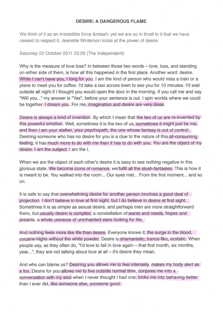
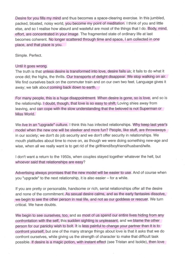
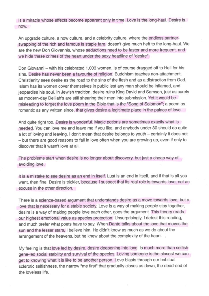
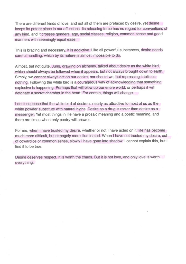
After some deliberation, I selected ‘The object of my desire‘ as the heading I wanted to provide a visual interpretation of. I found an article online from The Independent entitled ‘Desire: a Dangerous Flame‘ that I thought would offer quite a lot of options to explore visually. I printed a copy of the article and read through it once and then again, using a highlighter to select sentences/words I felt were the most significant in communicating the article’s messages. I found it beneficial reading the article several times and having to fully concentrate in order to make relevant selections.
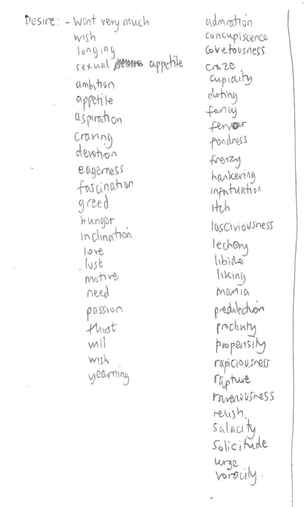
I then looked up the definition of desire and some synonyms of the word to help broaden my understanding of the concept.
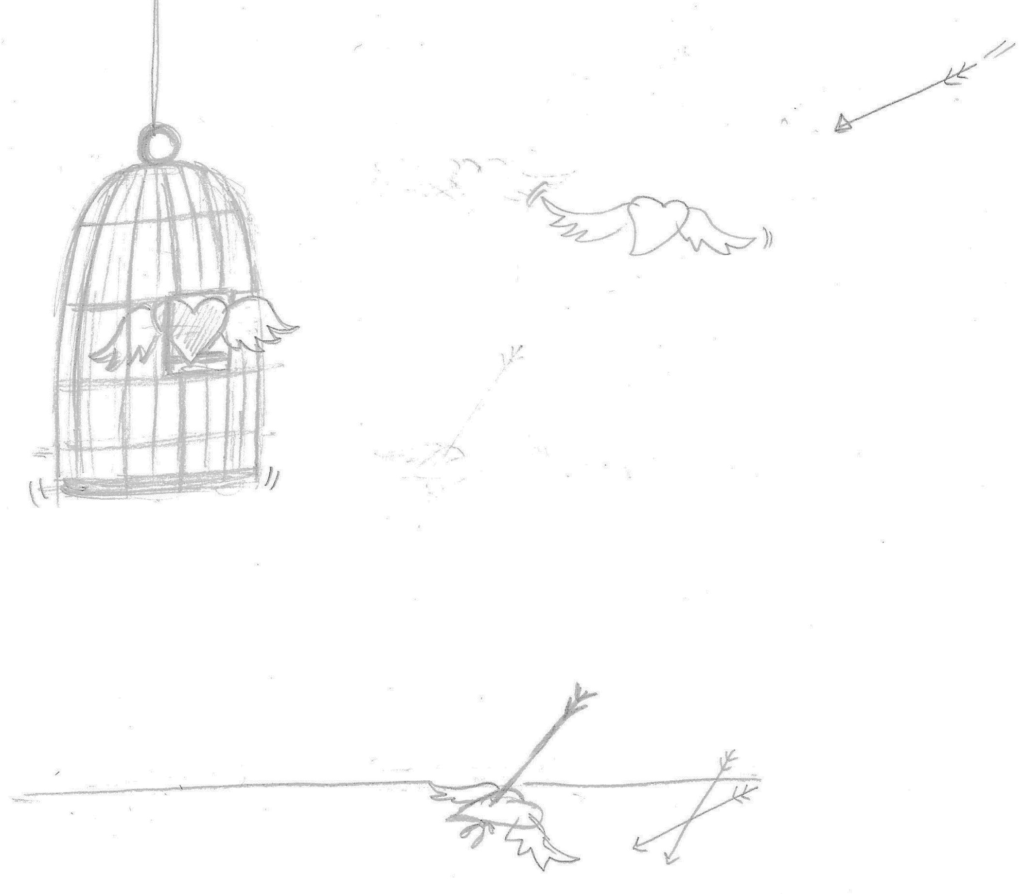
Rough Ideas as Sketches
I read through the article once again and and simultaneously drew some rough sketches of ideas as they came into my head. I tried not to think too much about this process or what my drawings looked like aesthetically.
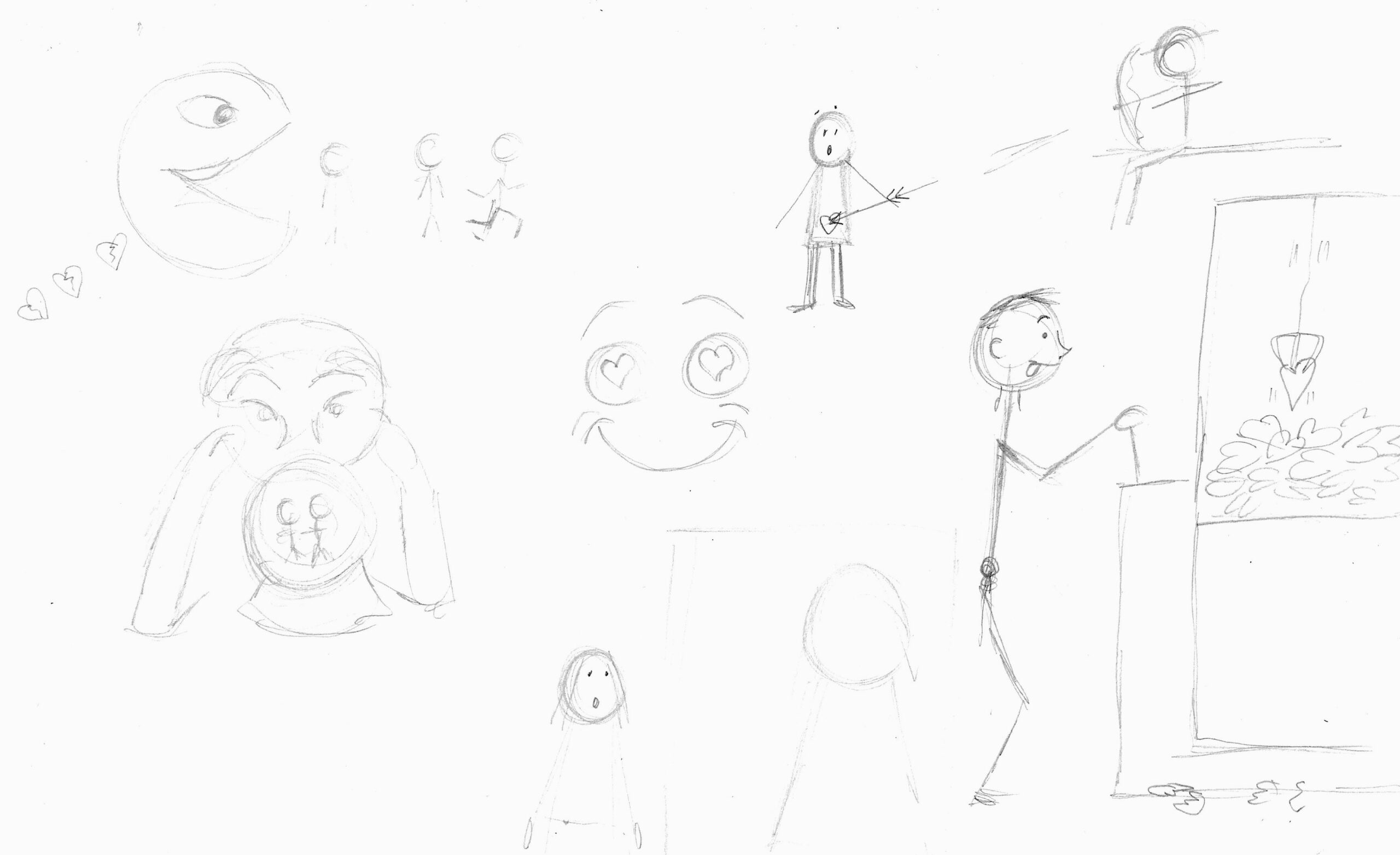
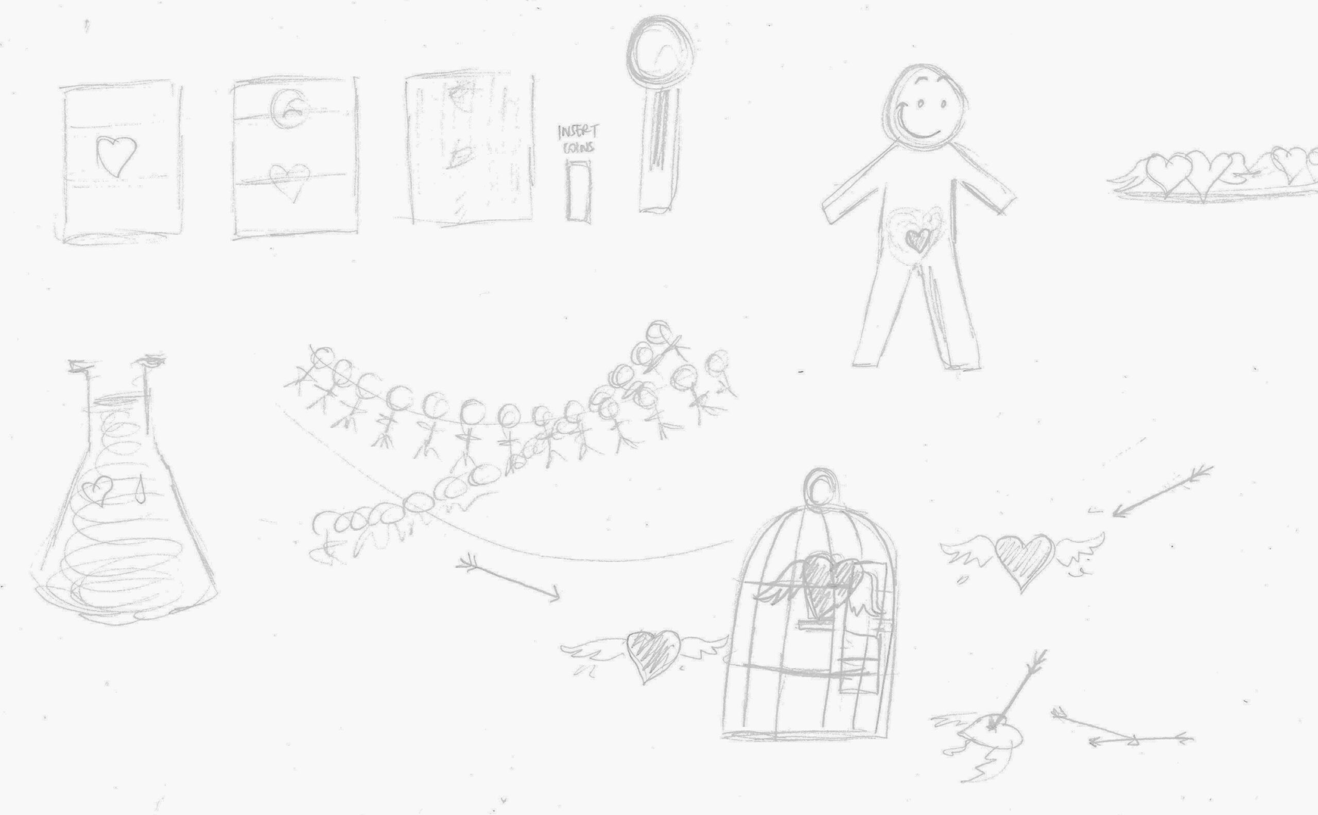
I felt this process had sown the seeds for several potential ideas to expand on.
Refining Ideas
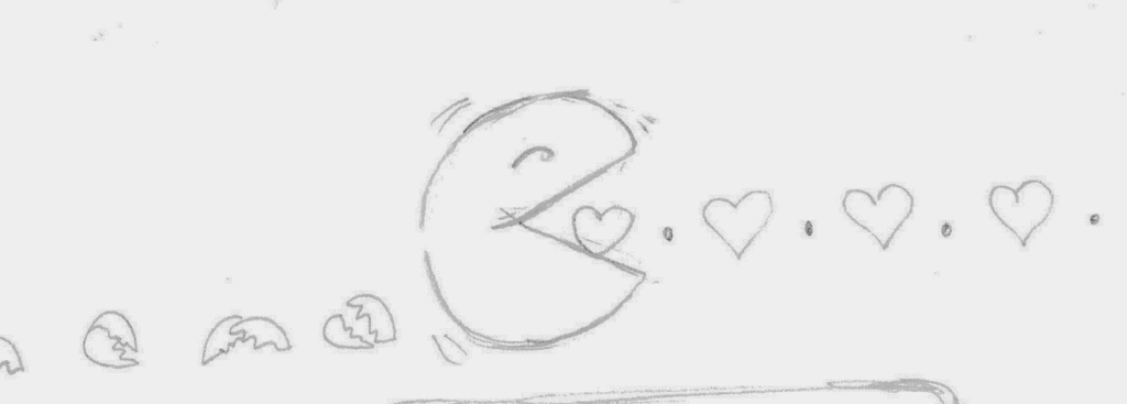
After a break, I returned to my initial sketches and selected those which I believed to be worth developing further. The first idea was ‘Pac-Heart’ in which a PacMan like character is chomping its way through hearts and leaving a trail of broken hearts in its wake. I thought this was quite a simple, but effective visual in terms of communicating its meaning.
The next idea was ‘Grab-a-heart’, based on the fairground game. Again I felt this idea could be quite easily read.
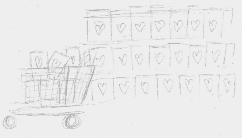
The next idea, ‘Bulk Buying Hearts’, had potential, but I was less pleased with this one, so decided to leave it alone.
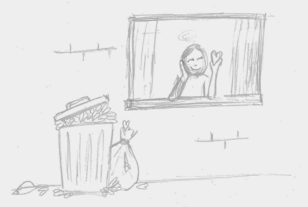
The next idea was ‘Bin of Hearts’, which I quite liked as it as character based and had humour. I also thought it communicated its message reasonably well.
I decided to attempt a more abstract image based on the article’s reference to desire being a white bird. I am not sure of its success, but the concept was roughly that the white-winged hearts (desire/love) should always have courage to take flight even if they are brought down to earth.
Refocusing on Term ‘Desire’
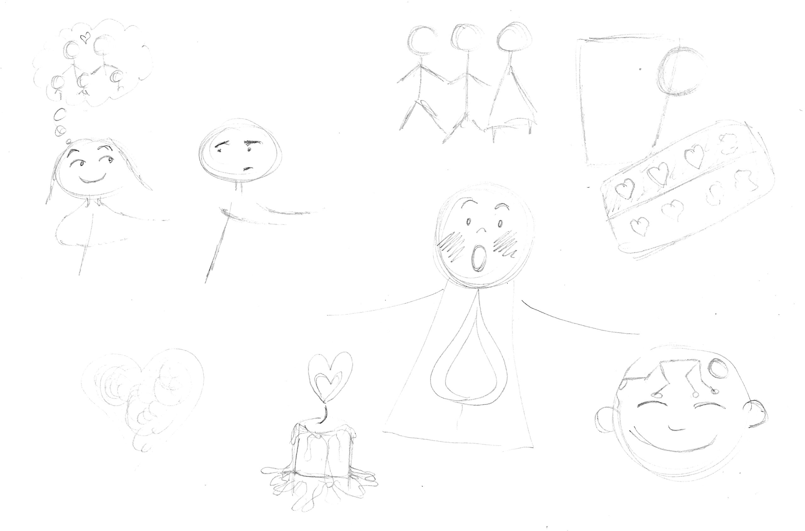
At this point I started to question whether I was drifting too far way from the term ‘desire’ and my ideas so far would be interpreted as regarding ‘love’ instead. The use of a heart is generally associated with love and I found it difficult to find a way to visually represent the term desire in a similar way. I reread the article and came up with some more ideas, which I felt were much more relevant and focused on the content. I used the author’s reference to desire having the potential to detonate an explosion of some kind, which could lead to love or not, along with the title being ‘Desire: A Dangerous Flame‘. This progressed to the idea of incorporating a flame as a visual representation of desire. The author also refers to desire/love as a drug several times in the piece, and I did come up with some ideas regarding this, but decided it was unlikely this route would be approved for publication in a national newspaper!

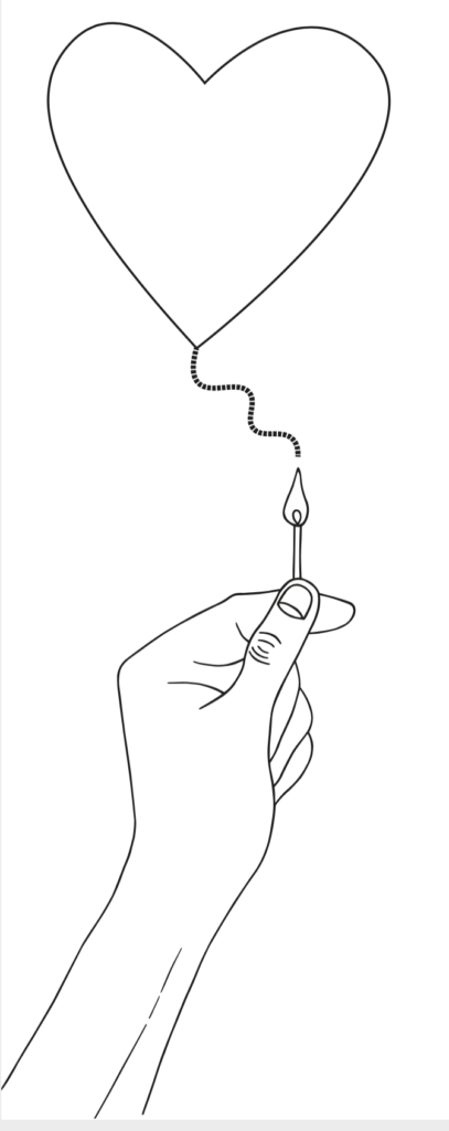
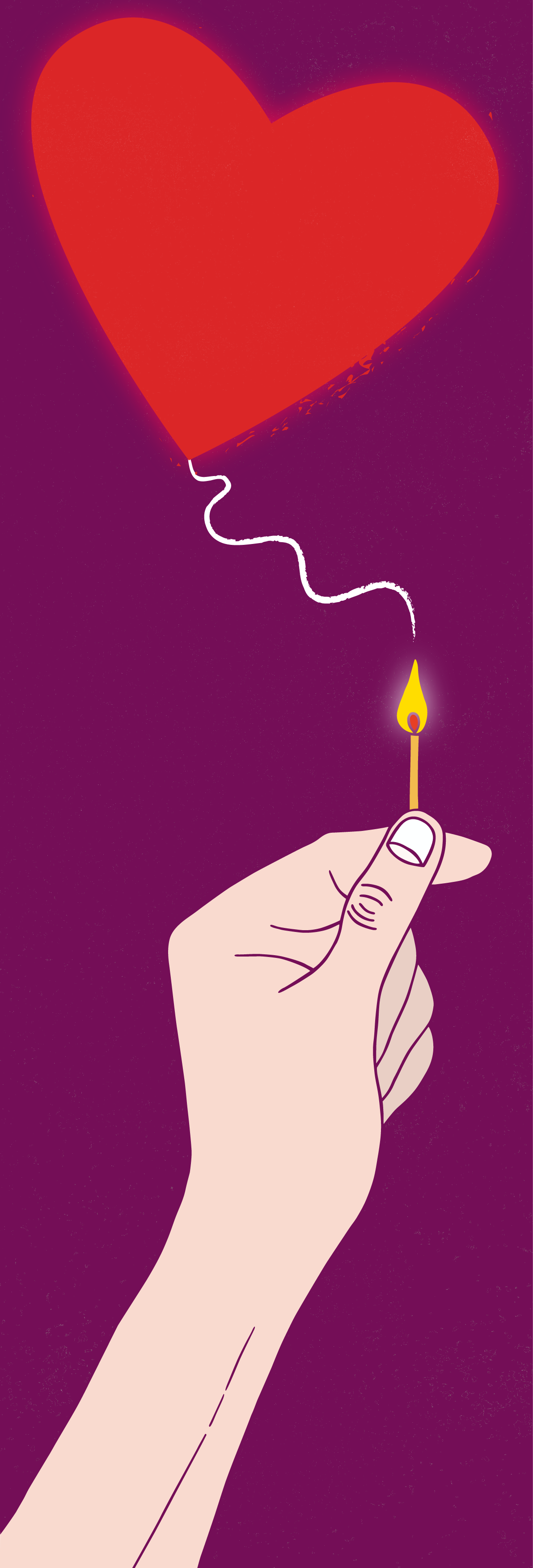
I decided I wanted to have a hand holding either a lighter or match below the fuse of a heart.
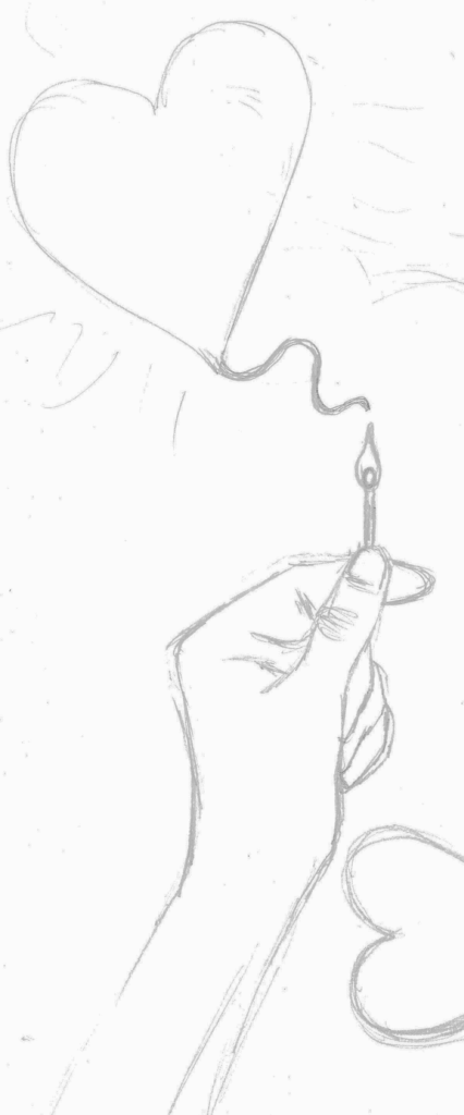
I then did another version with a unlit lighter below the heart, which I thought might add a sense of ‘something about to happen’.
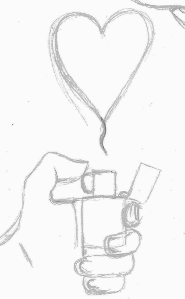
The final idea for this concept was to have a lit lighter melting a heart. I did not have room left on the paper, but the heart would be placed over the flame, not next to it.
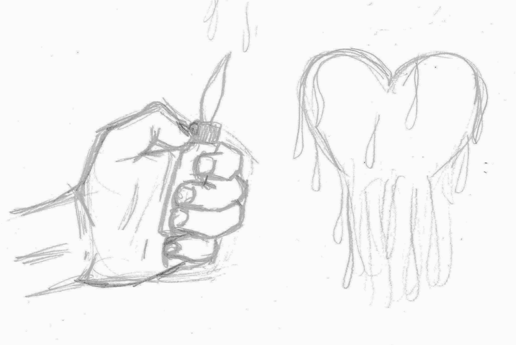
I was much happier with these ideas as I felt they related better to the text and the author’s opinions.
Purpose of Illustration
I wanted the function of my illustration to be to expand on the article content, clarify the author’s opinion and be visually engaging.
Creating the Line Visual
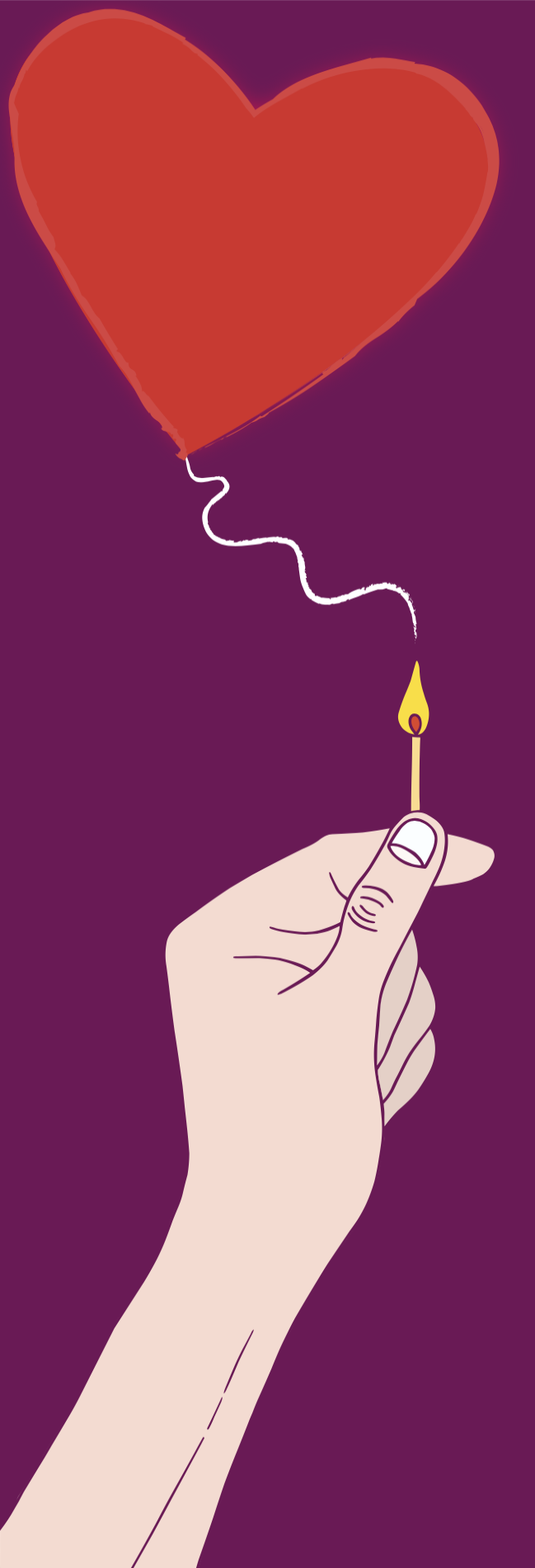
After some consideration, I selected the version with a hand holding a match under a fuse leading to a heart. Using a light-box, I refined the pencil drawing further and then made an ink version.
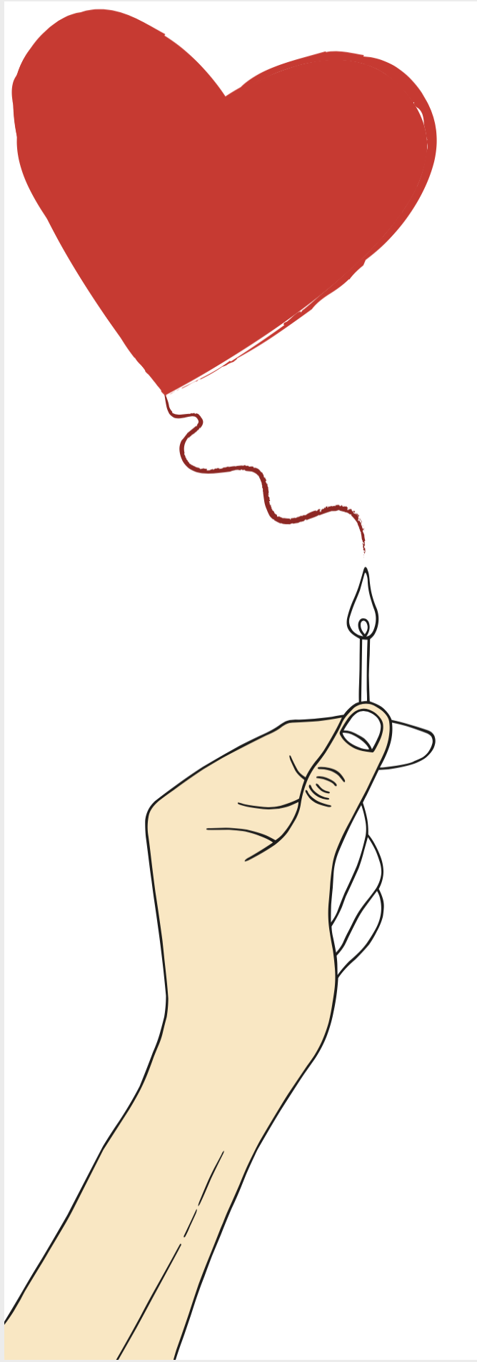
I then scanned this into Illustrator and applied the Image Trace tool. I refined the outline, but continued with my ‘style’ of trying to resist the urge of making it look too ‘perfectly neat. I wanted to retain the hand-drawn feel of the illustration. I did add colour intermittently just to experiment in the early stages.


I then added the heart and fuse and worked on various solutions for this part of the illustration.
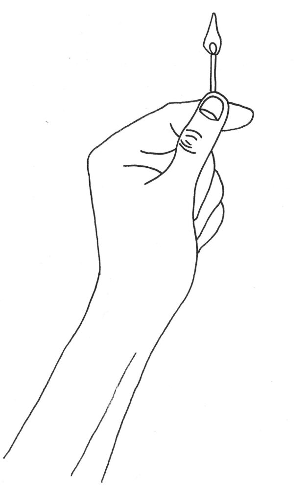
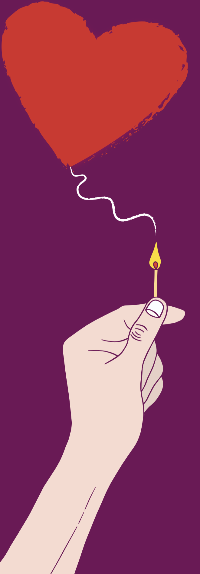
Final Line Art
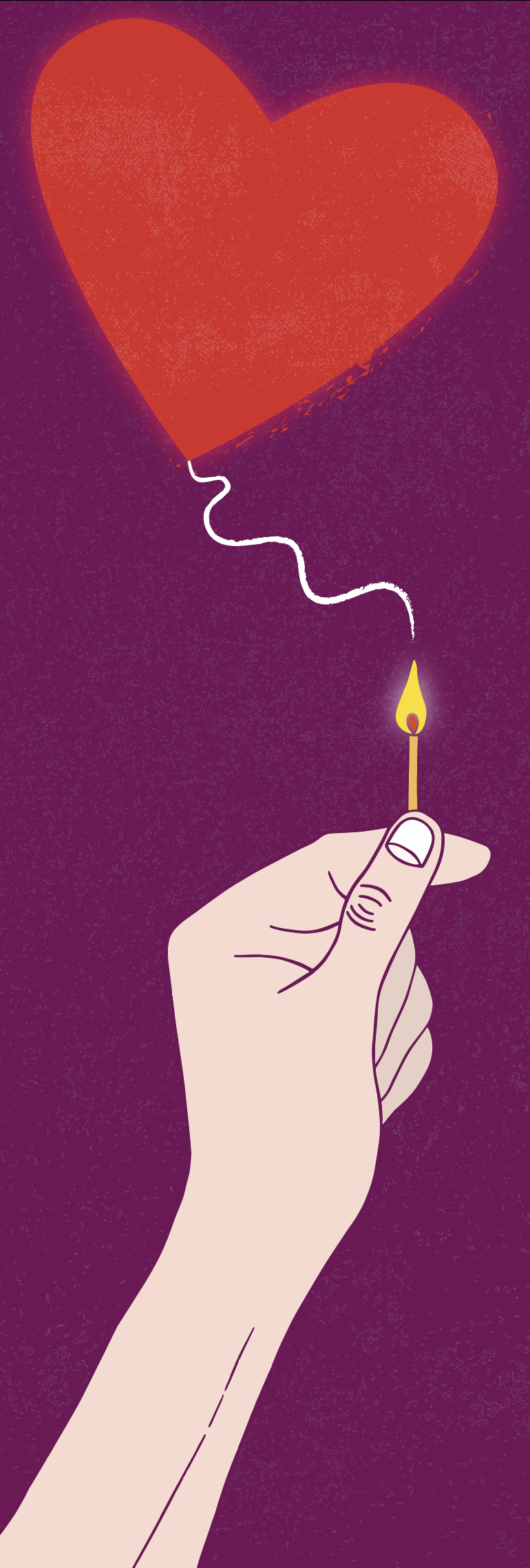
The final version of the line art for the illustration can be seen below. I was quite pleased with the style of the illustration so far and it had met my expectations of what I wanted it to look like.
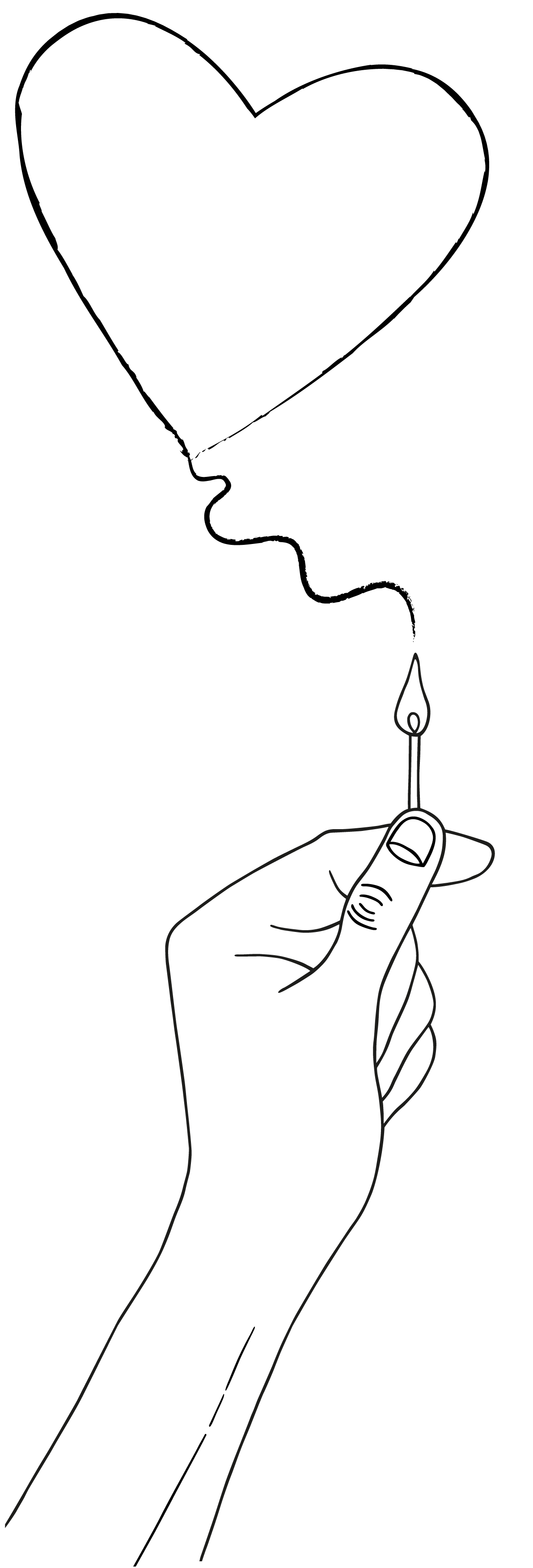
I was more focused on the content/title of the article I had found rather than the original heading choice, from the brief, as it gave me more to work with. I felt the line art was appropriate for the article and complemented it quite well.
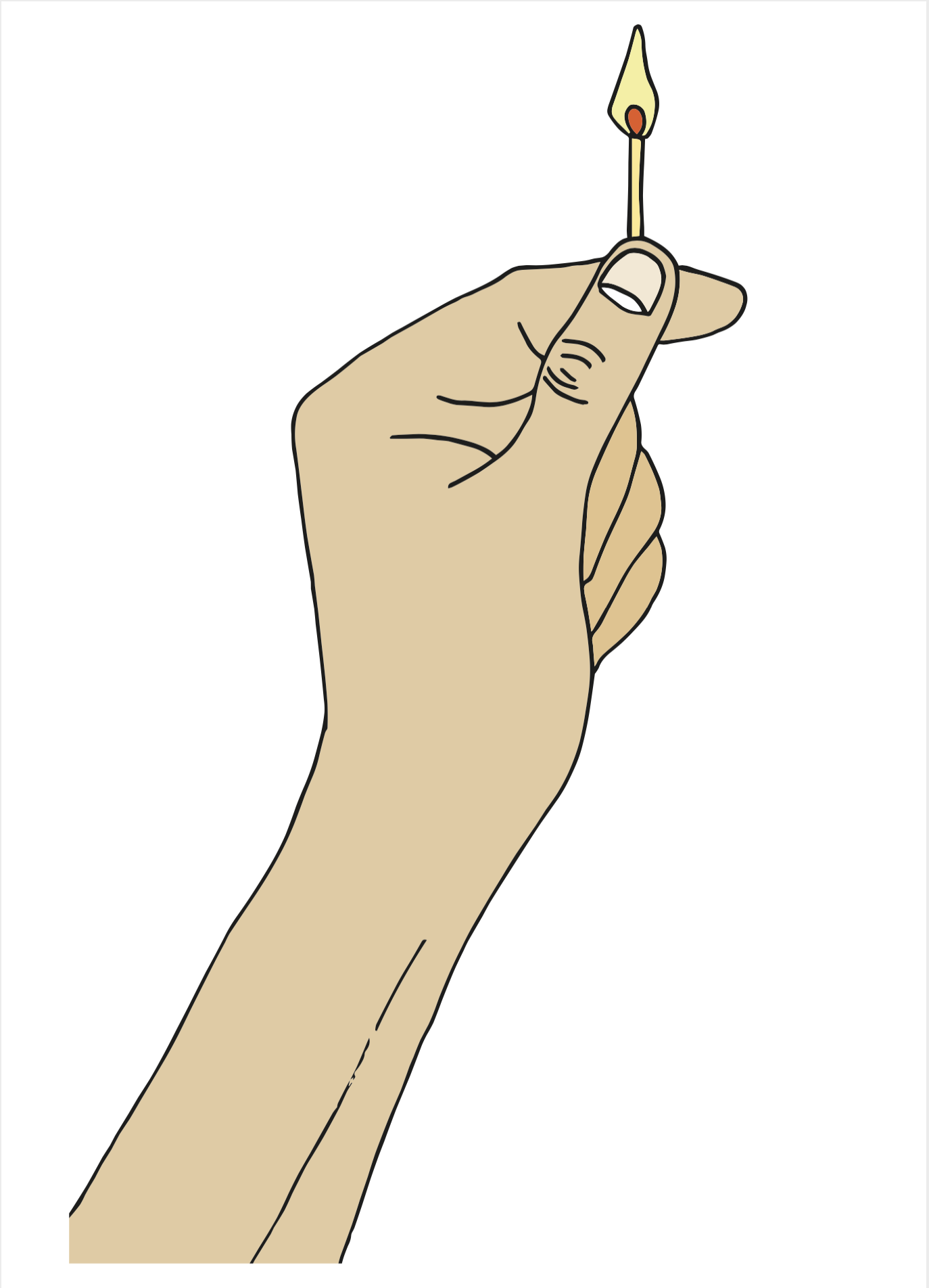
Creating the Final Artwork
As I was happy with the line art, I moved onto adding colour to the illustration. I decided to use the colours red and purple as these colours are usually associated with love and desire (in Western cultures). Another habit I am trying to move away from is using black outlines all the time, so I used the same shade of purple as the background. I took some inspiration from Dan Bejar and John Holcroft for my illustration’s style.
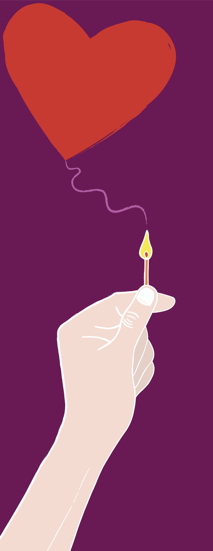
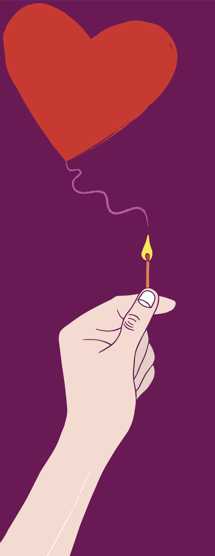

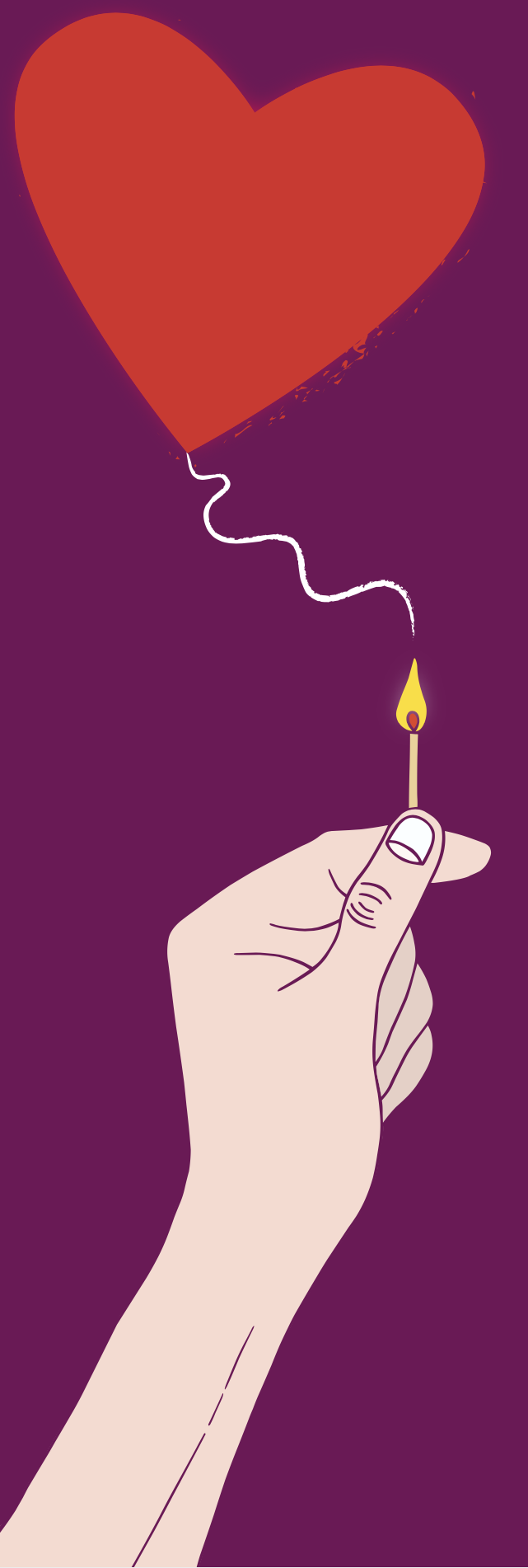
The final artwork, to which I added texture, can be seen below.
Final Thoughts
As stated earlier, I was quite disappointed that I did not manage to find more examples of editorial illustration in the newspaper and supplements I had chosen. However, I did find a great deal of inspiration from researching artists online.
Some of the aspects that I felt went well with this exercise included:
- taking my time to come up with some initial ideas/sketches rather than just going with the first thought that came into my head. This allowed me to think more deeply about the concepts behind my illustration.
- my drawing of a hand, which I thought was well executed considering how hard I find it to draw hands.
- resisting the urge to use a black outline.
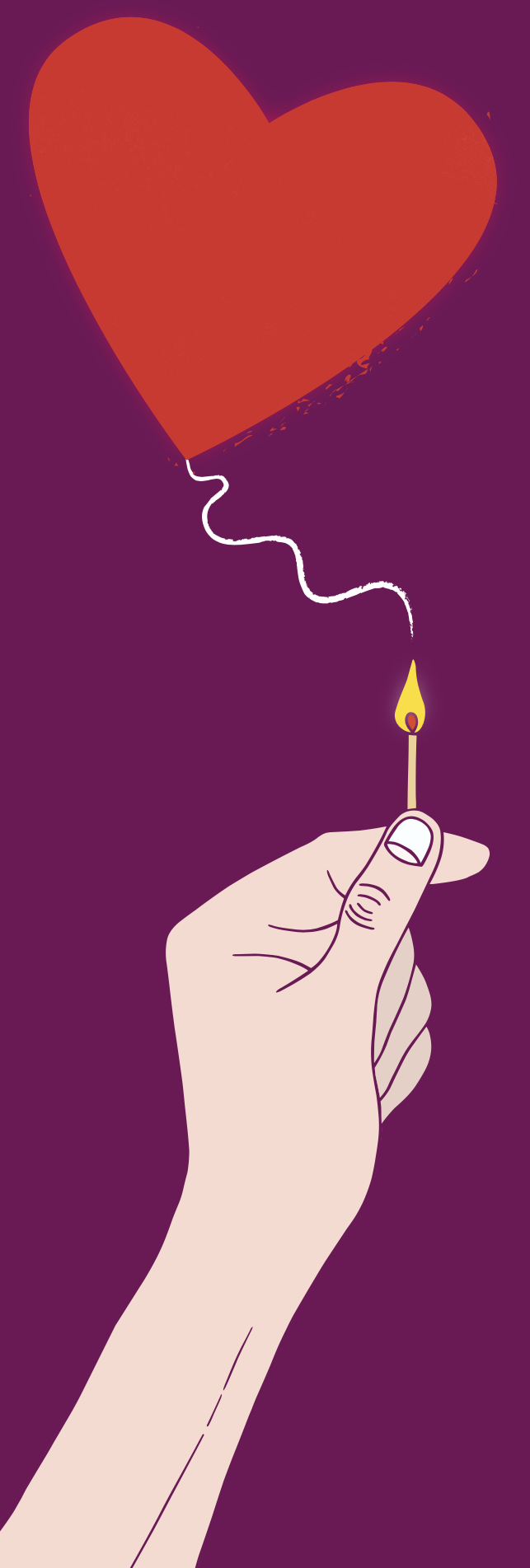
- the final concept/illustration, which I was pleased with and I thought suitably reflected the article content and met the purposes I had set myself.
Some of the things I felt I could have improved upon included:
- experimenting with more colour palettes rather than just using the one I initially decided upon.
- developing the other ‘flame’ ideas further to see if these could have been successful alternatives.
Overall, I enjoyed this exercise. Once I had found the article online, I found the subject interesting and this made it easier to come up with a range of ideas. I did start to go slightly off track, but once I had thought of the ‘flame’ concept, I felt more confident and was happy with the final illustration.
References
Bejar, D. (n.d.). Dan Bejar. [online] Available at: https://www.bejarprints.com [Accessed 30 Jan 2021].
Bonazzi, D. (n.d.). Davide Bonazzi. [online] Available at: https://www.davidebonazzi.com [Accessed 30 Jan 2021].
Fuller, H. (n.d.). Hollie Fuller – Editorial. [online] Available at: https://www.holliefuller.co.uk/editorial [Accessed 30 Jan 2021].
GoMedia.com, (2014). Tutorial: The Making Of An Editorial Illustration with These Are Things. [online] Available at: https://gomedia.com/zine/tutorials/tutorial-the-making-of-an-editorial-illustration-with-these-are-things/ [Accessed 31 Jan 2021].
Holcroft, J. (n.d.). John Holcroft Editorial Illustrator. [online] Available at: http://www.johnholcroft.com [Accessed 30 Jan 2021].
Thesauraus.com, (n.d.). Synonyms and Antonyms of Words. [online] Available at: https://www.thesaurus.com [Accessed 31 Jan 2021].
Winterson, J. (2011). Desire: a Dangerous Flame. [online] The Independent. Available at: https://www.independent.co.uk/life-style/love-sex/desire/desire-dangerous-flame-933994.html [Accessed 31 Jan 2021].