Brief
Look carefully at this image.
List the contents of the picture – breaking the image into its constituent parts and answer the following questions:
What is the image about?
Work out the narrative and identify the story.
Describe the palette and tonal range which has been used. Note if the colours are hot or cold, whether the elements are detailed or textural, and where these approaches are used.
Is there any connection between hot colour and the importance of the element in telling the story?
Begin to identify the hierarchy within the image. Which are the most important elements in terms of carrying the narrative or conveying the ideas and how have these been treated?
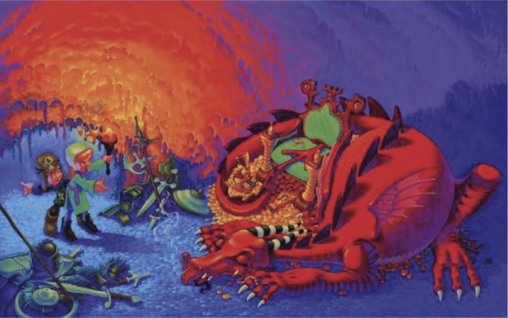
I decided to analyse this illustration without any prior knowledge of the story or characters.
The most visually important elements in the picture are:
The sleeping dragon
The treasure and throne
The two children (a boy and a girl)
The flame of the torch
The discarded piles of armour and weapons
The cave
I think the image is depicting the moment two children discover treasure being hoarded by a dangerous dragon. The children have got as far as many ‘brave’ men before them, who have since been dispensed with (as evidenced by the piles of armour and weapons). In my opinion, the boy seems more unsure of the situation and hesitant to proceed than the girl, who is standing in front of him and does not show any sign of apprehension.
The narrative appears to be that the dragon has been guarding the treasure in a cave for quite some time and many previous attempts to retrieve it have failed. Two brave children have managed to locate the cave and reached a critical point in the story where the fate of all the main characters, along with the treasure, will be decided. I noted that the children do not have any weapons.
The palette of the illustration is a strong contrast of hot (red, orange and yellow) and cold colours (blue, purple and green). The bright, strong red of the dragon really makes it stand out in the image – it the first thing that you look at in the illustration. The colour also represents the element of danger. I thought it was visually interesting how the dragon’s tail, wrapped around the treasure, ends up with the ‘arrow’ pointing into the seat of throne. The throne is bright green, so complementary to the dragon’s red, which makes it also stand out in the illustration. The bottom left and top right of the illustration consist of the cooler colours, whilst the top left and bottom right is filled with mainly the hotter colours, which balances the composition. Rather than using black, the illustrator has used different shades of blue and purple for the shadowy areas of the cave. These colours also create the atmosphere of the cave, e.g. cold and unwelcoming. I also noticed that the girl is clothed in green, complementary to the dragon’s red.
The most detailed elements of the illustration are the characters (including the dragon) the treasure and the discarded armour/weapons. I would suspect this is due to these being the most important elements in the image and thus what the viewer is being encouraged to look at. In terms of texture in the illustration, the most noticeable elements to me were the floor of the cave, the lit up area on the cave wall and also the coins, which the dragon is on top of. I was quite surprised that most of the dragon’s body was smooth in texture, rather than being scaly, but then I thought that perhaps this would be ‘overkill’ in terms of the texture as it would be similar to that of the floor and coins.
After looking at the image for some time, I discovered that the illustrator has used the hot colours of the flame from the girl’s torch to replicate the colouring and size of the dragon. I thought this was a very clever illusion as it suggested to me that there is balance between to the two, which would not be possible if you were just looking at the child against the dragon without the flame. It reinforced my sense that she is not afraid of the dragon and, indeed, is an equal match for it.
Hierarchy of the Image
- Dragon
- Treasure
- Flame/Children
- Armour/weapons
- Cave
The dragon is the most important element in the image, this is inferred by it colour, size and position. Due to the dragon’s position, I felt the treasure and throne were the next most important elements. It would be very difficult to look at the dragon and not notice the coins, etc. on which he/she is curled on top of.
I thought the flame was next most important element in the illustration due to its colour and near equal dominance as the dragon in the composition. This in turn led my eye to the children and the girl in particular.
Next my eye would be drawn the armour/weapons, particularly the pile below the children. I would place the cave as the least important element in terms of the illustration, but I believe I subconsciously decided the action was taking place in a cave without having to specifically look at these parts of the image.