Brief
Using internet searchers or your own visual references select an image of each of these:
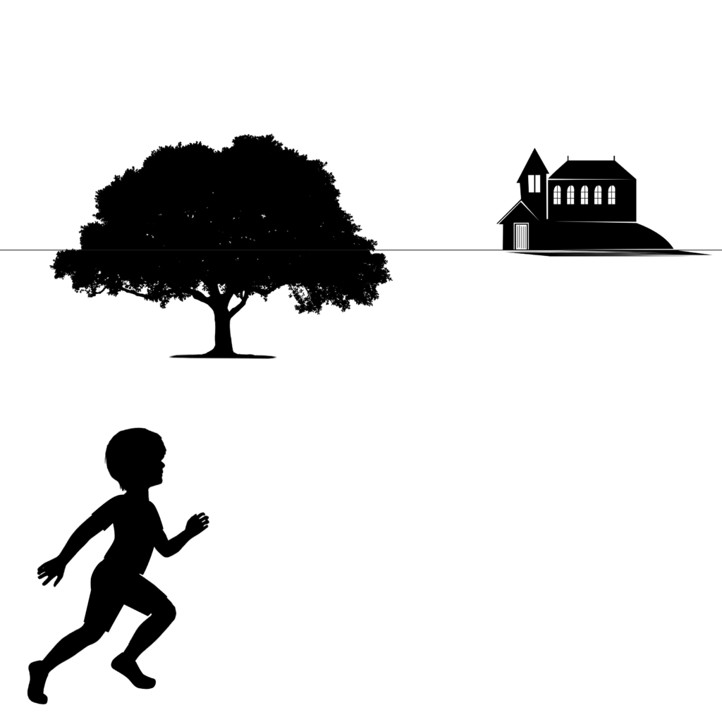
A tree A child running or walking A building
Photocopy them individually in black and white at different scales so that you have several versions of each image to work with.
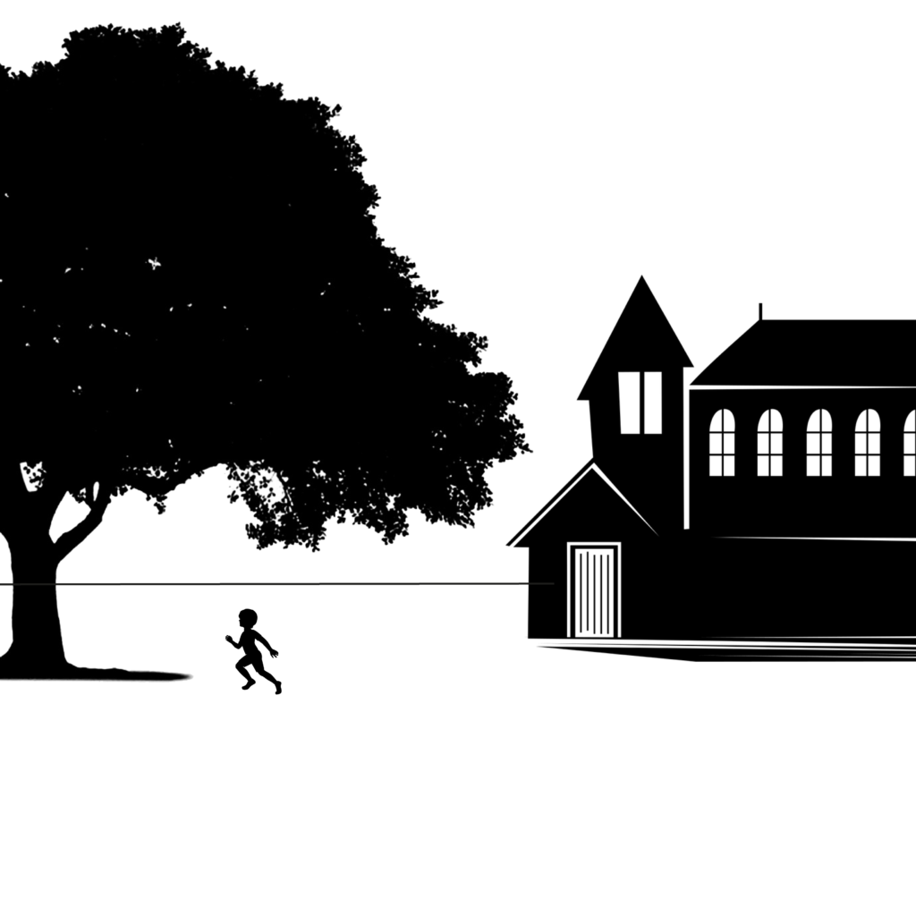
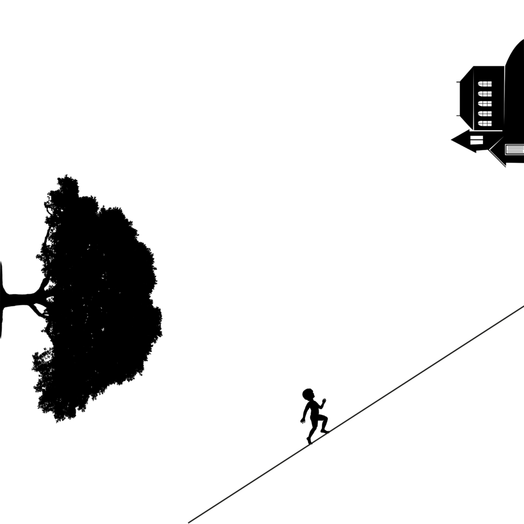
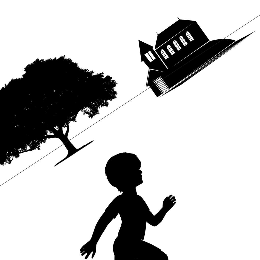
Working in a square format, arrange some of the cut-outs to create a representational image. You may use the distortion of scale of one element compared to another to create an image which is interesting visually. It is not important that the image is ‘real’ as a photograph would be. Move the fragments so they are not always vertical or horizontal to the frame.
You may need to add a drawn line to suggest a horizon to separate the ground from the sky and to create an illusion of space or distance. Experiment with the position of the horizon reparative to the visual fragments.
Compare the visual impact of the designs with one another. In your learning log, make note to answer these questions:
- How does your sense of the image and its meaning change when the figure is smaller than the other elements?
- If the elements are at differing angles to each other and at an angle to the frame, what dynamic is suggested?
- If all the elements are completely horizontal and vertical in relation to the frame, what dynamic is suggested? What is your opinion about this image and what sensation does it communicate?
- Which is your favourite composition? Explain why you feel it is the most successful.
Compositions
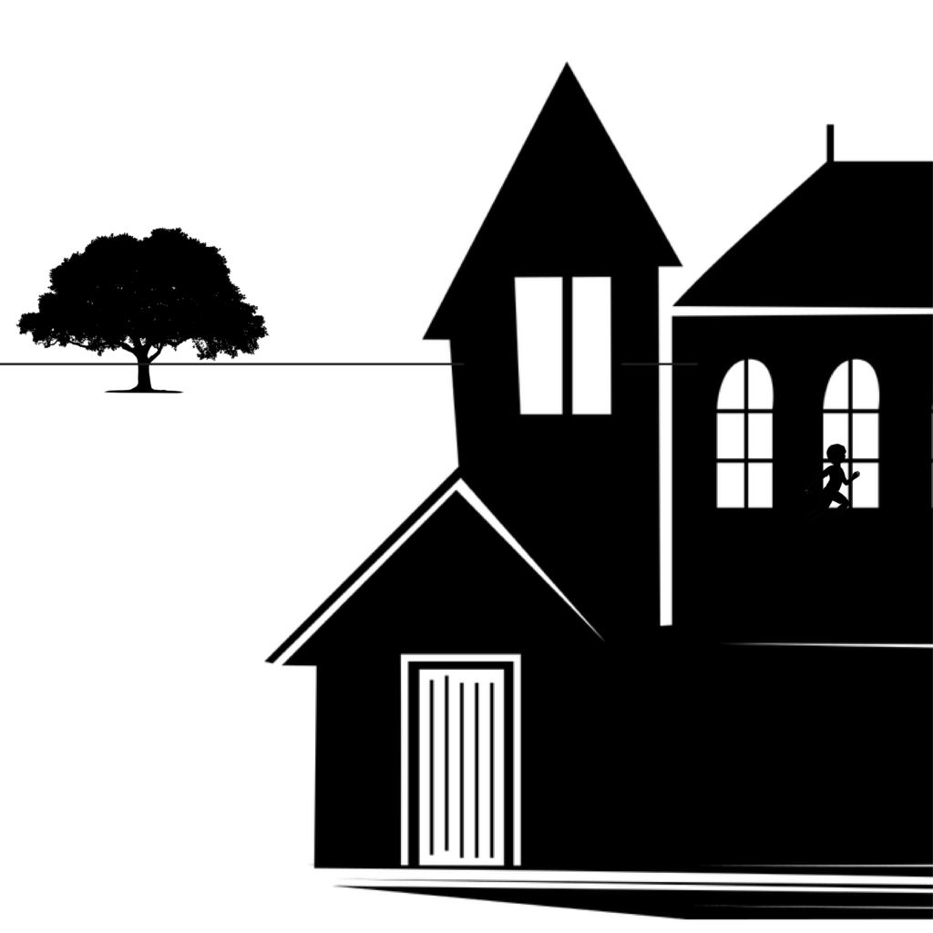
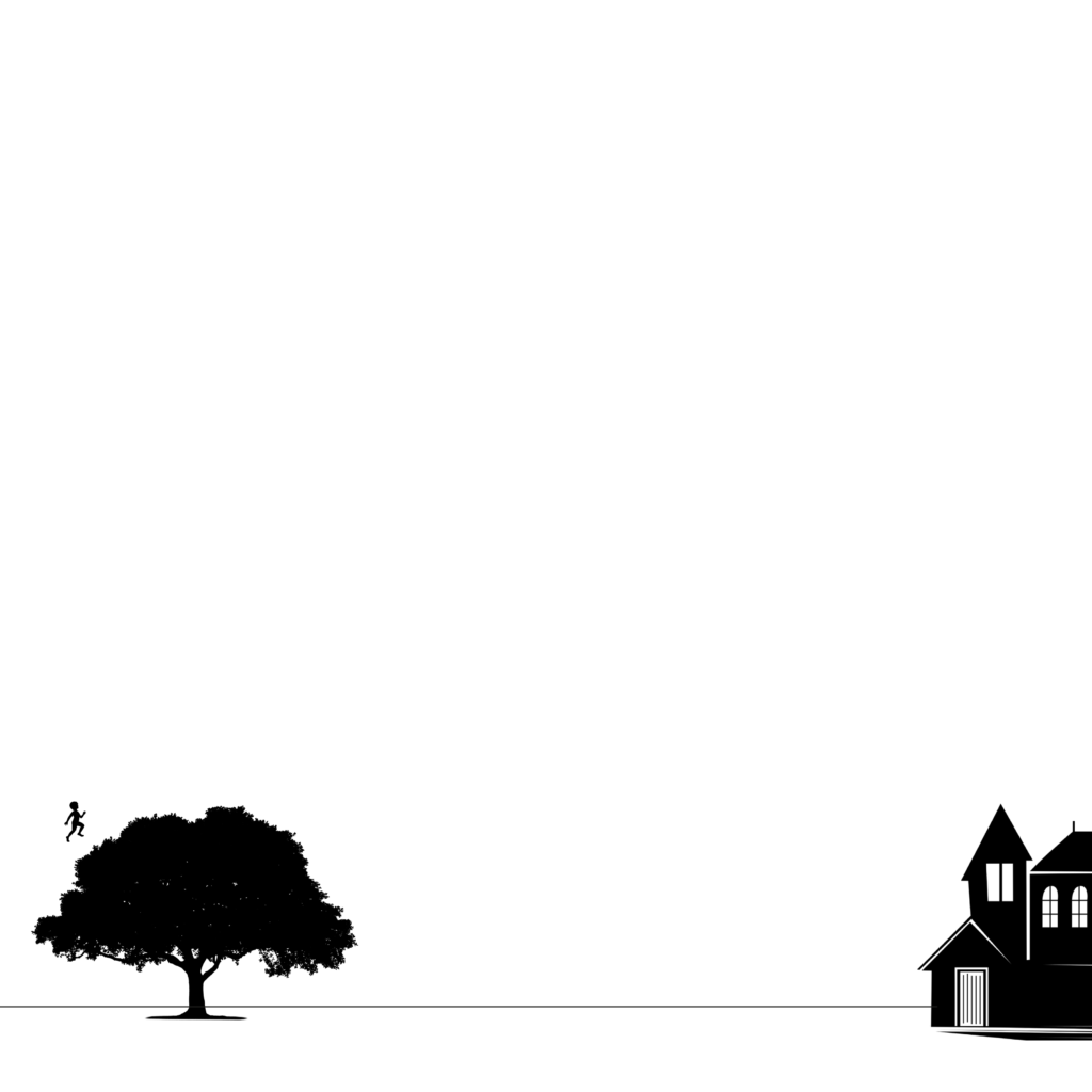
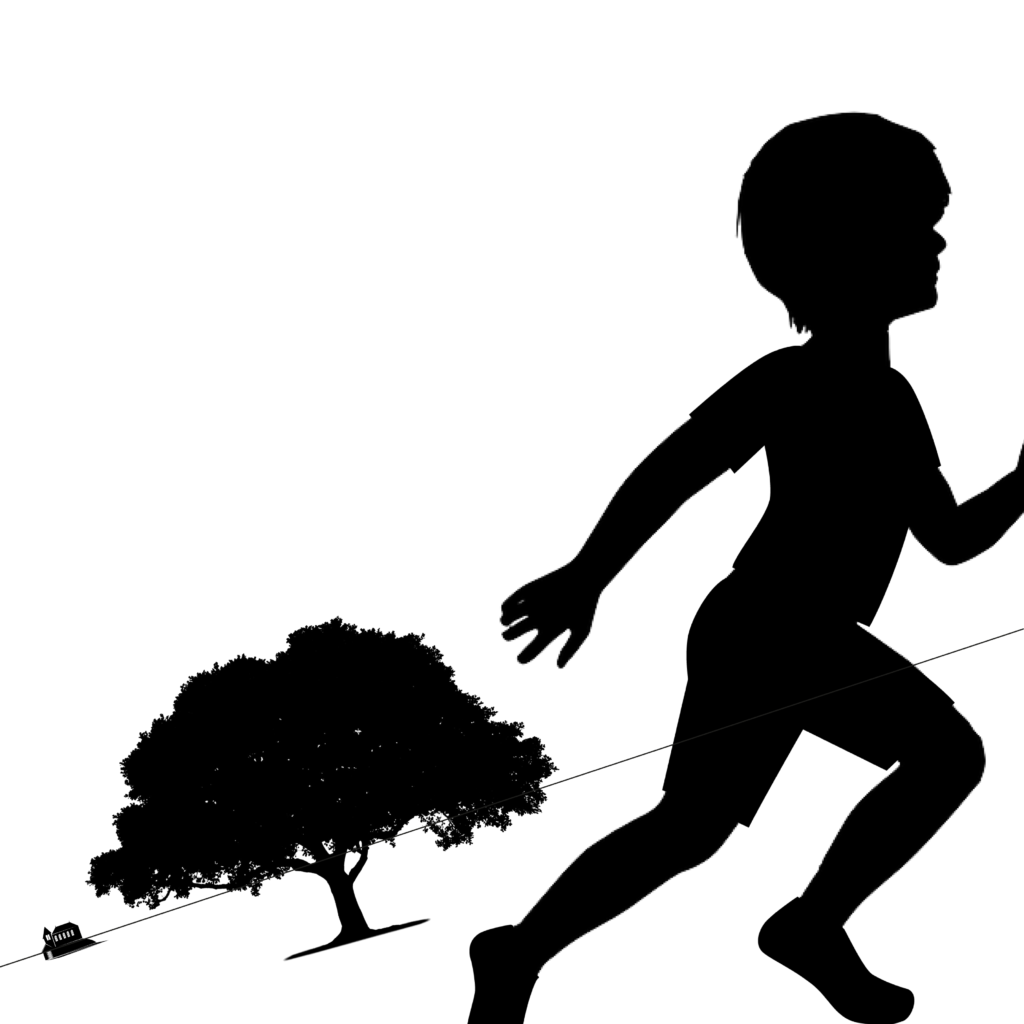
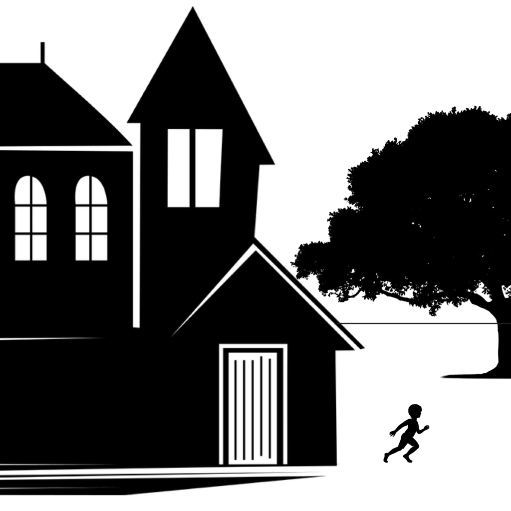
All of the compositions can be seen below for comparison.
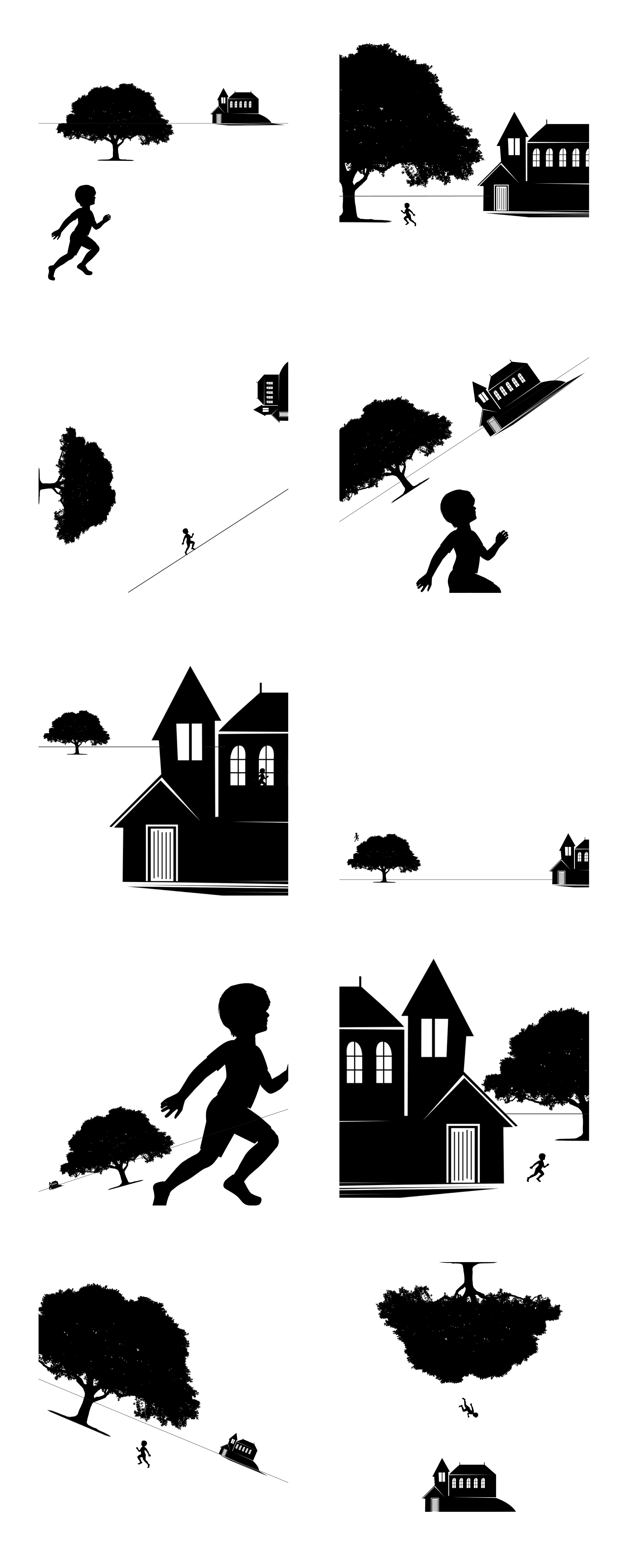
I added clothes to the child silhouette as I thought this would be more appropriate for this exercise.
When the figure of the child is smaller than the other elements, I felt it added a sense of danger or menace to the images, like the child is not in control of the situation. However, I do also think that the fact the child is running and the building is quite imposing adds to this as well.
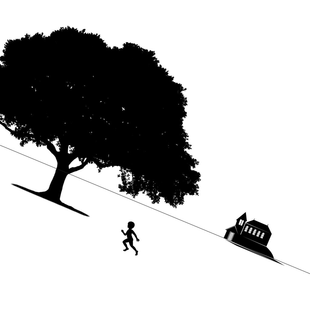
When the elements are at differing angles to each other and at an angle to the frame, I thought the images became more dramatic and movement was added to the composition. Some of these reminded me more of the Geoff Grandfield illustrations I had looked at in Part 2.
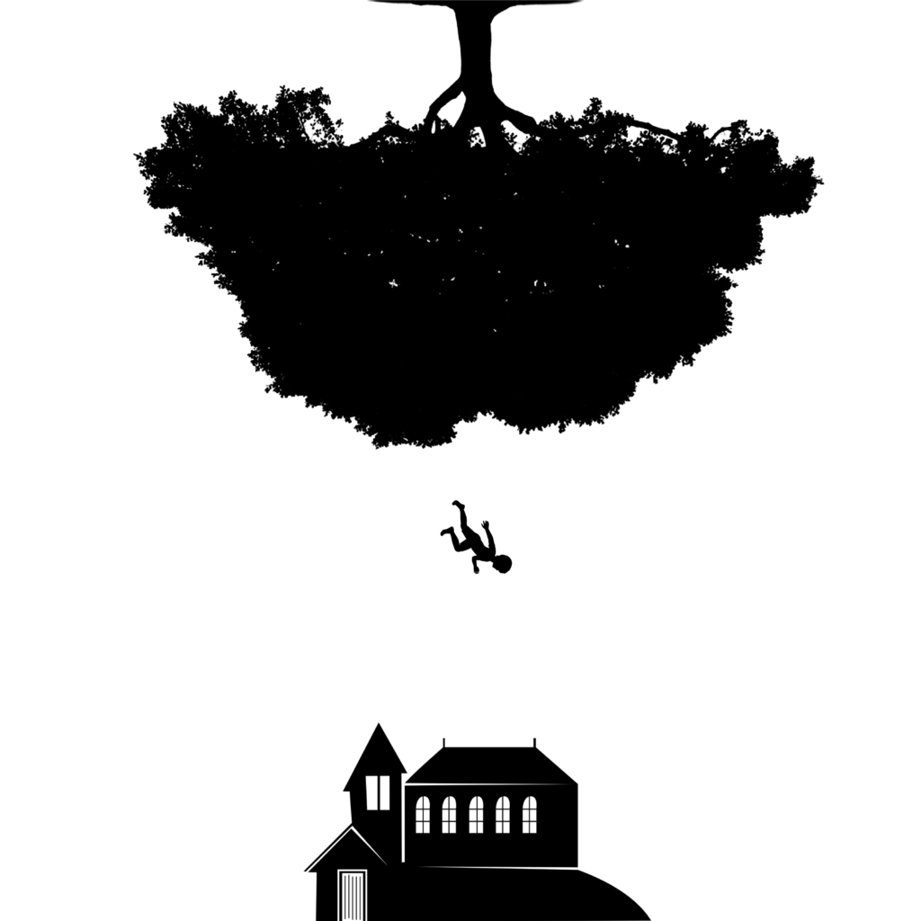
When all the elements are completely horizontal and vertical in relation to the frame the composition becomes more stable and organised. It was still possible to create visually interesting images by using contrasts, such as scale, and through the considered placement of the elements. I felt that even when the elements were not at an angle, it was still possible to make dynamic images, such as with the last one, in which the child appear to be falling out of an upside down tree.
I was actually pleasantly surprised with the ten compositions I managed to come up with and thought I could devise a narrative/story for each one. I think my favourite composition would be:
I chose this one because I liked the combination of angle and scale. I thought the elements were placed well in relation to one another and within the composition, with enough white space so it does not appear ‘too crowded’.