Brief
Cut two ‘L’ shapes of card or stiff paper. You are going to use them to explore formats to zoom in and out of compositions.
Take an image which has a range of content – a family photo, an interior from a magazine or another artist’s work – and enlarge it to A4 and make ten copies. Scenes that include action with a background and foreground can be most useful for this kind of exercise.
Use the ‘L’s to create edited versions of each image. Retain the content but try presenting it in different ways in different formats. Repeat this using all the copies. Do some images seem to have more drama because of the way you have cropped them? Has the focus changed – have you made the original subject of the image seem more or less important?
Choose a word for each image that relates in some way the content. It may contradict the image and show an alternative interpretation or may extend the narrative by describing the content in a slightly different way.
Using one of the images as a basis for an illustration, draw up your artwork to make a poster. Add colours and textures to emphasise your message.
Use the word you selected as the title and reproduce it in a typeface you feel suggests or reflects the meaning of the word itself. Position the text alongside the image.
Choosing a Reference Image
In decided to use a William Hogarth painting for this exercise. I chose one of his works as most have a large number of characters in them. I like Hogarth’s use of humour to make his point about morality (or the lack of it) in society. All of the individuals in his compositions have their own personality, which I felt was very relevant for this exercise. I also admire Hogarth as he was fond of animals and several of his paintings depict the cruelty inflicted on animals by some humans (particularly as children, which Hogarth infers often results in cruelty against humans as well in adult life).
I looked at several of Hogarth’s artworks and, in the end, selected Chairing the Member, The Humours of an Election series (1755). I chose this one as there is a great deal going on, which gave me several options in terms of editing the image.
Editing the Image
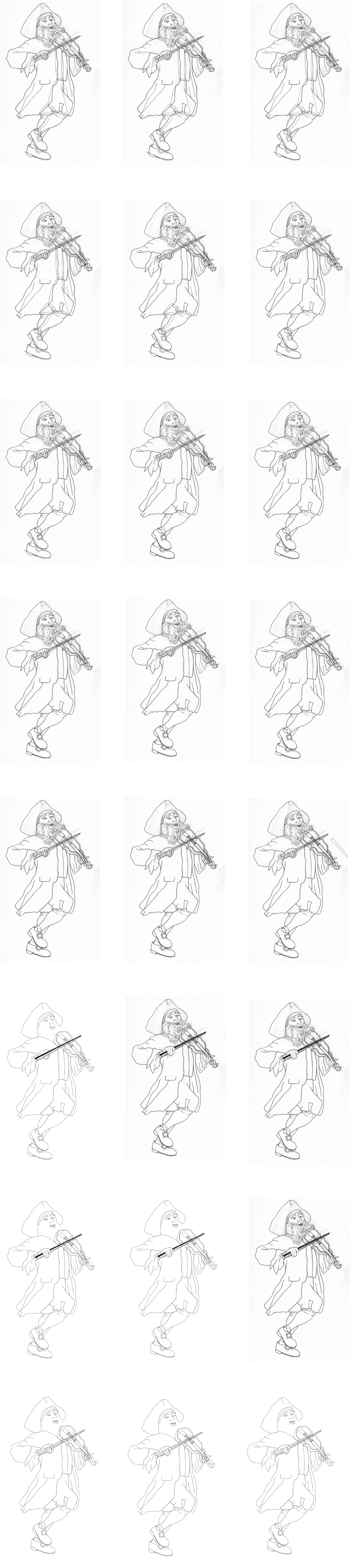
After studying the image, I edited it into ten ‘mini-compositions’ and decided on a title for each one. I found it harder than I had envisioned to create these edited versions as it was difficult to cut each one ‘cleanly’ from the surrounding action in the peripherals. I also found it challenging thinking of a single word to describe each image, therefore for some I noted more than one down.
After finishing this part of the exercise I thought it was interesting that I had not focussed on the politician in the chair at all (apart form being in the last edit), yet the mostly obscured man carrying the chair features in two of the edits. I used him as he is looking straight at the viewer and has a very expressive face. I also found I could see completely separate narratives for the edits, which bear no relation to the relation to the original intention of them.
Chosen Edit for Illustration
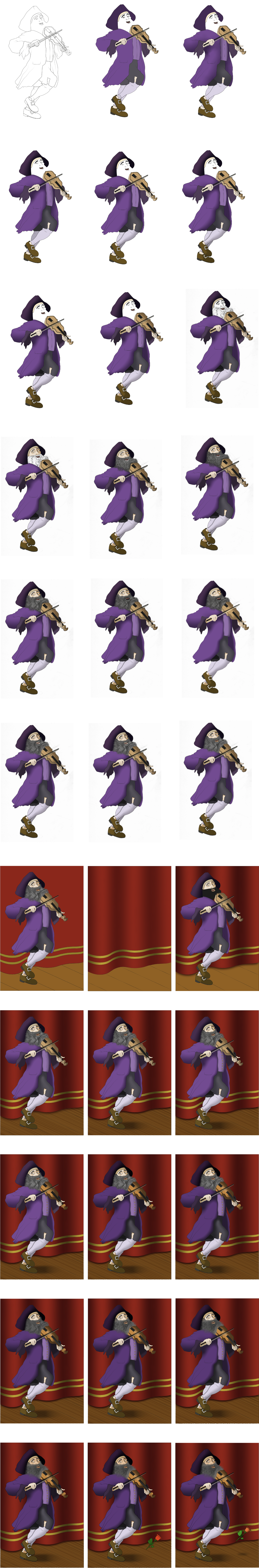
Following some deliberation I decided on the Maestro/Jester edit to base my illustration on. I chose this as I thought the character added a sense of farce to the unfolding situation. It appears to me as though he is the musical accompaniment leading the troupe of a hideous comedy show.
I began by sketching out my version and then using a black fine liner to outline this. It was quite difficult as the painting is quite dark both on screen and in a printed version from a book, so for some of the lines I had to take an educated guess.
I then scanned this onto Illustrator and began the process of outlining the image digitally.
I then moved onto adding colour. As the original painting suggests the musician was a poor man with his ripped clothes, I decided to flip this and give him an outfit of deep purple, which was a colour associated with wealth and finery at time of the original painting (although I left the tear in his trousers leg). I also added gold buttons to his waistcoat. I thought about a background for the illustration and settled on placing the musician where he looks like he should be, on a stage, lapping up the appreciation of the crowd.
Final Illustration
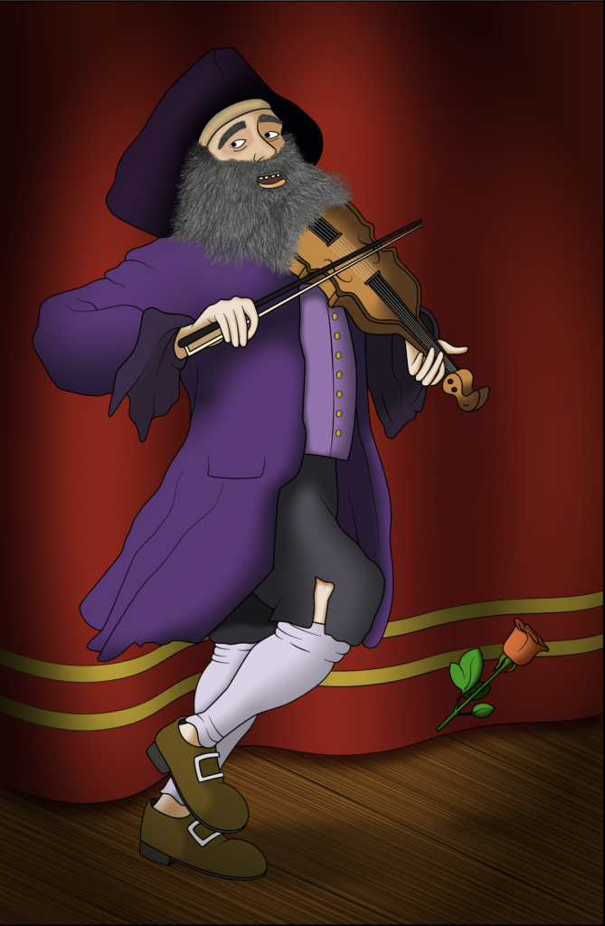
The end result can be seen below. I was really keen to work on my colouring skills for this exercise and spent a great deal of time trying to get my choices to look right. I also wanted to add shadows as this is something I often struggle with.
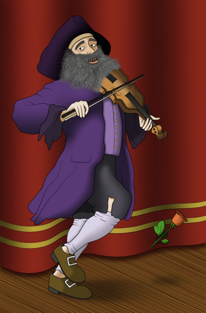
I then decided to add a vignette to make illustration look a bit more professional.
Adding Text to the Illustration
Finally, I was required to add the chosen word ‘Maestro’ to/alongside the illustration. I spent some time looking for appropriate typefaces in Adobe fonts and there were three that I narrowed my choices down to. I was looking for sophisticated, musical-inspired options…
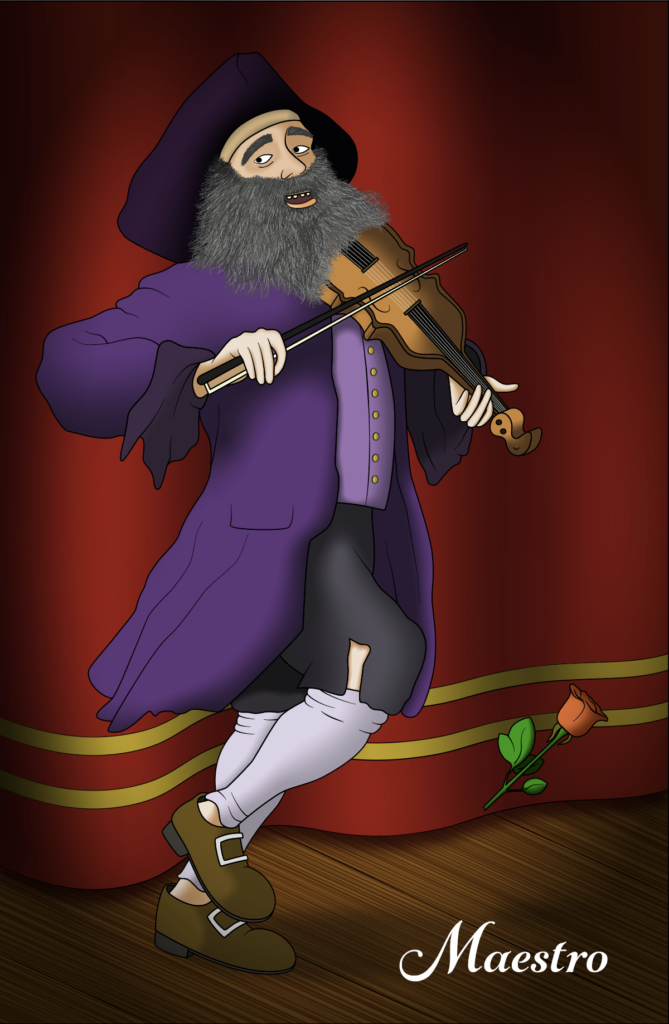
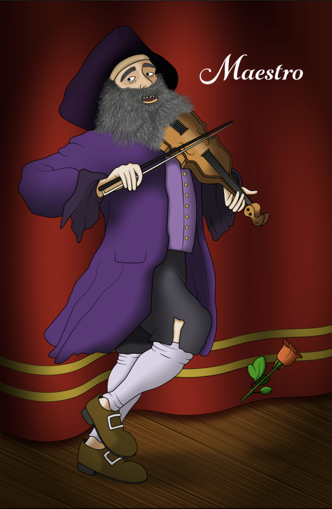
I tried to position the text both at the bottom of the composition (as above) and the top (as below), but felt the former more pleasing visually.
I am not that confident with my knowledge of typography, but I selected the final choice, below, as the end design for this exercise. I thought this typeface was the most musical, well-suited for the illustration and reflected the word ‘Maestro’.
Conclusion
I really enjoyed this exercise from start to finish, which was reflected in the amount of time I spent on the illustration. It was very interesting looking closely at reference images, editing them and noticing subtexts that I otherwise might not have considered.
Although I was pleased with the final result, I felt it lacked texture and this is something I need to work on. I did, however, think the beard was quite successful. The character did not look old enough when compared to the original who has a weathered, lived-in look about him. Also, I need to improve my skill in drawing, colouring and shading clothing/fabric, as I became quite frustrated with my lack of ability in this area. Overall, I needed to add more detail, but time was also a factor for this.
I felt my chosen typeface was suitable for the word it represented, but the positioning and scale was not fully successful. I think it made the image look slightly unbalanced.
References
Art UK, (n.d.). William Hogarth. [online] Available at: https://artuk.org/discover/artworks/search/actor:hogarth-william-16971764 [Accessed 20 July 2020].
Sanders of Oxford, (n.d.). Gentleman in Tricorne Hat. [online] Available at: https://www.sandersofoxford.com/shop/product/gentleman-in-tricorne-hat/ [Accessed 24 July 2020].
Tate, (n.d.). Hogarth: Hogarth’s Modern Moral Series. [online] Available at: https://www.tate.org.uk/whats-on/tate-britain/exhibition/hogarth/hogarth-hogarths-modern-moral-series [Accessed 20 July 2020].
Wikimedia, (2019). William Hogarth. [online] Available at: https://commons.wikimedia.org/wiki/William_Hogarth [Accessed 20 July 2020].
Wikipedia, (n.d.). Purple. [online] Available at: https://en.wikipedia.org/wiki/Purple#18th_and_19th_centuries [Accessed 07 August 2020].
Wikipedia, (n.d.). William Hogarth. [online] Available at: https://en.wikipedia.org/wiki/William_Hogarth [Accessed 20 July 2020].