Brief
For this exercise you are going to mock-up a book cover. Choose a book title that appeals to you. Read the blurb on the back of the book (or the whole book if you have the time). Examine the design of the cover to identify what the brief would be for the illustration and establish the function you want your image to perform.
You may already have done an illustration you can use or you may be inspired to make a new one. If you are using one you have already done you may need to modify in some way. You may need to play with the colours, edit or adjust the composition or alter the size or scale. Don’t make changes to the original.
Either copying the design of the cover and adding your illustration or designing the cover from scratch, make sure you incorporate the title, author and publisher’s details. If possible choose a paper for the mock-up as near a possible to that which would be used for real.
In your learning log note how well your image worked and any technical problems you had to overcame to make a convincing mock-up.
Research
I began this exercise by doing some research. I created a Pinterest board, with examples of book cover design. I found it interesting to note how many used a silhouette/cut-out style.
I then watched some videos on the theory behind effective book cover design:
Some key points I learnt from these included:
- the purpose of the cover is to entice potential readers to ‘pick up the book’
- the cover is visual storytelling
- the important elements are: colour, shape, texture and typography
- focus on who the target audience is
- the cover should reflect the tone of the book and be concept-driven
- several versions of visuals should be created.
Choosing the book
After some thought, I decided to choose the book The Snow Queen by Hans Christian Anderson. I have read this previously so was reasonably familiar with the story and characters. I created another Pinterest board with examples of cover designs of this story. I also looked on Waterstones and Amazon for further examples.
None of the cover designs really appealed to me and I thought many of them looked quite dated. I also am quite averse to book covers with characters on them (unless it is a picture book) as I like to use my imagination rather than having a predefined image in my mind.
I was keen to make a more modern looking design for the book, which would be minimalistic in style and aimed more towards to older readers as Hans Christian Anderson’s stories are also enjoyed by adults as they are generally quite dark in their themes.
Illustrator’s Brief
I then proceeded to think of what a brief for cover illustration may contain:
An illustration is required for a new edition of the timeless classic The Snow Queen by Hans Christian Anderson. We require a fresh, modern design that reflects the story in an intriguing way.
The illustration should be visually impactful and relate to the content of the story. It should entice potential readers to want to pick up a copy.
The cover must include: the title, author and publisher.
The target audience for this new edition will be Young Adult/Adult.
The suggested colour scheme is ‘winter’ and limited. Please keep in mind that the book cover will be printed, so the CMYK colour format should be used.
The style of the illustration is up to the illustrator, but should be modern, simple/minimalistic and non-descriptive, e.g. not a scene from the story.
Dimensions: 26.67cm (H) x 21.59cm (W)
Ideas
Next I started noting down word associations and possible ideas.
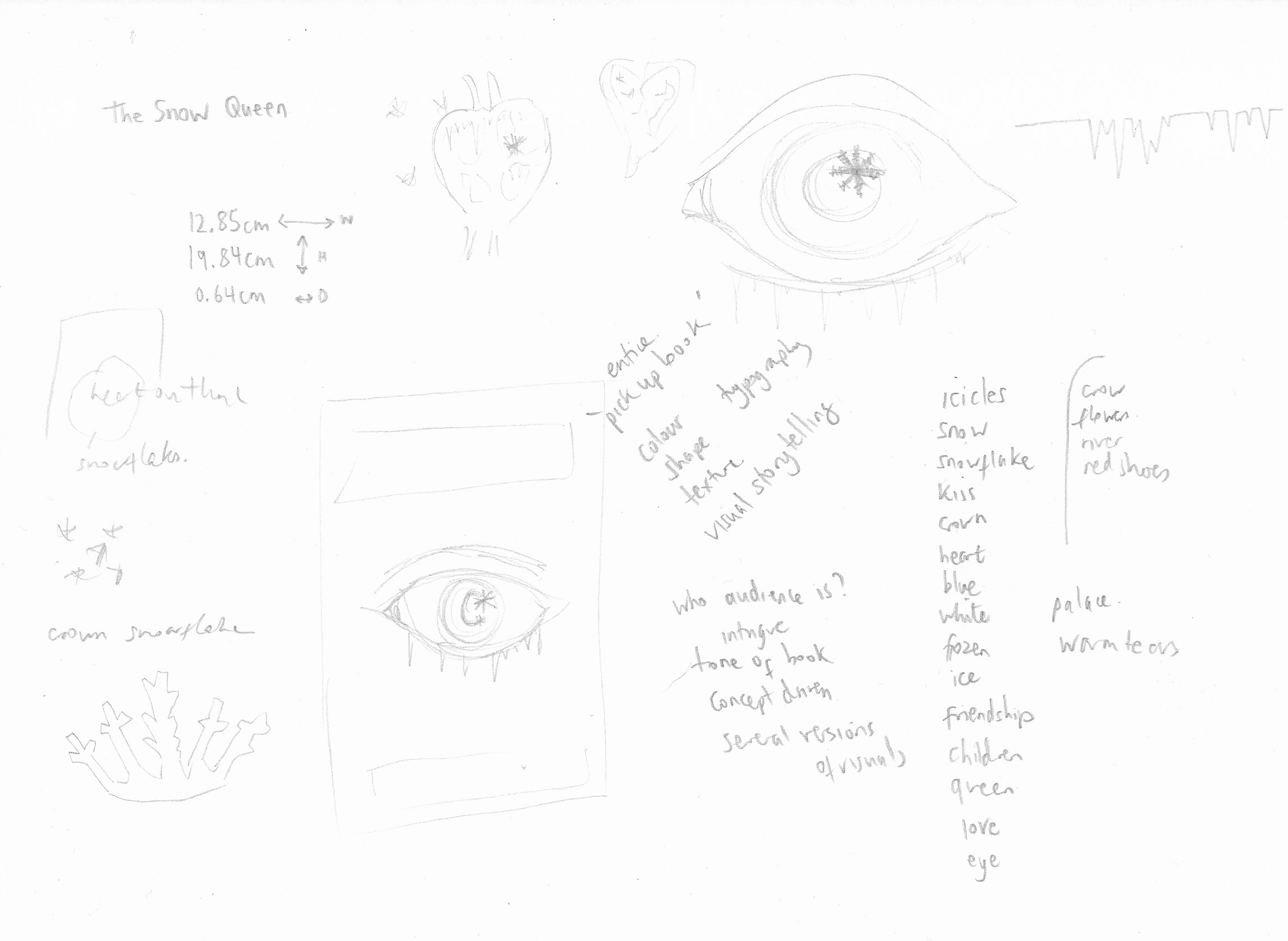
I then moved onto making some rough thumbnails of potential designs.
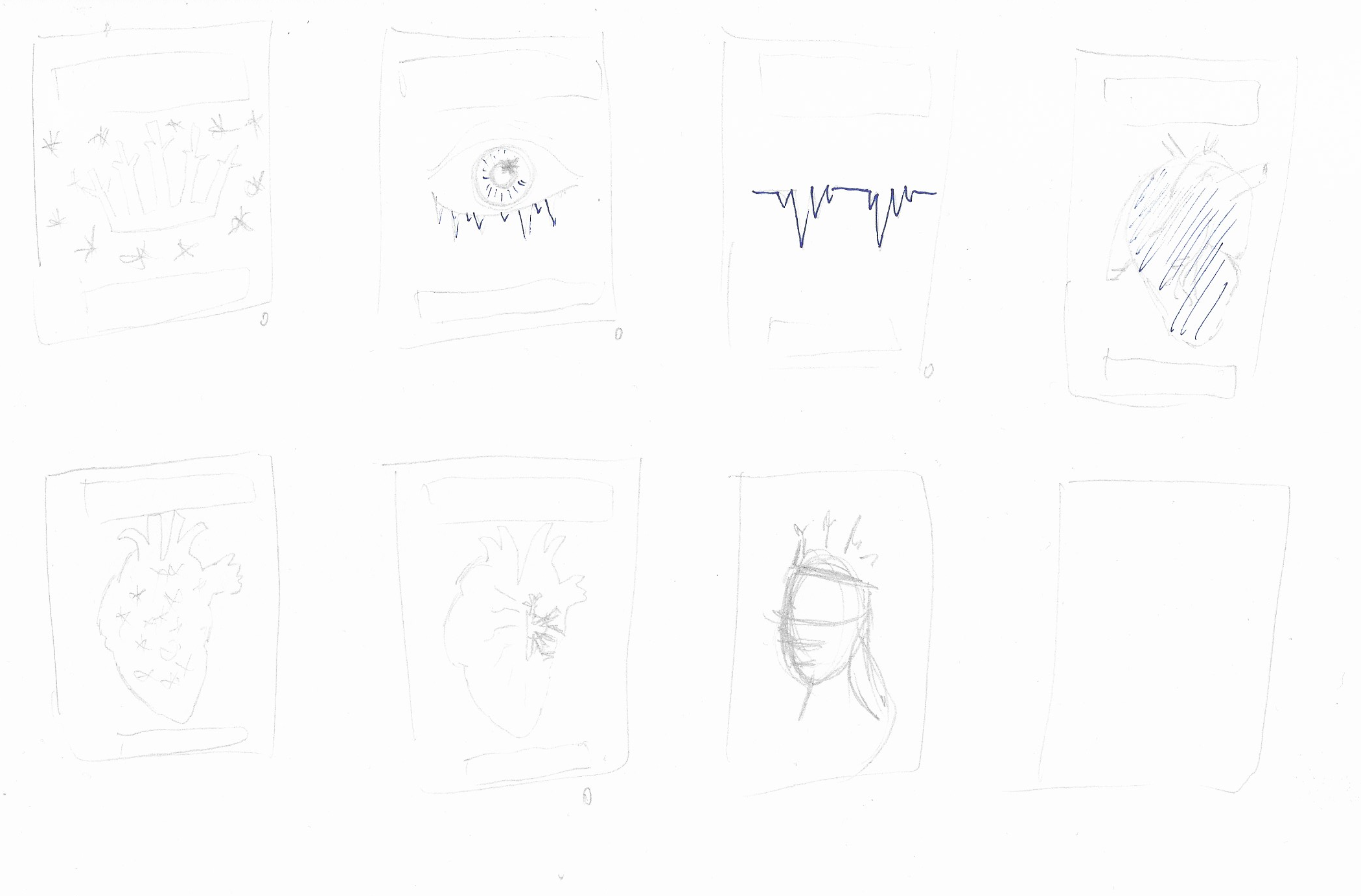
The main concepts I considered were based on:
- the Snow Queen’s crown
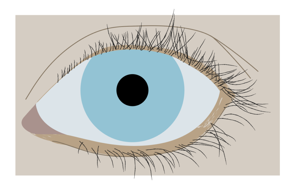
- a close-up of a snowflake in a child’s eye
- a heart rate line that looks like icicles
- a heart – silhouetted/with snowflakes in it/blue
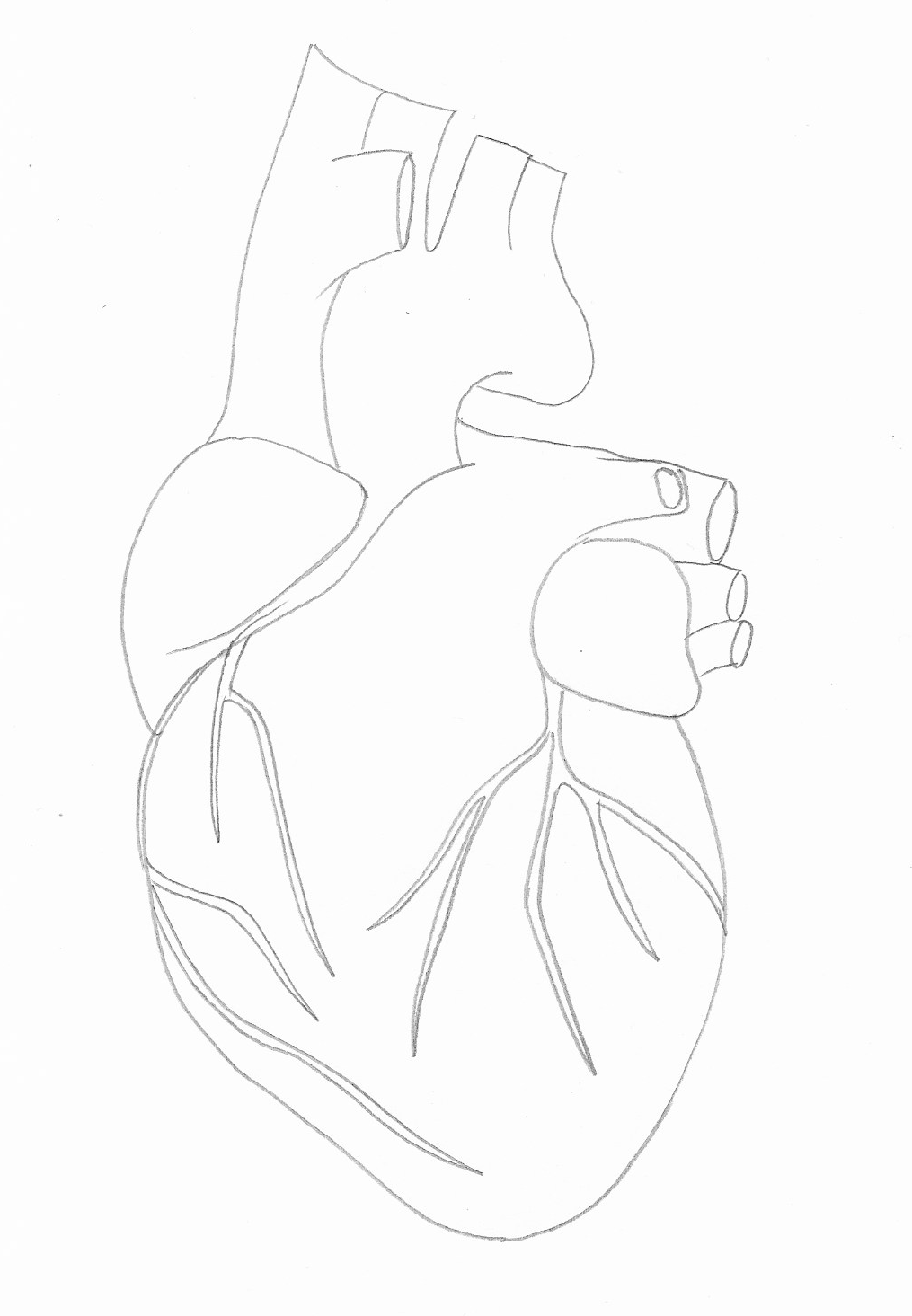
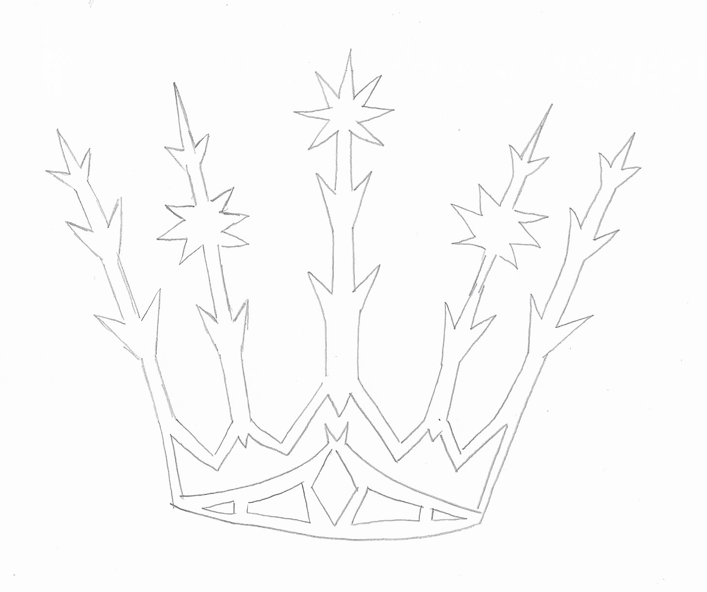
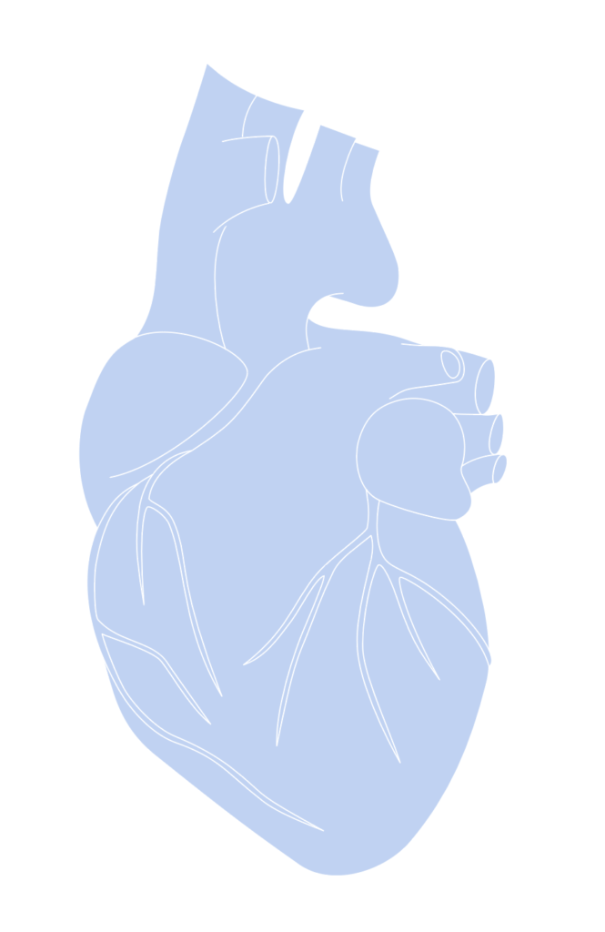
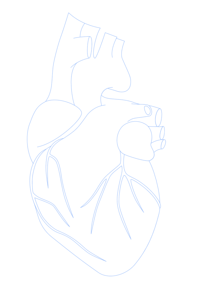
I decided to create visuals of both a simplified human heart and a crown.
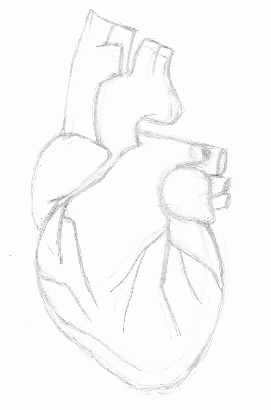
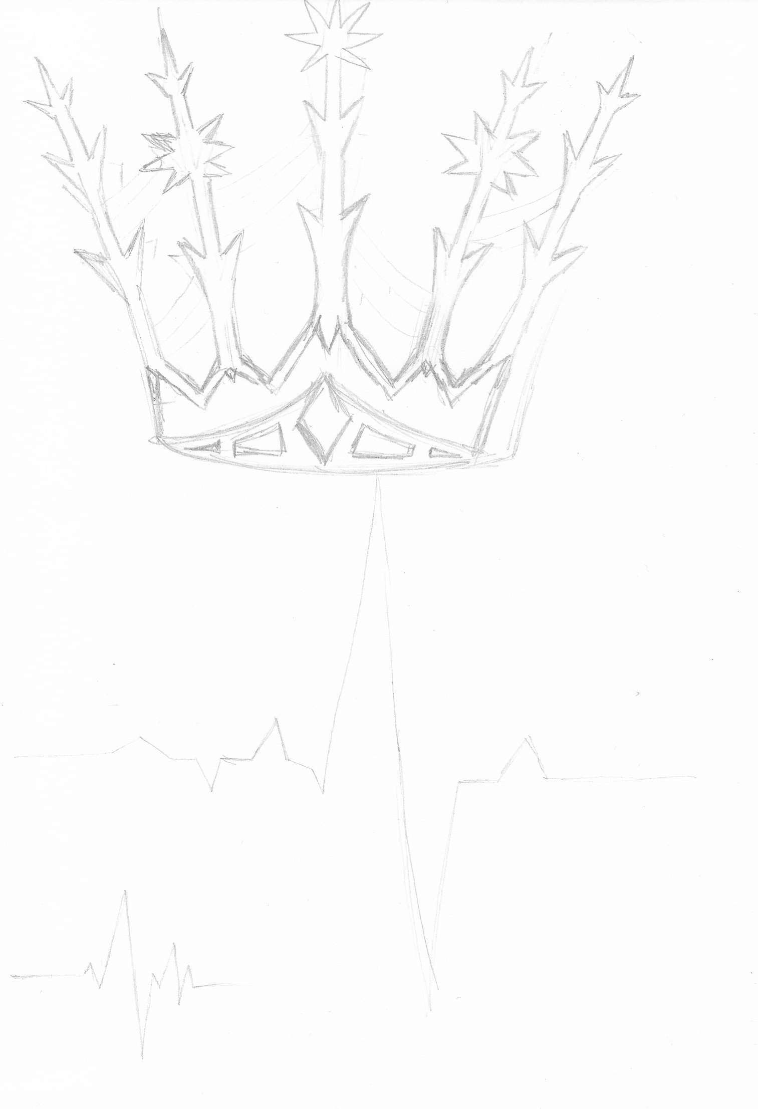
Using my light-box, I made cleaner line version of both.
Designing the Cover
I scanned my sketches into Illustrator and used these as guides.
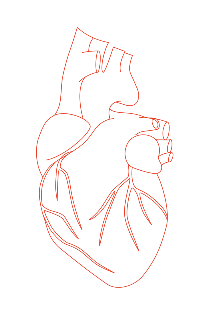
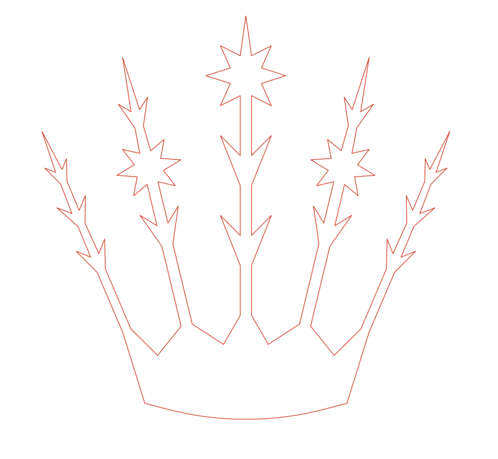
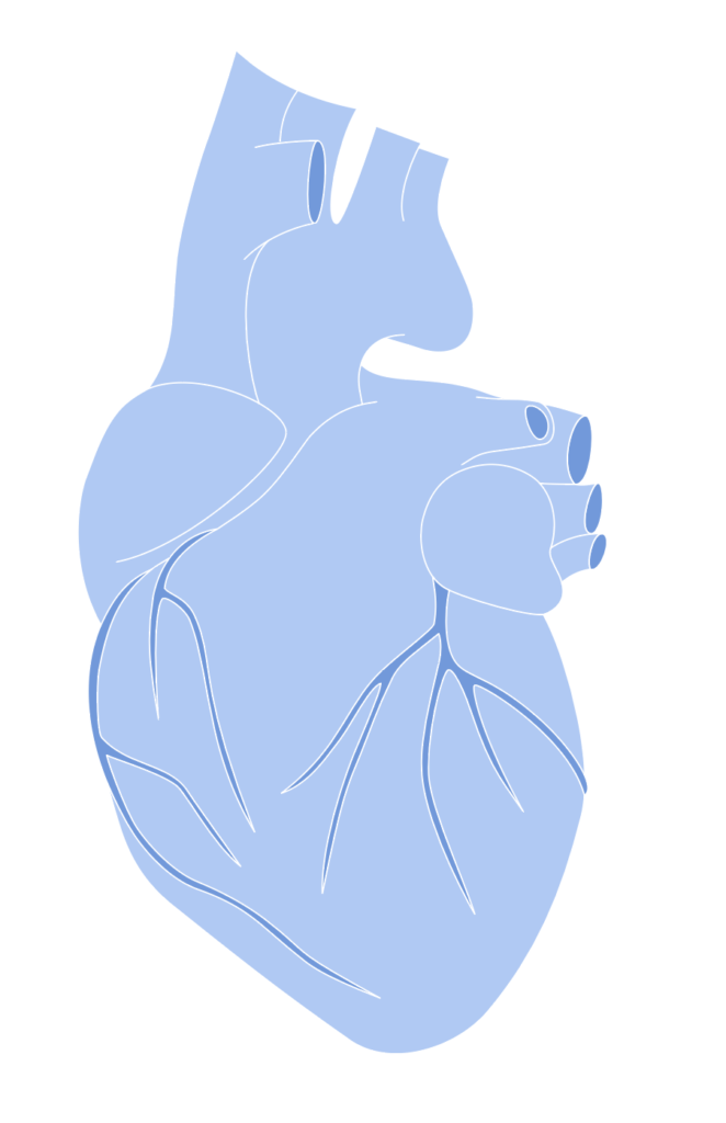
I then proceeded to add colour, texture and effects to make the designs ‘wintery’ in appearance.


I tried various versions of the heart, attempting to make it appear cold and icy.
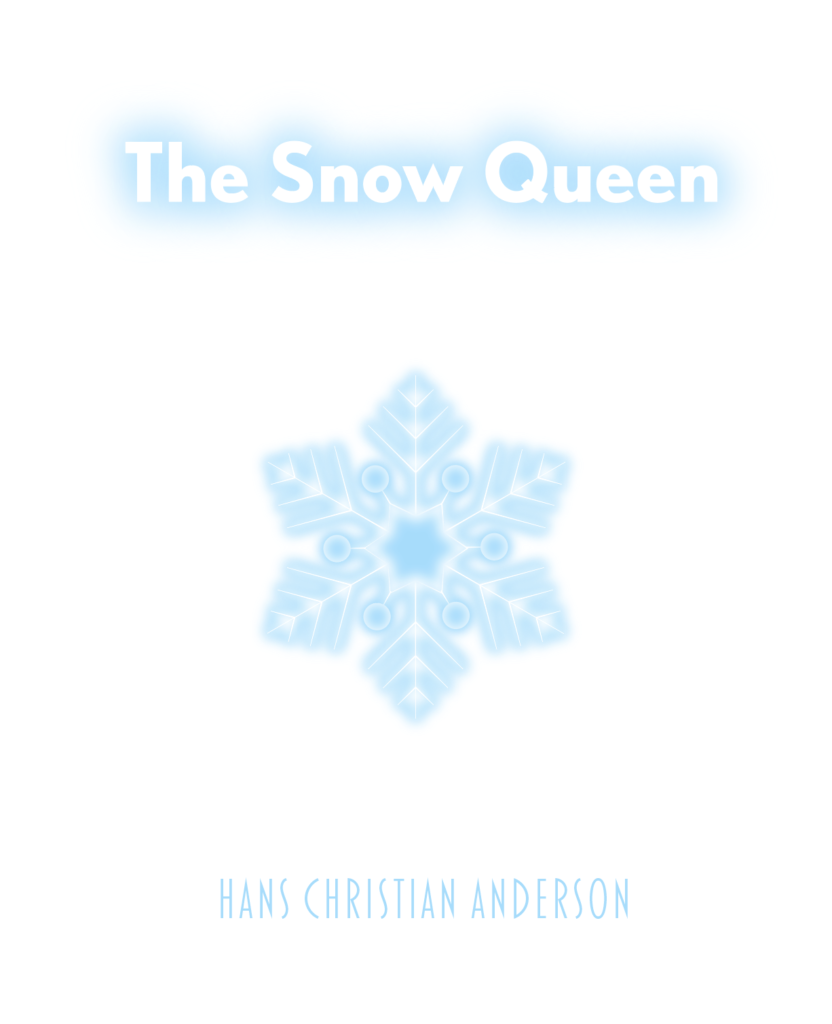
I did try to explore the idea of a child’s eye with a snowflake in it, but I could not recreate what I wanted it to look like, so decided to put this concept to the side. If I had more time and skill, I would like to pursue this at a later date.
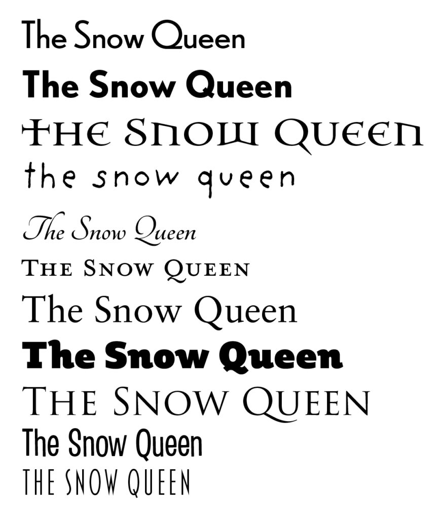
I then started to thin about potential fonts for the cover design. I wanted to find a ‘spindly’ type of font, but did not have much luck. So I picked a selection of different styles to work with.
Creating the Mock-Up
Next, I made several artboards of the appropriate size in Illustrator and played around with various compositions. I thought some were more successful than others.
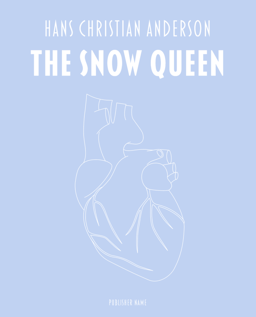
I quite liked the previous three designs, but after consideration I decided that the reason for using a heart in this way was not particularly clear.
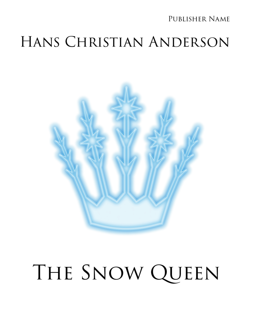
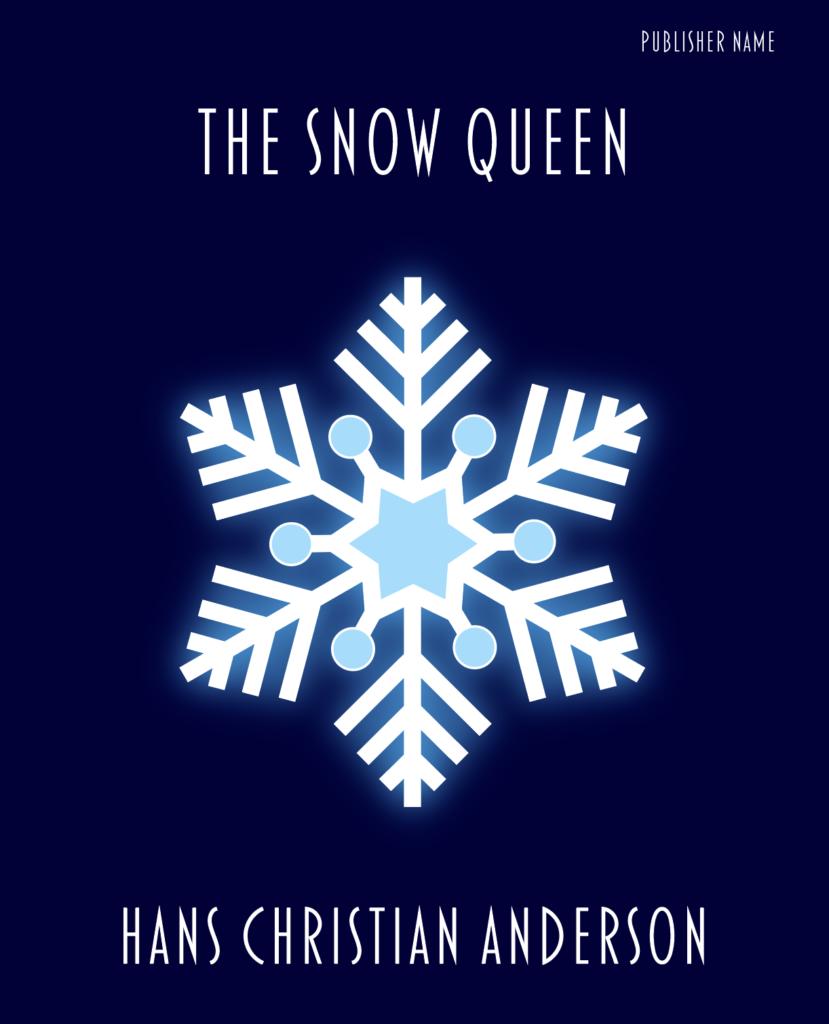
I thought the crown was quite a strong and visually eye-catching design on the cover and would stand out. I also felt the font choice was quite suitable as it looked quite regal, but perhaps the black was too strong a colour and the placement/spacing was not right.
I felt the above design was OK, but not very impactful.
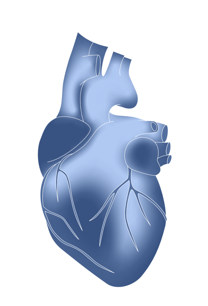
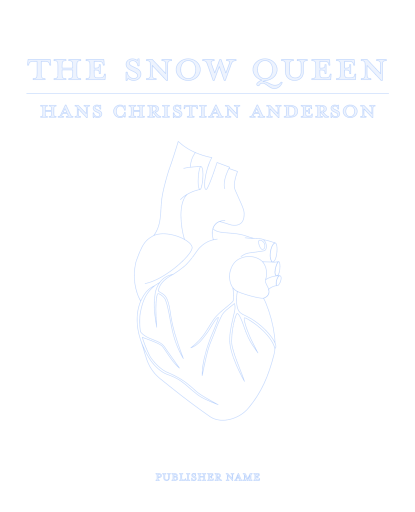
I then decided to try a dark blue background instead, which I thought was visually much stronger and interesting.
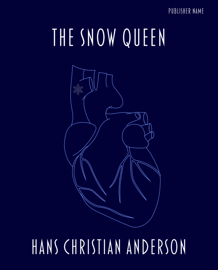
I felt the above design was a much better use of the heart illustration and related more to the story of the cold getting into the boy’s heart.
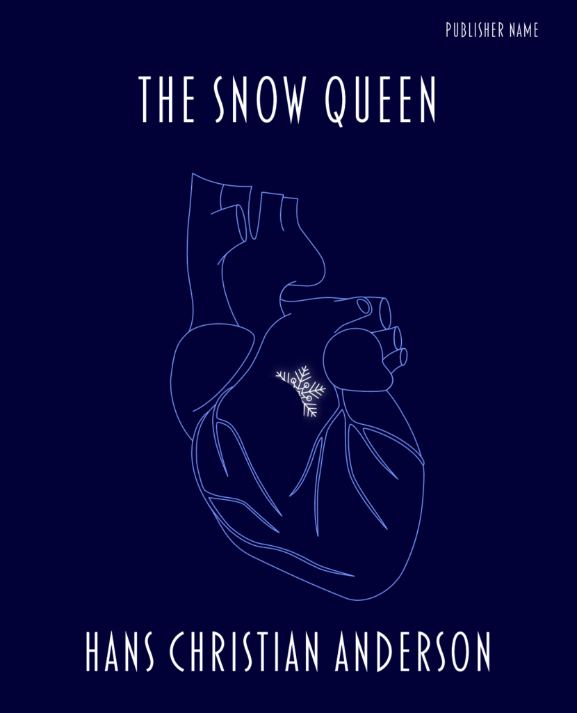
Building on this idea I wedged the snowflake in the heart, which I thought was quite successful in communicating the idea I wanted to get across.
The dark background was a much better decision in term of visual impact as demonstrated in the above and below designs.
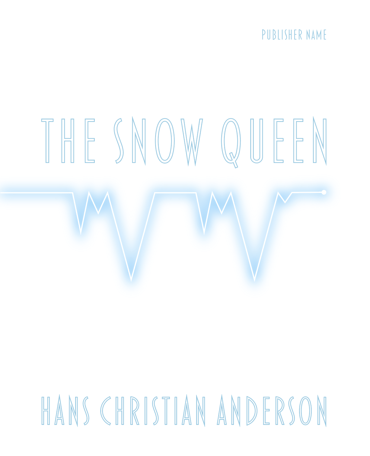
I then wanted to try out the heart rate monitor line, as I did not feel it was very successful on the white background and wanted to explore it further as option.
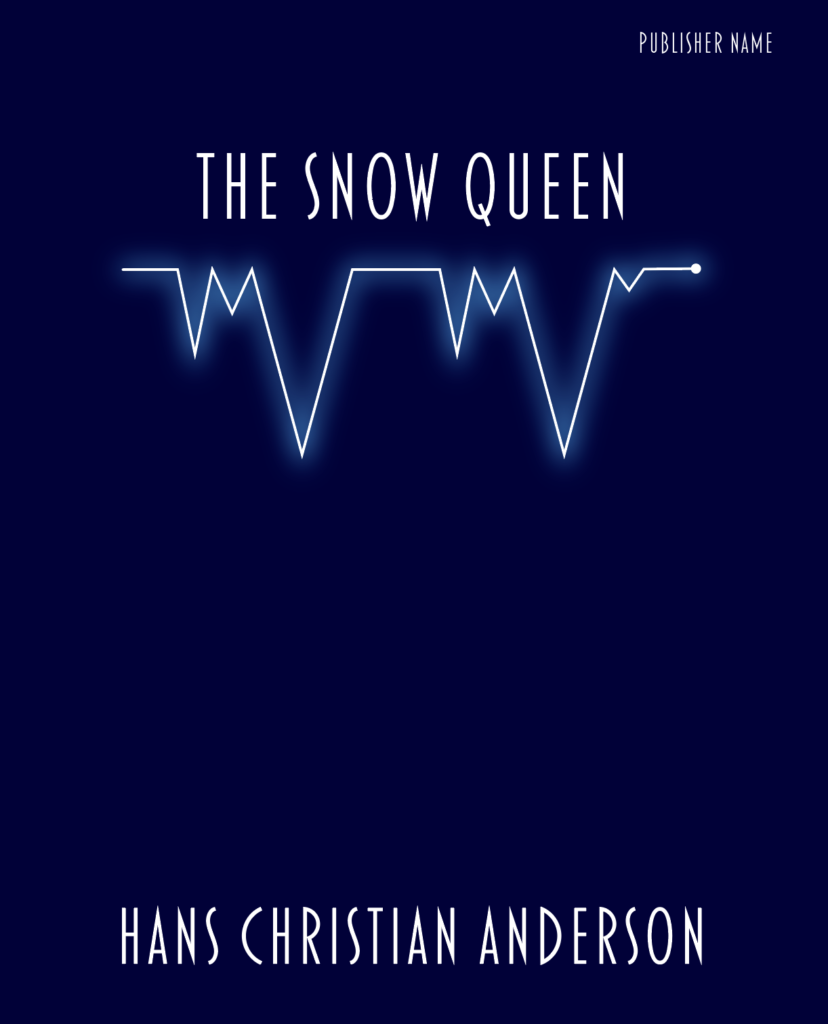
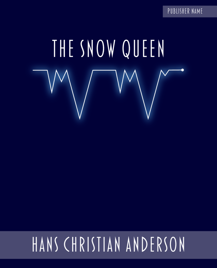
I was quite pleased with the simplicity of this idea and, in my opinion, the illustration communicated what I intended – heart rate monitor line/icicles.
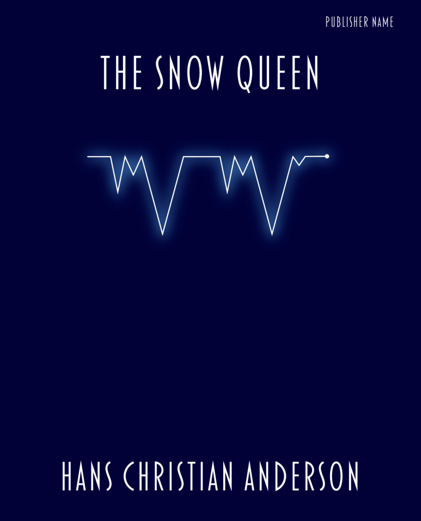
I liked the line coming in from the side of the composition as I think it made it look more dynamic, as though in motion – like a heart beat. I then also thought that it could wrap around the entire cover (spine and back), which could enhance the effect.
I did not think the white design was as effective.
Final Mock-Ups
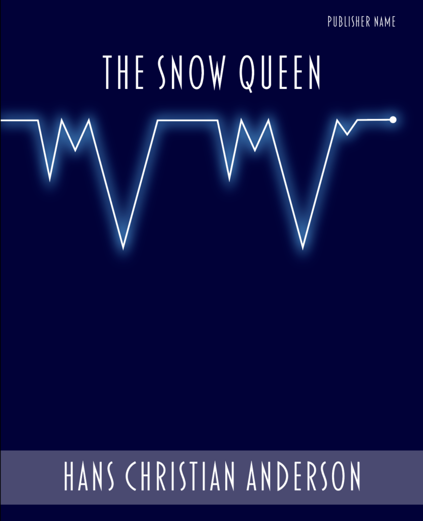
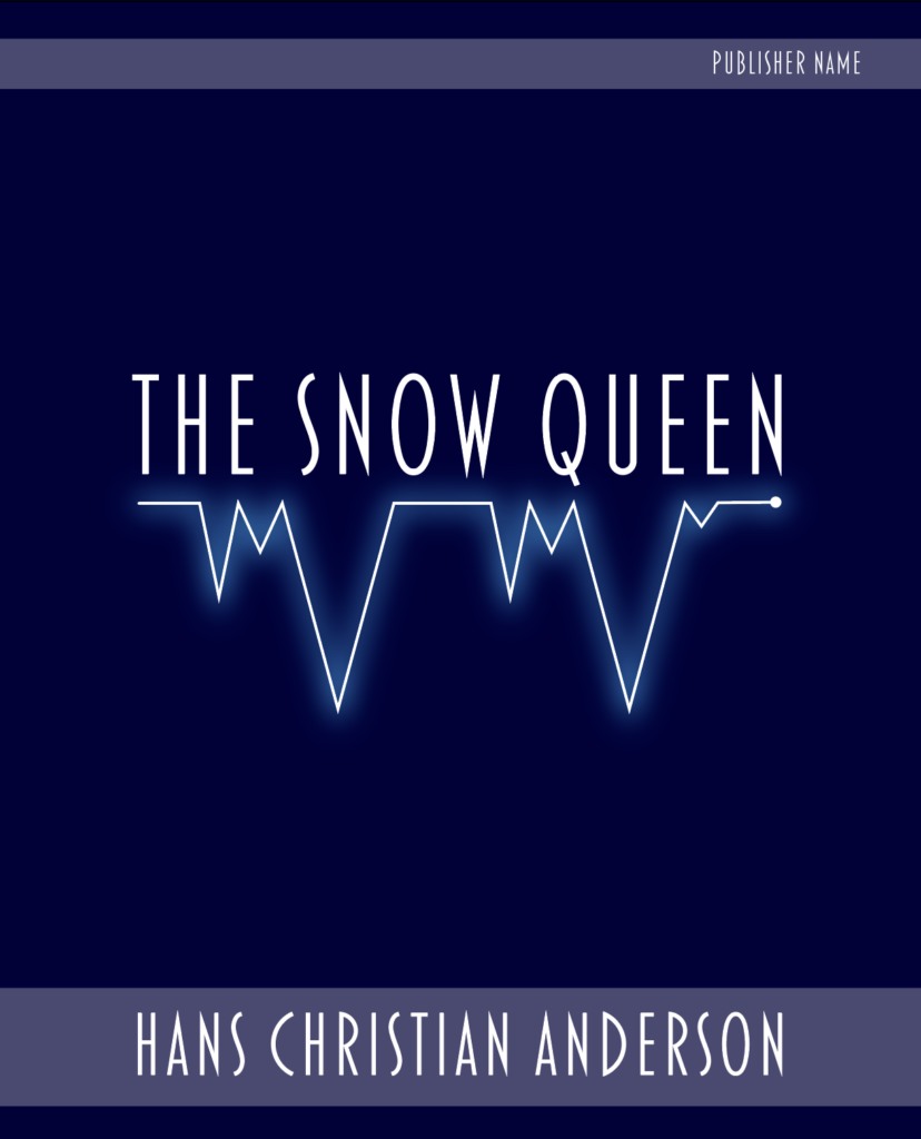
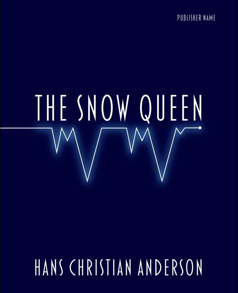
After consideration, I selected the following two designs as potential mock-ups for the book cover of The Snow Queen.
These two designs best reflected my original ideas of what I wanted to communicate. I felt they fulfilled the brief in terms of being eye-catching, modern and minimalistic. I used a very limited colour palette. I’m not sure if the fonts are right, but I wanted them to be angular, particularly in the ‘icicle heart rate’ design. I felt the final results would be at least quite good poster designs if not considered suitable for a book cover.
Reflection on Tutor Feedback
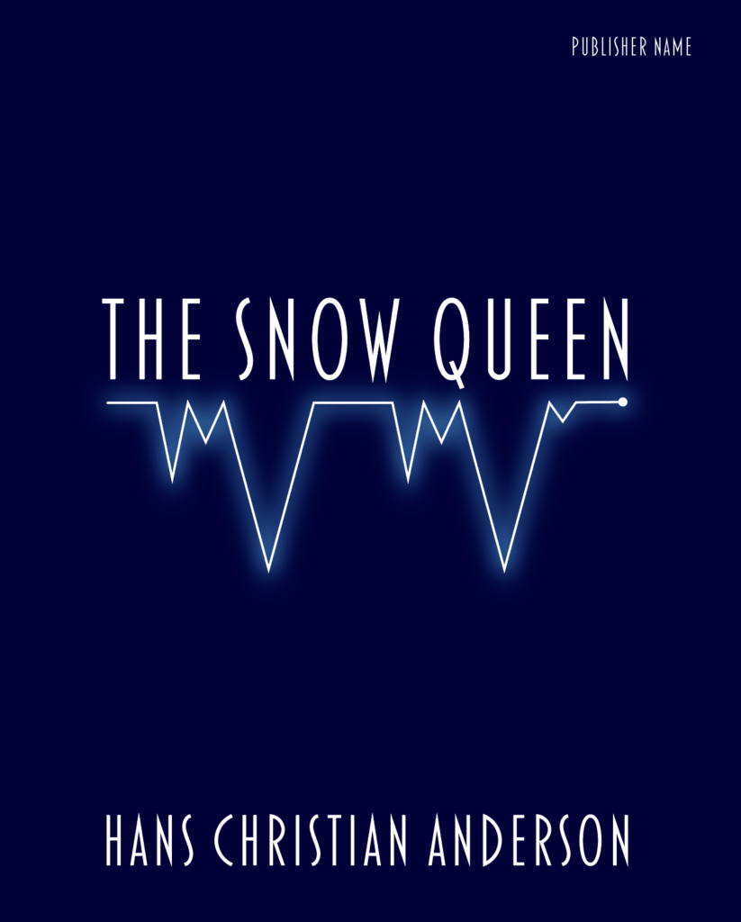
After a period of time away from this exercise and following tutor feedback, I returned to the designs and agreed 100% with my tutor’s preference for the white cover designs as these reflect the content of the story much better. The final choice of design would be the icicles/heart-rate design, as below, because it clearly relates to the Snow Queen’s impact on the heart of the boy in the story, but not in an overly obvious way.
References
Penguin, (2018). 100 Must-Read Classic Books, As Chosen By Our Readers | Fiction, Novels & More. [online] Available at: https://www.penguin.co.uk/articles/2018/100-must-read-classic-books/ [Accessed 26 August 2020].
Penguin Platform, (2019). Book Cover Designer (Publishing Jobs 101). (video) Available at: https://youtu.be/Gc_xXMARK08 [Accessed 26 August 2020].
Penguin Random House, (2013). Inside Random House: “The Art of Cover Design”. (video) Available at: https://youtu.be/l2Z86L25v30 [Accessed 26 August 2020].
Penguin Random House UK, (2019). The art of book cover design. (video) Available at: https://youtu.be/FJEfthrMLhs [Accessed 27 August 2020].
Signature Views, (2017). Designing a book cover | Mini-Doc. (video) Available at: https://youtu.be/9D5jvZbyA98 [Accessed 26 August 2020].
TED, (2012). The hilarious art of book design | Chip Kidd. (video) Available at: https://youtu.be/cC0KxNeLp1E [Accessed 26 August 2020].
TurboSquid, (2020). TurboSquid. [online] Available at: https://www.turbosquid.com/Search/3D-Models [Accessed 27 August 2020].
Wikipedia, (n.d.). The Snow Queen. Wikipedia. [online] Available at: https://en.wikipedia.org/wiki/The_Snow_Queen [Accessed 27 August 2020].