Brief
This exercise is to help you to edit an image to its main structural form and to practice creating a clear visual.
From the work you have collected pick at least two finished illustrations. These illustrations should contain a range of content. They can be representational, diagrammatic or metaphorical.
Measure the image at the size it was reproduced. Draw a box at least two and half times larger and in proportion to each of the printed illustrations.
Using a form of line which feels comfortable and which you can confidently manage, create a visual for each illustration. You are not tracing the original nor are you claiming this artwork as your own. Be aware of main shapes and directions; draw the elements of the image with sufficient detail for them to be readable.
Explore how many lines you need to describe the content. Try another version of the same image and see how much content you can remove so that the image is distilled to an extremely edited form but still makes sense.
This practice in editing and purposefully using selective line to describe an image will be applied in later images of your own generation. Give yourself space of a couple of days and then refer back to the original illustration and evaluate how honest your visual is to its source.
This exercise may have given you insight into the reverse process where the client edits the visual to get the final image. This is known as art direction. Find some images that made you more aware of the art direction behind them and annotate them to explain the thinking behind them in your learning log.
Chosen Illustrations
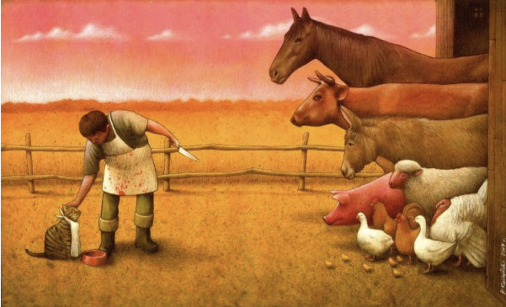
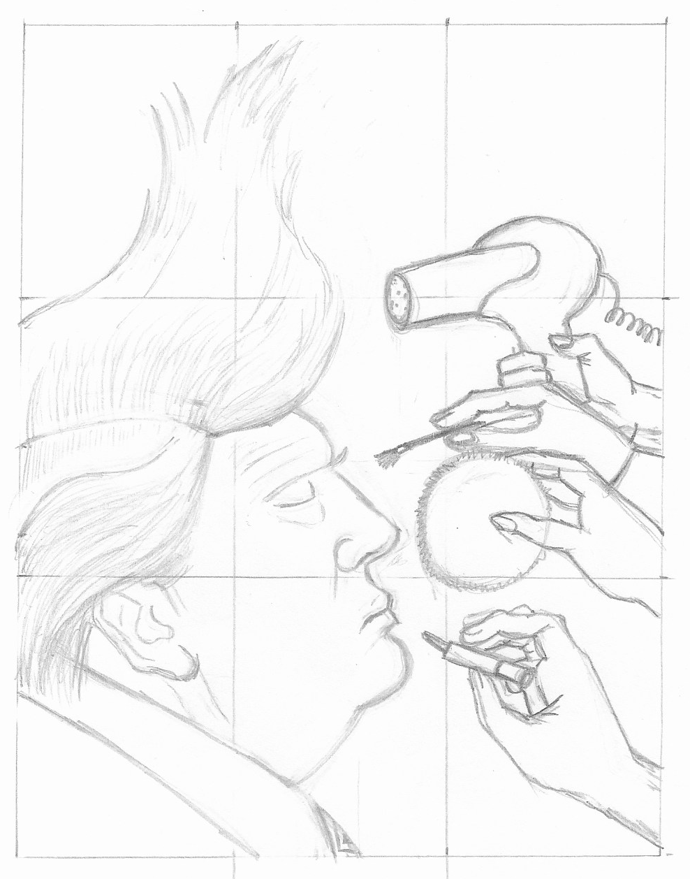
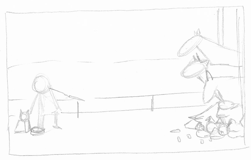
The first finished illustration was one by Pawel Kucsynski.
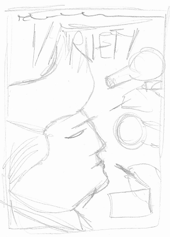
The second finished illustration I selected was a Variety magazine cover by Anita Kunz.
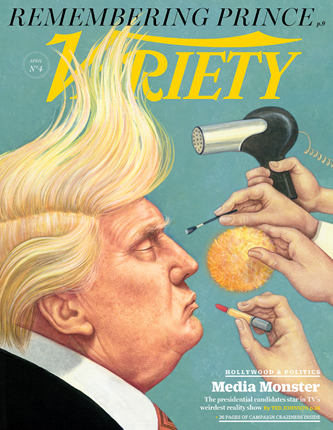
Illustration One
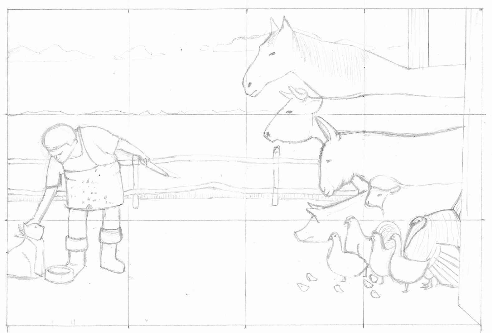
I initially attempted to draw a version by eye alone, which resulted in proportions and distances between the different elements not being true to the original. However, I did manage to do a fairly reasonable interpretation in this manner, which shows the overall idea of the illustration. It was interesting to learn how much I misjudge measurements, making everything bigger than it should be.
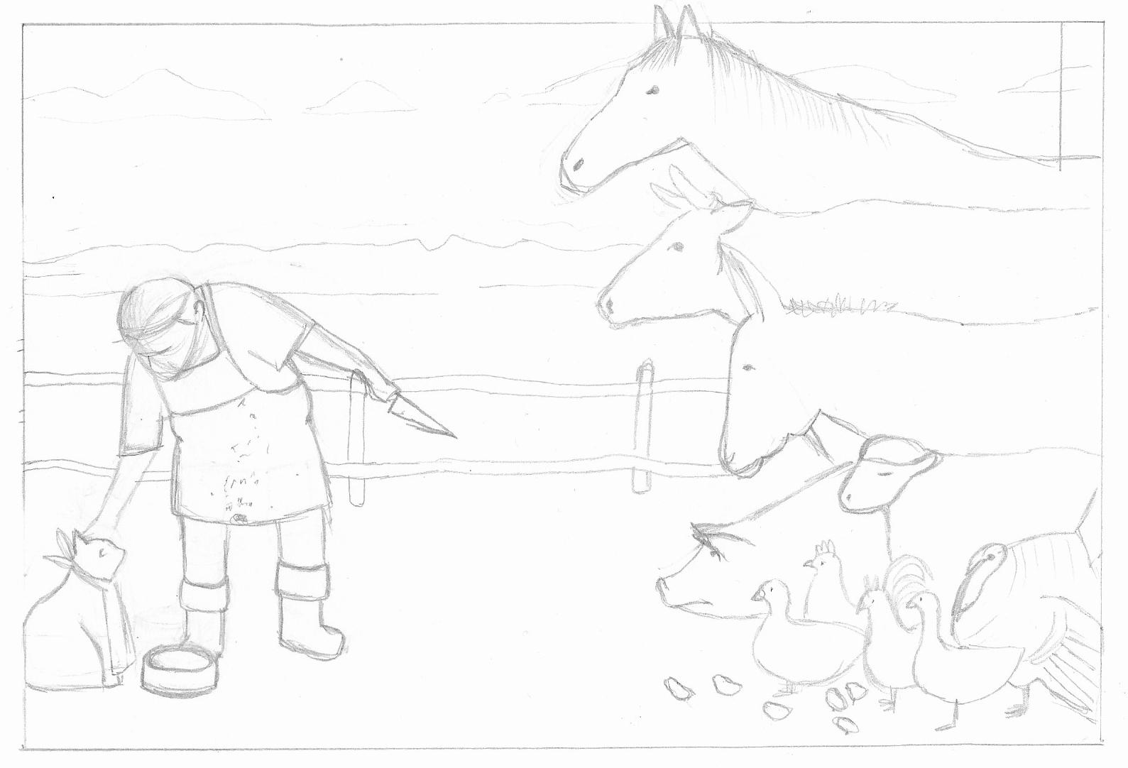
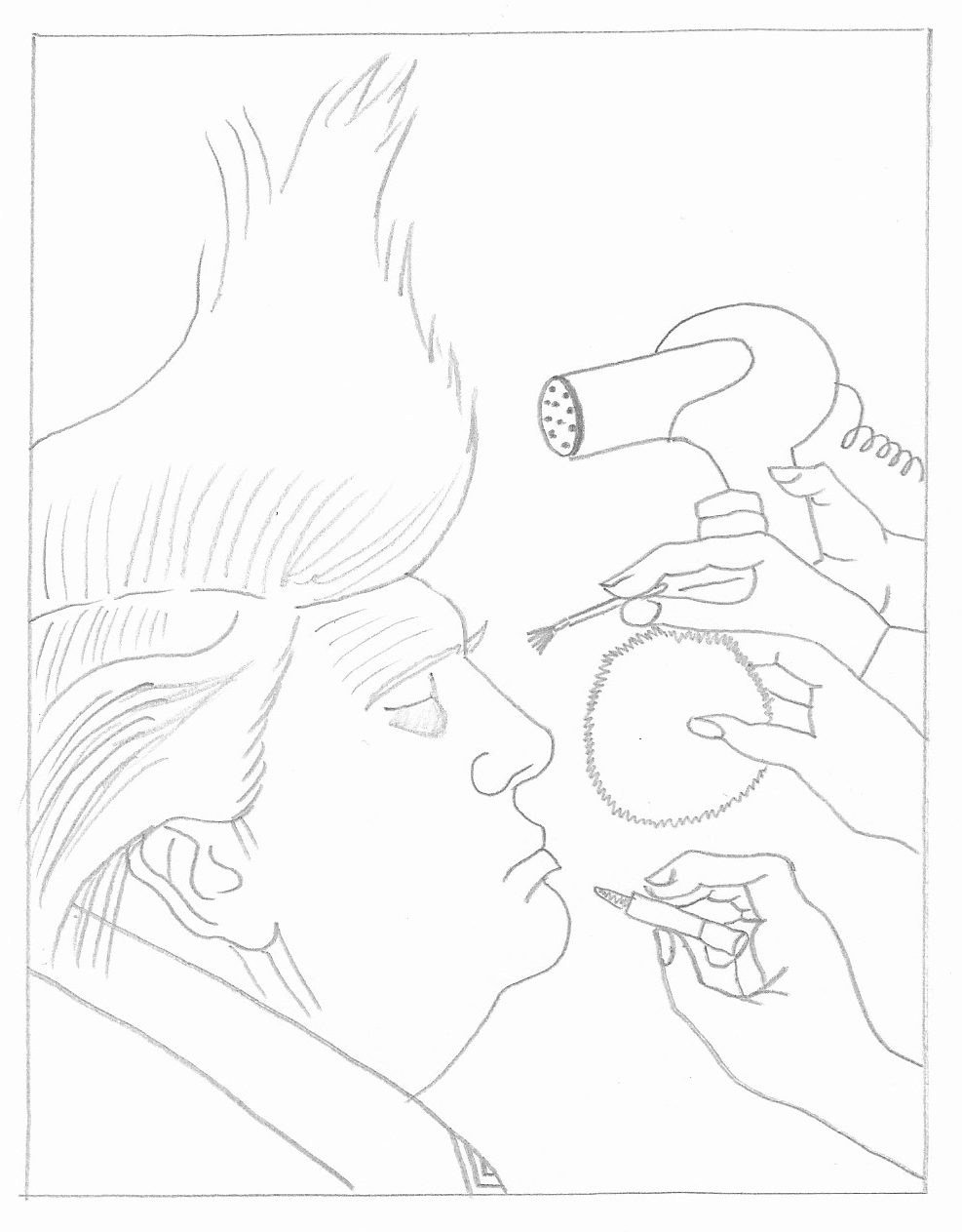
Using a light-box, I proceeded to make a reduced version, in which the key concept behind the image could still be interpreted.
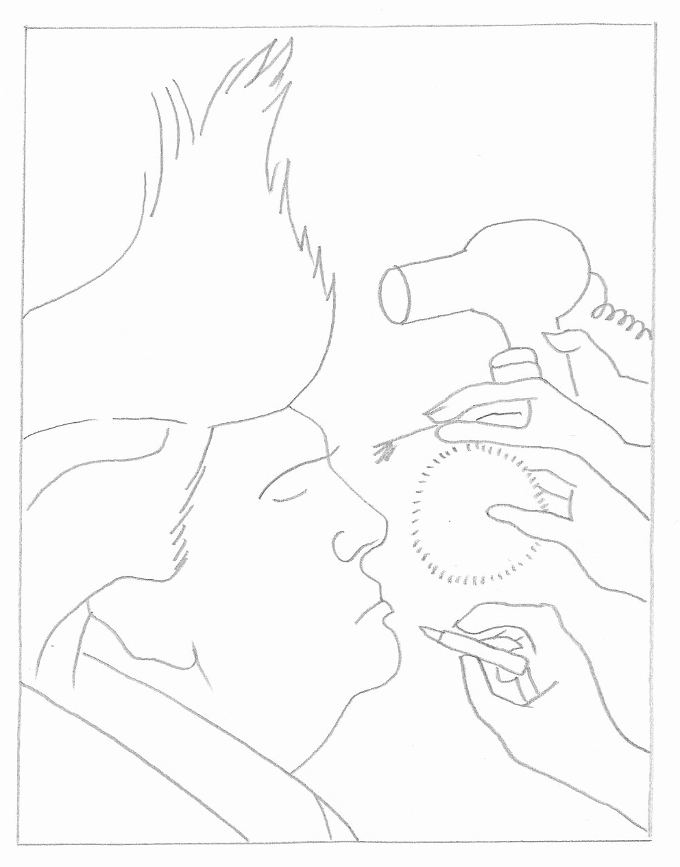
I decided to try again, this time using a simple grid drawn over both the original and the blank paper. I also used a ruler for some areas to make sure I was on the right track in terms of measurements. I found this result much more satisfactory.
Using a light-box I made a cleaner version with the grid lines removed.
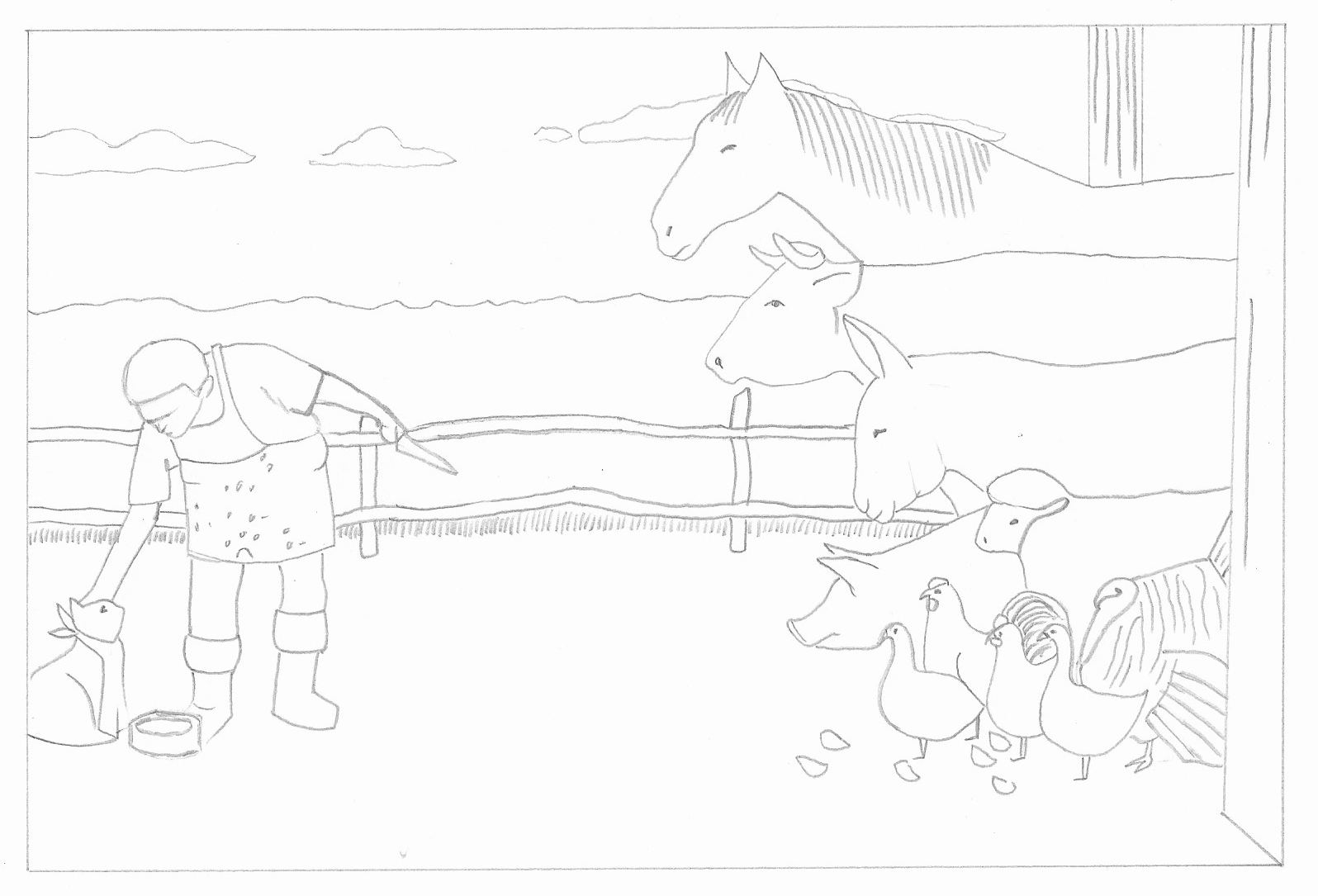
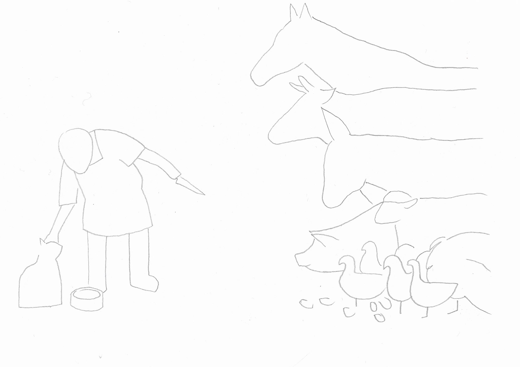
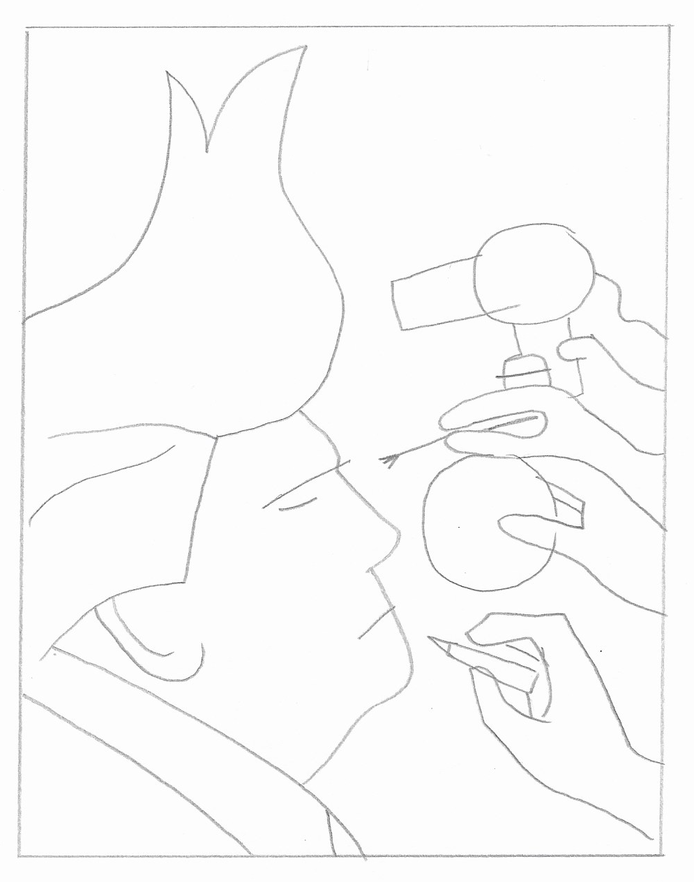
I then proceeded to make further versions with less detail, but still keeping necessary elements to maintain the concept.
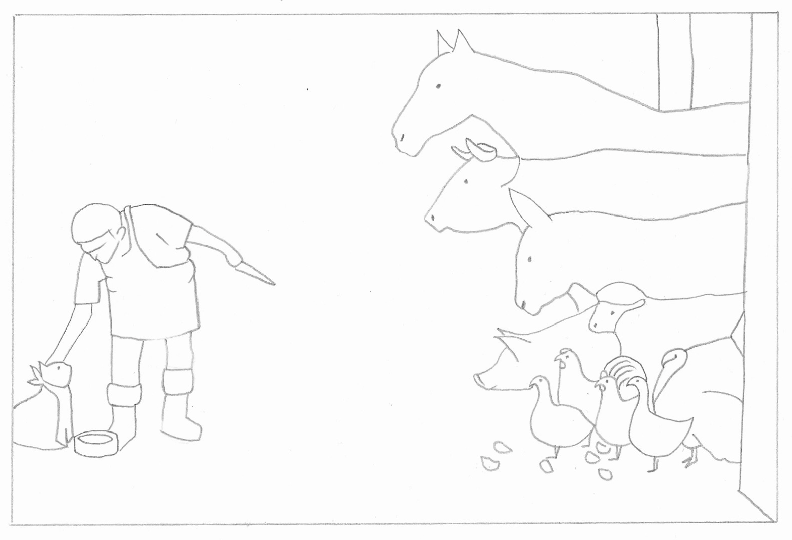
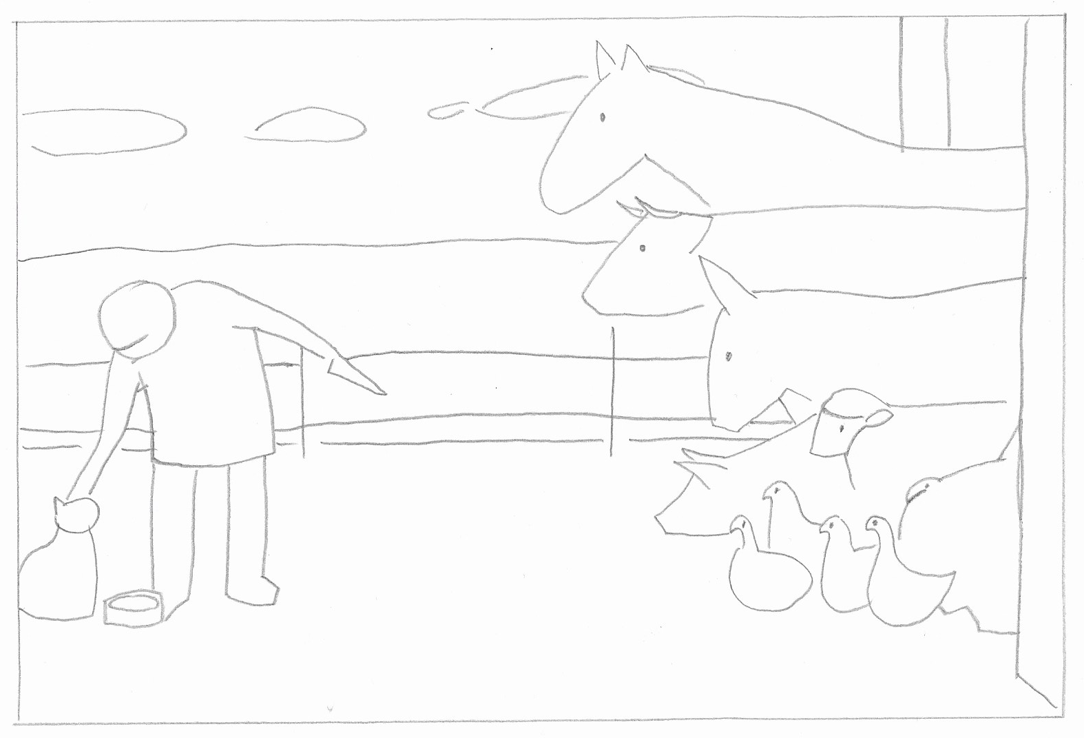
Illustration Two
For this illustration I used grid lines from the start. I also used the ruler much more for this image as, again, I was quite shocked how wrong my eyes were in terms of distance and size.
Again, I did a cleaner version minus the gridlines.
I then removed detail whilst trying to retain the main idea of the illustration.
I also created thumbnails for each of the images.
Overall I was quite pleased with my versions of the original illustrations. However, I did not feel I gained much from this exercise in terms of reducing the details. I understand the reason for doing this, but I think it will be more effective on my own designs as I was so focused on trying to replicate the original and I felt I had restricted myself when it came to simplifying the images.
Art Direction
I read some articles about art direction and now understand the main purposes of art directors, including to make sure the client gets what they have asked for. I also became more aware of the fact that I need to be objective about client work as I would not be creating it for myself, but for them. So, I should not take criticism personally or go off at tangent (too much). It is acceptable to put ideas across for discussion and some art directors would be more open to this than others, but the client ultimately pays the bills.
Examples
I found a few examples of illustrations that I tried to look at from the point of view of the art direction.
The first are the BAFTA Film Awards 2015 posters designed by Malika Favre. It is evident that the art directors (Human After All) must have wanted a particular style of illustration for this project as Malika’s own portfolio website is in a similar style. The designs are very minimalistic and the colour palette is restricted to orange plus one other colour in varying tones. There is also the use of white as a light source in each illustration. There is also a play on the shadows in each image, which I did not notice at first glance. There is very little text on the posters, which is placed in the same position on each poster, and the title of the films is not included, which demonstrates how well the illustrations need to be able to communicate to the view.
Following the same theme I decided to look at some more BAFTA posters and found the 2016 versions by Levente Szabo, with art direction again by Human After All. Similarly to the previous year, there is a limited colour palette, but this time Szabo has used the silhouette of a character from each film and filled the interior with a key scene that captures the essence of each storyline. Again there is limited text on the posters and therefore the title of the film has to be communicated visually.
References
Carless, J. (2016). ‘What Art Directors Want: Tips for Editorial Illustrators’, Adobe Create, 20 April. Available at: https://create.adobe.com/2016/4/20/what_art_directors_want_a_guide_for_editorial_illustrators.html (Accessed: 21 August 2020).
Favre, M. (2020). Portfolio Website. Available at: https://www.malikafavre.com (Accessed: 21 August 2020).
Johnson, T. (2016). ‘Presidential Race Takes Over Pop Culture as Hopefuls Embrace Celebrity Status’, Variety, 26 April. Available at: https://variety.com/2016/biz/news/politics-hollywood-2016-presidential-race-1201760170/ (Accessed: 14 February 2020).
Kuczynski, P. (2020). Portfolio Website. Available at: http://pawelkuczynski.com (Accessed: 14 February 2020).
Kunz, A. (2020). Portfolio Website. Available at: http://anitakunzart.com (Accessed: 14 August 2020).
Launder, M. (2016). ‘These BAFTA 2016 film posters steal the show’, DigitalArts, 17 February. Available at: https://www.digitalartsonline.co.uk/features/illustration/these-bafta-2016-film-posters-steal-the-show/#1 (Accessed: 21 August 2020).
Petzold, D. (2015). ‘BAFTA Film Awards 2015 Posters’, We And The Colour, no date. Available at: https://weandthecolor.com/bafta-film-awards-2015-posters/50190 (Accessed: 21 August 2020).
Pictorem (2020). Pawel Kuczynski – Art Collection. Available at: https://www.pictorem.com/profile/Pawel.Kuczynski (Accessed: 14 February 2020).
Pritchard, O. (2017). ‘The hovering art director: advice for receiving feedback under pressure’, It’s Nice That, 10 May. Available at: https://www.itsnicethat.com/features/advice-art-directors-spin-dixonbaxi-bowman-wired-nb-100517 (Accessed: 21 August 2020).
Spacey, J. (2015). ’10 Examples of Art Direction’, Simplicable, 13 December. Available at: https://simplicable.com/new/art-direction (Accessed: 21 August 2020).
Szabo, L. (2016). ‘BAFTA 2016 best film posters’, Behance, 15 February. Available at: https://www.behance.net/gallery/33674846/BAFTA-2016-Best-Film-posters (Accessed: 21 August 2020).