Brief
To design an illustration for a poster for a music event. An Early Music concert, a Jazz evening or for a pop group. You can choose.
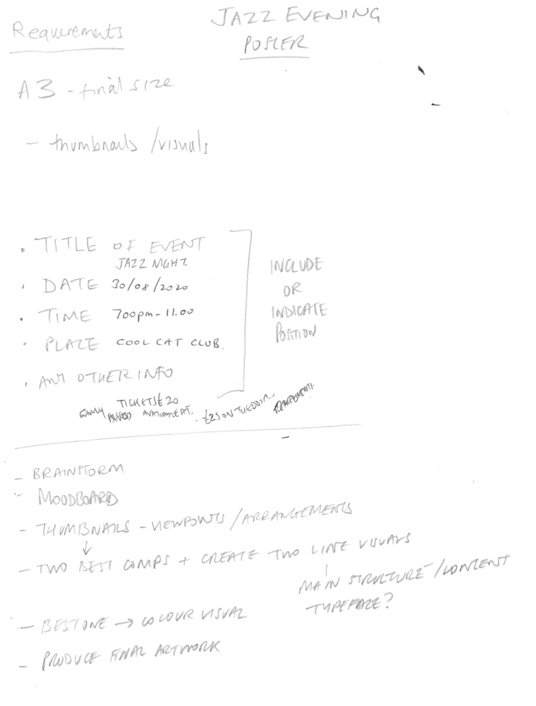
The finished poster will be reproduced at A3 size, but you can work at any size, in proportion, that you feel most comfortable with. You will need to provide your working drawings – the thumbnails and visuals – with the finished piece.
The poster will include the title of the event, the date, time, place and any other information you think appropriate. You can either include this on your artwork or indicate where it will be positioned.
What to do
Start by brainstorming and create a moodboard. Produce a range of alternative thumbnails in which you consider viewpoints and various arrangements of the content you selected.
Choose the two compositions you like best and create two line visuals. Don’t get bogged down by detail that doesn’t help you describe the main structure and content of the image. If you are including type, are you confident that you have chosen the right typeface? If you are not including it, indicate were it will go. Check that when added it will neither get lost or obliterate or compromise your composition.
Take the composition you think works best and create a colour visual. Use your moodboard to help you to establish a colour range to work within. Be selective.
Finally, produce you final artwork.
Research
I decided to choose the Jazz Evening option for this assignment.
I began by reading about the origins of jazz (see References) and what connotations are linked to it. I then looked at examples of posters/designs based on the theme of a jazz event and made a Pinterest board with some of these. The main words I associated with jazz included: energy, movement, instinct, rhythm, improvisation and bold.
Some of the more famous artists that created work associated with jazz included Picasso and Matisse. I noted that many of the examples on Pinterest seem to be influenced particularly by Cubism in their design.
The majority of the posters included an instrument, whether in an abstract or real form, and there was generally a sense of movement in the design. This movement was created through angles, curves, depth and colour. This was also applied to the typography in many of the examples. Several of the designs used ‘simplified’ styles, e.g. large blocks of colour and silhouettes of instruments/people. I thought it was important to keep in mind as the brief was for a poster design advertising an event and so the details of the event has to be clearly communicated and the illustration should catch a person’s attention but not distract from the purpose of the poster.
Mind-mapping
I then went on to create a mind-map based on my research and observations so far, which I hoped would help me begin to develop some ideas.
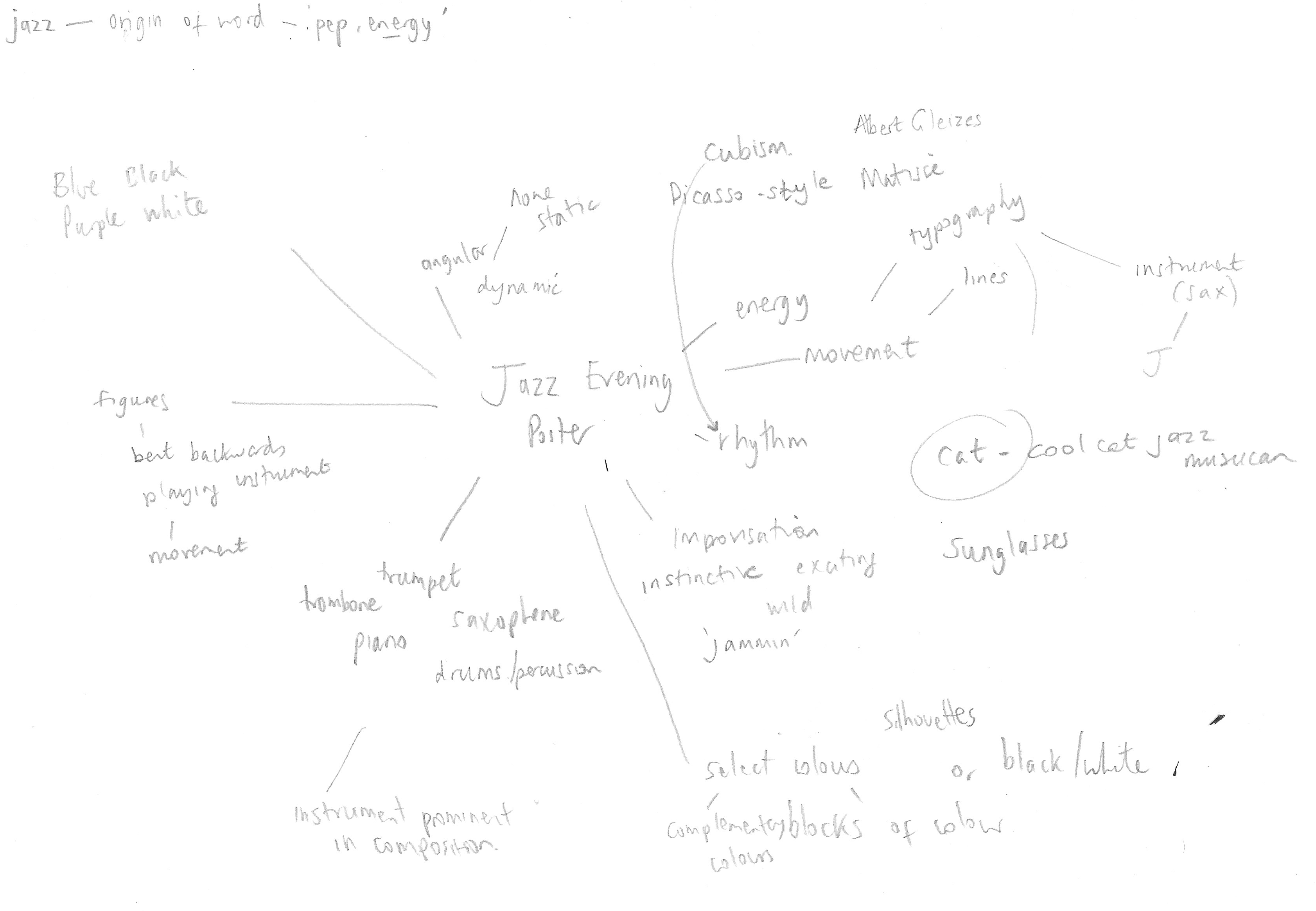
I also noted down the possible information to be included in the poster.
Thumbnails
Next I draw out some very rough doodles/thumbnails of potential ideas. I was initially thinking of using the ‘J’ in the form of a saxophone and then further ideas began to form.
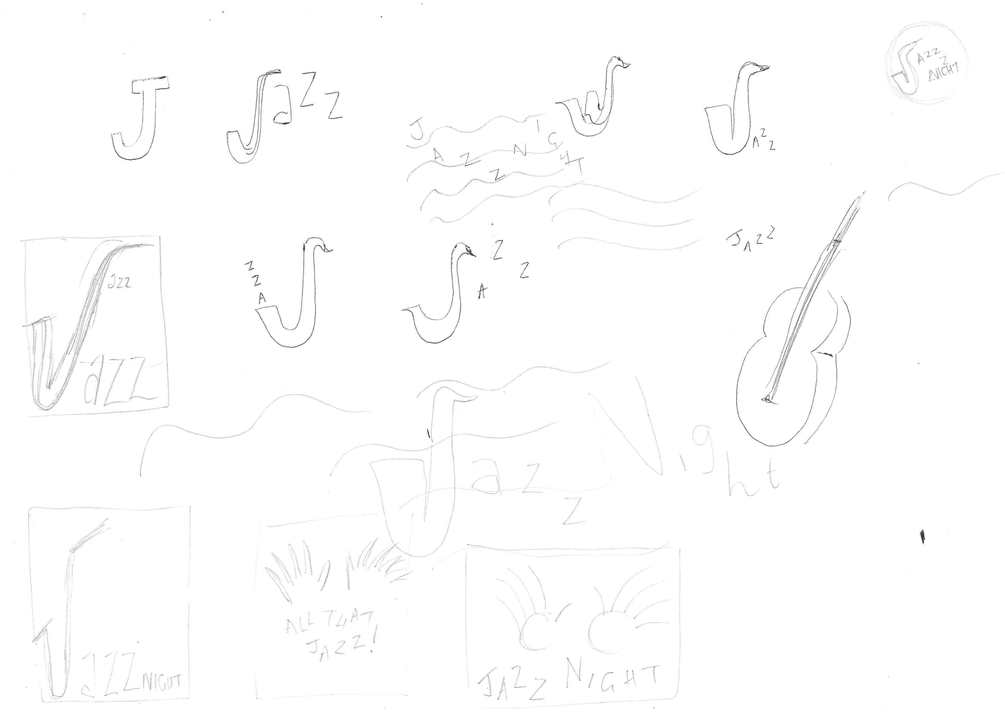
I progressed onto some slightly more refined thumbnails of ideas. I found it helpful working at this scale and not worrying about neatness.
From this initial selection, I opted for five that I thought were worth exploring further.
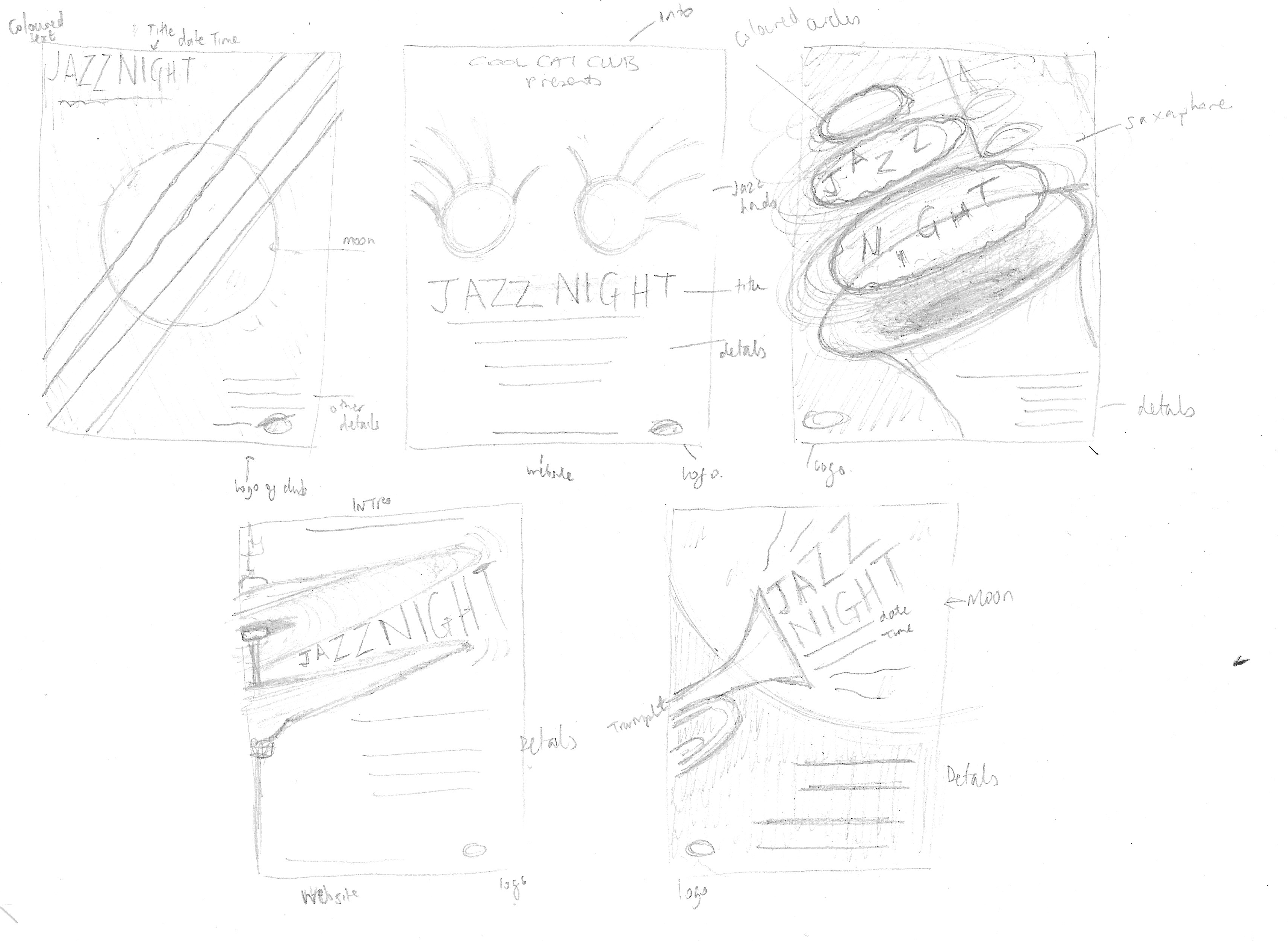
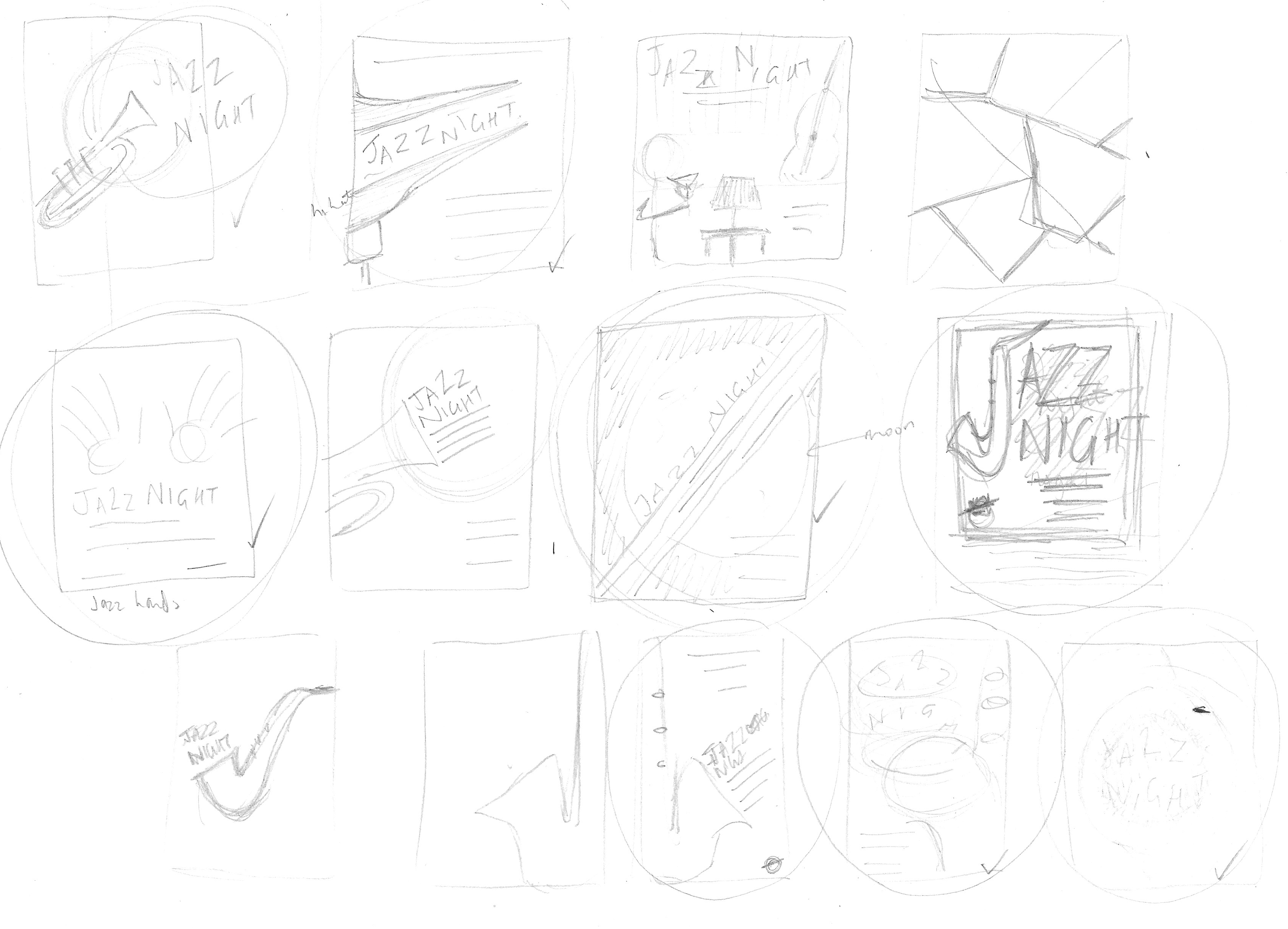
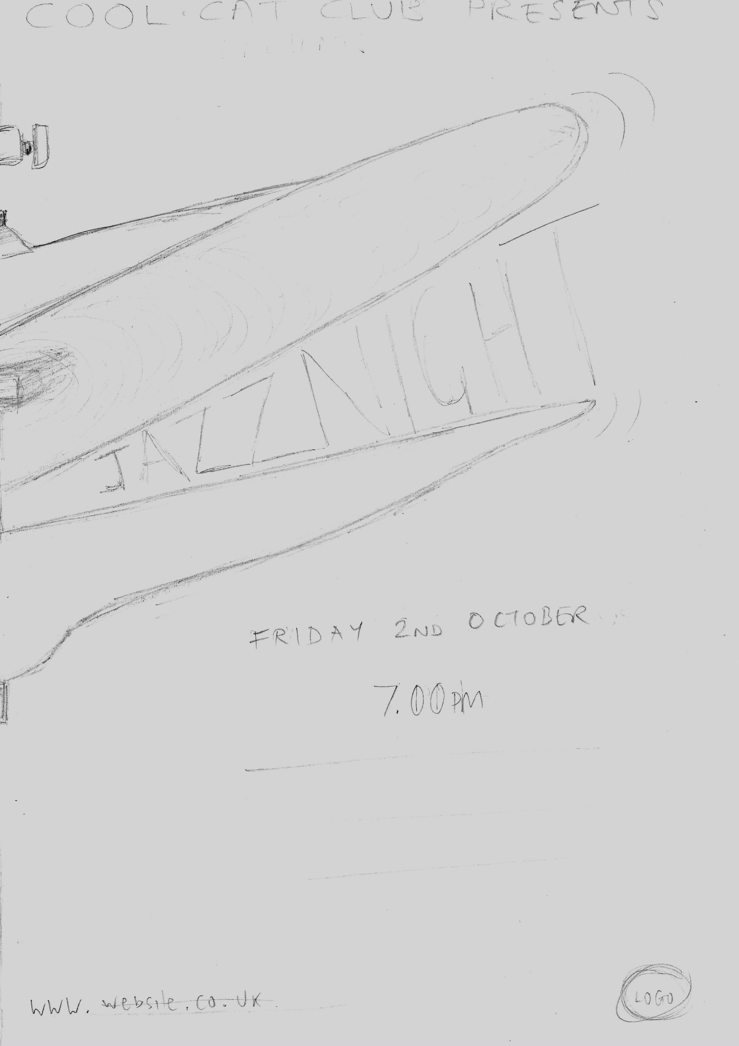
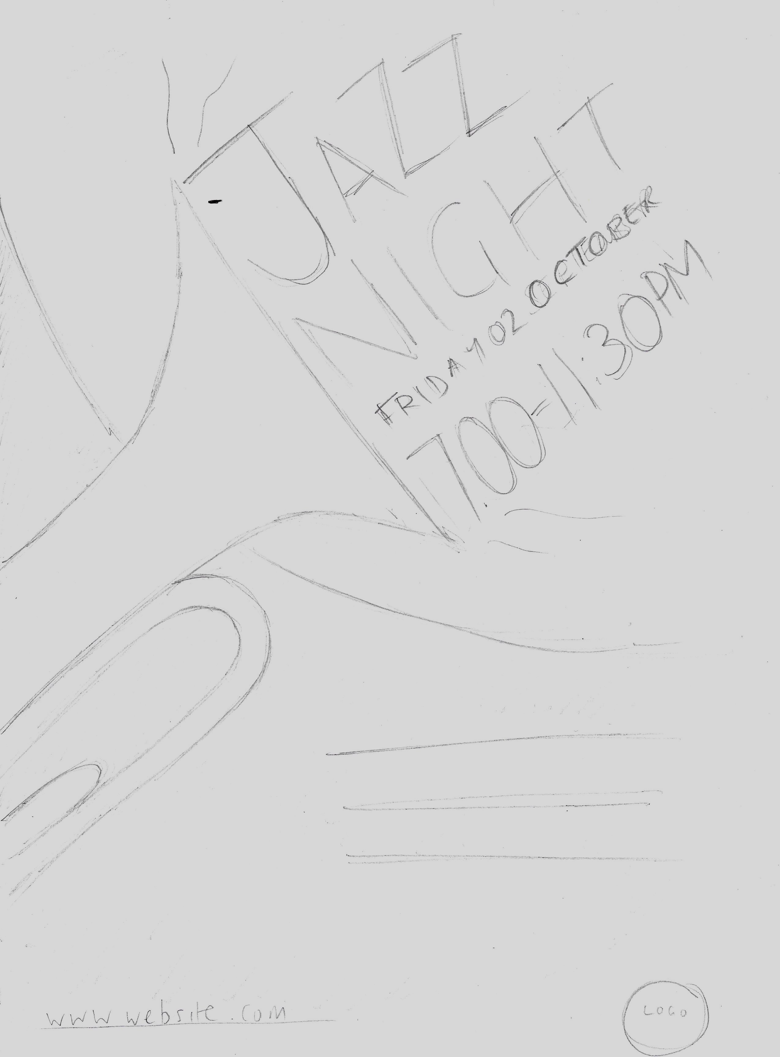
I took these five ideas and made larger versions as visuals.
Visuals of Ideas
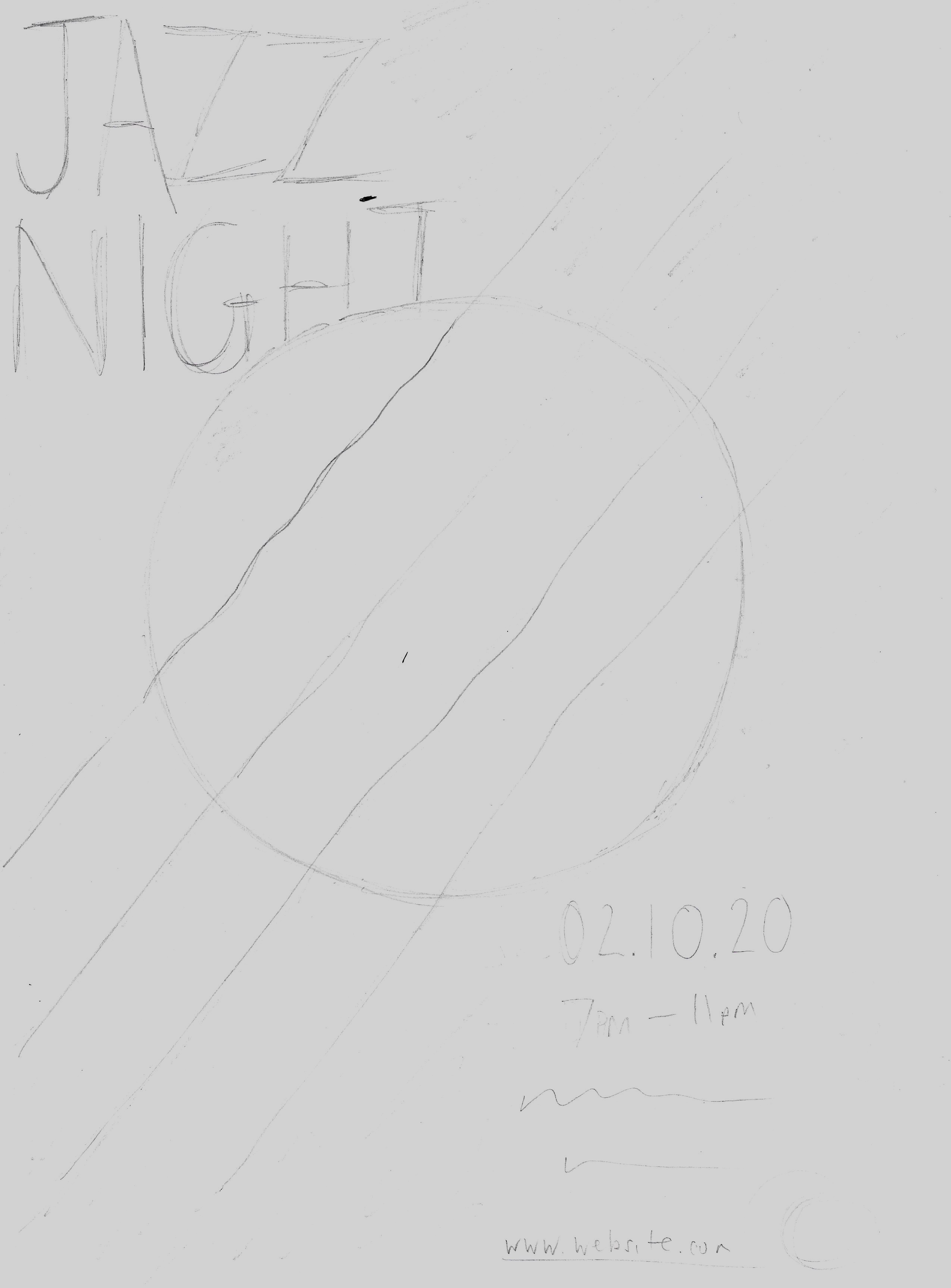
Idea One: Double Bass Moon
Initially I thought of this idea as being the strings on a double bass crossing over the moon. The colour scheme would be black and white. It then dawned on me that double basses do not have a hole cut into them like a guitar, so this made me doubt the validity of the design.
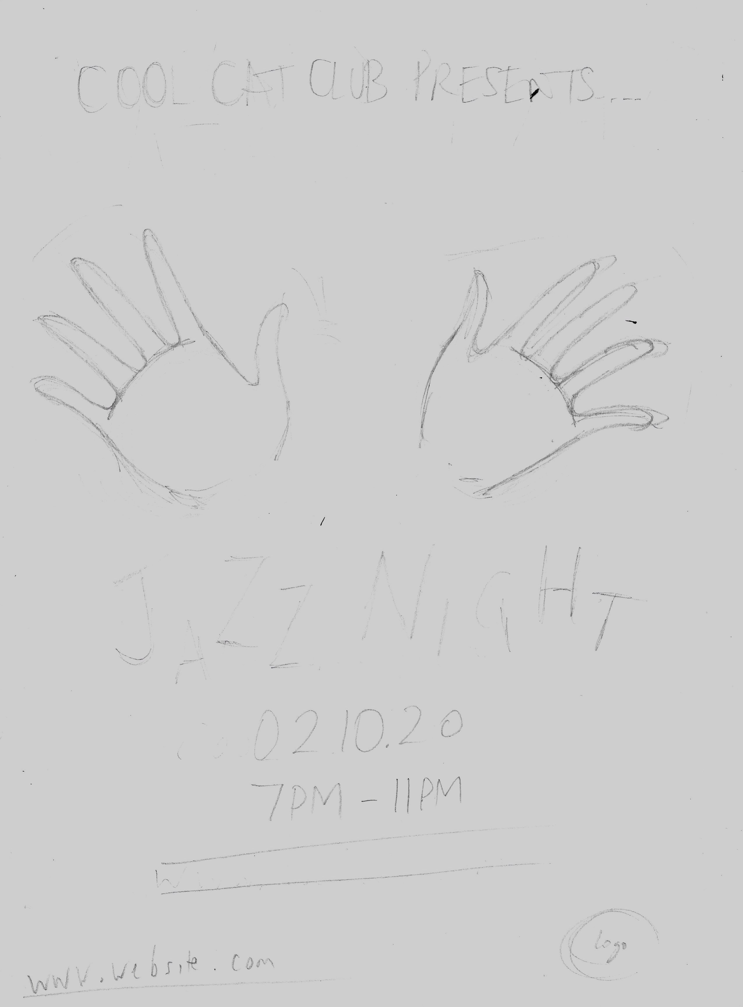
Idea Two: Jazz Hands
When I thought of this one it seemed like quite a good idea, but not so much once I had it down on paper at a larger scale. It would probably be better suited for a cabaret poster.
Idea Three: Saxophone
I quite liked this initial idea as the angle and placement of the saxophone made it more dynamic.
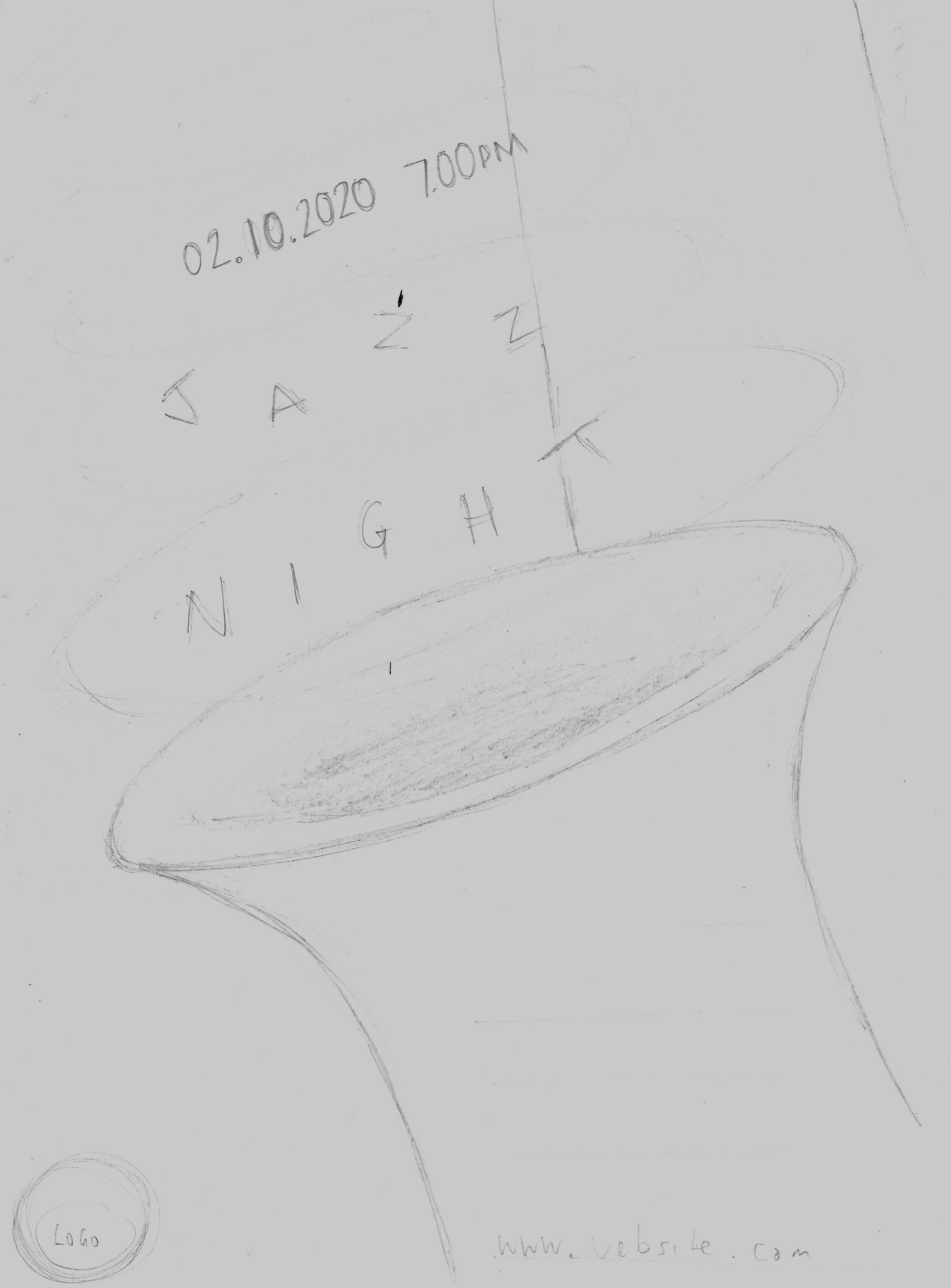
Idea Four: Hi-Hat Jazz
I thought there was some potential with this design as it included angles, but I was not sure about how to incorporate the text.
Idea Five: Trumpet Moon
Although I liked the concept of having a silhouette of the trumpet in front of the moon, I felt the text would not fit in very well with the composition alongside the trumpet.
It was beneficial drawing larger versions of these five ideas. However, I found not being able to play with different fonts and the placement of the text quite restricting as these elements would have a strong impact on the overall design and without experimenting it was difficult to visualise the space required and the impact on the overall design. My lettering skills are not of a high enough standard to be able to do this freehand!
Working in Illustrator
I then moved into Illustrator and tried out rough compositions of several of the above, which quickly narrowed down my choices to the two which I would develop further: Double Bass Moon and Saxophone.
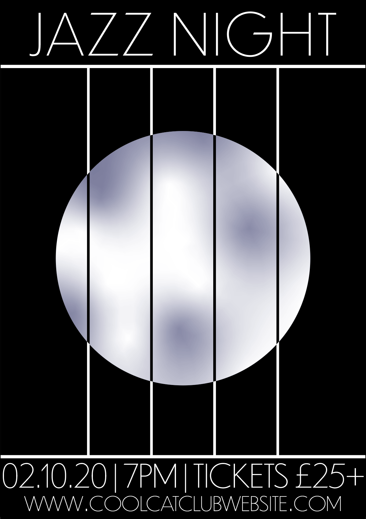
The progress of DBM can be seen below. I also tried incorporating the trumpet into this design.
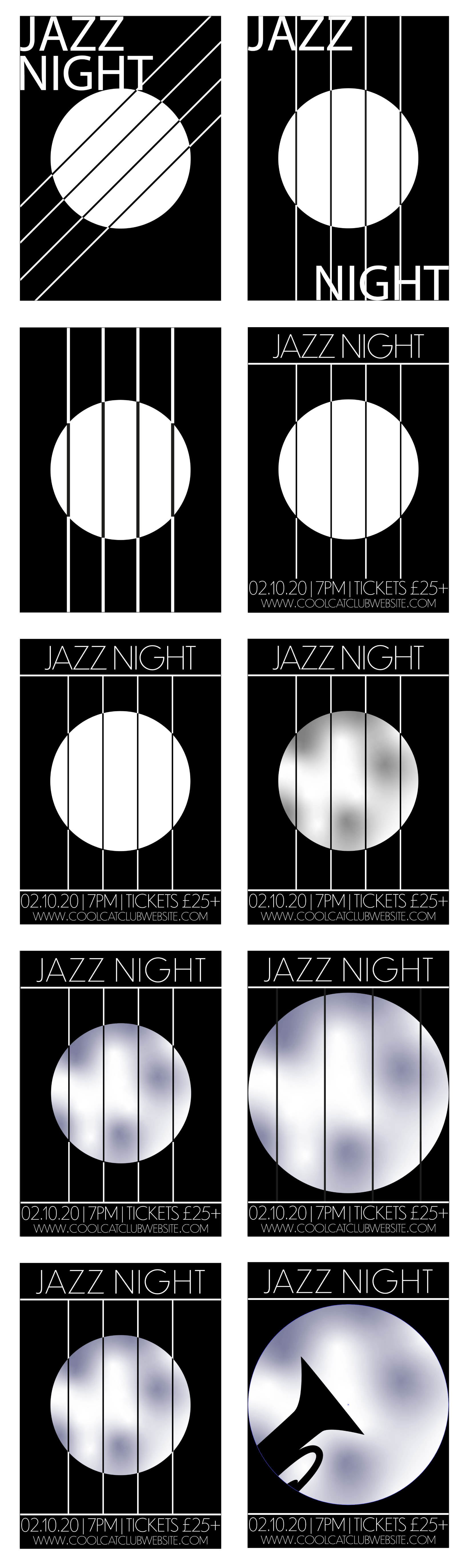
Although I did think this poster was visually quite eye-catching, it does not really communicate ‘jazz’ to the audience. The lines look bit like bars as though it is a view through a prison window! If I could have found a way to make them look more like belonging to a musical instrument, it may have worked better.
I then moved onto the Saxophone design, which I hoped would be more successful. The development of this poster can be seen below.
I tried to consider incorporating a sense of movement and rhythm into the composition through using angles, rotation of the text and uneven lines.I wanted to keep the illustration and overall design quite simple and balanced. I used complimentary colours as this seemed to be quite a common trend in the research I carried out at the beginning. I thought yellow and purple were good choices (besides the former being the ‘true colour of a saxophone) as they seem quite ‘cheerful’ and ‘fun’ colours, which would relate to the essence of the event (e.g. as opposed to red, which can have connotations of anger). Once I reached the point where I felt the layout was acceptable, I created a few different colour versions, which can be seen in the final row (above).
Final Thoughts
As previously mentioned, I found this assignment quite challenging mainly because I had to try to visualise and draw the rough layout of the designs, including the text, without experimenting with various typefaces, which would impact on the space and overall look of the posters. If these visuals were to be presented to a ‘real’ client I do not think they would be up to standard.
In terms of the final posters, I was quite disappointed my DBM design was not more successful as I felt it had the potential to be quite sophisticated, which would have fitted into this genre of event poster design. Although I did like the Saxophone design, I thought there was something missing and it did not have this ‘sophisticated-ness’ about it. Perhaps the text at the bottom of the poster could have taken up more space as well, but I could not work it to fit satisfactorily. I did, however, think it was quite successful at being bold and eye-catching.
Reflection after Tutor Feedback
After reading through the feedback from my tutor I was encouraged to return to my final piece for this exercise. Rather than my original final choice I decided to revisit the ‘strings and moon’ idea’, which my tutor suggested was perhaps the stronger of the two. I looked at the work of the artist A M Cassandre, as recommended, which inspired me to attempt to create a more dynamic design. The result, influenced by this research, can be seen below.
I felt this version was an improvement on the previous attempts and demonstrated the progress being made in terms of creating more professional-looking designs.
References
Felts, A. (2016). I Got Rhythm – How Jazz music inspired art. [online] Classic Driver. Available at: https://www.classicdriver.com/en/article/art/i-got-rhythm-how-jazz-music-inspired-art [Accessed 5 September 2020].
Jazz Cat, (2008). Jazz Slang Dictionary. [online] Available at: https://www.the-jazz-cat.com/jazz-slang-dictionary.html [Accessed 6 September 2020].
Retrographik, (n.d.). A.M Cassandre, The Legendary Art Deco Poster Artist. [online] Available at: https://retrographik.com/a-m-cassandre-art-deco-poster-artist/ [Accessed 8 September 2021].
Schuller, G. (2020). Jazz. [online] Britannica. Available at: https://www.britannica.com/art/jazz [Accessed 5 September 2020].
uChicago Arts, (2020). Henri Matisse: Jazz. [online] Available at: https://arts.uchicago.edu/henri-matisse-jazz [Accessed 6 September 2020].
uDiscover Team, (2015). The 100 Greatest Jazz Album Covers. [online] uDiscover Music. Available at: https://www.udiscovermusic.com/stories/the-100-greatest-jazz-album-covers/ [Accessed 5 September 2020].
Wikipedia, (n.d.). Composition for “Jazz”. [online] Available at: https://en.wikipedia.org/wiki/Composition_for_%22Jazz%22 [Accessed 6 September 2020].
Wikipedia, (n.d.). Cubism. [online] Available at: https://en.wikipedia.org/wiki/Cubism [Accessed 6 September 2020].
Wikipedia, (n.d.). Jammin’ on the Avenue. [online] Available at: https://en.wikipedia.org/wiki/Jammin%27_on_the_Avenue [Accessed 6 September 2020].
Wikipedia, (n.d.). Jazz. [online] Available at: https://en.wikipedia.org/wiki/Jazz [Accessed 5 September 2020].
Wikipedia, (n.d.). Jazz (Henri Matisse). [online] Available at: https://en.wikipedia.org/wiki/Jazz_(Henri_Matisse) [Accessed 6 September 2020].