This assignment will consolidate the skills and knowledge you have gained from the projects and exercises so far. At this stage of your development it is important that you focus on research and gathering and evolving your ideas.
Brief
To create images which will be used within a campaign for a supermarket, to package and promote a range of seasonal foods.
The supermarket is respected for the quality of food they supply. The want to promote this notion of quality in their design and packaging.
The finished image will be a ‘point of sale’ display sited in a store near and vegetables. The final reproduction size will be 12 x 12 inches. Your artwork can be the same size or in scale.
What to do
Create an illustration of fruit or vegetables. One illustration for each of the ranges:
- Summer
- Autumn
Your images should be objective and based upon direct observation. For each range you may choose an individual piece, dissected or partly sliced sections, or create a group of several pieces.
Then create separate images for Summer and Autumn that reflect both the produce you previously selected and aspects of the season itself. There are no limitations in terms of content – you can include other objects; a place; patterns; people or a combination of these.
Illustrating food is a challenging area of work. Focus on the food in your image. Remember to create a visual distance between you and the food. Put yourself in the place of the customer and ask, “Does this look edible? Would I like to eat it?” Be especially conscious of the way you use colour to describe tone, shadow and surface marks – poor colour choices can result in food looking mouldy, battered, and ultimately unappetising.
Aims & Objectives
The rationale for this brief is that a successful point of sale display for seasonal fruit or vegetables would encourage customers to purchase these products. The more appetising and appealing the image is, the more likely someone will want to eat the product.
The aim of this assignment is to create two 12×12 inch point of sale displays for seasonal fruit or vegetables (summer and autumn).
My objectives for this assignment are as follows:
- Research examples of how supermarkets advertise fresh produce both in store and in the media (billboards, magazine, online, etc).
- Find examples of illustrators/artists who use fruit/vegetables as the subject matter to see different methods/styles.
- Mindmap ideas
- Objective drawings of selected fruit/vegetables
- Explore composition/content in terms of representing the seasons
- Create final illustrations
Research: Supermarkets
I began this assignment by researching how supermarkets advertise fruit and vegetables both in store and in media.
I created a Pinterest board to get a general overview of display boards for fresh produce in supermarkets.It is not very easy to see close ups of the images used, but what I gathered from this source is that the majority, whether photography or illustration, are brightly coloured, close-up and both whole and cut up fruit/vegetables.
I selected some of those that utilise illustration, rather than photography, which particularly stood out to me.
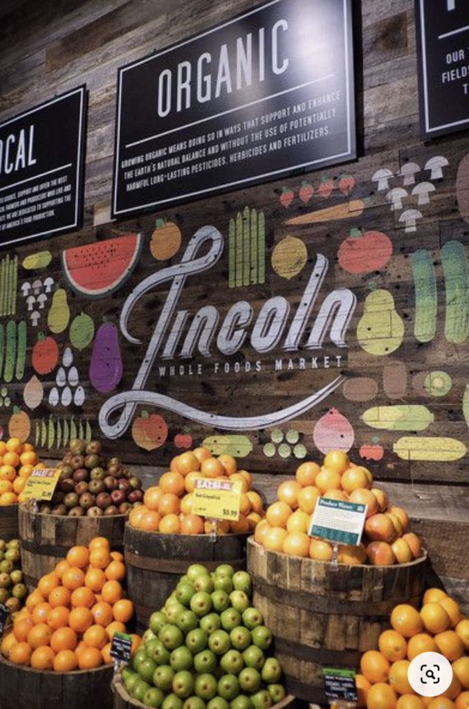
Above: I was drawn to the stylised illustrations and layout used for this board. although the illustrations are simplified versions of the fruit and vegetables, they are instantly recognisable and look good enough to eat.
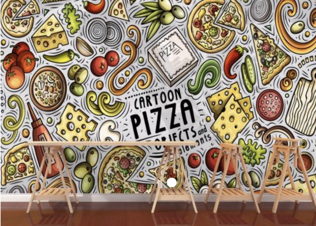
Above: Although this example is not from a supermarket, I thought this illustration was really fun and even though the style is ‘cartoony’ the food still looks appetising and the addition of the lines creates movement and makes it an overall lively and interesting display.
Above: these illustrations are painterly in style and include both whole and segmented fruit. Again, the produce looks appetising and attractive.
I then moved onto looking at specific example from UK supermarkets. Due to the current situation (coronavirus), I chose to use online examples rather than go to the supermarkets in person, which did restrict my sources. As the brief specifies that the supermarket is ‘respected for the quality of its food’ I opted for Waitrose and Marks and Spencer.
Waitrose
The images in the top three rows are from the ‘in season (June)’ section of the website, which was appropriate for this assignment. Although most of the images are photographs, illustrations are used on packaging for some of the ‘essential’ range of products. The style for both is similar in terms of composition, i.e close-up and there is a combination of whole and cut up fruits/vegetables. The freshness is enhanced by the inclusion of the knife. I also noticed the colour palette for the ‘in season’ range is complementary, i.e. red and green. The layout is very clean and minimalistic with white backgrounds so the customer will focus on the products. It all looks very fresh and appetising. The affect of the lighting and the use of moisture adds to the appealing appearance of the food.
Marks and Spencer
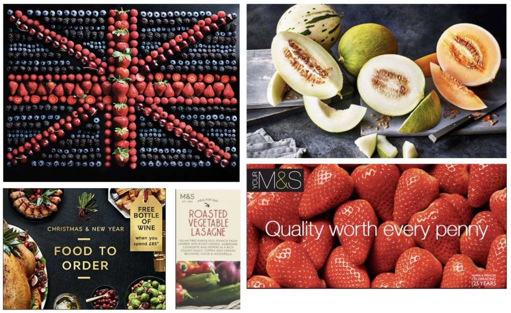
In contrast with Waitrose, the background for these images in dark, which still allows the produce to stand out, perhaps more so than the white, for example, with the melons. Most of the comments from above apply to these examples as well. I thought the use of berries to represent the British flag was an effective and imaginative concept.
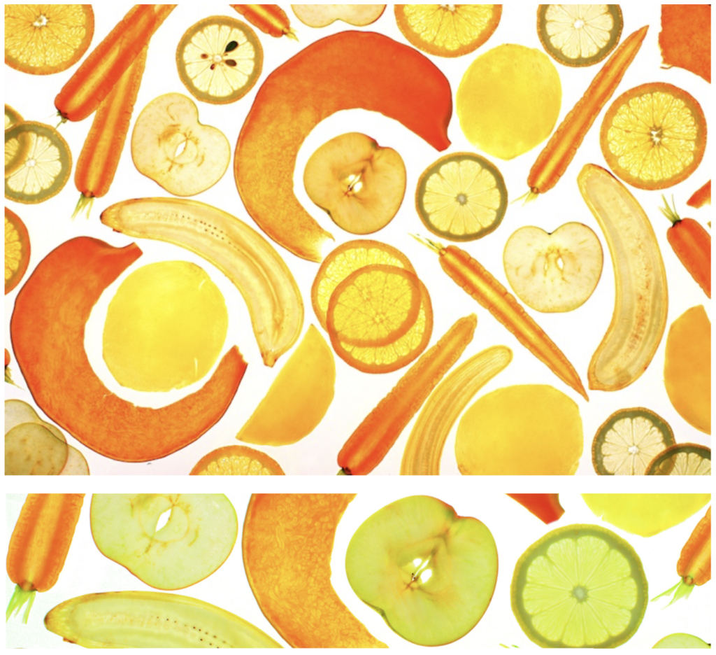
I really liked the images below – they are visually interesting and unusual. I think they would make people take time to consider them and work out what is being represented. It is a simple idea – scanning sliced fruit and vegetables – but really effective, in my opinion. The colour palette is not clashing at all and a white background has been used. The placement of each segment has been carefully thought out to use the space to maximum effect. It has become a pattern.
I then came across the television advert series by Marks and Spencer called ‘Adventures in Food’ and, although not illustrations, they demonstrate how to show food in a creative and lively way. I do not generally like most adverts, but I remembered enjoying these. I thought the colours, movement to the music and imagination were very effective. A few examples can be seen below.
Research: Artists & Illustrators
Next, I researched some artists and illustrators who have used fruit and/or vegetables as the subject matter in their work. I learnt that still-life artists often used the items as hidden symbols, suggesting other meanings.
I started by searching for ‘fruit and vegetables’ on Wikiart, which returned over 600 results. this was useful as it lead me to other avenues for research. Some of the artists I found include:
Thomas Hart Benton – Still Life with Fruit and Vegetables (1914) – this painting instantly reminded me of Cezanne’s artworks, for example, in terms of the composition and perspective.
Carvaggio – Still Life with Fruit on a Stone Ledge (1605-1610) – the use of light and shadow in this painting makes the fruit and vegetables stand out and adds depth. This is the image that informed me of symbolism in many still life paintings. After learning the supposed ‘meaning’ of this painting, the food became less appetising.
Vincent Van Gogh – Still Life with Vegetables and Fruit (1884) – I thought the colours used in this painting are quite gloomy, with various shades of brown involved. The only real brightness is the orange in the centre.
Frans Synders – Still Life with Fruit and Vegetables (1625-1635) – the artist has used some vivid, bright colours against a dark, drab background so the viewer’s eyes are drawn to the fruit and vegetables on display.
Paul Cezanne – Still Life with Apples and Oranges (1899) – I thought the composition and perspective were the most notable features of this painting. The colours are quite restrained.
Adriaen van Utrecht – Fruit Still Life (1650) – this painting reminded me of Caravaggio’s style (above), with its strong contrast of dark and light, allowing the highlighted fruit to stand out from the canvas.
Some contemporary artists/illustrators that I discovered include:
Robert Papp – I was drawn to these paintings. The style is realistic, so when viewed from a distance could be mistaken for photography, but up close you can see the painterly quality. The fruit and vegetables look appetising with bright colours against, mostly, dark and plain backgrounds. Some of the produce has been cut to show the inside.
Danny Smythe – similar to Papp’s work, the style of painting is realistic, but none of the illustrations have a background (the artist is a product illustrator).
Kendyll Hillegas – I thought these illustrations were are interesting to compare to the previous two as they are not ‘photographic’ in style, although still realistic. In my opinion, the fact that you can see the produce is not ‘real’ does not make the fruit/vegetables less appetising in appearance. The illustrations are very vibrant and detailed.
Jessie Ford – in contrast to the other examples, Ford illustrations are graphic in style. This example shows how effective ‘simple’ designs can visually communicate clearly. I enjoyed looking through the different works by this illustrator. There is also a website with artwork specifically for children, which includes more examples of fruit and vegetable designs.
I then watched the documentary Apples, Pears and Paint: How to Make a Still Life (2014) on the BBC iPlayer, which I found very insightful and helped to put some of the examples I had come across into context and I learnt about some new artists as well, including:
Anne Vallayer-Coster (1744-1818) – an artist who specialised in still life and counted Marie Antoinette as a fan. I found it interesting that women were not allowed to draw the human figure (or attend life drawing sessions), which is why such artists became so skilled at painting still life instead.
Jean Baptiste Simeon Chardin (1699 – 1779) – often considered one of the greatest still life painters of all, Chardin focused on the beauty of everyday objects and stillness, which are often overlooked by most people.
Ori Gersht (1967) – this artist explores the relationship between paintings and photography/film. The two works that were relevant in terms of this assignment were Big Bang (2006) and Pomegranate (2006). The latter was a take on the painting Still Life with Quince, Cabbage, Melon and Cucumber (c.1602) by Juan Sanchez Cotan, which Gersht describes as ‘chilling’. I was reminded of the M&S Adventures in Food adverts (above) in terms of explosions of colour.
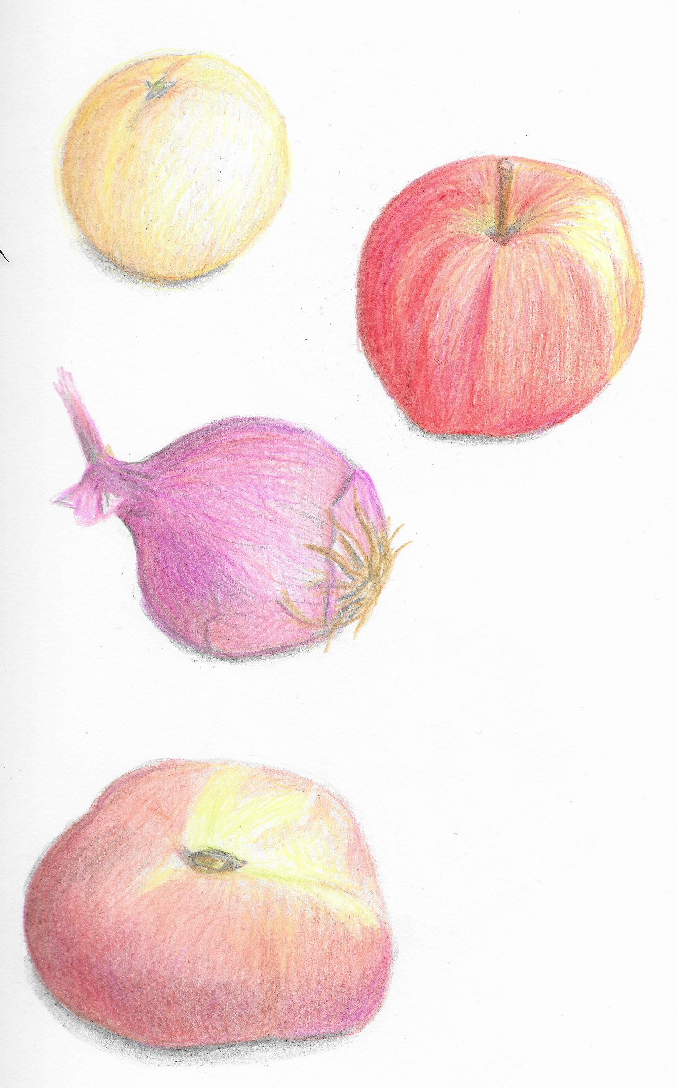
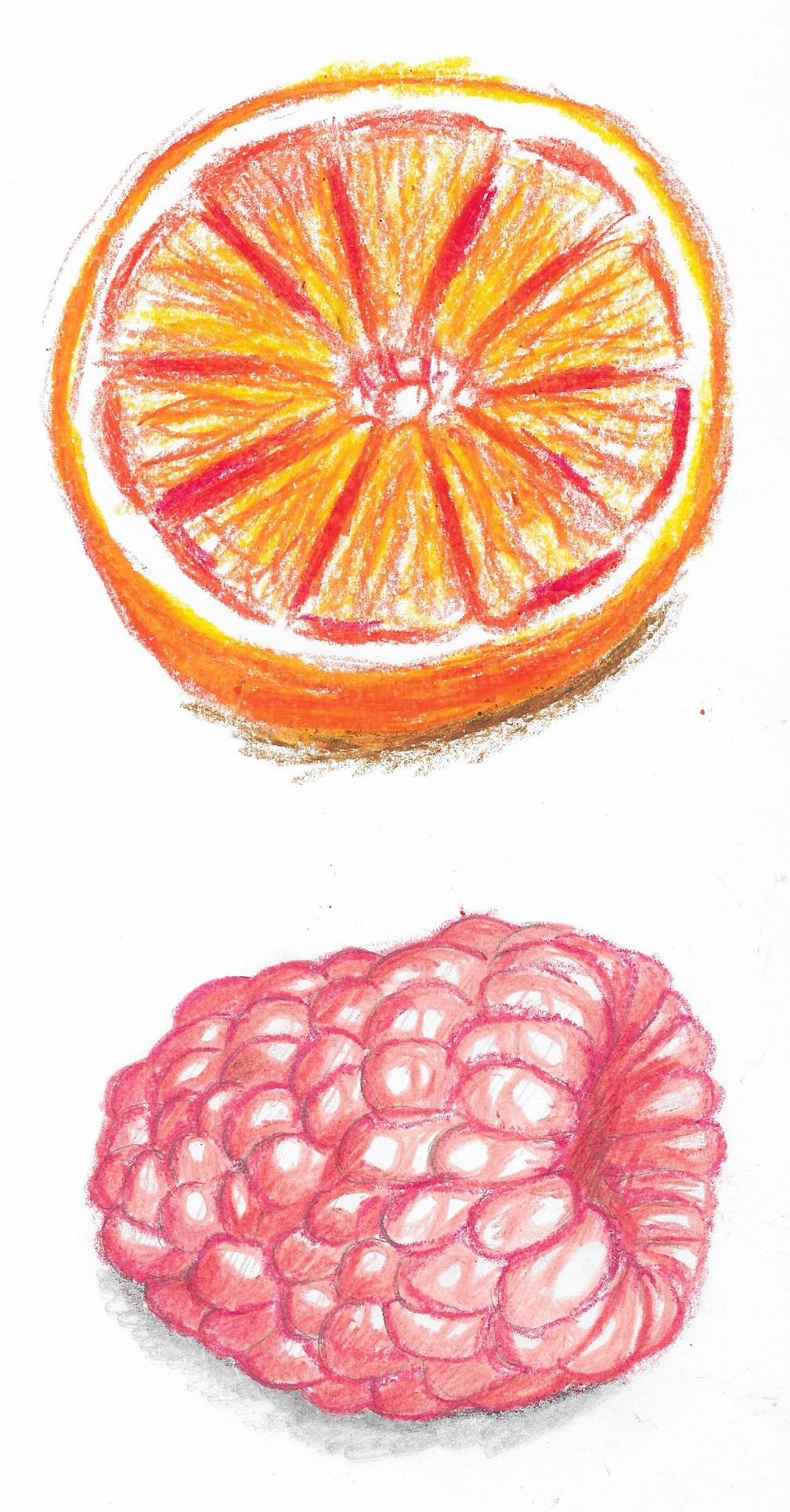
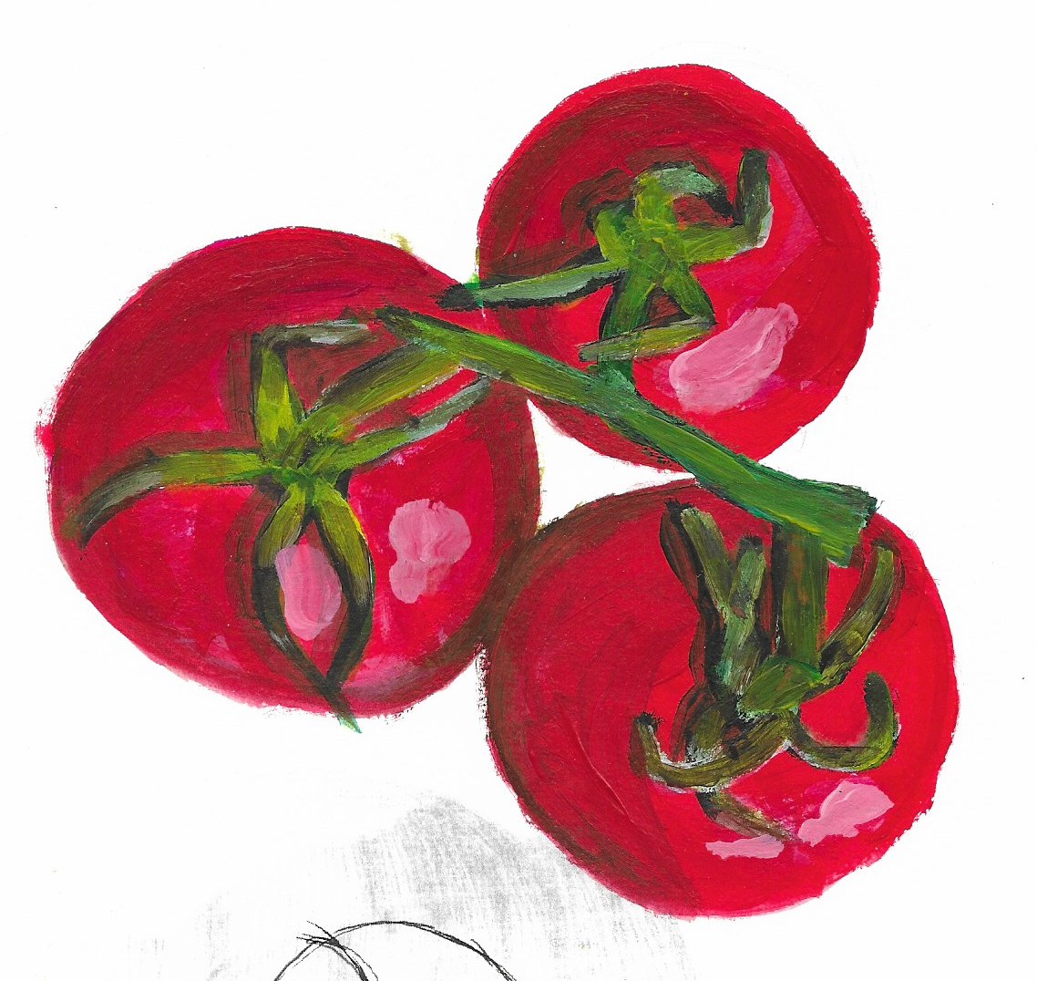
Observational Drawings
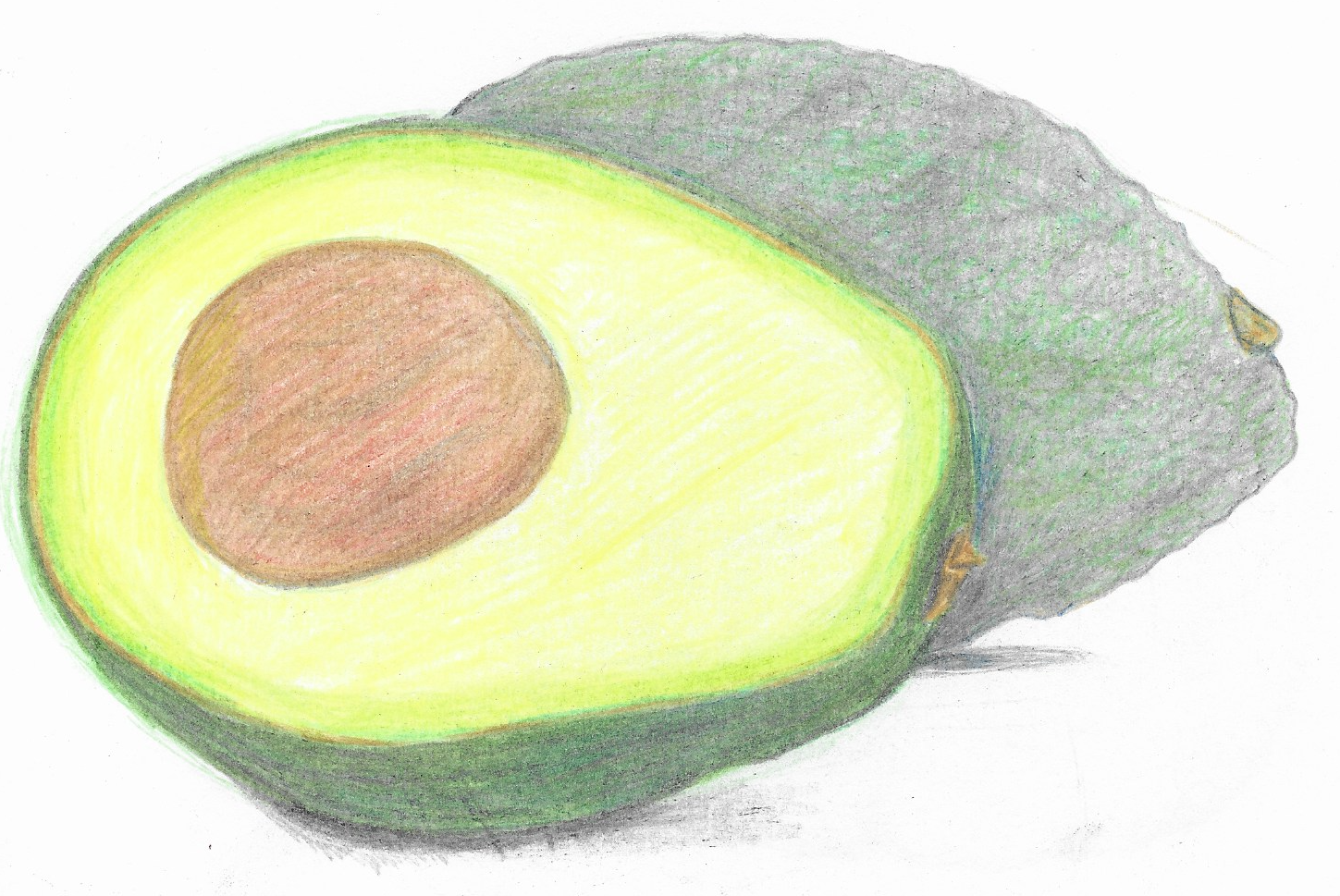
I then started doing some observational illustrations of fruit and vegetables. These were either from the ‘real thing’ or from reference photographs that I found on the website Pixabay.
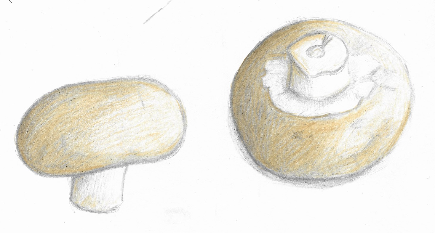
I always feel ‘safer’ doing an outline in pencil, but wanted to try and break out of this habit. I felt the drawings below were much more successful because of this.
I then tried using oil pastel on its own and combined with colouring pencils (below), but although the latter was OK, I did not like the pastels on their own.
I tried using acrylics to paint some cherry tomatoes, but I was not that keen on the outcome. I have not done any painting for a very long time and decided I would need to practice this in order to produce anything worthwhile.
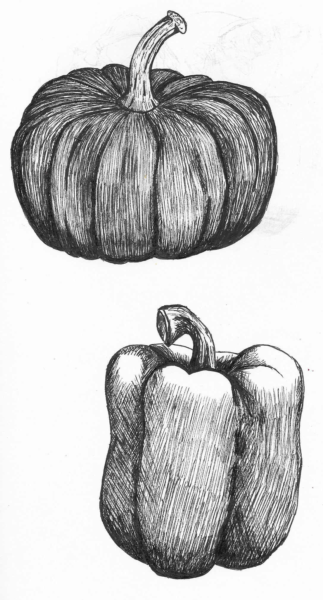
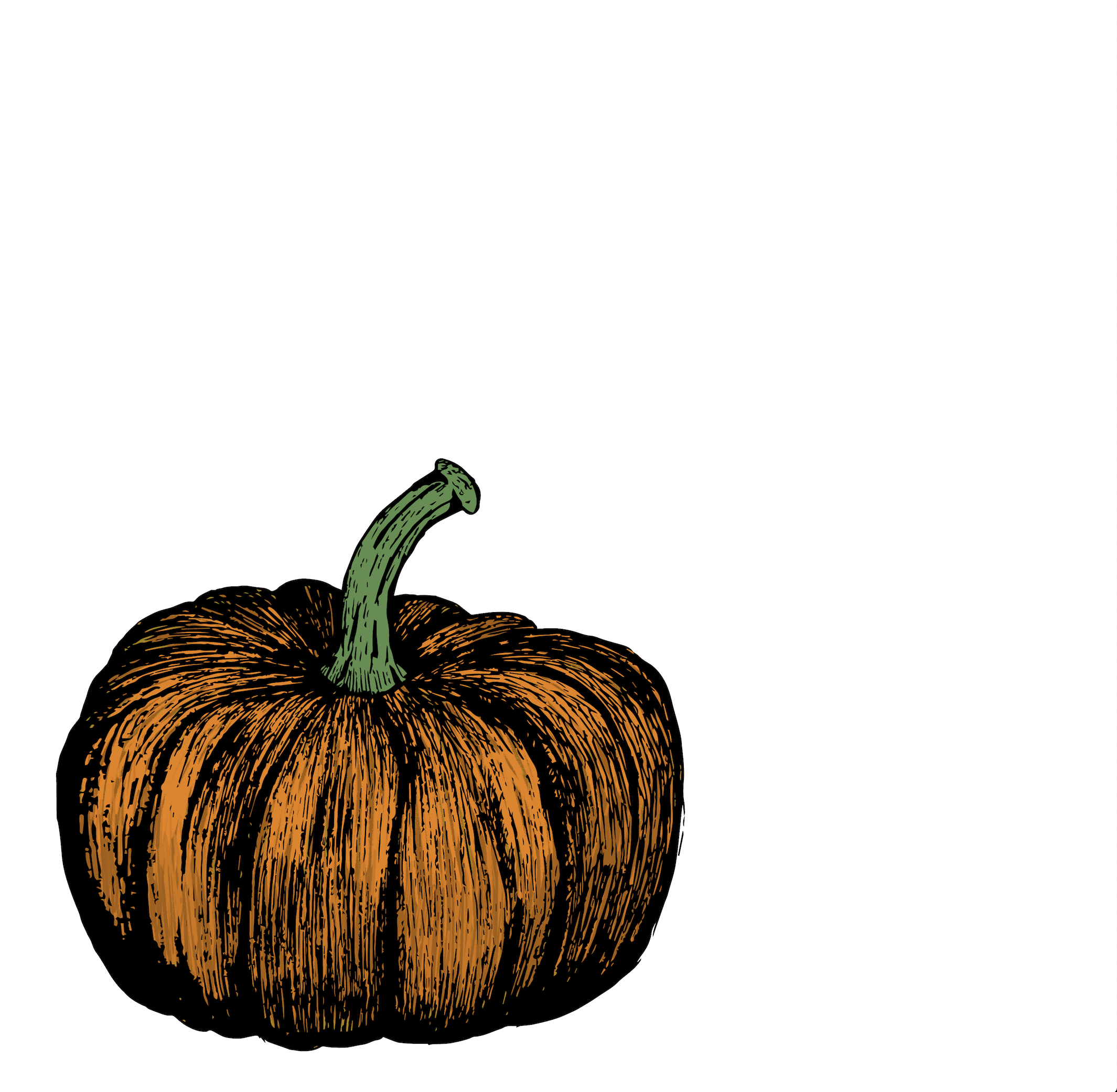
I have become very keen on ink drawings/etchings and wanted to have a go at replicating this style for this assignment. I did not use any pencil outline for these, just went straight in with the fineliner, which was a real achievement for me! I particularly liked the pumpkin and was pleasantly surprised with the result.
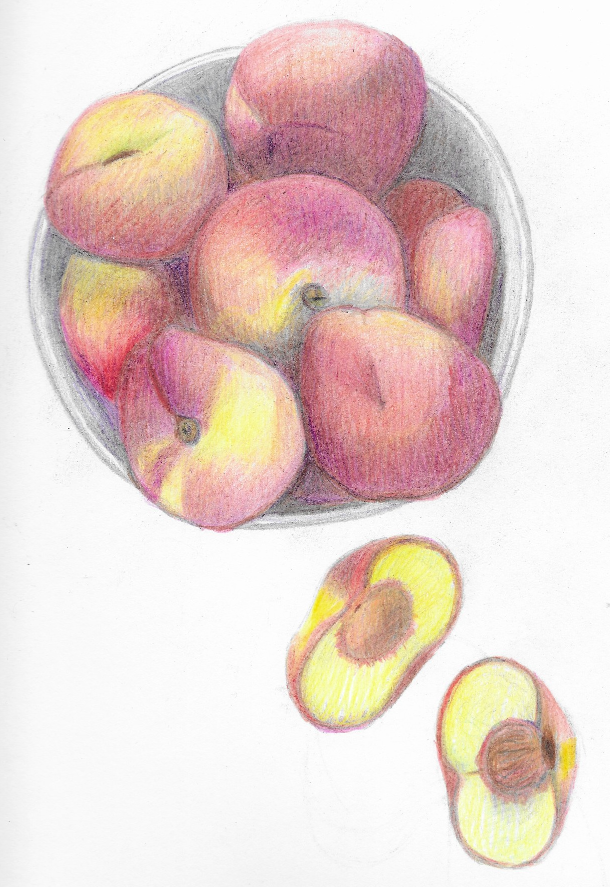
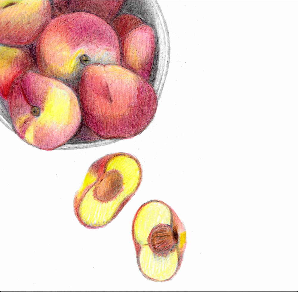
I then went back to colouring pencils, trying to really focus on the colours and how they blend together. I want to improve my use of colour so this was a good opportunity to observe how nature does it.
Although I was fairly pleased with the peaches (below) , I thought the bowl was not very good at all.
Mind Mapping & Rough Ideas
Next, I created some mind maps for the seasons Summer and Autumn as well as the colours I associated with each.
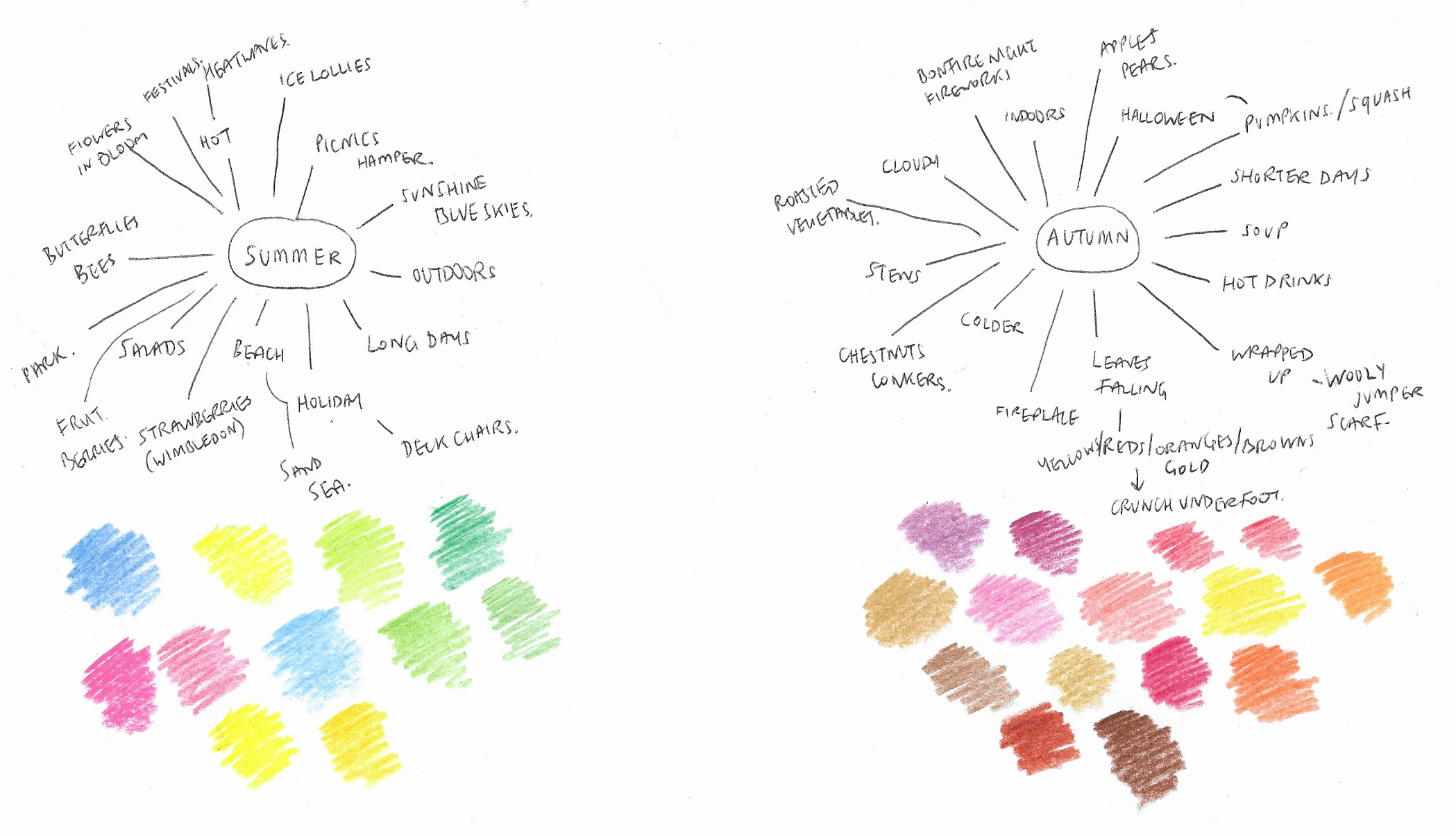
I also tried to devise a few rough, possible compositions:
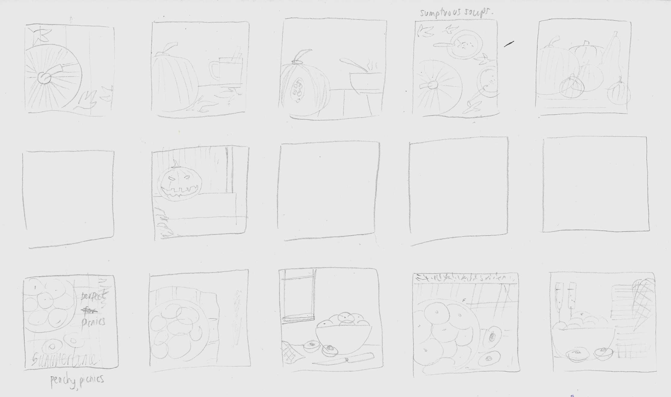
Working on Final Illustrations
My first attempt utilised the doughnut peaches in a bowl, which I placed in Photoshop. I tried to remove the white background from the scanned in image, but found it was quite hard to do. This meant I could only use a black fill for the background with certain blend modes as the edging around the drawings was not clean enough. This restricted my flexibility for this design. I did think the final result was OK and reminded me of some of the supermarket examples I had come across, although they used photography rather than illustrations. However, it did not have any indication of it being for the summer season.
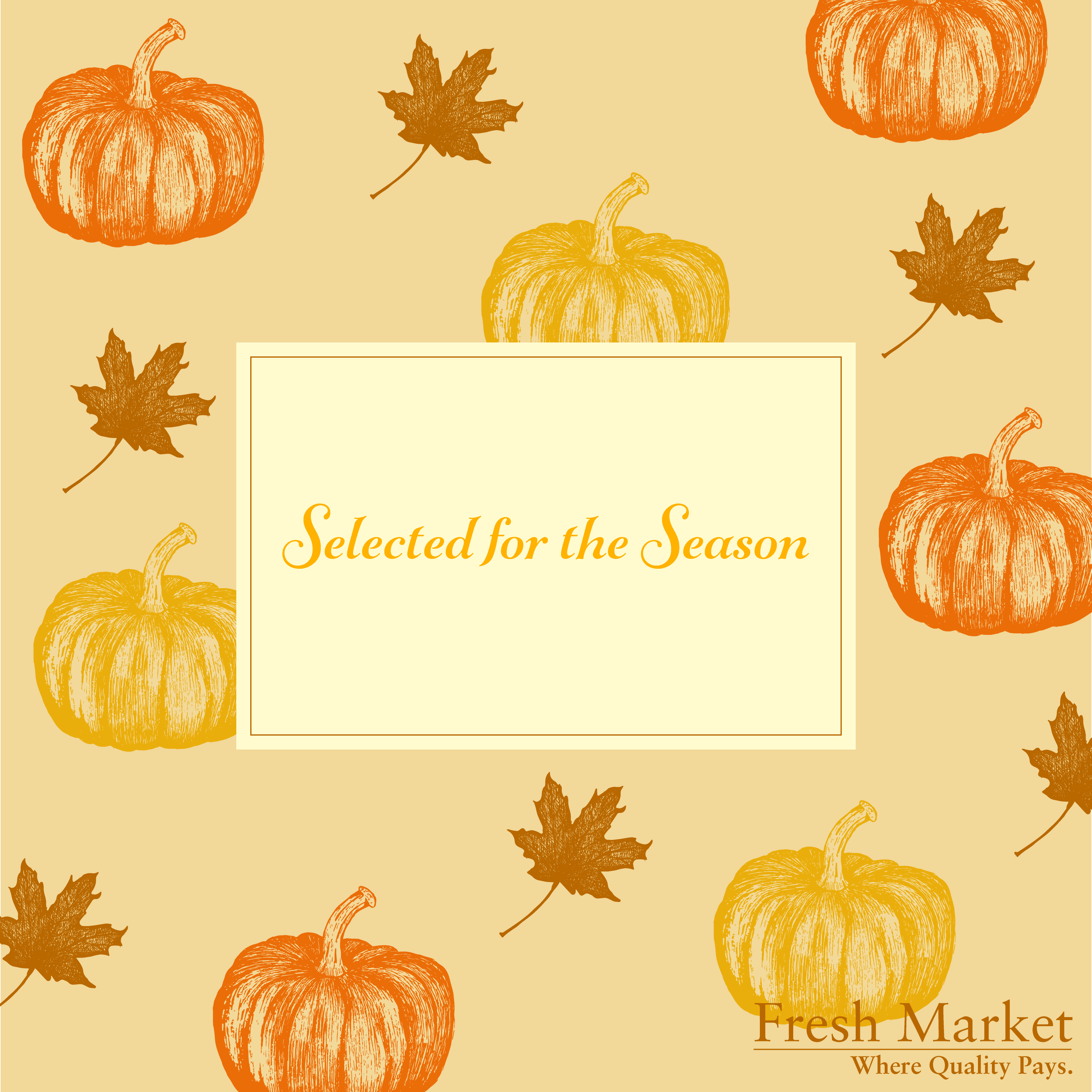
I then decided to try and do something with the ink drawings I did as I was quite happy with how the pumpkin turned out. I used Illustrator’s Image Trace tool to create and outline version of the pumpkin. I then transferred this into Photoshop and added some colour. Although I thought this was quite successful as an illustration of a pumpkin, I was unsure how to develop it further and I wanted to try something different for this assignment.
Returning to Illustrator, I played around with colours for the pumpkin outlines and then had the idea to make a pattern.
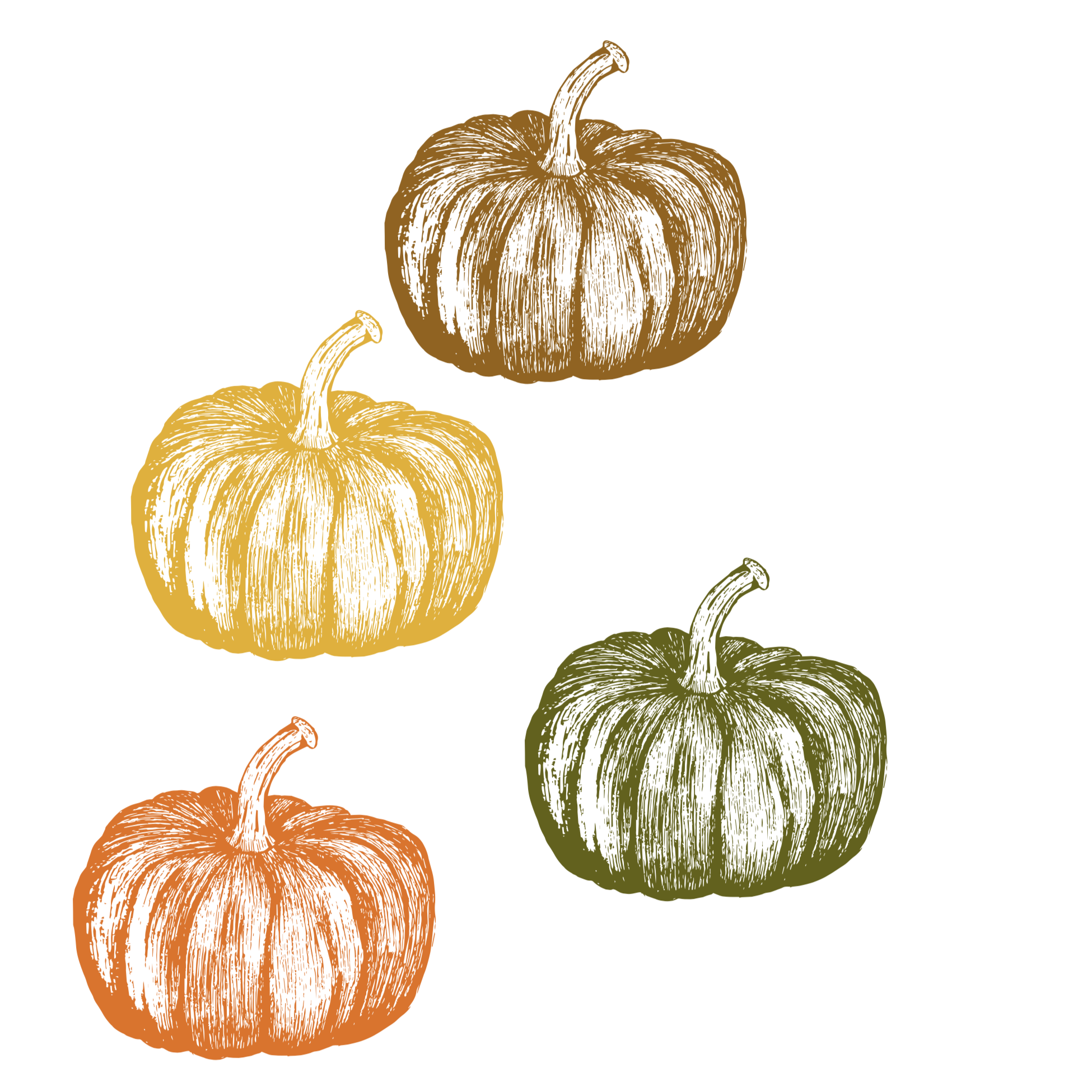
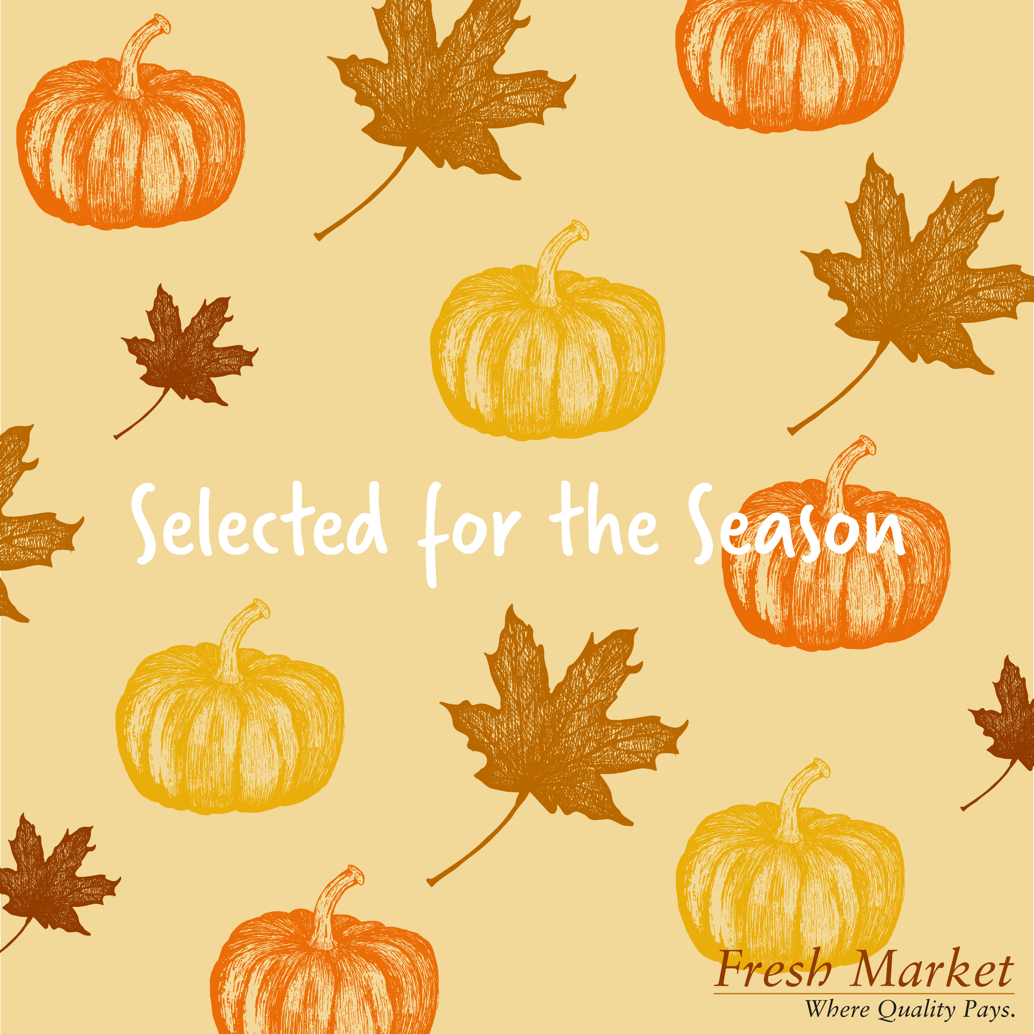
I decided to combine the pumpkins with an autumn leaf in the pattern. I created another ink drawing from observation and scanned this into Illustrator.

I then experimented with positioning and sizing within the 12×12 inch art board.
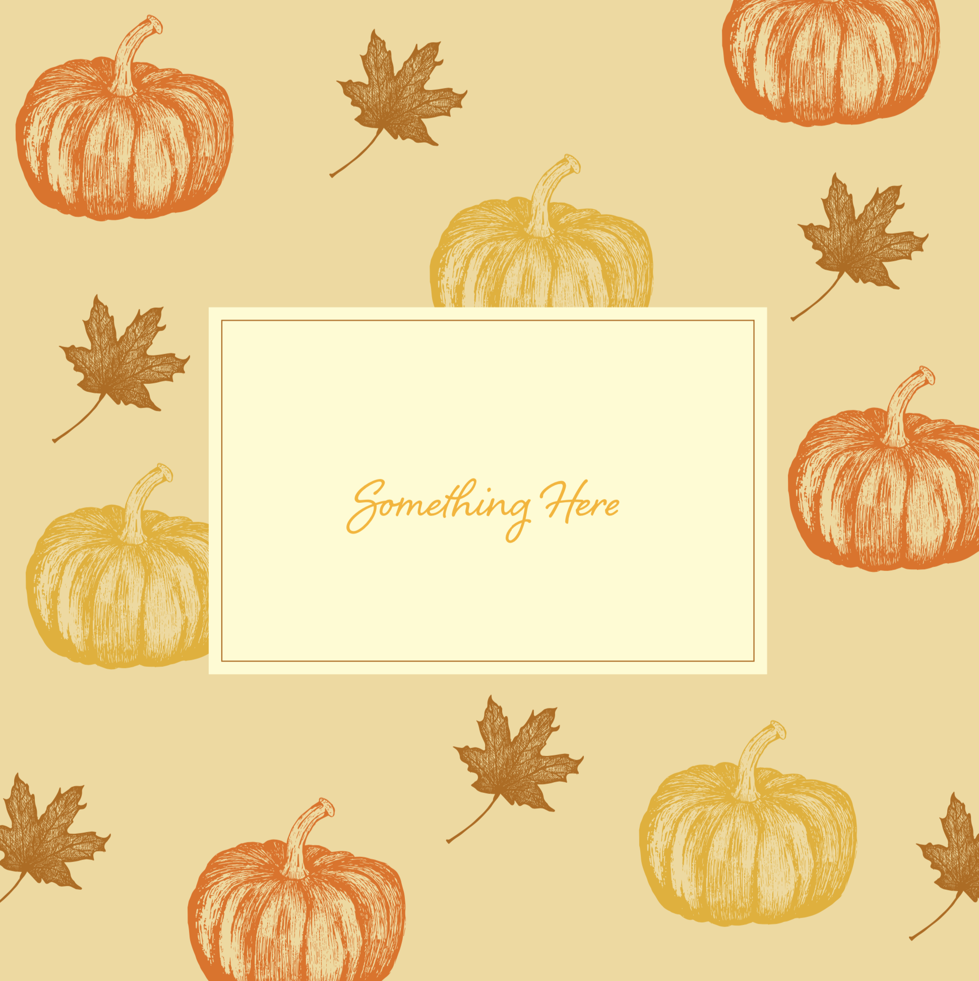
I was quite pleased with the result of this design as it was a style that I have not tried before and I thought it adequately reflected the season of autumn. I also felt the design reflected the notion of quality and would sit well in a ‘more upmarket’ food store.
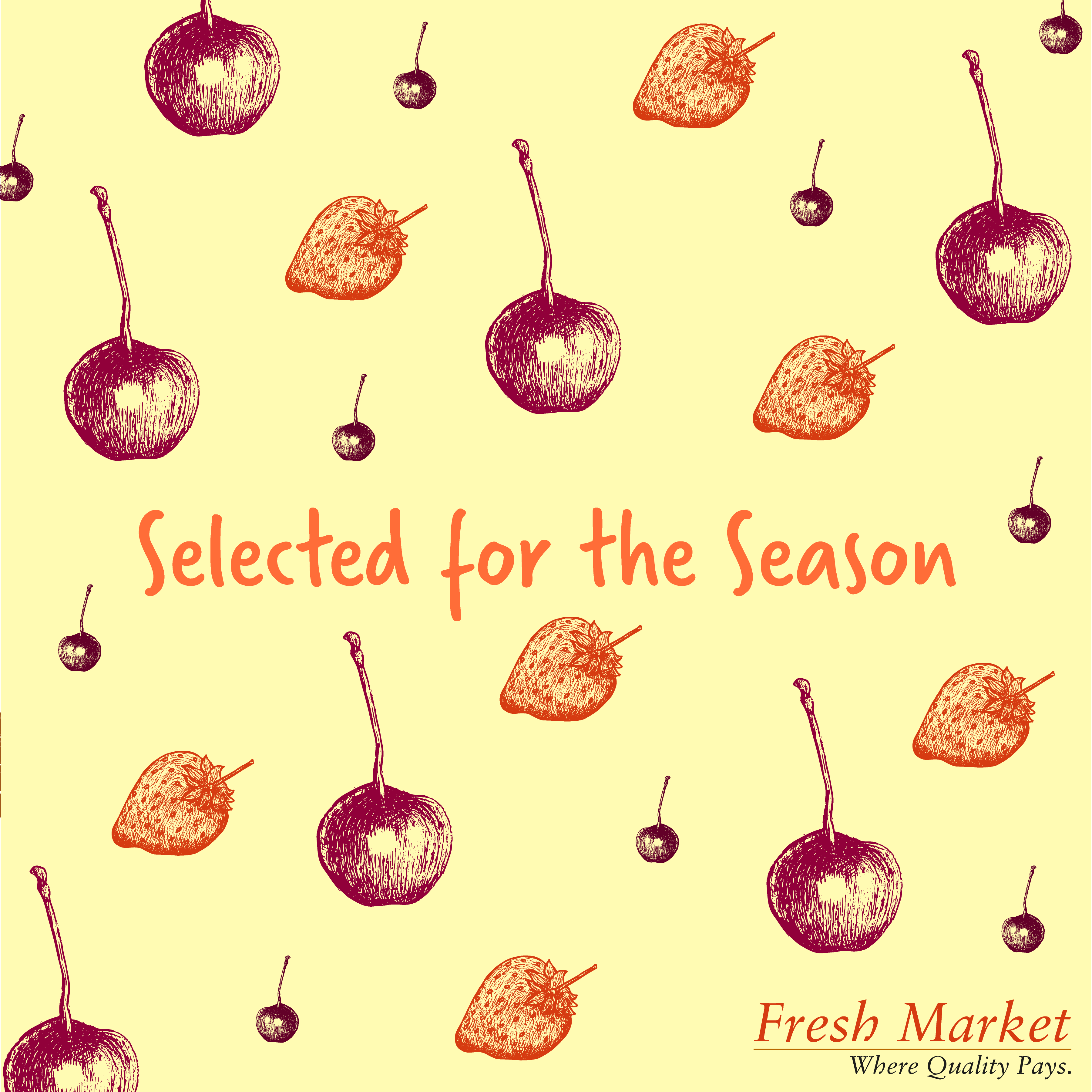
For the summer version, I focussed on some berries again using the black ink fine liner, some of which were more successful than others. I scanned them into Illustrator and used the Image Trace tool as before.


I selected the strawberry and cherry as I felt they were better than the other two.
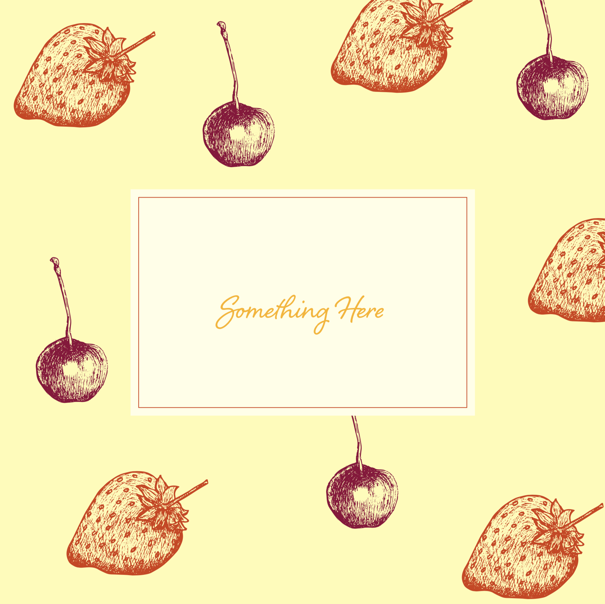
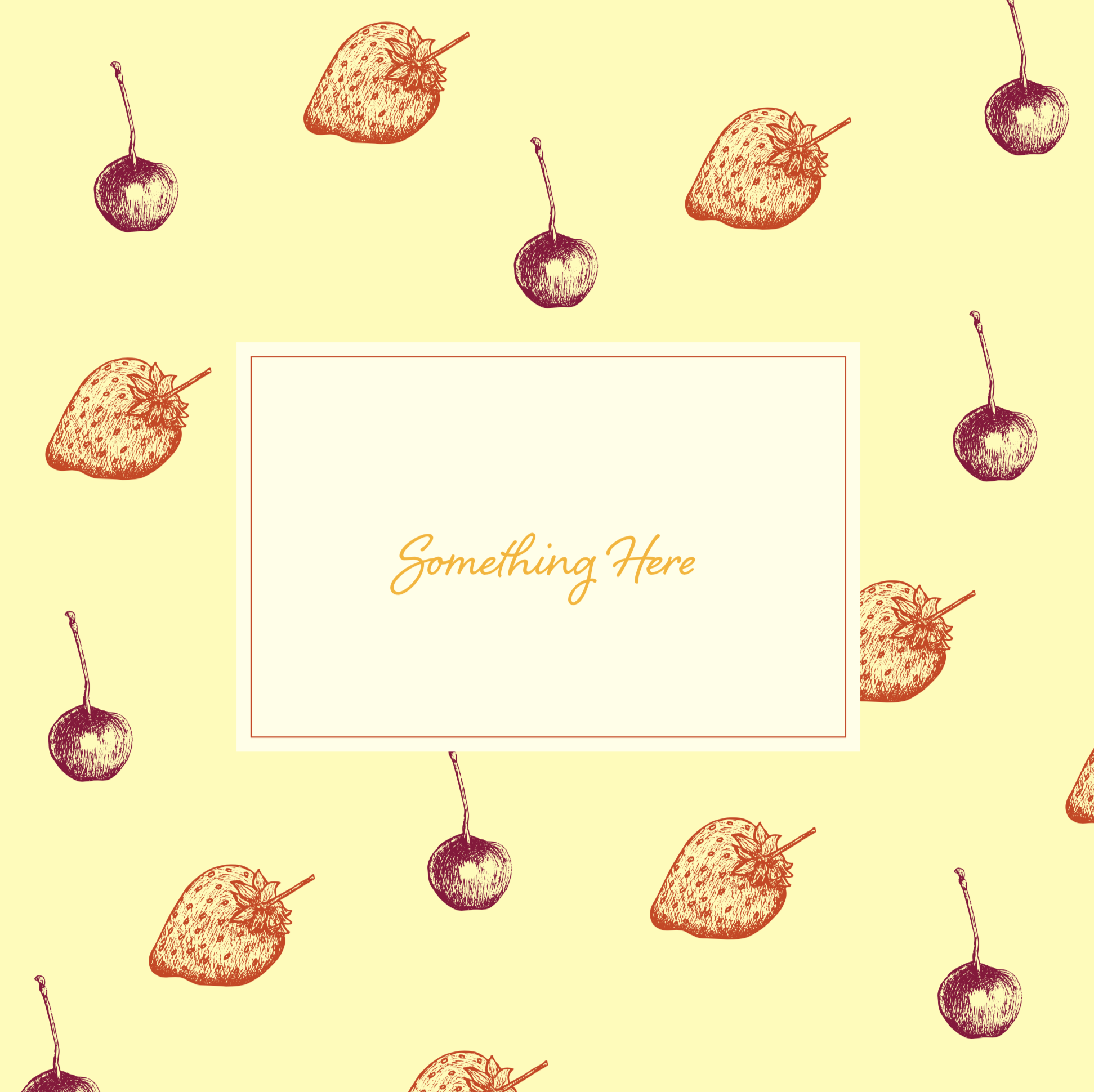
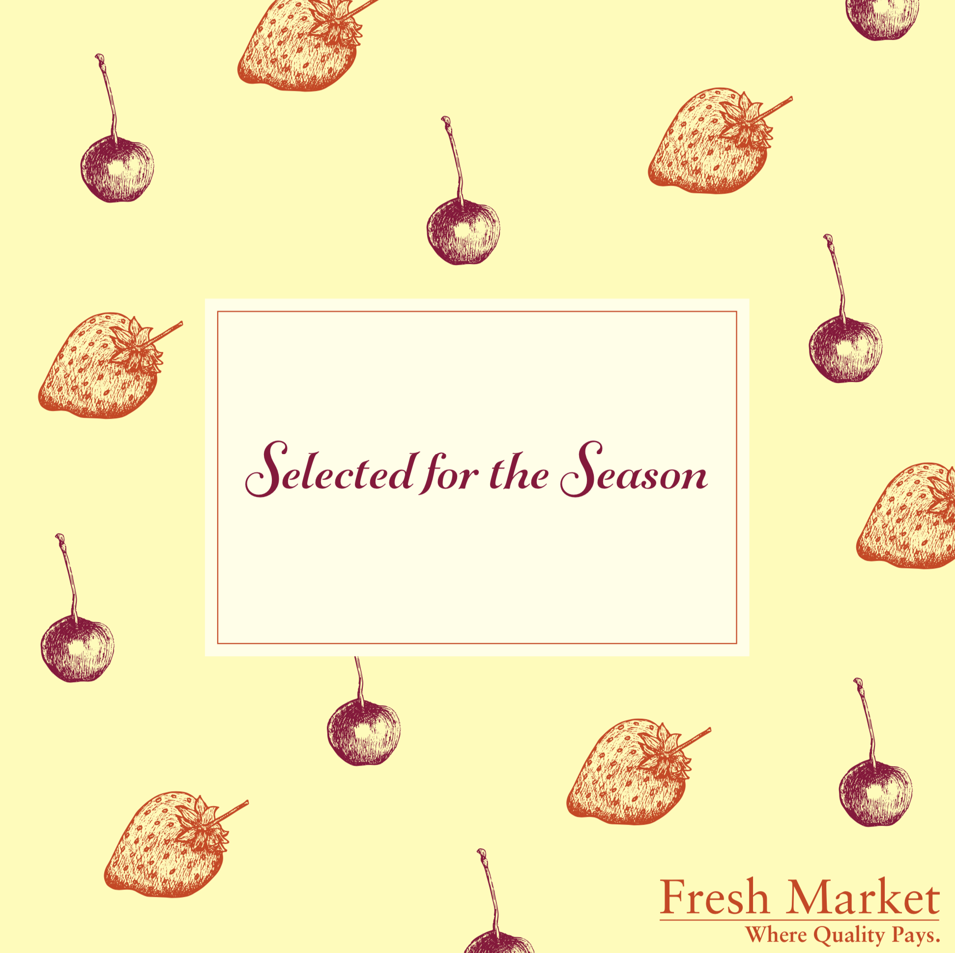
I was quite happy with the result for the summer version, but found it harder to get a balance in the composition. It helped when I scaled things down.
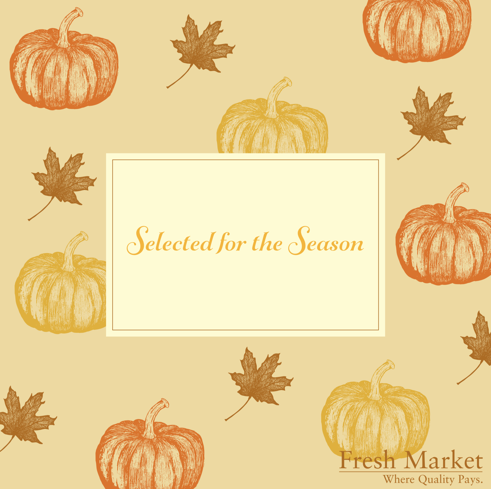
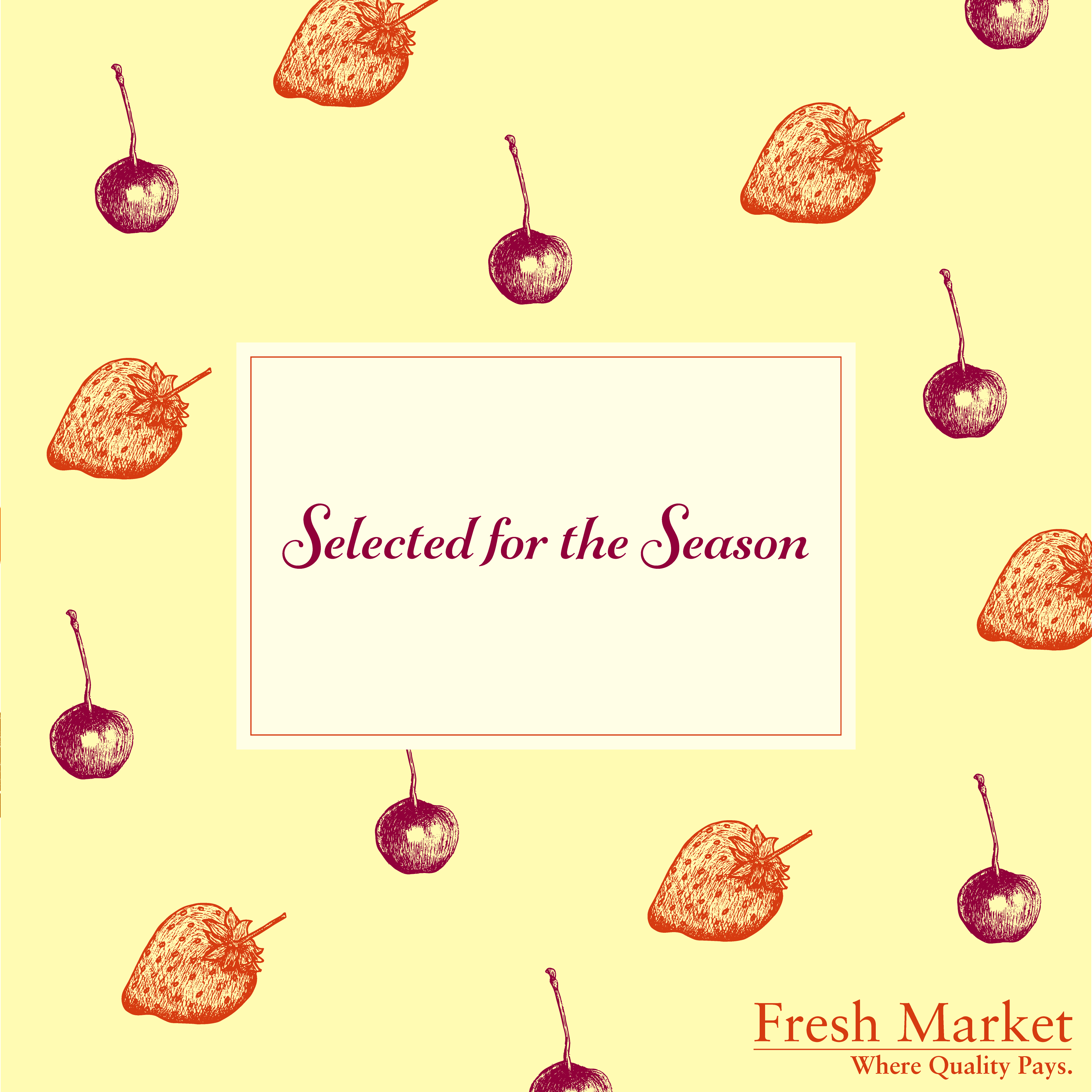
The final two display boards can be seen below.
Summary
I think the Autumn design was much more effective, visually-pleasing and balanced of the two. I felt the colours and layout worked well. It also communicates the season of autumn. I thought both designs may not work very well as point of display boards (which generally seem to contain photography), but perhaps would be better suited to packaging for select products. They reminded me of wrapping paper, which might not be a good thing…?
This assignment was extremely beneficial for me as I could work on my observational drawing and not always using pencil for drafts was a step in the right direction for me. I am not a fan of Photoshop, probably because I have not used it enough, but I found this fact quite restrictive when working on my initial ideas. I also started to develop my use of colour, which has always been something I am quite nervous of. I found the research of the artists/illustrators useful and learnt a great deal from watching the BBC documentary about still life. Although the end result may not fit the original brief exactly in terms of being effective point of display boards, I felt the process of getting to the final designs was worthwhile and challenged me.
Revised Version After Tutor Feedback
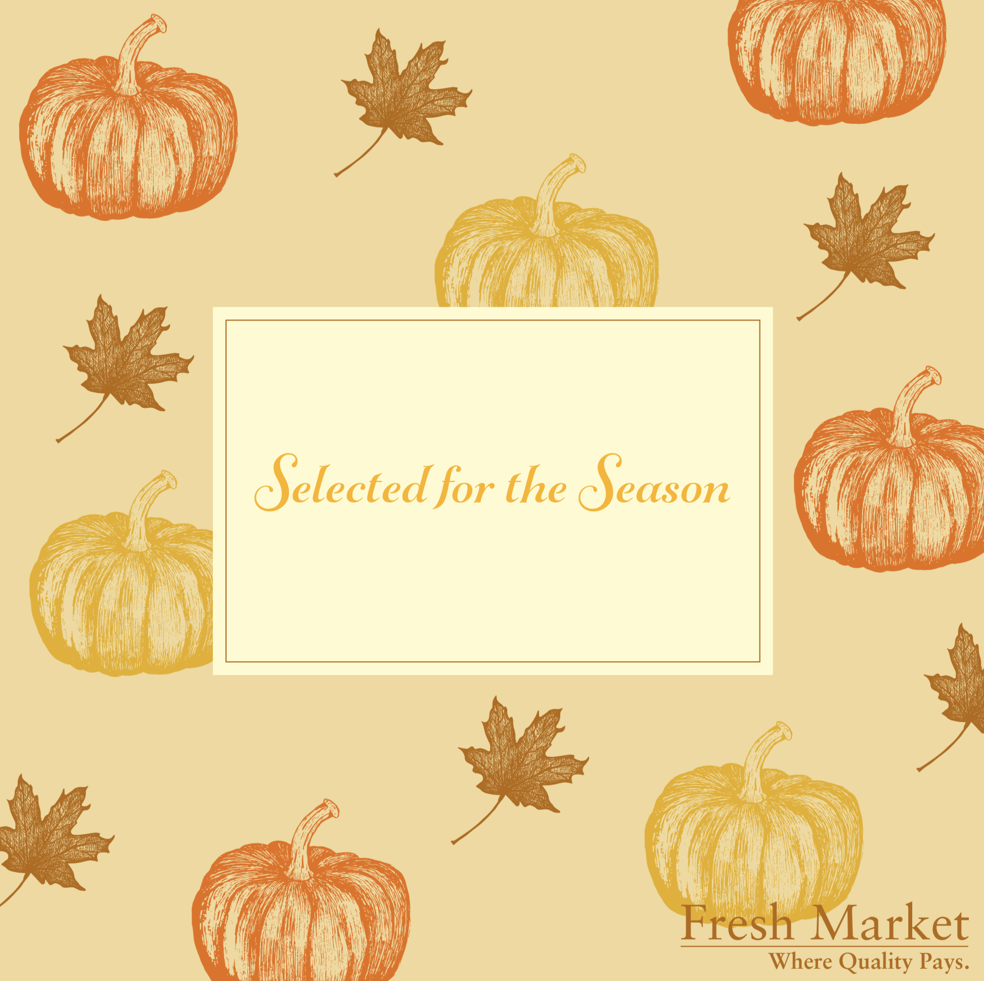
Following feedback from my tutor I decided to try and implement some of the suggestions made to make a less formal and more contemporary design, which involved:
- Removing the square boxes.
- Changing the font choice from serif to san serif or handwritten.
- Experimenting with scale and repetition.
The results can be seen below:
I did feel these were an improvement on my original attempts. However, the font choice, although certainly more contemporary, still does not seem quite right and perhaps a hand-rendered style (as also suggested by my tutor) would have served better.
The balance of the composition is still not quite right and the autumn version is the better of the two, in my opinion. I would also liked to have attempted making ‘proper’ repeat patterns, with corresponding fruits cut off at the edges in appropriate positions.
Overall, I preferred these updated versions to my original attempts.
Resources
Arty Factory, (n.d.). Still Life Paintings by Chardin. [online] Available at: https://artyfactory.com/art_appreciation/still_life/chardin.htm [Accessed 5 July 2020].
Fine Art America, (n.d.). Danny Smythe Art Collections. [online] Available at: https://fineartamerica.com/profiles/danny-smythe?tab=artworkgalleries&artworkgalleryid=263538 [Accessed 5 July 2020].
Fine Art America, (n.d.) Irina Sztukowski Art Collections. [online] Available at: https://fineartamerica.com/profiles/irina-sztukowski?tab=artworkgalleries&artworkgalleryid=563324 [Accessed 5 July 2020].
Fine Art America, (n.d.) Maria Hunt Art Collections. [online] Available at: https://fineartamerica.com/profiles/maria-hunt?tab=artworkgalleries&artworkgalleryid=428993 [Accessed 5 July 2020].
Fine Art America, (n.d.). Patricia Awapara Art Collections. [online] Available at: https://fineartamerica.com/profiles/patricia-awapara?tab=artworkgalleries&artworkgalleryid=111274 [Accessed 5 July 2020].
Fine Art America, (n.d.). Robert Papp Art. [online] Available at: https://fineartamerica.com/profiles/robert-papp [Accessed 6 July 2020].
Fine Art America, (n.d.). Tastes of Tuscany Painting by Bonnie Rinier. [online] Available at: https://fineartamerica.com/featured/tastes-of-tuscany-bonnie-rinier.html [Accessed 6 July 2020].
Fine Art America, (n.d.). Toni Grote Art Collections. [online] Available at: https://fineartamerica.com/profiles/toni-grote?tab=artworkgalleries&artworkgalleryid=3406 [Accessed 6 July 2020].
Ford, J. (n.d.). Jessie Ford. [online] Available at: http://www.jessieford.co.uk [Accessed 6 July 2020].
Frith, M. (n.d.). Michael Frith. [online]Available at: http://michaelfrith.com/food.html [Accessed 6 July 2020].
Gersht, O. (n.d.). Ori Gersht. [online] Available at: https://www.origersht.com [Accessed 6 July 2020].
Hillegas, K. (n.d.). Kendyll Hillegas. [online] Available at: http://www.kendyllhillegas.com/food-illustration-fruit/ [Accessed 5 July 2020].
Libers, A. (2014). 10 In-Season Fruits & Veggies (& Why You Need To Eat Them). [online] Refinery29. Available at: https://www.refinery29.com/en-us/best-vegetables#slide-1 [Accessed 6 July 2020].
Marks and Spencer, (n.d.). Marks and Spencer. [online] Available at: https://www.marksandspencer.com [Accessed 5 July 2020].
Marks and Spencer, (n.d.). Marks and Spencer – Corporate – Food. [online] Available at: https://corporate.marksandspencer.com/aboutus/food [Accessed 5 July 2020].
Norton Simon Museum, (n.d.). Still Life with Fruit and Vegetables. [online] Available at: https://www.nortonsimon.org/art/detail/F.1973.16.P/ [Accessed 5 July 2020].
Pound, C. (2018). Secret symbols in still-life painting. [online] BBC Culture. Available at: https://www.bbc.com/culture/article/20180318-secret-symbols-in-still-life-painting [Accessed 6 July 2020].
Sainsbury’s, (nd.). Sainsbury’s. [online] Available at: https://www.sainsburys.co.uk [Accessed 5 July 2020].
Vincent van Gogh Museum, (n.d.). Still Life with a Profile of Mimi. [online] Available at: https://www.vangoghmuseum.nl/en/collection/s0510S2005 [Accessed 6 July 2020].
Vincent van Gogh Museum, (n.d.). Still Life with Vegetables and Fruit. [online] Available at: https://www.vangoghmuseum.nl/en/collection/s0070V1962?v=1 [Accessed 5 July 2020].
WikiArt, (n.d.). Anne Vallayer Coster. [online] Available at: https://www.wikiart.org/en/anne-vallayer-coster/all-works#!#filterName:all-paintings-chronologically,resultType:masonry [Accessed 6 July 2020].
WikiArt, (n.d.). Fruits and Vegetables. [online] Available at: https://www.wikiart.org/en/tag/fruits-and-vegetables [Accessed 5 July 2020].
WikiArt, (n.d.). Still Life with Fruit and Vegetables, 1914 – Thomas Hart Benton. Available at: https://www.wikiart.org/en/thomas-hart-benton/still-life-with-fruit-and-vegetables [Accessed 6 July 2020].
Wikipedia, (n.d.). Adriaen van Utrecht. [online] Available at: https://en.wikipedia.org/wiki/Adriaen_van_Utrecht [Accessed 5 July 2020].
Wikipedia, (n.d.). Still life paintings by Vincent van Gogh.[online] Available at: https://en.wikipedia.org/wiki/Still_life_paintings_by_Vincent_van_Gogh_%28Netherlands%29 [Accessed 6 July 2020].
Wikipedia, (n.d.). Still Life with Fruit Carvaggio. [online] Available at: https://en.wikipedia.org/wiki/Still_Life_with_Fruit_%28Caravaggio%29 [Accessed 6 July 2020].