Brief
Take another object and write a list of a words to describe it. In this drawing you are not describing its function or purpose but its particular qualities. Is it shiny, hard, soft, fluffy, delicious or antique? These objectives are subjective – there is no wrong or right – whichever words you select will be appropriate because they reflect your interpretation and understanding of the object.
Choose one word from your list as the basis of your idea. You don’t need to look at your object; at this stage you are exploring your idea visually. Make a moodboard and include collage and found materials. Cut images from magazines based on their visual properties.
Photocopy, trace, or scan and print your line drawing. Choose a paper with a texture or surface which best relates to the idea you had about your object.
Use colours, textures and materials identified during your exploration with your moodpboard to translate the line drawing into an image which communicates the adjective which you associated with your object.
Use them to colour, or fill your line drawing. You are still attempting to describe the object, but focusing and exaggerating the quality that you have selected to identify.
Before starting the exercise I researched the use of texture in art. Some of the artists I found and why their work appealed to me are listed below:
- Anslem Kiefer – with regards to this exercise I was particularly interested in the inclusion of materials such as broken glass (!), lead flowers and plants in his paintings.
- Marcia Gygli King – the thick application of paint gives texture and depth.
- Vincent Van Gogh – as above, along with the direction of application of the paint (e.g. swirling).
- Justin Gaffrey – the extremely thick application of acrylic paint makes his work sculptural.
- Salvador Dali – that this particular work included paper mâché.
- Pieter Claesz – I just do not understand how people can paint like this!
- Albrecht Dürer – as above.
- Vija Celmins – the technique of drypoint to create such depth and movement.
- Samuel Silva – the fact that this these have been created with just ball point pens is unbelievable to me.
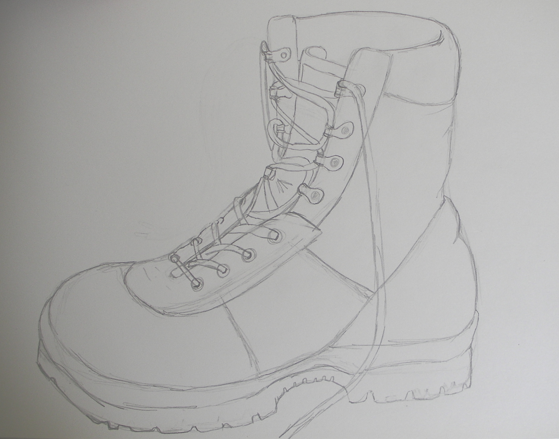
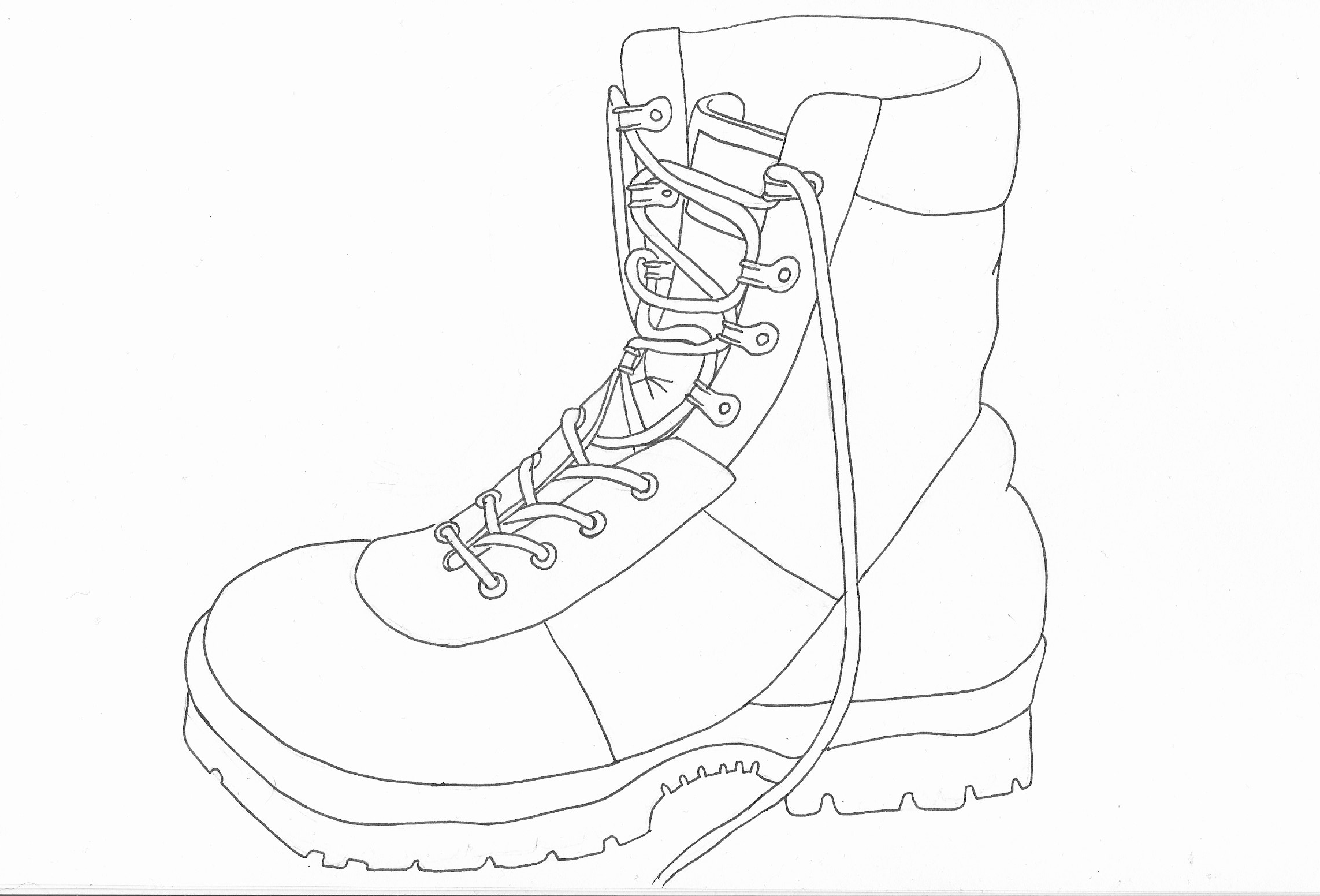
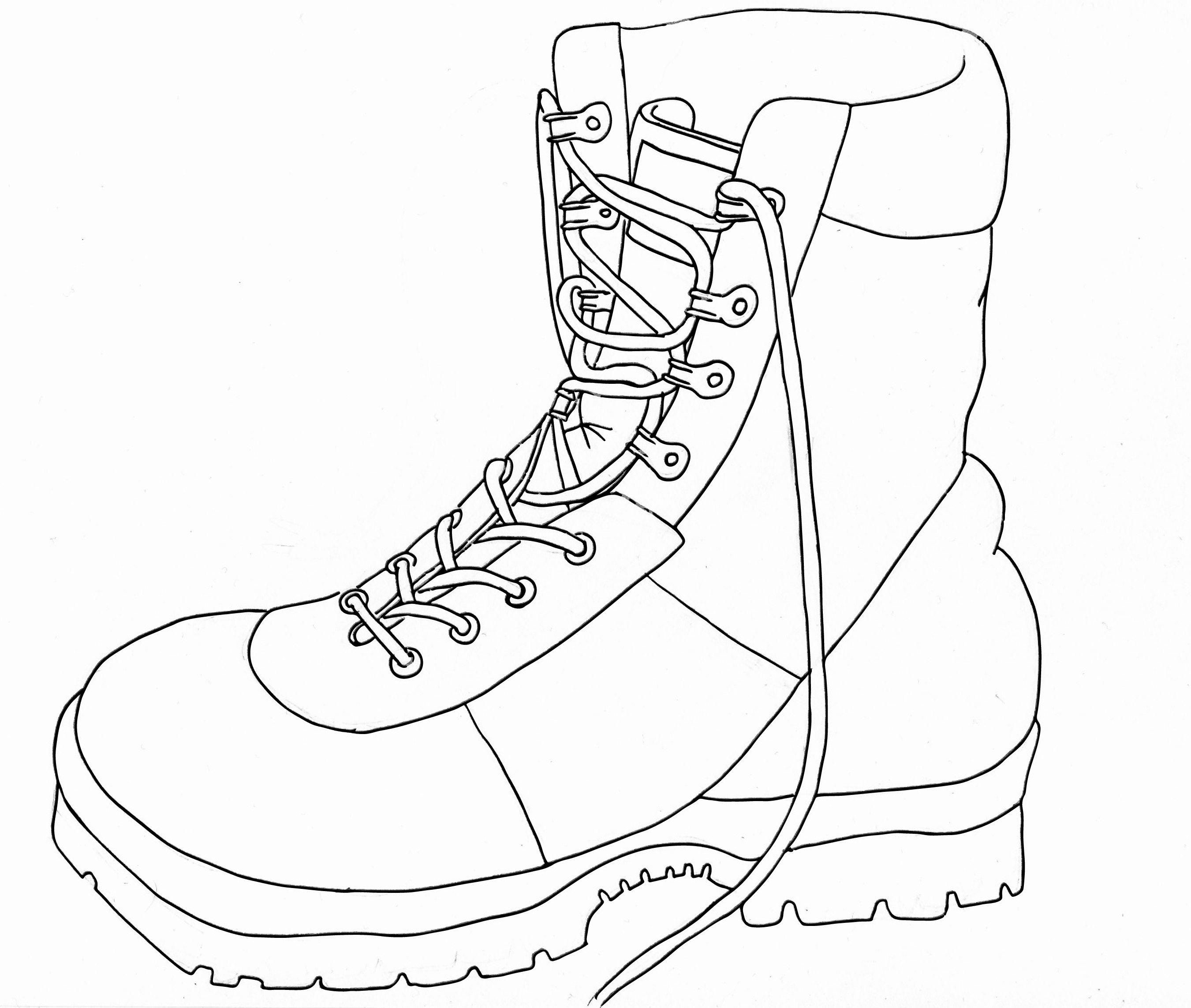
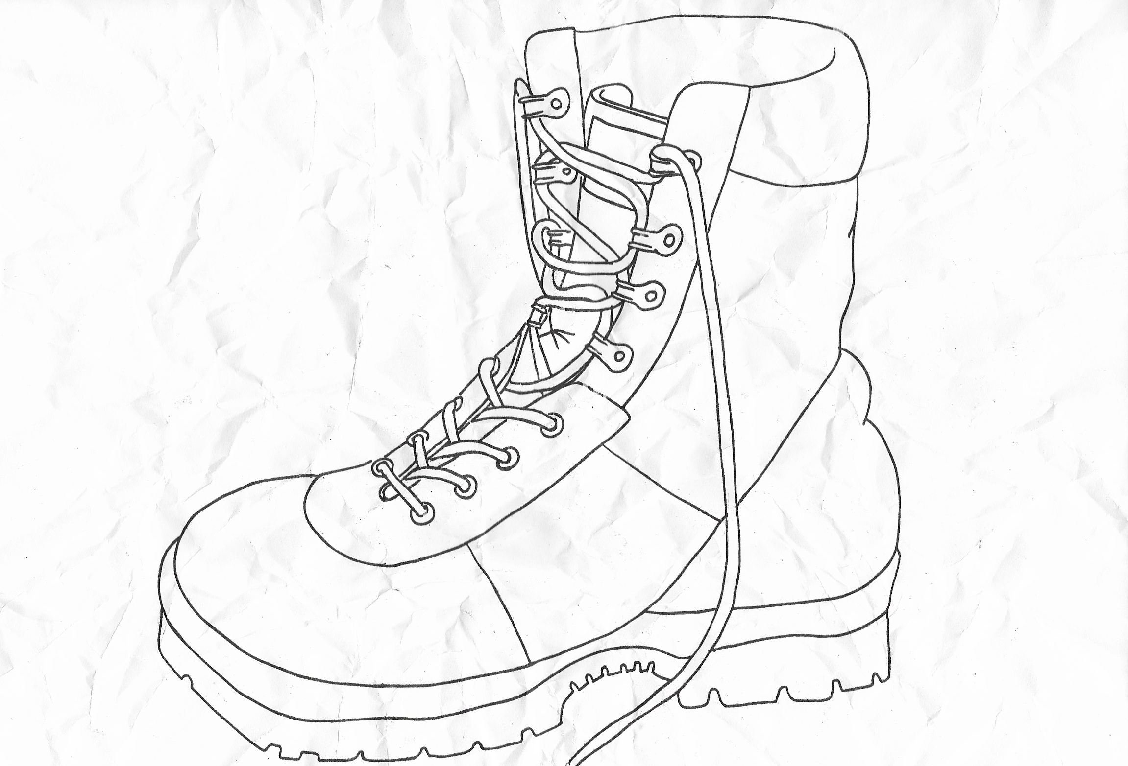
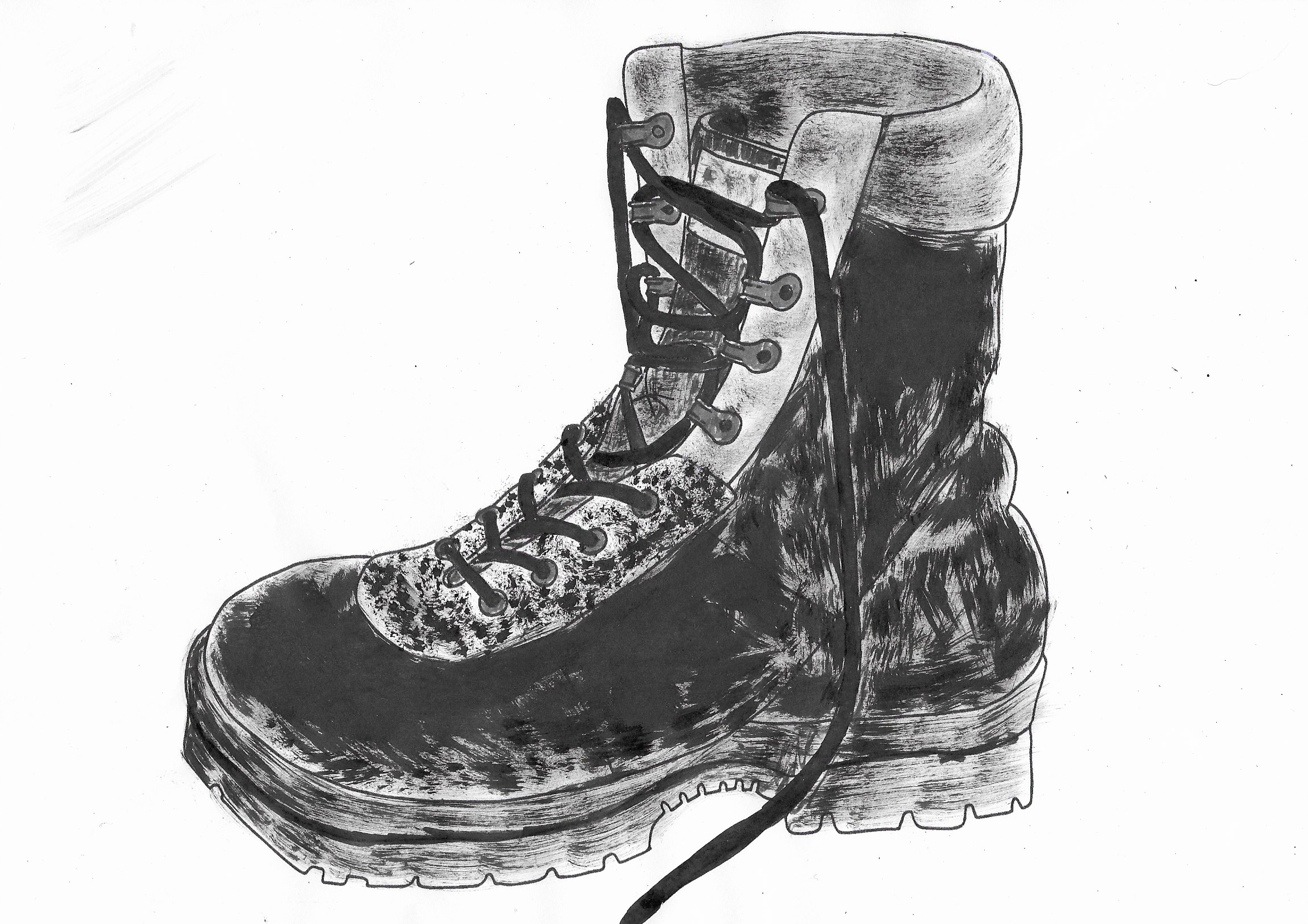
I chose a boot for this exercise. Initially, I did an observational pencil drawing, which I then went over with a fine liner and scanned onto my computer so I could print out copies to work with. I used Image Trace in Illustrator to make a bolder, thicker outline.
The words I associate with the boot included:
- Comfortable
- Well-travelled
- Physical work
- Frost-bite
- Tough
- Worn
I decided to focus on the word ‘worn’ for this exercise.
As with previous exercises, I found it really hard to create a moodboard and ended up just taking some photos of materials I considered worn looking.

I did not feel I gained much advantage from taking these photos, so instead I experimented with different textures on the printed out versions of the boot.
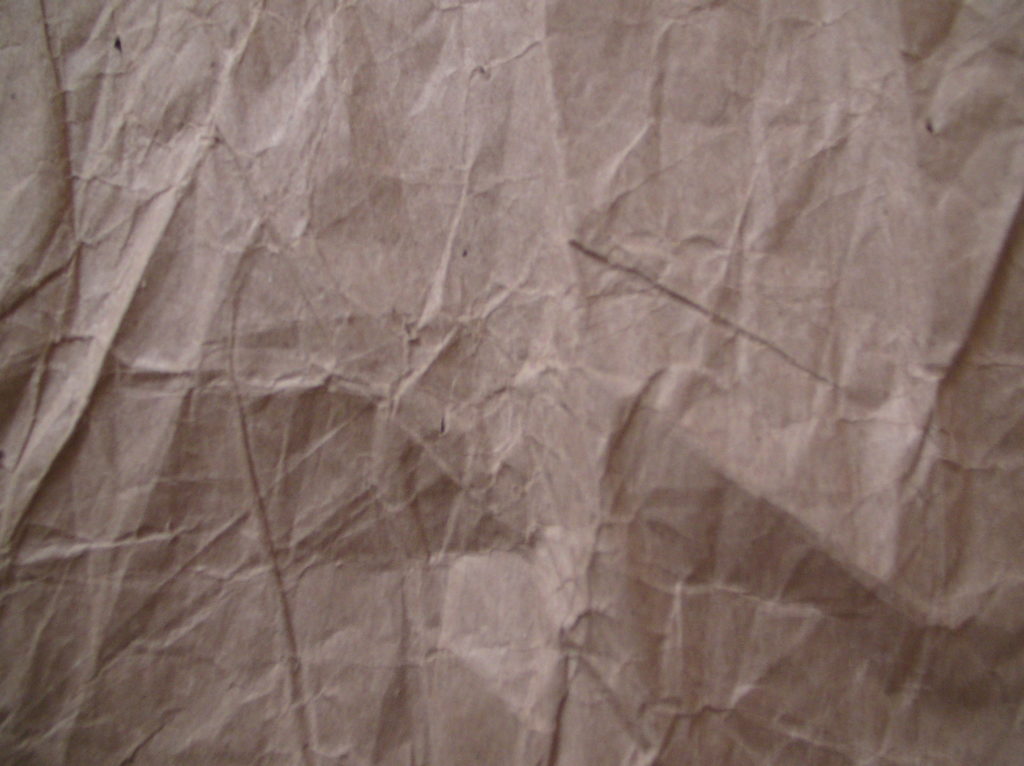
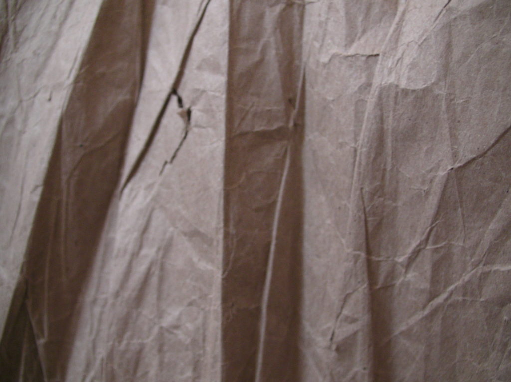
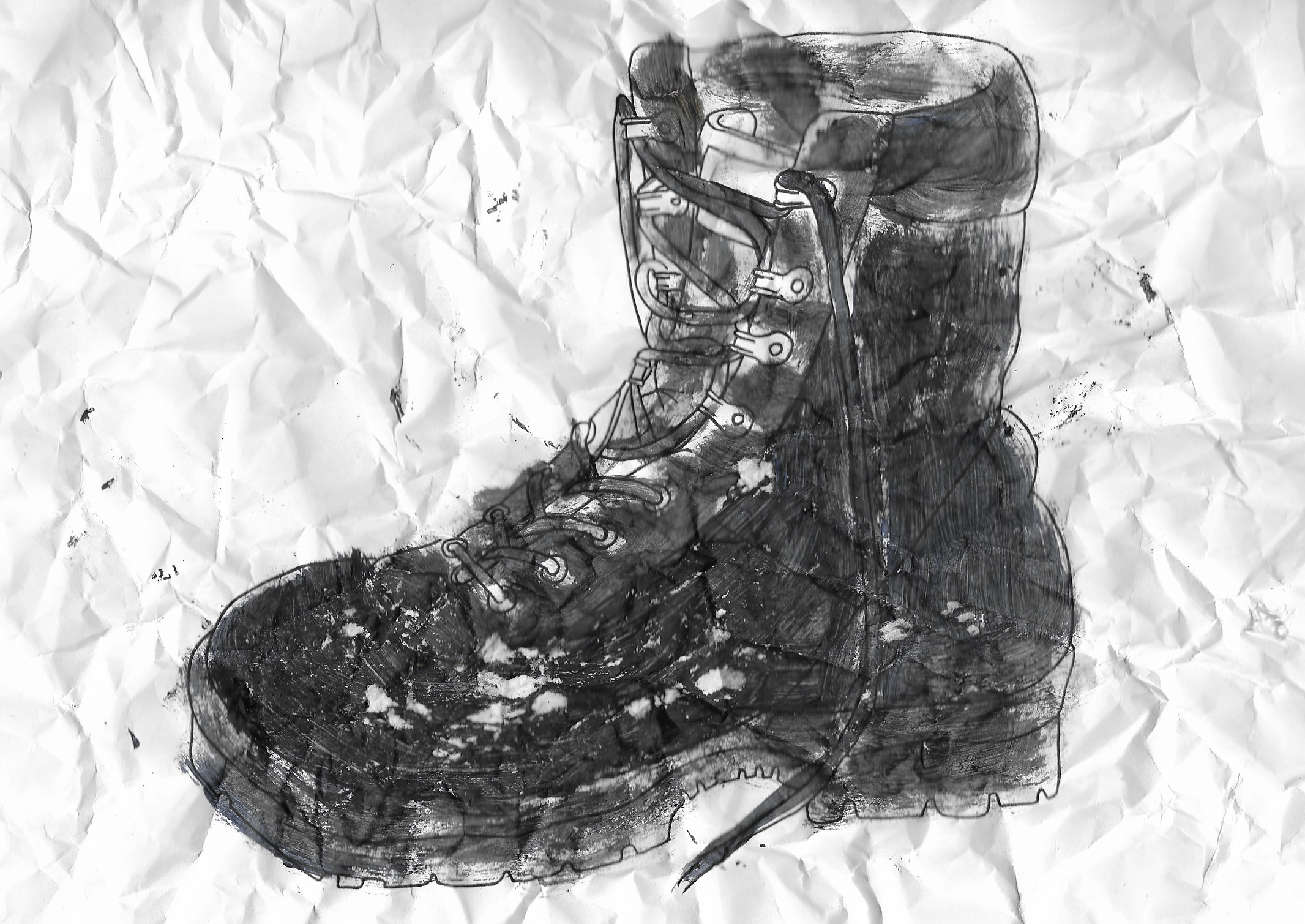
Firstly, I screwed up the paper, the resulting texture of which I thought was well-suited for the word ‘worn’.
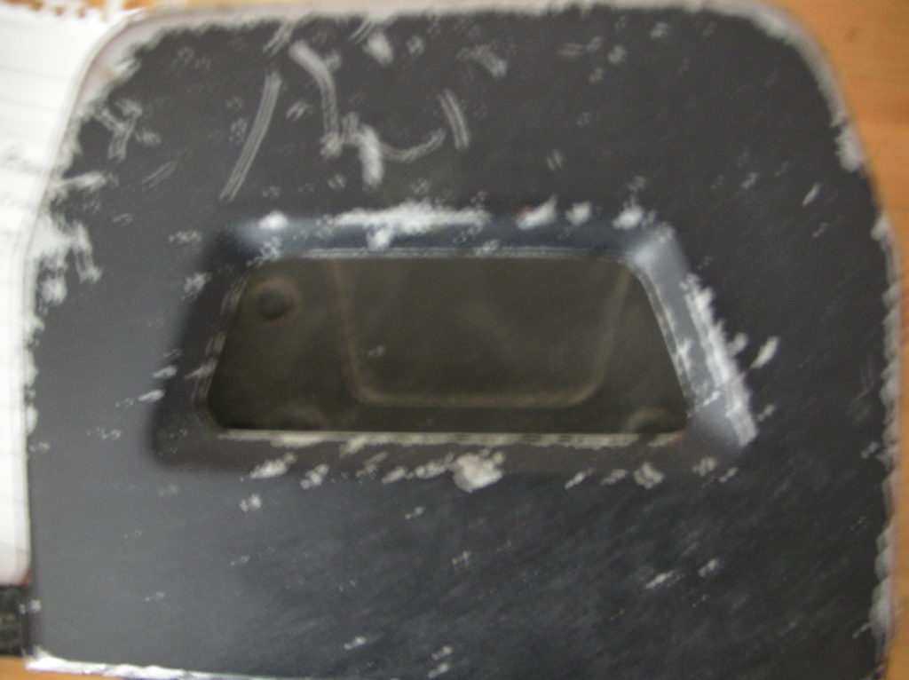
Then I tried using a black oil pastel to roughly fill in the line drawing, but I did not think this was very successful.
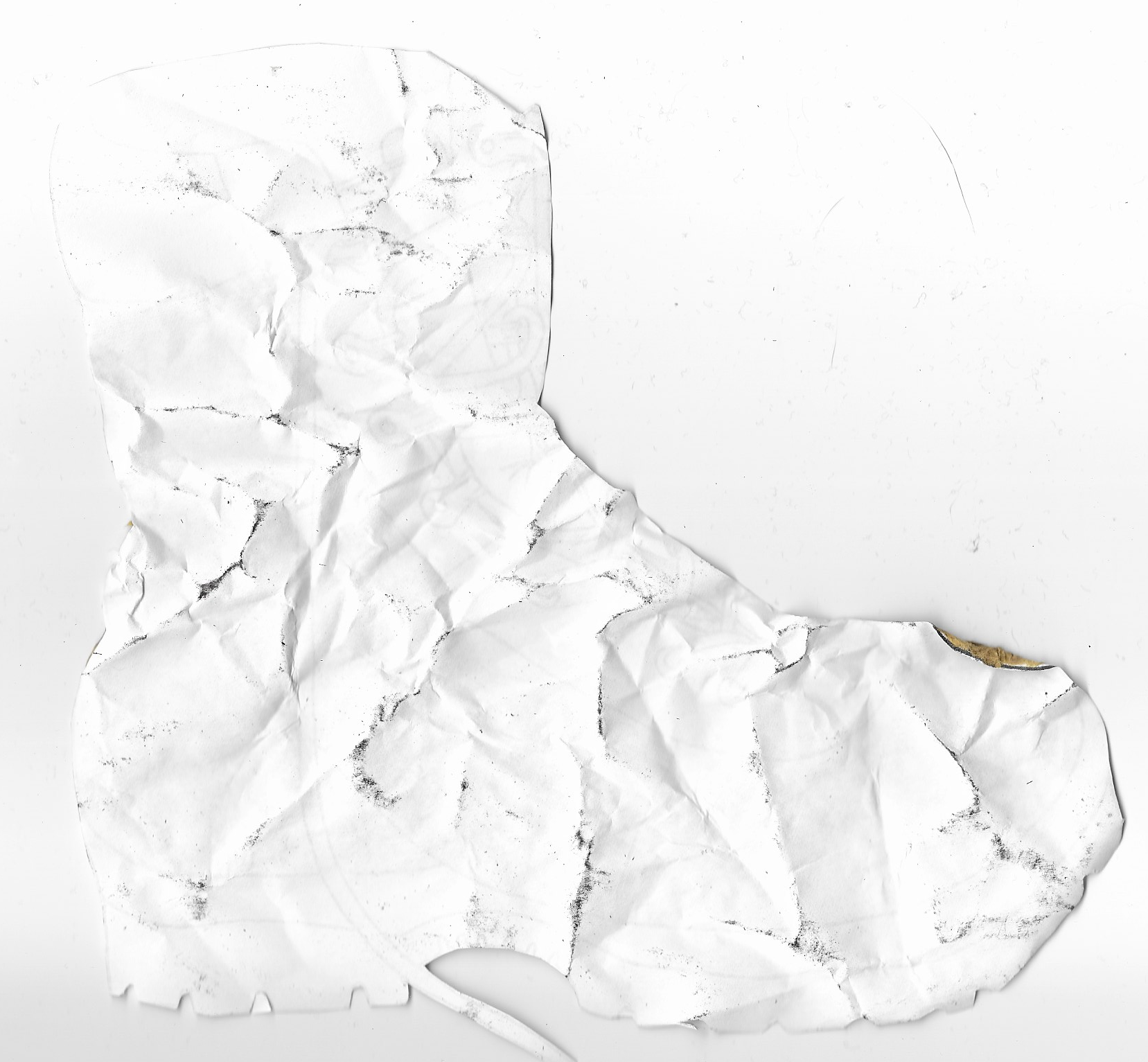
I then went off on a tangent and cut out the boot drawing, screwed it up and scanned the reverse. I think it is still possible to see what object is being represented and the texture does imply it is is ‘worn’.
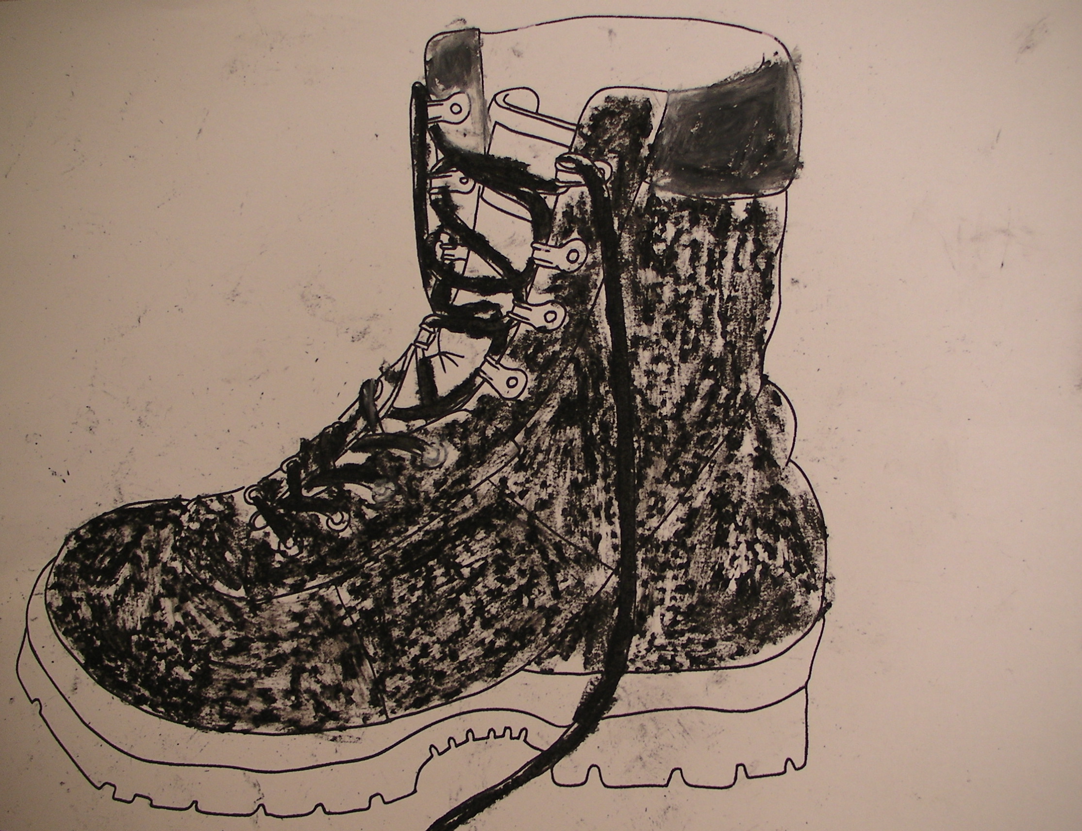
Next, I tried using black drawing ink and applying it with different brush strokes. I quite liked this version as it still looked like the real boot, but the varied applications of ink made it more visually interesting and I think it does look like a boot that has been worn.
My final attempt involved using a wet paintbrush to apply acrylic paint roughly within the lines of the outline. Whilst the paint was still wet I added some grains of soil, which did not go quite to plan as I thought I would be able to ‘paint’ the soil over the boot. Instead I screwed the paper up and because the paint was still wet, when I opened the paper up again some paint was pulled off. I think this was the most successful of my attempts to represent ‘worn’.
I found this exercise challenging, but I felt it made me begin to think in a more experimental way, with my most successful attempt being accidental. I should have experimented more and taken forward some of the ideas inspired by the artists I researched.
Resources
Cooke, R. (2014). Anselm Kiefer review – remembrance amid the ruins. [online] The Guardian. Available at: https://www.theguardian.com/artanddesign/2014/sep/28/anselm-kiefer-royal-academy-review-rembembrance-amid-the-ruins [Accessed 19 June 2020].
National Gallery of Art, (n.d.). The Elements of Art: Texture. [online] available at: https://www.nga.gov/education/teachers/lessons-activities/elements-of-art/texture.html [Accessed 19 June 2020].