Brief (Abridged Version)
Read the extract provided from The Daffodil Affair by Michael Innes.
Make notes on these questions:
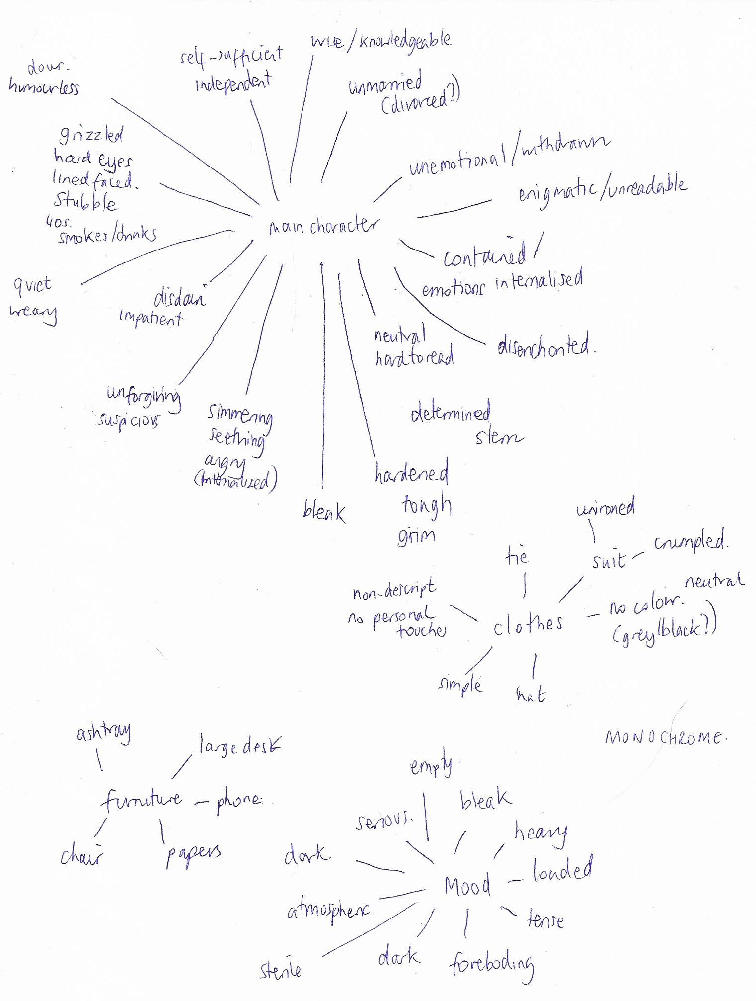
- If this were to be made into a film what would the main character be like?
- What clothes would the character be wearing?
- What furniture is in the main area which the action takes place?
Collect visual reference for the items on your list – be selective – don’t go for the first image you encounter. Try to remember your own version of the story and reflect this in your choices.
The next process is about textural and colouristically visual brainstorming and idea generation. Choose a word, which you feels captures the mood you would like to convey. Collect and create textures you associate with this word. Start with a broad vision to describe the overall colour or tone of the image, not specific elements of it. Be minimal and selective and gradually add textures and colours that complement this general impression.
Create a simple portrait (figure, or head and shoulders) of the character, suing the reference you have gathered. Use sketch books to help you select and edit form your reference materials and to explore where to position your figure within the frame or format of the picture. Use the colours, textures and qualities you assembled for your moodboard to render the portrait.
Notice the extent to which you have evolved the reference and used it to inform your illustration. If at any point you felt you had insufficient visual information what steps did you take to address this?
I used mind mapping to answer the initial questions.
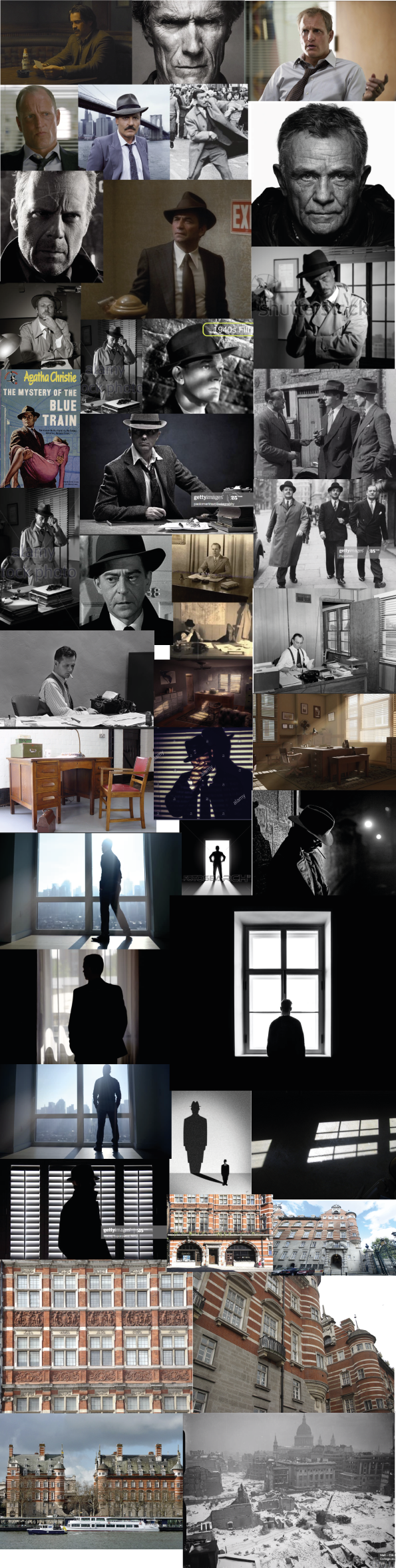
Next I used Google Image to collate some visual references for the above:
I then thought about the colour/textures that I associated with my impressions from reading the extract.

I then experimented with a few different materials and mark-making.
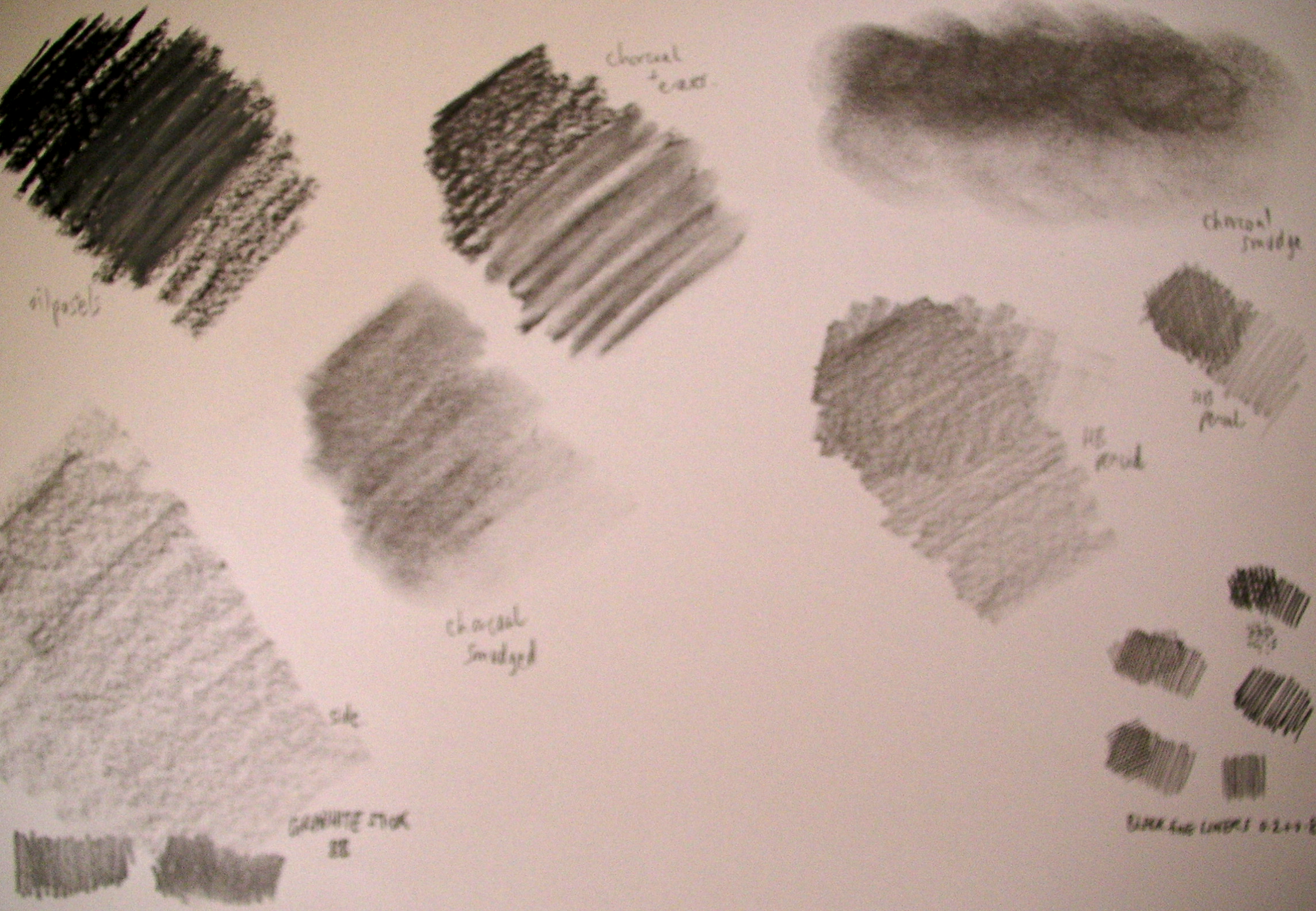
The word I chose for the overall mood I inferred from reading the extract, and inspired the above choices, was ‘grim’. The man has a grim job during a grim period in, at that time, a grim city. I did not feel that the use of much colour would be appropriate. As the photographs from this time was mostly black and white, I thought this would influence my choices as well.
Rather than go straight to digital I decided to start with pencil and paper, which is something I am trying to more often.
I made a few very rough sketches in terms of composition.
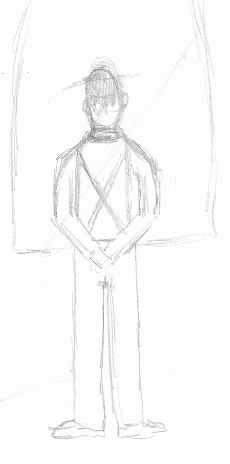
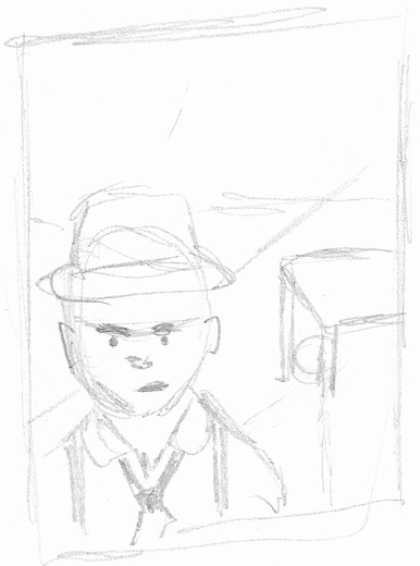
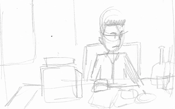
Originally I was thinking of placing the character in the room, but then decided against this for two reasons. Firstly, from my experience of the Using Reference exercise and the amount of time and frustration it took for me to get some sort of decent looking room in terms of perspective, etc, I did not think it would benefit this exercise. Secondly, I personally felt that it was the character that was the most interesting and intriguing element in the extract rather than the room/furniture apart from how this influenced my understanding of him. Therefore I decided to do a head and shoulders portrait.
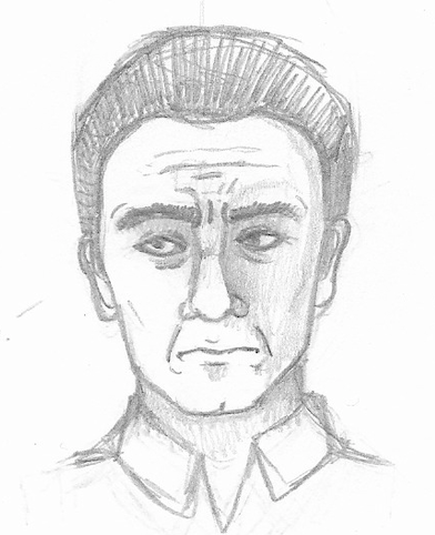
Using the reference material, I started sketching out my idea.
After leaving the sketch and looking at it again, I made some more adjustments and tried to clean up some of the lines.
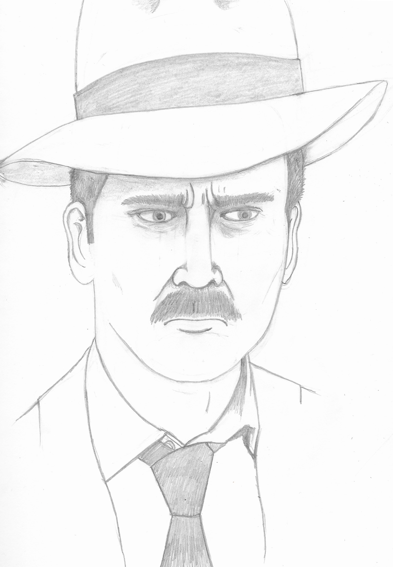
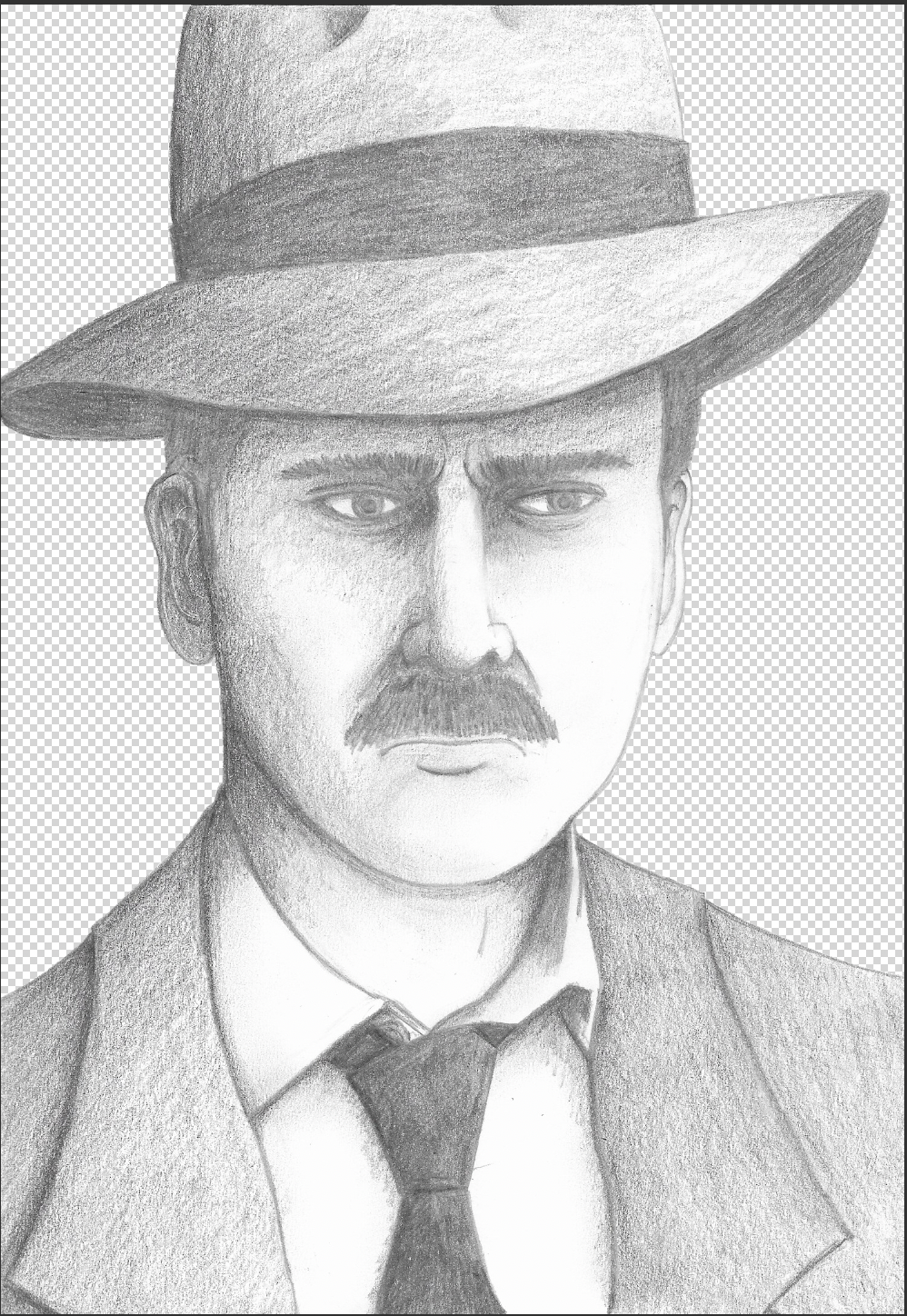
Then I worked on shading in the illustration. I think I needed to work more on having stronger contrasts as there is too much of a similar shade of grey.

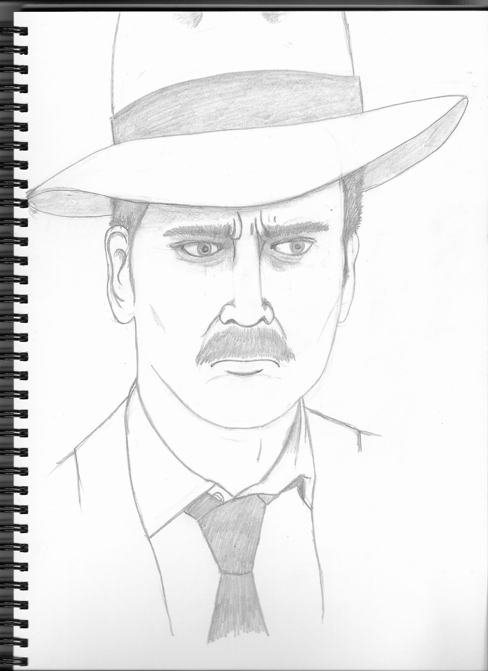
I then scanned the image into Photoshop and removed the white background.
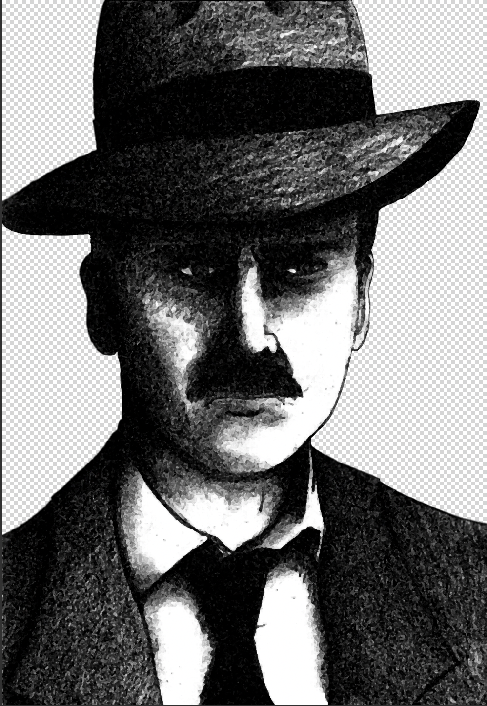
I then made copy and experimented with the different options in the effect gallery. This was the one that best suited my idea as I wanted to increase the contrast.
After much experimentation with different blend modes and trying out the different textures from my research, I ended up with the below.

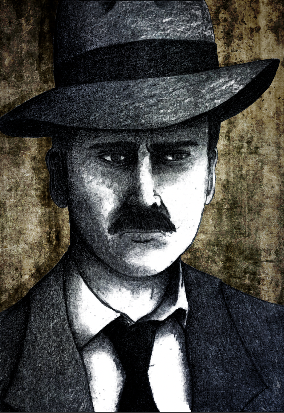
Once I got onto the final part of this exercise I became absorbed in trying to create my representation of the character. I enjoyed having a play with blending layers in Photoshop, which I think really enhanced the final illustration. I hope it is does the text justification and suggests the period it is set in and mood of the character.