Brief
Collect as many examples as possible of different characters – newspapers and magazines are a particular good source. Catalogue these characters as types – babies, children, sportsmen, old women – create your own category headings.
Decide upon a character you would like to create. this might be one from a book or story, or based on an archetype such as a businessman or vicar’s wife.
Begin to brainstorm around your character – perhaps there are characters from the media or your own life you would like to focus on.
Draw your character from the front, from the side and from the back. It may help to draw lines from the next, shoulder, waist and knees as an aid to scale and ensure a sense of proportion (this is know as a 360 drawing).
Draw your character over and over again. Get into role and adopt their mood, expression and personality. It often helps to work out what they are thinking or saying. Try moving the facial features around to extremes and using a few lines and dots to represent the face. Be conscious of the contribution clothing and costume makes in describing character.
Then try another, different, character. Make sure you come up with someone completely different, not just the same person in different clothes.
Character Design Resources
I began this exercise by collating some examples of different characters and I have saved this under relevant category headings on my computer. I already had several websites bookmarked in my Favourites with examples of different characters. Additionally, I keep examples that I find in printed sources in a folder, which I can refer to as needed.
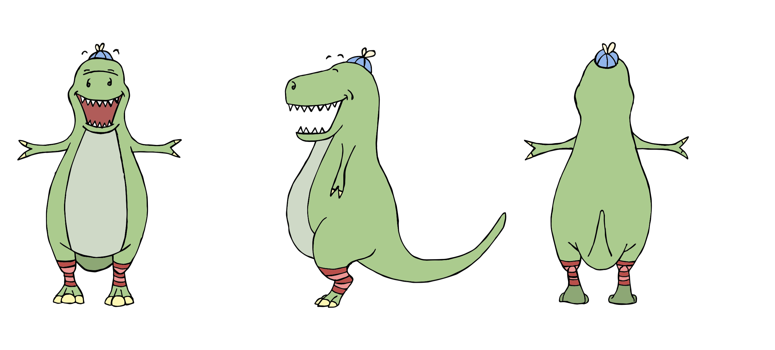
Character 01 – Dino
I had been looking forward to this exercise since I saw it during my initial read through of the course material. I really love looking at character designs – it is an area I want to learn more about and improve my own attempts. Having said that, I found myself slightly at a loss where to start as I wanted to come up with designs that were decent and believable – I put myself under pressure and this results in mental blocks.
I did not feel that my skills in drawing human beings was of a high enough standard, so decided against a ‘realistic’ human design. In fact, I chose to not attempt a human character for my first design and went with a dinosaur character instead. I felt this was a good option to ease into the exercise and there was more room for flexibility in terms of believability.
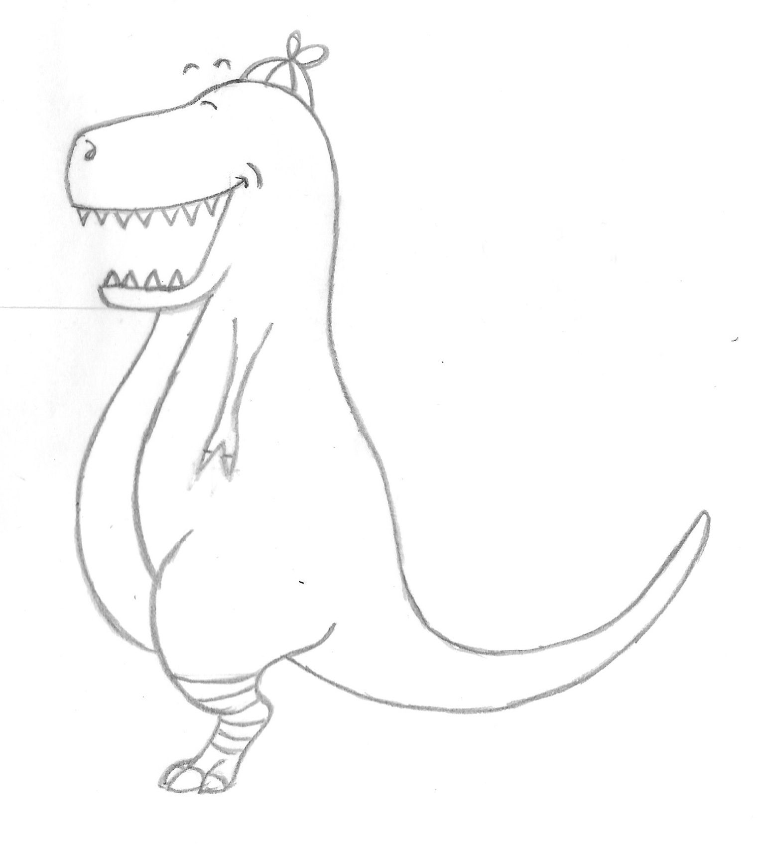
The character ‘Dino’ is a vegetarian T-Rex who likes bright colours and leg warmers. My initial sketch can be seen below.
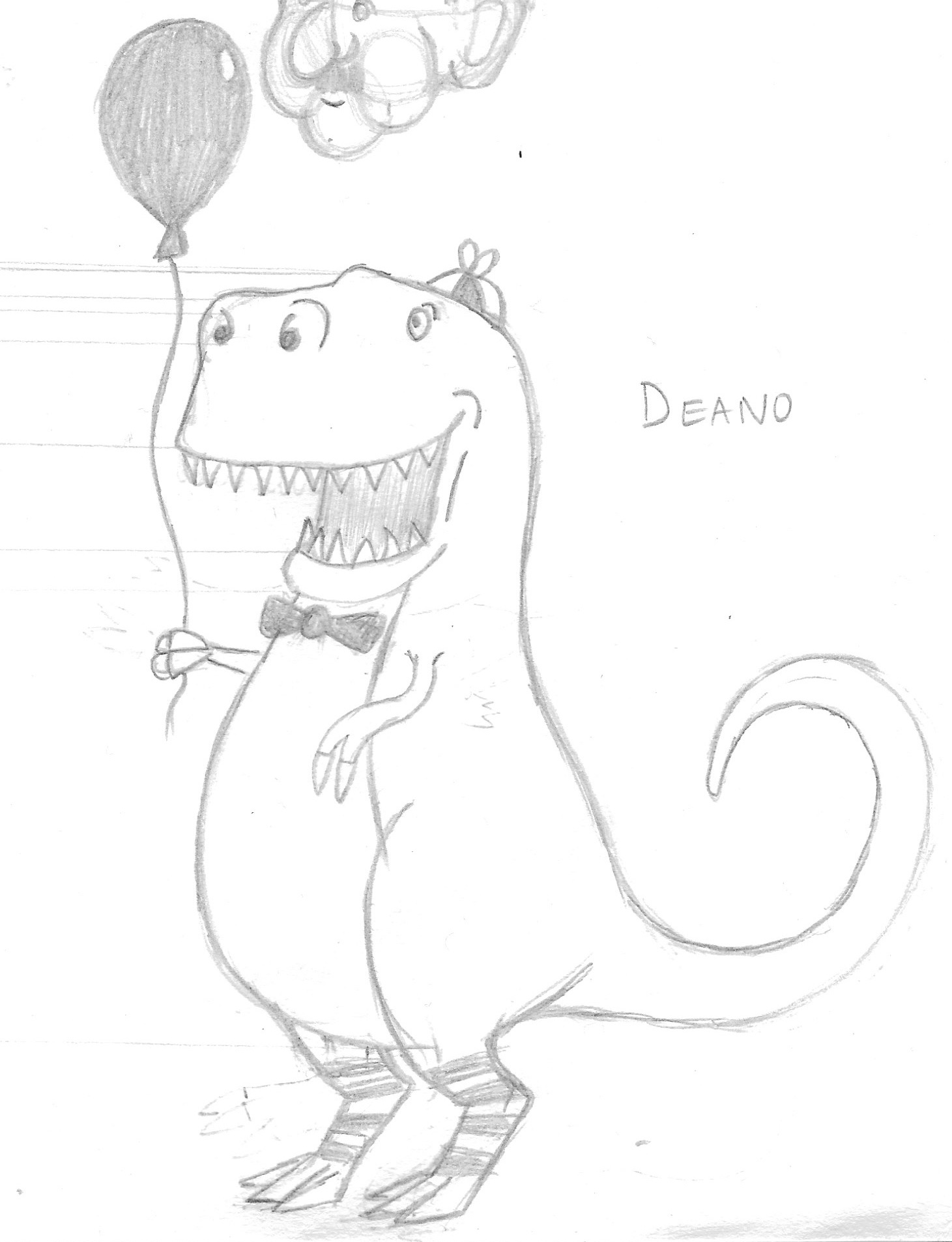
Next, I made another slightly cleaner version (I used a combination of a lightbox and layout paper throughout this exercise).
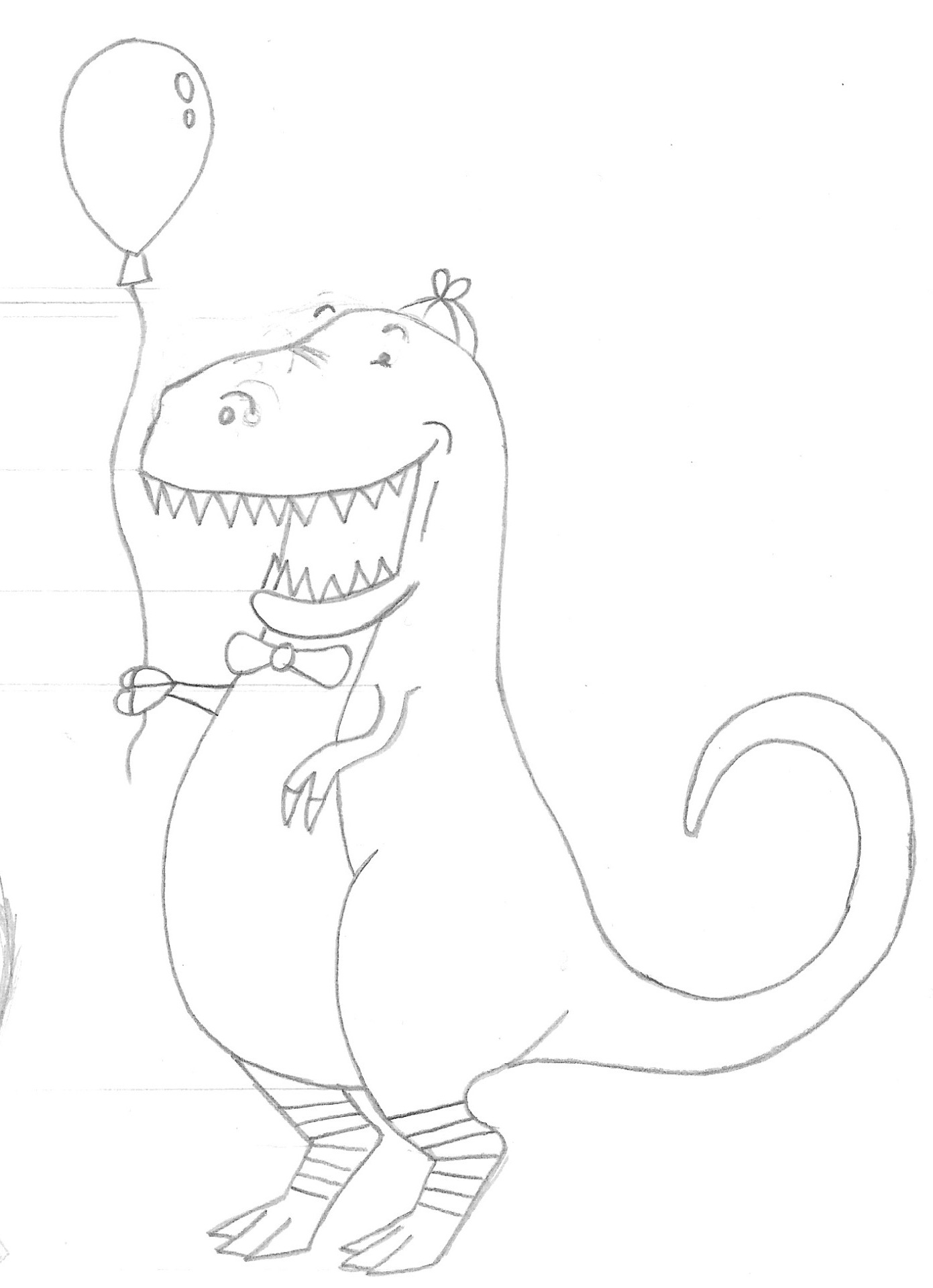
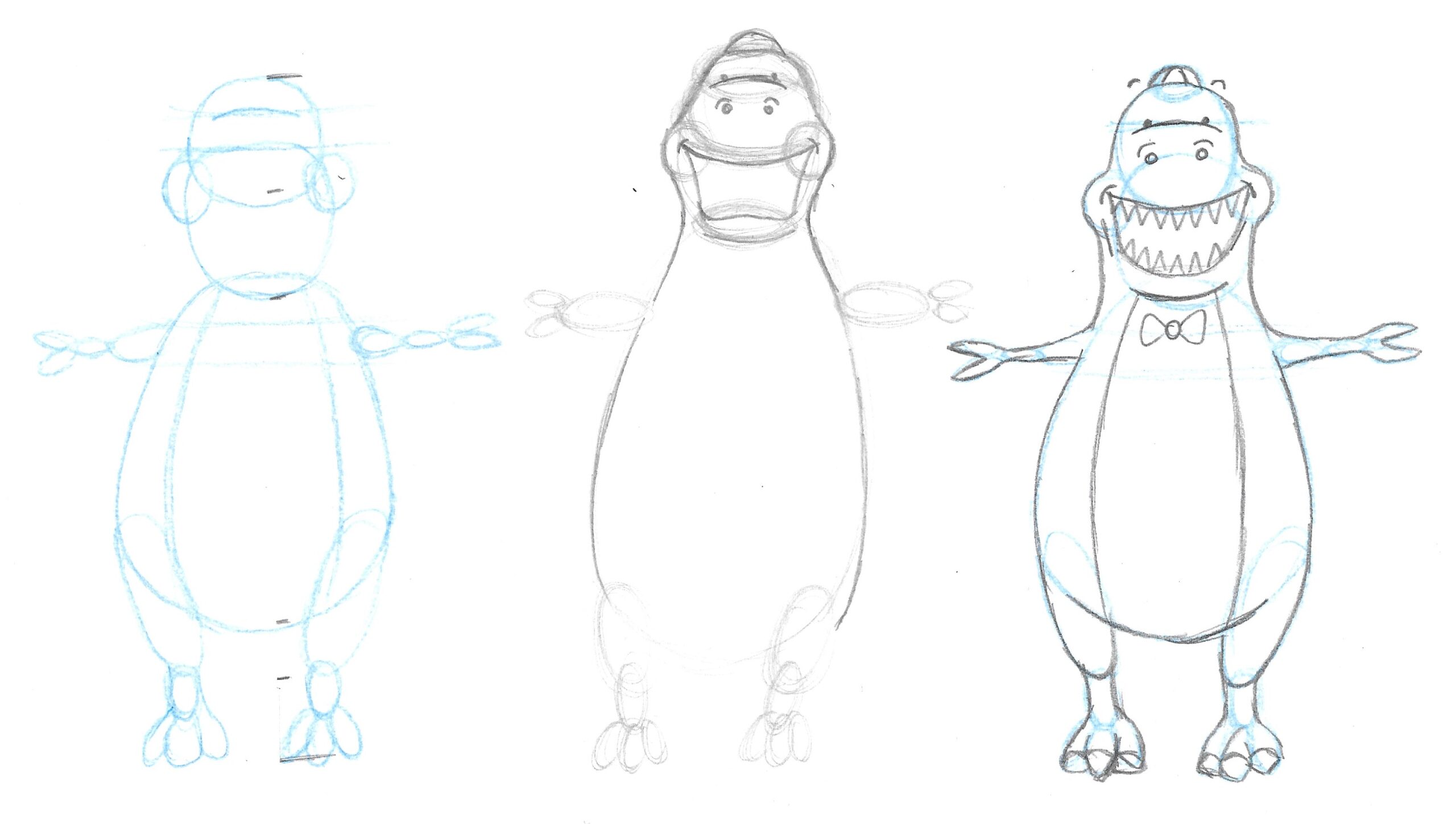
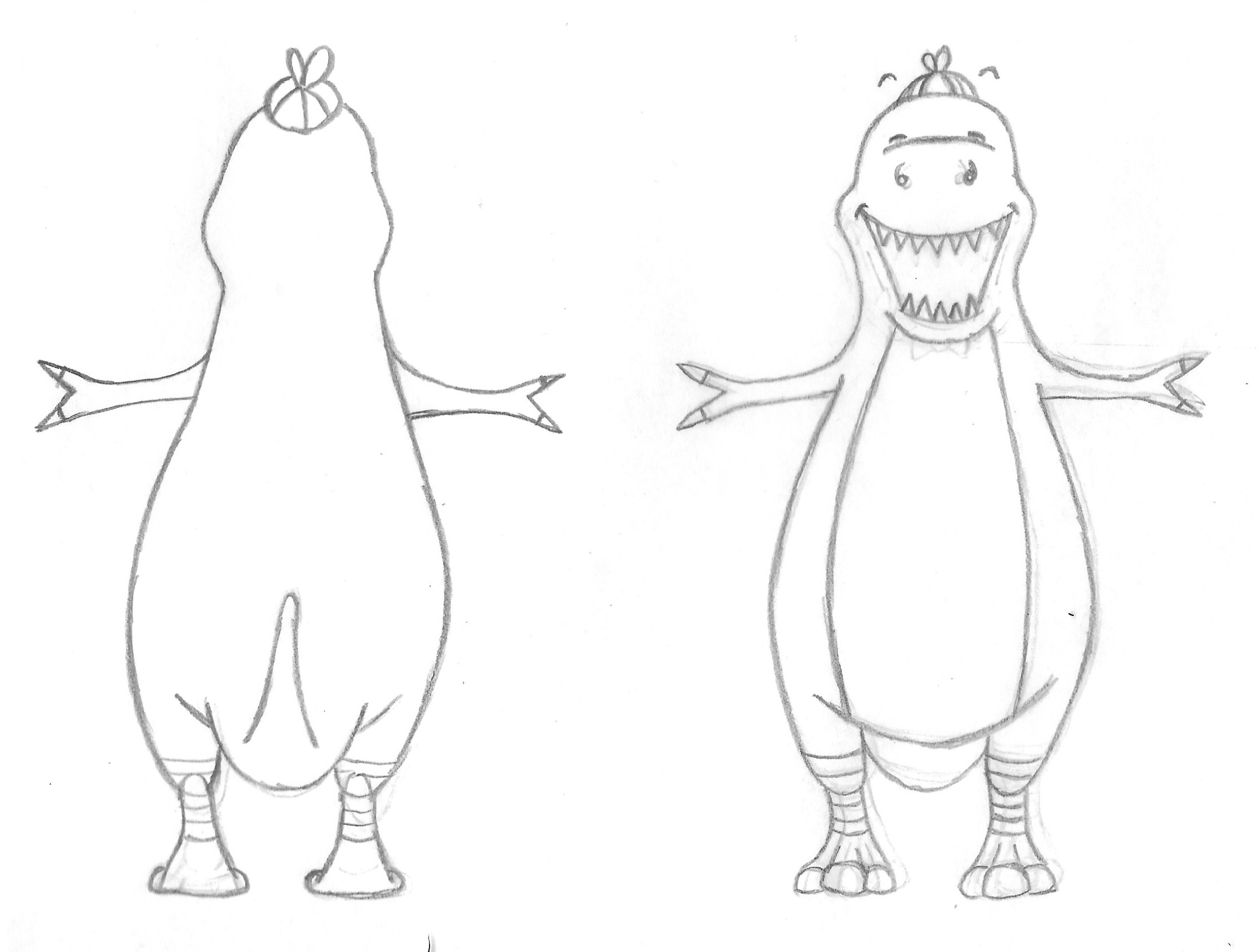
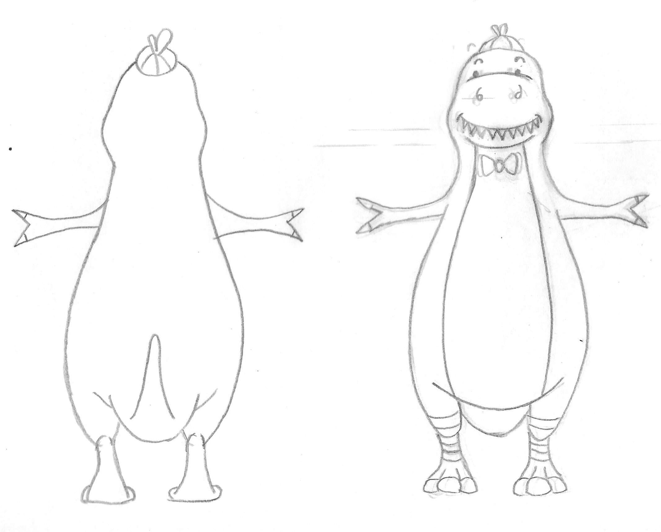
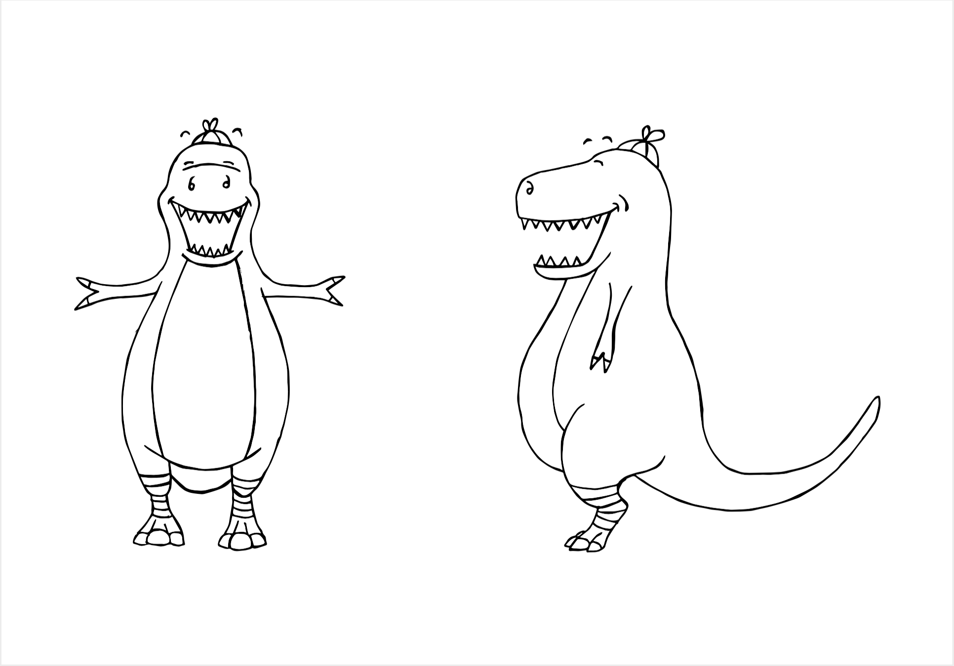
I then took these initial sketches and created a front view. This was much harder than I had expected it to be (as can be seen by the amount of rubbing outs!).
I made a cleaner version and then drew lines across the page to reference the other views (back and side).
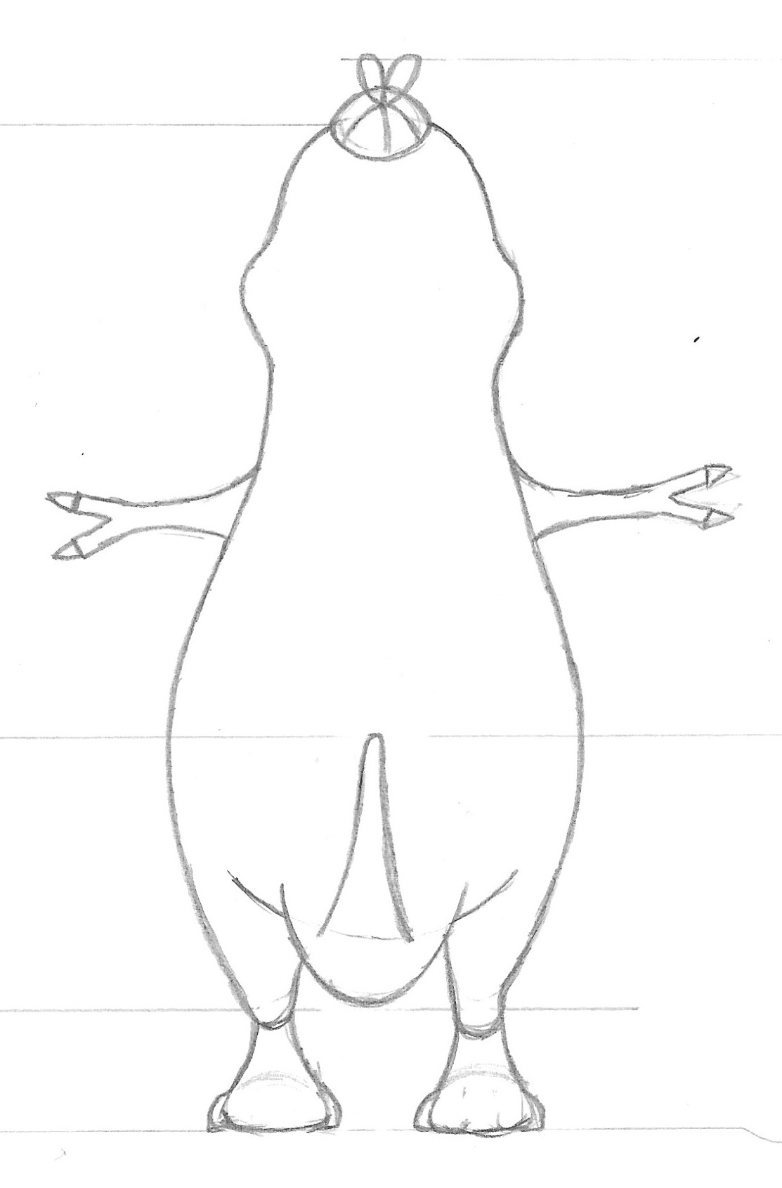
I found it really challenging to perceiving these other two views. I had to picture it in my mind and then put this accurately down on paper.
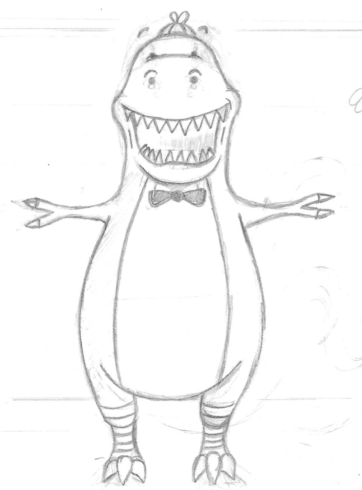
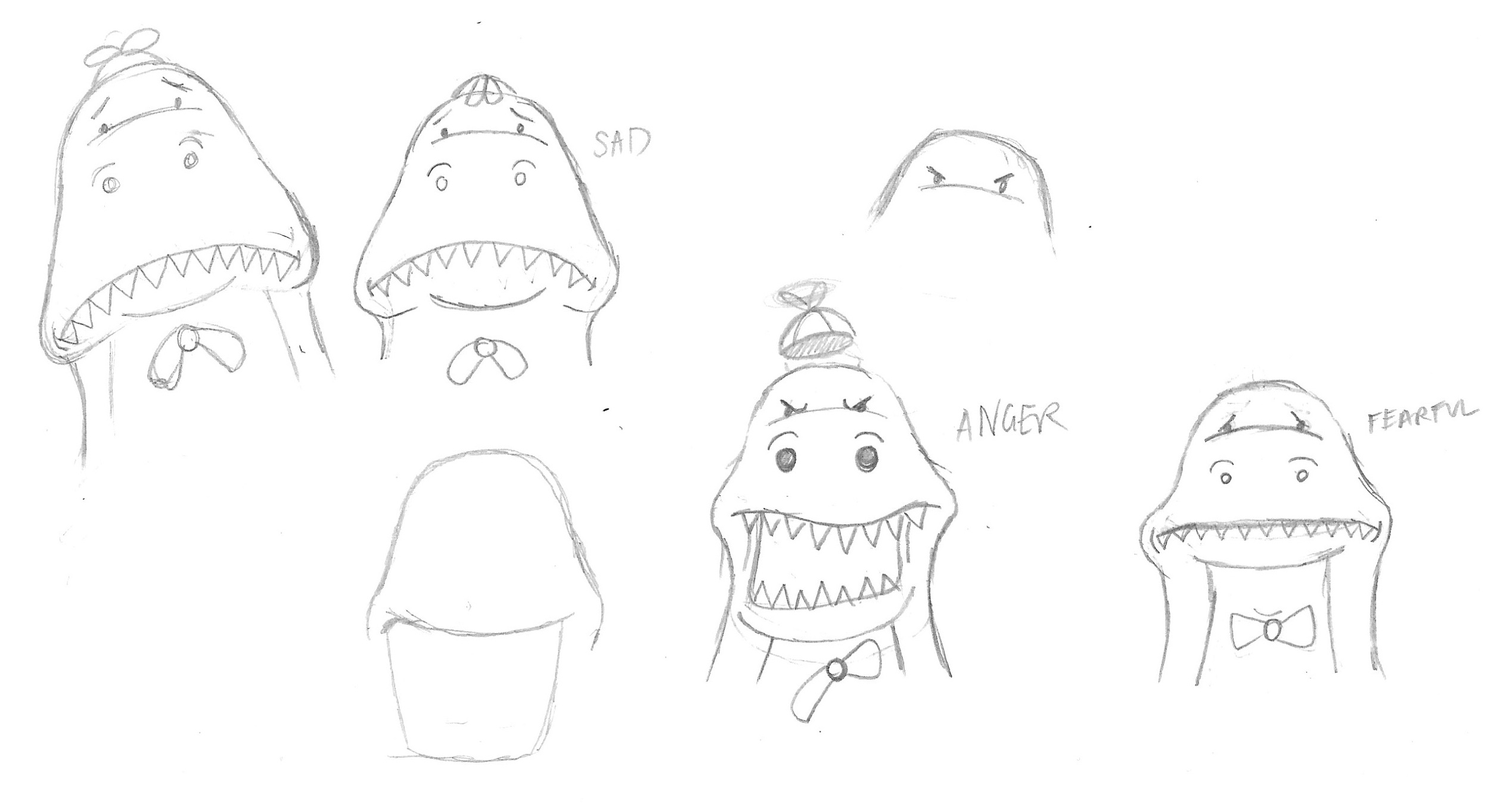
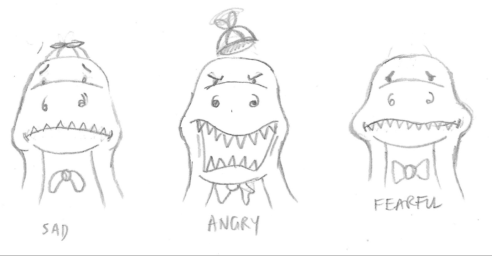
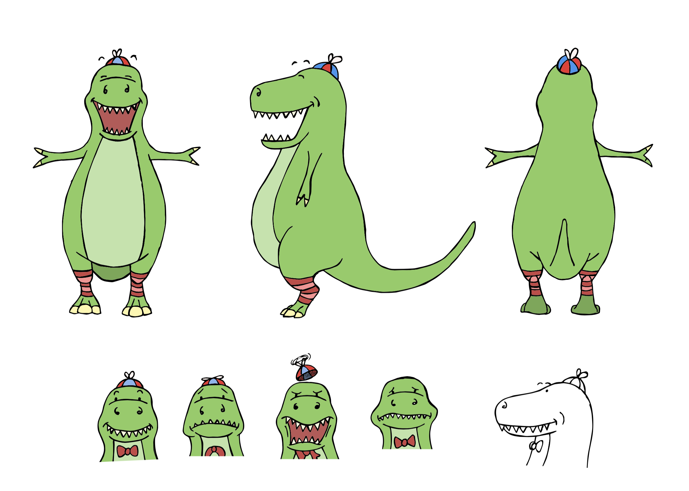
I then moved on to thinking about expressions. Although a dinosaur with an open mouth may have seemed easier in terms of the outline, trying to put expressions on his face was not a simple task!
I the thought about how he character could easily be accurately replicated quickly (e.g. for animation) and tried to work backwards using basic shapes to make up the body.
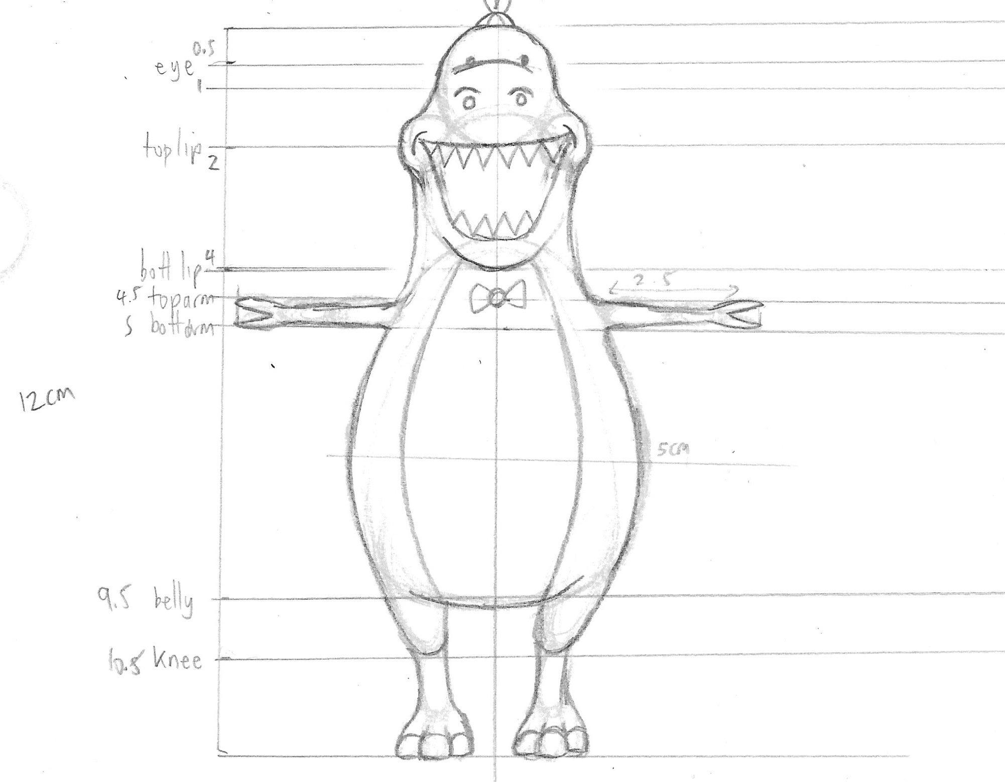
However, I think doing this retrospectively was not successful as it no longer looked like my original character concept and it was just not right.
Character 02 – Final Design
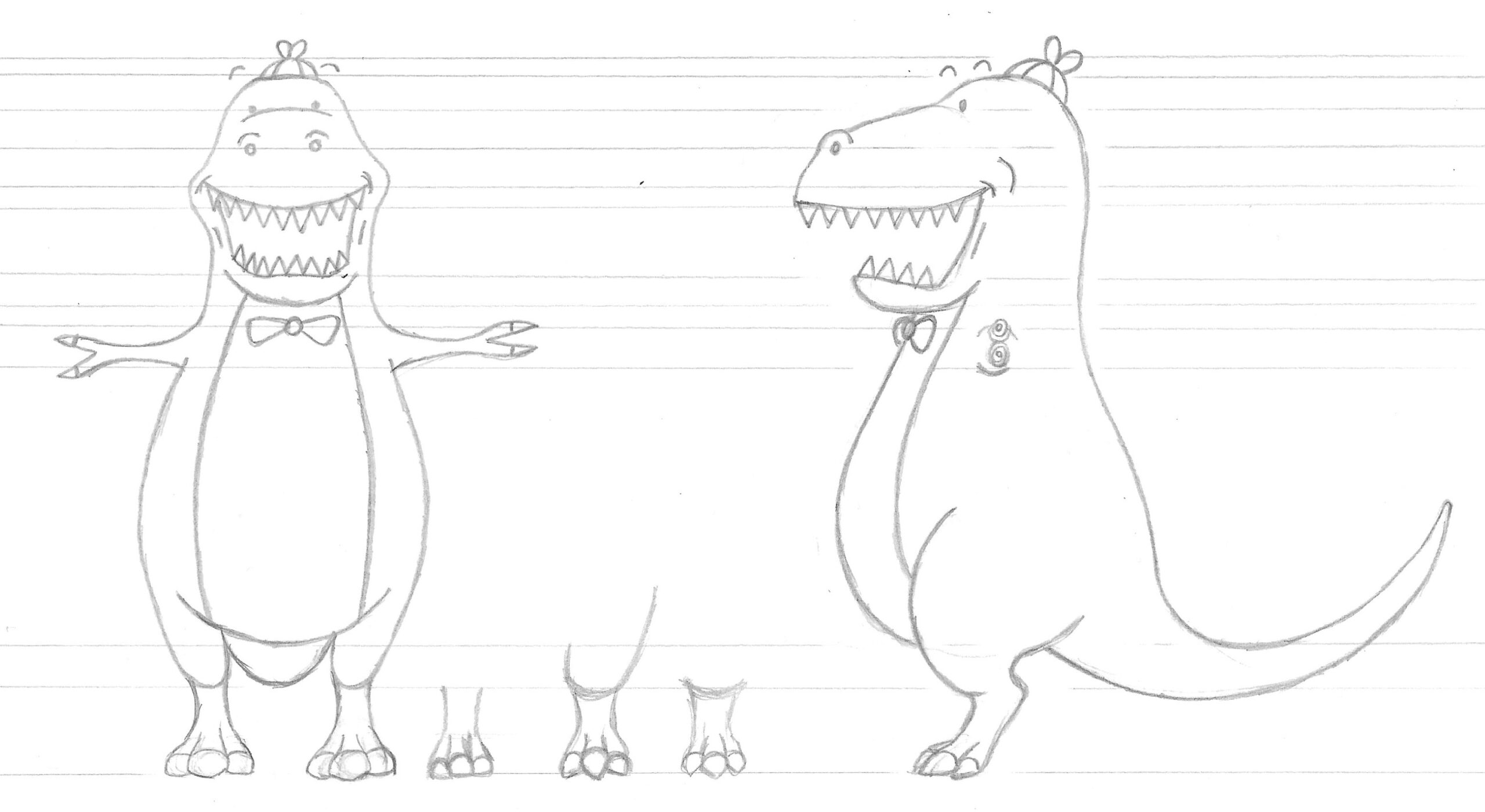
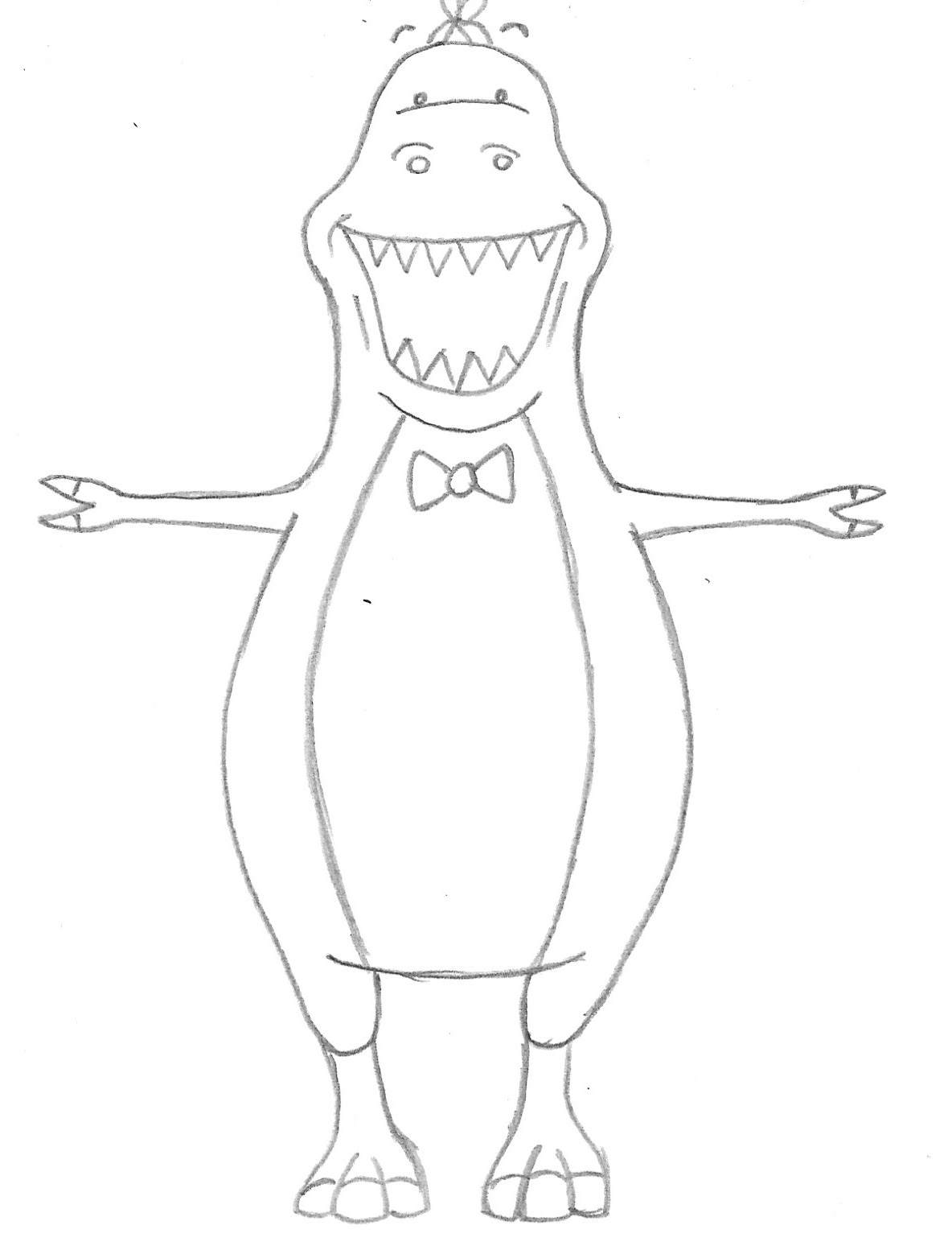
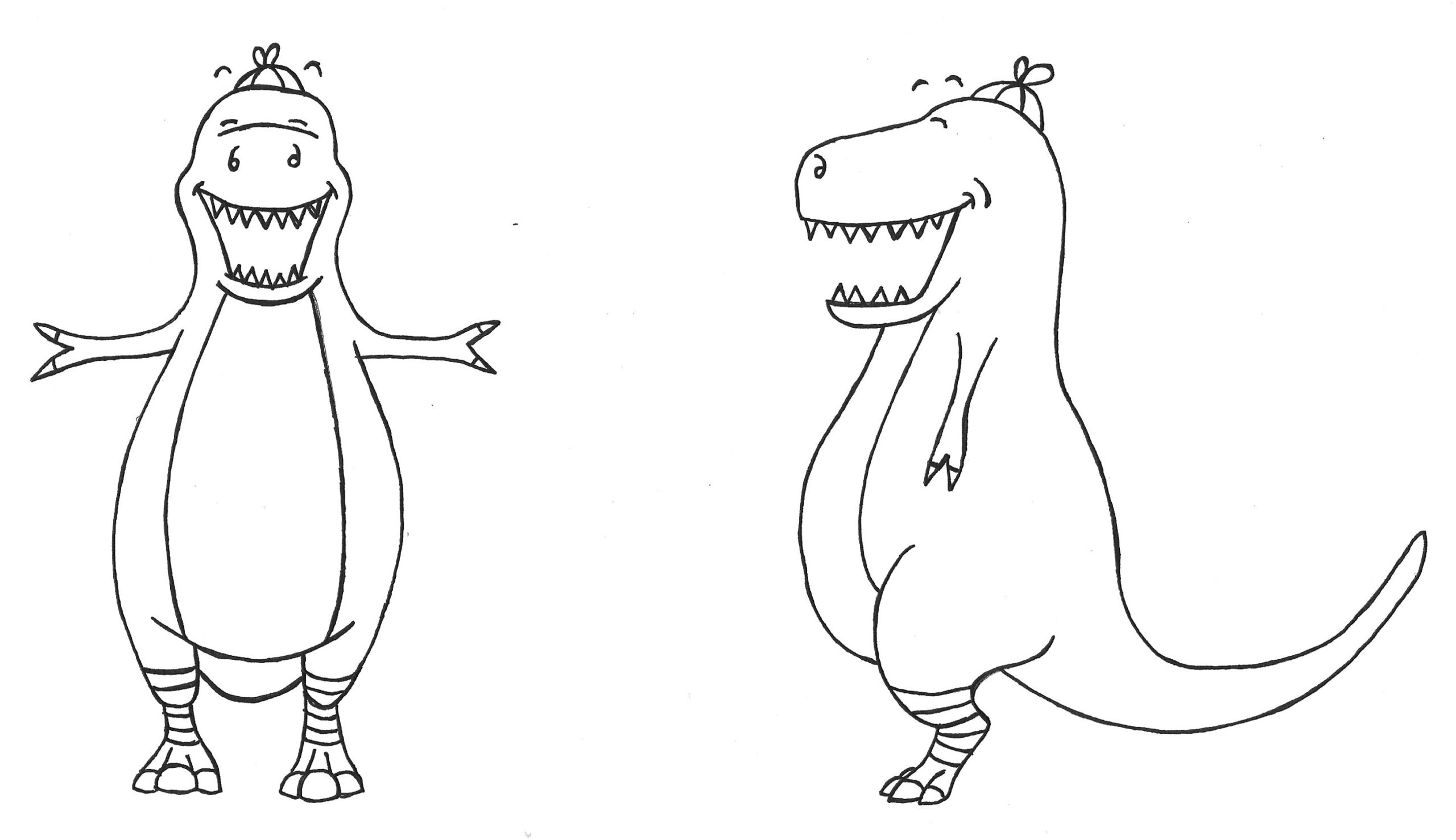
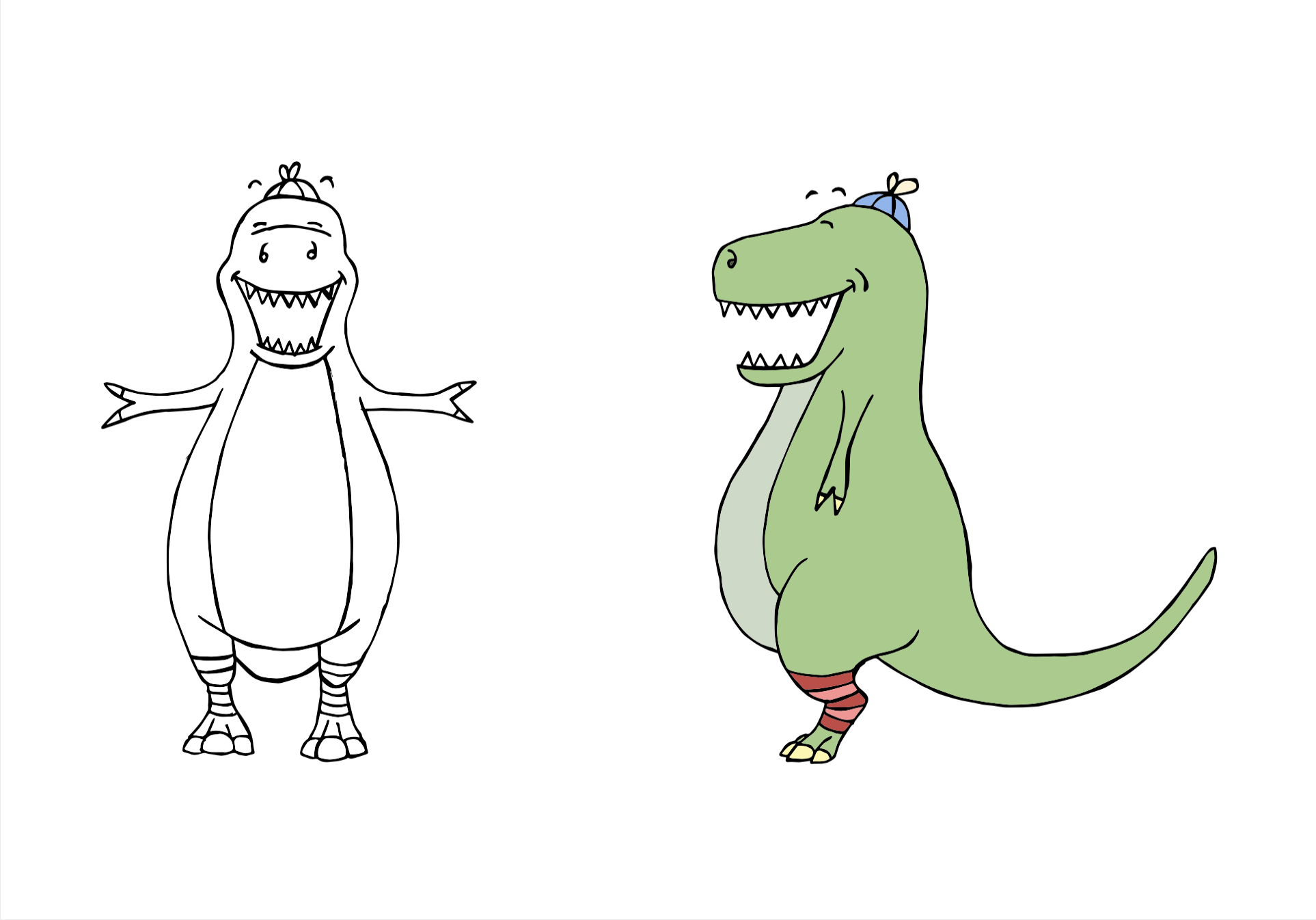
After that detour, I returned to thinking about Dino’s mouth as this was quite problematic for expressions as I had not worked out what he would look like with his mouth closed. So, with a slight redesign, I adapted the design and the final results can be seen below.
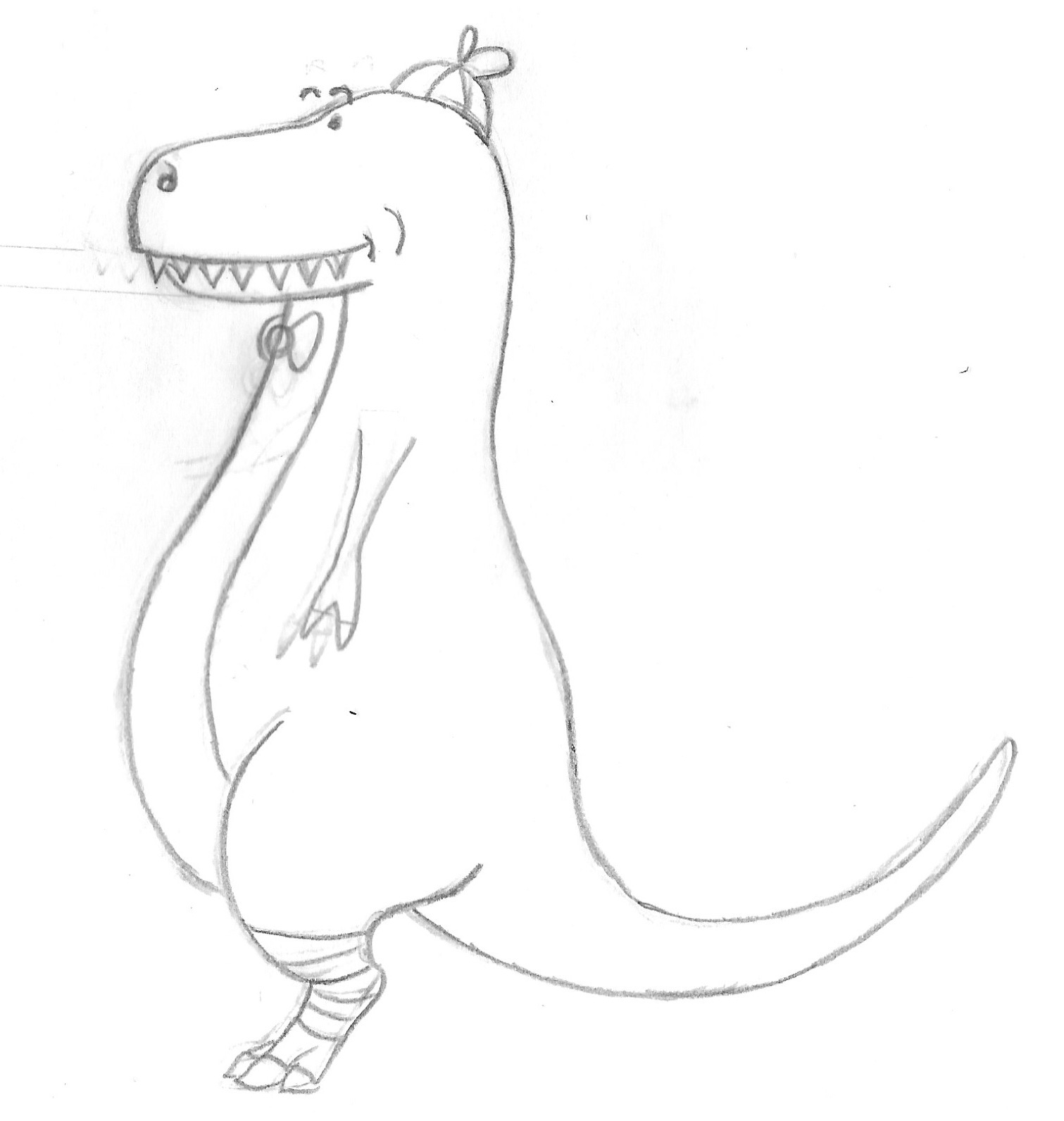
I found that one I had worked out what his mouth looked like shut, it was much easier to work out how Dino’s face would look with a few different expressions.
I then did ink versions of the designs. However, I now had started to notice issues with the design in terms of balance and symmetry, which got me quite frustrated. In this respect it is much easier working digitally as slight amendments (or big ones) are much easier to make!
I wanted to see what the design would like with simple colour added, so I scanned the ink versions into Illustrator and used Image Trace. I had to resist the urge to tidy up the black outlines too much as I have a tendency to do this and I wanted the design to keep its hand-drawn ‘feel’.

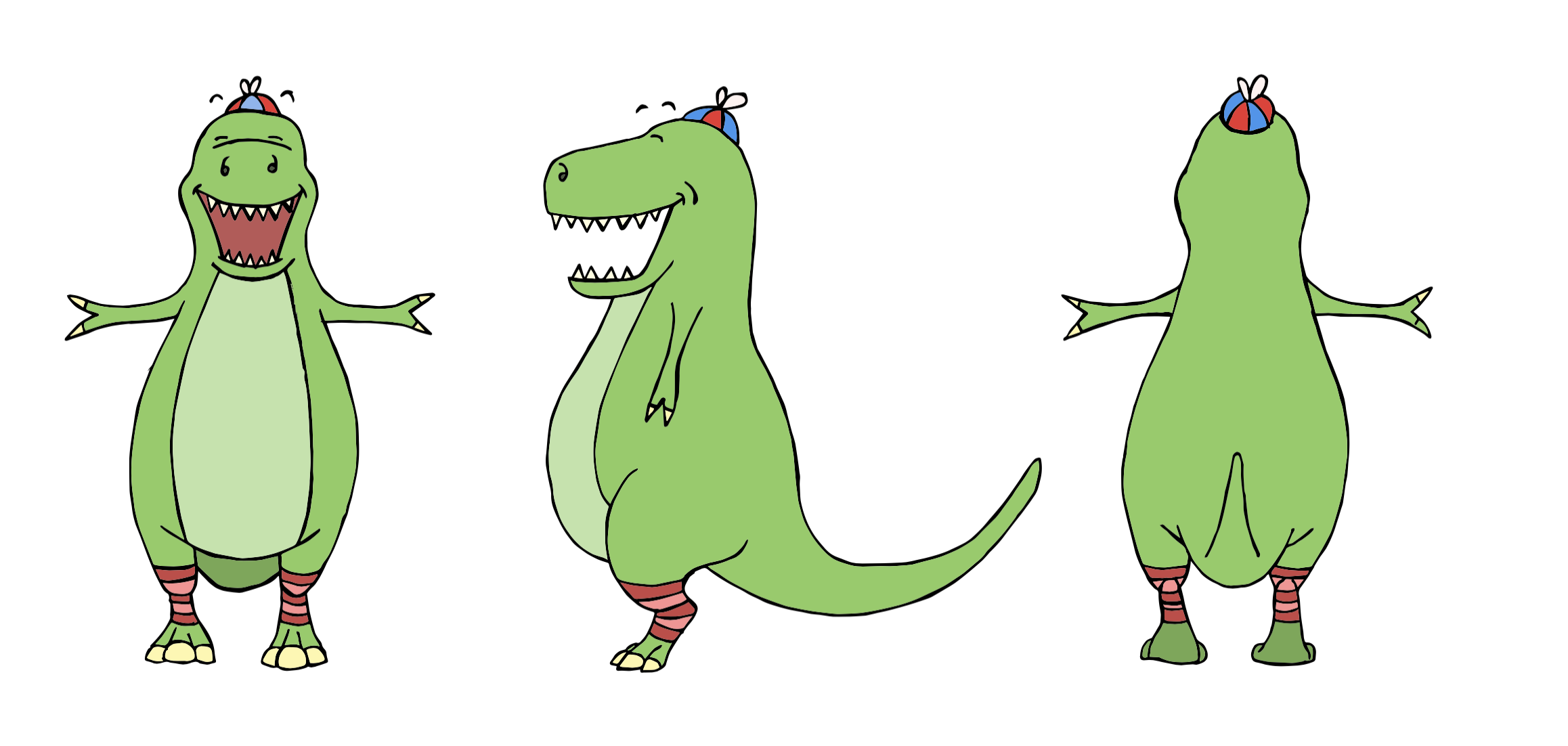
Final Version of Character 01
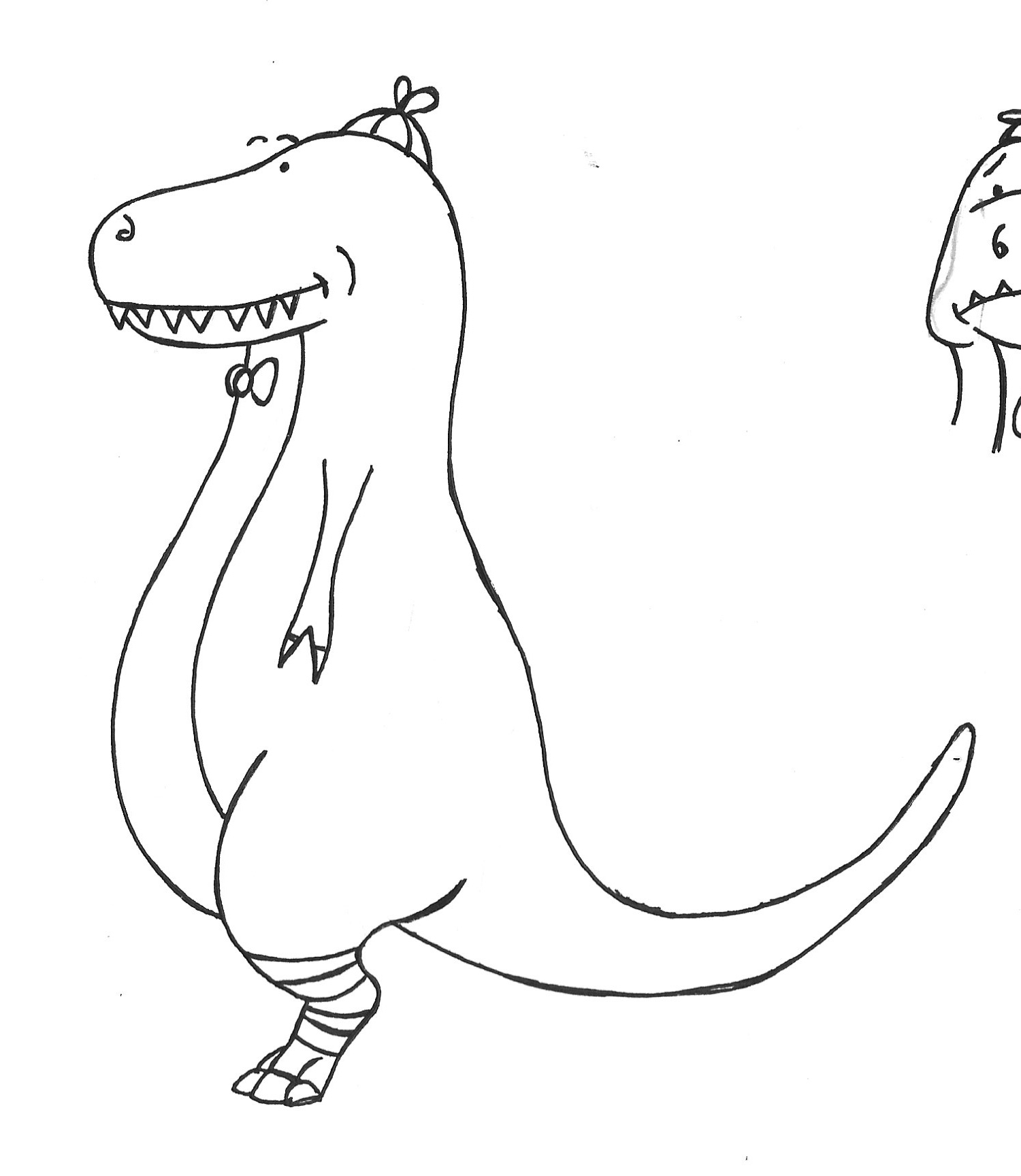
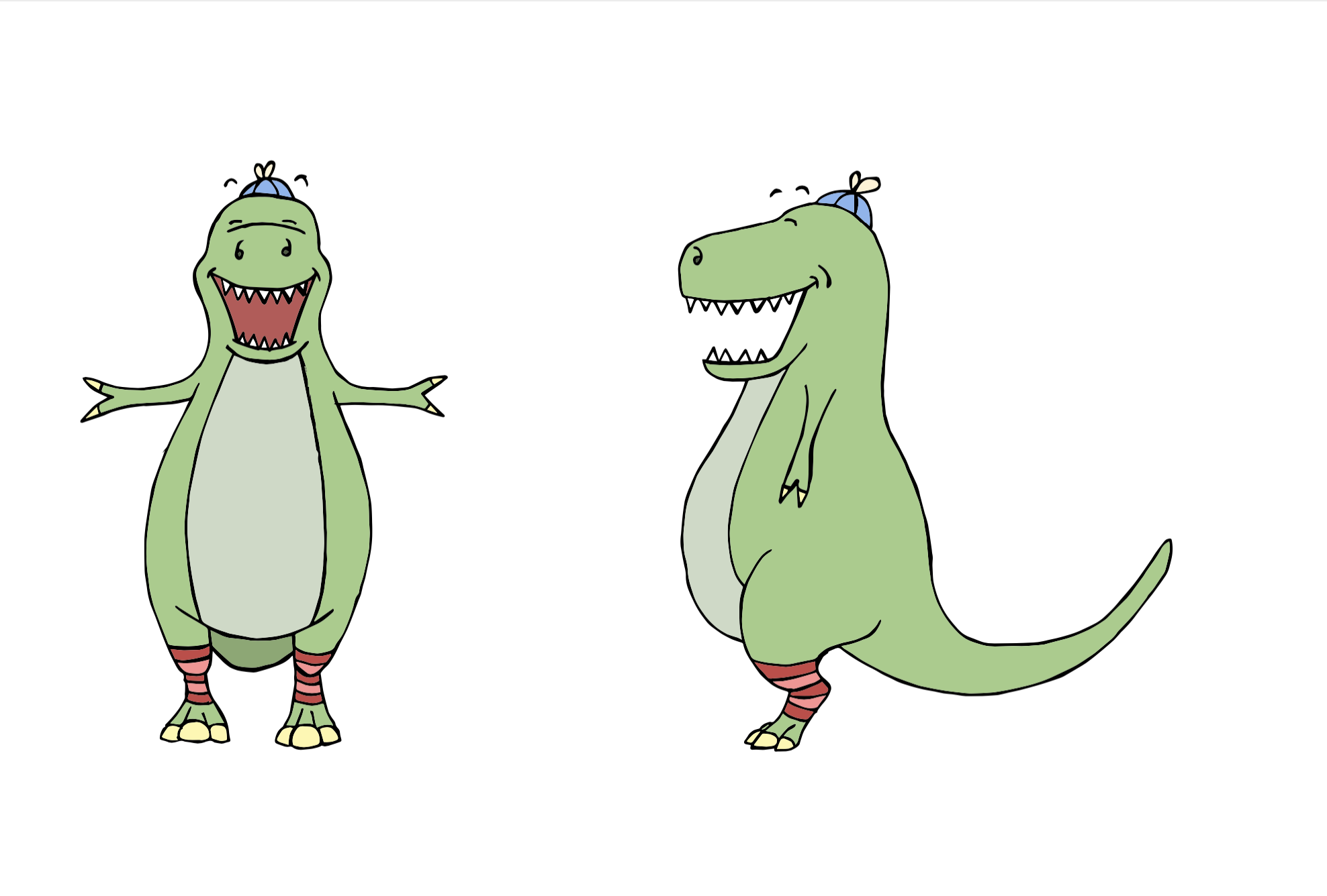
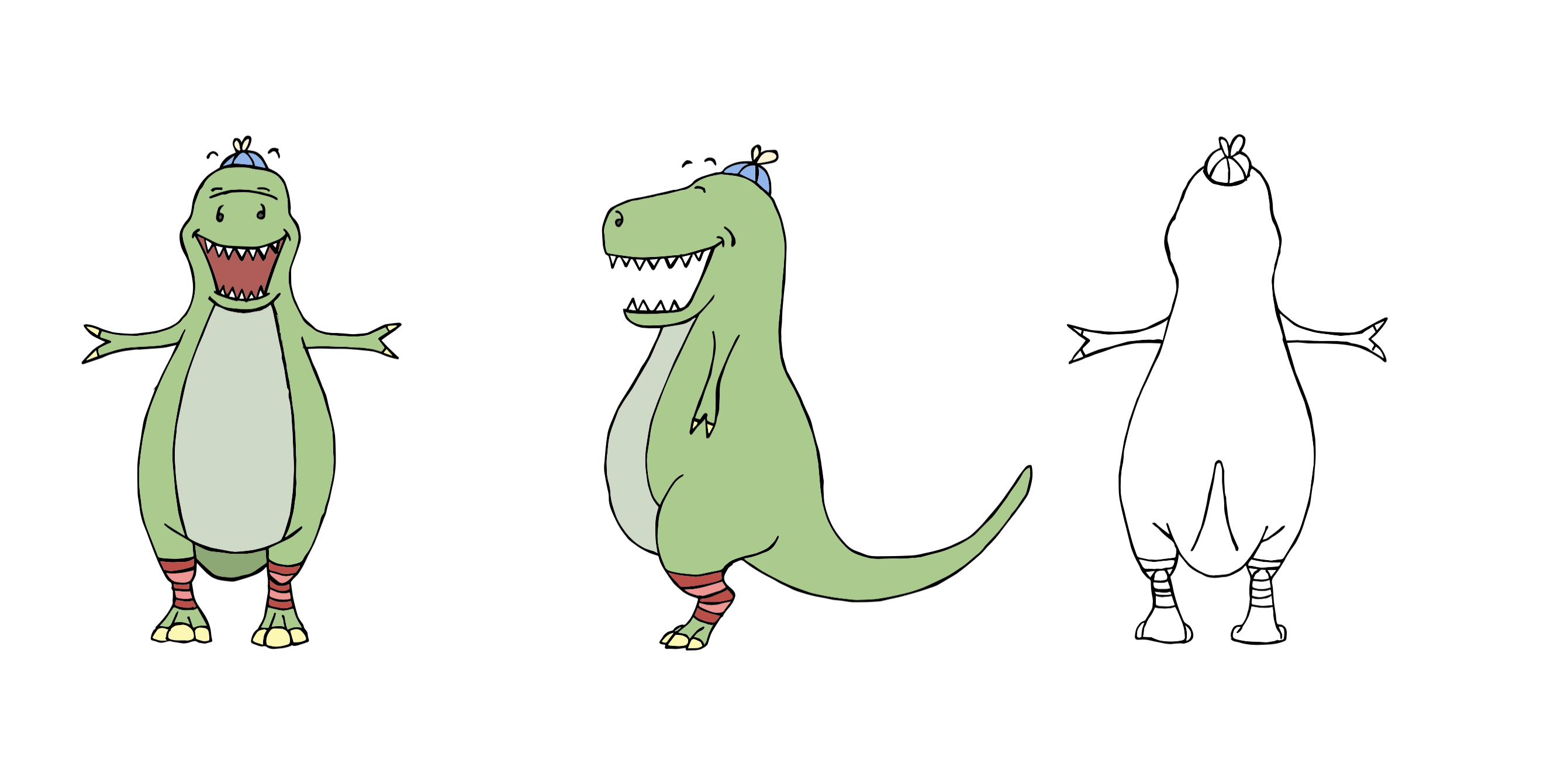
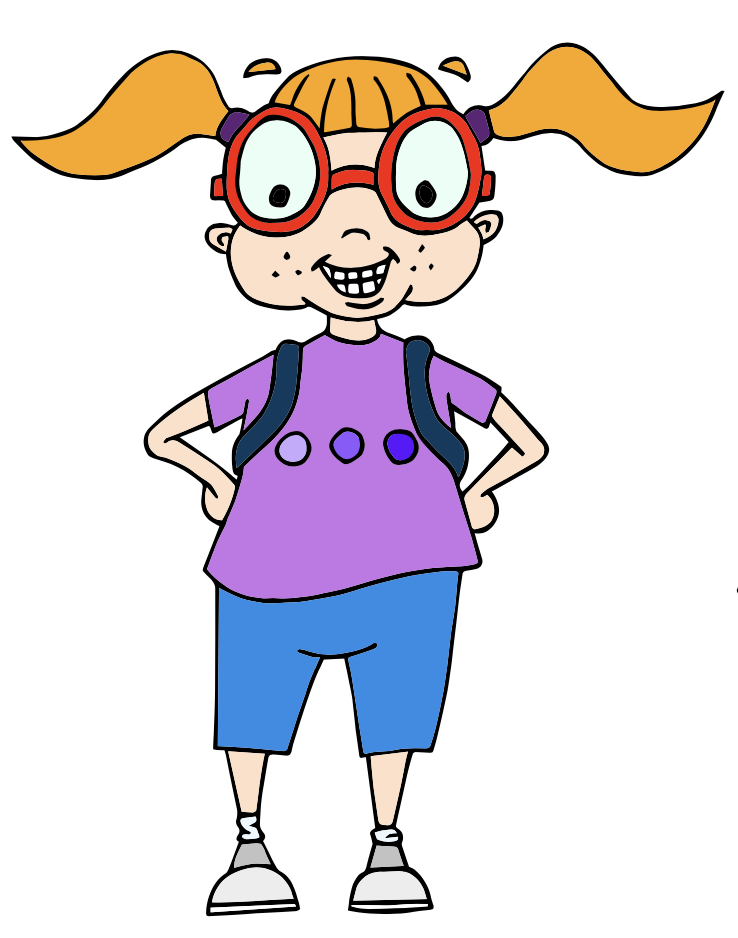
The final coloured version of Dino can be seen below.
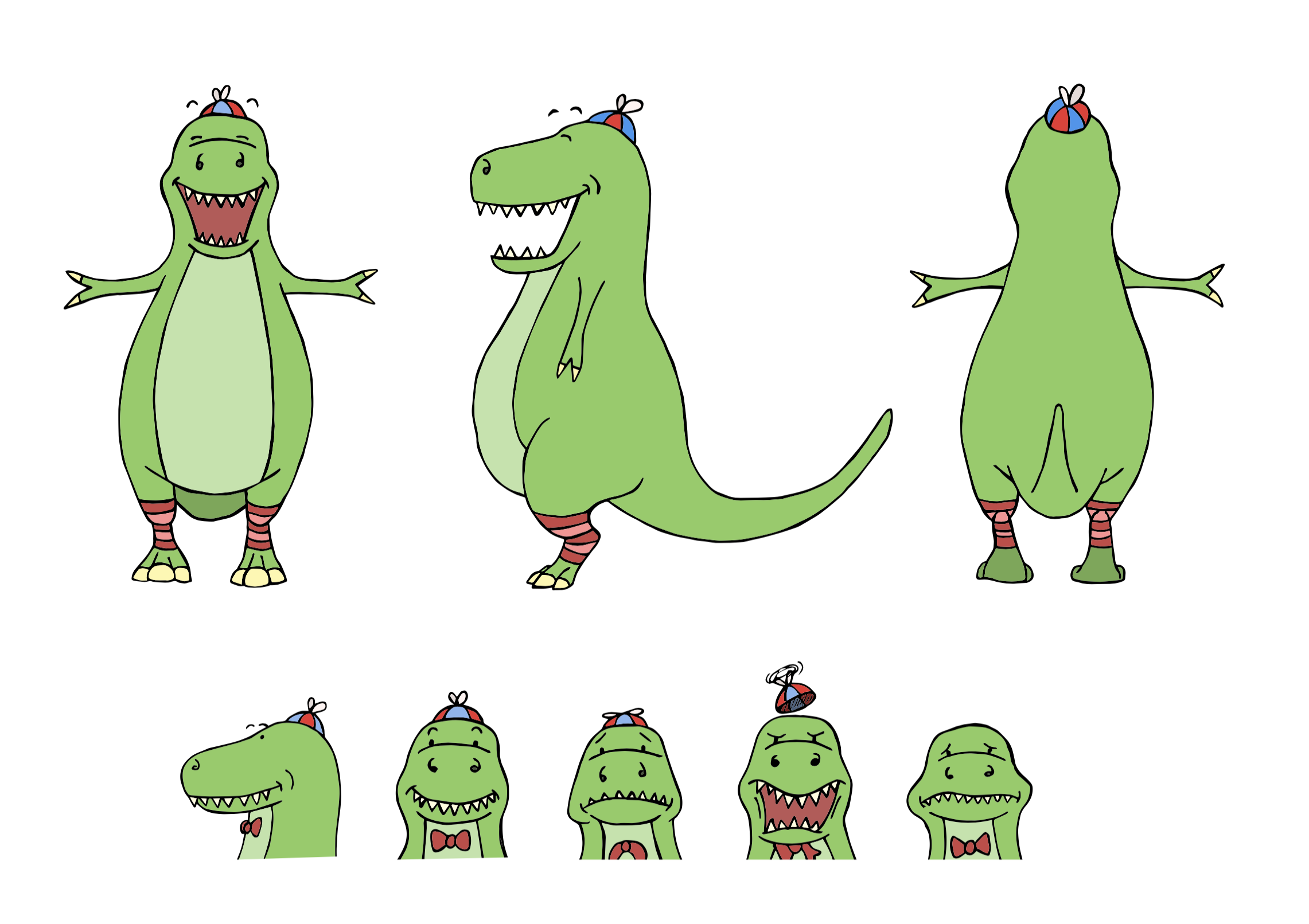
I was pleased with my effort for my first character turnaround.It was a steep learning curve and I found it very beneficial. As previously mentioned, I would like to have improved certain aspects, such as the balance and symmetry, but I felt this had a lot to do with my drawing skills. I would also like to work on drawing expressions on non-human characters with unusual facial features! I liked the general concept of the character and felt I managed to put his personality across quite well.
Character 02 – Lottie
As I was feeling slightly more confident after my first attempt I decided to have a go at designing a human character. I opted for a girl called Lottie.
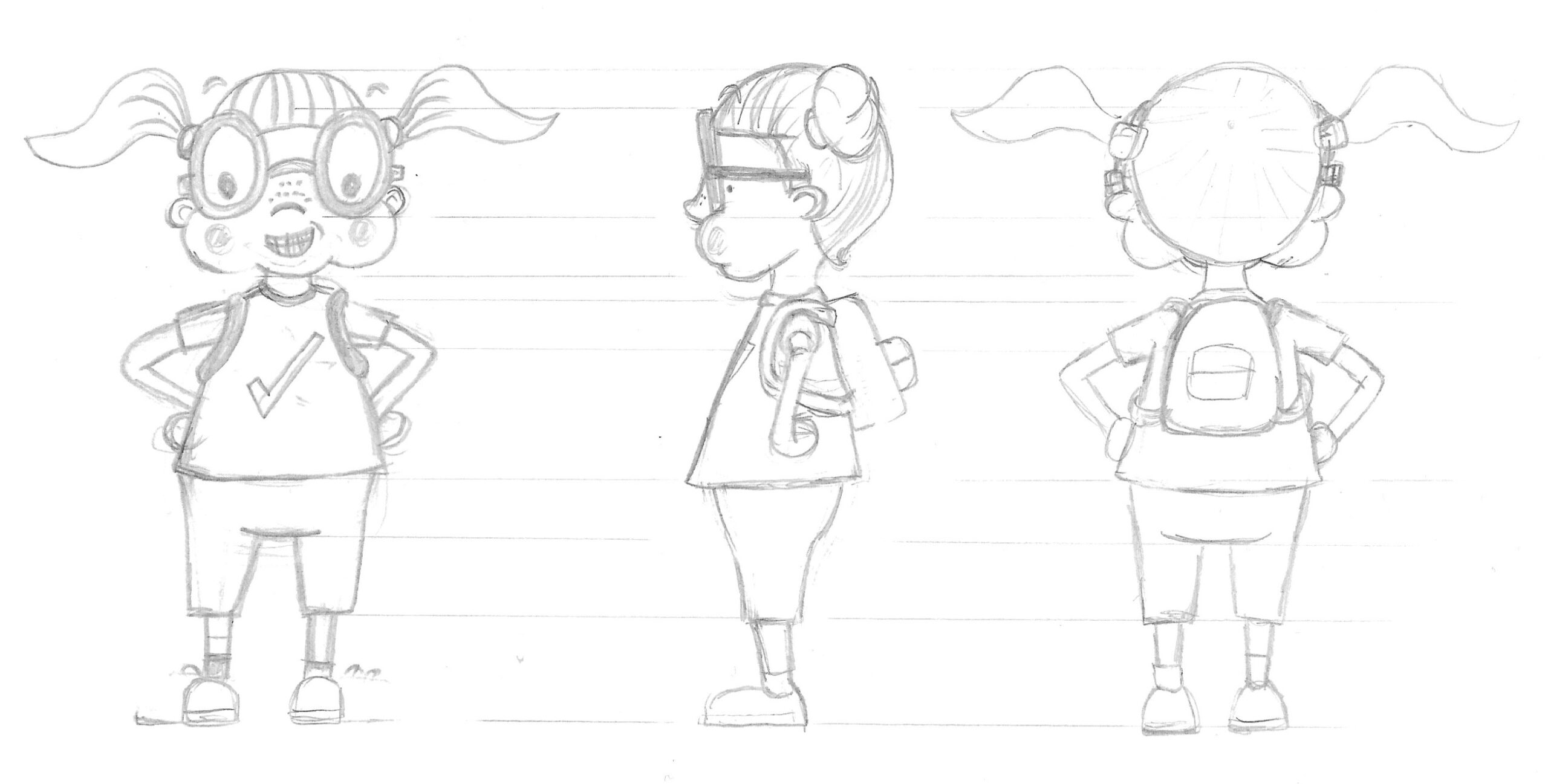
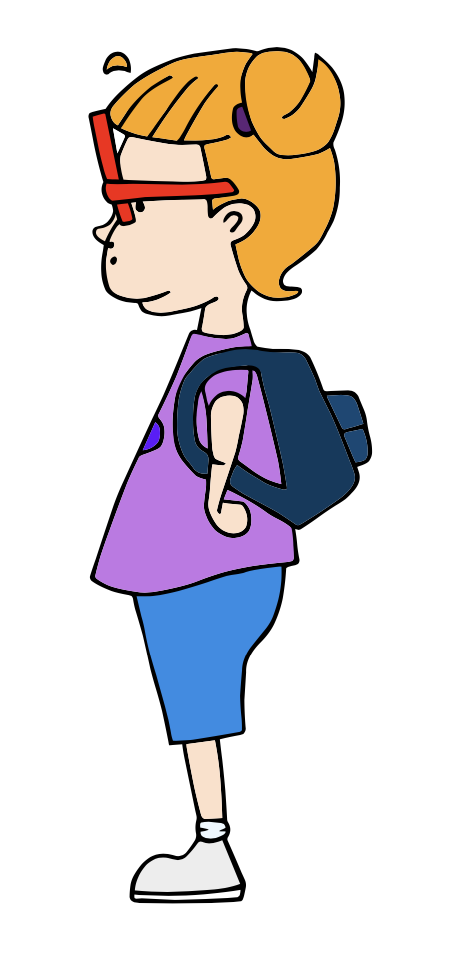
I worked on several versions to refine the design. This character was much harder in terms of working out what the different views would look like, particularly the side view as I had to imagine her ‘inflated’.
Once I was reasonable happy with the design, I moved onto making an ink version.
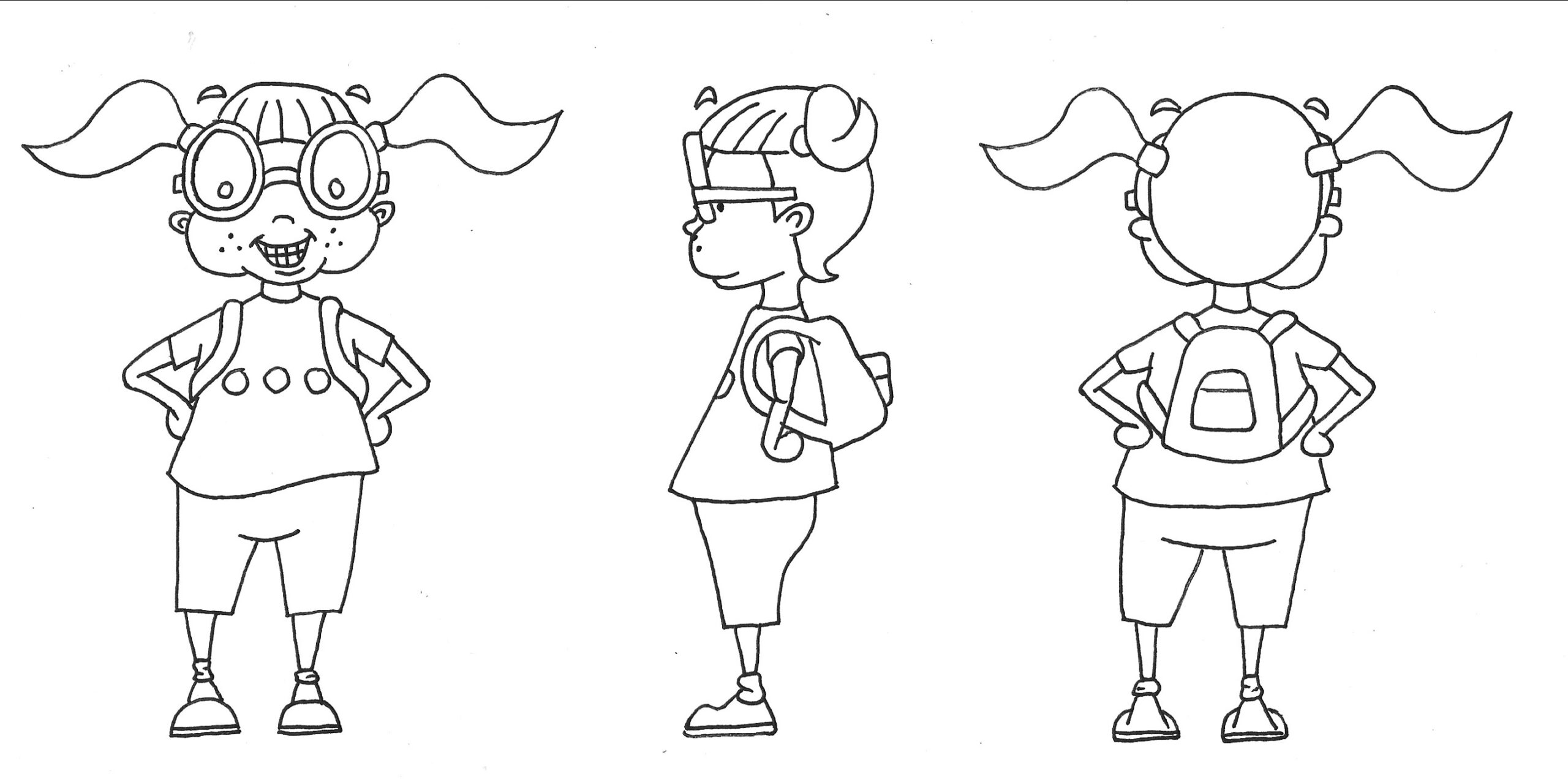
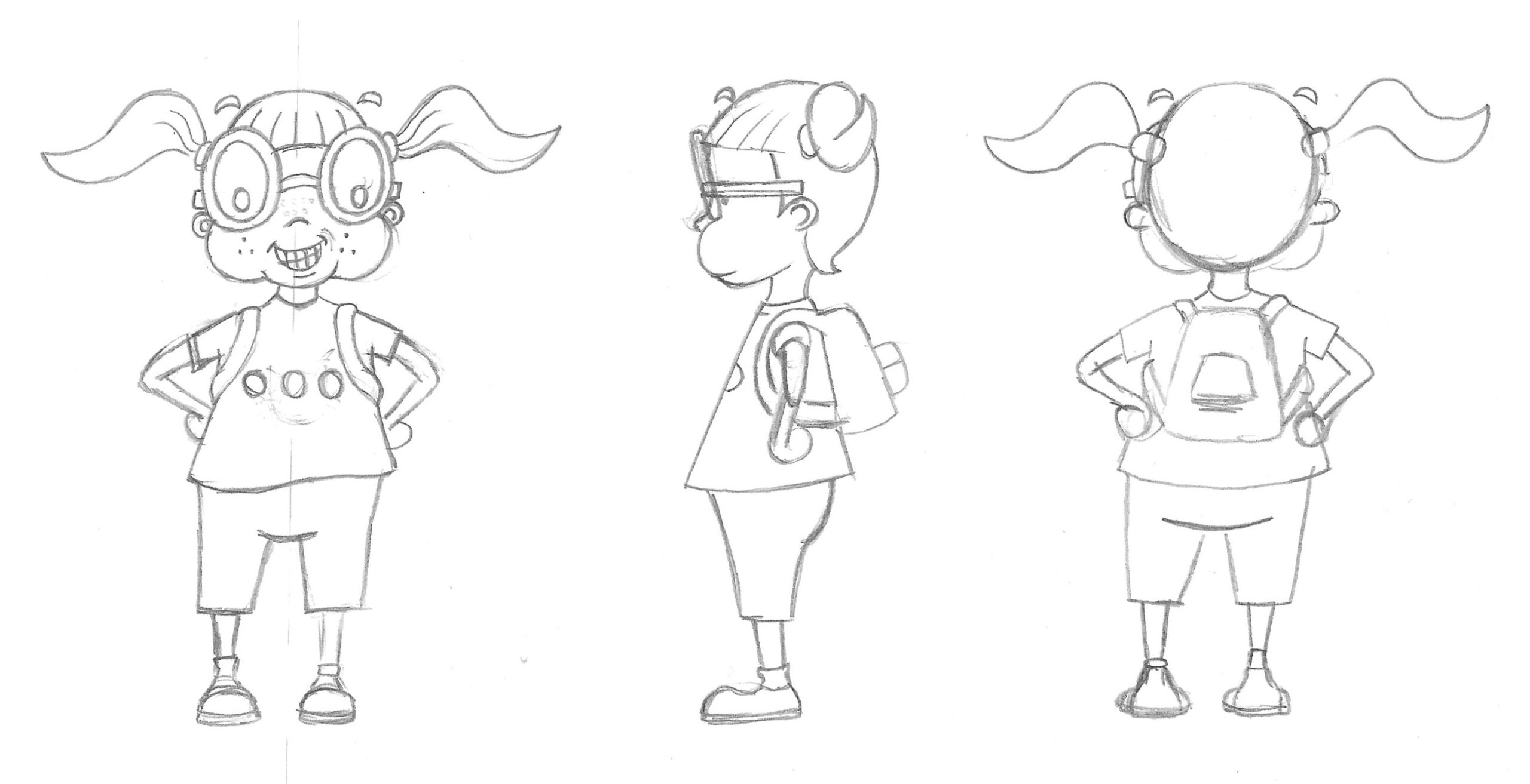
I was surprisingly pleased with my work so far and, although I was again starting to notice things I would like to correct/change, I scanned the design into Illustrator.
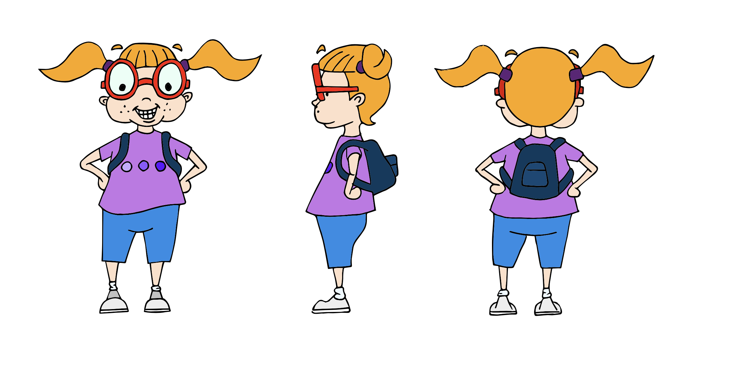
Character 02 – Final Designs
As with my first character, I used Image Trace in Illustrator and then added some simple colours.
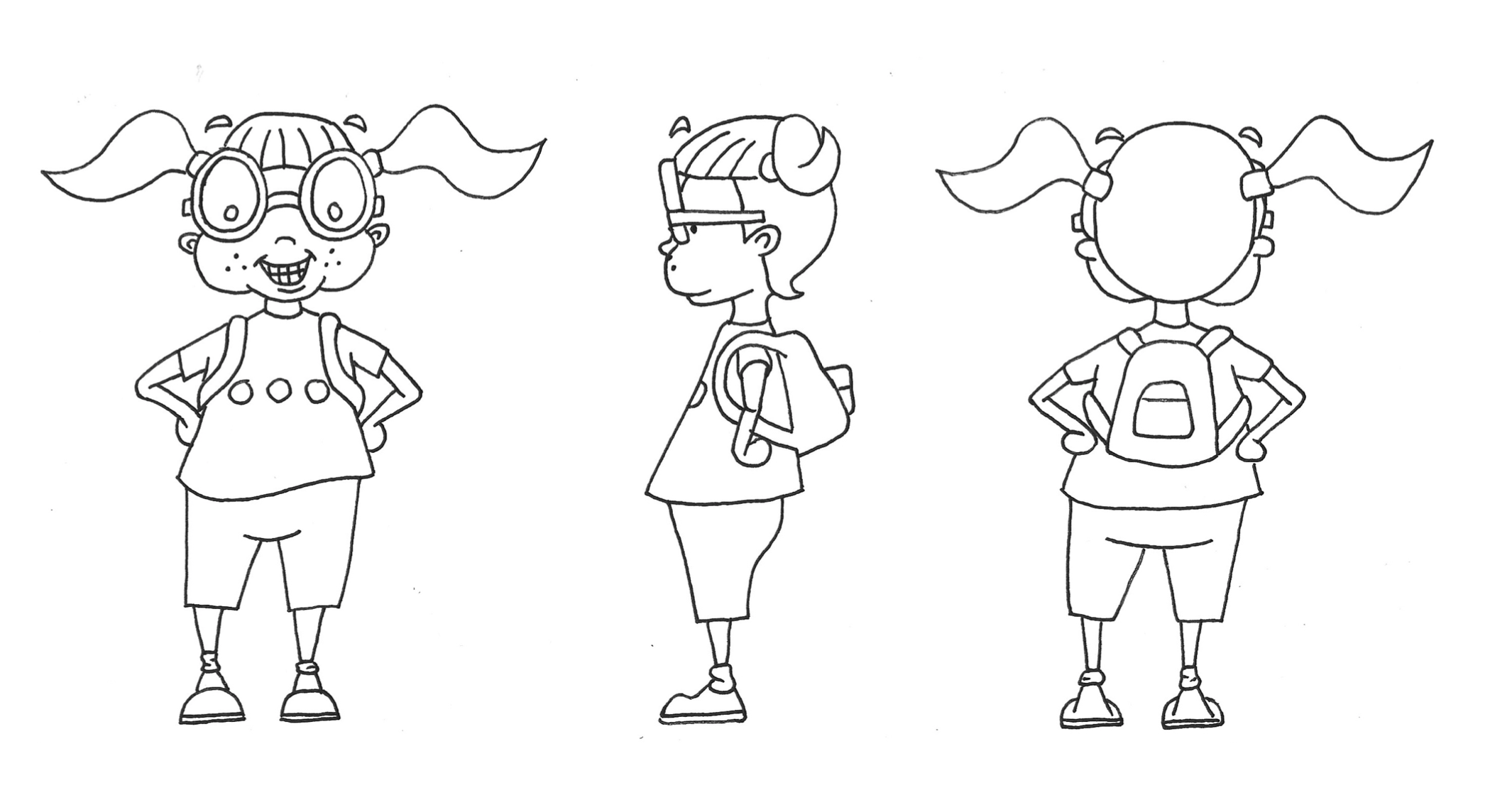
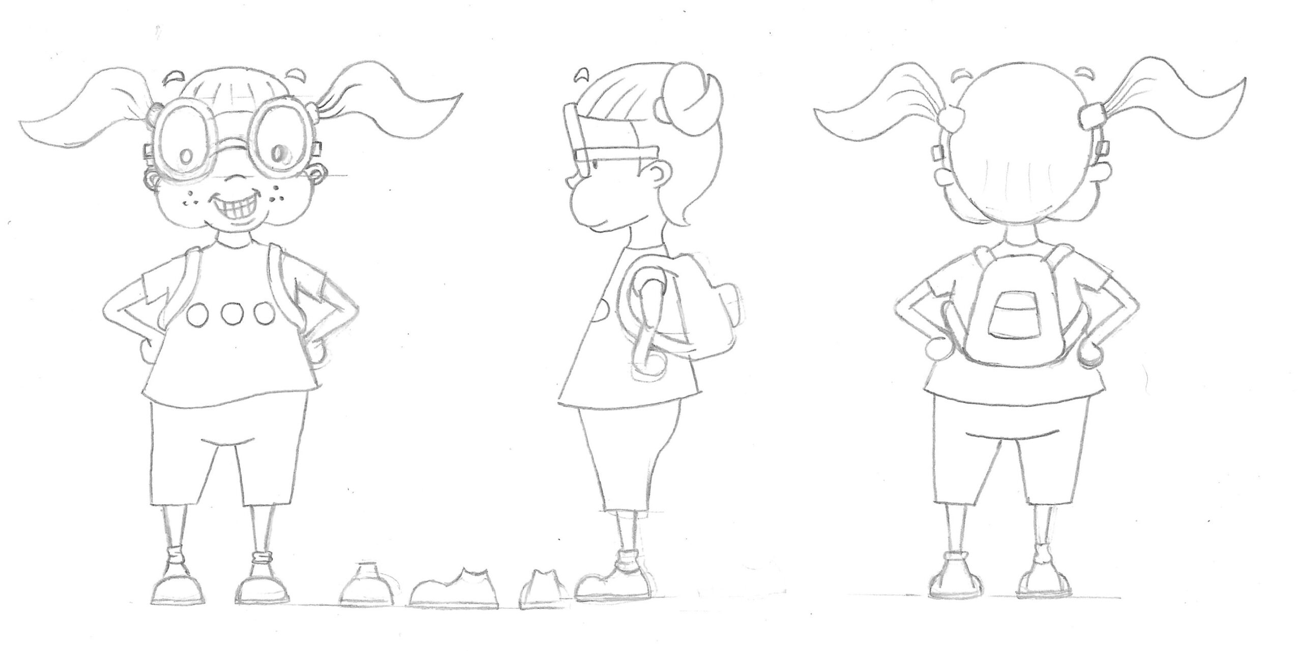
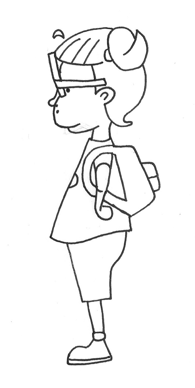
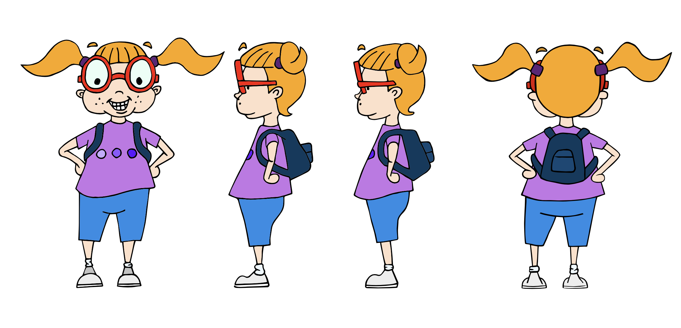
At this point I had noticed several issues in the design, which I found frustrating. I decided the most obvious one was the side view as the lower half was too far forward, so I went back to the drawing board and amended this.
I thought this was a definite improvement and scanned this version into Illustrator to continue refining the character (I left the original version on screen for comparison).
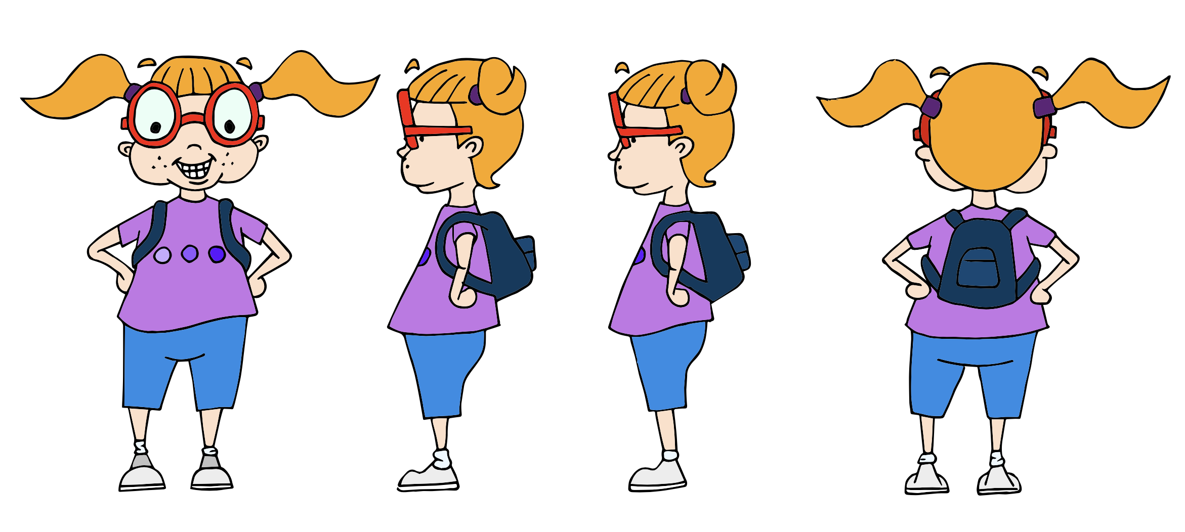
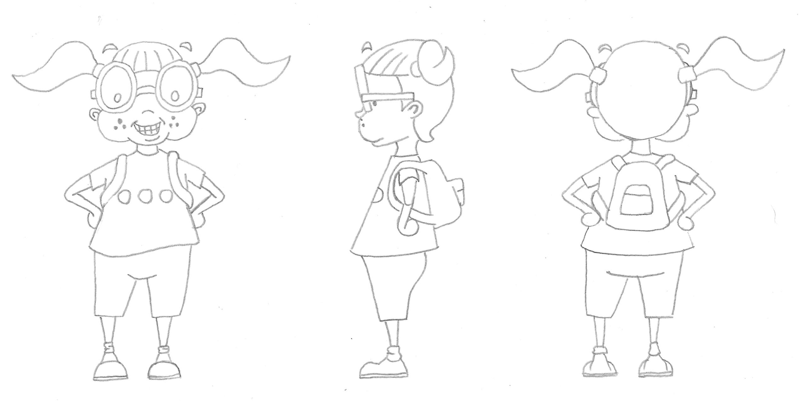
As with the first character, I tried to tidy up the design without losing the hand-drawn ‘feel’.
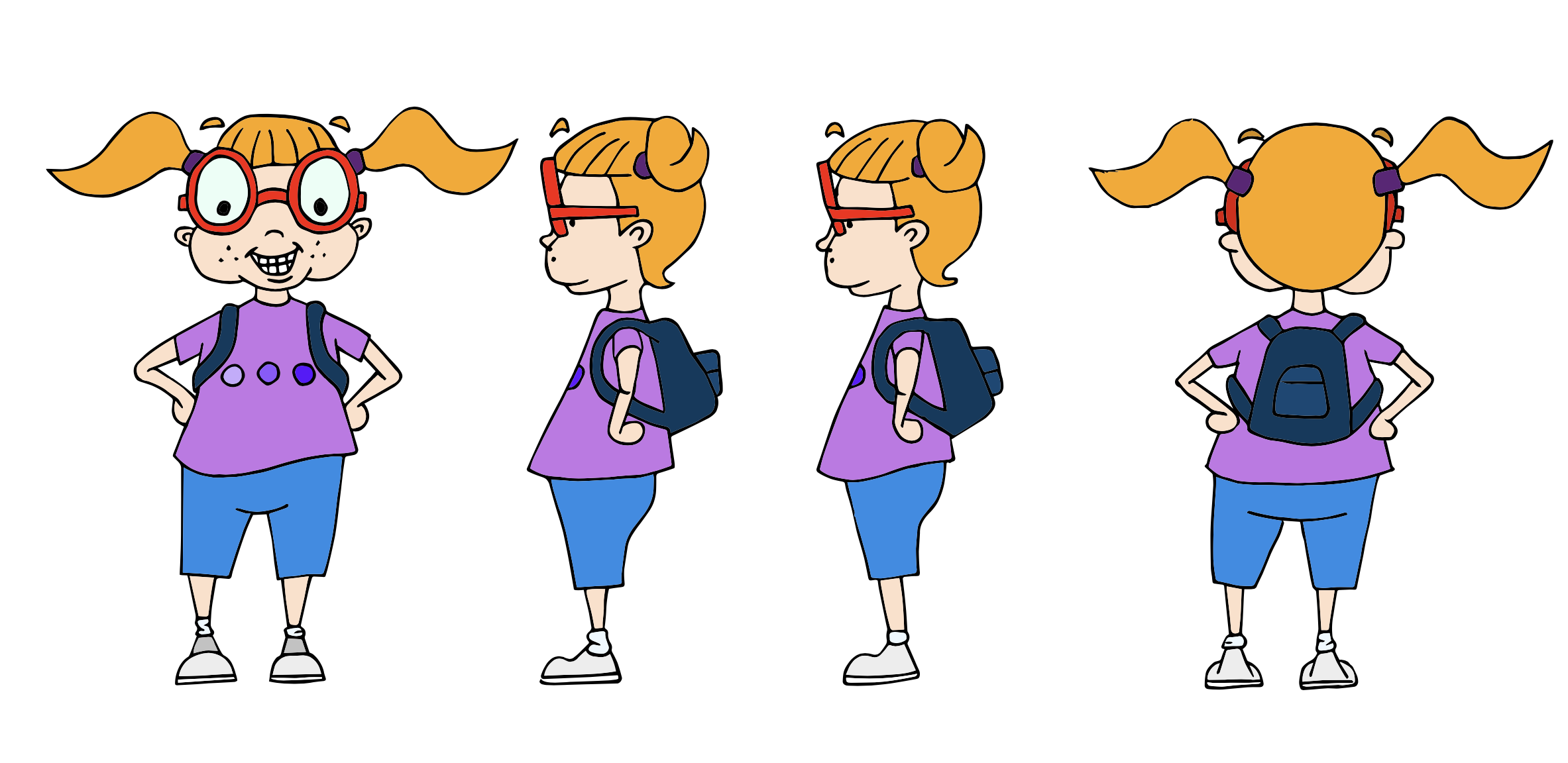
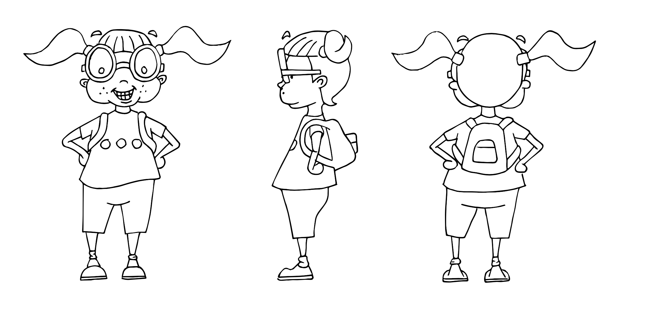
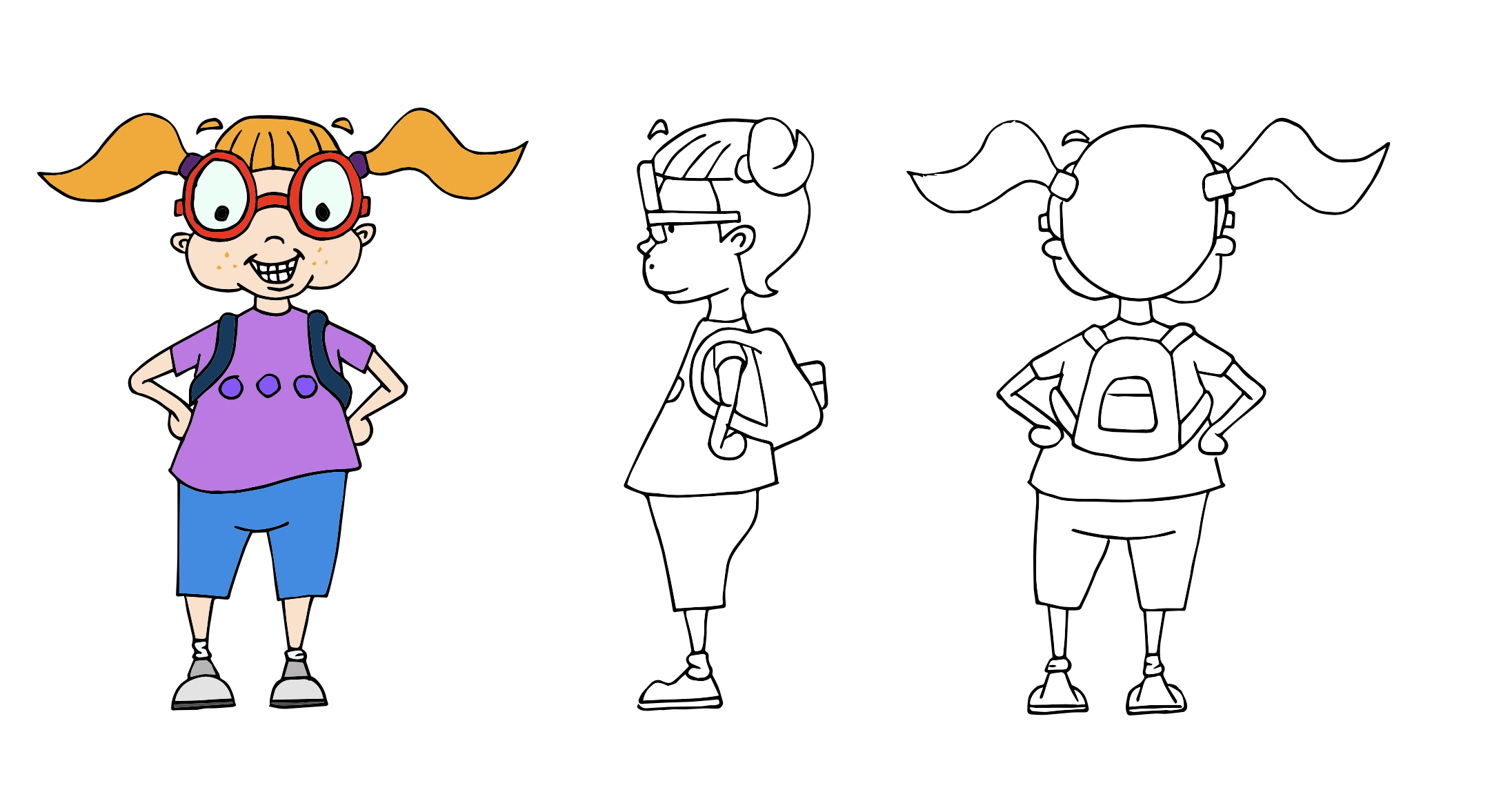
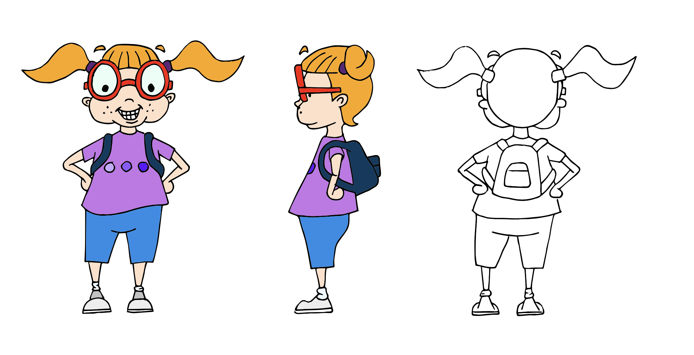
Character 02 – Final Design
The final colour version of Lottie can be seen below. I was still unhappy with certain aspects of the design:
- the shoes were too unequal in size
- the bottom edge of the t-shirt in the side view did not correspond with the front view
- the chin does not look right in the side view
- the bottom half is completely off balance in the back view (this is the mistake that irritated me the most!), along with the bottom edge of the backpack being lopsided and the arms being wonky.
- when using the lightbox/layout paper for outlines, I should have flipped the design over as the front and back views do not correspond correctly.
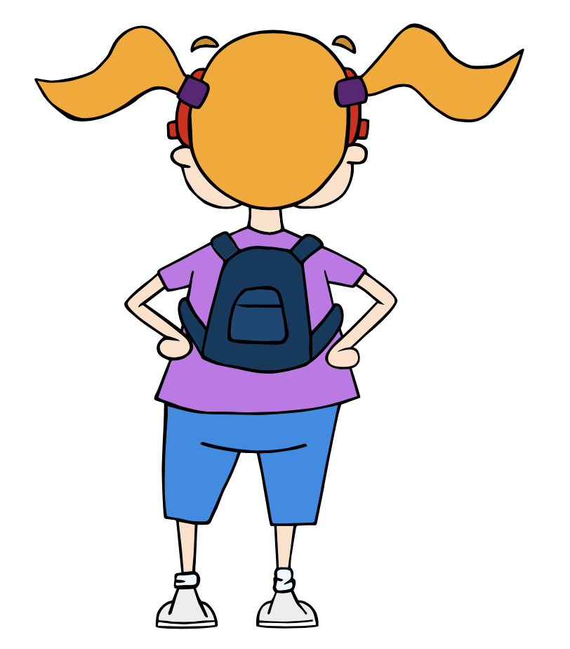
I also felt that it was perhaps too simplistic, but I decided that more detail would have resulted in more frustration! Despite my reservations, I was still genuinely pleased that I had actually managed to create a human character design in all three views. I also thought, as with my first character, that I had captured the personality I was aiming for.
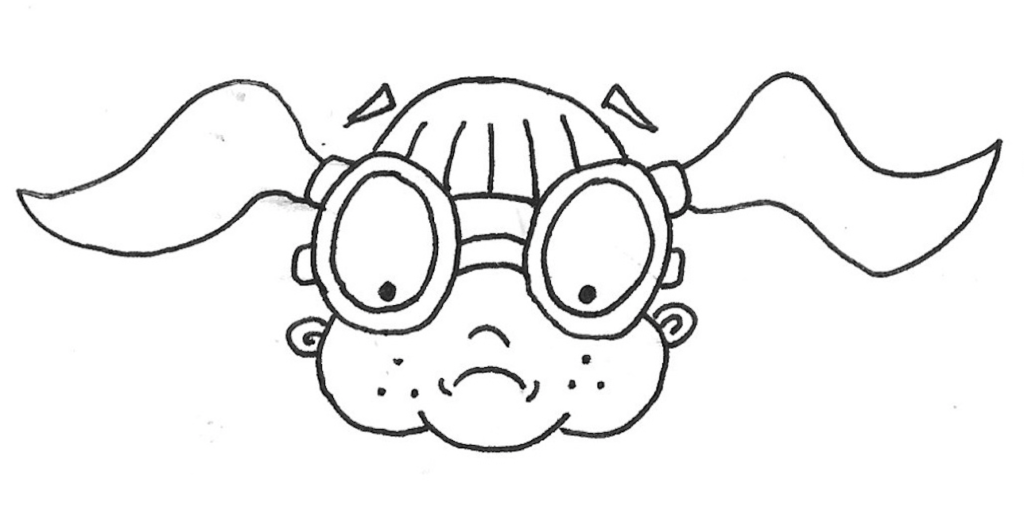
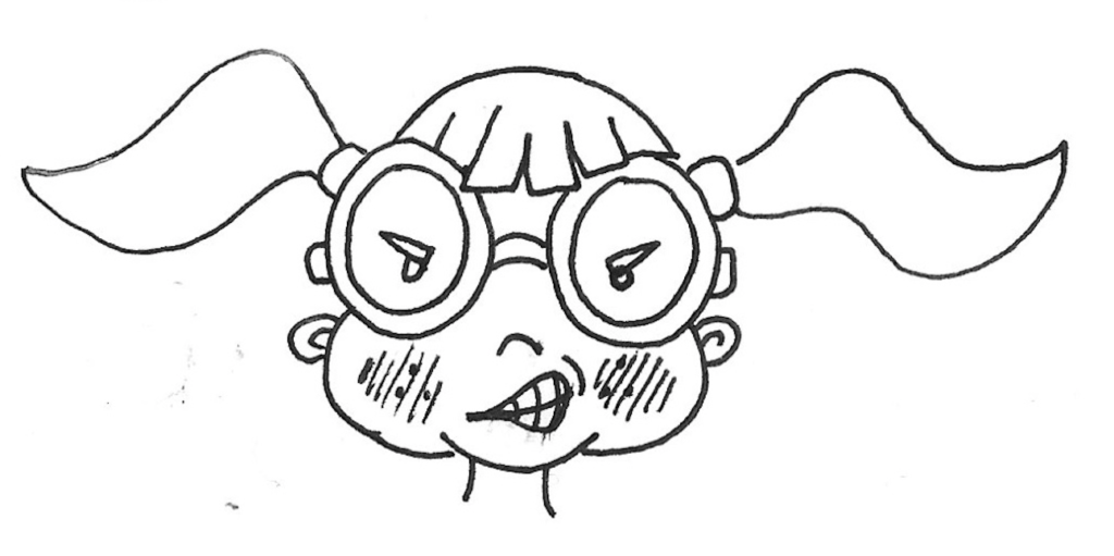
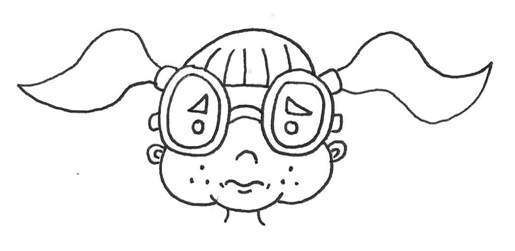
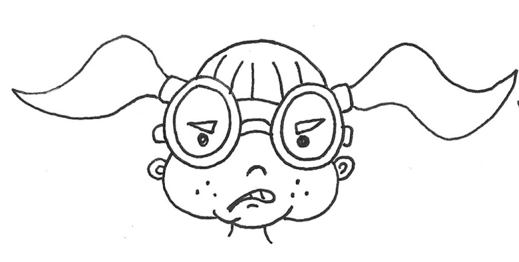
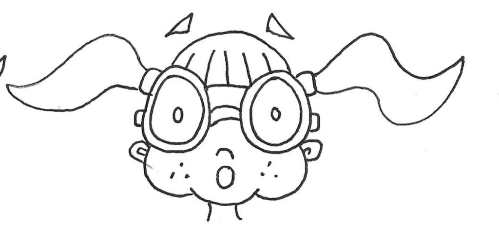
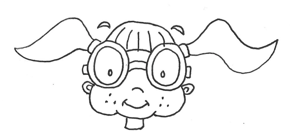
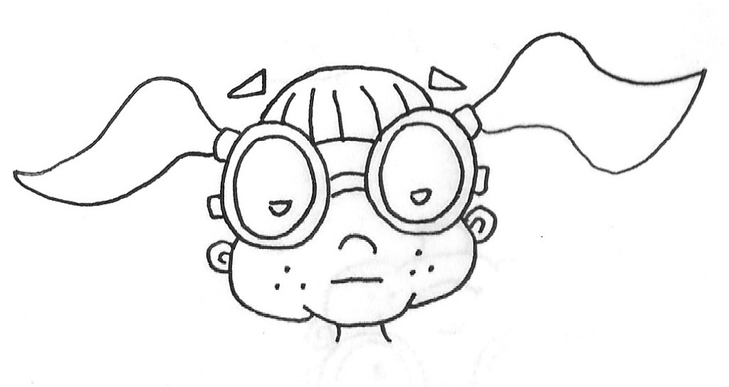
I then attempted to draw various expressions on Lottie’s face, as can be seen below, some of which were more successful than others. I did, however, find it easier to try and capture expressions on a human face than a dinosaur’s…
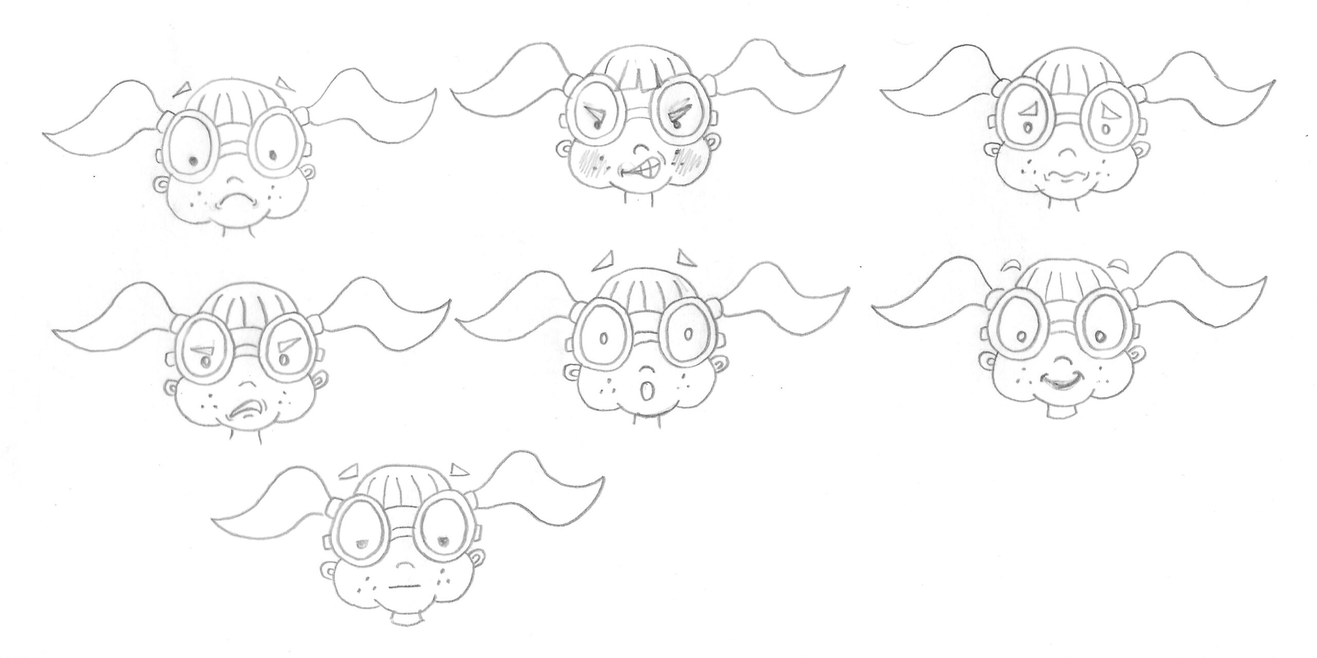
I then did quick versions of these using ink.
Final Thoughts
Although it was challenging, I found this exercise extremely enjoyable. Character design is an area of illustration that I definitely want to explore and expand on. This exercise highlighted issues with my drawing ability, which I want to improve on. I am working on my figure drawing separately from this course, which I hope will feed into any future designs, along with regular drawing practice. I also need to learn more about drawing the body in ‘movement’ as I am particularly keen to progress into animating characters.
Reflection After Tutor Feedback
I was really pleased with the feedback I received for this exercise as I thoroughly enjoyed doing it. One of the suggestions made was to possibly add tonal area to the designs, which although I decided not to do here, can be seen in the character designs I created in Part 5 for the Educational Strip exercise and Assignment 5.