Brief
For this exercise you are asked to provide an illustration for use on the menu of a sophisticated fish restaurant – one in a chain sited in major European cities. The menu uses fresh ingredients and the ambience of the restaurant is modern, bright and contemporary in design. Any food depicted needs to be visually appetising.
Although the image will be used at a small size on the actual menu, if it is successful the restaurant would be interested in also using the image as a logo on their stationery and vans. As such the image will need to be reasonably simple and clear.
You will probably want to work on the artwork at a a large scale, but you need to provide an example reduced to 40mm x 40mm as it will be initially used.
Research
I began this exercise by researching examples of fish/seafood restaurant/menu logos and illustrations on Pinterest. I found this to be extremely beneficial as I identified some creative and imaginative ways of simply representing sea-related creatures and objects. I noted that most of the logos were very simple in design, generally used just one colour (often blue) and often found a way to combine the text within the illustration.
I then looked for websites of restaurants and managed to find a few (listed in References). The most notable point I learn from this part of the research was that many of them do not seem to use illustrations and are more often based on typography or the illustration is within the lettering. Those that do use illustrations as part of the logo, are simplified versions of fish, boats and other sea-related items. Again, there was very limited use of colour and very often this was blue. In all the research there seemed to be a prevalence of cutlery within the logos!
Mind-Mapping
Following this research, I moved on to mind-mapping some thoughts and potential ideas for my logo.
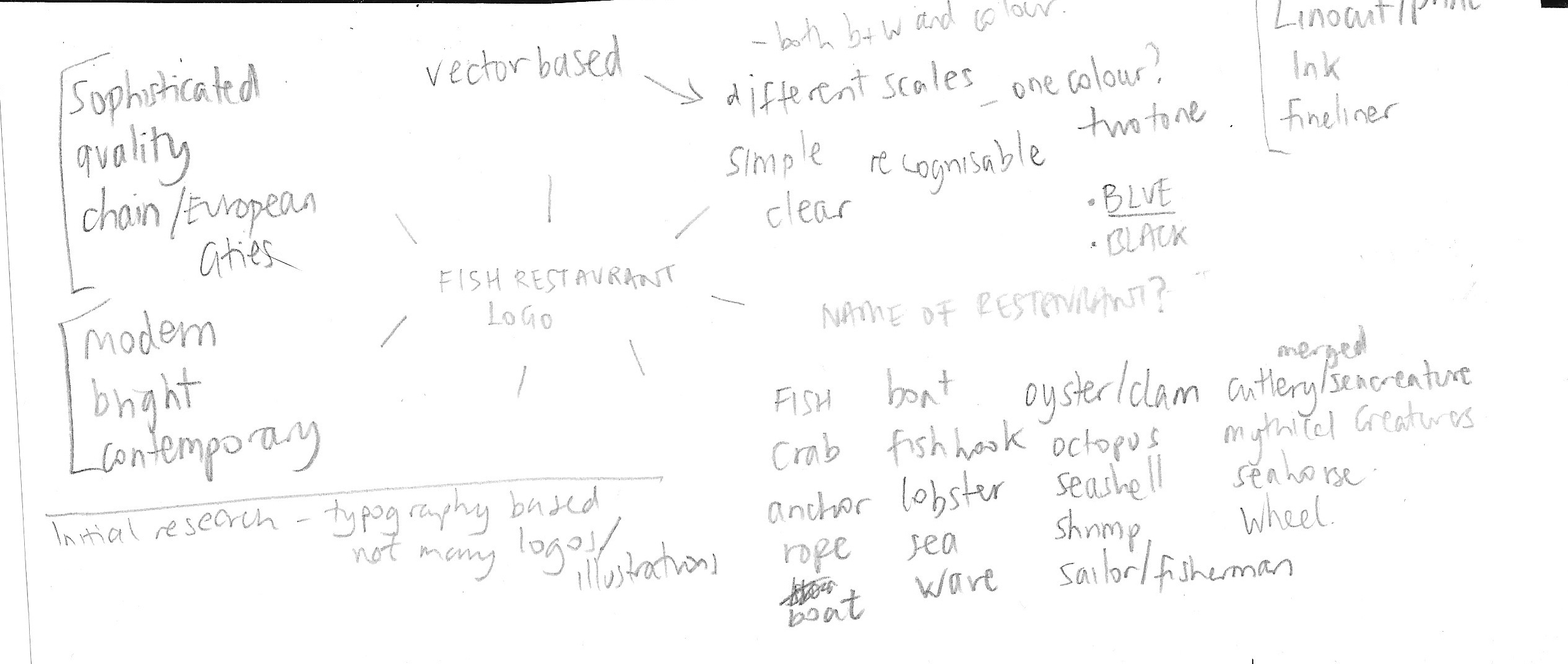
The key points I decided on were that the illustration should be:
- vector-based so it can be resize easily
- simple, clean and easily recognisable
- based on a sea creature/object
- limited in terms of colour (one or two)
I thought that the style of a lino print or ink illustration would be appropriate (and seems to be a popular choice in my research).
I also noted that it would have been helpful to be provided with the name of the restaurant as this could have influenced the design and also offered potential for more creative solutions.
Ideas
Next I started making some rough sketches of potential ideas. I found this much harder than I expected as all I kept thinking about was fish on a plate.
I decided to name the restaurant ‘The Good Catch’.
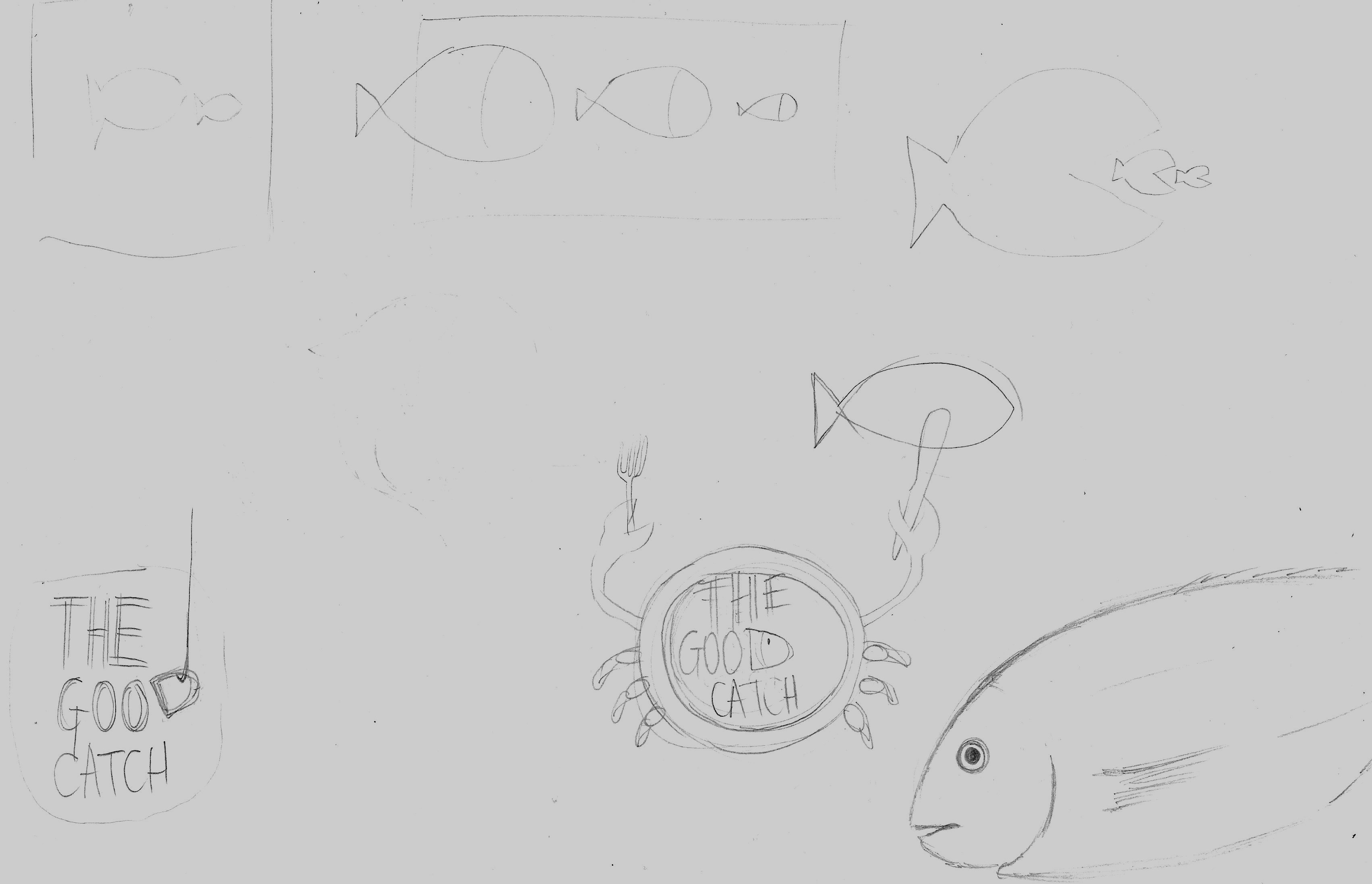
As can be seen from the above, I was initially a bit lost in terms of ideas, but then I thought of having a plate as the body of a crab, which put an idea in my head that started to take shape. I realise I should explore lots of ideas before pinning one down, but decided to just go with this one and see where it ended up (I would have spent a great deal of valuable time trying to come up with others).
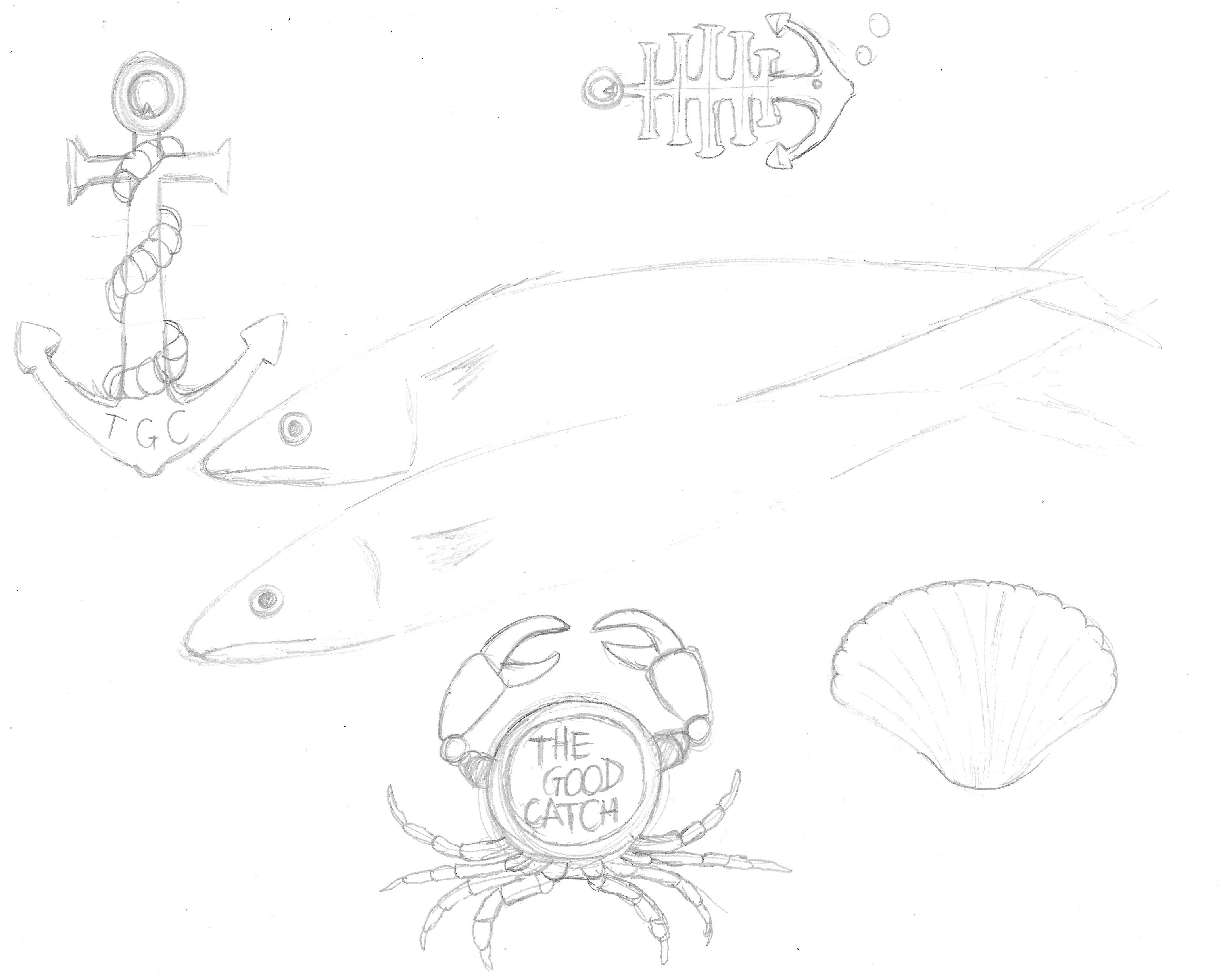
Developing the Idea
I found reference images for how to draw a basic crab and replaced the body with a plate. I had to remind myself that it did not need to be completely realistic and should be a simplified version.

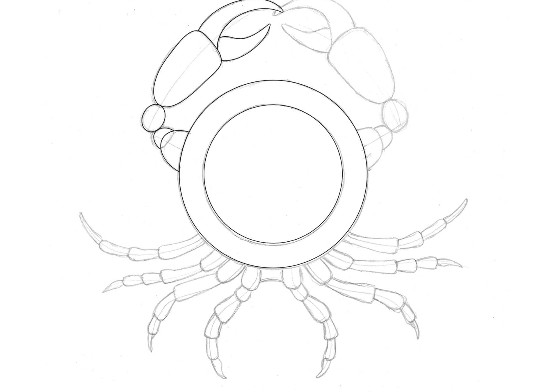
I was quite pleased with this initial sketch. I then scanned this into Illustrator and began making a vector based version.
I then began thinking about variations and making the illustration appear more visually interesting.
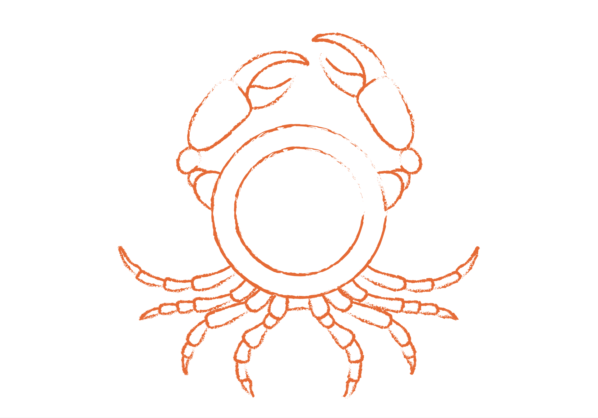
I felt that adding a brush to the stroke definitely improved the illustration and made it appear more traditional in appearance rather looking ‘perfect’. It was starting to look more like what I had initially had in mind. I was not sure about the use of the colour red at this point as it looked quite severe.
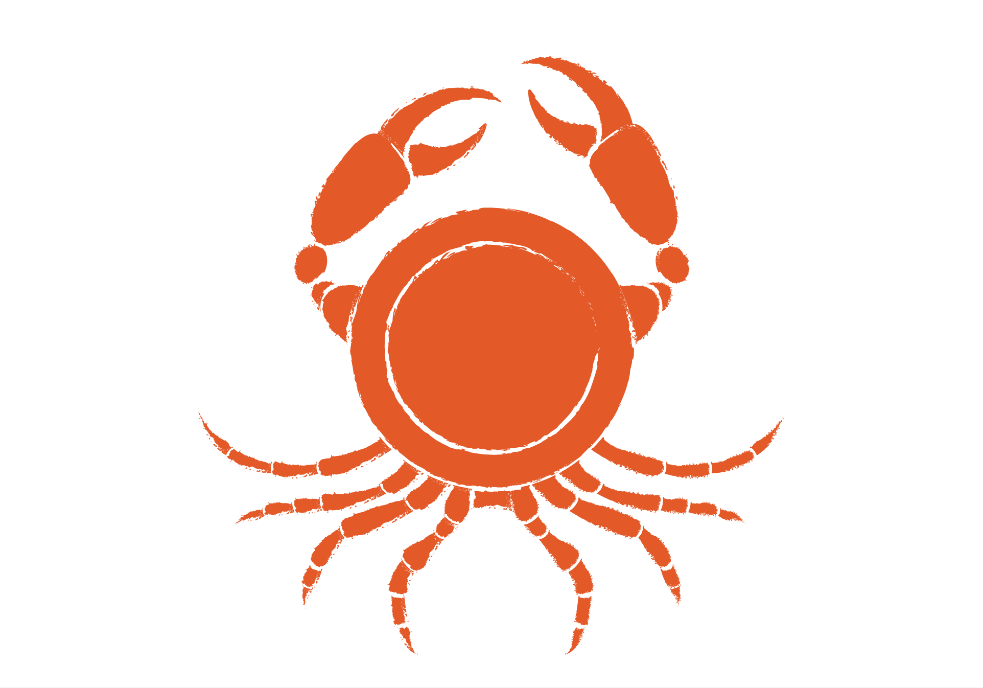
I could not decide if filling the plate with colour made it less recognisable and defeated the idea of the design. This would lead to several more different versions.
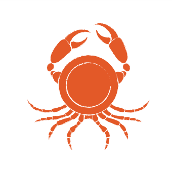
I decided that the overall design was recognisable at the required size of 40mm x 40mm
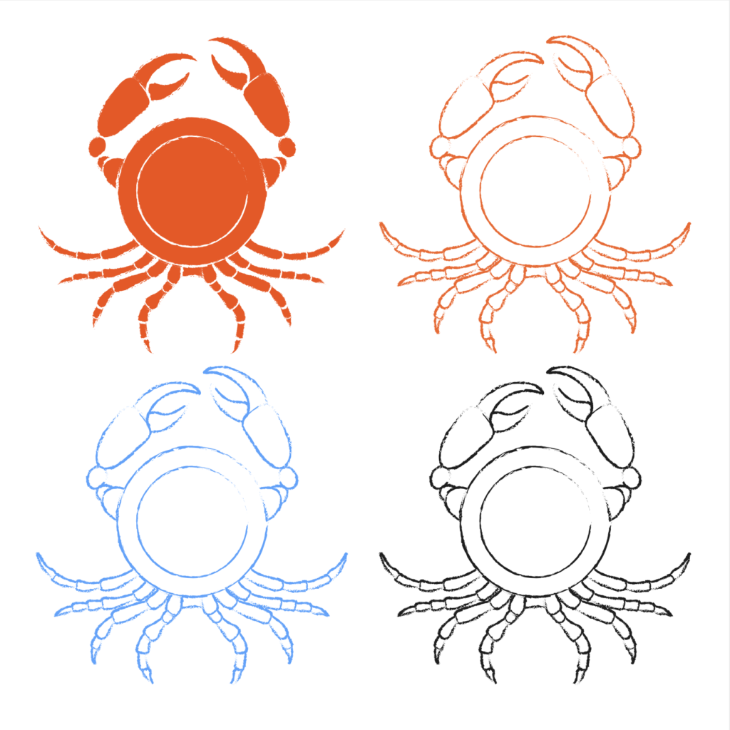
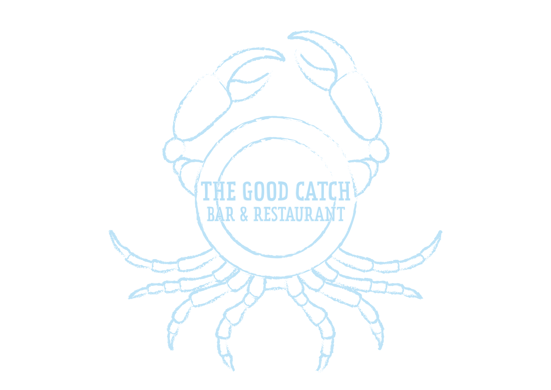
The use of blue was an improvement in terms of softening the illustration.
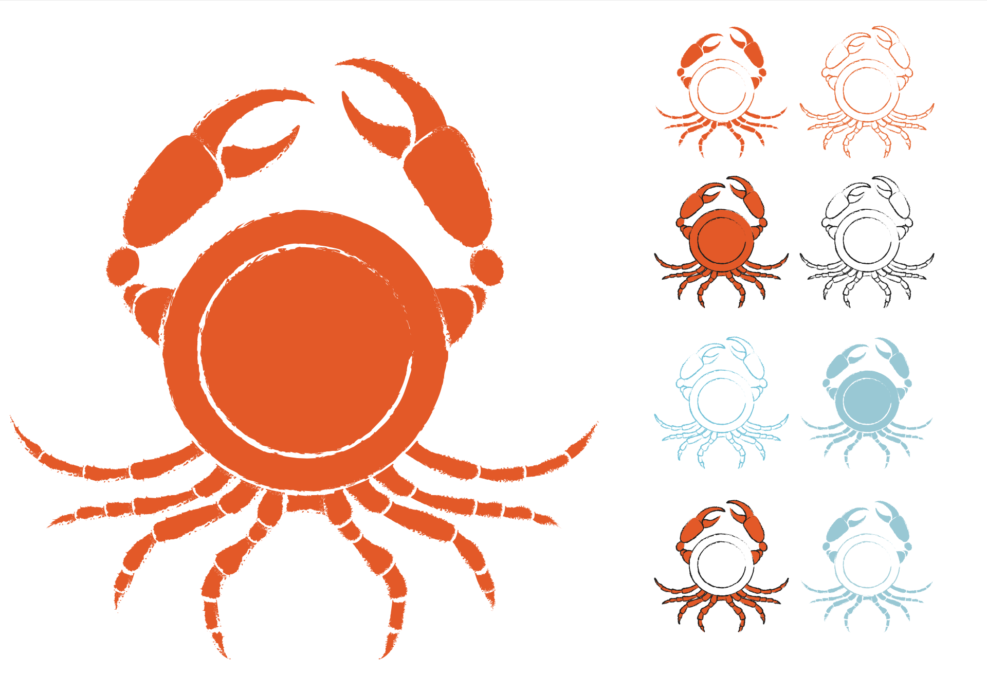
The designs which kept the plate as white were more successful in communicating the concept.
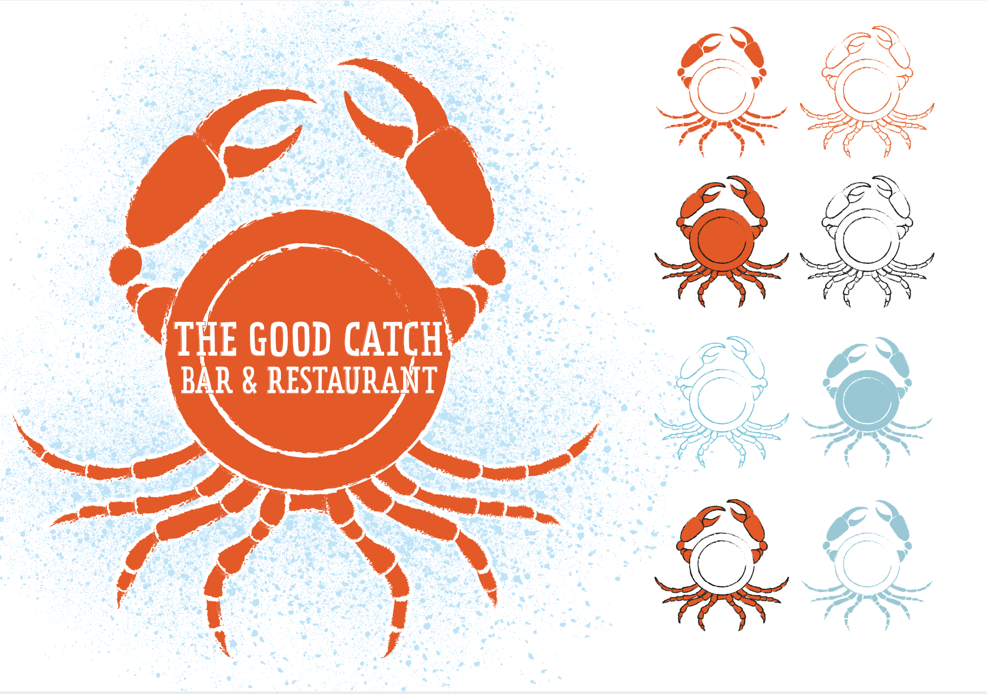
I then attempted to start add text to the design, which created the dilemma of trying to fit it in the plate whilst still being readable. I realised that the text would only be added to the design when displayed at a larger scale.
Although I was quite pleased with the design so far, I wanted to avoid the text being obscured by the inner rim of the plate as this was not ideal in terms of visual appeal and also readability at a glance.
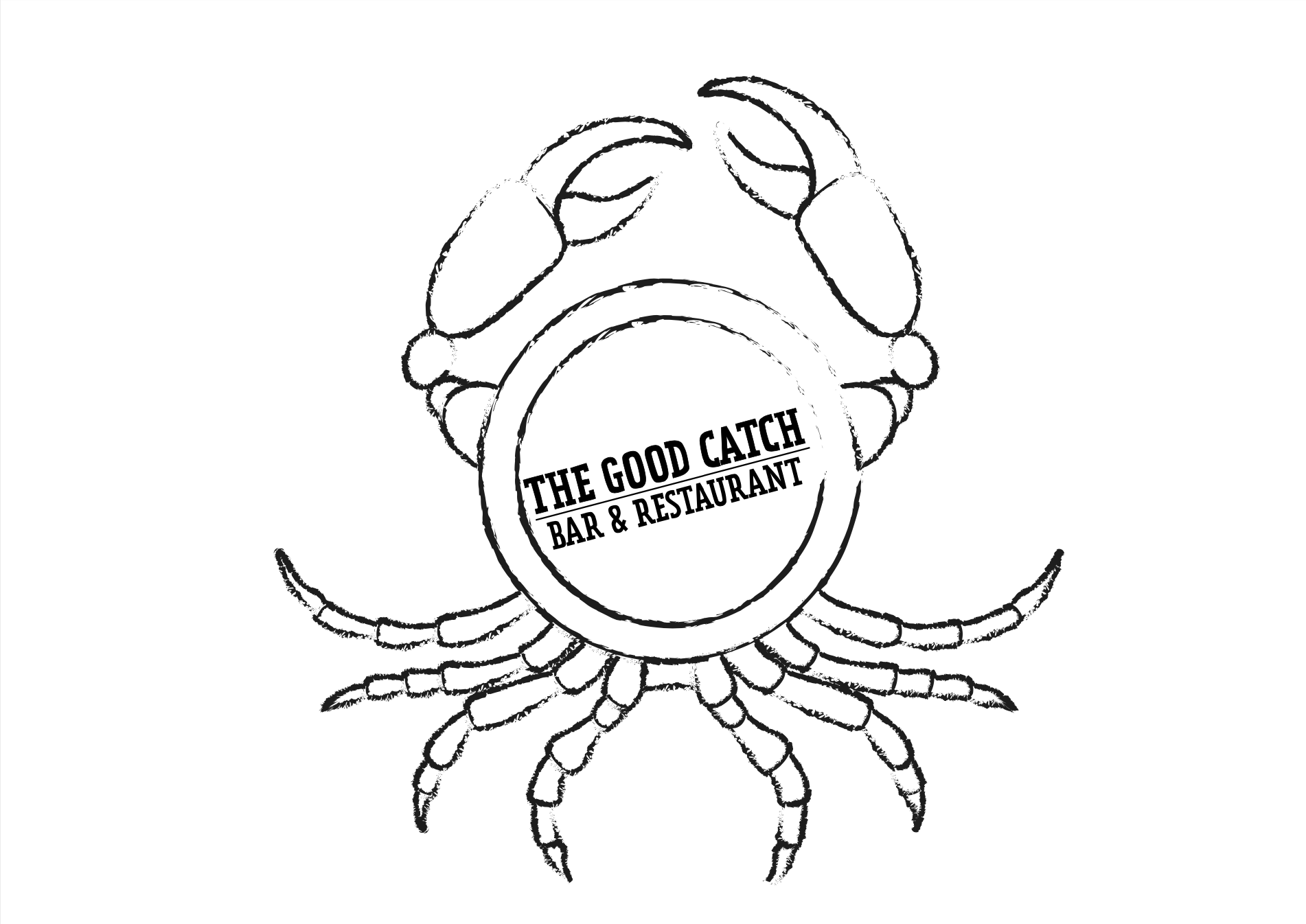
I decided to scale down the text and make the rim of the plate thinner, which I felt worked better. I also experimented with rotation of the text, which I thought made the design look like a stamp.
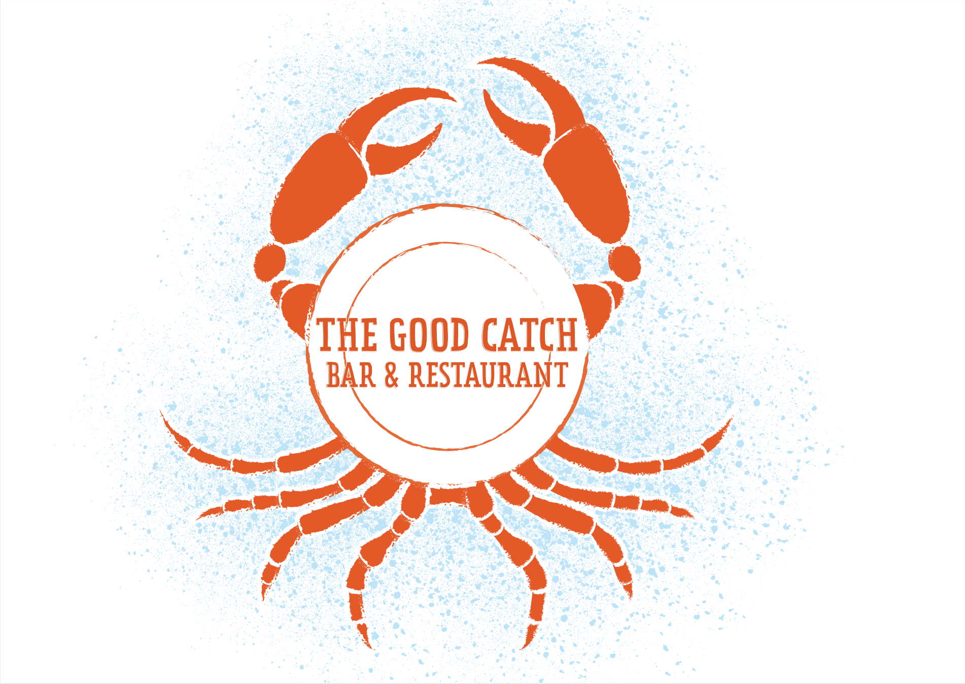
Final Design
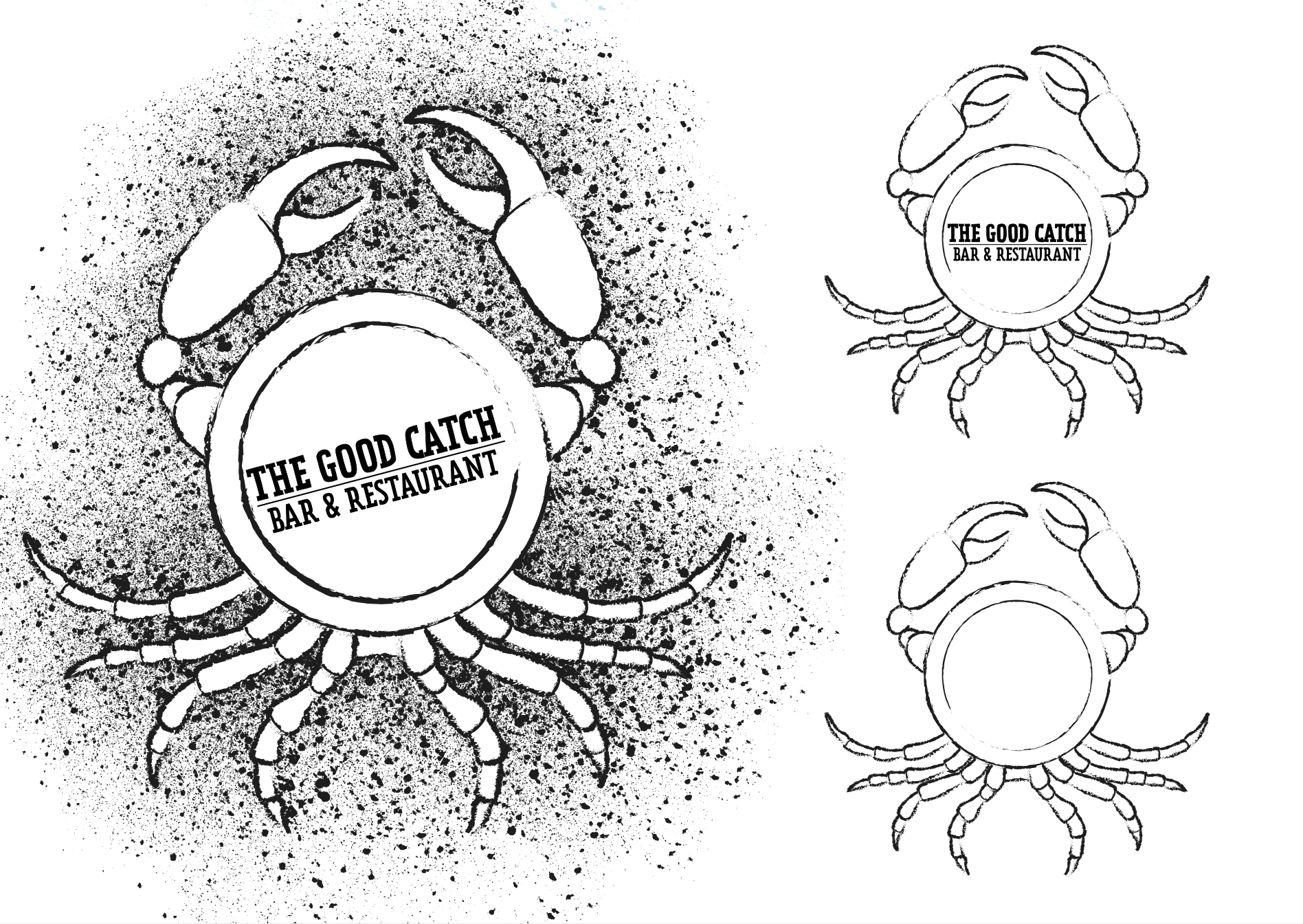
I chose to have six variations of the final design. these did include text, but as stated previously, for smaller scale versions this could be removed.
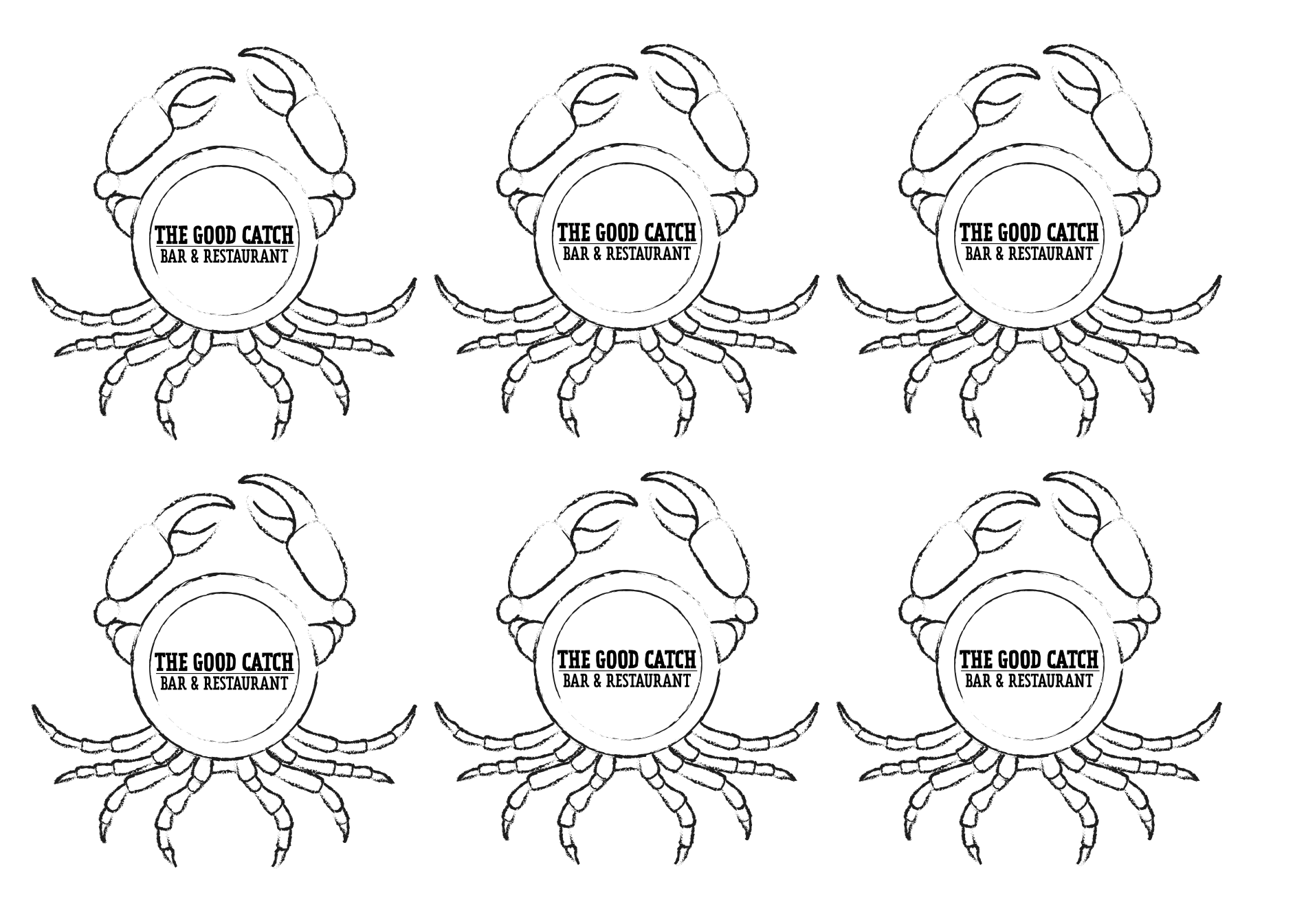
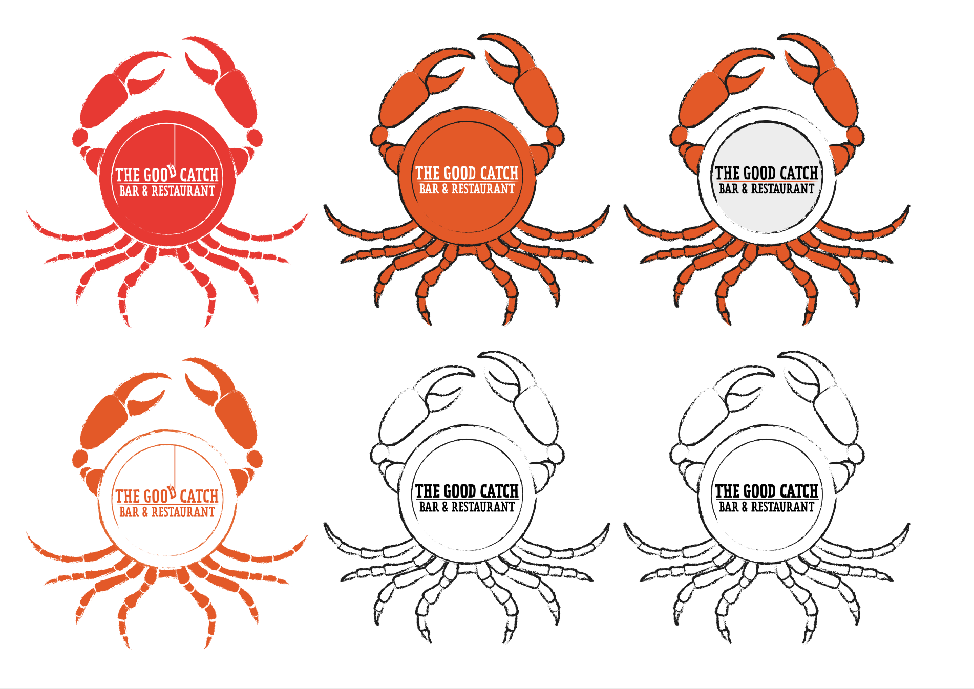
I incorporated another of my initial ideas in these final options, with the the letter ‘D’ being fished out, which I thought worked quite well and added another visual element to the design. I felt the red/black designs were more more impactful, but the blue ones came across as more ‘friendly’, which is probably appropriate for the purpose of the illustration.
Final Thoughts
I could have kept coming up with variations of the final design and I was genuinely quite pleased with the results. I thought it fulfilled the brief and worked as a logo design. In hindsight, I would have tried moving the legs further around the plate as when I looked at images of crabs they were higher up on the body. However, I still felt it was recognisable as a crab and did not look terrible.
I was glad I went with the idea and this allowed me to start being creative without worrying about coming up with other ideas fo the sake of it (although I understand this is generally not recommended).
It would have been beneficial to attempt a real linocut print or ink version of the design.
On a side note, this exercise demonstrated potential ethical issues as I do not eat animals so being asked to do an illustration for something that goes against my values was quite challenging. This may have added to my lack of inspiration when trying to come up with ideas as I do not find the food appetising or appealing and did not feel comfortable trying to portray it as such.Therefore, this is something I would need to consider further in terms of any future projects.
Reflection on Tutor Feedback
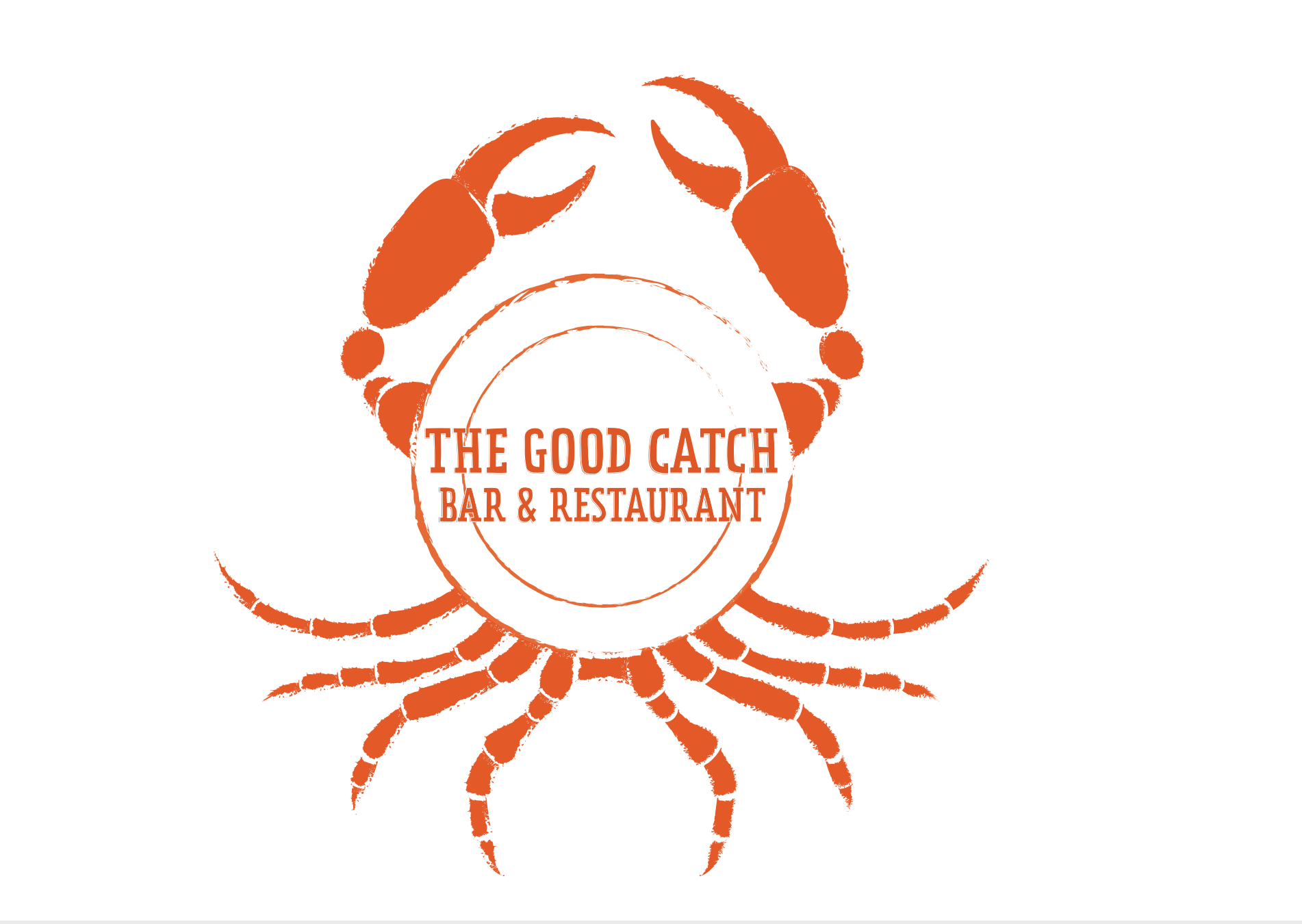
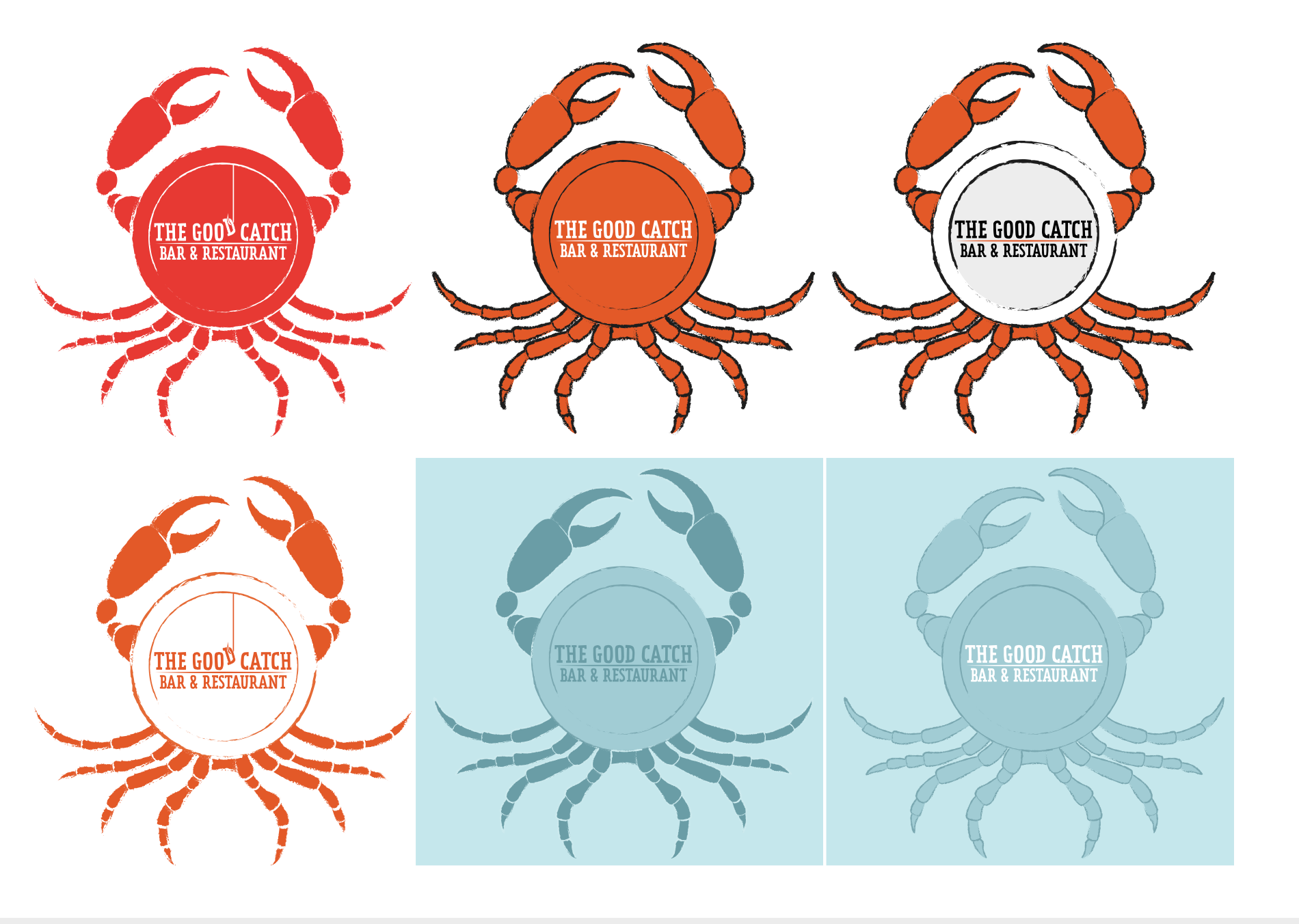
The main thing that I wanted to go back and amend in this exercise was the positioning of the legs on the crab plate, which my tutor also suggested. I also changed the font to a sans serif choice. I was still not sure about the positioning of the text, that is whether it should all be within the inner circle of the plate or not, but I was very glad to have moved the legs. The result of the amendments can be seen below.

References
Barnacles Restaurant & Bar Bistro, (2020). Barnacles Restaurant & Bar Bistro. [online] Available at: http://barnacles-restaurant.co.uk [Accessed 18 November 2020].
Fish! Borough Market, (2020). Fish! Borough Market. [online] Available at: https://www.fishboroughmarket.com [Accessed 18 November 2020].
Little Fish Cafe, (2020). Little Fish Cafe. [online] Available at: https://www.littlefishcafe.com [Accessed 18 November 2020].
Loch Fyne Seafood & Grill Restaurant, (2020). Loch Fyne Seafood & Grill Restaurant. [online] Available at: https://www.lochfyneseafoodandgrill.co.uk [Accessed 18 November 2020].
Poole Seafood Restaurant, (2020). Poole Seafood Restaurant. {online] Available at: https://therockfish.co.uk/pages/poole-seafood-restaurant [Accessed 18 November 2020].
Sole Seafood & Grill, (2020). Sole Seafood & Grill. [online] Available at: https://www.sole.ie [Accessed 18 November 2020].
St Annes Fish Restaurant, (2020). St Annes Fish Restaurant. [online] Available at: https://stannesfishrestaurant.co.uk [Accessed 18 November 2020].
The Fish House, (2020). The Fish House. [online] Available at: https://www.thefishhousefistral.com [Accessed 18 November 2020].
The Seafood Ristorante, (2020). The Seafood Ristorante. [online] Available at: https://www.theseafoodrestaurant.com [Accessed 18 November 2020].