Brief
Produce a series of illustrations for packaging to be used for a new range of organic biscuits for children. There are three varieties in the range: Raisin, Choc Chip and Ginger biscuits. The client specifically wants three illustrations featuring extinct animals interacting in some fun way with a biscuit to be used on the boxes. The drawings should be in full colour, and the client would like the colours to reflect the ‘flavour’ of the biscuit.
Research the market – how will you stand out amongst the others?
As it will probably be an adult who makes the purchase, you need to decide whether you will exploit ‘pester power’ or appeal to both adult and child. You may want to develop characters suitable for young children or imply a style of drawing to appeal to all your audiences. You also need to decide whether you will have hand-drawn or ‘straight’ typography.
You need to submit all stages of the development process – thumbnails, visuals for all three designs and a mock-up for at least one.
Writing the Brief
I decided to begin this exercise by writing a more detailed brief so I could clearly define the requirements for the illustrations.
Three illustrations are required for packaging to be used on boxes of a new range of organic biscuits aimed at children. There are three varieties of the biscuits: Raisin, Choc Chip and Ginger.
The style of the illustrations should, firstly, appeal to children, but as an adult will likely be the purchaser, this audience should also be taken into account. The main purpose of the illustrations is to persuade the customer to buy the product.
The illustrations should be bold, colourful and must feature extinct animals interacting with the biscuit in a fun way. The characters/designs should be easily recognisable by children.
There should be a recognisable theme that runs across all three boxes, so that the potential customers are easily made aware there is more than one option available.
The type use for the product name can either be hand-drawn or digital typography, but should fit in with the overall design of the illustration.
As the illustrations are aimed at children, the use of bright, bold colours is crucial. Each variety of biscuit should have a colour theme that reflects the different ‘flavour’ of each.
The choice of tools used by the illustrator is flexible, but as previously stated, graphics must be supplied in a vector format to allow for reproduction at different scales.
Research
I then carried out some research of packaging of biscuits/sweets aimed mainly at children.
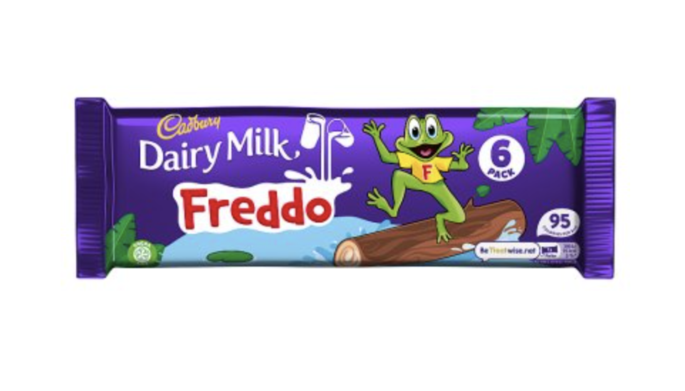
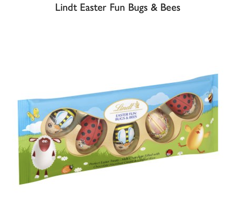
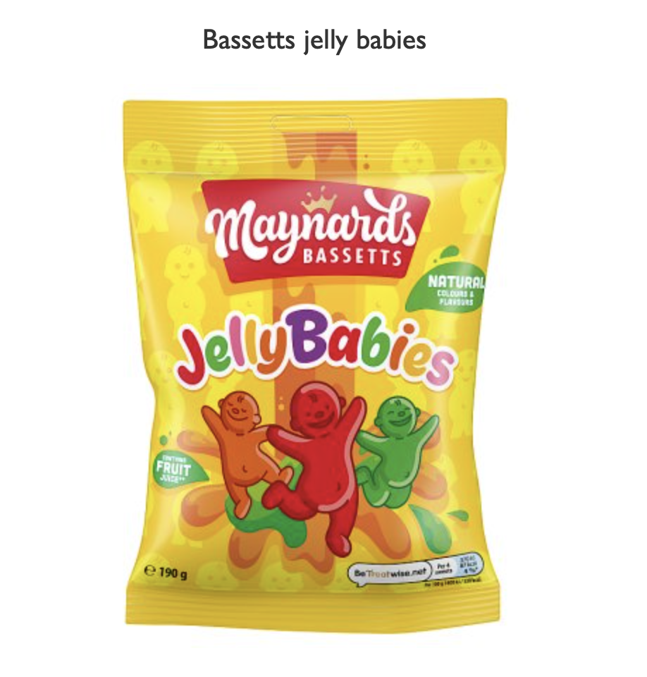
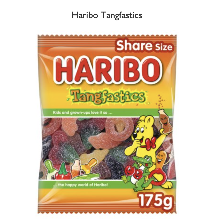
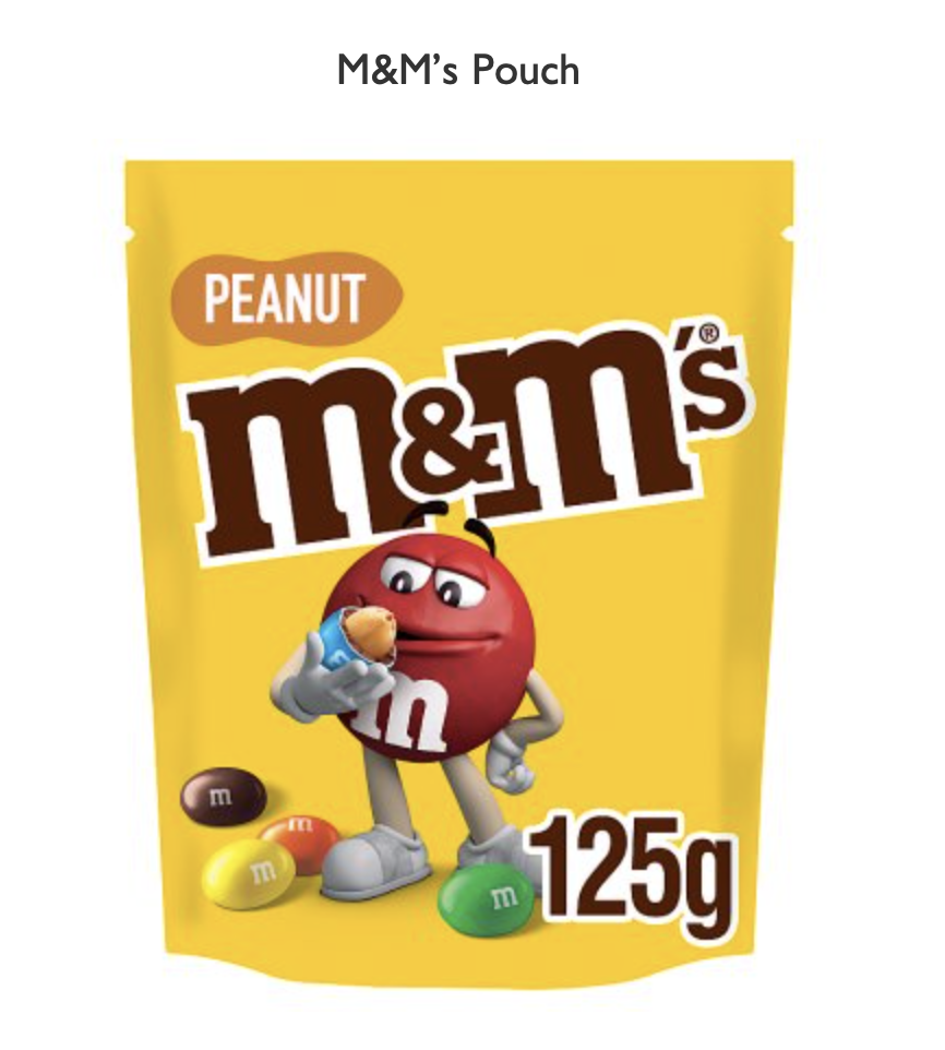
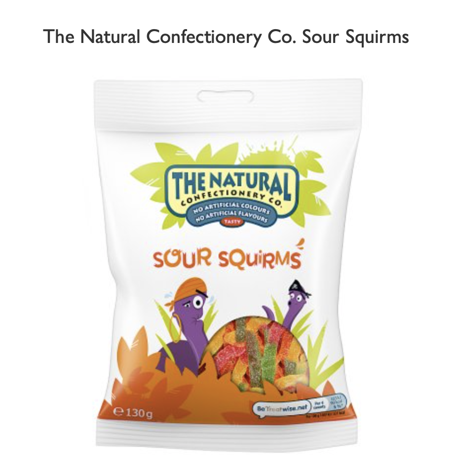
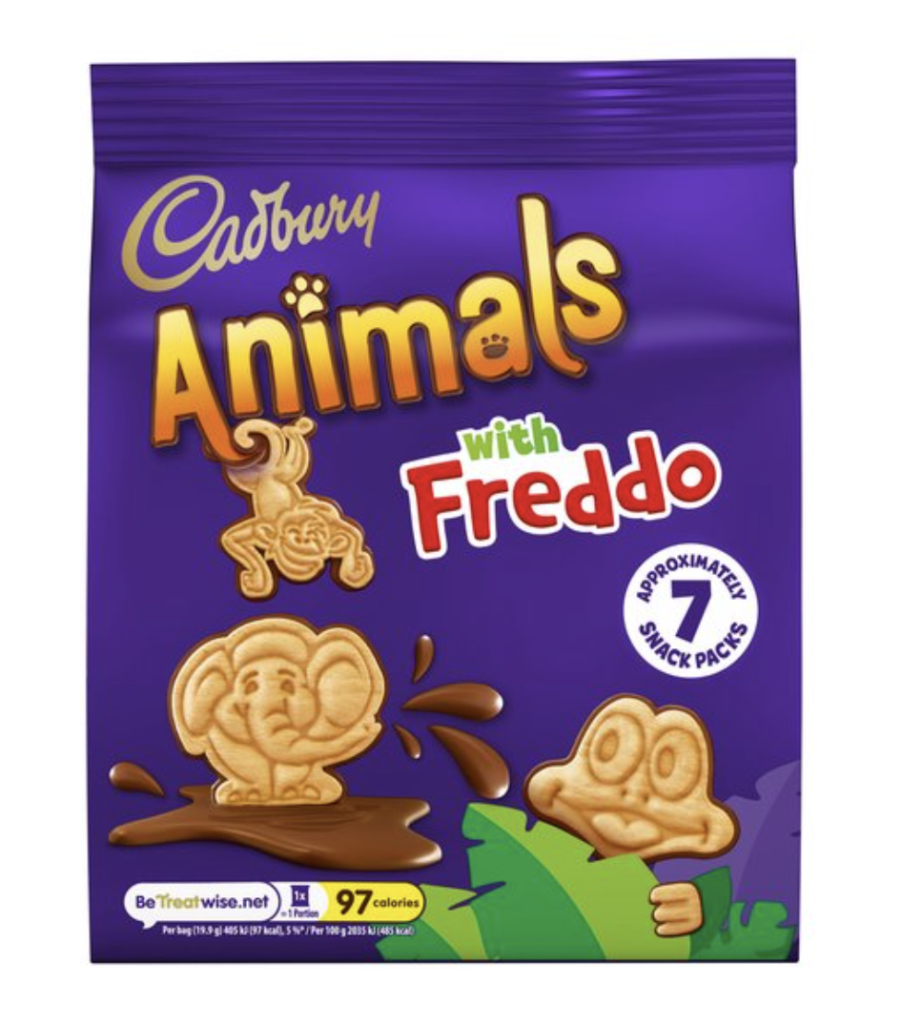
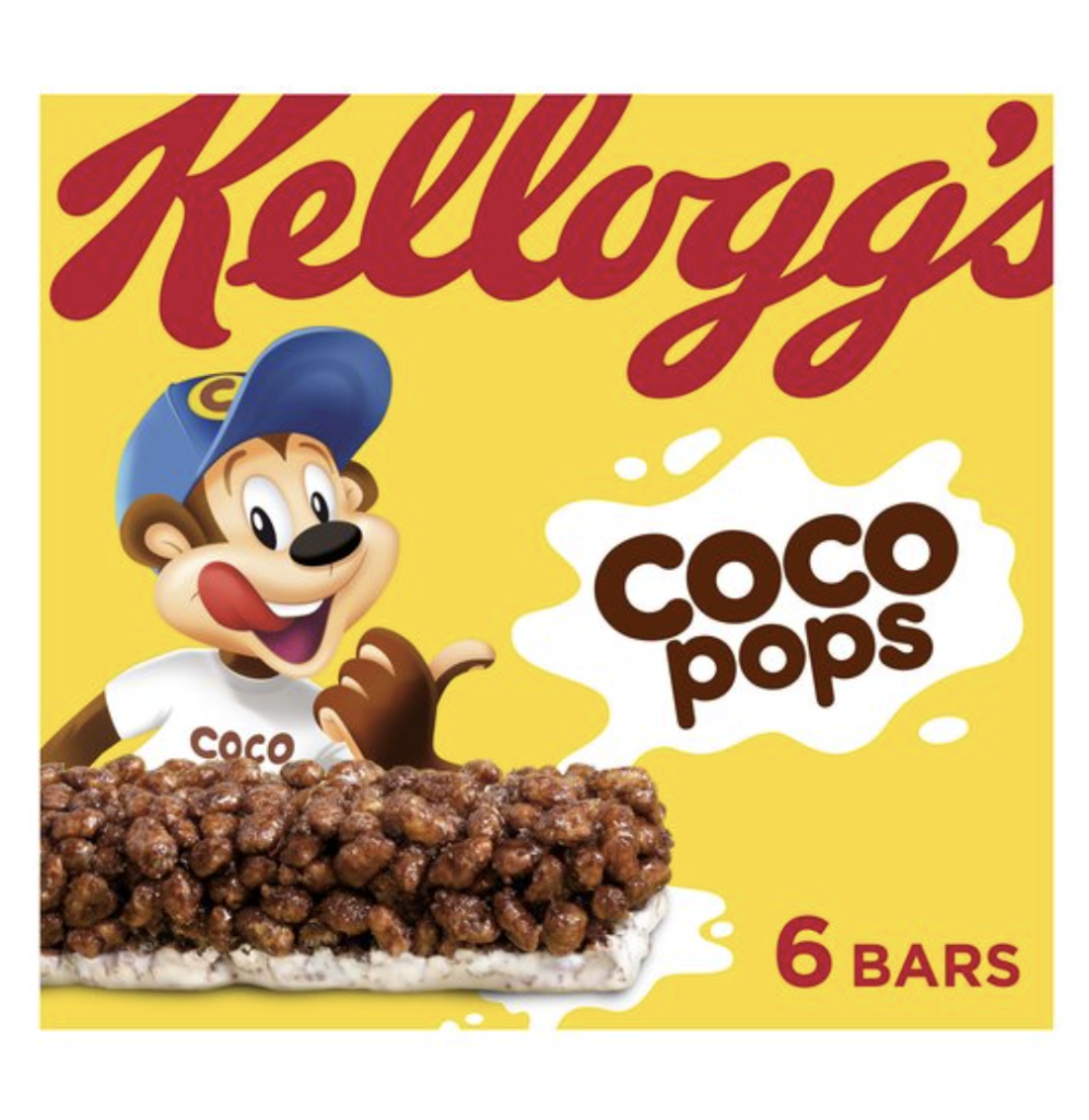
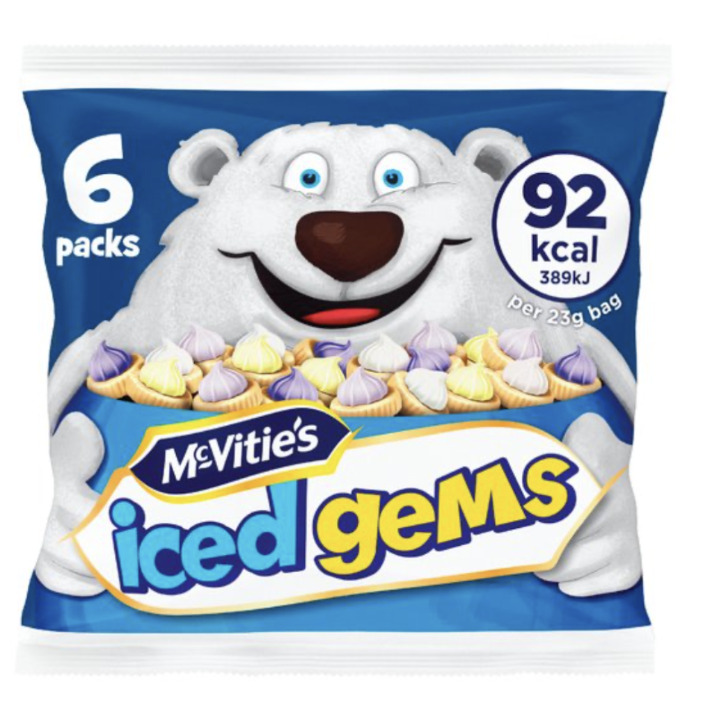
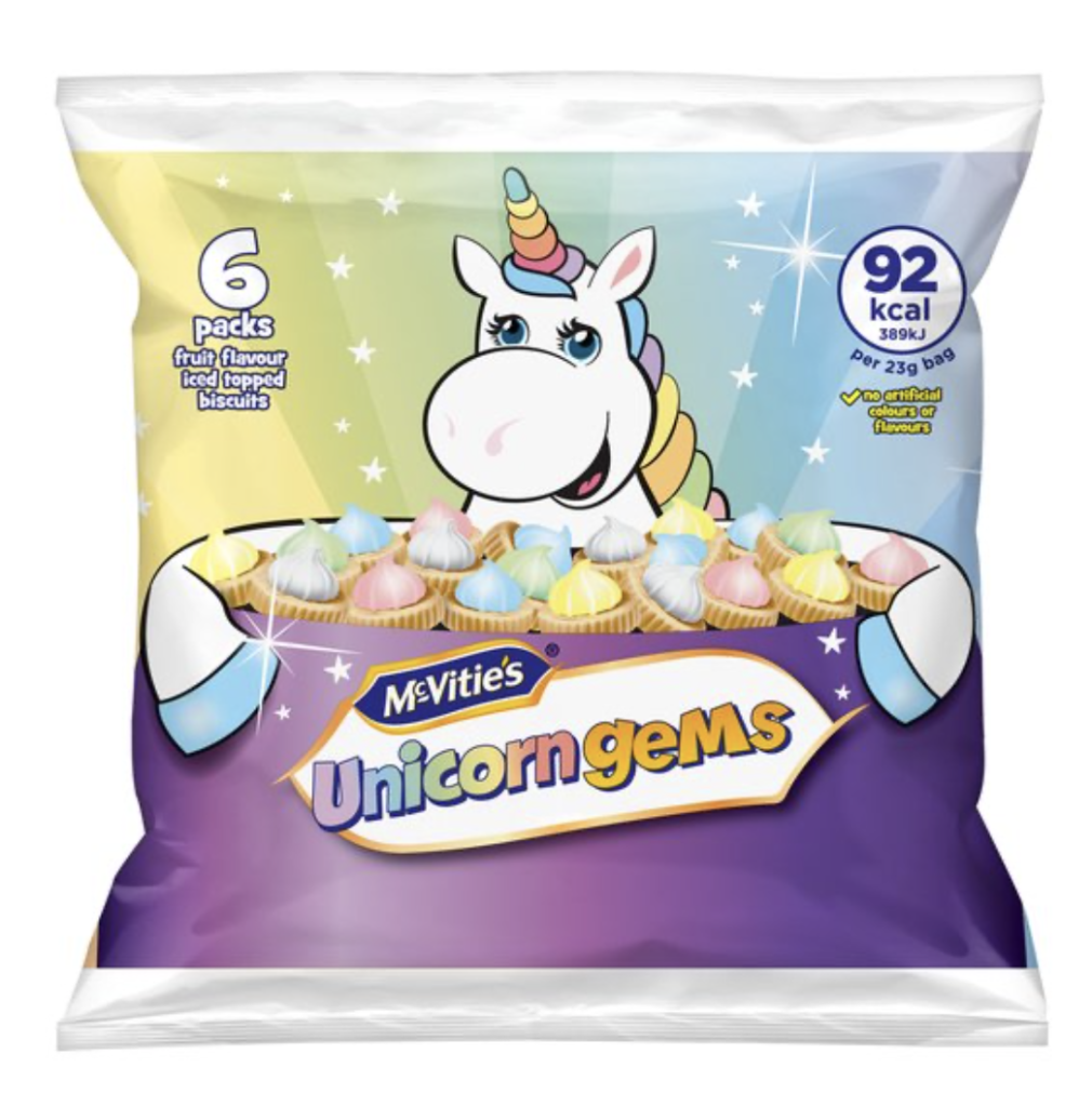
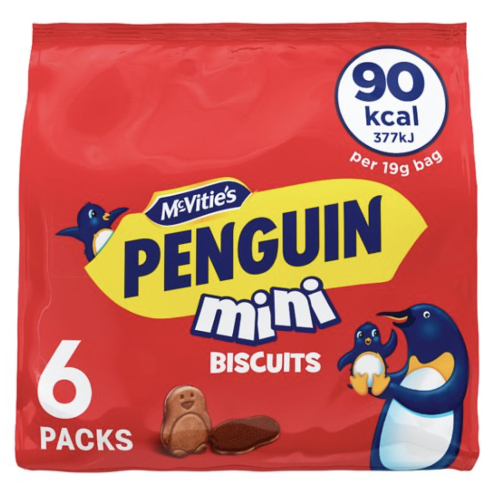
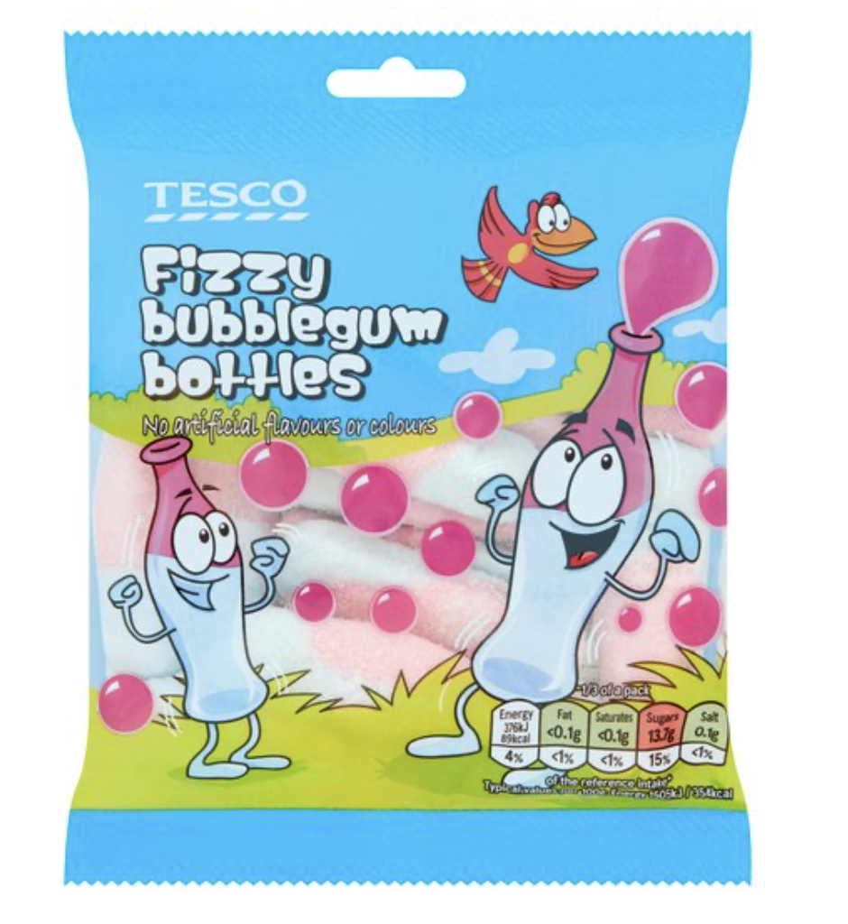
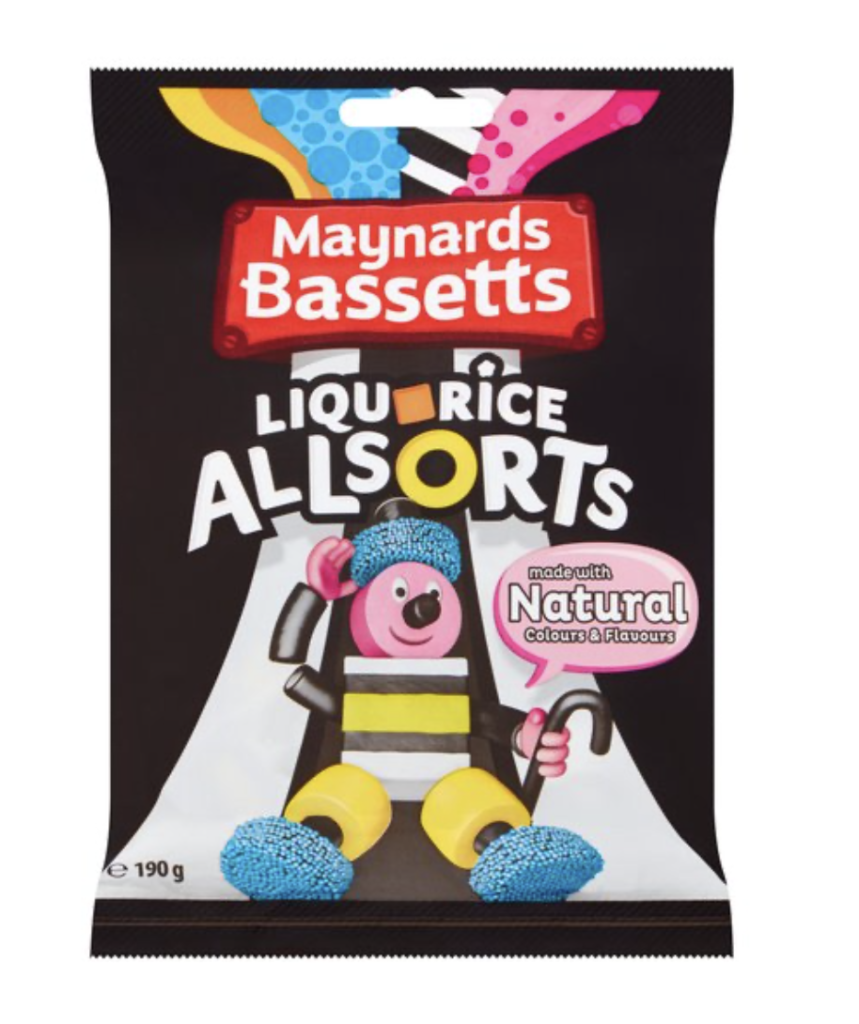
The majority of the above were not in the organic, ‘healthy’ range of products. I felt slightly uncomfortable with the concept of advertising many of these products at children (let alone adults). Using characters, bright colours and the like that appeal to young children is quite deceitful, in my opinion, as the only purpose is for the companies to make a profit. The products do not provide any benefits to the consumer (apart from contributing to health problems). I carried out some research on the issue of advertising aimed at children, which reinforced my opinions.
Additionally, I created a Pinterest board with further visual research. It was interesting to note that I could not find many biscuits (organic or not) aimed directly at children. The key trends that I noticed in the research I had undertaken included:
- the character design is simple and easily recognisable
- bright, saturated colours are used, generally one main colour with accents
- emphasis is placed on characters putting food in their mouth/licking their lips!
- some of the packaging uses ‘windows’ to add interactivity between the characters/design and the product
- pop-up eyes and ears, etc were also present on some of the products
- most of the characters have large eyes (sometimes one larger than the other)
- typography generally appears to be hand-drawn in origin and is bold/easy to read
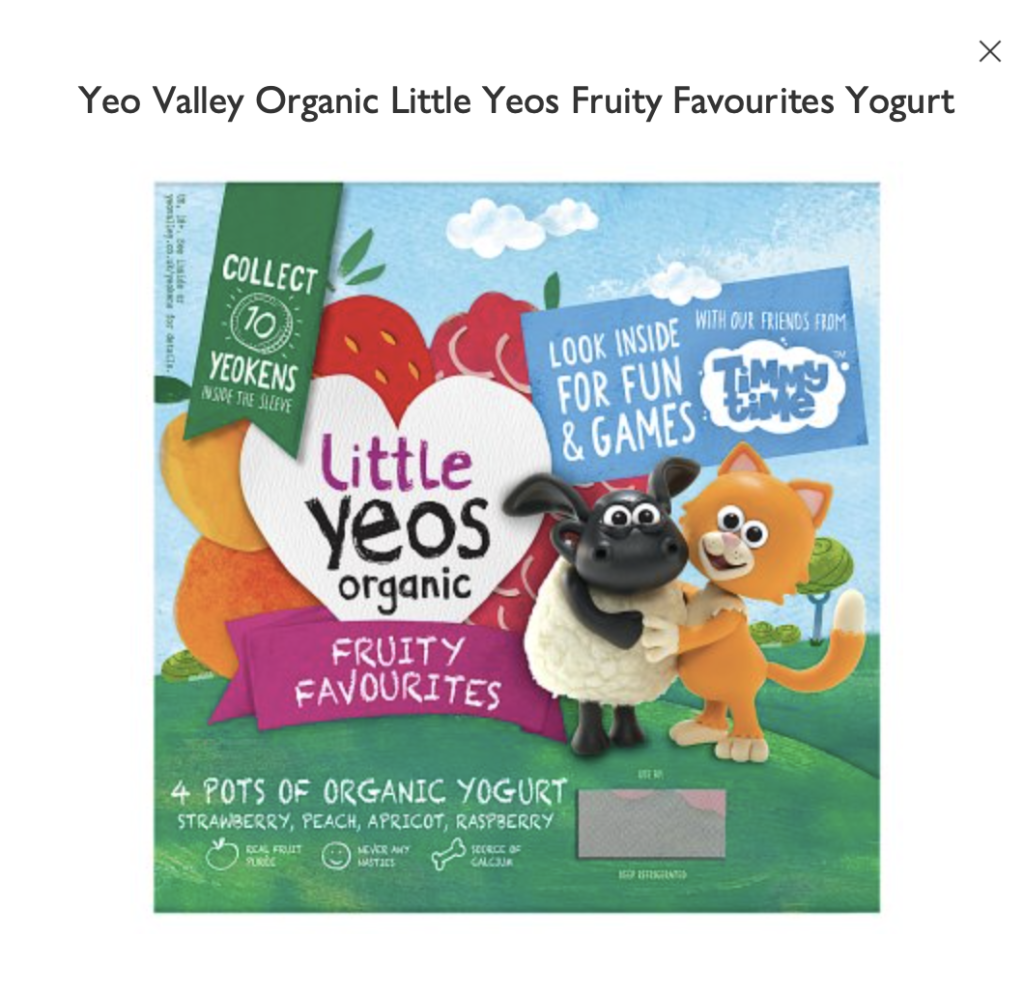
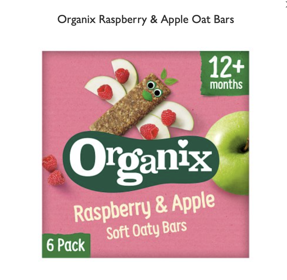
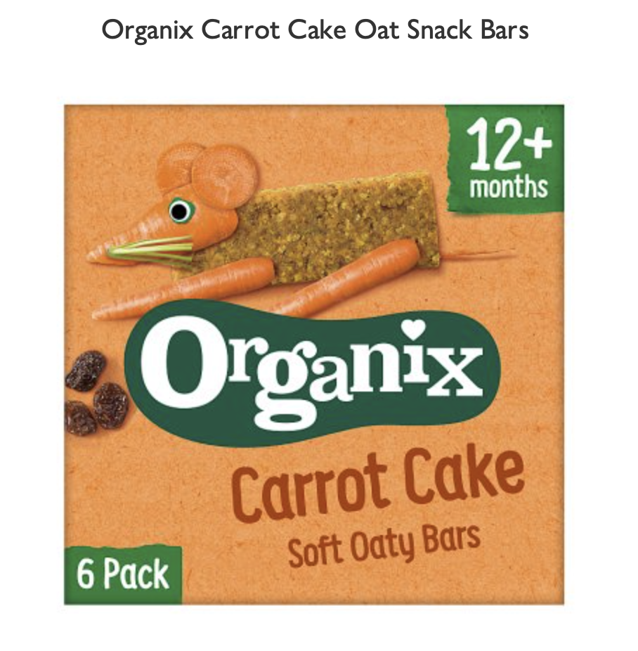
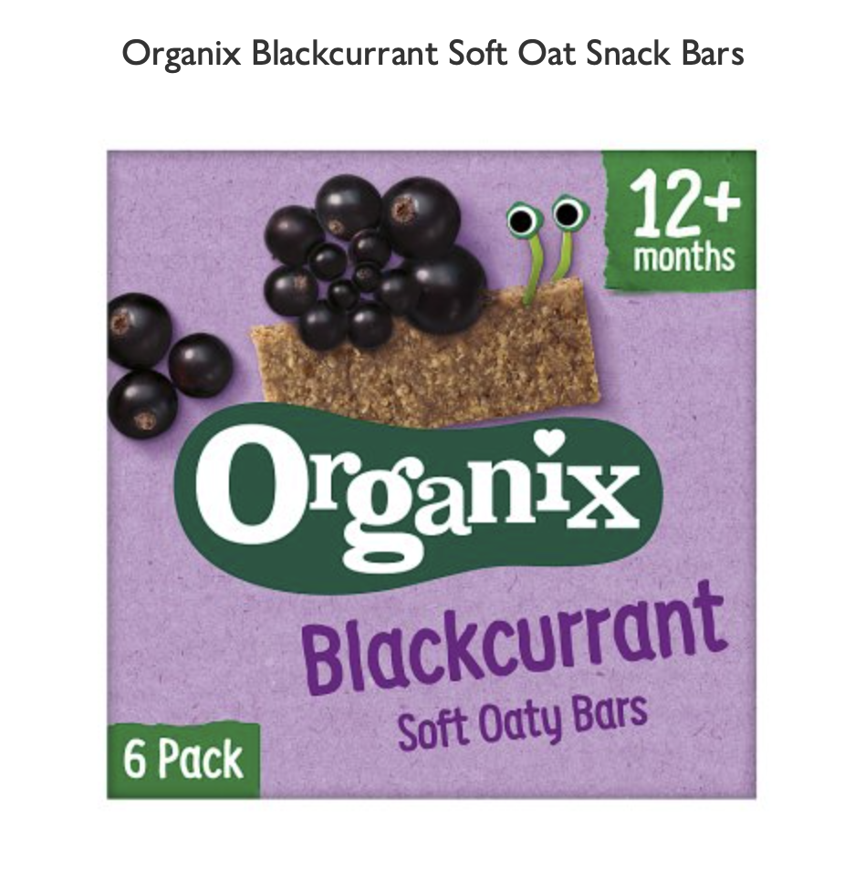
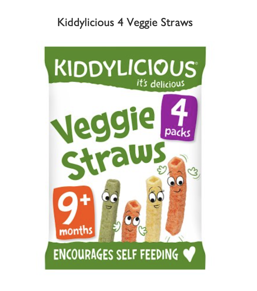
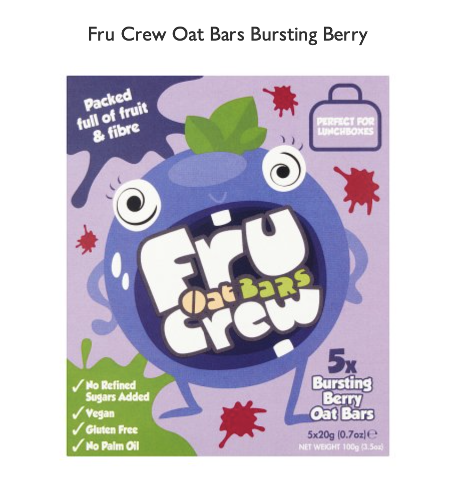
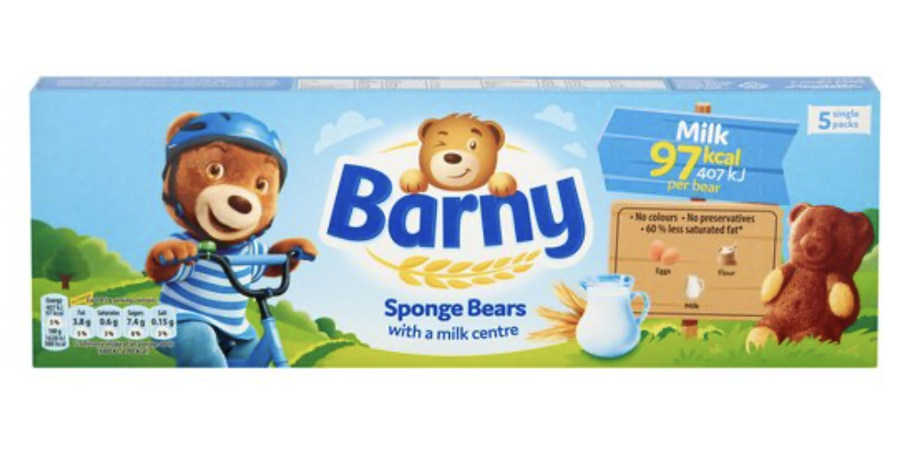
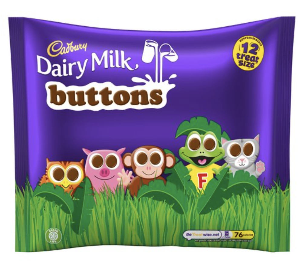
I then focused on two different product ranges that were in the healthier range.
Bear Snacks – bright, simple, ‘cartoony’ style additional characters (licking their lips/eating the product). Uncluttered design with clear and bold typography which relates to the product name (e.g. the ‘yoyo’ has twirls for the ‘o’s) . Recognisable logo of bear on all products (in different style to other characters).
Little Dish – quite different illustrative style to other products – reminded me more of storybook quality characters and is fairly subtle in comparison. They have a hand-drawn/painted quality to them. The characters relate to what is in the particular product. I looked into this product in more depth, trying to find out the illustrator, but found that it was created by a brand design agency.
I decided that the biscuits for my illustrations would be exceptionally healthy, alongside being organic, with minimum ingredients, so I could have a clearer conscience!
Ideas
I decided to use dinosaurs as my extinct animal choice. I started by writing down some initial thoughts.
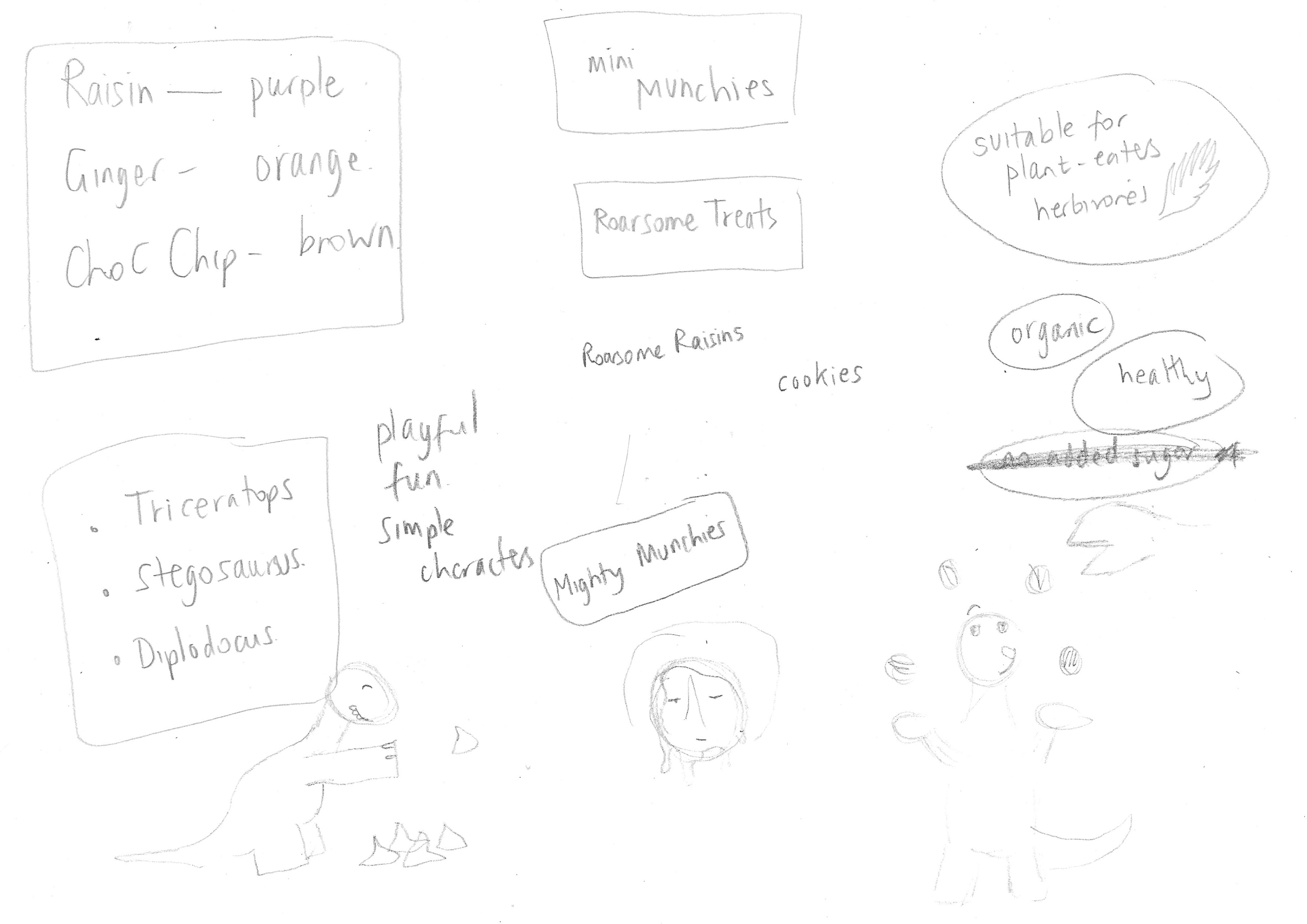
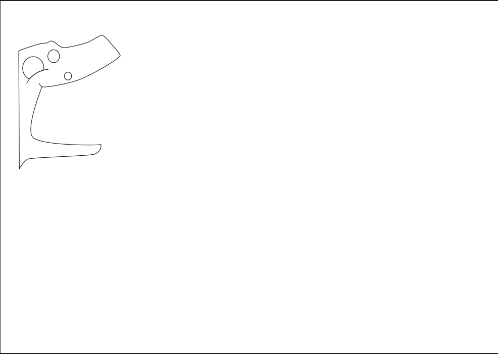
I found it quite challenging to come up with many ideas for the illustrations – I am not sure why this was the case, but possibly because I knew the illustrations would have to work around the text on the designs – but I sketched out those that I could think of. These were not very inspiring, but I did start to like the idea of having a ‘window’ on the biscuit packaging which the illustrations could work around.
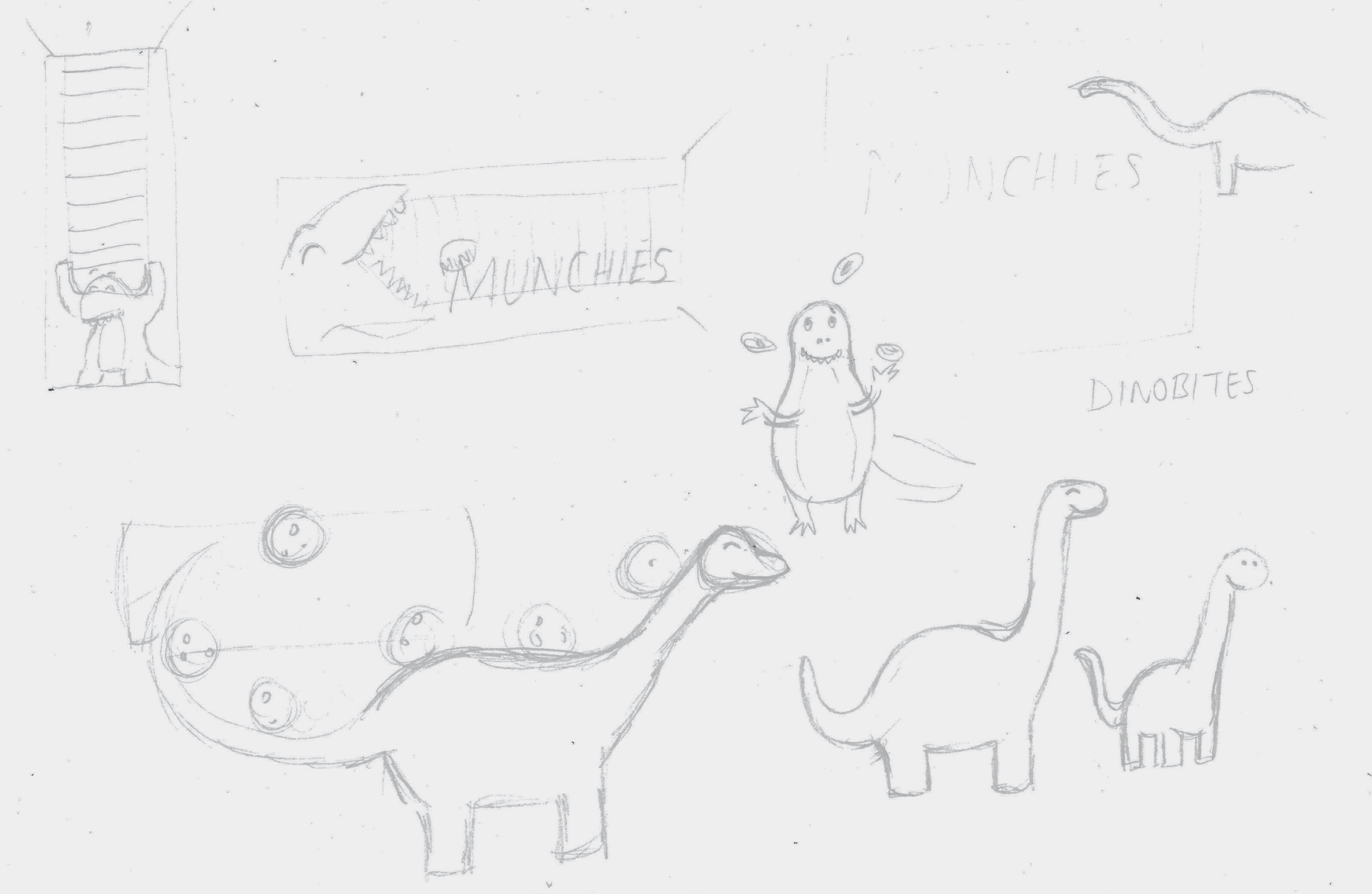
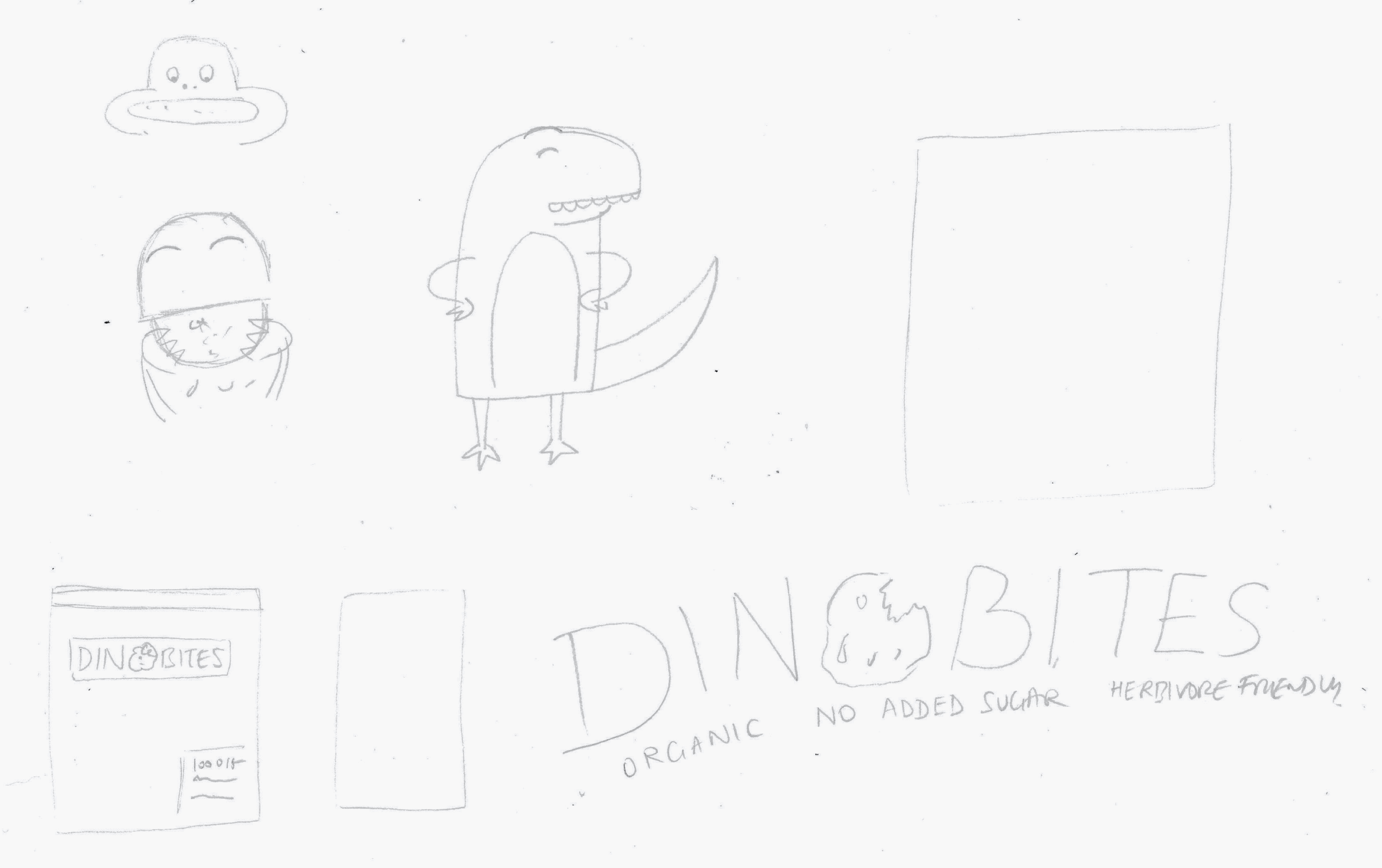
As I was quite stuck for ideas, I decided to pursue the option of having this ‘window’ and concepts for the Raisin and Choc Chip flavours began to form. I also wanted my designs to be aimed more specifically towards children (hence the inclusion of dinosaur poo).

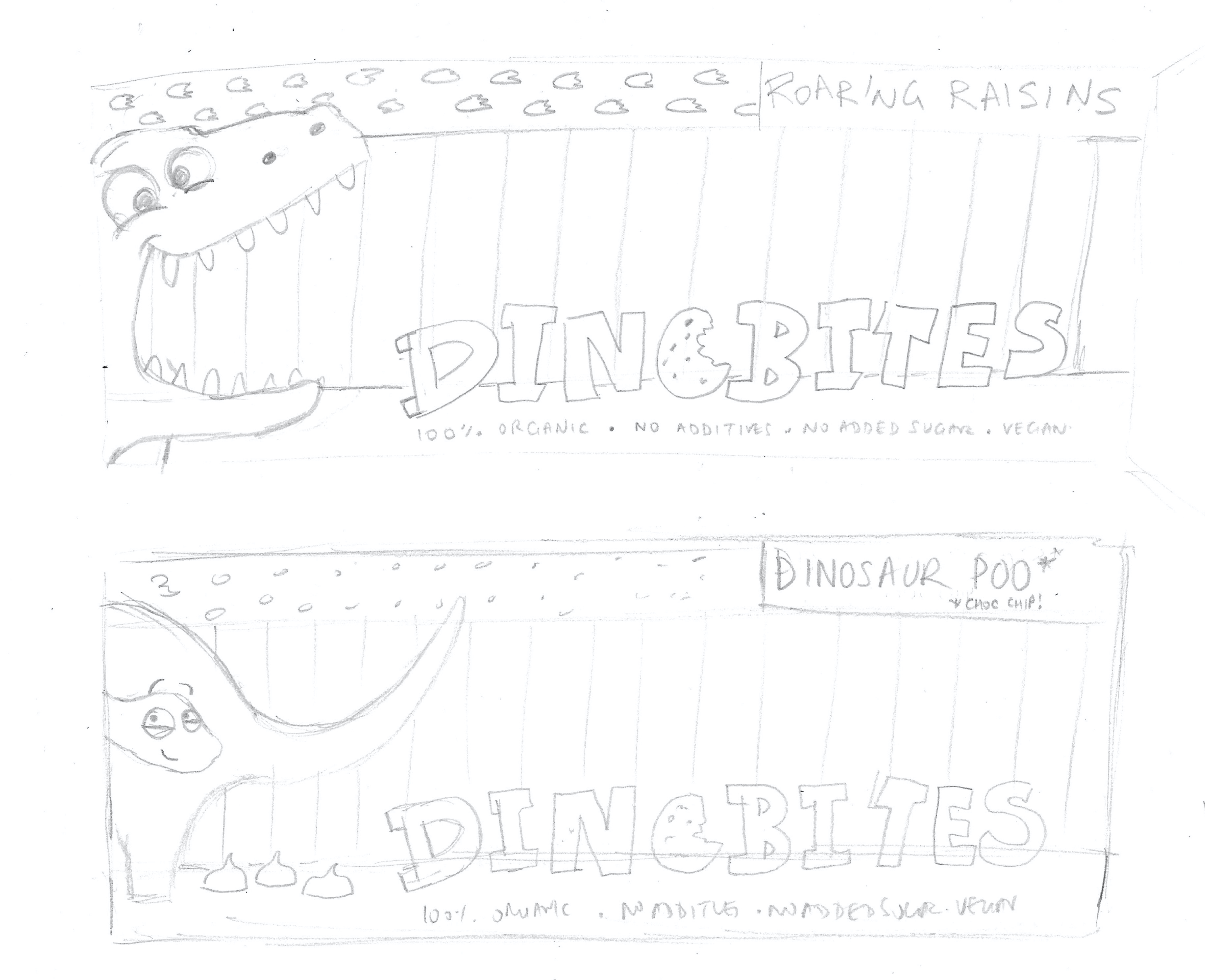
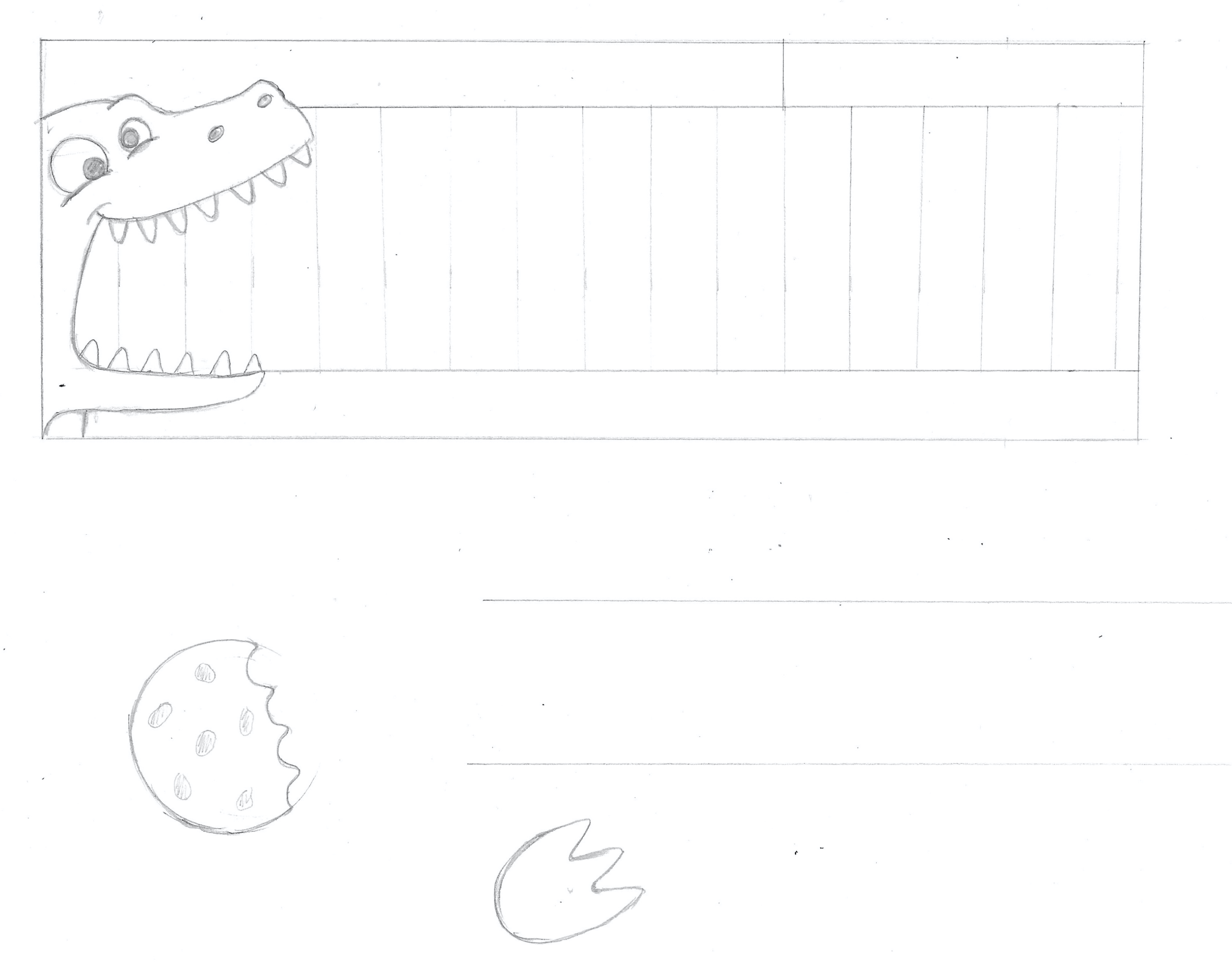
I felt quite enthusiastic about what I had come up with so far (although the Ginger flavour eluded me), so I created a cleaner line version of the elements in the Raisin version, which I could use in Illustrator as a template.
Working in Illustrator
Next I began to build up the design in Illustrator.
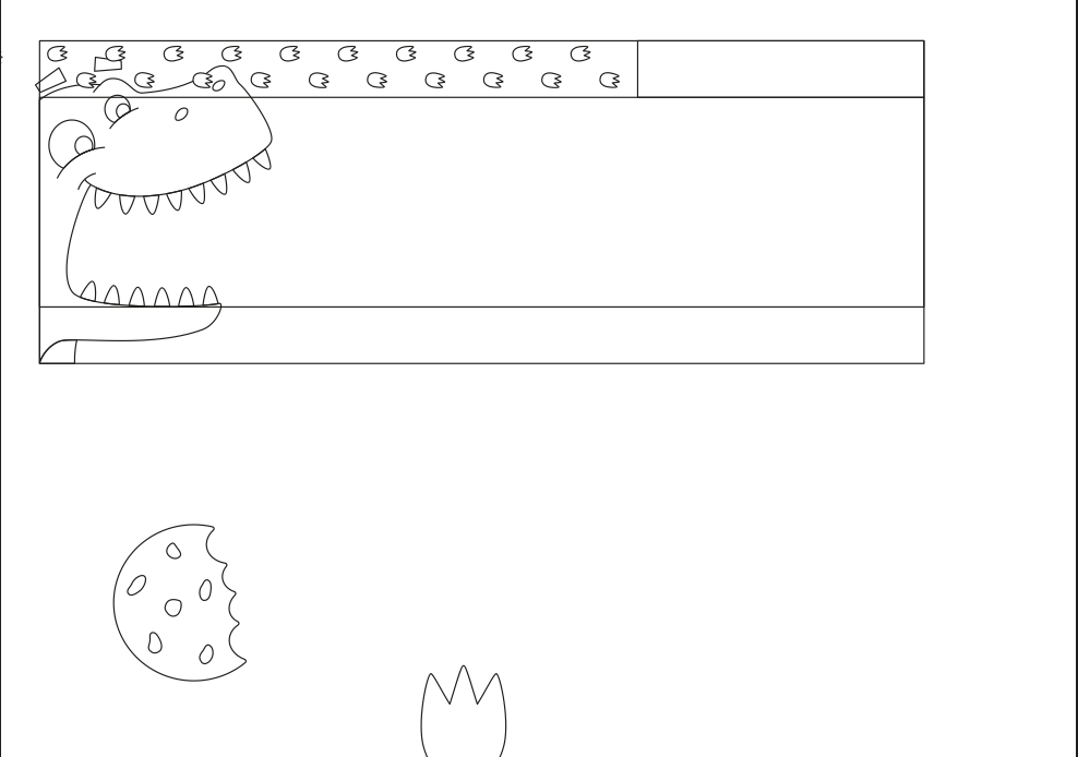
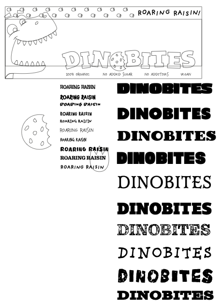
Once I had the rough, basic elements in place I considered the typography that would be used and decided to use digital fonts rather than hand drawn ones. I selected a few different options and experimented with each in place on the design.
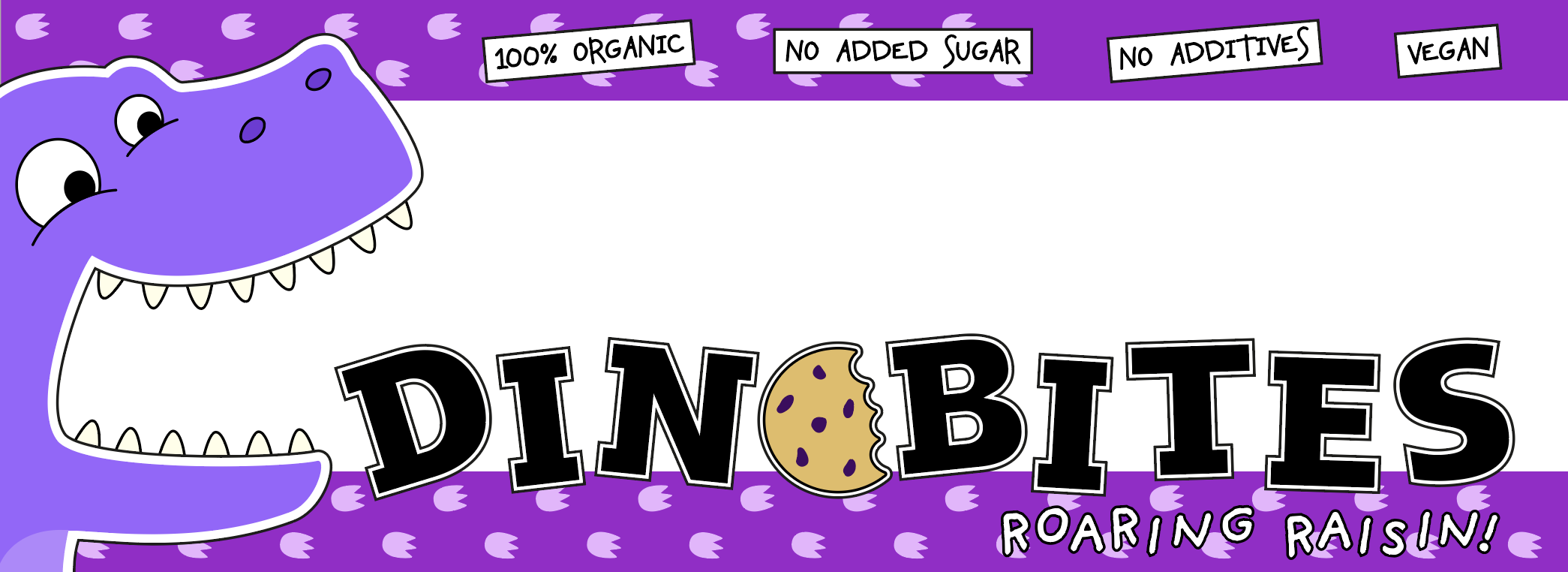
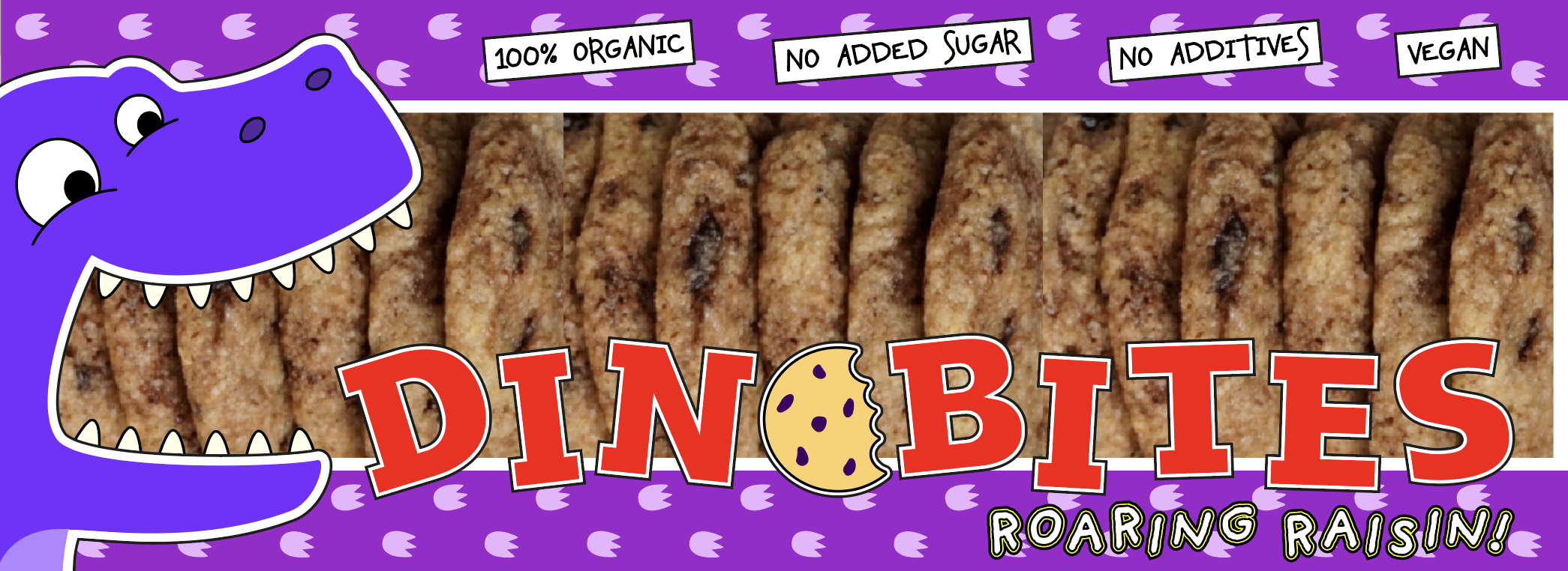
I then moved onto adding some colour, which as prescribed in the brief had to reflect the flavour, so would be purple for the Raisin flavour.
I continued to experiment with colour and placement of the elements in the design. I kept in mind that it needed to be eye-catching and easy to read visually.
As I was continuing to develop the initial design, I also used this as a template to work on the second design for the Choc Chip flavour packaging.

I wanted the design to have more ‘pop’ so thought about how to increase this factor and decided to work more on the outline of the character.
I replicated this with the Raisin design.
I continued to develop the designs.
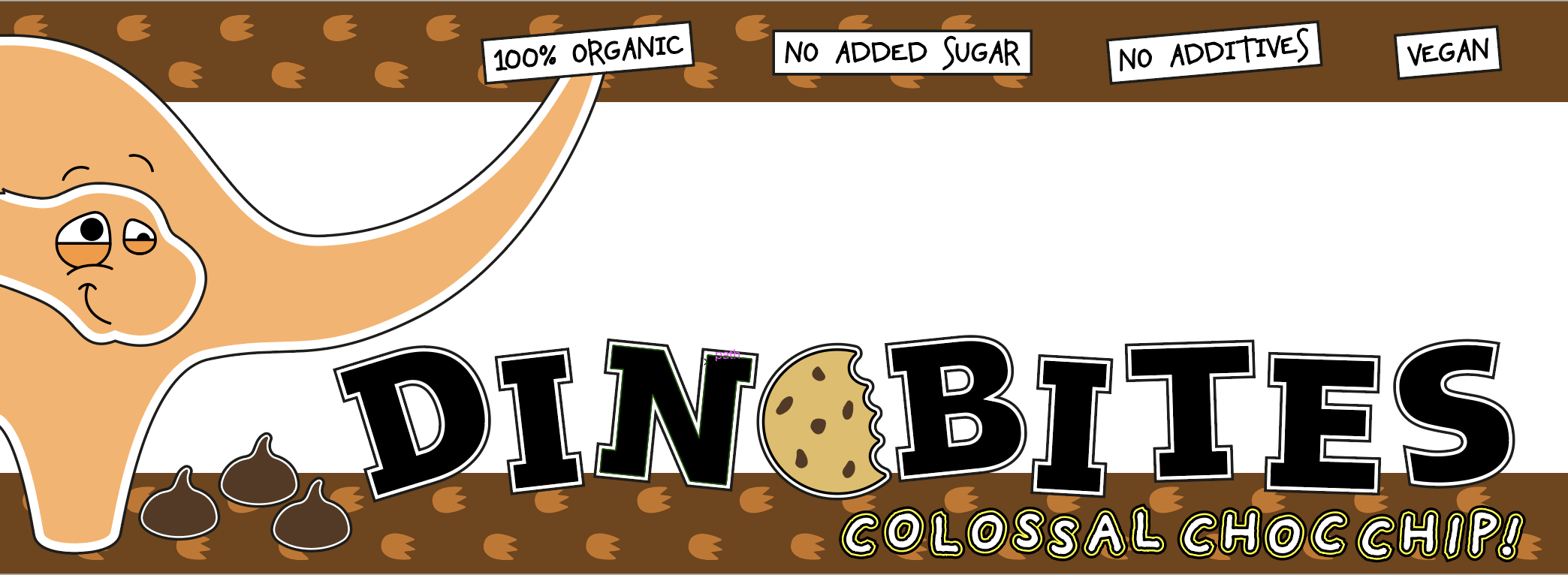
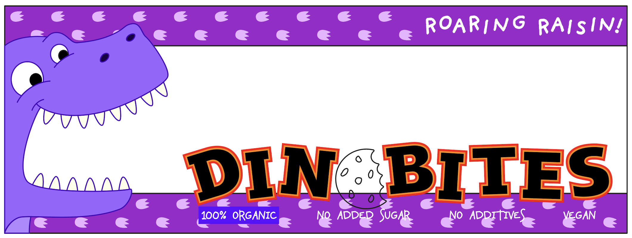
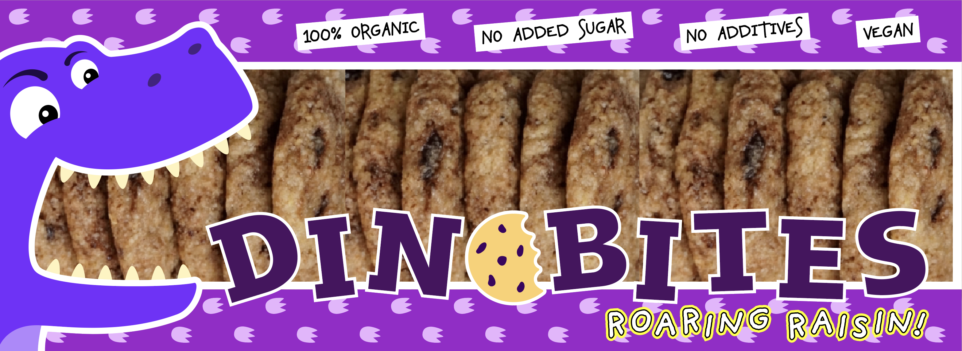
I did not feel that the black text was very effective and needed to stand out more, so I tried various solutions and settled on red.
I then added some biscuits behind the design so I could see what the design would look like against a realistic background.
I felt that the Raisin flavour dinosaur failed to stand out enough in the design, so changed the colour slightly.

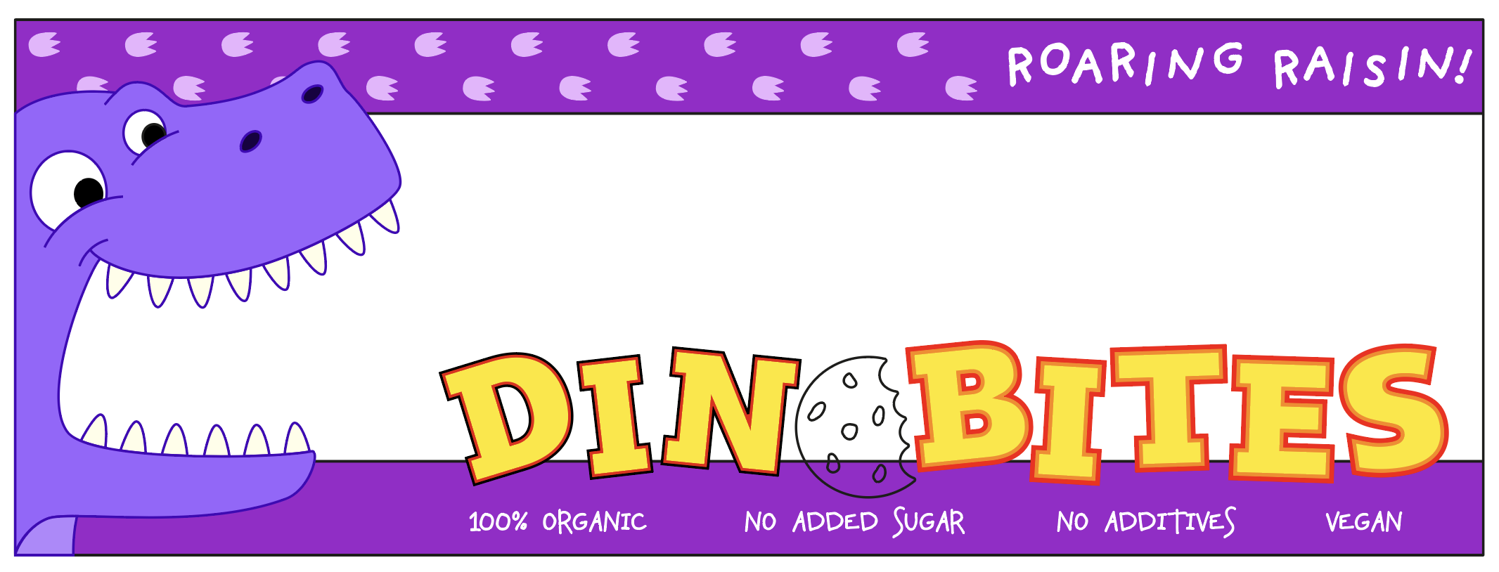
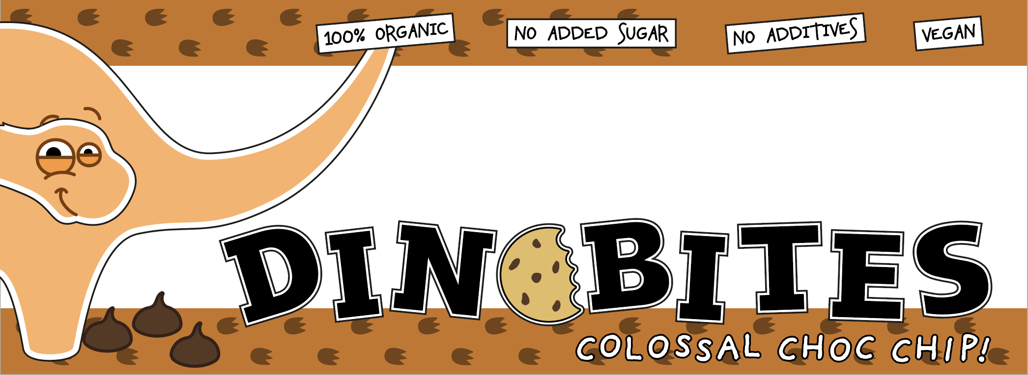
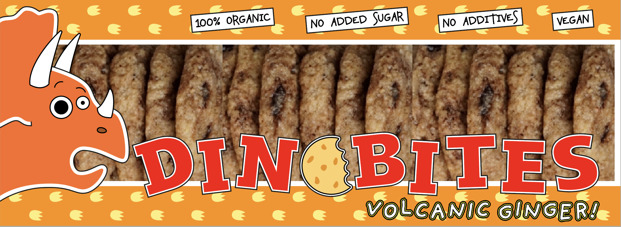
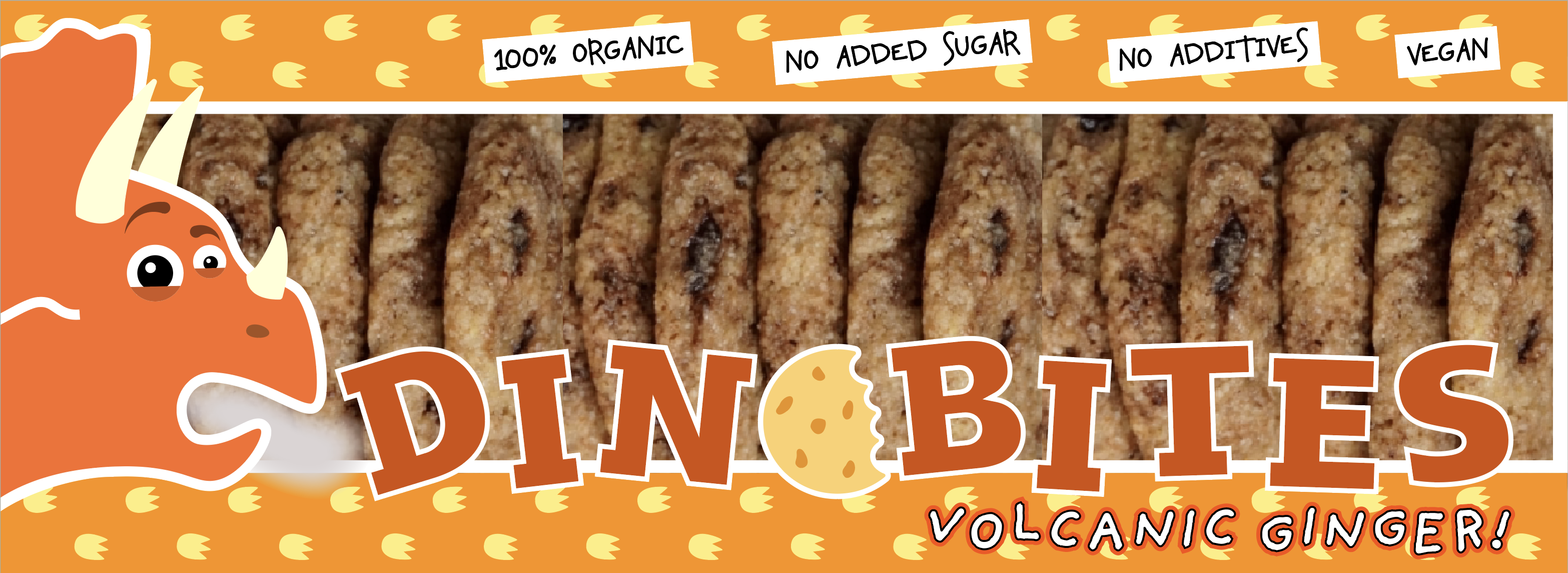
Once I had reached this point with the two designs I was forced to return to the Ginger flavour, which I was having great difficulty coming up with a suitable concept for. I eventually decided to go with the heat of ginger and the result can be seen below. It was of great benefit that I had already had the main template in place.
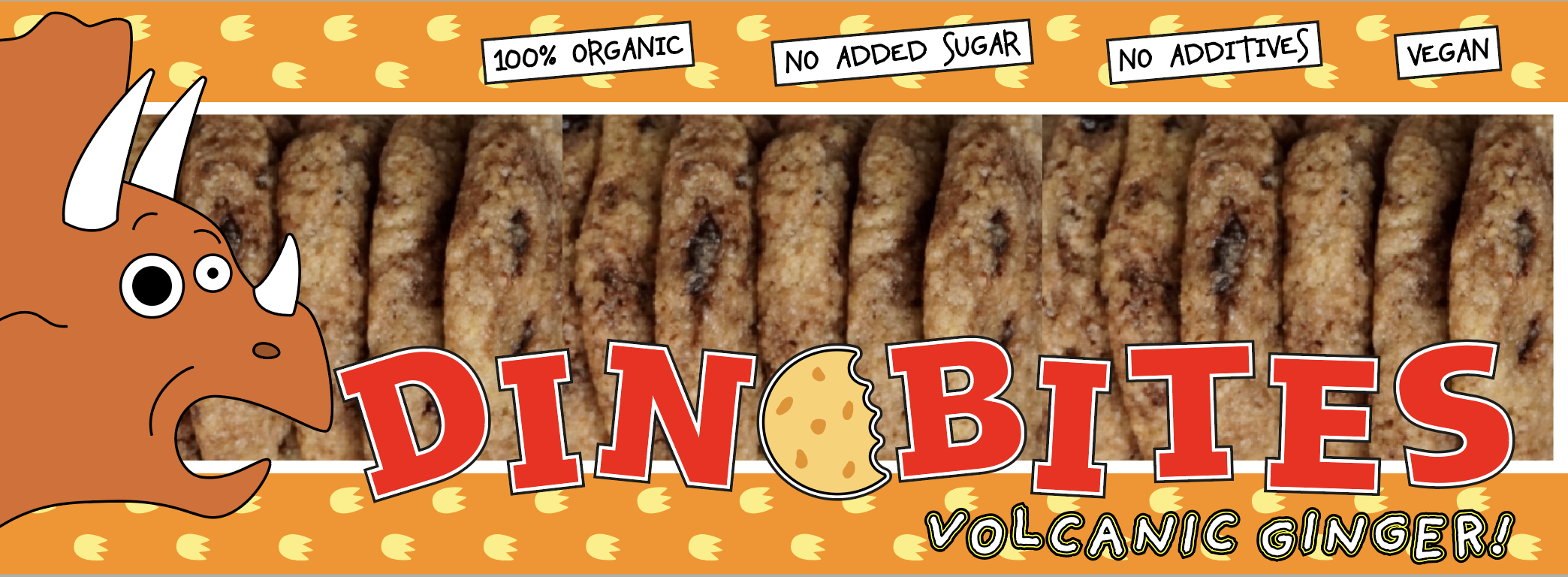
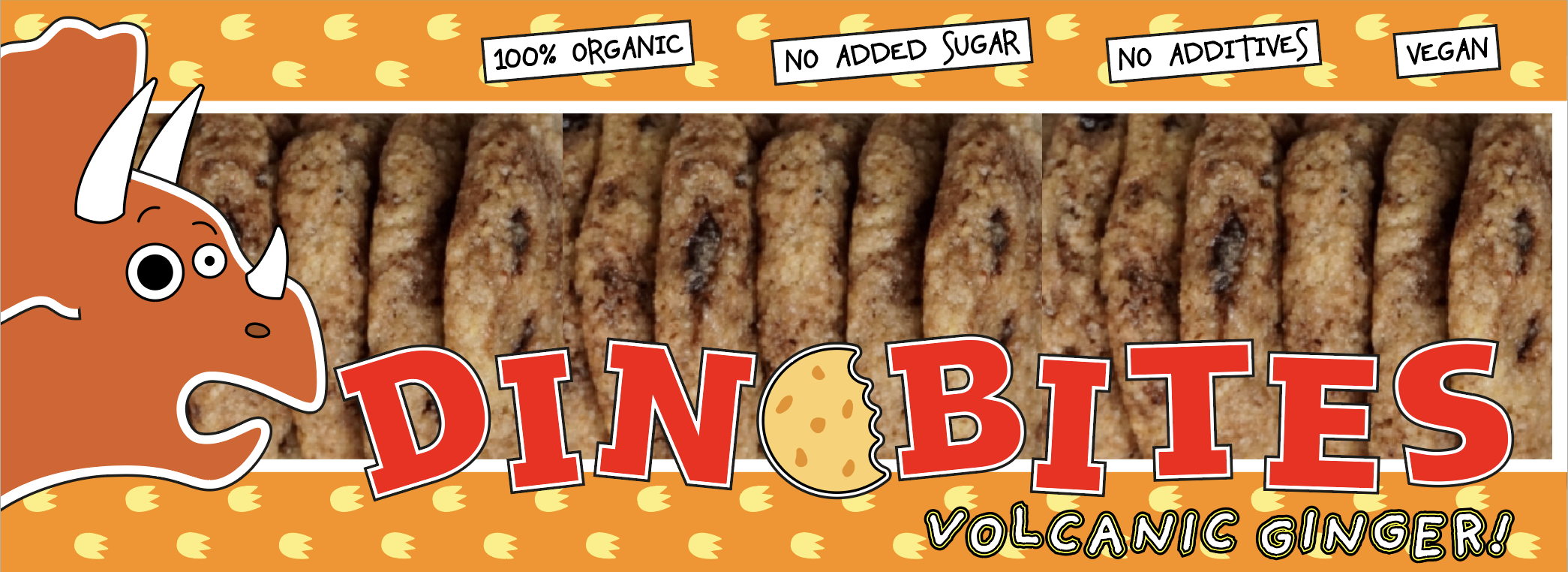
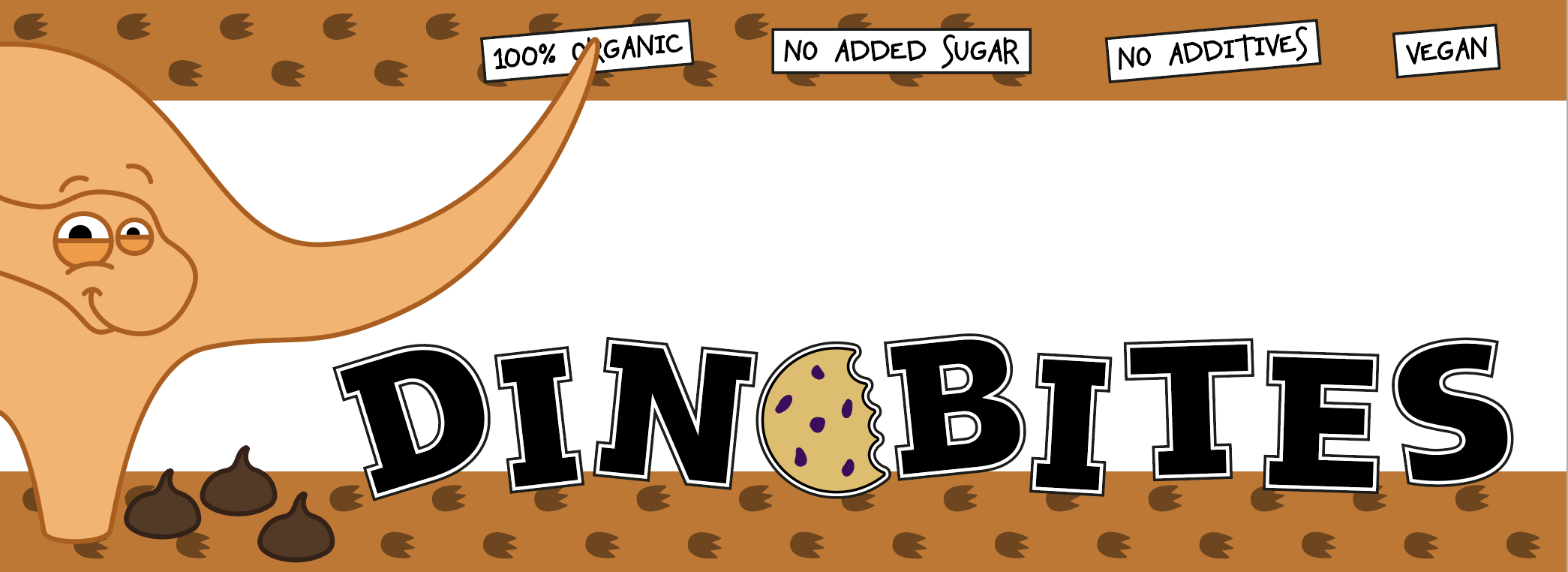
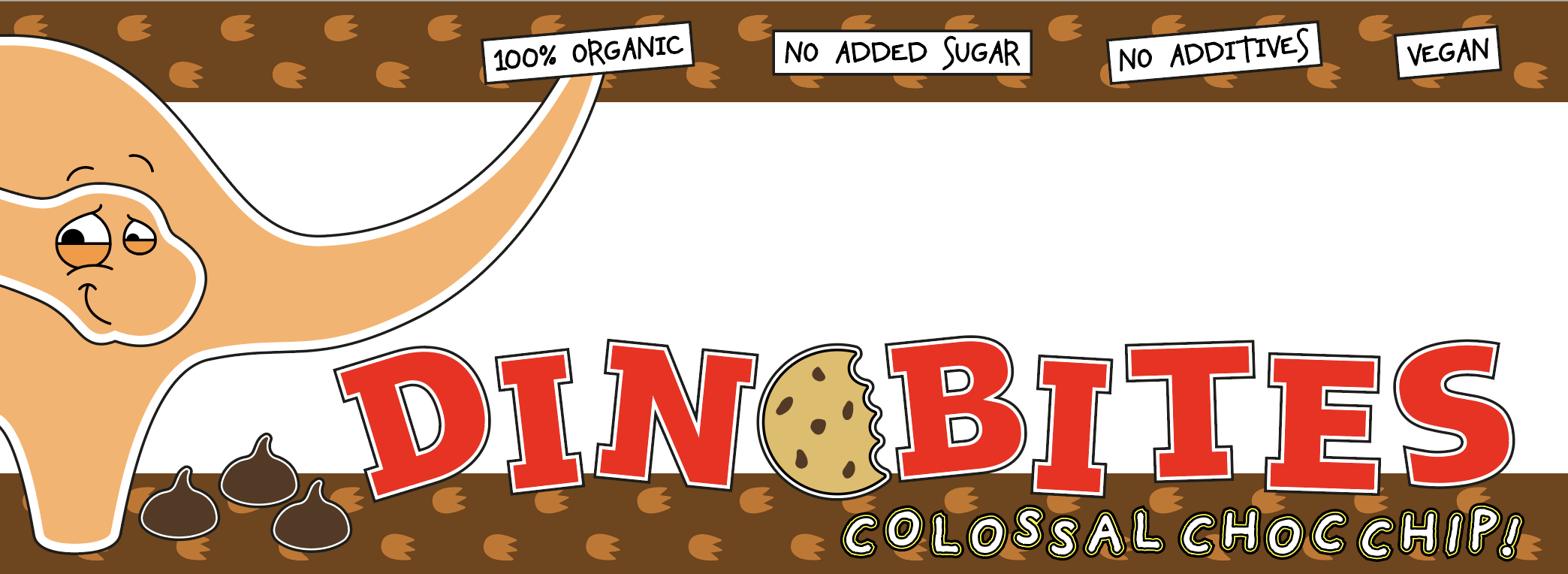
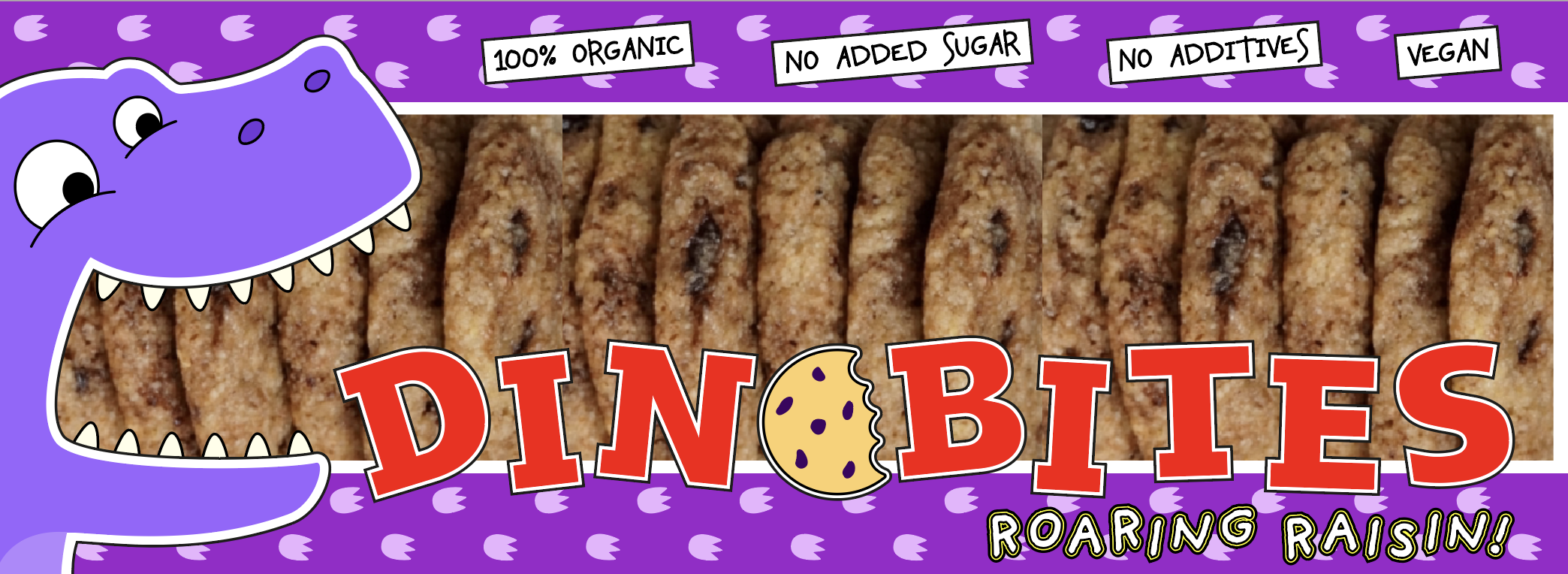
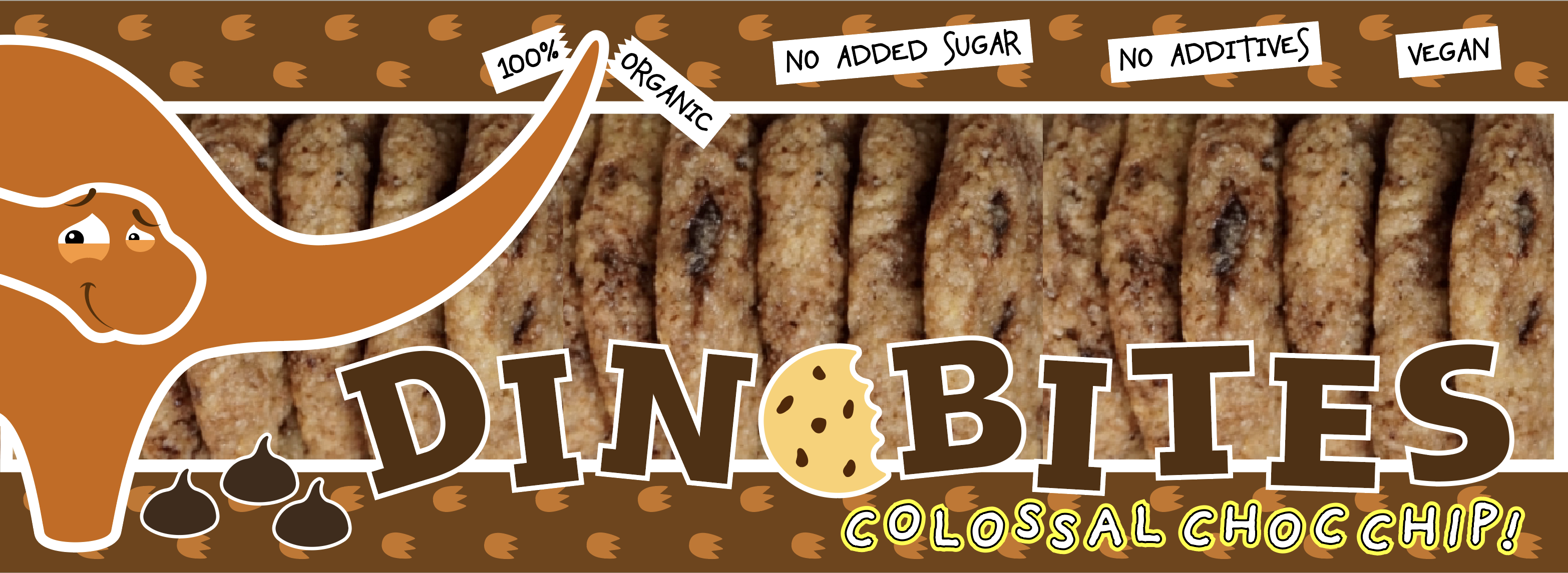
Final Designs
The final designs for the packaging can be seen below. I felt these worked well as a set.

Final Thoughts
Although I found it hard to come up with many ideas for this exercise, which is something I really need to improve on, once I had came up with the concept of ‘Dinobites’ I felt more confident that I could create something worthwhile. I thought the designs would appeal to children and would hopefully stand out on a supermarket shelf.
If I had more time I would like to have created all the sides for the packet as I had some ideas of how to continue the design onto these. I also think the designs would benefit from adding highlight to the eyes of the dinosaurs.
Overall, I enjoyed this exercise and felt pleased with the outcome I achieved.
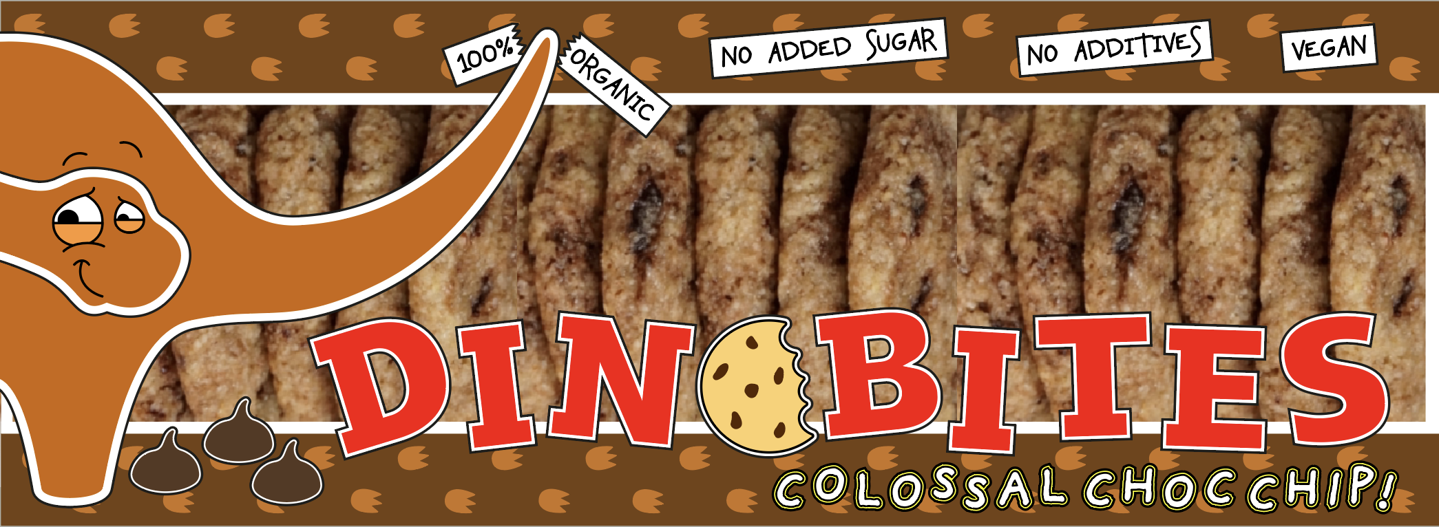
Reflection After Tutor Feedback
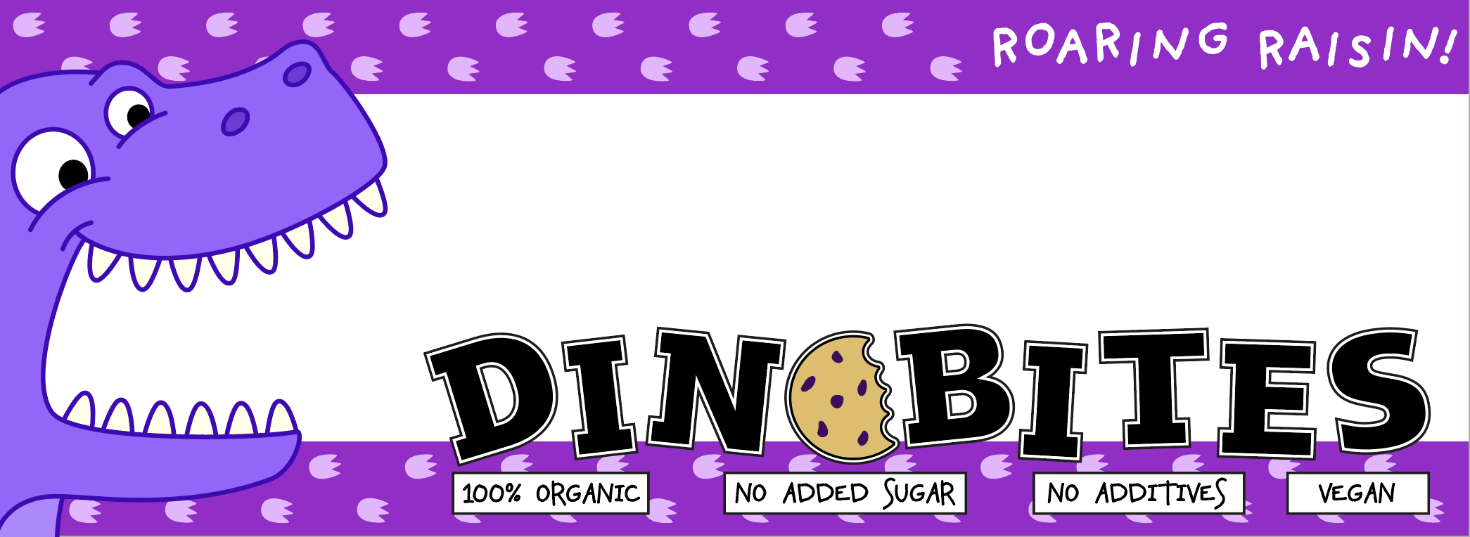
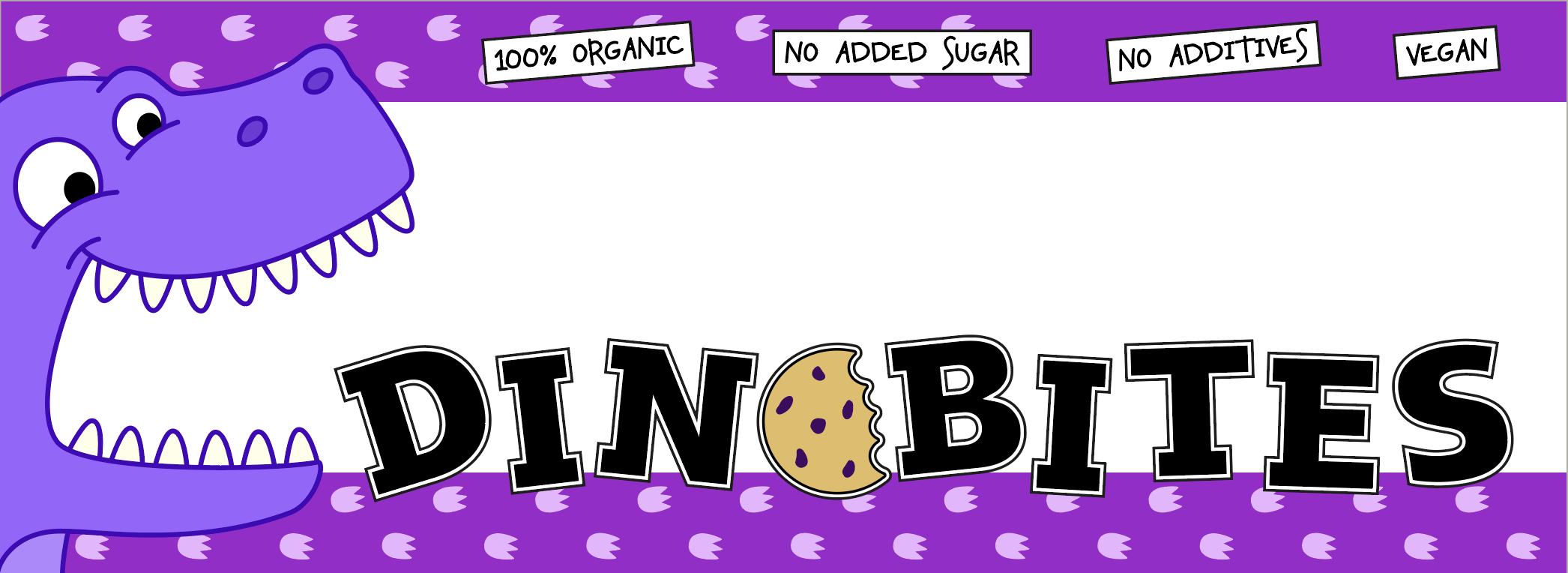
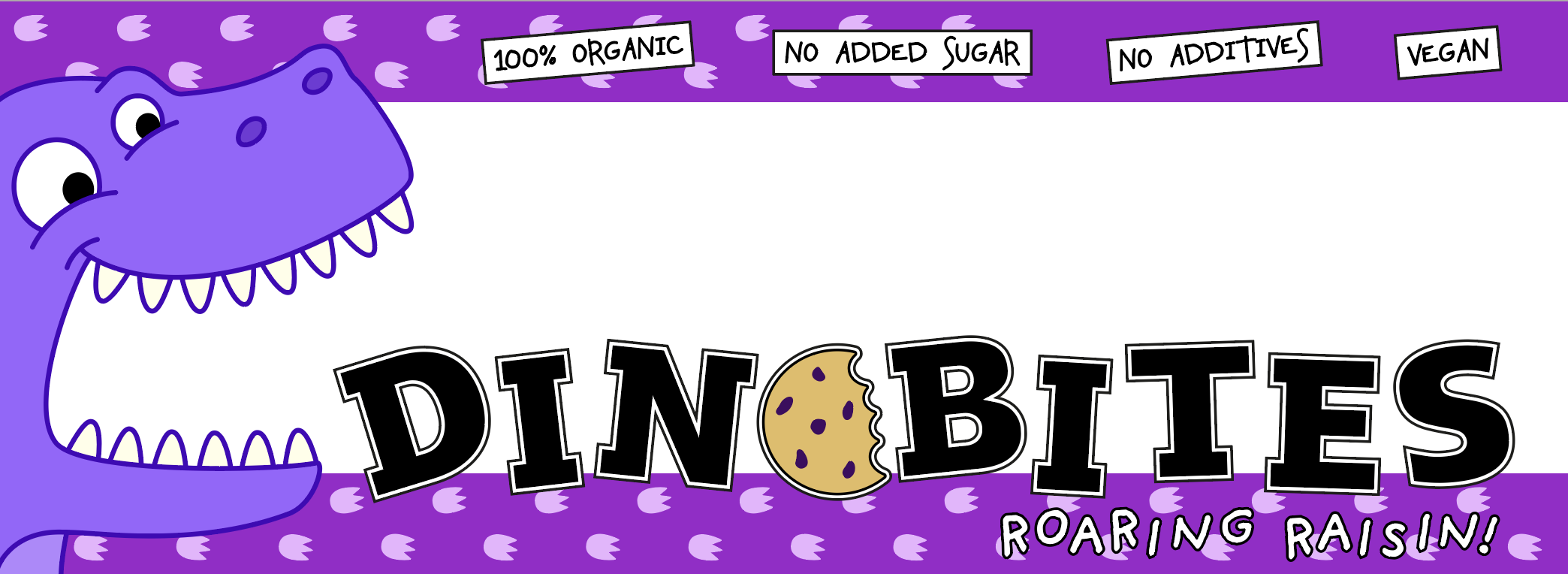
I returned to this exercise and, following my tutor’s advice, experimented with alternatives to the red typography as I certainly agreed it did not really fit with the rest of the colour scheme on the designs. I also made some other amendments, including removing the black outlines, which I felt was also an improvement. The final results can be seen below.
References
Bear Snacks, (n.d.). Bear Snacks. [online] Available at: https://www.bearsnacks.co.uk [Accessed 28 February 2021].
Hill, D. (2003). The kids aren’t alright. [online] The Guardian. Available at: https://www.theguardian.com/media/2003/nov/11/marketingandpr.advertising [Accessed 27 February 2021].
Little Dish, (n.d.). Little Dish. [online] Available at: https://www.littledish.co.uk [Accessed 28 February 2021].
Media Smarts, (n.d.). How Marketers Target Kids. [online] Media Smarts: Canada’s Centre for Digital and Media Literacy. Available at: https://mediasmarts.ca/digital-media-literacy/media-issues/marketing-consumerism/how-marketers-target-kids [Accessed 27 February 2021].
Pearl Fisher, (n.d.). Design, Packaging and Branding of Little Dish – Pearl Fisher. [online] Pearl Fisher. Available at: https://www.pearlfisher.com/work/little-dish [Accessed 28 February 2021].
Tesco, (n.d.). Tesco. [online] Available at: https://www.tesco.com [Accessed 27 February 2021].
Waitrose, (n.d.). Waitrose. [online] Available at: https://www.waitrose.com [Accessed 27 February 2021].