Brief
This exercise is in two parts.
- Firstly, you need to decide on a famous person from history that you want to research. This could be a politician, royal figure, celebrity, pop star, inventor or sportsperson. It could be someone you already know a lot about or someone you want to find out more about. Now research them and their life, through the internet and reading history or reference books. Collect together written and visual information on them, ideally from when they were a child and then through their whole career as an adult. Collect together a file of your research. Try to find photographs to draw from rather than other artists’ drawings and illustrations.
- Now select a number of key or significant events that represent their life in summary and illustrate them as single illustratons from your photo reference or written descriptions.
Once you have completed your group of illustrations, arrange them on an A3 page in a visually attractive and balanced way.
Preliminary Research
I began by looking at examples of the comics listed in the exercise’s introduction, Ripley’s Believe It Or Not, Look and Learn and the Eagle. Although I could understand the benefits of these examples, such as being educational and informative, I found the visual style did not particularly appeal to me and I could not imagine a younger me being very keen to read them.
I also discovered another artist who specialises in biographical illustrations of famous people, Steve McGarry. He has a very realistic style and I thought the layouts of his pages were visually quite well-balanced.
I knew from the start of this exercise that there was no way I would be able to create such realistic drawings and would therefore have to employ a more cartoony style.
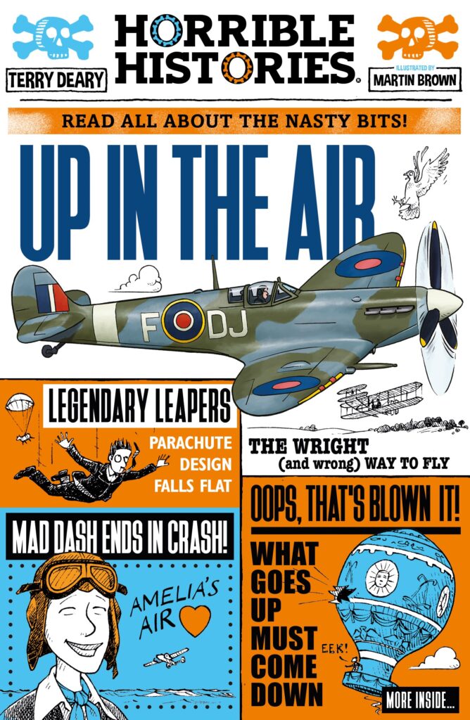
Two artists whose drawings of historical figures that I personally find more appealing are Martin Brown, most famous for illustrating the book series Horrible Histories, and David Roberts, a children’s book illustrator. I find their humorous, but still informative, stylised drawings really enjoyable and easy to absorb.
Selecting a Famous Person
I searched online for ‘famous women in history’, which led me to the article 100 Most Important Women in World History. After scanning through the names, I shortlisted a selection and settled on Elizabeth Garrett Anderson. I had sadly not heard of her before, but she seemed liked an inspiring choice and someone I certainly wanted to find out more about.
Research
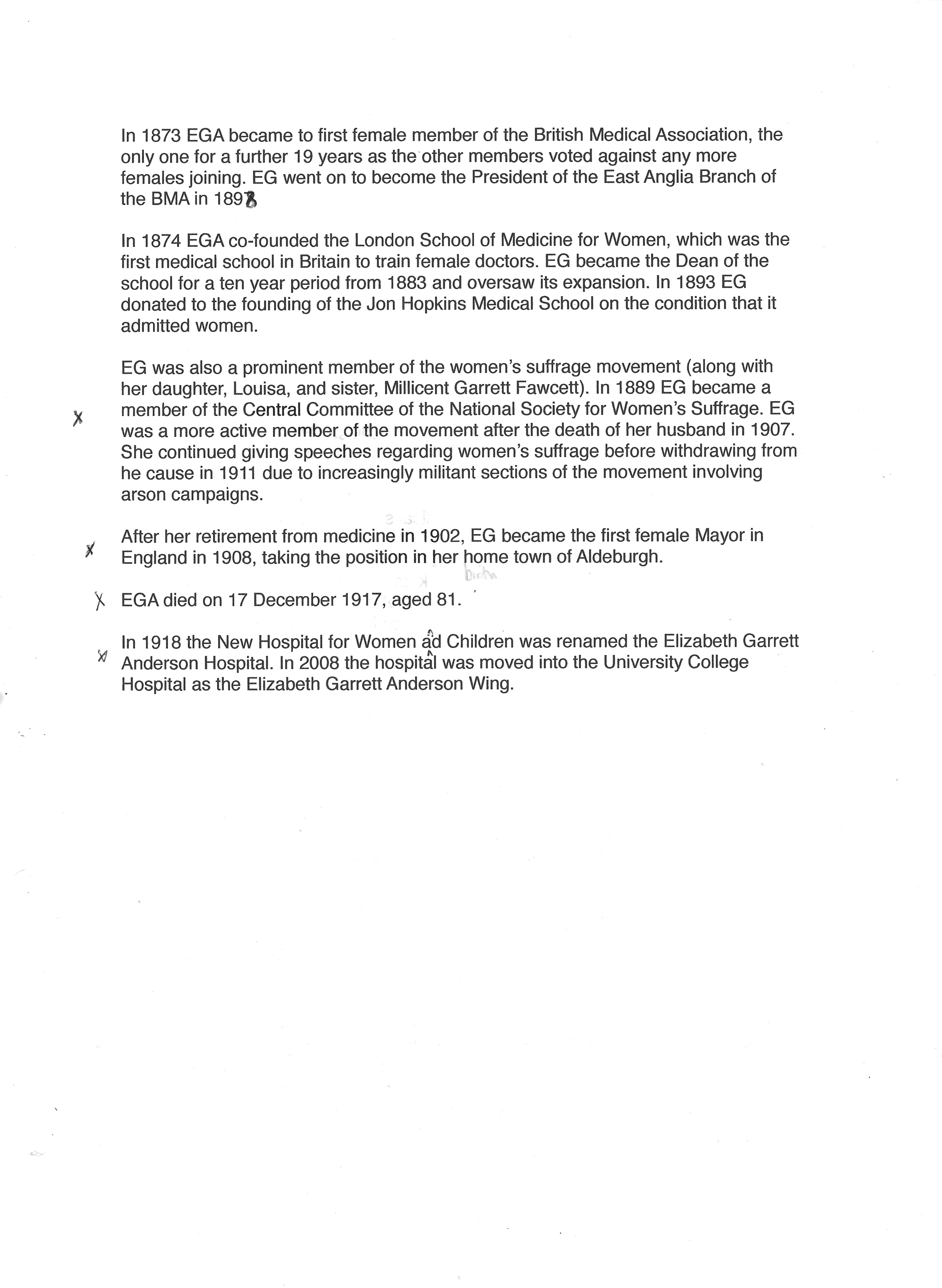
The research part of this exercise was so interesting and I found myself wanting to find out as much information as possible about Elizabeth Garrett Anderson’s life and achievements – she was a woman of so many ‘firsts’! I made notes as I worked my way through the details fo her life.
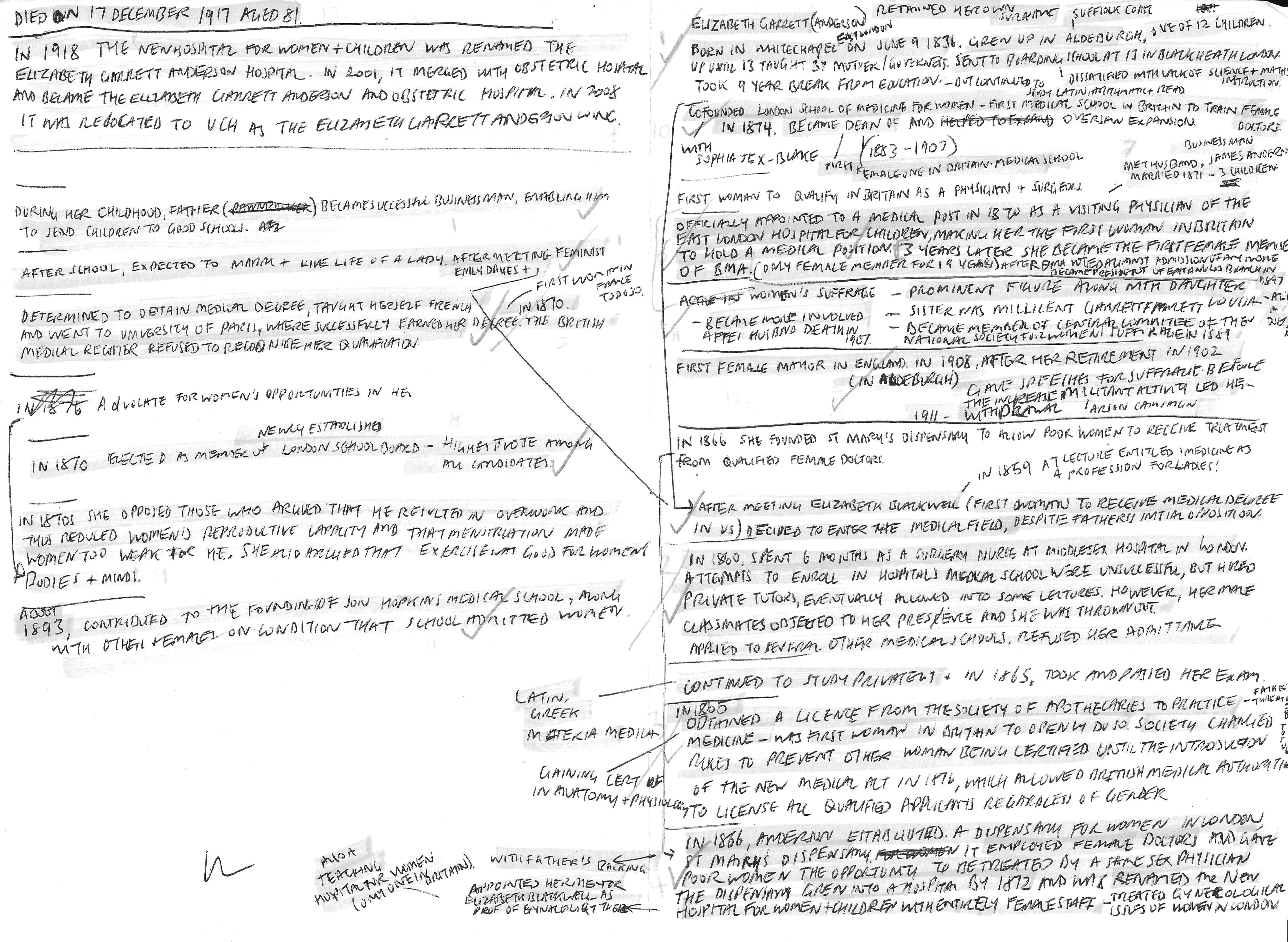
I then collated all of what I had found out and broke these down into key events.

Alongside the written research I also did several image searches, which I saved for reference on my computer. Unfortunately there were not that many photographs available and I could not find any of her as a child, but I was so invested in Elizabeth Garrett Anderson as my choice that I hoped it would not be too problematic as my style of drawing was not going to be hyper-realistic anyway.
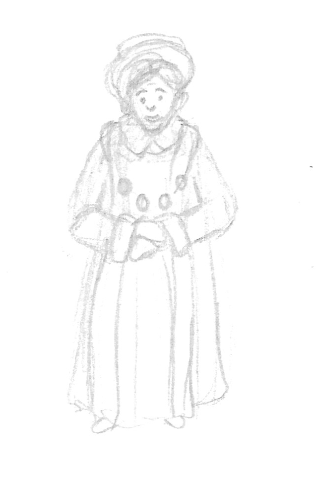
Rough Thumbnail Sketches
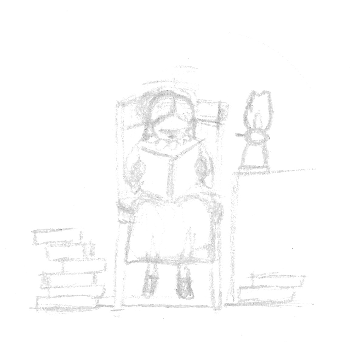
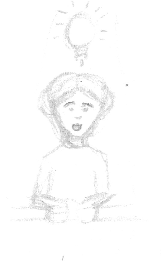
I then moved onto drawing some rough thumbnails for each key event.
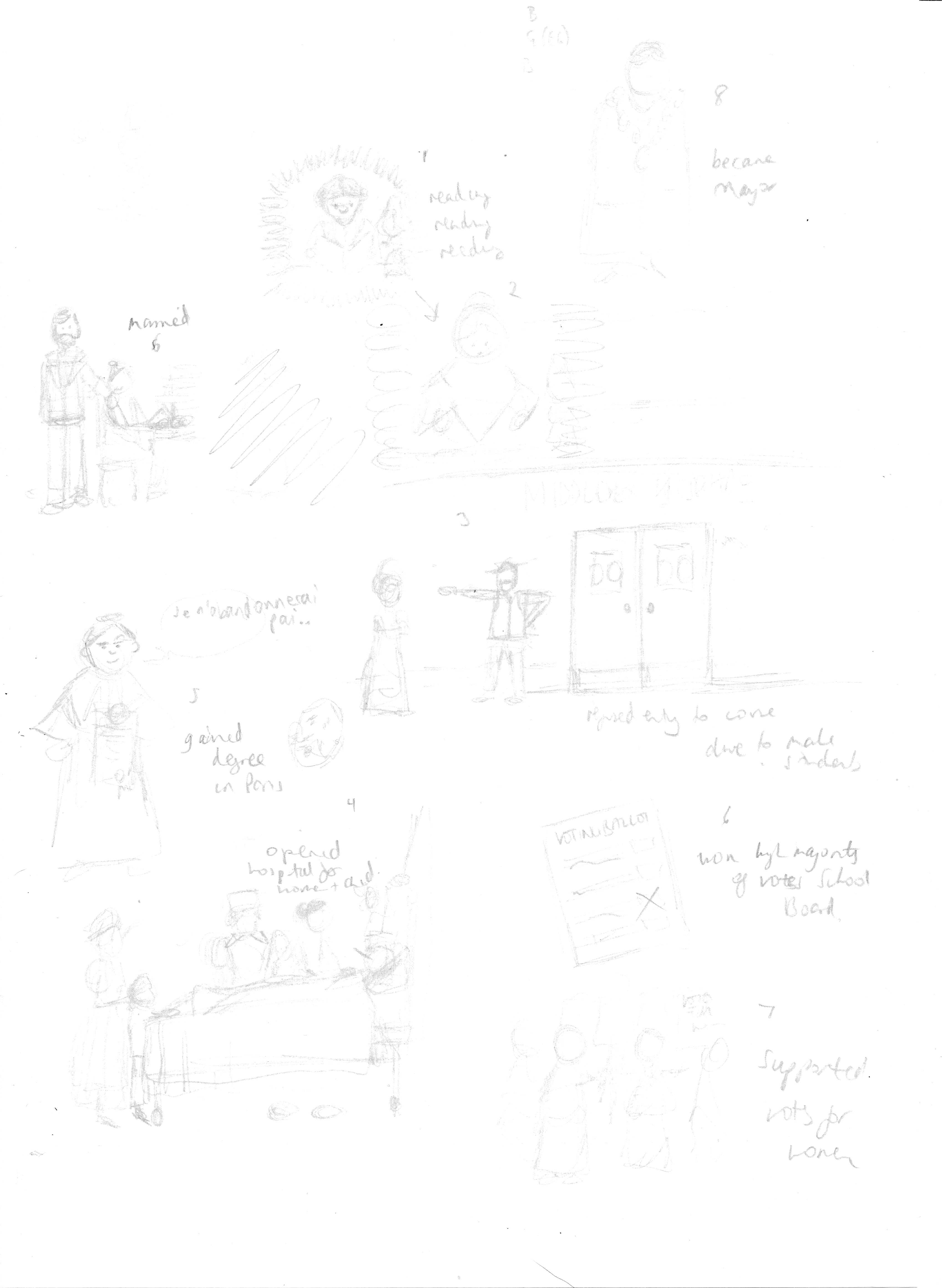
Next I drew out neater versions as I continued to refine my ideas.
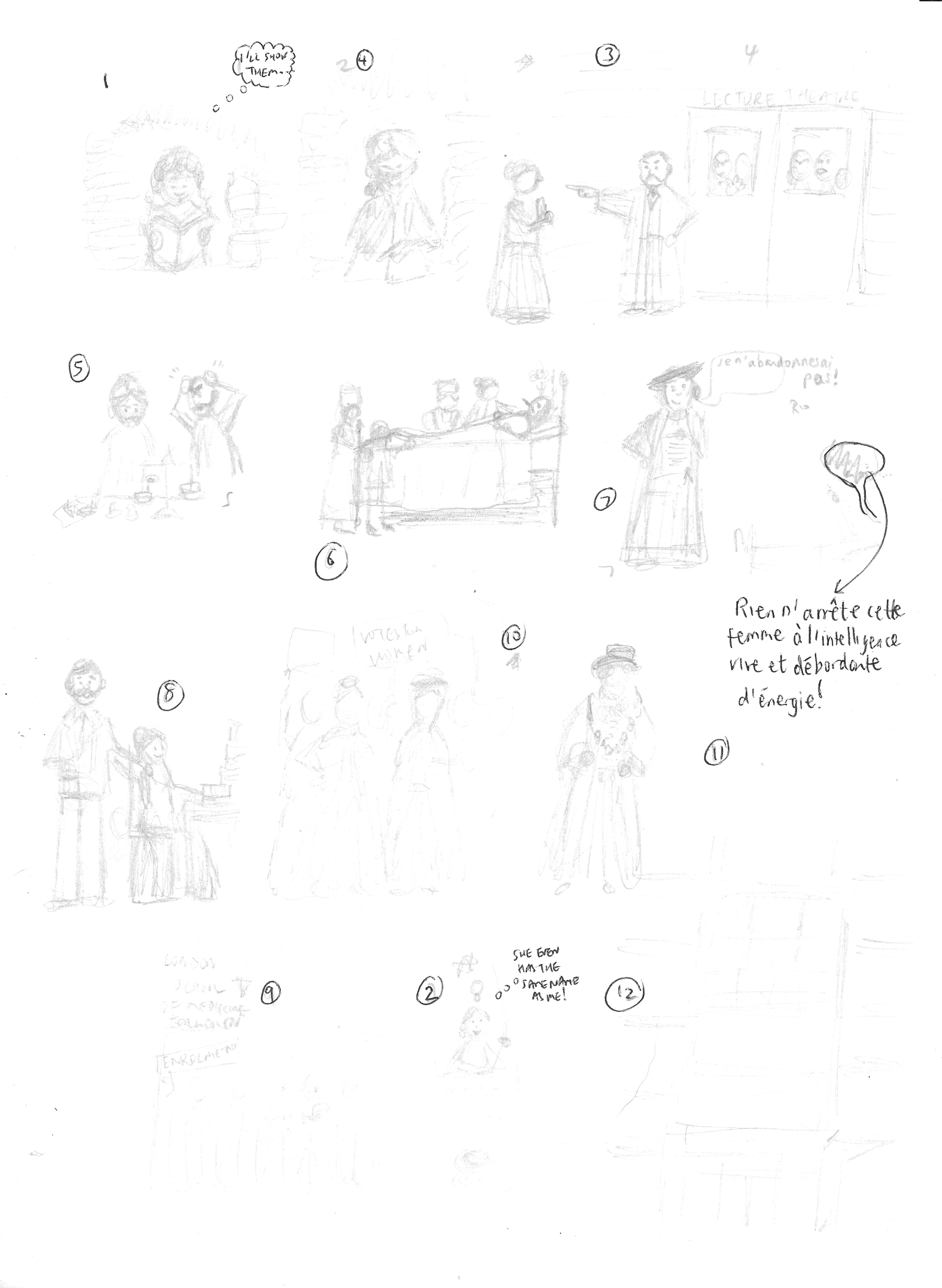
Once I had a fairly clear idea of what I wanted each illustration to look like I drew a set of more detailed thumbnails, which I would then be able to base my final illustrations on.
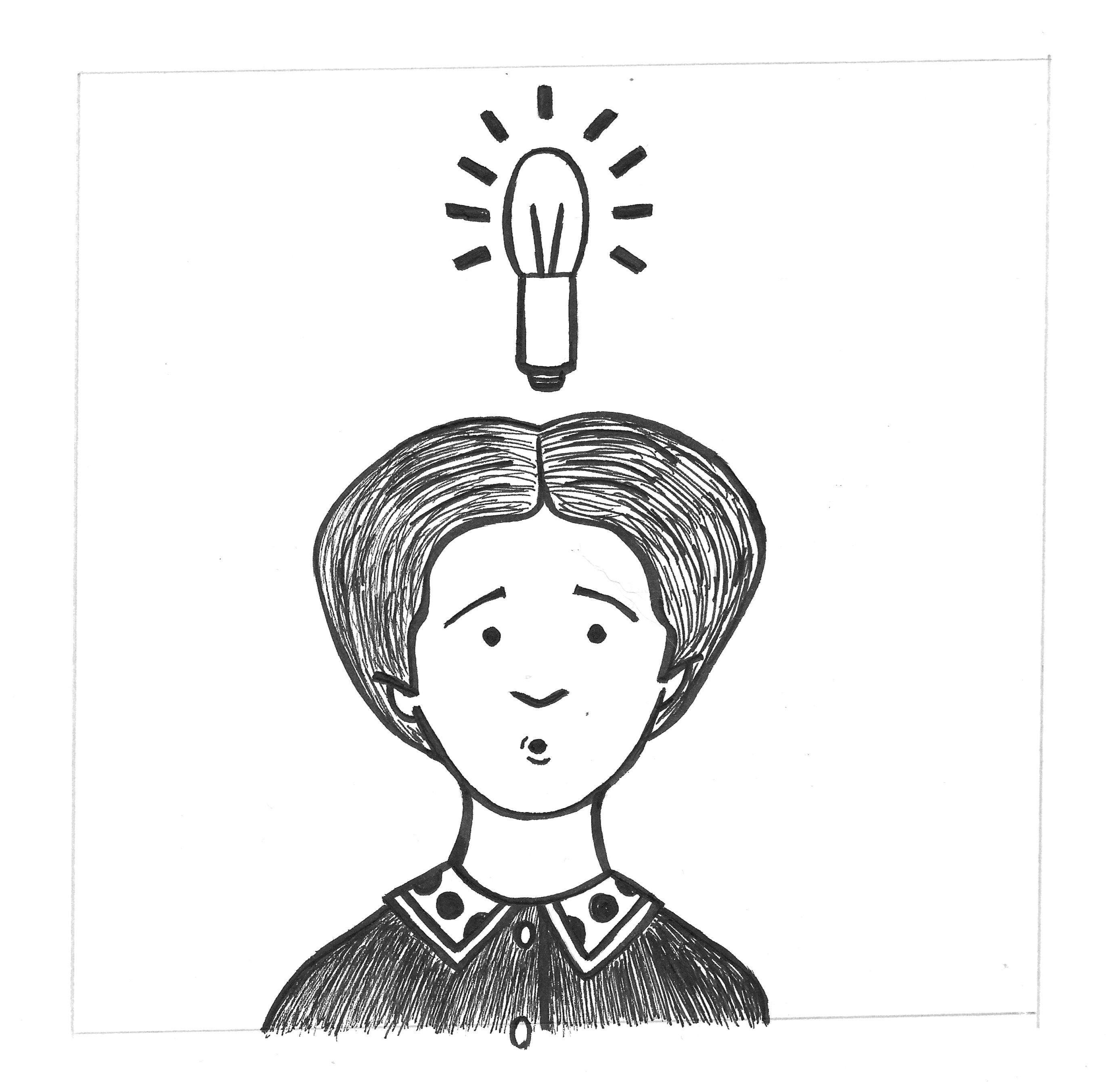
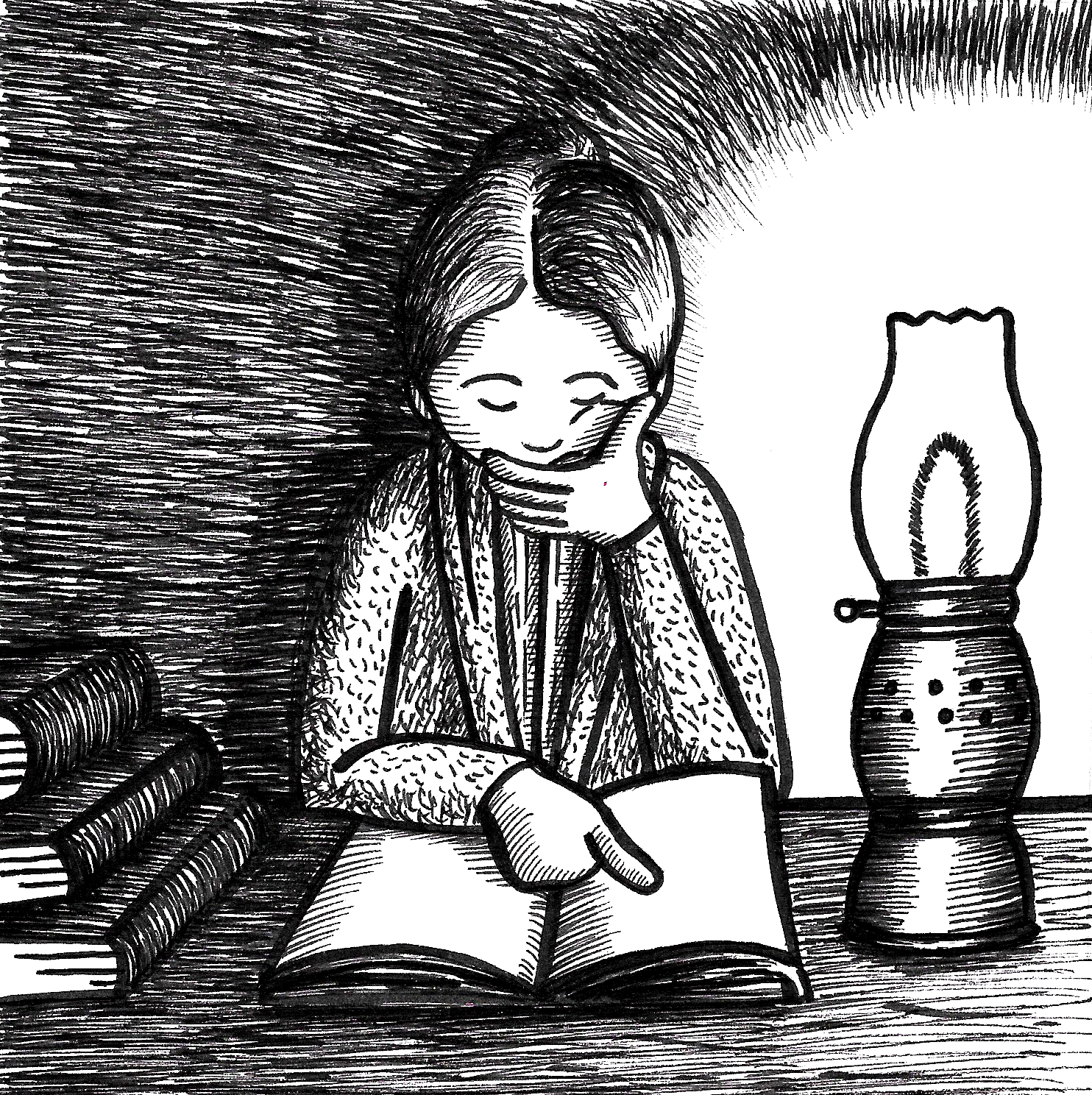
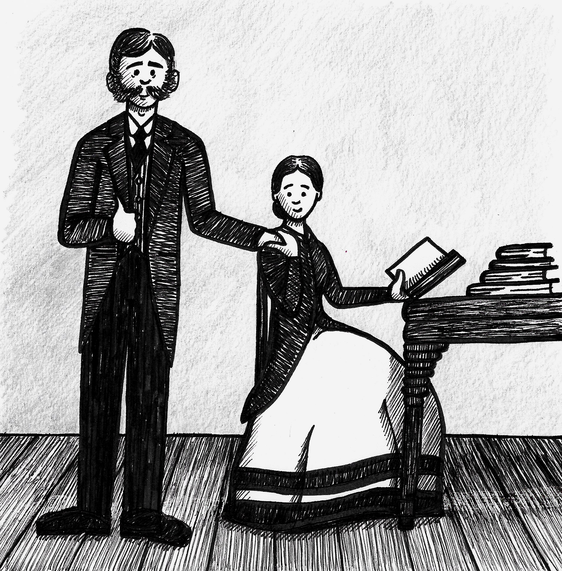
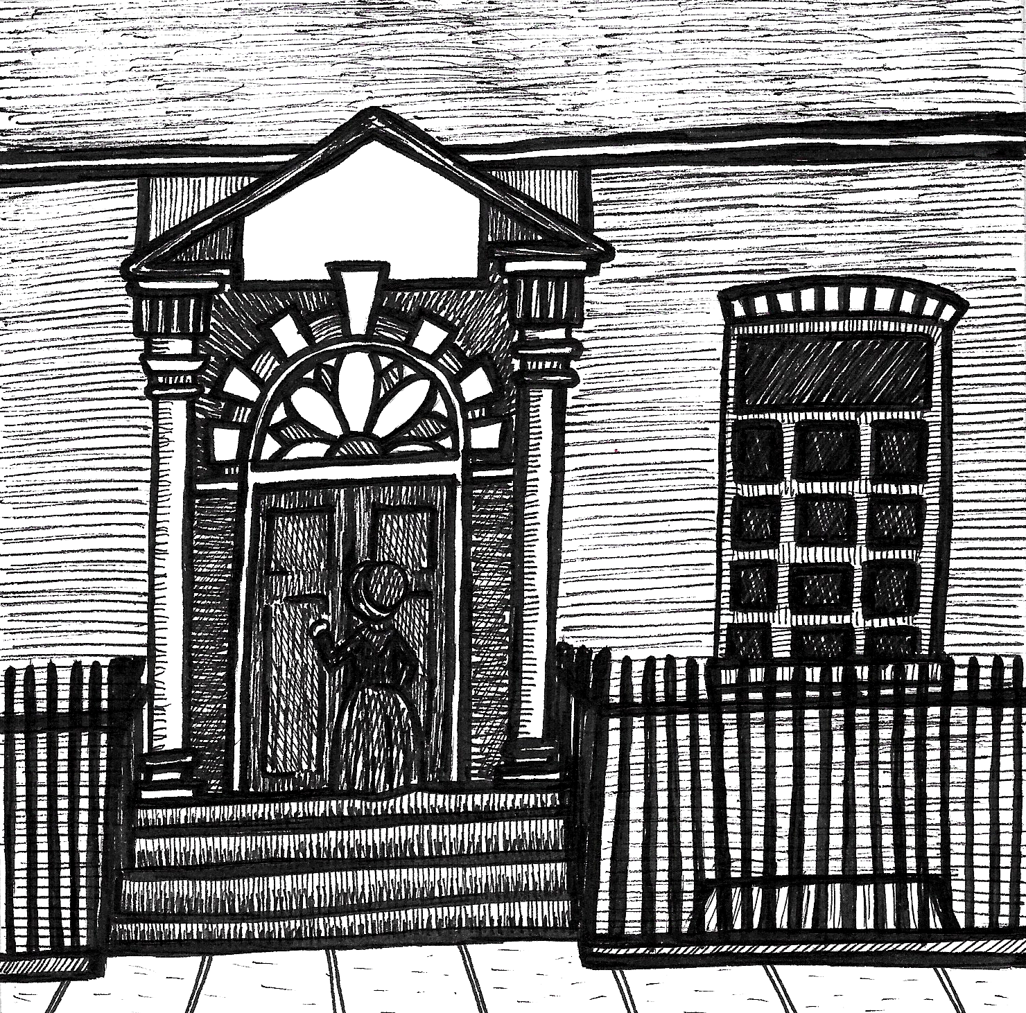
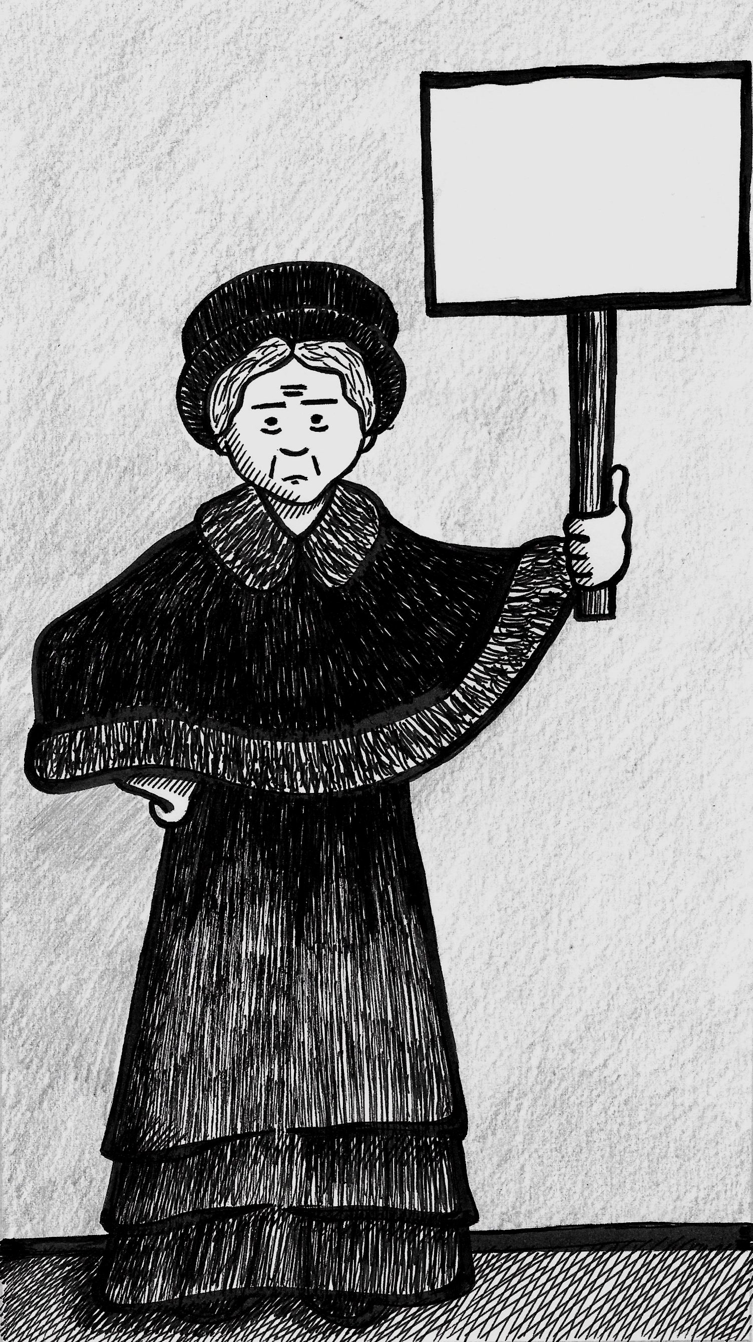
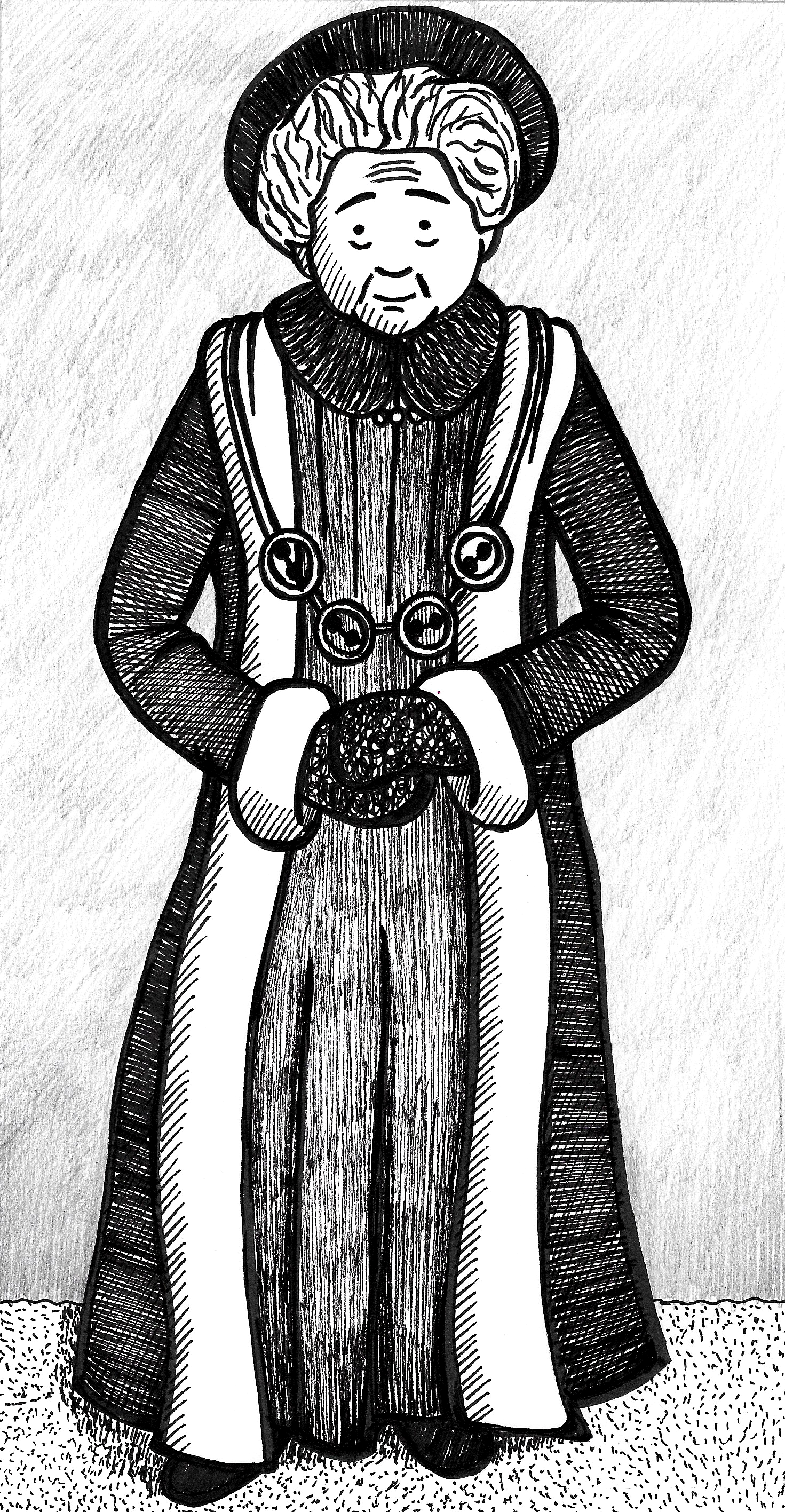
Creating the Final Illustrations
I decided to use a brush pen to draw the outlines for the illustrations, but I was disappointed with the rough finish I achieved, so I used a fineliner to work back into the drawings and neaten them up. I then took some time to consider whether or not I should try to add more detail, such as texture. Using analogue tools has required me to be much more thoughtful about each of action I take as there is no easy ‘undo’ button! Although some of the additional lines worked better than other, overall I was glad that I decided to add these to the drawings as I felt it made the (nearly) final pieces more visually appealing and complete.


Adding Text for Final Design Layout
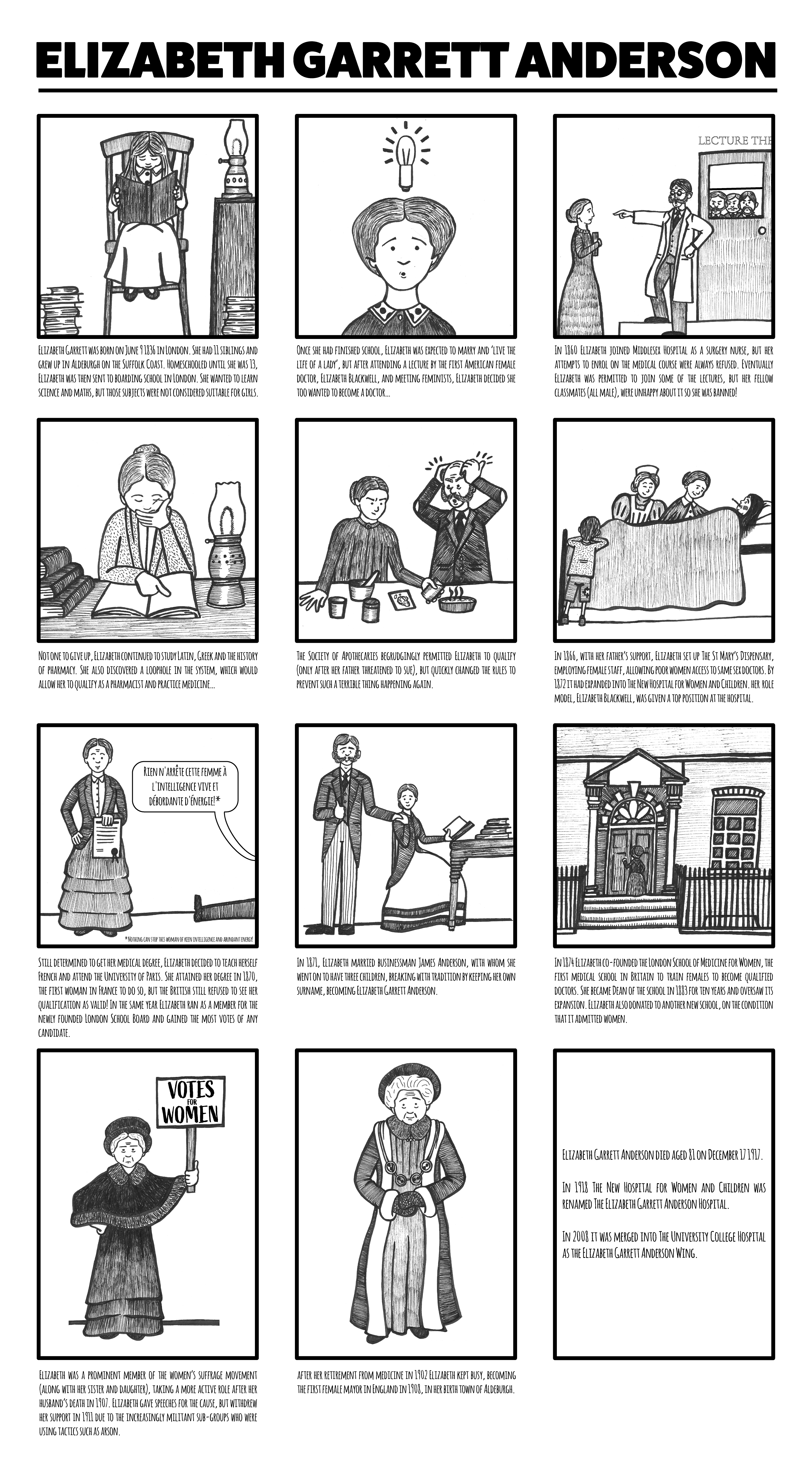
I tried to edit the text in a more ‘younger reader friendly’ format, but it was really difficult to cut the amount of text down too much, so this created an issue in terms of adding the text to the final piece. In the end, using Illustrator, I went with a mainly square panels, grid layout and placed the wording underneath. The page ended up being slightly longer than A3 in order to fit everything in. The final design can be seen below.
Final Thoughts
My first comment would be that although the introduction to this part of the unit advised each exercise was designed to be completed in one day, this first one has taken me nearly two weeks to finish and I still wasn’t 100% satisfied with leaving it as it was!
This unit does seem to have flicked a switch in my mind as I am finding the use of thumbnails so beneficial, something I have not experienced before.
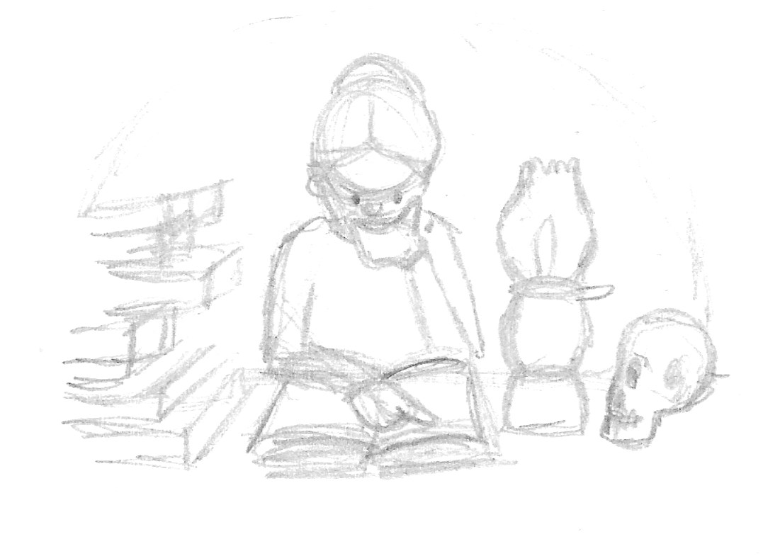
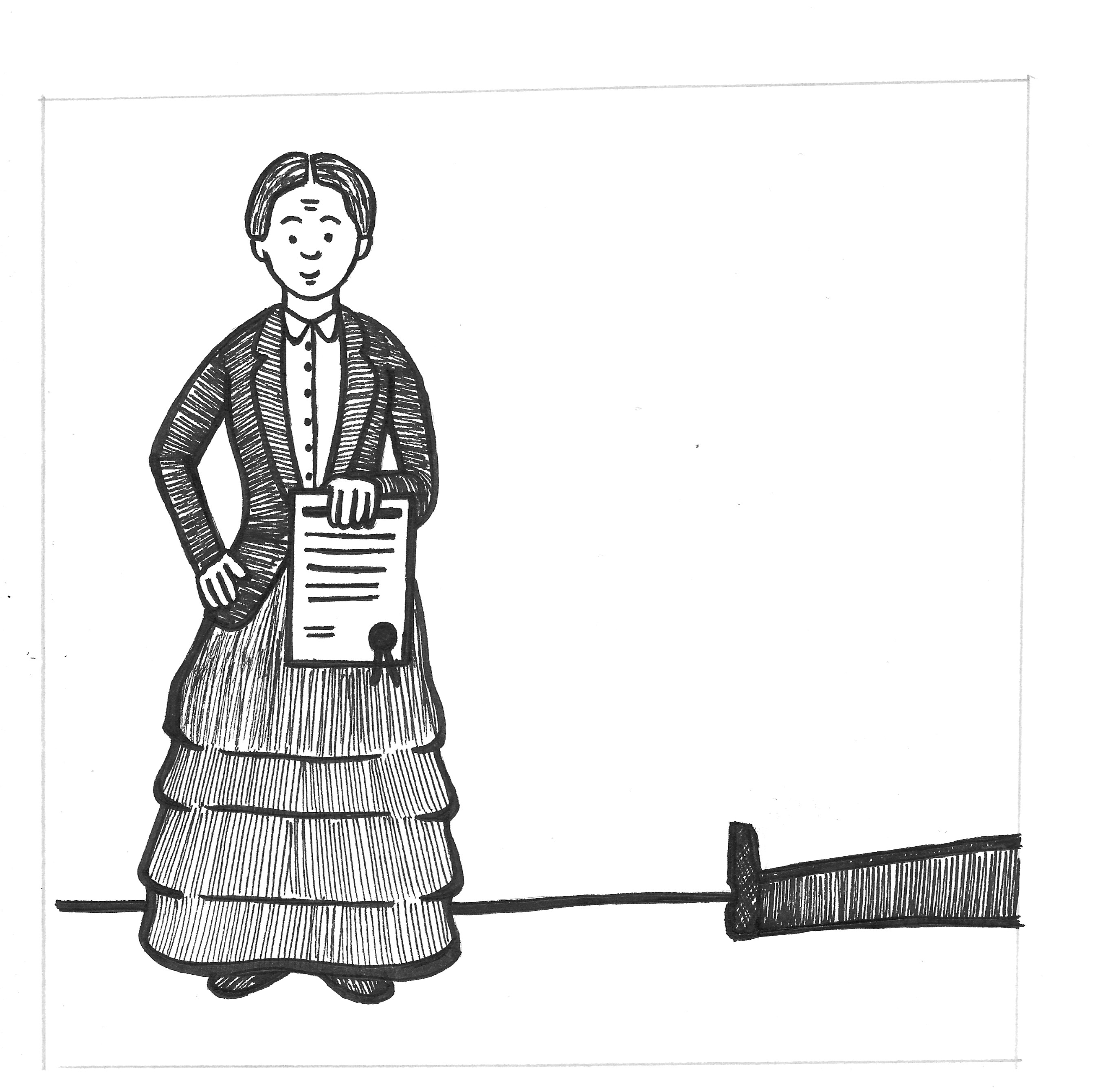
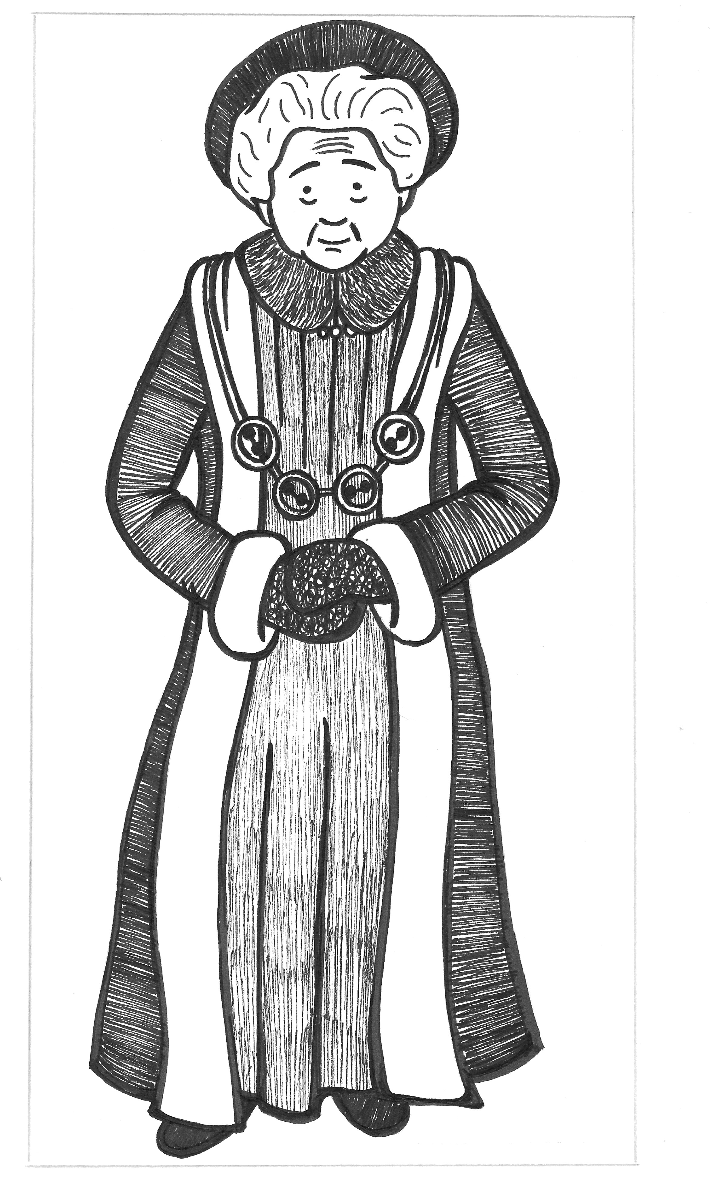
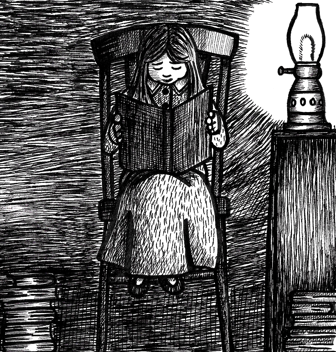
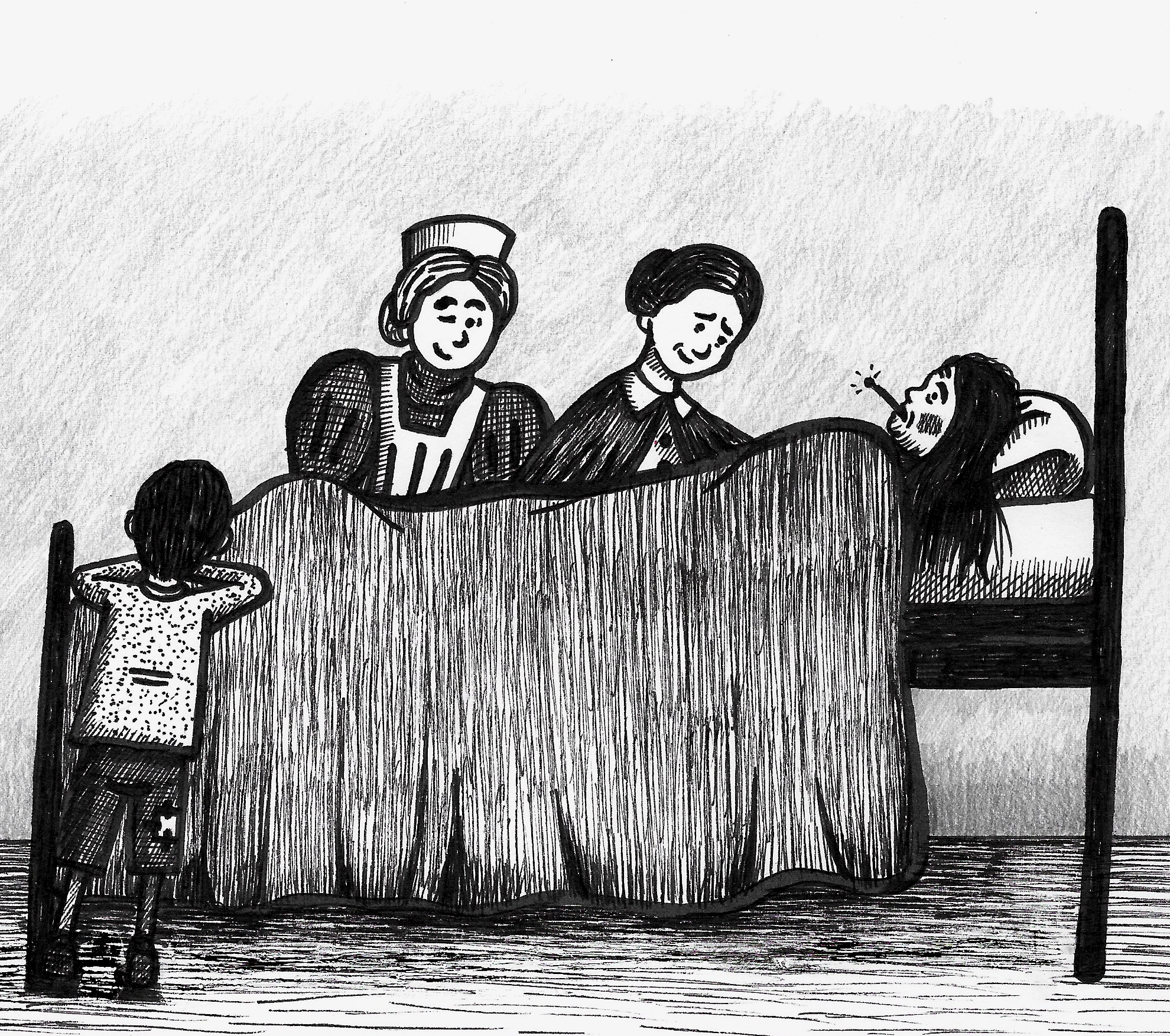
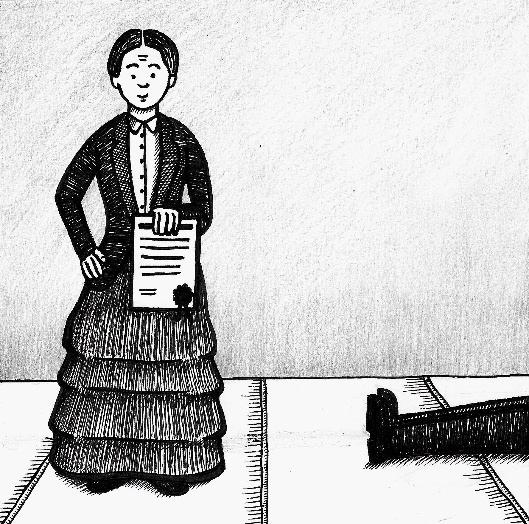
I was extremely pleased that I decided to add more detail to the illustrations and I felt with each exercise my non-digital drawings generally seem to develop and improve. The people are still stiff looking, but I was particularly happy with the fourth and final drawings as I felt they captured the subject’s quality.
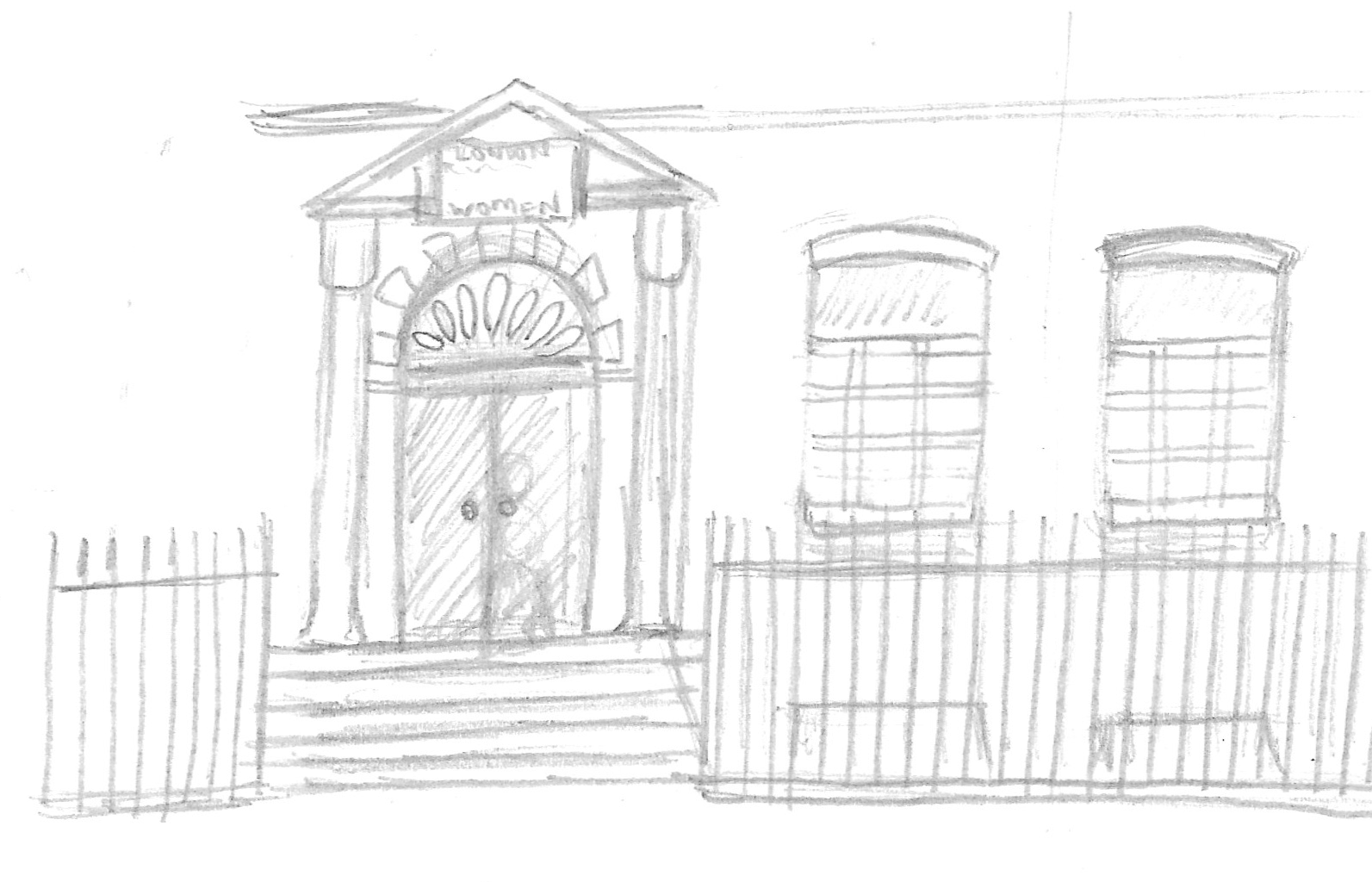
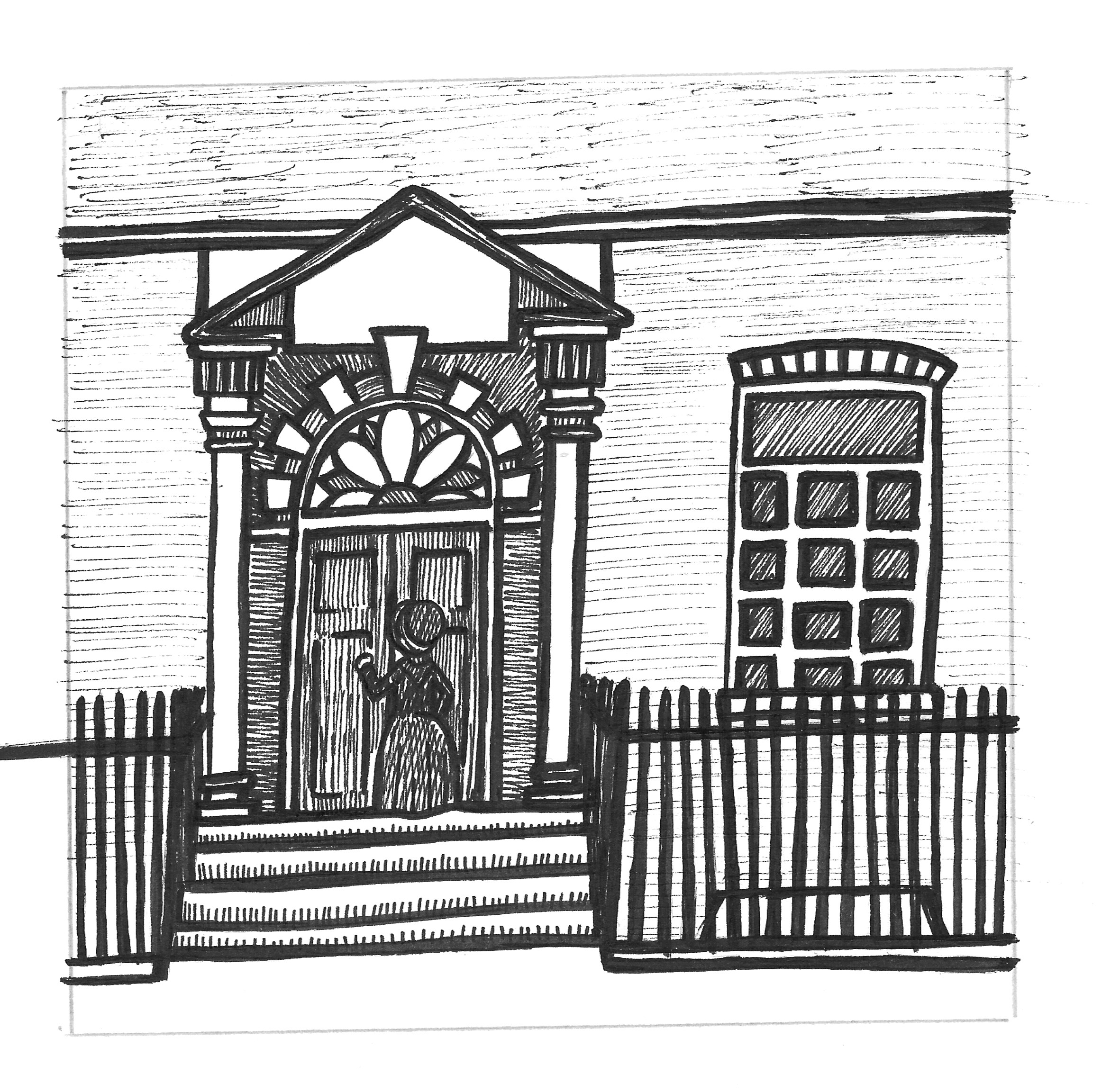
On reflection I should have hand-drawn the text within the panels myself, but this was partly due to time. I should have at least added the text for the hospital building’s name in the ninth panel as it looks glaringly obvious that this is missing above the door. Additionally I could have tried adding more detail such as the brickwork in the third and ninth panels, or experimented with tonal qualities. However, the latter may have led me down a never-ending path that would have taken another week!
I also should have considered the final layout in the planning stages as I may have been able to devise a more creative options to display the illustrations and information on the page.
For some reason I have noticed that my horizontal lines tend to slant up slightly towards the right for some reason as can be seen in the ninth panel, so this is something I need to work on.
I intend to continue experimenting with mark-making and use more variety to differentiate between objects/surfaces in my drawings. I felt I achieved this to a slightly better effect in the fourth and final panels.
As already stated, I thoroughly enjoyed learning about Elizabeth Garrett Anderson and my respect for her made me want to create a final piece that I felt was worthy, which I hope I managed to do.
Reflections After Tutor Feedback
My tutor raised various points in the feedback for this exercise, which I will try to address below:
Scale of Roughs
The original roughs were drawn at a very small scale using a 2B graphite pencil. I scanned these and enlarged them digitally, before printing and using them as guides for the pen versions.
Use of Humour
My tutor commented on the humour aspect of both my own work and the references I had found. Most of the humour in these is conveyed via the body language and expressions of the characters. I believe this type of visual humour transcends language and is accessible to most people. A perfect example of this in terms of TV would be Mr Bean, who speaks very few comprehensible words, but it is Rowan Atkinson’s ability to perform using his facial expressions and body language that allows the character to be enjoyed by all (as long as you like this type of humour).
As stated many times during this unit, I prefer work that has a limited amount of text with artwork, too much can be a distraction in my opinion, and there is a fine balance between the two elements. An good example of this balance can be seen in the Martin Brown example above, in which the text and illustrations compliment one another and enhances the humour, but the humorous intent can still be comprehended without reading the words.
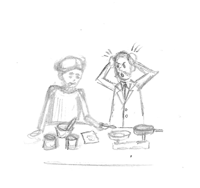
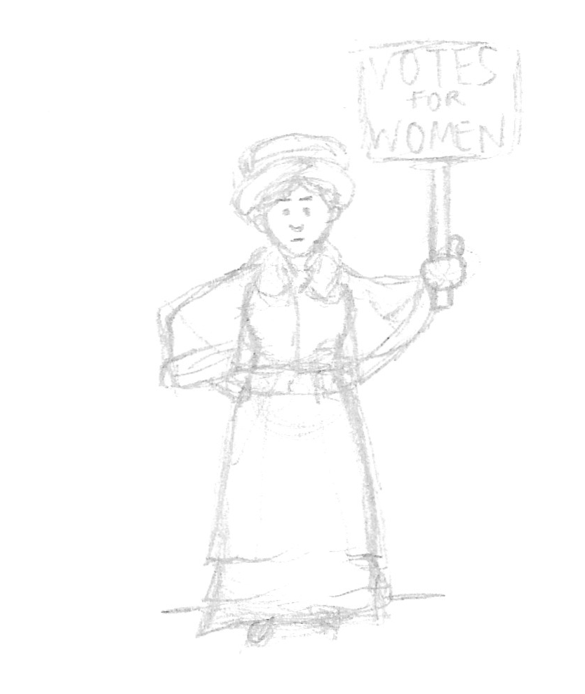
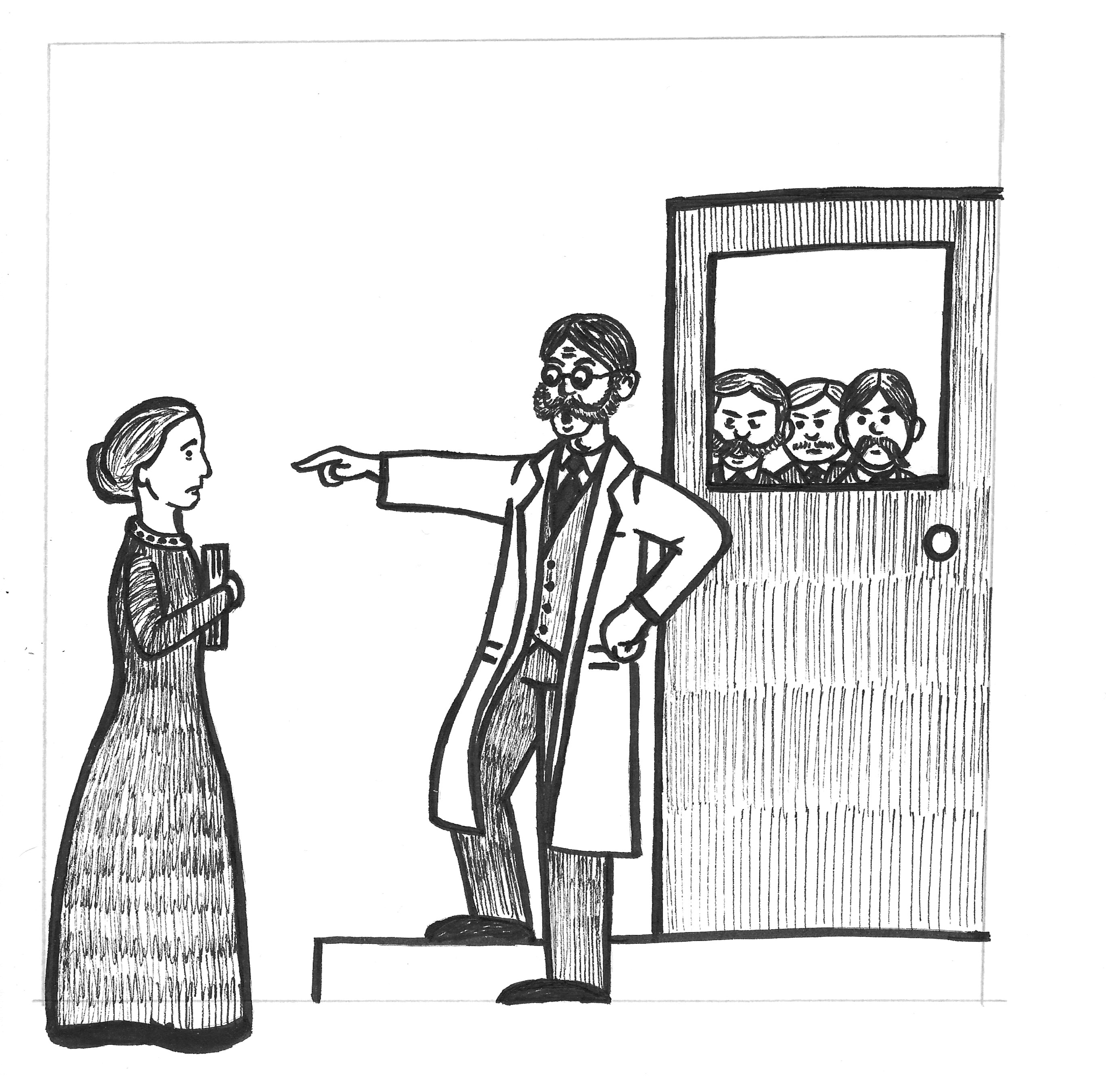
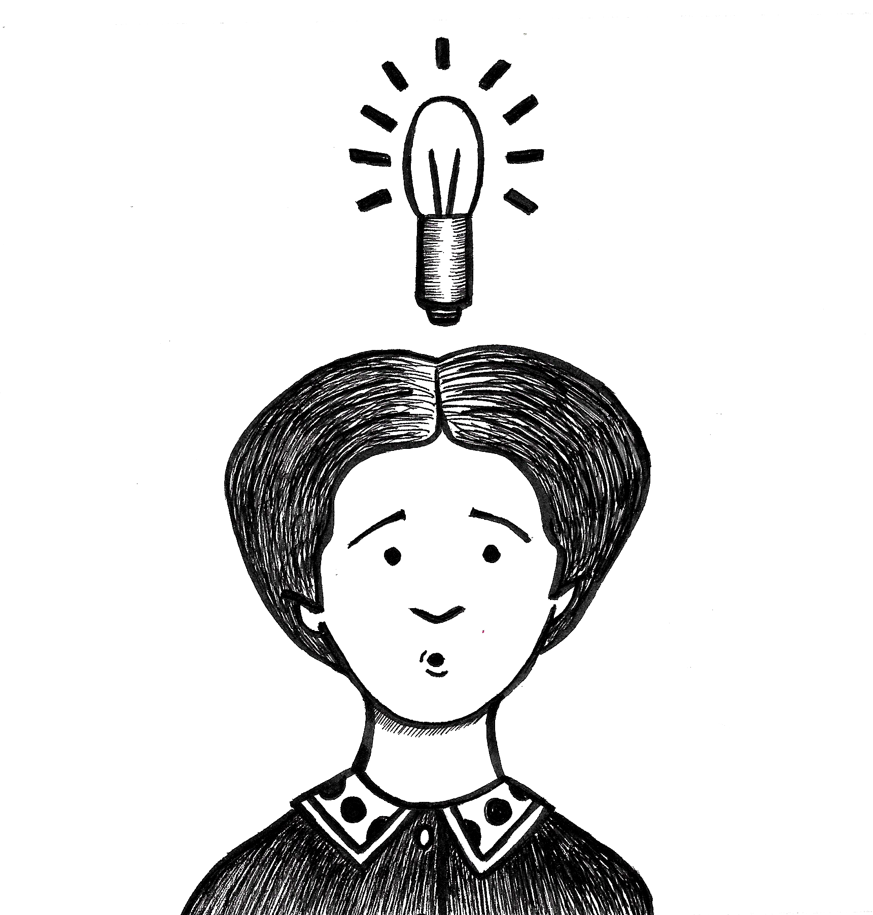
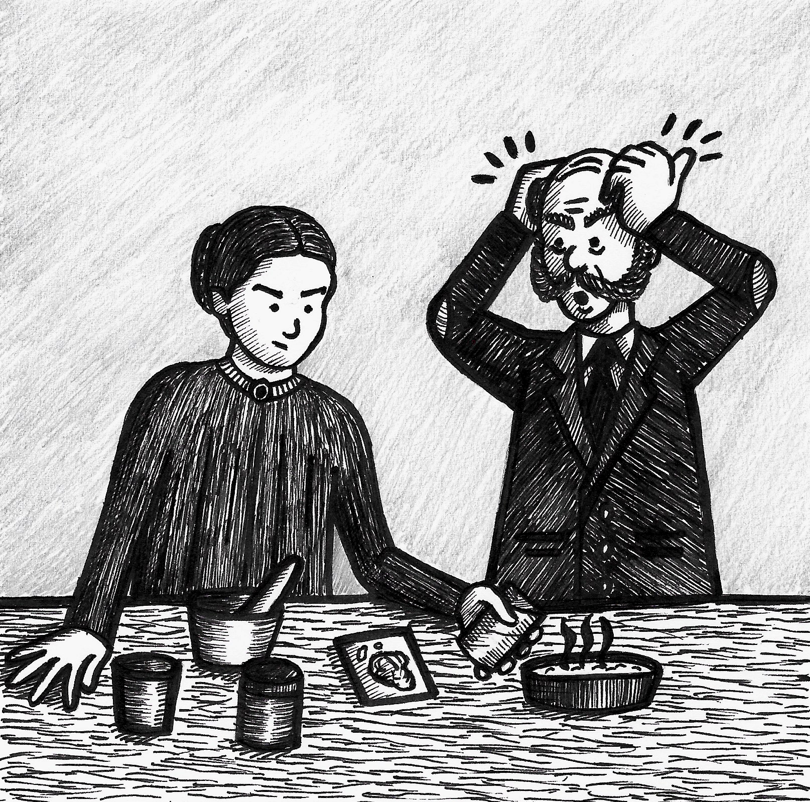
In relation to my work in this exercise, I tried to use humour, via body language and expressions, most obviously in Illustrations 5 and 7 mainly to emphasis the absurdity of the situations Elizabeth Garrett Anderson found herself in!
Layout and Development of Final Versions
In hindsight I would like to have been able to produce a more dynamic layout for the final poster, but I found it challenging to work out such a composition during the planning stages and by the time I had reached the later versions I had settled on a regular grid layout that would fit neatly on the A3 page (although I had to make the page longer than A3 size anyway). Additionally, as stated previously, there was so much text that I could not really edit out that I was unsure how it would be possible to fit this around a more dynamic layout.
As a result, the regular grid of mostly square panels, meant I cropped the illustrations down to size. The final row broke this rule only because I did not think it would look right to trim the character in half in order to fit in the square grid.
A definite area for improvement as I progress on the course would be to consider composition more thoughtfully in the early stages of development and be braver sketching out potential ideas.
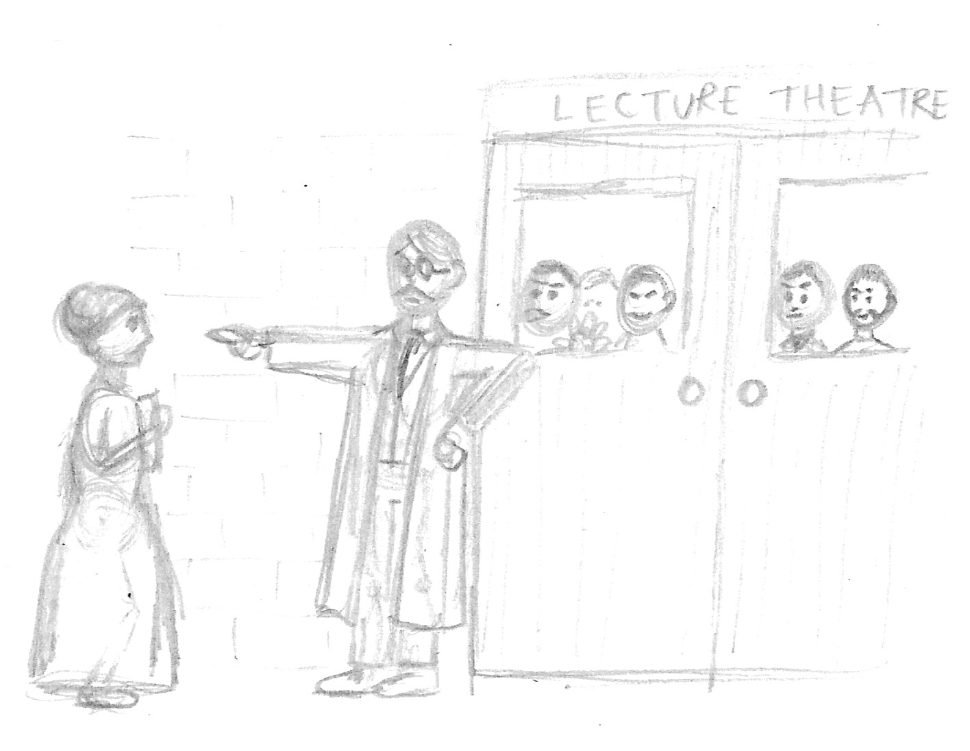
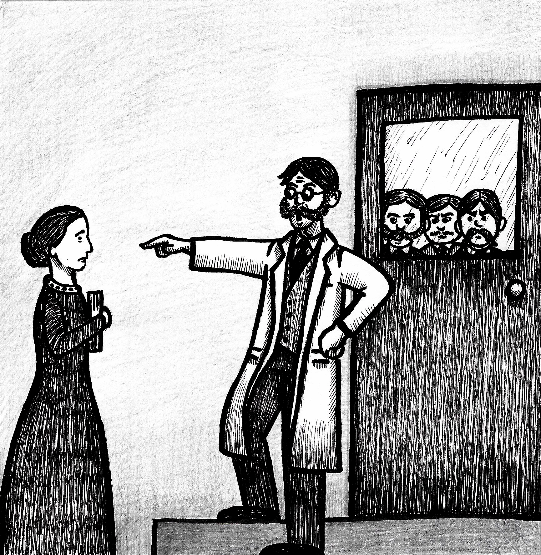
On reflection I noted that there is no variety in viewpoint in the panels, so every scene is face on and flat. It would have been more visually interesting to vary this, for example, in panel 3 the illustration could instead be drawn from EGA’s point of view and show the group of men blocking her way into the medical class. I feel this would have more impact visually.
Feedback
There is no doubt that I need to start testing my work for feedback so I can gauge how well the intended message is communicated and received. I have always found it really challenging to show my work to other people, but I realise this is not exactly ideal if I want to progress in the creative field, so I plan to work on this aspect as I proceed on the course.
Revising the Panels
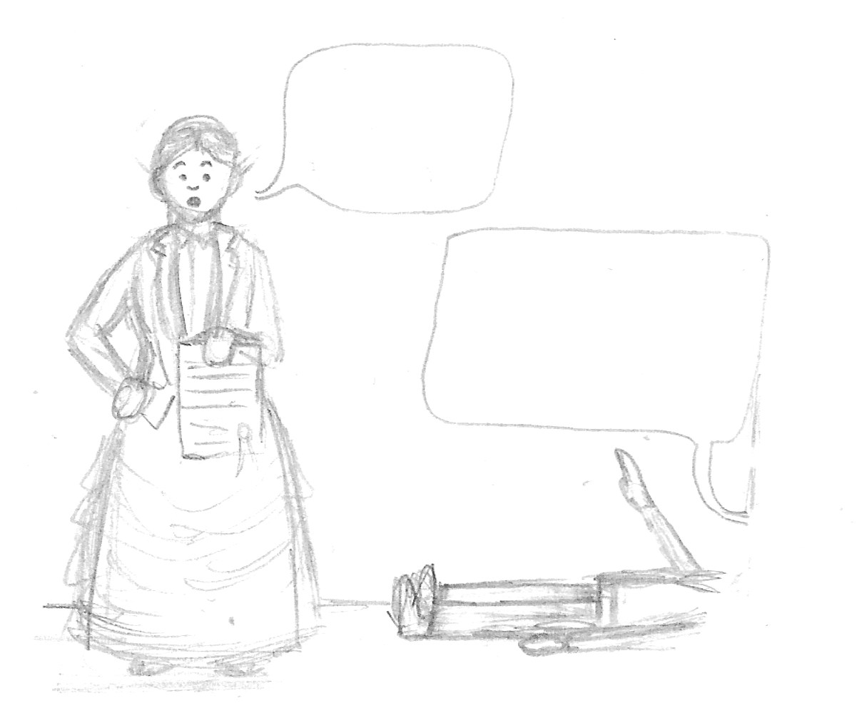
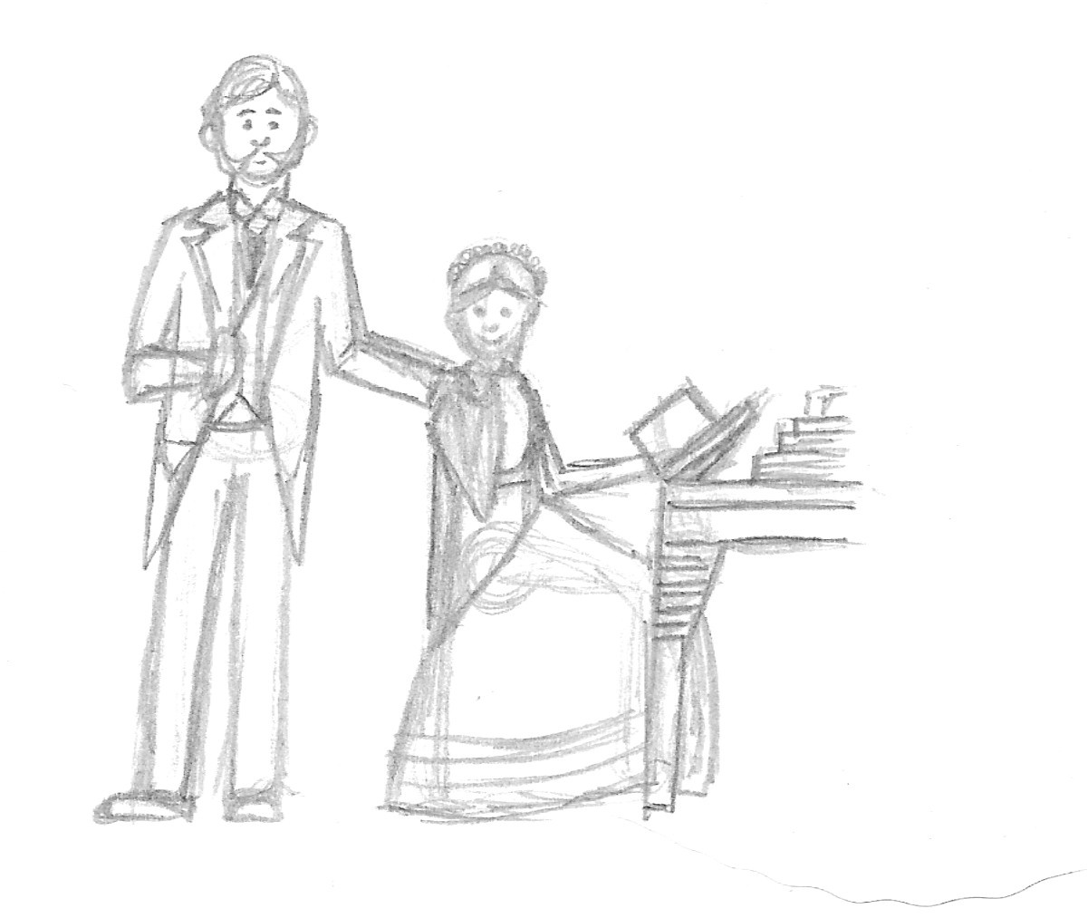
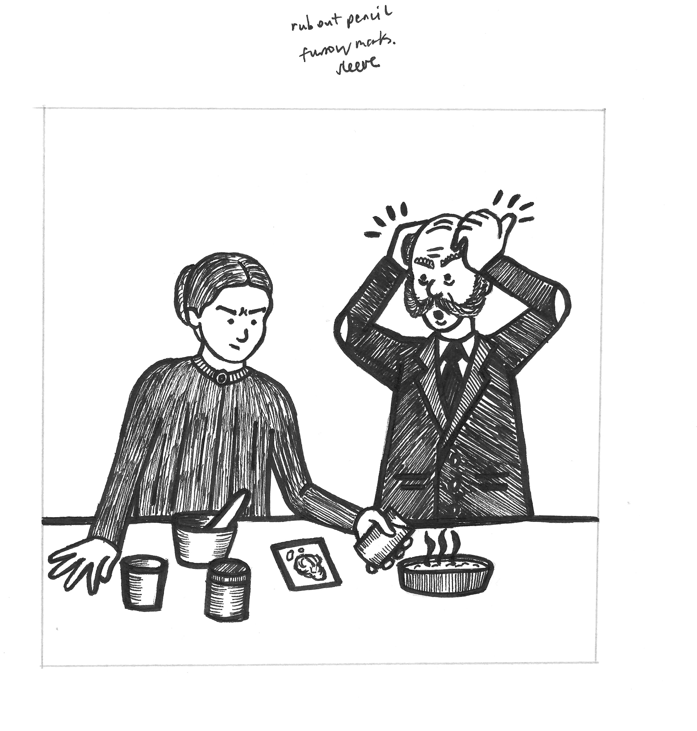
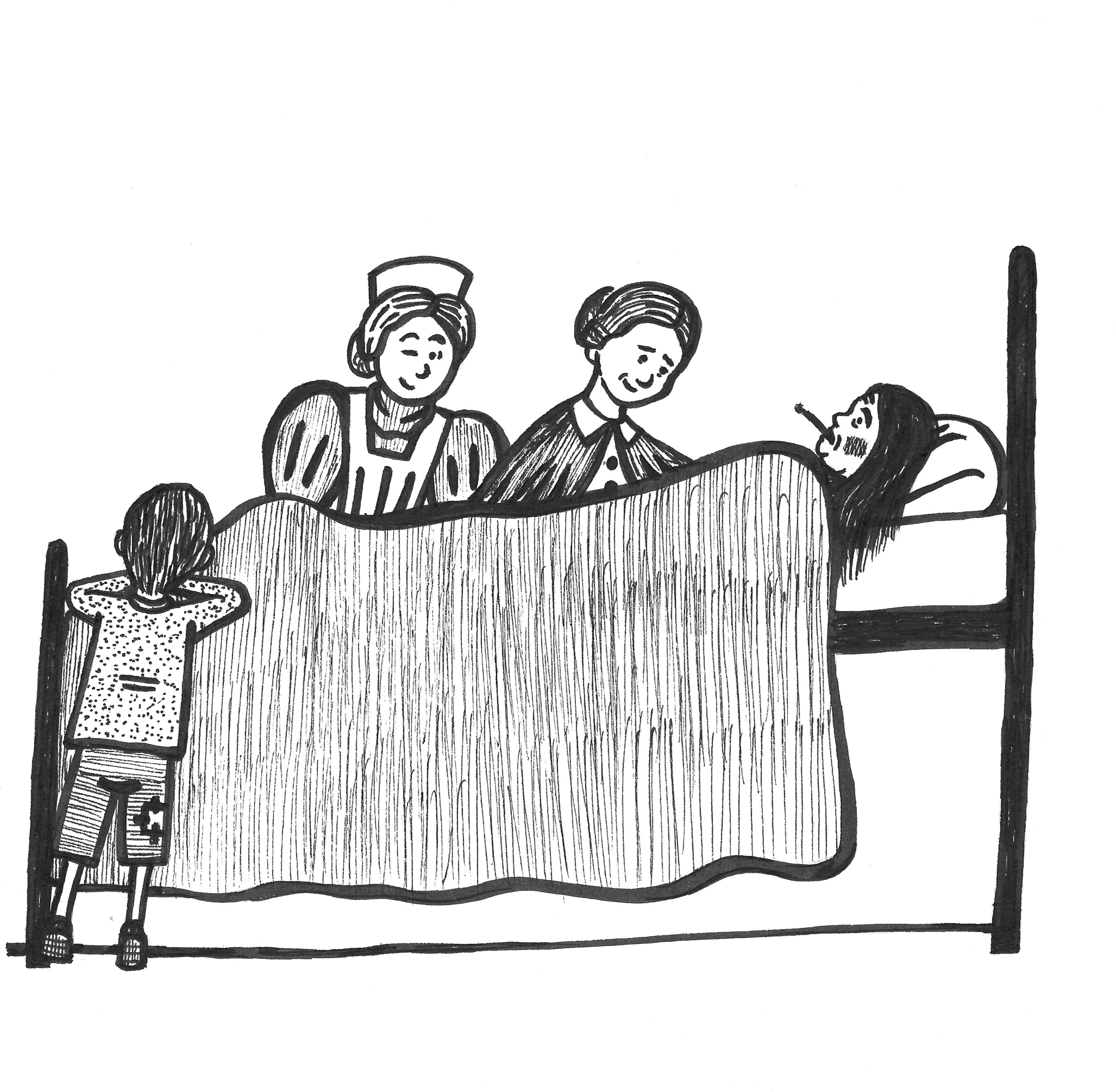
My tutor commented on the lack of depth within the panels and the positioning of the ‘floor’ lines, along with the thickness of these, resulted in flat and sometimes confusing illustrations. When I returned to the artwork, I could completely understand this and decided I wanted to make improvements. My tutor had suggested I did this digitally, which would have been ideal, but I have been having many problems running Adobe products on my computer and after several failed attempts to open Illustrator, I resorted to making revisions by hand. The revised panels can be seen below:
I found having to work using analogue tools was actually much more satisfying and I do not believe I would have achieved as decent results if I had been able to make the changes digitally. I used Tippex to white out certain areas, such as the floor lines and then repositioned these using fineliners. I also added more detail lines along with some tonal qualities and attempted to vary my markmaking to suggest texture. In addition I used graphite pencil to shade in a very soft background in some of the illustrations, which I hope added to the sense of depth.
I felt panels 4,5 and 11 were the most successful visually. I was never keen on panel 9 as the lines are skewed and it falls short of what I wanted to create. My tutor highlighted the visual confusion in panel 7 due to the positioning of the horizontal line, so along with moving this ‘back’, I also added a back leg to the man who has fainted. I felt both of these helped improved this panel. I intend on practicing my mark-making skills regularly, which I hope will improve any future work in this style.
Overall, I was very pleased with the results and that I had taken the time to take on board my tutor’s valuable comments and implement changes that created much more visually satisfying illustrations.
References
BBC History, (n.d.). Elizabeth Garrett Anderson. [online] Available at: https://www.bbc.co.uk/history/historic_figures/garrett_anderson_elizabeth.shtml [Accessed 18 November 2021].
Brown, M. (n.d.). Martin Brown Illustrator. [online] Available at: https://martinbrownillustrator.co.uk [Accessed 17 November 2021].
Dan Dare Corporation, (n.d.). Eagle Comic, The Official Home of Dan Dare. [online] Available at: http://www.dandare.com/eagle-comic.htm [Accessed 17 November 2021].
GoComics, (n.d.). Ripley’s Believe It Or Not. [online] Available at: https://www.gocomics.com/ripleysbelieveitornot/about [Accessed 17 November 2021].
Johnson Lewis, J. (2017). Elizabeth Garrett Anderson. [online] ThoughtCo. Available at: https://www.thoughtco.com/elizabeth-garrett-anderson-3529952 [Accessed 18 November 2021].
Johnson Lewis, J. (2019). 100 Most Important Women in World History. [online] ThoughtCo. Available at: https://www.thoughtco.com/most-important-women-in-world-history-3528530 [Accessed 17 November 2021].
Look and Learn History Picture Archive, (n.d.). History of Look and Learn. [online] Available at: https://www.lookandlearn.com/history/index.php [Accessed 17 November 2021].
McGarry, S. (n.d.). Steve McGarry. [online] Available at: https://stevemcgarry.com [Accessed 18 November 2021].
Roberts, D. (n.d.). David Roberts Illustration. [online] Available at: http://davidrobertsillustration.com/index.html [Accessed 17 November 2021].
Simkin, J. (1997). Elizabeth Garrett Anderson. [online] Spartacus Education. Available at: https://spartacus-educational.com/WandersonE.htm [Accessed 18 November 2021].
STEM Sisters, (n.d.). Elizabeth Garrett Anderson. [online] Available at: http://www.hmdt.org.uk/hmdtmusic/stemsisters/elizabeth-garrett-anderson/ [Accessed 18 November 2021].
Stirling-Middleton, E. (2017). Incredible Life of Elizabeth Garrett Anderson. [online] Science Museum Blog. Available at: https://blog.sciencemuseum.org.uk/doctor-who-100-years-of-female-doctors/ [Accessed 18 November 2021].
The History Press, (n.d.). 11 Little Know Things About Elizabeth Garrett Anderson. [online] Available at: https://www.thehistorypress.co.uk/articles/11-little-known-things-about-elizabeth-garrett-anderson/ [Accessed 18 November 2021].
Wikipedia, (n.d.). Elizabeth Garrett Anderson. [online] Available at: https://en.wikipedia.org/wiki/Elizabeth_Garrett_Anderson [Accessed 18 November 2021].
Women in Exploration, (2021). Elizabeth Garrett Anderson. [online] Available at: https://www.womeninexploration.org/timeline/elizabeth-garrett-anderson/ [Accessed 18 November 2021].