Brief
This assignment will bring together some of the experiments you have undertaken in the course’s exercises so far, where you have looked at comic structures and conventions like:
- The opening scene
- Character design
- Point-of-view
- Text styles of word balloons and text captions
- The silent comic
- Visual style
The nine-panel grid is most famously used in early Spider-Man and Doctor Strange comic stories by Stan Lee and Steve Ditko. You can also see it in the work of comic artist Daniel Clowes, and the superhero graphic novel Watchmen by Alane Moore and Dave Gibbons (1987). Also known as a ‘waffle’ grid, it is a 3×3 panel grid where all the panels are the same size.
For this assignment, produce a nine-panel comics page that brings some of the structures and conventions from the course so far together. you may decide to use all of them on one page, or you may choose to make a text-heavy or completely silent comics page. Here are four titles you can use as starting point options to develop a story:
- ‘City Story’
- ‘On a Journey’
- ‘A Chance Encounter’
- ‘The Big Event’
These are starting points for your story, you can interpret them in anyway you want, and you story can be black and white or colour. The important thing is to consider the structure and how you move your narrative along within the nine-panel grid format.
Research
After my lack of success with the previous exercise, I felt a bit deflated starting this assignment. Unfortunately, I could not find much specific information regarding single page, nine-panel grid comics, so I began by looking at examples of the nine panel grid format in comics along with general advice about comic book layouts (please see References). I have also been working my way through the graphic novel Watchmen by Alan Moore and Dave Gibbons.
Ideas
Initially I formulated quite a few ideas in my mind, but I was finding it quite challenging to imagine limiting any of these stories to just nine panels on a single page. I decided that I would need to keep it fairly simple and that each panel would certainly need to have clear purpose in the narrative.
As I result I filtered my original thoughts down to two options:
- A disillusioned worker in a monotonous/boring job builds up the confidence to hand in his/her notice to an intimidating boss (relates to ‘The Big Event‘ title).
2. A young girl, bullied at school, dreams of becoming an explorer/adventurer (relates to ‘Chance Encounter’ and ‘On a Journey‘ titles)
Thumbnails
Taking these ideas forward for further development I moved onto visualising them on paper in rough thumbnails.
Idea 1
The page begins with the worker looking at an envelope which contains the ‘letter of notice’ and anxiously looking at the clock.
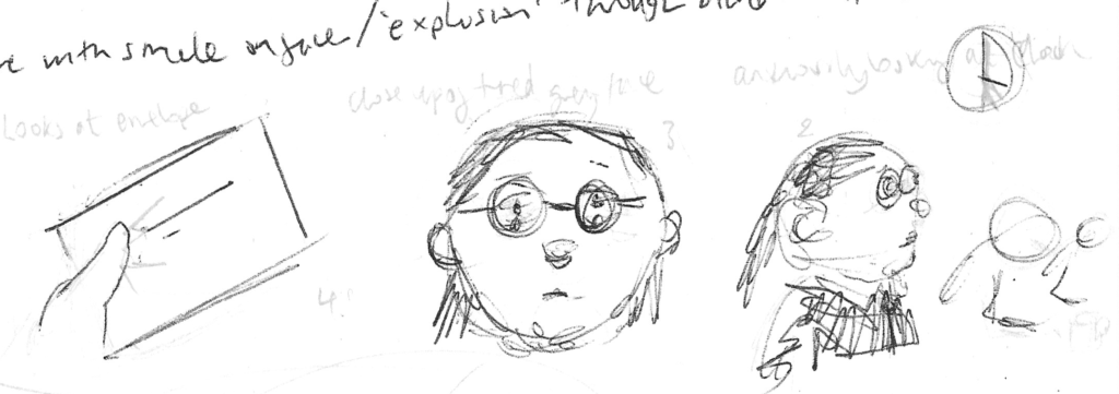
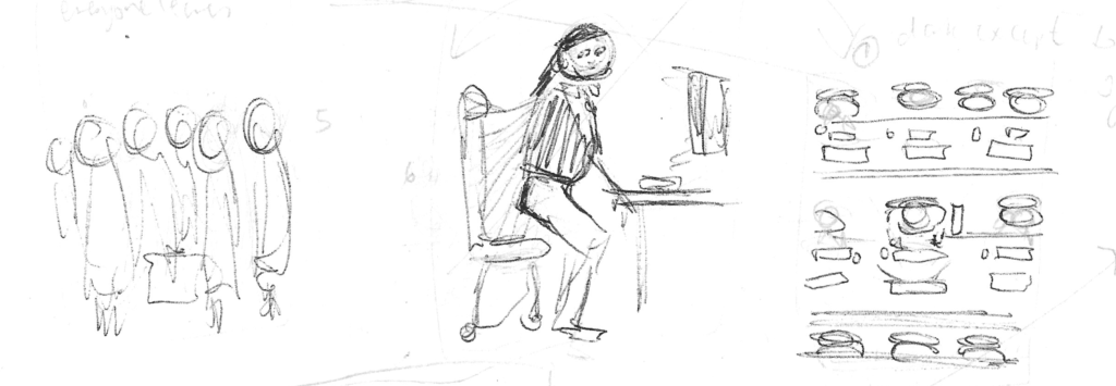
All the colleagues leave for the day and the character tries to stand up, but is fused to the chair. There would then be a bird’s eye view of the empty rows surrounding the worker.
I was not sure where this panel would fit in, but felt it would be important to show the change in mindset of the character making to decision to ‘just do it’.
The final row would show the character knocking on the boss’s door and then leaving with a smile as the silhouette of the boss is seen in the background.
Although I felt the story had potential, I thought the ending was a not quite what I had in mind and was a bit flat, so I moved onto my second idea which was beginning to become more concrete in my mind.
Idea 2
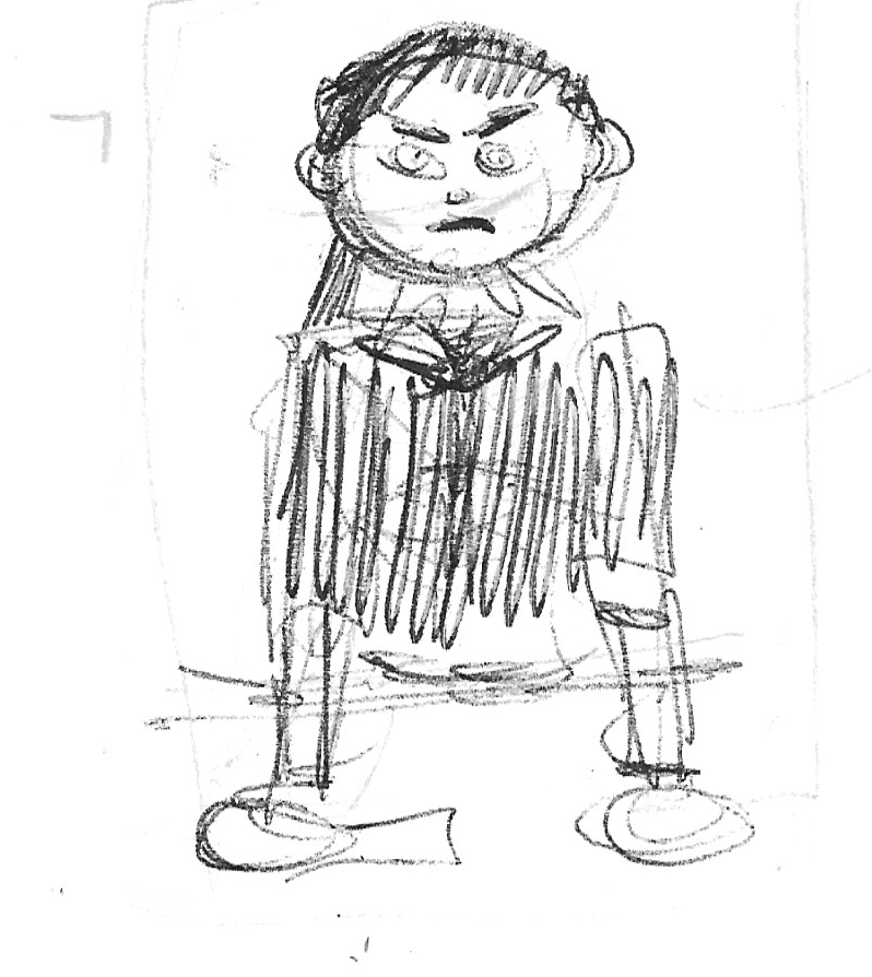
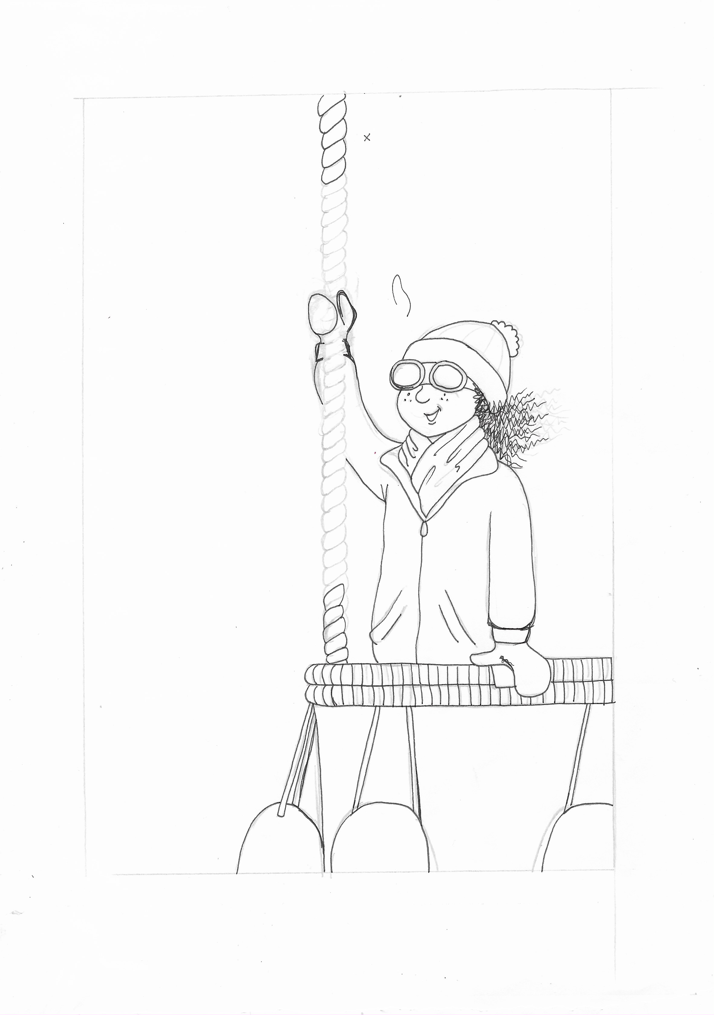
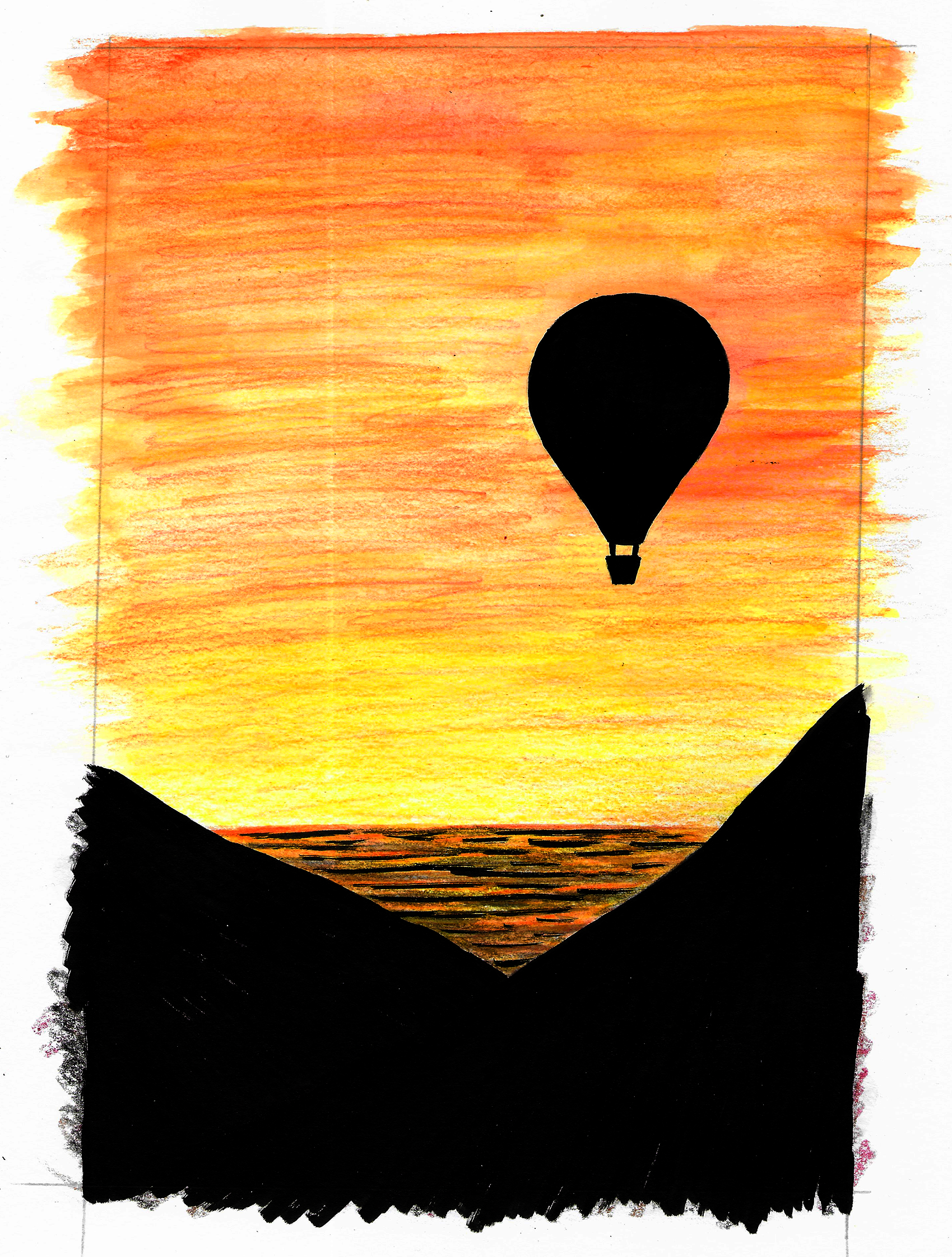
The initial concept I had for the second idea had a young girl taking part in class presentations about what they ‘wanted to be when they grow up’. She wants to be an explorer/adventurer and wears a pilot’s hat and is always reading about the subject. Nobody pays any attention to her and she is bullied. The next day the class photographs are taking place and the photographer makes an encouraging comment about her dream and the resulting photo is then shown close up. In the final row, a three panel picture showing the same photo on a pinboard in the study of an older version of the girl, now a woman, who has clearly now accomplished her dream, with various examples of her travels evident.

I was much more enthusiastic about this idea, but realised that it would not currently fit onto one page of nine panels.
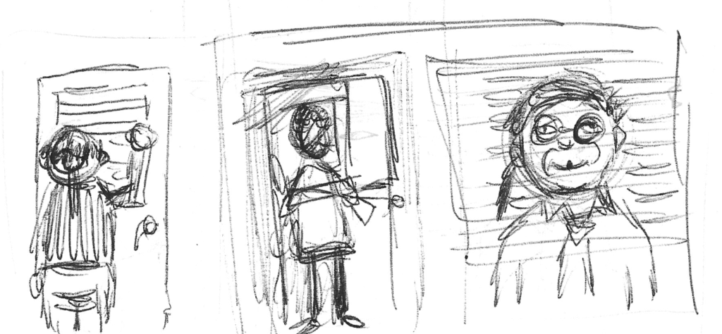
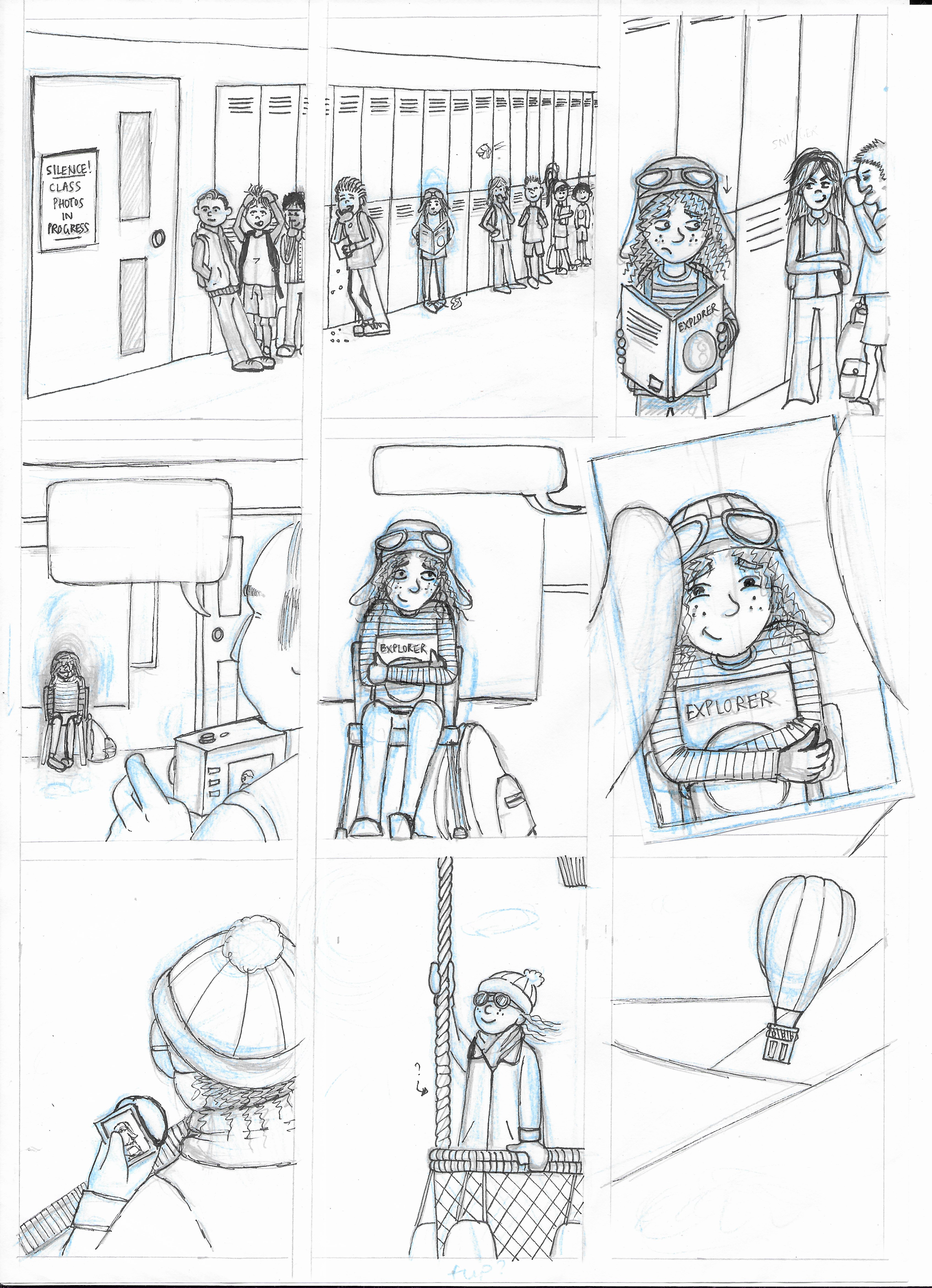
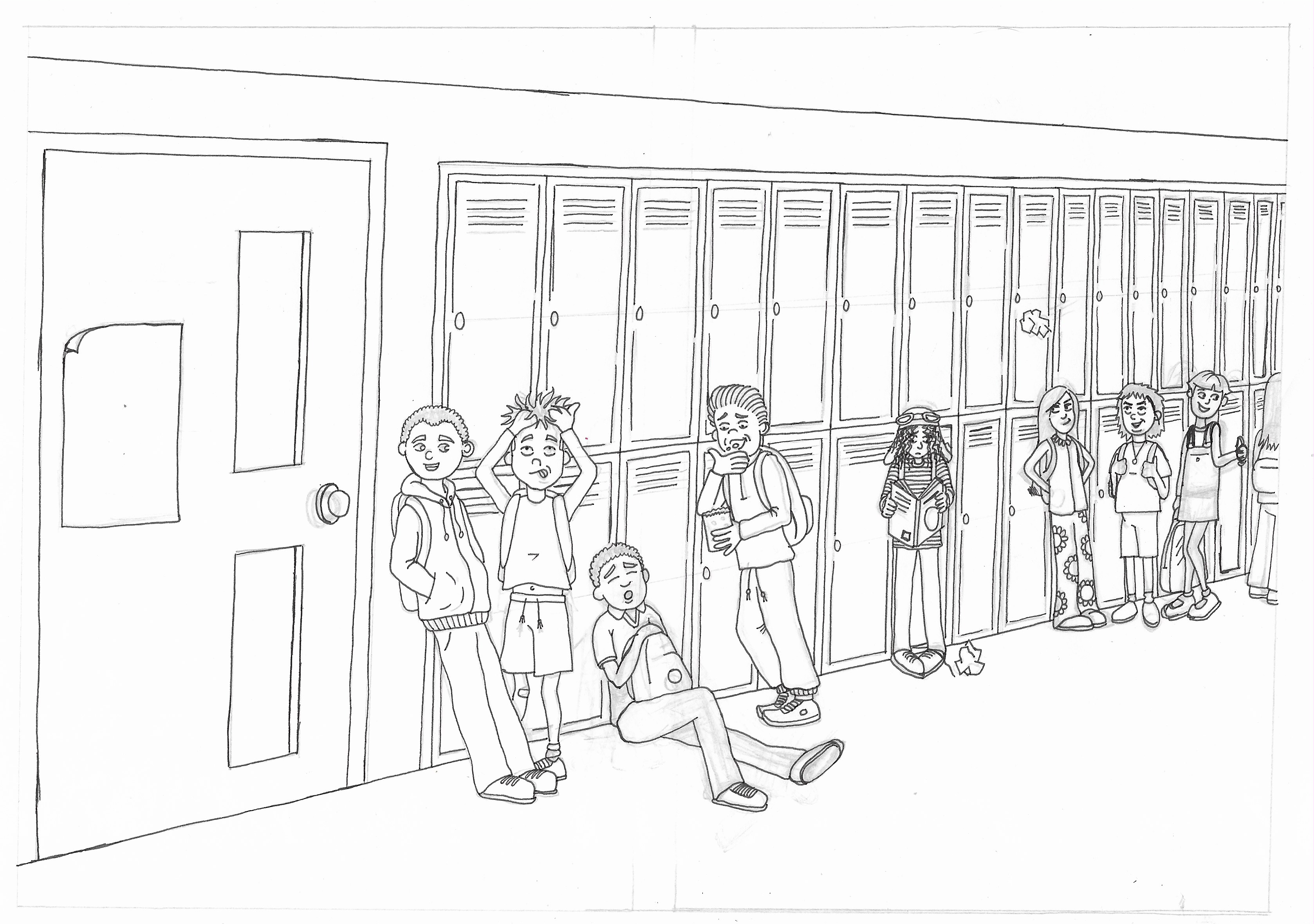
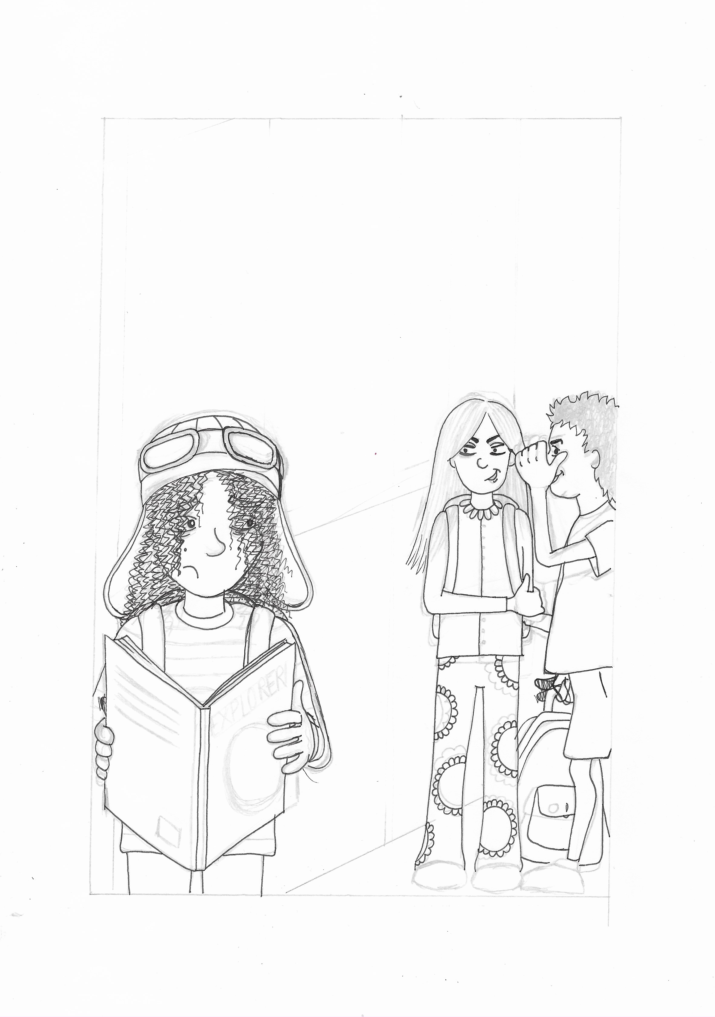
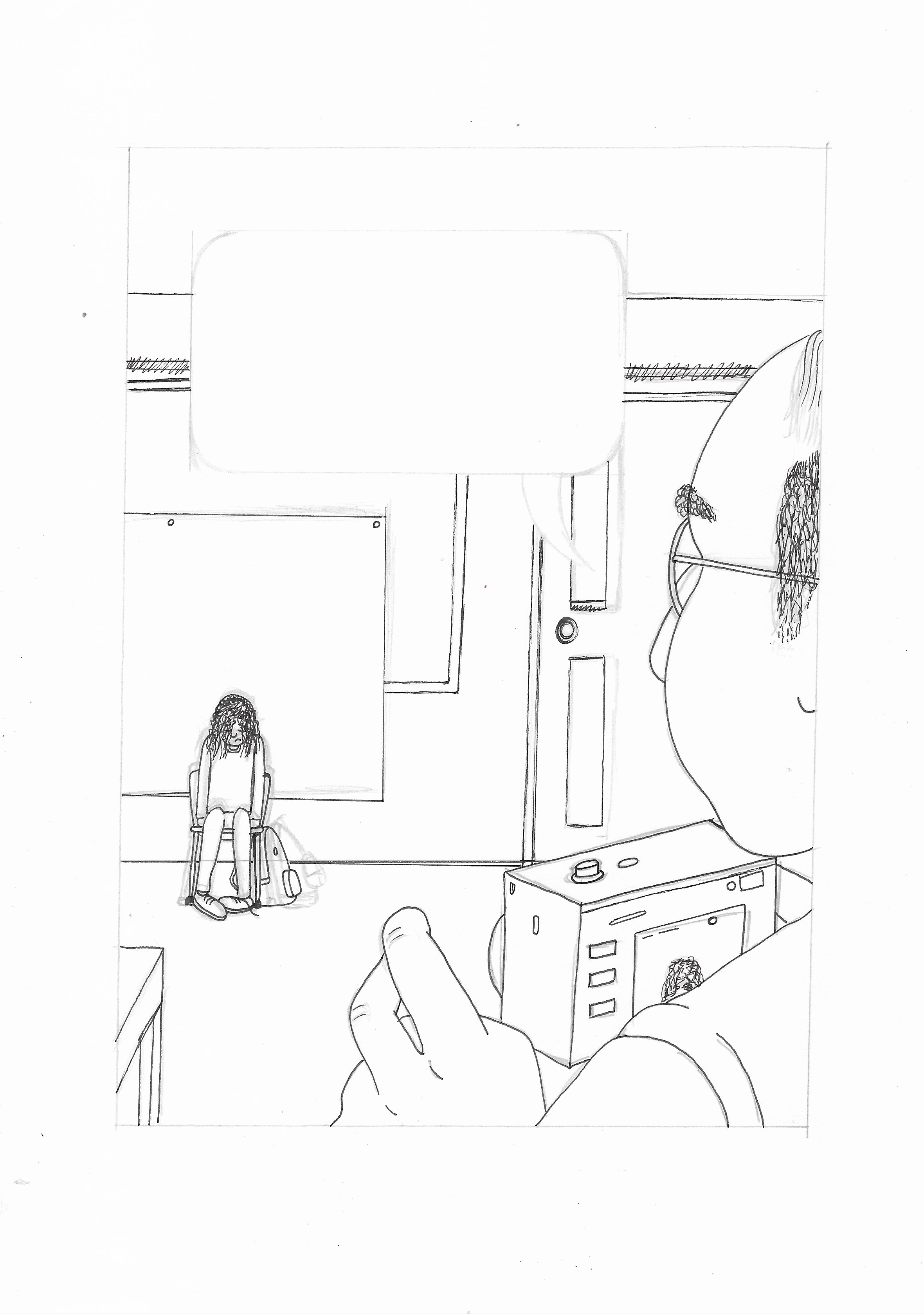
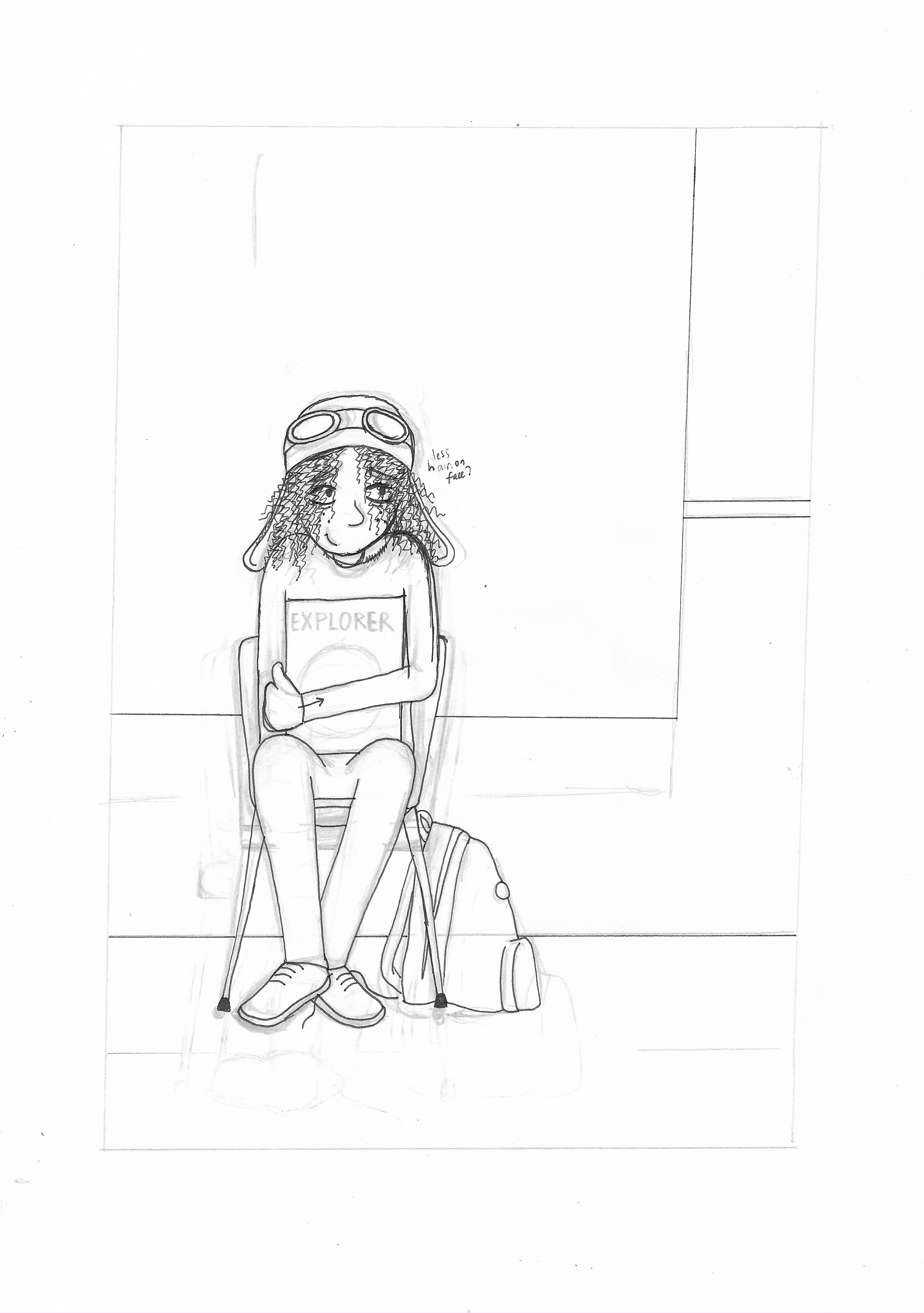
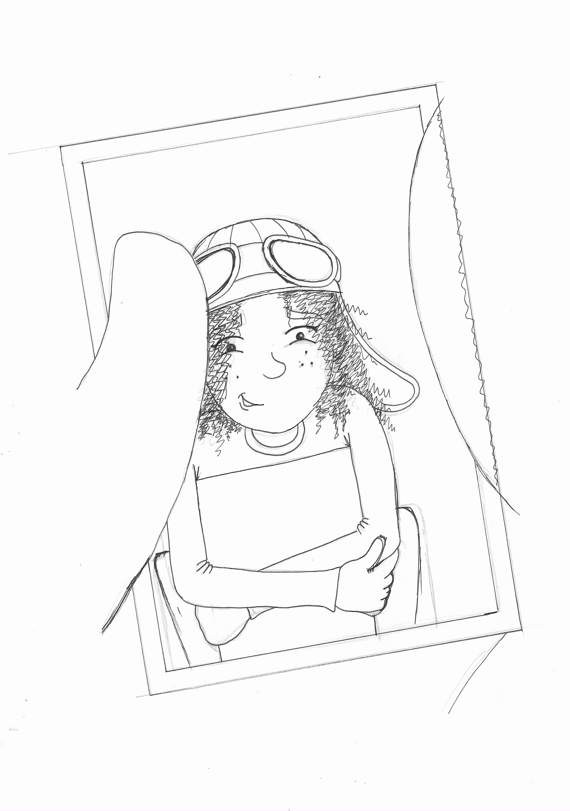
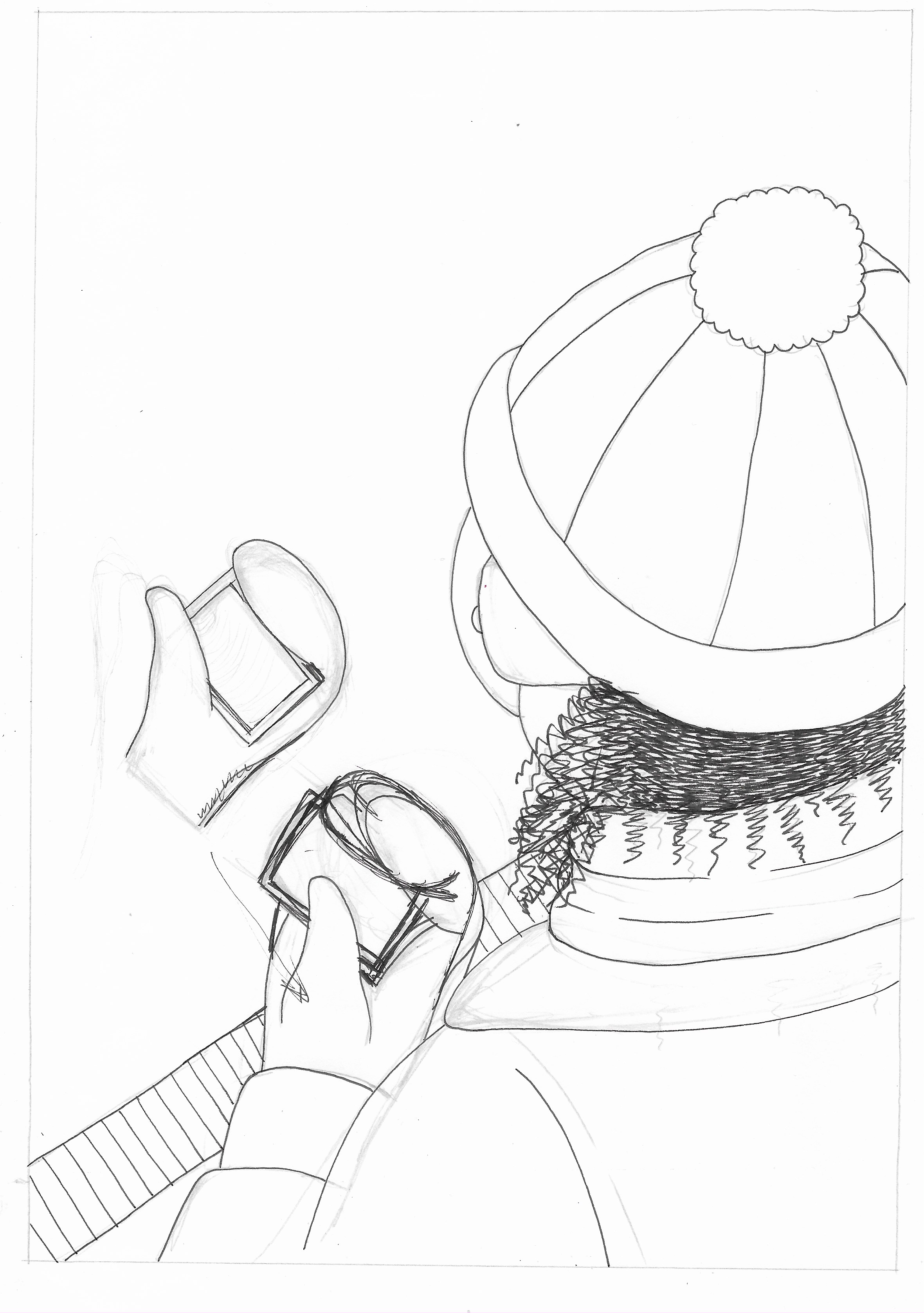
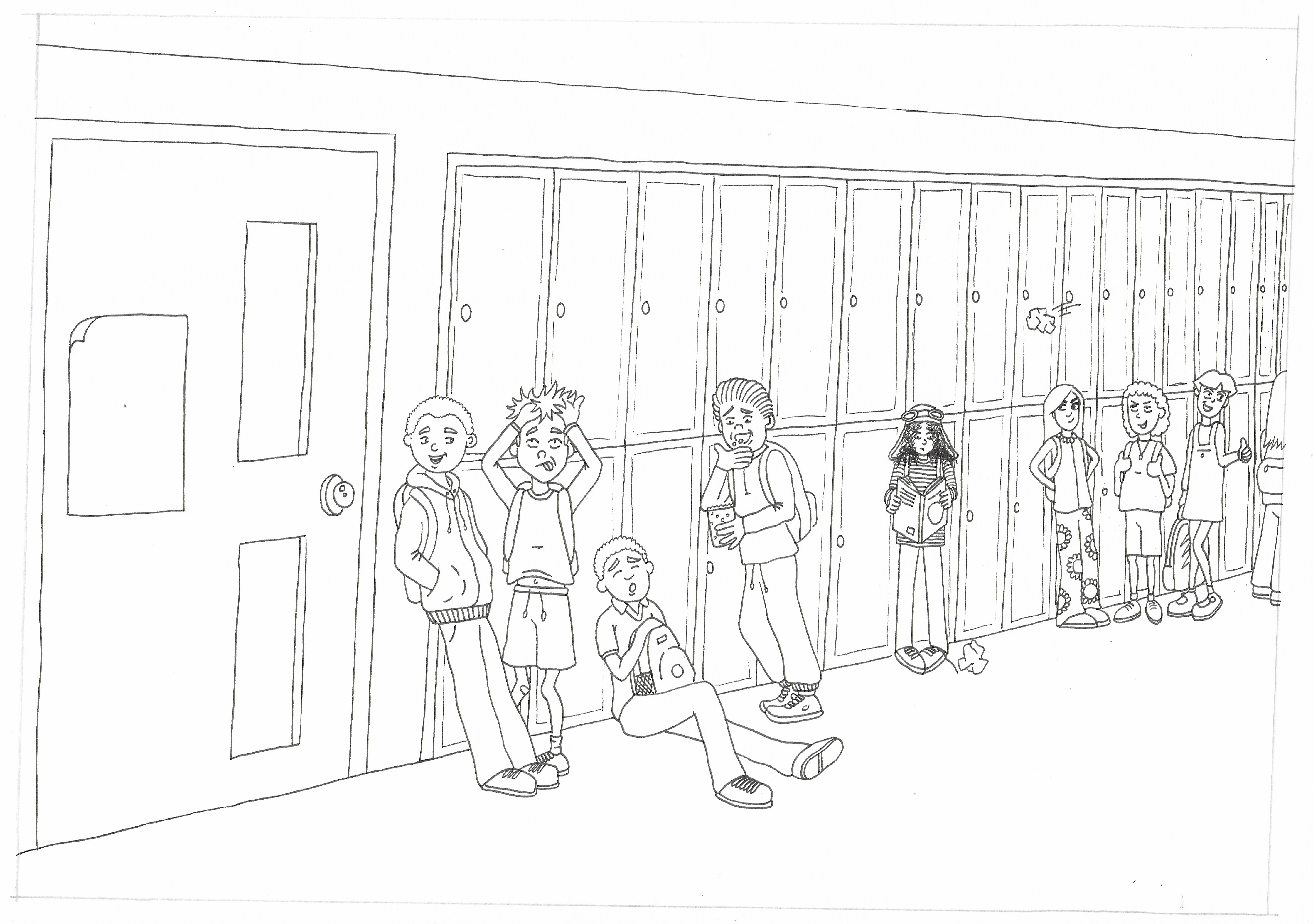
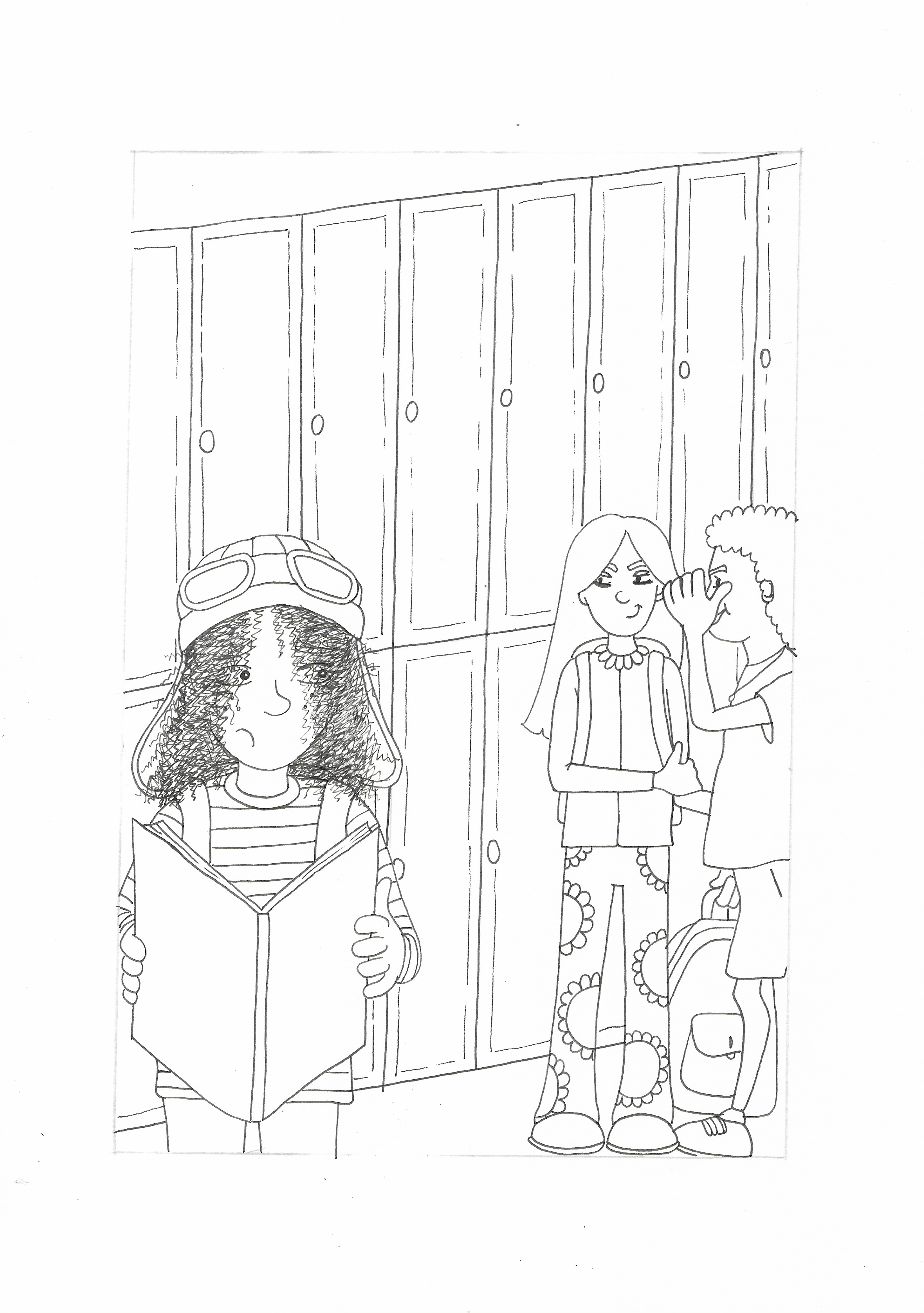
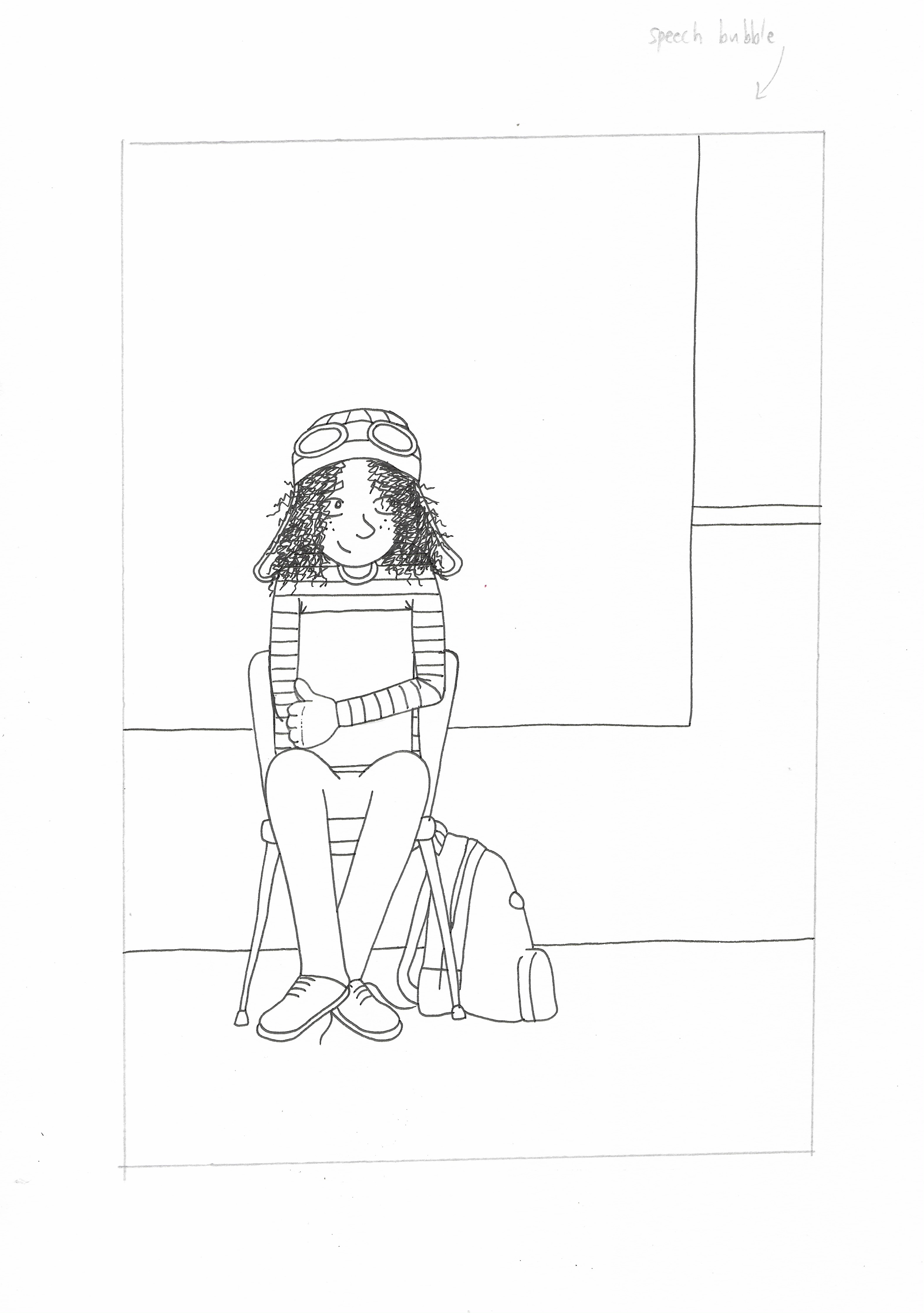
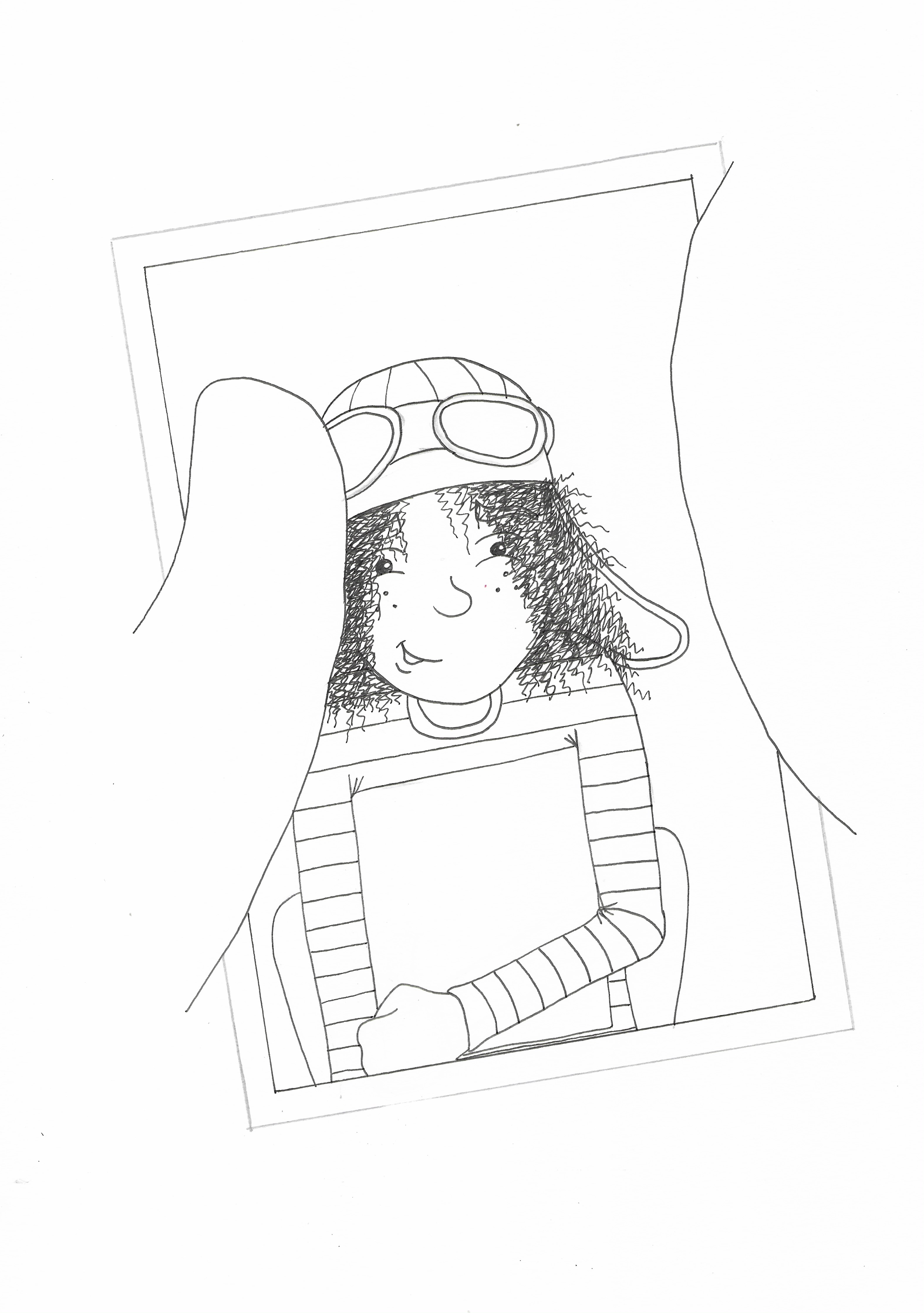
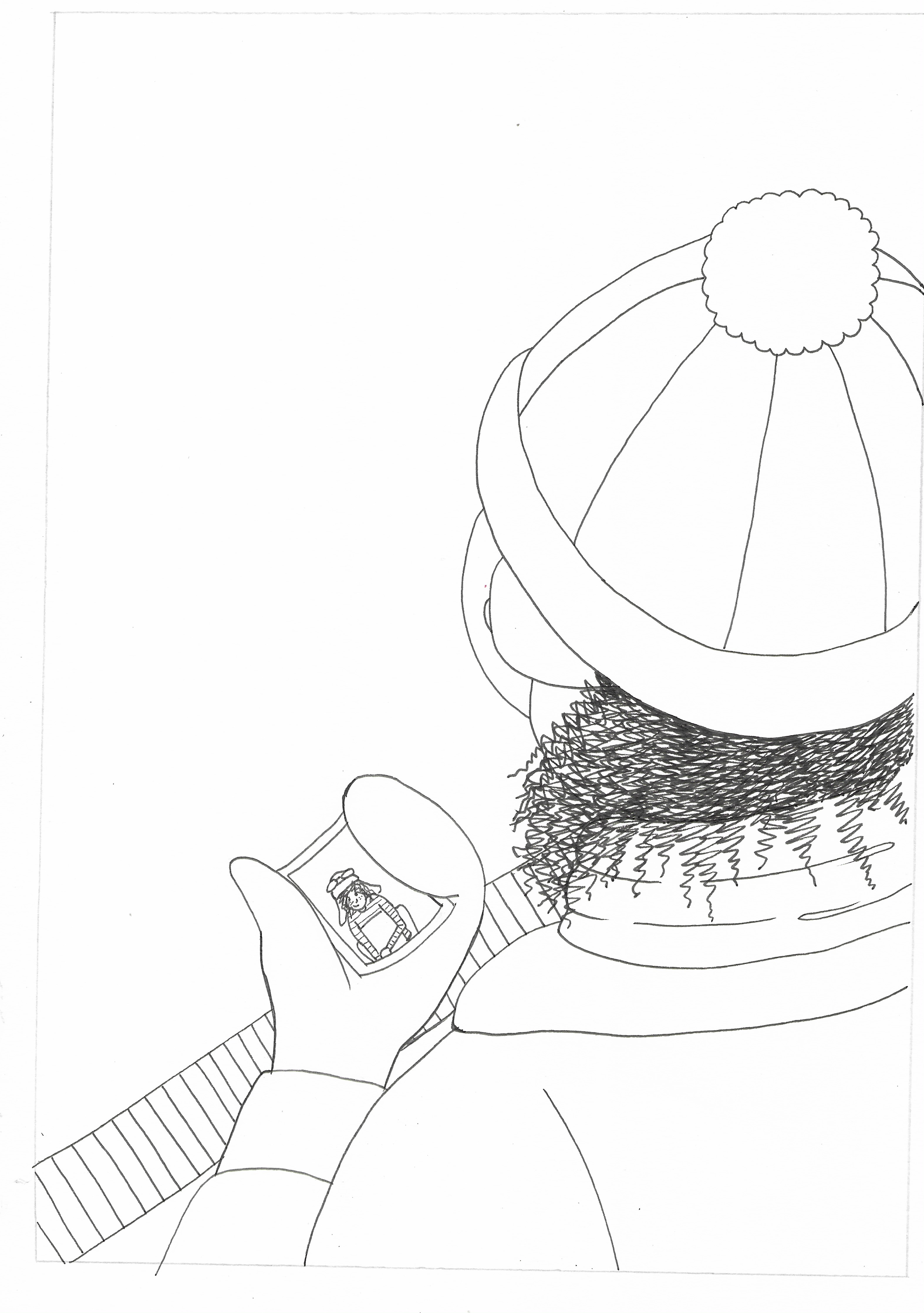
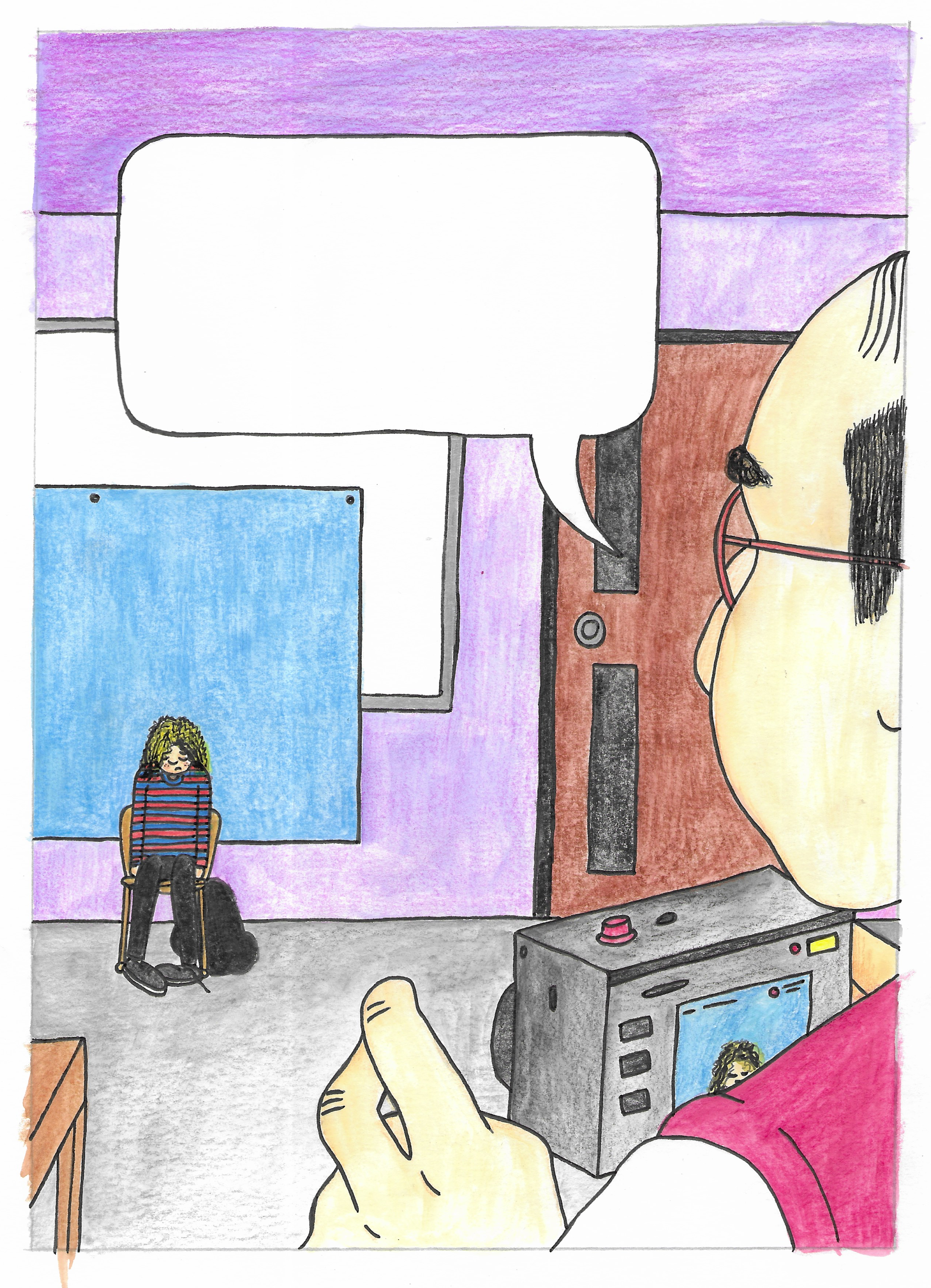
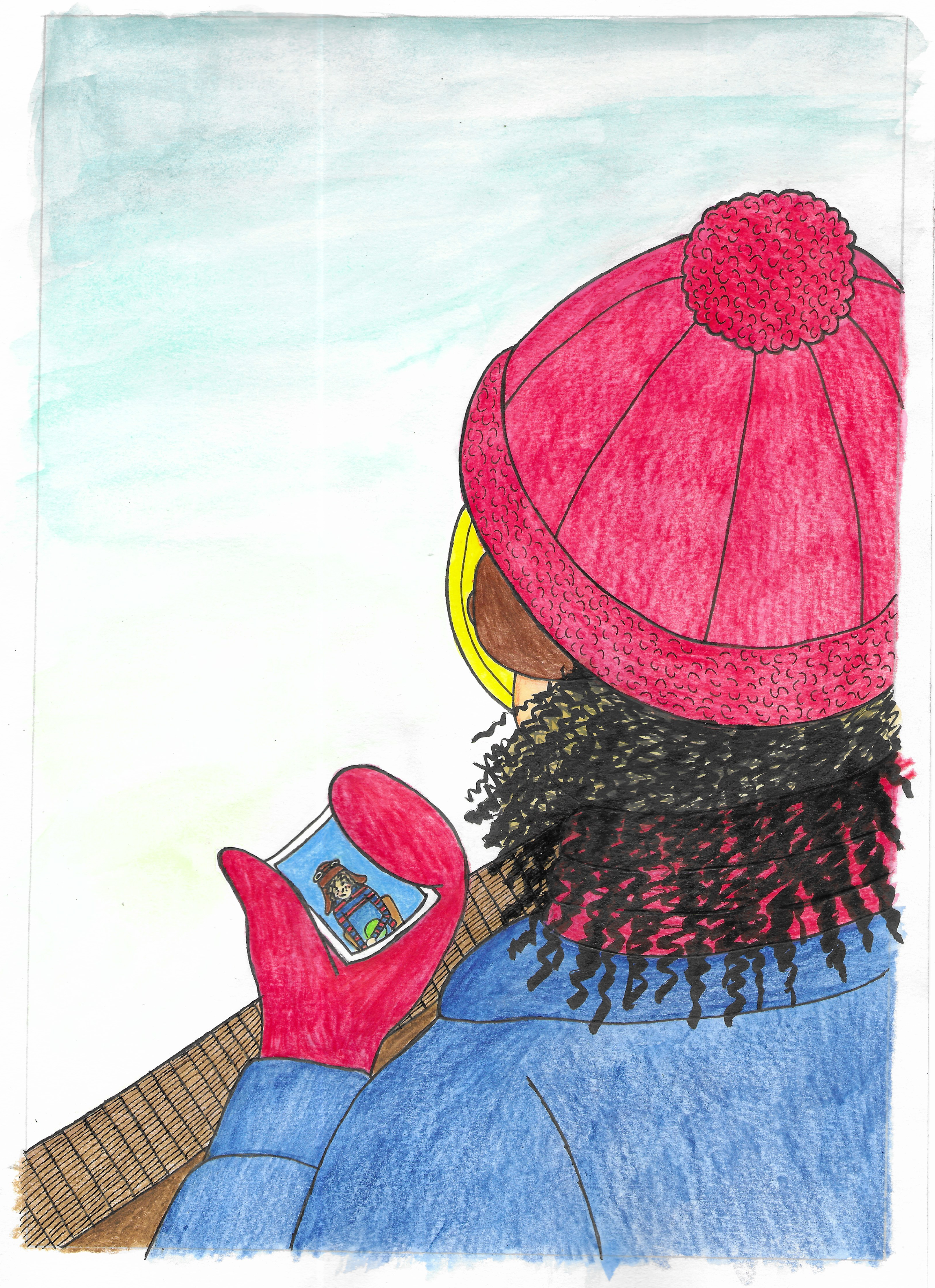
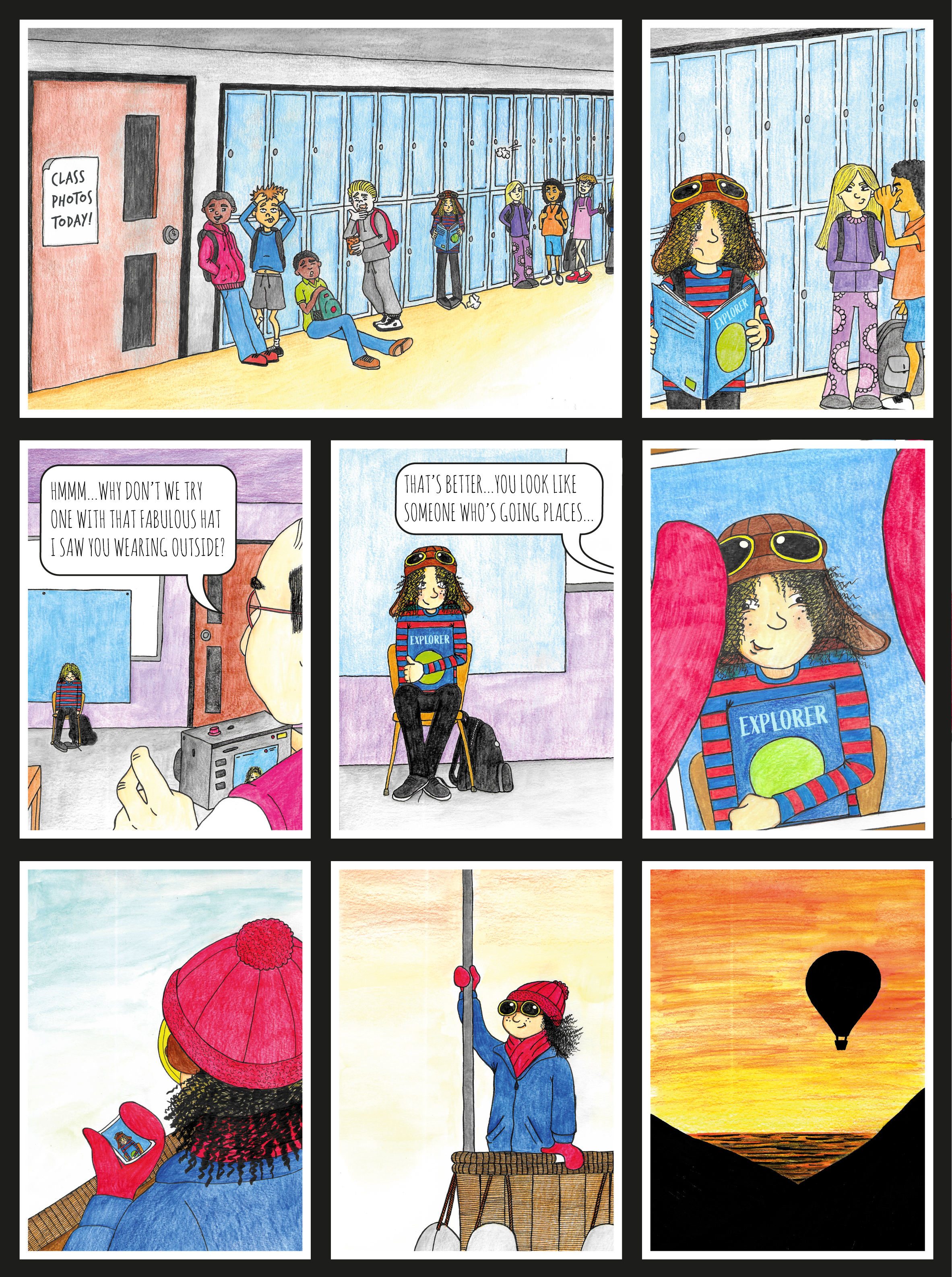
After some further thought, I reimagined the concept, focussing on the class photo part of the story. This time the class are queuing up for the photos in a corridor, alongside a row of lockers. The girl is isolated from the other children, reading a book and wearing her pilot’s hat. The photographer suggests she puts her hat back on (she has taken it off for the photo), which she does. The resulting photo would then be seen in the gloved hands of an older version who has clearly become what she wanted.
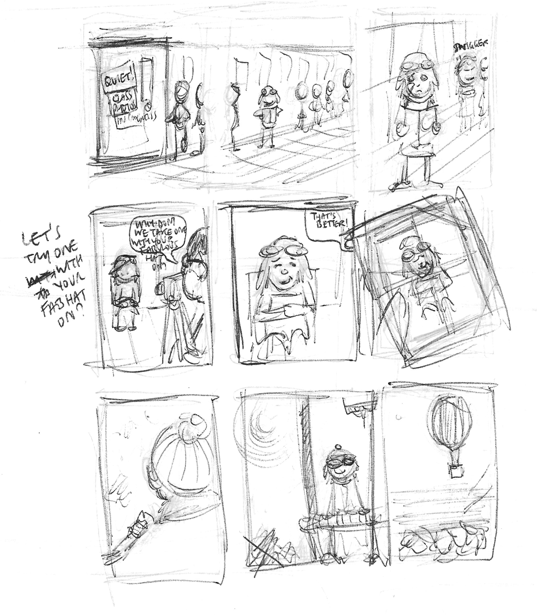
I was much happier with this idea and felt the story was complete with a clear narrative.
Draft Versions
The next stage was to produce a draft version, which I could then build upon.
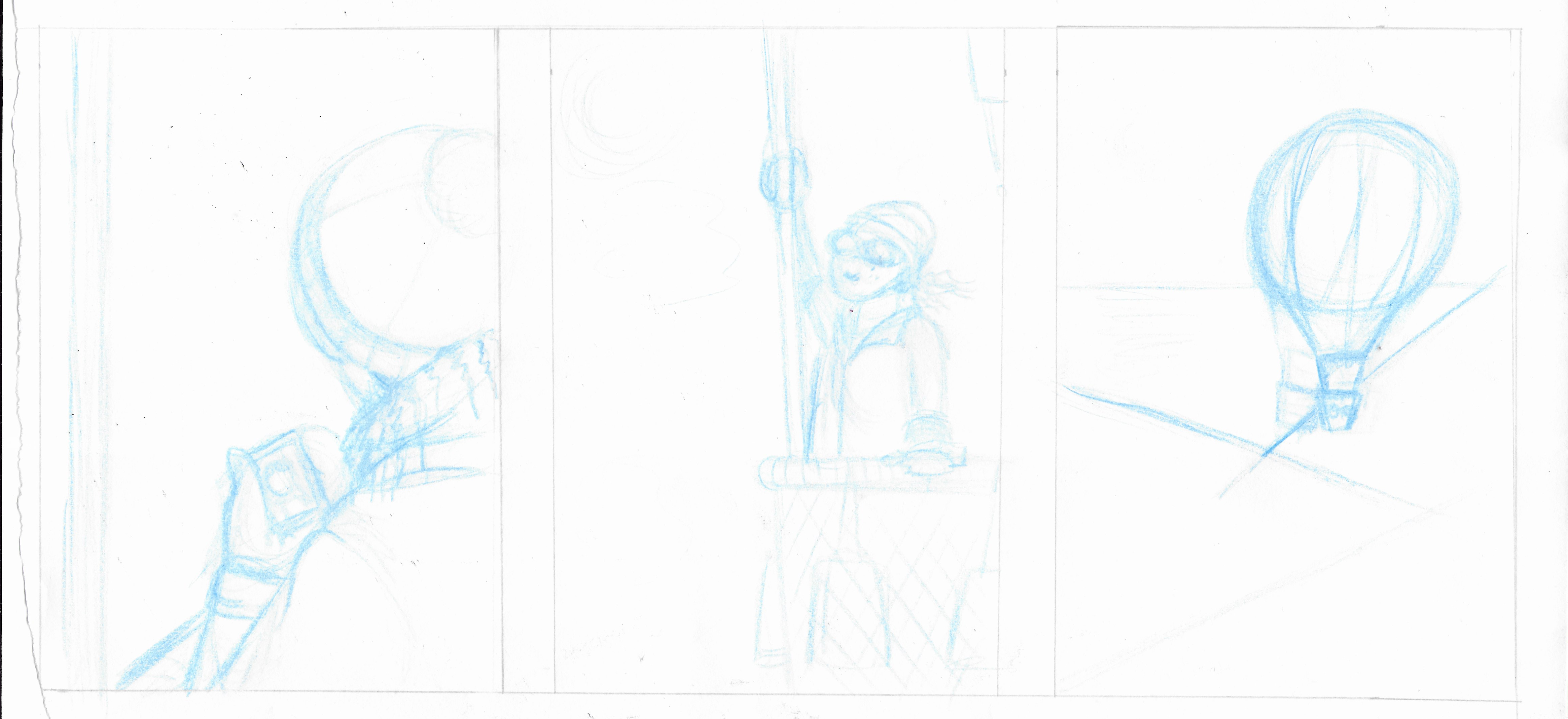
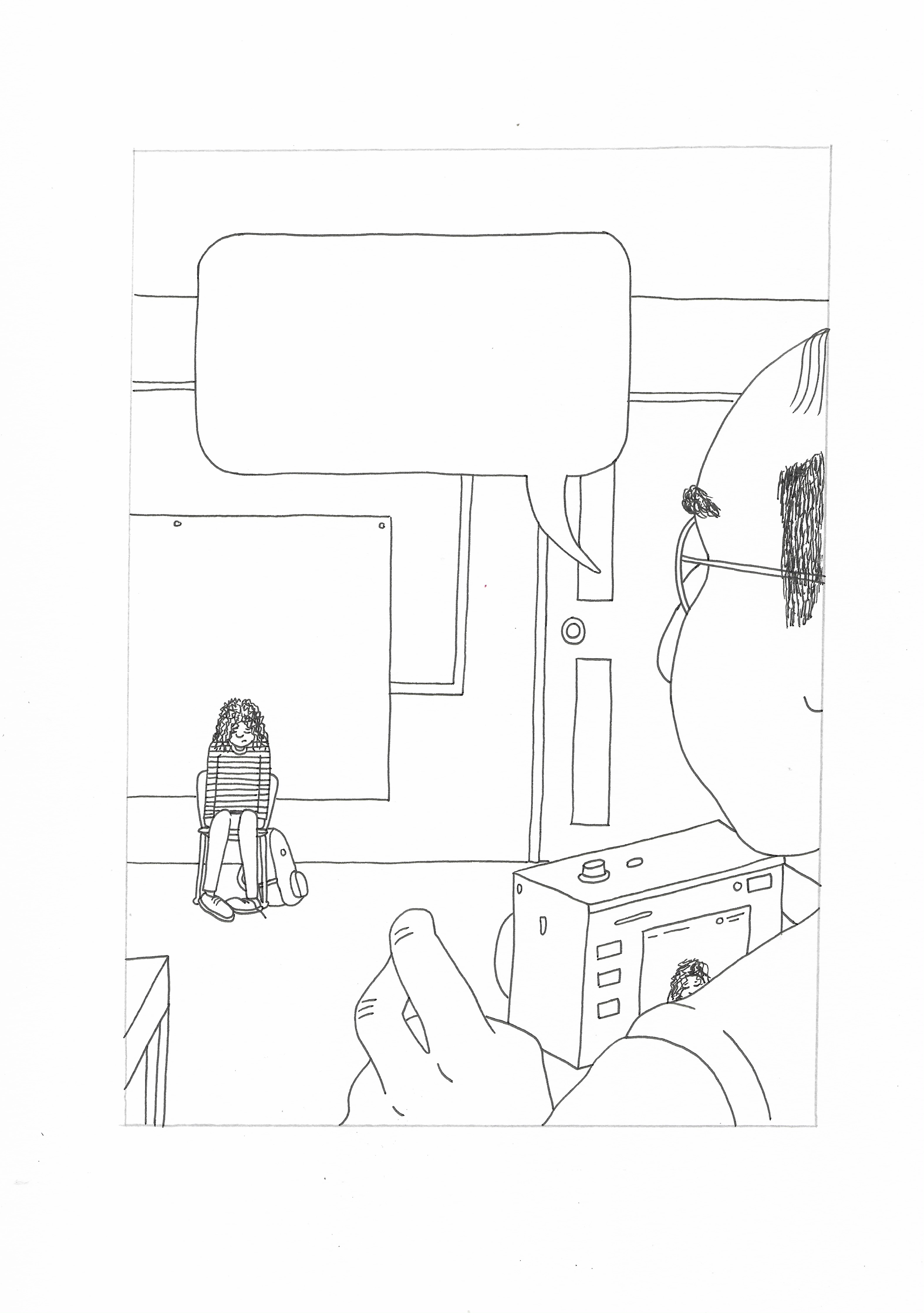
I then used a black fineliner to define the outlines to create a second draft version. My intention at this stage was to have the panel with the photo in a gloved hand to be at an angle and break outside the panel borders, perhaps even having it as part of a background image which would cover the entire page.
Working Large Scale
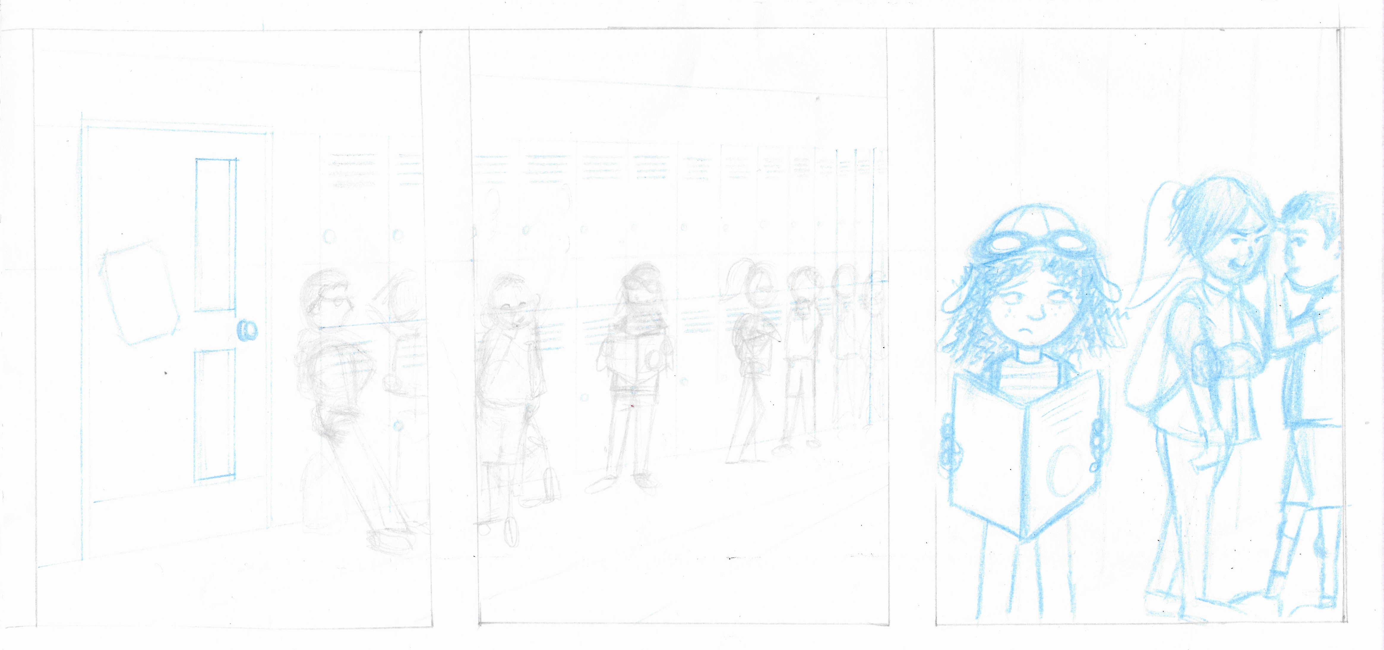
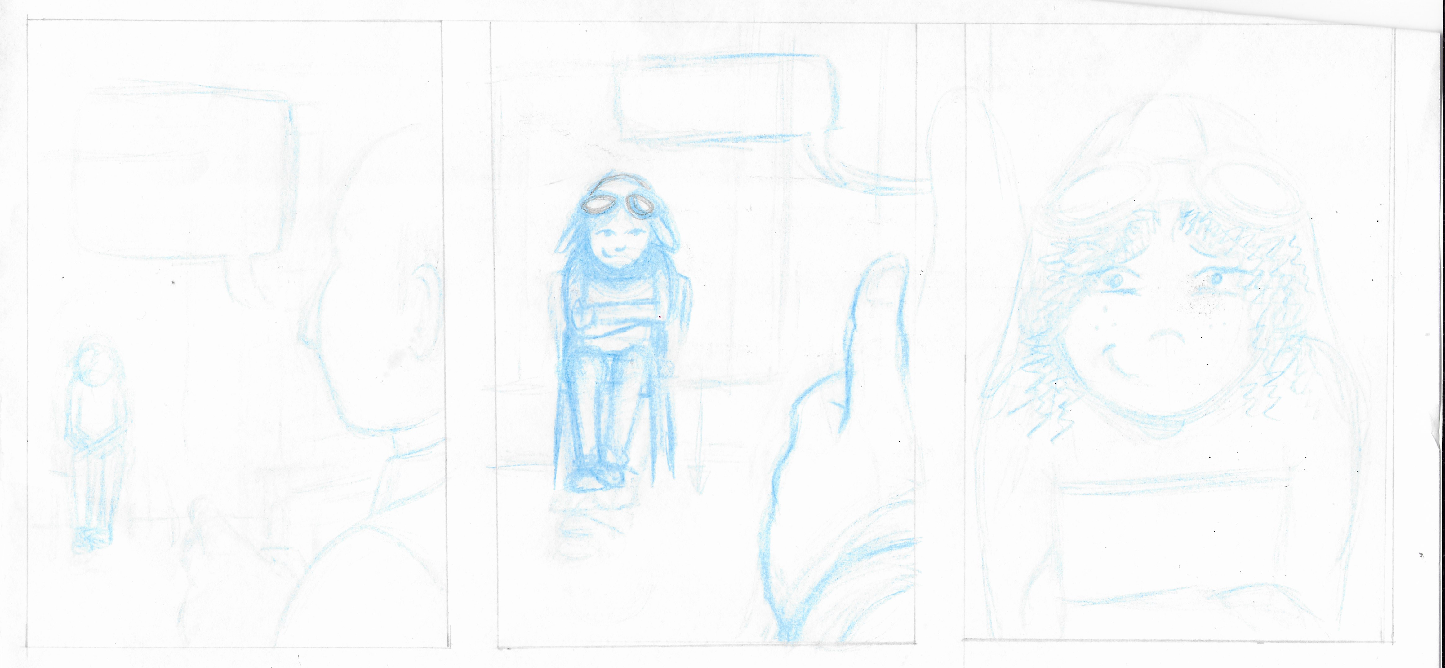
Rather than working on the panels laid out on one page, I made the decision to take each panel individually, scale it up on an A4 sheet and then, once complete, reunite them all together on one page at the correct size.
I scanned each of the panels at a larger scale, printed these off and then, using a light-box and layout paper, made neater, pencil versions, which I then went over again with a fineliner.
I merged the first two panels as I wanted to use it to set the scene and felt this was best achieved with a wider format, without the gutter between them.
I was still considering the composition for the final ninth panel at this stage.
Final Line Versions
Next, using a fineliner on cartridge paper, I made final outline versions of the panels ready for colouring.

Working in Colour
In the previous exercises and assignments I had either avoided using or not had much success with applying colour, but I was determined to use it in this assignment. I decided to use watercolours as a base colour layer, which I would then enhance using coloured pencils to add depth and texture. I found it really difficult to persevere, particularly at the watercolour stage as I thought it looked terrible! However, I forced myself to continue and once I began adding the coloured pencils I was surprisingly quite pleased with the outcome. Once the colour had been added, I went over the outlines one final time with a fineliner.
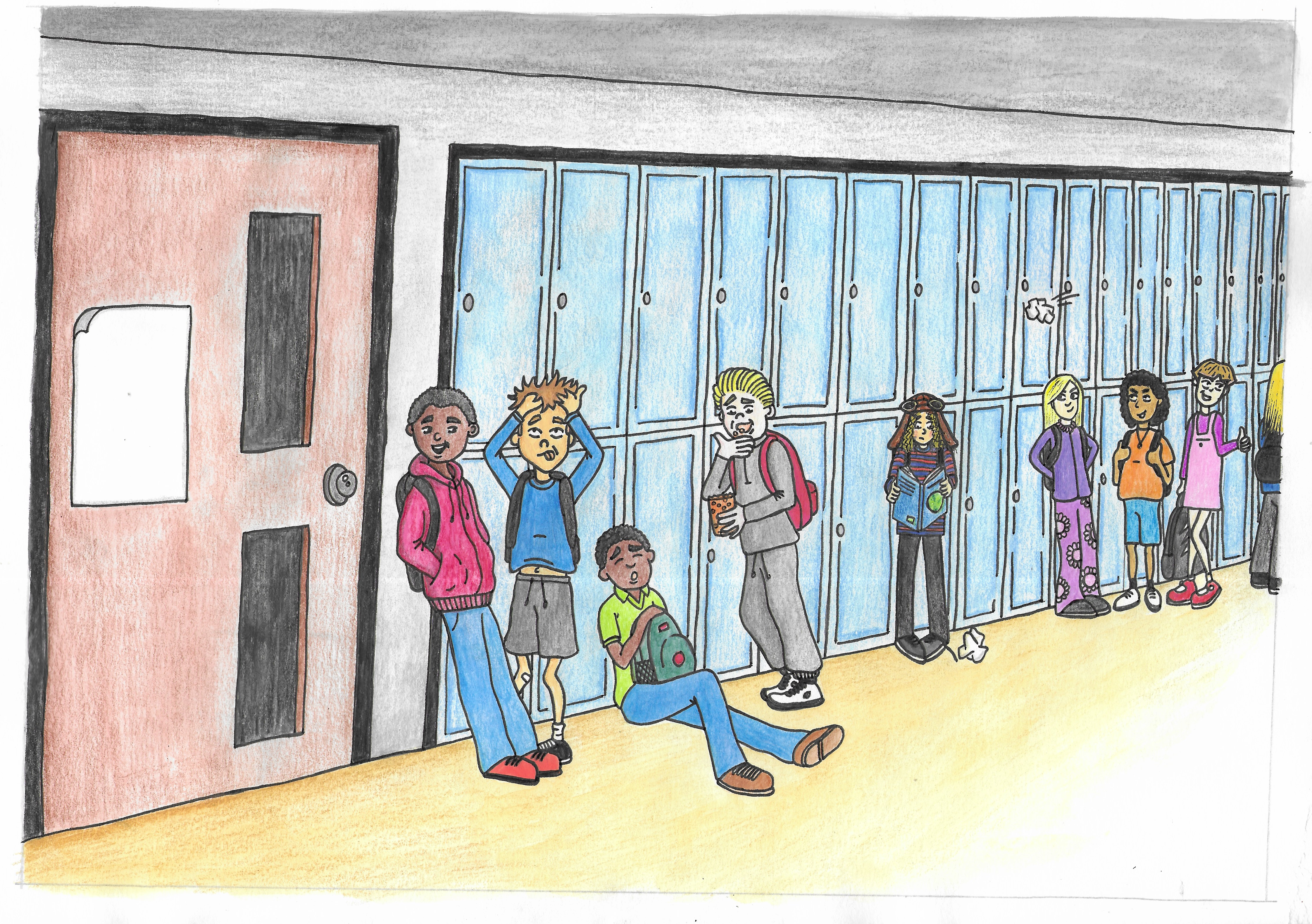


Although I was pleased that I had actually managed to used analogue colour, I wanted to enhance the images to make them richer so I made a few slight adjustments in Photoshop, which I felt improved the final results, for example as with the final panel below. I wanted the style to be bright and saturated in colour for this story.
Final Version
Despite several attempts, I could not get the ‘gloved panel’ to work as I intended, which was most likely due to my earlier decision to work on the panels individually rather than as part of the whole page. I eventually made the decision to just place it within a panel as per the others, which I found to be a satisfactory result.
Additionally, I should have added a map to the globe on front of the book that the character is holding and the perspective in the second panel on the top row is slightly awkward, but I was quite pleased that I had managed to achieve a better result for this in the first panel. The hair colour of the character also did not turn out as I had wanted and ended up turning from blonde to black by the final panel! I felt the hair looked better in the pen versions, without colour added.
I decided to use a reasonably thick white border around the panels to relate to the photo theme.
The final page can be seen below.
Final Thoughts
I was quite surprised how much I liked working on this assignment as I did not feel that confident when I began. As stated in previous exercises, I tend to work best when I have a clear plan rather than a vague outline. I found having a couple of fairly strong concepts which I could clearly visualise in my head, set up a foundation upon which I could build. This meant I was able to sketch out clear thumbnails, the influence of which is evident in the final piece which is almost identical to these early scribbles. In previous units, I tended to not find thumbnails to be very beneficial, but in this unit I am definitely beginning to understand their usefulness.
I was keen to keep the text/speech/captions to a minimum as I have found I prefer comics that have limited text in the panels (if not silent). I felt I achieved this in my attempt by only adding the absolute necessary wording and relying on the drawings to indicate the narrative.
I also tried to include a variety of viewpoints, such as POV and closeups, and considered how to direct the reader’s eye across the panels/page. I felt I was quite successful in terms of continuity of the narrative through the panels, particularly when transferring between the two time periods in panel 6, although I was disappointed I did not manage to achieve my idea of having the glove outside the panel, at an angle.
I was pleased I managed to finally complete a piece of work using analogue colour tools and felt mostly satisfied with the outcome. I really liked the combination of using watercolour as a base with the pencils overlaid. In the future, I would like to experiment with adding tone, but ultimately decided it was not crucial for the style in this piece. I am still finding it hard to adjust to the fact that analogue tools are so permanent and non-editable unlike digital tools, but I am certainly enjoying using them and they are actually less frustrating as they do not constantly ‘crash’ for no reason…!
Overall, I thoroughly enjoyed the entire process of this assignment and it restored my expections and confidence in my current abilities going forward.
Reflections after Tutor Feedback
My tutor noted that the second of the drafts for panel 9 may have suggested an opportunity to break out of the frame and, looking at the page with fresh eyes, I completely agree. I believe that this would have enhanced the idea of freedom for the character that I wanted to communicate. The silhouettes of the mountains could have merged with the black background and the sunset sky could fade out behind the surrounding panels.
References
Furino, G. (n.d.). Dissecting the Classic 9-Panel Grid in Comics. [online] Vice. Available at: https://www.vice.com/en/article/gvwey7/dissecting-the-classic-9-panel-grid-in-comics [Accessed 07 November 2021].
MacDonald, H. (2017). Dave Gibbons reveals the origin of Watchmen’s 9-panel grid – and has an upcoming book about it. [online] The Beat – The Blog of Comics Culture. Available at: https://www.comicsbeat.com/dave-gibbons-reveals-the-origin-of-watchmens-9-panel-grid-and-has-an-upcoming-book-about-it/ [Accessed 07 November 2021].
Making Comics with Salgood Sam, (2015). The Grids – Making Comics. [online] Making Comics. Available at: http://makingcomics.spiltink.org/the-nine-panel-grid/ [Accessed 07 November 2021].
Rodriguez, A. (2012). Composition 101 – Laying out your Comic Page. [online] Webcomic Alliance. Available at: http://webcomicalliance.com/featured-news/composition-101-laying-out-your-comic-page/ [Accessed 07 November 2021].