Brief
Similar to the last exercise, you will be starting with a set text. This time you should pick a favourite song. Try not to choose anything too epic and it’s best if the lyrics have an interesting range of action or colourful description.
First, listen to the song and answer the following:
- What mood does the song have?
- What colours can you imagine fit with the song and how much these change through the song?
- What season its it set in?
Now write or print out your song’s lyrics.
- Read these and focus on where movement and sound might occur in the words.
- Start by highlighting any of these elements, circling the most visual imagery which inspires you within the text.
- If you can imagine scenes to go with these, then start to make notes or thumbnails about what these could be next to the text.
Now section the writing into what you think will fit on a row of comic and divide this writing up into what feels like the right amount of panels for your first row. Once you have broken the text up into the first four rows, make a note or mark on the sheet to denote that you have sectioned out your first page. Repeat this task until you have made notes to plan out the full writing across four pages.
Once you have created your plan for how you might break up the lyrics into comic panels, you should pick between three to six consecutive panels to draw as a silent comic where only the pictures evoke a sense of sound, mood or movement.
Draw these panels up in finished form and then pick out a colour palette which you can use to colour up at least one panel in full.
Selecting the Song
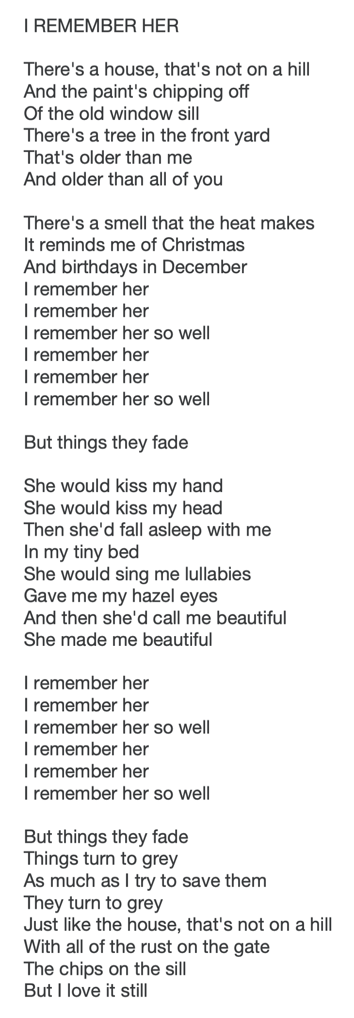
I took some time to listen to some songs and simultaneously read the lyrics. I began with quite a few potential options, but soon discovered these would not be suitable for this exercise as they did not contain enough words to cover the required four pages (or there was repetition) – it took me quite a while to find one that did! Eventually I settled on ‘I Remember Her‘ by Ingrid Michaelson. This song was written after the death of her mother, which is clearly evident in the lyrics.
Annotating the Lyrics
I listened to the song several times and as I read through the lyrics, I began to form a rough concept for my comic version. I made some notes for each verse, which I then typed up (and re-edited several times), until I reached the point below:
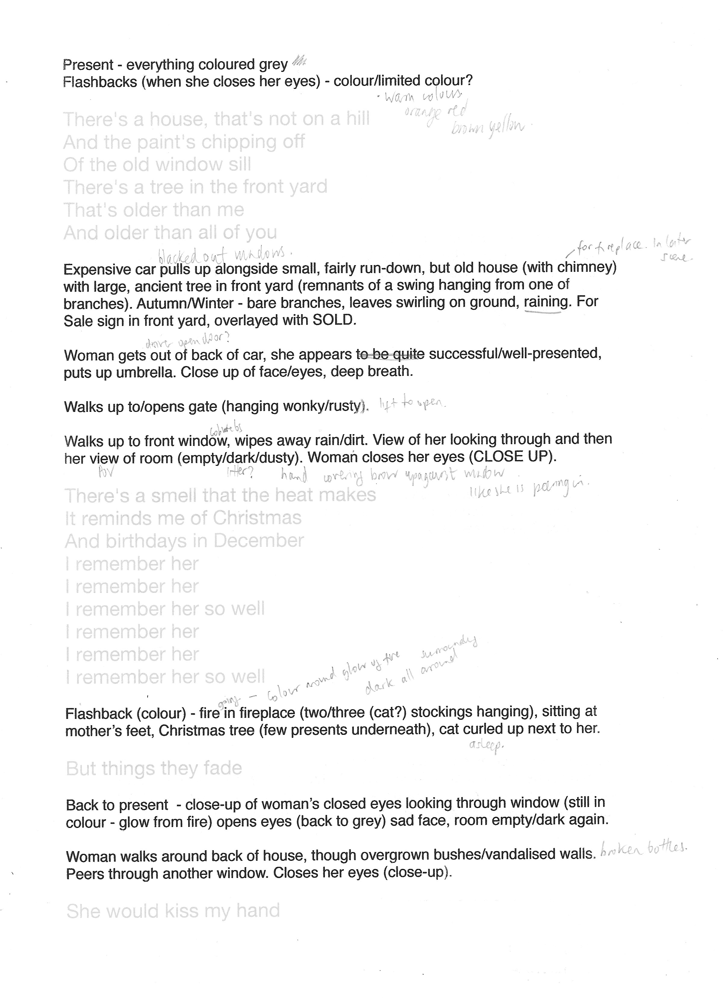
I then went through this text again and divided it up into more logical sentences.
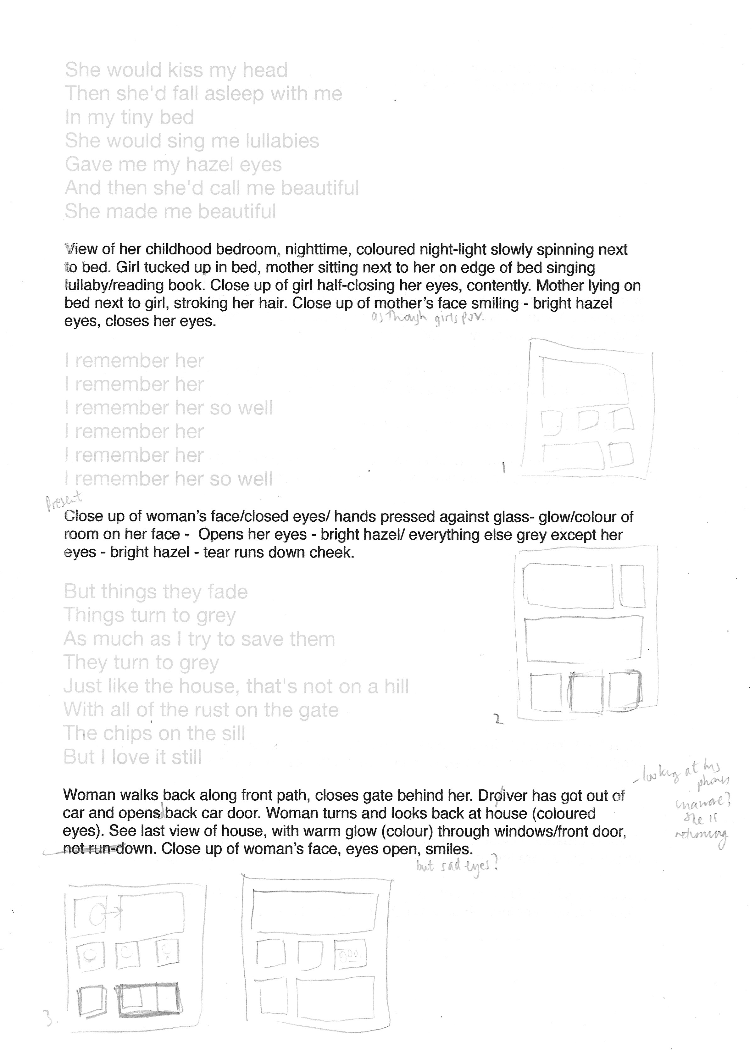
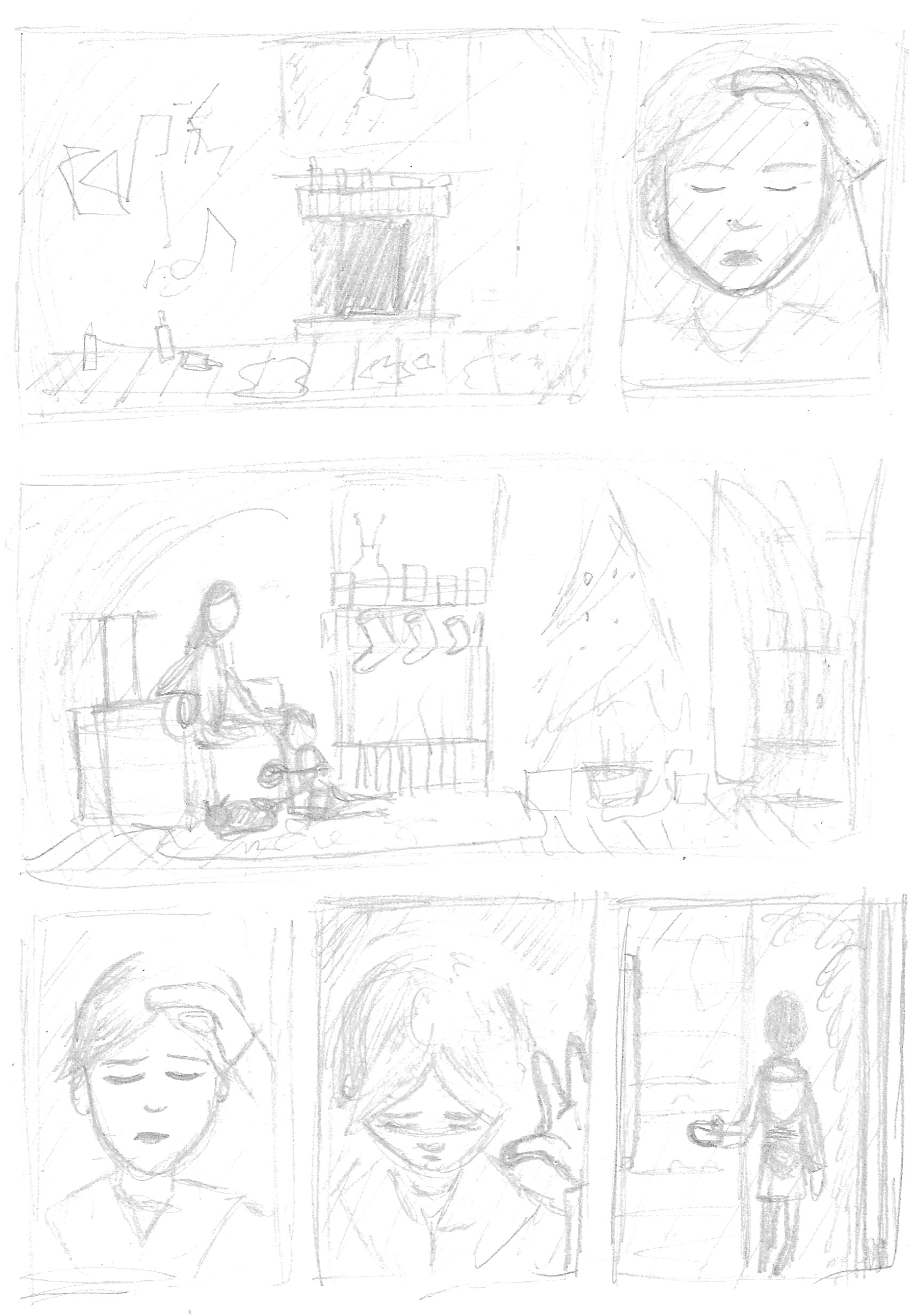
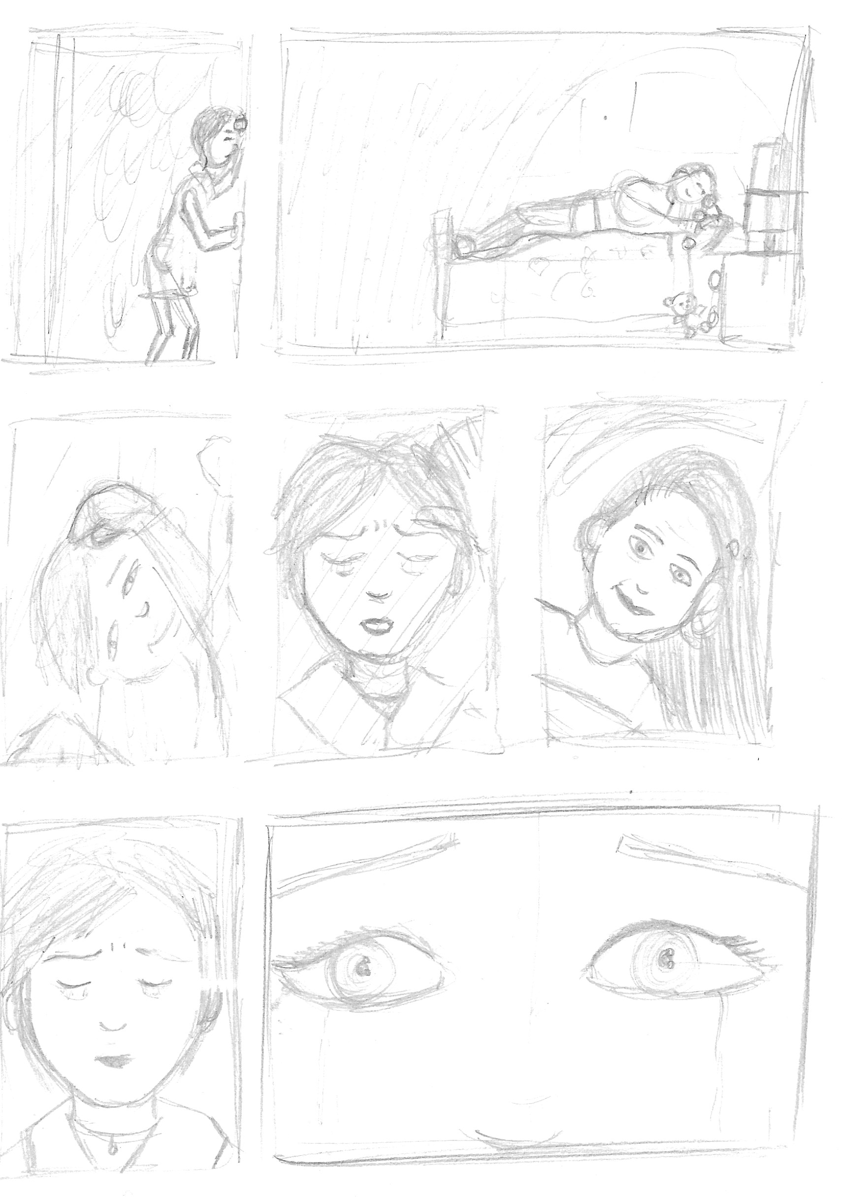
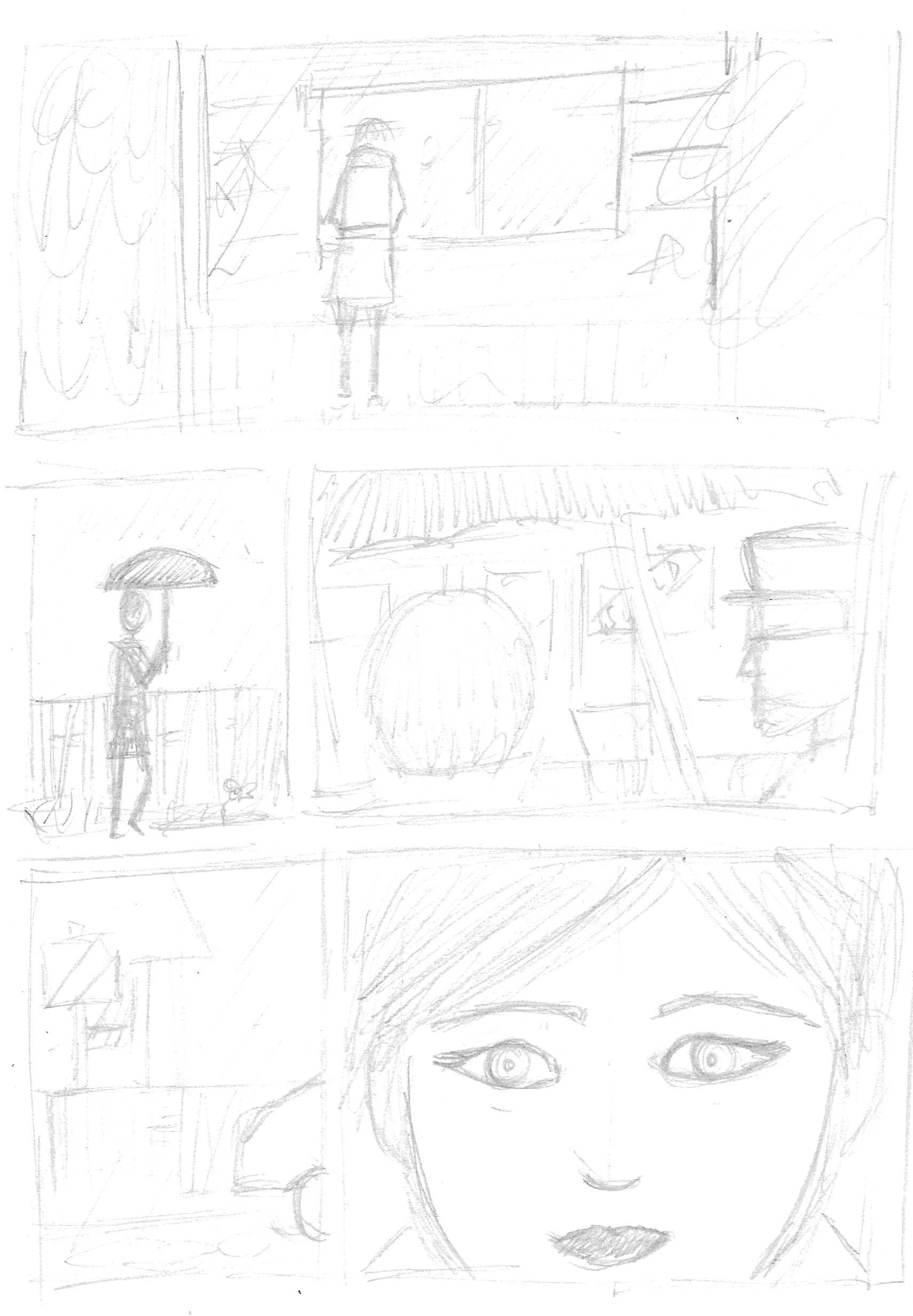
As can be seen on the second page of the initial annotation screenshots above, I thought about how the text could be broken up into individual panels, which I sketched out as thumbnails of the four pages. I tried to incorporate a range of panel sizes. I corresponded these with the final page-by-page, panel-by-panel write-up below.


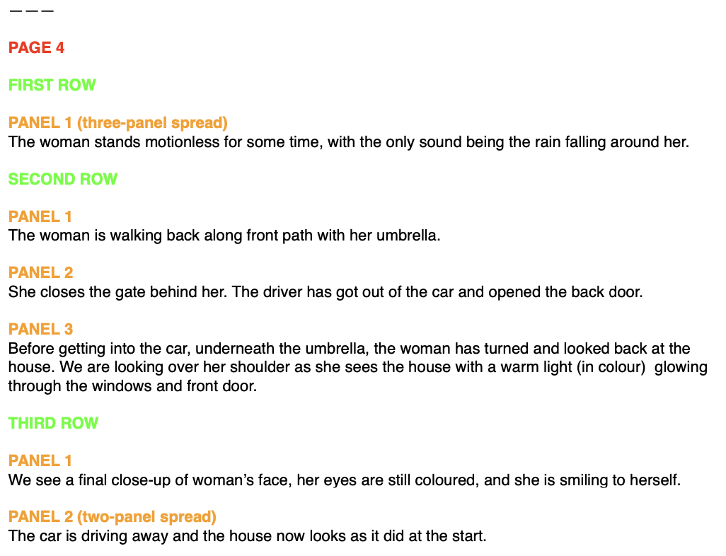
Thumbnail Version of Comic
Once I felt fairly confident with my outline, I created a rough thumbnail version of the entire four-page comic. During this process I rearranged some of layout, by combining or moving the panels on the pages. I found this part of the exercise a real challenge in terms of putting what I could visualise in my mind onto paper (it was very frustrating!), but after much perseverance, I eventually reached the final panel.
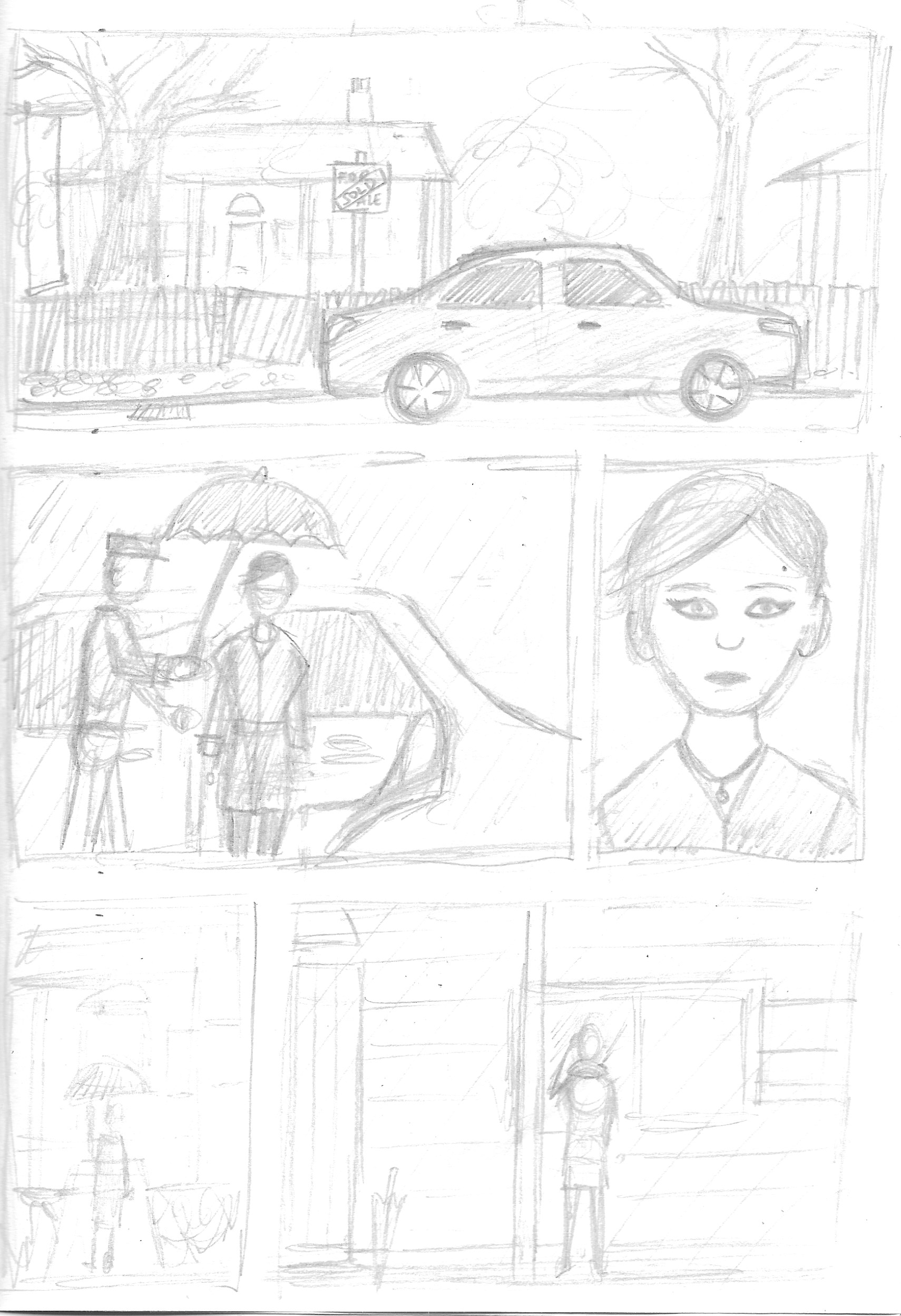
Selection of 3-6 Panels
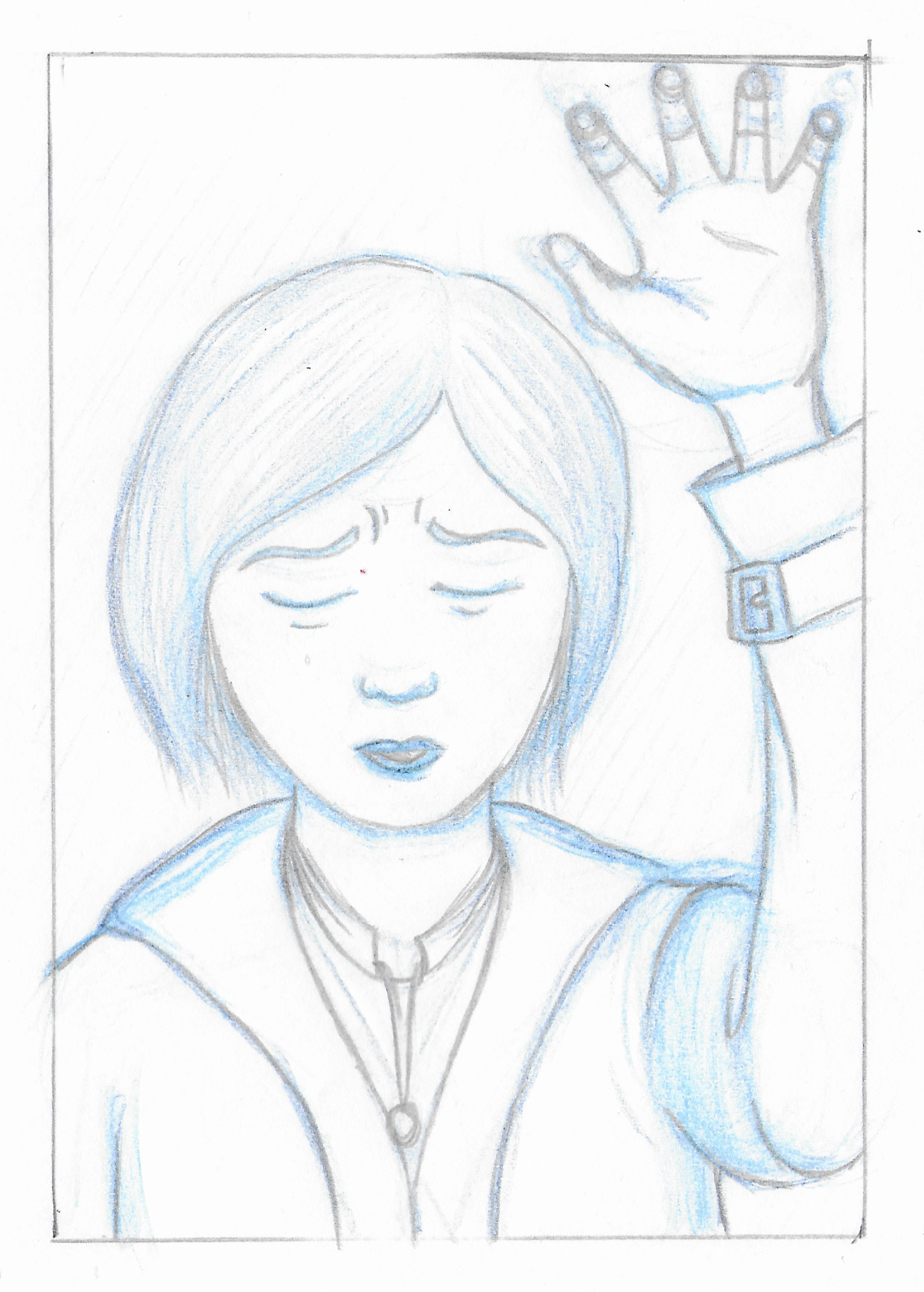
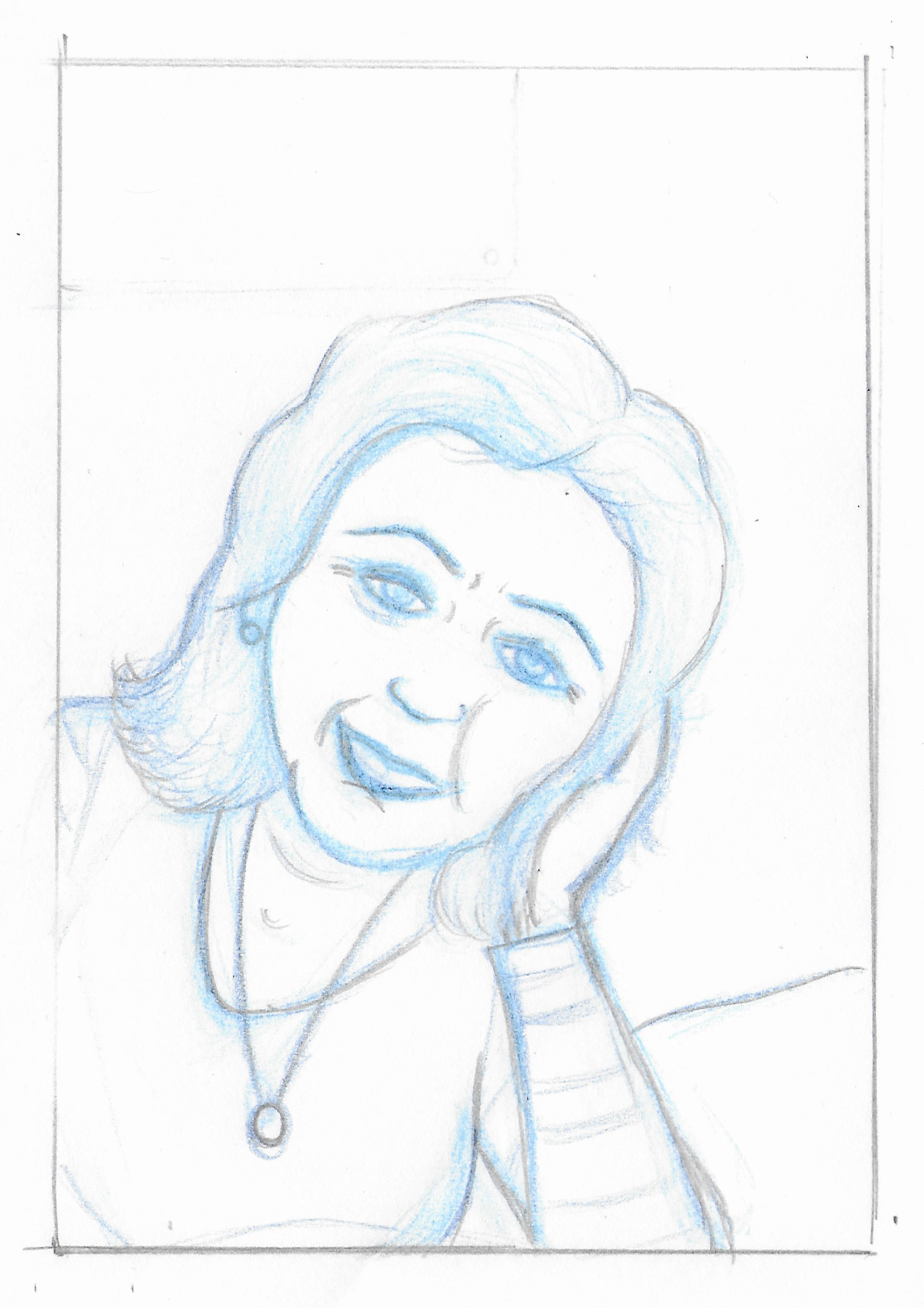
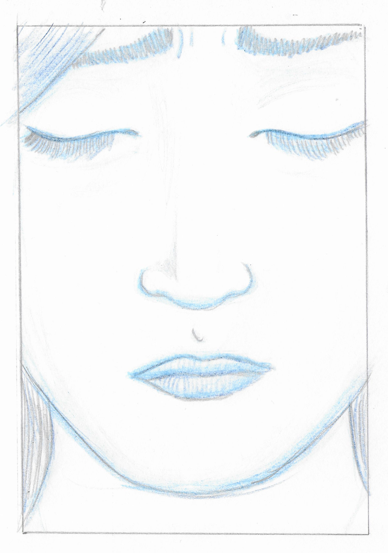
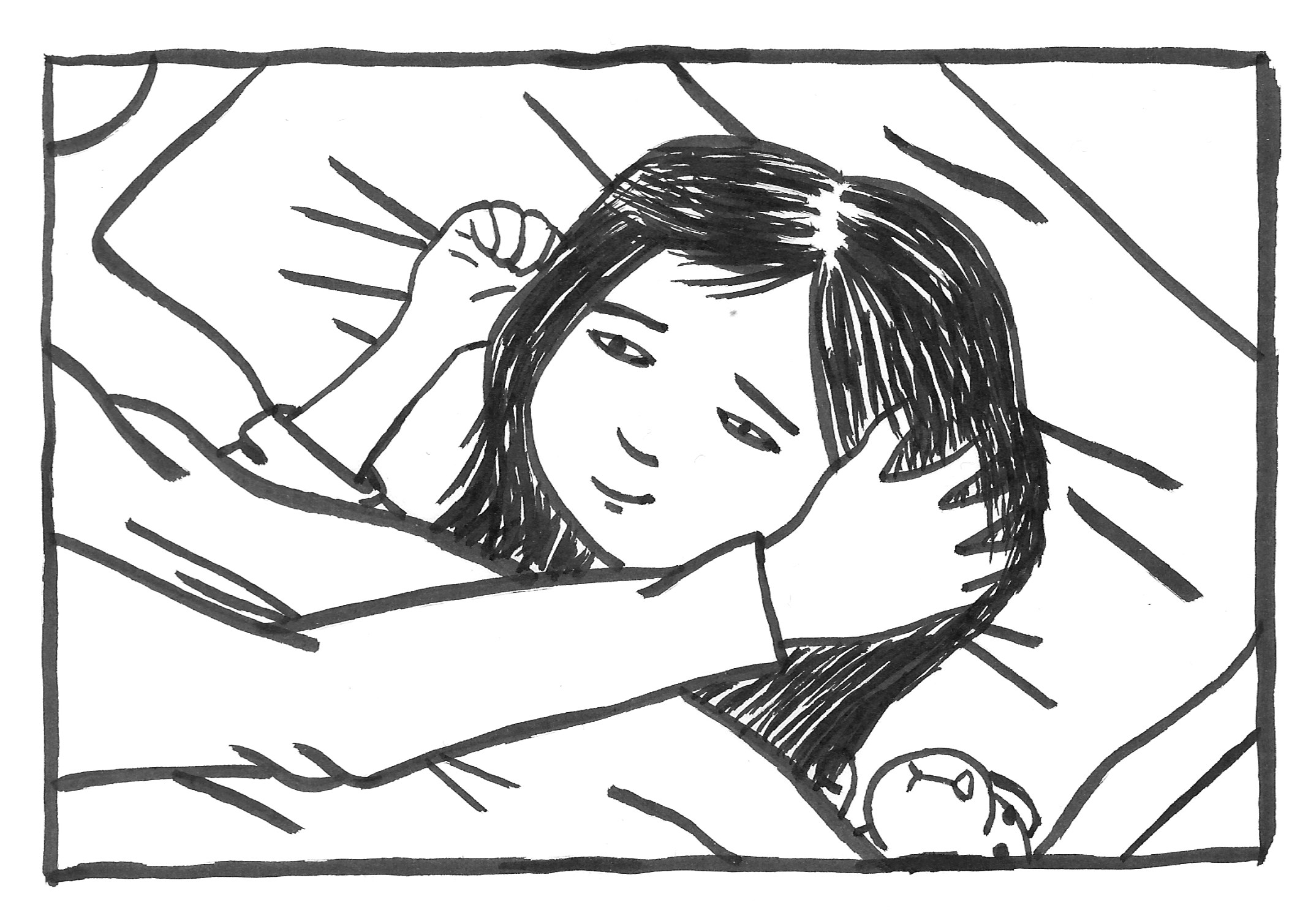
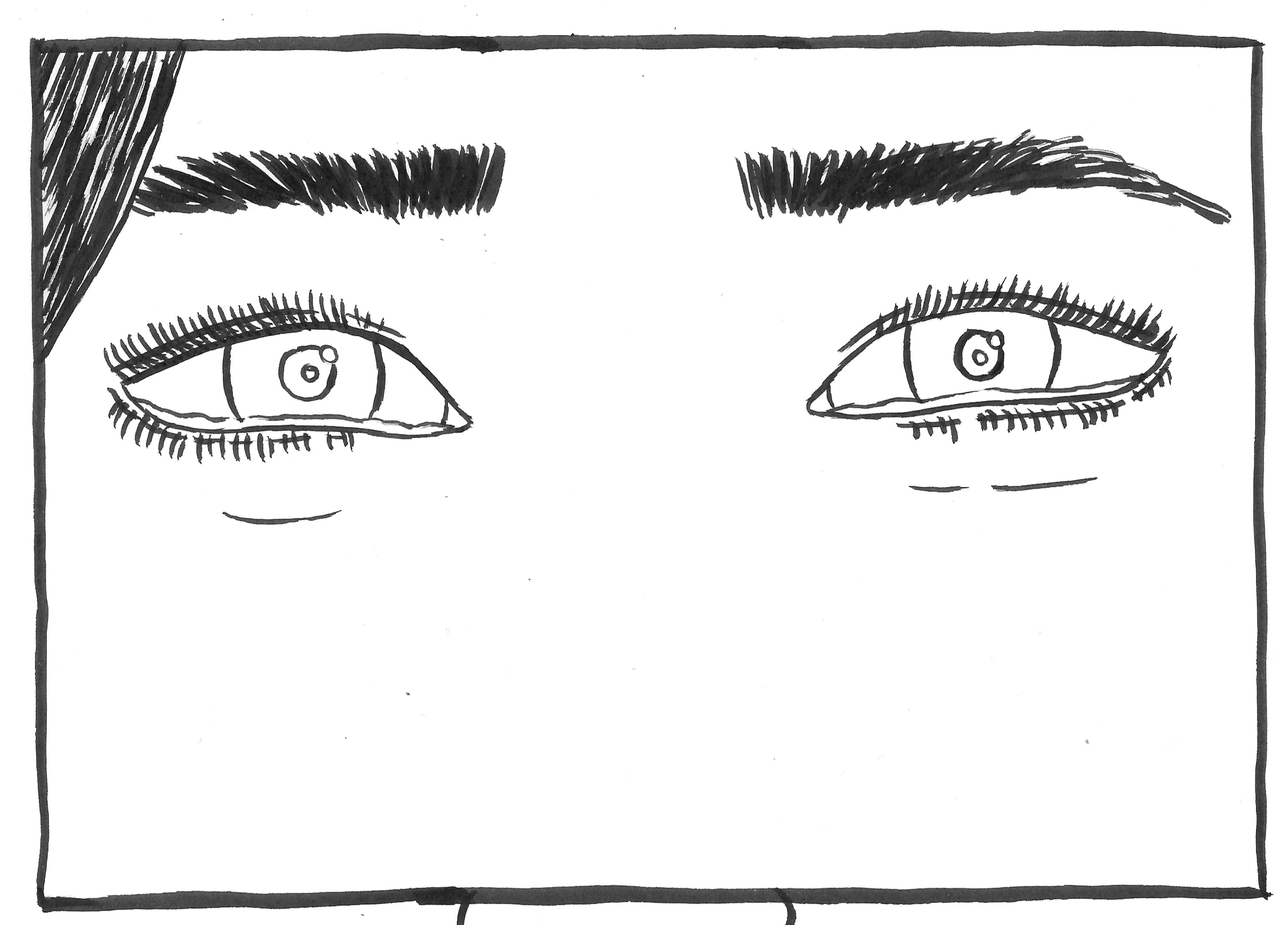
I felt that the third page was the most concise in terms of summing up what the song/comic was about. I therefore chose the last five panels of that page to take onto the next stage as I thought they would also make sense as a standalone group.
I measured out the panels on an A3 sheet of layout paper and drew the first draft versions.
Next, using another sheet of layout paper, I used my brush pen again for this exercise.


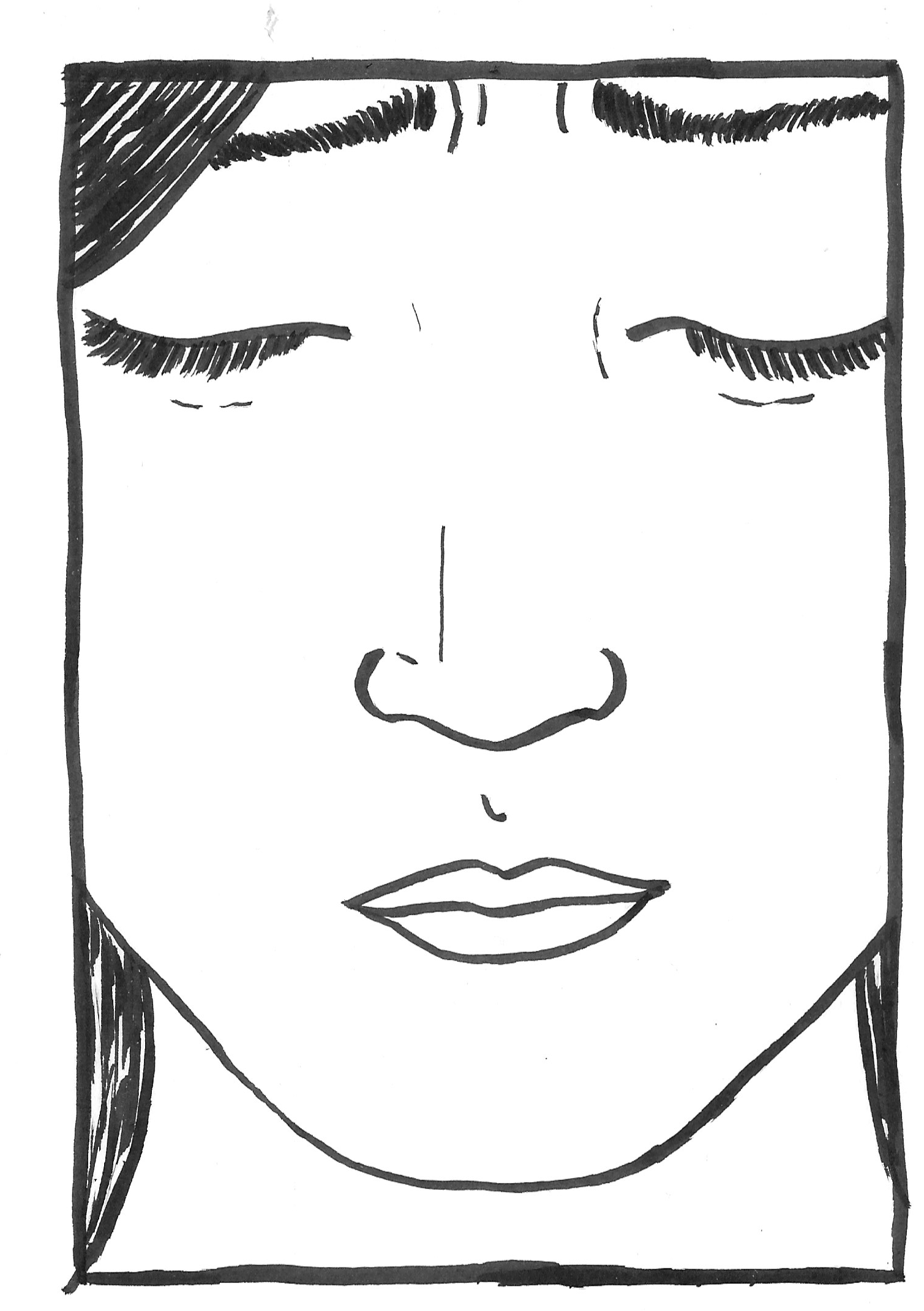
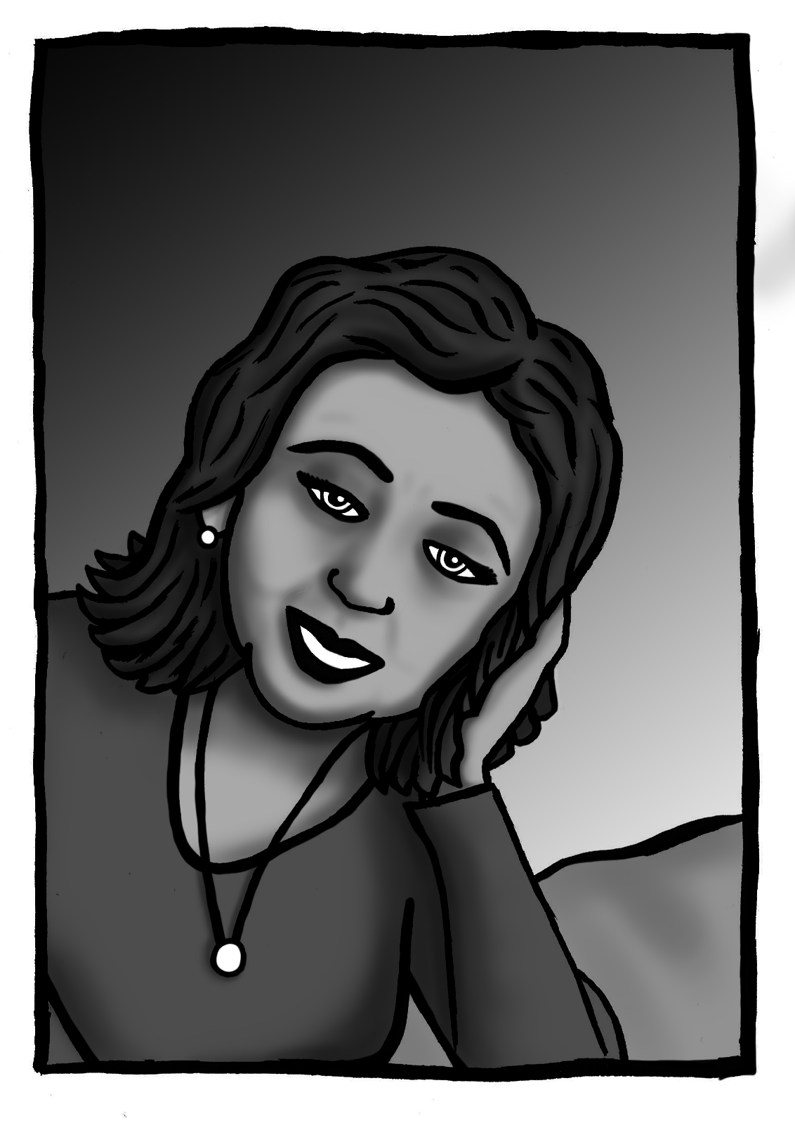
I felt more confident using the brush pen than in the earlier exercise, but I clearly still need to keep practicing as some of the strokes were rather poorly chosen. I thought the final panel would have benefitted from changing dimensions so that the bottom half was cut off as the distance to the nose meant it was slightly out of the frame – the eyes should have been the focus. I also would like to have tried other versions using fineliners and brush with ink to see the variations I could achieve in style.
Adding Colour
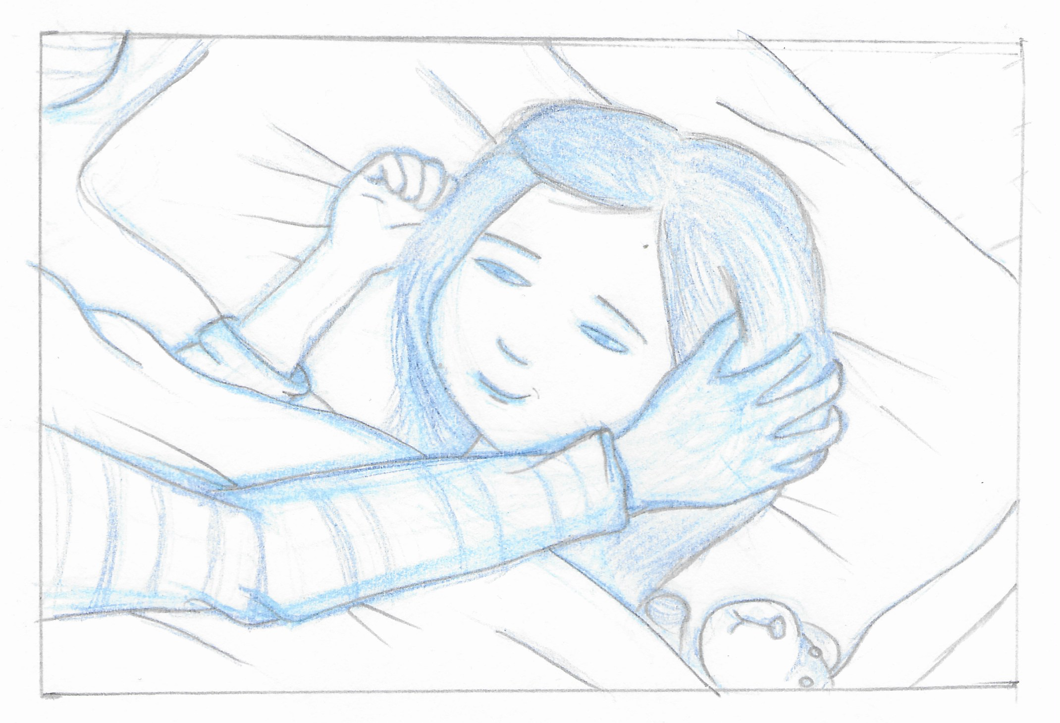
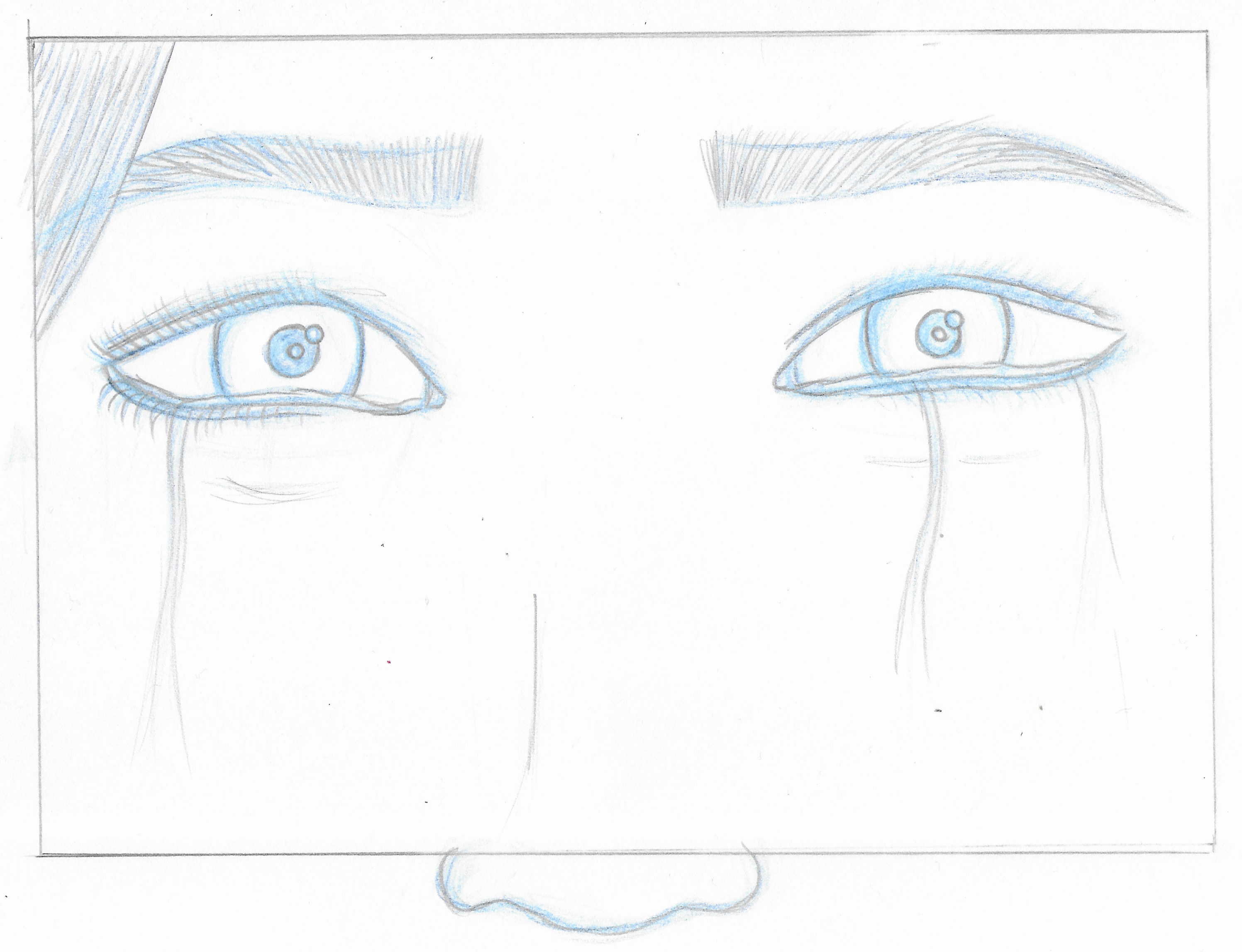
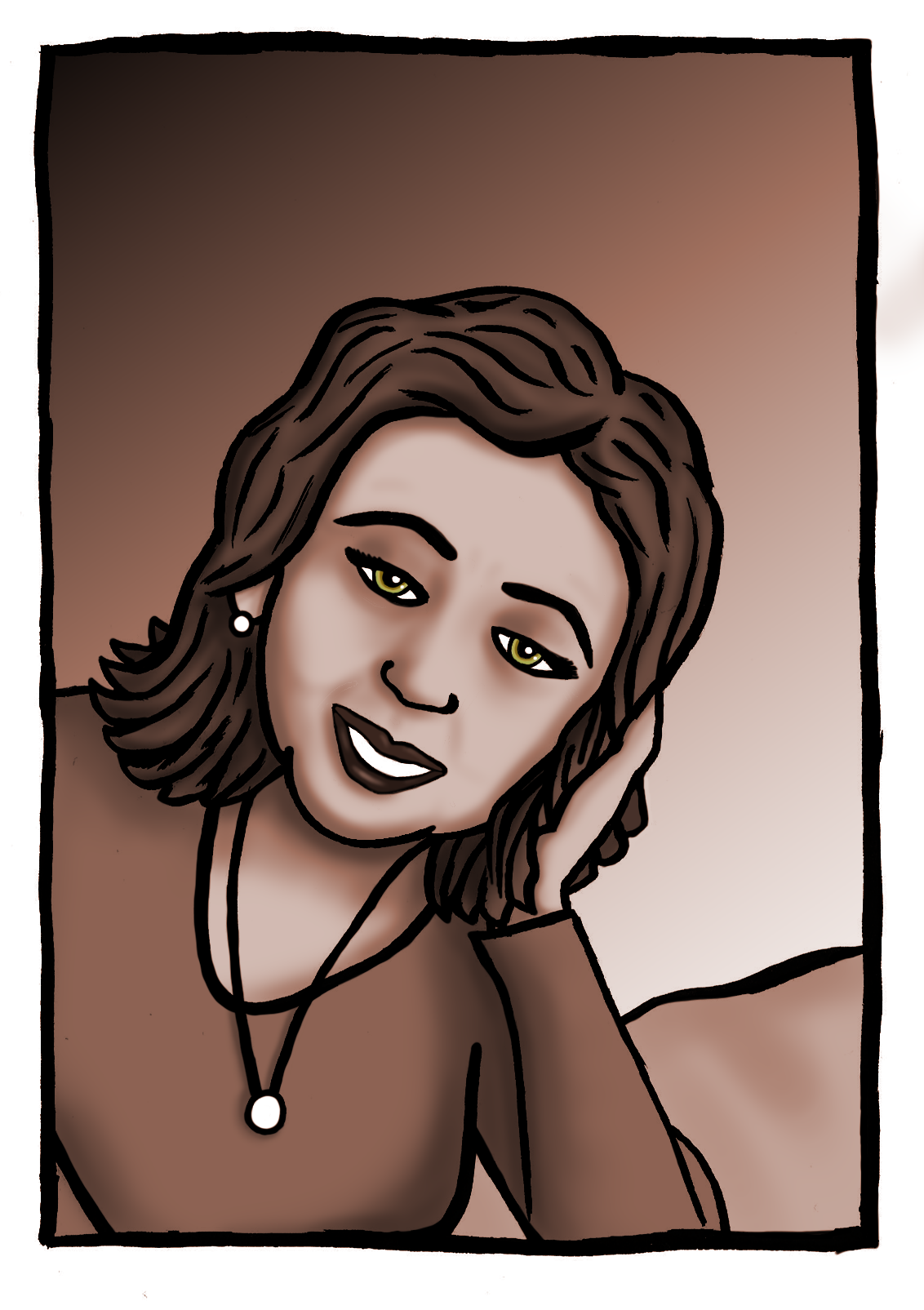
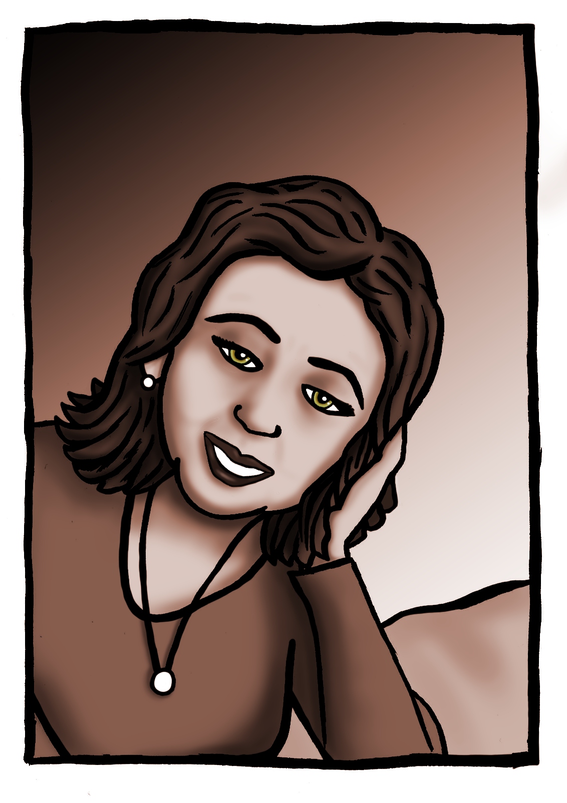
As there was meant to be an emphasis placed on separating the past from the present through the use of colour, I opted to take one panel from each time to demonstrate the intended effect – I selected panels three and four.
For this exercise I decided to attempt to utilise Photoshop, which I have generally avoided as it appears to be so complicated and quite intimidating (I feel much more comfortable using Illustrator). However, I wanted to have experiment with combining the hand-drawn element of the outlines with the digital application of colour/tone.
I began with panel four and built up the layers of tone for different areas of the face.
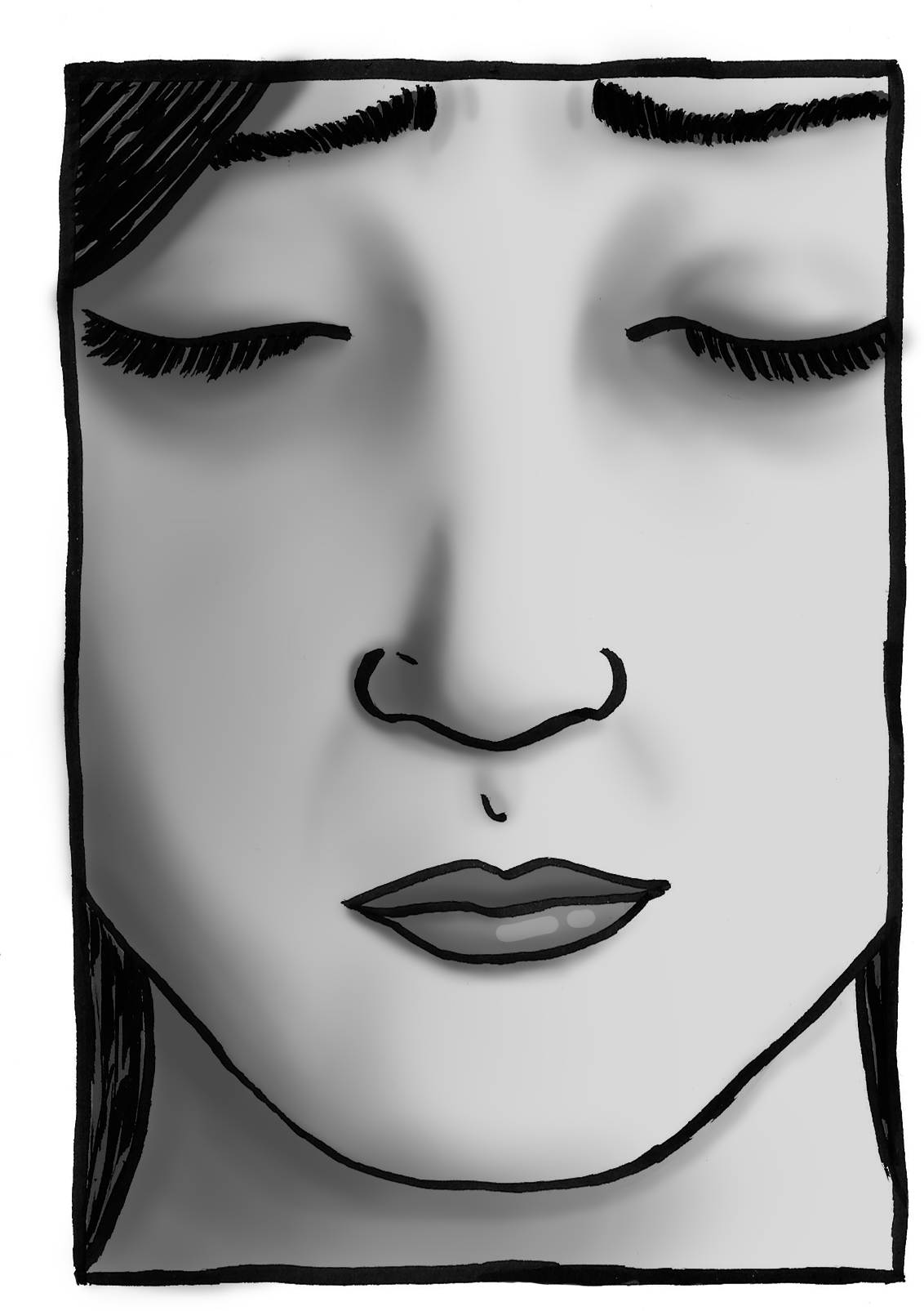
I then moved onto panel three, which was much more complicated as I had to clean up several areas of the outline first and then had issues with being unable to remove certain ‘erased’ marks, which, although not extremely noticeable in the final versions unless viewed large scale, really irked me! Rather than initially focusing on colour for this panel I worked in grayscale so I could build up the tone. Once I was ‘happy’ with this I then proceeded to colourise the image. I decided to use one colour, which I felt added to the sense of ‘looking back’. I then added the colour for the eyes, but I was a bit disappointed as these were not as luminous as I had wanted.
Final Thoughts
I thoroughly enjoyed working through this exercise, from start to finish. I felt I learned a great deal about the process of forming an idea and writing up a detailed plan, which provided a solid base for the thumbnail version (I often find myself floundering when required to draw thumbnails). I could then use all of this planning to support the process of creating my final versions.
I was quite pleased with the draft versions of the selected five panels, but the as previously stated I need to continue to work on my application of the brush pen and experiment with other methods (such as using brush and ink). If the lines had been cleaner at this stage, it would have meant less effort was required in Photoshop when making selections, etc.
I was surprised by how much I enjoyed using Photoshop and for my first attempt, I thought the final results were satisfactory. I could have added more contrast of tone and experimented with texture. It is a tool I definitely will explore in future exercises as I liked the combination of the digital and the analogue.
In terms of meeting the brief, I felt I was successful at representing the song lyrics and its meaning. In comparison to the previous exercise, this one required that I took my own interpretation and built up a story from this rather than using an excerpt from a book, which more clearly outlined it’s visual intentions with descriptions.
I am becoming a fan of ‘silent comics’ as I have always been impressed by animations that do not have any dialogue. I feel there are many ways of expressing oneself without talking all the time. I would certainly like to explore these in more depth and incorporate the techniques in my work.