Brief
Select a sequence of about three pages from a book you like. Try to think of a story you find visuallly interesting rather than something philosophical. Ideally it will include all different types of storytelling, so a story that includes dialogue, interesting characters as well as descriptions of places and objects. Try not to choose a book with a well-known and strong visual sense that has been adapted and visualised many times, but instead something you feel you can bring some of your own original visual interpretation and ideas to.
Photocopy your sequence of book pages and then either cut them up or mark them into sections. These could be the paragraphs that the text is already broken up into, or sections that either set a scene or contain a conversation. Essentially you are making a storyboard by breaking up the story into short descriptions or guidelines for a film director or cameraman to work from except you are the film director and the storyboard will become your comic story. You could then colour-code your text, for example using a yellow highlighter for dialogue, pink highlighter for thoughts or inner monologue, and green for descriptions of objects or backgrounds that need to be drawn. This will help you balance the verbal and visual information you want to include. You do not have to use all the text – try and be selective.
When you have finished organising your text you can start to structure your story. Perhaps the text works across three pages in the way the book does or maybe it takes more pages to tell the whole sequence. This is when you might need to think about editing. Some parts of your story may need to be lengthened, shortened or removed altogether.
You could start to thumbnail your story in rough panel-by-panel until you have sketched out each scene. Then see if you can fit them into three pages. Perhaps some panels will need to be made smaller or bigger to fit onto the pages. You could scan your thumbnails into Photoshop or another software programme and move them around and resize them. Work through the exercise in stages until you feel the the relationship between the text and your images is coherent and resolved.
Selecting the Text
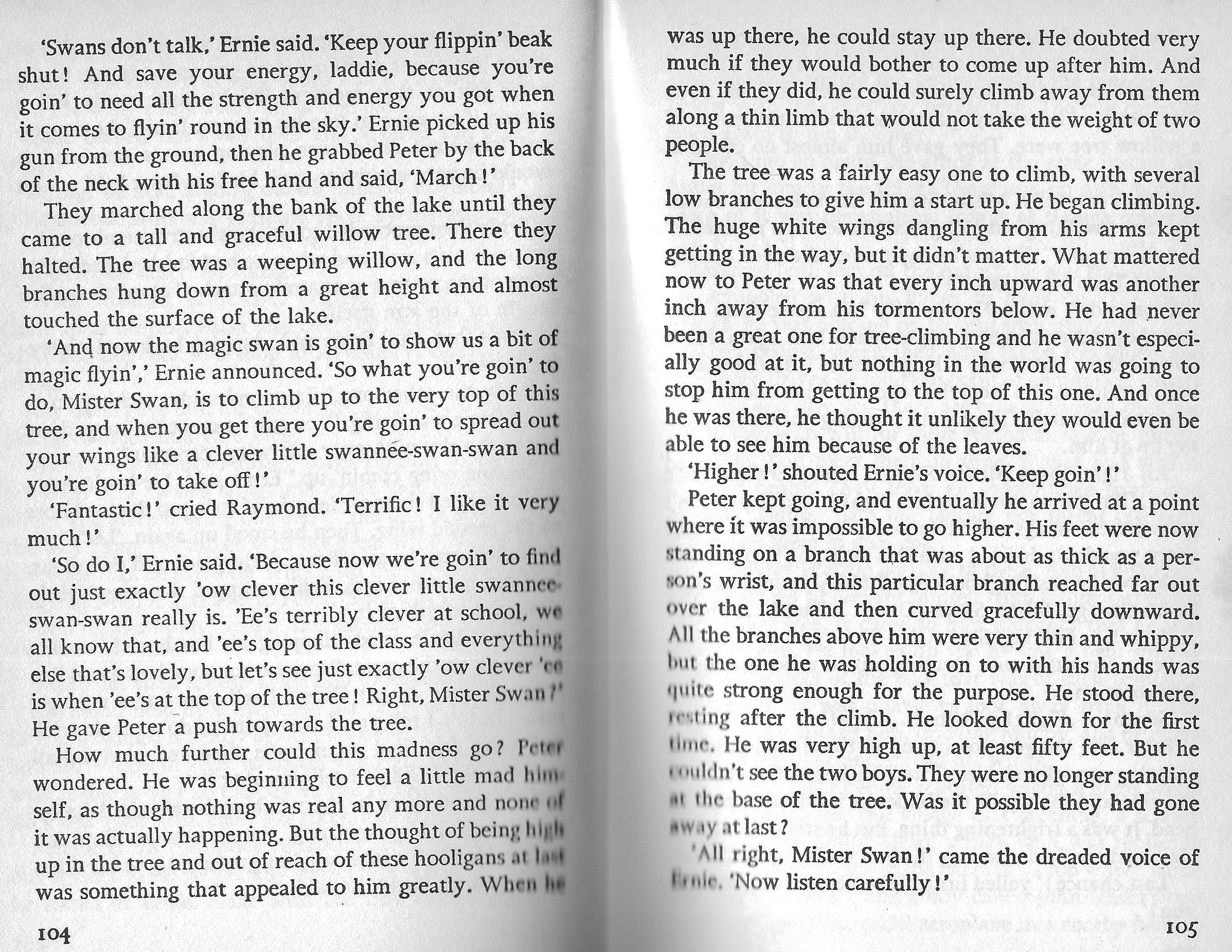
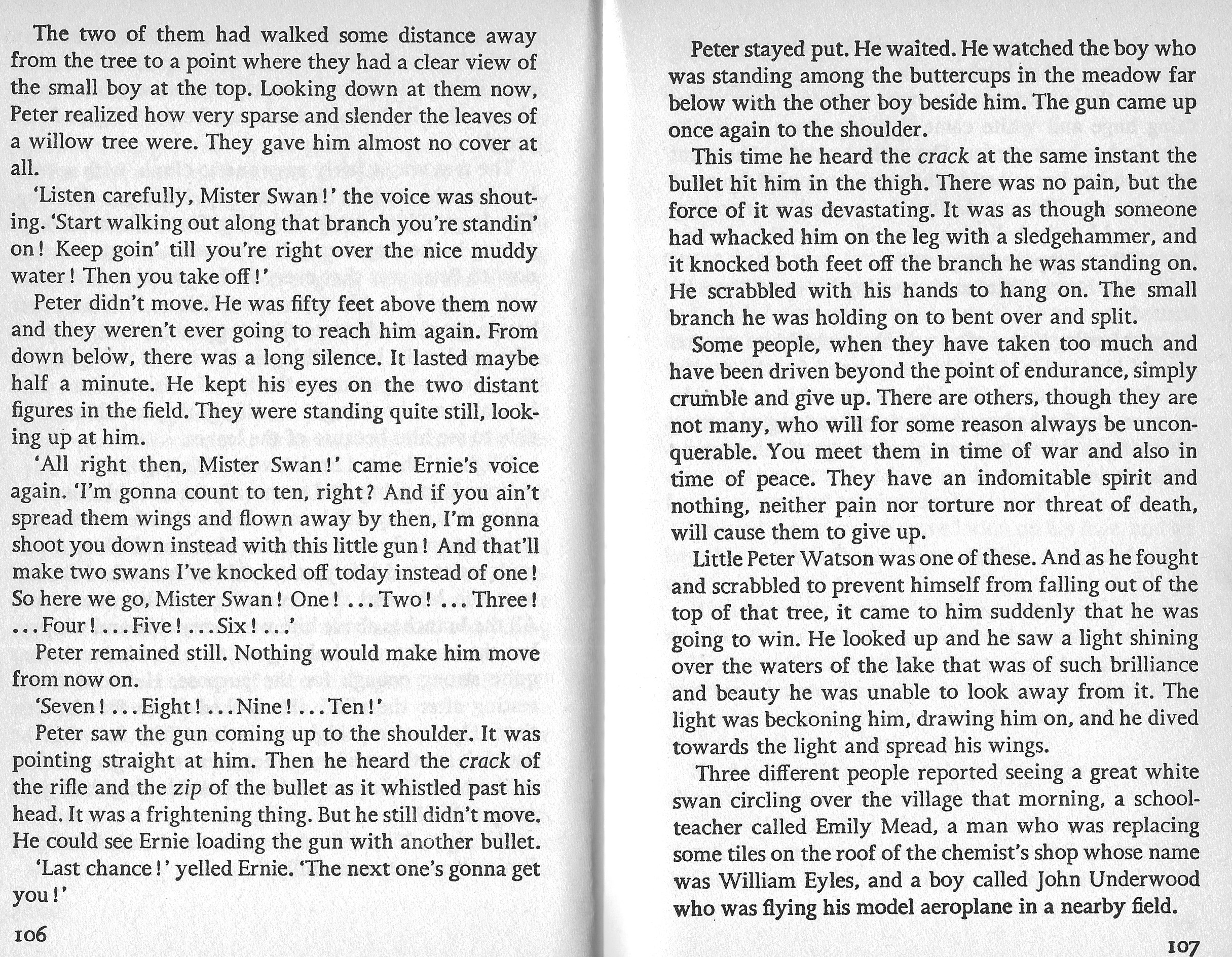
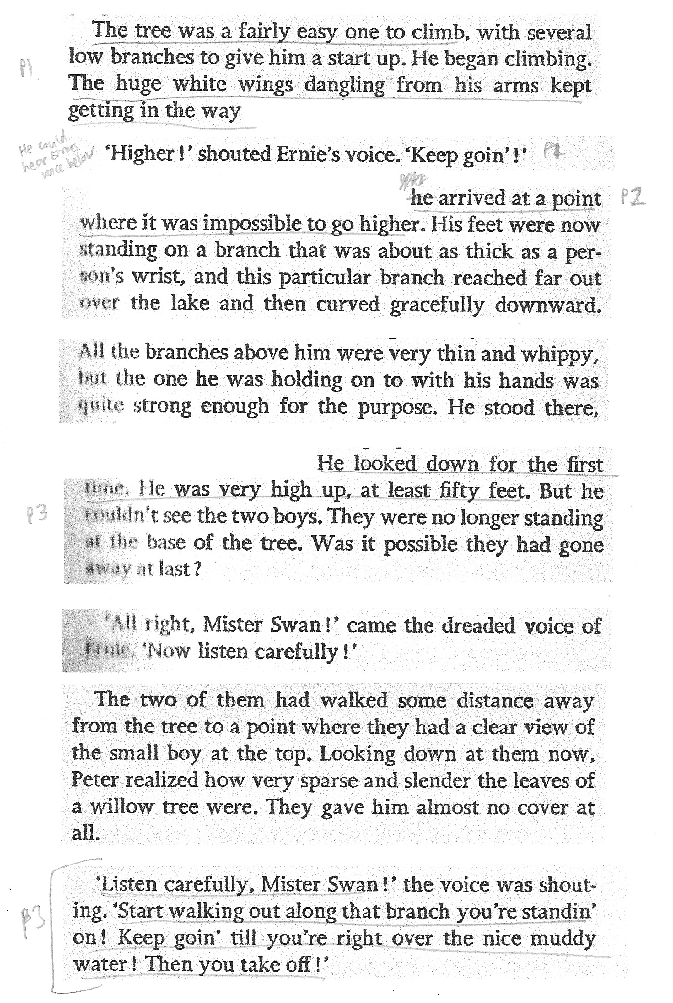
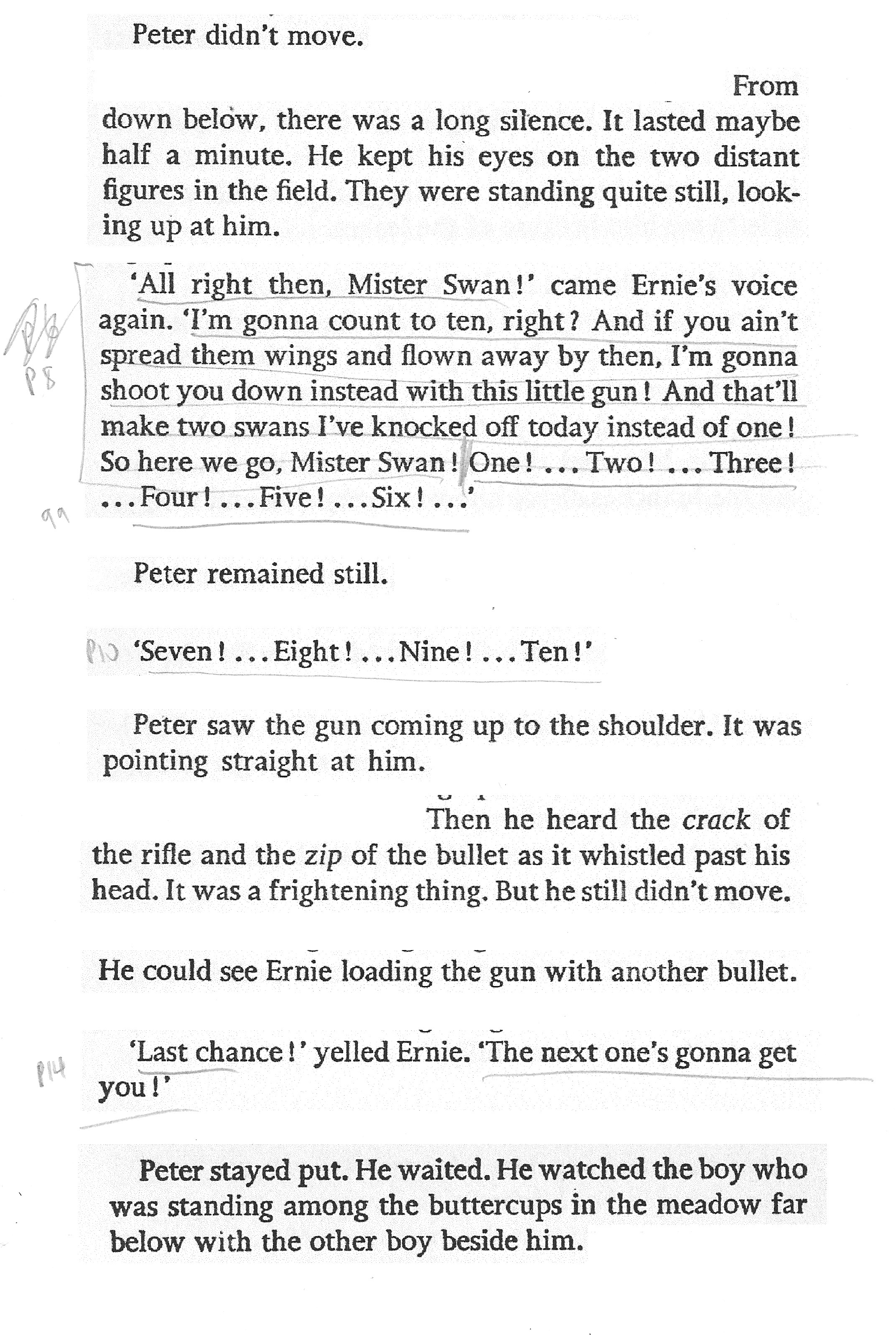
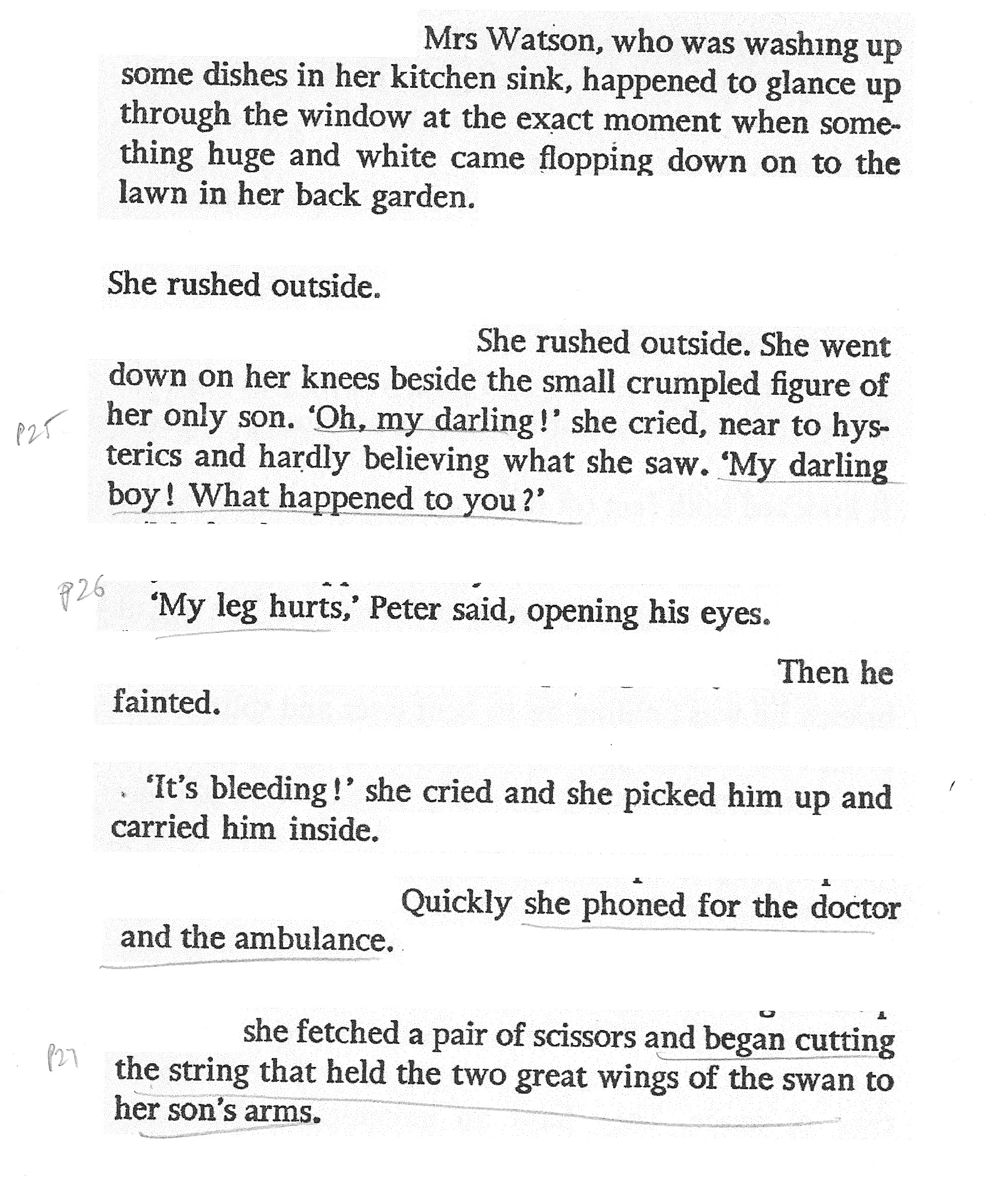
Due to mainly reading reference books for this course, I have not read many fiction books for quite a while (at least not any that are not well-known with strong visual representations on TV, etc). Therefore I decided to go back to my childhood and one of a few stories that has always stuck in my head – The Swan by Roald Dahl. It really shocked me when I was younger and it formed strong images in my mind.
I began this exercise by reading through the story again to refresh my memory and then considered which pages I would select. In the end, I chose the last few pages of the story and photocopied these.

Working on the Text
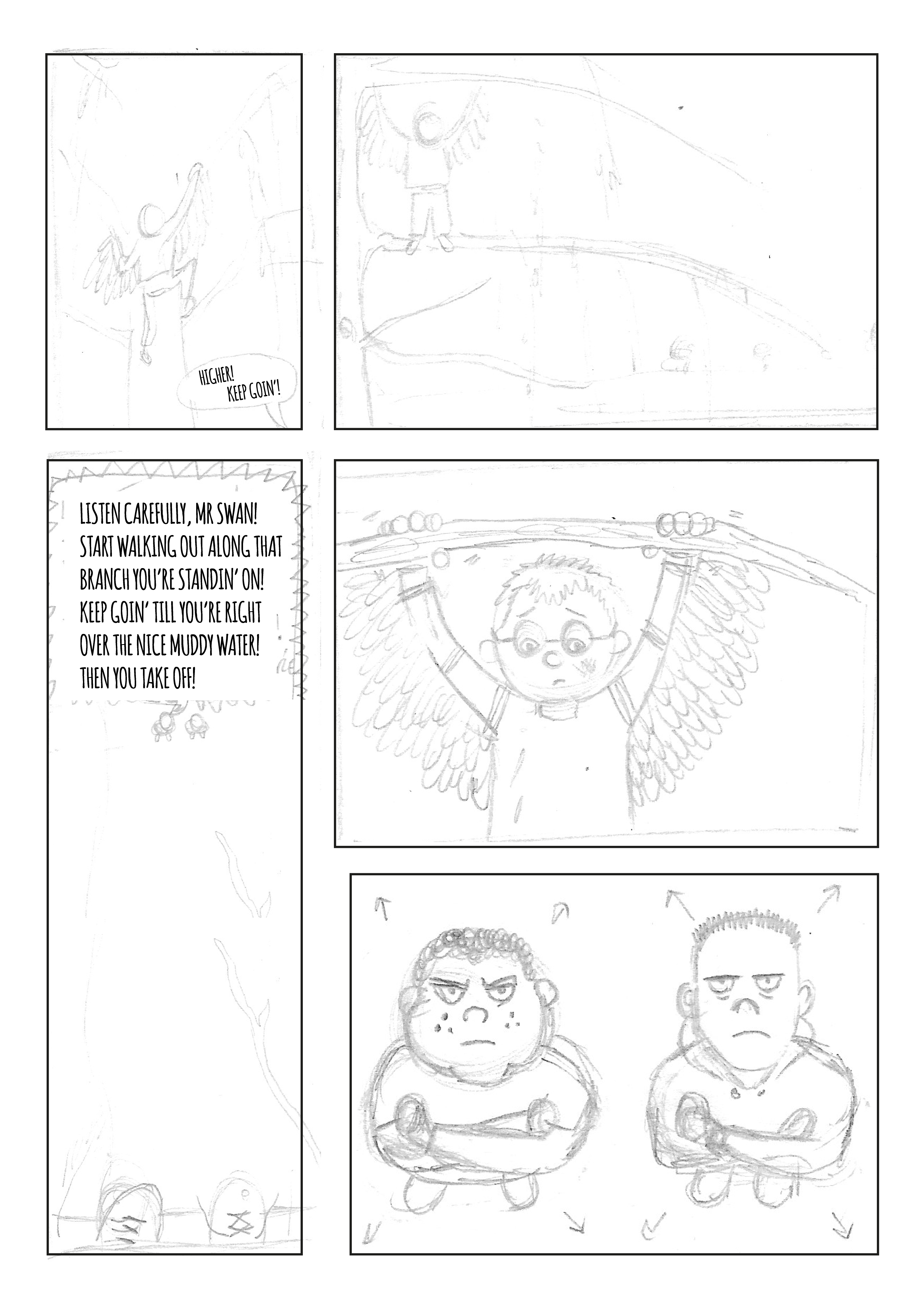
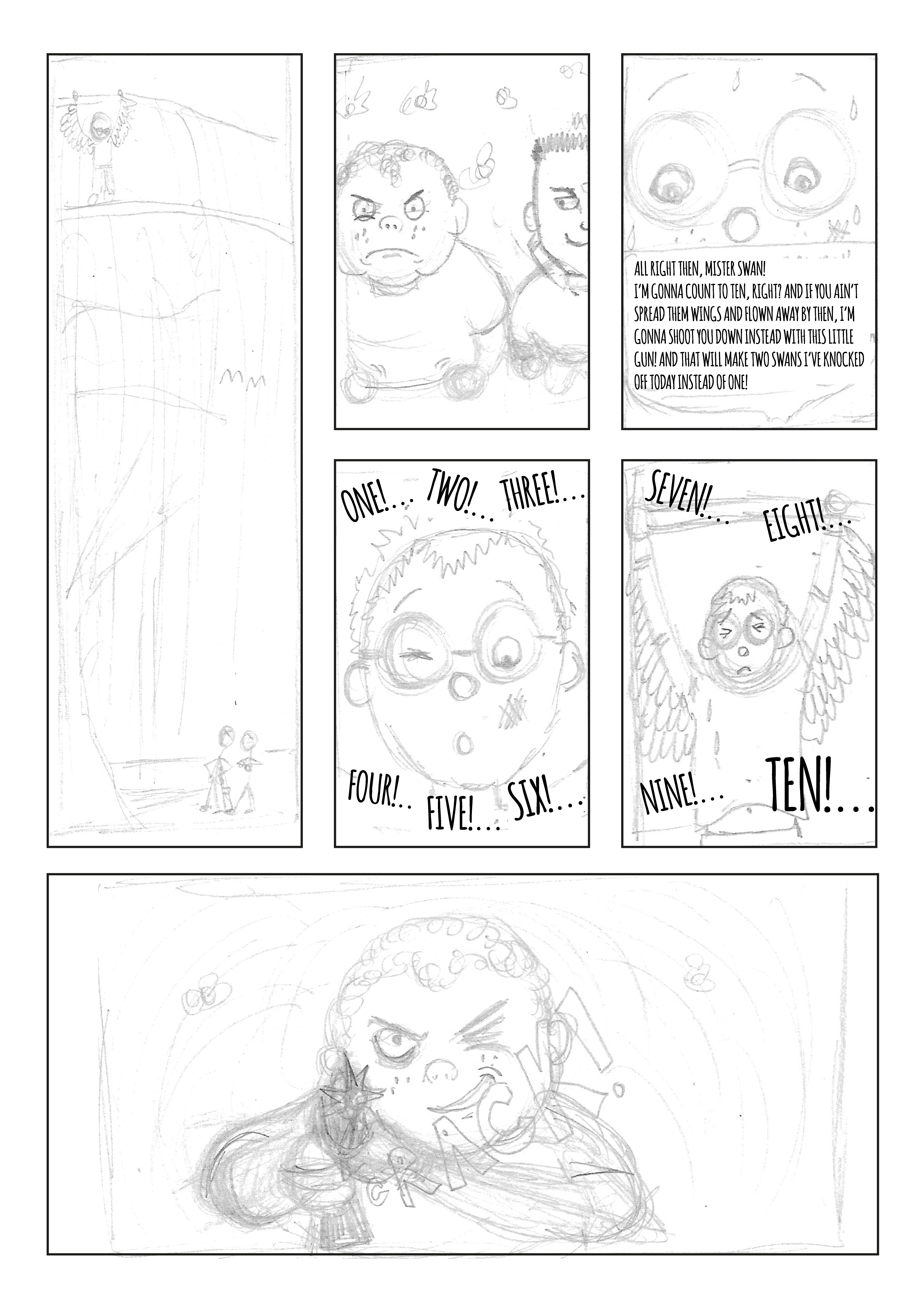
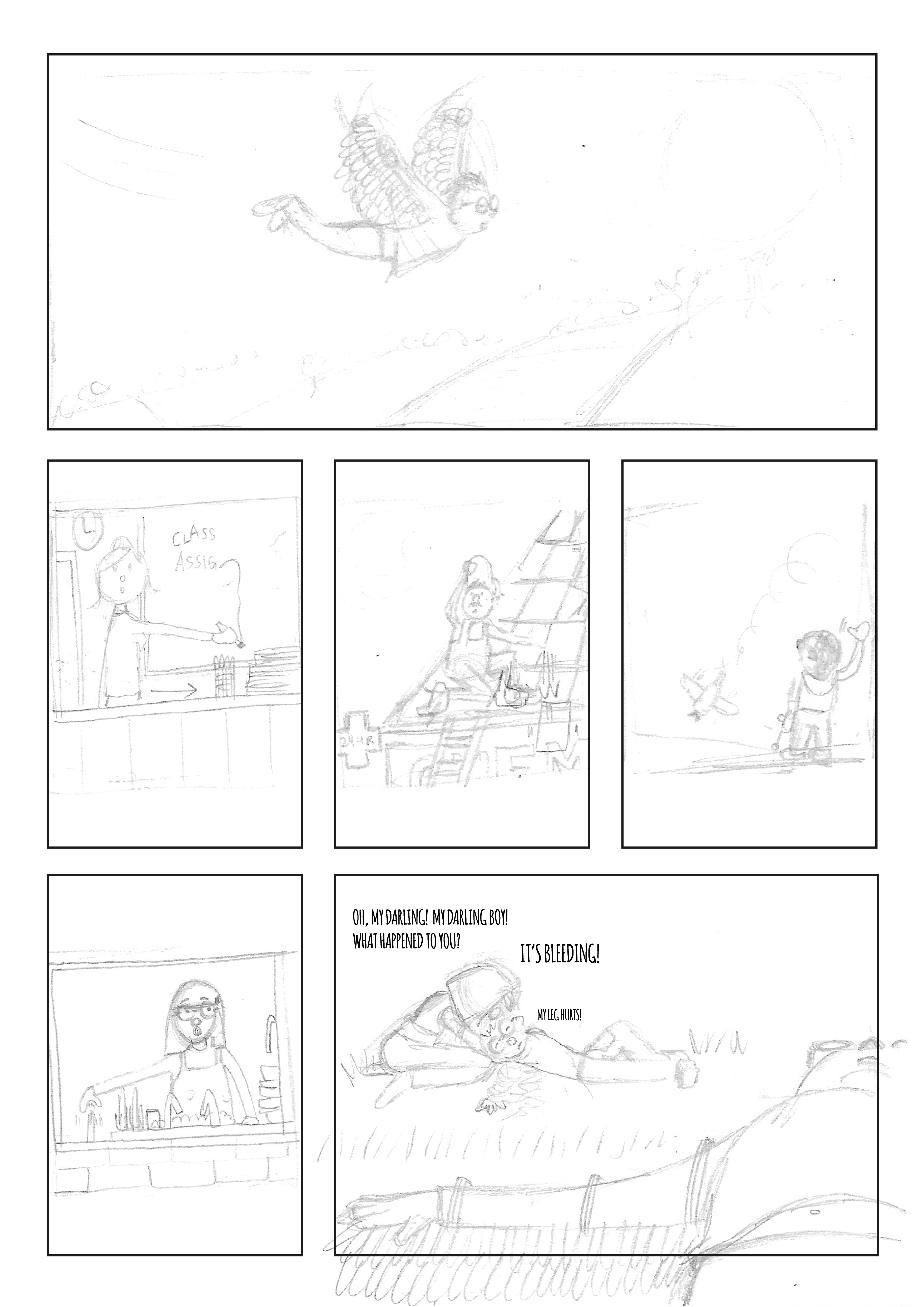
I then began working through the text, separating it into coherent sections, before highlighting dialogue, internal dialogue and visual descriptions for easy identification.

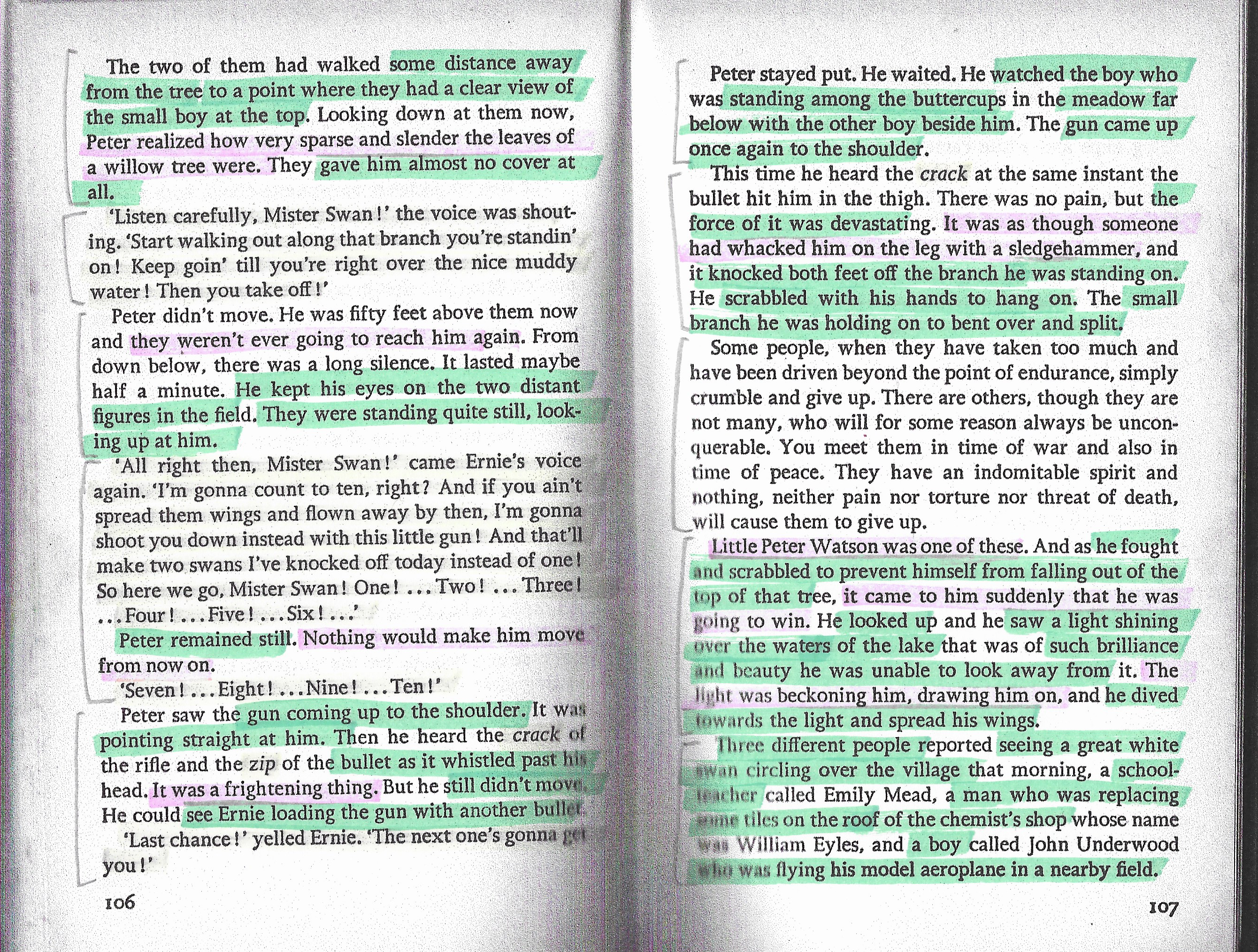
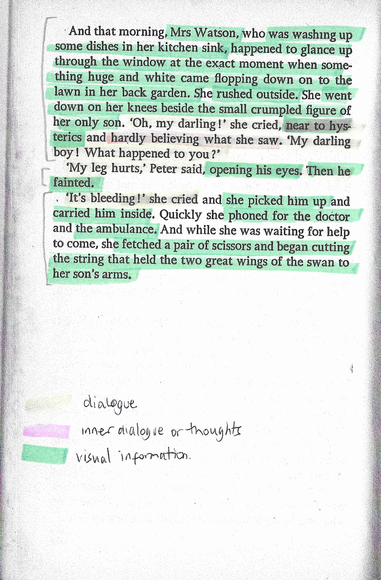
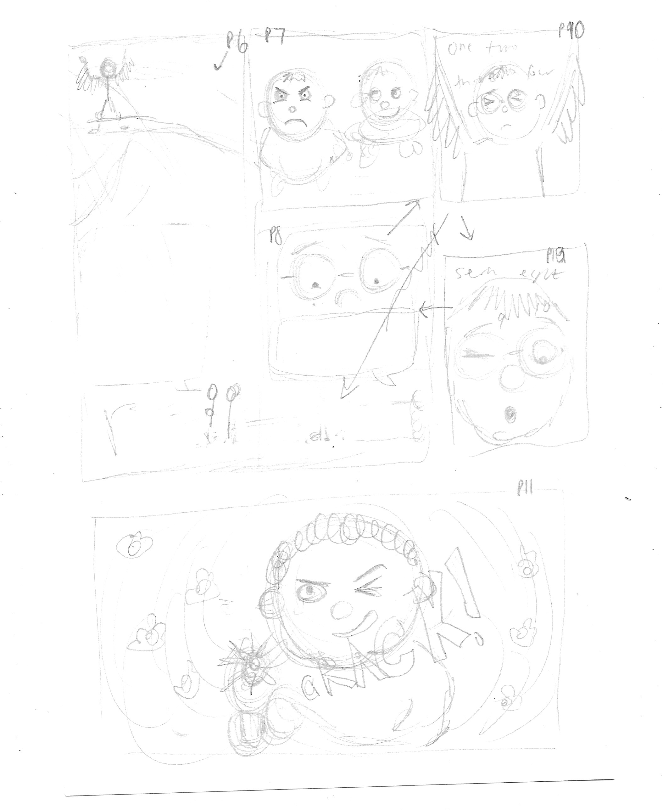
I then scanned the text into Illustrator so I could edit it more easily, cutting out sections I felt could be discarded and begin to divide it up into blocks that could be used to inform individual panels. This took me quite some time as I thought it was possibly the most important stage in the development. The result I was reasonably happy with can be seen below.

Creating Thumbnails of the Text
Once I reached this point I felt quite unsure of how to start drawing the thumbnail versions as even though I had strong visuals in my head, I found it challenging to translate these to paper. I drew out some very rough ideas based on my edited version, as above, which I then reworked several times to get a semi-clear idea of the layout I felt worked in terms of visually representing the text. In this exercise, I wanted to try and incorporate more variety in the panel shapes and sizes, as well as different viewpoints.
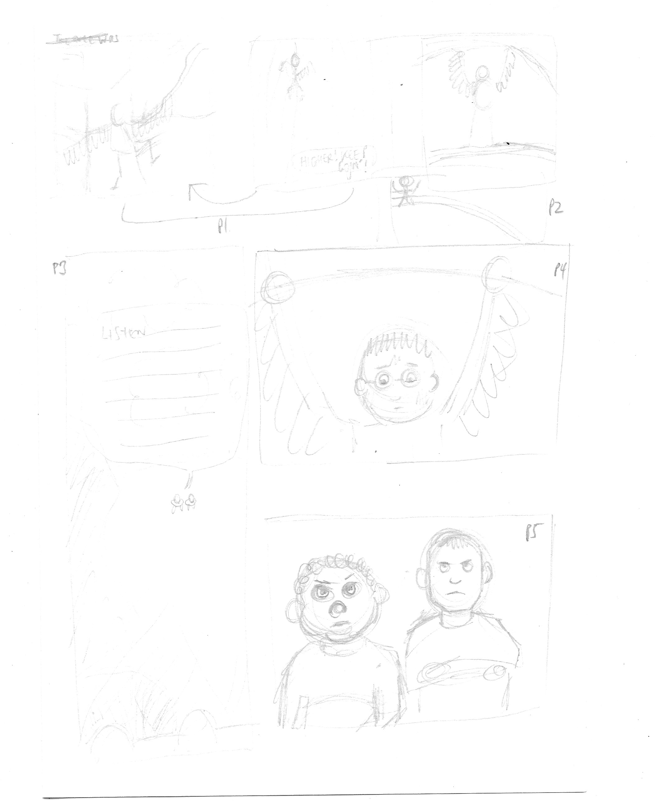


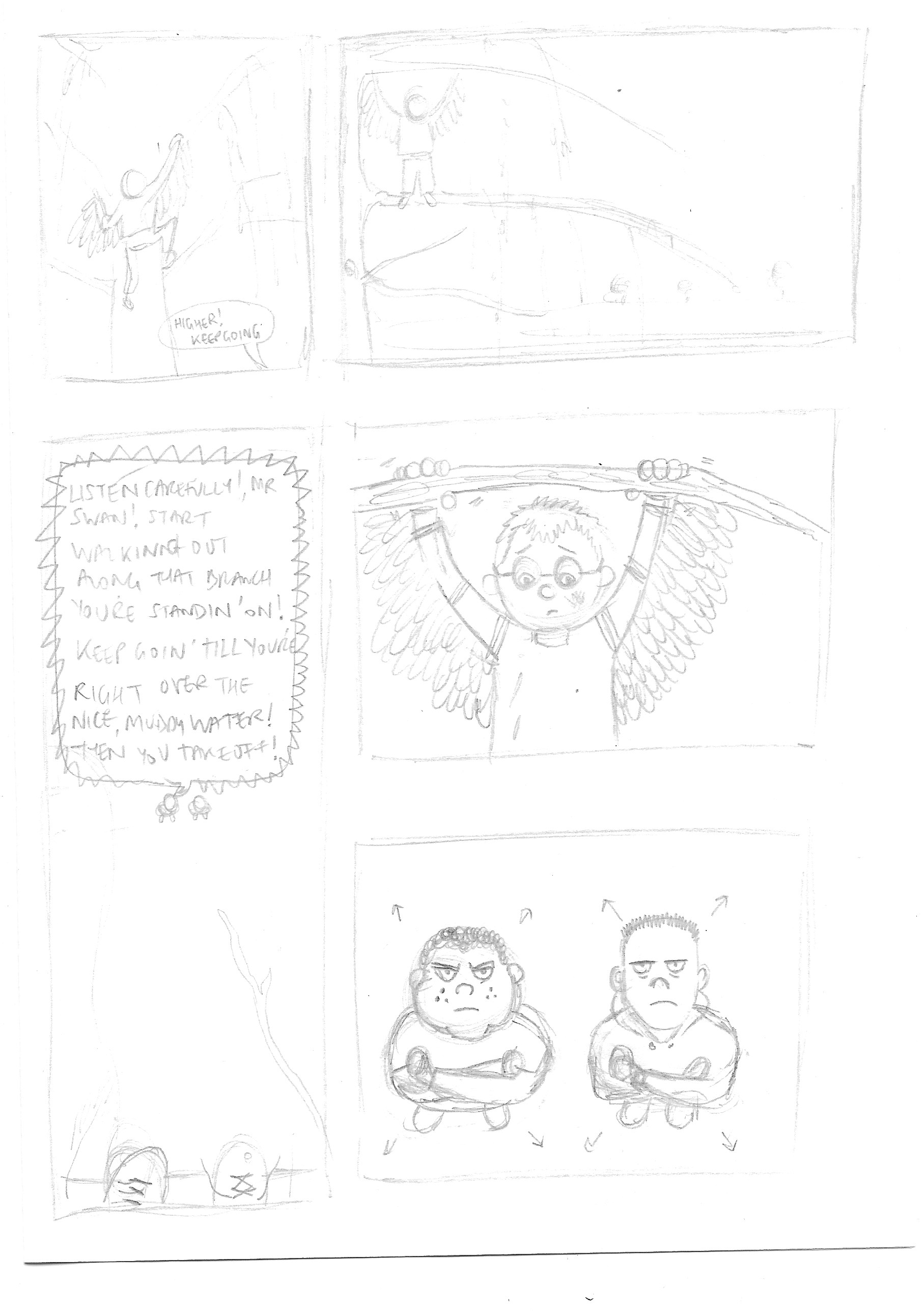
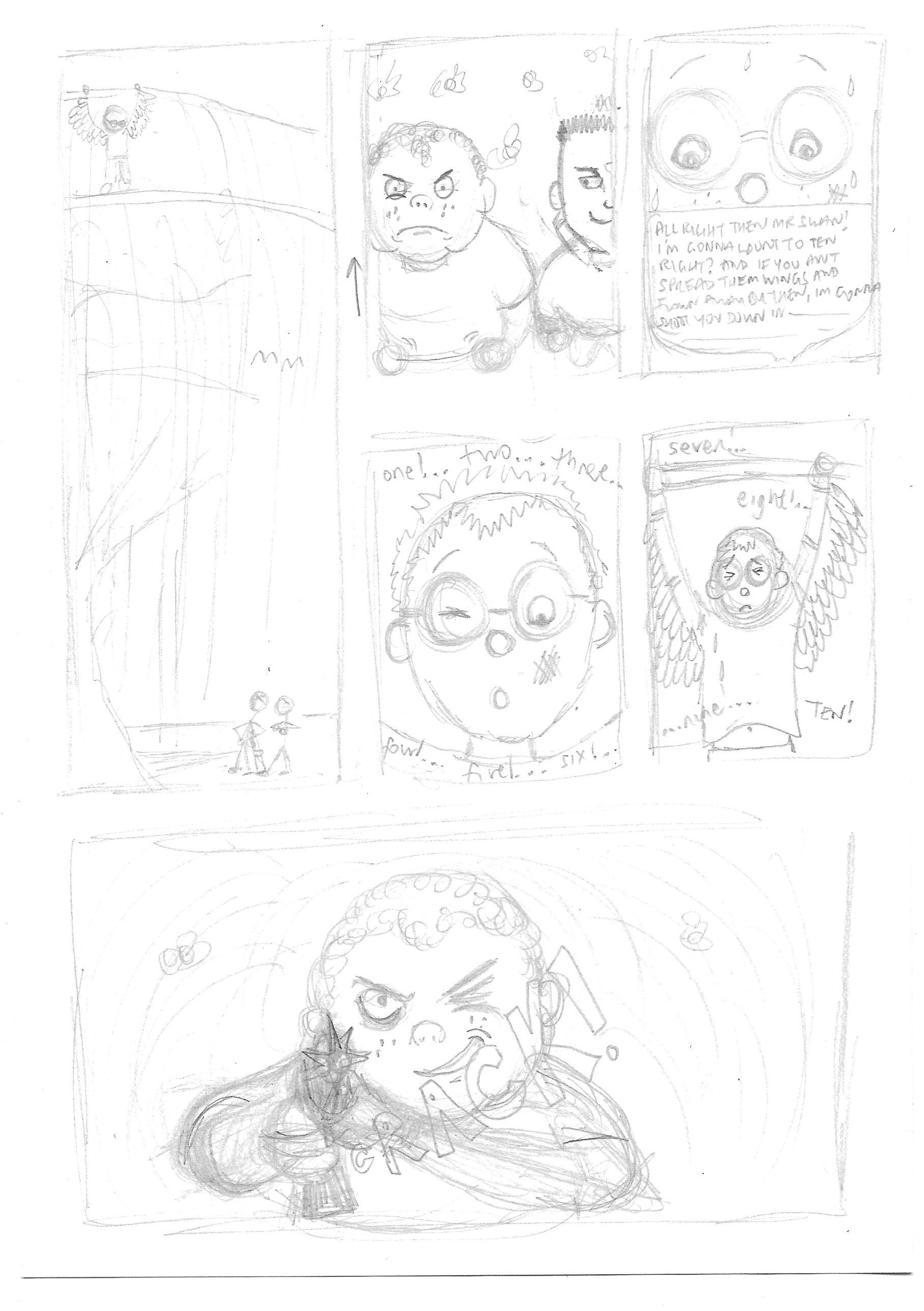
I then redrew these thumbnail panels more clearly.

Working in Illustrator
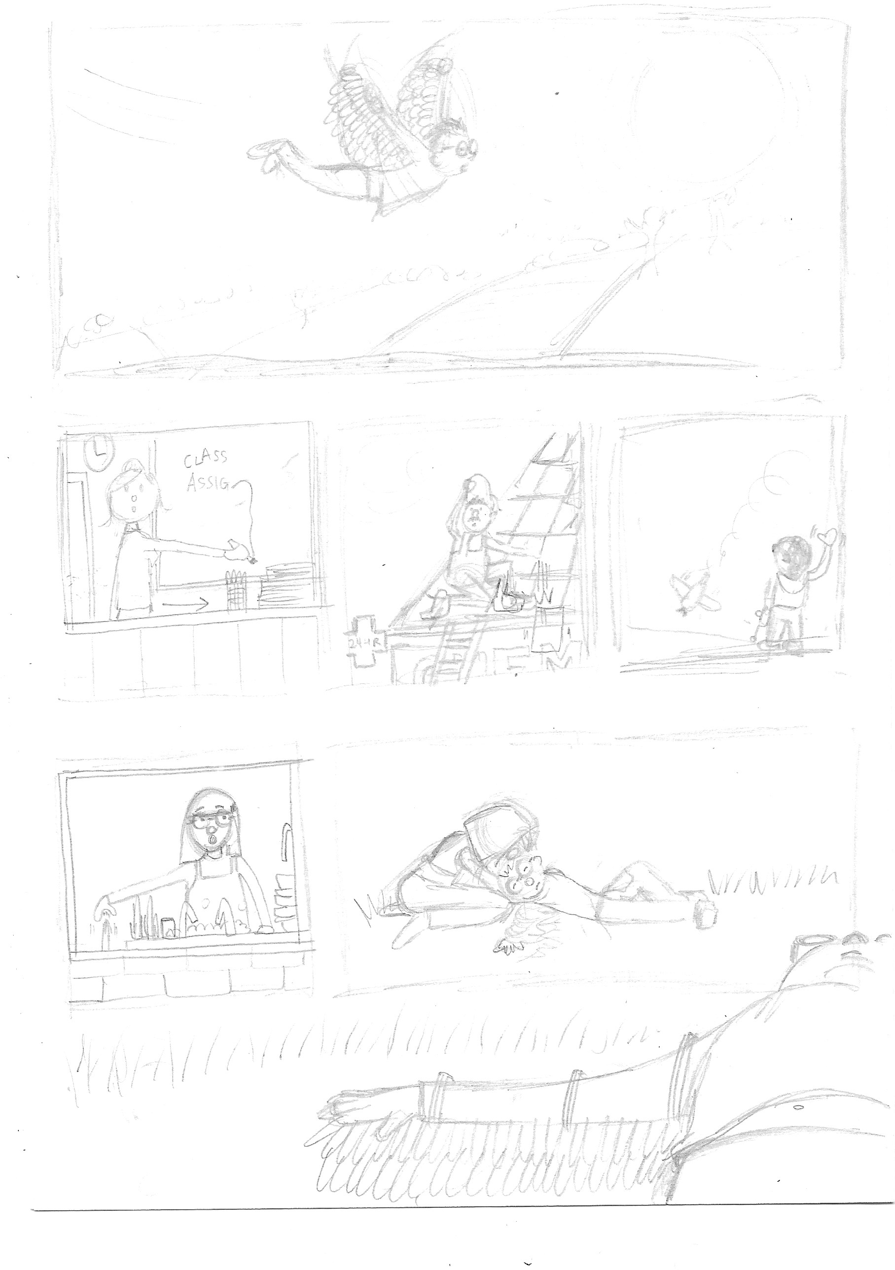
Moving into Illustrator, I created four A3-sized artboards on which I added the panels as per my drafts. I then cropped my drawings to place them in the appropriate ones. This ended up being more challenging than expected as I had not measured the panels on my much smaller drafts and therefore I needed to resize several of my drawings to fit in terms of scale and dimensions. I then decided to add the text digitally, just so it was clearer to read. The results can be seen below.

Final Thoughts
I felt unsure whether I should add caption text to some of the panels, i.e. take sections from the original story. I decided not to do this as I felt most of the drawings were self-explanatory and any additional text would have been unnecessary.
Personally, I have much preferred the examples of graphic fiction I have seen that are not too ‘wordy’ as I feel this can detract from the visual impact of the pictures. An example would be Anya’s Ghost by Vera Brosgol, which only contains text in the form of speech bubbles, but several of the panels rely solely on the picture to tell the story (very coherently).
I usually do not feel very confident about drawing thumbnails, but having the text for guidance meant I know exactly what I was meant to be visually representing.
I found the systematic approach of this exercise thoroughly enjoyable and rewarding, as I tend to work best when I have a clear process to follow.
Reflections After Tutor Feedback
My tutor suggested that I expanded on my decision making process in relation to the characters. I decided to opt for almost stereotypical character designs for Peter and the two bullies. I recall that this was almost an instinctive decision, possibly slightly encouraged by the fact that the reference material was Roald Dahl’s work.
I decided to give Peter features associated with those of characters who are usually thought of as being the victims of bullying: glasses, a kind face with earnest/worried expressions and smaller than the bullies. On reflection, although the wings are part of the story, they do emphasis the angelic quality of Peter that I want to put across. In contrast, the bullies were bigger than Peter, both in height and build. I gave them hard, unpleasant expressions and intimidating body language.
There was not any particular reference/s that I based my characters on, but subconsciously I must have been influenced by the aforementioned stereotypical attributes given to bullies and their victims in popular culture, such as cartoons and comics.
On reflection it does appear that this exercise may have been the ‘click’ moment for me during this unit in terms of beginning to feel more confident in my approaches and producing higher quality work. I enjoyed working with the narrative and transforming this into a visual version. Having an almost emotional connection with the material added to my enthusiasm for this exercise.
References
Dahl, R. (1977). The Wonderful World of Henry Sugar and Six More. London: Penguin Books. 105-108.