Brief
In this assignment you will create the cover to a comic book. This will be the cover to a fictional comic book of your own invention, so you can be as imaginative as you want.
The aim of the exercise is to suggest the content of the comic book, so you could use an existing character like yourself, or Sherlock Holmes or Dracula, or you could create a completely new character or characters. As with any novel or fictional work, the cover of a comic book or graphic novel should give the reader a strong sense of the contents. This can be achieved in many different ways; the cover can show a central character, such as the hero or villain, or the cover can create a sense of mood through landscapes or objects.
There is a generally accepted visual hierarchy to most comic book covers. For your finished cover there may be some or all of the following:
- A logo or title, hand-written in an appropriate font, which takes up the top quarter of the cover.
- A main image, which is the focus of attention, which will feature the tittle character or characters. If not one main image, your cover may be the first page of story that would continue inside.
- Secondary images such as insets or a corner box showing the main character.
- Captions or ‘blurbs’ that tell the reader what they might expect inside the comic.
- Speech balloons or sound effects.
Make your original comic book drawing 37cm high x 24cm wide. When finished, reduce it down by 70% and you will have an image the size of a standard American comic book.
Research
I began this exercise by carrying out some visual research of comic book covers, initially via Pinterest. The majority of these had an illustration of the main character from the comic. I felt I could gauge the personality of the character and also the general tone and theme of the story from these examples.
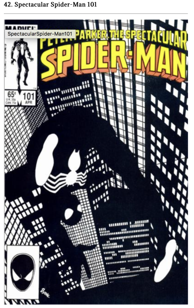
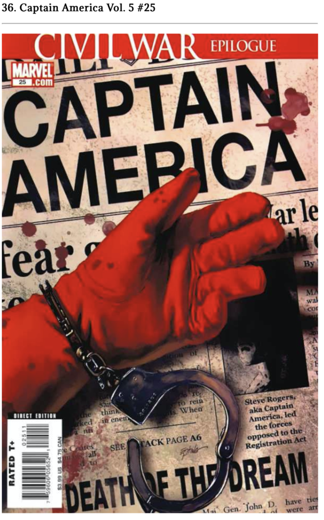
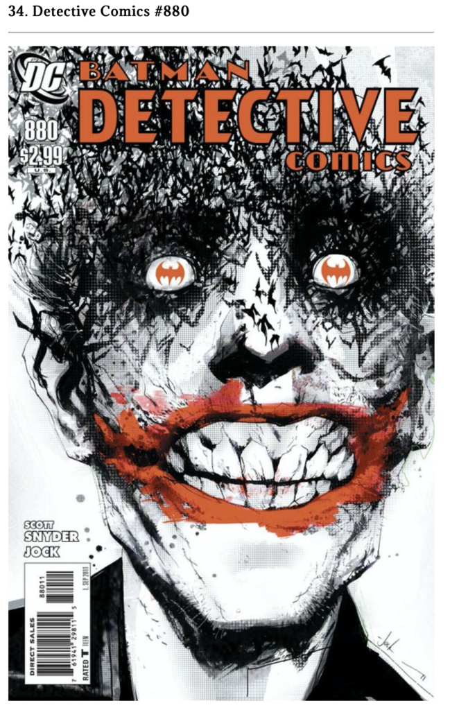
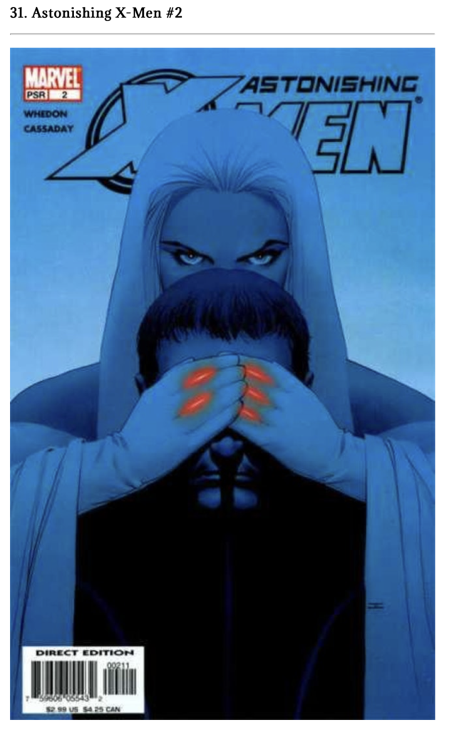
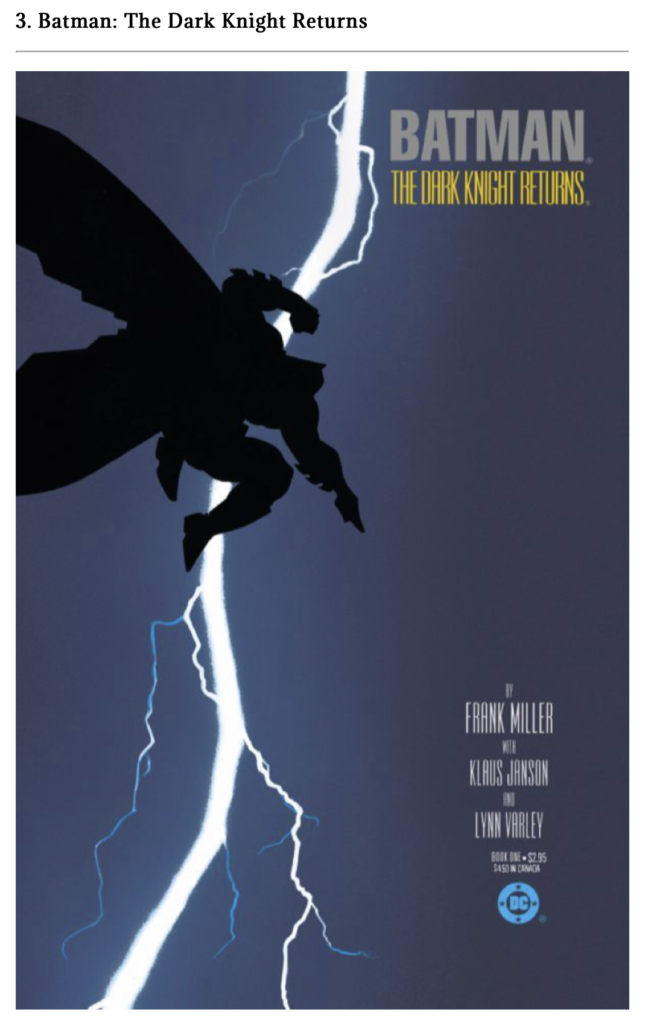
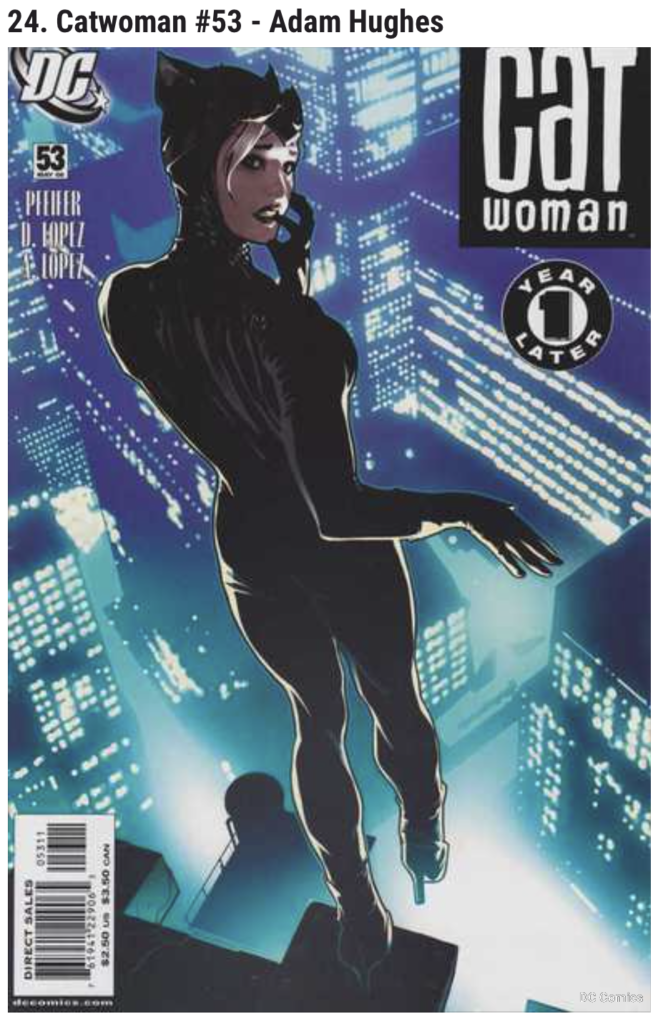
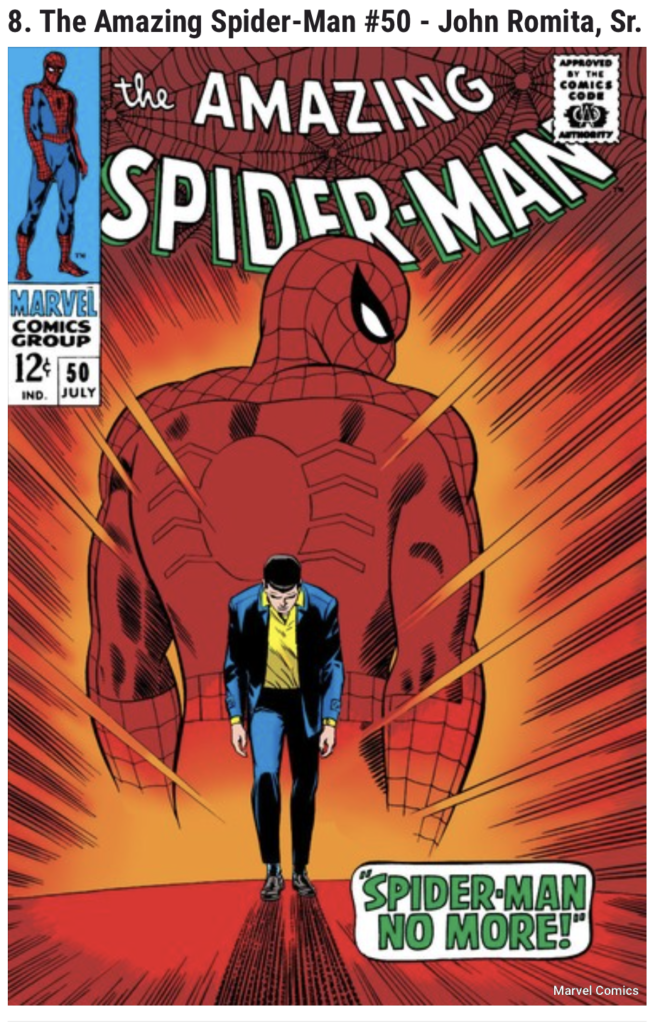
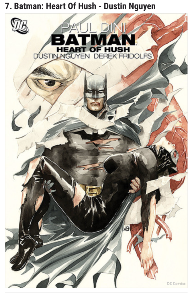
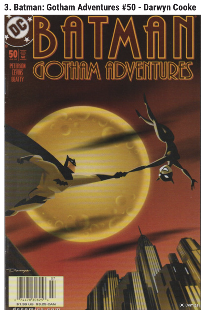
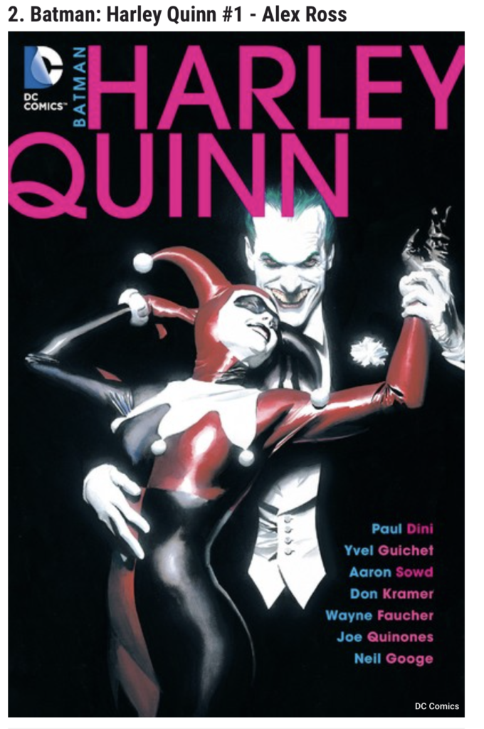
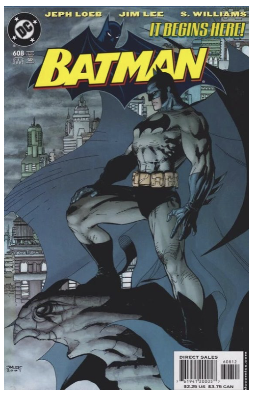
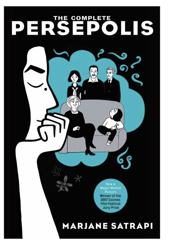
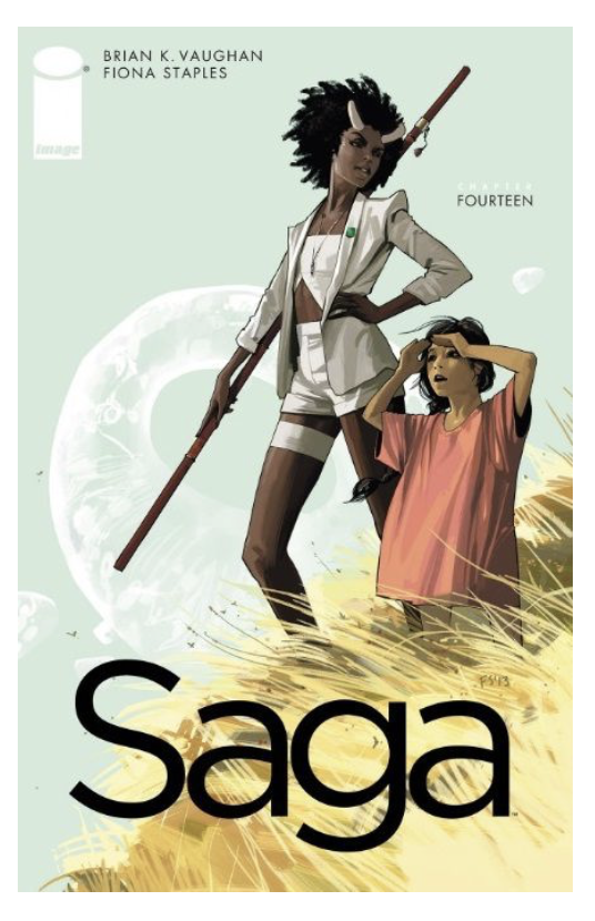
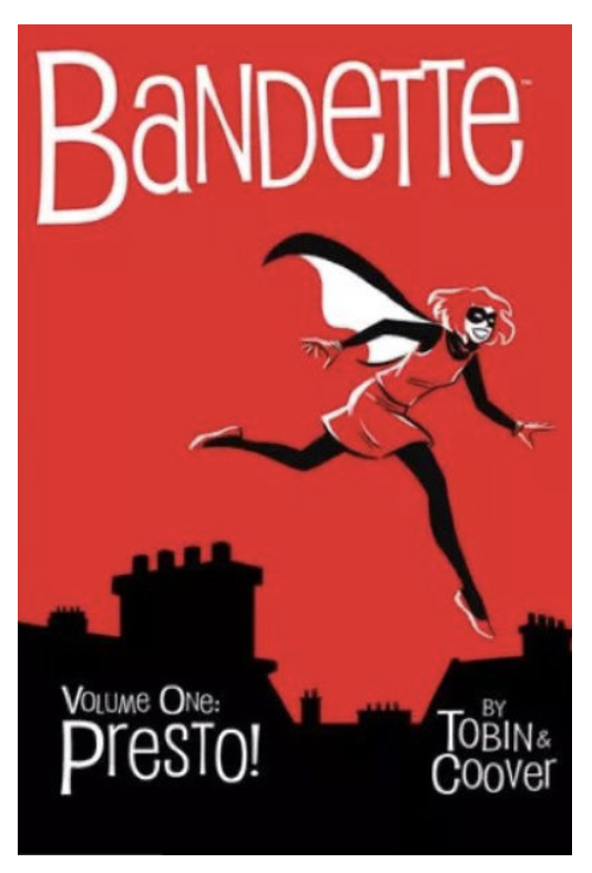
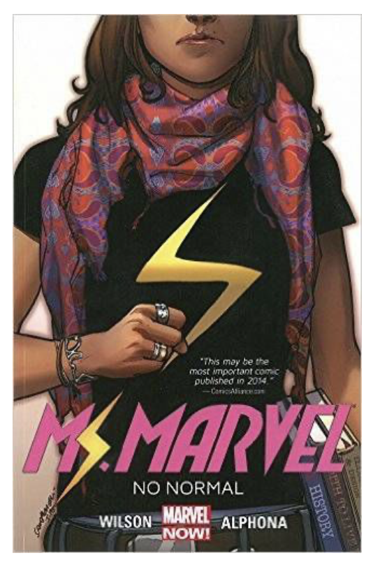
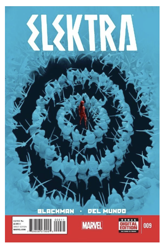
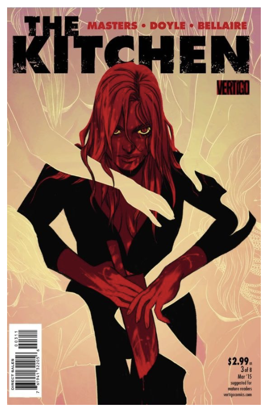
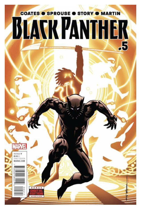
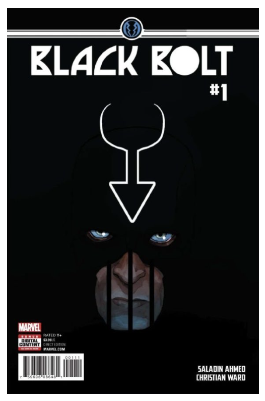
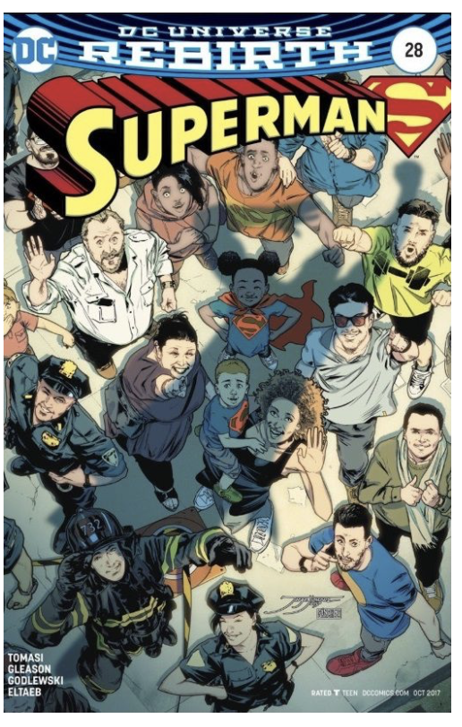
I then found various websites listing numerous examples of well-received comic book covers (please see References). I went through these and took screenshots of the ones that I found most visually appealing. I noted that the majority of these examples were of the superhero genre, which is why I also collated more variety via the Pinterest research.
One of the main trends I noticed in the most successful examples, in my opinion, was the fairly restrictive use of colour, with one dominant hue, and the effective utilisation of negative space. Again, generally, the main character was depicted either explicitly or their presence was implied. The font choices also added to setting the tone of the comic books.
For the final part of research, I found an online article that suggested a method for creating a comic book cover design, which I found both helpful and encouraging.
Idea
I felt quite under pressure with this assignment as I am fast approaching the deadline for my Level 1 timeframe, so I had to become extremely decisive and focused. Therefore I did not spend too long dithering over what idea to carry forward.
I briefly considered revisiting some of the characters I had created in previous exercises, such as the ‘ninja squirrel’, ‘Flow’ or the cartoon version of me in the previous one, but I was keen to explore a new idea that had been forming in my head for a while.
I have always been quite interested in the concept of taking traditional fairy-tale characters and recreating them as an updated, alternative version. I had been thinking about a potential story about Red Riding Hood and Goldilocks (as they were both ‘in the woods’). I did begin to devise a fairly complex storyline that kept bringing up more questions, which diverted my attention from the objective. I created a mind map, which did not really help to add much clarity!
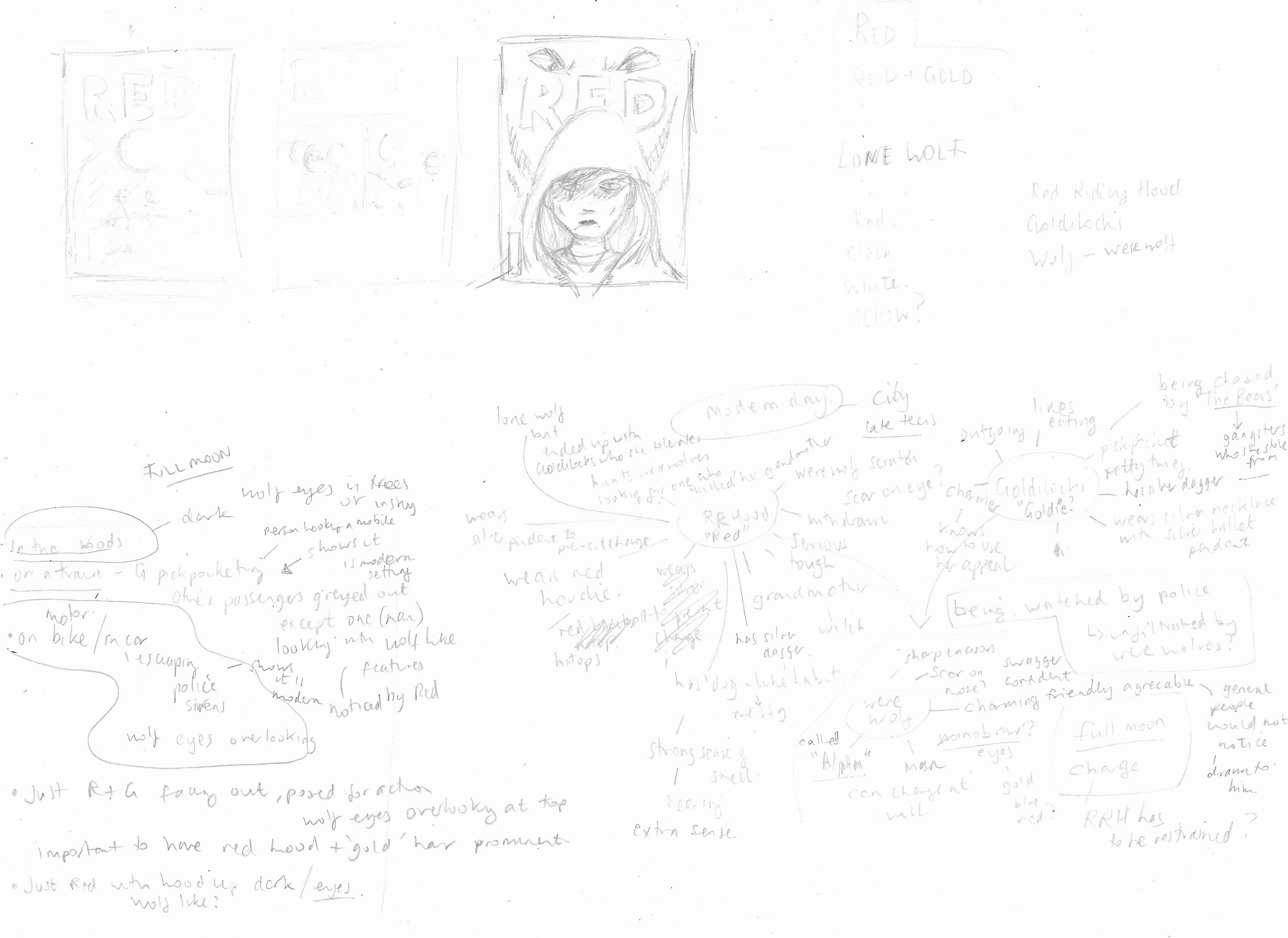
I decided that for the purpose of this exercise I just needed to have a clear outline of the gist of the story.
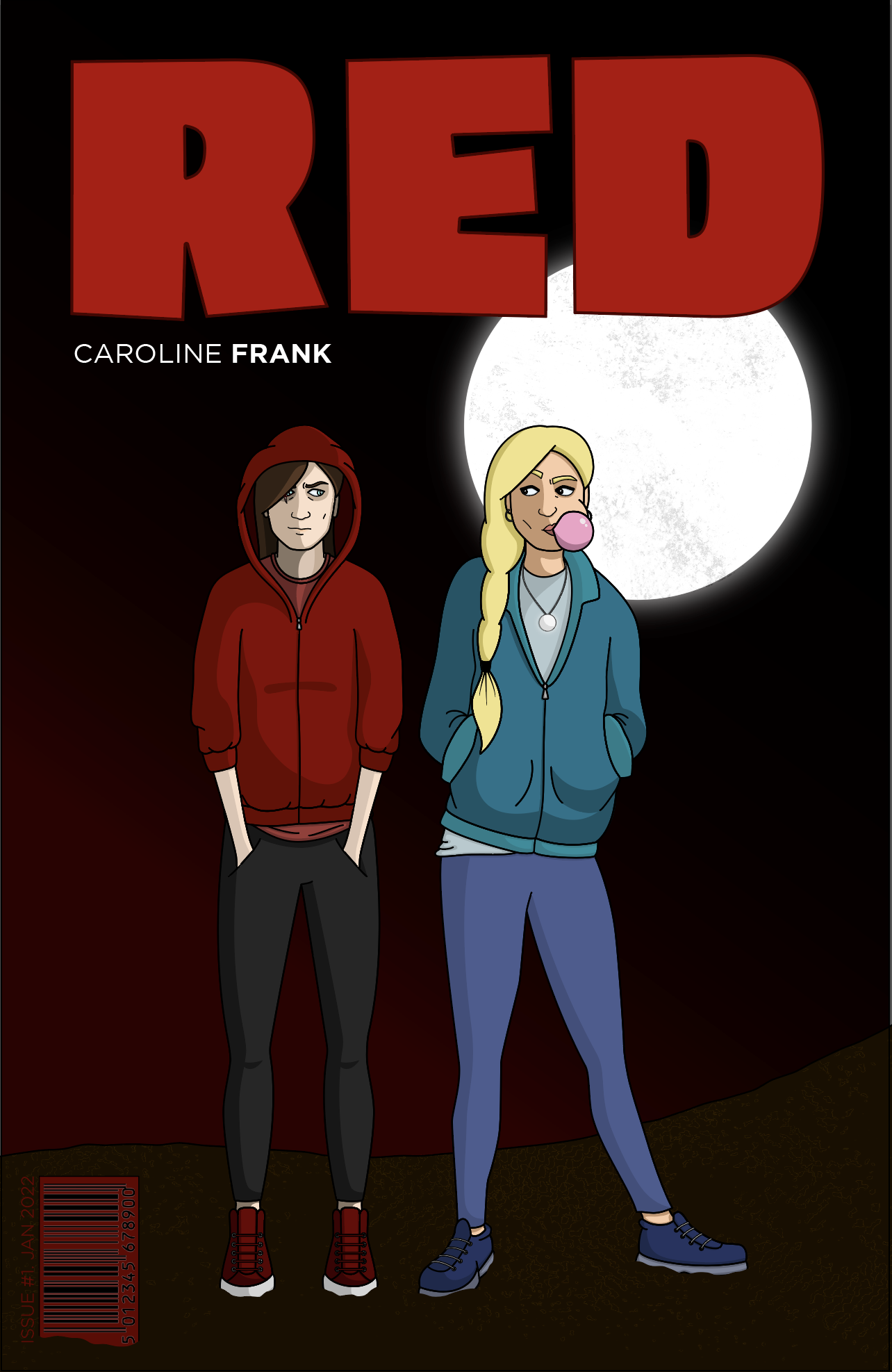
Red and Goldie are two young women in an uneasy partnership. The former is a quiet yet strong loner seeking to avenge the murder of her grandmother, but was afflicted during the traumatic event in more ways than one… The latter is a cocky, petty thief who is trying to evade The Bears, a criminal organisation that she unwittingly stole from…
I was undecided as to whether The Wolf and The Bears would be humans or animal-like in appearance, and whether Red would be a werewolf, due to the scar on her eye (inflicted by the wolf) which was part of my initial idea. I was quite inspired the notion of the heroes having flaws as used in Watchmen. What I was most certain about was the personality and appearance of the two main characters I wanted to try to portray, which I realised was ultimately more beneficial in this instance. I wanted Red to be a more withdrawn, awkward, less-easy to read character. Whilst Goldie had to have, at first glance, attitude and confidence.
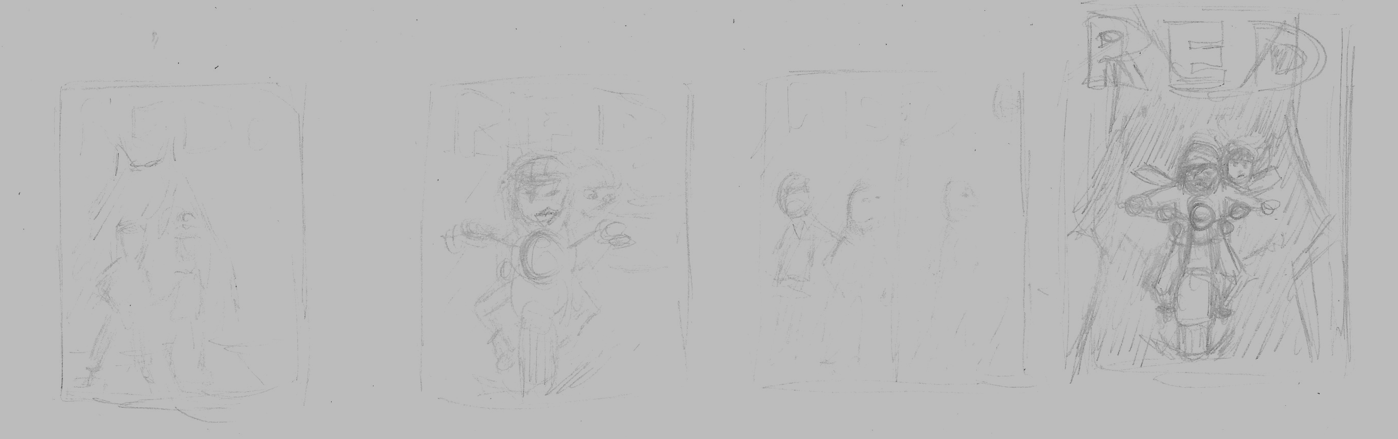
Initially I came up with some quite ambitious concepts for the cover design including trains, motorbikes, police chases… but I soon realised there were several limiting factors with these – most obviously lack of ability and time! I could clearly picture some of these in my mind, but I knew I would not be able to recreate them to a high enough standard to meet my expectations.
Creating the Characters
I was starting to feel like I was a bit lost and overwhelmed, so I just started drawing the two characters.
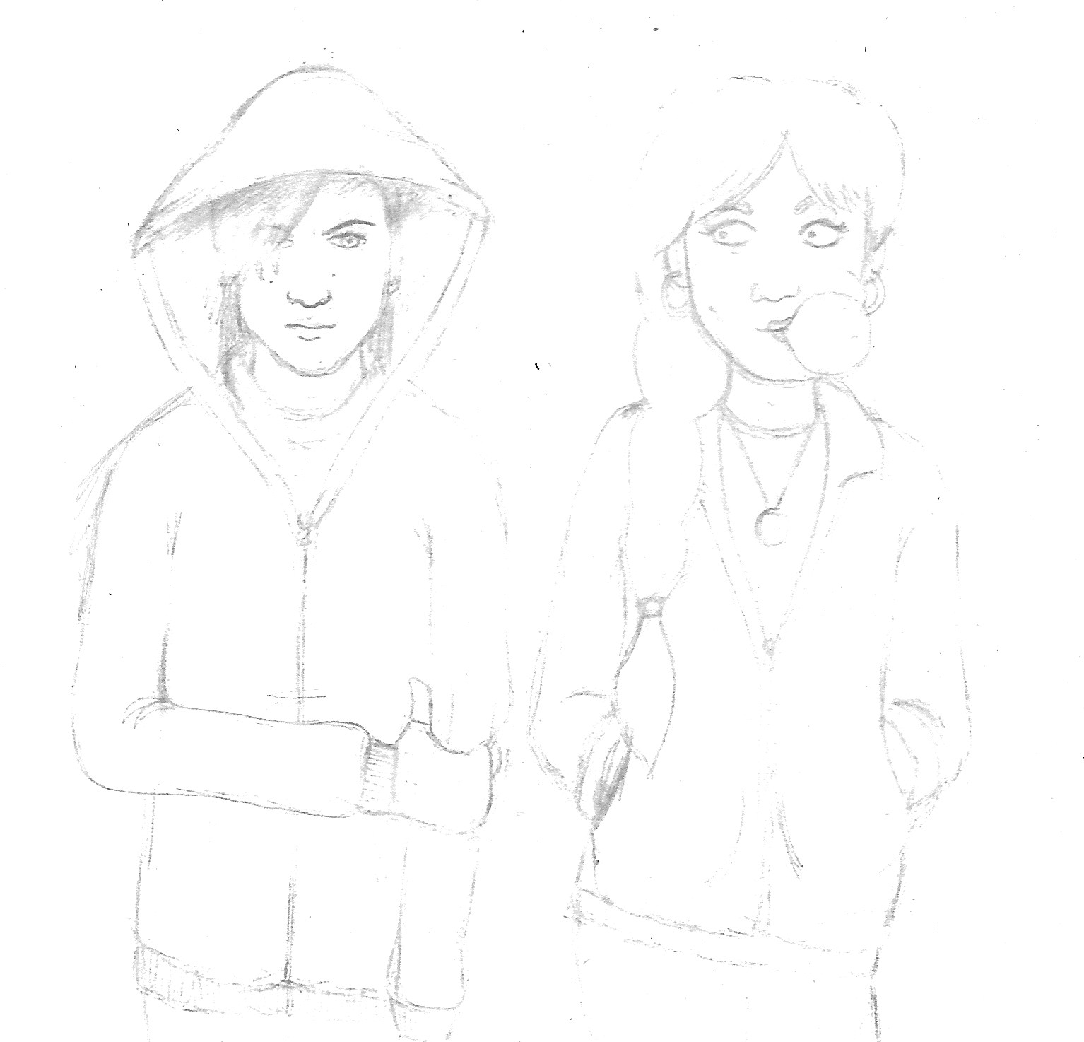
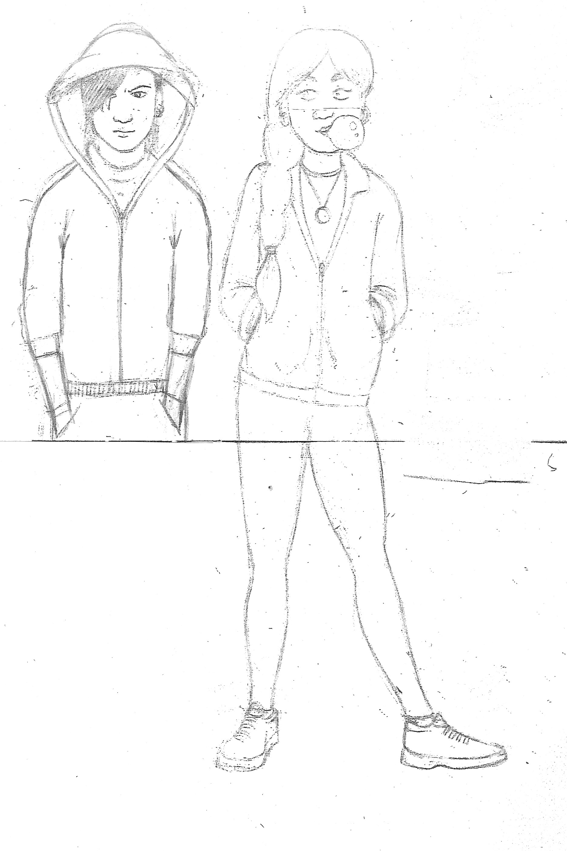
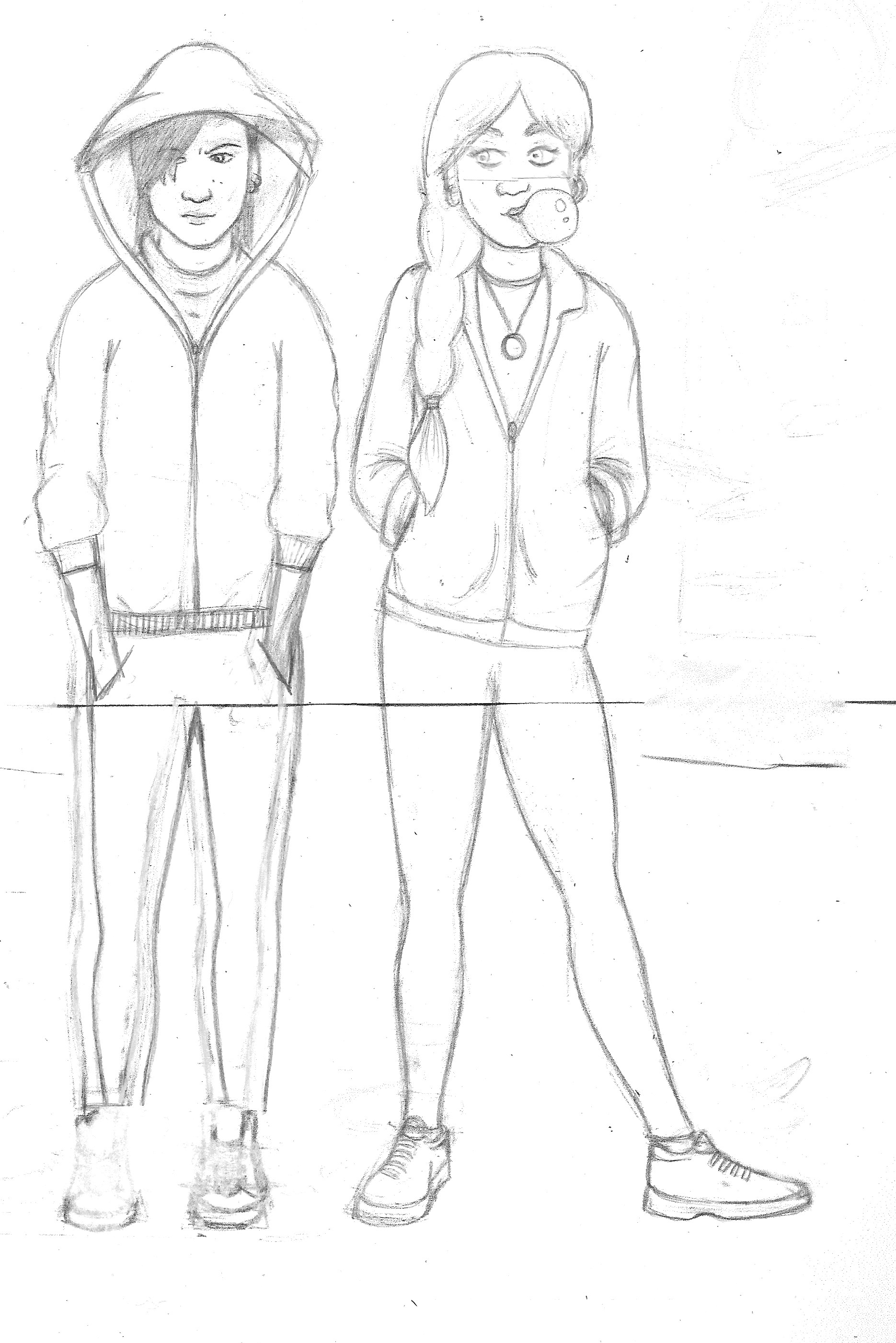
Getting this down on paper was really encouraging, but unfortunately I had run out of paper at the bottom, which set me off on a journey of combining the use of my copier and light-box. After copying the above on an A4 sheet of paper I was able to add the lower limbs. Using a light-box, I continuously flipped the paper over to check the balance and placement of the lines, so I could make adjustments by redrawing lines or cutting out and pasting various features, which I could then photocopy and repeat the process (examples of this process can be seen below). I found it quite a satisfying and eye-opening way of working.
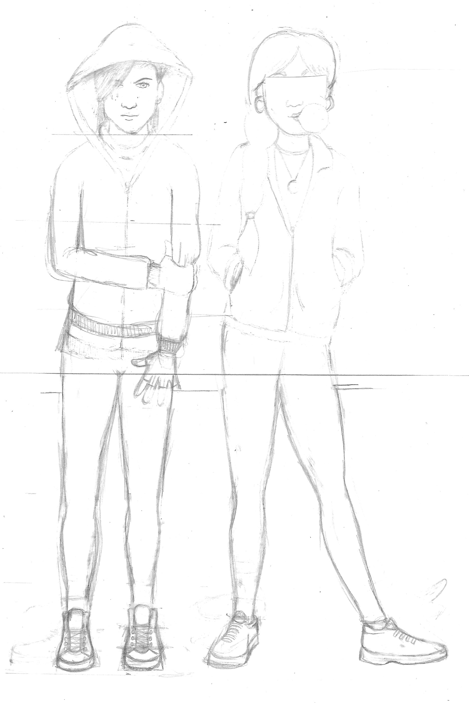
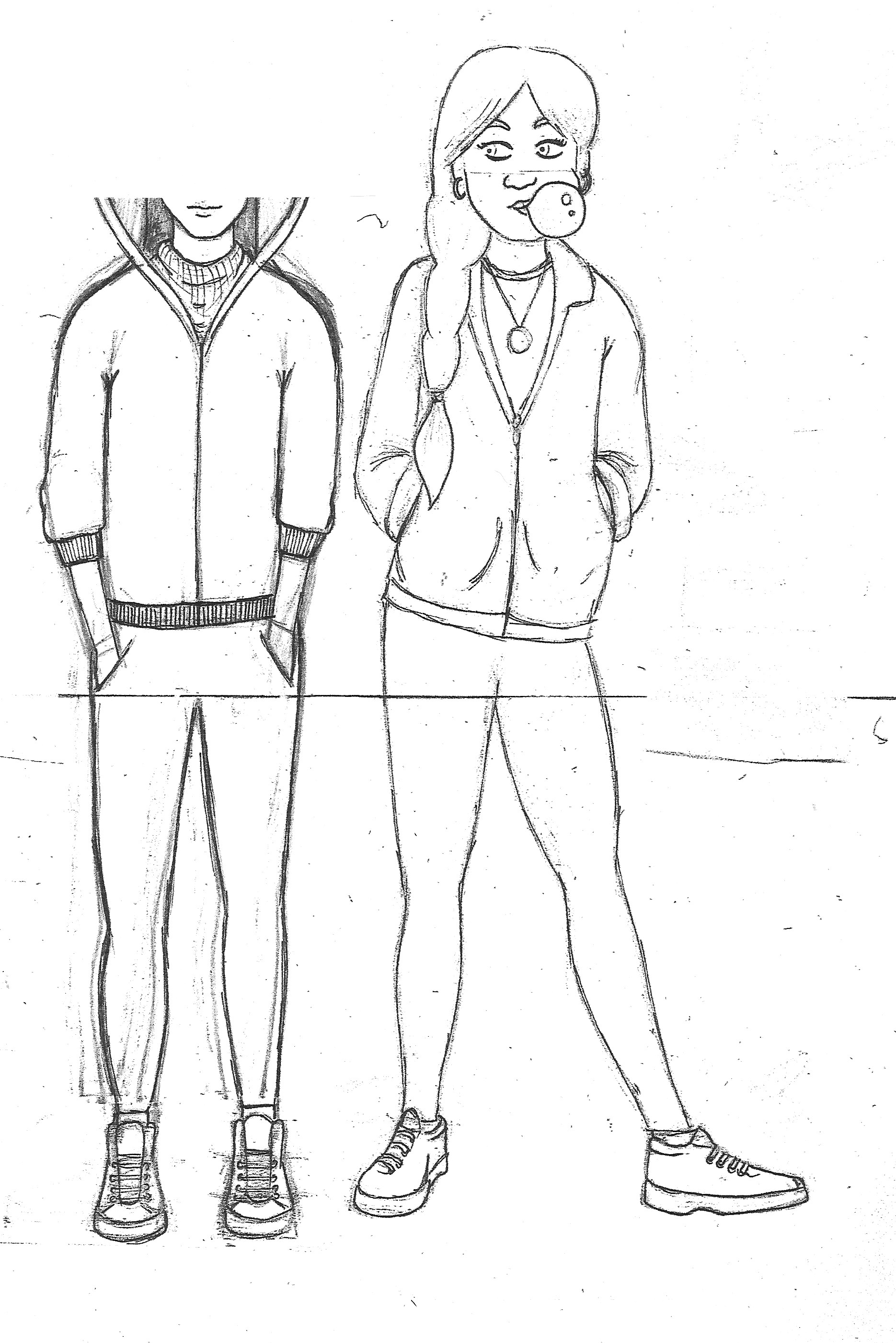
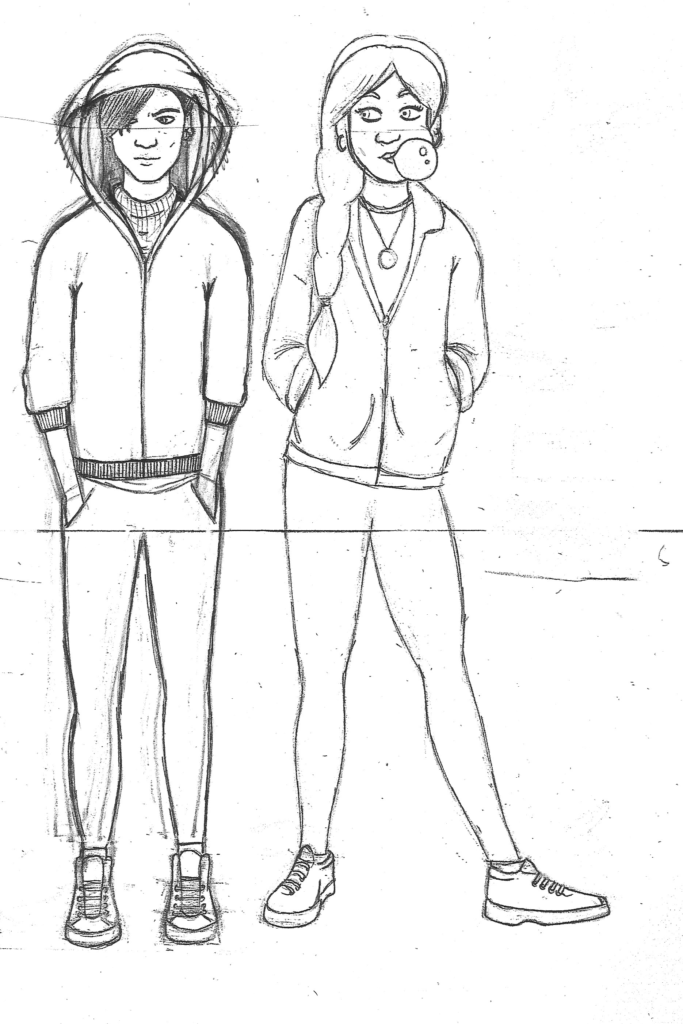
I reached a point where I was reasonably happy with the draft drawing, as below, although I would later discover many more amendments were required. At this point I was quite pleased that I had created reasonable examples of the characters I had devised in my mind. I preferred the design of Goldie (on the right) as I felt she looked more natural in her pose. I was impressed I had managed to add bit of a hip raise in her pose, which added to the attitude I wanted her to have.

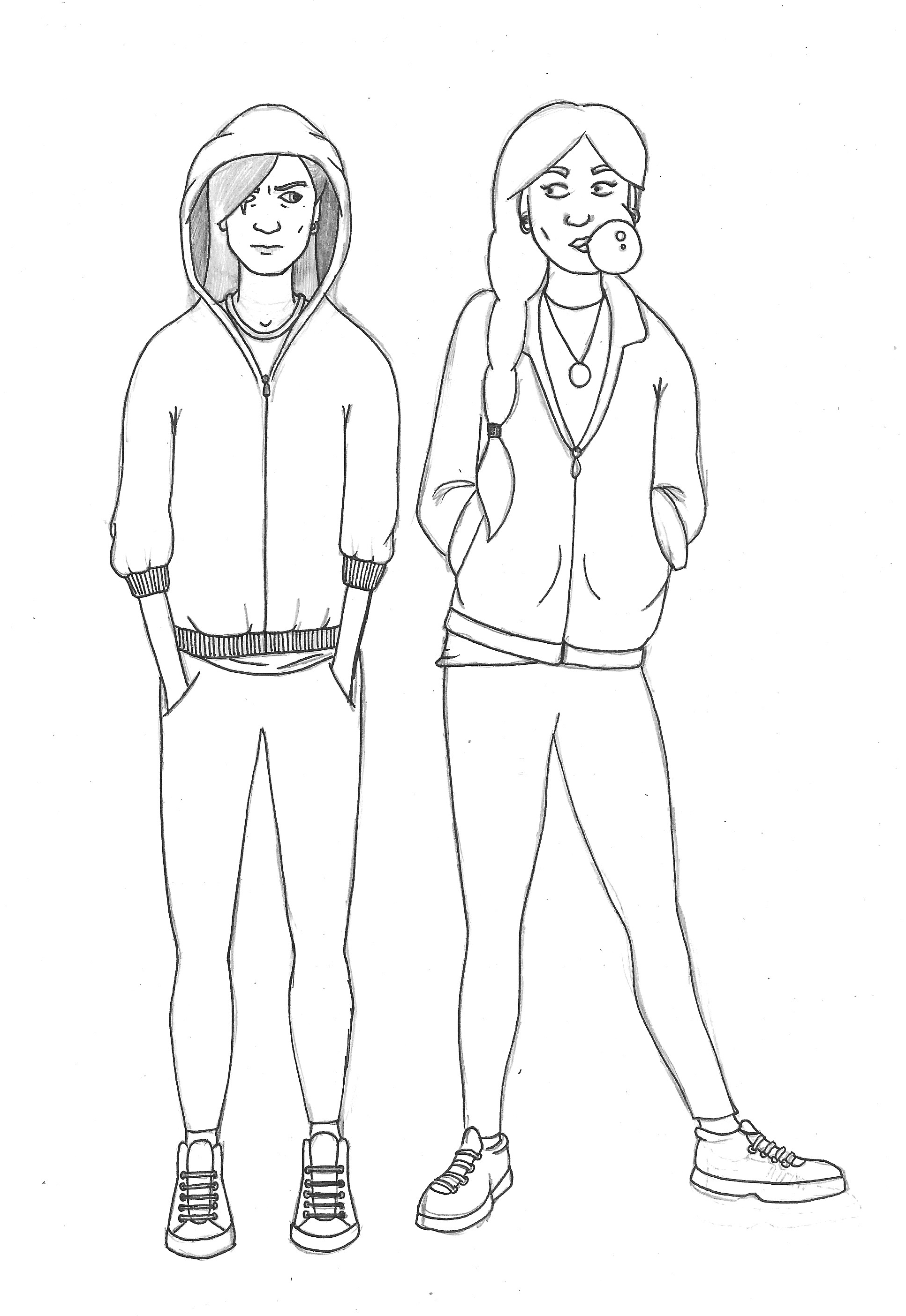
I then proceeded to use a fineliner, to make a draft ink version.
Next Stage….
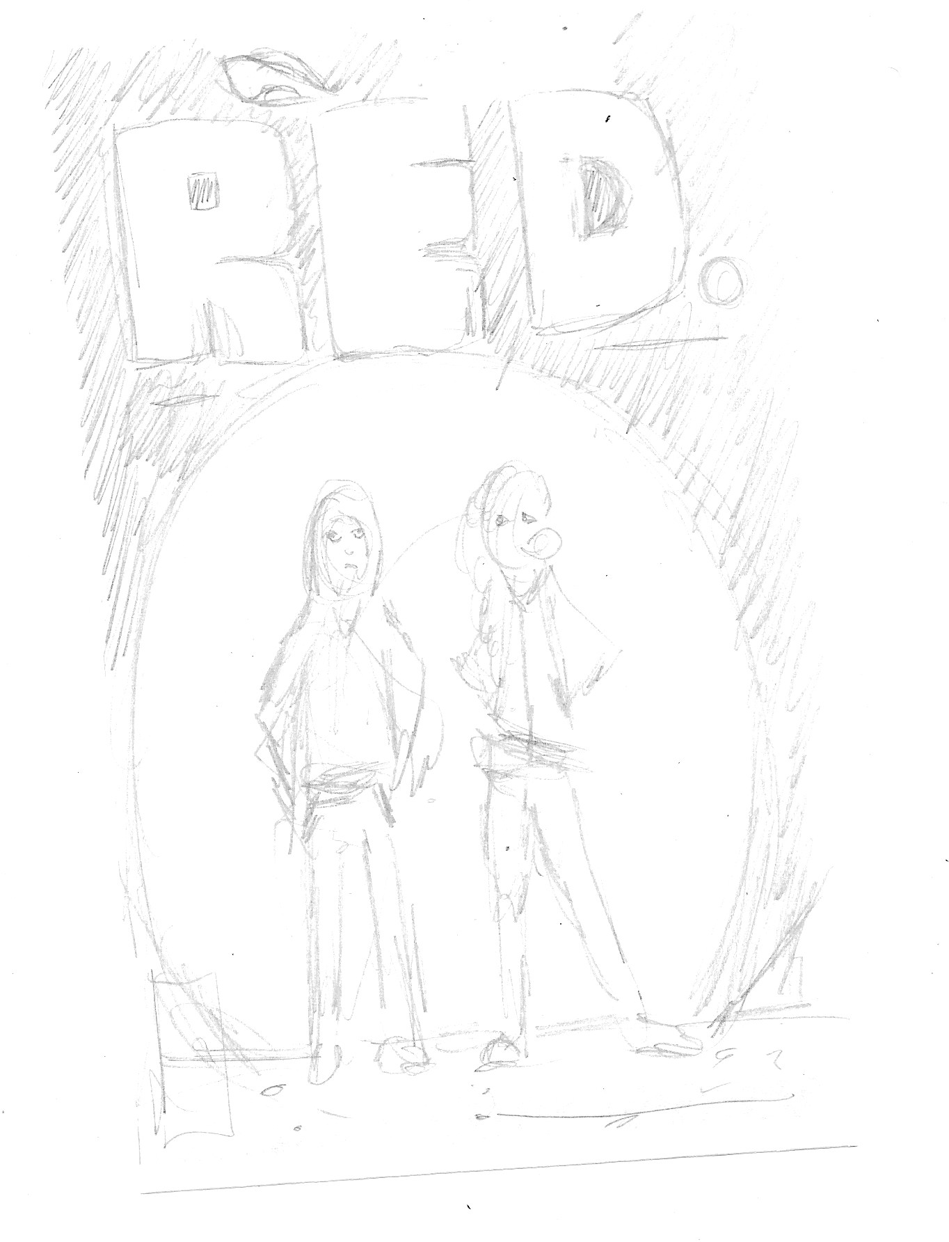
Once I reached this point I, once again, felt lost as to how to proceed. I was unsure about how to add colour and, most importantly, how to integrate the characters into an overall cover design. I spent quite a bit of time deliberating what to do, which made me even more anxious about meeting the deadline! I needed to be decisive, so I drew out a very rough thumbnail sketch of a potential cover idea, which would depict the characters standing in front of a full moon. I decided I wanted to (and needed to) keep it simple and uncluttered.
Next I needed to address my next move so I chose to go digital and use Illustrator.
Working in Illustrator
I felt I had reached a stage in my progress through this unit to try combining both analogue and digital methods (in addition to being much less confident with colour in the former) in order to create a design that would meet my satisfaction.
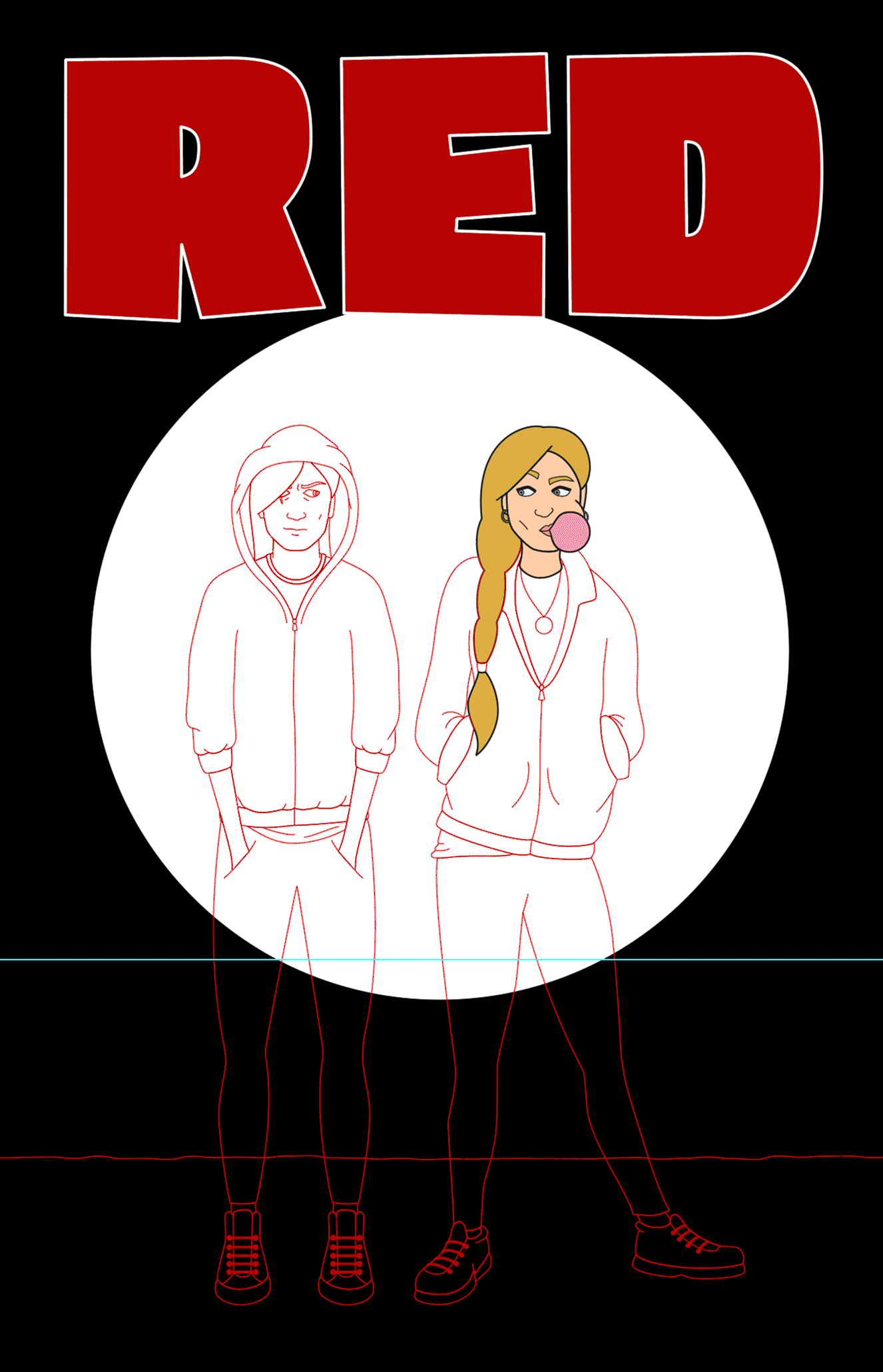
I scanned the draft into Illustrator and began to build up the outlines, making several amendments as I noticed quite a few proportional and positioning oddities. The process can be seen below.

Once I was quite happy with the outlines, I proceeded to experiment with adding colour and shadows, as can be viewed below.
Final Cover Design
I became really engrossed in working on the image and had to force myself at a certain point to stop and add the final elements to make it resemble a comic book cover. I wanted to avoid these being too distracting from the main image, so I restricted the elements to my name, the ISBN and issue/date details – the latter two I tried to incorporate into the design.
Overall, I was pleased with the final design, which is not a common occurrence! There were certainly improvements I would to have added such as texture and more details to the clothes, such as crease in the trouser around the knee areas. However, I definitely felt that the result was one of my best so far and I could certainly identify progress in the standard of work from the beginning of this unit. I believe this is mainly due to consistently drawing and reworking, which I could then transfer onto the screen and build upon.
Final Thoughts
I found this assignment to be one of my favourite so far. Although at first I was quite unsure of what to do and looking at the standard of the examples was slightly intimidating, once I made a decision about the route I wanted to take, I was fully absorbed. It was satisfying to successfully visualise a fleeting idea that I had devised a couple of months previously. Many challenges arose, as detailed above, which required me to take decisive and fairly swift action due to the aforementioned looming deadline.
I was pleased with the synthesis of analogue and digital in the process. Making sure I had a fairly satisfactory drawing to work from, which had been reworked many times, meant I could improve on this digitally, rather than staring at a blank screen and creating much stiffer looking characters. It also allowed me to become more familiar with the lines of the characters. As previously stated, I believe my drawing skills are steadily improving and I will continue to practice as it is reaping many benefits.
In terms of the characters, I felt Goldie was more successful overall than Red. The latter ended up being too symmetrical, particularly in the legs, but I was happy about the knee shadows I added in the finals stages. I also felt the final proportions of the two was good and the stances did reflect the personalities I had initially wanted to try and portray.
As a cover design, I was fairly pleased with the outcome. I had kept it simple and the characters stand out against the background. I limited the colours, apart from the characters, to red, black and white, which created quite strong contrasts and would therefore be eye-catching. I hope it reads well as an image as a result. I tried to keep the colours of the characters quite subdued and so that everything blended in well together, rather than clashing, which I felt I did manage to achieve.
I really did enjoy this assignment and just wish I had more time to continue working on it.
References
Burton, B. (2018). Marie Severin, the legendary Marvel artist who never got her due. [online] CNET. Available at: https://www.cnet.com/news/legendary-marvel-comics-artist-marie-severin-dies-at-89/ [Accessed 4 January 2022].
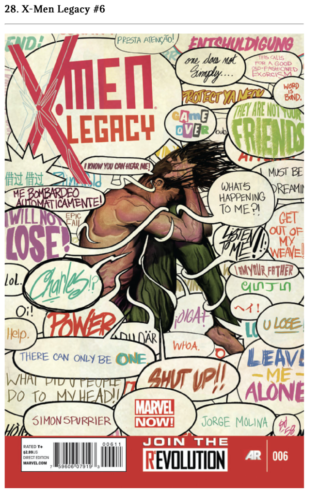
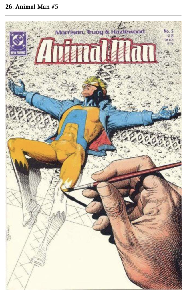
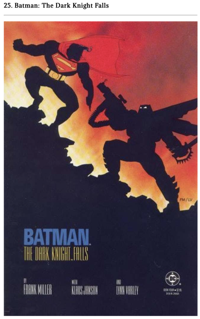
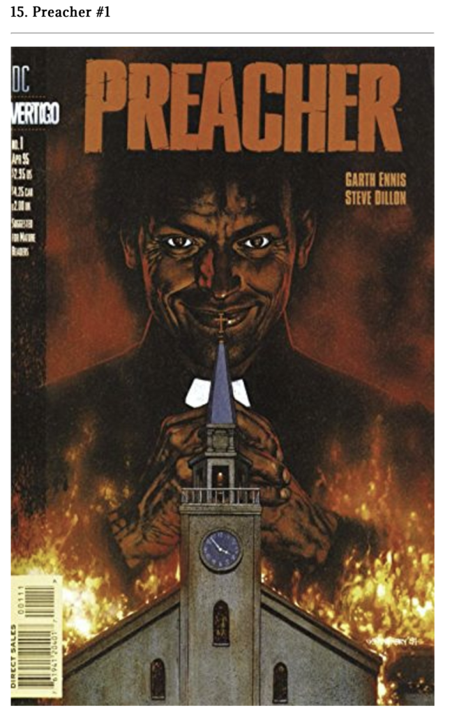
Comic Basics, (n.d.). The Top 100 Most Industry Changing Comic Book Covers of All Time. [online] Available at: https://www.comicbasics.com/100-comic-book-covers/ [Accessed 4 January 2022].
Cover Browser, (n.d.). Cover Browser. [online] Available at: https://www.coverbrowser.com [Accessed 4 January 2022].
Gonzalez, E. (2019). 26 Of The Best Comic Book Covers of All Time. [online] Book Riot. Available at: https://bookriot.com/best-comic-book-covers/ [Accessed 4 January 2022].
Kantor, J. H. (2019). 25 Gorgeous Comic Book Covers You Must See Before You Die. [online] What Culture. Available at: https://whatculture.com/comics/25-gorgeous-comic-book-covers-you-must-see-before-you-die [Accessed 4 January 2022].
Mansfield, A. (2019). What Makes A Good Comic Book Cover. [online] Book Riot. Available at: https://bookriot.com/what-makes-a-good-comic-book-cover/ [Accessed 4 January 2022].
MissChatz, (2020). How to Make a Comic Book Cover. [online] envatotuts+. Available a: https://design.tutsplus.com/tutorials/guide-to-making-a-good-comic-book-cover–cms-32567 [Accessed 4 January 2022].