Exercise: Abstract Cities
BRIEF
Create a series of 10 abstract designs in which you balance blocks of subordinate, dominant and accent colours. These designs are going to be used in covers for guidebooks to the following cities:
MADRID
MALMO
MANAGUA
MANCHESTER
MANHATTAN
MARRAKECH
MARSEILLE
MELBOURNE
MONTREAL
MUMBAI
The books are going to be A5 landscape size. You can use as many colours as you like and need to include the name of the city. You may want to find more about each city to help you develop your colour palette and also the size, shape and positioning of the colour blocks.
KEYWORDS
Abstract, balance, subordinate, dominant, accent, colours, guidebooks, A5, landscape, name of city.
RESEARCH
To begin this exercise I decided to explore what is meant by the term ‘abstract art’. The Tate website defines it as:
art that does not attempt to represent an accurate depiction of a visual reality but instead use shapes, colours, forms and gestural marks to achieve its effect
The definition goes further, stating that abstract art can use simplified shapes to represent an object, landscape or figure, which I thought would be applicable to this particular exercise.
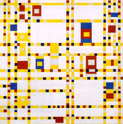
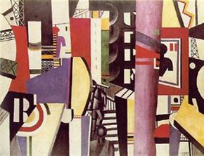
I then tried to find artists whose style of work I could use to inspire to my designs. Two artworks I liked were Broadway Boogie Woogie by Piet Mondrian (1942-43) and The City by Fernand Leger (1919). The former depicts New York City as a modern and orderly place – it reminded me of a subway map – in which the smaller squares could represent pedestrians of taxis moving along the streets. Mondrian limited his palette to just the primary colours, along with black and white, as he believed he could create a harmonious balance that way. Leger’s work is from the Cubist period and he concentrated on overlapping shapes and colour to recreate the hustle and bustle of a modern city.
I then decided to find out more information about each of the cities. For this I mainly used Wikipedia for ease of use (I realise this is not always the best choice for research, but it was useful for this exercise). However, I found it more beneficial to look at images of the cities rather than reading vast amounts of text. I initially set up some Pinterest boards for each of the cities:
Madrid
Malmo
Managua
Manchester
Manhattan
Marrakech
Marseille
Melbourne
Montreal
Mumbai
I needed to pare down my selection as I found having such a wide choice too difficult to work with. Instead, I used Google Images/Wikipedia to choose pictures (ones that are freely available) that I felt suitably represented the cities from the information gathered. These selections can be seen below.
Madrid
Malmo
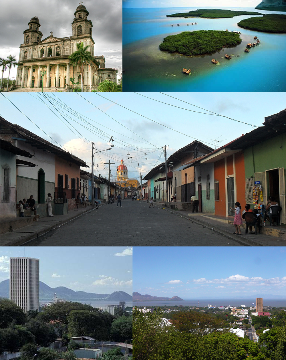
Managua
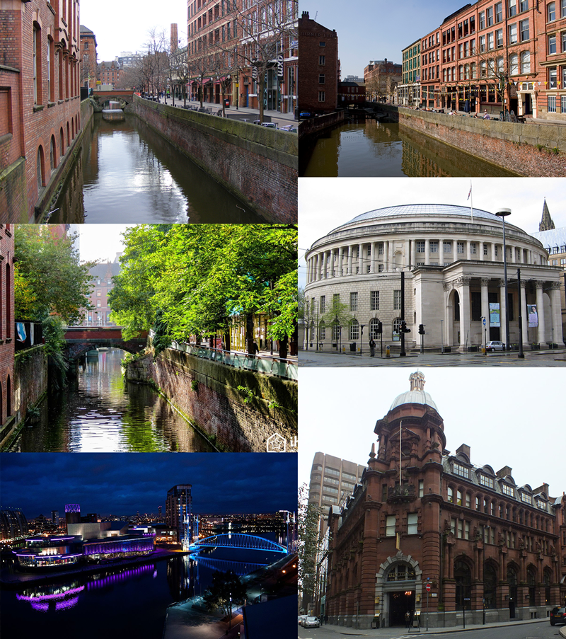
Manchester
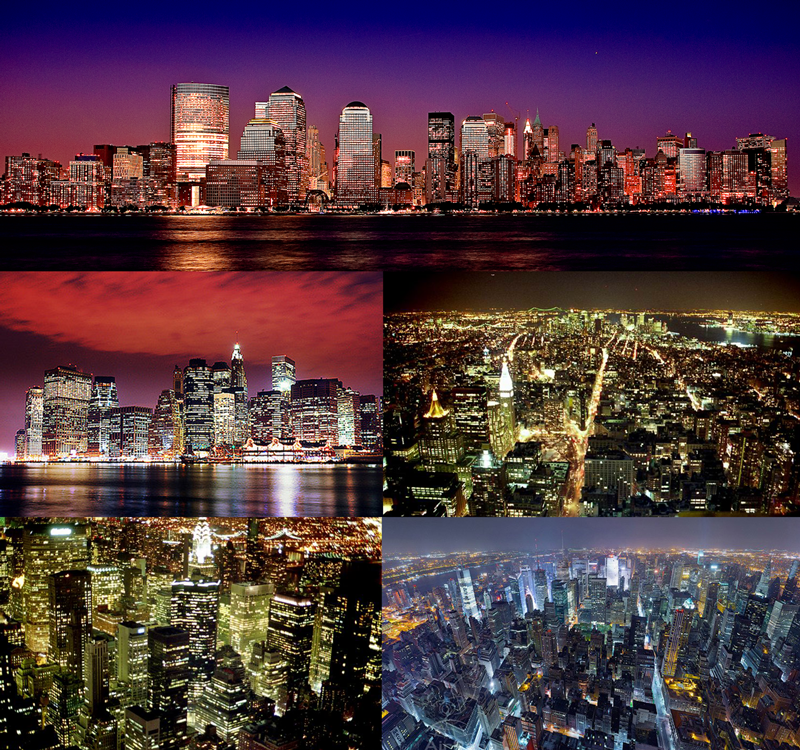
Manhattan
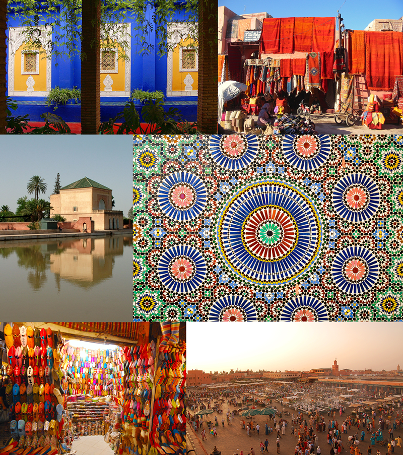
Marrakech
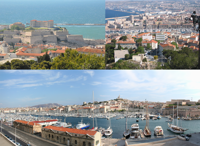
Marseille
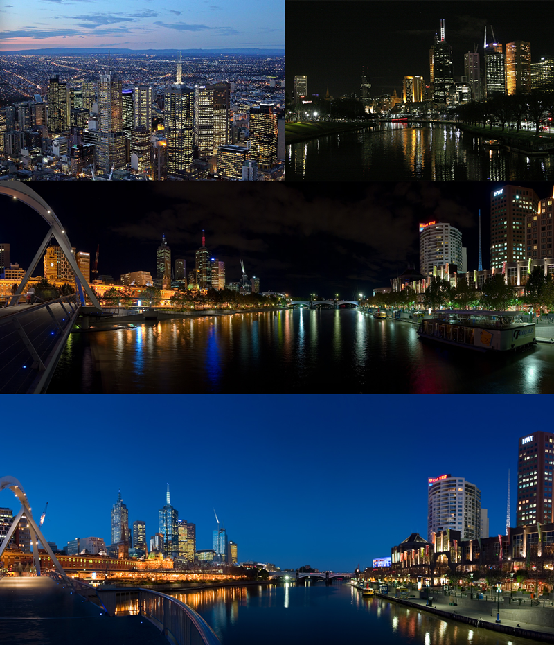
Melbourne
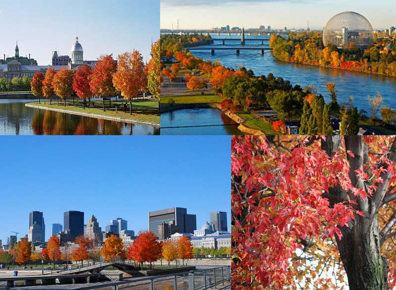
Montreal
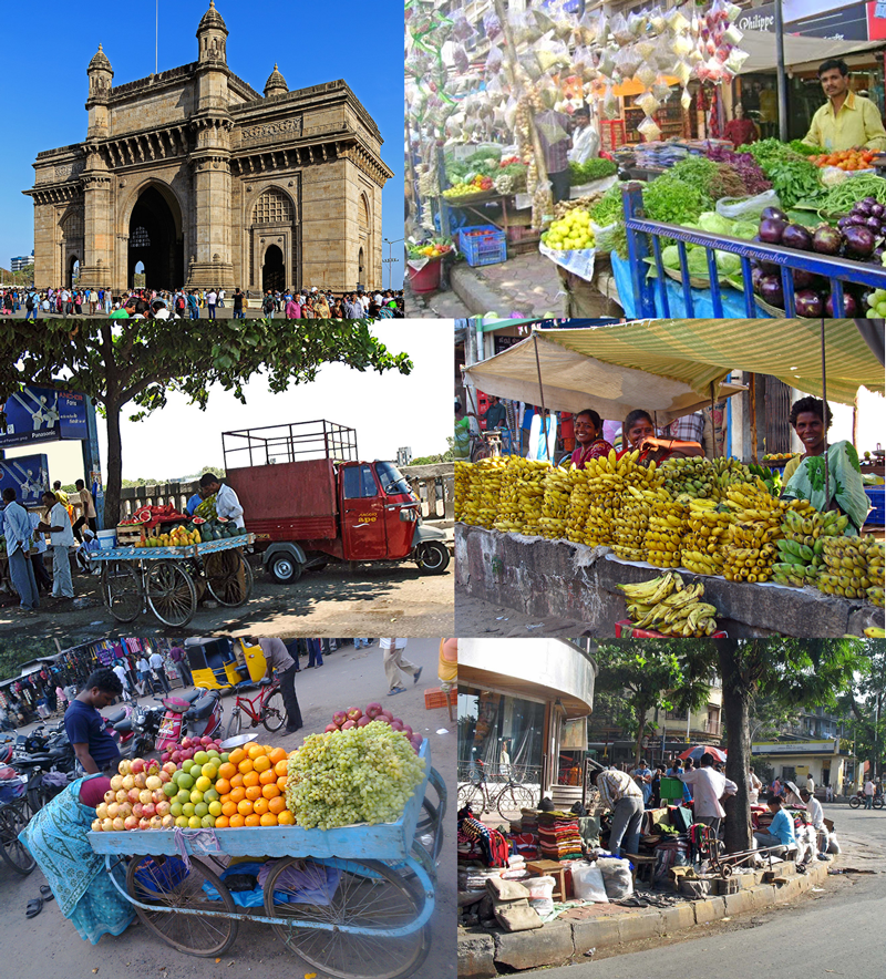
Mumbai
DESIGNING THE BOOK COVERS
As suggested in the brief, I tried using Illustrator, Photoshop and InDesign to create the designs. I found Illustrator the most relevant for this exercise as I was creating vector images.
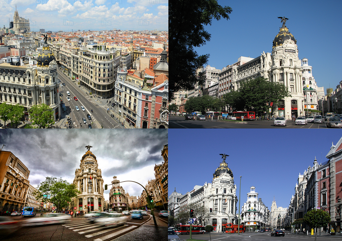
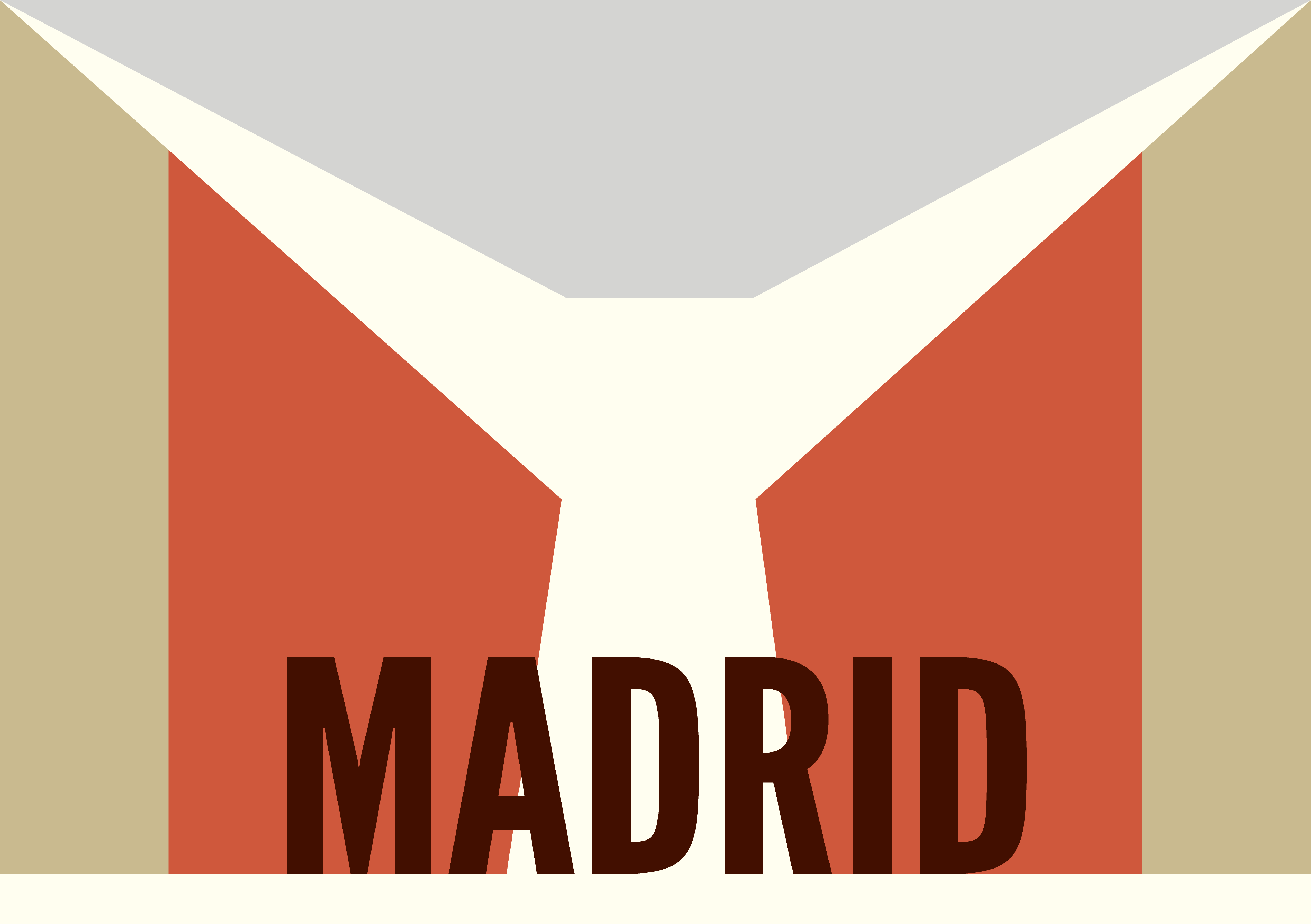
MADRID
I initially tried to focus on a more abstract design (top), but although I liked the colours, I did not feel it represented the essence of Madrid at all. So I chose instead to focus on Gran Via (as in the photograph above). I wanted to vaguely recreate the angles of the street, the result of which could also be interpreted as bull horns (referring to the bull fighting history of the city). The colour of the text has high contrast with the neutral background (the colour of the buildings), as I wanted it to be bold and stand out – I felt the city had a strong sense of pride. The use of the solid font League Gothic reinforces this.
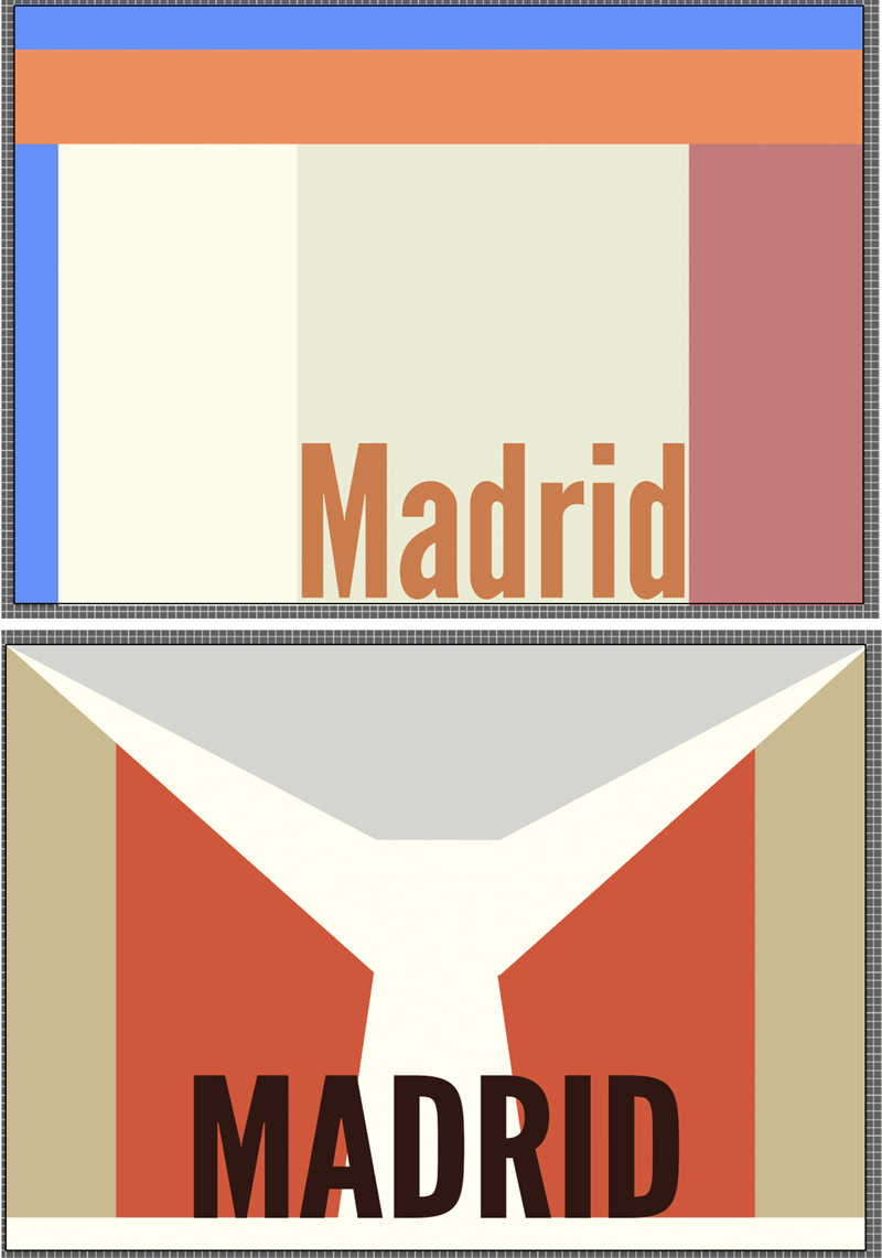
The final design is below:
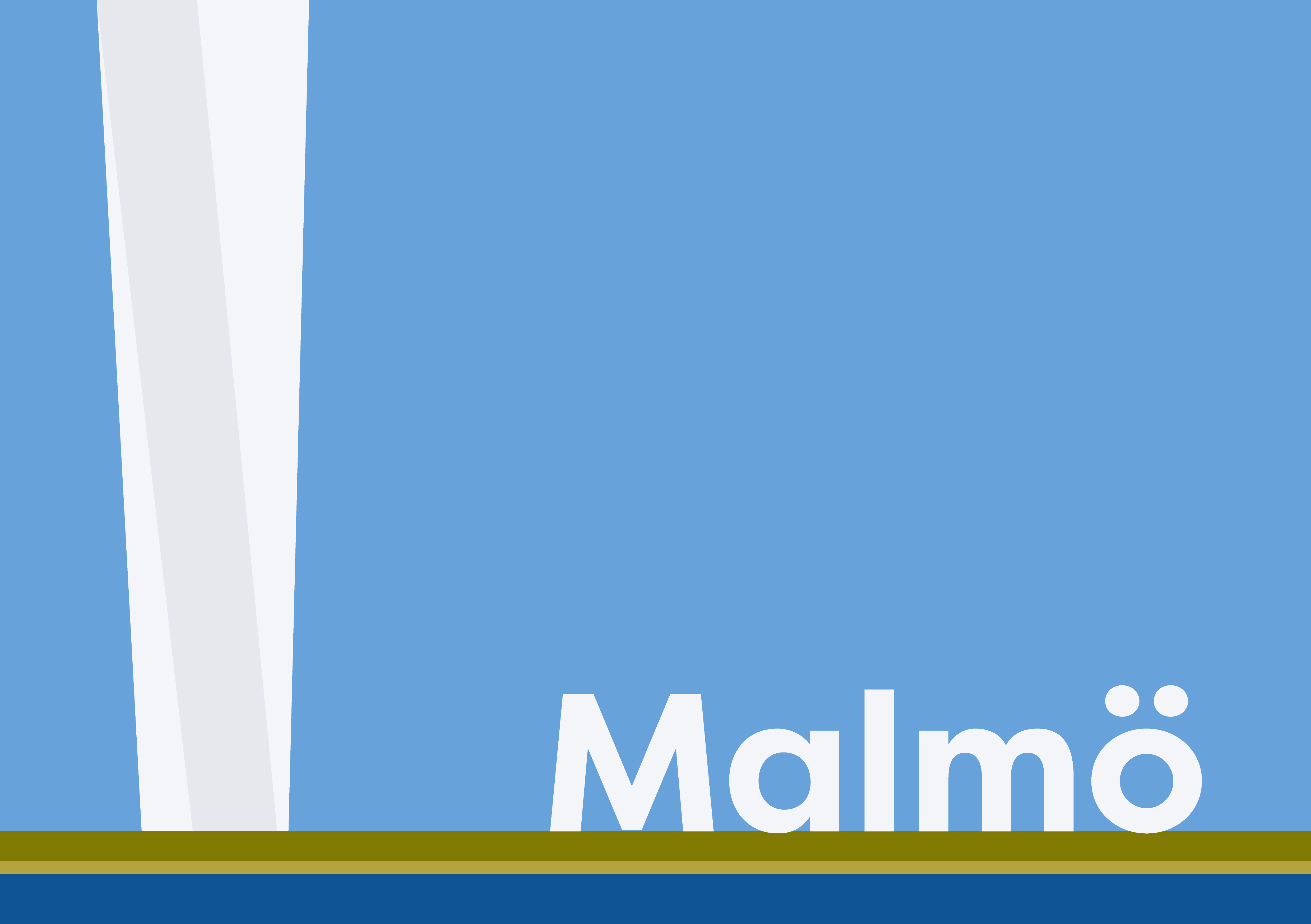
MALMO
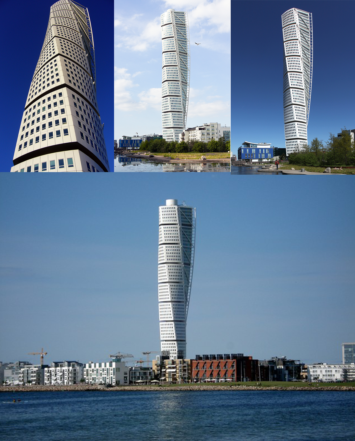
From my visual research it was apparent that The Turning Torso is the modern landmark of Malmo, so I wanted to include a reference to this in the design. The flatness of the land and the vast expanse of sky also stood out to me about this city. So the colour palette was mostly blue with the lines of green running through it. I tried different fonts before deciding on Filson Pro Bold.
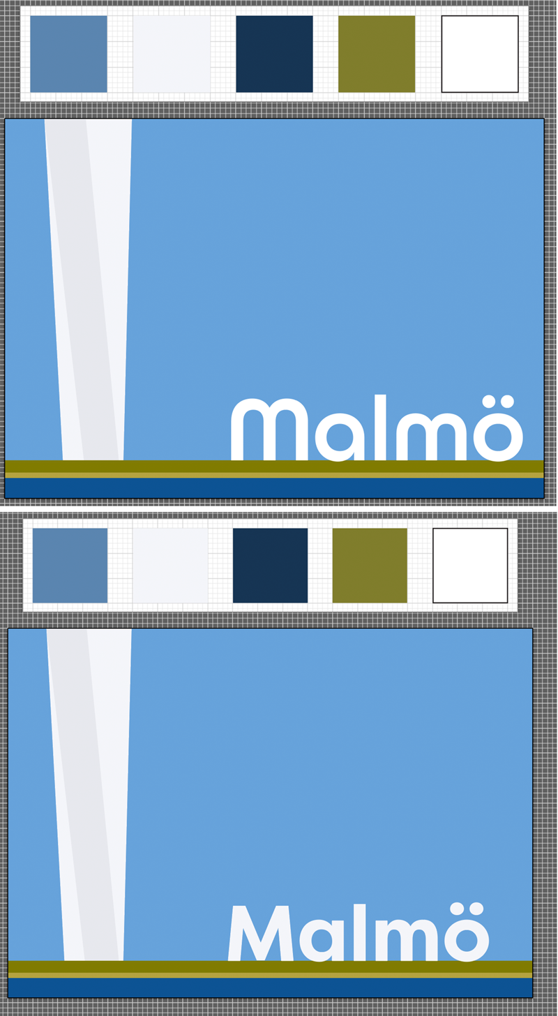
The final design is below:
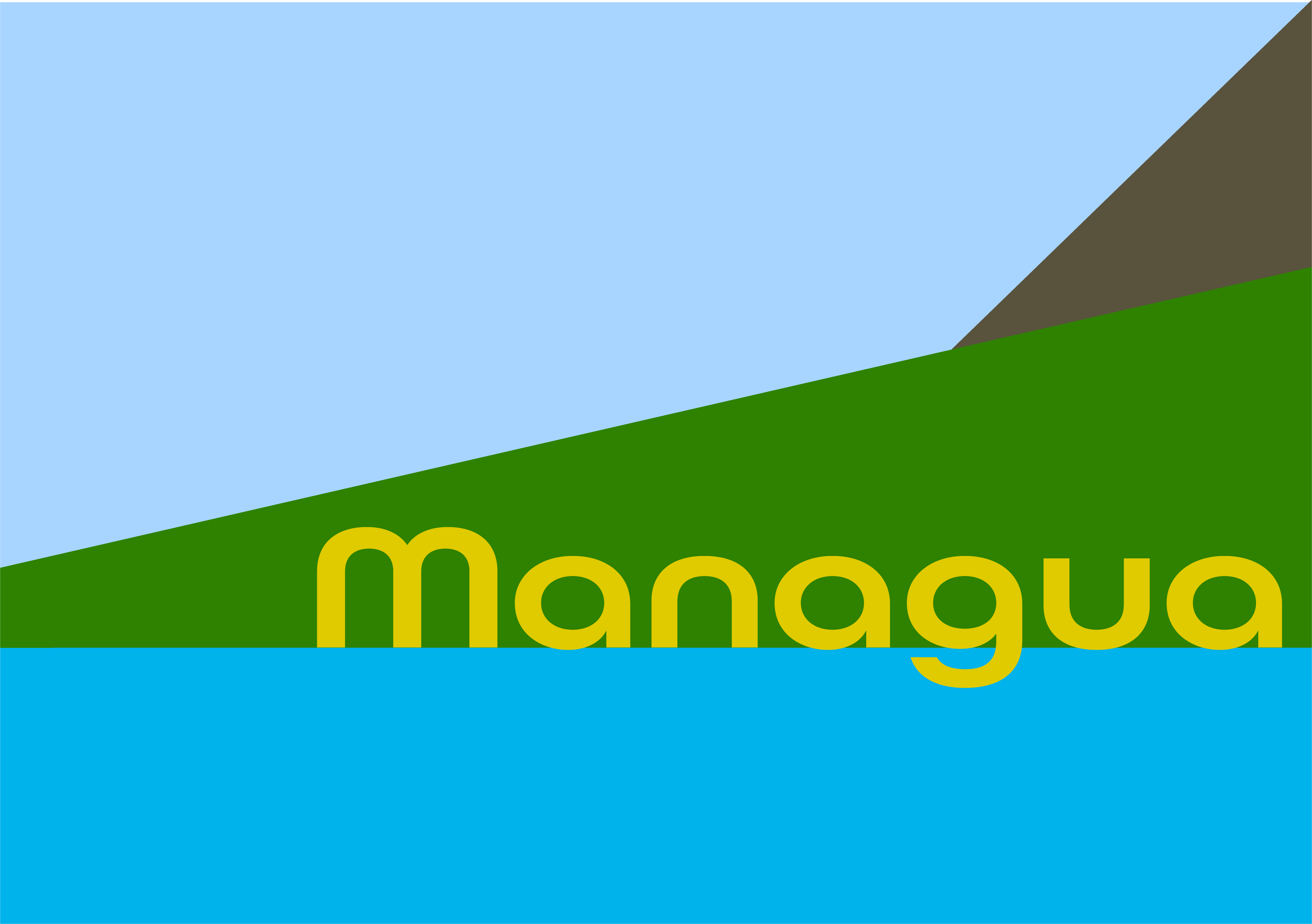
MANAGUA
To begin with, it was quite difficult to find quality photographs of Managua to work from for this city and I then found myself getting far too representational by drawing the individual islands as in the photo above. After reminding myself it should be more abstract and focus on colours, I used basic shapes to indicate the land, sea and sky.
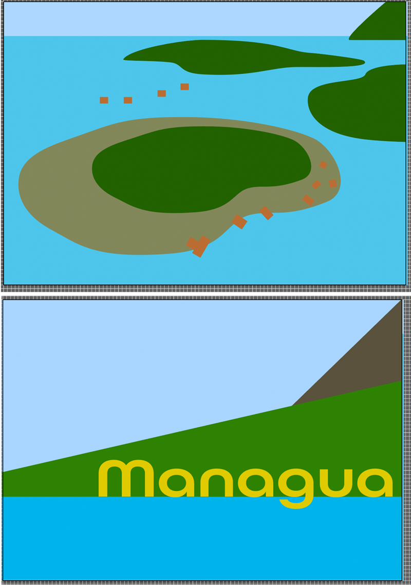
The final design is below:
MANCHESTER
I wanted the Manchester design to have an urban/industrial feel to it, so the hues were quite neutral, but I kept the saturation levels fairly high so it did not appear dull.

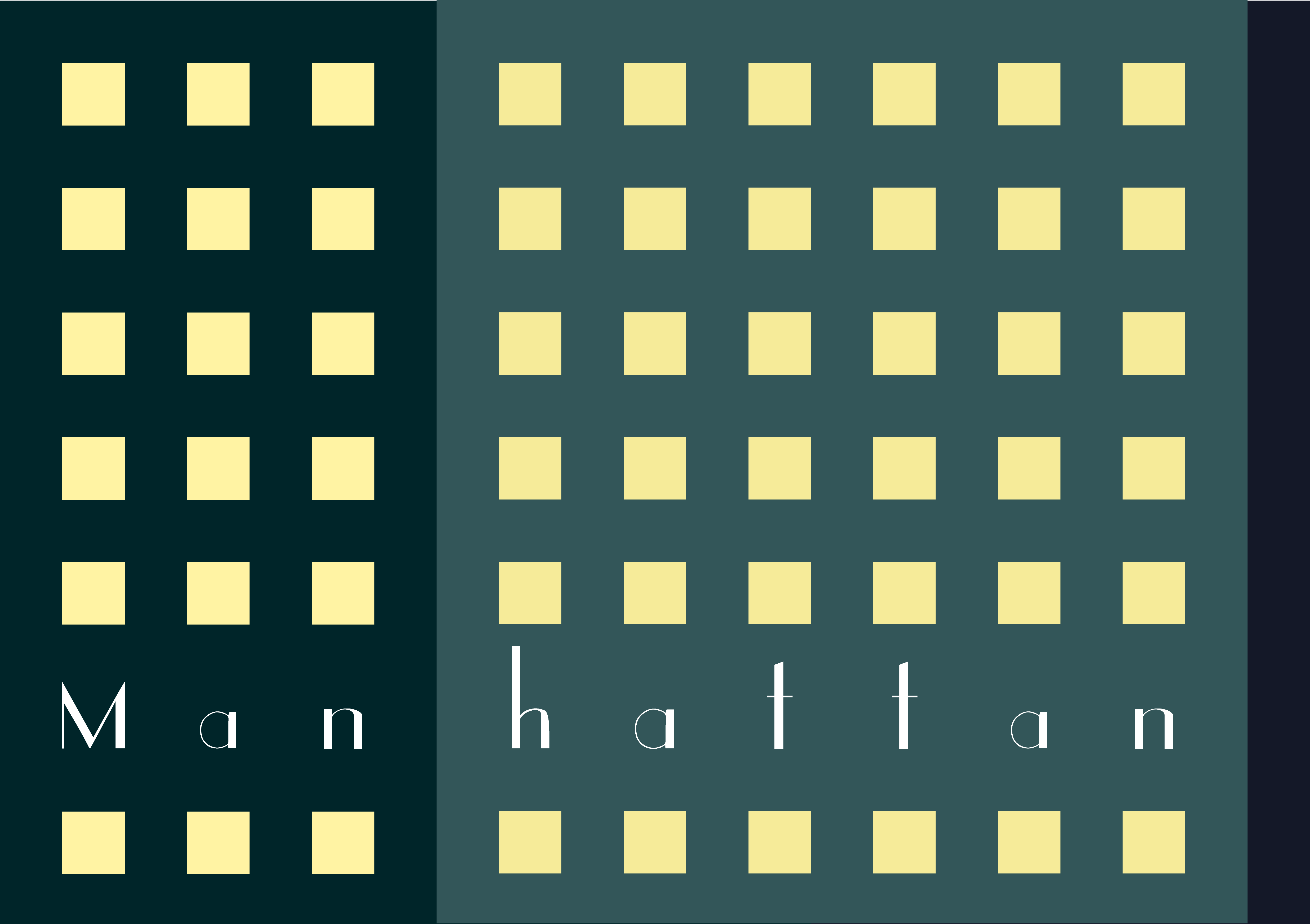
MANHATTAN
For the Manhattan design I attempted to convey the idea of it being ‘the city that never sleeps’ by contrasting squares of bright yellow against grey/blue to represent skyscrapers at night. I originally created a more abstract version (top left), but then decided to go with the literal version as I thought this better represented my idea. I was going to place the text inside the ‘windows’ , but the it did not seem legible enough so I chose to replace that row of squares with the text instead, which I think worked better.
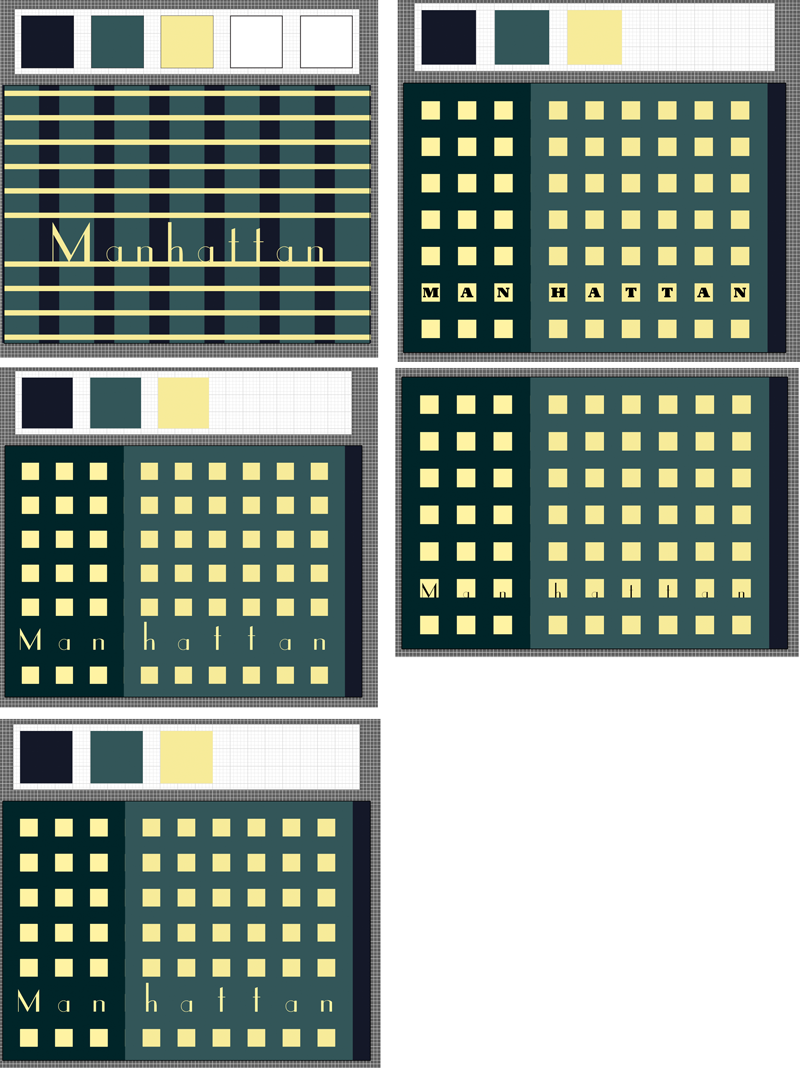
I had read that a good way to check the contrast in an image is to make it grayscale, which I found really useful in this design and as a result I could make the contrast much stronger.

The final design is below:
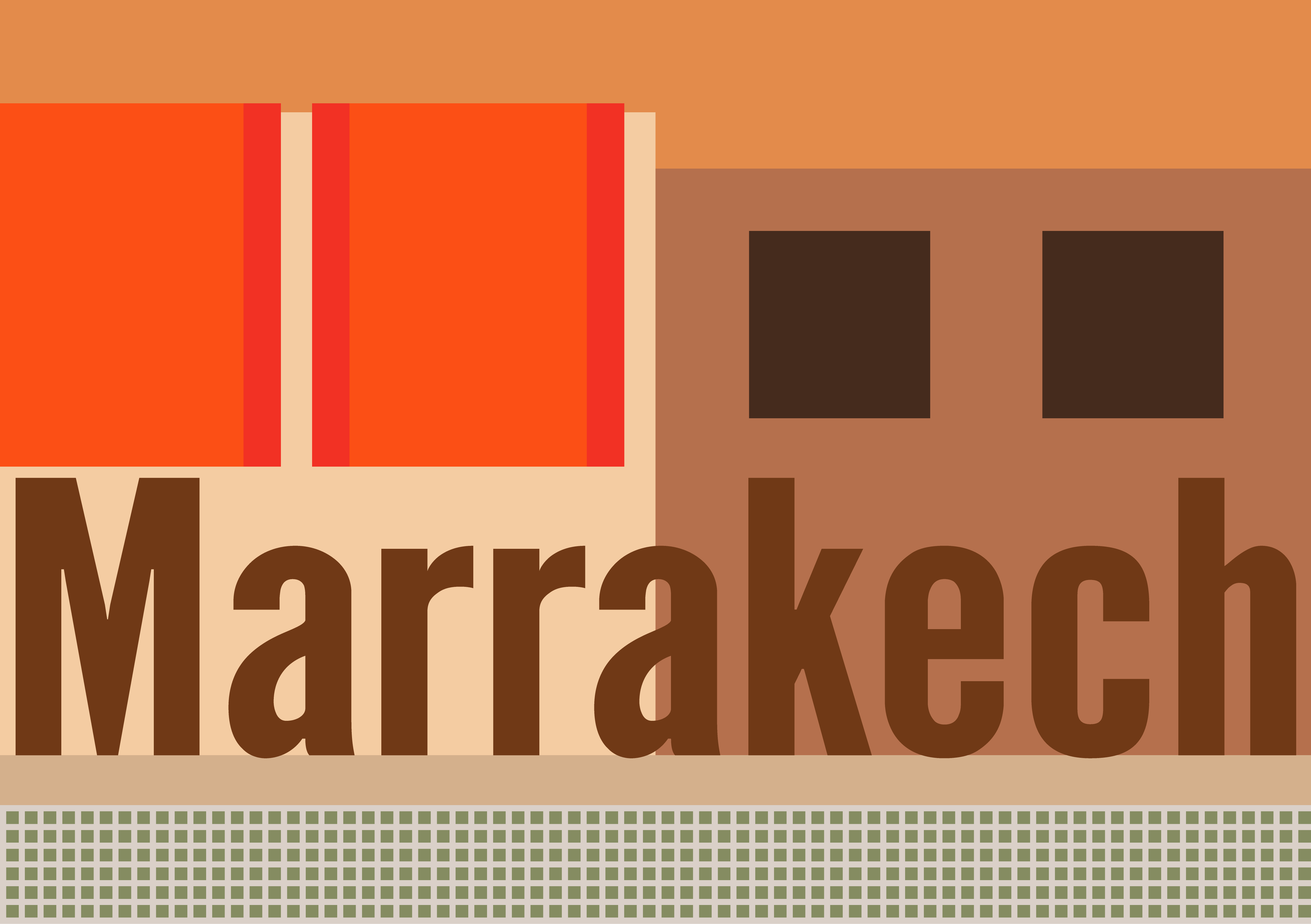
MARRAKECH
I tried to convey the sense of heat in the design for Marrakech by using a warm palette based on orange and brown.
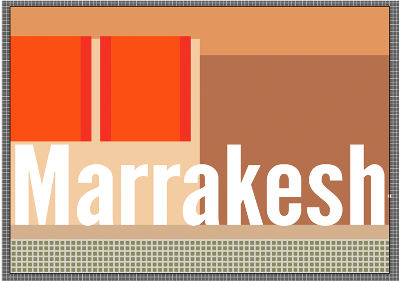
The final design can be seen below:
MARSEILLE
The colour palette for Marseille was quite saturated to show the climate and overall feel of the city. I wanted the warm, red rooftops to feature in the design.
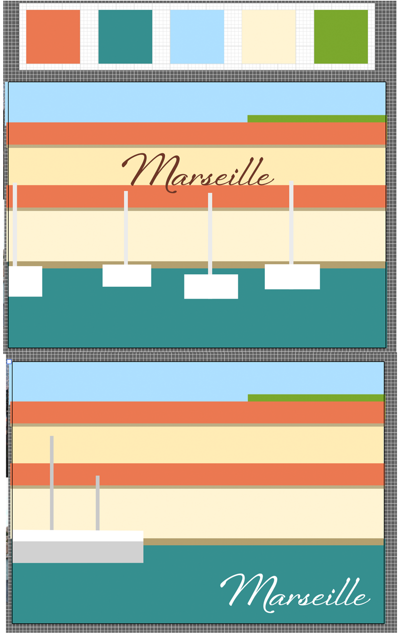
The final design is below:

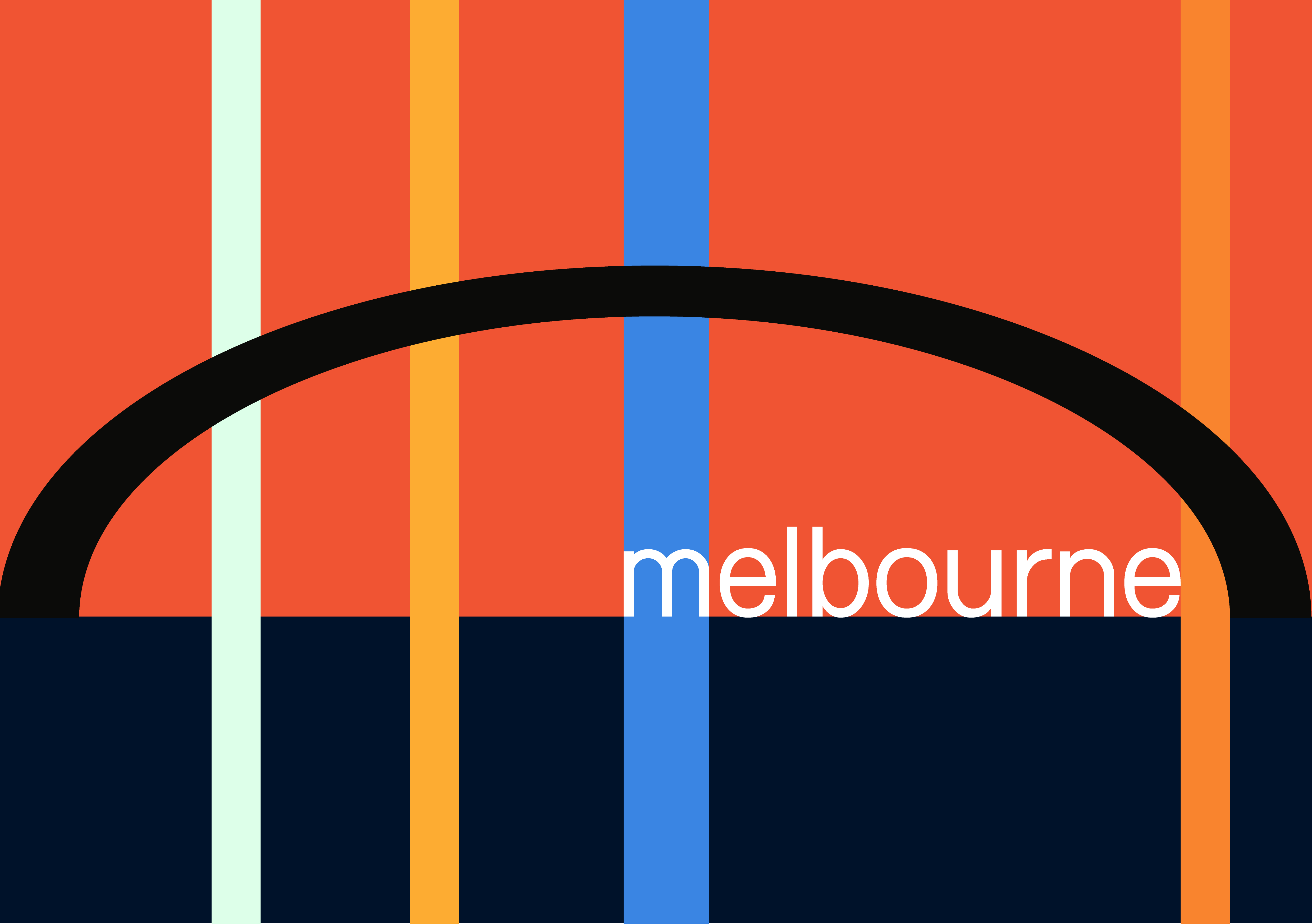
MELBOURNE
I focused on Melbourne harbour for this design. I wanted to convey the warmth and welcome of the city through colour choice. The vertical strips of colour were meant to represent the lights of the skyscrapers. I thought the use of complementary colours worked quite well in this design.
MONTREAL
I always think of Canada as being a welcoming country, where nature is intertwined within the cities, so I wanted to emphasise this in the design. I also wanted to include the red/orange/brownness of the trees.

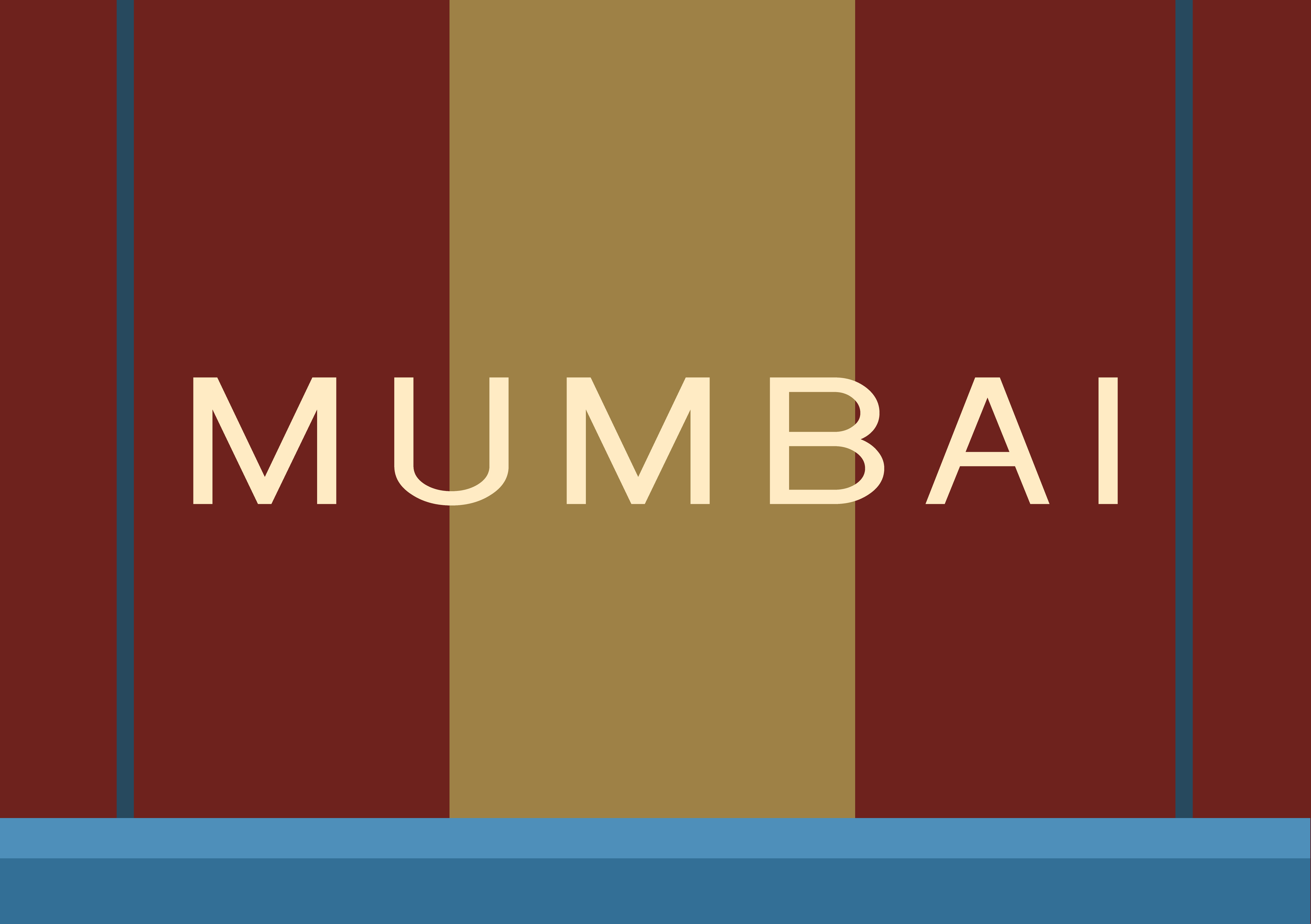
MUMBAI
I found it hard to come up with ideas for Mumbai and I felt my initial designs were too illustrative, so I really tried to focus on just the colours.
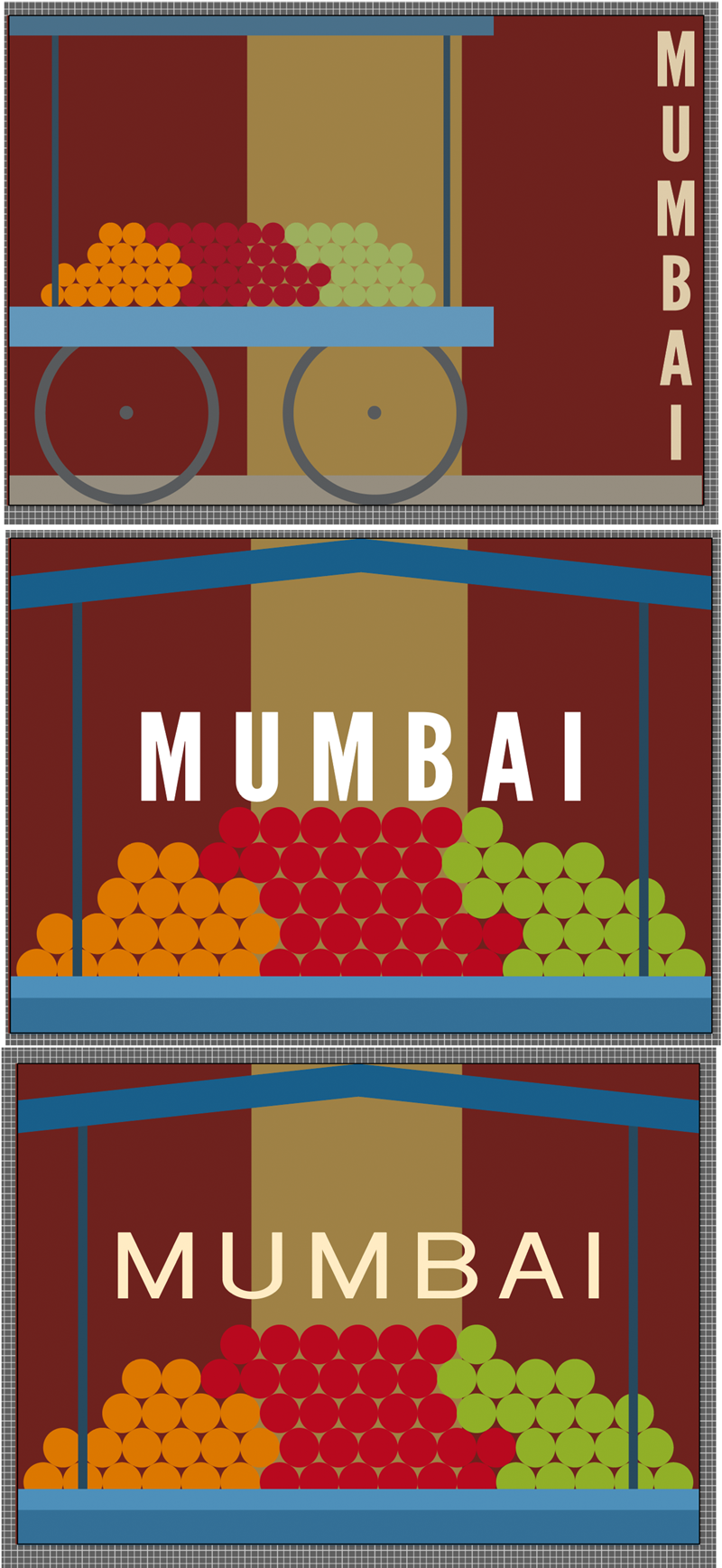
The final design is below:
EVALUATION
I found this exercise very difficult and it was quite a struggle to finish it. I wanted to focus on colour and I think I may have made my designs too representational and literal. However, on positive note, I do think my typography choices have improved and the colours I used were appropriate. I hope to improve on this exercise after receiving feedback from my tutor.
RESOURCES
http://www.tate.org.uk/art/art-terms/a/abstract-art
https://www.thoughtco.com/what-is-abstract-art-183186
http://www.theartwolf.com/articles/cityscape-painting.htm
http://www.theartstory.org/artist-leger-fernand-artworks.htm#pnt_1
http://www.theartstory.org/artist-mondrian-piet-artworks.htm#pnt_6
https://www.britannica.com/biography/Piet-Mondrian
https://www.moma.org/collection/works/78648
https://www.guggenheim.org/artwork/artist/vasily-kandinsky/page/3
https://www.wikipedia.org
https://images.google.com