Draw a range of people in different clothes. In some of the drawings try and describe their whole outfit; in others, focus on specific elements, such as different types of hat. You can take a reportage approach and draw people out on the street, or use yourself, friends or family as models. Focus on describing the clothes through your drawing, but don’t forget the people themselves. Try and capture something of the wearer’s physical shape, posture and character as well as the clothes they’re wearing.
Work some of your drawings into illustrations which perhaps exaggerate what you’ve observed. You might want to bring in more colour, simplify your lines or create images that are much more stylised to do this.
Initial Thoughts
I had been very surprised by how interesting I found researching the history of fashion illustration in the previous Research Point. It is clear to see that I personally pay little attention to fashion, but I discovered some really inspiring work and was introduced to a wide selection of practitioners that I would unlikely have discovered otherwise. I was impressed with the draftsmanship skills that were evident and the variety of styles use in this genre.
One of the main lessons I learned was that fashion illustrators do not simply make photorealistic representative drawings of an outfit, they have the freedom to be creative in expressing the ‘feel’ and character of the clothing, along with the person wearing it.
Another point to note is that although I am not an avid fan of fashion, I really do want to improve my skill in drawing clothing on characters as I generally stick to a very limited selection of simplistic outfits and I have no confidence in drawing folds/creases. I have purchased the book Draw Natural and Believable Clothed Figures by Barbara Bradley, which I hope will help me to develop in this area. I also realise that in order to draw believable clothing, I need to be able to draw a believable body underneath, so I can understand where the material hangs, etc.
Drawing People in Clothes
For my initial drawings I used reference photos from the internet as I found the thought of drawing people out on the street too daunting.
For the first sketch, below, I tried the same image in both pencil and ballpoint pen. I felt a bit visually overwhelmed with this one and I did not properly ‘look’ at the reference, so I was not particularly happy with the result.
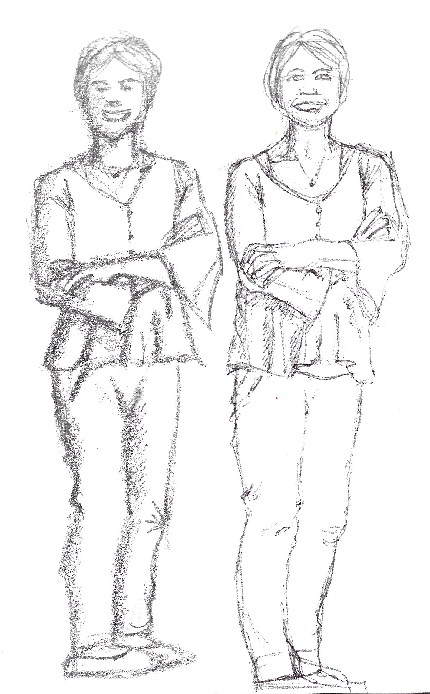
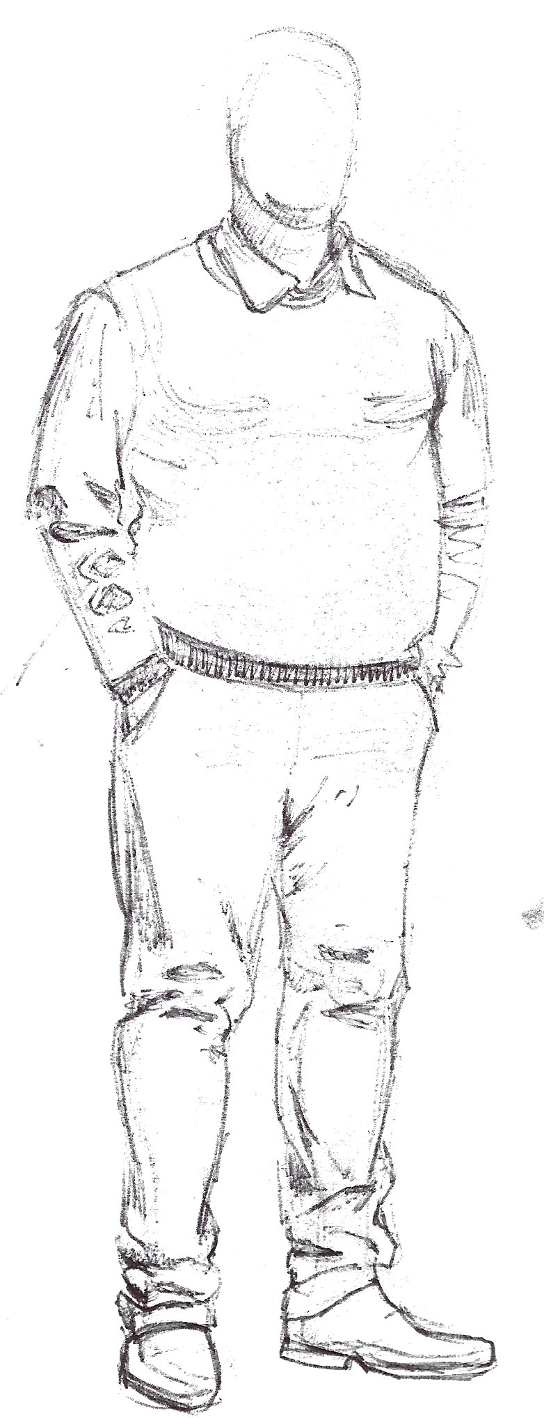
For the subsequent drawings I mainly used a pen as this required me to take more care. I tried to really study the folds and creases in the clothing, as well as capturing the pose of the model. Although I do prefer this one to the previous attempt and I was happier with the trousers, the man looks slightly flat, which is possibly partly due to drawing from a photo rather than a real person.
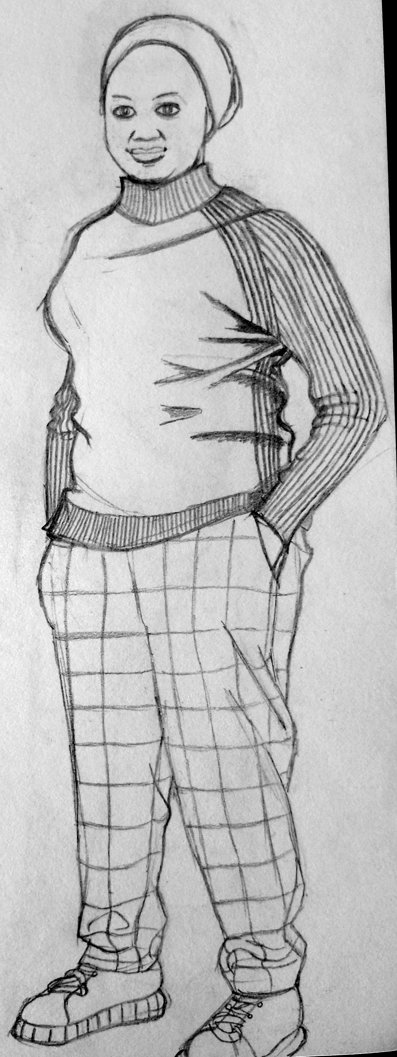
I began to feel more confident and moved onto another drawing. I had noted that the brief asked for the illustrations to capture something of the wearer’s body shape, posture and character, which I tried to keep in mind as a I progressed.
For some reason I was finding that I was happier with the lower half of the drawings, i.e. the trousers.
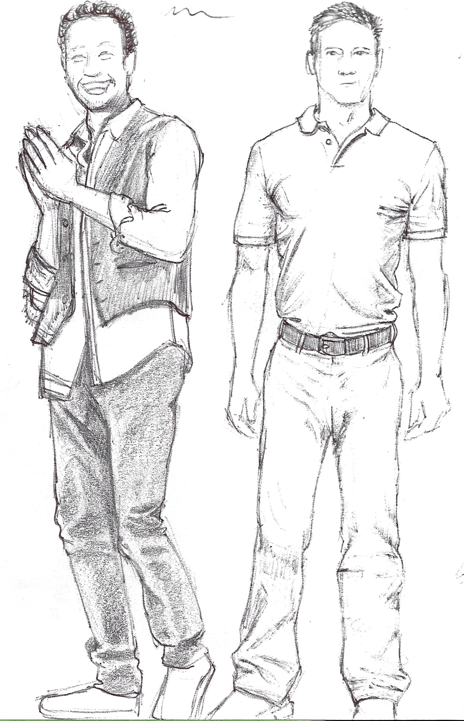
Although I used photos as reference material, I imposed time restrictions for some of my sketches to try and replicate the scenario of drawing someone from life who is not specifically posing for me. This forced me to work quickly and capture the essence of the stance and body language. I could then go back to the drawing and work on the folds/creases of the clothing.
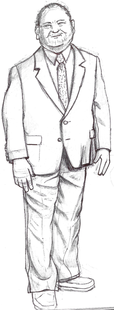
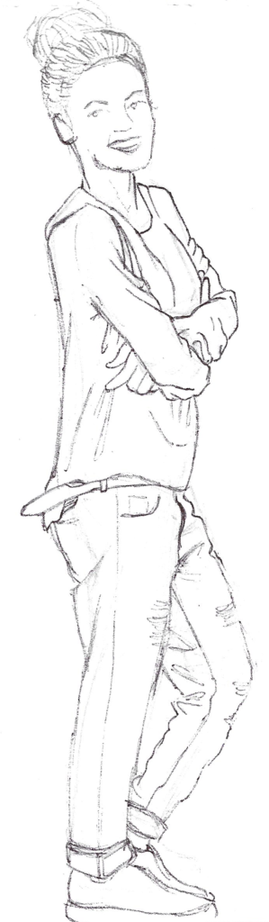
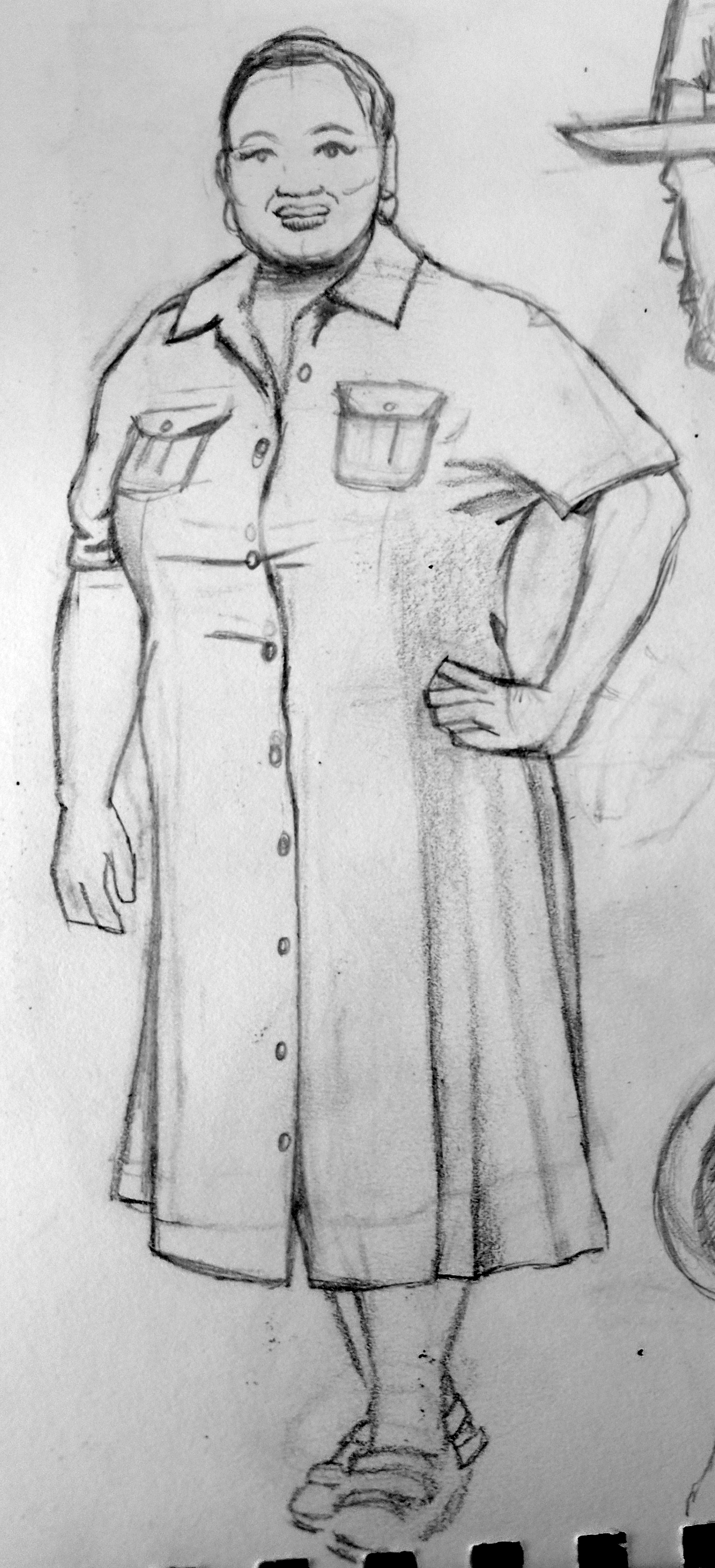
At this point, I moved back to working with a pencil. I was much more comfortable and had become fully absorbed in the exercise, which I feel is apparent in the following two sketches. My lines became more confident and I think I managed to capture the weight of the clothing fairly well.
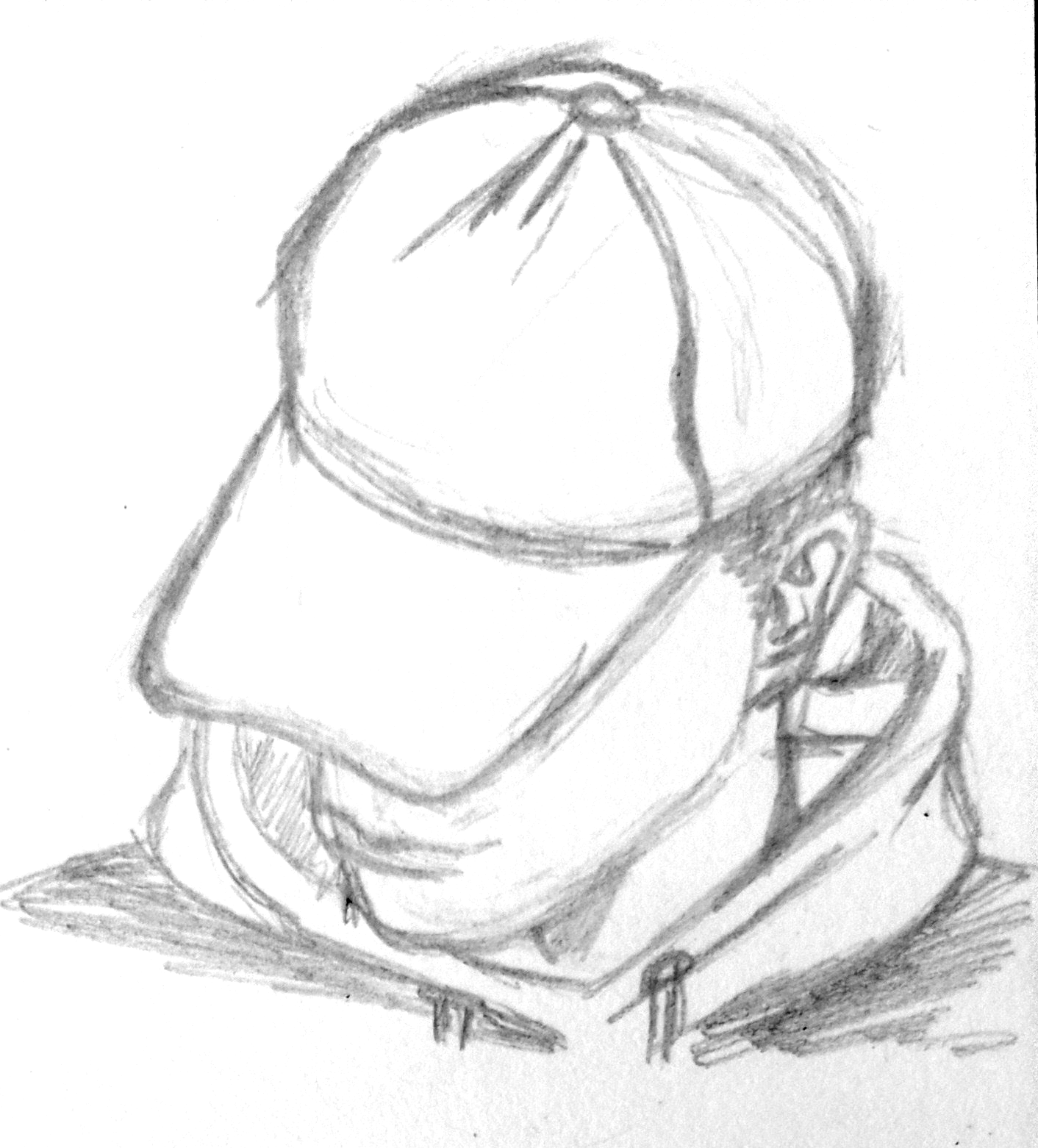
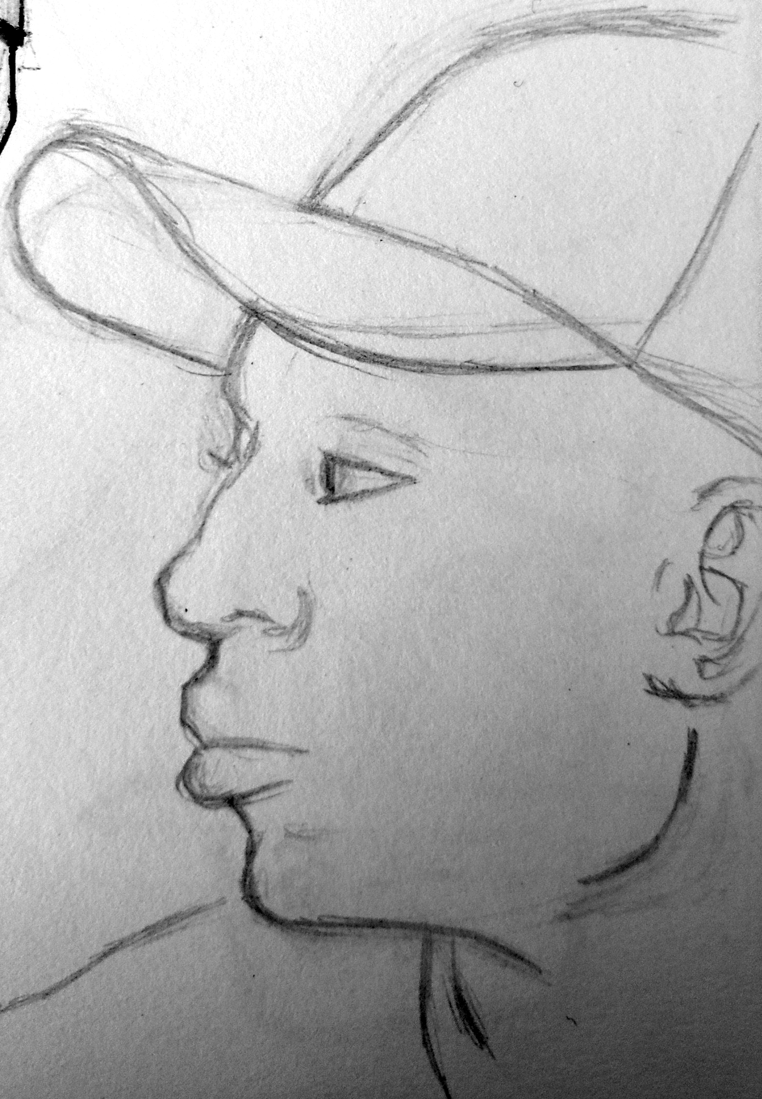
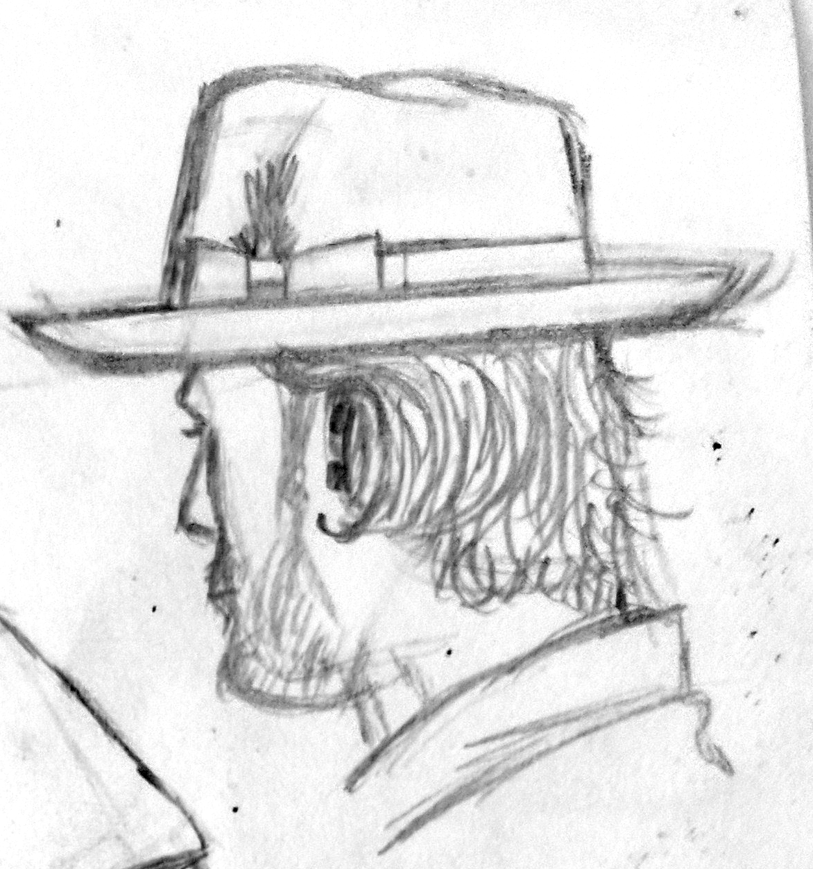
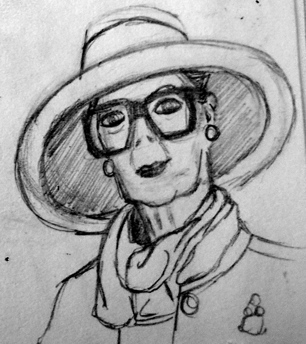
To finish with this part of the exercise, I decided to focus on the heads of people wearing hats. I have always found drawing believable hats challenging, so this forced me to really look at the source material. I sketched a few different angles of the head. I was quite pleased with these and it made me feel more confident in my ability for when I want to include hats in future drawings.
Drawing Fashion Illustrations
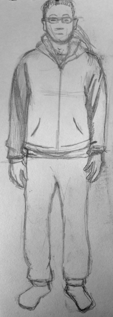
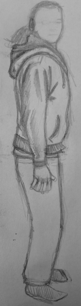
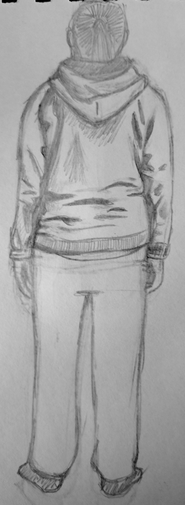
For the second part of this exercise, I decided to take the humorous route by using myself as a fashion model, wearing my standard outfit of a hoodie, tracksuit bottoms and socks. I began by drawing front, back and side views.
Next, using the invaluable book I had looked at for the previous Research Point, 100 Years of Fashion Illustration by Cally Blackman, I selected several fashion illustrations that I then tried to replicate, using myself as the model. I opted for a range of styles of illustration from different decades.
For the first illustration I chose a design by Erté, which was created using ink and watercolour. The model’s body has been elongated and the facial features simplified. One of aspects of fashion illustrations that appeals to me is that they are not necessary ‘perfect’ in so far as the edges are not always neatly finished, for example, as can be seen in here.
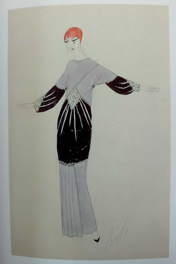
For my interpretation of the illustration, I sketched myself in similar pose and then used black ink and watercolour to fill in the certain areas as in the original. At first I was not too keen on my attempt, but on reflection I think I was reasonably successful at capturing the style of Erté’s. It was also quite freeing ‘copying’ a style of illustration that I would not normally try.

(Click on image for larger version, opens in new tab).
The next fashion illustration I chose was by Benito. He used extreme exaggeration for every part of the model, from the extra long body and limbs to the tiny feet. It is a perfect example of how far removed fashion illustrations can be from the reality of an average person wearing the actual clothing.
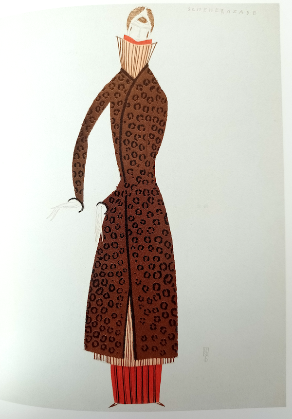
advertising the Main Fourrures Max (Blackman 2007, p. 75)
For my version of Benito’s illustration I used coloured fineliners for the outlines and then coloured pencils to fill in the clothing. As with my previous attempt, at first I found it quite awkward drawing in this way, but I thought the result was recognisable as being based Benito’s style, although I do look like some kind of alien in this illustration.
(Click on image for larger version, opens in new tab).
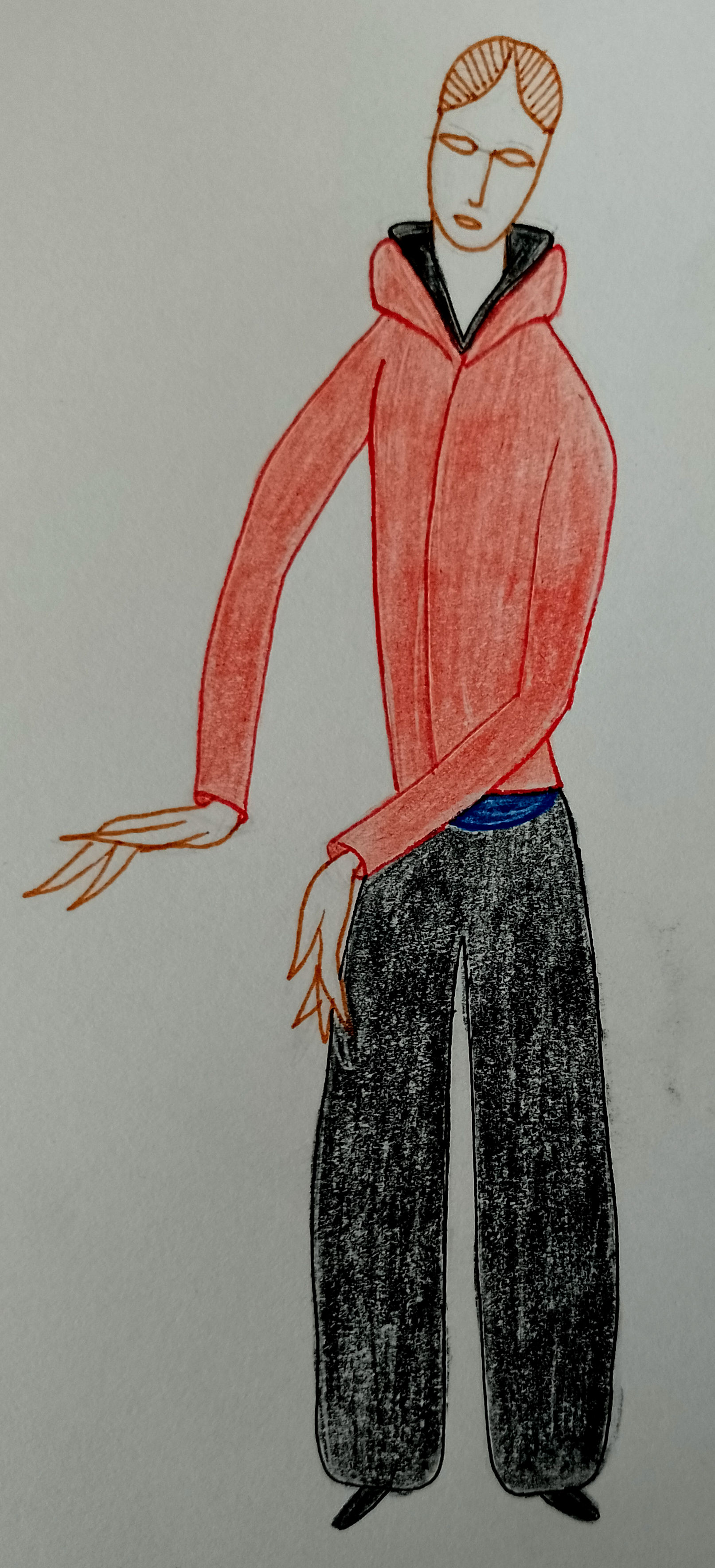
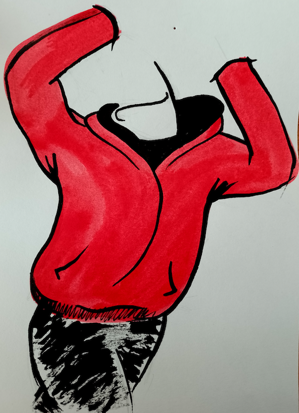
One of the illustrators that I discovered during this exercise was Tom Purvis and his style greatly appealed to me. I think Purvis had a clear understanding of how to use colour, shape and negative space. His flat and simplistic style for posters and adverts, such as the one below, demonstrate his ability to pare a complicated image down to the minimum visual information required to successfully communicate to the viewer, who can then mentally complete the ‘missing’ parts, such as the details of the face. It reminded me somewhat of Malika Favre’s style.
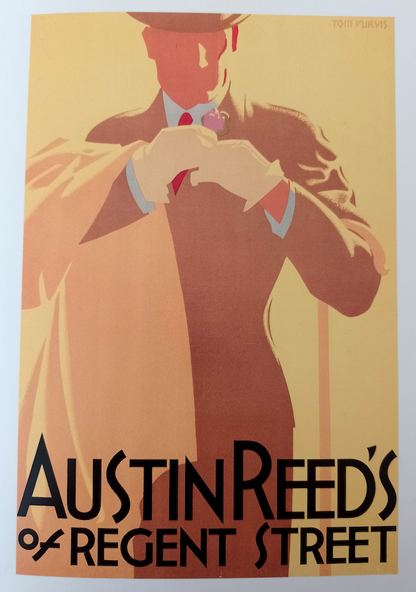
Purvis’s style appears to be deceptively ‘simple’. I used acrylics for my version, which I have not experimented with for a very long time so I found it challenging. I think my attempt was reasonable, but two factors in particular hindered it. Firstly, there is not enough contrast between the red and the highlighted or background area. Secondly, my lack of skill at drawing folds/creases prevented me from creating believable representations of these in the clothing. However, when viewed at a distance, the illustration was reasonable as a basis to build upon and this style is definitely one that I want to explore further. It was also good for re-introducing me to the use of acrylic paints.

(Click on image for larger version, opens in new tab).
After the challenge of recreating Purvis’s style, I selected an illustration by the prolific fashion illustrator Rene Gruau which was looser in style, although equally impressive in terms of skill.
(Blackman 2007, p. 190)
I decided to replicate Gruau’s style and not draw a pencil outline first. I also used a bamboo stick with ink, which meant not being so fussy about making marks. Although I quite liked working in this way as I could just ‘go with the flow’, I was not that keen on my attempt. Perhaps I tried adding too much detail and applied too much ink as Gruau’s illustration was much cleaner in appearance, but he would have had such a thorough understanding of how to draw the human body and the way clothing falls/hangs that he could use minimal marks to demonstrate this. Indeed some of his illustrations are simply a few strokes to suggest a dress, for example, but are instantly recognisable for what they are describing – I found it quite mind-boggling.

Click on image for larger version (opens in new tab).
The last selection I made was a couple of illustrations by Ty Wilson, a current practitioner. As with Gruau, I was particularly interested in Wilson’s expressive marks that capture both the shape of the body and the clothing.
(Blackman 2007, p. 302)
For my version of Wilson’s illustration style, I used red and a black ink. I applied the black using a bamboo stick and the red using a brush. I tried to keep my strokes loose and restrict the number of marks I applied. I was quite pleased with the shape of the body, particularly the crossing over of the legs, but not so keen on the clothes. This was also the first time I had used coloured ink and I now want to experiment more with this media.
Click on image for larger version (opens in new tab).
Final Thoughts
I found this exercise much more valuable and informative than I had expected to. It confirmed that I need to learn and practice the art of drawing clothing so I can create both realistic and simplified or more abstract illustrations of people wearing it. I found the examples in this exercise and the preceding Research Point inspiring and I have a much greater knowledge of different styles that can be applied to not only fashion, but all genres of illustration. I think I am gradually beginning to be more experimental in my work and not quite so concerned about things going ‘wrong’, but this is something I will continue to push as I go forward.
Bibliography
Blackman, C. (2007) 100 Years of Fashion Illustration. London: Laurence King.
Google Images (n.d.) Google Images. Available at: https://images.google.com (Accessed 15 January 2023).
iStock (n.d.) iStock – Stock Images. Available at: https://www.istockphoto.com (Accessed 15 January 2023).