Brief
Choose panel from the portfolio of work you have created.
It could be a single panel from much earlier in this course or a drawing you just made for the last exercise, it just needs to be something you want to develop further. Perhaps it’s a small detail from a panel, a figure or a portrait, or a combination of all of these.
Experiment with scaling it up and painting it with pens, paints or ink. In a way this reverses the usual comics-making process where drawings are made large for reduction; here you are taking something small and finished and making it larger and loose. This is an opportunity to use your own comic art to make a more experimental, stand-alone artwork suitable for framing and hanging on a wall and consider a different context for your graphic fiction.
Research
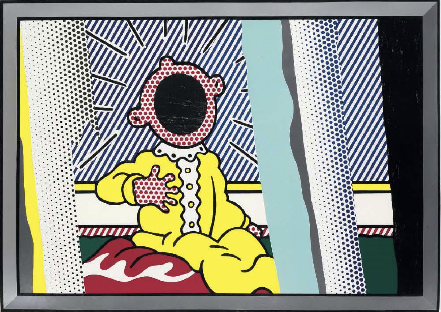
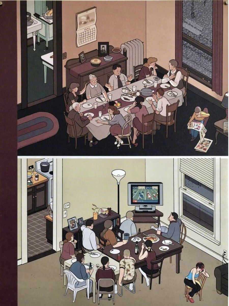
I began by searching for examples of work by most of the artists named in the introduction to this exercise (please see References below). Some of the examples of artwork were single panels whilst others were a full page strip. The two artists whose work most appealed to me visually were Roy Lichtenstein and Chris Ware.
I liked how Lichenstein took the graphic style of comics and presented this in such a bold fashion to the art world, which often distanced itself from such styles, not considering comics as being worthy of the title ‘serious art’.
I have a certain extra admiration for Chris Ware as I can relate to his extremely introverted personality (which he humorously sums up in this comic strip). Ware seems to be able to effectively portray subtle, mundane human behaviours in his work.
Selecting a Panel
I did not feel particularly inspired by many of the examples I had come across in the research in terms of creating my own piece, so I spent some time looking back through the work I had completed for this unit. I initially narrowed down my selection to two options.
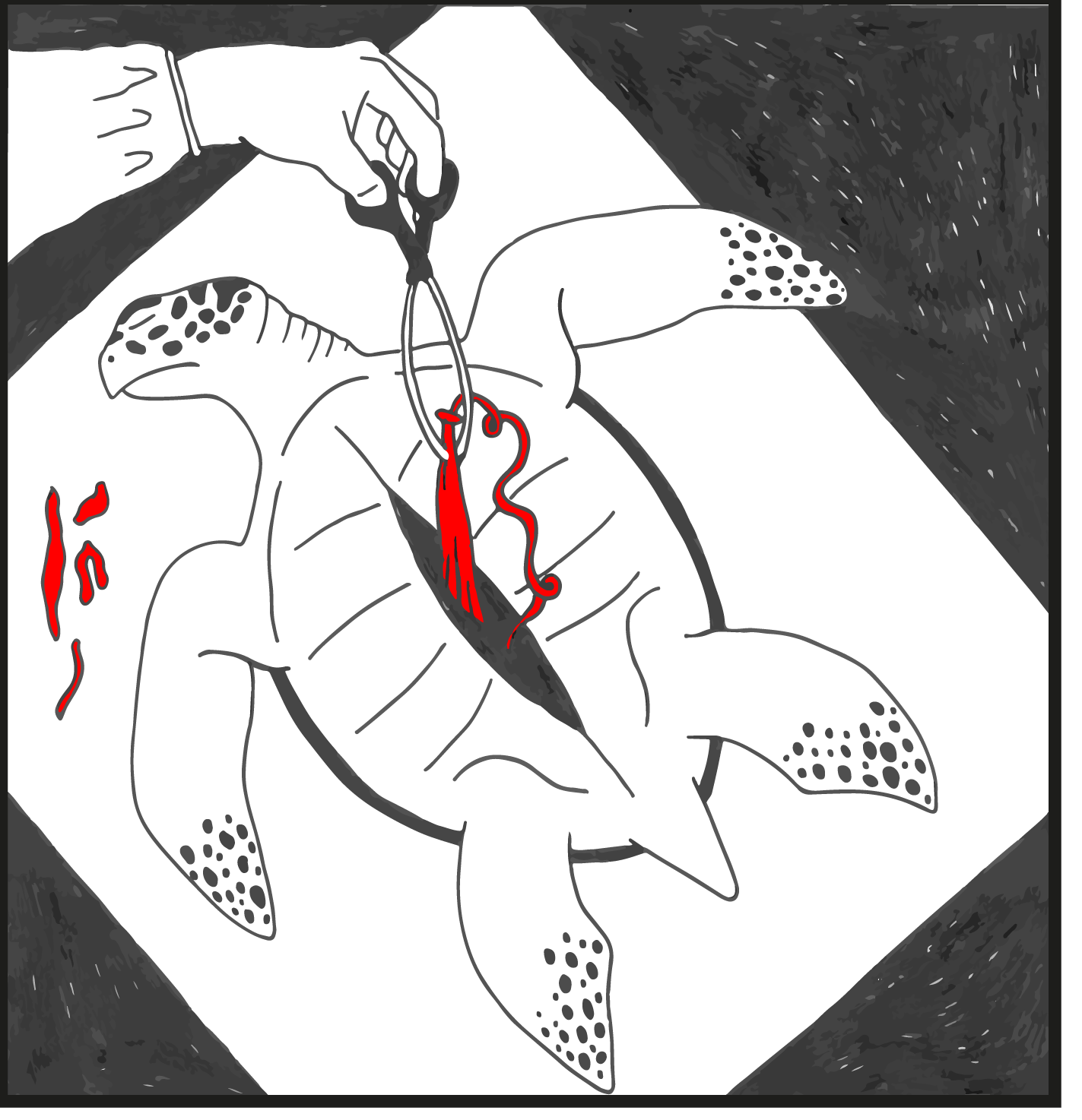
I thought the turtle image below was quite powerful in its message, which is one I feel strongly about, but then I began to think about all the improvements I would want to make in terms of its design, e.g. I was not keen on the background and felt a spotlight would be more effective and, after further pictorial research, the proportions of the turtle were not correct.
I could imagine ending spending a great deal of time making adjustments before even reaching the final piece, which would normally be fine, but due to the tight deadline I made the decision to abandon this option for the moment.
Equally, the second choice of a panel from Assignment 2 (below) was very enticing as I felt I could create a much improved version. However, after examining the original piece flipped over on a lightbox, I discovered a series of imbalances and poor decisions in terms of design. Being quite a detail-heavy piece, again, I felt this option would require plenty of time to reach satisfactory result at a larger scale.

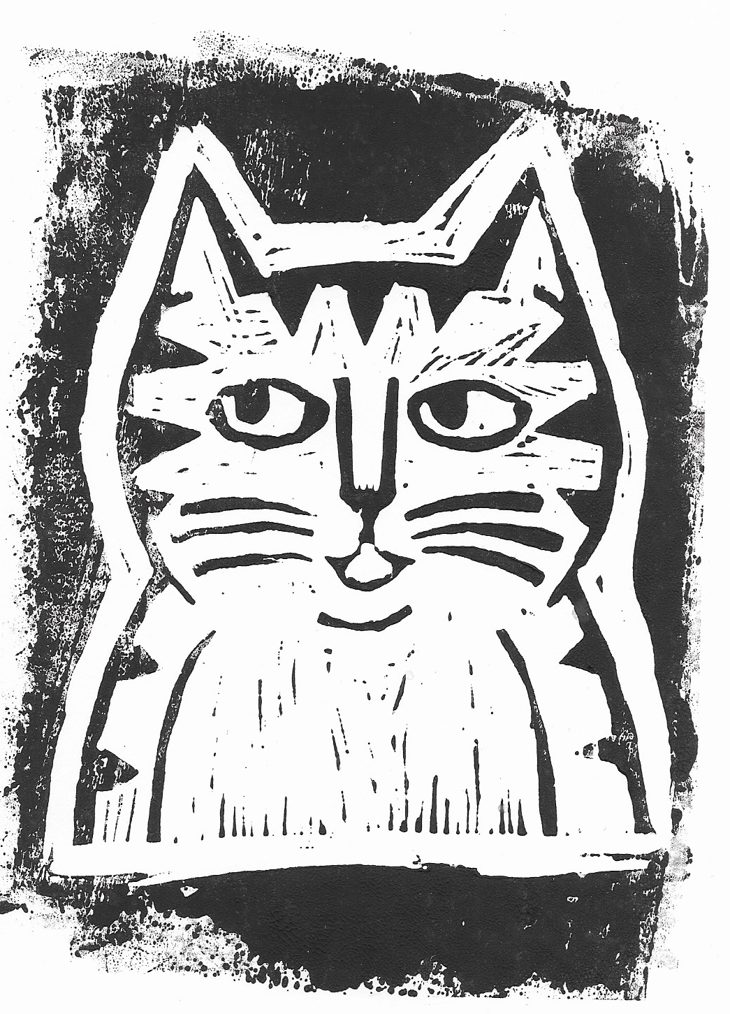
I was starting to slightly panic until I recalled a linocut print I had created for an early exercise of Key Steps in Illustration, which was the first (and only time) I had used this method. I really enjoyed learning the process and was fairly pleased with the outcome (for a first attempt anyway!)…
I always intended in exploring linocut further, but I had not managed to do so. I decided this was the perfect opportunity to have another go.
Having though of linocut as a potential way forward, I nearly reverted back to the second option from above as my panel choice, but eventually persuaded myself that this would increase the time factor immensely due to the amount of detail in the tree bark (especially at a larger scale) and it would be quite a jump in terms of skill from my first attempt.
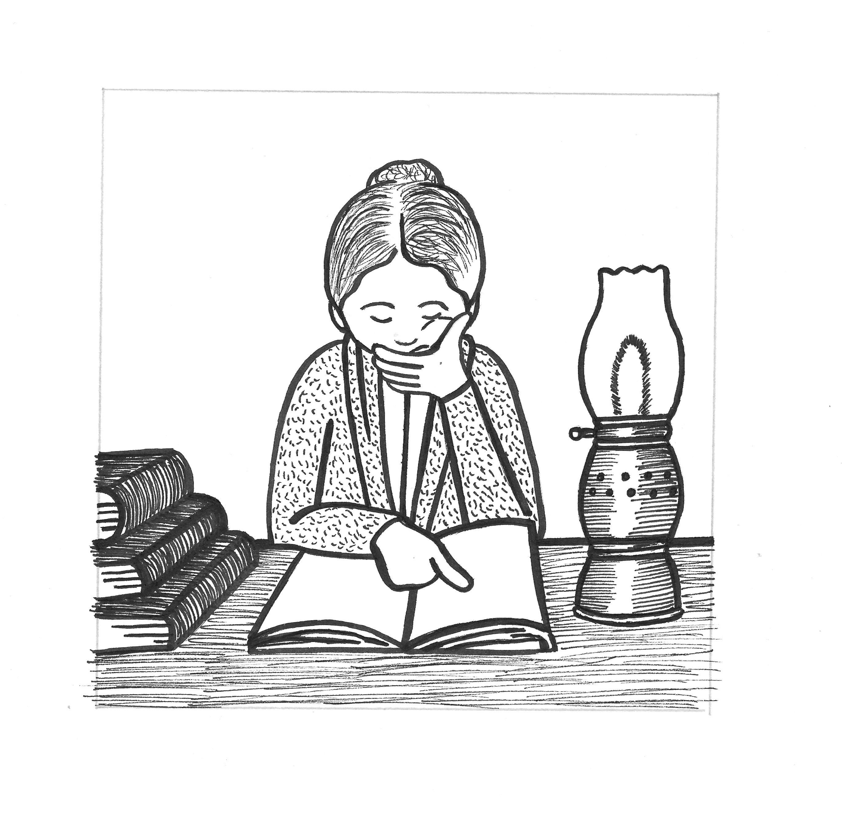
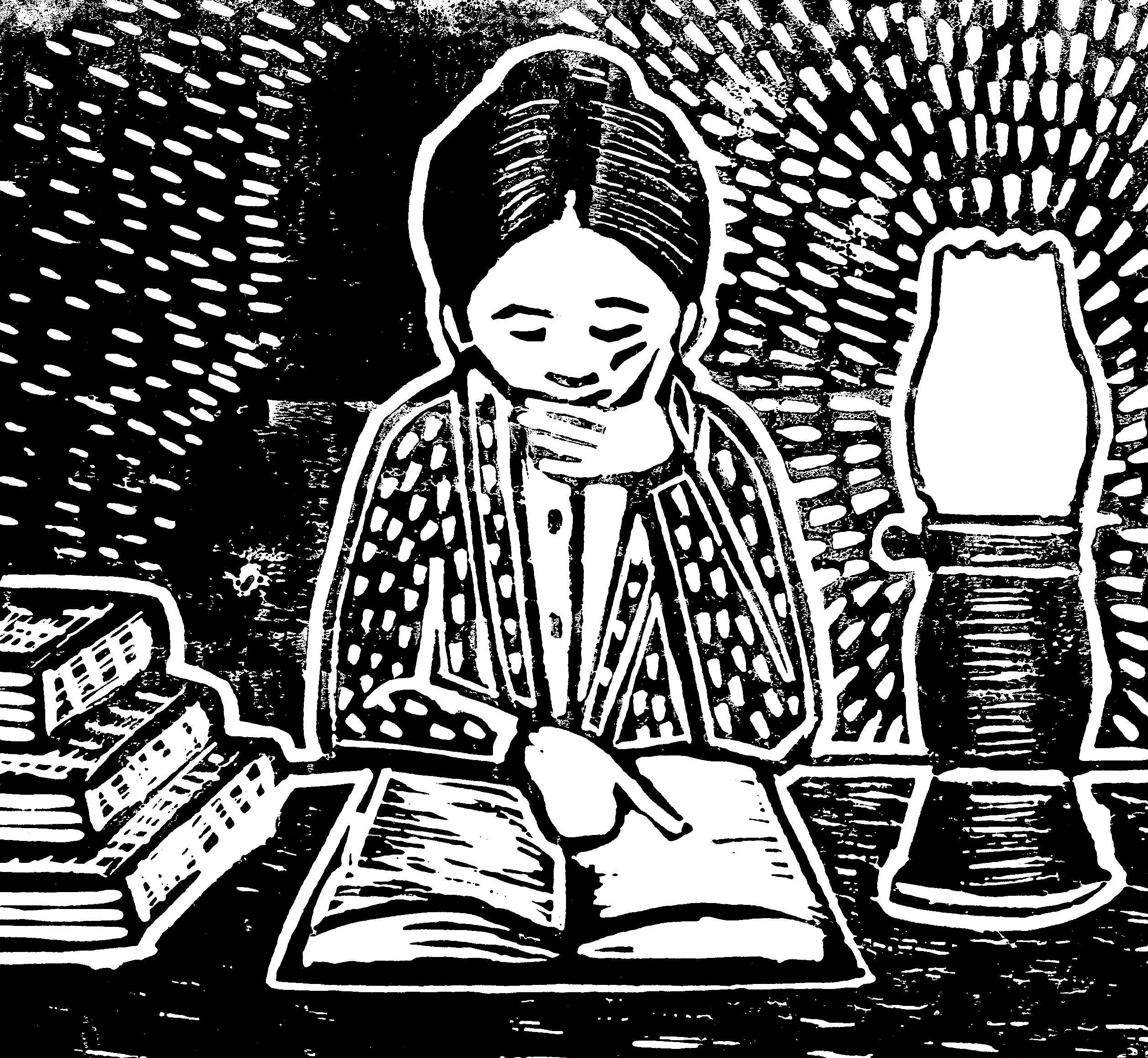
Instead I opted for one of the panel Elizabeth Garrett Anderson from the True Stories exercise (Part 4), which I had been quite pleased with and felt would be well-suited to the style of linocut.
Preparing the Panel
There were some minor adjustments that I wanted to make to the original panel before proceeding, such as the shape of the lamp and the one book. With the assistance of a lightbox, I was able to make these and others. I ended up with an enlarged pencil version.
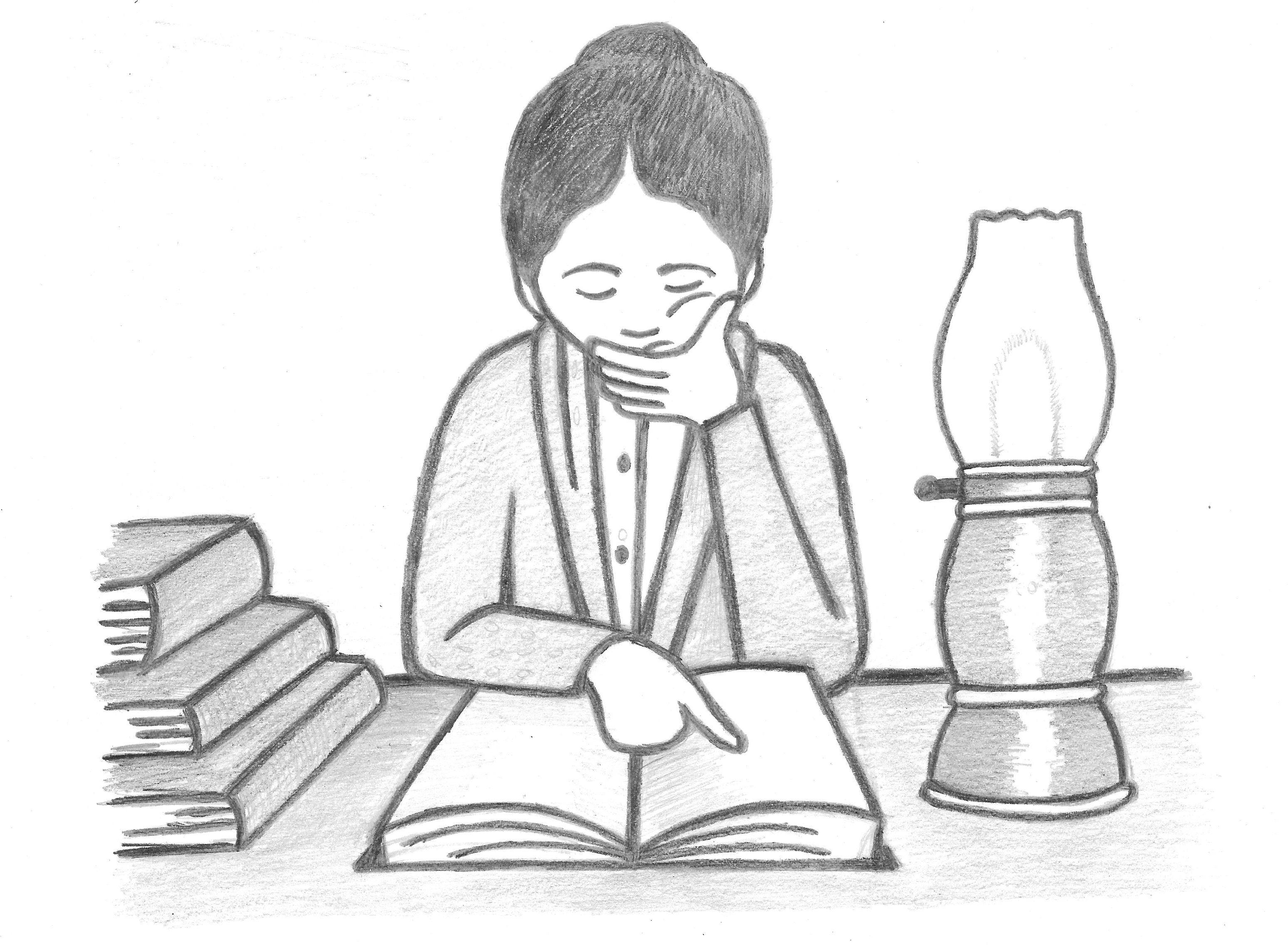
I preferred this to the original and was actually really happy with it as this stage.
Preparing the Linocut Panel
I decided to refresh my memory of the process for linocut printing and also to find some examples reflecting the style I was aiming for. I found plenty of instructional resources as listed in the References (below), which were really helpful and boosted my confidence. Two artists that I came across in my research whose work included linocut prints were: Rachel Newling and Marina Pallares.
I really liked how Newling incorporated colour into the prints using paints. I thought her designs had a visually powerful, graphic style. I was impressed with the amount of detail Newling managed to include in her work.
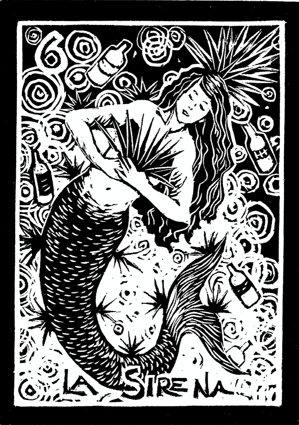
I was particularly drawn to Pallares use of varying ‘marks’ on the different objects and the amount of energy she managed to produce in the compositions.
Indeed, I was hoping to add some texture details to my own print by varying the ‘mark making’ using different blades and cuts. I only have basic linocut equipment, which does not include a wide variety of blades so I wasn’t sure how easily this ambition would be achieved.
I also had to order linocut sheets and a bench hook (for safety reasons), which delayed me getting started by a couple of days. Although the brief requests the to the final artwork should be large, I went for A4 due to the cost and practicalities, however, this was still quite a significant enlargement of the original panel.
I also purchased some tracing paper to transfer the drawing onto the lino, but this ended up being redundant. Instead, I went over the pencil drawing with a very soft 9B pencil and rubbed this onto the lino, which resulted in a very faint outline. I then drew over this with pencil followed by a black marker. I found it being a mirror image quite disconcerting. Once I was happy with this I was ready to start cutting!
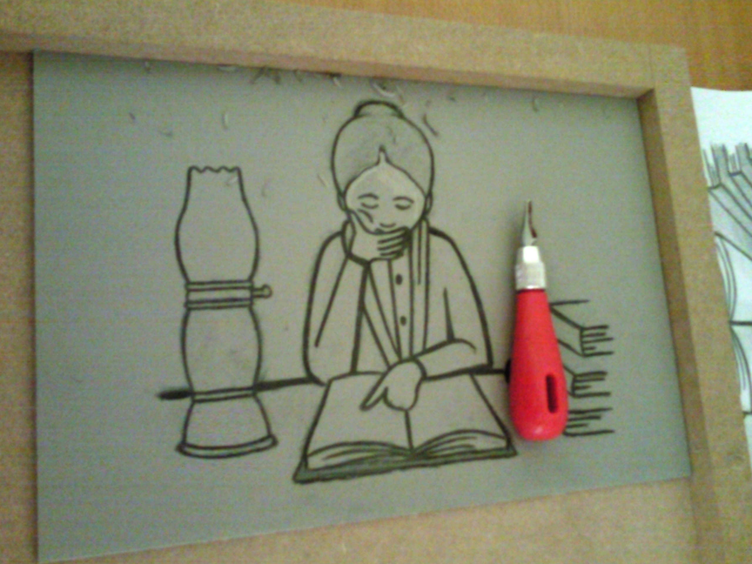
I spent quite a bit of time carefully cutting out the sections that I wanted to be white first, e.g. the face and hands, gradually proceeding to the more complicated areas and finally trying to create differing textures, e.g. for the table surface and her hair. I also tried to take into account the effect of light from the lamp and add some contrast in terms of the lit and dark areas. It was a case of trial and error when working out how deeply to make the cuts and on one occasion I almost went through the lino! I was not happy with some of the cuts I made and it was quite frustrating when I removed too much of the lino thus resulting in a wider cut than intended and, being unable to restore it, I felt this ruined the design quite a bit.
Eventually I reached a stage at which to remove any more of the lino would have been for the sake of it and cause irreparable damage, as I learnt the hard way a few times. The finished linocut (with ink on it) can be seen below.

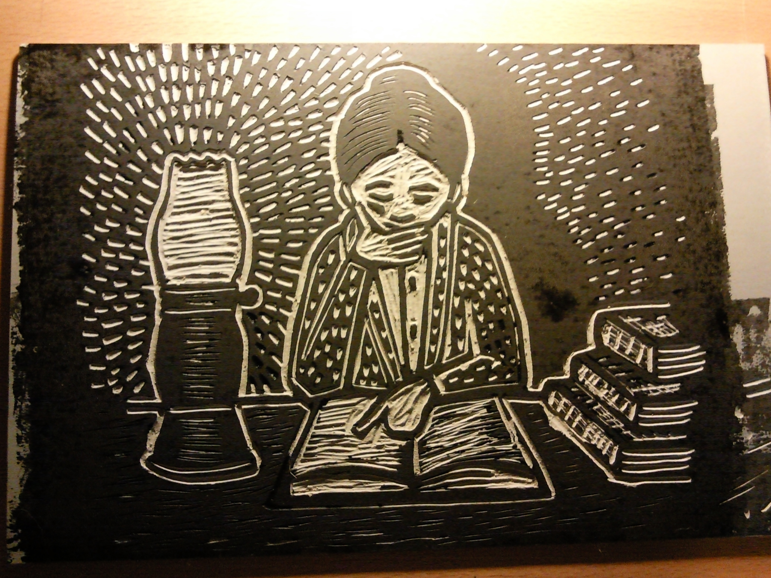
I really did not think the prints from this linocut were going to be particularly good as all I could see was the cutting errors I had made and I did not think some of the cuts, such as those on the table surface, would be deep enough to show up. Although I had not managed to vary the cuts as much as I intended to, I did hope there would be some variation visible in the final prints.
Printing from the Linocut
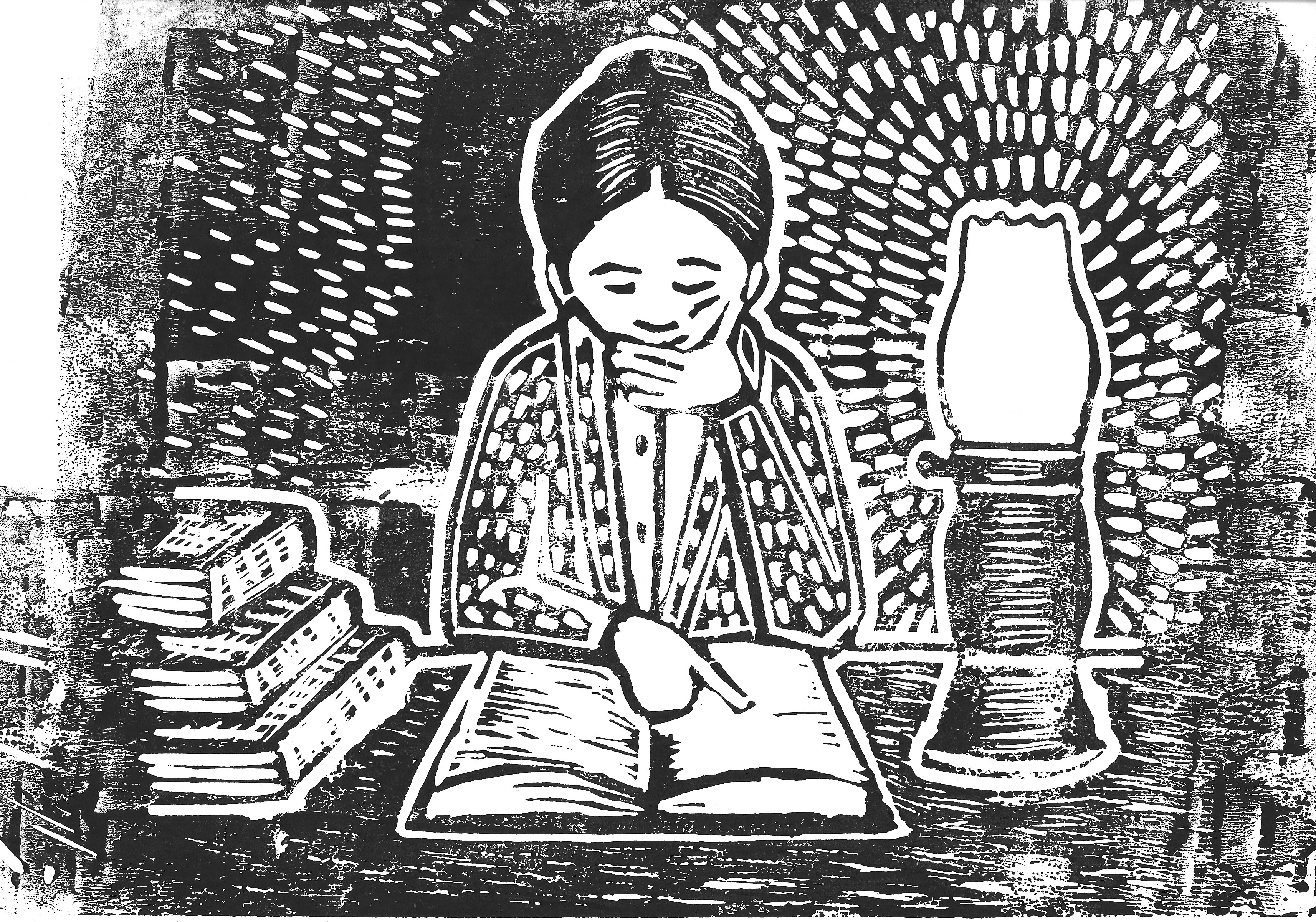
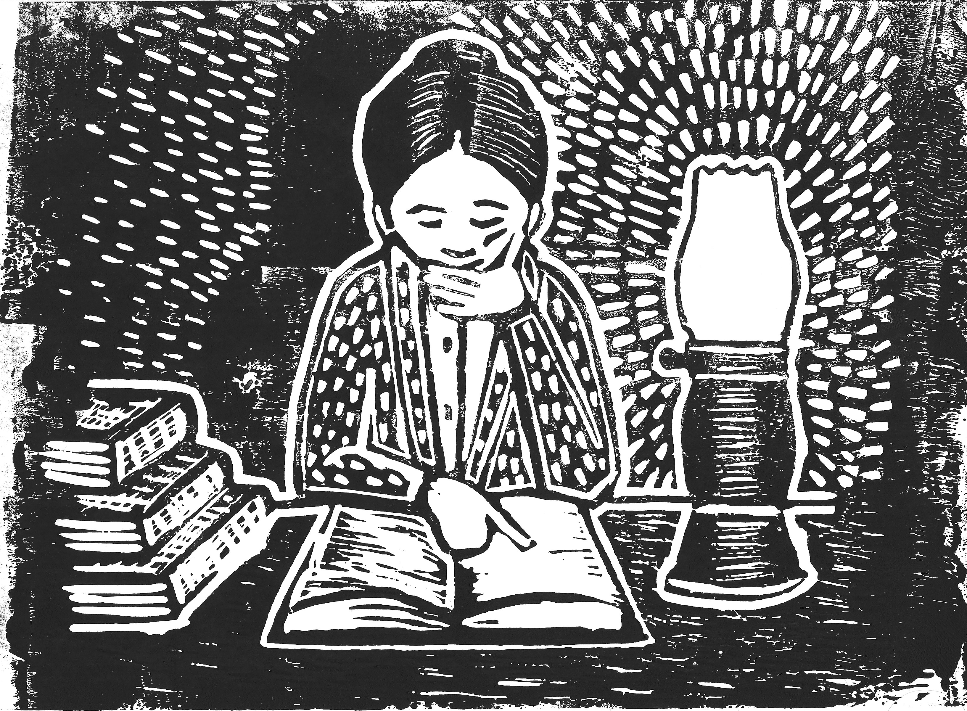
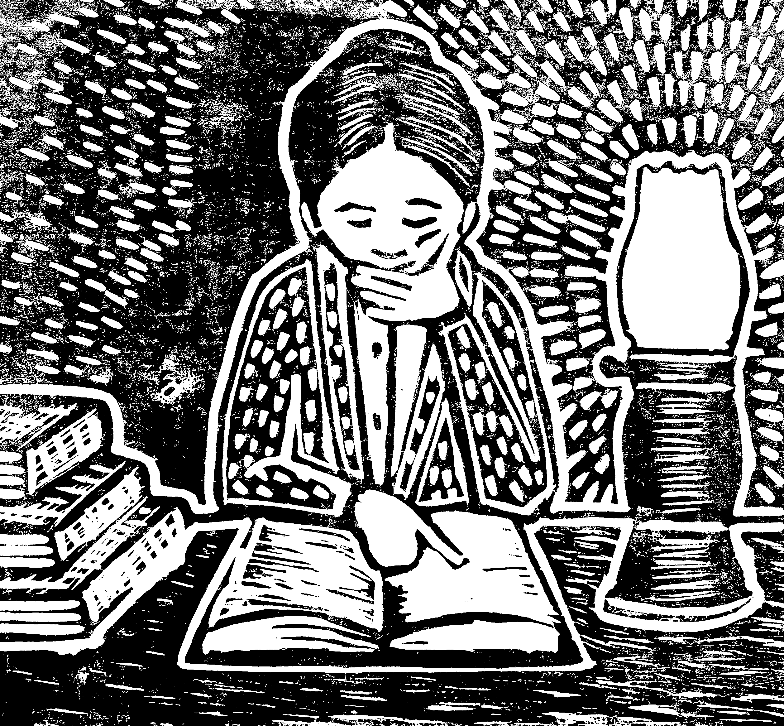
It was fairly challenging trying to roll a smooth, even layer of ink onto the lino and make sure it was well covered, but not too thickly…I am not sure I got the balance quite right. I made four prints as can be seen below.


Final Piece
I decided to edit two of the prints digitally. I adjusted the contrast to make this stronger and cropped the images down so it resembled the original’s dimensions. The first one below had the best coverage of ink (but some areas could have done with more), but this meant some of the finer details, such as the lines on the table, did not show through. The second one had less ink coverage and so the reverse of the previous occurred.
Final Thoughts
Once I had decided to attempt linocut printing again for this exercise I became quite enthusiastic. Although I felt quite frustrated at some of the cuts I made, I did enjoy trying to work out where to add these to indicate texture/light. Overall I was pleasantly surprised with the final result – I genuinely was not expecting it to turn out quite so well. Evidently, upon closer inspection it is clearly made by a novice, for example, with the jagged, sharp edges, but for a second attempt at linocut printing I was quite pleased with it.
I felt printing was a well-suited for the style of the original drawing and that it would be interesting to try using this method to create panels for an entire story. I also liked the fact that I was completely removed from the working digitally. Additionally I had to be decisive with every single cut I made, really thinking about my choice before committing (something I would definitely need to improve on). In some ways it might have been easier to work at an even larger scale as there would have been more room for manoeuvre.
I am not sure that the final piece fully meets the brief as it is may not be considered an ‘artwork’ to be ‘hung on a wall’. However, in terms of developing my skills, I found it very beneficial and made me keen to experiment and learn more about printing.
References
Artnet, (n.d.). Karen Kilimnik. [online] Available at: http://www.artnet.com/artists/karen-kilimnik/. [Accessed 9 February 2022].
Artnet, (n.d.). Robert Williams. [online] Available at: http://www.artnet.com/artists/robert-williams/. [Accessed 9 February 2022].
Artnet, (n.d.). Sue Williams. [online] Available at: http://www.artnet.com/artists/sue-williams/. [Accessed 9 February 2022].
Artsy, (n.d.). Chris Ware New Yorker Cartoonist Limited Edition Thanksgiving Print NYC Poster. [online] Available at: https://www.artsy.net/artwork/chris-ware-chris-ware-new-yorker-cartoonist-limited-edition-thanksgiving-print-nyc-poster. [Accessed 9 February 2022].
Artsy, (n.d.). Jim Shaw – 25 Artworks for Sale on Artsy. [online] Available at: https://www.artsy.net/artist/jim-shaw/works-for-sale. [Accessed 9 February 2022].
Artsy, (n.d.). R. Crumb – 27 Artworks for Sale on Artsy. [online] Available at: https://www.artsy.net/artist/r-crumb/works-for-sale. [Accessed 9 February 2022].
Artsy, (n.d.). Search Results for ‘Chris Ware’. [online] available at: https://www.artsy.net/search?artist_ids%5B0%5D=chris-ware&term=chris%20ware. [Accessed 9 February 2022].
Boswell, L. (2018). 10 top tips for linocut printmaking. [online] Artists & Illustrators. Available at: https://www.artistsandillustrators.co.uk/how-to/printmaking/10-top-tips-for-linocut-printmaking/. [Accessed 9 February 2022].
Boddy-Evans, M. (2019). An Introduction to Lino Printing. [online] The Spruce Crafts. Available at: https://www.thesprucecrafts.com/an-introduction-to-lino-printing-2578530. [Accessed 9 February 2022].
Buick, M. (2020). Lino printmaking: An introduction. [online] Creative Bloq. Available at: https://www.creativebloq.com/how-to/lino-printmaking. [Accessed 9 February 2022].
Cass Art, (n.d.). Creating a Lino Print Portrait with Lucy Bartholomew. [online] Available at: https://www.cassart.co.uk/blog/creating-a-lino-print-portrait-with-lucy-bartholomew.htm. [Accessed 9 February 2022].
Handprinted, (2018). Using Different Tools to Make Marks on Lino. [online] Available at: https://handprinted.co.uk/blogs/blog/using-different-tools-to-make-marks-on-lino. [Accessed 9 February 2022].
Illustration History, (n.d.). Chris Ware. [online] Available at: https://www.illustrationhistory.org/artists/chris-ware. [Accessed 9 February 2022].
Jones, E. (2021). Linocut Printmaking for Beginners. [online] Jackson’s Art Blog. Available at: https://www.jacksonsart.com/blog/2021/10/04/linocut-printmaking-for-beginners/. [Accessed 9 February 2022].
Mike Kelley Foundation for the Arts, (n.d). Mike Kelly Foundation for the Arts. [online] Available at: https://mikekelleyfoundation.org/art-and-archives/artwork-and-exhibition-search. [Accessed 9 February 2022].
Newling, R. (n.d.). Rachel Newling. [online] Rachel Newling. Available at: https://www.rachelnewling.com. [Accessed 11 February 2022].
Richmond, M. (2018). Creating Textures in Linocuts. [online[ Three Bears Prints. Available at: https://threebearsprints.com/blogs/blog/creating-texture-in-linocuts. [Accessed 9 February 2022].
Romano, C. (2021). Masters of comics: Chris Ware. [online] Pixart Printing. Available at: https://www.pixartprinting.co.uk/blog/chris-ware-comics/. [Accessed 9 February 2022].
Tate, (n.d.). ‘Just what was it that made yesterday’s homes so different, so appealing? (upgrade)’, Richard Hamilton, 2004. [online] Available at: https://www.tate.org.uk/art/artworks/hamilton-just-what-was-it-that-made-yesterdays-homes-so-different-so-appealing-upgrade-p20271. [Accessed 9 February 2022].
Tate, (n.d.). Raymond Pettibon born 1957. [online] Available at: https://www.tate.org.uk/art/artists/raymond-pettibon-2754. [Accessed 9 February 2022].
Tate, (n.d.). Roy Lichenstein 1923-1997. [online] Available at: https://www.tate.org.uk/art/artists/roy-lichtenstein-1508. [Accessed 9 February 2022].
Todd Hignite, (n.d.). Daniel Clowes Original Art. [online] Available at: https://www.toddhignite.com/daniel-clowes-original-art. [Accessed 9 February 2022].
V&A Explore The Collections, (n.d.). Paolizzi, Eduardo (Sir). [online] Available at: https://collections.vam.ac.uk/item/O139900/hi-ho-collage-paolozzi-eduardo-sir/. [Accessed 9 February 2022].
Ware, C. (2020) Self-Isolating: A Pandemic Special. [online] The New Yorker. Available at: https://www.newyorker.com/magazine/2020/03/30/self-isolating-a-pandemic-special. [Accessed 9 February 2022].
WikiArt, (n.d.). Marina Pallares. [online] Available at: https://www.wikiart.org/en/marina-pallares/6-la-sirena-the-mermaid-2008. [Accessed 11 February 2022].
Wikipedia, (n.d.). Raymond Pettibon. [online] Available at: https://en.wikipedia.org/wiki/Raymond_Pettibon. [Accessed 9 February 2022].
Wray, A. (2016). Linocut illustration: 10 stunning examples. [online] Creative Bloq. Available at: https://www.creativebloq.com/illustration/linocut-11410303. [Accessed 9 February 2022].