Brief
Find a photograph you like or are interested in drawing from. Try to choose one with figures, buildings and a lot of detail. The source or context is not as important as the richness of imagery and potential it offers you for visual interpretation.
- Photocopy or print your chosen image so that it is A4 size.
- Now trace your image onto a sheet of tracing paper or ordinary photocopy paper.
- Make 10 photocopies of your traced drawing.
Now ink or colour in your ten copies so that they are all as different as possible in style and materials.
Selecting an Image
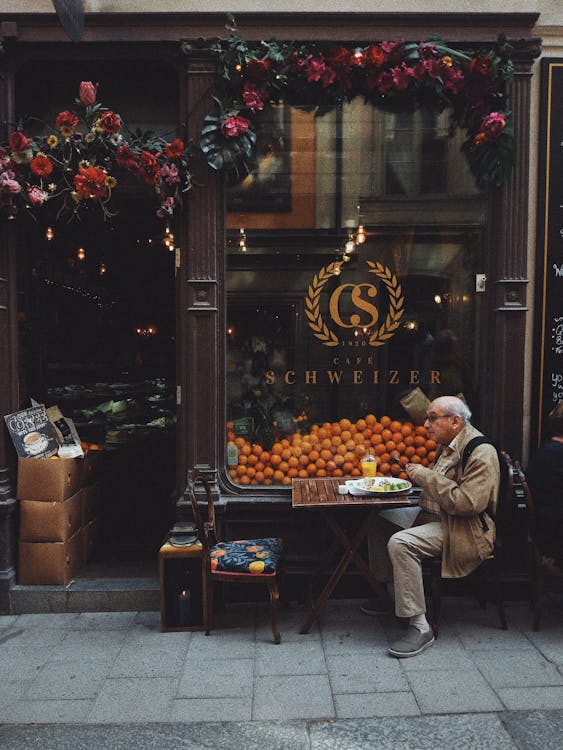
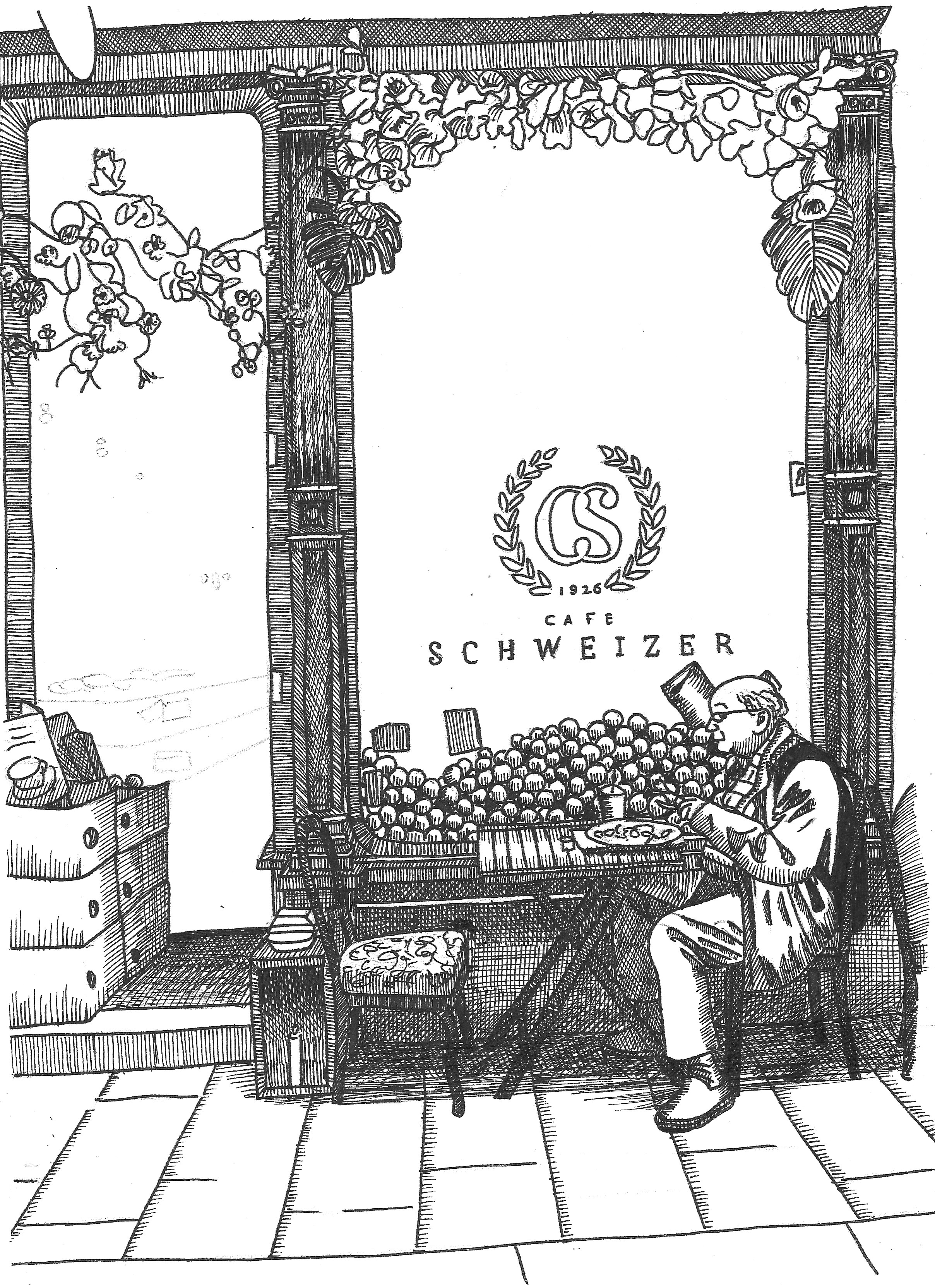
After looking through various free image websites, selected the image below for this exercise.
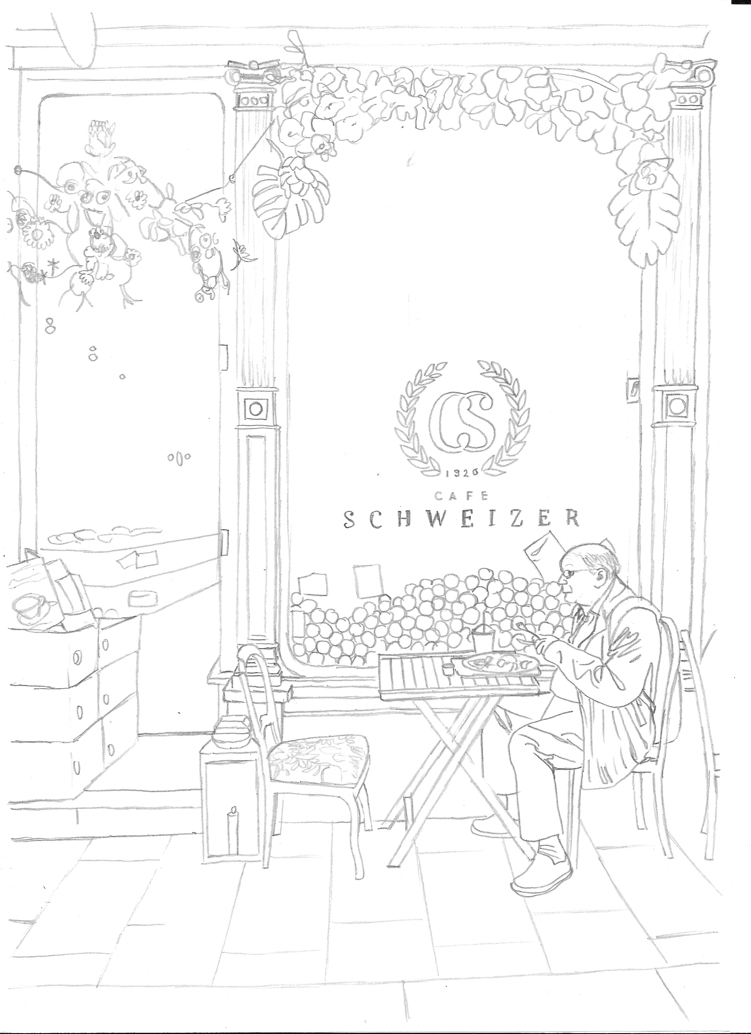
Tracing the Image
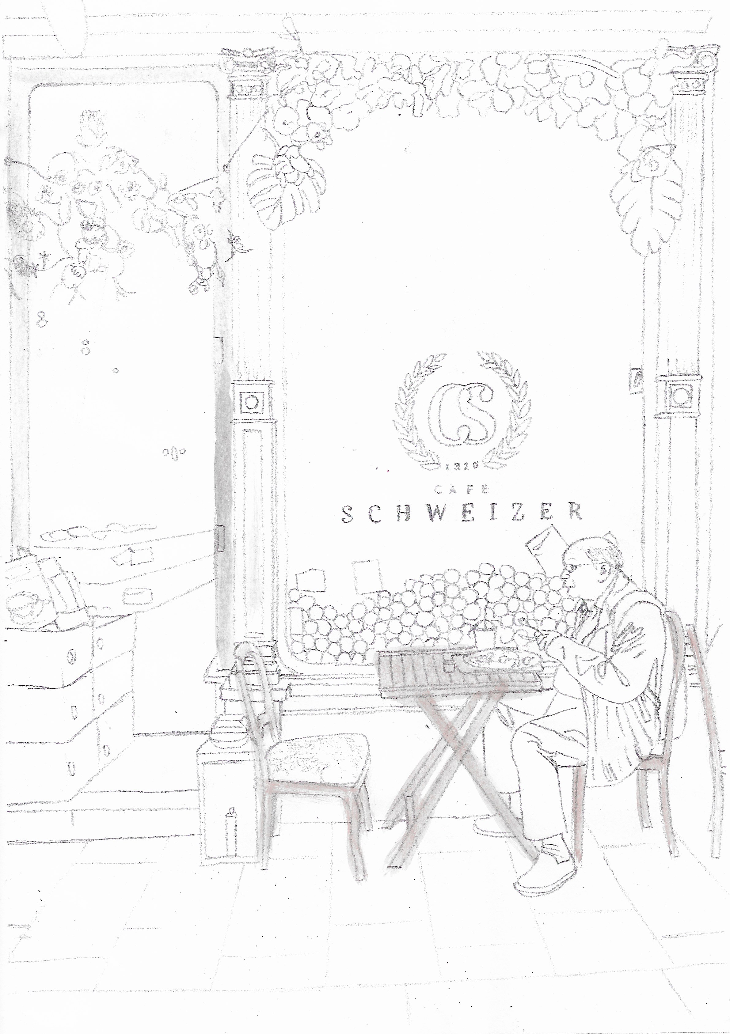
I printed the image at A4 size and then, using my lightbox, traced it to the best of my ability. It was really challenging to see all of the outlines using the printout even with the brightest setting, so I had to leave some of these or add my own interpretation via checking the original on screen. I then made ten photocopies of the drawing.
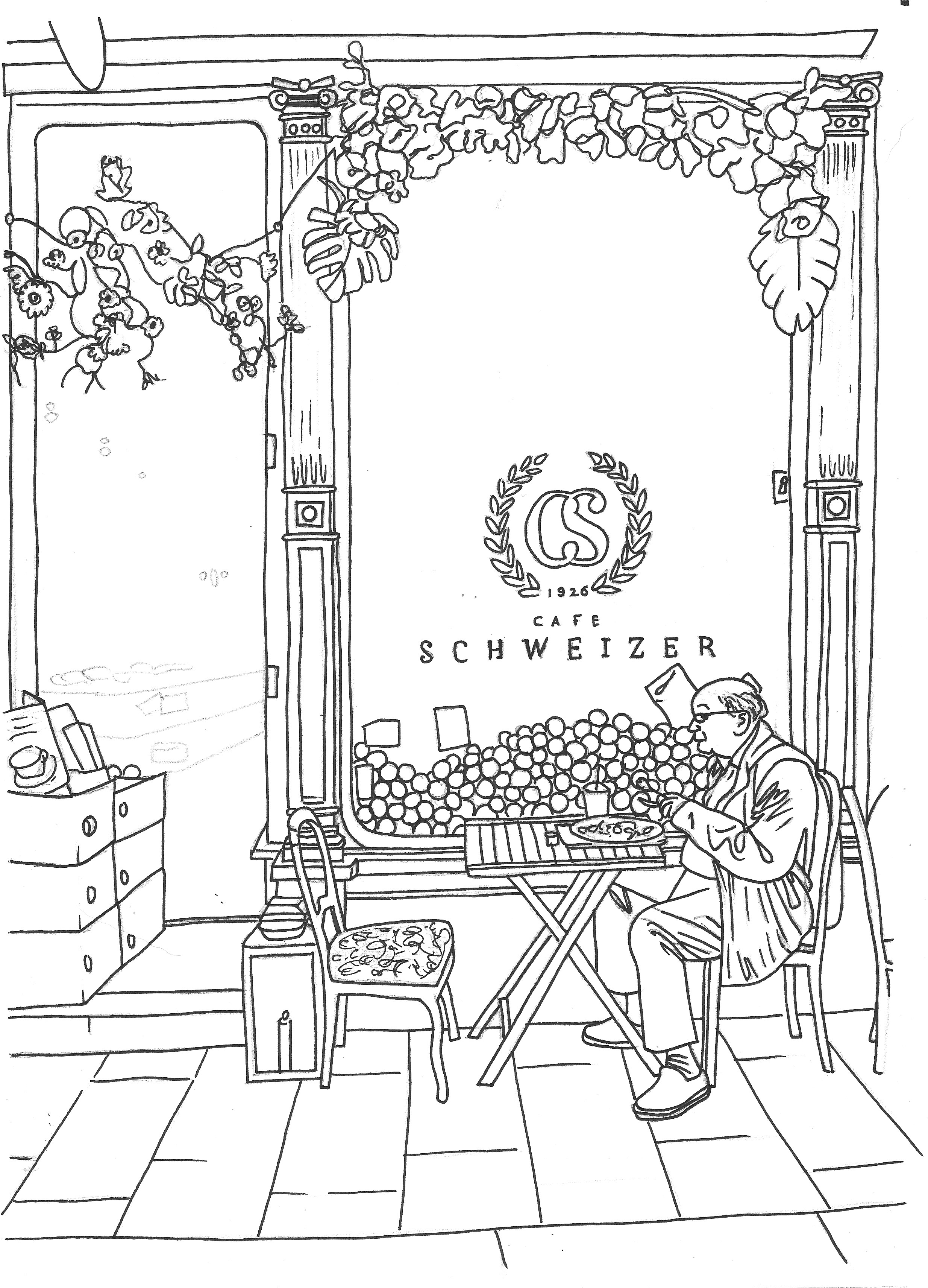
Creating Stylistic Variations
The first version I made was using a fineliner, trying to keep the lines as clean as possible. The lack of clarity in the photocopy/screen version of where the lines should be was quite inhibiting and, as a result, some of these look ‘wrong’, for example the creases on the man’s trousers.
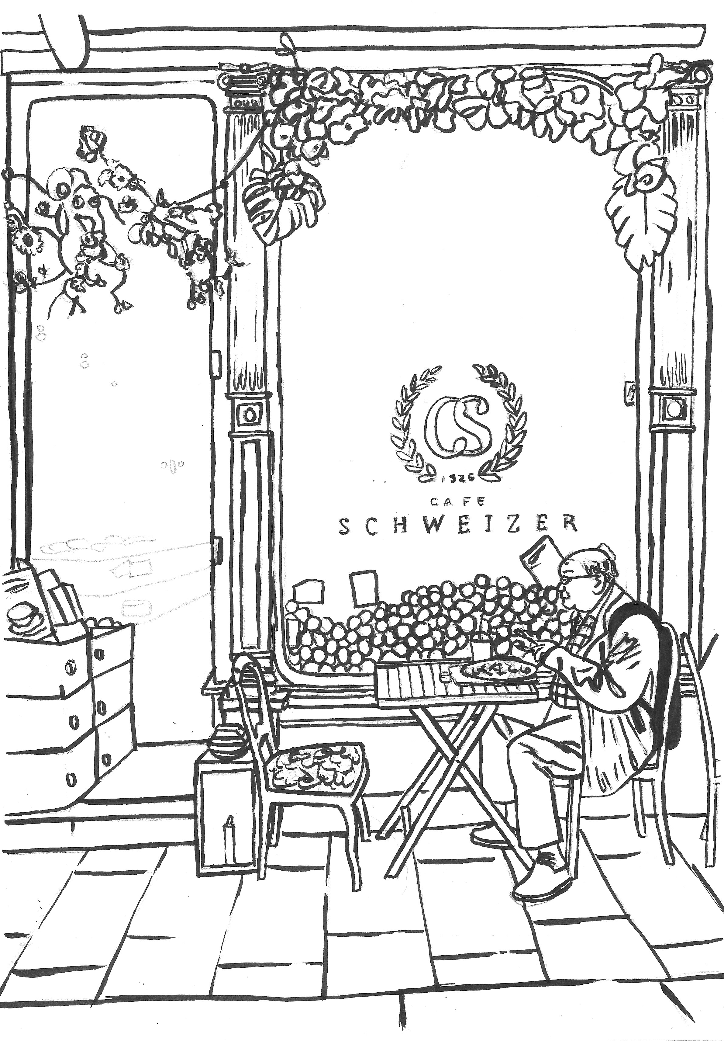
I then decided to use a brush pen for the second version. I am still getting used to applying this so some of the lines were quite messy, but I was quite pleased with the ‘sketchy style’ of the drawing.
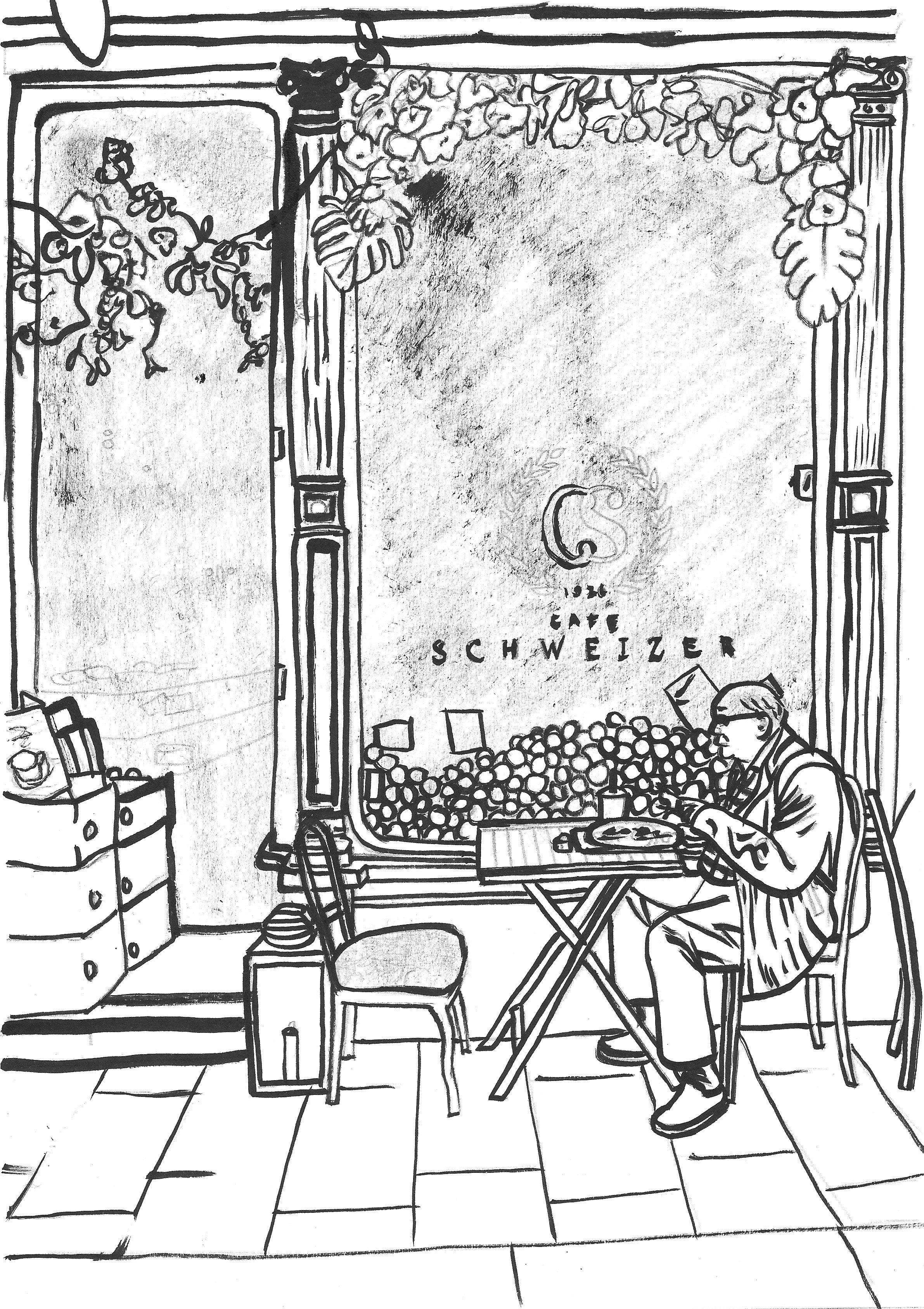
The next version was by far the most successful, in my opinion, of all of my attempts at the exercise. I used a fineliner to apply cross hatching. I tried to keep the lines consistent and follow the contours of the object. I also found myself completely absorbed when creating it as I had to concentrate on each line.
Off to a good start, then…
After reaching the peak with the previous version, it was a steady decline in quality from then on! At this point I began to find the exercise extremely difficult and I was quite unsure of what was expected from me. I had interpreted that the brief required me to pick an image and the create ten different versions based on ten different visual styles, but I soon found that I became so aware of and restricted by the presence of the pre-drawn lines that I could not think how to make any significant variations. It also became very repetitive as the image had so much detail in it and this added to the demotivation. The remaining futile attempts I made follow…
I tried using a bamboo pen for the version below (top left of drawing), but it was quite unwieldy so I switched to a brush, which was easier to use, but I was not impressed with the result.
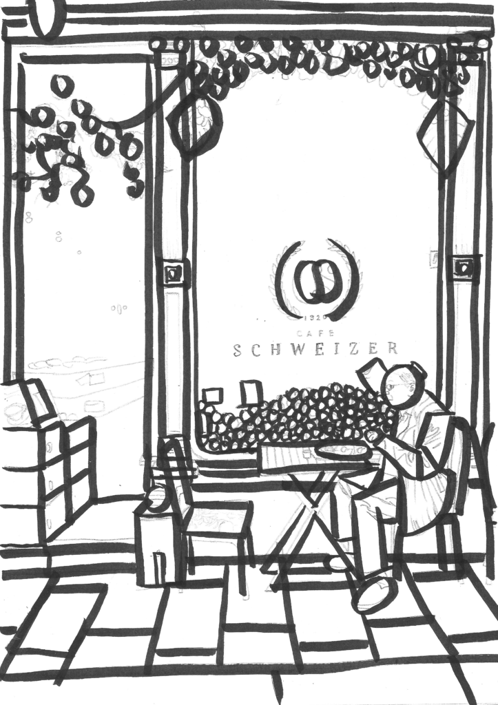
The brief suggested a ‘geometric’ style version, which resulted in quite a disastrous outcome, below.
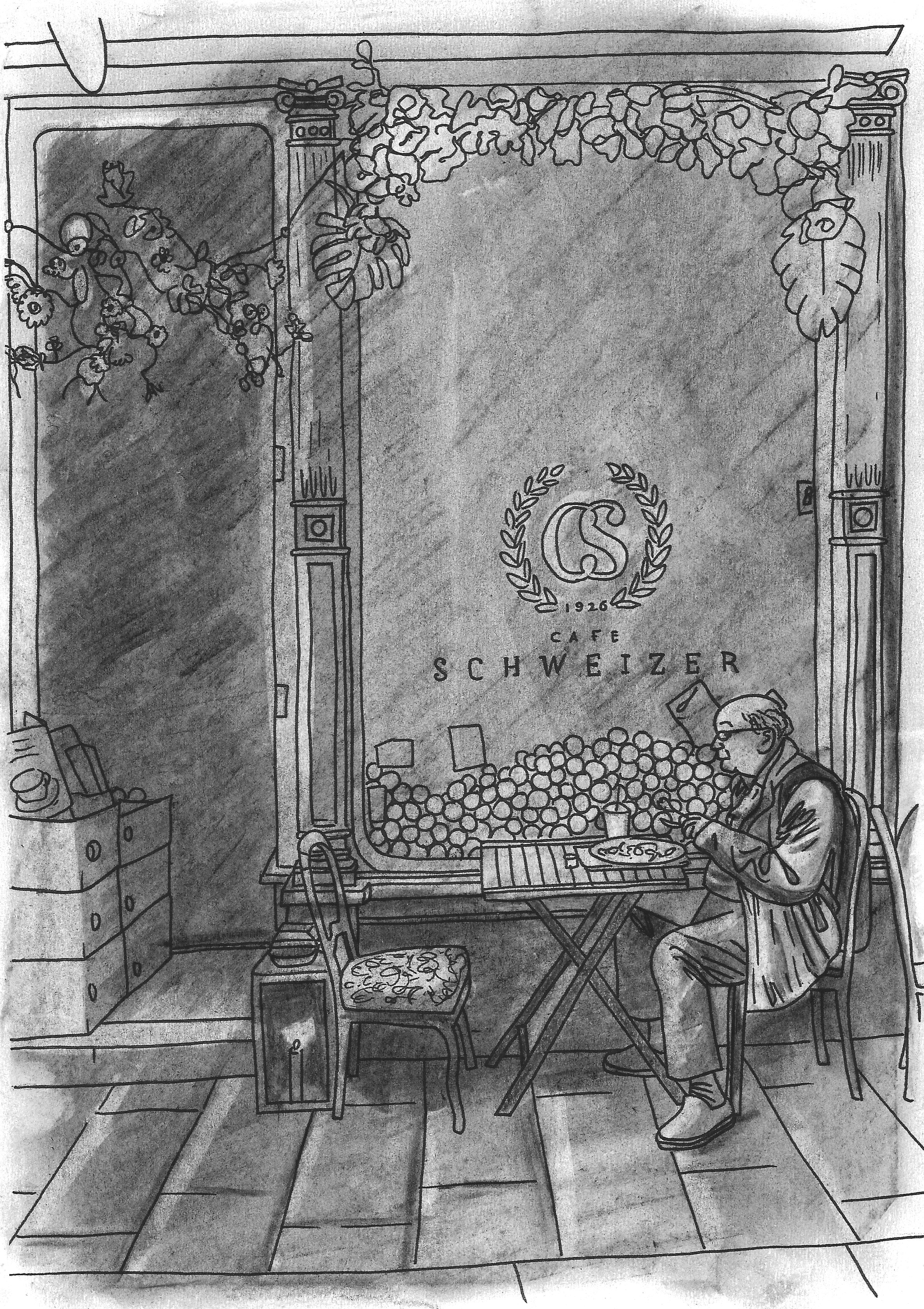
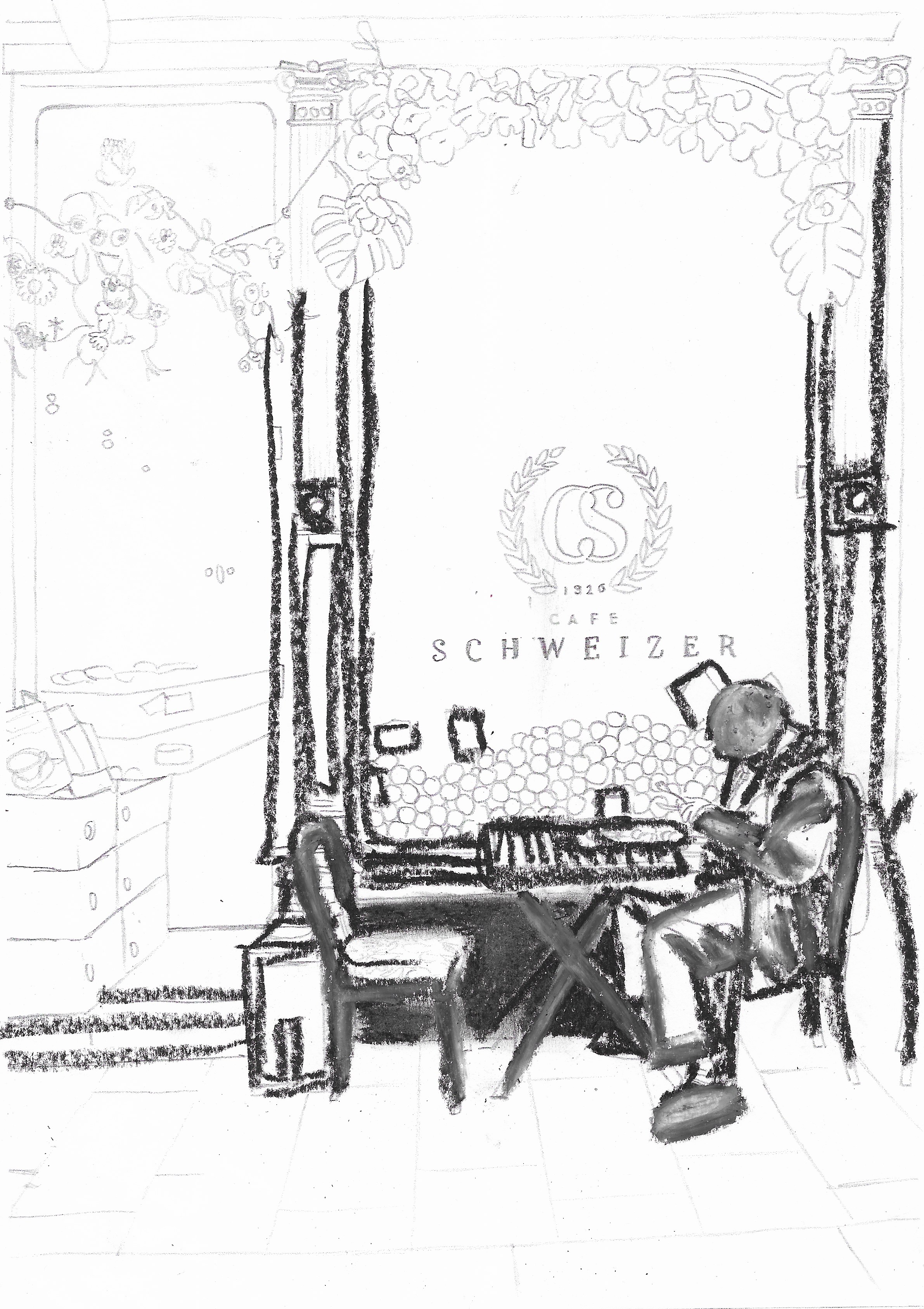
I did slightly redeem myself by deciding to use charcoal to cover the page and then working back into this with a kneaded eraser. Although the contrast between the light and dark areas was not strong enough, I could see the potential for this technique.
Next, I destroyed the image trying to use pastel, which I learnt does not work well at small scale or for intricate details.
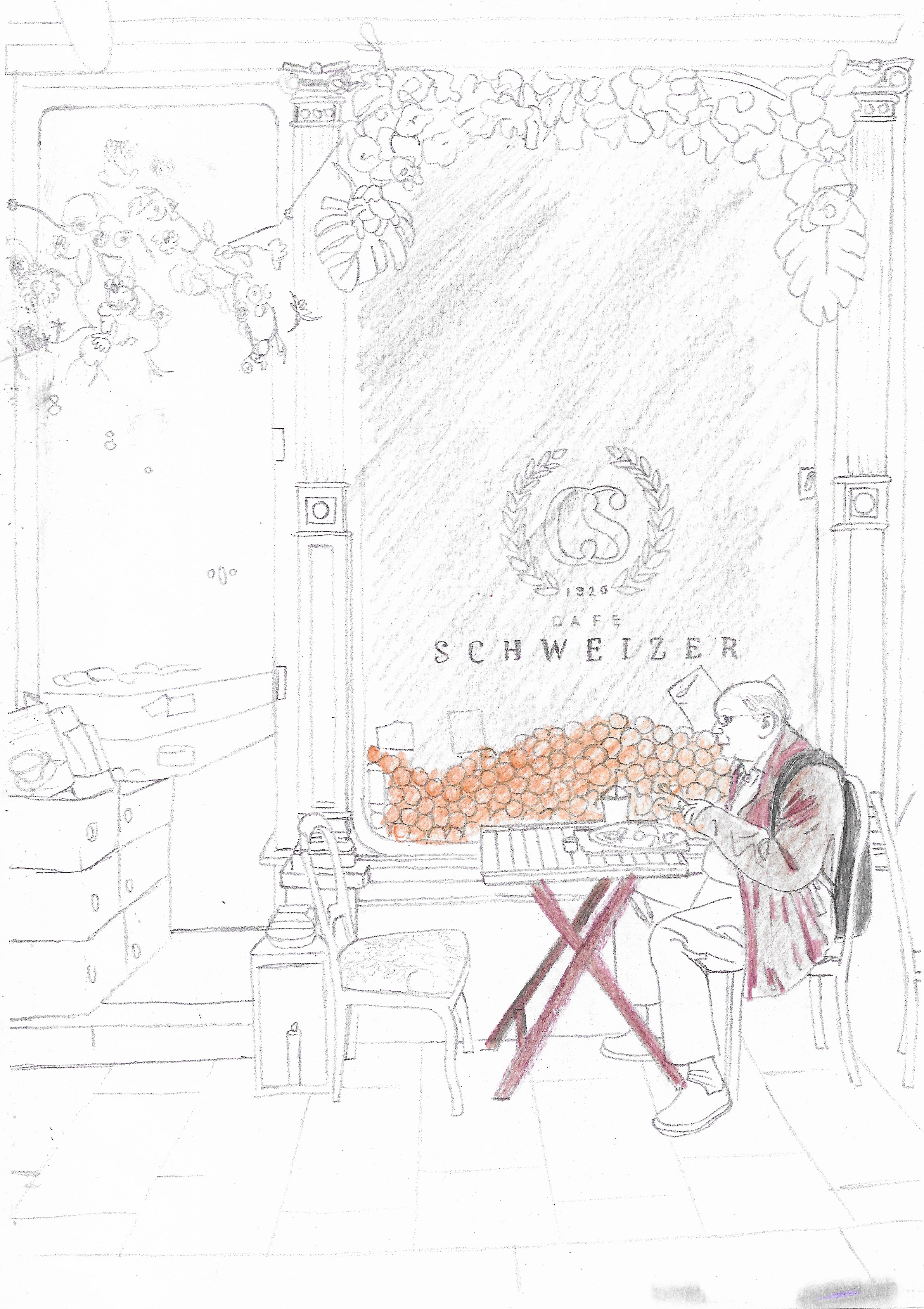
I did go on to attempt a couple of feeble colour versions, but by this point I was so fed up with the exercise that they were not worth the paper I wasted creating them!
Final Thoughts
After the previous exercise, I was really disappointed with my efforts for this exercise, but also felt that the expected outcomes were not particularly clear in the brief either. I thought I would have the opportunity to experiment, but found myself so restricted and unmotivated. The only positive outcome was that I confirmed I am drawn to the effect of crosshatching. It also highlighted, again, that I really need to learn to use colour in a confident way. Although it may not appear that way, I spent a lot of time trying to get through the exercise, but I had to keep taking breaks as I was becoming more frustrated. I decided to stop and move onto the next exercise, as I am quite restricted for time with this unit, and perhaps I will return to this at a later date before assessment.
Reflections After Tutor Feedback
Returning to this exercise after some time, I agreed with my tutor’s observations that the main cause of my frustration was created by the size of drawing tools I experimented with and the scale of the detail in my chosen image. An example of this explanation would be how I managed to use the fineliners with relative ease and enjoyment ,as they are perfectly designed for detailed, small-scale work, but using the thick pastels and trying to repeat the same level of detail clearly did not work. However, as the brief highlighted that the image should include plenty of detail and the copies would be A4 in size, this seemed to me to be an almost unavoidable problem to try and solve 10 times.
Perhaps if I had used a simpler image it would have allowed me to experiment more with different materials in an unrestricted fashion, which I believe would have been more beneficial to my artistic development.
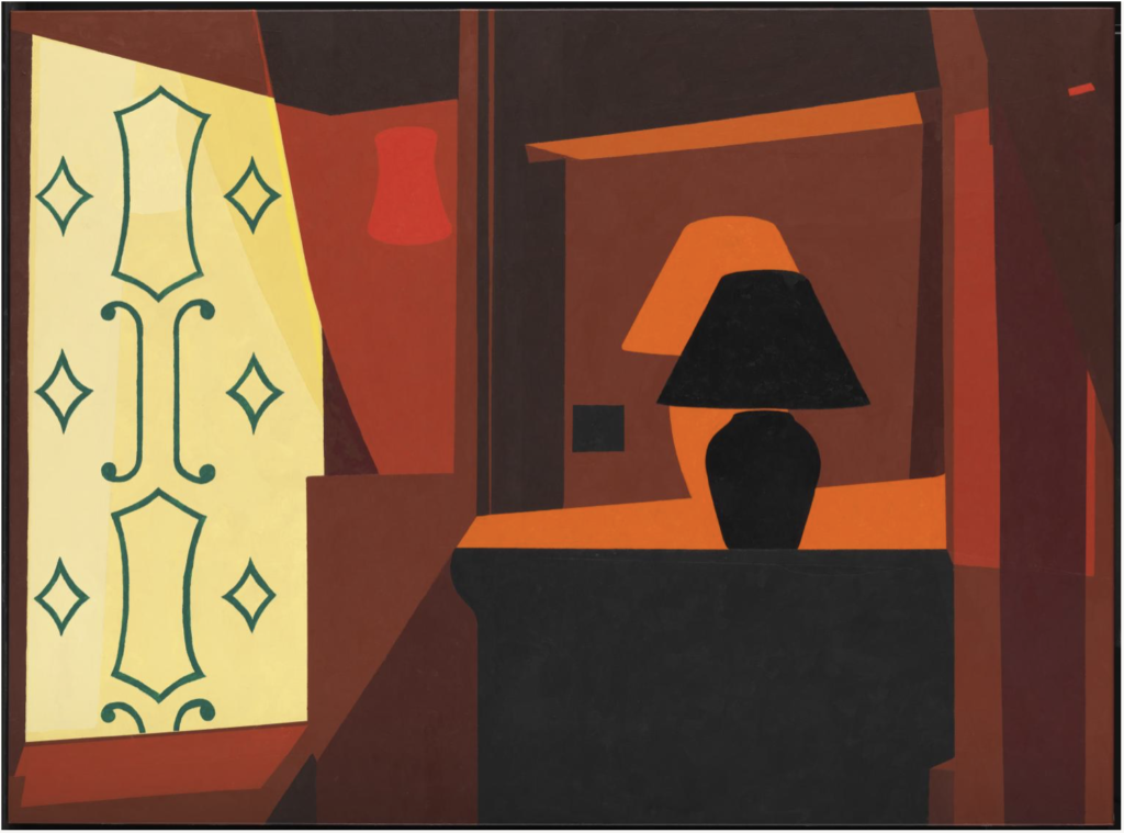
The example provided by my tutor in her feedback was Braque Curtain (2005) by Patrick Caulfield, in which he has reduced a limited number objects to their basic silhouettes and experimented with blocks of colour, layering and positioning. This image greatly appealed to me and I particularly liked the varying shades of orange to create depth.
It would also be interesting to experiment in terms of hardness, for example, using watercolour/pencil combinations would produce a softer less constricted composition, whilst using a marker to create solid geometric outlines would produce a more abstract, solid image.
References
Tate, (n.d.). Patrick Caulfield 1936-2005. [online] Available at: https://www.tate.org.uk/art/artists/patrick-caulfield-873 [Accessed 16 April 2022].