Brief
Part 1
Draw a grid of 20 panels on two A3 sheets of paper so you have a total of 40 boxes.
Make a written list of 40 characters and professions.
Draw character sketches in pencil of each one on your list in the 40 boxes. Work across the page and down so you are filling in the boxes in order. Try to spend at least 5 minutes on each drawing, draw each character’s whole body, and try to make them easily identifiable.
You are trying to represent some typical aspects of the characters, not relying on stereotypes, but creating what we call archetypes.
When you have finished, look at the whole sheet and try to identify common styles of drawing that might show your personal drawing style developing. Ask yourself questions such as:
- Do you tend to draw hair in a particular way, or the folds of clothing in a certain style?
- Is there an identifiable point in the exercise where your drawing noticeably improved as you went along?
- Or maybe even a point where it got worse?
Part 2
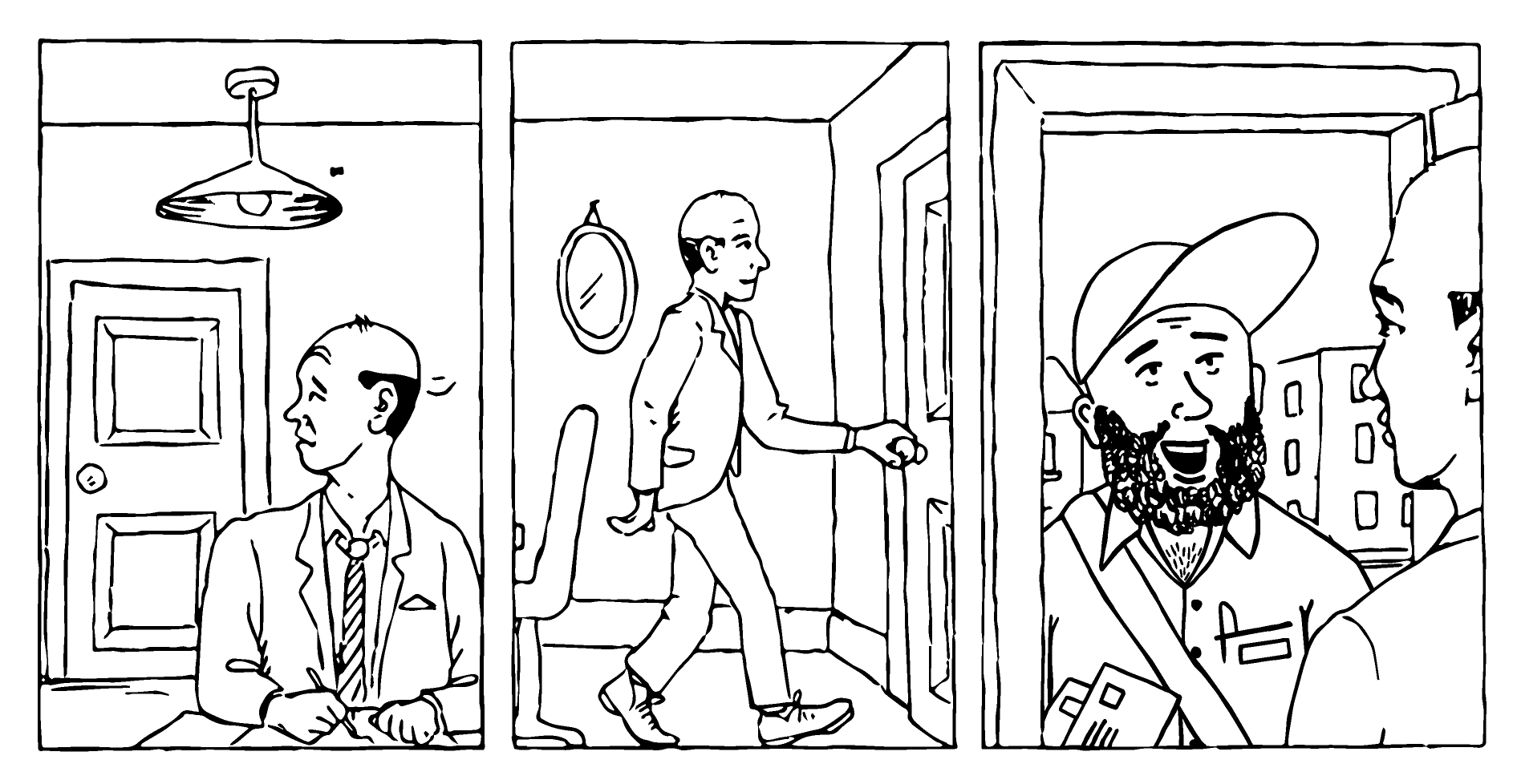
Photocopy the provided three-panel sequence. Select one of your favourite characters and redraw this character into the space in the final panel.
You could also have a go at writing some simple captions, sound effects or speech balloons to create a micro-narrative.
Part 1
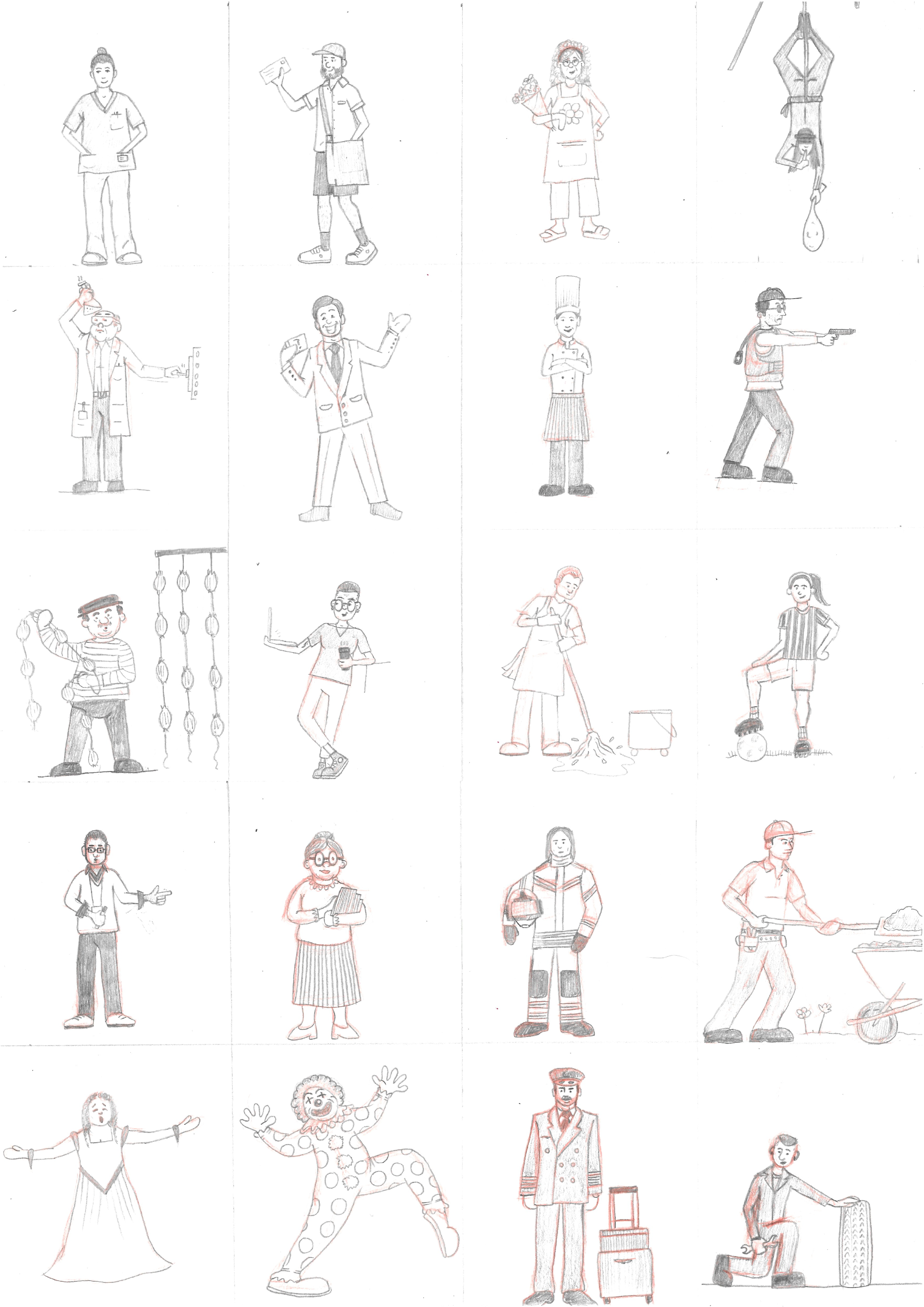
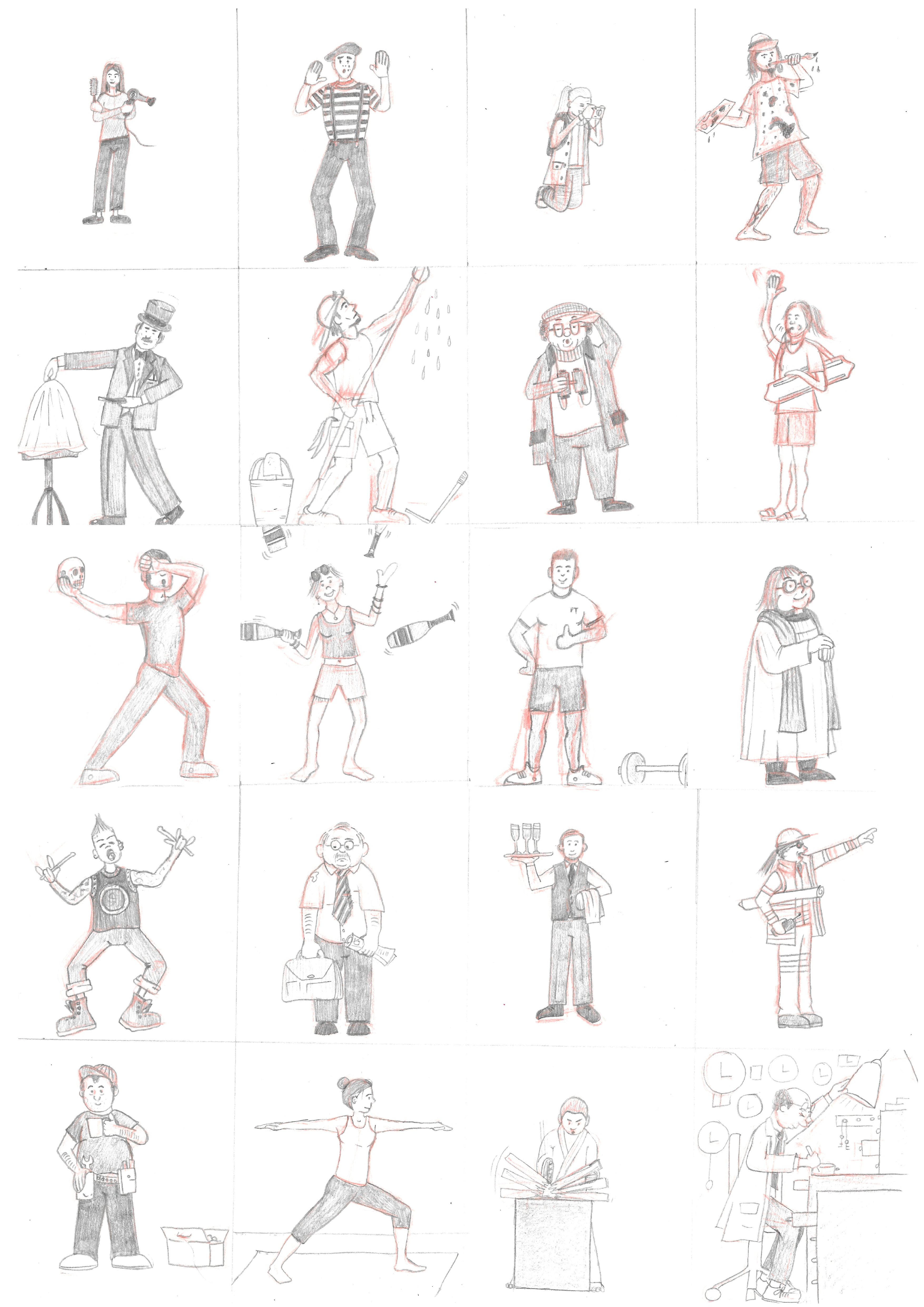
As directed in the brief I began this exercise writing down a list of 40 characters/professions (which was much harder than I had anticipated):
- Nurse
- Postal Worker
- Florist
- Cat Burglar
- Scientist
- Quiz Show Host
- Chef
- Detective
- French Onion Seller
- Tech Entrepreneur
- Cleaner
- Footballer
- Teacher
- Librarian
- Firefighter
- Gardener
- Opera Singer
- Clown
- Pilot
- Mechanic
- Hairdresser
- Mime Artist
- Photographer
- Artist
- Magician
- Window Cleaner
- Bird Watcher
- Lifeguard
- Actor
- Juggler
- Personal Trainer
- Vicar
- Drummer
- Office Worker
- Waiter
- Construction Site Manager
- Plumber
- Yoga Teacher
- Karate Sensei
- Clock Repairer
I felt I had come up with quite a range of characters to try and depict. Next I divided two A3 sheets into 20 boxes and worked my way from left to right, top to bottom.
Thoughts on Character Sketches
I spent much longer than 5 minutes on each of the drawings and I found it a real struggle to draw details at such a small scale on a large piece of paper, which was unexpected as I generally do draw fairly small. I ended up becoming quite frustrated and for some reason I also found myself not using the full space allocated for the characters, so they became even smaller(!) – I felt I rectified this to a certain extent on the second page, once I had noted what was happening.
I began the exercise using just a pencil, but then decided to use a red colouring pencil for a rough draft, which gave me a bit more confidence.
I also found it difficult to come up with ways of visually representing certain characters/professions in a recognisable way either without resorting to a more stereotypical version or because I could not think of how to do this without the character being a particular environment or situation.
I realise I am a complete novice when it comes to drawing clothing/materials and this was highlighted in the exercise. I also was disappointed with the shoes I drew. The style is extremely simple, but this does mean that the characters do all look like they are part of this similar style.
On a positive note, I did feel that once I moved onto the second page, my drawing did begin to free up a bit more and thought most of these were an improvement. Additionally I have been learning more about body proportions and I felt that overall this aspect was quite successful, but more variety would have been a bonus. I did try to mix up the characters’ hair and clothes as well. I also tried to bring out the personality of each individual and I hope I managed to do this at least in some of the examples.
I felt the least successful drawings were the teacher, firefighter, mechanic and hairdresser. The best ones were probably the postal worker, clown, mime artist, birdwatcher and yoga teacher.
Overall, I was a bit disappointed with my attempt at the first part of this exercise as character design is the area I am most interested in and, therefore, I really need to improve my drawing skills.
Part 2
Perhaps an obvious choice considering the theme of the provided three-panel sequence, but I decided to select the Postal Worker for second part of this exercise.
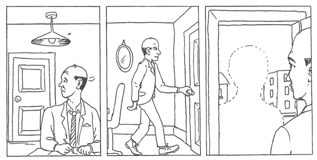
I drew a draft version with my character added. I initially did this using a red colouring pencil for guidance, went over this with a pencil and then, using a light-box, used a fineliner pen for the final version. I tried to keep in mind the style of drawing in the provided panels, so my character would, hopefully, fit in.
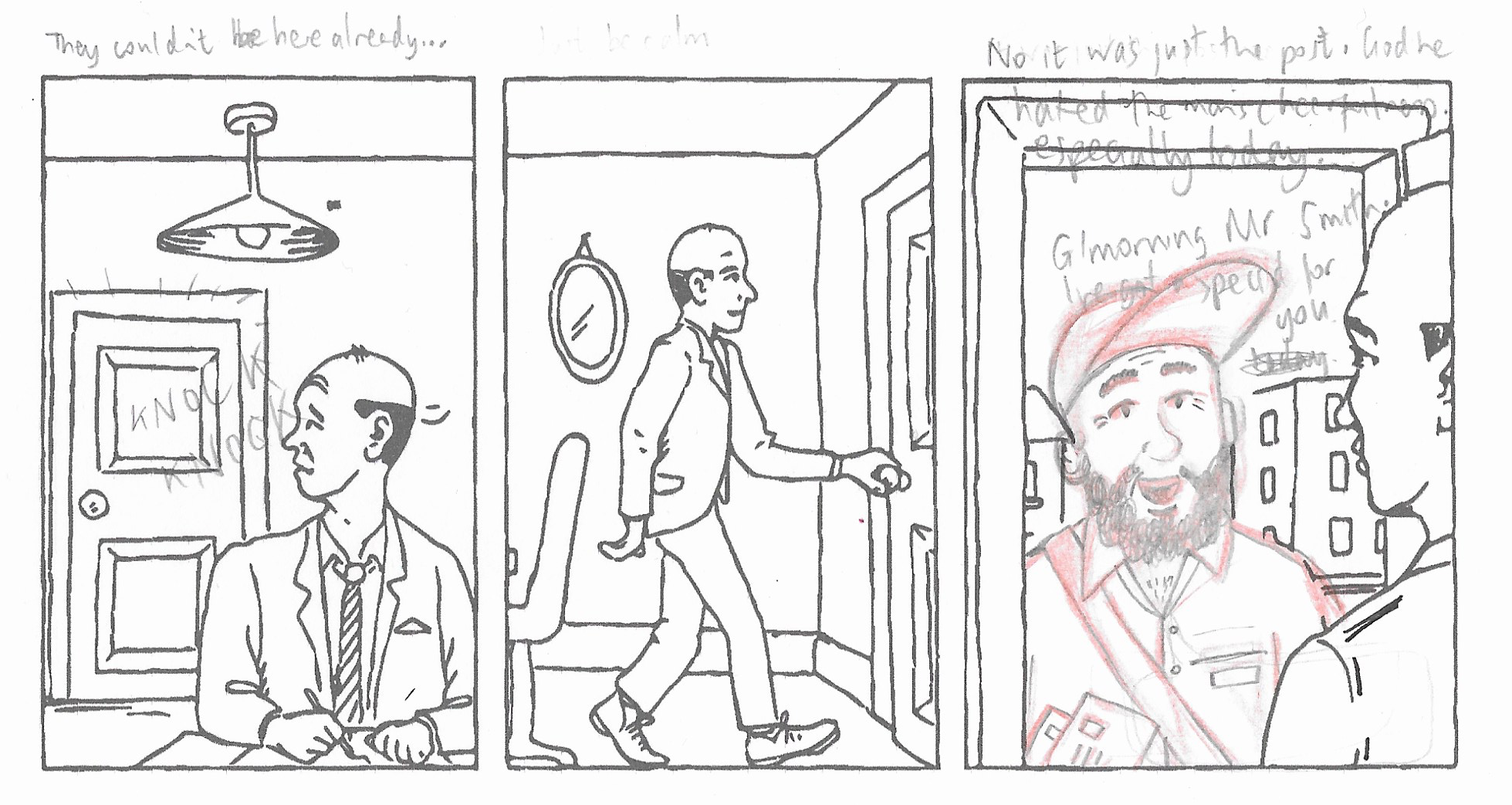
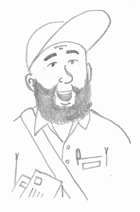
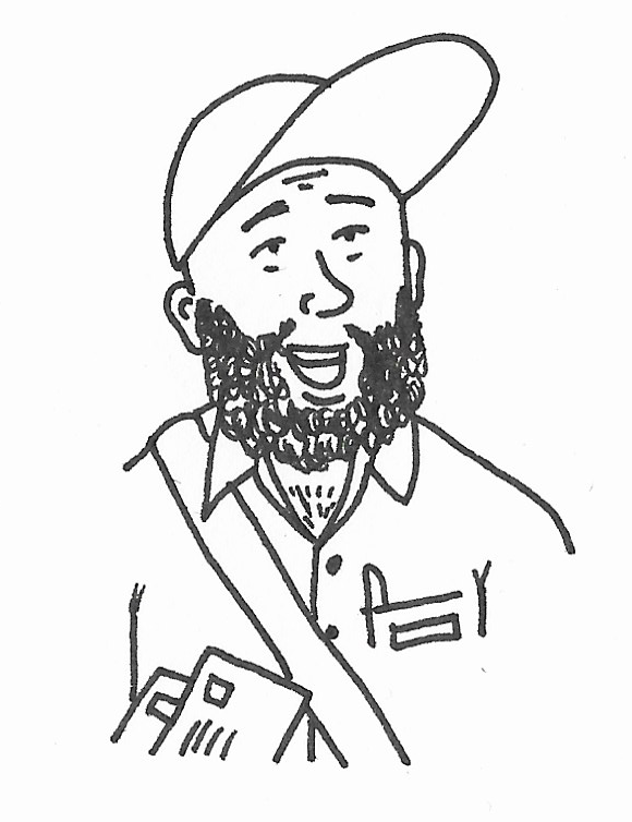
I then scanned the pen version into Illustrator and used Image Trace to make my character fit in with the rest of the drawings. I found the lines were slightly thicker than the original, so I should have used a thinner fineliner.
The brief suggested trying to add some captions or sound effects to create a micro-narrative, so I decided to have a go at this as well. As with the previous exercise, I drew the lettering freehand rather than selecting a digital font and scanned it into Illustrator.

The lettering could have been a bit neater and, again, I should have used a thinner pen. I also found it quite a challenge to fit the text into the panels without obscuring the drawings, but the final version can be seen below.
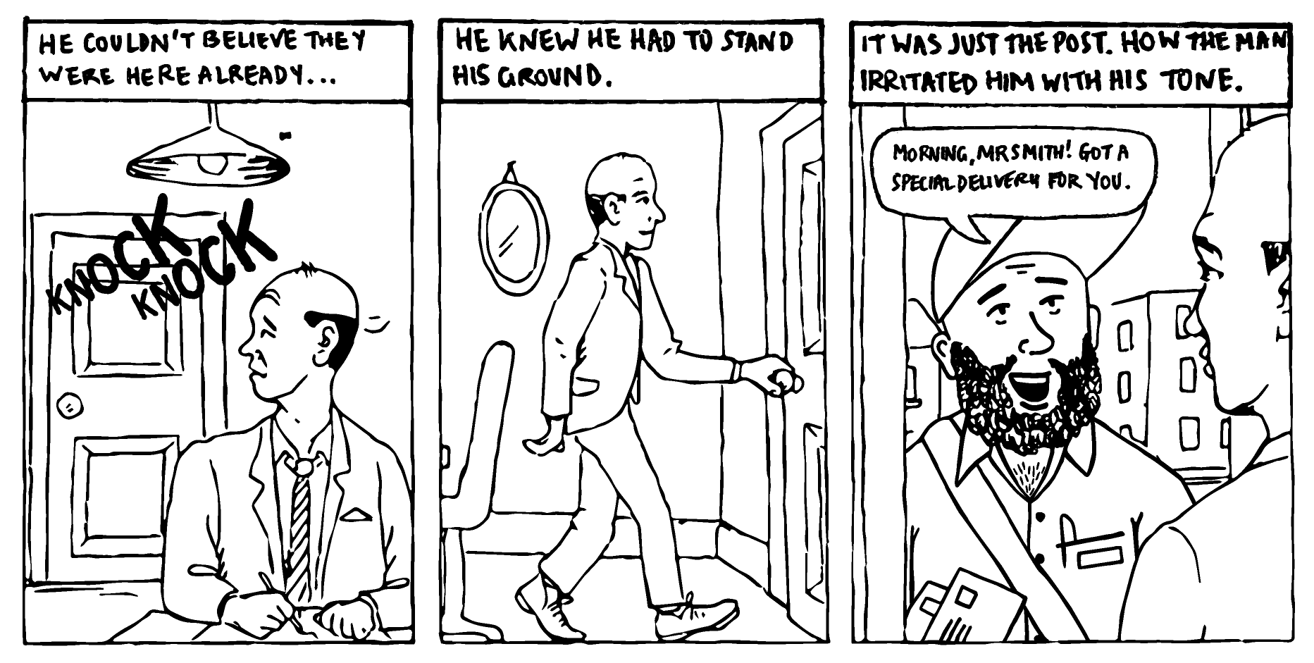
Overall, I felt that the integration of my character into the three-panel sequence was successful and the style of my character was similar to the drawing provided. The narrative I created was not particularly inspiring, but it was a good opportunity to practice lettering and the logistics of fitting the text into panels.