Brief
To start this exercise you will first need to draw an A3 pencil drawing. This could be copied from a photograph you like or have in your swipe file, or it could be your own drawing or it could be for a photograph. Ideally it will contain people, objects and buildings, and a good amount of detail. Try to keep a good amount of detail in your drawing, keeping the pencil lines quite light, so that you can work into it at the next stage.
Now make three photocopies of your A3 drawing at the same size:
- Using a fineliner or nib pen, make an ink drawing on one of the photocopies, inking over the details. Try to use the qualities of the pen, the way you can use ‘hatching’ and ‘cross-hatching’ to create shade, and ‘stippling’ to show gradations of shade.
- Use brushes and a bottle of ink to make a finished black and white drawing. You could use a variety of brush thicknesses, using a fine brush for subtle lines and thick brush to darken in areas of solid black. Again, focus on the particular properties of the brush and way you can vary the thickness of the line, or use an almost dry brush to scratch fuzzy half-tones.
- Finally take you third photocopy and colour it in. You could use coloured pencils or marker pens, watercolour, acrylic or oil paints, but do not black ink or pens. Given that your original reference image is black and white, you are having to colour this image from scratch., int he same way that old films have been ‘colourised’ in recent years. Try to make your palette as varied as possible. If using coloured pencils or pens, try to use every one. You can shade areas with the pencils and then use the markers to shape and model the pencil shades – this also ‘fixes’ them so the pencil will not smudge.
Write about how you found the threee implements and processes:
- Did you prefer using a pen, a brush or working in colour?
- Which of these implements was easier to control with no mistakes?
- What type of lines worked best with each implement?
- What is easier to draw (say) a face in the in picture with a brush, and what is easier to draw a car or building with a pen?
- What effects could you achieve with colour that you could not in black and white?
Selecting Chosen Image
To begin this exercise I searched for a suitable photo on the free-to-use image website Pixabay, which I have previously found to be an excellent image reference resource. After narrowing my choices down, I finally decided on the photograph below.
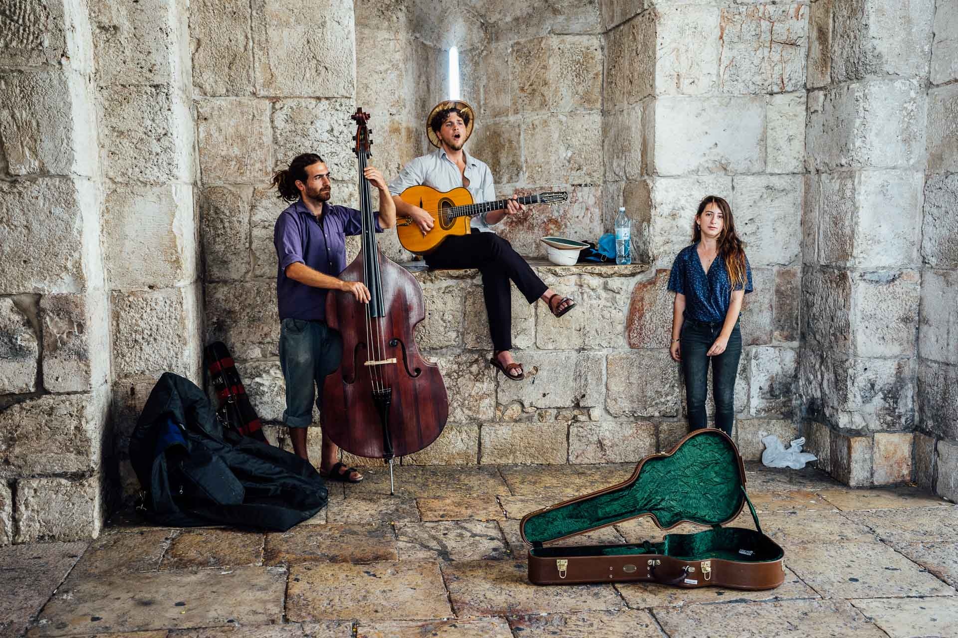
I was tempted to use a photo with buildings and cars, but did not feel confident enough in my current ability to replicate these, particularly at A3 scale.
Initial Drawing
This exercise raised issues before I had even put pencil to paper as I do not have easy access to an A3 photocopier so was unsure how I would be able to make the three copies of my initial drawing as required. I also thought that if I had been able to do this, the quality of the photocopying paper would not be very suitable in terms of quality for the materials I was required to use, e.g. ink. after puzzling over this for a while, I decided to invest in an A3 lightbox, which proved to be an ideal solution.
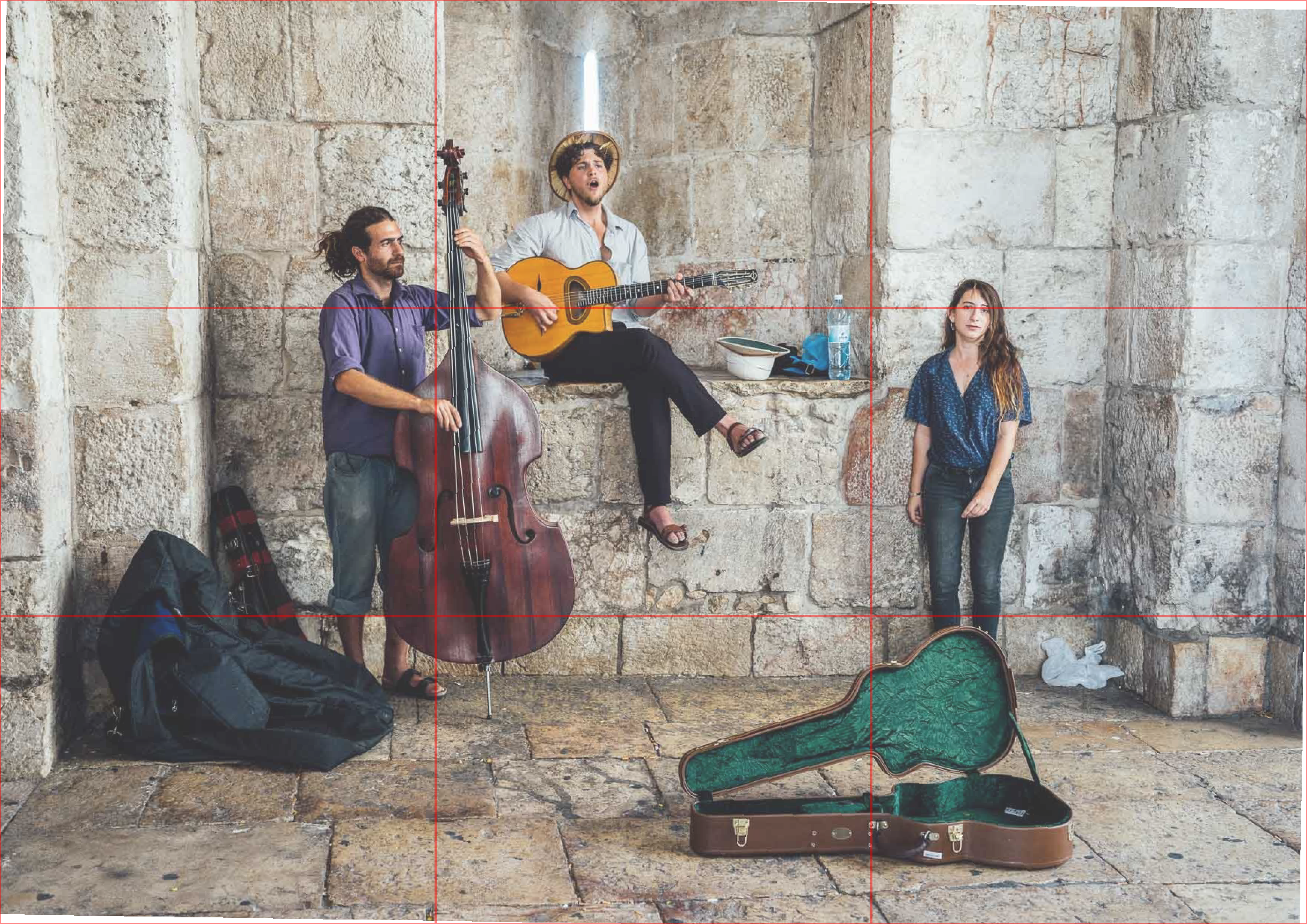
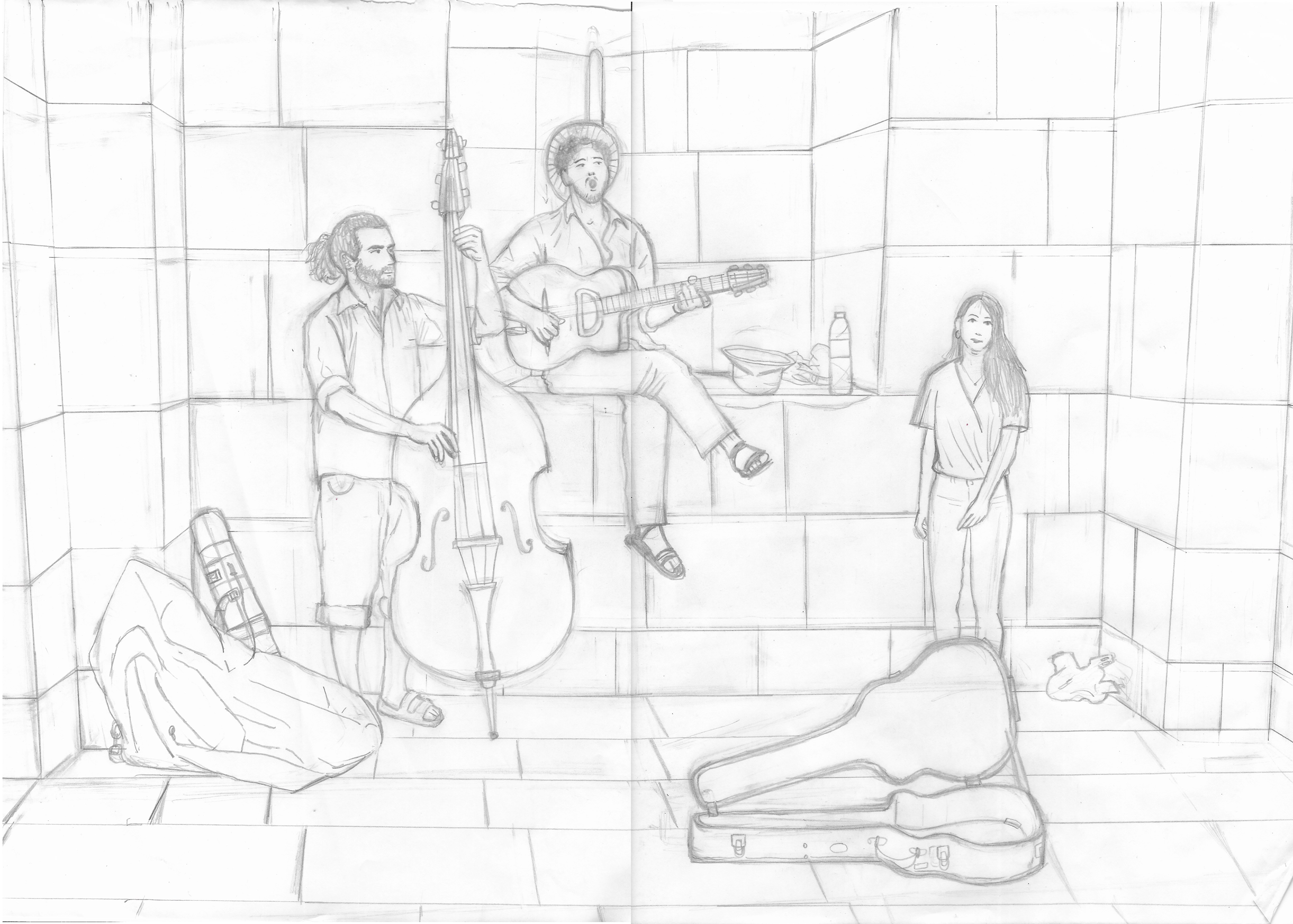
I was quite apprehensive about working at A3 scale using non-digital tools, but was determined to attempt it for this exercise. I considered how I could map out the drawing and decided to split both the reference image and a blank A3 sheet of layout paper into a 3×3 grid. I also straightened the image as I found this easier to work from.
I could then lay another sheet of layout paper over my blank grid to work on, using my newly purchased A3 lightbox. I found this method helpful in breaking down the task of trying to copy the image at a larger scale, but there was still a great deal of erasing (and cursing!) involved. I felt that the stone walls and ground were quite wrong in terms of perspective, but as previously stated, this is an area I find particularly challenging and I would go on to improve this as the exercise progressed. I was quite pleased with this initial result.
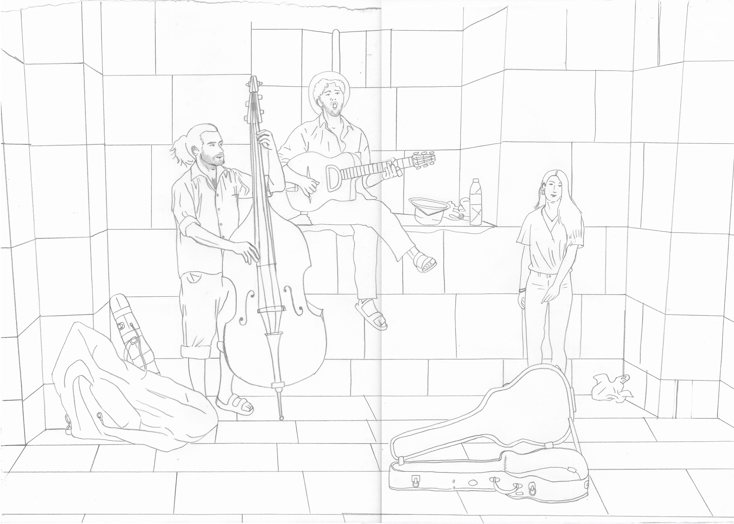
Next, I made a clean line copy on another sheet of layout paper, which would act as the template for the three final versions.
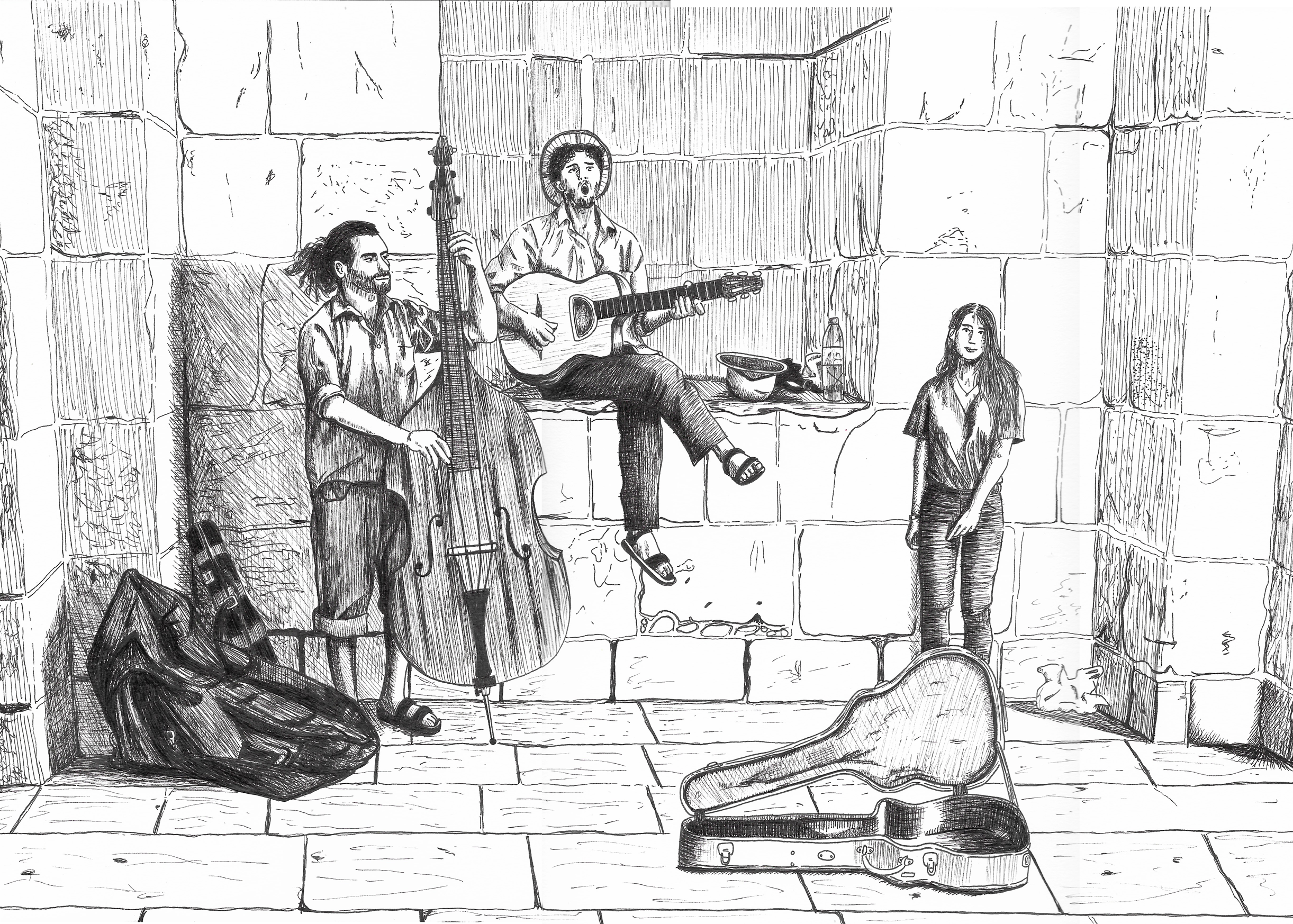
Fineliner Version
Despite having a template to work from I still found myself procrastinating this part of the exercise as I was not confident I would be able to create anything worthwhile using these materials. However, once I made a start I found myself quite absorbed in the process and I thoroughly enjoyed working in this way.
I experimented with various nibs – 0.1, 0.2, 0.3, 0.5 and 0.8 – and found that I much preferred the smaller ones. I liked doing the more detailed work using the fineliner, but found the larger areas harder to work out what lines/marks to add.
Although I did use the template, I found myself looking more at the original reference photo as I drew, noticing misjudgements I had initially made as I worked. I enjoyed using the fineliner and although the final result was not ‘perfect’ and I certainly need to practise using this tool and the technique of hatching and cross-hatching, I was pleased overall with what had I managed to create.
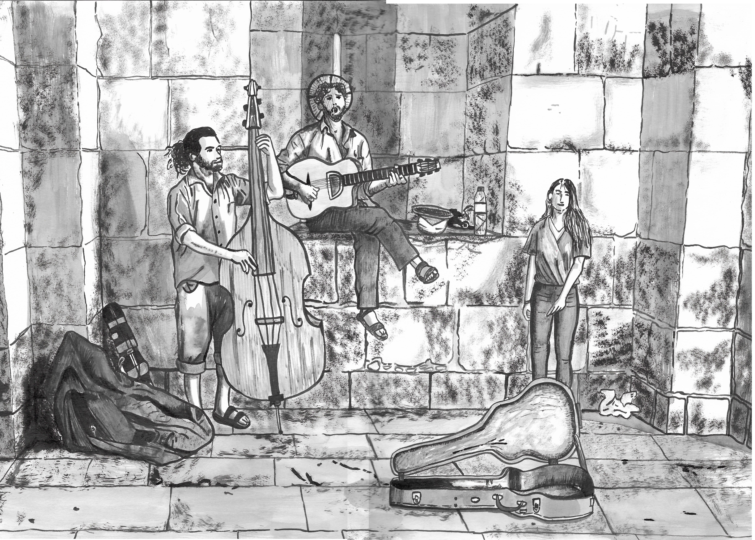
Ink and Brush Version
Moving onto the second version, I found myself procrastinating once again, but, as before, I found myself thoroughly absorbed using ink and brush. I found this method quite ‘freeing’ and there were many different ways of applying the ink to create different effects. Although, I felt there were plenty of ‘mistakes’ in this version in terms of accuracy, I found myself more confident in trying things out.
I could cover larger areas more effectively than with the fineliner, but I found it difficult to do the more detailed work, e.g. faces, but this could have partly been due to my choice of paintbrushes. I also had difficulties maintaining the appropriate amount of ink on the brush and often too much was applied the the paper for what I required. It made me consider what I could achieve if I had been able to add white ink to certain areas.
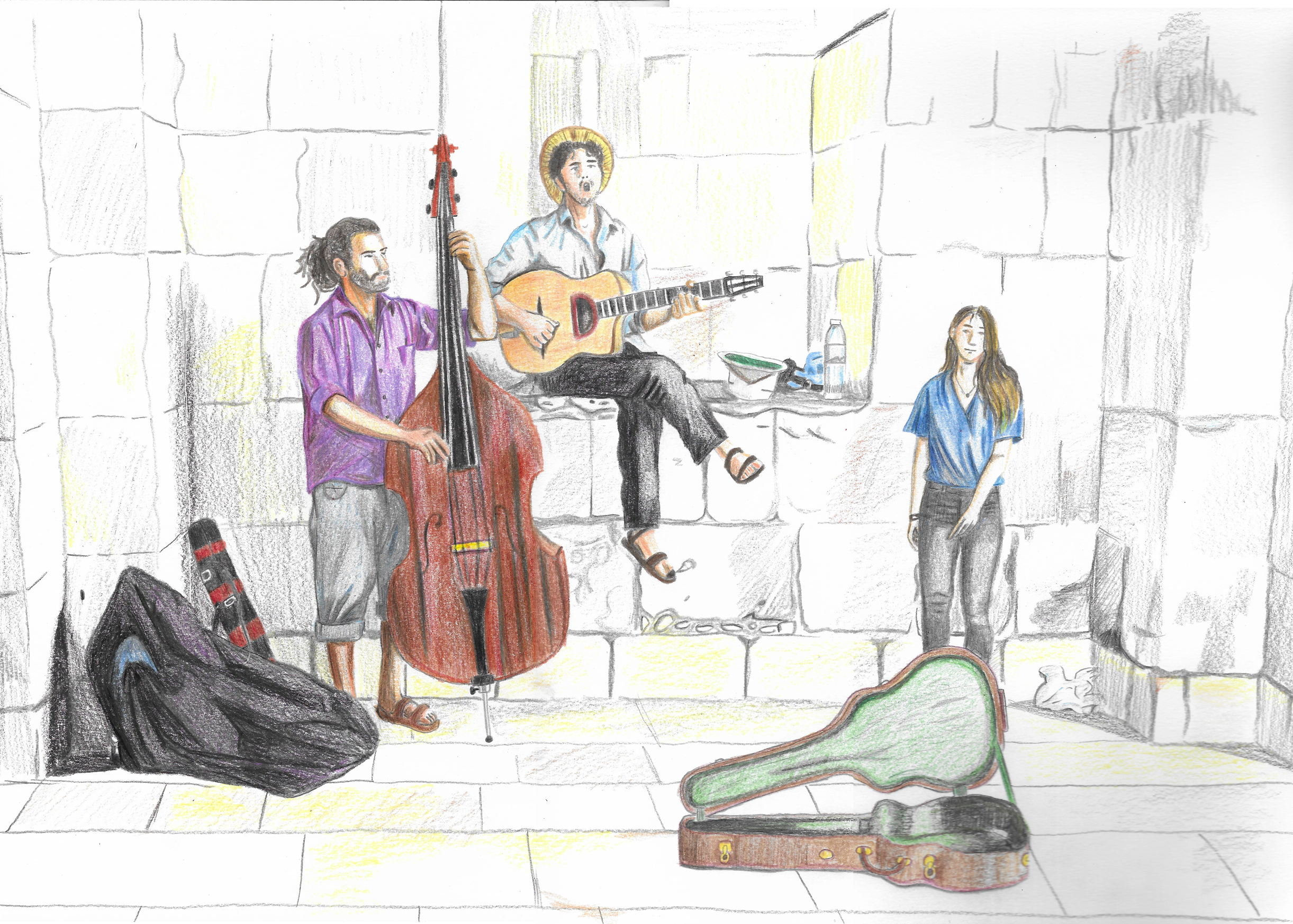
Coloured Version
The fact that I am not very confident using colour made this version particularly daunting for me, so it was always going to be a real challenge. In hindsight, I made the wrong choice for this version of the image and should have chosen to experiment with acrylics, but instead decided on coloured pencils. I found myself unhappy with the result after colouring just the first few areas so by the time I got to the walls/ground I felt a bit lost with what to do. The only aspect that I was reasonably happy with was the folds of the clothes.
I am not sure if it was due to the quality of the pencils I was using or choice of colours, but more likely it was lack of technique/ability using them. Afterwards I thought it may it been more successful if the paper had not been white so I could have integrated this into the background more effectively. I was quite disappointed with this version and felt I should have achieved something more substantial.
Evaluation
Did you prefer using a pen, a brush or working in colour?
I enjoyed using the pen for the more detailed work and the brush for covering large areas. I also liked the variety of marks that could be made using the latter.
Which of these implements was easier to control with no mistakes?
I felt the fineliner was the easiest to control, but that is not to say mistakes were not made!
What type of lines worked best with each implement?
I found the fineliner could be versatile in terms of application, e.g. varying the pressure allowed me to create delicate or strong lines and hatching/cross-hatching allowed me to build areas of shade (a technique I could not quite get right). I did try stippling, but could not find a way to make it work effectively in the drawing.
The ink and brush allowed for more free-flowing, organic lines to be created and, although not always accurate, I found them quite visually pleasing. It was possible to apply the ink in a range of ways – e.g. directly from pot to paper, using a dry brush or thinning it with water to create a a range of tones.
I could not really comment on the coloured pencils as I did not use these in a successful way.
What is easier to draw (say) a face in the in picture with a brush, and what is easier to draw a car or building with a pen?
I felt this question was slightly unclear, but as previously stated I found the pens were better to use for more detailed work, e.g. faces, and the ink and brush was suited to covering larger areas.
What effects could you achieve with colour that you could not in black and white?
In this exercise I did not manage to achieve much using colour. In general terms, I believe colour is a tool that, if used correctly, can evoke emotions, add impact, affect balance and direct the viewer’s gaze to particular areas of a composition.
Final Thoughts
I found myself really enjoying this exercise. It was challenging in many ways, but I am glad I stayed away from using a computer and certainly want to develop my use of both fineliners and ink/brushes. I clearly need to experiment and try various methods of applying colour in an effective way.
I was pleased with how I used the grid to scale up/copy from the reference photo to create a reasonably successful pencil drawing. This exercise has increased my confidence for working at A3 scale.
Reflection After Tutor Feedback
My tutor suggested that using a media such as watercolour or ink for the colour version of this exercise may have allowed me the same sense of freedom that I had with the black and white versions. I felt this was completely right as I was much too controlled and detail focused when using the coloured pencil and, as the image was quite large, I could have tried applying watercolour/ink in a looser way, perhaps going outside the outlines. I also thought this loose style might create a more dynamic illustration, which could enhance the sense of movement/sound created by the instruments/music.