Brief
This final assignment is an opportunity to consolidate the understanding you have gained so far, reflect on the work you have enjoyed, the successes you have had and the areas of comics productiion you feel most drawn to. It allows you to create an original and personal project and gives you maximum opportunity to show off your interests and talents.
The task for this assignment is very open and will bring together all the knowledge and understanding acquired throughout the course. All we are asking is that you produce a five-page comic book.
- You could plot, write, design and draw your own five page short story with a beginning, middle and end.
- You could make five one-page stories all completely different from each other.
- Or you could produce five one-page stories that might share a locale, characters or visual style, but are still individual micro-narratives.
The content is entirely your choice, it could be:
- a standalone short story
- a section from a longer narrative
- a very personal experience based on your own experience
- a story looking at current political or social concern
- a transcription of a dream from your own dream diary
- a combination or synthesis of all these approaches.
Your original story pages should be drawn 38cm high x 25 cm wide, which is a standard size for reproduction to normal comic format. Your story pages can be any grid structure you want it to be, but the finished pages need to be on A3 sheets of card or Bristol board.
Influences
I began this final assignment by looking back at some of the illustrators/comic book artists that had the most impact on me and that I felt related in style and/or content to the vague idea I had in mind.
I liked that they often used ink in their work (not always using colour) and had individual, recognisable styles. As I had a vague idea for a fairly gothic or ghostly story in mind it was also appropriate that many of these artists have also created work in those sub-genres. At this early stage I was intending to try and recreate Edward Gorey’s use of hatching and cross-hatching as I thought it was well suited to the nature of his work and added to the ‘creepy’ aura.
Ideas
I was feeling slightly overwhelmed at the prospect of creating a finished five page story so, before developing any ideas, I drew out a general mindmap based on what I had learned so far in the unit and some more specific research (see References). I filled it with some important points I felt I should try to follow.

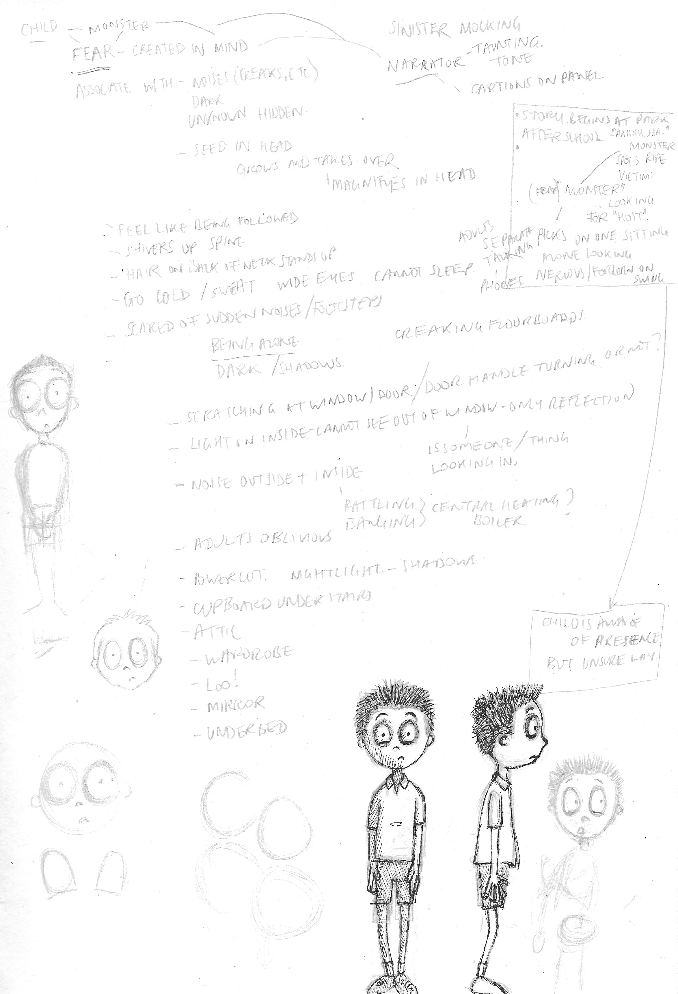
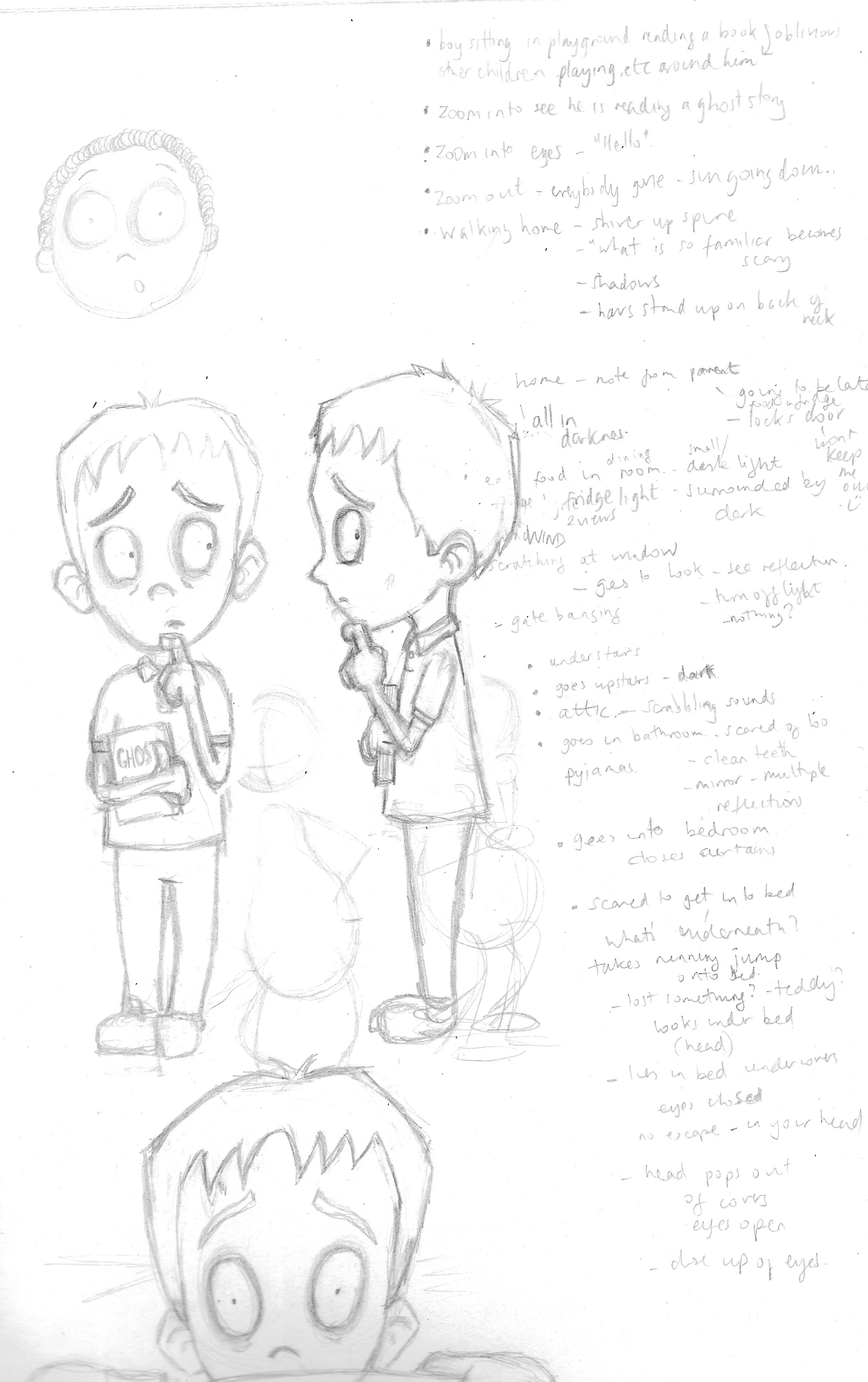
I had an idea which related to how fear can be created in an individual’s mind and completely take over his or her life. The basic concept involved a ‘monster’ following a child home and then suggesting various hiding places for the monster in the house (e.g. under the stairs, in the attic, under the bed, etc), but it would end up with the monster stating that it was most at home in the child’s head – I wanted the monster to be the narrator of the story in a mocking tone.
Although I was keen on this idea, I soon realised that having so many different locations would create a great deal of work and, working to such a tight deadline, I doubted my ability to create work to high enough standard. Additionally I found although I was able to visualise it quite vividly in my mind I could not work out how to put this into a panel by panel version. Perhaps it is an idea I will return to at a later date.
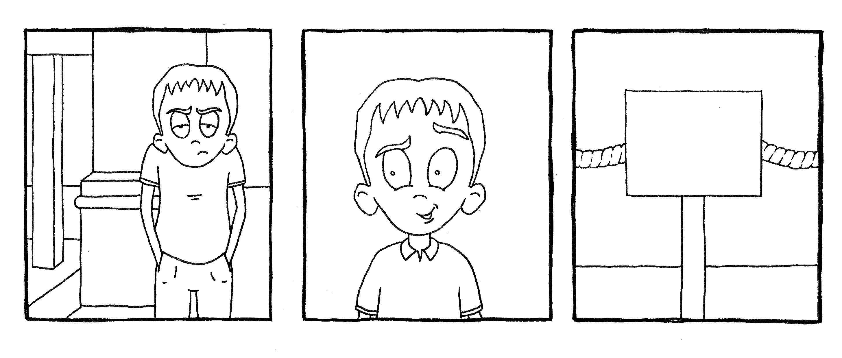
The rough notes for this idea can be seen below. The drawings were the early developments for a character design, initially very simple in style, but I wanted to push myself further for this assignment so I found a tutorial that really helped and I was pleased with the first attempts which can be seen in the second image below.
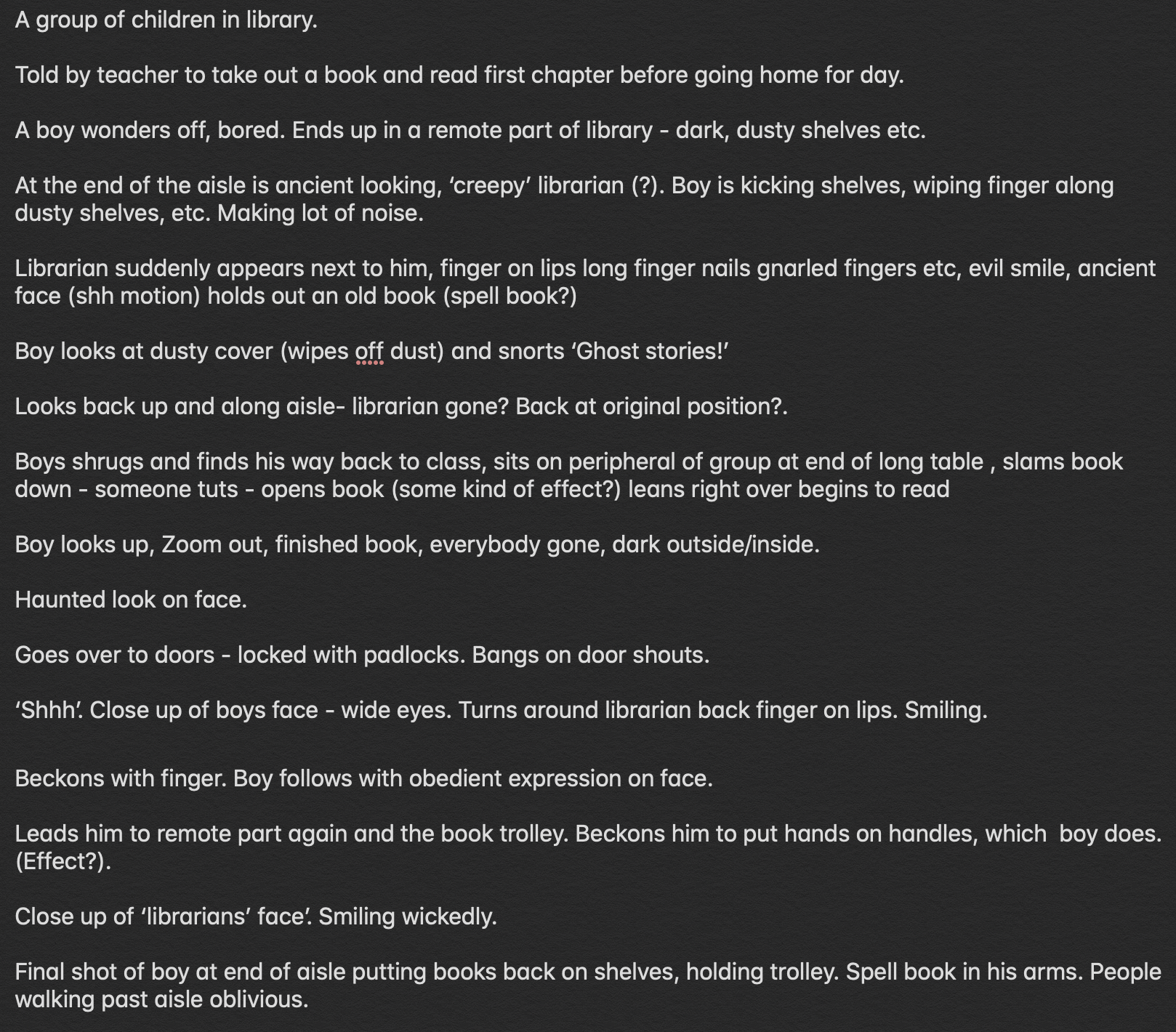
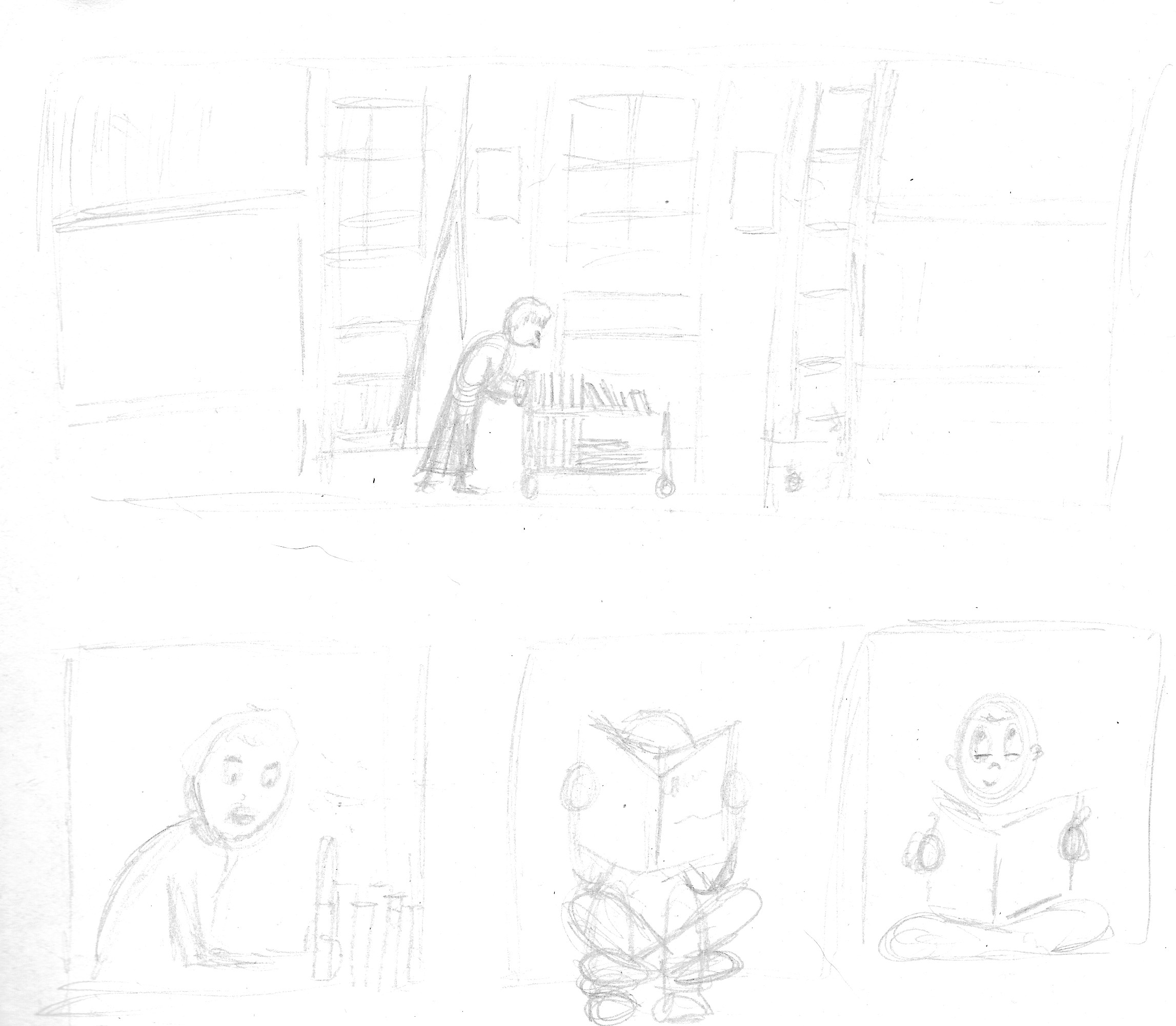
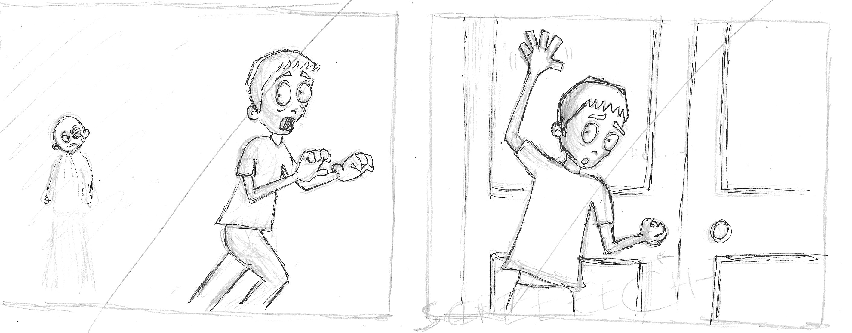
I was still keen to create a gothic story so I moved onto another idea which involved a child finding a hidden area in a public library with a creepy ‘librarian’, but I was not as certain about this one in terms of content. I did type out an outline and make a few rough panel drawings as below, but I fairly quickly moved on.
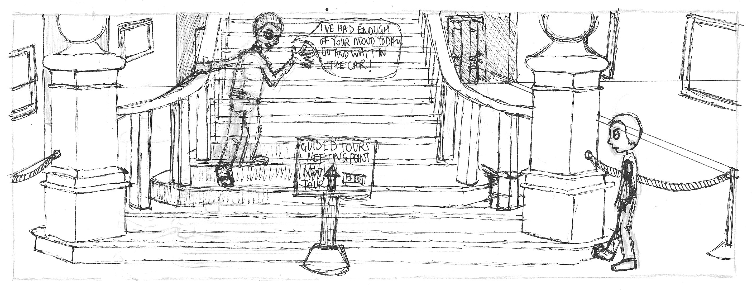
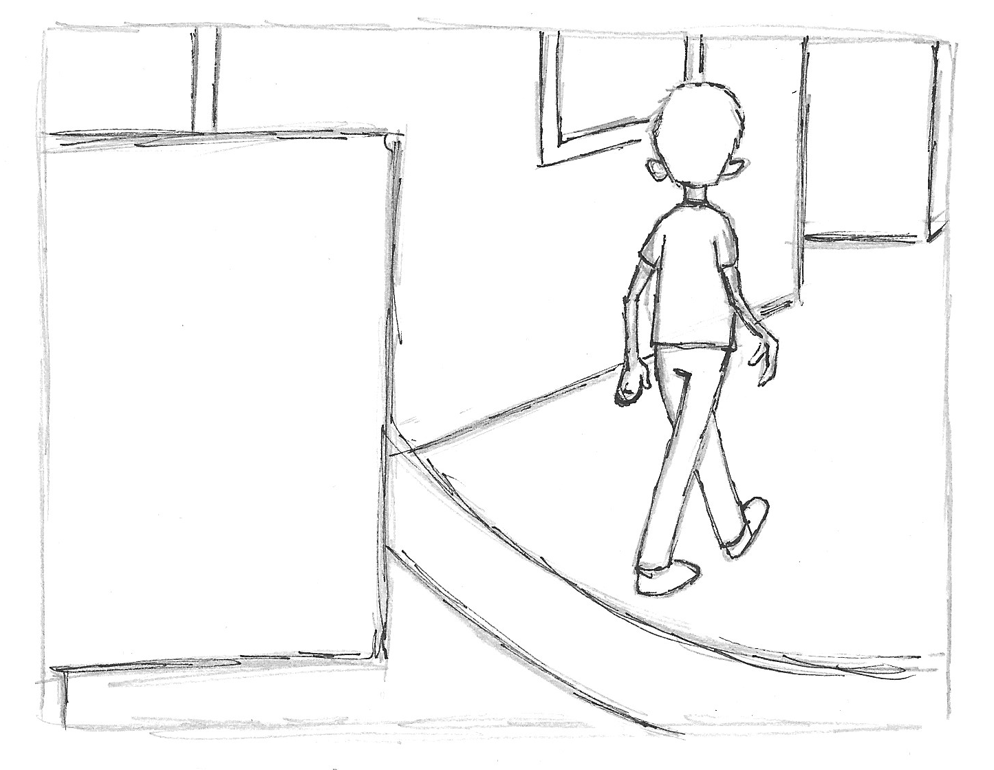
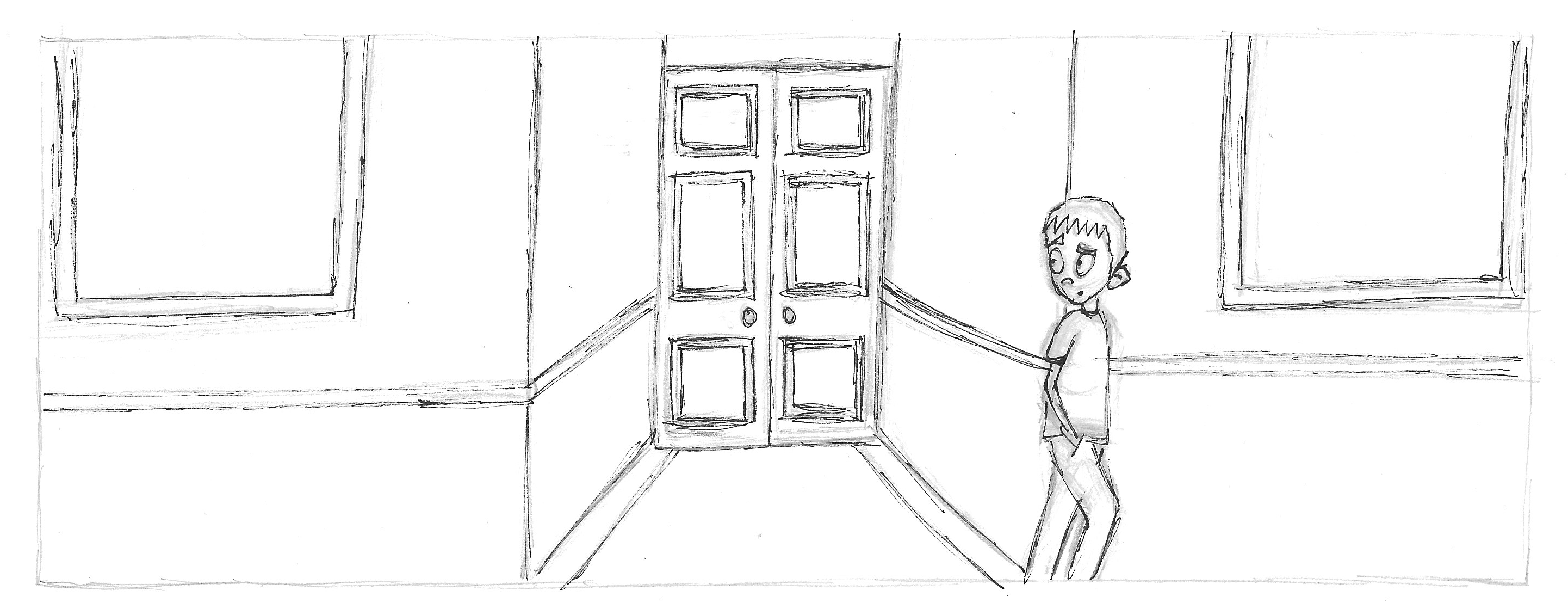
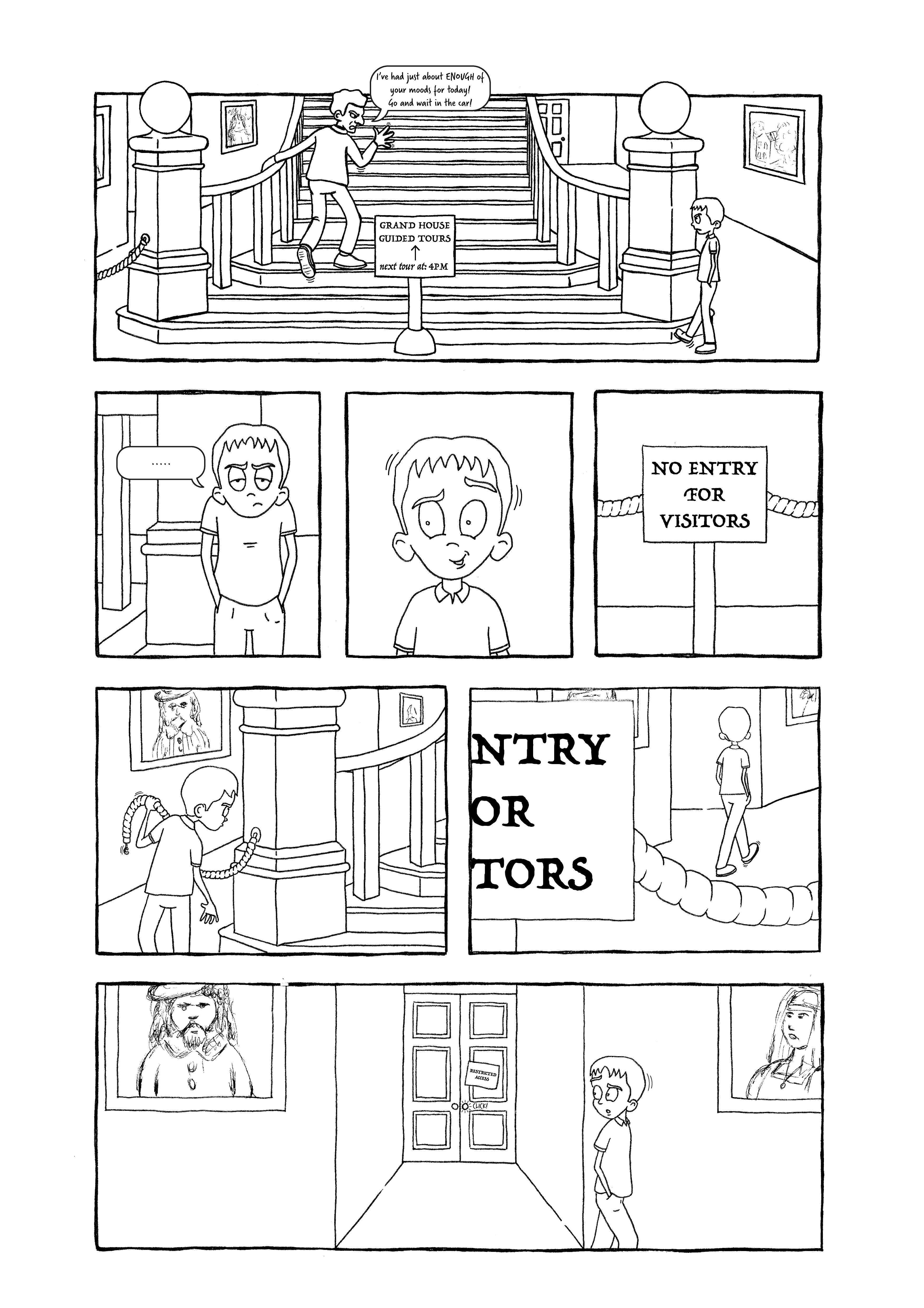
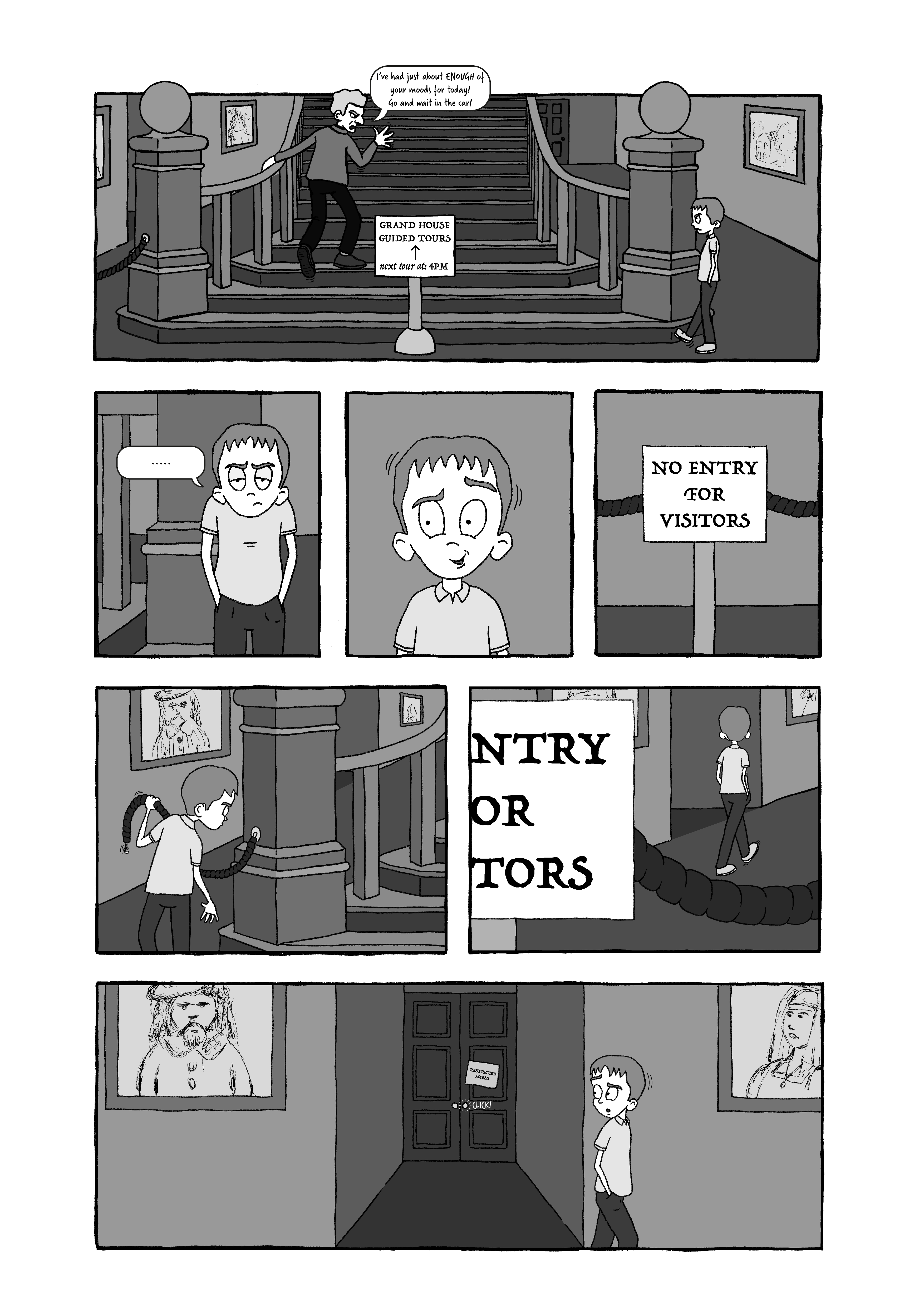
However, the concept of a library/books/librarian did influence another idea, which would involve a child visiting a stately home with his family and being in bad mood and extremely bored. He wanders into a restricted area (a library), which has sinister intentions. I was quite keen on on developing this final idea, as outlined below, and could see potential in it.
Developing the Story
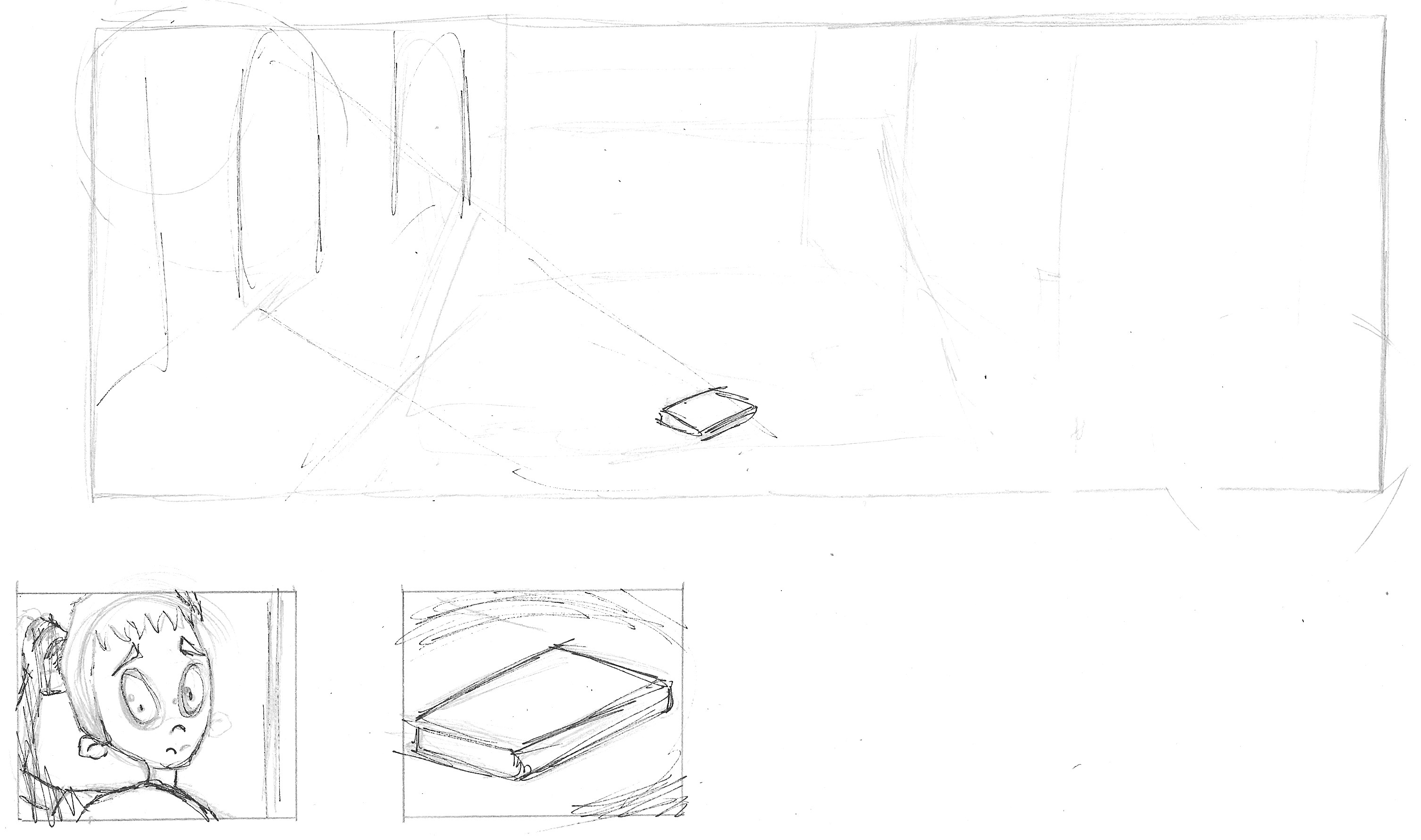
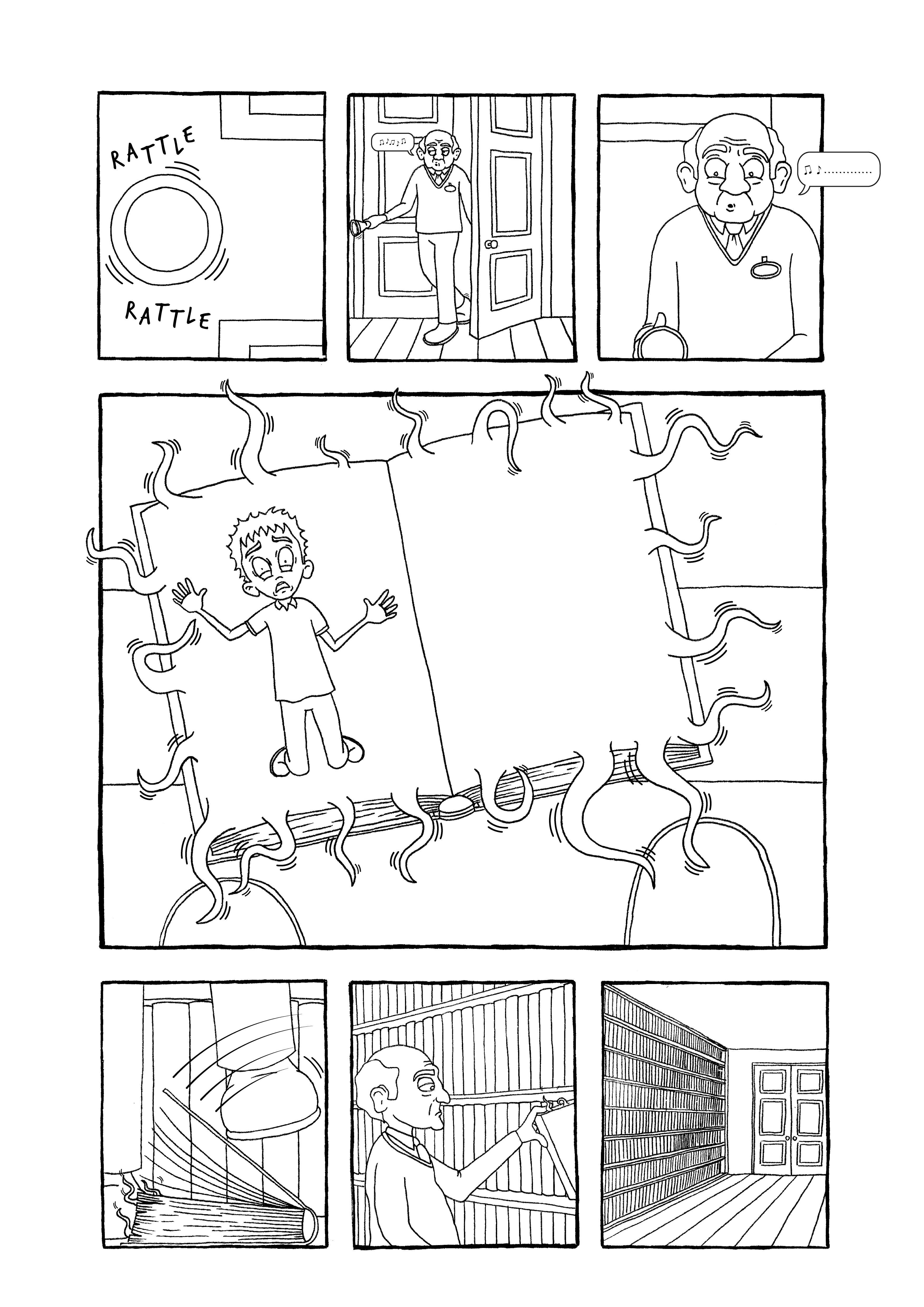
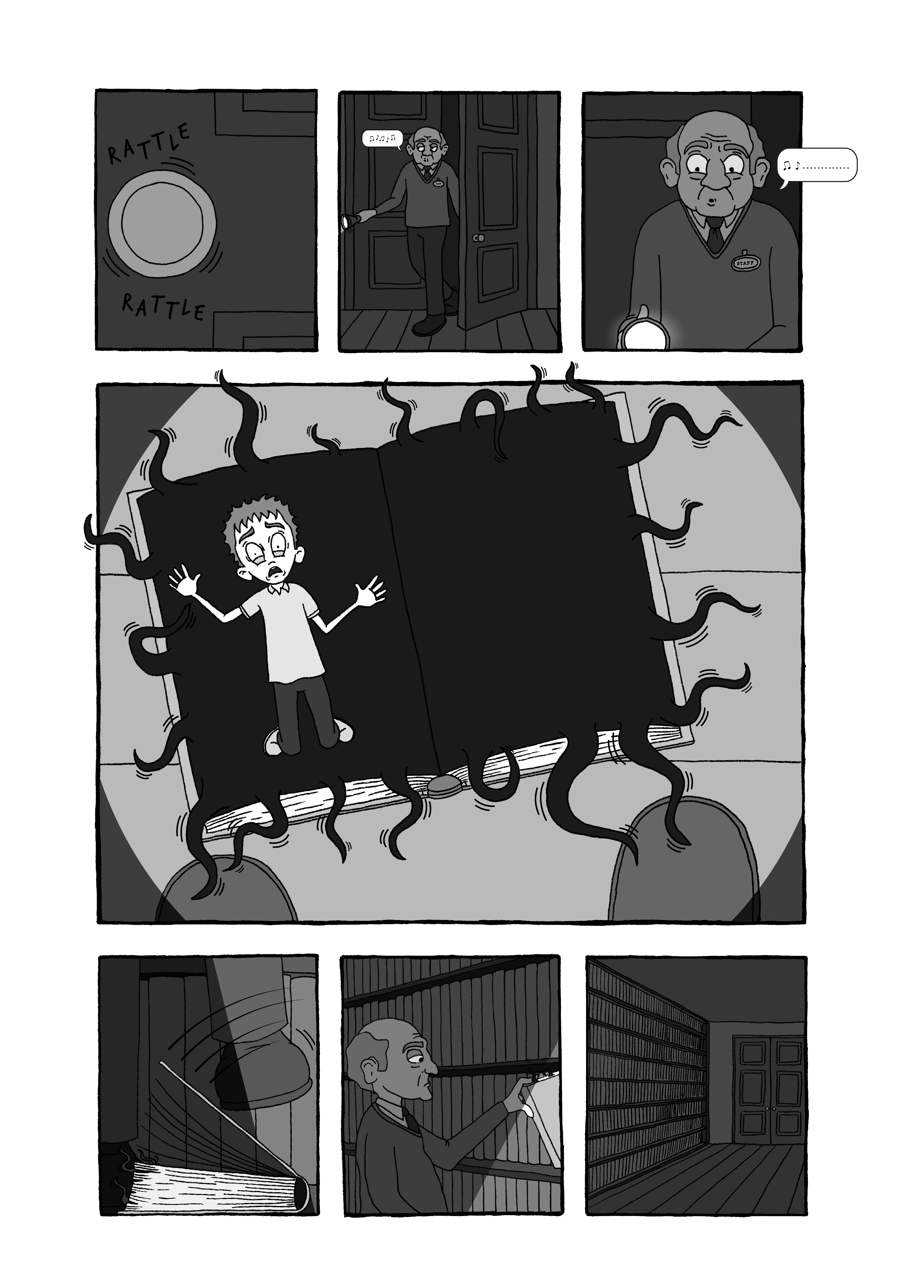
I drew out some rough panels for each of the five pages. The final page was the most difficult to formulate, but I decided that a security guard/member of staff would be doing the rounds after closing (so in the dark) and find the book, placing it on one of the bookshelves.
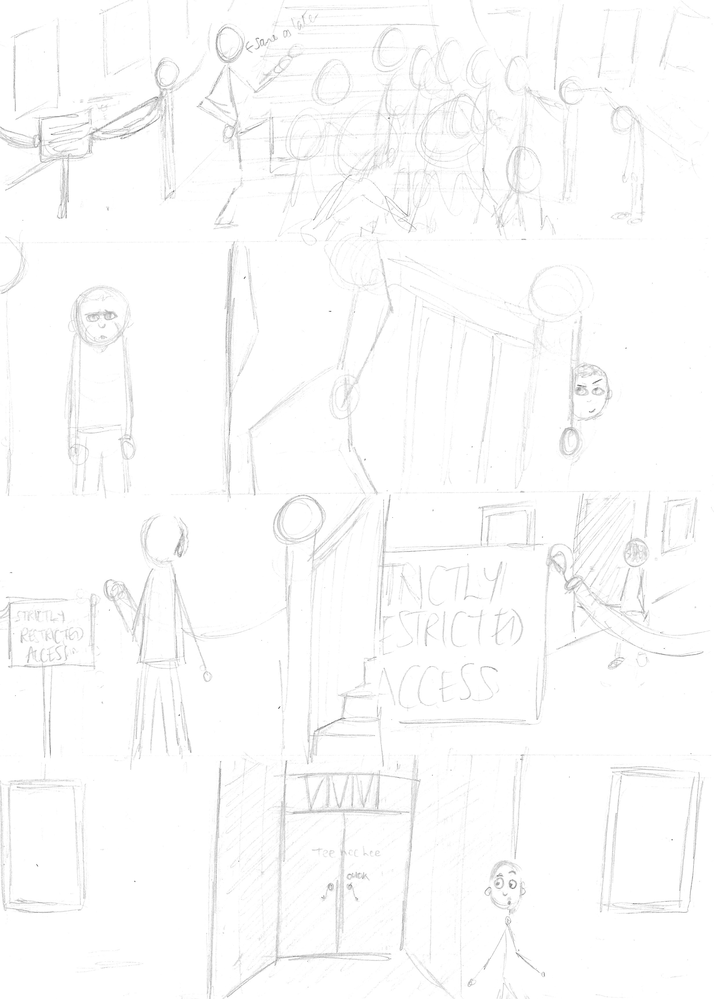
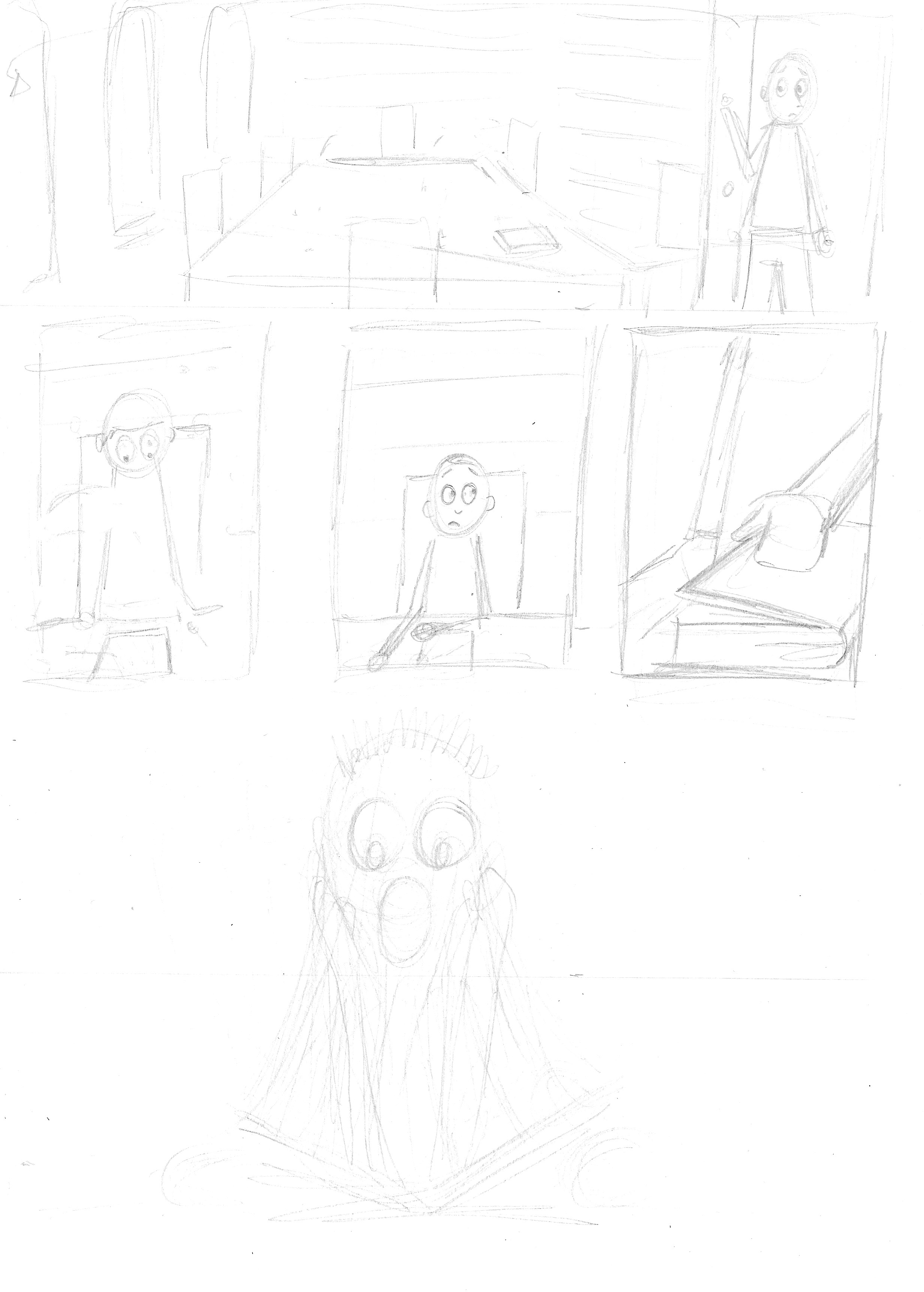
I was quite impressed that I had managed to draw out a more or less full story at the first attempt! I did go on to make quite a few fundamental changes, but having a foundation to build upon was extremely reassuring.
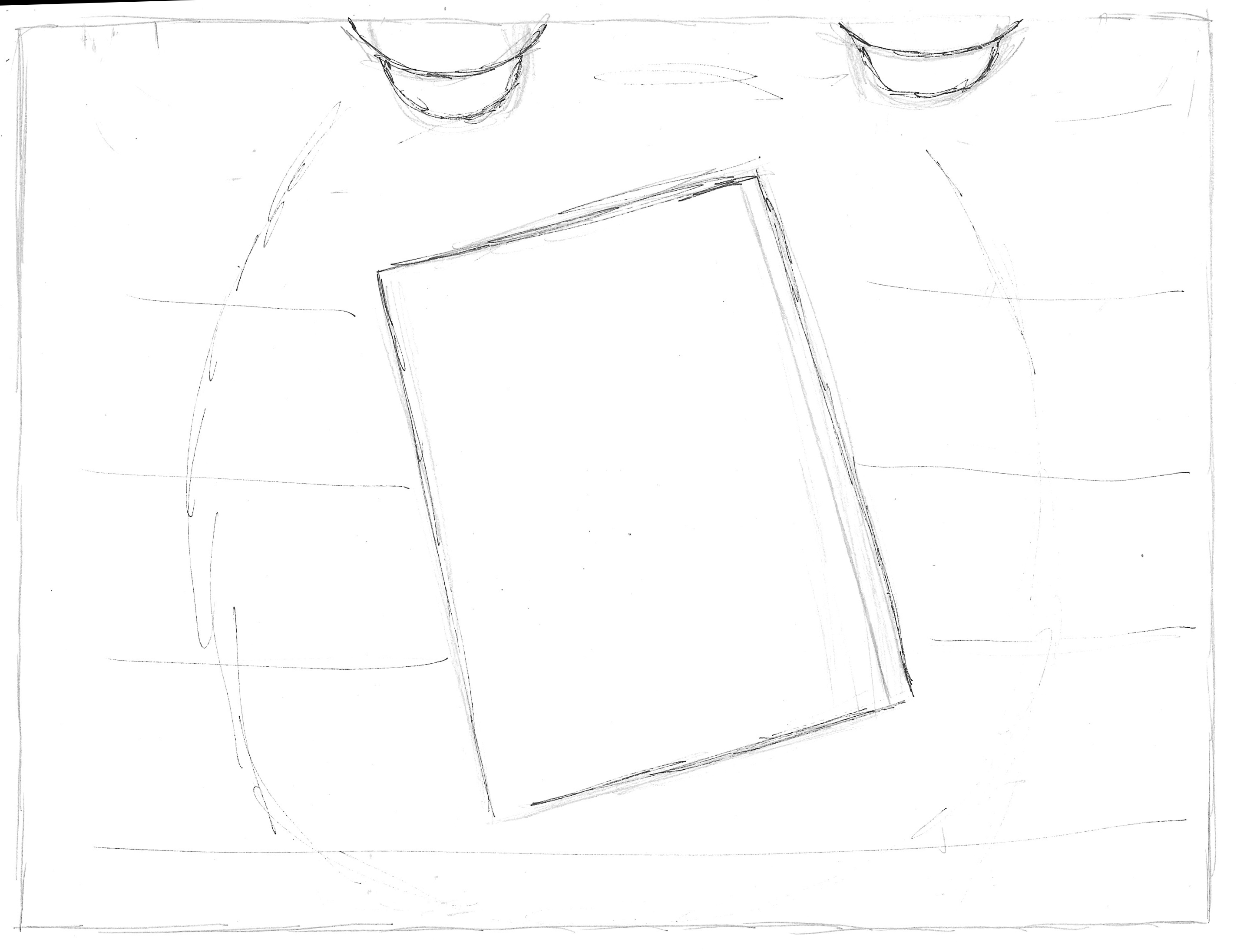
Measuring the Panels
Having previously let myself down in terms of not having accurate sized panels or creating artwork that did not fit within them, I decided this time to create digital page templates using Illustrator to measure the sizes. I then printed these out and noted the measurements. Although the arrangement of panels would change it was so useful to have these guides. An example can be seen below.

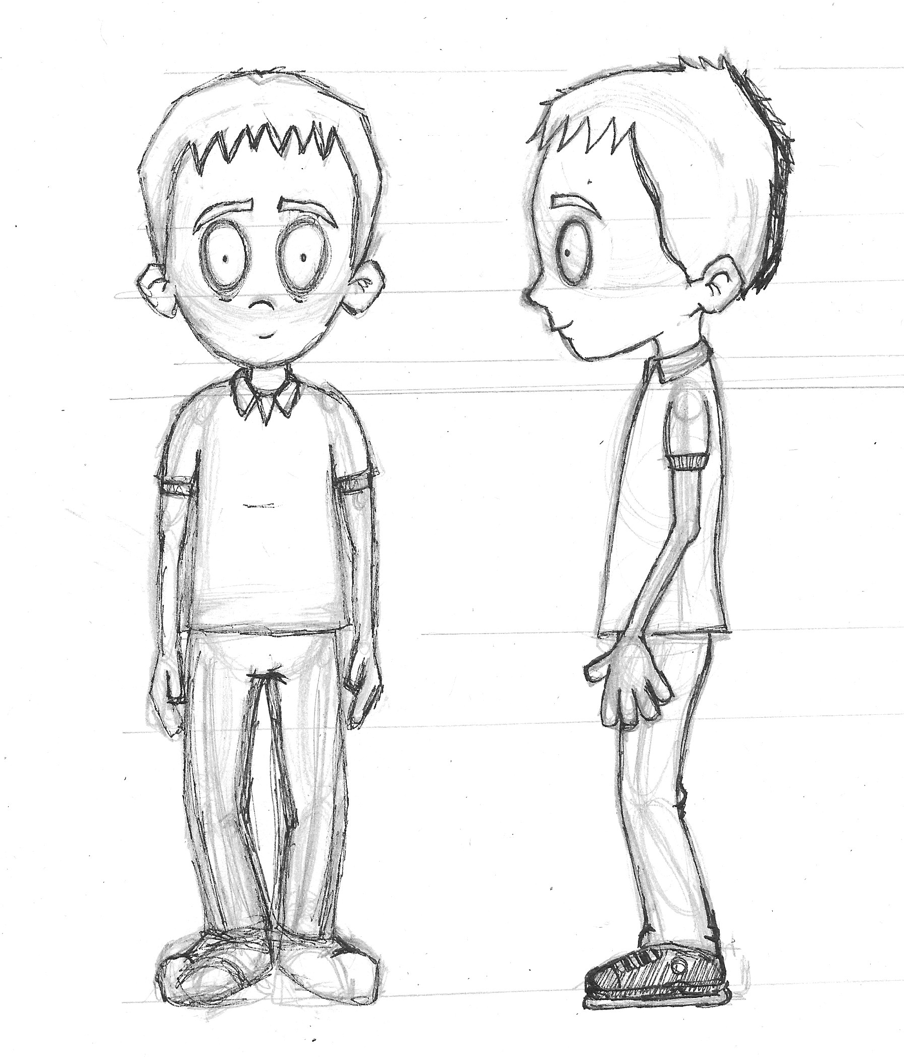
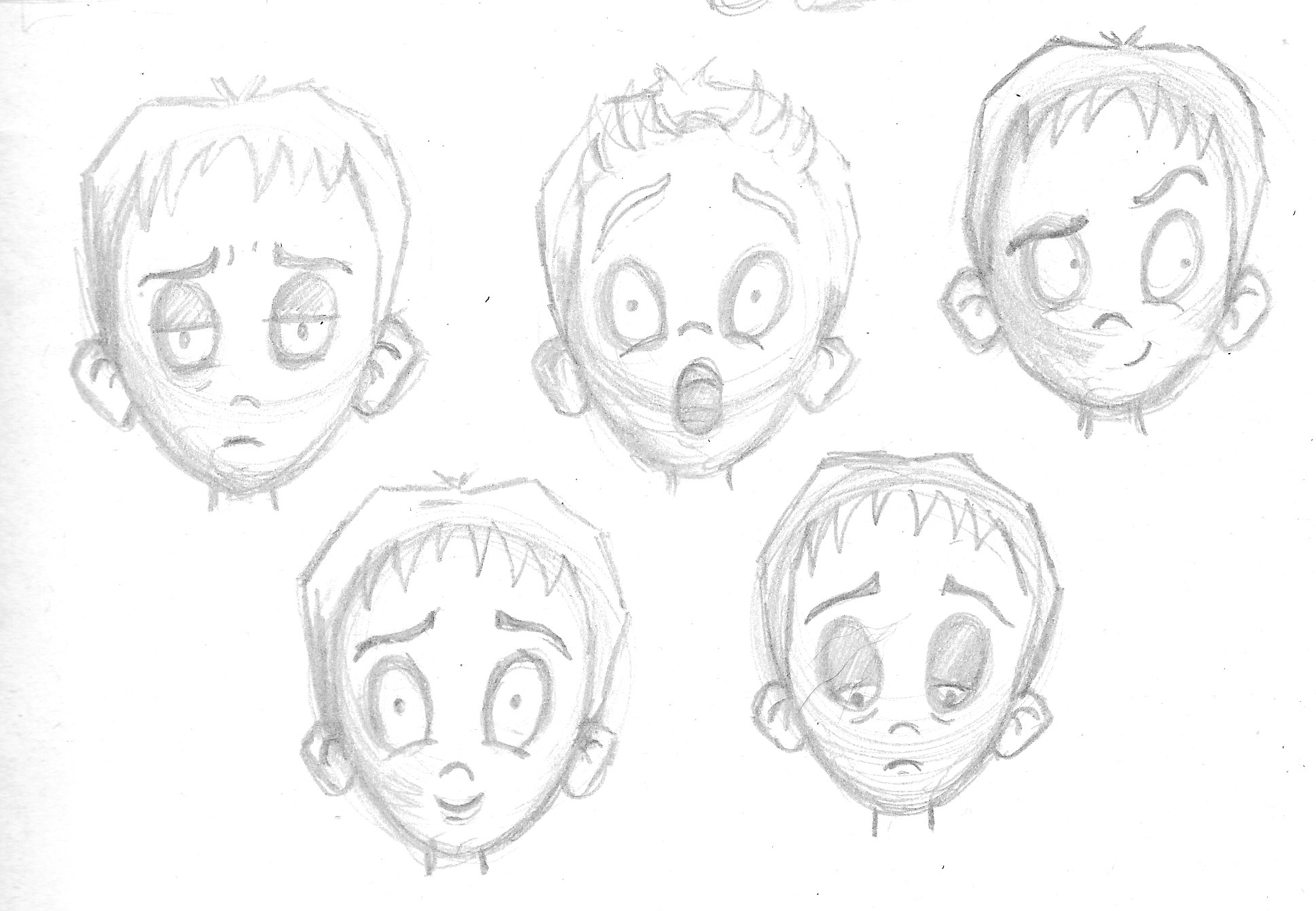
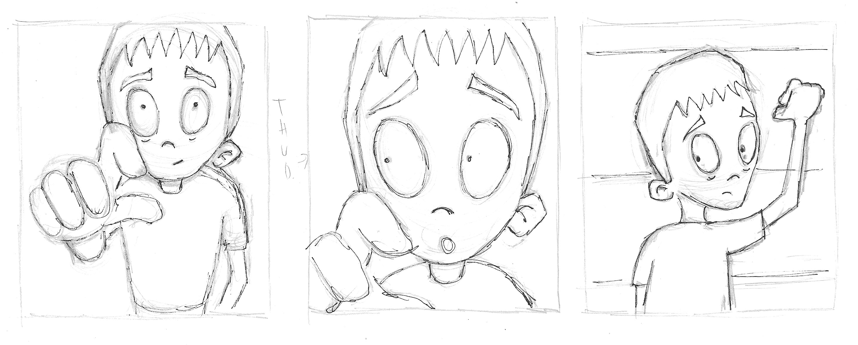
Refining the Character Design
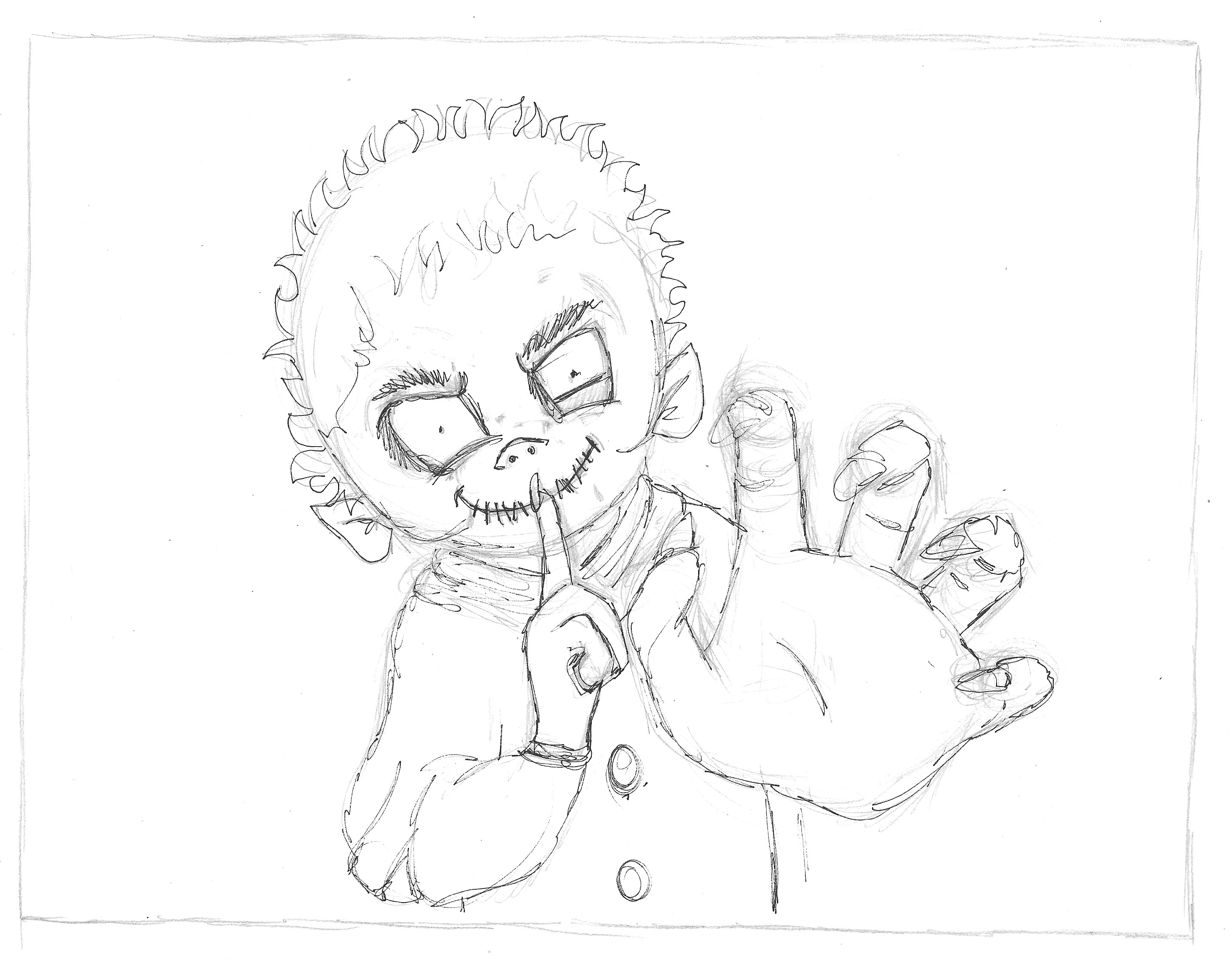
Before progressing further with the story, I decided to return to the character design. I draw out front and side views along with a few expressions. I would have liked to have spent more time on these, but I had to get a move on as time was running out.
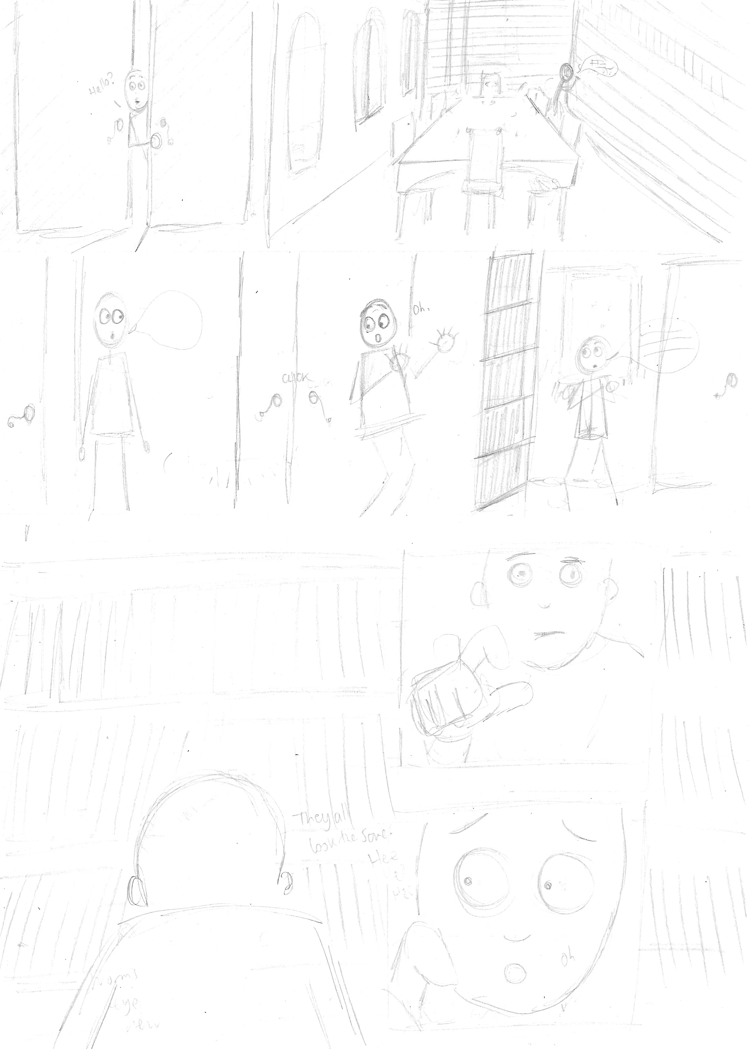
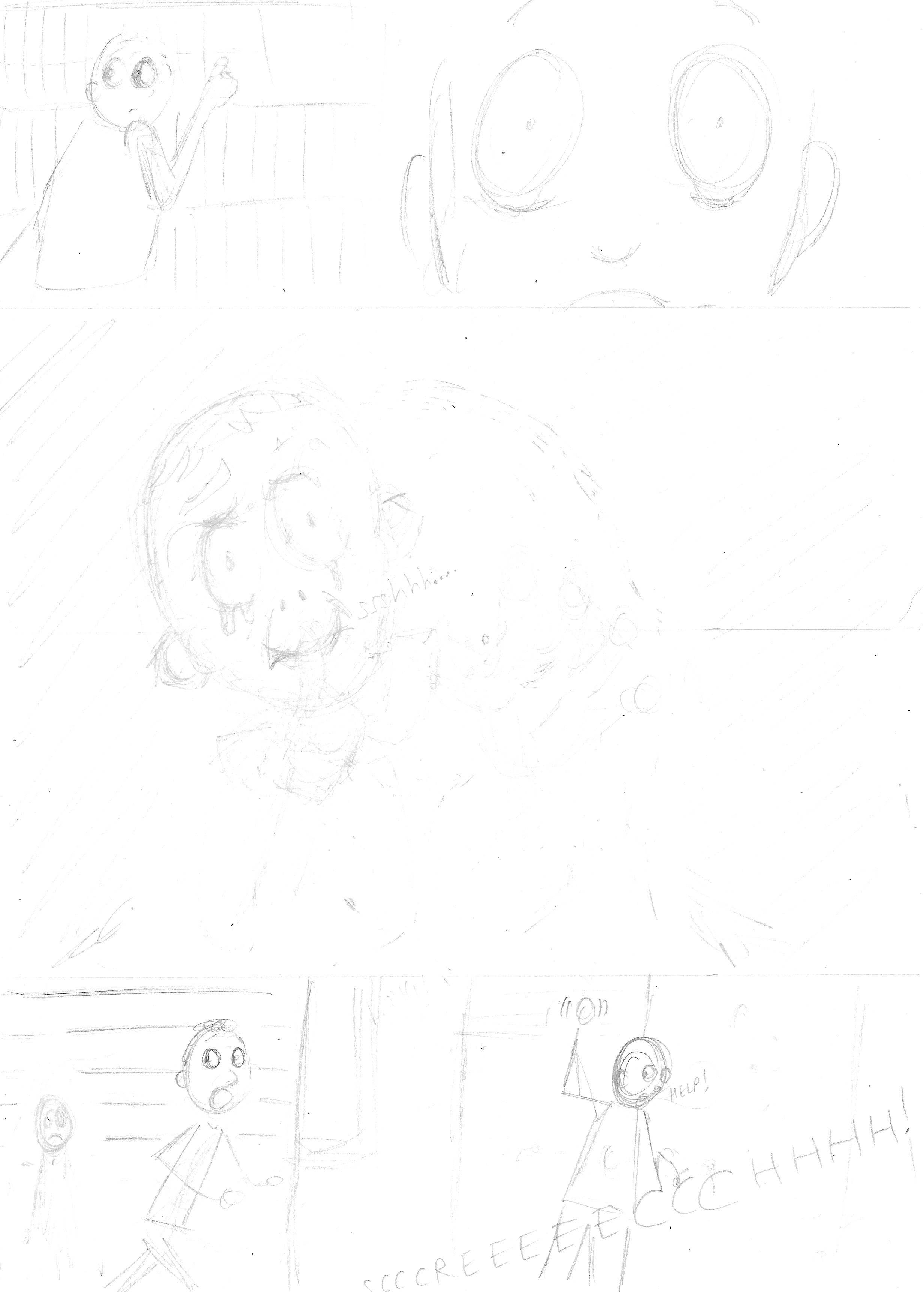
Developing the Panels
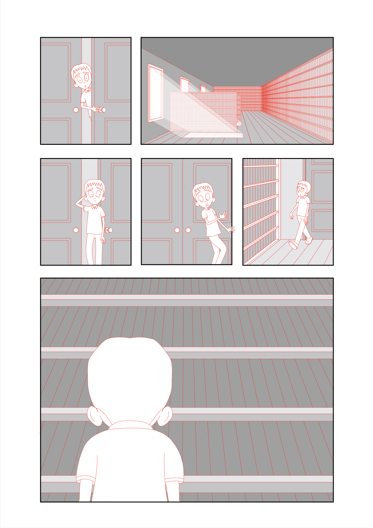
I moved onto drawing more detailed versions of each of the panels (please click on each one for a larger version, opens in new tab).


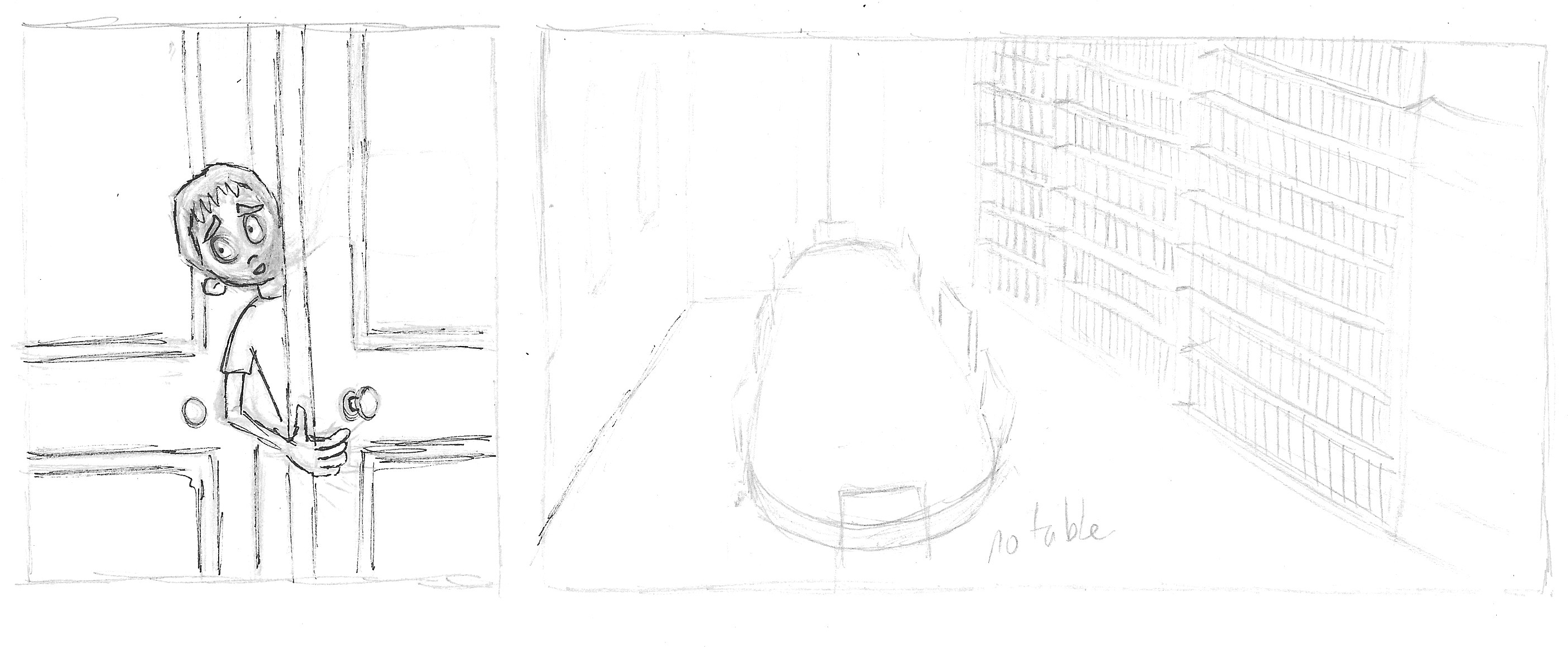


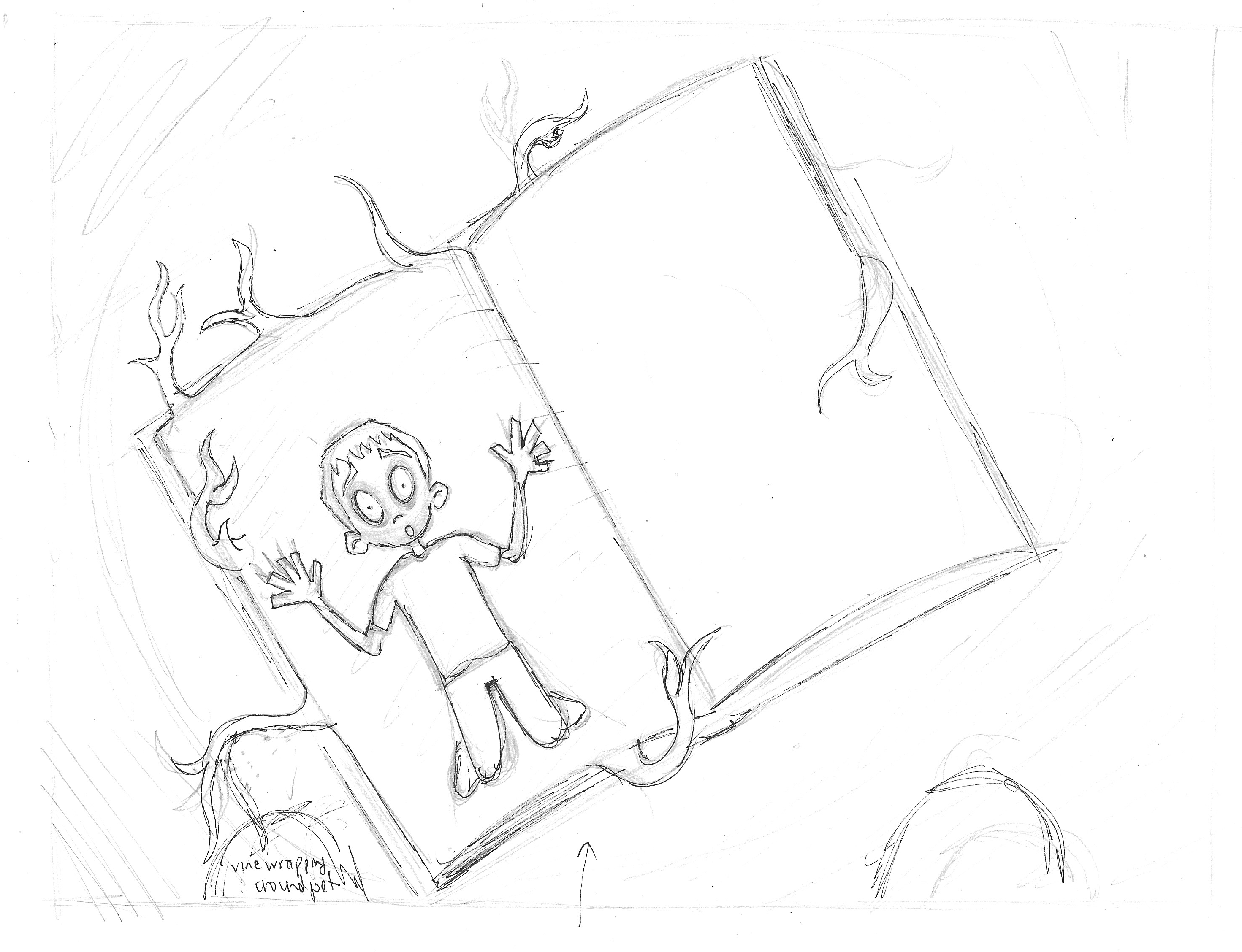
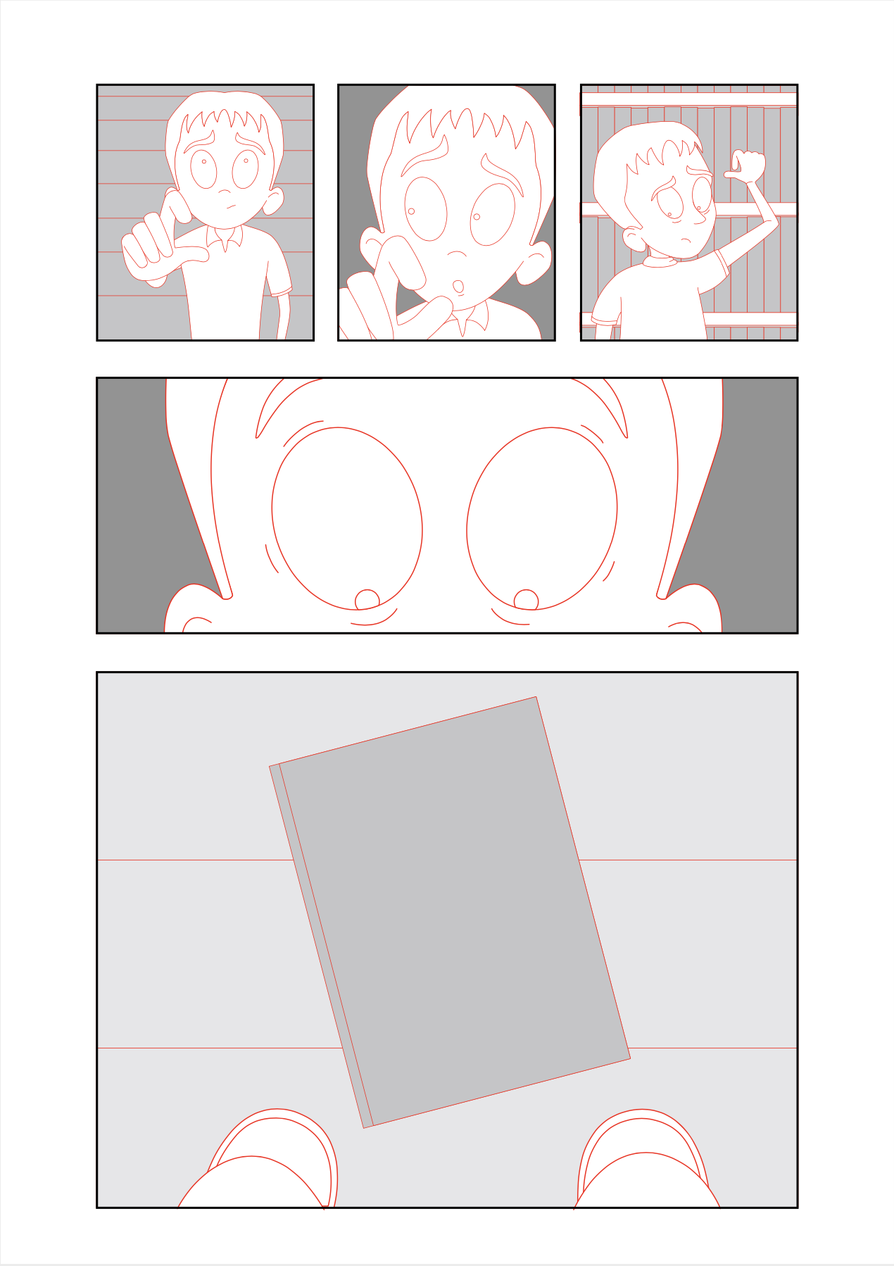
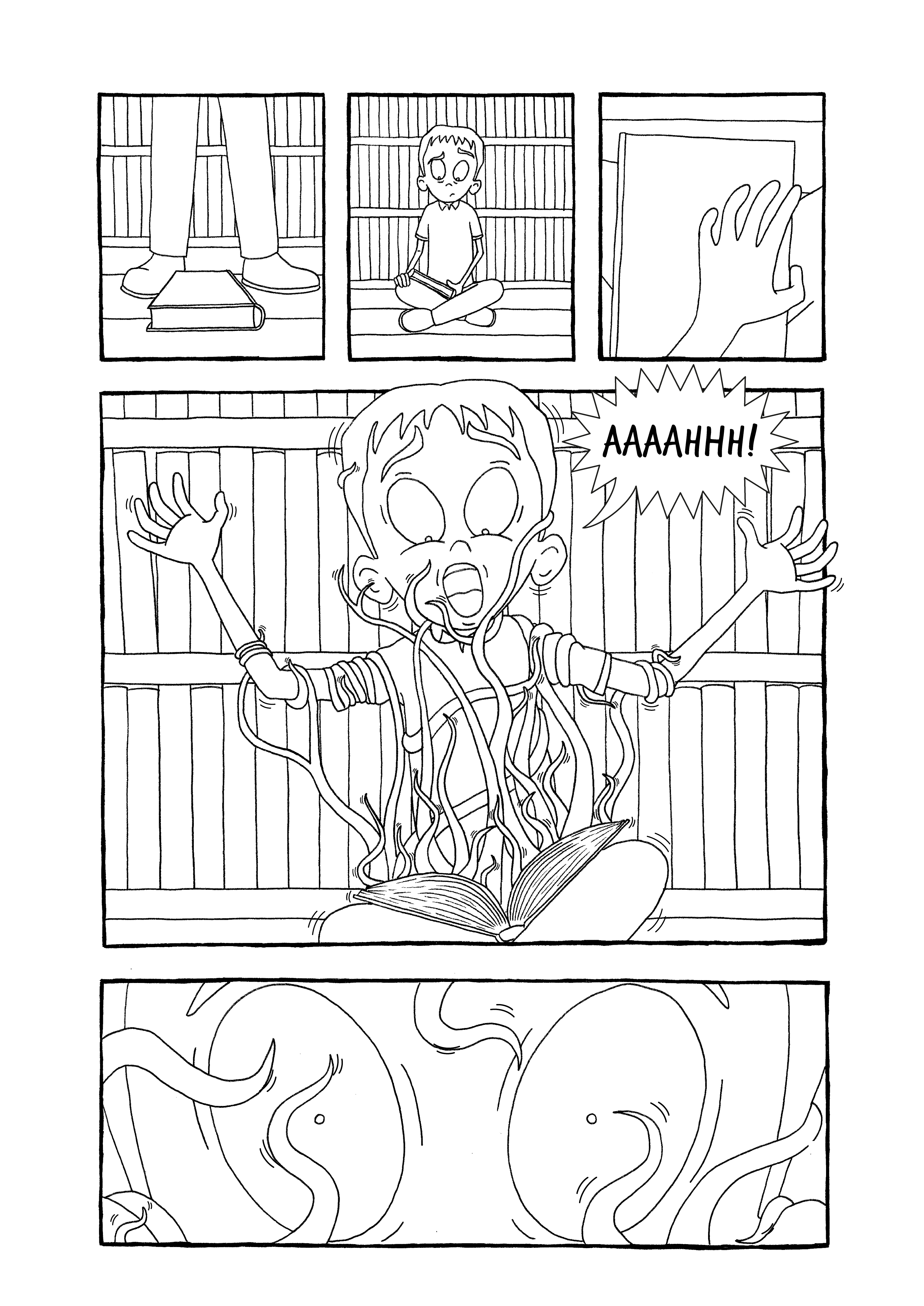
Some of the original panels that were edited out at this stage can be seen below. Rather than have the ‘creepy child’ as initially planned, I decided to just use the books themselves as being the evil presence within the room. I also removed the reading table as seen in the original rough sketches as, to be frank, the thought of having to draw this in perspective (under a time restraint) was not something I relished! I also learned that I had drastically overestimated my capabilities in the initial written outline of the story with aspirations of drawing an elaborate library setting, which did not materialise.
Refining the Panels
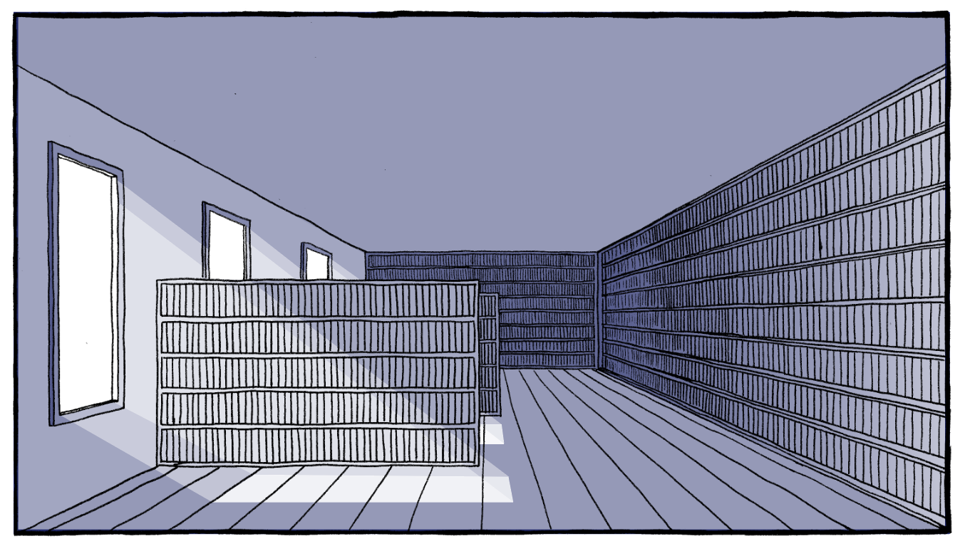
Rather than spend an infinite amount of time drawing and redrawing each panel trying to get them look exactly as I wanted, I decided to utilise Illustrator and create a cleaned up digital version of each page. I was inspired to try this process as I had discovered that Vera Brosgol does a similar thing. In fact, this method did end up taking a very long time time, but I was happy with the final result. I felt this was a good example of how I can use Illustrator as tool rather than relying on it as a starting point for my work – I believe this process works well for me. It also helped me with working out perspective, which was an important feature in the room settings. The results can be seen below (please click on each on for a larger version, opens in new panel).

I was very tempted at this stage to stay on a digital route, but I felt the lines looked too neat and ‘clinical’, which was not the effect I was looking for. So I stuck with my plan and printed off the panels so I could use them as templates for ink versions (using my light box).
Creating the Ink Version
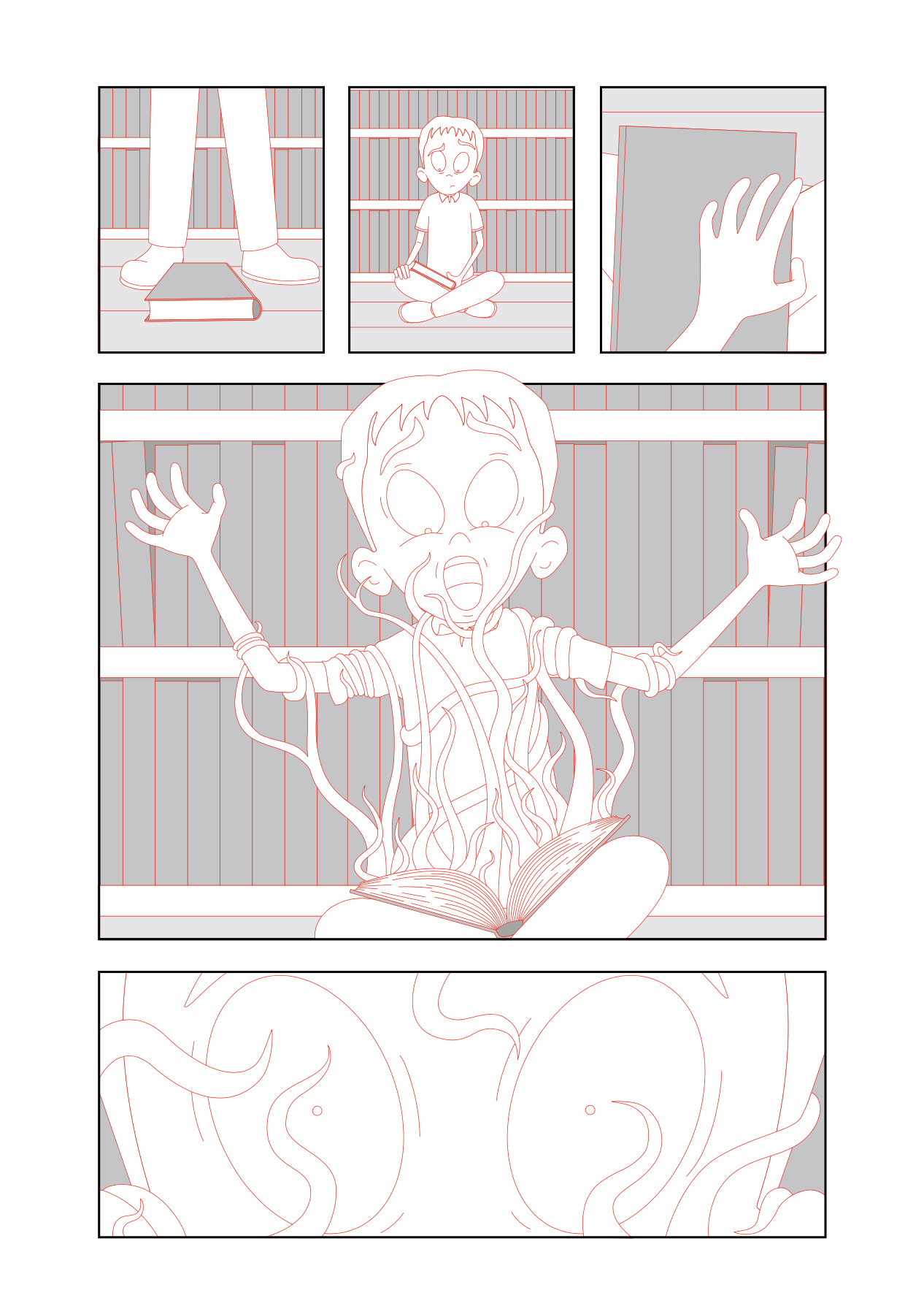
I was hoping to try using a brush with ink for this assignment, but I decided to use fineliners instead as I felt more comfortable with these. I was extremely pleased that I had not stuck with the digital version and spent the time as the resulting pen outlines were more or less what I had hoped for. I felt they had much more character to them. These can be seen below (please click on image for larger version, opens in a new tab).


Adding Text and Sound Effects
I scanned the pen versions into Illustrator and positioned the panels on each page. I then added speech bubbles, sound effects and movement lines as can be seen below.
Adding Colour?
As with almost every other exercise and assignment in this unit I reached a sticking point when it came to whether I should attempt adding colour or not and how to go about doing this. I did consider applying a single colour on a tonal version, as in Anya’s Ghost by Vera Brosgol in which the colour was added in Photoshop, but I felt the story lost some of its impact once colour was introduced (and I could not get the quality I wanted when I tried this in Photoshop).
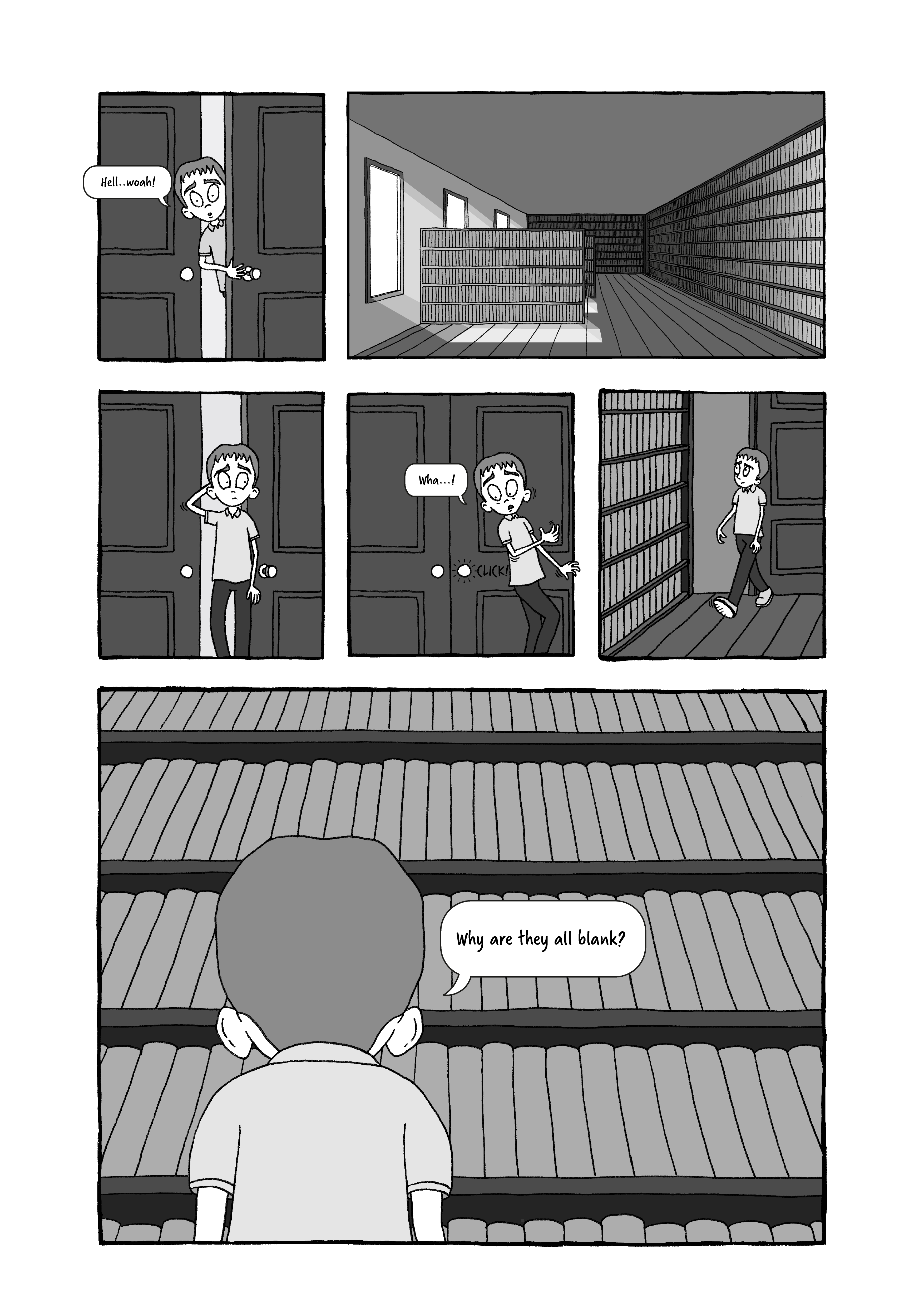
Ultimately, I was quite happy with the tonal version I had created, as can be seen below, and I think it lent itself well to the nature of the story. I reminded myself that much of the work by some of the influential artists I had mentioned at the beginning of this write-up, such as Charles Addams, Pam Smy and Edward Gorey, did not include any colour.

Final Version
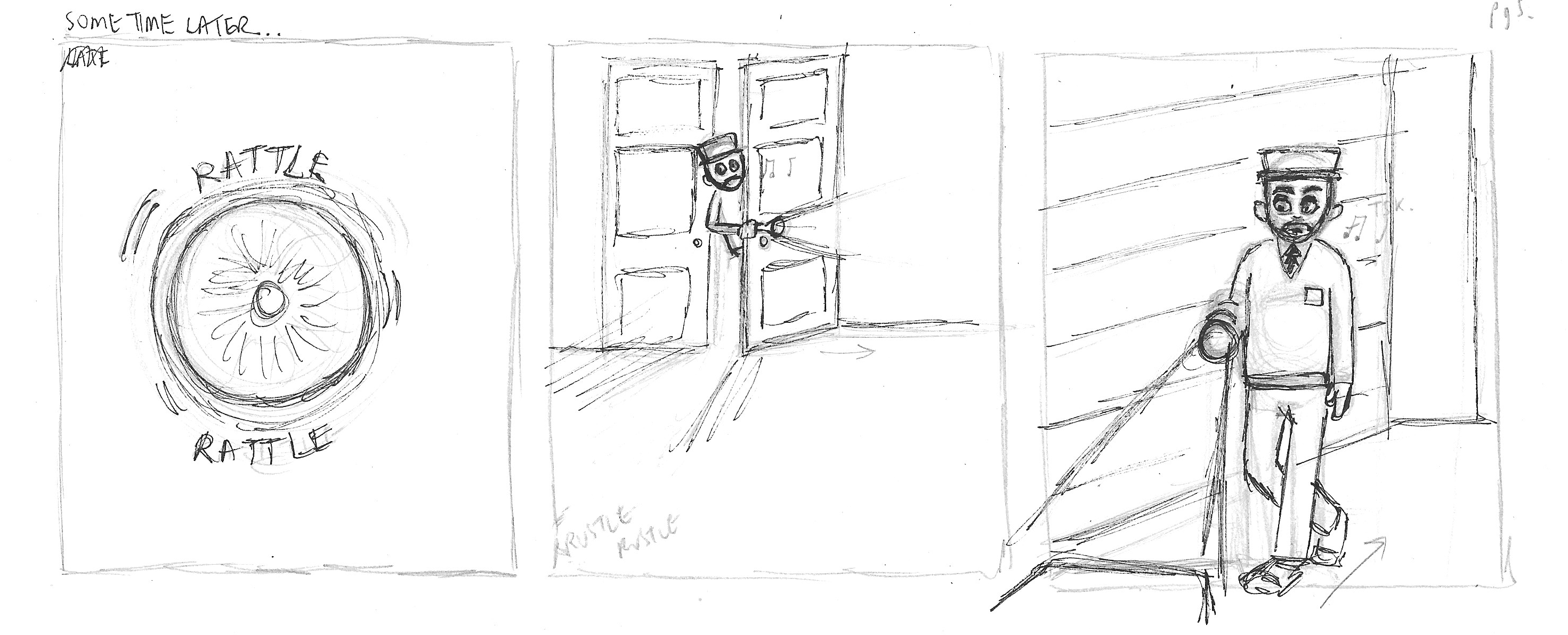
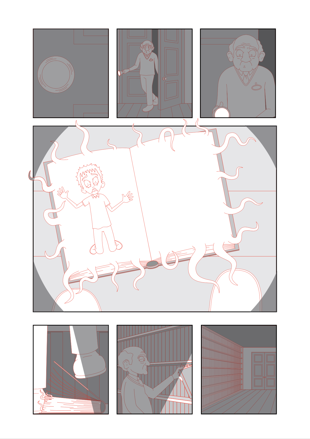
For the final version of the pages I made various amendments including increasing the contrast between the tones used for a greater visual impact and adding the effect of the torch on the final page, which I felt created more of an atmosphere.

Final Thoughts
I throughly enjoyed creating my graphic story for this assignment and was genuinely very pleased with the final result. I did feel under pressure in terms of time restraints, but I often find this encourages me to produce better work, which is what I believe happened in this case. I knew I had to persevere and could not dither too much. I stuck to a plan of action and gave myself mini-deadlines, all of which I met.
In terms of the content of the story, I believe it is fairly successful in communicating what is happening. As stated many times previously in this unit, I am not that keen on having too much ‘wordy’ content as this often seems to detract from the visual impact of the artwork, in my opinion, so I hope I managed to balance the text and illustrations successfully.
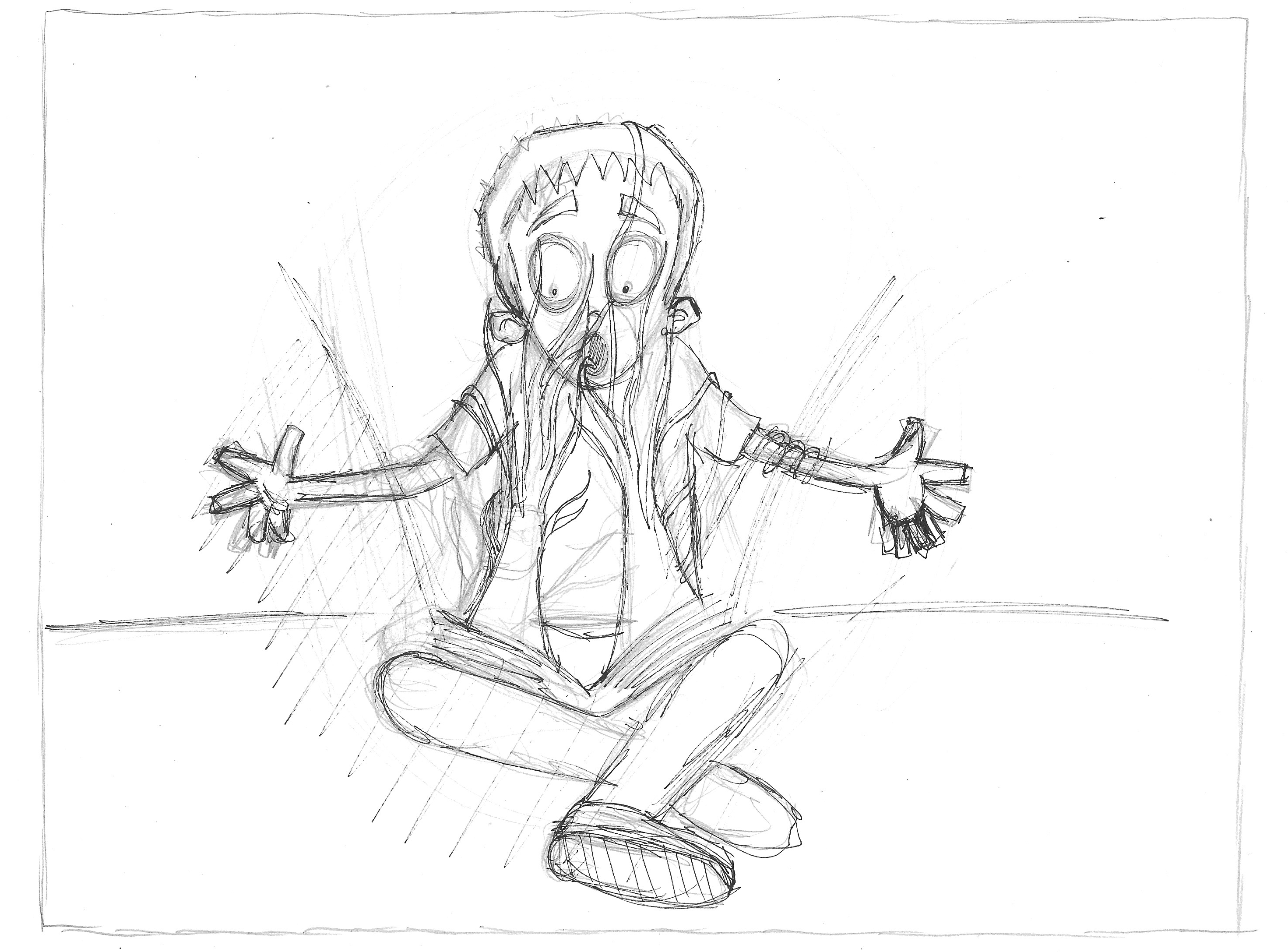
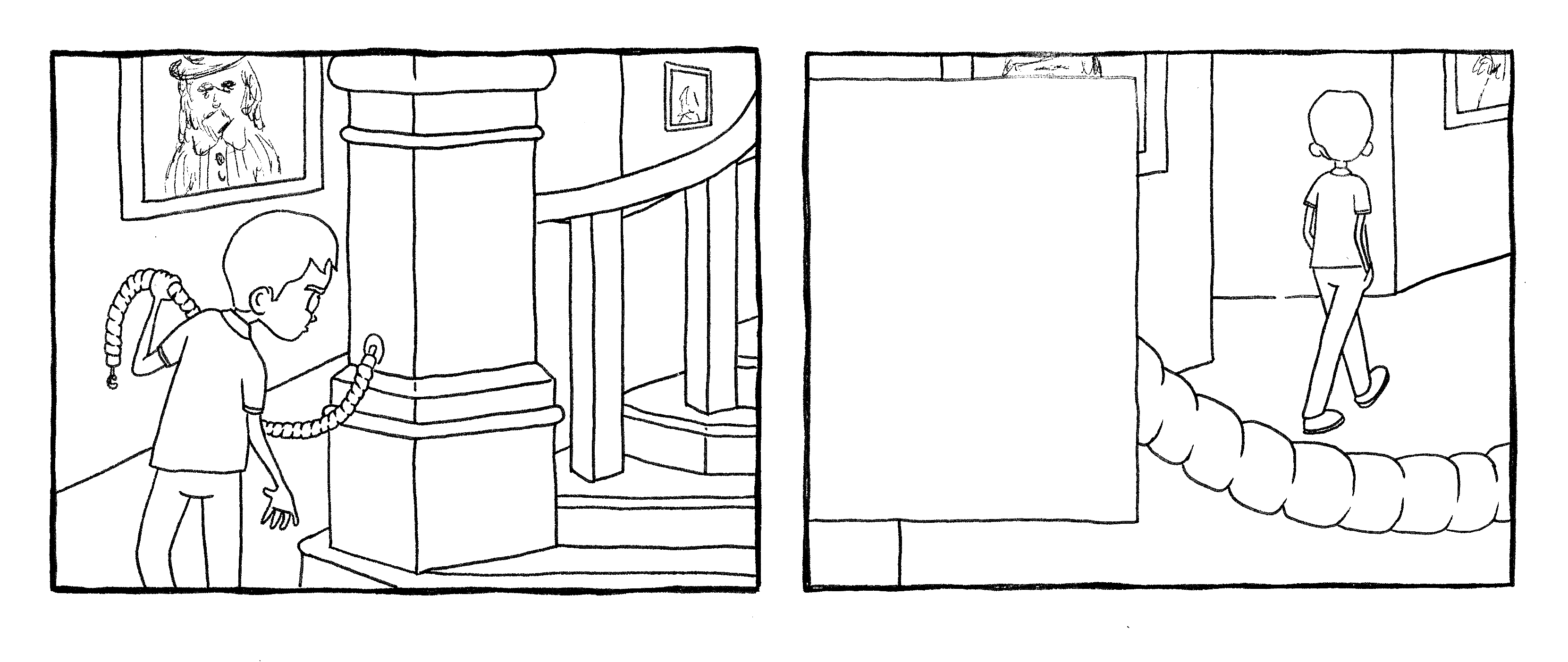
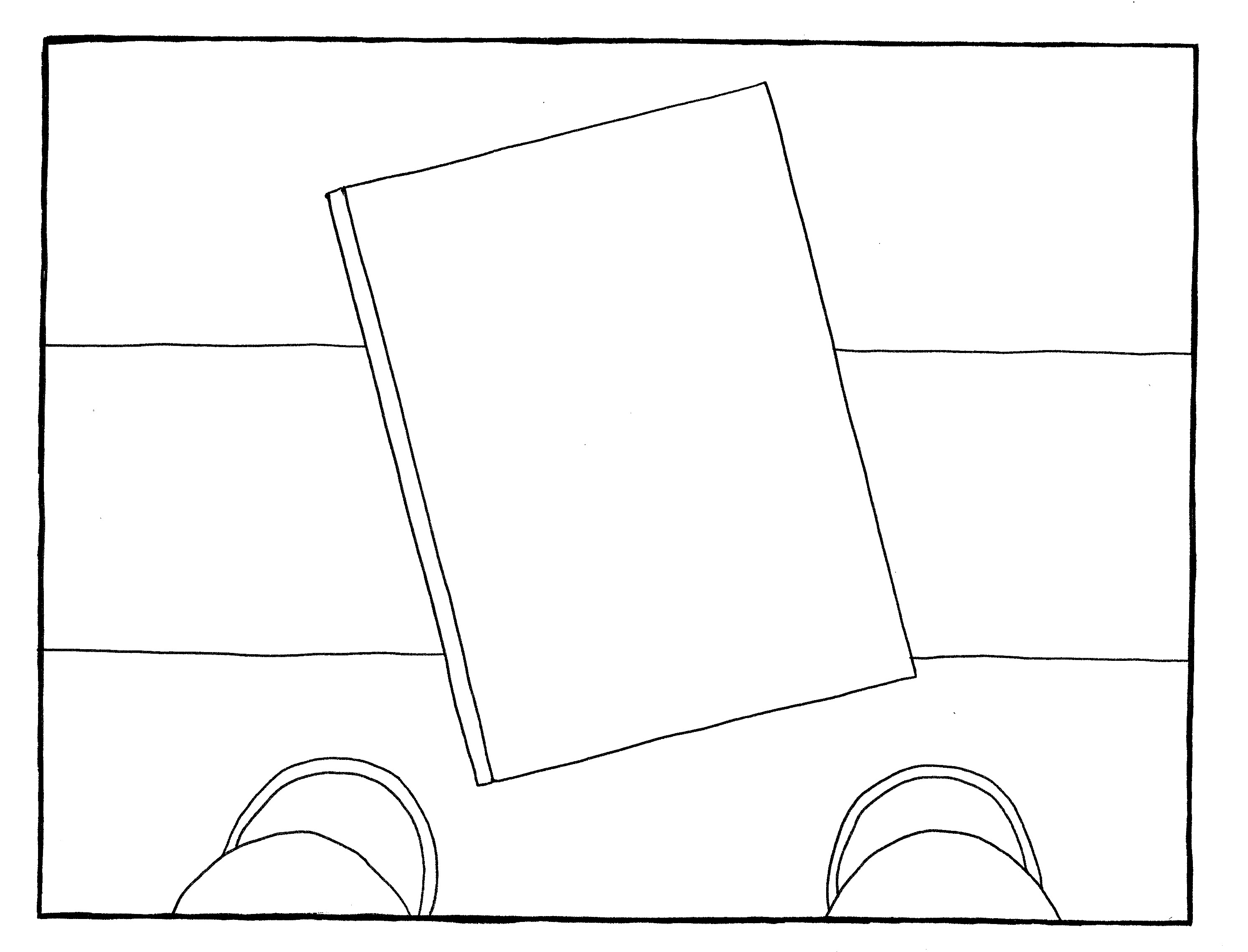
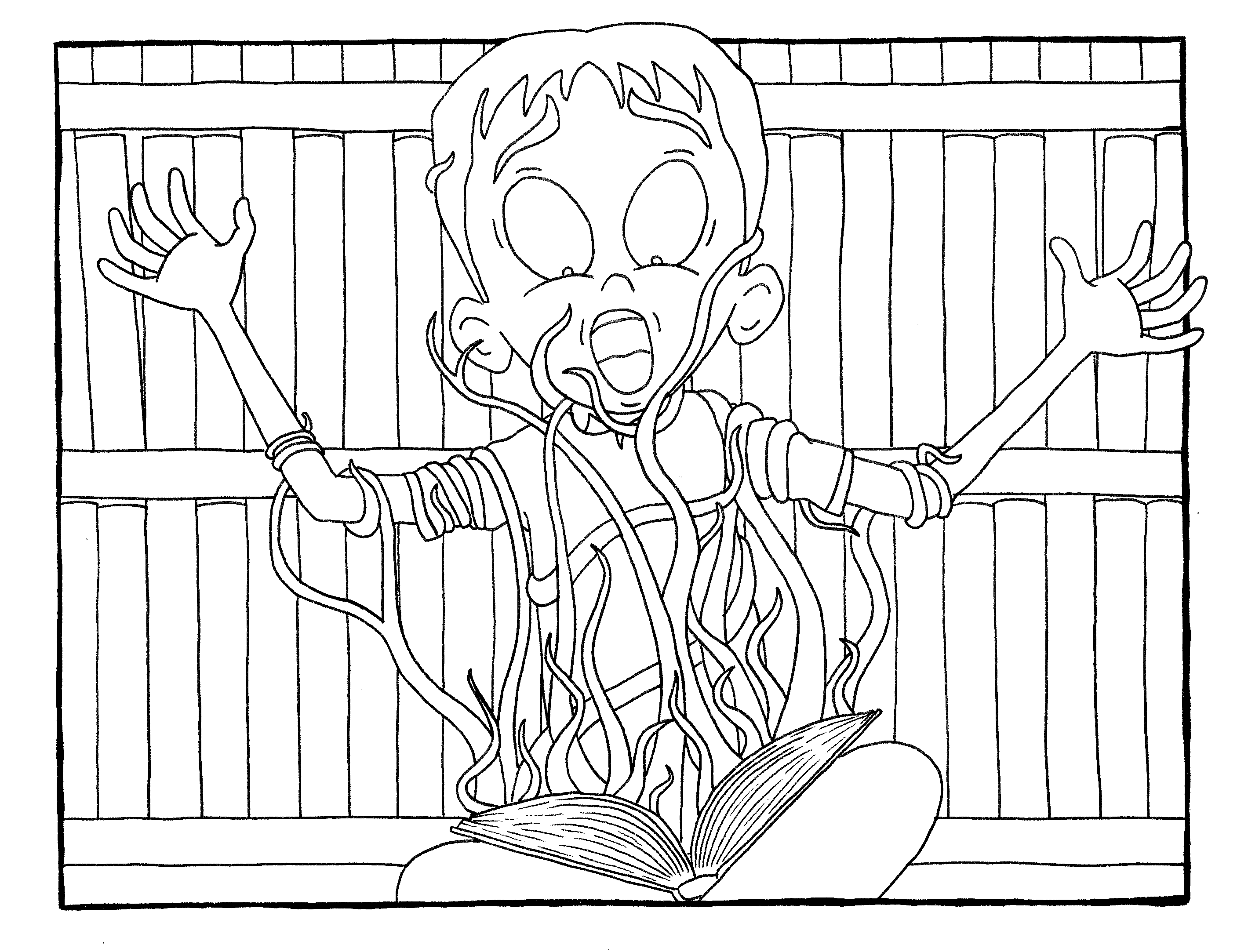
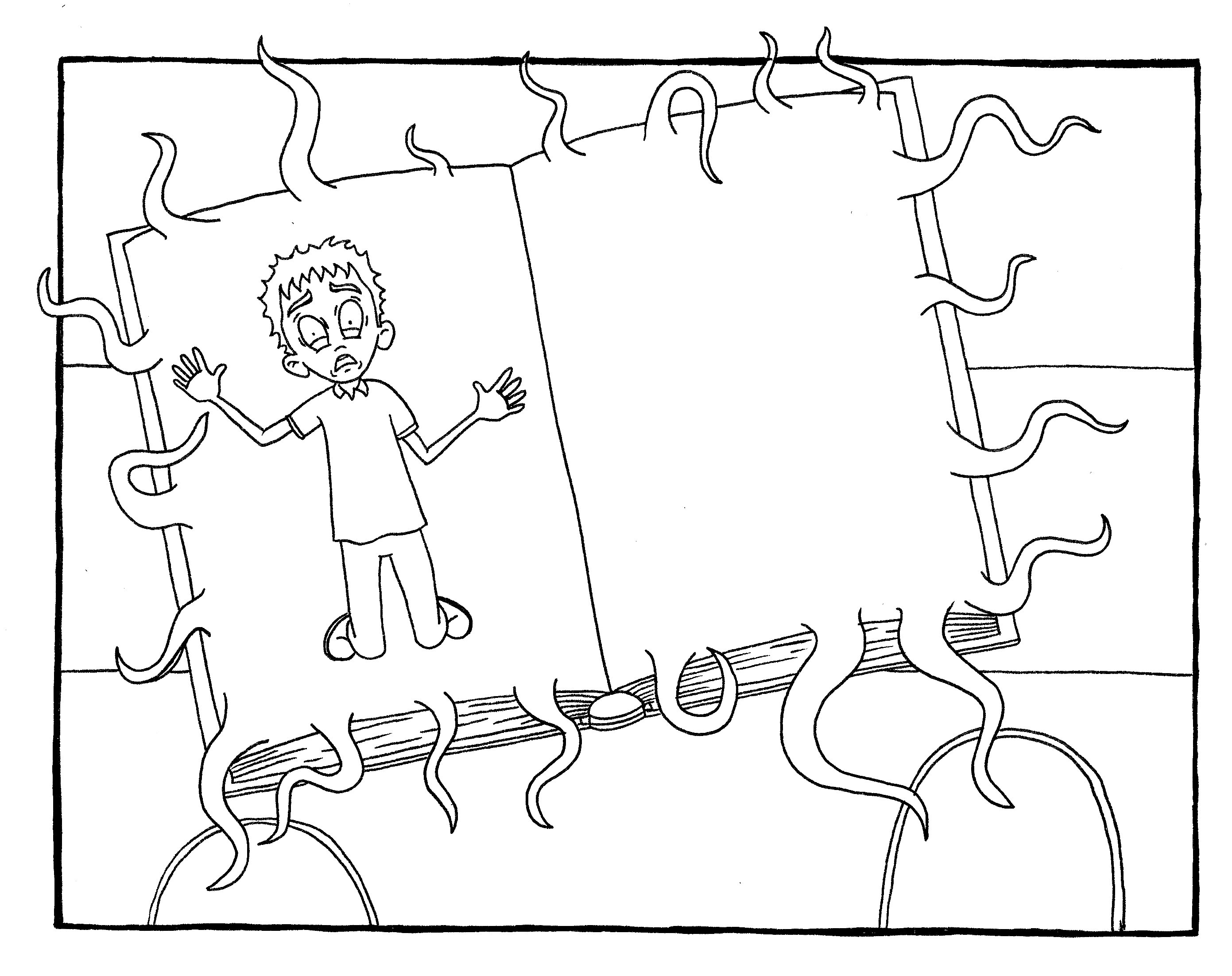
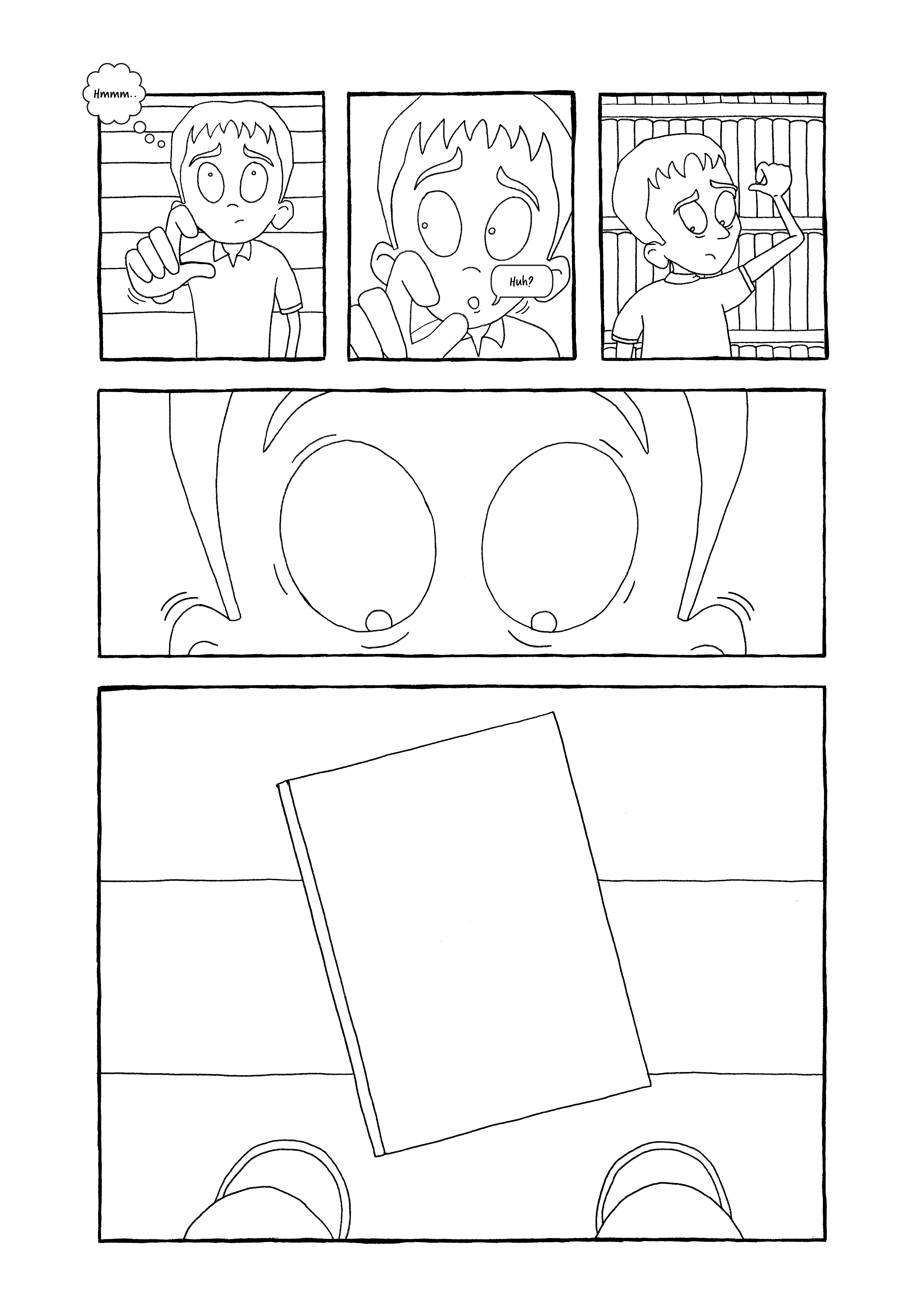
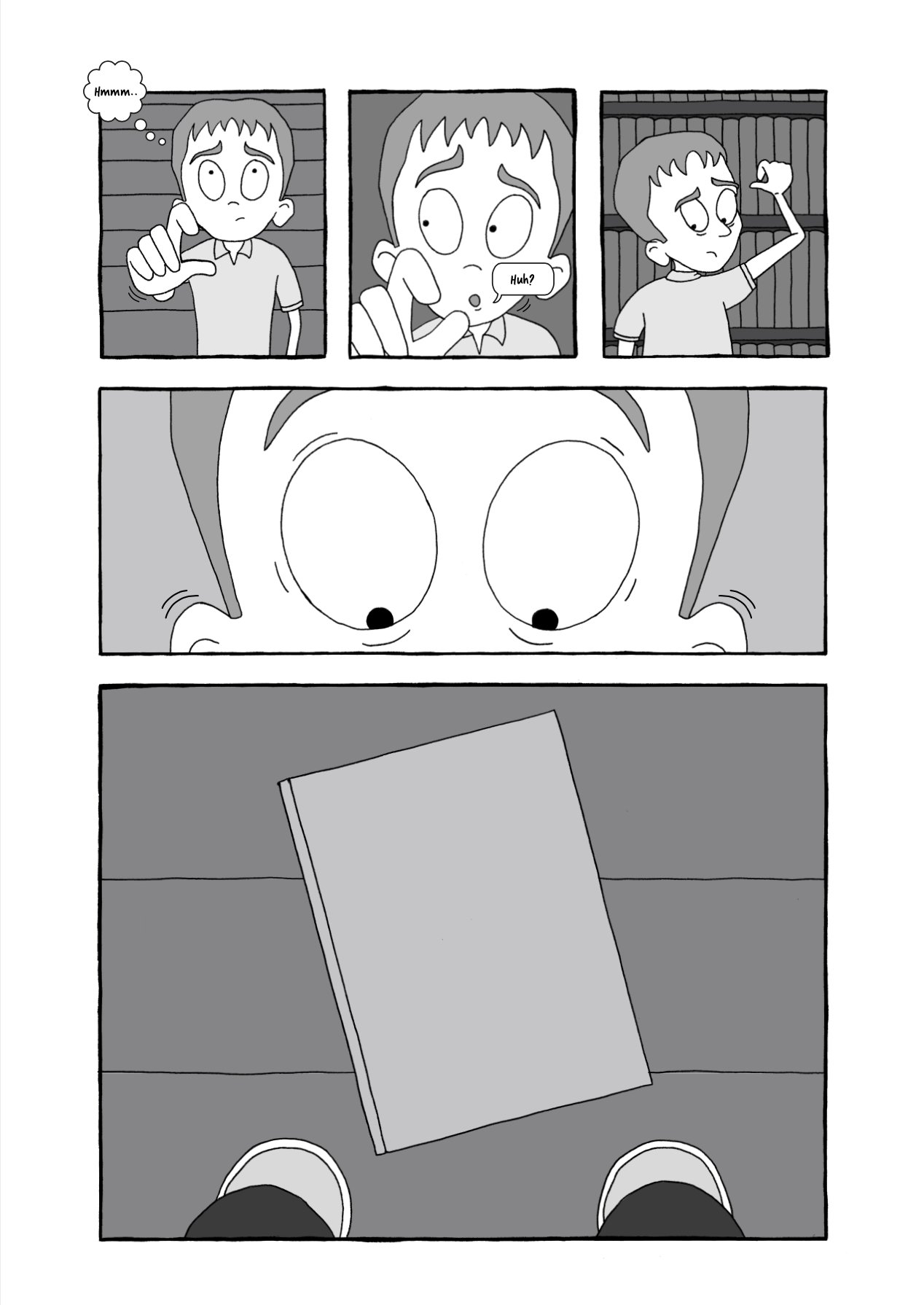
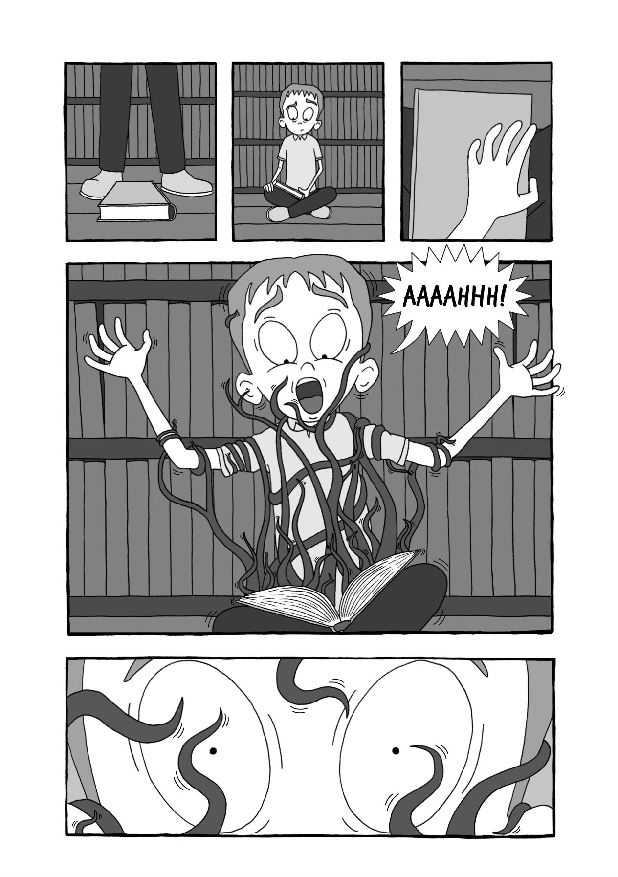
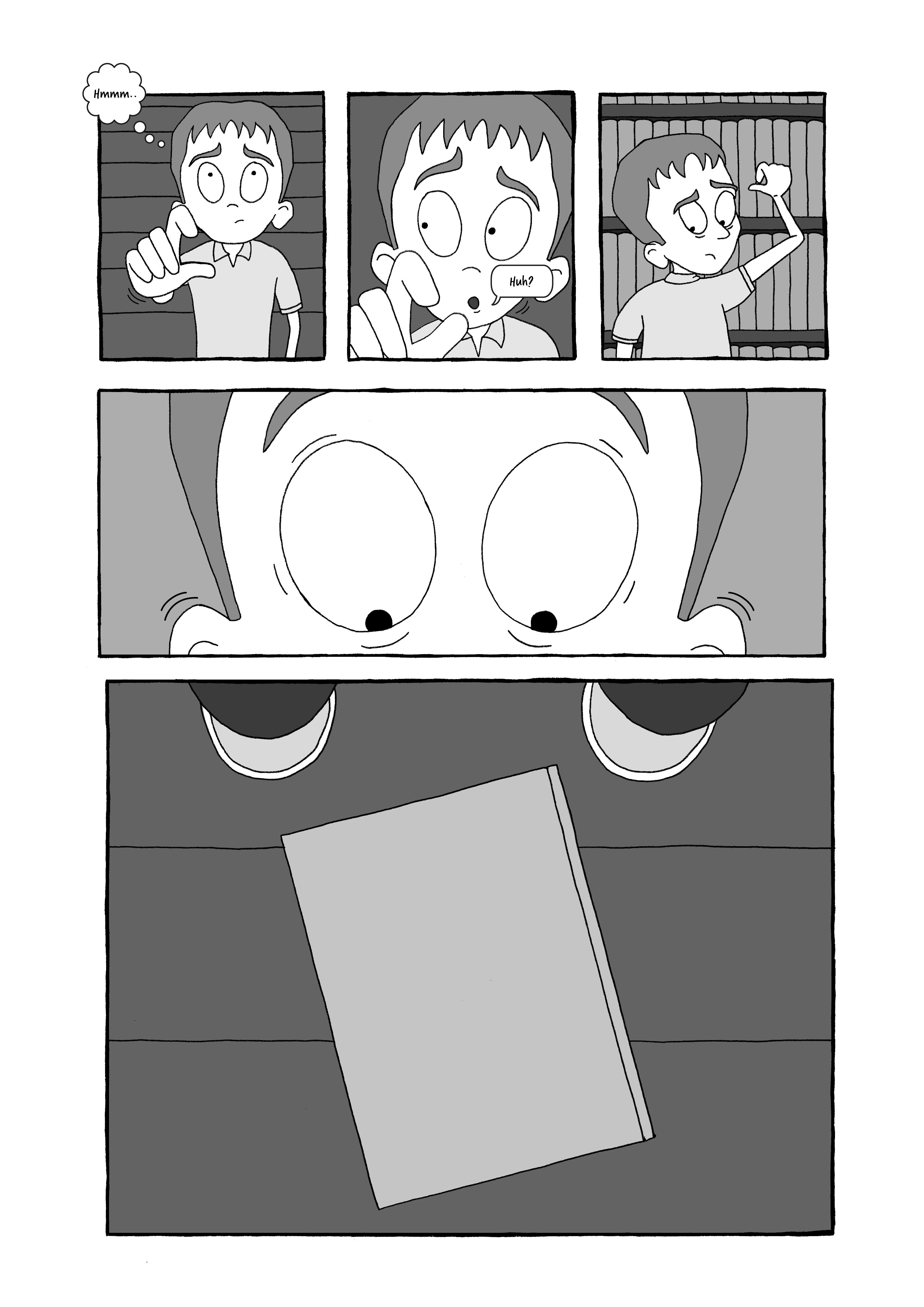
I felt the final illustrations demonstrated an improvement from the first assignment I did for this unit and I tried to portray clear depictions of body language/movements to imply what was happening to the characters. I made a conscious effort to incorporate different viewpoints and panel sizes. I also allowed the drawing to break out of the panels a few times. My favourite panel is the one where the book is attacking the character and the amount of time I spent on the tentacles was worthwhile! I thought the final page was perhaps the weakest as I found it difficult to contain this to just one page, but I was pleased that I decided to add the light effect from the torch, which increased the sense of atmosphere.
Once I had planned out the panels, I realised I had not left the space for a title, which was slightly frustrating, but I was struggling to come up with a good idea for this anyway. I convinced myself that there could be separate cover page, which perhaps excused this omission.
Although I had initially planned to try emulating Edward Gorey’s style of drawing, with cross-hatching, I ultimately found that this would take me far to long to produce and I was not confident enough in my abilities. However, I was really happy with how I managed to combine my digital and analogue work, without relying too heavily on the former. I certainly need to improve my confidence for using colour effectively, but I did learn quite a bit about tone and producing strong contrasts for a greater visual impact.
Overall, this assignment gave me a real boost and I feel much more sure about setting myself and meeting deadlines, alongside cementing my creative process for producing work, from initial planning through to the final stages.
Reflections After Tutor Feedback
I was really pleased (and relieved) that I received such positive feedback for this assignment as I put a great amount of effort into it. However, as always, my tutor did raise some valuable points that I wanted to address.
Viewpoints
I wanted to be bolder and more experimental in terms of viewpoints/perspectives in the panels for this assignment. Influenced by the wide range of other practitioners’ work that I had discovered throughout the unit, I used a variety of wide shots, mid-shots and close-ups, depending on the the ‘job’ of that particular panel.
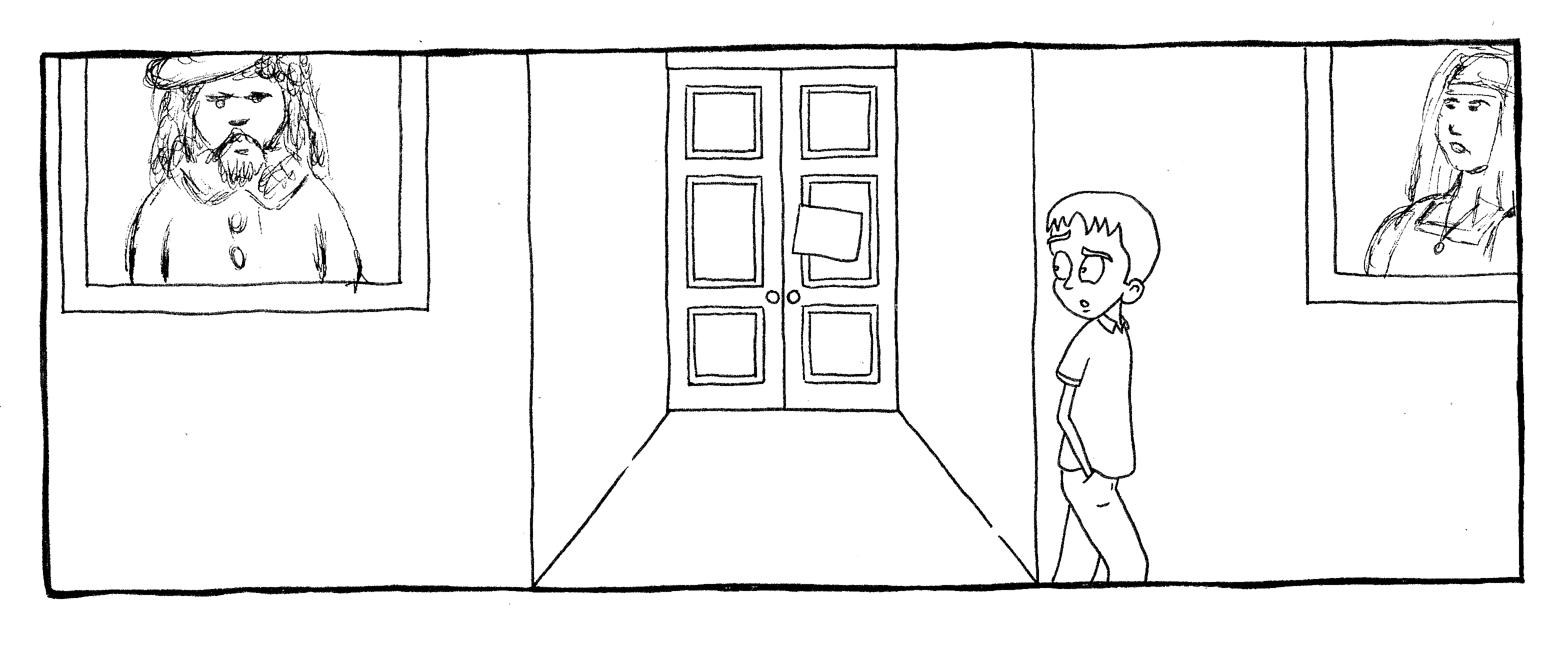
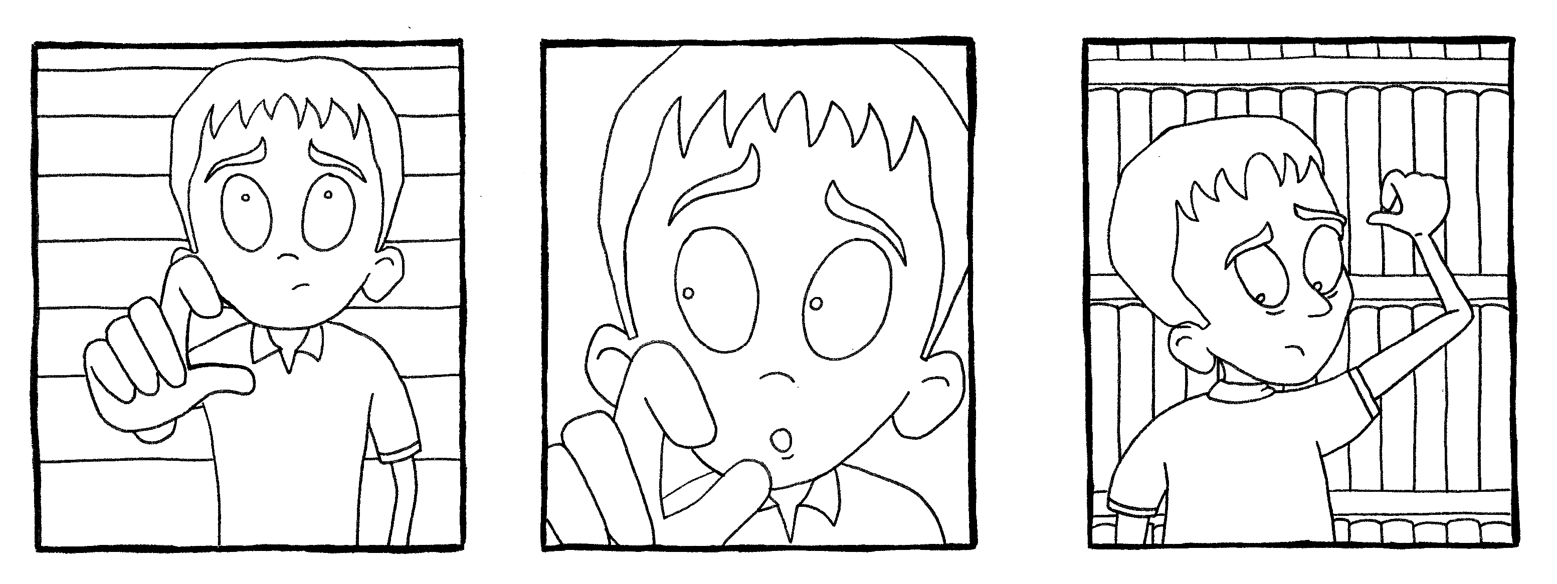
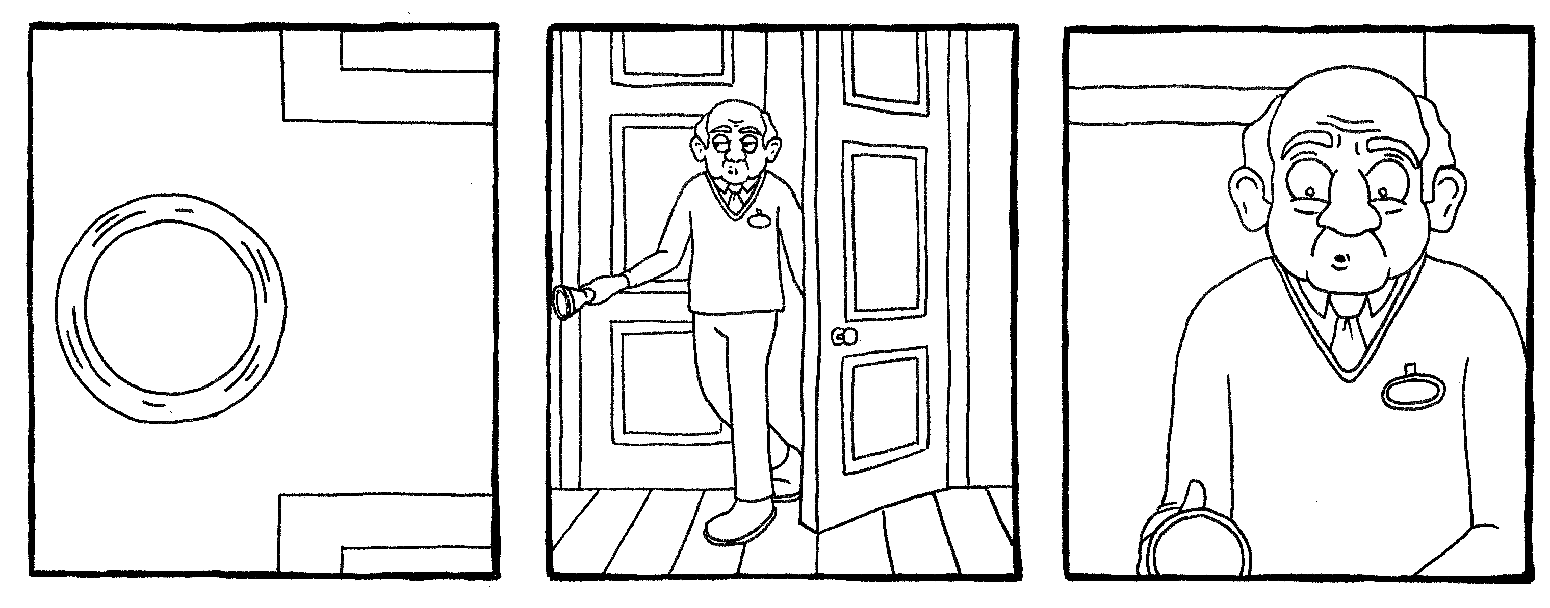
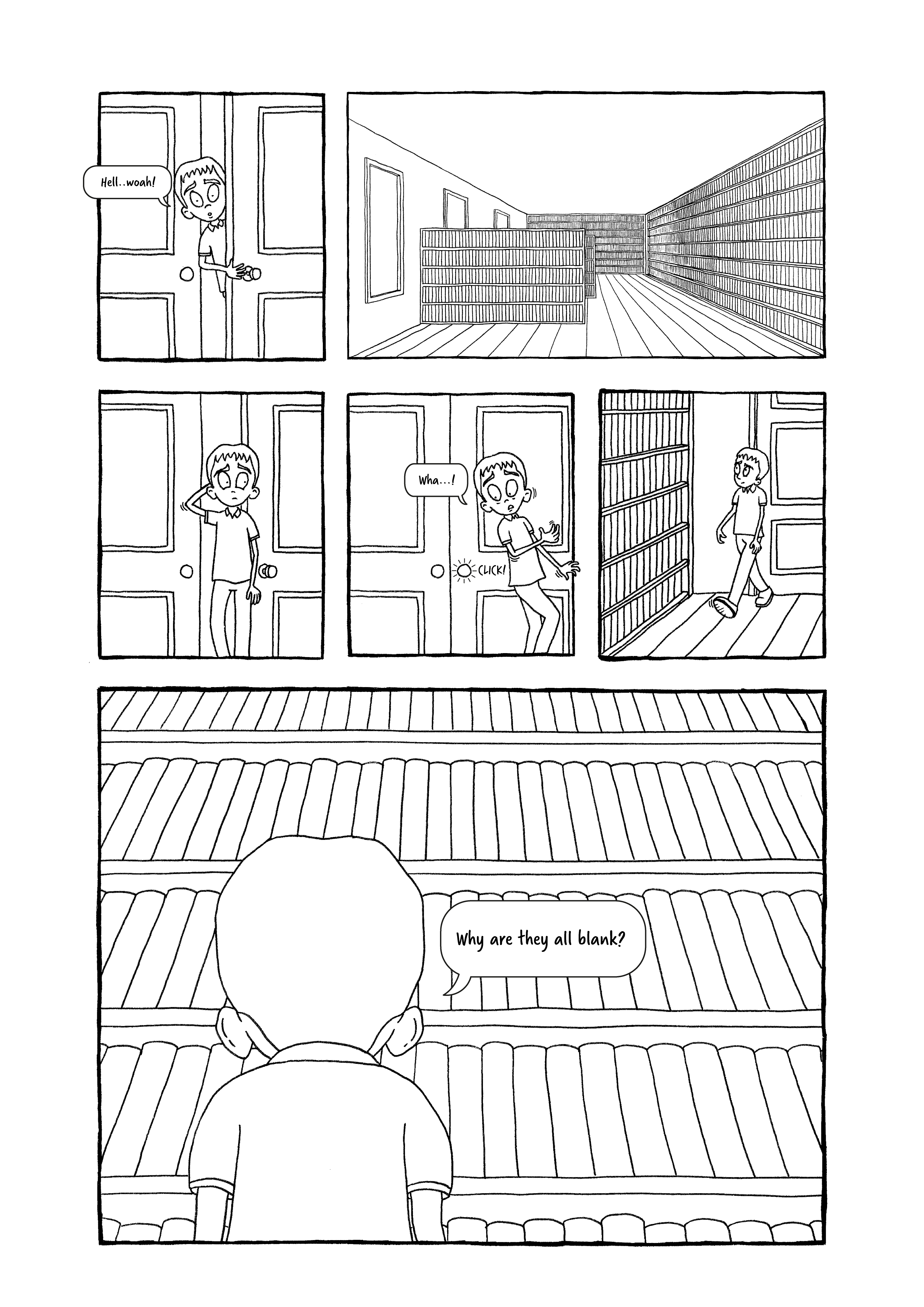
An example of a wide shot panel would be the first one of the story, which establishes the location and therefore I wanted it to include more visual information for the reader. Examples of where I chose a close-up view would be the two that show the boy’s eyes as he sees the book on the floor and as the tentacles surround him. The magnification effect of using a close-up for this increases the sense of terror that the boy is feeling and cuts out any additional, unnecessary information.
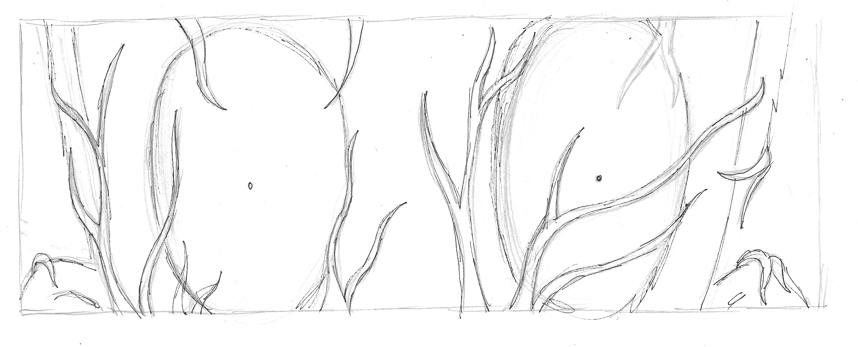
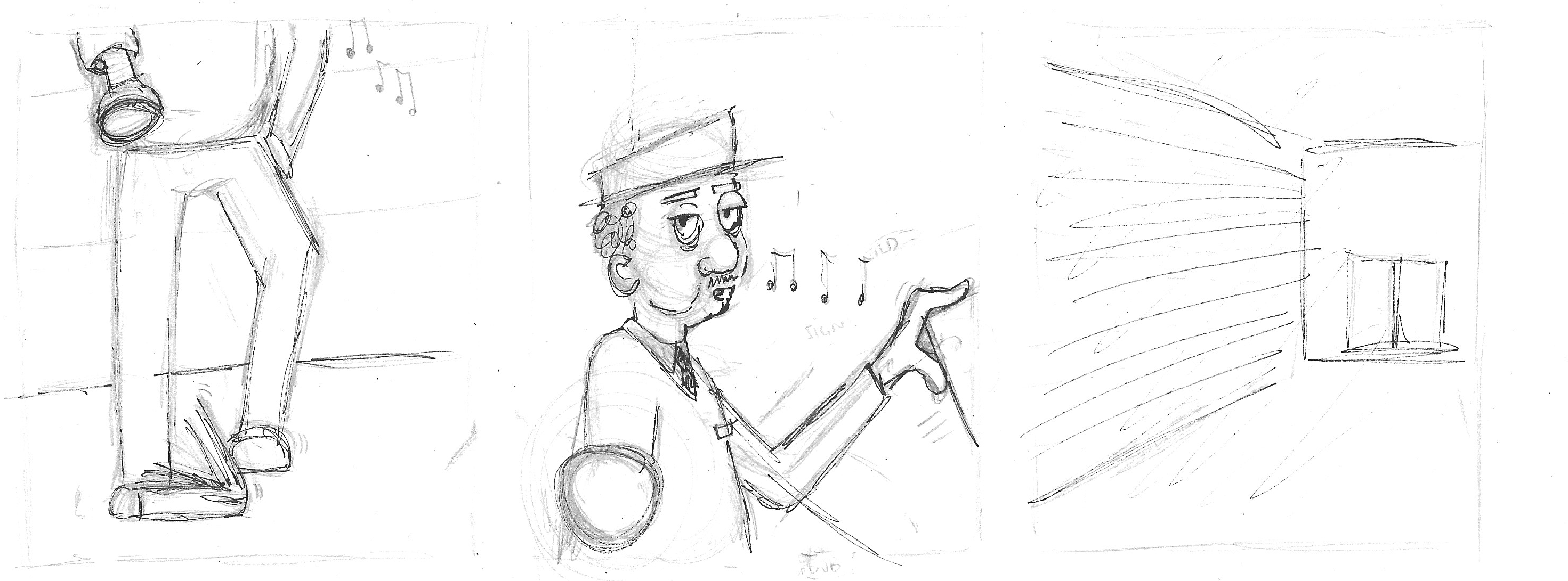
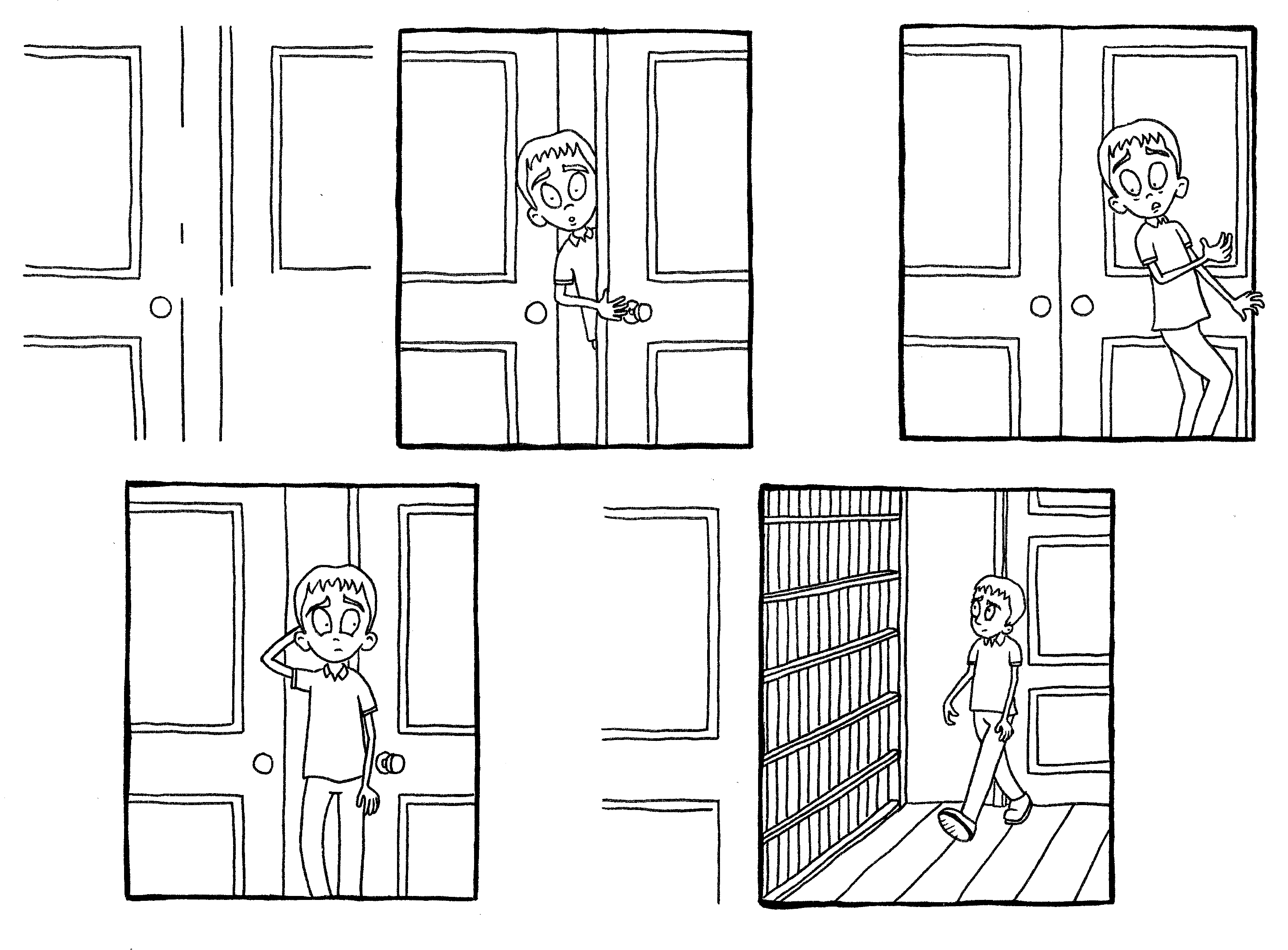
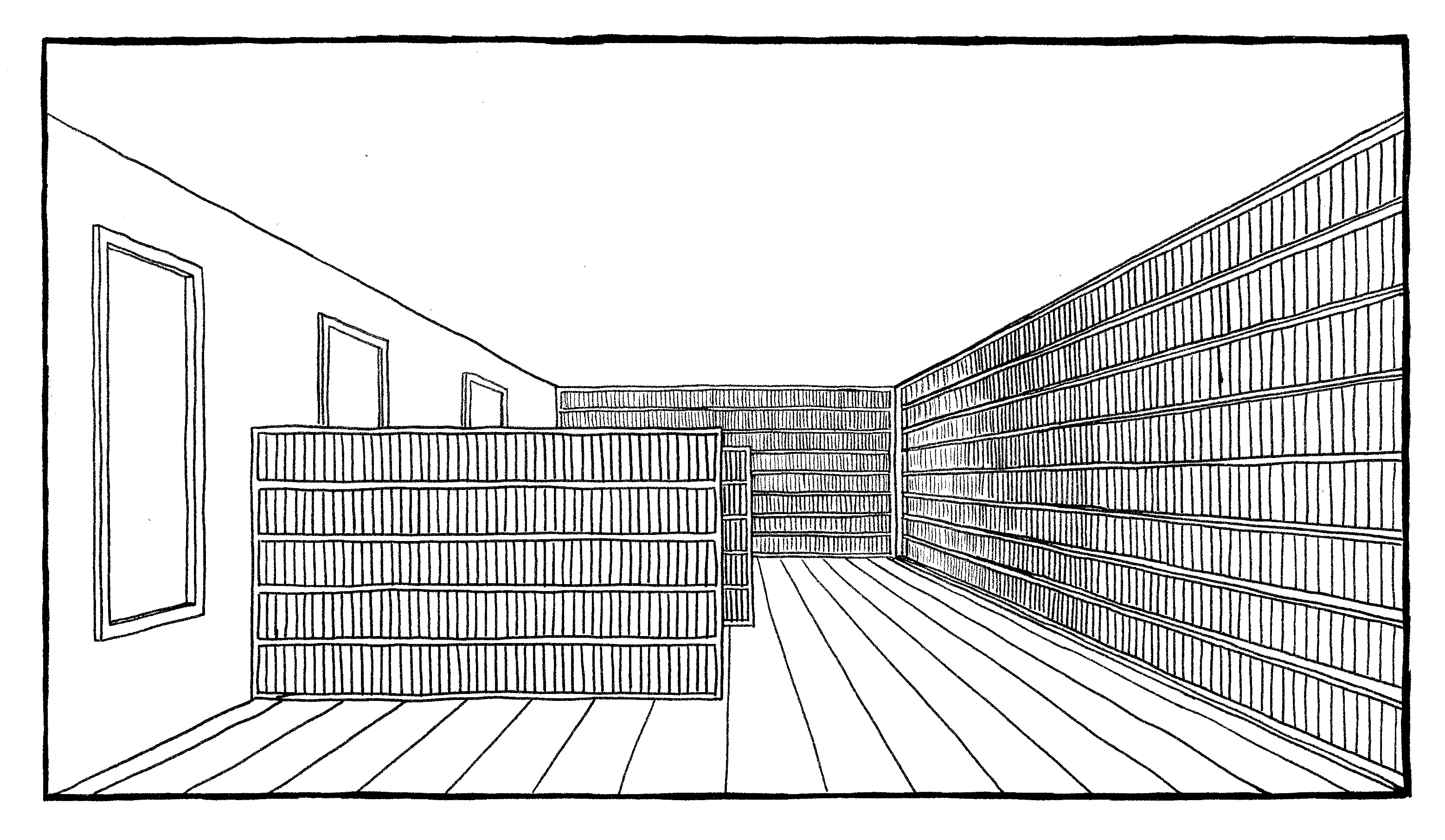
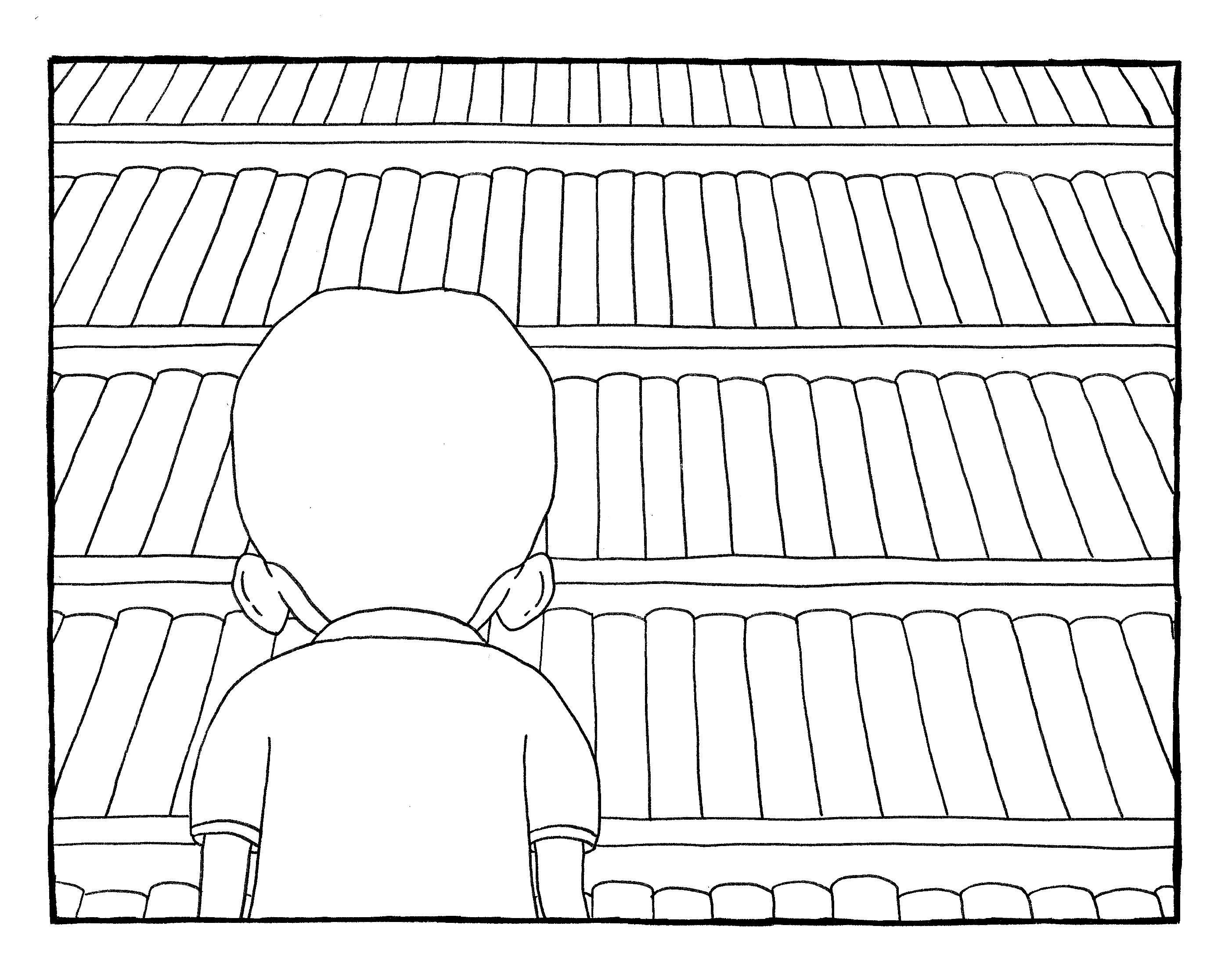
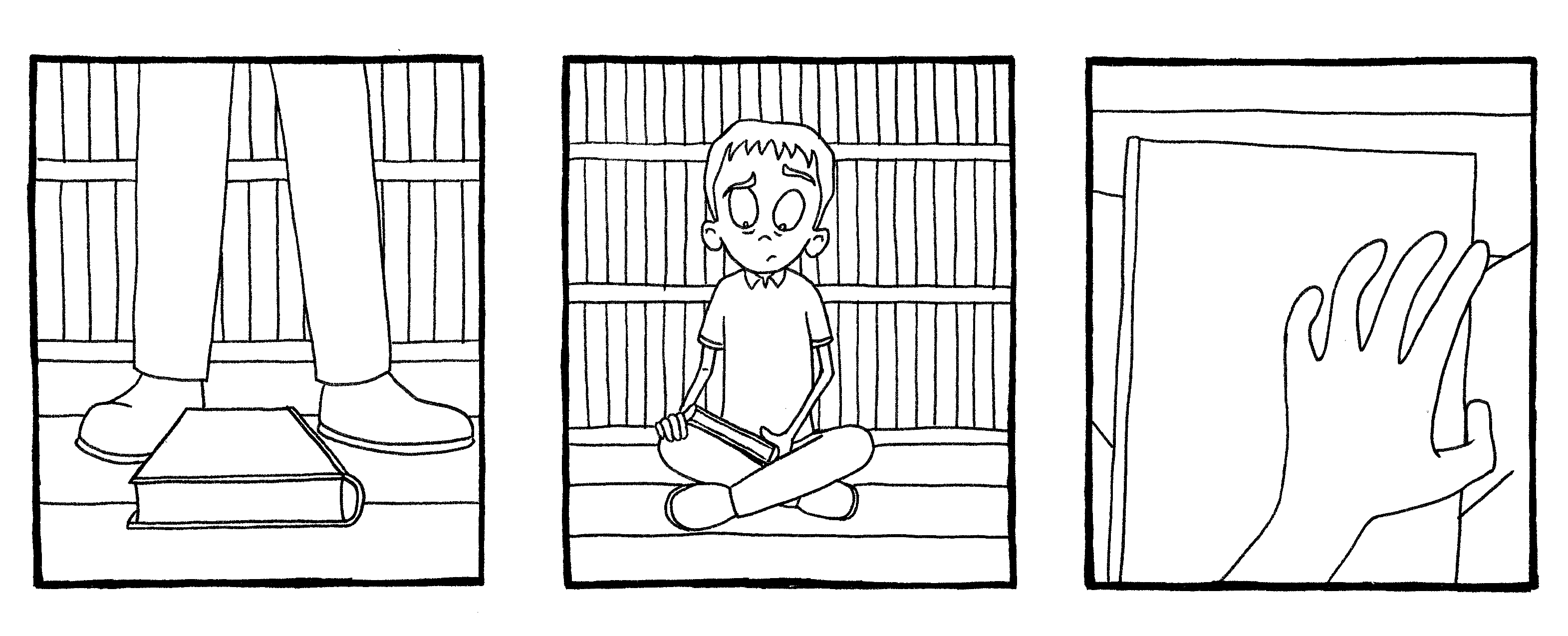
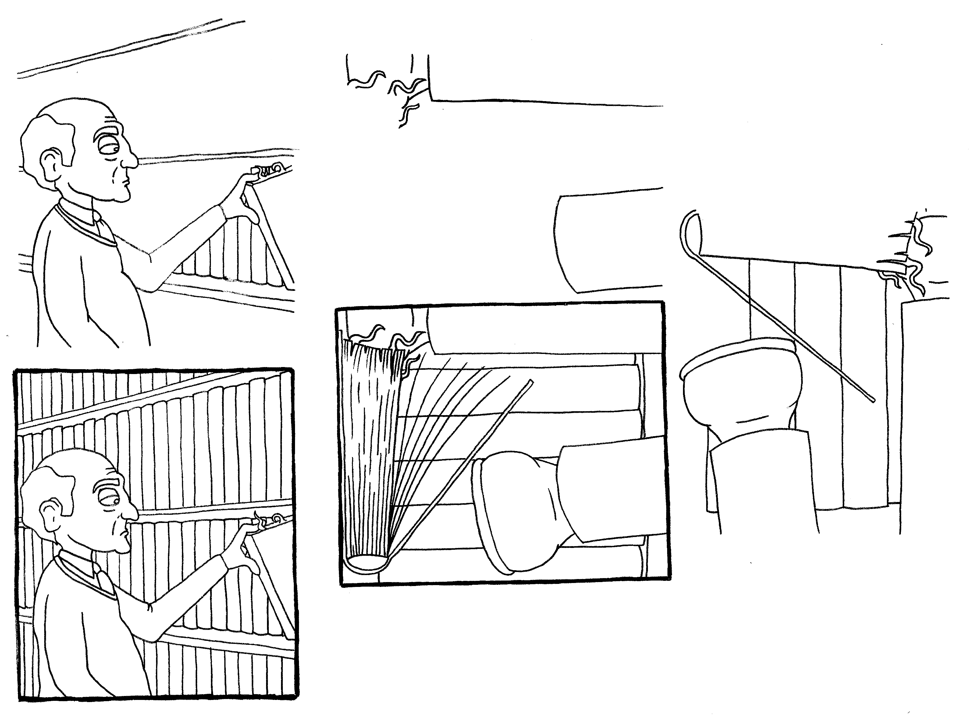
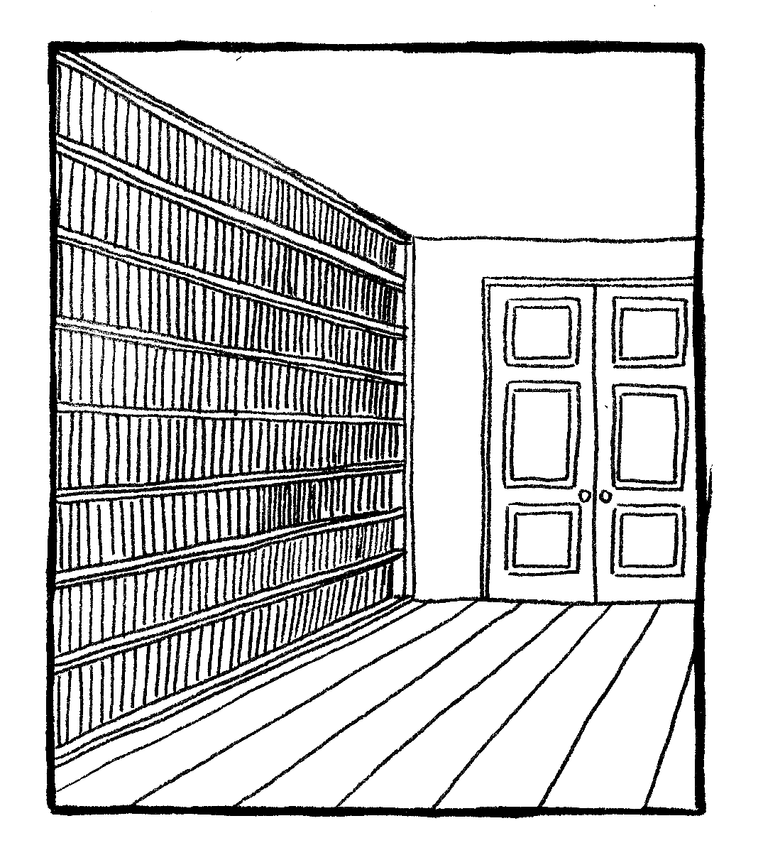
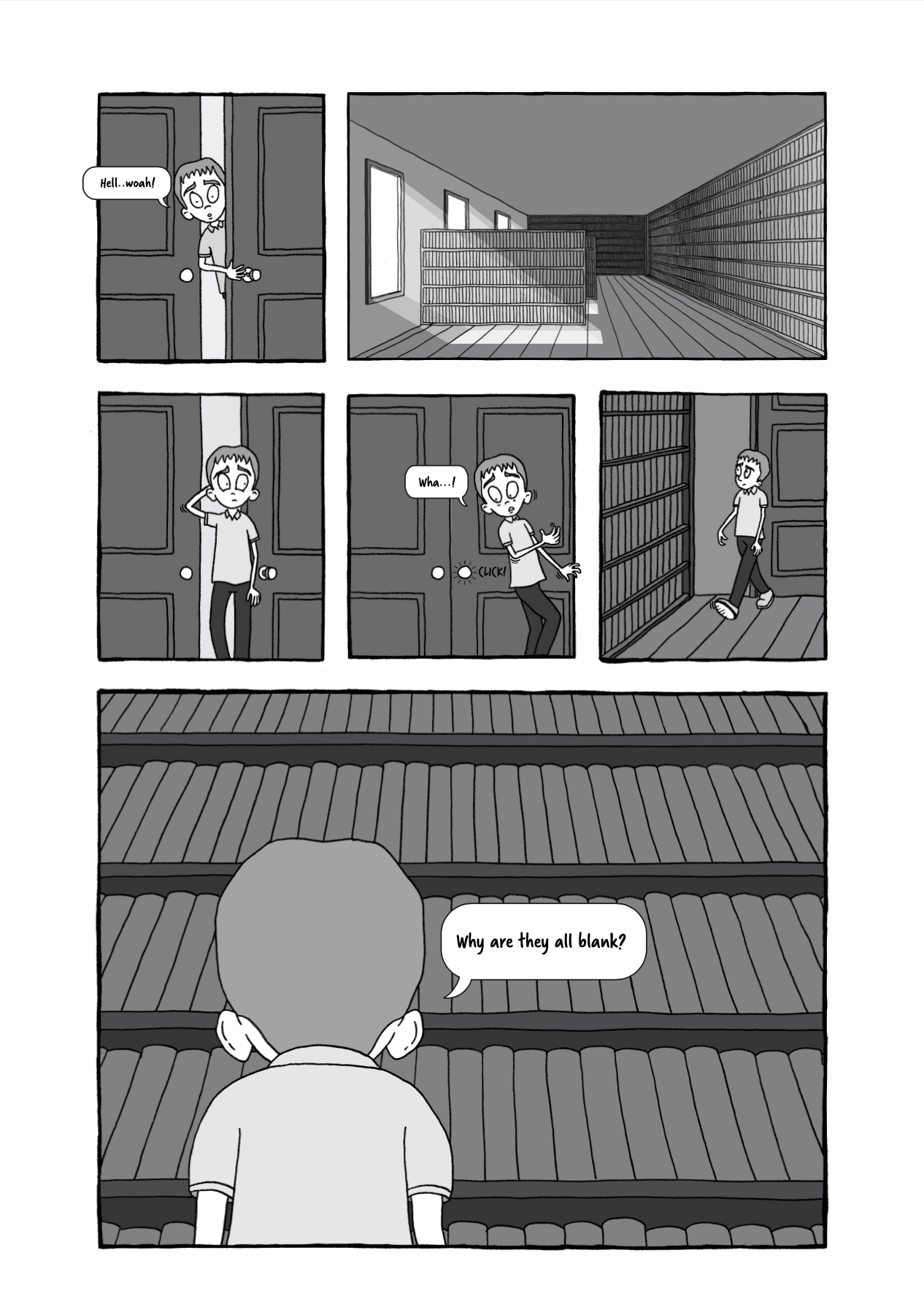
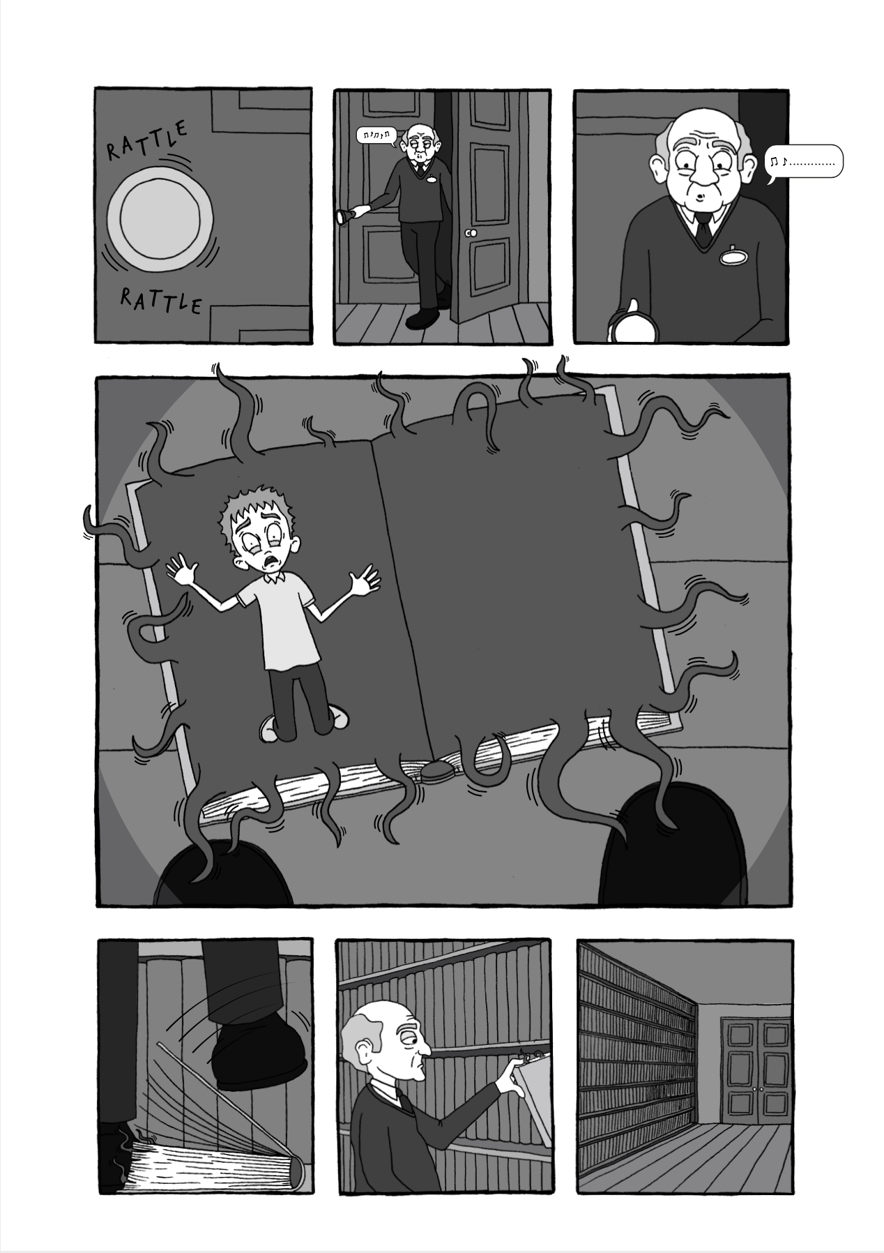
I also made a conscious effort to include a mixture of viewpoints/perspectives, such as using the POV of both the boy and the security guard as they look down at the book, which (hopefully) makes the reader feel more involved in the story as they discover things alongside the characters. I used a worm’s-eye view when the boy is looking up at the books on the shelves (page 2) to suggest its power.
Lighting
I felt the use of the torchlight on the final page really helped to boost the atmosphere of the room. My tutor commented on the use of lighting to direct the viewer’s focus, which is what I was trying to achieve, but not in a too obvious way, i.e. I wanted it to be as a result of the character’s movements and direction of the torch.
Slight Amendments
My tutor highlighted two design queries that I wanted to address, so I returned to the artwork and made a couple of slight changes.
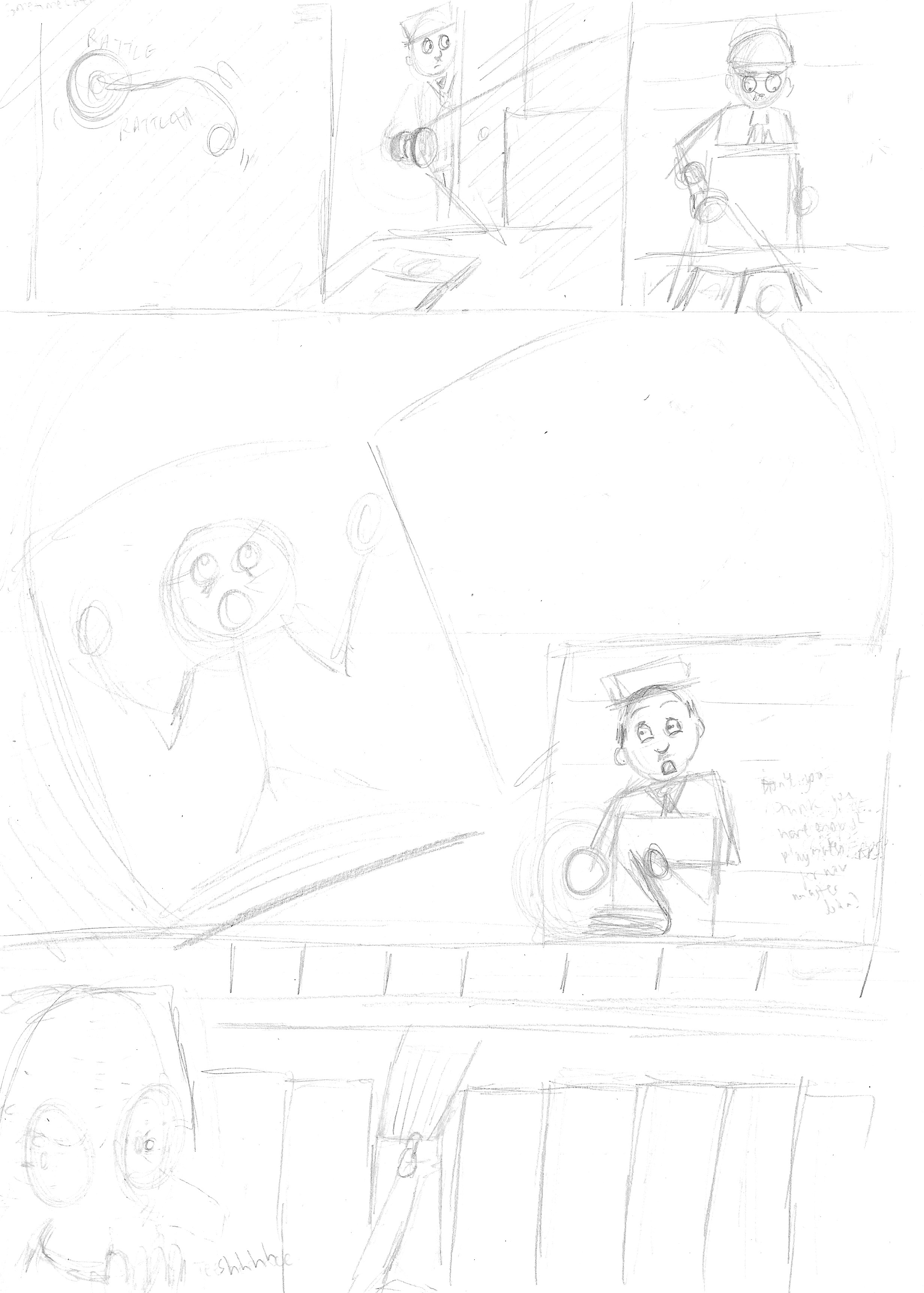
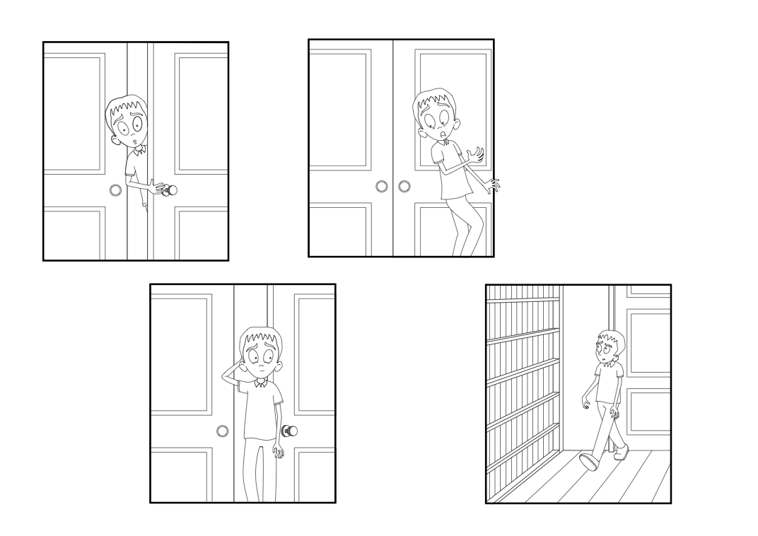
The first issue was the text in the speech bubble on the final panel of page 2, “Why are they all blank?”. This was the one piece of text that I was really unsure about so it was interesting to see my tutor had singled it out! I decided to change the wording to, “They all look the same…“, which I felt was much more suitable.
The second change I made was to the sound effect ‘click’, also on page 2, from black to white so that it stood out again the background. I also decreased the size of font by 1pt so that it fit better between the boy and the door handle. I did experiment with making a similar change to the sound effect ‘rattle’ in the first panel of the final page, but decided that making it too bright took away from the effect of the room being in darkness.
A version of the page 2 with these changes implemented can be seen below.

Visual Language
My tutor commented on my original rough sketches for the character and the tutorial I followed that inspired the final version. I realise there are certain popular trends in character design, such as the ever-present Manga style or that used in the tutorial, which is ‘Disney-like’. I try make sure that my designs do not follow such trends, at least not obviously, as I much prefer more individualist styles. However, I did find the tutorial very helpful in terms of having rough guidelines for facial proportions, etc, and I attempted to add some of my own style to the character of the boy rather than just copying directly.
As I progress I hope that I will be able to build on these foundations and have the confidence to create characters with personalities and features that reflect even more of my own visual language.
References
Berntsson, S. (2015). Create a Comic: How to Plan and Lay Out Your Comic. [online] envatotuts+. Available at: https://design.tutsplus.com/tutorials/create-a-comic-how-to-plan-and-lay-out-your-comic–cms-24179. [Accessed 26 February 2022].
Brosgol, V. (2011). process – verabee. [online] Vera Brosgol. Available at: https://www.verabee.com/news/2011/06/process. [Accessed 04 March 2022].
Brosgol, V. (n.d.). verabee. [online] Vera Brosgol. Available at: https://www.verabee.com. [Accessed 26 February 2022].
Gomes Cabral, C. (2014). Cartoon Fundamentals: How to Draw Children. [online] envatotuts+. Available at: https://design.tutsplus.com/tutorials/cartoon-fundamentals-how-to-draw-children–cms-21954. [Accessed 26 February 2022].
Knudde, K. and Schuddeboom, B. (2021). Charles Addams. [online] Lambiek Comiclopedia. Available at: https://www.lambiek.net/artists/a/addams_charles.htm. [Accessed 26 February 2022].
Masterclass, (2021). How to Create a Comic Book: Neil Gaiman’s Step-by-Step Guide for Making Comics. [online] Available at: https://www.masterclass.com/articles/how-to-create-a-comic-book-step-by-step-guide-for-making-your-own-comics#how-to-outline-a-comic-book-in-6-steps. [Accessed 26 February 2022].
Roberts, D. (n.d.). David Robert Illustration. [online] David Roberts Illustration. Available at: http://davidrobertsillustration.com/index.html. [Accessed 26 February 2022].
Smy, P. (2018). Pam Smy. [online] Pam Smy. Available at: https://www.pamsmy.com. [Accessed 26 February 2022].
Tan, S. (n.d.). Arrival book – Shaun Tan. [online] Shaun Tan. Available at: https://www.shauntan.net/arrival-book. [Accessed 26 February 2022].
The Edward Gorey House, (n.d). The Edward Gorey House. [online] Available at: https://edwardgoreyhouse.org. [Accessed 26 February 2022].