Research Point: Visual Literacy
Research the work of graphic designers that interest you. How do they use visual language? What is it about the work that you admire? Make notes on their work, your reflections on it and note down aspects of it that you could use as a starting point yourself.
I understand that being visually literate is having the ability to understand the meaning of images. It means being able to interpret what the designer is communicating, which could be obvious or implied. I think this is a skill that takes time to acquire, as it requires you to be able to gain experience in thinking about images in a certain, critical way rather than just taking them at face value and stating whether you like them or not. At present, I do not believe I am very visually literate, but I am starting to think more about the reasoning behind certain design choices. I feel the way to improve is to keep reading and learning about design from people who know what they are talking about.
That being said, I have listed below some of the graphic designers I have discovered so far whose work visually appeals to me, but I am not very successful at communicating why at this stage:
Albert Exergian– I particularly like the Iconic TV Poster series, which I think are perfect examples of how design can communicate through simplicity.

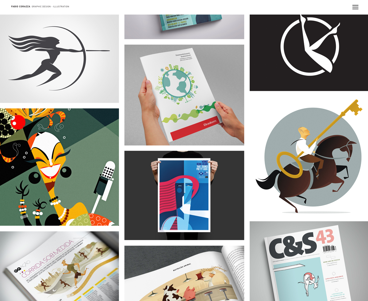
As I am keen on illustration, I’m always drawn to design that incorporates this in some form (especially characters). Two artists that demonstrate this are Fabio Corazza and Edel Rodriguez.
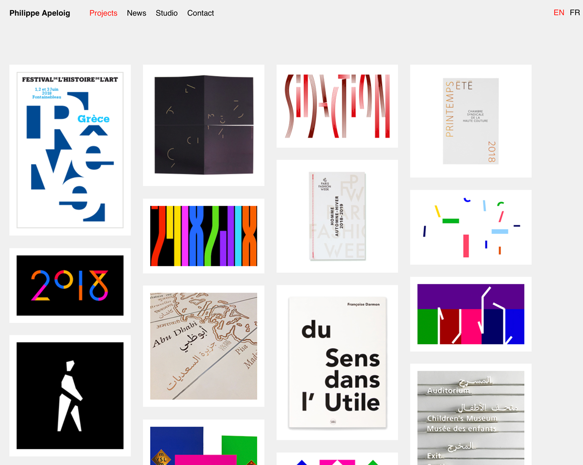
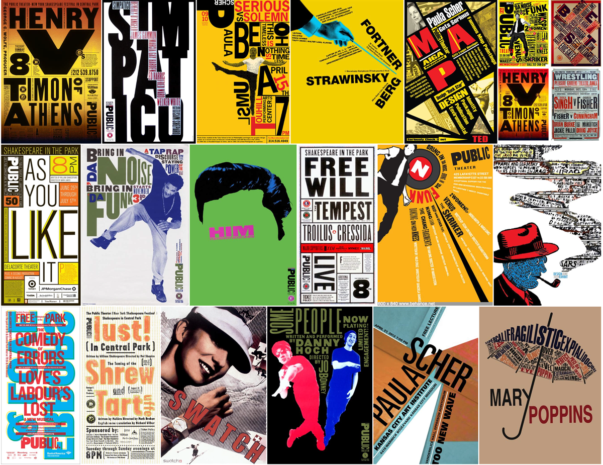
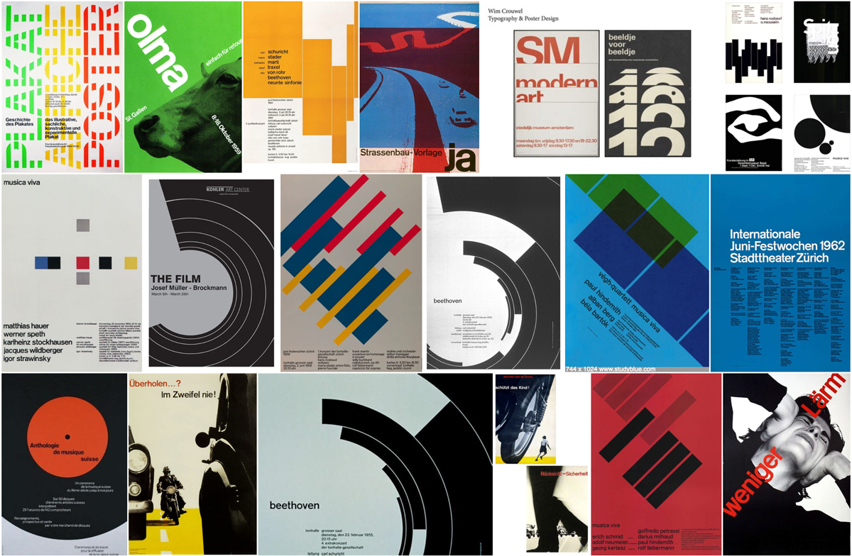
Since beginning to read about typography, I have become more drawn to designs that incorporates this in a creative way. Some artists that I admire particularly in this regard are Philippe Apeloig, Paula Scher, Gunter Rambow and Joseph Muller-Brockmann.

I am also very interested in the poster designs created for London Transport. I think these are an excellent source of inspiration and the fact that the archives go back over 100 years allows you to see how design trends have changed over time. I was really intrigued to see how the posters communicate their message in such creative ways and how the London Transport logo is incorporated into the designs, as demonstrated in the poster below.
I can interpret some key design aspects from these examples that stand out to me as making the designs more engaging:
- Limited colour palette
- Use of white space
- Clean
- Boldness
- Scale
- Angle
- Perspective
- Vector graphics
- Combining typography and photos
- Hierarchy of information
- Making the viewer fill in the gaps
RESOURCES
Visual Literacy Today, 20–. What is Visual Literacy? [online] Available at: <https://visualliteracytoday.org/what-is-visual-literacy/> [Accessed 14 May 2018].
Yenawine, P., 2016. Thoughts on Visual Literacy. Visual Thinking Strategies, [online]. Available at: <https://vtshome.org/wp-content/uploads/2016/08/12Thoughts-On-Visual-Literacy.pdf> [Accessed 14 May 2018].