Research Point: Readability & Legibility
Collect as many newspapers, newsletters, magazines and brochures as you can. Start by going through them and dividing them into the ones that immediately look easy to read and those that don’t. Is this due to the typefaces used, the way the type is laid out – the number of words per line and the column width, or its alignment? Work out from your examples what the designers have done to make things more legible and readable.
DIFFICULT TO READ
I thought this example was a good demonstration of how using a script font makes hard to decipher the text without some effort. The use of the colour yellow on a white background is not helpful either as there is not a very strong contrast between the two.
EASIER TO READ
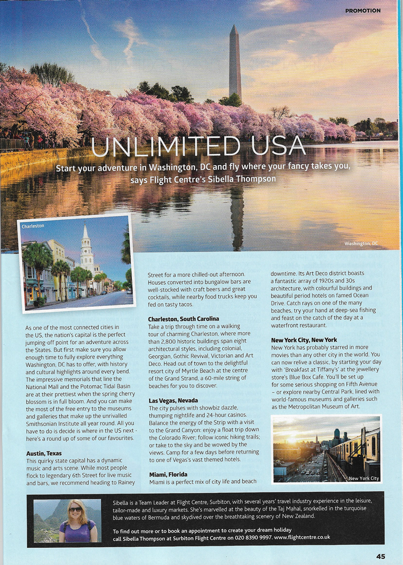
Although the layout of this first example is not particularly dynamic or exciting, I thought the layout made it very easy to read and there is a clear hierarchy, with headings and logical sections of text.. The leading and font choices make it very readable.
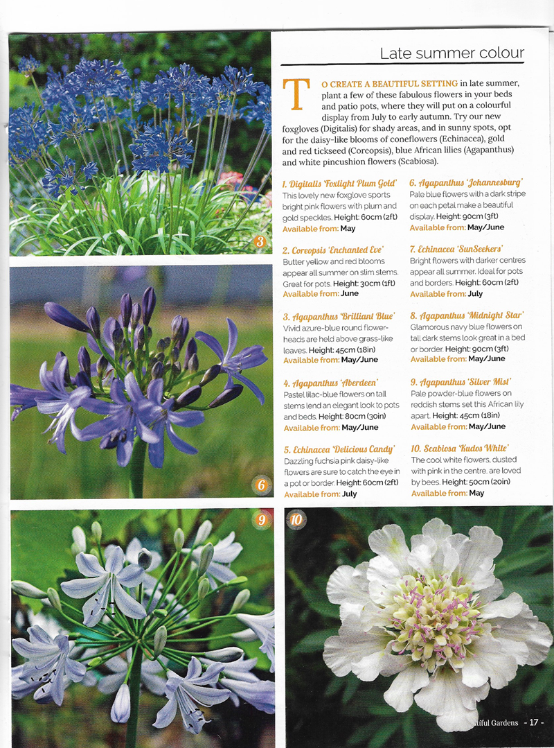
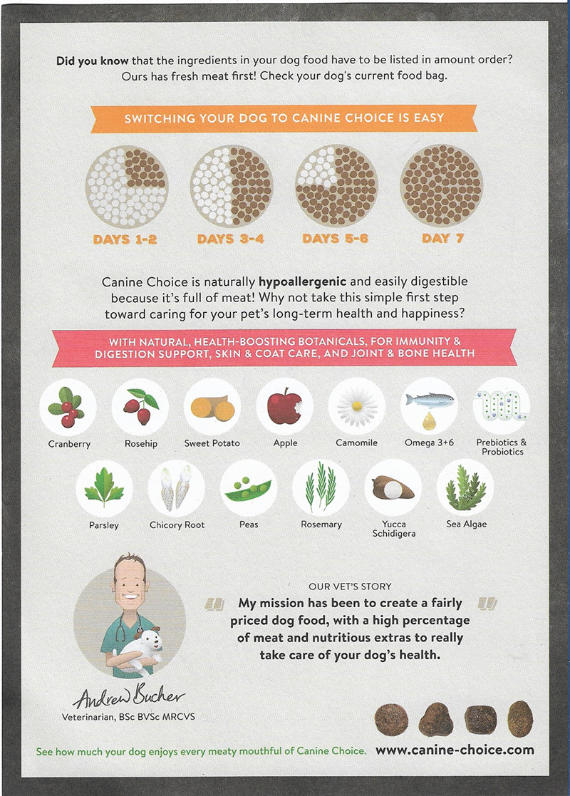
I chose these two examples as they both, in my opinion, demonstrate how information can be shown in a visually interesting and easy-to-decipher way. The use of colour and pictures/infographics attracts the eye. The fonts used are bold, readable and contrast with the surroundings enough to stand out.
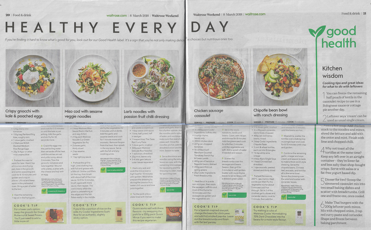
I found the layout of this double page spread very easy to read. There is a clear hierarchy and the use of white space effectively means a lot of text and information can be included without affecting readability. The choice of font and leading makes it easy to read, even at a smaller point size. The colour scheme runs across both pages.
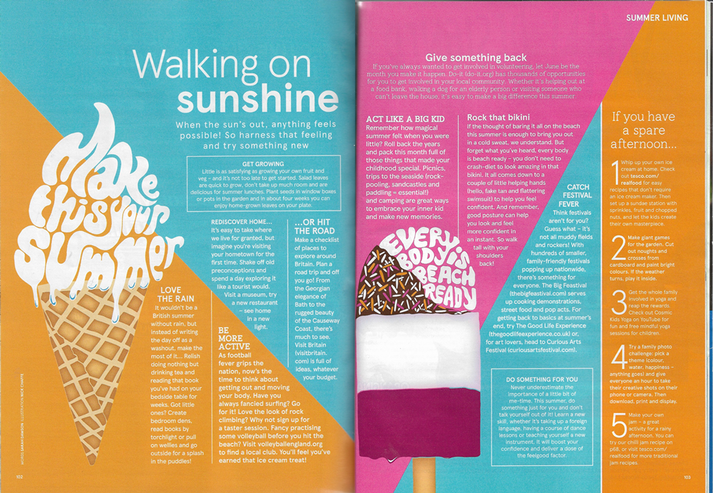
I thought this design was quite bold, but still easy to read. The way the text fits into each colour block makes for a more interesting visual experience. I’m not sure if there is a strong enough contrast with some of the text and the background colours, but I liked the layout and font choices. The inclusion of the text as part of the ice cream images is an inventive use of typography. I thought the overall design was quite balanced.