Exercise: Understanding Colour
Draw two grids of squares, filling one with colours that you like and the other with colours you dislike. Then put the two grids side by side and ask the question ‘which one looks better?’
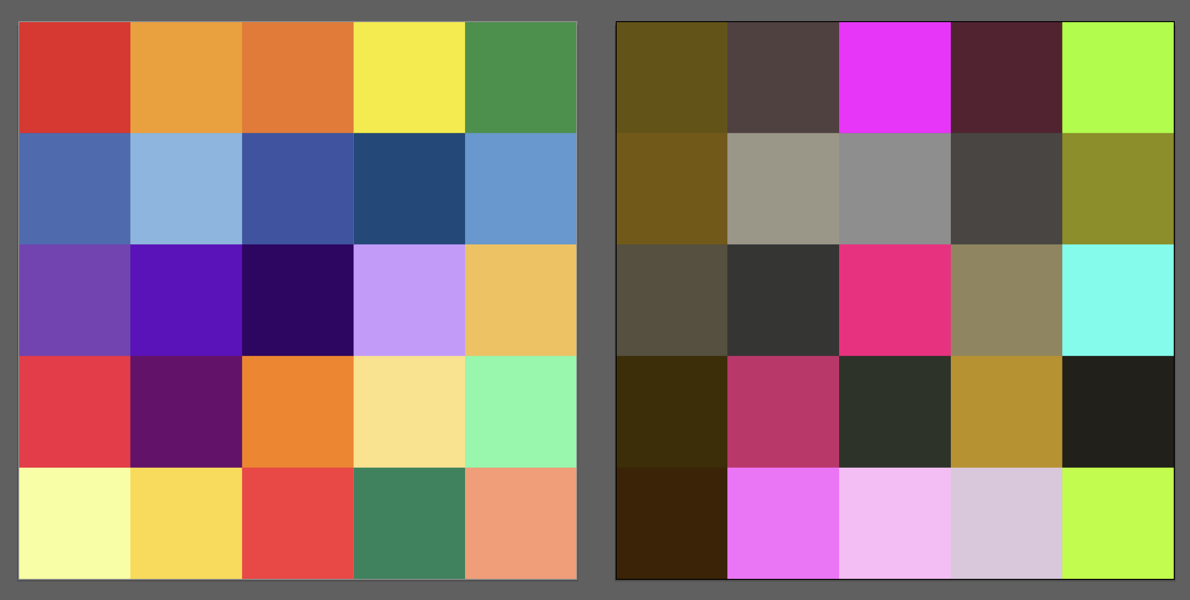
From this initial experiment, I can see that I tend to be drawn towards yellow-reds and blue-purples, mostly in their brightest forms. Many of these do not blend together well and clash when placed side by side, apart from some of the softer tints/shades. The dislike grid is mostly filled with subtle browns and greys, with some pinks and a couple of bright (almost fluorescent) others. It is apparent that most of the browns/greys would blend together and are not overpowering so would serve well as neutral background colour.
Next try experimenting with placing colours together as Itten did.
I then tried another of Itten’s tests, in which I selected the colours I associate with each of the four seasons.
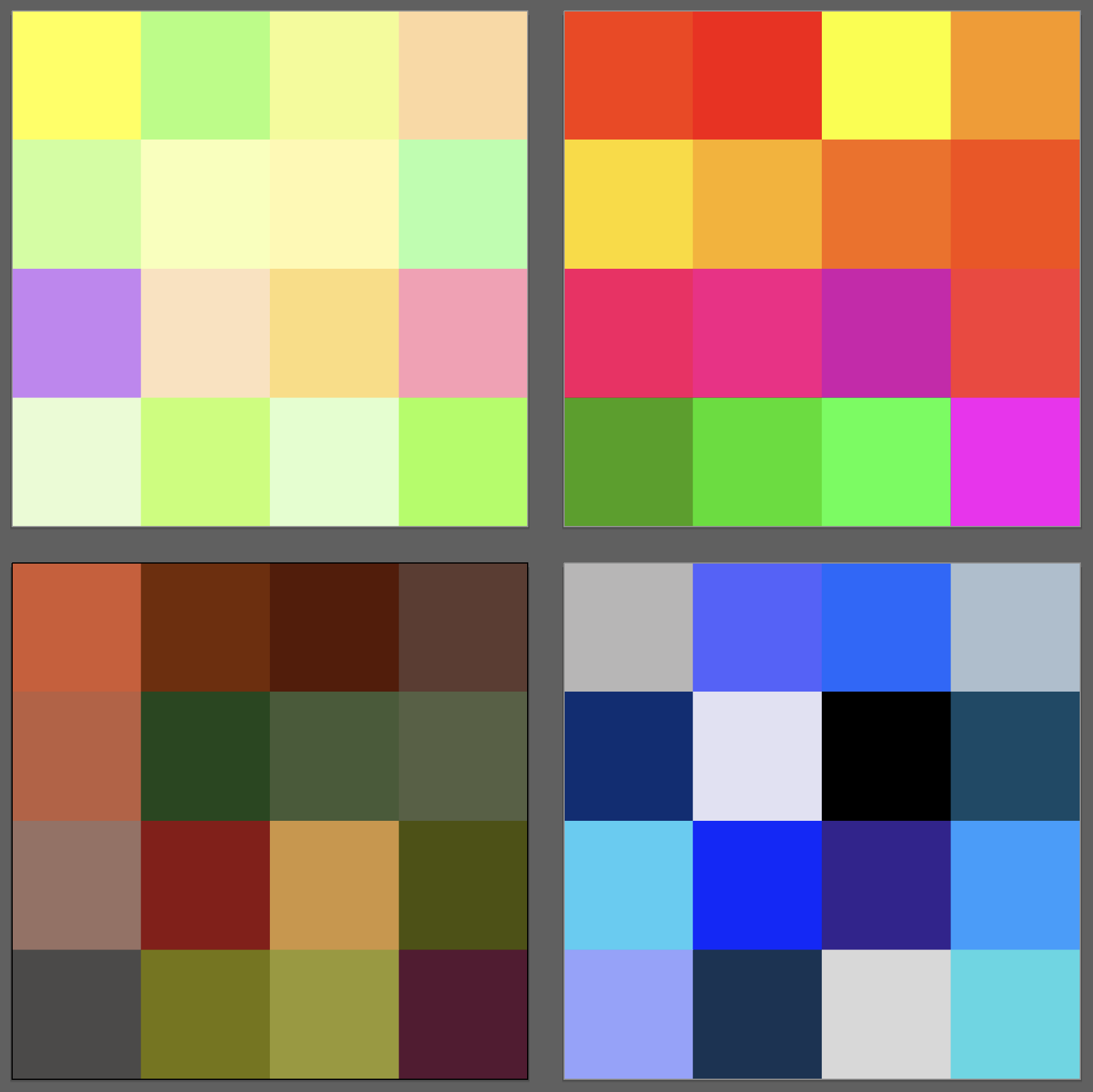
For Spring I chose tints of mainly greens and yellows as these represent the gentle awakening of nature and new growth after the harshness of Winter. For Summer I chose bright reds, oranges and purples, with some greens, to represent the vibrance and life of the hotter months. For Autumn I used shades of orange and green to represent the calming down of the colours from Summer, when nature is preparing itself for Winter. For Winter I selected various blues and greys as these represent the coldness of the months when nature is withdrawn into itself. I think these are fairly universal choices and, when grouped together in this way, it is fairly easy to decipher what is being abstractly represented.
Next, I read about Itten’s concept of The Seven Colour Contrasts on various websites, but I could not find descriptions that were clear and thorough enough for me, so I attempted to find a copy of Itten’s book The Art of Colour, but it appeared to be out of print. However, I did manage to find a copy Itten’s book The Elements of Colour, which is based on the former. This was really useful to read and I feel I learnt a great deal from taking the time to read it all the way through. I particularly liked the fact he included several examples of paintings which demonstrate his theory and I could look these up on Google Images.
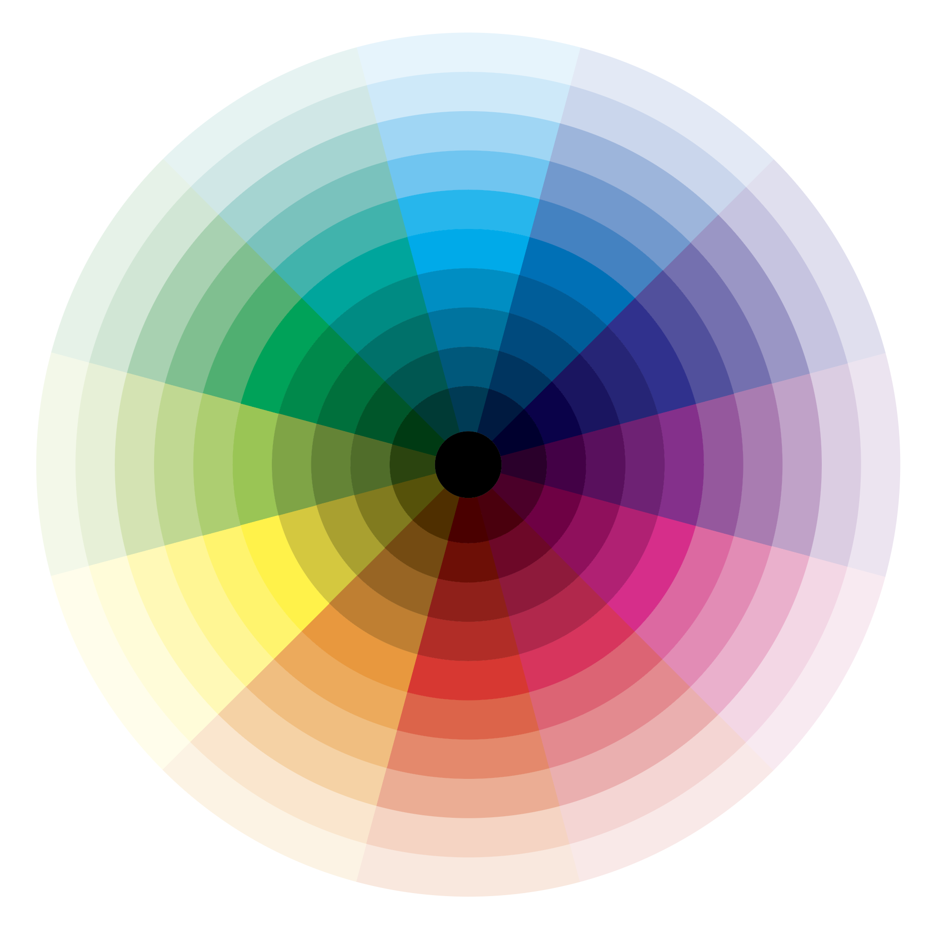
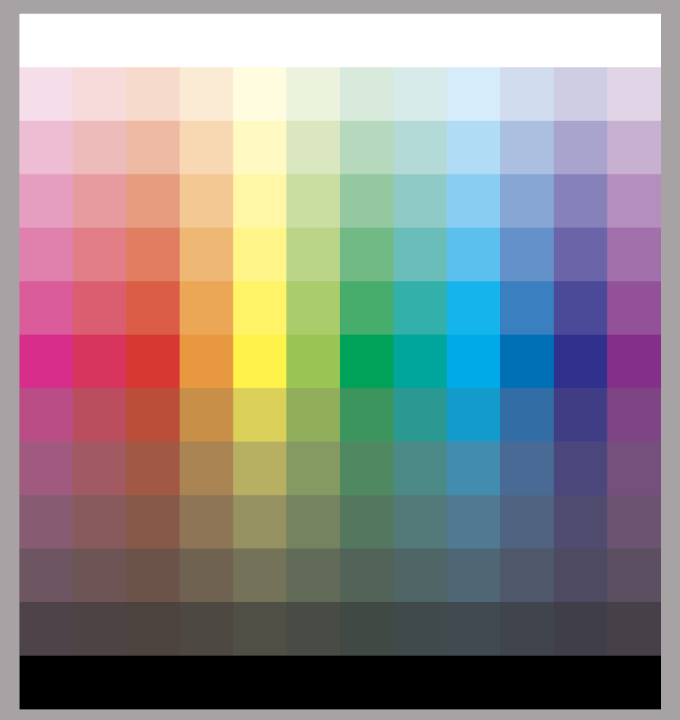
Once I reached the section on the seven contrasts, I wanted to make my own versions in Illustrator. Before this, however, I decided to create a colour wheel. I chose to work with CMYK colours for these exercises.
The first colour contrast Itten refers to is The Contrast of Hue, created by placing different hues side by side. The contrast is strongest with the primary colours and lessens with the secondary and further with tertiary colours. The contrast is also weakened by using shades and tints of the colours. Black and white also affect the contrast as black darkens adjacent colours, whilst white lightens and subdues them.
The second contrast is Light-Dark Contrast, which refers to the contrast created by the opposition of black and white, with the gradation of greys inbetween the two. When these are added to colours the brightness/dullness is affected. To begin with I created a greyscale from white through to black.

I then applied this to the twelve colours from my colour wheel.
Using this I worked on my own versions of Itten’s examples, creating grids of various brightness for the primary colours (monochromatic) and then for different colours of equal brightness. I still do not fully understand the difference between brightness, saturation and tone, as all three seem to refer to the level of black, white and grey used and this distracted me from the thought behind this contrast.
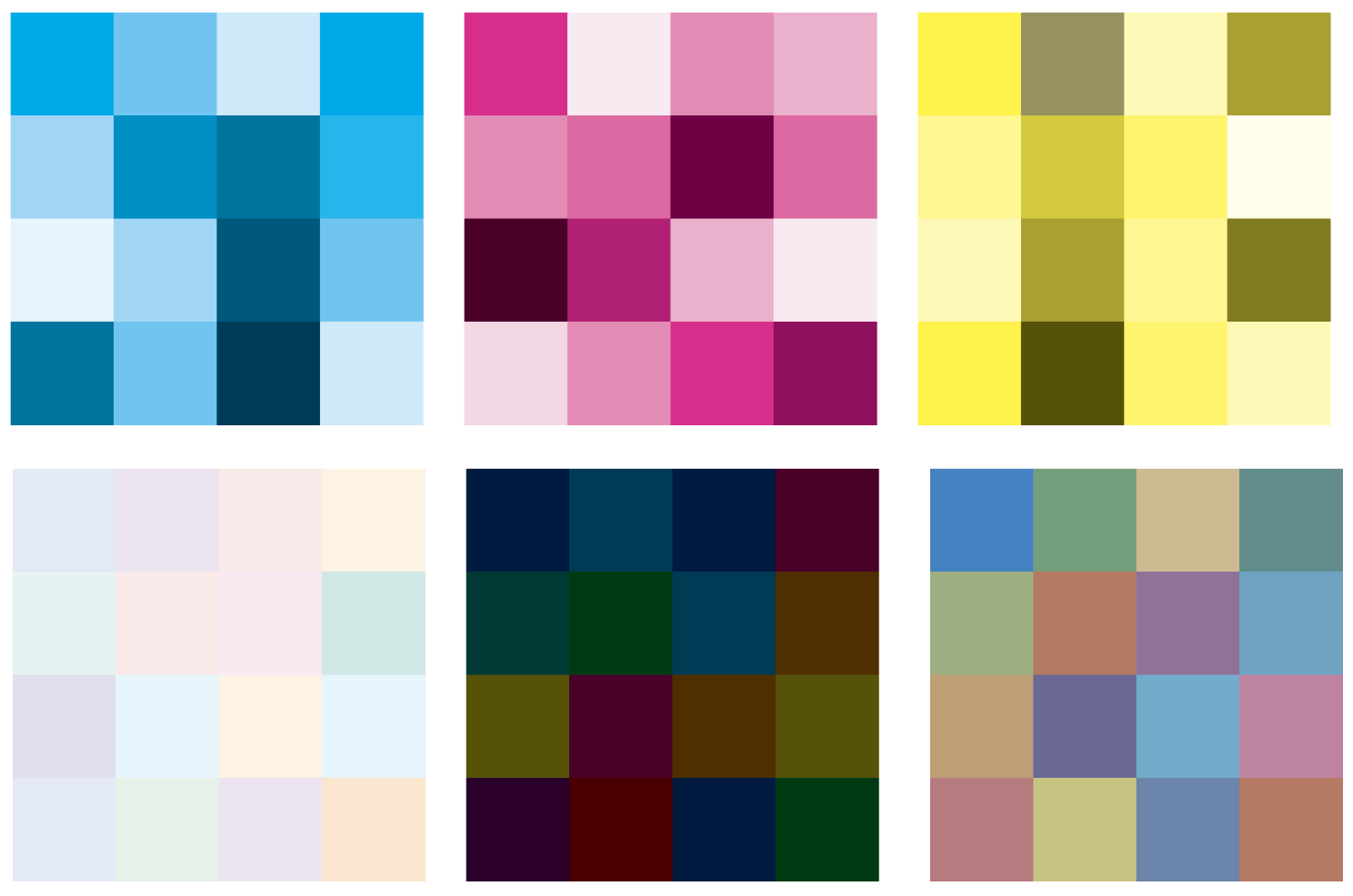
The third contrast is Cold-Warm Contrast, created by the juxtaposition of colours considered warm (red, orange and yellow) and cold (blue, violet and green). Itten expands on this concept by pointing out that the temperature of colour is relative to the colours used, e.g. orange will appear ‘cooler’ next to red, whilst violet will appear ‘warm’ beside blue.
The fourth contrast is Complementary Contrast, created by using colours opposite one another on the colour wheel. Itten stresses the importance of understanding the concept of complementary colours and I felt that the explanation he uses enabled me to take the information on board. I found it fascinating seeing the complementary pairs turn grey when blended together and how vivid the colours were when placed side by side.
The fifth contrast is Simultaneous Contrast, which refers the fact that for any colour, the eye simultaneously requires the complementary colour and will produce this itself if the colour is not present. It is in fact an optical illusion. Based on Itten’s examples, when staring at the grey squares within the coloured squares results in a thin line of the complementary colour appearing around the edge. I found it particularly interesting when the grey was changed to include slightly more blue (bottom left) and the effect was stronger, whilst when orange was added to the grey (right) the effect weakened (the middle grey square is neutral.).

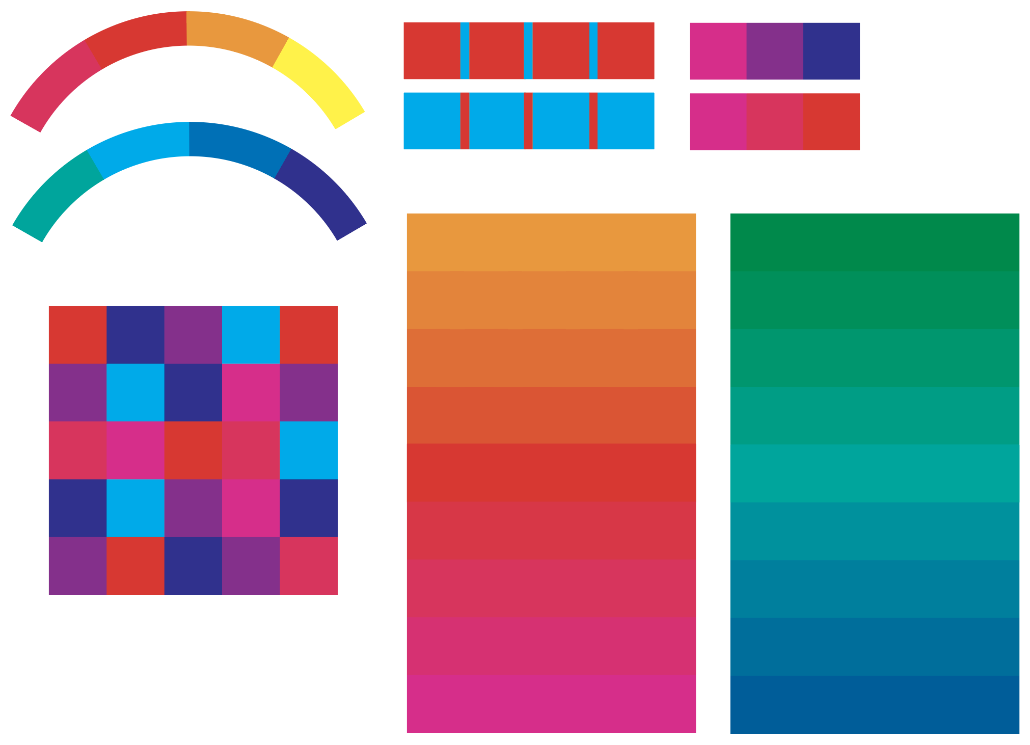
The sixth contrast is Contrast of Saturation, which relates to the purity of colour, whether it appears strong and intense (saturated) or weak and dull (desaturated). A colour can be diluted with white, black, grey or by its complementary colour. Itten states that dilution can completely change the character of colours, e.g. he says that fully saturated dark violet appears sinister, but when mixed with white to create lilac it becomes a pleasant and ‘happy’ colour.

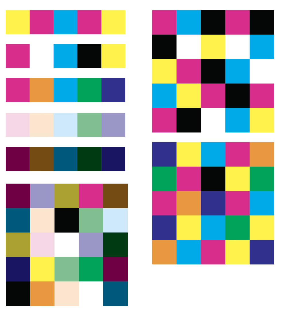
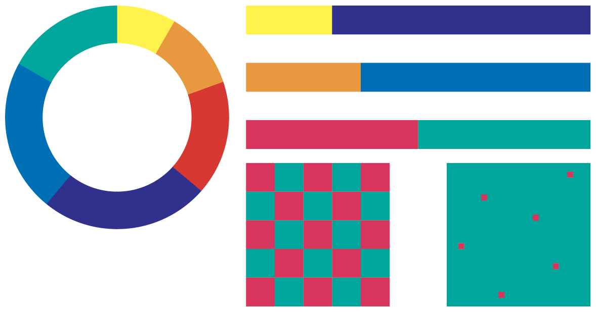
The seventh and final of Itten’s Colour Contrasts is Contrast of Extension, which refers to the proportion of one area of colour to another. He bases this concept on Goethe’s calculations of light value for the three primary and three secondary colours, with yellow having the highest value (3) and violet the lowest (9). Itten states that in order for colours to be proportionately balanced these values have to be taken into account. For example, violet would need to occupy three times as much space as yellow to achieve this. The circle and the three lines below demonstrate Itten’s theory of colour balance through proportion. The red and green checkerboard shows red and green in balance, but once the red squares are reduced in size the contrast between the two colours makes the red appear to be agitated.
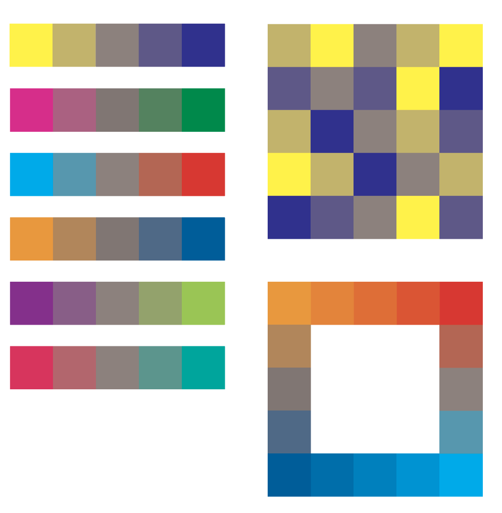
In the book, Itten also talks about the theory of colour expression, detailing the properties of each colour based on the ‘mental and emotional expressive values’. Examples show how these expressive values are changed by placing different colours side by side, which was relevant for the final part of the exercise.
Try and find different combinations of two colours to illustrate each of these ideas:
ANGRY
BRAVE
CREATIVE
DANGEROUS
ENERGETIC
FAMILIAR
GREGARIOUS
HOPEFUL
INDEPENDENT
JUMPY
KINETIC
LUXURIOUS
MASCULINE
NEW
OPEN
PRECIOUS
QUIET
REASONABLE
SOCIABLE
TASTEFUL
UNHAPPY
VITAL
WONDERFUL
EXTRA SPECIAL
YOUTHFUL
ZANY
I decided to try out three colour combinations for each word. Alongside Itten’s book, I also looked at several websites which detailed the relationship between colour and emotion, and how this is applied in marketing (see Resources below). I have attempted to explain my reasoning behind the choices, using examples where possible, but for some I just went with what I thought looked right.
Angry: Red was the obvious choice to represent anger and Itten suggests that red on black creates the most powerful, ‘demonic’ combination. I also tried red combined with a less intense red, but this weakened the combination too much.

Brave: I chose to combine blue/purple with black and grey as these are strong, but calm colours that complement one another, not clashing at all.

Creative: I found this particularly difficult, but decided to use colours that might not usually be put together.

Dangerous: Again, red was the obvious choice (e.g. road/warning signs), with the red and white or yellow working much better than the orange, as there is a stronger contrast to make these ones stand out.

Energetic: I used colours that contrast strongly, based on Itten’s theories. Red and green are equally intense so ‘zing’ of one another; white enhances the brilliance of yellow; and I used a grey with some complementary violet added to produce simultaneous contrast in the last square.

Familiar: I chose tints of similar colours, which blend together in a gentle fashion.

Gregarious: This word required loud and bright colours that intensified one another. I felt the middle square was the least successful as the colours work against each other too much, whereas the other two combinations reinforce one another in a positive way.

Hopeful: For this word I chose a shade of blue as it is associated with trust and integrity, along with tan, which is associated with being dependable and also with green to represent ‘a new start’ and ‘potential’. An example of the use of blue for this purpose is the ‘Hope’ poster used for the Obama presidential campaign. I think the middle square, a combination of complementary tints of yellow and purple, is less representative of hopefulness as the colour are not strong enough .

Independent: I decided to use black as one of the choices for each of these squares as it does not really blend with any other colours and therefore the two remain ‘independent’ from each other. I’m not sure how well these work as I found this one difficult to come up with ideas for.

Jumpy: For this word I chose colours at their most brilliant and combined them with their compliment to create squares that reacted intensely with one another.

Kinetic: I found it difficult to come up with different ideas for this word, but as with the previous selection I chose colours that react with one another.

Luxurious: Purple and gold are both associated with royalty, wealth and prestige so were the ideal combination for this term. Black is associated with elegance and power so these three colours all suggest luxury.

Masculine: I chose shades of blues, greens and greys as these are all associated more often with males, especially in marketing terms. They are strong and powerful combinations, without glaring contrasts.

New: For this word I chose soft combinations of various tints, which suggest they are untainted and fresh. These colours are often used on ‘New Baby’ cards.

Open: The colour orange is associated with friendliness, so I combined different tones to create a warm, ‘open’ sentiment. Green can be a positive and welcoming colour as well.

Precious: I found this to be another difficult one to come with ideas for, but I used warm browns and pinks to try and recreate the feeling of fondness for something or someone.

Quiet: I used unobtrusive colours that blended well together.

Reasonable: Another very difficult term to come up with ideas for, I decided to use ‘sensible’ colour combinations that looked dependable and solid together.

Sociable: I chose tints of colours that seem ‘friendly’ and ‘fun’. I did not use blue as this is often associated with being withdrawn and cold.

Tasteful: I thought that taste is generally a personal choice, but decided to use purple as it is associated with prestige and luxury. I did not use any garish or clashing combinations for this term.

Unhappy: the colour blue is well-known as being associated with feeling sad, so I used subdued versions of blue with greys, which made melancholy combinations.

Vital: I used bright, but not garish, tones of green and yellow for the first two choices, which I felt represented vitality. I do not believe the blue worked as well as it overpowered the green too much.

Wonderful: For this word I chose colours associated with positivity and happiness to create warm, upbeat combinations.

Extra Special: Similar to the notion of Precious, as above, I used versions of orange with pink to try and create a sense of warm happiness.

Youthful: I used soft tints to create pastel colour combinations that remind me of make-up, which is marketed as a way to stay ‘forever young’. They look pure and unblemished together.

Zany: I chose the colours cyan, magenta and yellow at their brightest so they would clash and bounce off one another. I think the first two squares are more successful at being ‘zany’.

EVALUATION
I felt that I learnt an enormous amount working on these exercises and I thoroughly enjoyed beginning to learn about colour. It was especially worthwhile taking the time to read Johannes Itten’s book, which was enormously helpful with trying to understand the concepts covered. I still need to clarify certain areas and intend to do further reading and experimentation. In practical terms I also learnt about the Blend tool in Illustrator.
RESOURCES
Itten, J. ed., 1970. The Elements of Color: A Treatise on the Color Theory of Johannes Itten. New York: Van Nostrand Reinhold Company.
Smashing Magazine- Colour Theory for Designers
Colour Cube – Colour Glossary
Colour with Lara
Vimeo – Adobe Illustrator Colour Wheel
CoSchedule – Colour in Marketing