Exercise: Too much or not enough information
BRIEF
Design two posters to promote a local event. The first poster should be full of details of the event – include all the information you think your audience might need (e.g. when, where, cost, what’s happening, timing, what to expect). For the second poster apply Occam’s razor to pare back the information to bare minimum – be extreme: what is the least amount of information/words you can get away with? Ask yourself and other people which of the two designs works best – what key information do you need to include? Using the feedback design a new poster that utilises the best of both designs. How did the feedback help you with your final design?
RESEARCH
Chosen Event: Kingston Rotary Dragon Boat Challenge, Sunday 22nd July 2018
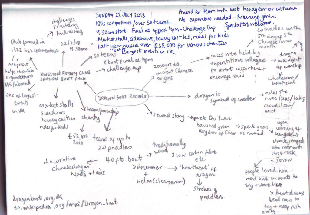
I researched dragon boat racing and gathered necessary information about the particular event. I compiled this information onto a mind map.
Sources:
Kingston Online – Kingston Rotary Dragon Boat Challenge
http://www.kingstononline.co.uk/dragon-boats-event-kingston-july/
Kingston Rotary Club Events
http://kingstonrotaryclub.org.uk/events/dragon-boats/
British Dragon Boat Racing Association
http://www.dragonboat.org.uk
Wikipedia – Dragon Boat
https://en.wikipedia.org/wiki/Dragon_boat
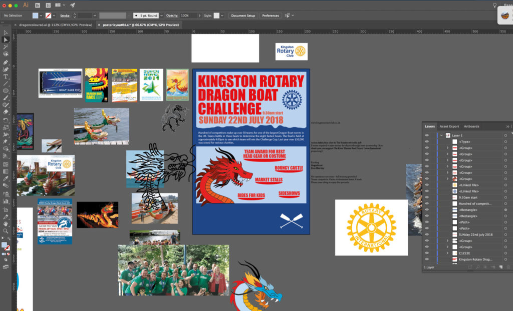
I was completely unaware of what Dragon Boat racing was before deciding on this event and thus was unsure how it is generally represented. So I searched online for examples of poster designs for similar events. This was really useful as it allowed me to familiarise myself with the subject. Most of the posters have an illustration of a Chinese dragon as a fairly dominant feature, with red being the colour of choice for the dragon. Generally, a representation of the dragon boats is included as well. The overall styles seem to be characterised by a Chinese theme.
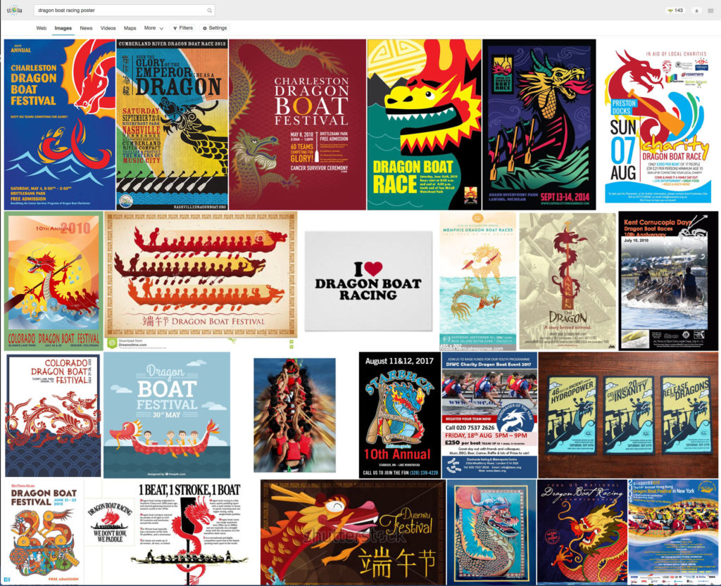
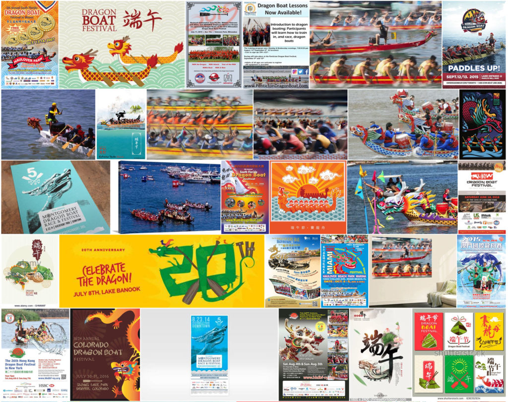
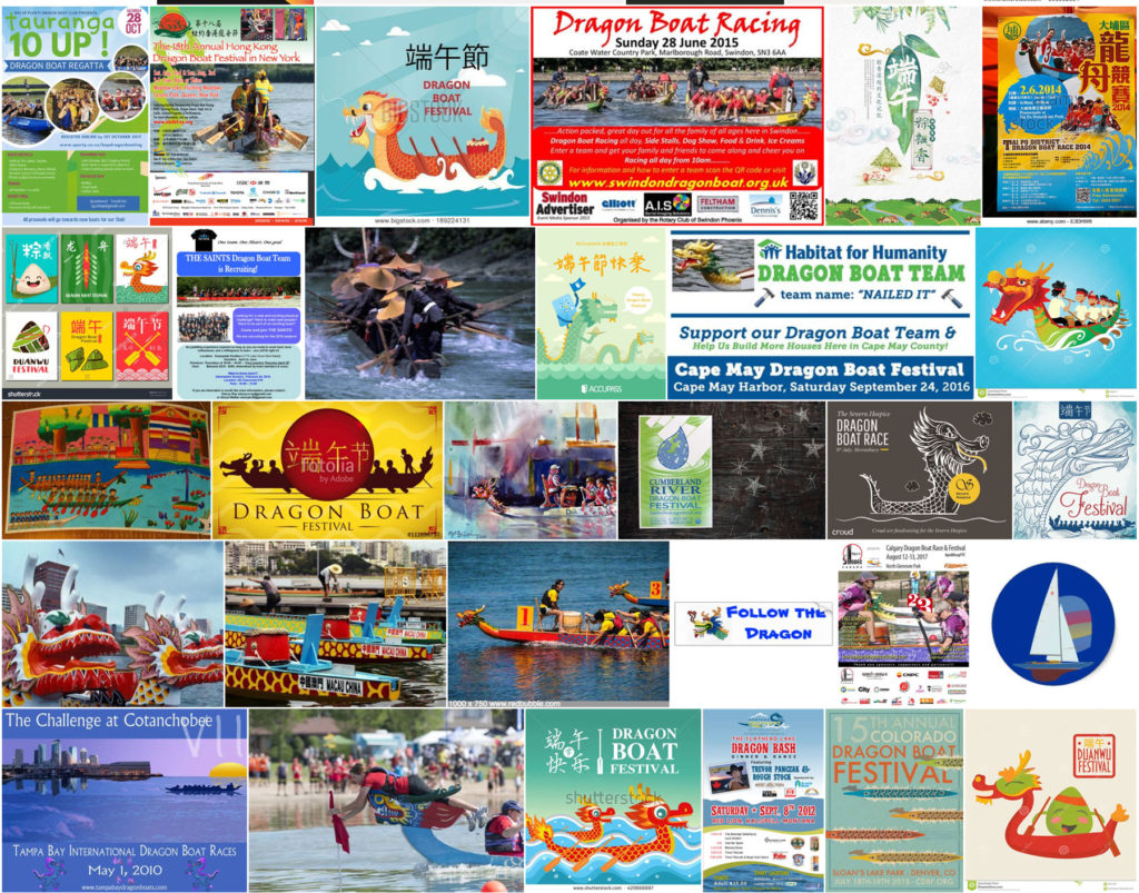
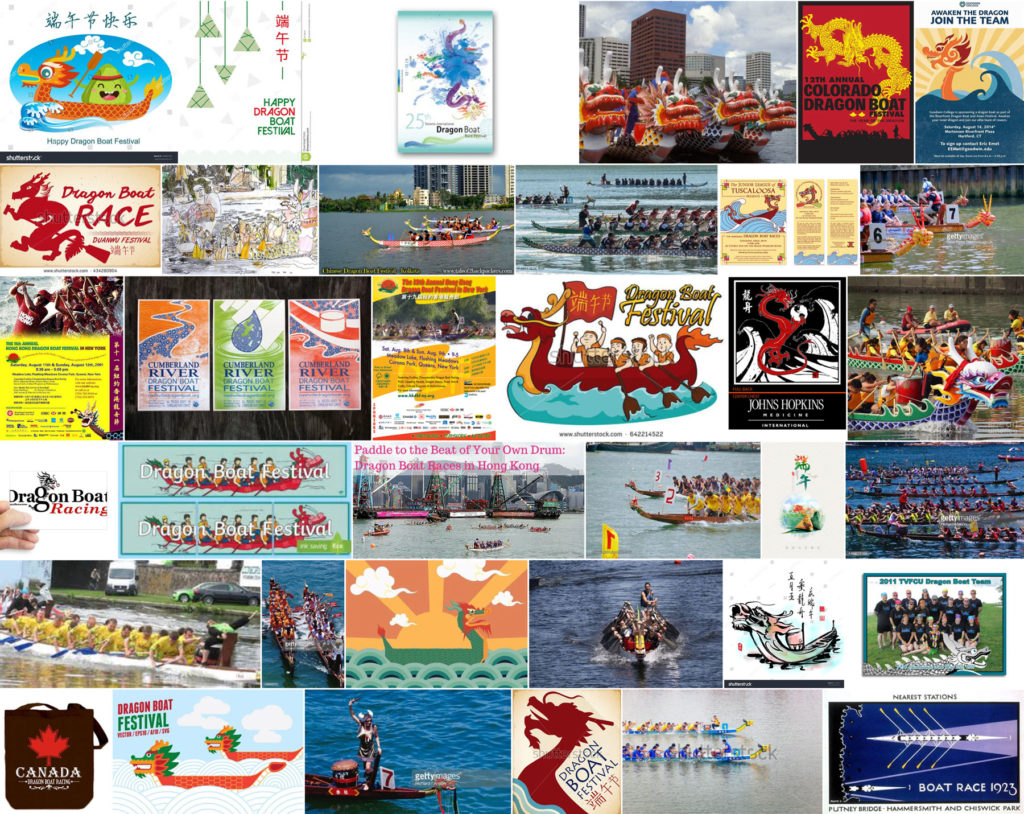
Source: https://www.ecosia.org/images?q=dragon+boat+racing+poster
CREATING THE FIRST POSTER: TOO MUCH INFORMATION?
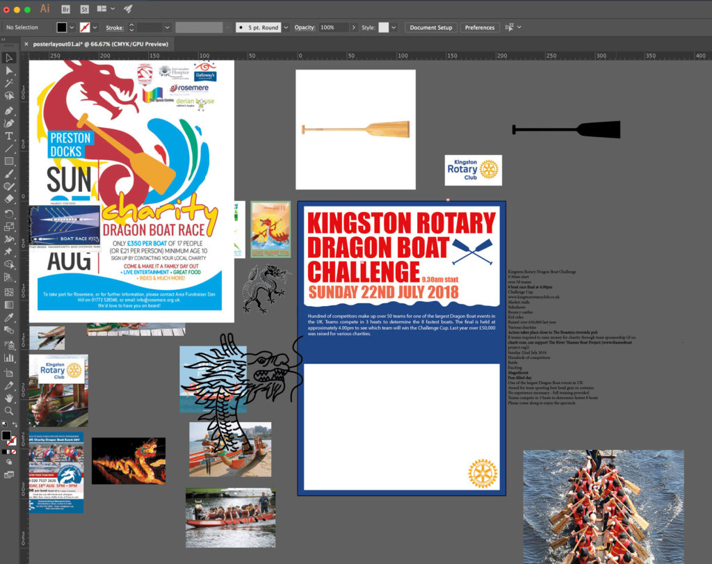
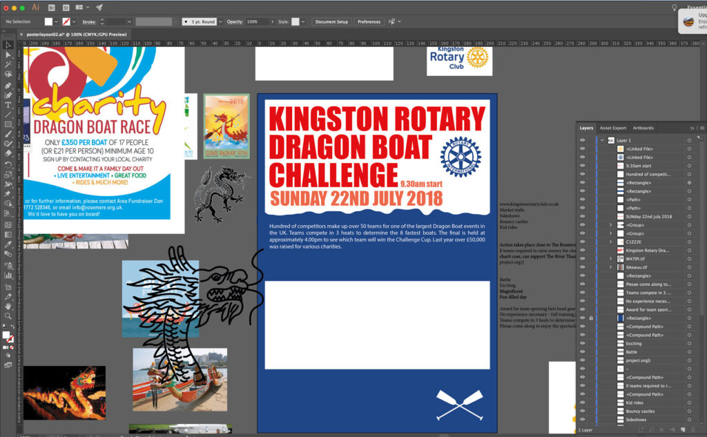
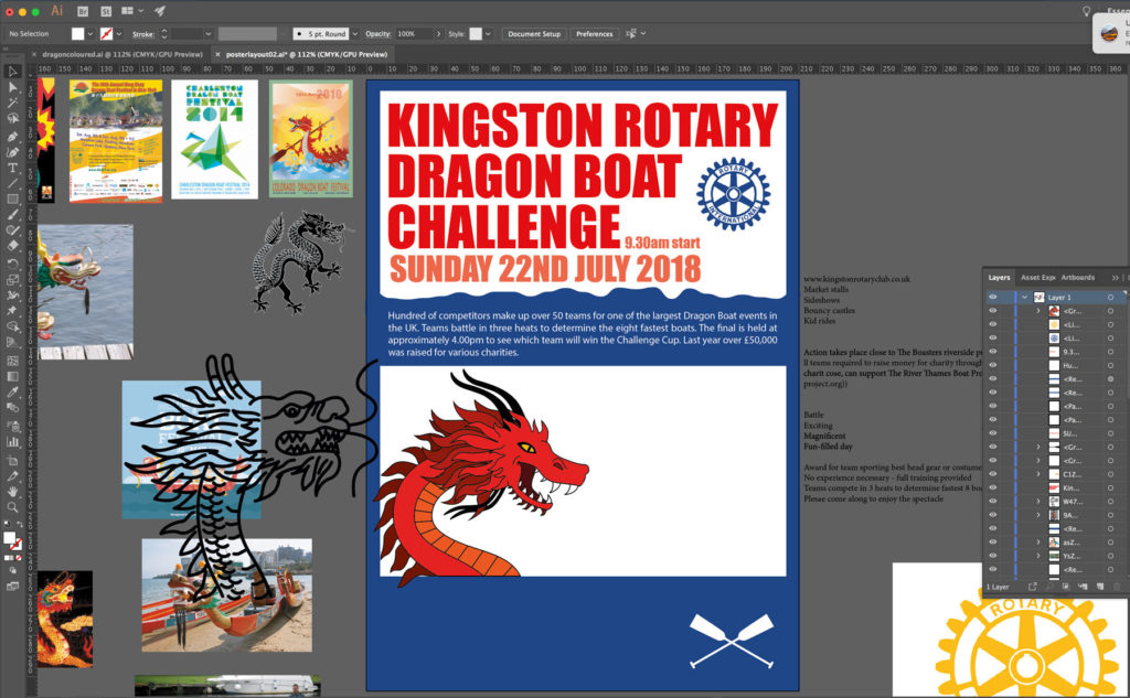
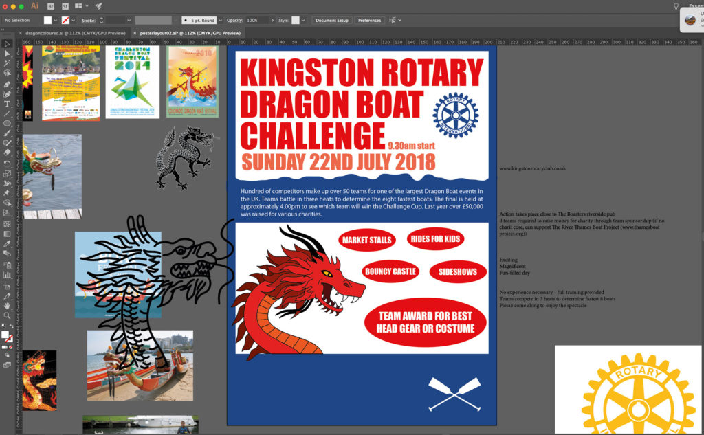
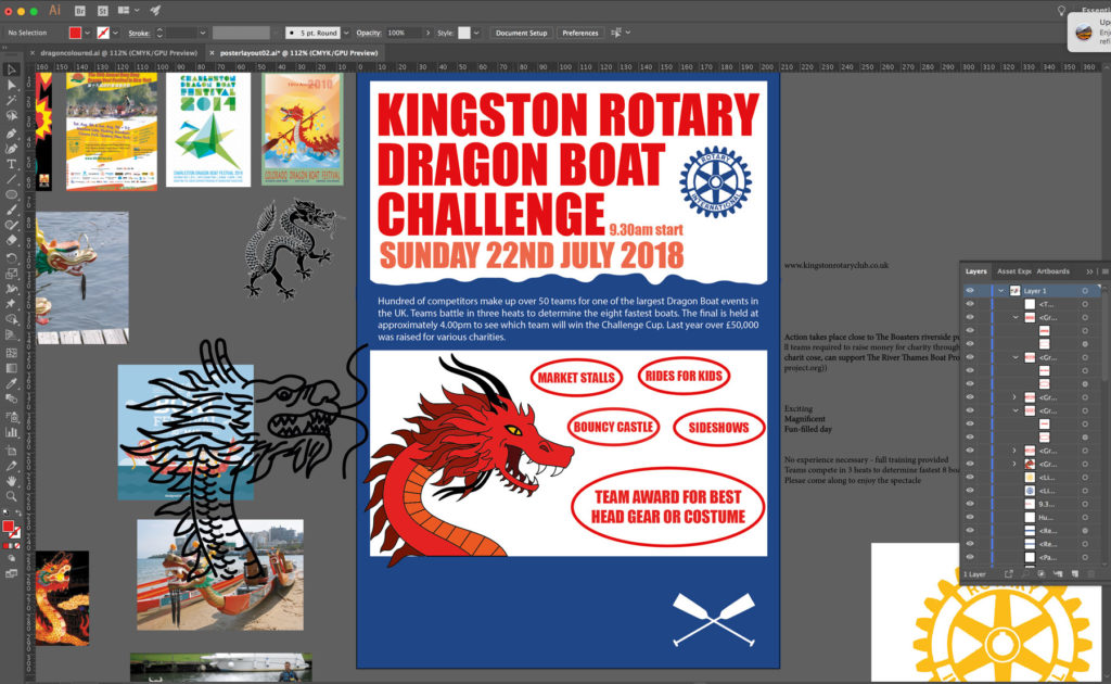
I mainly used Illustrator for this exercise and started by pasting in several poster examples for inspiration. I also pasted all the text I would include in this first poster. I find having these on screen, rather than a blank page, helpful in getting started with a new project. After making a rough structure of the layout, I wanted to add a dragon to the poster and searched online for a ‘free to use’ example, but could not find any suitable, so I created my own. I was not sure if I would be able to design one that would be up to standard, but was very pleased with the result.
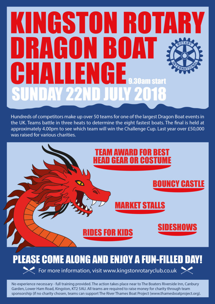
In keeping with the example posters, I used the colour red for the dragon. I decided to keep a limited colour palette with blue being the main colour (to represent the water of the race) and red for the text as this links to the dragon and makes the title of the event stand out against the light blue. I made the text big and bold so that it would catch a passer-by’s attention. The logo for the Rotary Club is yellow/gold, but I did not feel this fitted in well with the colour scheme of the poster, so I used Photoshop to change it to the dark blue of the border. However, I do realise that if I was really creating the poster for a client I would have to check this with them first.
Although there is a great deal of information on the poster, I attempted to ensure that it was clearly laid out so it would not put people off reading it. I broke up the various blocks of text into manageable amounts. I decided to decrease the size of the font in relation to the importance of the text, which I think worked well. Initially I was going to use ellipses around the text in the bottom half of the poster (‘market stalls’, etc), but then thought of changing these into very simplistic boat shapes, which worked quite well. Overall I was happy with the result of the first poster.
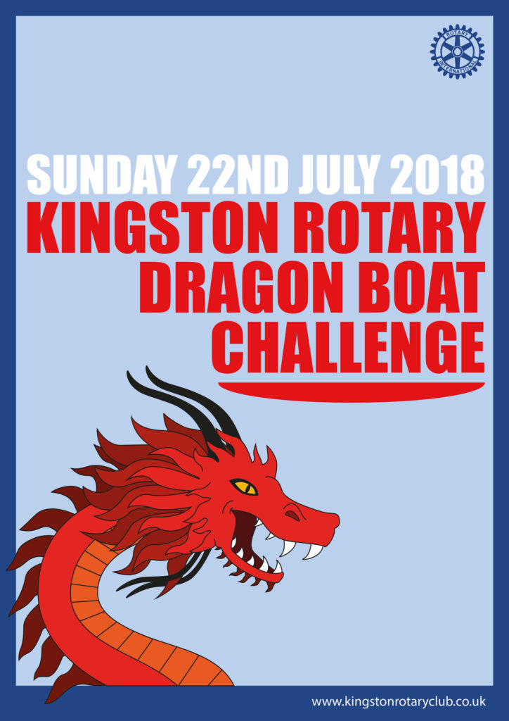
CREATING THE SECOND POSTER: NOT ENOUGH INFORMATION?
As I had already created the first poster, it provided the basis for the second poster to which I attempted to apply Occam’s Razor – if two possibilities aim to produce the same outcome, the simpler of the two will be more effective in achieving this (Harwood 2010, p.58-59). I decided that the essential information of the poster is the title of the event, the date and where to find out further information (assuming people have access to the internet). I do quite often see posters with such limited amount of information on them, sometimes even less, with the focus being on the image or design. I was pleased with this poster and I’m not sure if I could have taken away any further content without it losing its ability to communicate clearly to the audience, perhaps I could have taken the date off as this would be on the website, but I think potentially may put people off as the date provides a reference point for them. I was happy with this poster and I felt that the use of space made it more aesthetically pleasing than the first.
FEEDBACK
I posted the two designs onto the OCA Visual Communications Facebook page and asked for any feedback.
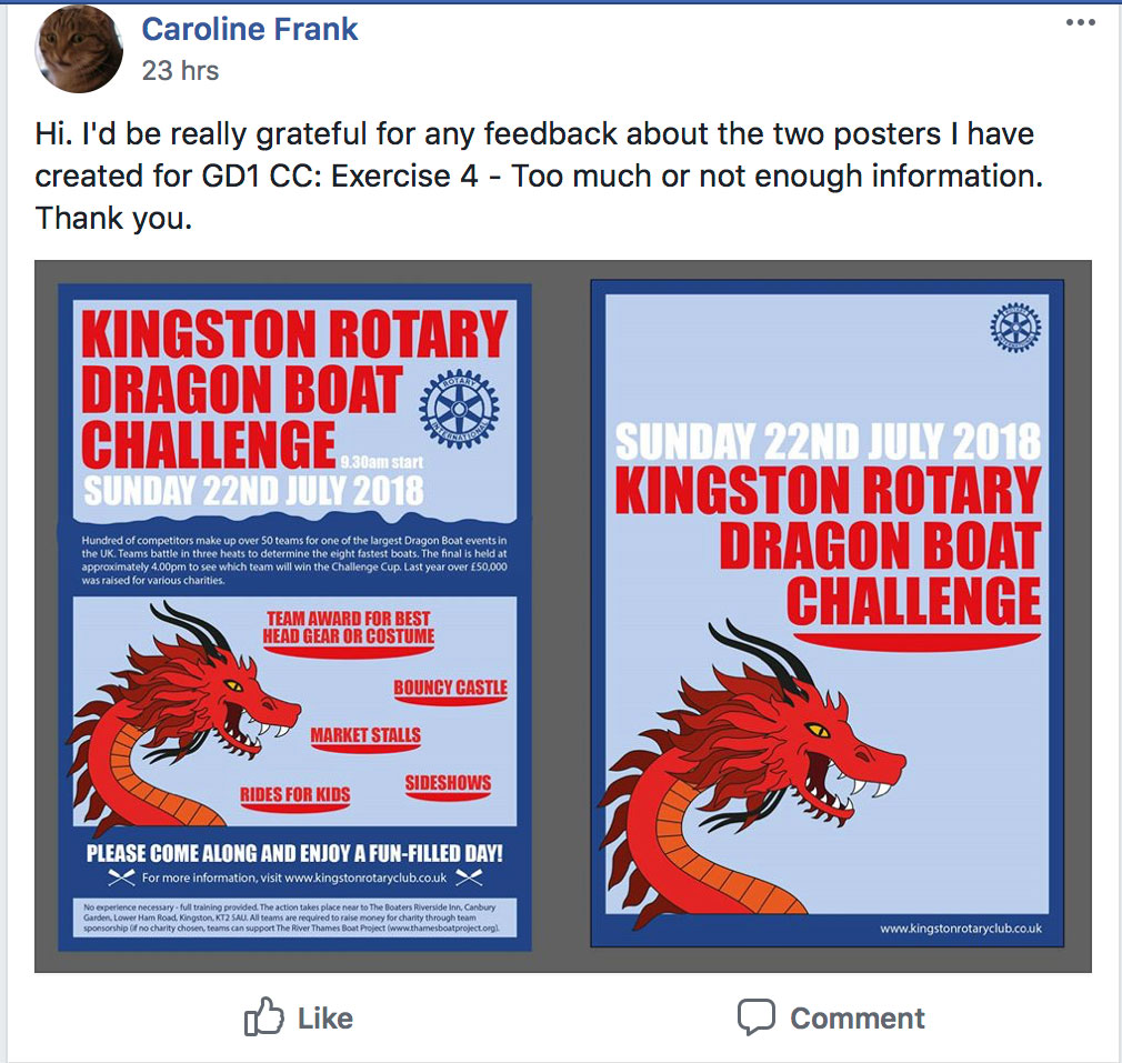
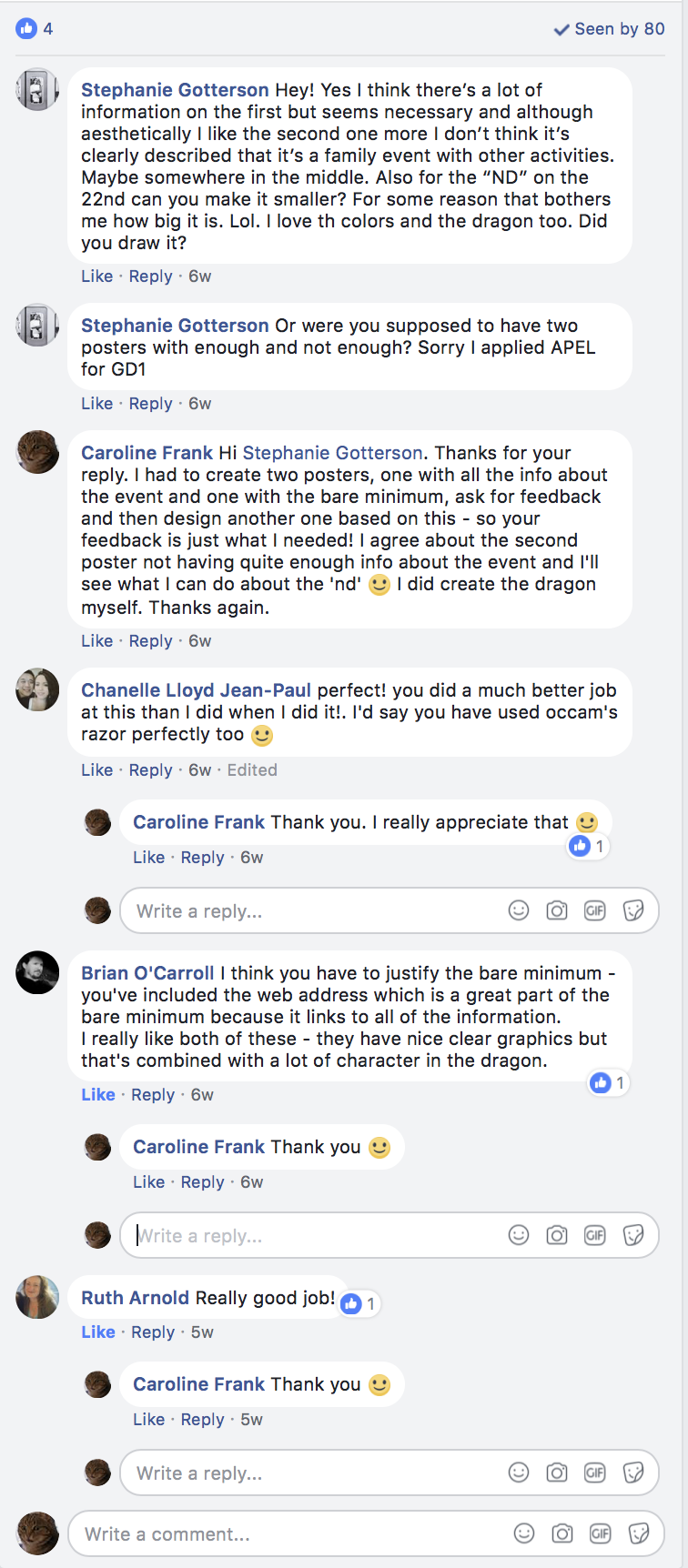
I was quite apprehensive about asking for feedback, as I tend to get quite attached to my work and take criticisms as a bit of a personal failure, but although I got a limited response I was pleased that the comments were really positive. I took on board the note about the second poster not being clear that it is a family event with additional activities available.
Other feedback I got also suggested that although people liked the second design as a poster, they did not feel it provided quite enough information about what the event involved.
FINAL DESIGN
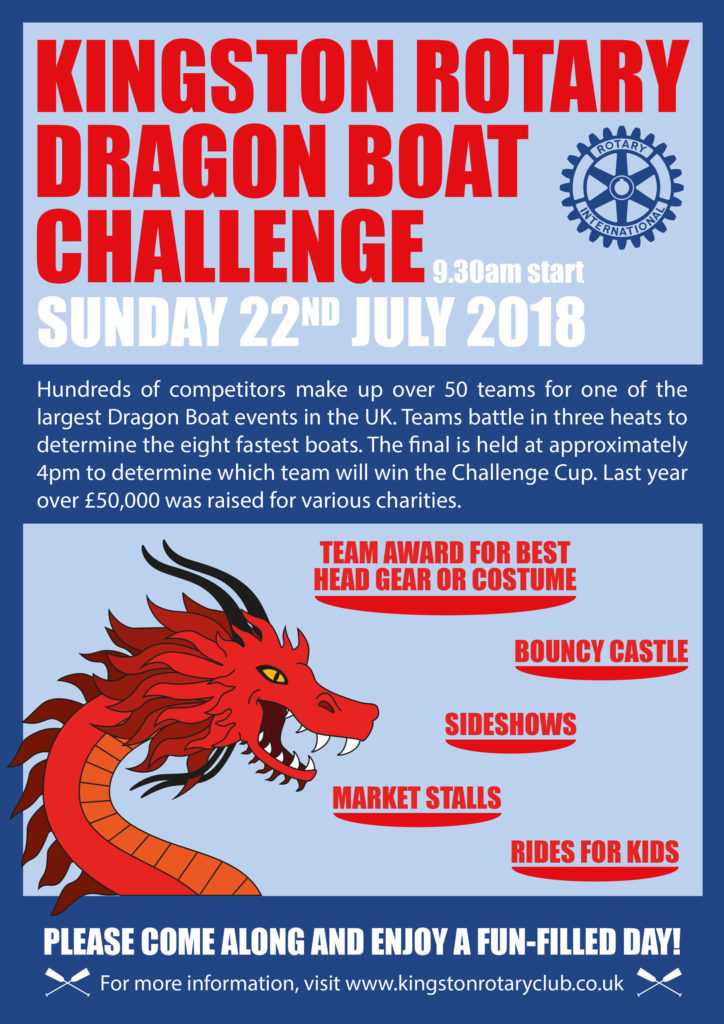
Taking on board the feedback I received and after further personal consideration I decided to rework the first poster, cutting out some of the non-essential text, which could be found on the website of the event instead.
EVALUATION
I really enjoyed this exercise as poster design is an area that greatly appeals to me and I want to learn and improve on how to create effective designs. In terms of the brief, I think it would be helpful to have an indication of the target audience and where the posters would be placed. I feel this would influence how much information would be required in the design e.g. if the audience were familiar with Dragon Boat racing, a less explanatory approach could be taken and thus minimal information would have to be included on the poster.
It would have been beneficial for me to try and get even more feedback as it is important to find out a range of people’s interpretations and the effectiveness of the designs – it may be different to what is expected and can have a positive impact on any reworking. I’m pleased that I took my first step into asking for feedback on the OCA Facebook page.
On reflection, I feel the final design may still be too overcrowded, perhaps I could have taken out the paragraph in the centre, but I thought this information may be helpful to those completely new to the event. However, I do think it works better that the first poster as there is more space in the design. I personally feel that the second poster was the most effective in terms of being visually appealing and I would be intrigued enough to look up further details on the website provided.
(19.06.2018) REWORKING THE DESIGN AFTER TUTOR FEEDBACK
Following the feedback I received from my tutor, I decided to rework the final design – the details of which can be found below.
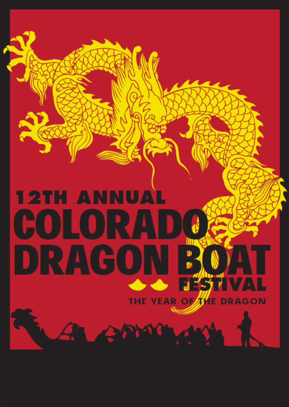
I selected a few poster designs that I wanted to influence my design. I particularly like this Dragon Boat Race poster. It is a simple yet striking and eye-catching design. The yellow of the dragon contrasts with the red and black to really stand out, whilst the style of illustration also contrasts with the silhouette illustration at the bottom of the poster. The positioning and style of the animation also adds a sense of movement, as if the dragon is writhing around. The text is bold, dominant and stands out against the red background.
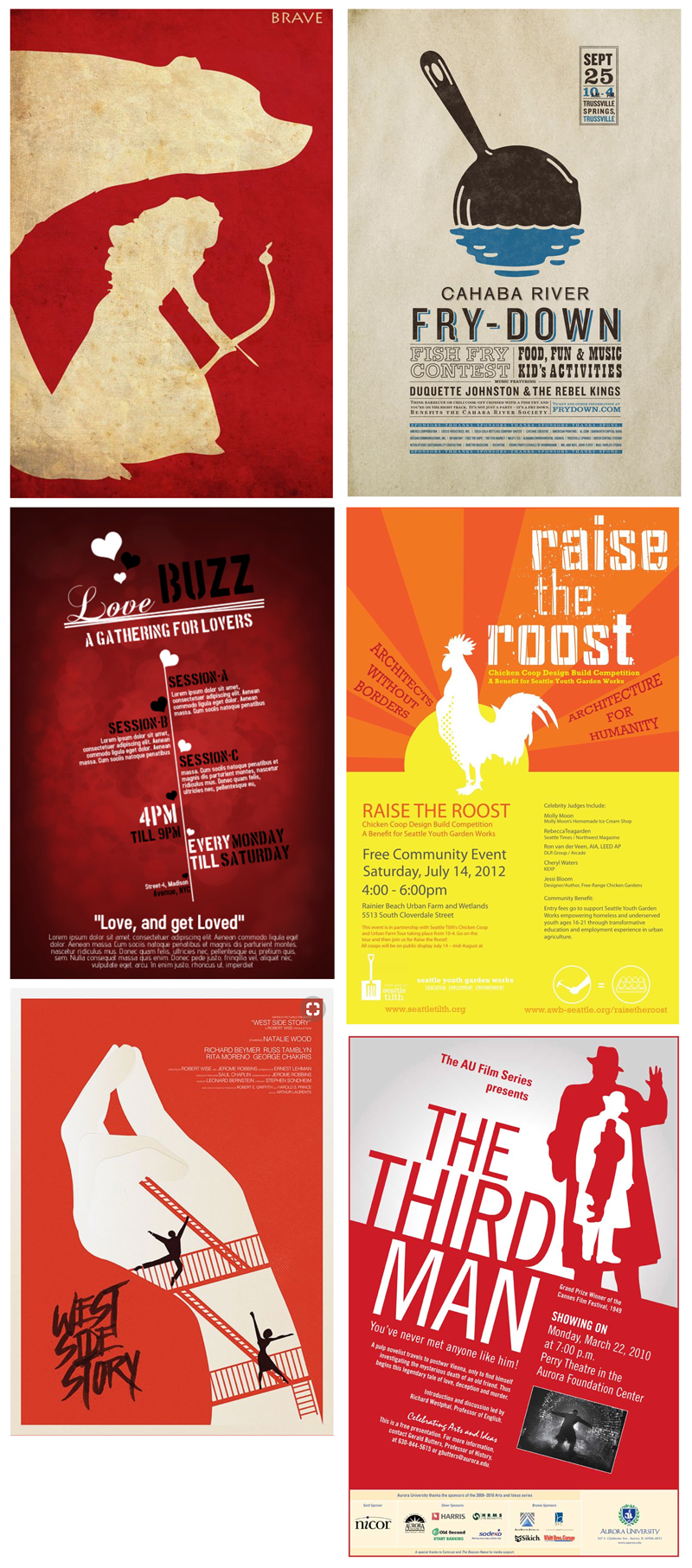
The examples below all make use of silhouette illustrations. In particular, the West Side Story and The Third Man posters have utilised these silhouettes to reinforce the story of the films. The posters all have a limited colour palette, mostly just one colour along with black and white. The bottom four posters have elements that are at an angle, which I think makes a more dynamic design. I particularly like the use of texture as a background, which adds depth and just makes for a more visually interesting design. Several of the posters have quite a large amount of information included, but the designers have arranged this using a visual hierarchy, which makes it easier for the viewer to take in the important details first – the ‘Fry-Down’ poster clearly demonstrates this.
I wanted to incorporate some of these elements into my reworked design. This time I worked in Photoshop so I could make use of the layer styles and blend modes. I still wanted to use my original illustration, but my tutor said that it was too cartoony for the target audience of this event. I transformed the dragon into a silhouette instead and I think the result was much more sophisticated. I added a red background with added noise, with a paper texture blended over the top. This added more depth and interest to the design. I used the colour red as it has connotations of danger/excitement and is eye-catching.
My tutor said he thought the poster with minimal information worked better, so I chose to use this in my reworked design – just enough information to grab someone’s interest. I decided to place the text at an angle (to create a less static composition) and used League Gothic as I thought it was bold and clean – easy to read at a distance. I tried a few other typefaces – I did consider Lithos Pro as it looked quite good with the dragon, but decided against it.
I did think of adding a flame coming out of the dragon’s mouth, as suggested in the feedback, but I could not get it to look right. Instead I added the text ‘Can you take the heat?’ and used a gradient over this to create a ‘fire-like’ effect. I also changed the text to white as I thought it stood out more, but in the end I was undecided which worked best.

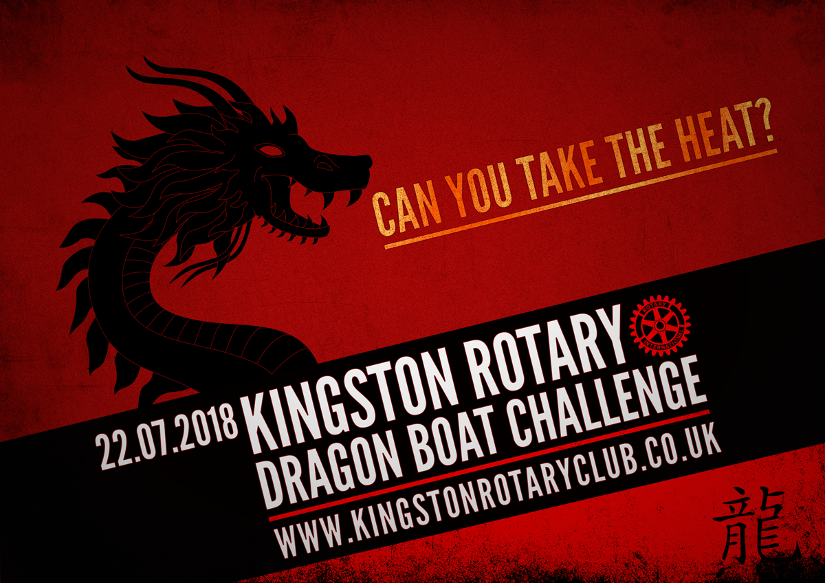
I felt the reworked version of this exercise was much more satisfactory than the original. I think it looks more professional and sophisticated. There is still much room for improvement (especially in terms of balance and placement of the different elements), but I am learning and I believe this is a good example of how much I have developed in the last couple of months, which is encouraging. I also learnt that even though I had positive responses on the OCA Facebook page, I should not have taken these too ‘seriously’ as the original design was not successful.
Reference
Harwood, J., 2010. Philosophy: A Beginner’s Guide to the Ideas of 100 Great Thinkers. 1st ed. London: Querus Publishing.