Exercise: The French Hen
BRIEF
Newton and Ridley are opening a cafe/wine bar near the city centre. IT is designed to appeal to younger women and sophisticated young men. The brewery has identified a gap in the market and wants to provide a ‘sophisticated and relaxed venue’ for the ‘discerning’ drinker. The bar will be called The French Hen and will be in direct competition with the cheap ‘binge drinking’ venues on the same street. The brewery is also trying to enhance its own image as a ‘respectable’ alcohol vendor.
Develop some ideas for a logo, to be used:
- on covers for the food and cocktail menus
- in colour on the signage outside, and as a cutout for a window detail
- on T–shirts for the staff and paper napkins
- for one side of a beermat, the other will carry drive on sensible drinking.
There are many conventions that have been developed around the marketing of both bars and products to this age range. You need to be conscious the whole time of avoiding cliches and stereotyping.
Draw up at least three ideas to start with. Be critical of your work. Check it against the information provided – will it do what your client wants and how will you know?
When you have decided which one you are happiest with, mock up the menu covers, the outside sign, the window detail, a t-shirt, paper napkin and beermat. Does it all still work?
I started this exercise by selecting the keywords from the brief so I had a clearer idea of what was being asked for.
KEYWORDS
- Cafe/wine bar
- appeal to young, sophisticated customers
- sophisticated/relaxed
- respectable/sensible drinking
- ideas for a logo
- avoids cliches/stereotyping
EXAMPLES
I began my research by using Google to search for examples of logos from some ‘real’ world establishments.
Many of the logos are completely typography based, so the choice of typeface is the most important factor. Some do use effects on the text, eg.g. to make it have a ‘distressed’ appearance or have motifs/fancy borders added surrounding the words. Others are based on an illustration with the text along side this.
I was quite surprised just how many only use text, many without any decoration at all. Some used san serif typefaces, which came across as bold and modern, whilst others used script or handwritten typefaces, which seemed to create a more sophisticated, established identity (many of the ones that used the latter style of typeface were French Wine Bars). I thought the use of only text created a streamlined, modern identity, which was successful (in most examples) of representing the ethos of the venue being advertised. However, I did think that the use of illustration could make for a more personalised and unique logo.
I also noted that the logos were very limited in colour palette with many of them being solely black and white. I think this makes them more striking and visually pleasing.

http://www.frenchhentulsa.net The French Hen Bistro & Wine Bar
http://frenchhencafe.com The French Hen Cafe
http://thefrenchhen.blogspot.com The French Hen
http://www.baranis.co.uk Baranis
http://www.lebarlondon.co.uk Le Bar London
http://www.cabotte.co.uk Cabotte Wine Bar & Restaurant
https://www.davy.co.uk Davy’s Wine Merchants
https://toulouse-lautrec-jazz-club.designmynight.com Toulouse Lautrec Jazz Club
http://lesgarrigues.co.uk Les Garrigues French Food & Wine Shop
https://www.frenchquarternewcastle.co.uk The French Quarter
https://www.lebeaujolais.london Le Beaujolais
http://www.boudoirwinebar.co.uk Boudoir Wine Bar
http://lepifwinebars.com Le Pif Wine Bars
http://www.clarettelondon.com Clarette
https://www.leroyshoreditch.com Leroy Wine Bar & Restaurant
https://rivercafe.co.uk The River Cafe
http://www.ottos-restaurant.com Otto’s Restaurant
https://elliotscafe.com Elliot’s
http://www.blanchettesoho.co.uk Blanchette Soho
https://www.medlarrestaurant.co.uk Medlar Restaurant
http://www.glasshouserestaurant.co.uk The Glasshouse
http://cornerkitchen.london Corner Kitchen
https://www.10cases.co.uk The 10 Cases
http://thewinemakersclub.co.uk The Winemakers Club
https://www.sagerandwilde.com Sager and Wilde
https://noblerot.co.uk/wine-bar Noble Rot
http://www.theremedylondon.com The Remedy Wine Bar & Kitchen
https://thequalitychophouse.com The Quality Chop Shop
http://www.jasonatherton.co.uk/restaurants/social-wine-tapas/ Jason Atherton
http://primeurn5.co.uk Primeurn
http://www.andrewedmunds.com Andrew Edmunds
https://www.labonnebouffe.co.uk Bonne Bouffe
http://www.theveenocompany.com Veeno The Italian Wine Cafe
https://www.lebouchonwinebar.co.uk Le Bouchon Wine Bar
http://www.enotecarosso.com Rosso A Food And Wine Experience
https://neptune.london Neptune
http://www.therosepublichouse.co.uk The Rose Public House
http://salonbrixton.co.uk Salon
https://the-dairy.co.uk The Dairy
http://www.naughtypiglets.co.uk Naughty Pigletsh
https://www.terroirswinebar.com Terroirs Wine Bar
http://casamalevo.com Casa Malevo
I then used Pinterest to find some more examples of logo designs for Wine Bars and the use of French Hens in designs, the latter of which I also looked at on Shutterstock.
I have selected some of those that stood out to me below.

IDEAS
Next, I sketched out some rough ideas, however, I did find this particularly challenging for this exercise. I was conscious of the brief’s requirement to be sophisticated and ‘trendy’ and not to be cliche.
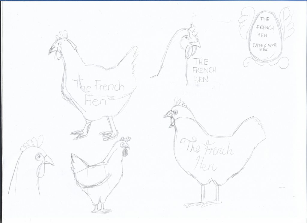
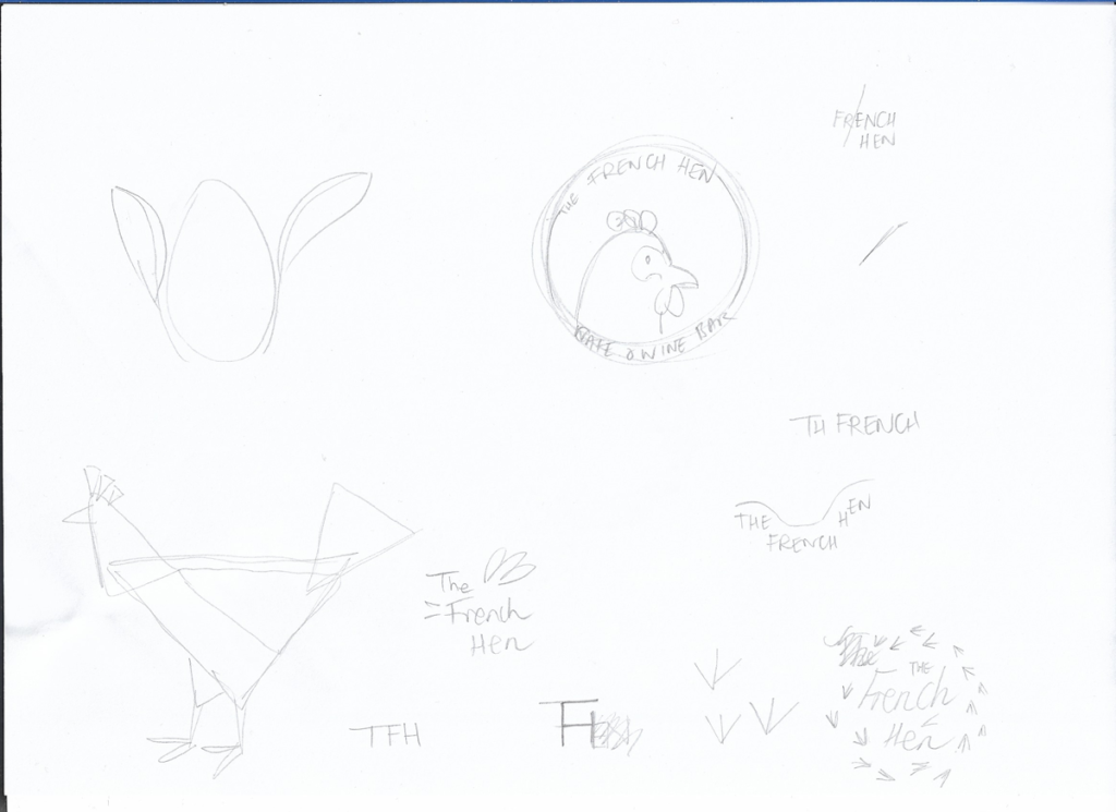
I did not think any of these were particularly inspiring, but I really found it difficult to come up with anything worthy. However, I did use a couple of these ideas to build on.
DESIGNING THE LOGOS
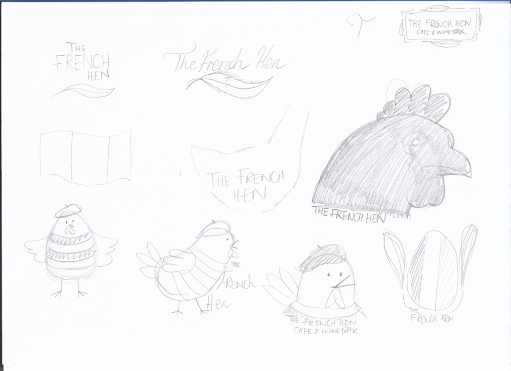
I decided to start by working on the idea of using triangles to create an abstract outline of a hen. This developed into the slightly less angular version (bottom row) and I actually felt this was quite successful, particularly with the blue background (the colours of which reference the French flag).

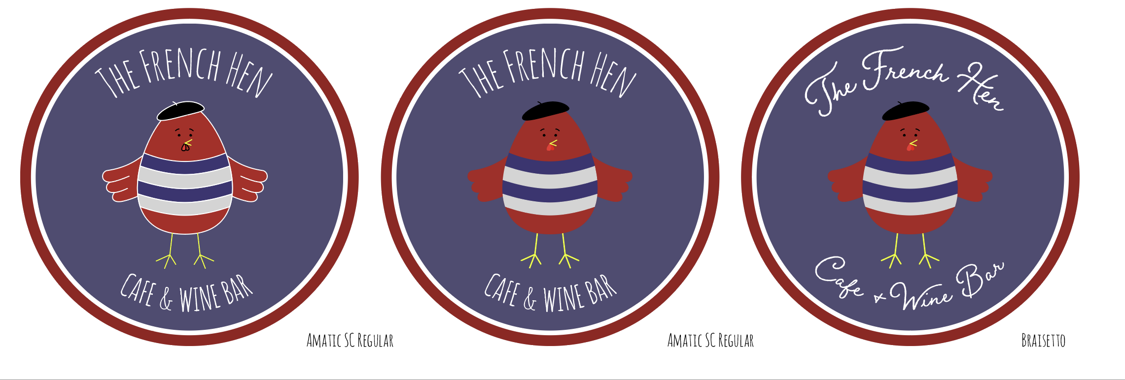
I then had a go with the character design version of a cartoon-style French Hen, mainly because I enjoy this aspect of design the most. I liked the result, but it did not really fit in with the brief as I do not think it would be considered sophisticated. It probably would be better suited to a family cafe or something aimed at children.

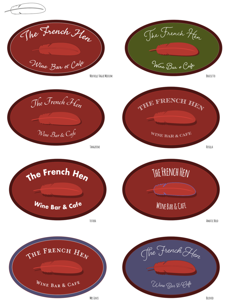
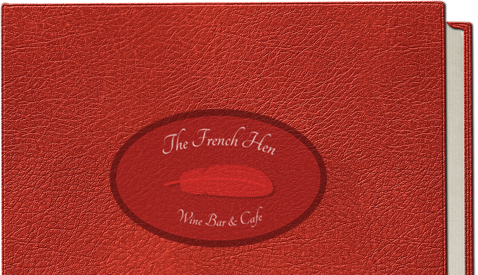
My third attempt was based on the idea of a feather. I thought this worked reasonably well, especially once I added the shadow to make it pop a bit more. Obviously, some of the typefaces were more successful than others – I think the finer, more artistic ones worked better in this context.
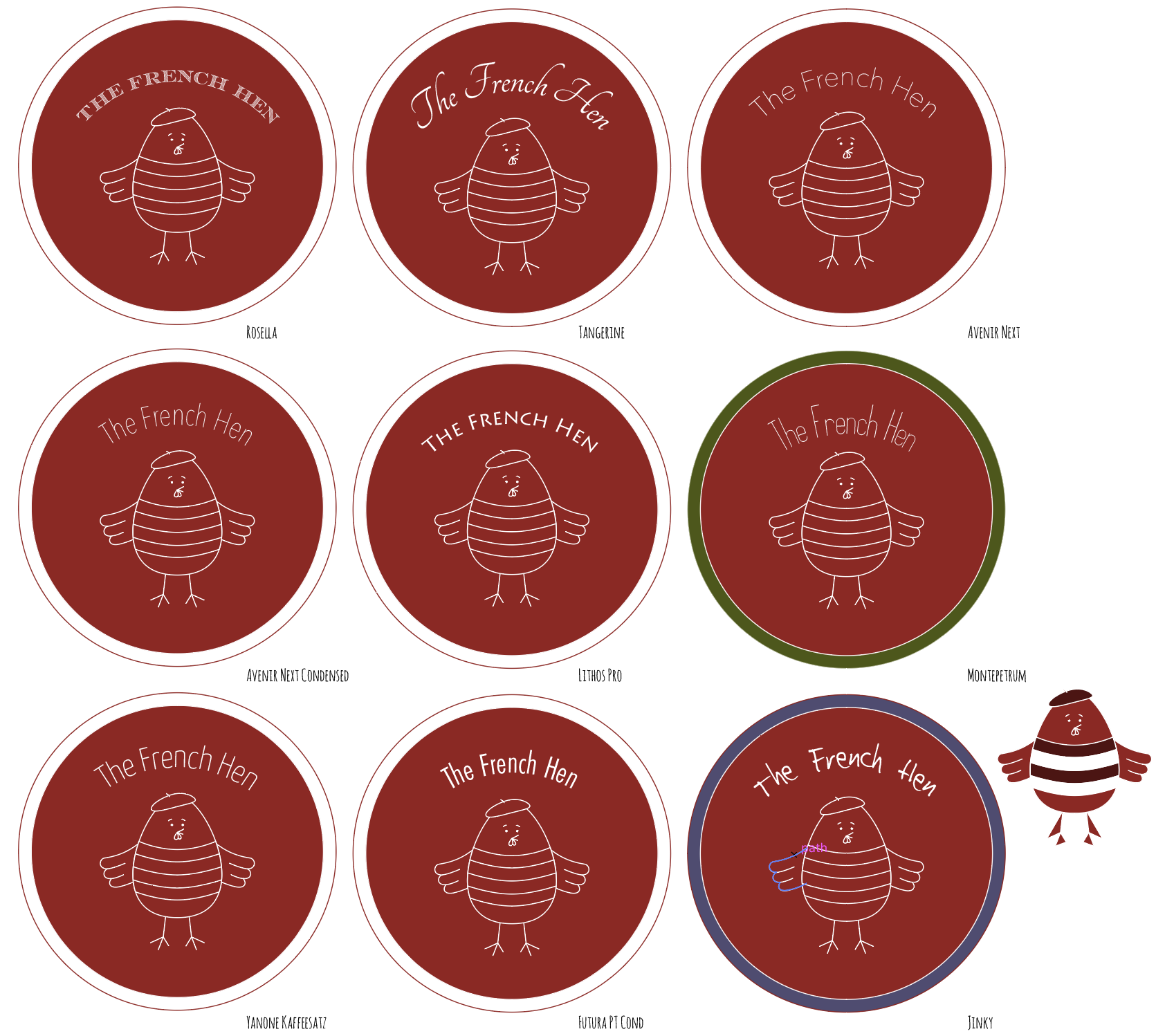
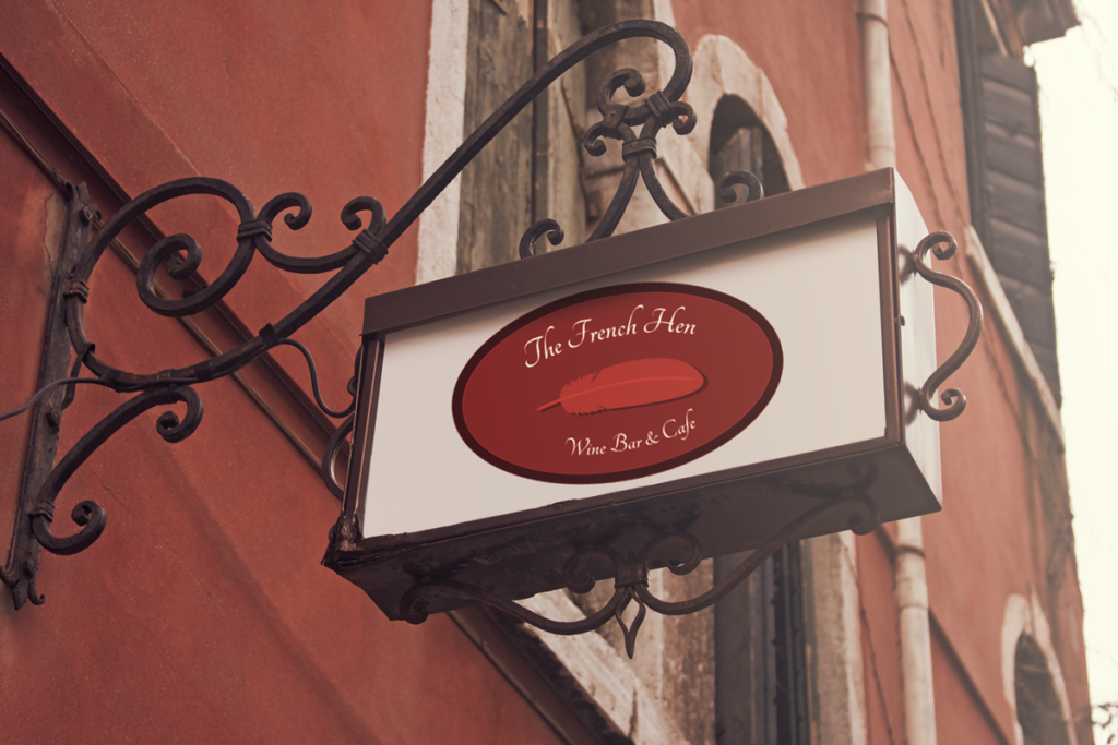
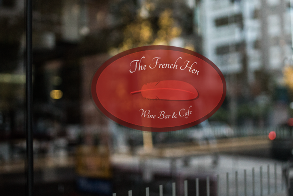
MOCK UPS
I had real difficulty with this part of the exercise as I had never created mock-ups before and I found it hard to make them look realistic. In the end the logo choice was decided by the one that looked fairly decent in the mock-ups. The mock-up templates were sourced from Mock Up World.


EVALUATION
If I am being honest, I did not really enjoy this exercise very much. I found the whole thing quite challenging and I was not convinced by the results. However, as always, I did enjoy using Illustrator to create the designs, once I had come up with the ideas and I found some of the examples quite inspiring. I hope that I will continue to improve my abilities in developing logos for different contexts.