Exercise: Seeing the Light
BRIEF
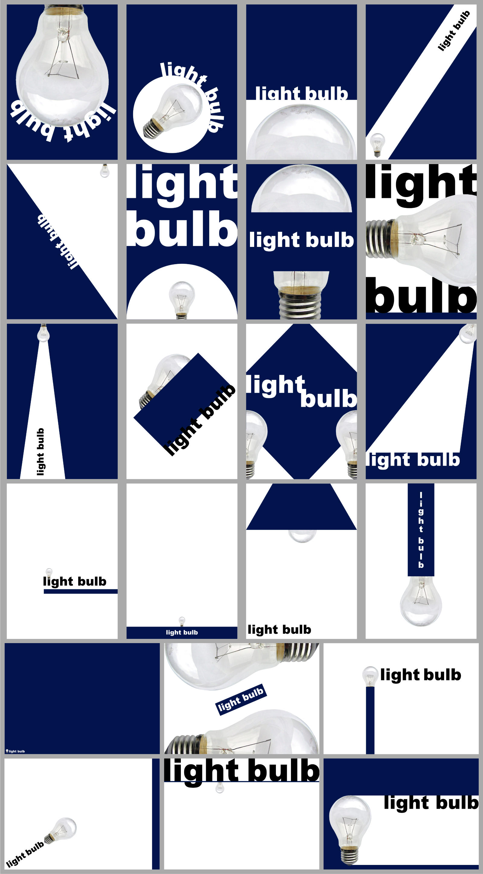
Using only an image of a light bulb, the word ‘light bulb’ and a block of colour of your choice create different designs that explore visual dynamics.
Think about your compositions, trying each element at different sizes and try cropping your photo. Your block of colour can be any size, so use it fully to create a sense of space your composition. Think about layering your visual elements to create depth within your designs and think about contrasts.
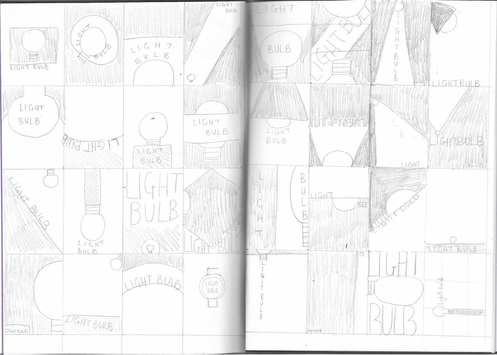
Use thumbnails to work out what sort of designs you might try.
Be playful within the rules set, creating a many different designs as you can. Edit these down to about 20 designs that you feel represent the breadth of different approaches you have explored.
THUMBNAILS
I used a double page spread in a sketchbook to work out some rough designs. I tried to be imaginative and varied in my approach. I was a initially going to use yellow as my chosen block of colour (to resemble light), but then decided to try using dark blue instead as I could then use the white against this to represent the light – it provided more of a contrast. For some reason I limited myself to only portrait orientation in these sketches (perhaps from looking at the examples provided), but when I moved onto the digital versions, it occurred to me that landscape compositions should be explored as well.
When deciding on my designs I considered the implications of the following design principles:
Scale: the larger elements appear more dominant in the composition.
Cropping: suggests either the element is too large to be contained within the edges or the viewer is only seeing part of the composition.
Angles: creates a more dynamic composition – as if there is movement in the design.
White space: allows the individual elements space to ‘breathe’ and therefore increases visual impact of the design. It can also be incorporated as part of the design itself.
Overlapping: implies depth within the composition and that certain parts are hidden or revealed – it adds more intrigue to the design.
Contrast: makes a design more eye-catching, grabbing your attention, and can be achieved in various ways, e.g. scale or colour, as long as there is an obvious difference.
Rule of thirds: dividing the composition into three sections (both vertically and horizontally) and then placing elements at the intersections creates a balanced and therefore visually pleasing outcome, as opposed to placing elements randomly around the composition.
RESULTS
I found this exercise very enjoyable and it was fascinating to learn that so many different designs could be created from using the same three visual elements. I was quite pleased with the designs I came up with, but I think the ten in the lower half (below) are the most effective from implementing some of the design principles outlined above.