Exercise: Point Of Sale Display
BRIEF
A local greengrocer has asked for a point of sale display to go above the fruit and veg in their shop. The display will be seen from the street to attract passing shoppers. It is in a small precinct of shops and is en route to a local well-respected primary school. The final pieces will be two A1 landscape displays. Either take photographs or create illustrations (or a combination of the two) to develop two images. Identify any wording you may want to use.
RESEARCH
Keywords
I first looked through the full brief and underlined key words:
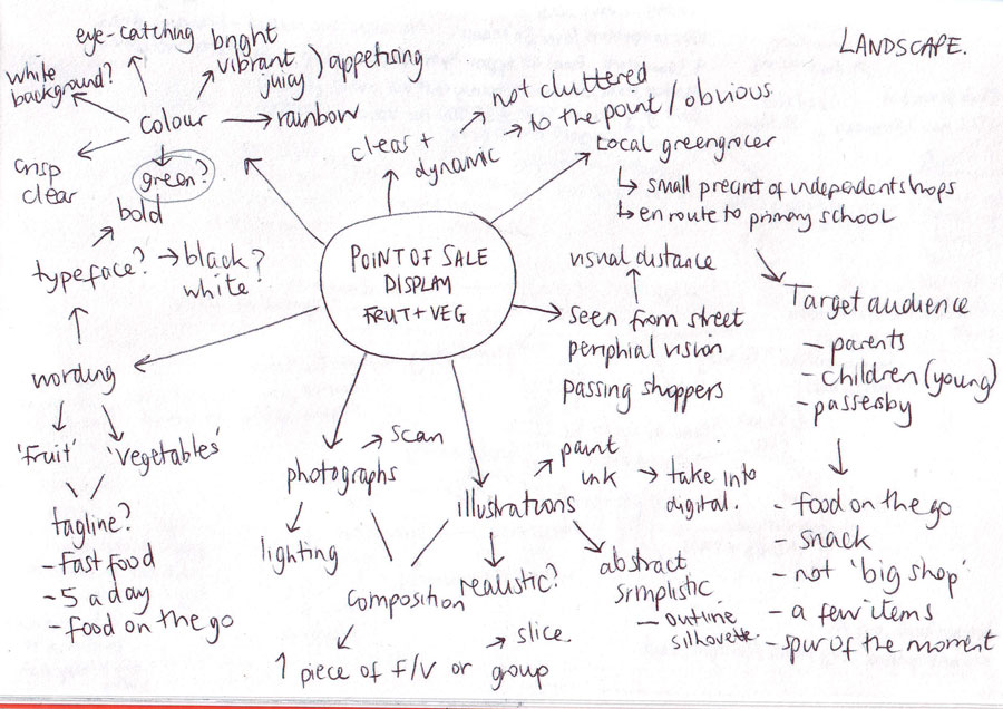
Local green grocer, point of sale, fruit and vegetables, seen from street, attract passing shoppers, boost trade, small precinct, primary school, landscape, photographs, illustrations, wording, what shopkeeper wants to achieve, peripheral vision, clear and dynamic, focus on the food, visual distance, look edible, like to eat it, use colour, tone, shadow, surface marks, appropriate software.
Target Audience
From the brief, I would presume that the target audience would mainly be passing shoppers who would drop in for a few items rather than a big shop. Most likely these will be local people, with a high percentage being parents/guardians and young children. I would like this to clarified by the client.
Mind Map
Based on this initial information I created a mind map to get some thoughts and ideas down on paper.
Examples
I then started to research some examples of point of sale displays or food advertising in general. The displays in my local supermarkets were all of close ups of fruits or vegetables with white text over the top, e.g.’Berries’, etc. The produce in the images appeared very fresh and vibrant (bright colours, moisture added to demonstrate freshness), and did not have any marks or blemishes on them. These techniques are employed to make the products look appetising to potential customers.
I found slightly more varied approaches to the point of sale displays by searching online. I set up a Pinterest board with some examples that stood out to me. Some of these are shown below:
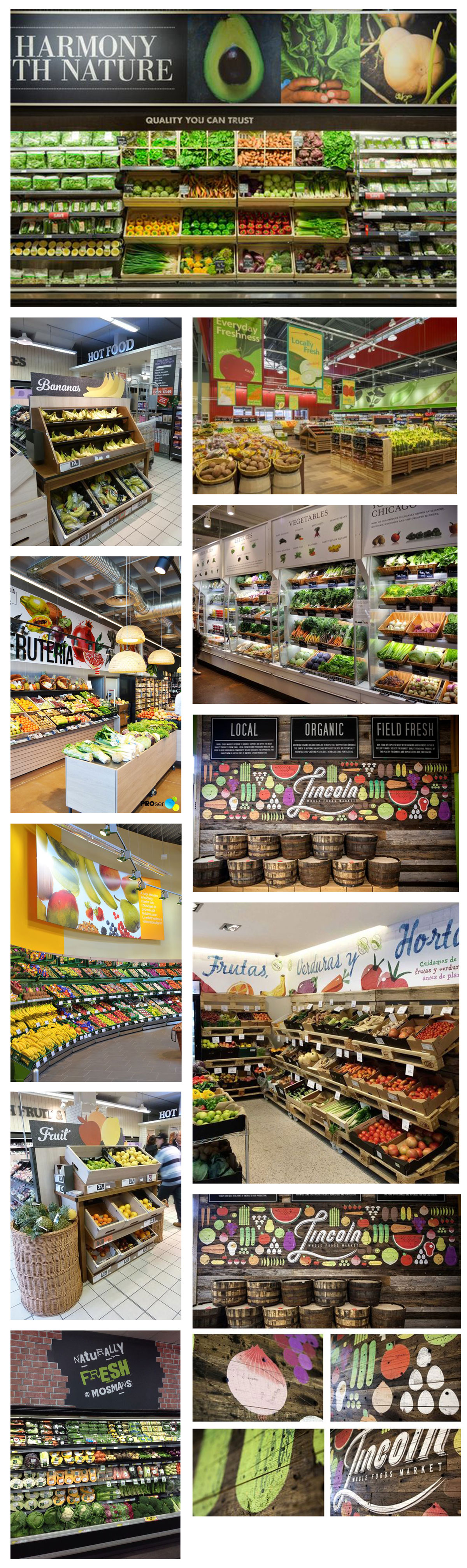
Again, the displays all intend to make the produce look appetising whether in a photograph or illustration. The food looks perfect and brightly coloured, the imagery is clean and bold. The use of illustrations makes the displays look less formal, more like a local market board, especially with the use of white of coloured text/illustrations on a black background as this resembles chalk on a a blackboard. The illustrated displays tend to use a handwritten style typeface, which, again I feel makes them appear less corporate. I noted the use of the words ‘fresh’, ‘natural’ ‘locally’, ‘natural’, ‘field fresh’ which all aim to reinforce the idea of the produce being ‘just picked’.
SKETCHES
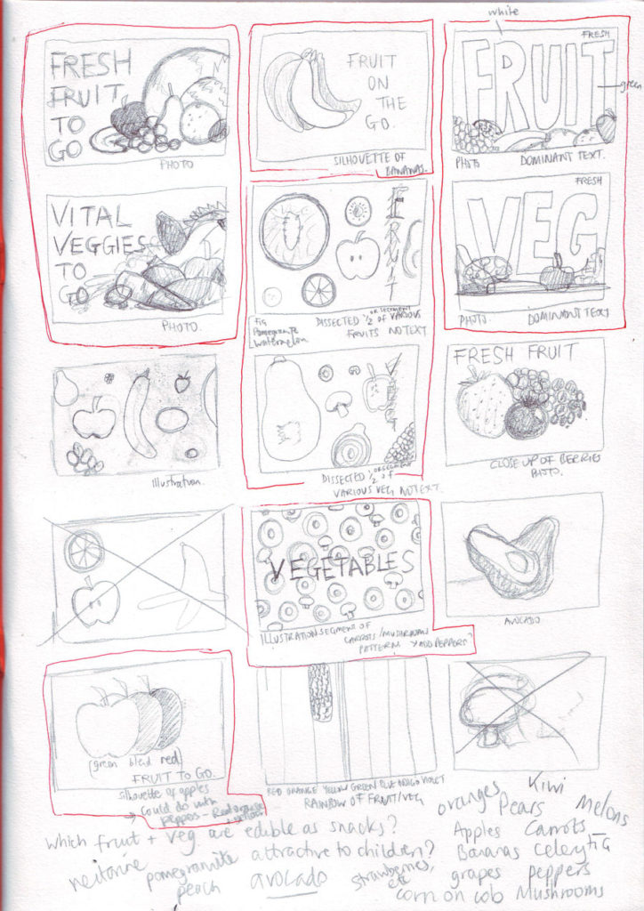
Next, I drew some rough thumbnail sketches, influenced by what I found so far. I attempted to come up with a variety of potential ideas, using both illustration and photography.
DESIGNS
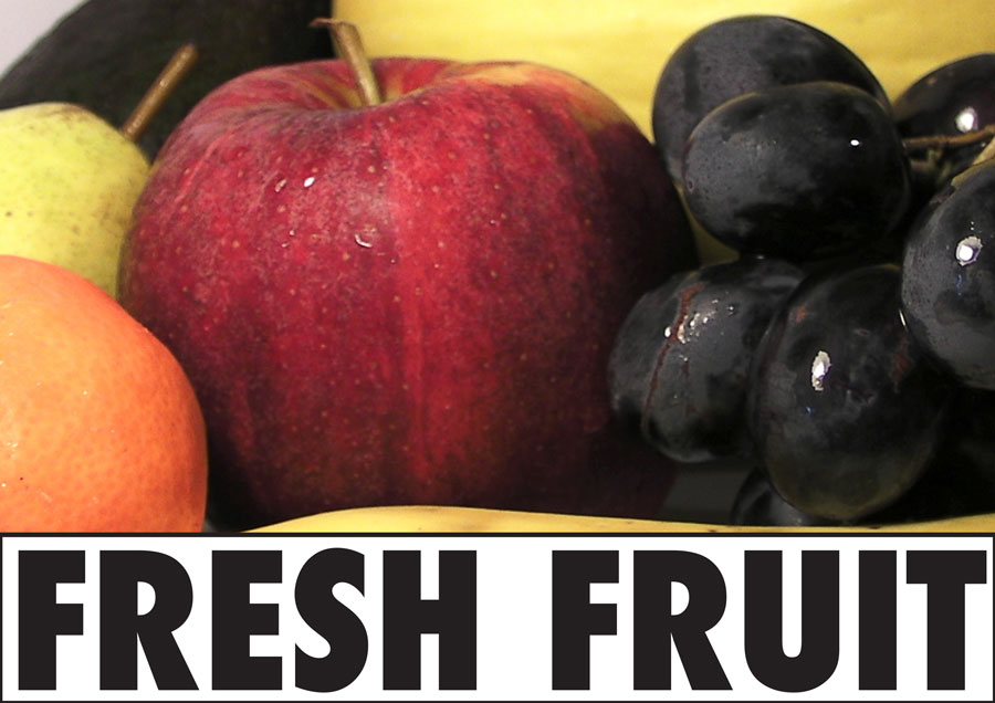
I decided that I would focus on the word ‘Fresh’ as this seems to be a very popular term when used to describe fruit and vegetables, conjuring up connotations of ‘just picked’ produce. I was not confident my photographic skills would be good enough to use, so initially I chose to rely on ‘free to use’ stock photos I found using a Google Image search, which provided ‘perfect’ looking produce.
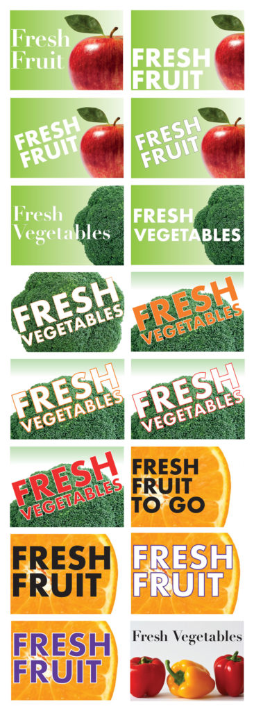
Although the results were not that impressive, I did discover that having the words at an angle created a more dynamic image; the use of scale and cropping photos makes the image more visually interesting, in some cases the fruit/veg was really close-up in an almost abstract style, but still recognisable; and using a san-serif, bold typeface such as Futura, would be more eye-catching and legible to a passing shopper when viewed at a distance. It was also useful to see which colours for the words were visible over the photo in the background. I did not feel that black was pleasing to the eye when using the bold, sans-serif typeface, but it worked better with the last image on the white background using Didot, a serif typeface (it looked more elegant, which is better suited to that composition).
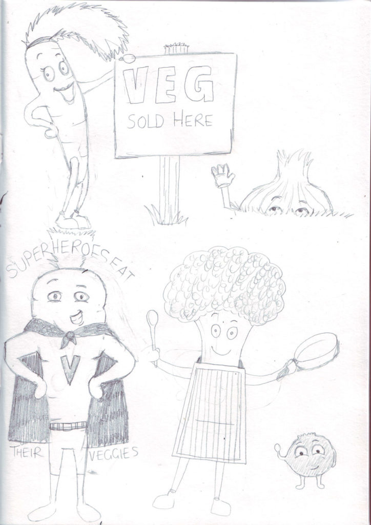
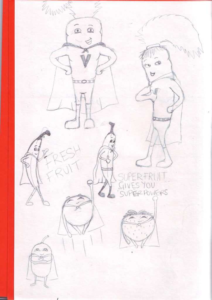
Next up, I focused on the target audience being school children and decided to create illustrated characters of superhero fruit and vegetables. I initially did some rough character sketches and scanned these into Illustrator.
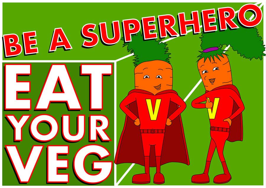
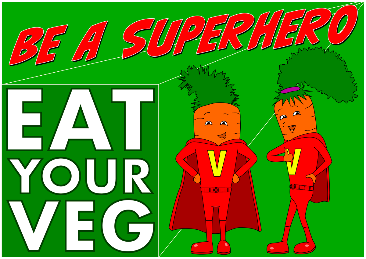
I had a great time creating this poster as I love character design. I used green as the background with its connotations to nature and ‘eat your greens’. The text at the top was placed at an angle to add some dynamism to the poster, as well as the lines in the background. The message of ‘eat your veg’ is big, bold and clear. I also used some overlapping and shadows for the lettering to give a slight depth to the poster. I decided to use a ‘superhero-style’ typeface and found CCBiffBamBoom on Font Squirrel – this would be more suitable for a poster aimed at children as they could instantly relate to the style as being comic/superhero influenced. I think this poster would be eye-catching for passing children and hopefully a concept they could relate to. I don’t think the layout is particularly successful though – especially the angled text.
Finally, after much procrastination, I decided to have a go at taking my own photographs of fruit and vegetables. I set up a fairly crude composition of each and took several photos. I then imported theses into Photoshop and made some adjustments to Levels, Curves, Brightness/Contrast and Colour Balance (this was mostly guess work) to make the photos look more ‘professional’, vibrant and attractive. I also cropped the photos to get rid of any background as I did not have the set-up (lighting, etc.) of a pure white background that I could easily remove in Photoshop. I was surprisingly pleased with the results.
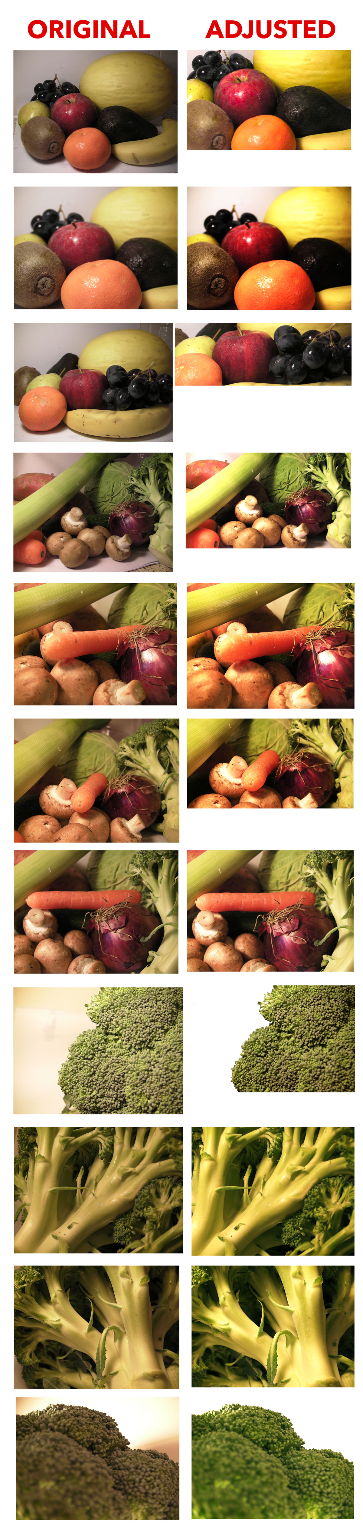
I then took some of these images and added wording on top.

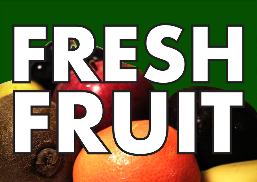
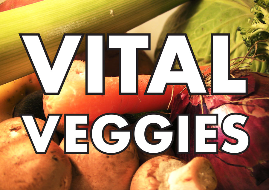
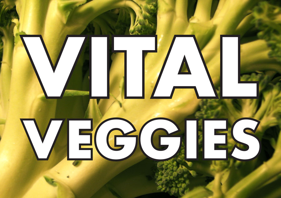
I do not feel these were particularly successful as I could not seem to get the wording to look right. However, out of the five, the two vegetable ones are probably the best as I think the strong typeface suits the bold colours of the vegetables.
EVALUATION
I used limited text on the posters as the displays would be viewed from a distance, in a passing glance, so the less wording the better. I used Illustrator and Photoshop without too much trouble, but found InDesign a bit too much, so I need to watch some tutorials on this software. I found this exercise quite frustrating as not much seemed to work out how I wanted it to, however, rather than clinging to one idea I attempted to experiment, which was worthwhile. I also tried to be more thoughtful about my choices for typefaces. Out of all of the designs I liked the illustration the best, but I would need to know more details from the client who the target audience would be and who they mainly wanted to aim the designs at. Going forward I need to plan more, sketch more and experiment more.