Exercise: Playing With Words
BRIEF
Using the following words create typographical representations that present both the word and a suggestion of its meaning.
SAD SAFE SARDONIC SAUCY SCHOLARLY SERIOUS SHADOW SHATTERED SHY SHORT SILLY SINKING SKIMPY SLEEK SMART SNOWY SODDEN SOOTHING SORDID SOPHISTICATED SPEED SQUAT SQUEEZE STIFF STODGY STONED STYLE SUPINE SWAGGER SWEET
Start this exercise by working on A4 paper. Set the words in 48pt Helvetica Bold, print and cut out the words and try to capture the meaning of the word visually. Think about composition, using the white space of the page to help you construct your meanings.
Then work digitally. Explore how you can set set text at a slant, at different sizes, indifferent colours and fonts. Try using filters in your software for different effects.
Explain your choice of representations and which ones you feel that you were most successful with.
PAPER VERSIONS
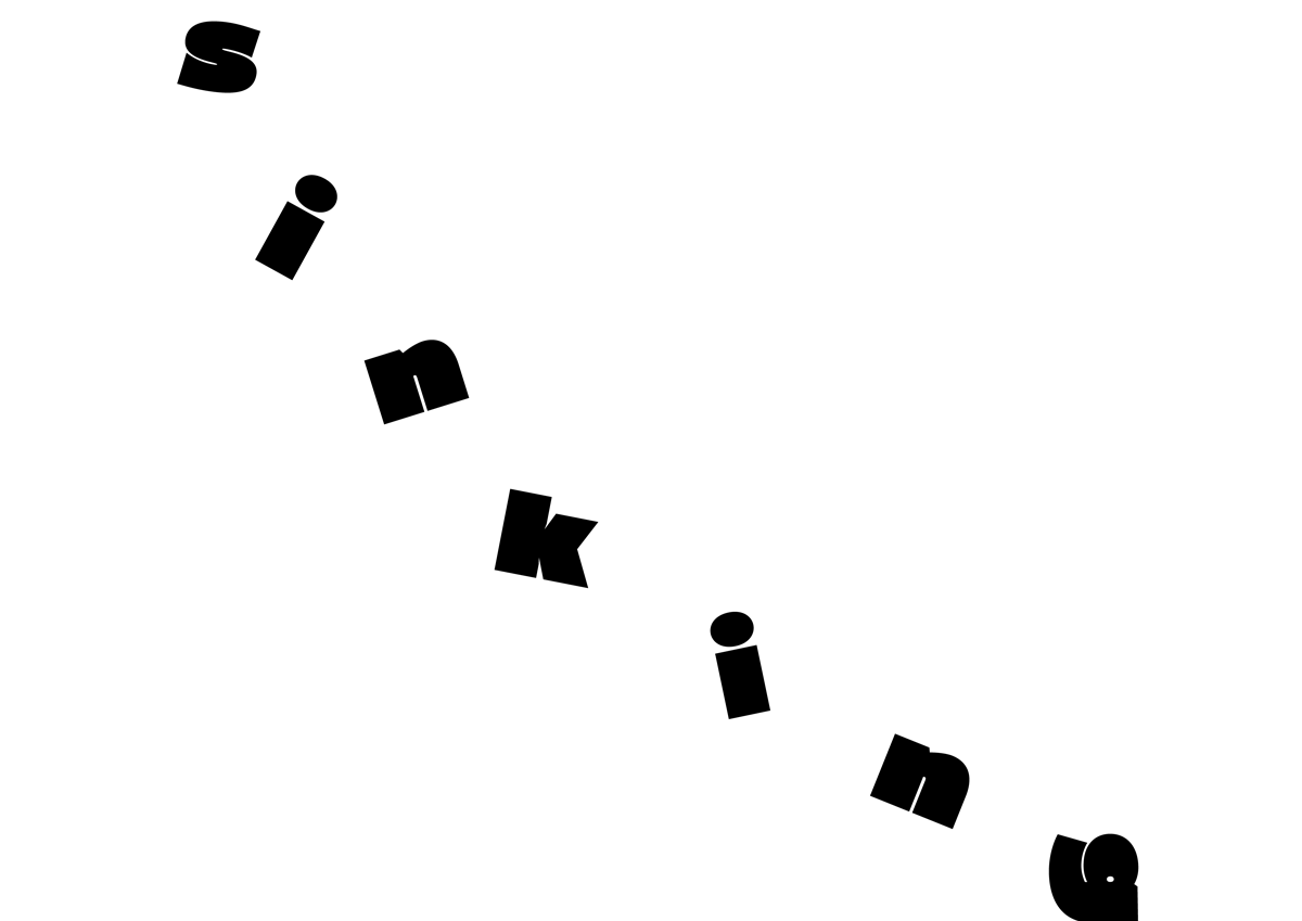
I began by working with printed letters of the words.
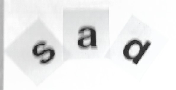
I could only think of recreating an ‘unhappy mouth’ with these letters.
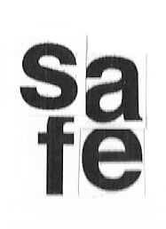
By tightly arranging these letters, I wanted to demonstrate a closeness and protectiveness to represent security.

I found this word particularly difficult to represent, so I tried to recreate a sneer, but I don’t think it was a very successful attempt.
I wanted these letters to be bold and playful.
Although the scan is slightly blurred, I folded each letter to resemble a book.
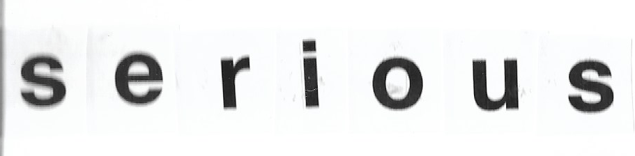
I kept this simple and did not apply any repositioning to emphasise the seriousness of the word.

I thought this would work better than it did, but I tried to recreate the slant of a shadow by splitting the word in half.
I thought this was one of the more successful visual expressions of the words as it clearly demonstrates its meaning.
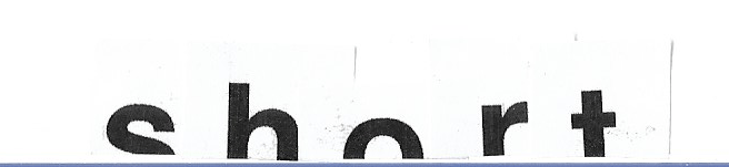
I decided to cut the word short ‘short’.
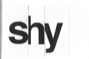
I wanted to overlap these letters to represent a bashfulness and attempts to hide behind one another.

I was pleased with this attempt as the letters appear to be be doing rolls and moving about, which I think effectively represents the word.

I was also pleased with this attempt as it clearly demonstrates the meaning of the word.
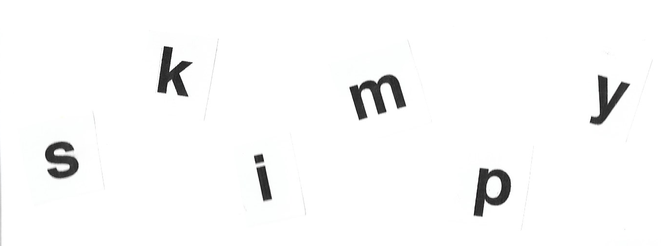
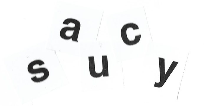
I spread the letters out to demonstrate the nature of the word, but I don’t think it is very easy to interprets the meaning from this.
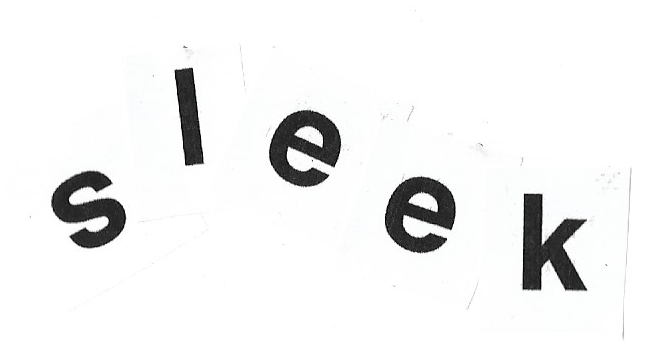
I wanted to create an aerodynamic version of the word to represent sleek, which I think is fairly successful.

I attempted to recreate an algebraic equation to suggest the meaning, using the ‘m’ as the equals sign and ‘t’ as the ‘to the power of 2’.
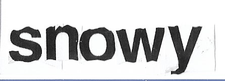
By cutting out sections of the letters, I tried to suggest they were both resting in snow and covered in it, which I felt was successful as a visual representation of the word.

By splitting the letter and spacing them slightly apart, I wanted to imply rainfall. I’m not sure this would be easily interpreted.

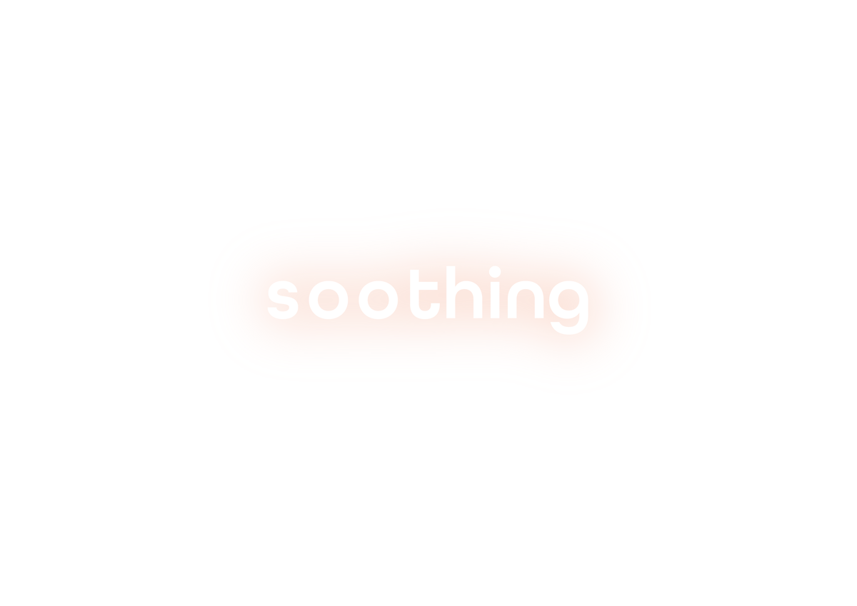
I tried to recreate how this word is spoken s-o-o-thing, which is quite soothing in itself.

I had no idea what to do with this word so I just tried something a little different, which bears little visual resemblance to the actual word.
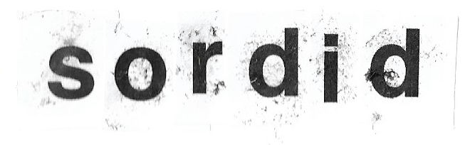
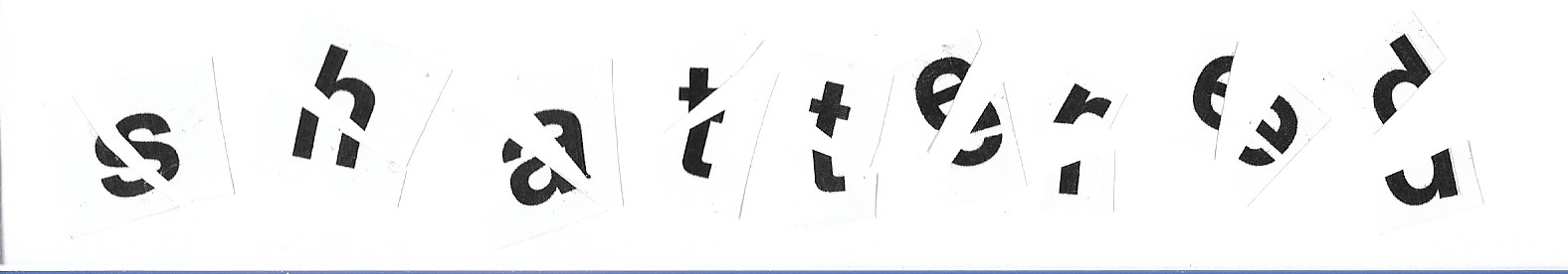
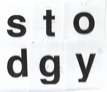
I took advantage of the black from the ink that mixed with glue and made the word appear dirty, which visually summed up the word very well.
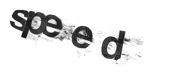
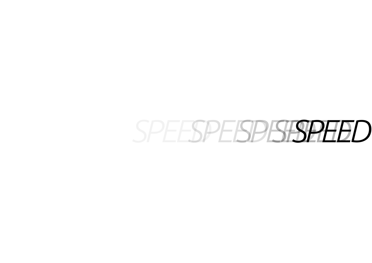
I made the beginning of the word aerodynamic and positioned the word at an angle. I then created more distance between he last two letters and used the black ink and glue combination to indicate speed lines. I thought this was quite successful.
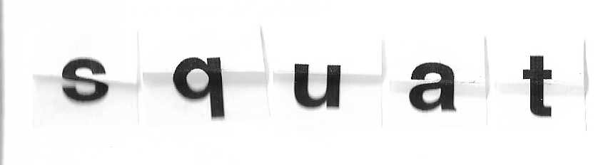
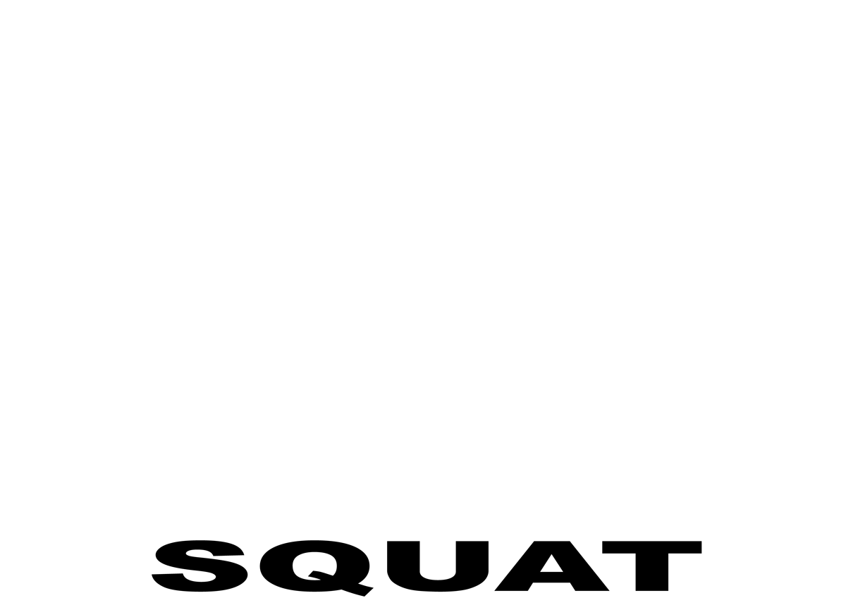
I folded the letters in have to represent squatting, which was quite a simple but effective visual representation of the word.
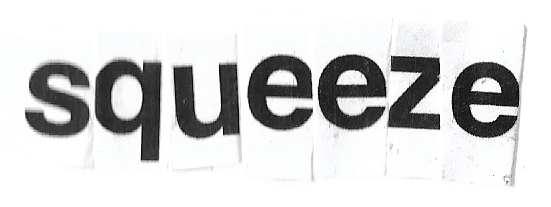
I placed the letters tightly next to one another for this word.
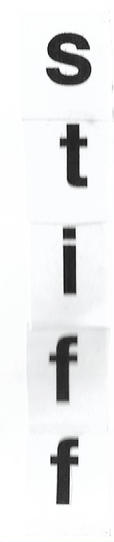
I placed the letters vertically for this word, which gave the impression of them standing straight to attention.
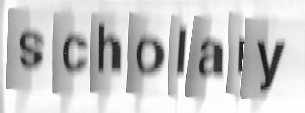
This was quite a tricky word, and I didn’t come up with a successful representation.
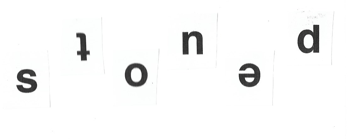
By placing the letters unevenly and some upside down, I tried to recreate the nature of the word.
I could not think of anything for this word, so I just positioned the letters in a fairly unusual arrangement.

I lay these letters on their ‘backs’ , which I think successfully represents the word.

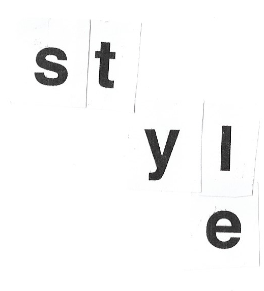
I could not think of anything for this word, so I just position them in a line, which could suggest a certain boldness in the context of all the others.
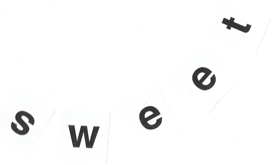
I tried to recreate the sensation of eating something sweet – the resulting high.
DIGITAL VERSIONS
Next I moved on to creating the digital versions.

I used the colour grey to represent the feeling of sadness and by dropping each letter slightly lower, I tried to represent the sense of the word.
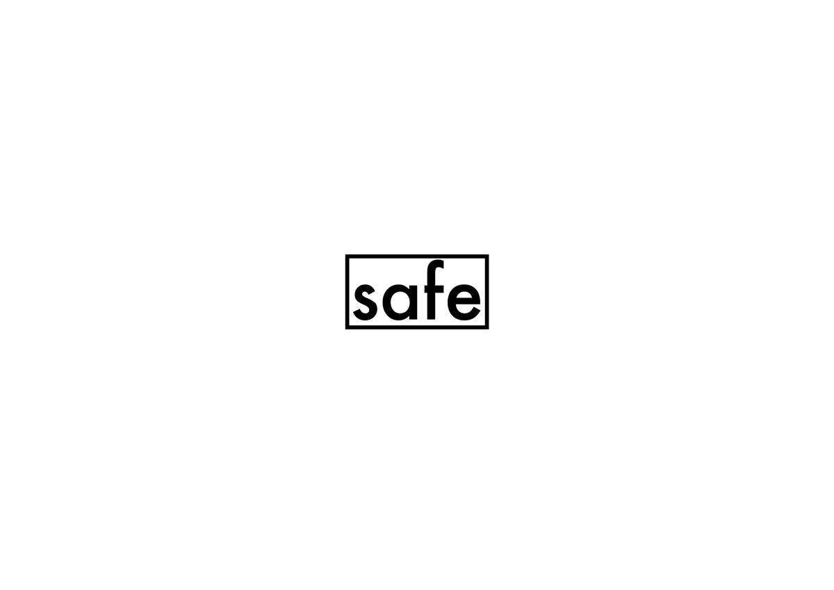
I used a solid border to create a ‘barrier’ around the word in the centre of the page.
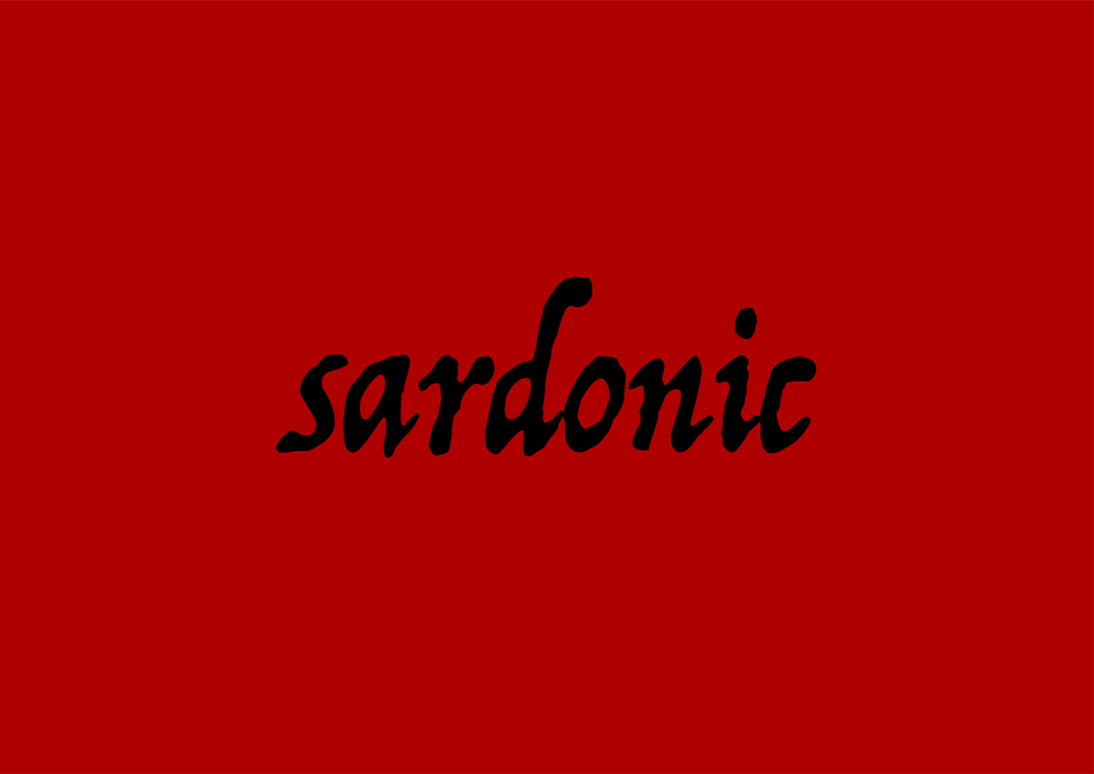
I found this word quite difficult to come up with a solution to, but chose to use Trattatello to recreate the type of font I associate with Jack the Ripper, whom I think could be described as sardonic in his communications with the authorities. I used red as a background to emphasise the negativeness of the word.

I used the expressive and bold font Brushstrike and set it at an angle in a deep pink, to express the meaning of the word.
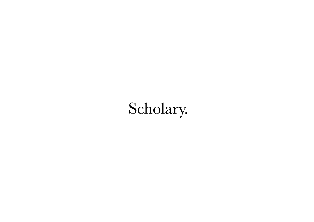
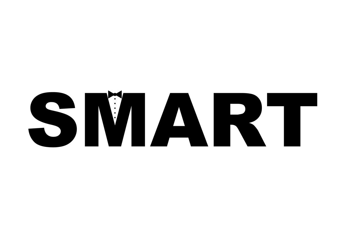
I used Baskerville for this word as it looks rather educated.

Times New Roman was appropriate for this word as it is often used for legal documents and the like.
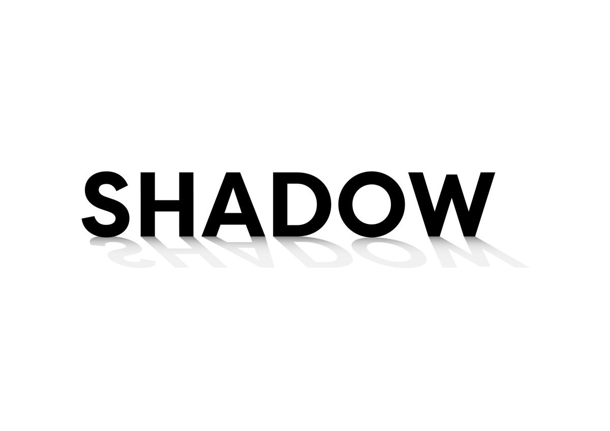
It was much easier creating a shadow effect digitally and I think this effectively demonstrated the meaning of the word.
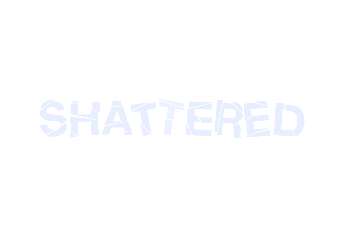
I used the knife tool to split up the letters in Illustrator and used a very light blue to suggest a fragile material such as glass, to reinforce the meaning of the word. I think this worked well.
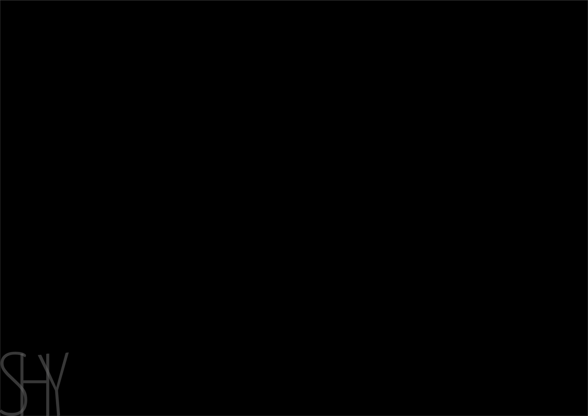
I used a very thin font and overlapped the letters, made them transparent and placed them right in the corner of the page to emphasise the meaning of the word, which In think was quite successful.
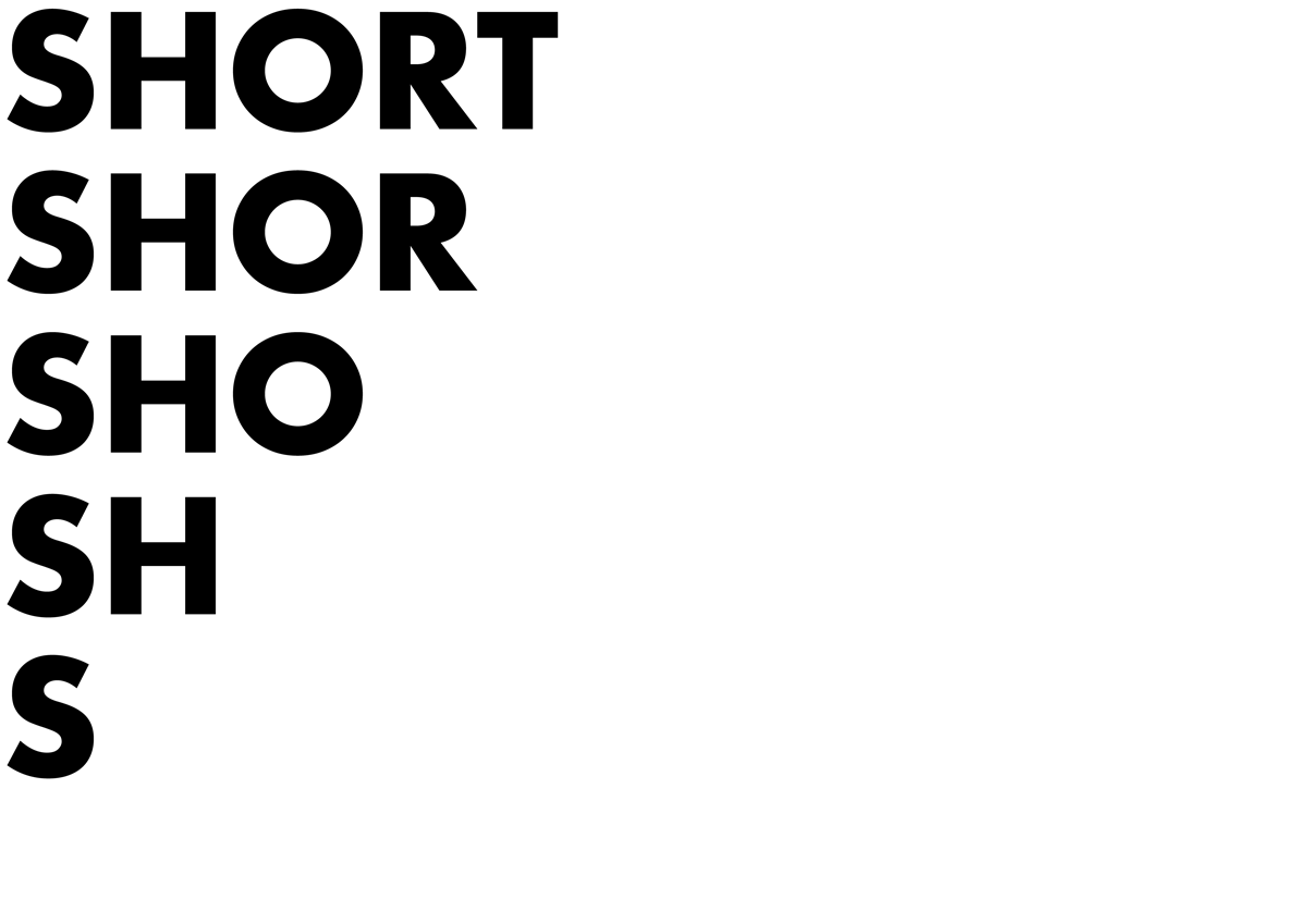
I tried to be slightly imaginative with this one, but cutting the word short on each line.
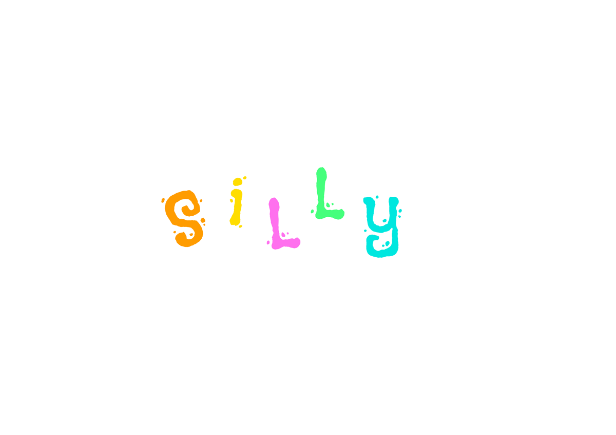
The font ‘Flavors’, the placement of the letters and the use of different bright colours visually implies the meaning well.
I was pleased with this one as the heavy font and the placement depicts the word well.
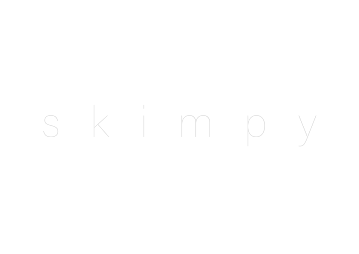
I used the font Acumin Variable Concept (Thin), increased the tracking and used a very pale grey to emphasise the meaning of the word.

I used the plastic wrap effect on this word and combined with the font, Filson Pro Bold, thought this depicted the word rather well. I added a purple backgrounds this colour is associated with luxury and wealth.
I used a different meaning of the word for this version and added an illustration incorporating the ‘M’.
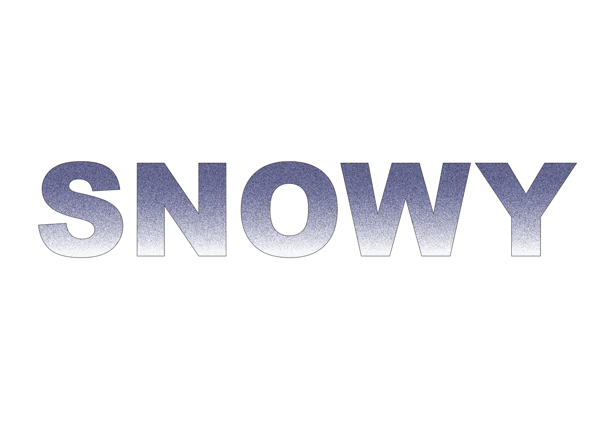
I used gradients, blend modes and grain filter to create snow effect within the letters.
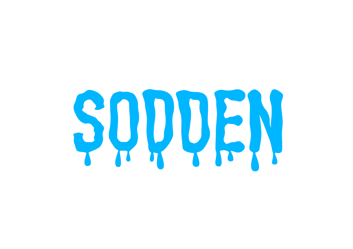
I created outline of the letters and manipulated these to create a waterlogged effect. The use of the colour blue is self-explanatory.
I used the font All Round Gothic Demi as this created a softness to the word, changed the font colour to white and added an outer glow of a soft pink-orange. I felt this was quite successful.
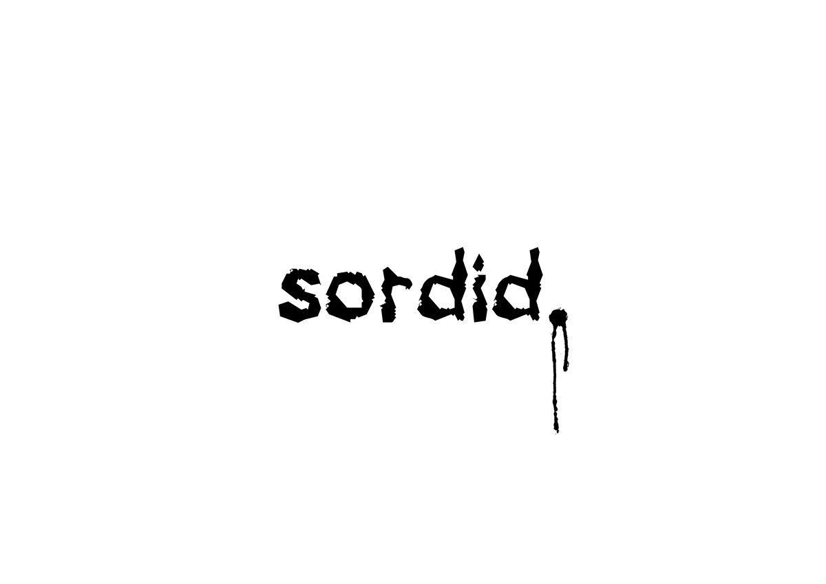
I used the appropriately named font Drunker, which produced a rough depiction of the word and added a dripping full stop to emphasise the nature of the word.
I used a script font, Snell Roundhand, and added an underline, which I thought was simple yet effective at depicting the meaning of the word.
I used repetition and reduce opacity to suggest movement for this word, taking it to the edge of the page. Using italicised version of Ubuntu added to the sense of movement.
Although it produced an ugly effect, I reduced the vertical scale of this word to suggest the meaning.
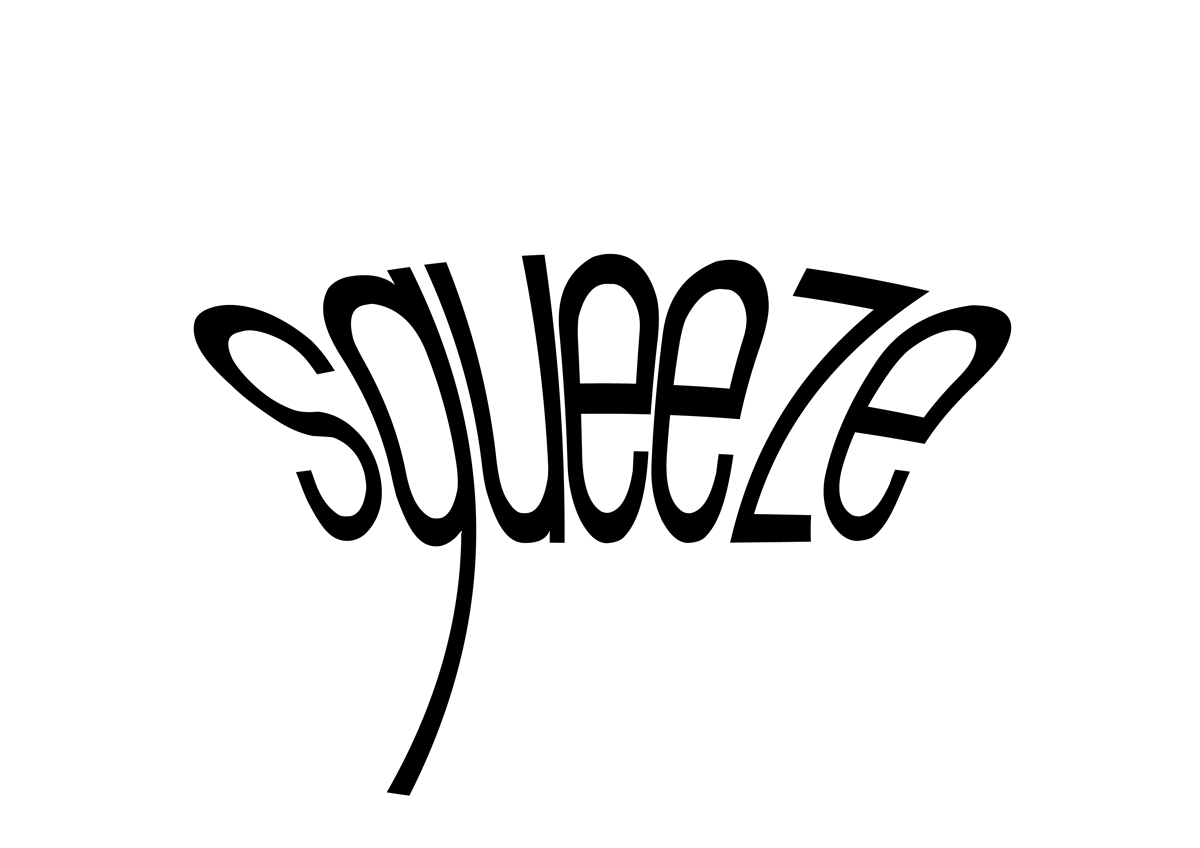
I used the squeeze warp tool to create this effect, which I felt successfully demonstrates the meaning of the word.
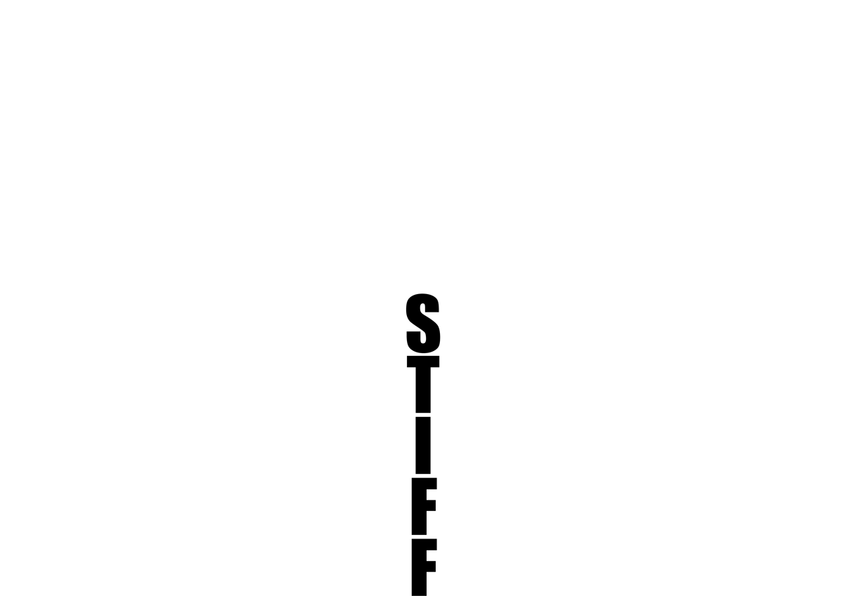
I used the solid font Impact, reduced the line spacing and placed each letter on top of one another to attempt to suggest a stiffness.
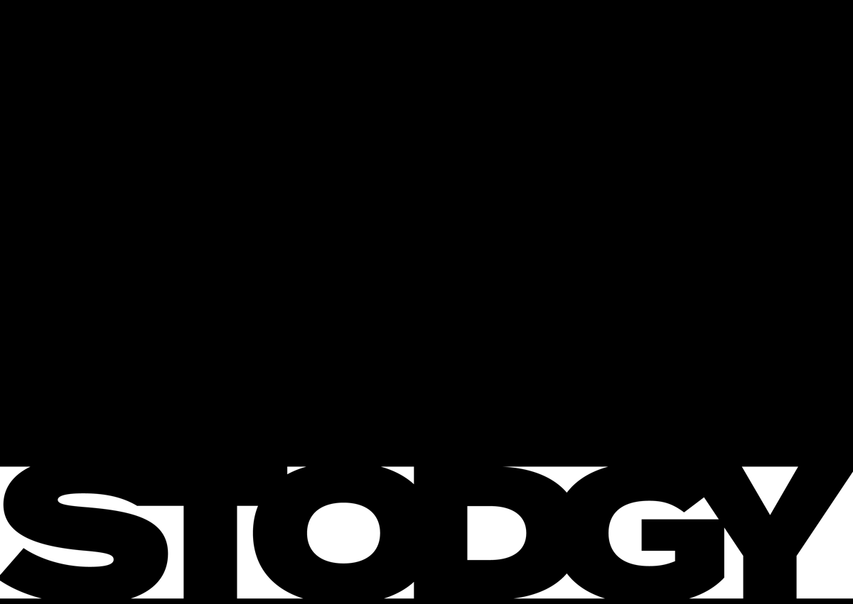
It took me a while to come up with a concept for this word, but used the font Termina (Black), reduced its vertical scale and tracking to create a heavy sense, increased by the use of black ‘weighing down’ on the word.
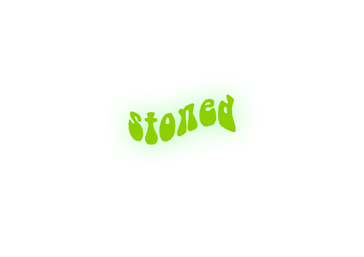
Using the font BellBottom.Laser, I wanted to recreate a 1960s hippy style. I used the wave warp tool to add to the sense of getting high and added a green haze with the outer glow.
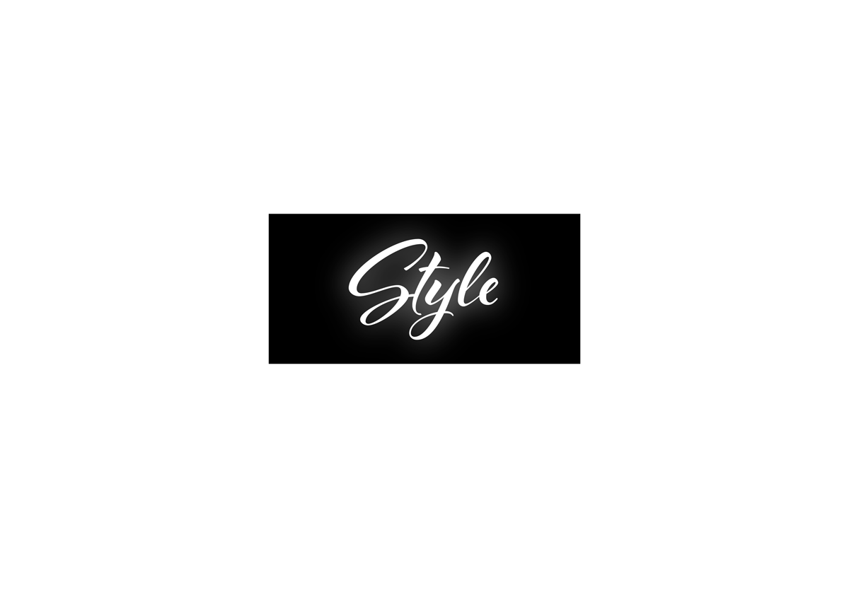
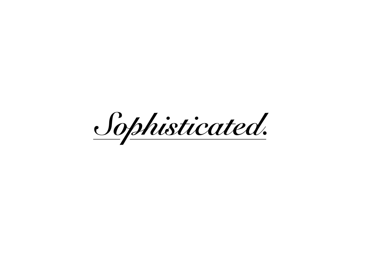
I used the font Al Fresco and added a white drop shadow directly behind the text to create a stylish glow. I placed this on a black background to make it look more sophisticated.
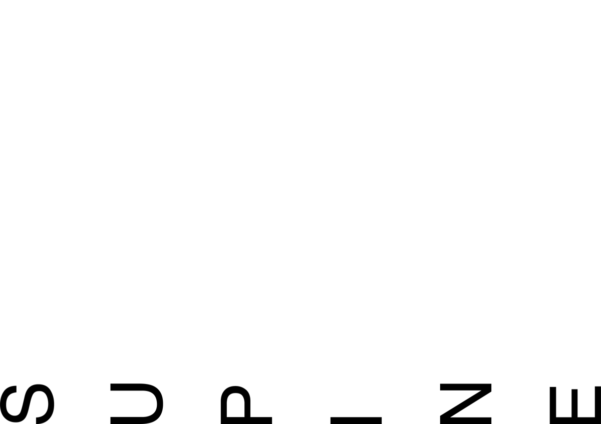
As with the paper version, I went with the straightforward representation of lying the letters on their backs only the bottom of the page.
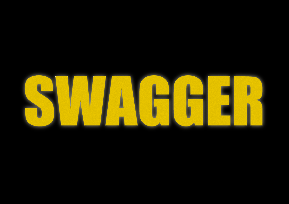
I wanted to make this text look boastful, so I made it a gold colour, aded an outer glow and used the sponge effect to produce an effect of gold shining. This was emphasised by the black background and the use of the bold font, Impact.
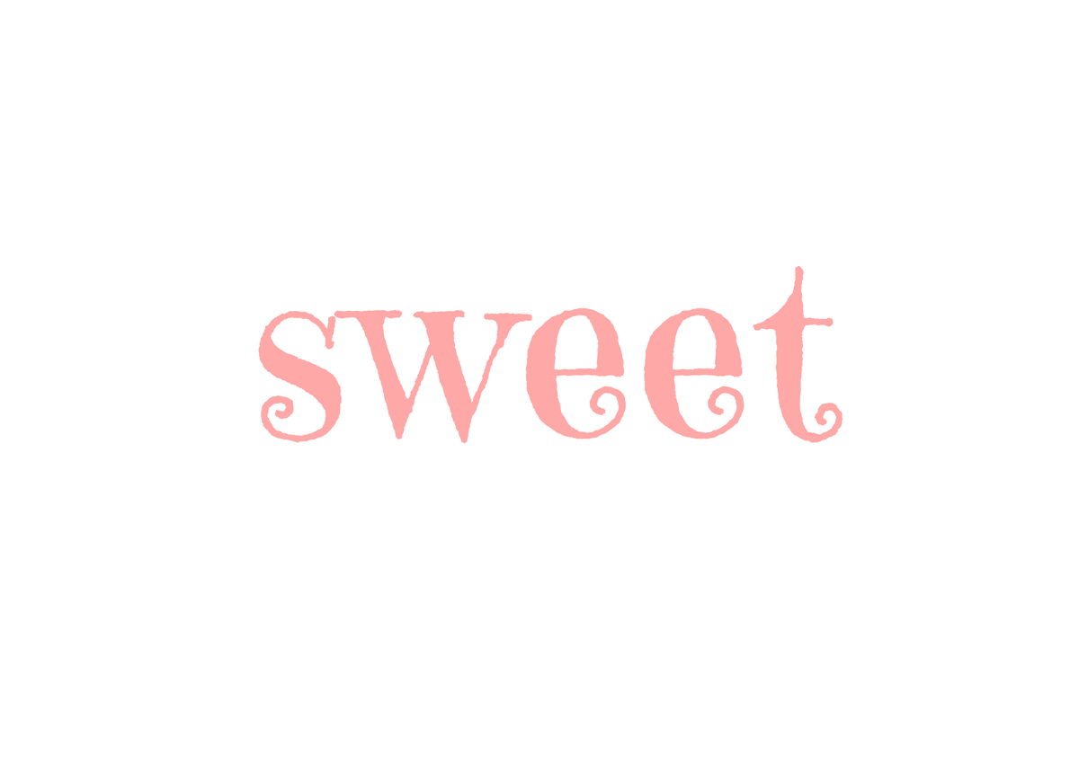
I used the font Curely for this word and used a baby pink colour.
EVALUATION
Although I found this exercise quite challenging, particularly the paper versions, I really enjoyed trying to come up with ways to represent the meanings of the words in a visual way. I learnt a great deal about different tools and effects in Illustrator and also it was useful having to think about how different typefaces can be interpreted and therefore how to use them appropriately for different situations.