Exercise: Lorum Ipsum
Lorum Ipsum is dummy text with more-or-less normal distribution of letters tear makes it look like readable English. Ithas been used for many years and some desktop publishing packages now use it as their default model text.
Now select one of the designs from your research that you like and think works. Using the dummy text, try and copy the layout and design as closely as possible. You will need to measure the margins and column widths. If you don’t have the exact typeface get as near as you can. If you are copying a page that includes photographs just leave 10% tinted boxes to indicate their position.
Is the type serif or sans serif? Is the text set ragged or justified? Are there spaces after paragraphs or are new paragraphs indented? How many columns are there to page?
What happens when you alter the fonts, change the alignment, adjust the leading or tracking?
Now try another, different publication from your collection.
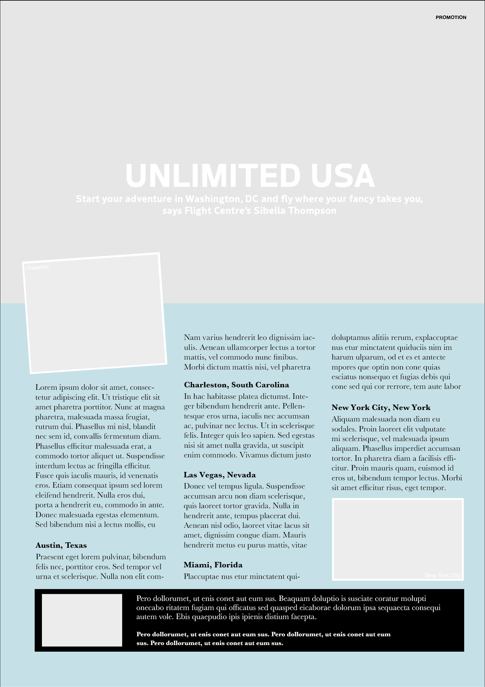
Design 1: USA Advert
Although this design was not particularly ‘flashy’, I did find it easy to read and the layout was logical. There was a clear hierarchy of information. On thong I would like to have changed about the design is the position of the ‘Miami, Florida’ title and line of text as I think this would have been better if it was kept with the bulk of the corresponding paragraph. However, I can see why the designer did this due to limited space and balance.
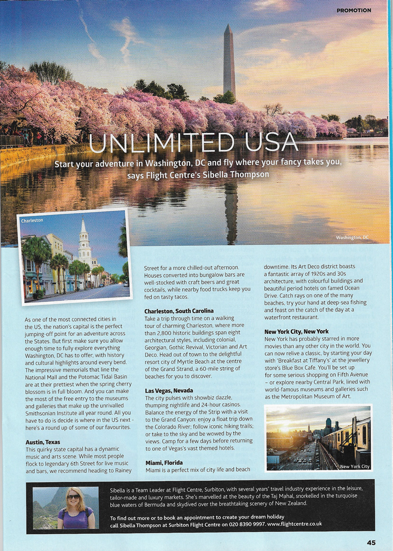
I used both identifont.com and typekit.com to try and fond the fonts that were used and had mixed results. I think I found the correct font for the headline and sub-heading – Boreal – but although the body text looked familiar to me, I was unable to find an exact match. I ended up using Helvetica Neue. I found not being able to locate the precise font quite frustrating.
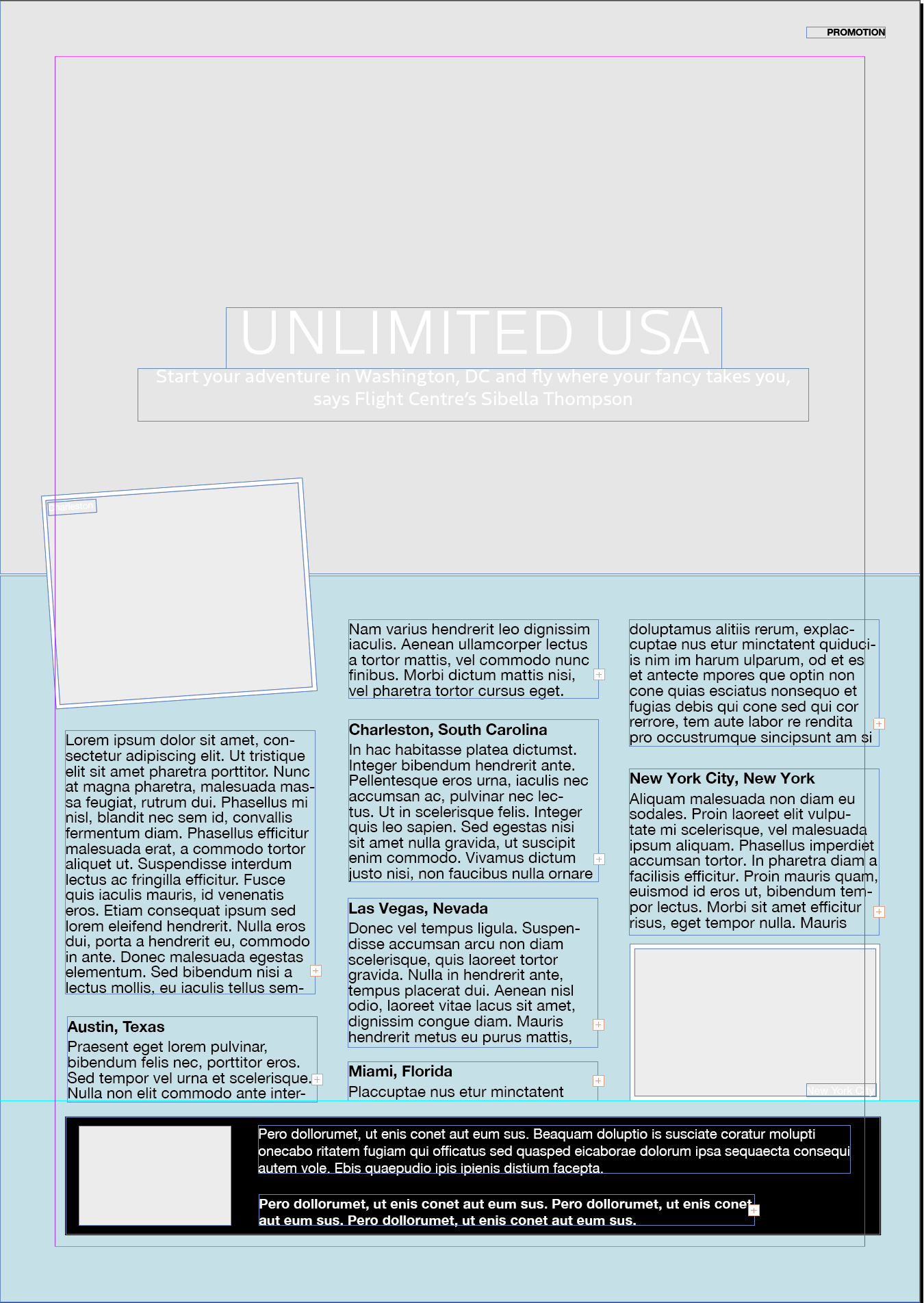
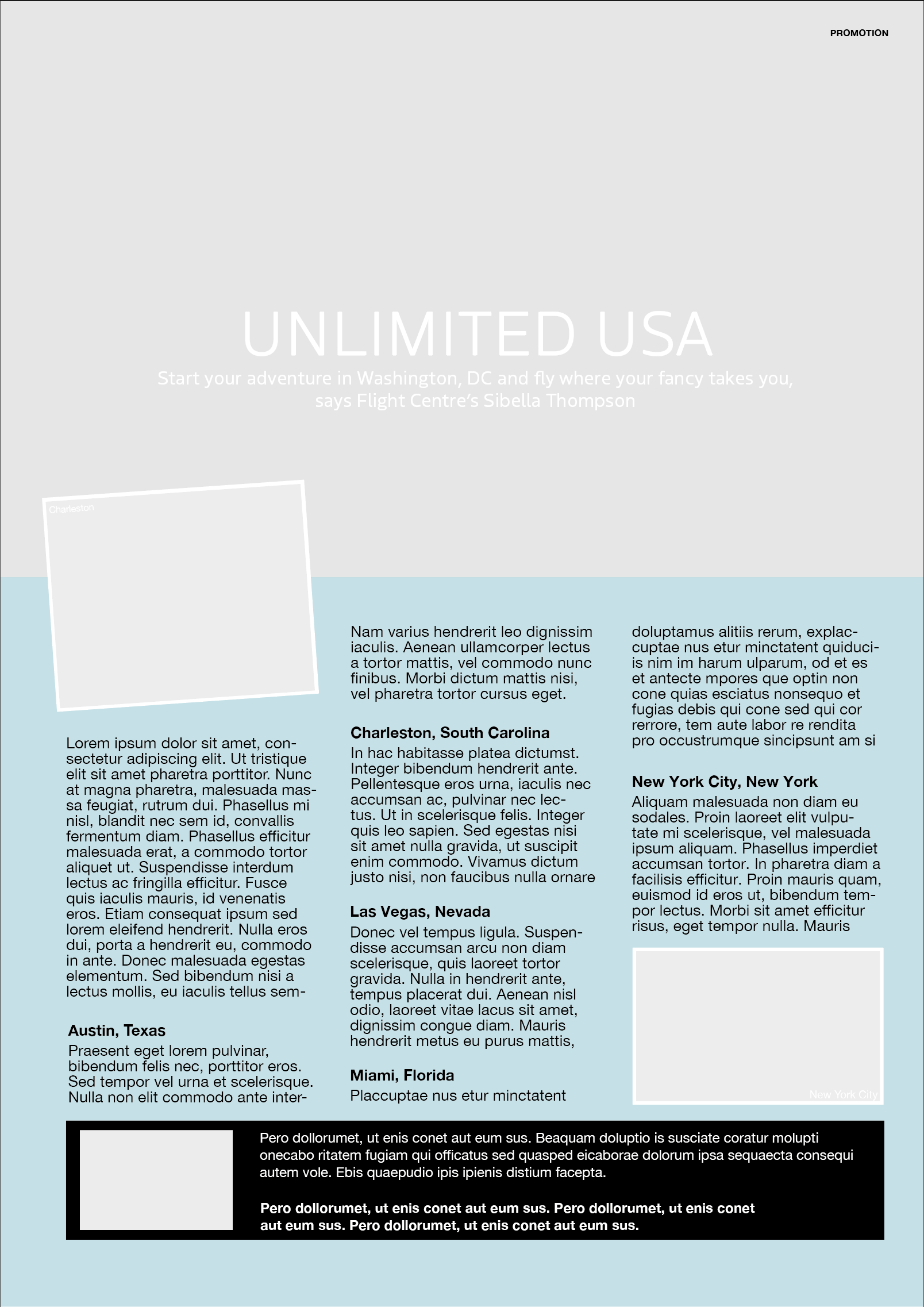
Altered Versions
I tried justifying the paragraphs and, although I do like justified text in some design because I like the ‘neatness’, it resulted in ‘rivers’ being created.
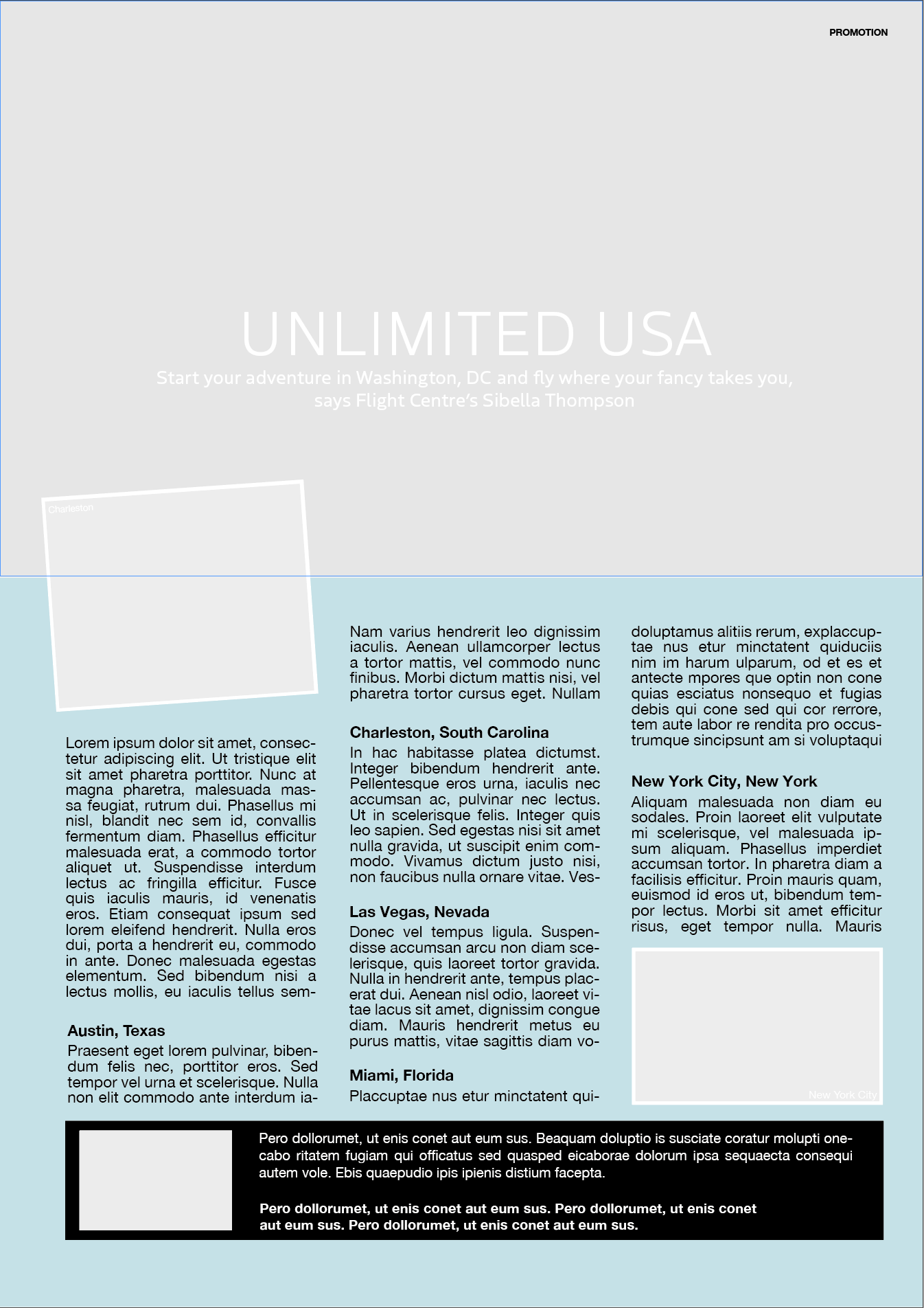
I then tried changing the font. I decided to use a san serif font, Baskerville, for the main text. I increased the leading to improve readability, this change meant I had to slightly readjust the positioning of the text boxes to fit. For the headline, I still used Boreal but made it bold so it stood out more than the original, especially when set against the photographic background as I the original.
I preferred this last version to original as I think the choice of Baskerville as the font for the body text makes it more appealing and sophisticated. I think it is less harsh and make for a more ‘customer-friendly’ advert.
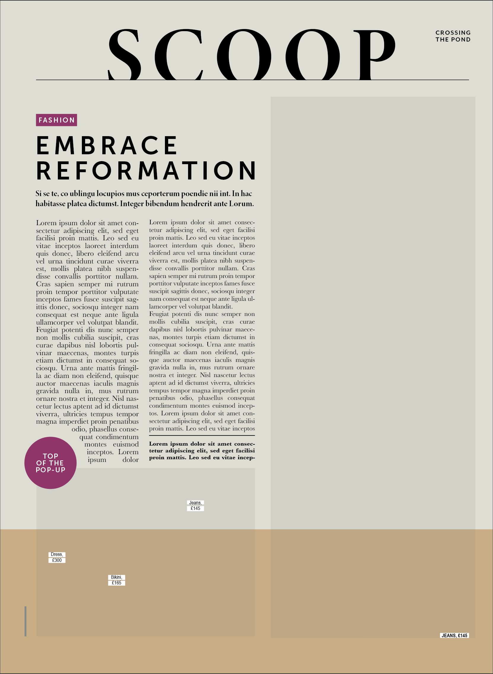
Design 2: Magazine Article
Again, although this was not a ‘flashy design’, I did find it quite easy to read and it is a good example of the use of columns to break up long paragraphs of text. There is a clear hierarchy to the layout and my eyes moved easily across the page.
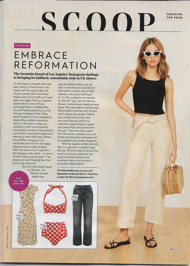
Again, I used identifont.com and typekit.com to try and find the correct fonts, but either the results were fonts that I would need to purchase or I could not find the exact match. So, I tried to use the most similar ones I could.
For the title ‘SCOOP’ I used Minion 3 Display (Bold) as this was the closest tot he original I could find. For ‘EMBRACE REFORMATION’ and the text in the red blocks, I used Mr Eaves Mod OT (Regular and Bold, respectively). For the subheading I used Minion 3 Display (Bold) again. For the body text, as before, I could recognise the font, but needed up using Arial Narrow, which frustrated me as it did not look the same as the original.
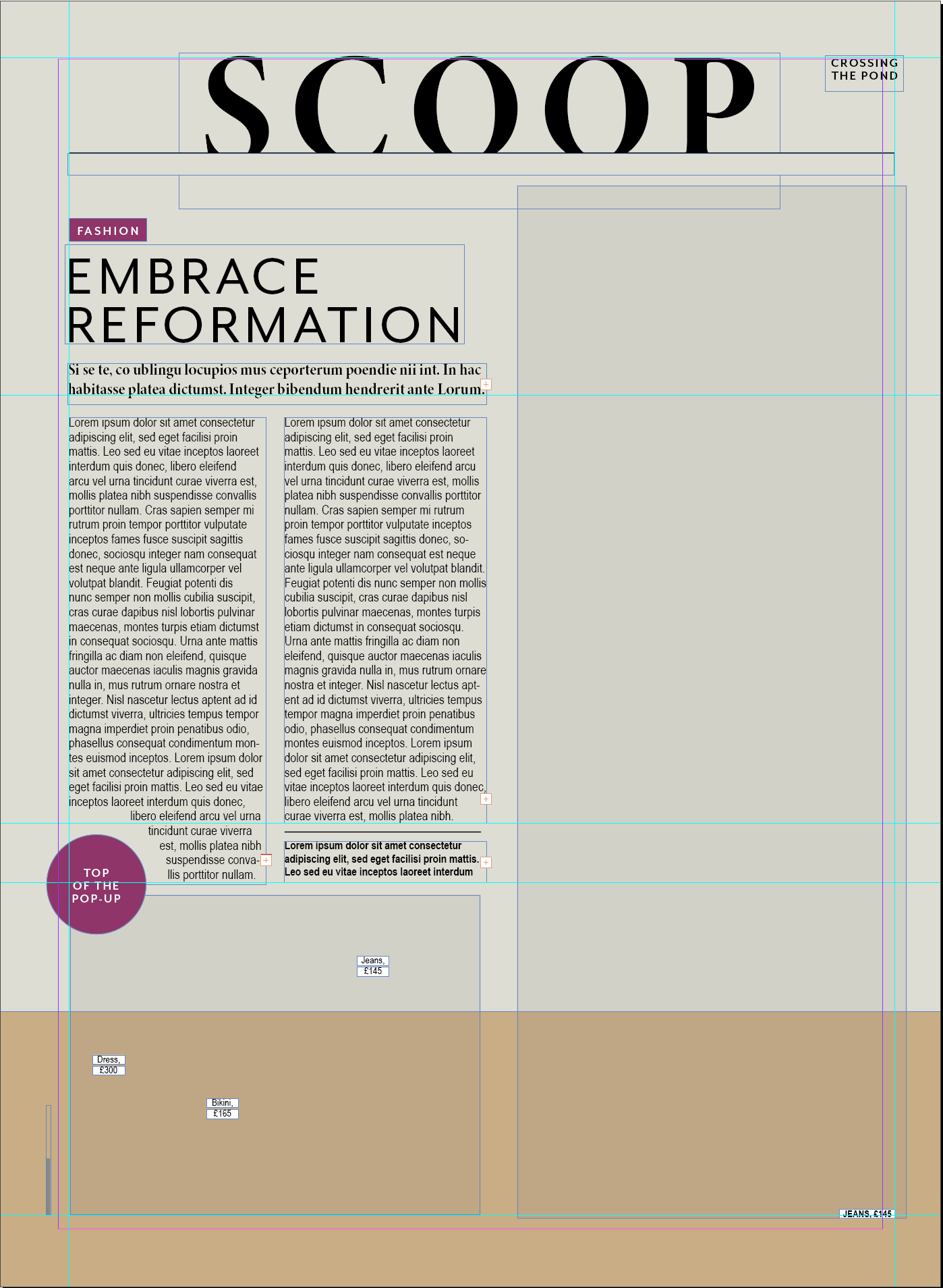
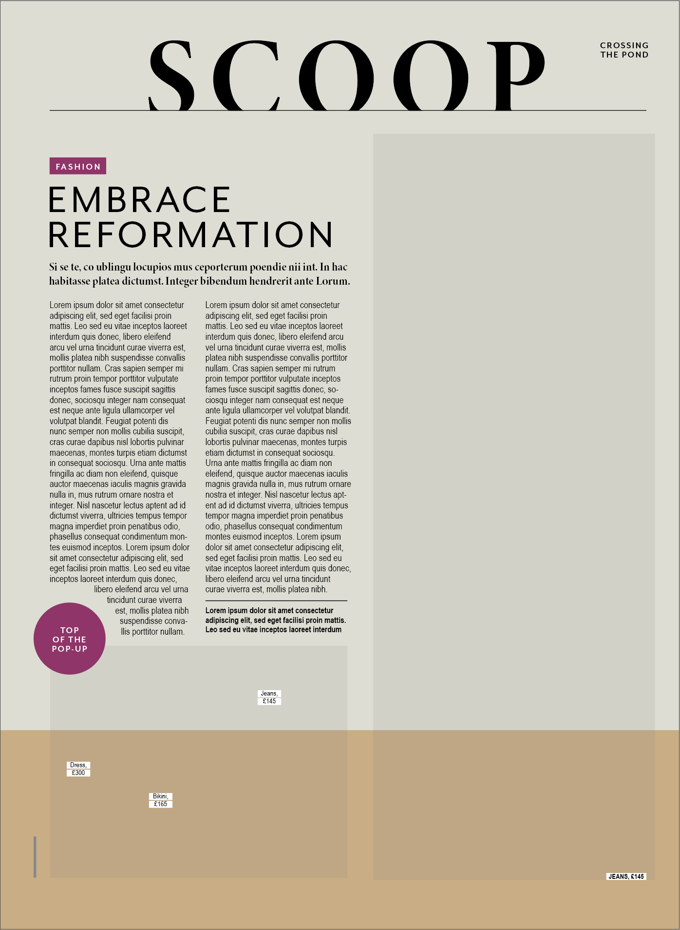
Altered Version
I tried justifying the paragraphs and some font changes.
I changed the ‘EMBRACE..’ font to Museo Sans, which I was not sure about and the body text to Baskerville, which I liked as it made the text more readable (in my version as I could not find the original font used in the magazine). I also justified the paragraphs, which I thought worked better in this design as it made it looked more balanced. Personally, I thought this was a more visually appealing layout than the original, but that is my preference for everything to be lined up and neat.
EVALUATION
I used this exercise as a chance to really work on my Indesign skills. I deliberately did not pick anything too elaborate as I am just starting to learn. I quite enjoyed the process of recreating the designs and then thinking about what changing the fonts and their properties has on the readability and overall layout. It also made me realise that how much space is required for the text is a major consideration and any changes to the font often results in having to resize and move text boxes to not lose the layout. As previously mentioned, I did find it very frustrating not being able to identify the original fonts and appreciate even more the ability of some people who recognise fonts straight away.