Exercise: If the face fits
BRIEF (PART I)
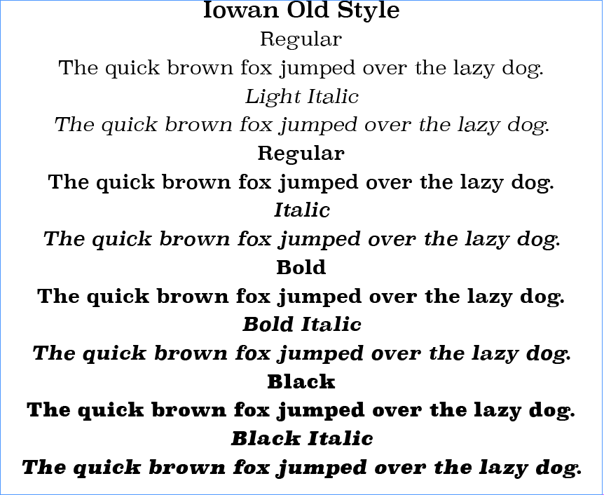
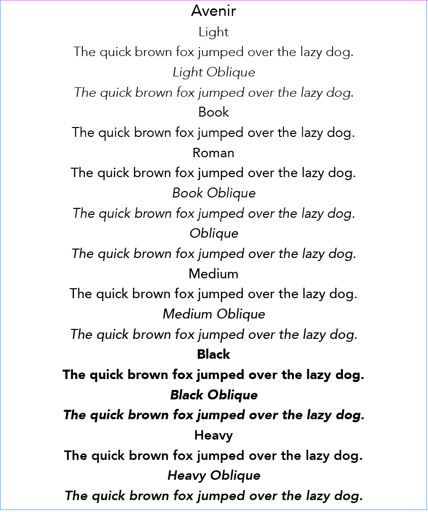
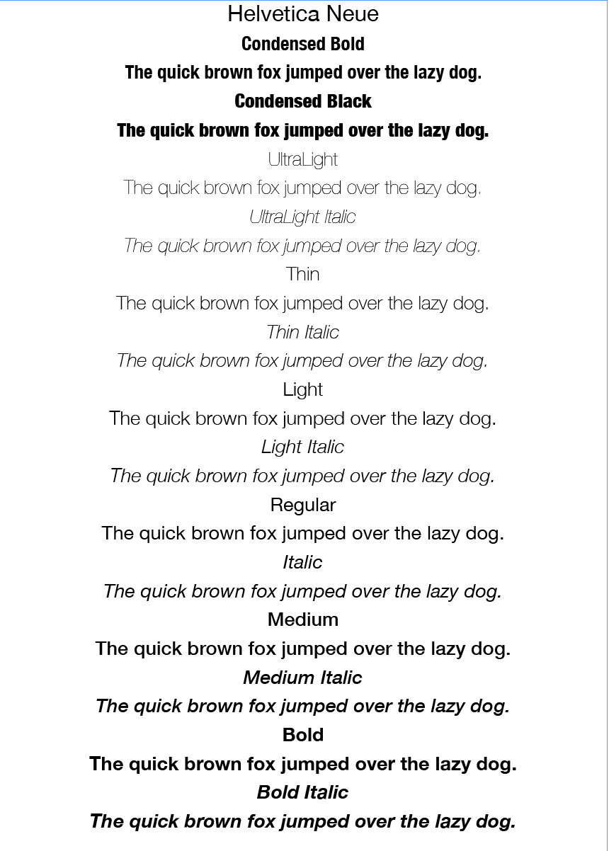
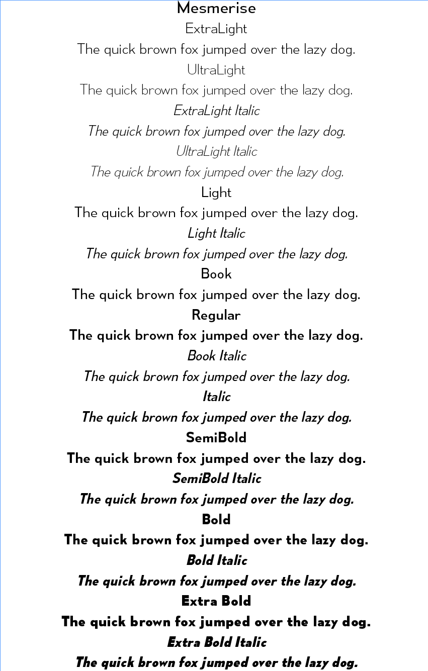
Create your own sample book of typefaces on your computer that you can refer to. Organise them into serif fonts, san-serif fonts, script fonts, decorative fonts and fixed-width, techno and pixel fonts. Identify which typefaces have bold, italic, black or light fonts.
I enjoyed organising my fonts for easy reference and will continue to add to the font book as I increase my collection. I was quite surprised by how many different versions of each I had available and laying them out in this manner was very useful. Some screenshots can be seen below.
BRIEF (PART II)
Now identify which fonts you might use in each of the following commissions:
– A short story in a woman’s magazine (1300 word long with headline and body text)
– An advertisement in a parish magazine asking for more helpers on the the flower rota (A6 landscape)
– A poster to advertise an after school club for boys aged 13-14 (A3 size)
– Your friends’ engagement party (A5 flyer in style of ‘club night advert))
Then have a go at mocking up each of these. Try different fonts to see how each changes the feel of the text and make notes in your learning log about which works best and why.
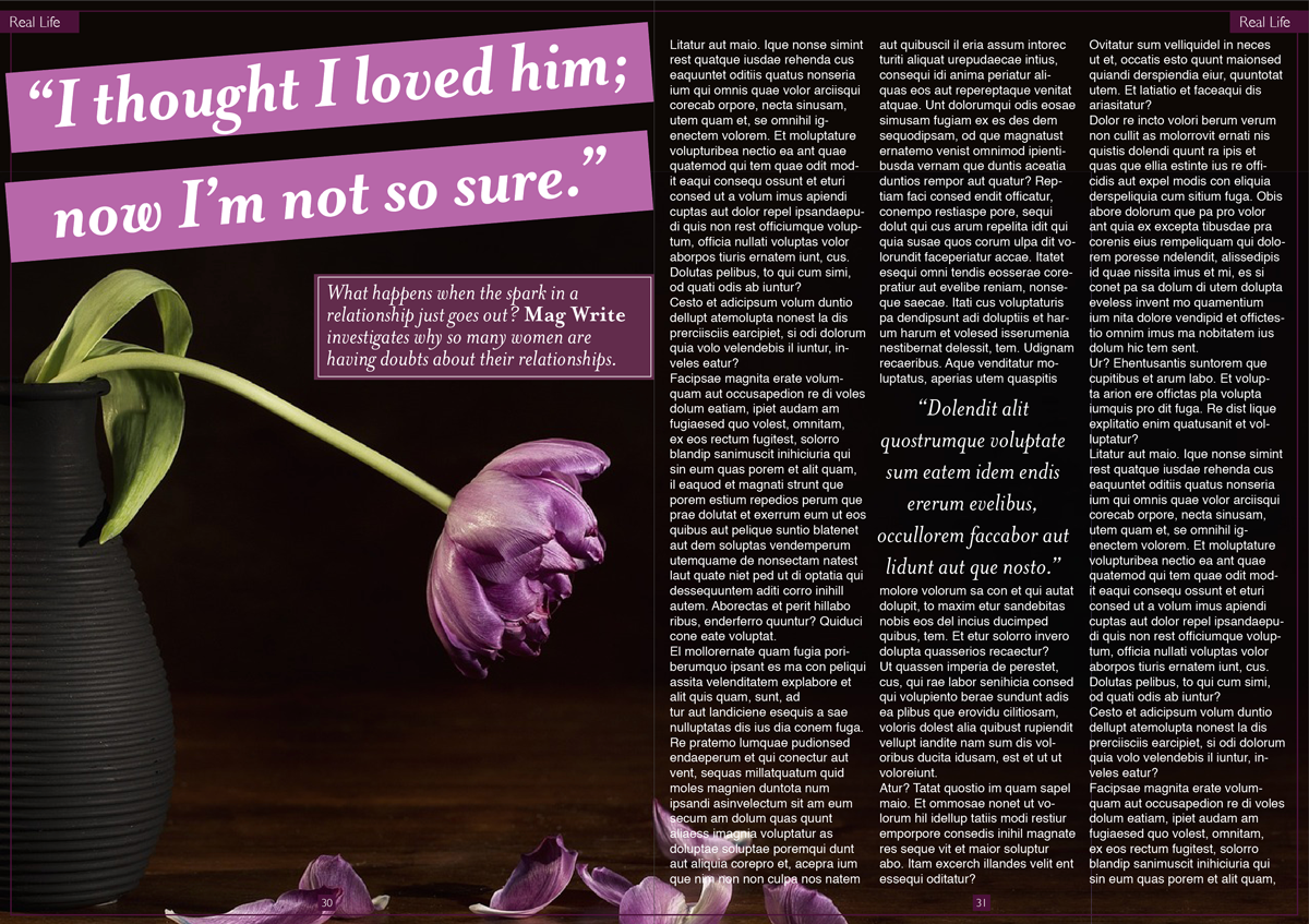
A SHORT STORY IN A WOMAN’S MAGAZINE
I began by sourcing some examples of layouts and text for magazines aimed at women.
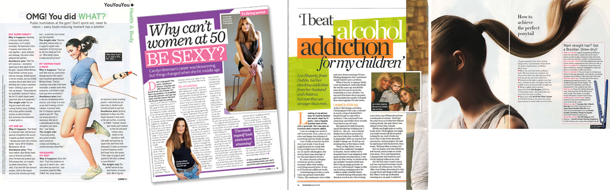
I noticed that the articles generally have 3 or 4 columns of left-justified text, which makes it easier to read. The headline and subheadings cover about a third of the first page and incorporate some colour and font styling to make it stand out. There did not seem to any general rule of whether a serif or sans serif typeface was used, but the spacing around the text was quite generous, again to make it easy to read. However, the choice of font for the headline and the body text was always different.
Next, I created a layout for my fictional article, which, in order to incorporate the word limit and pictures, ended up covering three pages. I made three versions, each using different font choices.
VERSION 1

Headline font: Palatino Bold Italic
Body text font: Gills Sans Regular
I chose to use a serif font for the headline as I thought this was better suited to text that is a quote from the article, which I also applied to the block quote within the article. I used a san-serif font for the body text as it looked clean and easy to read. The leading and spacing around the columns added to this readability. I thought this combination of fonts worked quite well together and ended up being the best version of the three. The strong contrast between the two fonts makes their roles in the hierarchy clear. I was quite pleased with the layout for this design, although on reflection I would move the text box on the first page more to the left.
VERSION 2
Headline font: Georgia Bold Italic
Body text font: Avenir Book
I chose these fonts for the same reasons as above, but I thought the body text font was not well suited to this context as I thought it looked rather amateurish and clunky when in the column layout.
VERSION 3
Headline font: Mrs Eaves Bold Italic
Body text font: Helvetica Regular
Similarly, I thought this font for the body text was not well-suited to this layout, but perhaps reducing the font-size would have improved on this.
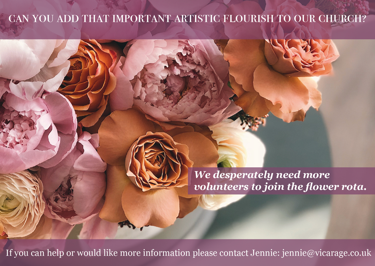
AN ADVERTISEMENT IN A PARISH MAGAZINE ASKING FOR MORE HELPERS ON THE FLOWER ROTA
As before, I wanted to begin by looking at some examples of this genre, however, most of what I came across looked quite amateurish, so it was not very inspiring. Many of them used Comic Sans a great deal. These were the best I could find:
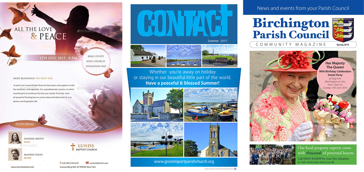
I decided that the advert would need to be quite formal and fit in the context of the magazine. I designed the layout and then created two versions, each with different font choices.
VERSION 1
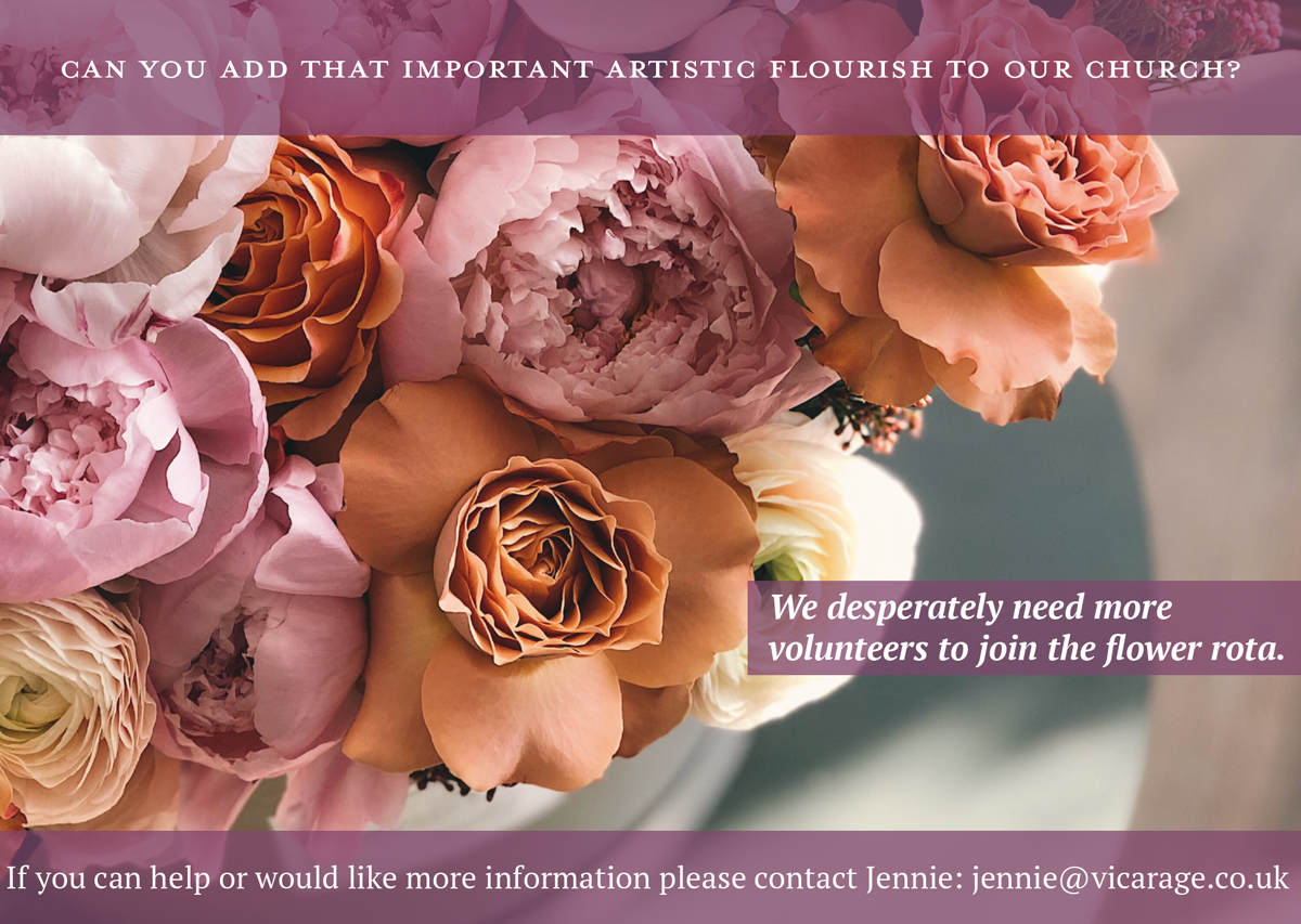
Title font: Bodoni Small Caps
Body font: Georgia Bold Italic & Regular
I thought the advert should have quite a traditional and formal feel to it, so I felt the choice of serif fonts was particularly appropriate for this context. I think this version worked better than the second as it feels more balanced and not cramped, particularly the title font.
VERSION 2
Title font: Mrs Eaves Roman All Petite Caps
Body font: PR Serif Bold
A POSTER TO ADVERTISE AN AFTER-SCHOOL CLUB FOR BOYS AGED 13-14
For this design I sourced examples of youth club adverts. These demonstrated the use of bold fonts and colour with lots of movement in the design.

I wanted my design to be fun, but not too ‘babyish’ as boys of this age want to be taken more seriously. So, I aimed for something quite bold and sophisticated, but also clearly aimed at a younger audience, rather than adults.
VERSION 1
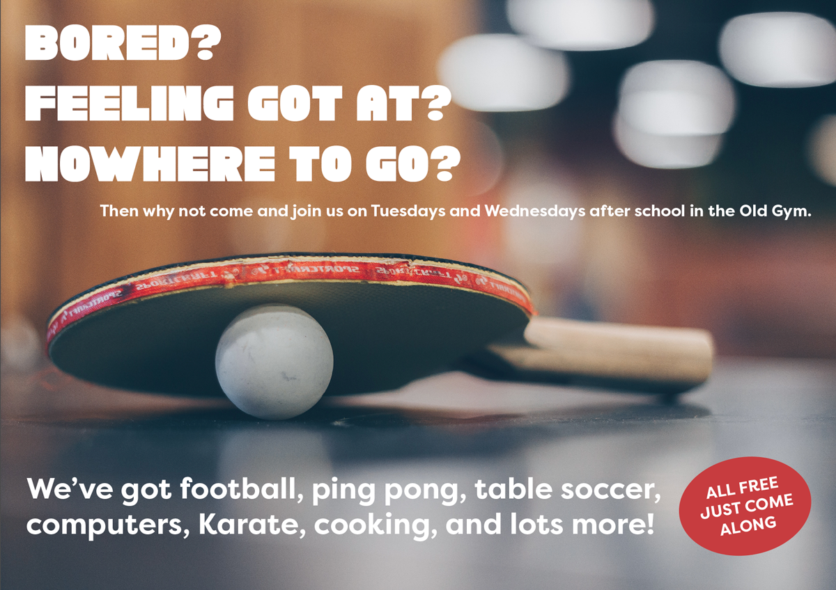
Title font: Chunky Funks Regular
Body font: Filson Pro Regular
I thought these fonts worked better than those used in version 2, particularly the body text, as they are bold and clear, but on reflection I think the design would’ve benefitted from being more dynamic and colourful.
VERSION 2
Title font: Solid Grooves Regular
Body font: Impact Regular
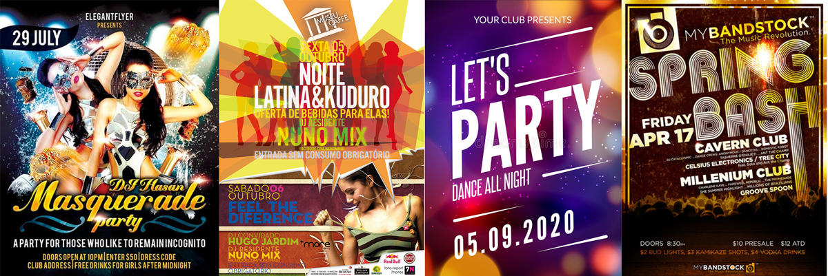
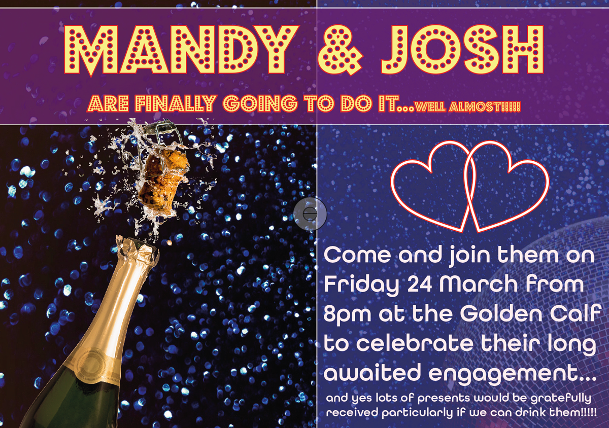
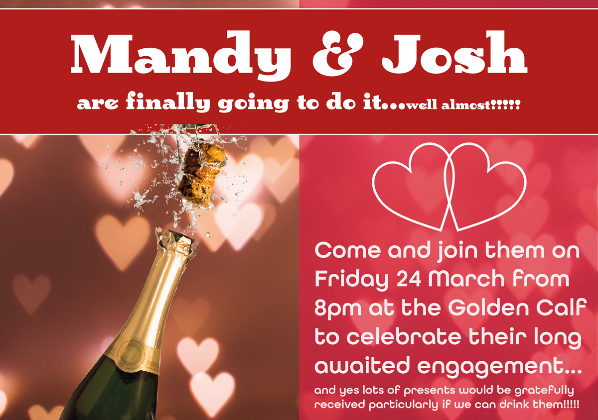
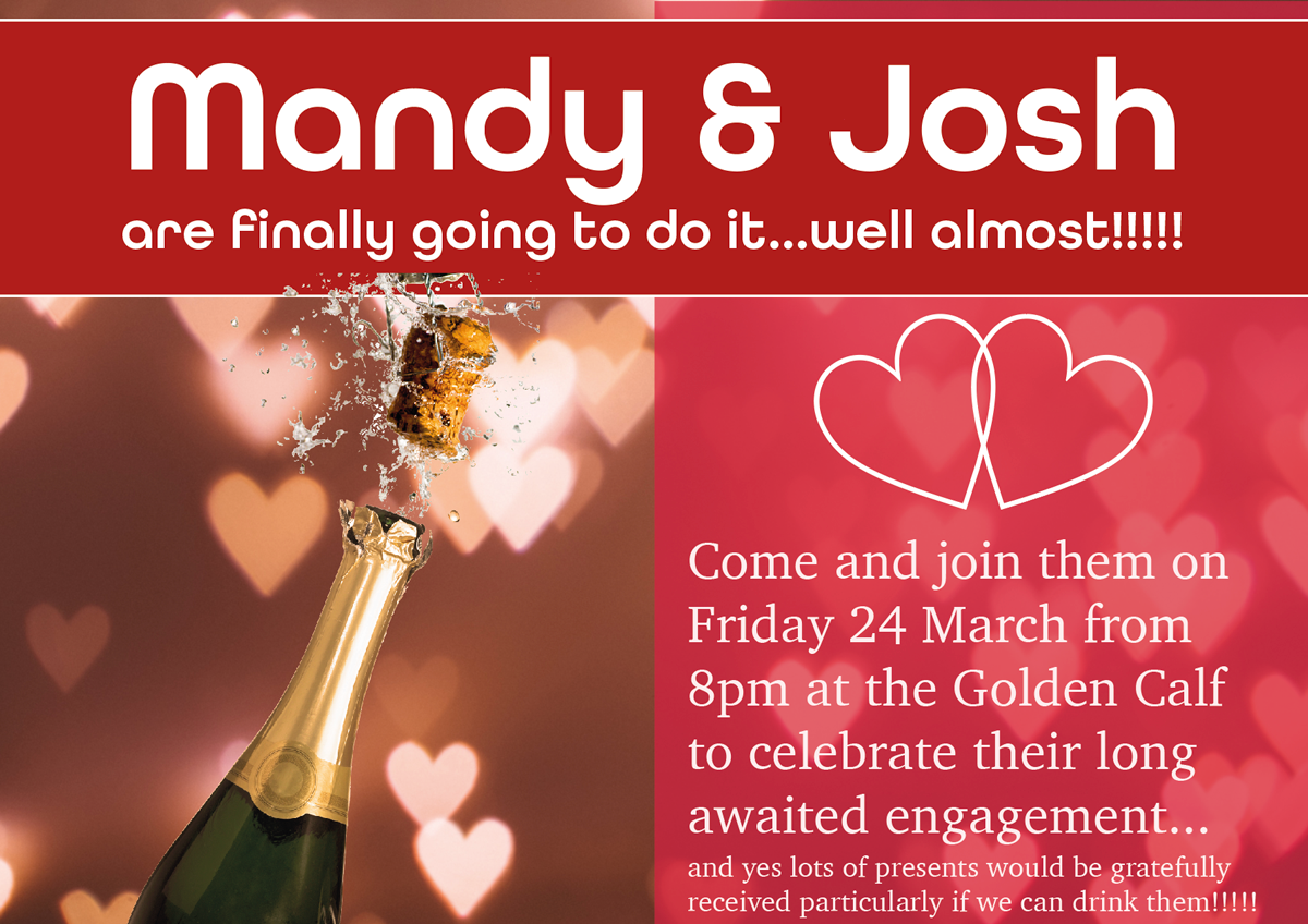
YOUR FRIENDS’ ENGAGEMENT PARTY
As the theme for this design was a ‘club night advert’ I looked up examples of this genre. Similarly to the youth club adverts, these designs use bright, bold colours and fonts, with a sense of dynamism and excitement.
VERSION 1
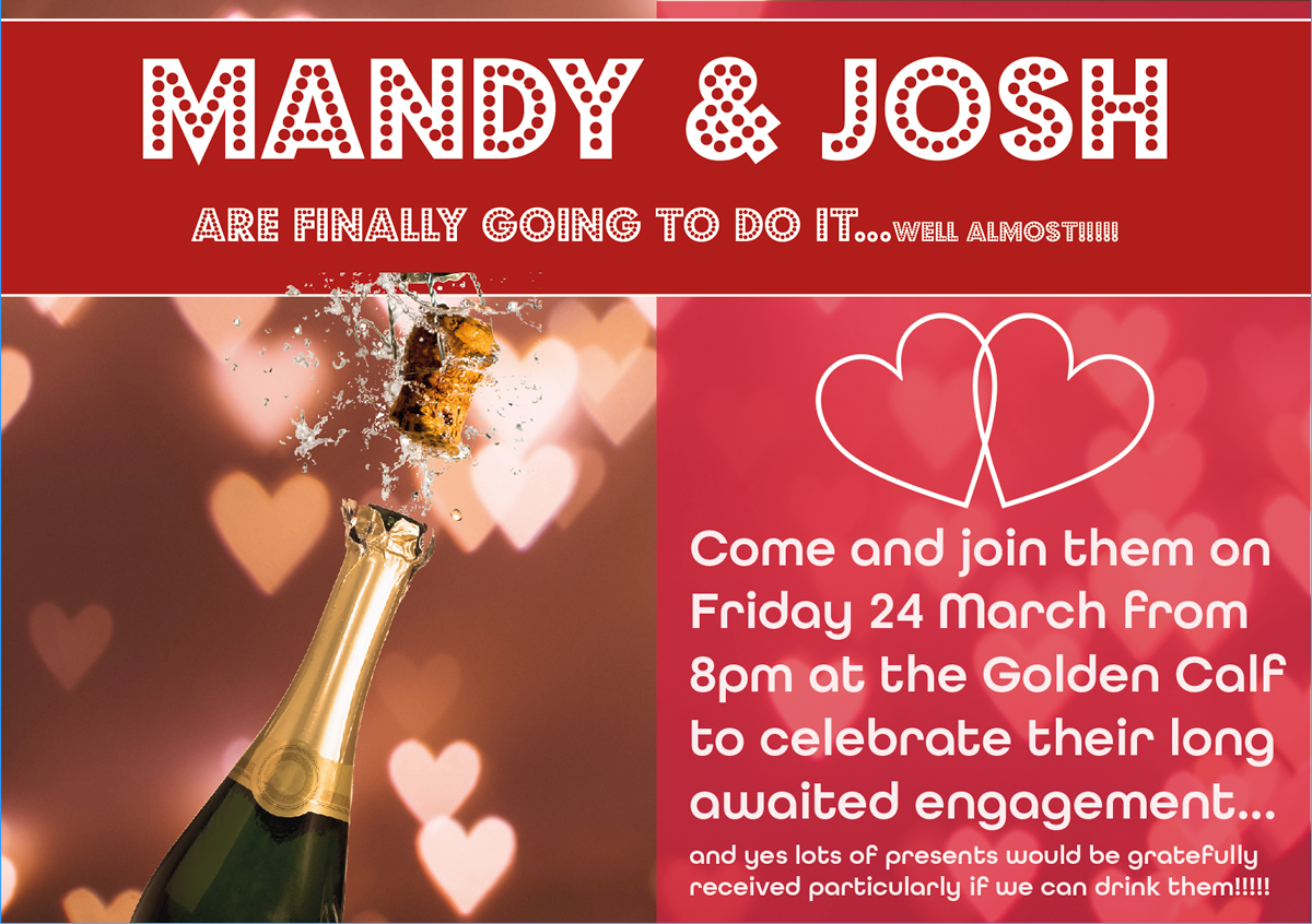
Title font: Budmo (Jiggler)
Body font: All Round Gothic
VERSION 2
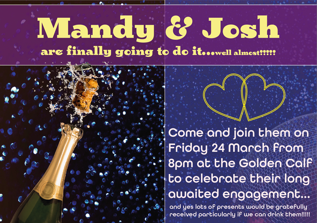
Title font: Birra 2 Stout
Body font: All Round Gothic
VERSION 3
Title font: All Round Gothic
Body font: Charter Roman
I do not think I was very successful at incorporating the ‘club night’ theme into these designs and they would have benefitted from some movement, maybe by setting the text at angles. I found it quite tricky working with such colloquial wording as most professional adverts/posters do not have wording like this. Howeve,r in terms of font choices I thought Version 2 was the worst and Version 3 the best as it is clear to read and bold. It is also obvious what is being celebrated.
(ALL PHOTOGRAPHS SOURCED FROM PEXELS.COM)
REFLECTION
I found this exercise quite tough, but it was interesting to have to think about what is appropriate for different design briefs. I feel like I am learning quite a lot about typography, but find it quite hard to apply this to my designs. I realise this will take time and practice. Perhaps I need to be more adventurous with some of my choices. It was definitely a valuable exercise for using InDesign as I am still very much a beginner in this software and this task forced me to practice using it.