Exercise: Hierarchy
BRIEF
Using about 500 words of Lorum Ipsum (or other dummy text) design three different pages:
- an interview with a TV actor in a listings magazine entitled: Will Sheila tell the naked truth?
- a review of a new piece of hardware or software in a specialist computer magazine
- a book review in a newspaper’s weekend edition.
Research these types of publications and identify three different combinations of typefaces appropriate for each publication. Invent headings and subheadings for your articles. Set these combinations so that your header is above 12 pt in size, your body text is 12pt or below and subheadings sit in between in your hierarchy.
INTERVIEW IN TV LISTINGS
I begun this exercise by looking at several examples of the different publications. Below are the ones I decided to base my designs on:
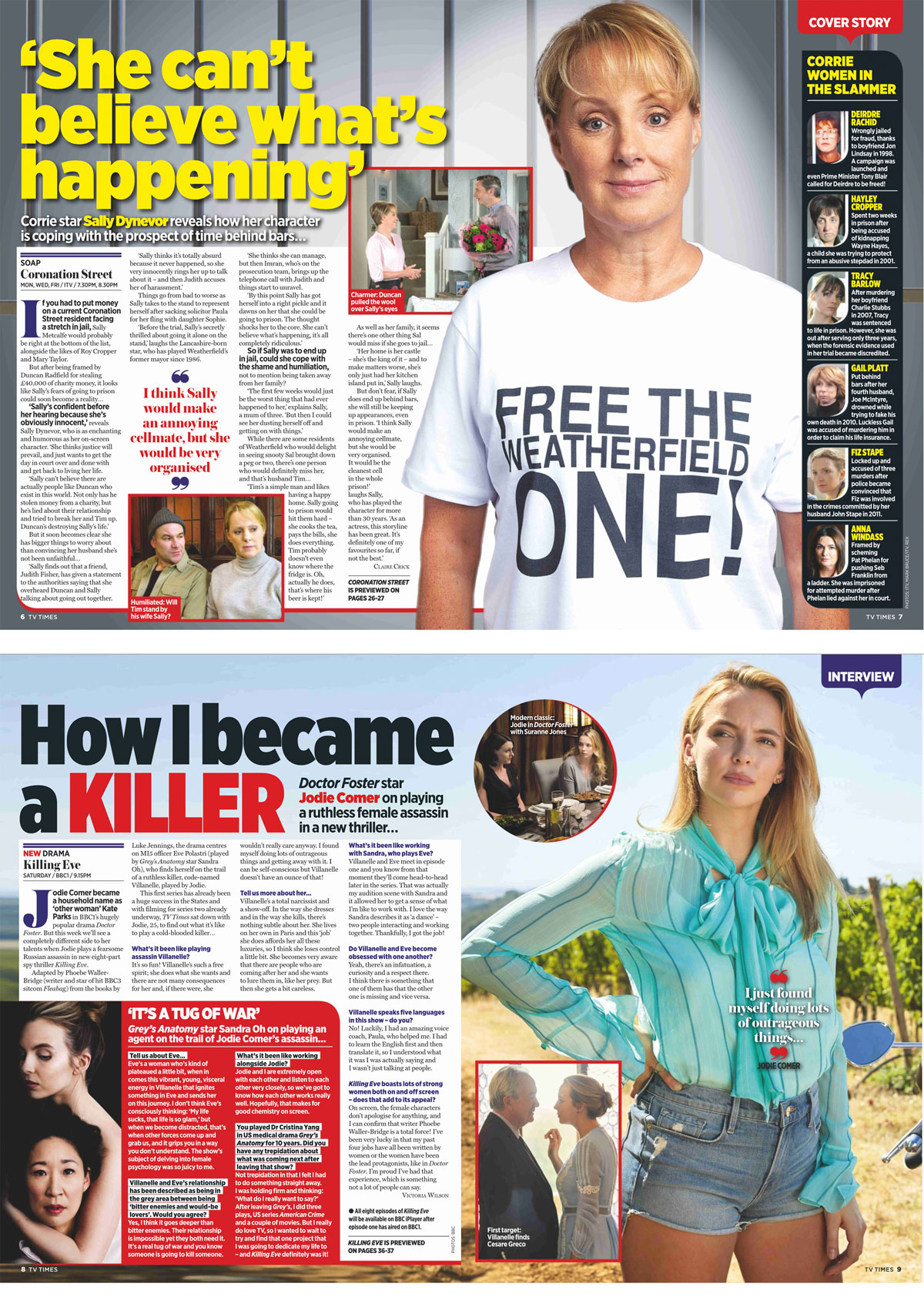
From researching this genre of design I noticed the use of big, bold fonts for the headings, generally sans serif with quite large x-heights, set at a dominant size. This makes it eye-catching and stand out against the background (generally a colour photo). The pages tend to be ‘busy’ with text boxes and images. Bold blocks of colours are used to to divide sections, to make it easy for the reader to focus. The body text is usually a serif font set in black, unless against a coloured background, when white is used in order to stand out. Colour and boldness is used to separate different ‘voices’ within the text, e.g. in the the context of an interview. A sans serif font is also often used for differentiation with a serif one. Quotes from the text are often set within the columns of body text, trying to entice the reader in.
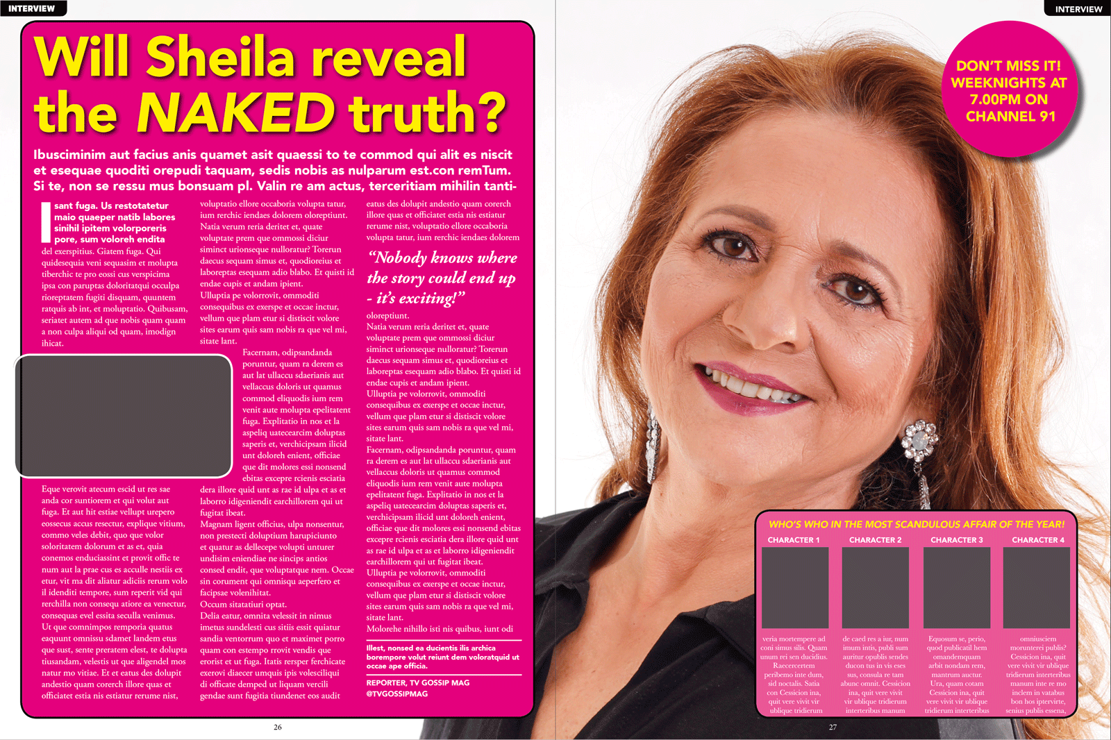
VERSION 1
For the first version of, design I used Soleto (Black and Black Italic) for all of the text apart from the body text and quote, for which I used Times New Roman. I think Soleto worked well as it is clean and bold, so it stands out and easy to read. It looks similar to the fonts used in the examples above. I’m not so sure whether Times New Roman works as it is often seen as a ‘serious’ font, so, on reflection, it may not be suited to this genre.

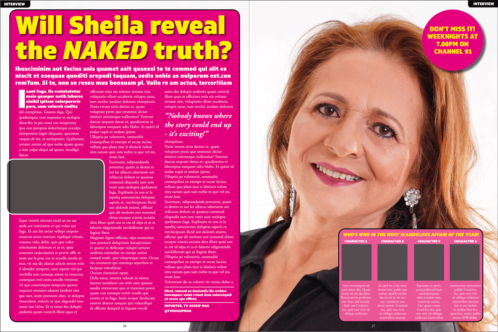
VERSION 2
For the second version I kept the heading font the same as I felt it worked well, but changed the body font to Baskerville. I thought this worked better as it looks less ‘weighty’ than the previous version, but still not right in my opinion.

VERSION 3
For the third version I changed both fonts: the body text to Adobe Garamond Pro and the header/other text to Avenir. I thought Adobe Garamond Pro worked much better for the body text as it looked more ‘reader-friendly’ than the previous two. However, I was not keen on the change to Avenir for the other text as I felt it was not bold enough, particularly for the header, as the letters were too thin.
I decided to create a final version with the combination of Soleto and Adobe Garamond Pro, which I felt worked the best and suited the genre of design.
REVIEW OF HARDWARE/SOFTWARE IN COMPUTER SPECIALIST MAGAZINE
From researching this genre I noted the clean, modern, structured layout of the pages. Columns of text with sub-headings break up the the large blocks of text, making it less intimidating for the reader. The headers tend to be san-serif as did the body text, in most cases. The use of colour for the text is fairly limited, but when it is used this text stands out and catches the reader’s attention. The style of these pages is generally very similar across the different magazines researched.
VERSION 1
For the first version of my design I used Futura (Condensed ExtraBold and Condensed Medium) for the heading and sub-headings as well as the header and footer fonts. I thought this worked quite well was it looks modern and professional. It is both bold and very readable. For the body text I used Avenir as the font, which I also thought was well suited for the context. It is a clean and readable font at the size used. I felt the combination of the two fonts was successful as they complimented each other.

VERSION 2
For the second version I experimented with using serif fonts. For the heading and sub-headings /header and footer fonts I used Museo Slab (100 and 900), a slab serif font, which I thought was readable for these elements of the page, although it probably would not work so well as body text. I used Minion Pro (Regular) for the body text, which seemed to be fairly readable at the size used. I increased the leading to add more space, which helped with this. I thought this combination worked reasonably well, but I’m not sure if it is as well suited to the context of this genre as the previous version.

VERSION 3
For the third version I returned to the sans serif typefaces and chose Avenir Next (Bold, Demi Bold, Demi Bold Italic and Regular) for the heading and sub-headings/header and footer fonts. I thought this worked quite well and was suited to the genre. For the body text I used Helvetica Neue (Regular), which although is easy to read, I felt made the page look a bit amateurish.

My favourite version, and the one I would choose for use, was Version 1 as I thought the fonts complemented each other well, suited the genre and looked professional.
BOOK REVIEW IN WEEKEND NEWSPAPER

From researching the newspaper book reviews I noted that the body text is mostly a serif font, as is the heading. The title of the book and other details are generally in a sans serif font. The heading font is large in order to catch the reader’s attention. Columns are used as per normal in newspapers and there is a sense of order to the layout.
VERSION 1
For the first version I used a few different fonts. The heading and page title, plus the body text are in Times New Roman (Regular, Italic and Bold Italic); the book information text is LFT Etica Display (Heavy and Heavy Italic); the headers are Avenir (Medium and Black); and the picture text is Tahoma (Regular and Bold). I thought this combination worked well to differentiate between the different elements of the page and improve the sense of hierarchy. All of the chosen fonts are readable in their context and pleasing to look at.

VERSION 2
For the second version I used Palatino (Regular, Italic and Bold Italic) for the body text and headers. For all other text I used Gill Sans (Regular, Bold, Bold Italic and UltraBold). I do not think Palatino worked for the main heading as the weight of the letters looked uneven at that size, however it was more suitable for the body text. I was not keen on the UltraBold version of Gill Sans for the book information section’s header as it was not very readable. Overall I did not feel this design served its purpose.
VERSION 3
For the third version I used Georgia (Regular, Italic and Bold Italic) for the body text and headers. For all other text I used Arial (Regular, Bold, Bold Italic) and Arial Black (Regular). although I thought Georgia worked reasonably well for the body text, it did not seem to look right at the larger point sizes. It appeared cluttered and not appealing to the eye. Arial was adequate and I noted it was particularly readable at the smaller font sizes, but I thought it looked a bit amateurish in the book information section.

My favourite version, and the one I would choose for use, was Version 1 as I thought the fonts all work well together, Times New Roman was a one of the few serif fonts I could find that looked good at a larger point size and the page looks visually appealing and ordered, as per the examples researched.
EVALUATION
I found this exercise very useful in terms of understanding that different fonts are suited to different contexts. It made me consider if my choices were fit for purpose (e.g. in term of the layout and where that particular text fitted into the hierarchy of the page) and through having to explore different options I discovered that some fonts compliment each other better than others. This exercise further improved my skills in InDesign and I am starting to feel much more confident using this software. I am looking forward to using what I have learnt in this exercise in future ones.
ALL PHOTOS USED IN MY DESIGNS TAKEN FROM: PEXELS.COM