Exercise: Book Cover Design
BRIEF
To design a stunning and contemporary cover for one of the 20th century’s most acclaimed authors, HG Wells.
Known mostly for his science fiction writing, HG Wells also wrote social novels that are still relevant today, covering topics such as the mid-life crisis, class, feminism, materialism, consumerism and love. Your challenge is to create cover designs for three of his books that work as a set and establish the books as timeless fiction. The books will be published in a paperback format and need to include the title, author’s name, publishers name and trademark. You only need to design the front cover and spine.
Summary of brief:
Create contemporary designs for three H.G. Wells books, which work as a set.
The designs should establish the books as timeless fiction.
To design the front cover and spine of each book, to include the title, author’s name, publisher’s name and trademark.
KEYWORDS FROM BRIEF
Stunning, contemporary, 20th century acclaimed author, science fiction, social novel, relevant today, mid-life crisis, class, feminism, materialism, consumerism, love, work as a set, establish, timeless fiction, paperback format, title, author’s name, publisher’s name, trademark, front cover, spine.
CHOSEN BOOKS
1. The War of the Worlds
2. The Invisible Man
3. The Time Machine
RESEARCH
Initially I thought of general ideas for research and how these could be explored, as detailed below.
Primary Research:
*Read the chosen books to understand the main points, themes and genre of the story.
*Investigate cover design examples of previous and current editions of the chosen books – are there any common themes? Are there any that buck the trend and could be considered radical?
*Look at examples of contemporary cover designs of books from the same period or genre.
*Start a swipe file for both of these points to refer back to. These resources could be sourced at a library or bookshops, but online would provide a wider catalogue to compare.
*Look at books created as part of a set – what links them together?
*Find out any practical requirements for book cover design – are there any industry standards to adhere to – size of cover and spine, what is the trademark required, bleeds/margins? This information may be available on publisher websites, or otherwise in a relevant book or online.
Secondary Research:
*Due to time restraints, it may be possible to only read synopses of the books, which should be gathered from a reliable source.
*Establish the target audience for the chosen books – gender, age, ethnicity (would there be any language barriers depending on countries the book is published, which could limit the use of text?). This could be established after reading the books or is most likely available online (from a reliable source), but I would have thought the publishing house would provide this information in the brief.
*Watch film versions of the books could provide the overall gist of the story, but I would have to ensure it is a reasonably reliable interpretation of the original.
Reflecting on these techniques, it became clear that certain ones were more appropriate and practical for this exercise. As most work has a set time limit it was not very realistic to read through and digest three books to fully understand the themes, underlying meanings, historical context, etc. Therefore a summary of the story would suffice (and if this was a real brief I would expect the publisher would provide this). In this case, I had previously read both the War of the Worlds and The Invisible Man so I was familiar with the stories.
As a designer, however, the visual representation is the main interest so looking at examples of book cover designs is definitely a valuable use of time. I found Pinterest to be an excellent resource for this. It was possible to compare the covers visually as a group and therefore notice any trends and themes depicted for each title. Also, it was generally possible to gauge the intended audience for a book from just looking at the cover and to identify books that have been designed as part of a set. I also used Pinterest to explore contemporary book cover designs in the same manner and this was beneficial when thinking of possible designs of my own. I have expanded on my use of Pinterest in the section below.
SWIPE FILES OF EXAMPLES (PINTEREST)
As outlined above, I created Pinterest boards for each of the chosen titles alongside one for contemporary book design covers. These can be found below:
The War of the Worlds
The Invisible Man
The Time Machine
Contemporary Book Cover Designs
I then picked out five examples from each board, which stood out to me.
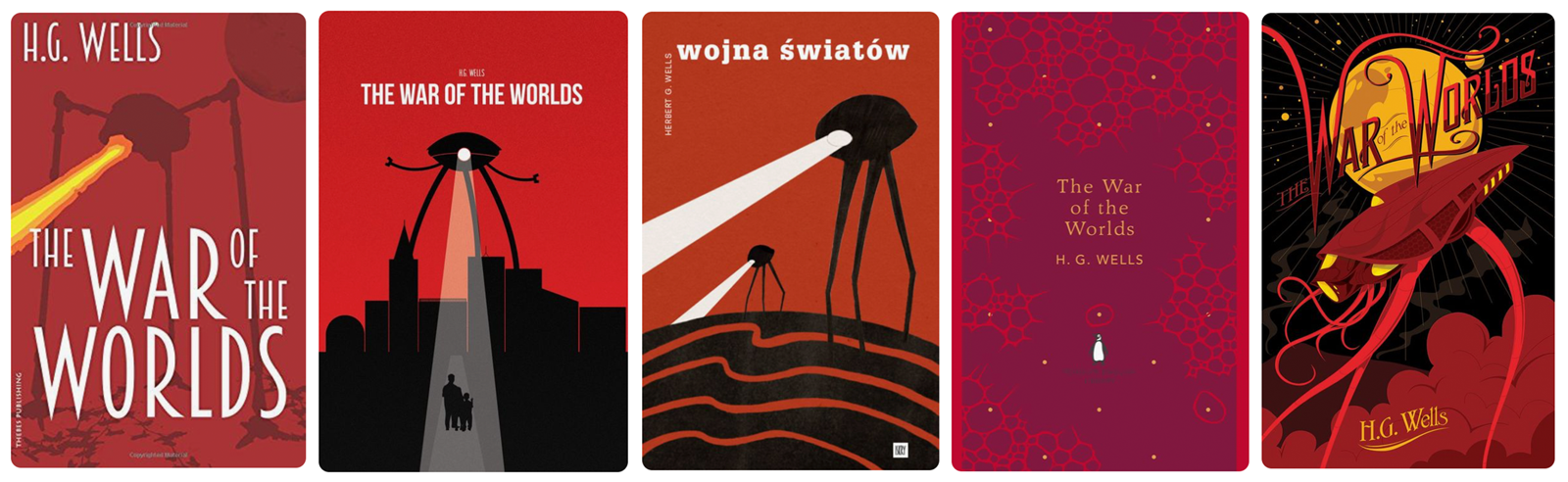
The War of the Worlds: The most obvious point to make about this selection is the dominance of the colour red, which I would suggest emphasises the overall theme of danger and threat of this story. The tripod fighting machine features in four of the designs, the first three being quite simplistic, bold silhouettes – I wanted to incorporate the use of vector illustrations into my designs, so these were important to have as reference points.The fifth design is more stylised and reflects the period in which the book was written. I chose the fourth design as it was different, so stood out (and it is one of a set, as can be seen in the selections below).
The Invisible Man:
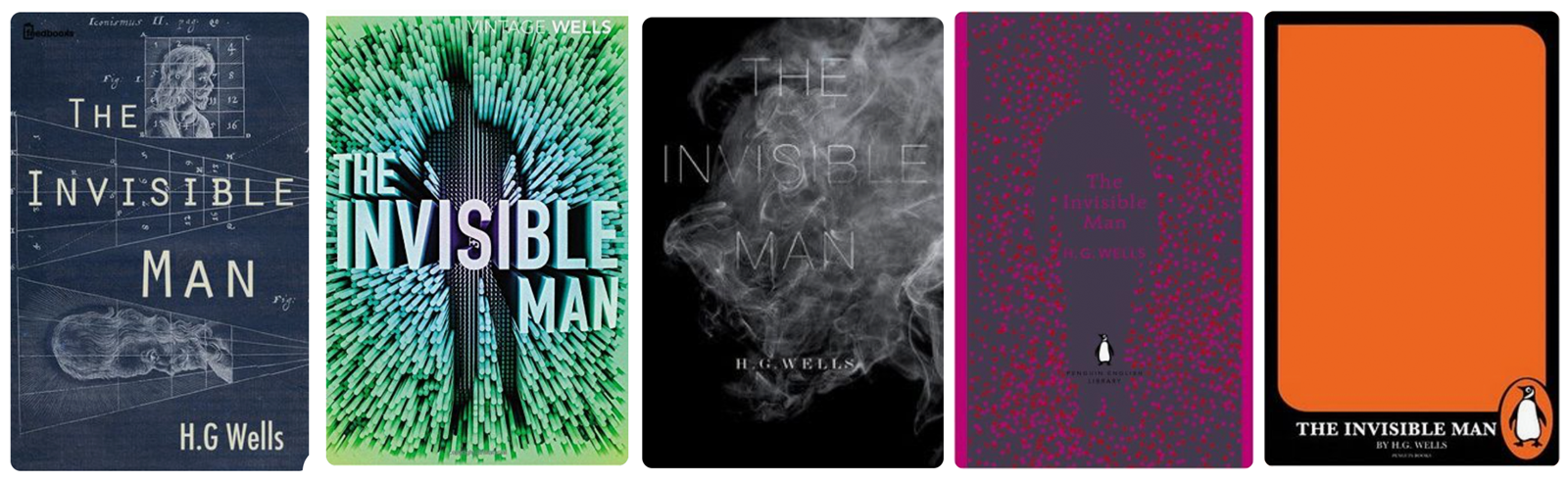
This group had the most variety of covers to choose from. The first design reflects the scientific nature of the book, whilst the second and fourth designs both show an outline of a man in the centre of the page. I liked the use of the ‘barely there’ font in the third design and how it is almost lost in the wisps of smoke. I think my favourite is the fifth design as is so simple yet effective, especially if seen alongside other titles of the same style.
The Time Machine:
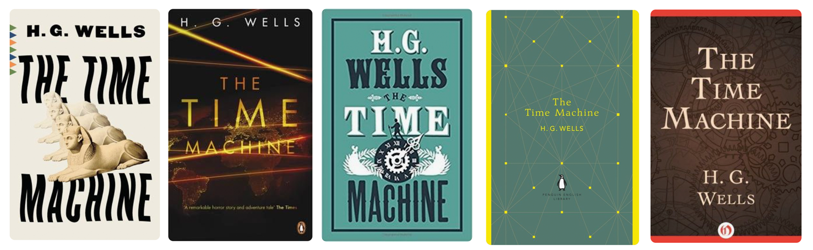
I particularly liked the warping of the text in the first design, along with the varying position and opacity of the four sphinxes, which creates a sense of movement (i.e. time travel). Movement is also implied in the second design with the beams of light going across the page at different angles. Similarly, the four design has a sense of movement albeit structured by the placement of the dots on the lines. In like the symmetrical layout of the third design and, again, the use of silhouettes for the illustrations. The use of layering and opacity in the fifth design creates a sense of both movement and depth, as well as the reflecting the complexity of the subject of time travel.
Contemporary Book Designs:
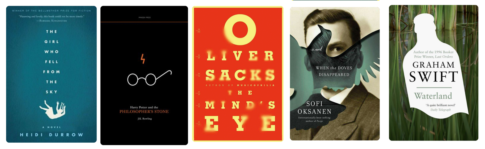
I really liked the use of the text in the first design to emphasise the title along with illustration and the use of the blue and white reinforces title as well. The simplicity of the second design is possible because most people would recognise the scar and glasses of Harry Potter (so much so that the text is almost not necessary!). I also felt the colour palette could represent a school chalkboard. I found the third design to be visually effective as it appears to be an eye sight test, but the use of blur is quite disconcerting. I liked the sense of depth created in the fourth design by the overlay of the dove image and use of an inner shadow. Again, another example of using a silhouette, this time over a photograph – in this case the use of white makes it look as though the object has been cut out and removed from the design.
MIND MAPPING
Using the images explored above and after reading general synopses of the three books on Wikipedia, I created a mind map of the key points. I also mind mapped ‘contemporary book cover designs’:
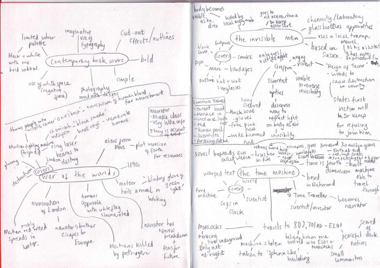
I found it beneficial to group together all the information/ideas I had gathered, from which I could then build concepts for my own designs.
KEYWORDS FROM MINDMAPPING
There were some keywords/themes, which were common across the three mind maps for the chosen books:
Destruction, threat, mankind in peril, extinction, scientists, menace, male, death, violence, ‘unhappy’ endings, science fiction, predicting the future?, red, based in South East England, machines, weapons, narratives are accounts of events.
POSSIBLE SOLUTIONS TO THE BRIEF
From looking at examples of other covers for these three books, the majority used the most obvious solutions for the designs:
*The War of the Worlds: represented by the tripod Martian fighting machines with a laser beam being emitted, wreaking havoc on the human race.
*The Invisible Man: generally depicted by a representation of an ‘invisible man’ – i.e. the outline of a man wearing a coat, wrapped in bandages, sunglasses, smoking a floating pipe/cigarette, etc.
*The Time Machine: generally either represented by a depiction of the scientist/inventor on the time machine or the cogs of a clock to represent time.
Many of the covers are illustrations and are not obviously contemporary, this may be due to the period the books were originally written.
So the obvious solution would seem to be to design covers that show a character or scene from the stories.
As a reader, I personally prefer it when books do not have an illustrative representation of the characters as I like to use my imagination to create my own image of what they look like, so most of these cover designs do not appeal to me.
I decided to experiment with three different routes for my designs: photograph-based, text-based and minimalistic vector illustrations, inspired by some of the contemporary designs I had previously looked at.
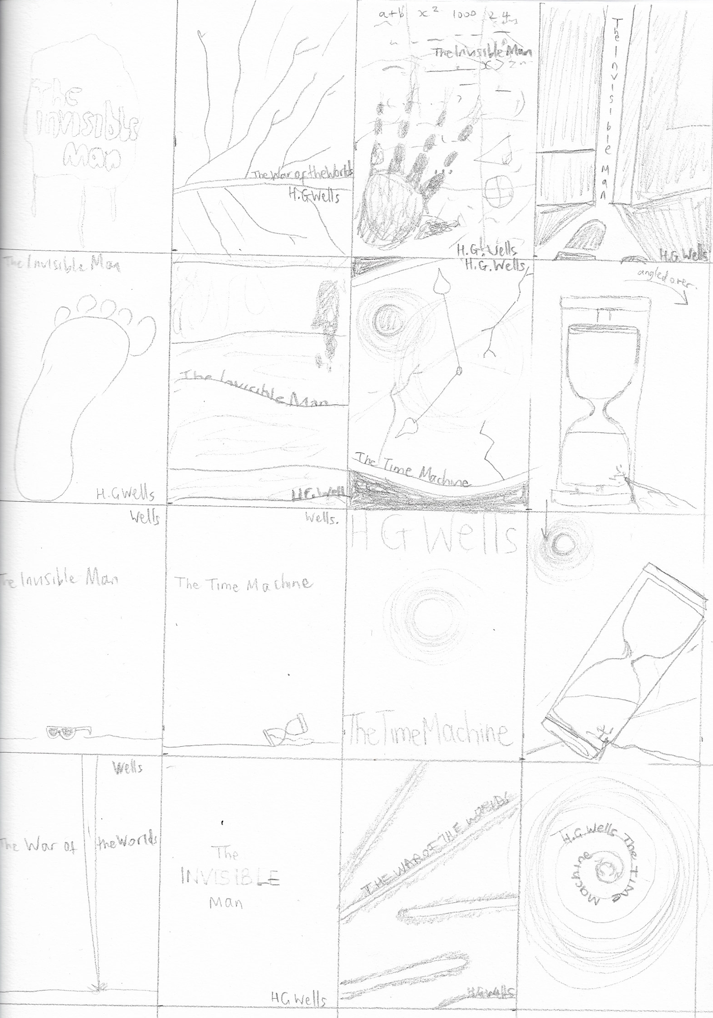
THUMBNAILS
I initially drew out some rough thumbnails of ideas, which loosely outlined some potential designs to test out.
ROW 1 (L-R): breath on mirror/window with title in centre; close up of red leaf; bloody handprint on page of formulas; light through crack of doorway with footprint in foreground.
ROW 2 (L-R): footprint; close up of bloodied bandages; close up of cracked clock with red sun reflecting in glass; cracked sand timer.
ROW 3 (L-R): sunglasses; cracked sand timer; red sun; cracked sand timer with red sun.
ROW 4 (L-R): fighting machine tripod leg; word ‘invisible’ rubbed out; laser beams across cover; title being ‘time-warped’.
VERSION ONE
The first route I decided to take was to scan three objects that I felt represented the stories and then using Photoshop I stylised these images. For The Invisible Man I scanned my hand, for The Time Machine I scanned a clock face and for The War of the Worlds I scanned a leaf. I scaled the images up and then used layer styles and blending modes. I decided to use red as this represents the themes of ‘danger’ and ‘threat’ that are common with all three books. I chose the font ‘Furore’ as it has the appearance of both the Industrial Age (the period the books were written) and also science fiction.

VERSION TWO
Next, I chose to work on text-based designs. I was not sure how successful these would be as I am in the early stages of learning about typography. I used League Gothic for these designs as it is would link back to the period the books were written, whilst being strong and bold on the page. I thought this was important for designs based on text for impact.
For The War of The Worlds cover I used the shape tool and layer styles to create the laser beams, which I also applied to the text. I originally was going to use a white background, but then decided the a darker one would be more striking in contrast to the beams. I positioned the beams and text at different angles to create a sense of chaos.
For The Time Machine I used liquify, blur, scale and opacity to create the appearance of a ‘text time warp’. This ideas is directly influenced by the example from Pinterest shown above.
I created two versions for The Invisible Man. For the first one I sampled used blur and opacity to give the impression of the text being ‘invisible’. This was influenced by the Oliver Sacks cover design shown above. For the second version I tried to create the impression of the word invisible being cut out using Layer Styles.

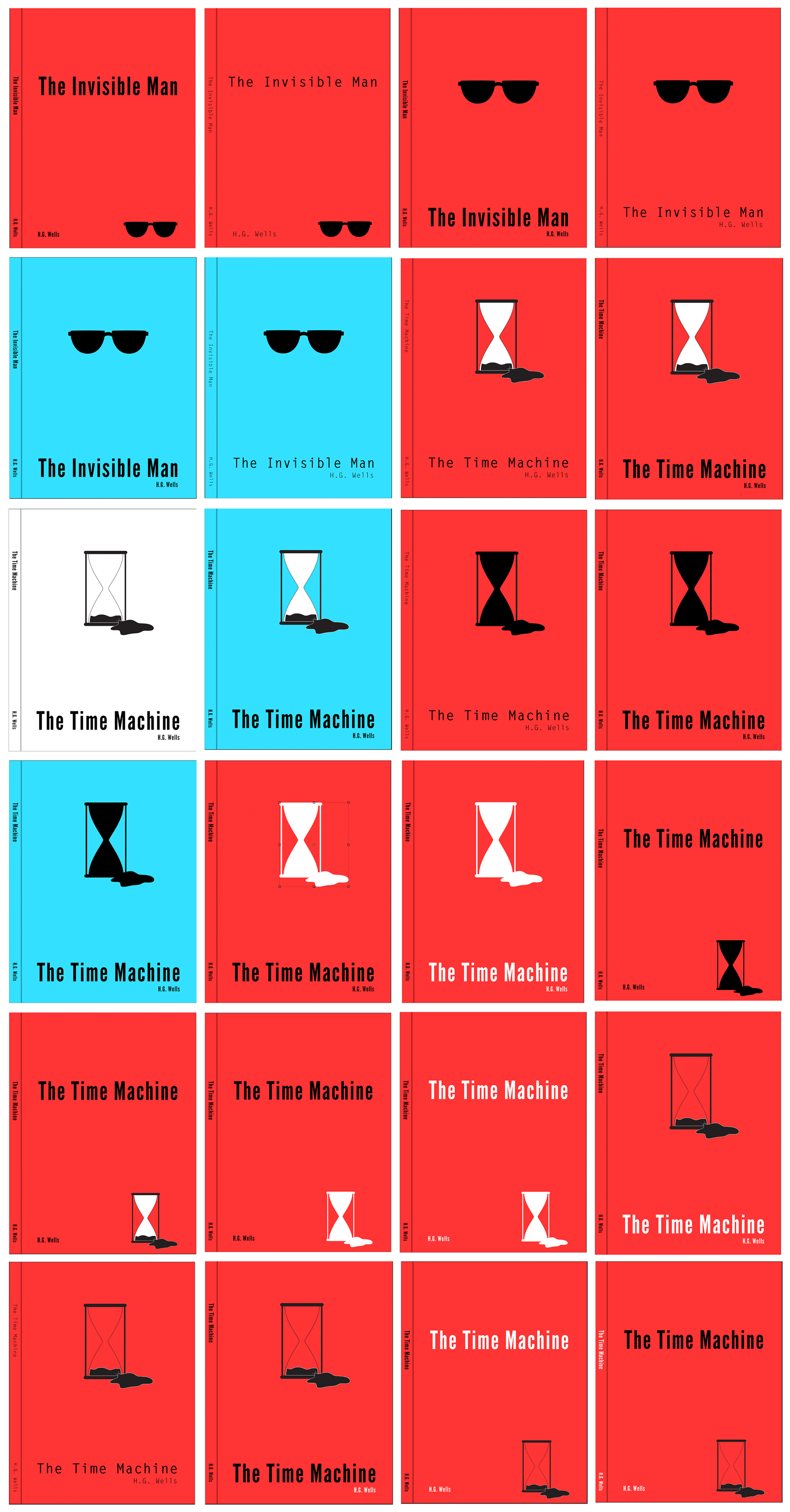
VERSION THREE
The final experiment was to create minimalistic vector-based designs. I wanted these to be more contemporary in appearance – similar to the cut-out style of some of the Pinterest examples. I created very simplistic vector illustrations of a sand timer and sunglasses in Illustrator for The Time Machine and The Invisible Man respectively. I then tried out various layouts for the cover. I experimented with both Letter Gothic and League Gothic fonts, but I felt that the latter looked better as it appeared stronger on the page, which was what I was trying to achieve with these designs. I think it was well suited to the bold style of the illustrations. At the time I was unable to think of an object that could represent The War of the Worlds, which is why I only created examples for the other two.
EVALUATION
I believe that working on the three versions was a good learning experience as the styles are so different, so I wasn’t fixated on one solution as I have often done previously and this is something I need to build on in future exercises. I need to improve the quality of my thumbnails as I did not find them to be particularly useful. I also need to show more of my working stages and comment on the process.
Out of the three versions, I prefer the third group as I believe it meets the criteria for being contemporary more than the other two. I like its simplicity and boldness. I think it is quite striking. I feel that the first version would fit in nicely with other science-fiction books and I learnt a great deal creating these ones. The second version is probably the weakest group as it relies on typography, which is not something I am very strong with at the moment. However, I did enjoy creating the various effects.
Note: I also realised at the end that I did not add the publisher’s name or trademark to any of the designs, but this could be added as required.