Assignment 5: Your Choice
For the final assignment I chose to undertake Brief 1: Book Design. This was the one that appealed to to my interests the most and I enjoyed previous exercises, which were based on designing book covers.
BRIEF
Penguin Books have asked you to design a new house style for a collection of books on design for children and young people.
They are starting with three titles: Colour, Typography and Photographs. You will need to produce three covers (front, back and spine). The designs will need to be recognised by readers as a series and at the same time be appreciated on their individual merits. The book dimensions are 190mm wide by 225mm high.
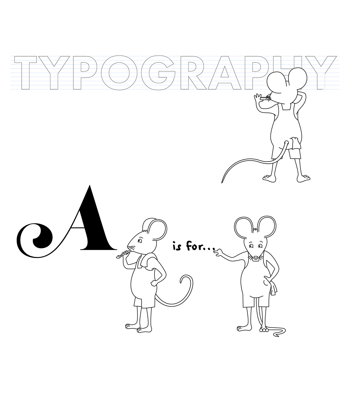
In addition they have asked you to produce the one on typography called A is For… It doesn’t have to be a conventional text book. Create an introductory chapter of at least 4 pages that is visually interesting and will entice young people into wanting to buy the book and read more about the fascinating world of typography.
Work through the design process, researching and visualising range of ideas before critiquing your work and choosing your selected design to present as print ready artwork.
ANALYSING THE BRIEF
KEYWORDS
- Collection of books
- Children and young people
- Three covers (front, back and spine)
- Series
- Individual merits
- Doesn’t have to be conventional
- Introductory chapter (4 pages)
- Visually interesting
- Entice young readers
TARGET AUDIENCE
Although the brief does state a target audience of children and young people, this covers a wide age range. It would have been helpful for this to have been more clearly defined as book categories are generally subdivided into various age ranges and the cover designs would be created with this in mind. Although the books would be educational, and therefore may be used in a school setting, it was important to make sure the books stood out from standard ‘boring’ or dry textbooks and really sparked a creative interest for the topics.
PURPOSE
To encourage young people to pick up (and buy) the series of books to learn more about each of the three topics.
ISSUES WITH BRIEF
- Although I thought ‘colour’ and ‘photographs’ would be accessible subjects for younger children, I was not sure about ‘typography’, so I would have preferred a defined age range for the target audience rather than the open ‘children and young people’, which could include 0-16 years. This would also have assisted in determining the appropriate style of illustration, etc.
- I also did not find the information provided in the brief clear in terms of the title of the books. Initially these are stated as ‘Colour’, ‘Typography’ and ‘Photographs’, but the second part stated that I was to produce the one on typography called ‘A is for…’. I would have found it helpful if this had been clarified more concisely. I tried looking at some examples fo previous students’ work, but some had used the latter as the chapter title and others for the book title, so this was even more confusing to me.
SIZE
190mm wide by 225mm high
SPECIFIC REQUIREMENTS
The two main requirements I could think of were to include the Penguin logo and ensure the final covers appeared as a complete set, whilst also having individuality.
SOFTWARE
I planned to use Illustrator for any vector illustrators and for creating the title text; and InDesign for the layout of the three covers and the internal pages. If I was to include any photographs, I would have used Photoshop for any clean up or effects required to improve these.
BUDGET
This was not specified in the brief, but considering that Penguin is one of the biggest publishing houses, I would not have thought there would be much restriction in terms of budget for a quality product, within reason.
GAPS IN MY KNOWLEDGE
- Designing for the defined target audience – research books aimed at this age range.
- Creating a series of designs that link together – look at how other book designers/artists have tackled this.
SUCCESSFUL OUTCOME OF BRIEF
This would ultimately be based on the sales of the finished books.
RESEARCH
To begin with I found some short videos in which the important points of book cover design are discussed. I found these to be very useful, particularly the one by Chip Kidd in which he states that you should either show the word or the image of an object, not both as this treats the audience like a ‘moron and states the obvious.
- The Hilarious Art of Book Design – Chip Kidd
- Inside Random House – The Art of Cover Design
- 4 Key Elements of a Killer Book Cover Design
- Project Remix: Tips on designing a book cover with designer Laura Bird
- Cover to cover: book design in focus
- Chip Kidd: The art of first impressions – in design and life
I decided to find out some more about the history of Penguin book cover designs. I read through the following articles:
- 20 inspirational Penguin book cover designs
- All The Colours of Penguin
- BBC Arts – Designing obsession: The book covers that brought art into the home
I then looked at various examples of book designs for various Penguin’s series:
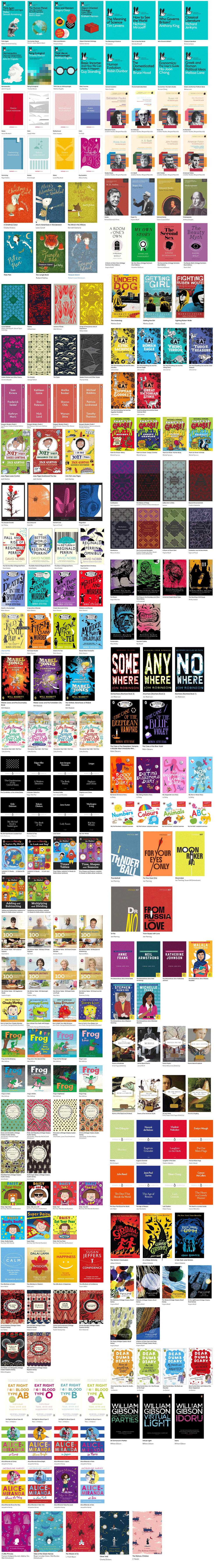
From looking at these examples, I noticed several design ‘tools’ used to link the books in each series:
- The layout – on many of the covers the positioning of the text and/or placement of the illustration is the same for each book, which I thought was the most obvious factor in determining the group being categorised as a set.
- The style – the same font choices and illustrative/photographic style has been used on each cover, even though the wording or subject is different.
- The colours – the choice of colour is generally the most obvious design aspect that is changed from book to book, which I thought was a good way of differentiating between them at a glance.
I then searched for some examples of reference books aimed at children/young people. The first that came to mind was Horrible Histories and Horrible Science, both of which I remember reading when I was younger:
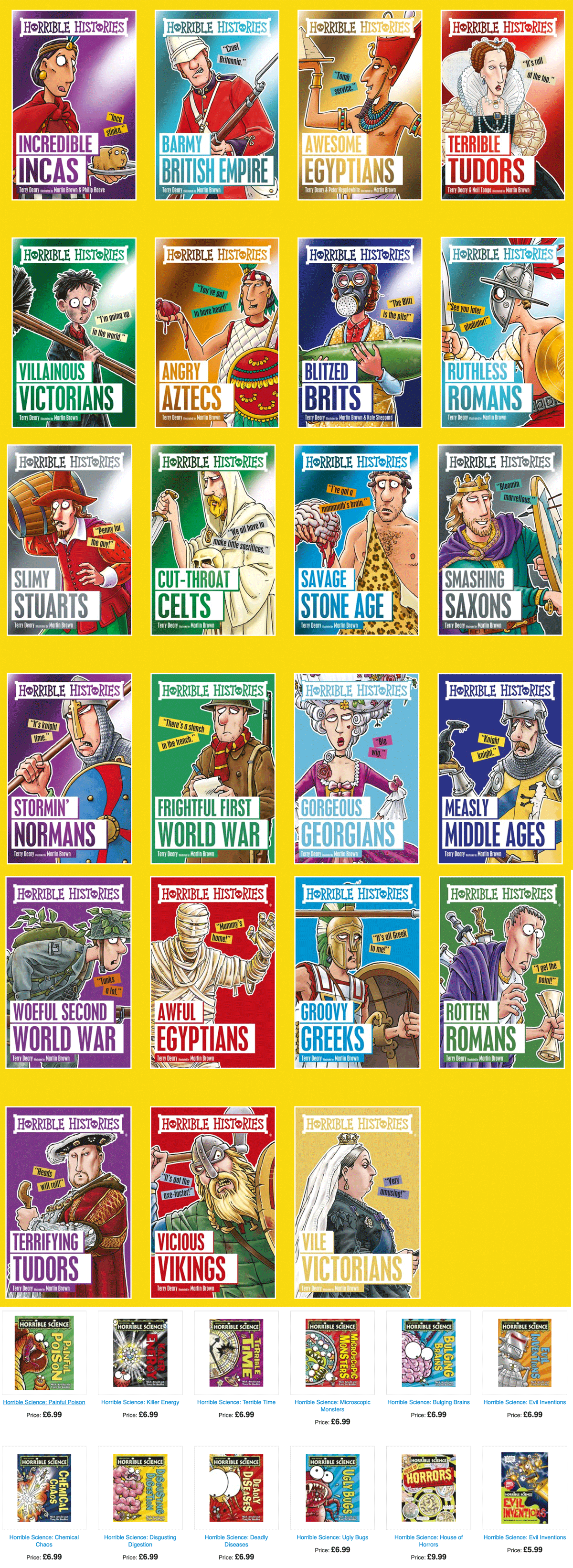
I noted that these covers follow the same design ‘rules’ as those I found above, e.g. the position in of elements in the layout is the same for each one. These covers also use characters, humour and play on words – all of which would appeal to young people. The designs are bold, bright and colourful – they are certainly eye-catching and instantly recognisable as a set.
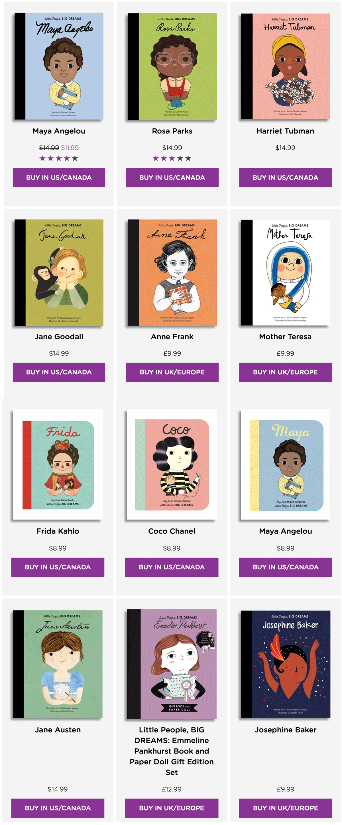
The next examples I came across was Little People, Big Dreams, which also follow the design ‘rules’ I stated above. These illustrations are portraits of the subjects for each book. I noted that even though these drawing were created by different illustrators, they still work perfectly as a series.
I then found various examples of children reference book cover designs on Templar Books and Big Picture Press, a selection of which can be seen below.
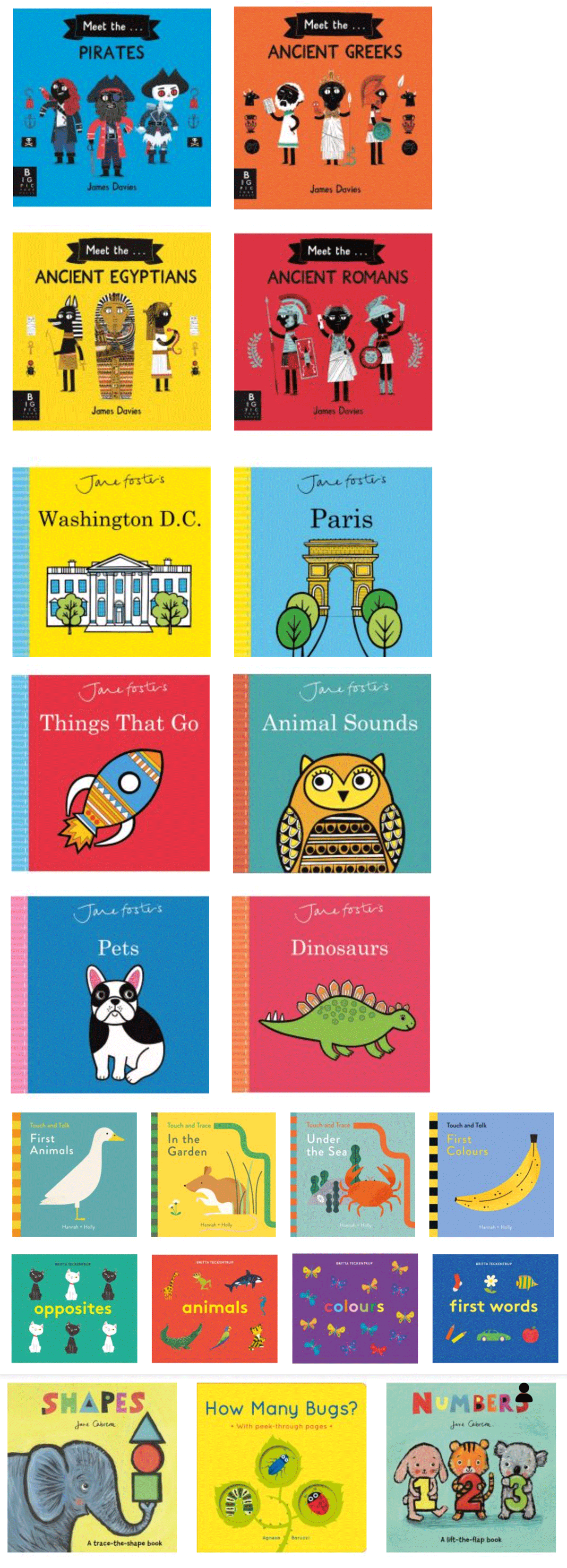
These ones are aimed at younger children, but I liked the simplicity of the layouts and the illustrations. I thought they would be very appealing to their target audience.
The final example I looked at was the DKfindout! series.
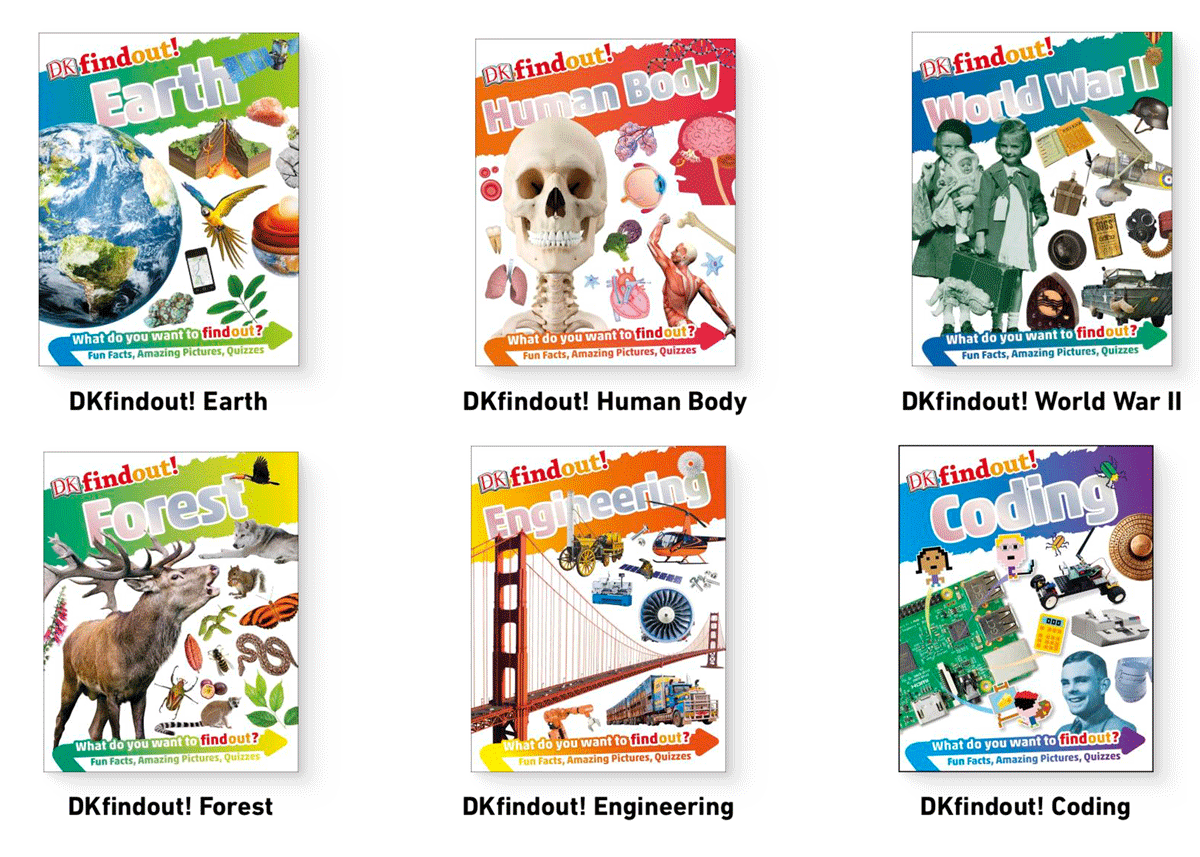
These ones differ from the previous examples as they use collages of related images (both photographs and illustrations), however, they do follow the layout ‘rule’ as previously defined and therefore it is clear they are part of a series.
IDEAS
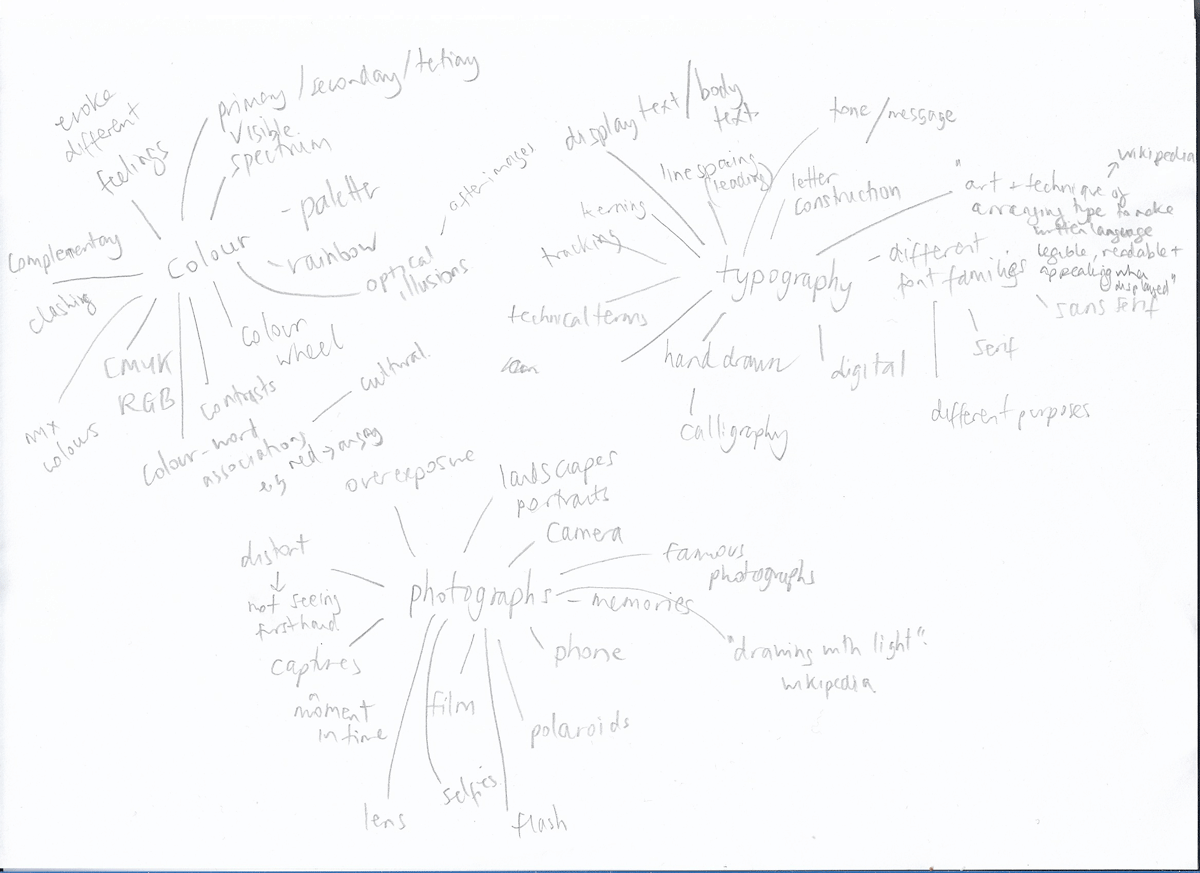
I then moved onto drawing mind maps of the three subjects and noting down as many associated words as possible.
I started by playing around with some initial concepts, but although I though individually there may have been possibilities, I did not believe they would be specifically aimed at young people and I could not think of how to make them link to one another very well.
I was most drawn to replicating a similar style to that used for the Horrible Histories, so I decided to go the character route, as this does seem to be popular and effective. I also planned to (attempt to) include humour in the designs.
SKETCHES
I made some very rough outlines for 3 different scenes for each of the books. I chose to use three mice as my characters because I prefer using animals and anthropomorphism does seem to be effective with young children. The three covers would be based on the following:
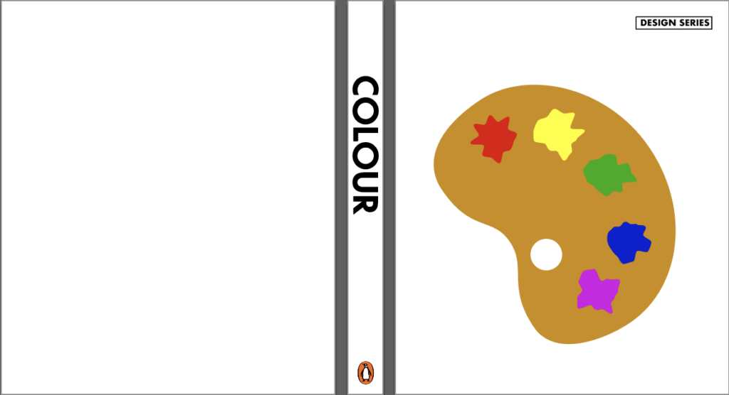
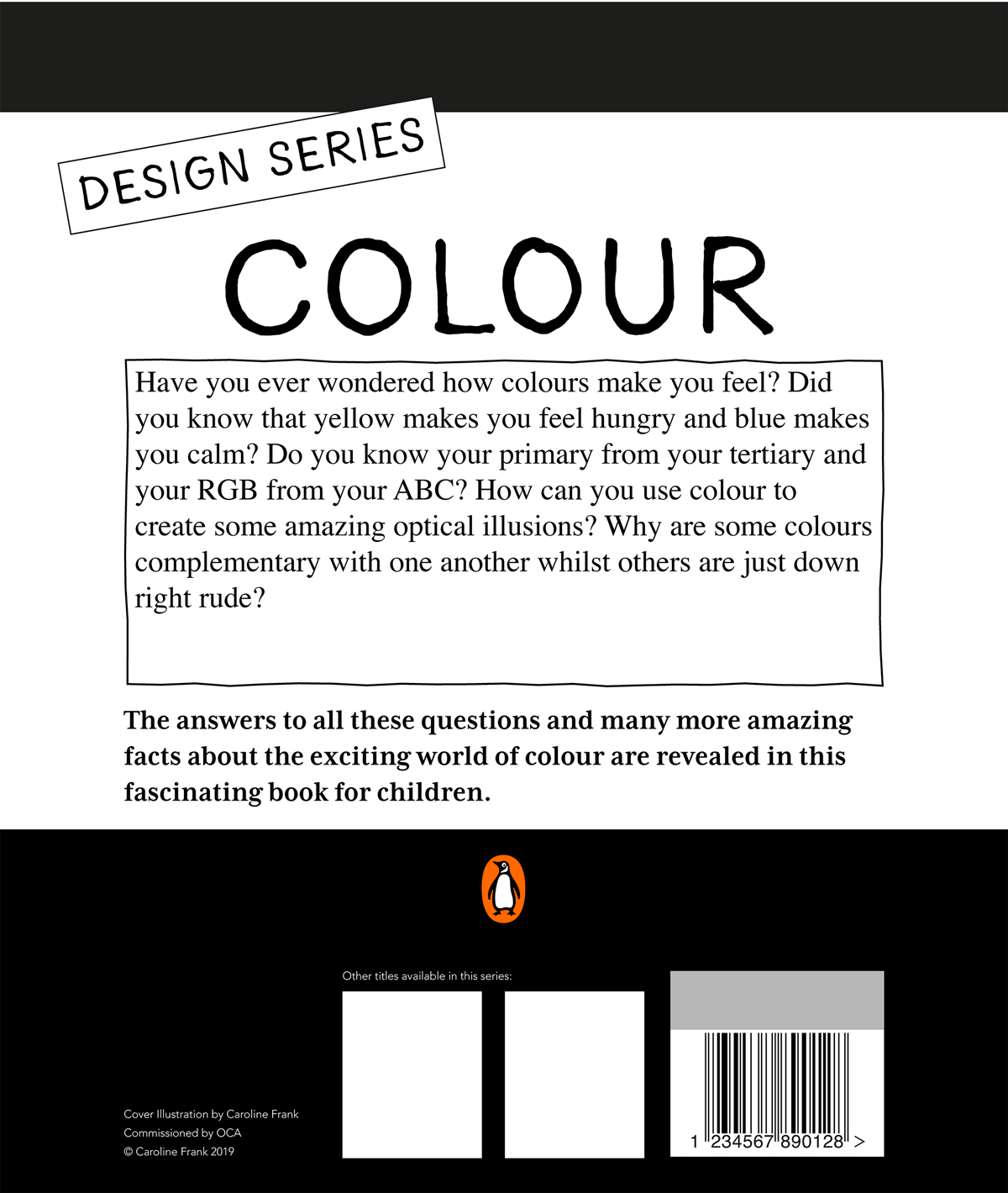
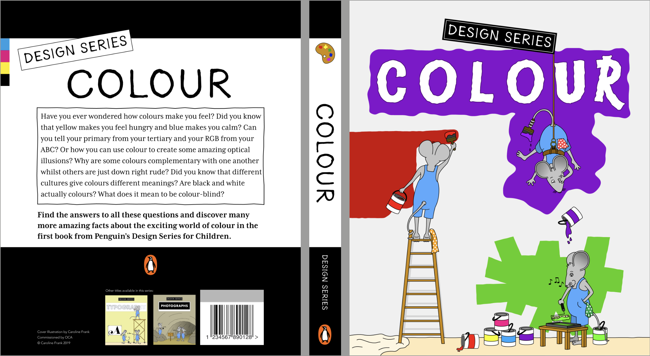
Cover 1 – Colour – the three mice characters painting the cover.
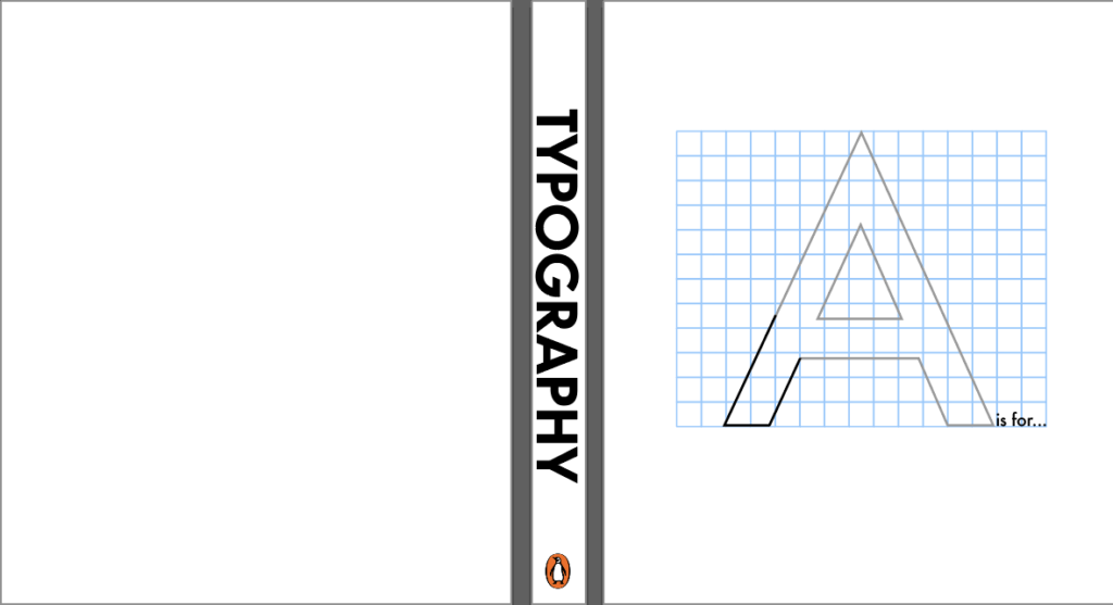
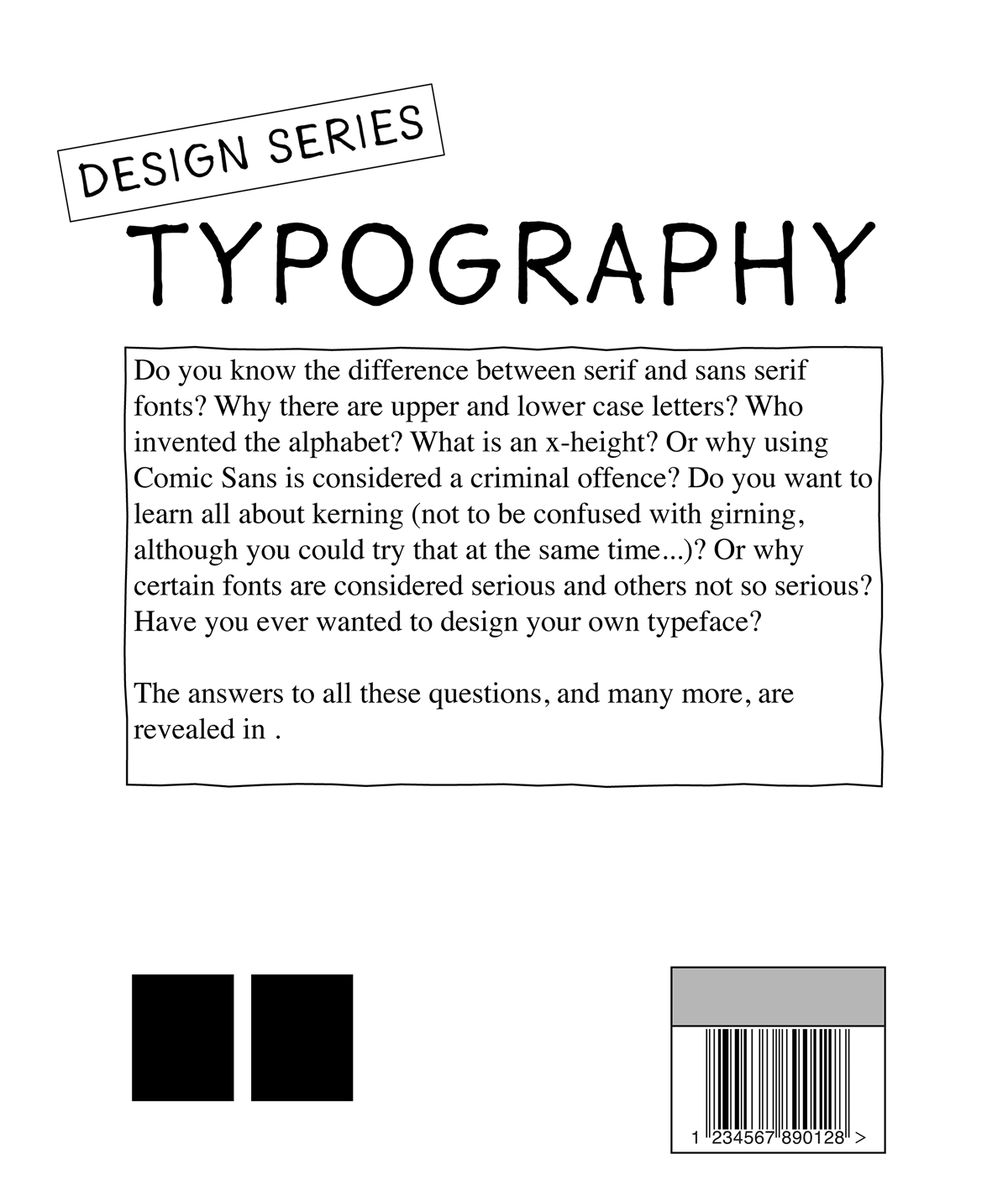
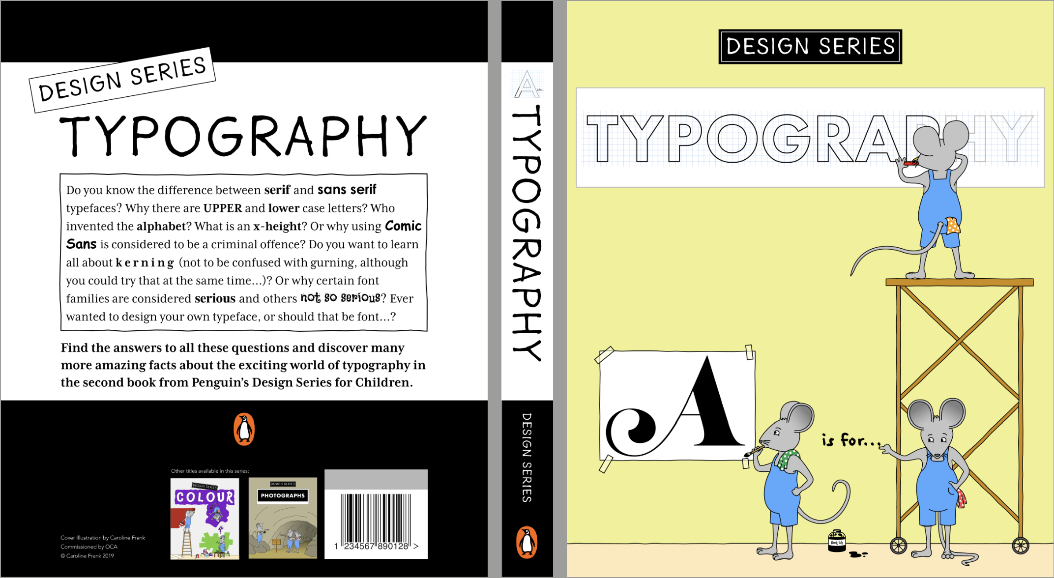
Cover 2 – Typography – each of the three mice designing a different typeface.
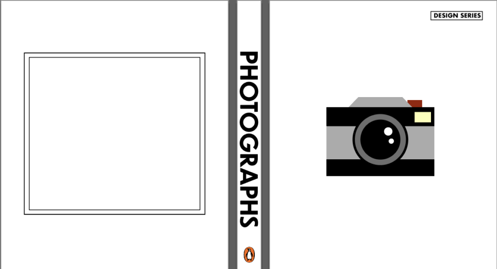
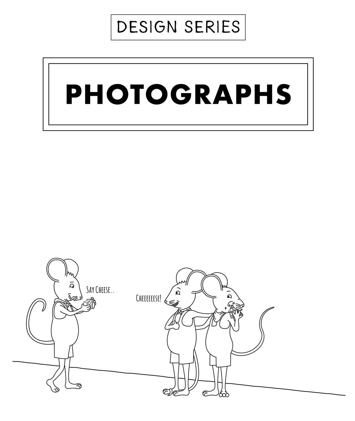
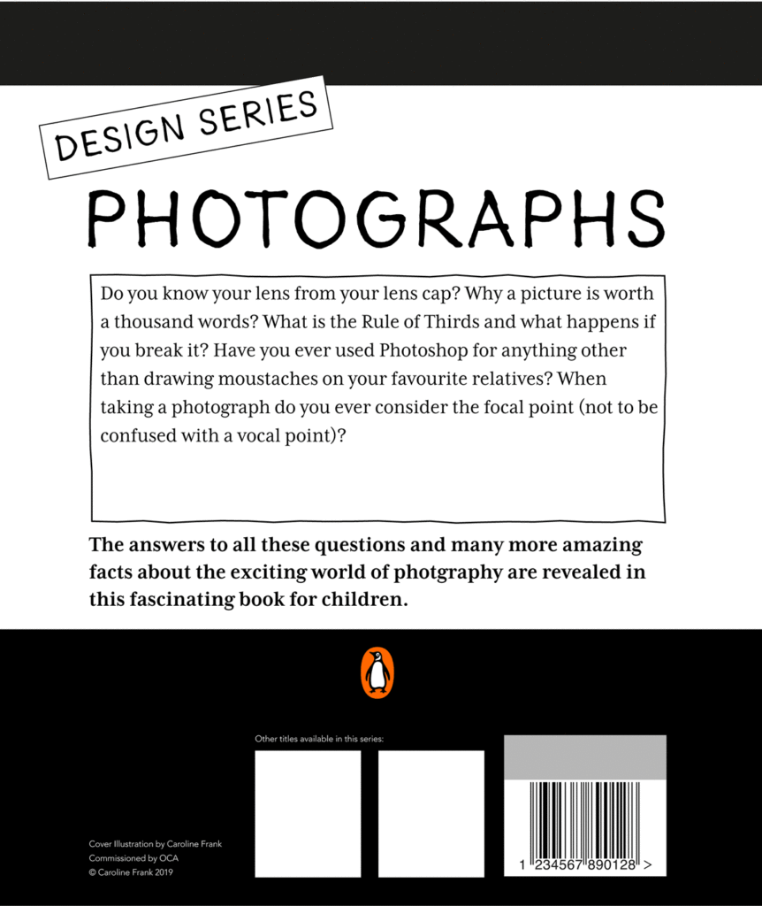
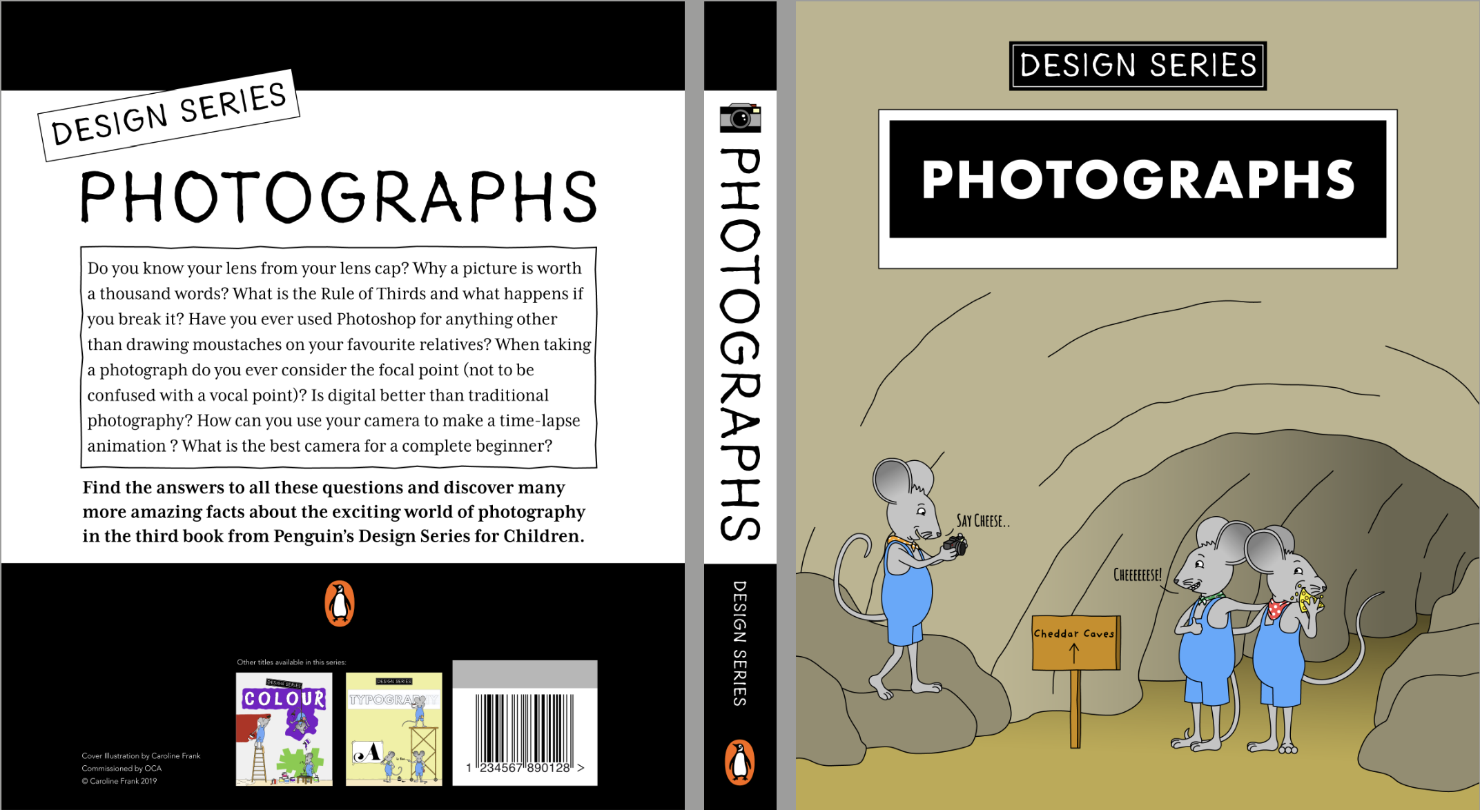
Cover 3 – Photographs – one of the mice taking a photo of the others.
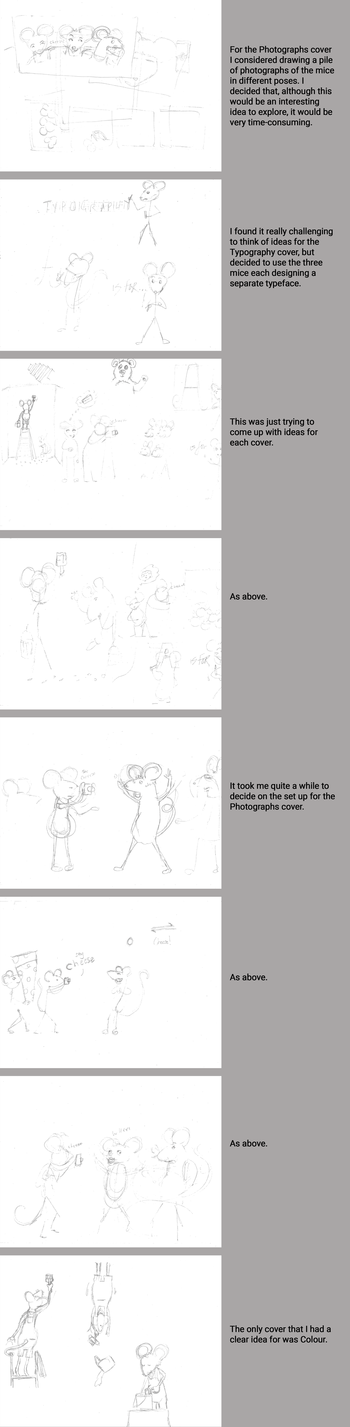
I then moved into Illustrator and roughly positioned the mice in the composition.
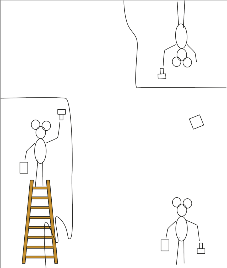
I still was not happy with the idea for the Photographs cover, but decided to make a start. I began with the Colour cover as I felt most confident with that one.
DESIGNING THE COVERS
I created GIFs showing the process of designing each of the covers and the inside pages. These can be seen below.
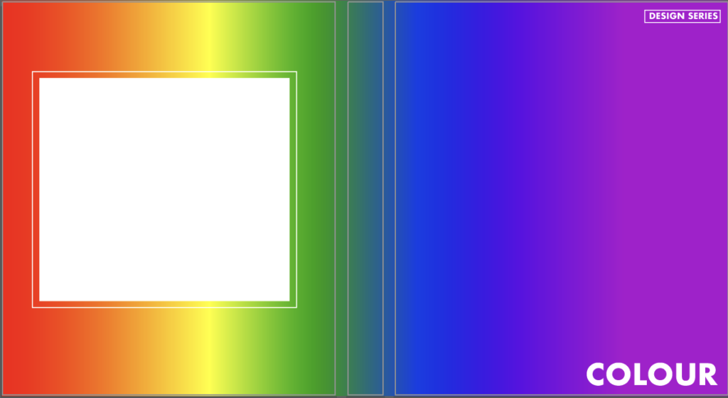
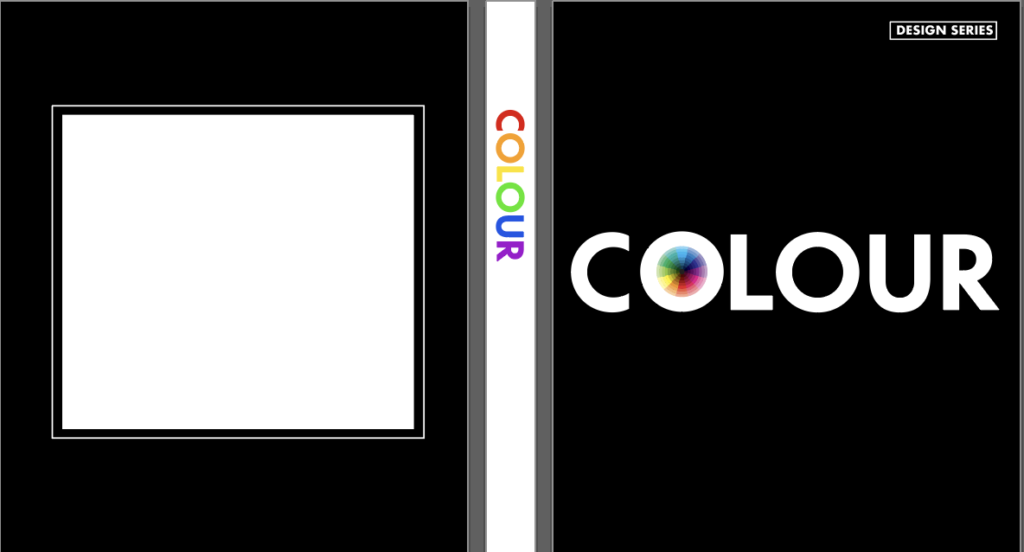
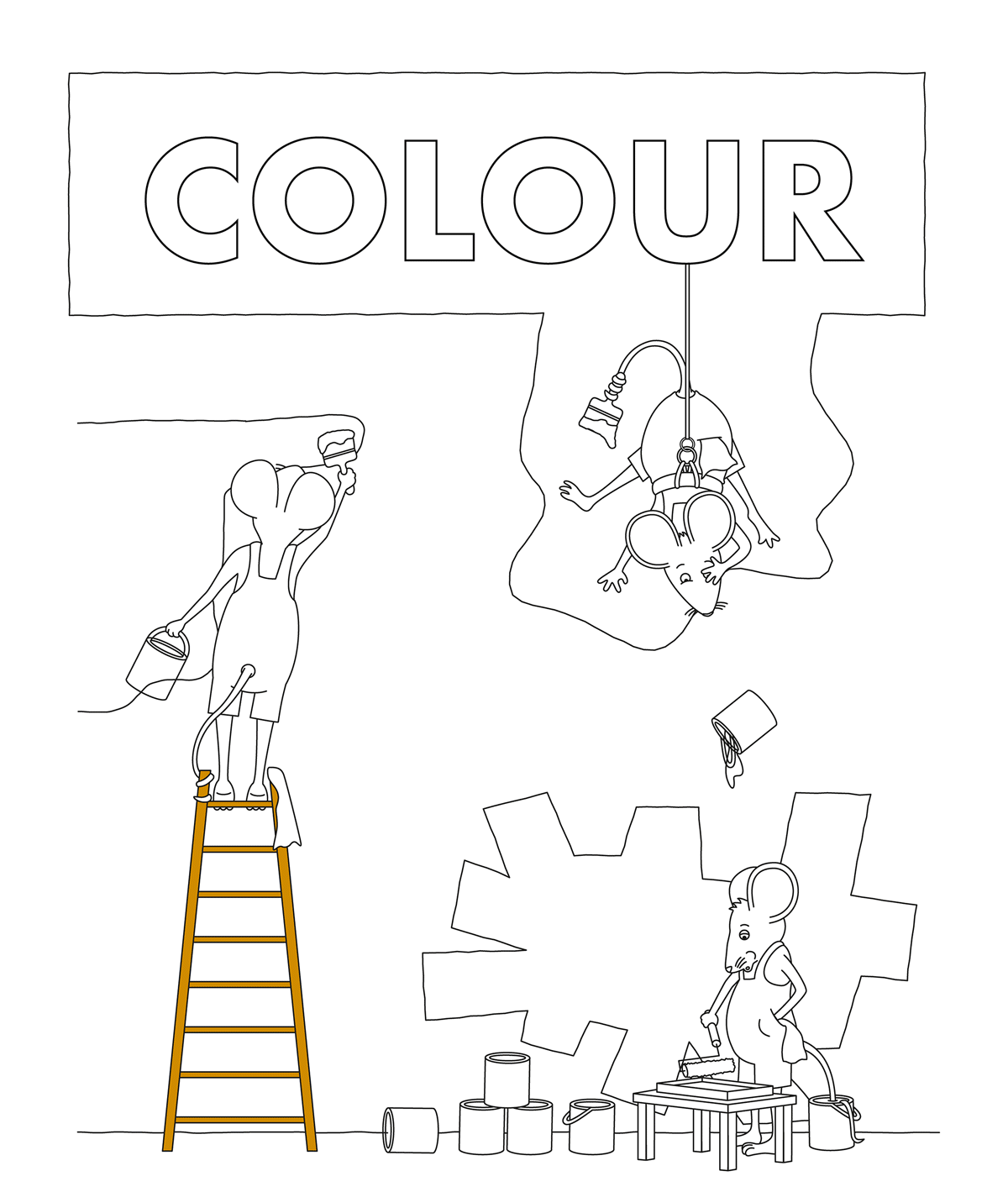
COLOUR
As previously stated, I found this one the easiest to think of a fairly decent idea for. I tried to create quite a dynamic layout.
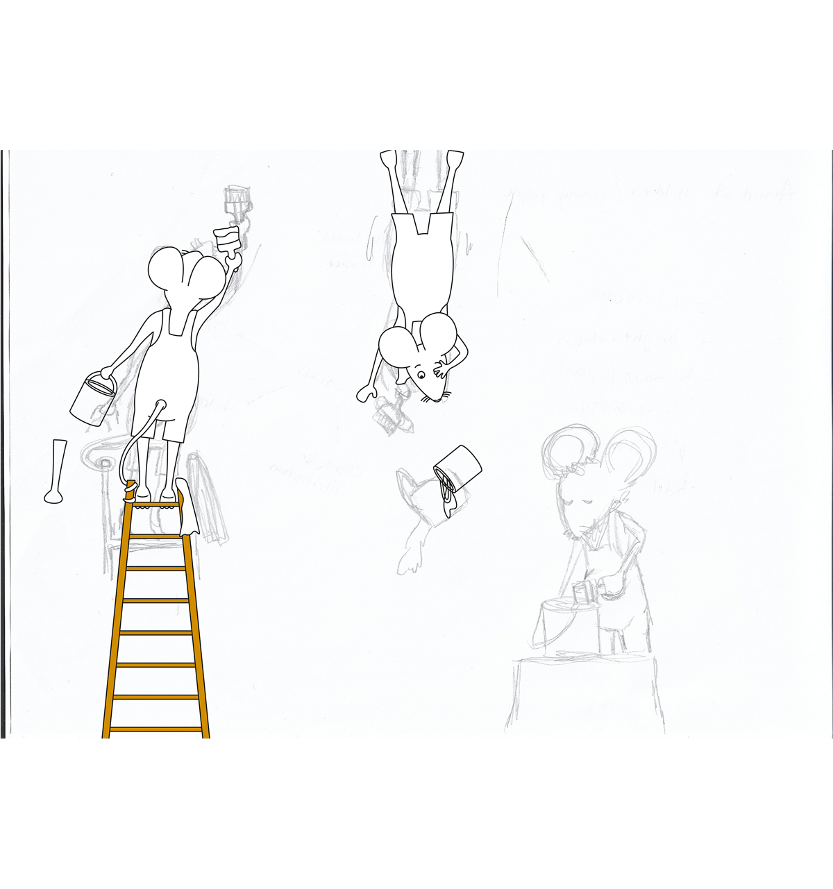
Once colour was added, I was quite happy with the result for this cover.
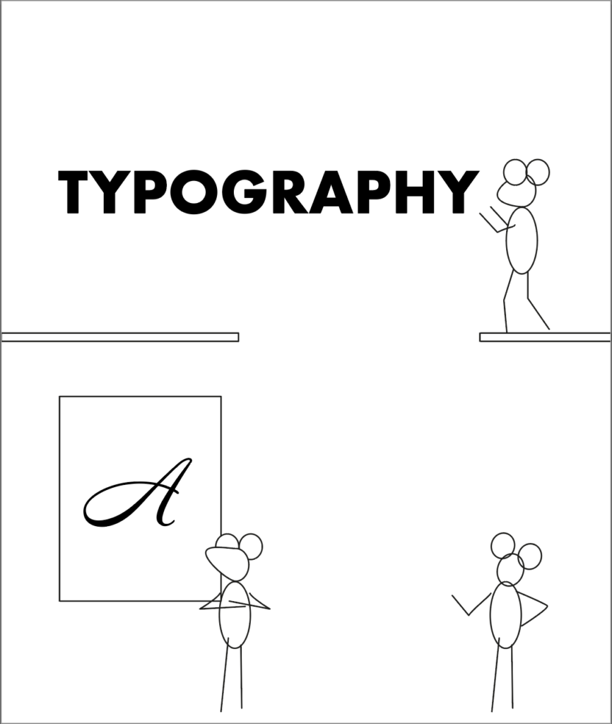
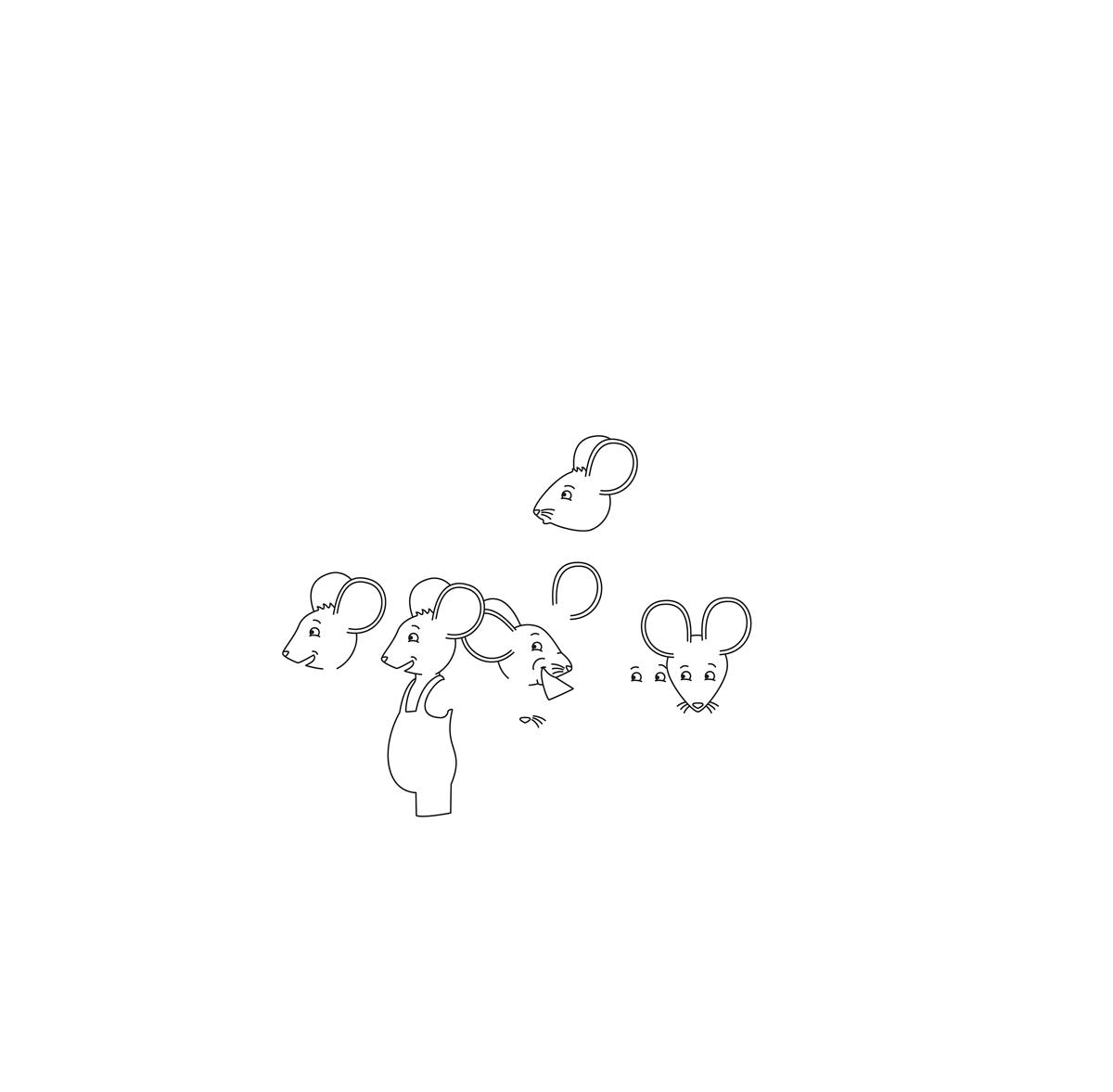
TYPOGRAPHY
For the second cover, I had to try and think of a way visually communicating typography to a younger audience, which was quite challenging. Again, I was actually quite pleased with the outcome for this cover.
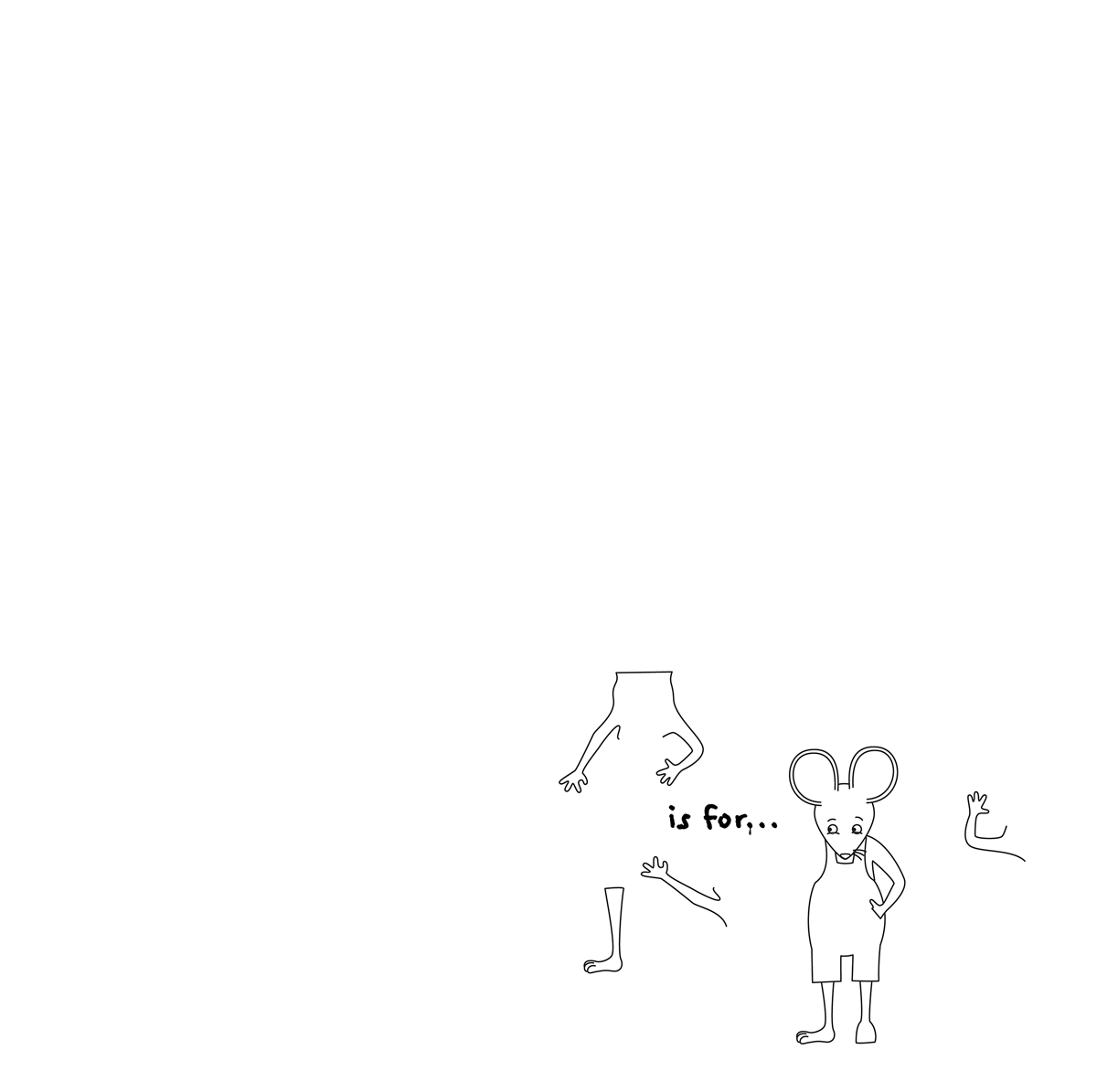
And adding colour made it appear much more complete.
PHOTOGRAPHS
I found the title of this book quite tricky as I would have thought generally books would be called photography rather than photographs. I eventually decided to go with the idea below.
I’m not sure if this one was as successful as the others in terms of the concept, but it turned out better than I thought it would.
THE BACK COVERS
I found it very challenging coming up with the text for the back covers, but I thought the final result was not too bad and would be suited to the target audience. I based the layout of these on some of the Penguin book covers I had previously seen.
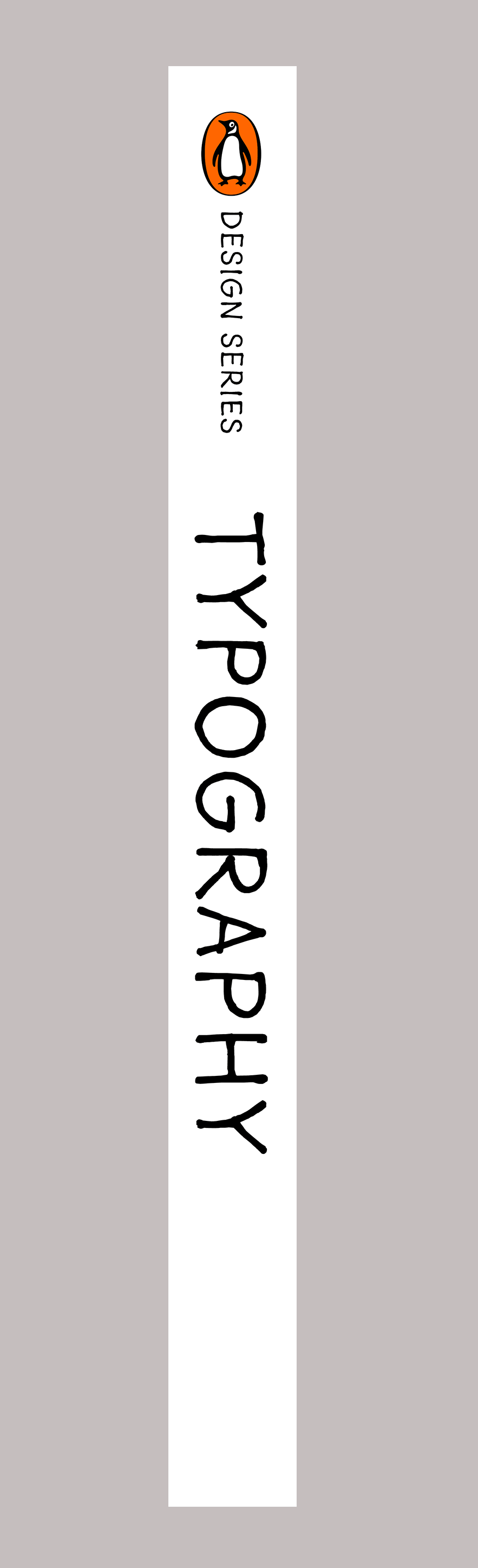
THE SPINES
Once I had a rough idea regarding the back covers, I worked on the spines keeping to a similar theme.
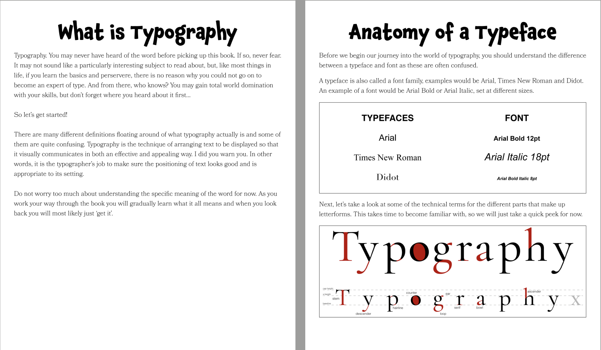
INSIDE PAGES
Once I got to the inside pages, I first had to think up wording that would make the subject interesting to younger people. I tried to keep a humorous tone, similar to Horrible Histories, but I’m not sure how successful this would be. I then thought about the layout. Although I thought the finished pages were adequate, they could have been much better. I did consider continuing the illustration theme, but this would have been much more time-consuming and I had spent too much time deliberating what to include.
FINAL LAYOUTS
The finished designs can be seen below. I thought the Colour and Typography covers were the most successful, although all three do work as a linked series whilst being individual. I was less pleased with the inside pages and I found it quite difficult to be motivated when designing them. I also realised I the page numbers are missing from these.
EVALUATION
Although I enjoyed the illustration side of this assignment, I found it one of the most challenging to stay motivated for. I think it would have been helpful if the brief had been more detailed, e.g. the age range of the target audience, and I found it difficult to come up with ways to make typography understandable and enjoyable for younger children. As previously stated, I thought the covers where more successful than the inside pages, but I should have done more experimentation with different ideas at an earlier stage just to see what else I could come up with. I believe some of my previous assignments and exercises were carried out more successfully.