Assignment 4: Show Me…
BRIEF
Design the font for use on the cover of a magazine called type and write a short article for the magazine using a range of typefaces, with typographic illustrations, drawing on all that you have learnt from this section. The article should include sections on:
- what makes a typeface interesting
- how a typeface is constructed
- question marks
Requirements
Do a mock up of the magazine cover to show where and how your title font will appear along with other cover elements.
Produce a magazine article that is attractive and interesting enough for someone to pick it up to read, and which shows off what you have learnt so far about typography. Add illustrations, photographs and colours as you want.
ANALYSING THE BRIEF
I was quite apprehensive starting this brief as I have not felt confident with typography, but this unit has developed my awareness and interest in the subject, so I was hopeful this would have a positive influence on the production of this assignment.
KEYWORDS
Design the font, cover, magazine, type, article, range of typefaces, typography, mock up, title font, cover elements, attractive, interesting, illustrations, photographs, colours.
PLANNING
TARGET AUDIENCE
The target audience for this assignment would be the readers of the hypothetical magazine title Type. Therefore, the magazine would be grouped within the genre of design magazines. These are mostly aimed a specific interest group and there tend to be similar themes for the covers and layouts, as I discovered in my research.
PURPOSE
To effectively inform the readers about the specified topics, be visually interesting and eye-catching enough to result in the sale of the magazine.
SIZE
This is not specified in the brief, so I chose A4.
SOFTWARE
I attempted to use Indesign for the mock-up of the cover page, but decided to use Illustrator instead, along with designing the typeface, as it is so much more flexible in my opinion. However, I did choose Indesign for the creating the inside article pages, as by now I feel much more confident with this software.
GAPS IN MY KNOWLEDGE
The style of this genre of magazine – research other examples and define the common features
Magazine layouts – research examples, read about grid layouts
Designing a typeface – look at examples of fonts used for the covers of magazines from this genre
RESEARCH
I was really unsure at the start of this assignment in terms of creating a typeface, so I decided to begin by looking at some examples of non-specific magazine cover designs I found visually creative. I set up a Pinterest board with these initial examples: Magazine Typography Board
Three particular examples that stood out to me are shown below:
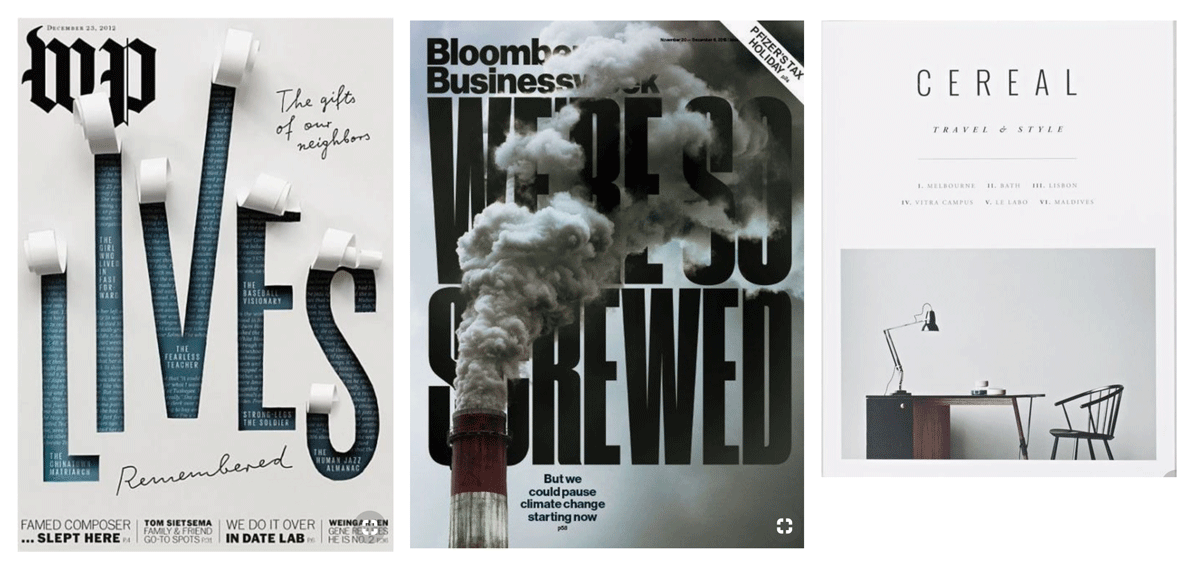
I thought the first example was a really creative way of using the material of the magazine and is a way of revealing a message below. I liked the depth created in the second example by interweaving the typeface with the image, which also reinforces the message of the title by obscuring the words. I thought the third cover was an example of using a really clean design and font, adding an element of sophistication, which is what the magazine is aiming for.
I then carried out a Google Image search and looked for genre-specific examples of magazine covers. Some of those which stood out to me are shown below:
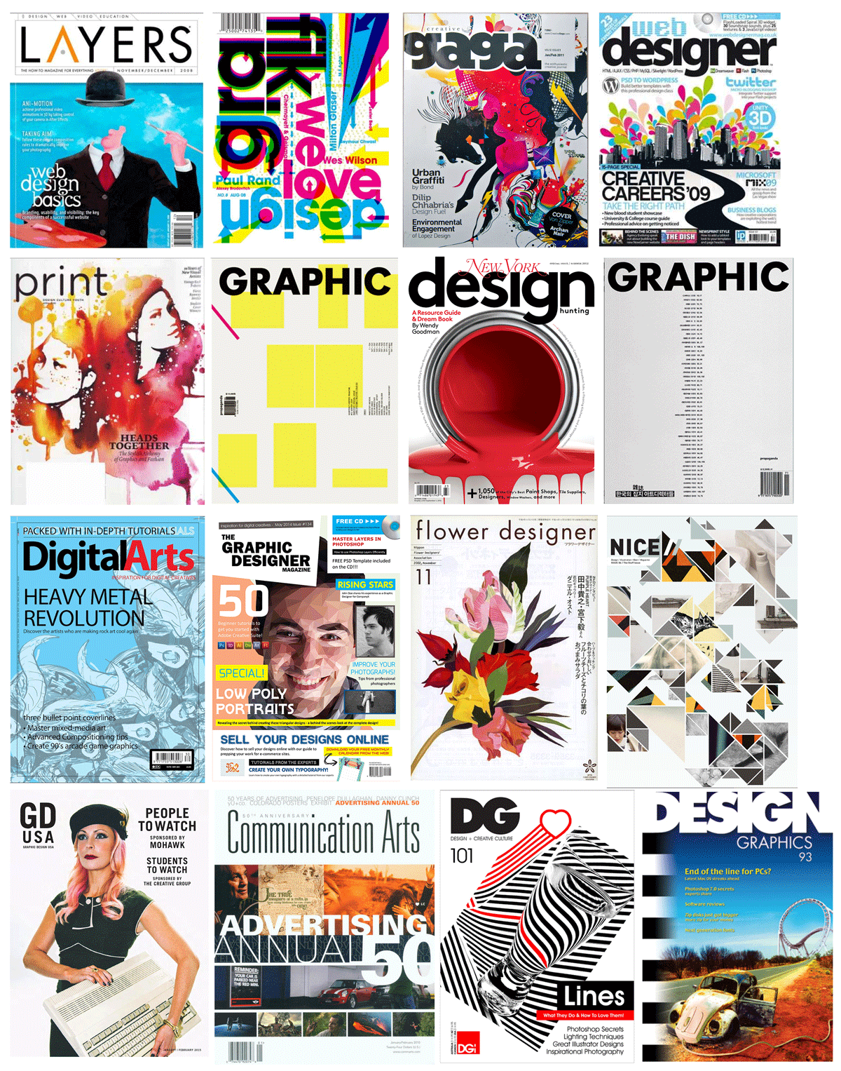
The main points that I noted included:
Nearly all of the covers use sans serif typefaces, which I thought reflected the modern, ‘slick’ and minimalistic nature of the design world.
Many of the covers use a minimal colour palette and the use of white space is incorporated.
The title of the magazine is generally the first element that the viewer will notice, so there is a strong contrast between this and the background. It is also something that recurs on every issue of the magazine so it needs to have the flexibility to be incorporated successfully into different layouts and designs.
DESIGNING THE COVER TYPEFACE
Taking on board what I had found so far from my research, I proceeded to start sketching some ideas for my typeface.
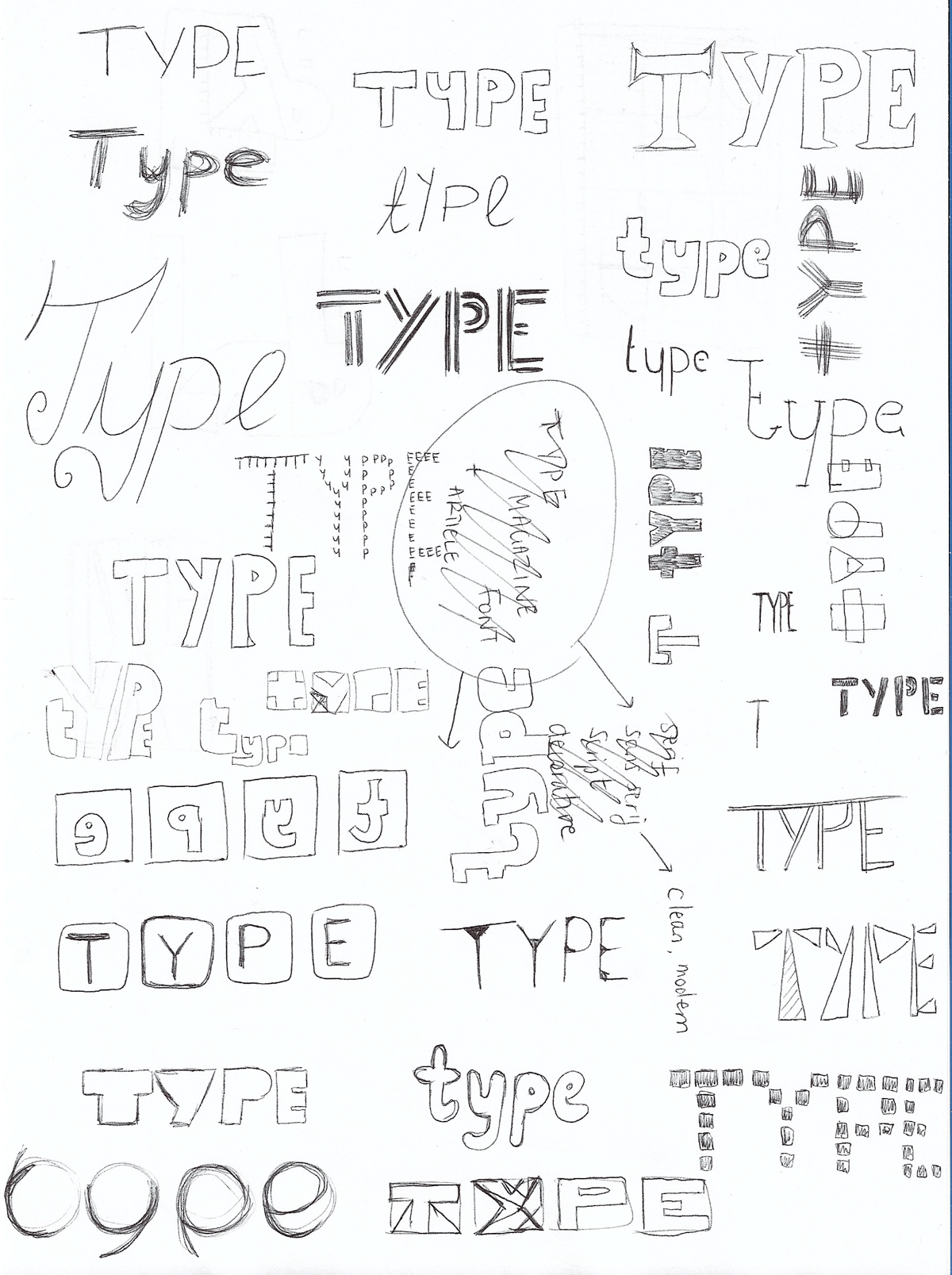
I then selected the few that I thought had some potential and scanned these into Illustrator so I could create digital versions (below). I tried to keep to simple designs as this was my first attempt. I also kept in mind that the examples I had looked at were bold, clean, readable and well-suited to the genre.
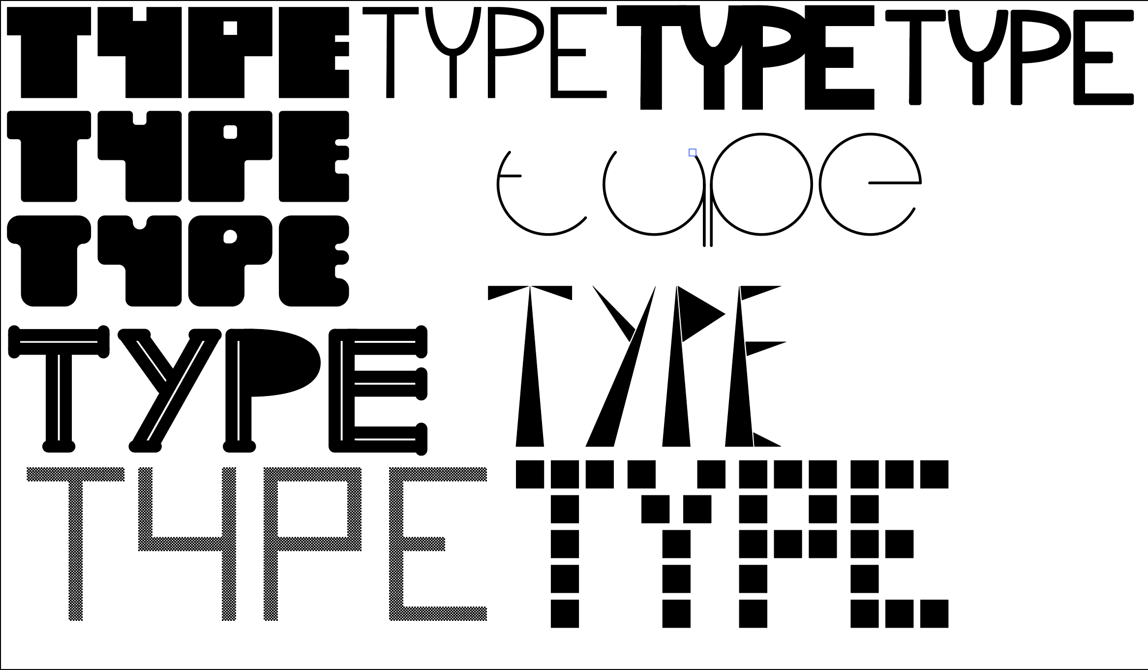
The ones that I felt worked best are shown below:
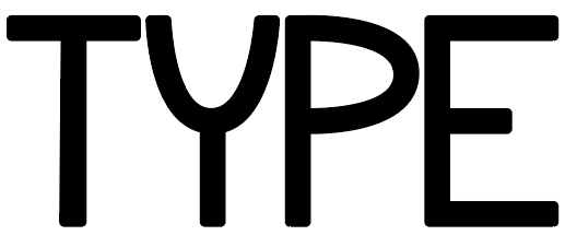
I liked the ’roundness’ of this example. It is also very clear to read and bold.
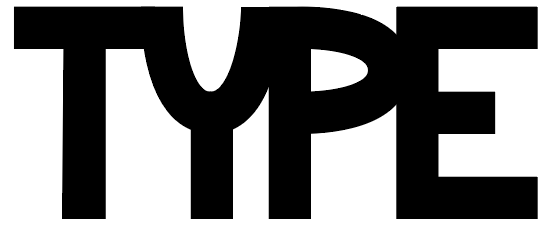
For this font I increased the stroke width of Example 1 to increase the boldness and make it so the letters merged into one another, which I thought made it a more visually interesting choice than before. It is still readable and would be even more dominant on a full page layout.

I thought this example looked liked blend of a retro computer font from the 1960s (if that’s possible) and I felt it was quite successful as it has a quirky boldness to it rather just appearing to be an offshoot of a pre-existing typeface. It is still readable for display text, but it would not be so successful for body text.

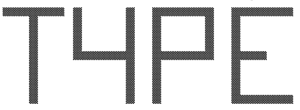
I thought these two examples would be suited to the genre of magazine as they could be thought of as ‘pixelated letters’. I decided the top one was not readable enough and so would not really catch someone’s eye, but the bottom one was much more successful in this respect..
DESIGNING THE FRONT COVER MOCK UP
I then progressed onto designing the front cover onto which the typeface would be added. I created three different versions, the development of which can be seen below. I used guides (I divided the page into a grid of nine) on the designs so I could align certain elements. This was extremely helpful and I felt it enabled me to create much more pleasing designs.
VERSION ONE
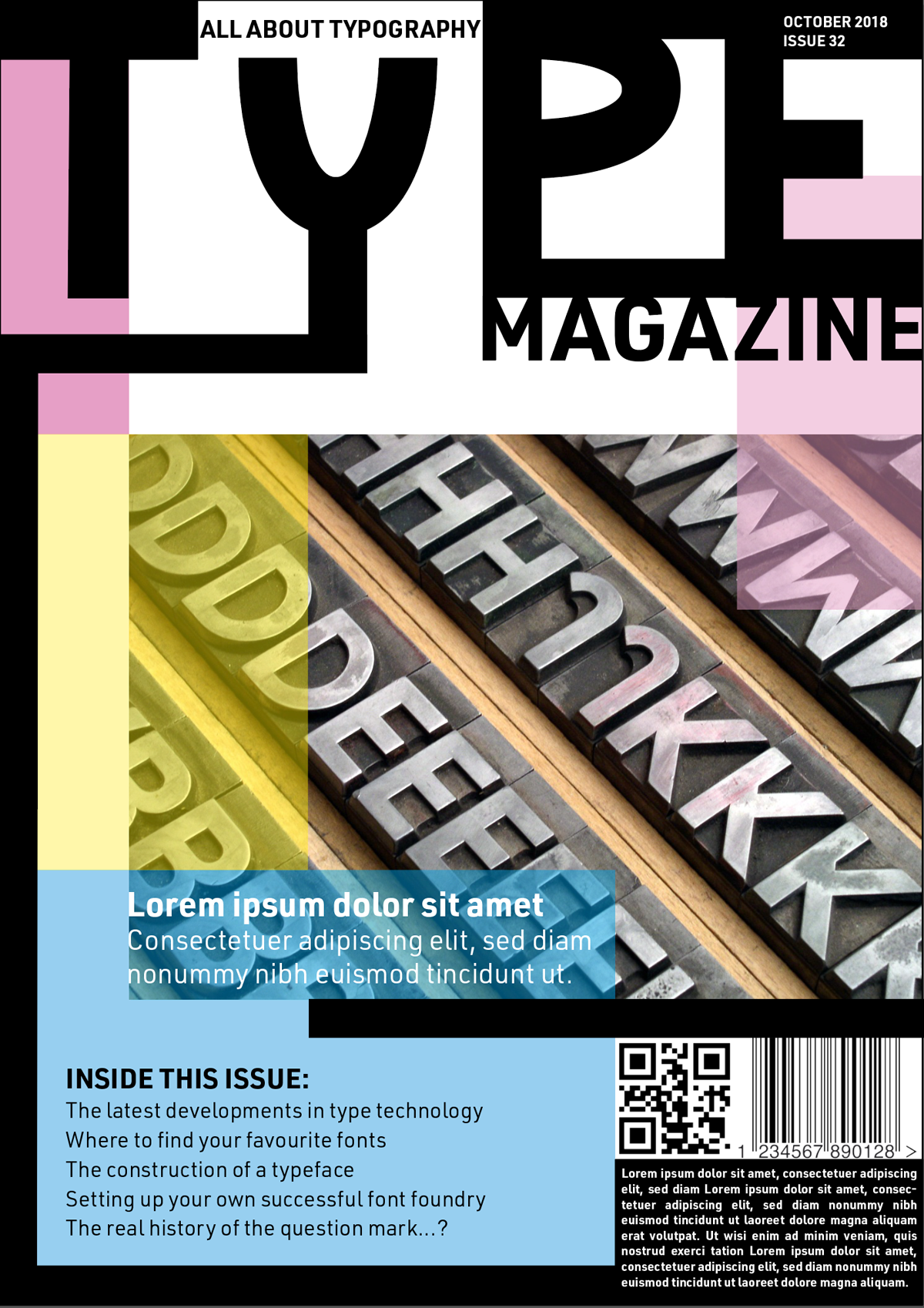
The first design used the bold, curved typeface and I decided to limit the colour palette to CMYK, which was influenced by one of the examples shown above. I tried to make the layout more dynamic and add depth by using opacity and lines. By positioning the ‘Y’ at a slightly lower level than the other letters, I thought this could represent the key on a typewriter being pressed, along with adding some dynamics to the layout.
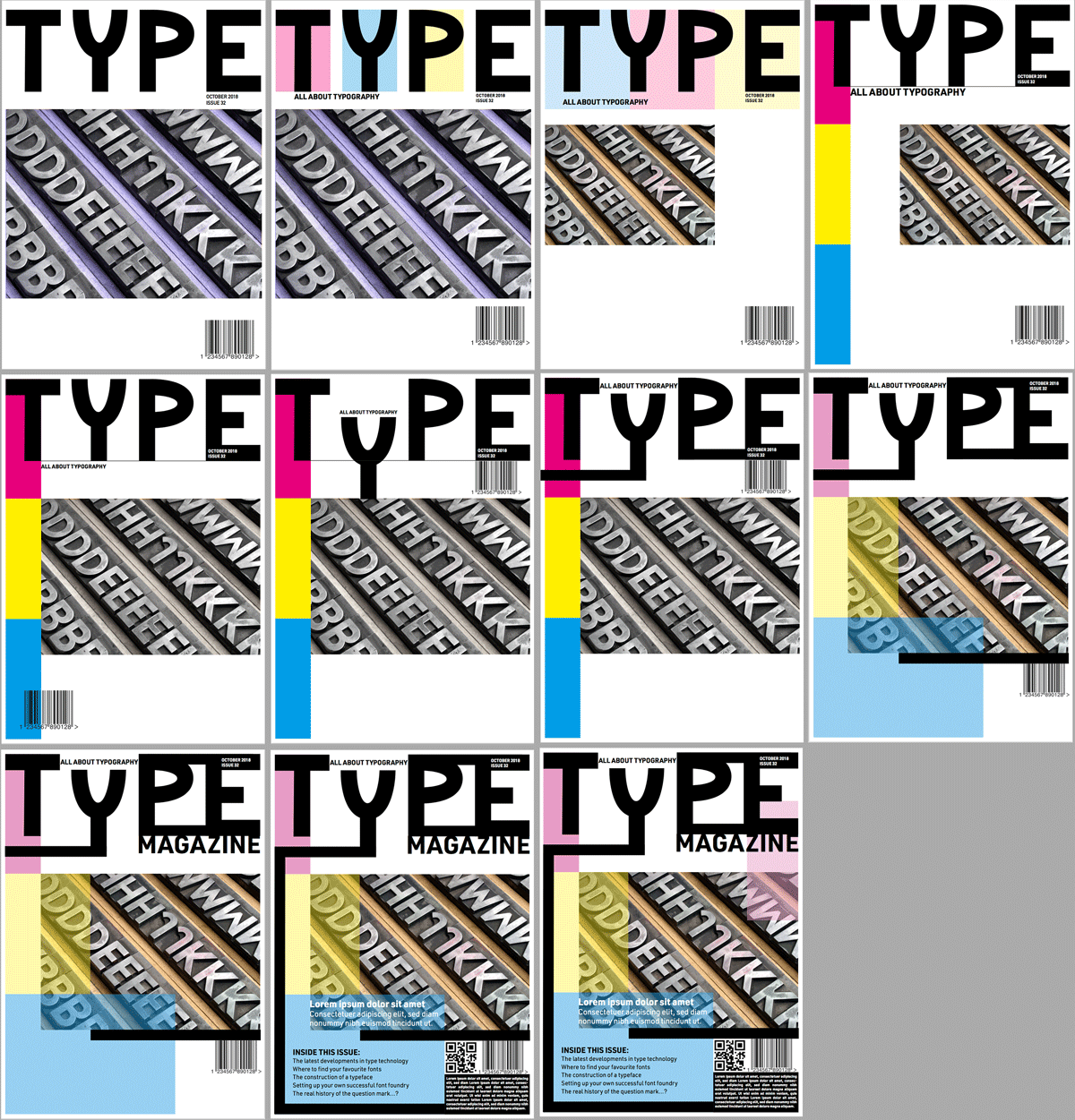
The final version of this design can be seen below. I thought this fairly successful and would definitely stand out. I was quite pleased with how I placed the elements on the the page.
However, I then decided that perhaps everything was bit too bold and clunky, so I refined the thickness:
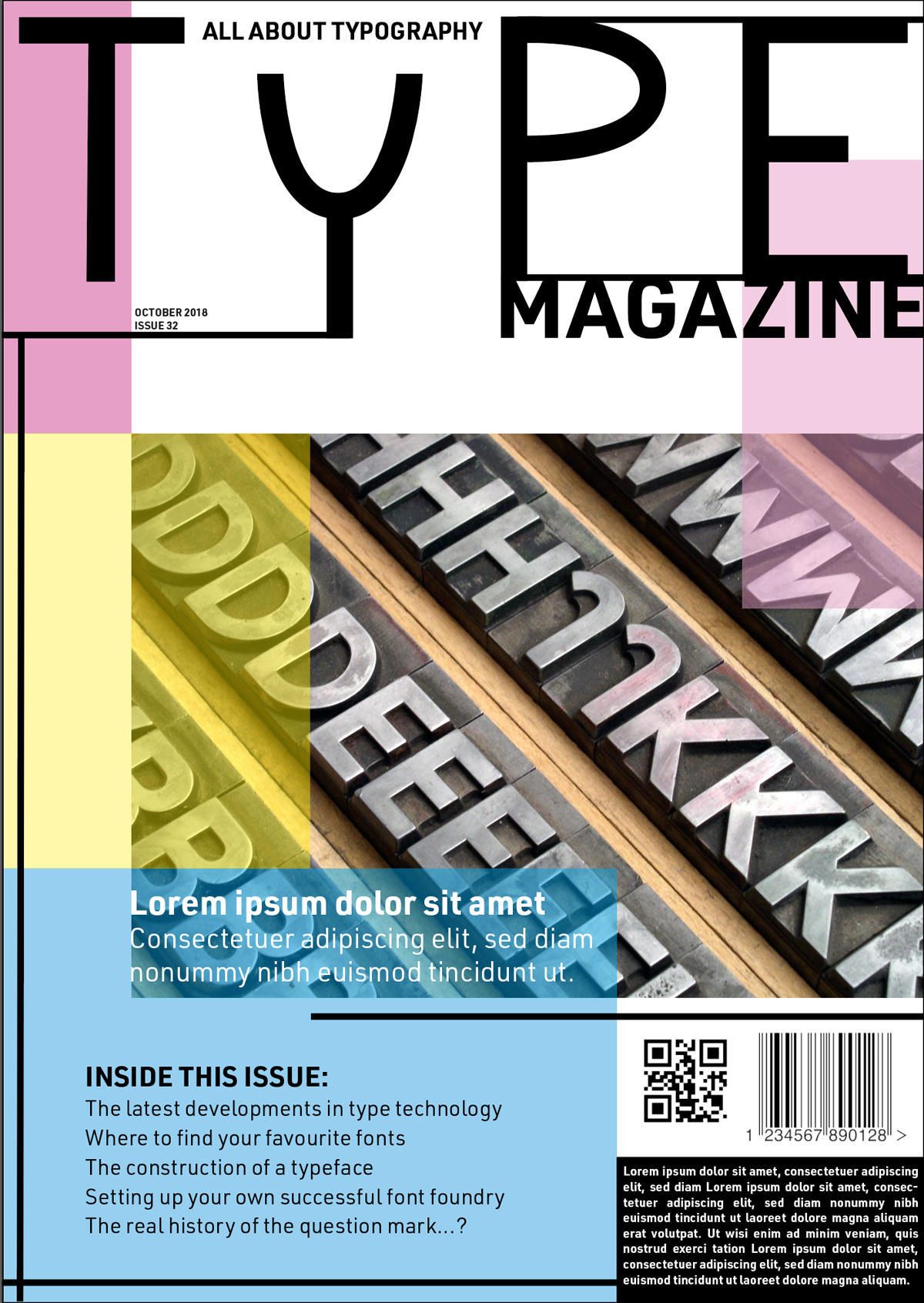
I thought this was more aesthetically pleasing, but the title lost some of its dominance on the page and some of the elements were no longer anchored to one another.
VERSION TWO
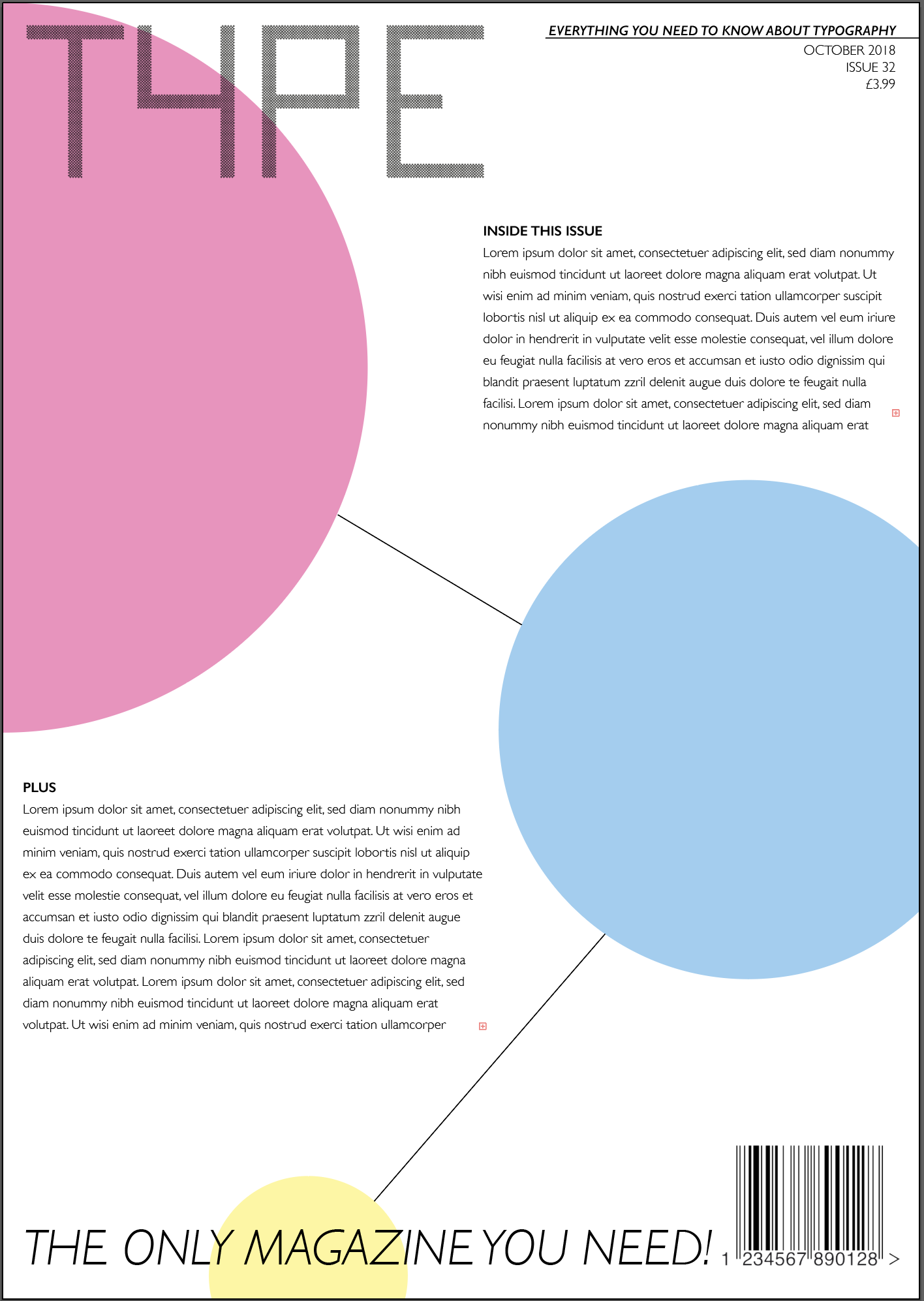
For the second version of the cover I used the retro, computer font. I did not add any colour to the page as I thought black and white worked better with the overall design. I thought this version was quite successful and unusual. However I was unsure about the large block of text at the lower left of the page, which would have to be filled with real wording and might look a bit odd on the front cover.
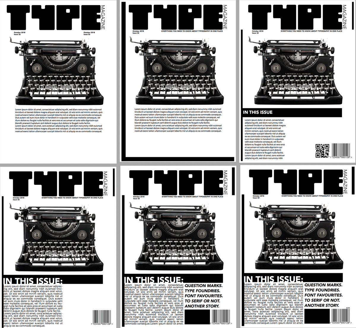
The final version of this design can be seen below:
VERSION THREE
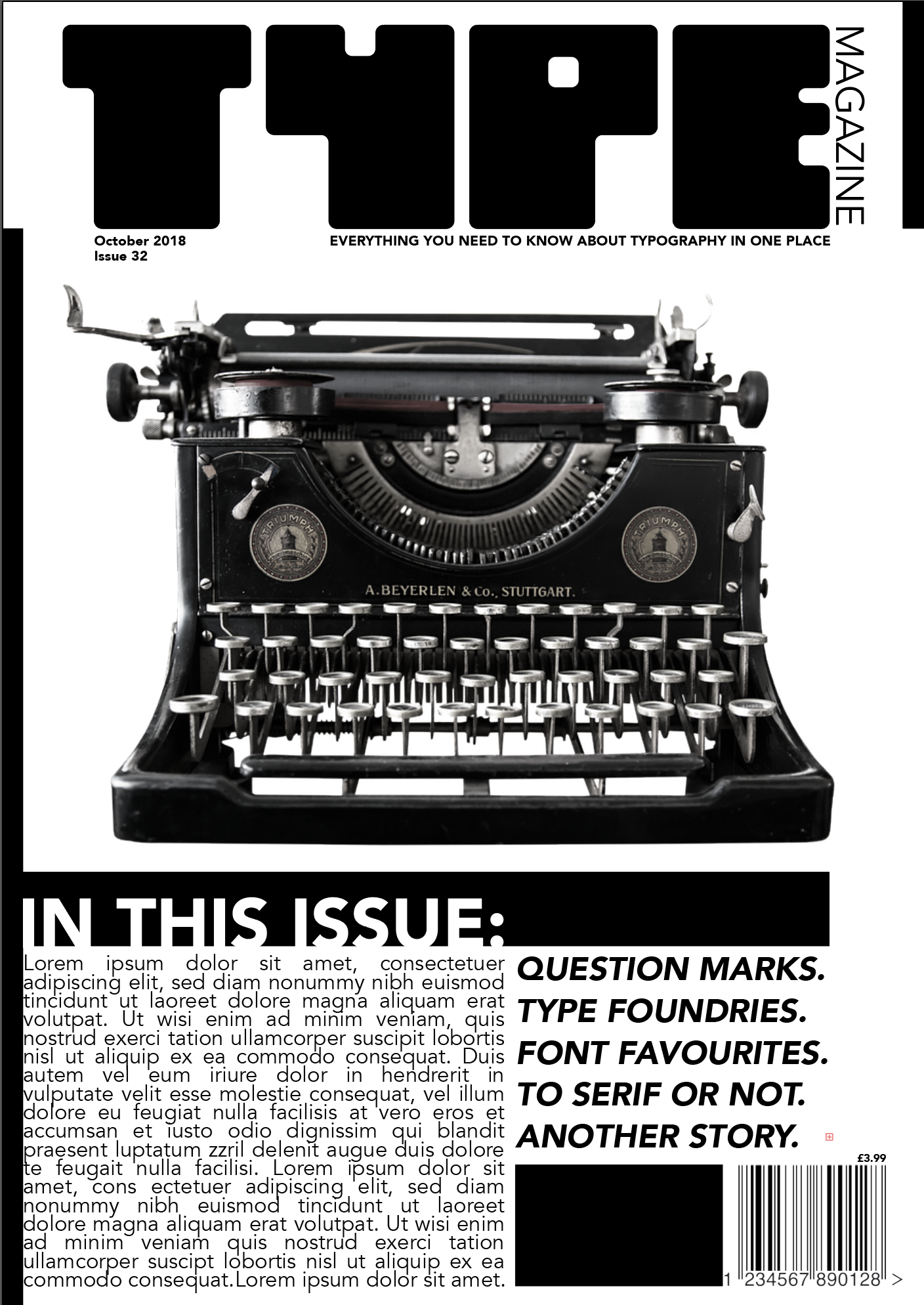
For this version I decided to use the round typeface I had created as I thought it would fit in well with the circles. However, I did not feel the title contrasted enough with the background and was therefore lost in the layout.
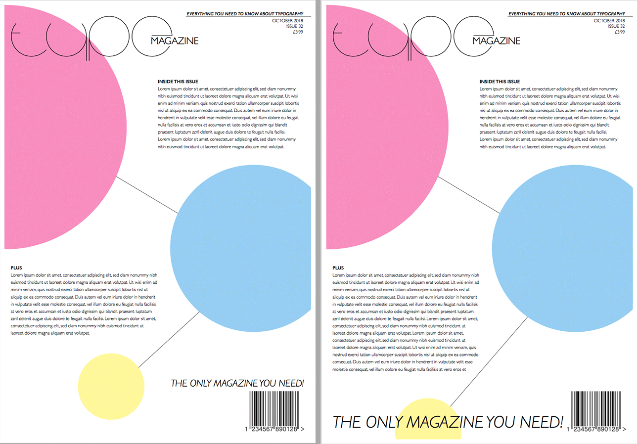
So I decided to use the pixelated typeface instead and I thought this contrasted better with the circles and made for a better design. This version ended up being more restrained and refined than the previous two and this, perhaps, could be used for a more sophisticated style of magazine.
DESIGNING THE INSIDE PAGES
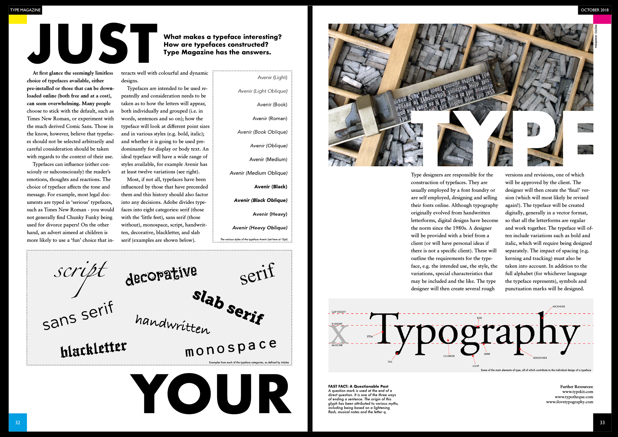
I decided to create double page spread for the article. I used Futura for the headings (as well as for any labels), whilst using Sabon LT Pro for the body text. I tried to be fairly experimental with the layout and add some dynamism to design, whilst being conscious of the need to allow breathing space (white space) and minimal distractions from the body text. I used three column grids on each page, whilst also using guides that divided the pages into thirds, so I could line elements up and make a more visually appealing spread. I kept the paragraphs aligned left, as rivers developed within the text when I tried to fully justify them. I wanted the design to complement the front cover designs and have a modern, clean layout.
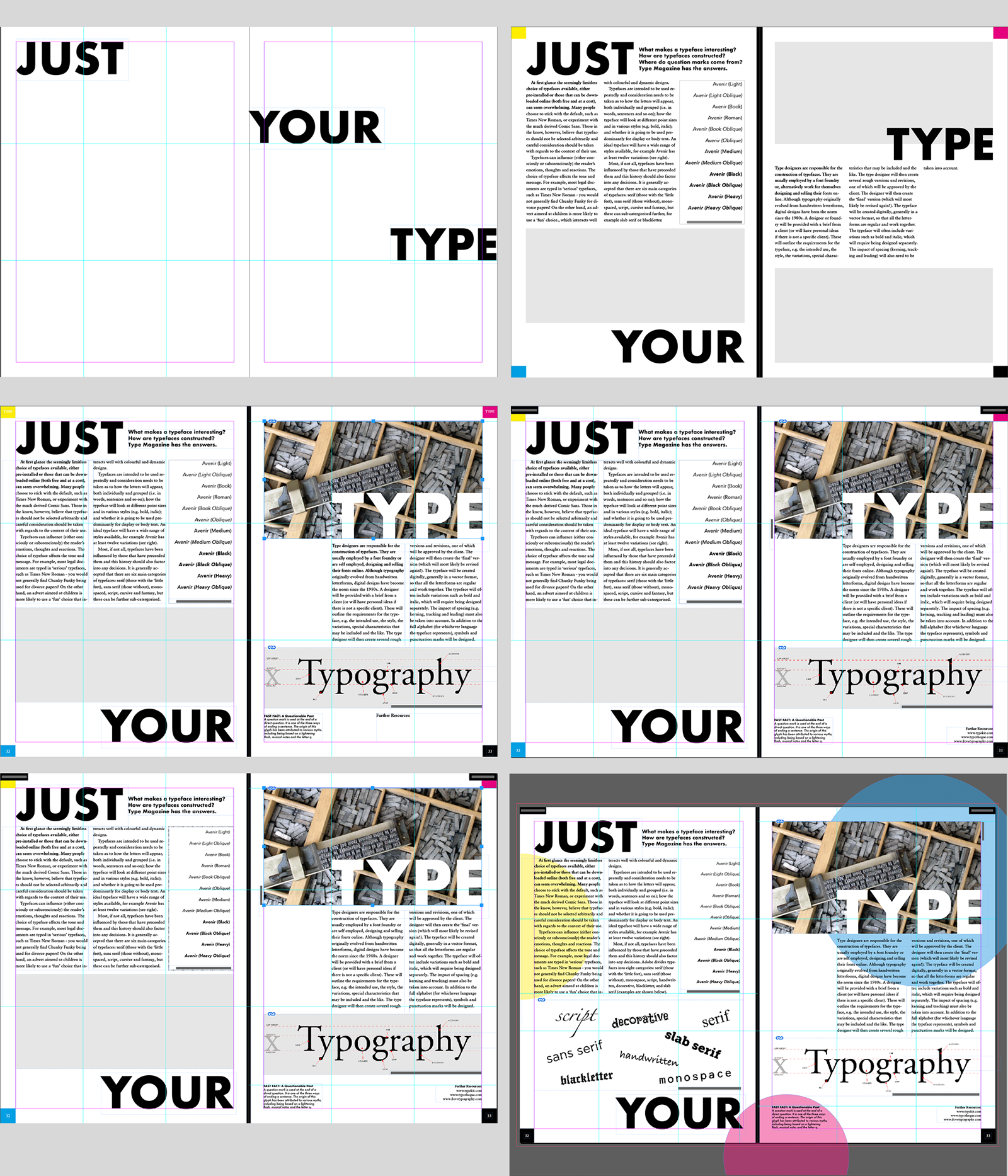
I created three final versions of this design, which can be seen below.
The main issue I had with the first example was how all the different elements appeared ‘cut off’ from one another (such as the borders around the example boxes) and there was no real cohesion.
So, for version two I removed the borders and added some background circles in CMYK colours, which not only added some cohesion between the elements, but also linked back to the cover designs and added a slight sense of depth and movement to the layout.

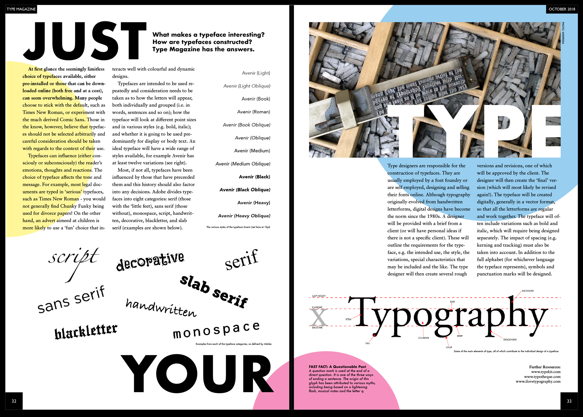
For the final version I changed to colours of the circles to ones which I thought would be less distracting for someone trying to read the article and would add some variety to the magazine’s overall design. I thought this version was the most successful and the one I would choose to go in the magazine.
EVALUATION
Initially I was quite unsure how to move forward with this assignment, but once I started thinking of some ideas, I became more involved with the process. I particularly enjoyed designing the layouts of the different pages and deciding where to place the various elements within the design. I also felt that my improved knowledge of Indesign meant I could explore more options with confidence and did not waste so much time trying to work out how to use the software. I learnt a great deal whilst working through this unit and I believe I have improved my knowledge and skills in typography hugely since I started the course. I never realised there was so much to type ad how each typeface has its own personality, which can be used to boost a design. I realise I have a long way to go before I can be truly confident in my choices, but progress is being made.
RESOURCES
https://en.wikipedia.org/wiki/Type_design
https://en.wikipedia.org/wiki/Question_mark
https://en.oxforddictionaries.com/explore/origin-of-question-mark
https://en.wikipedia.org/wiki/Type_foundry
https://www.canva.com/learn/font-design/
https://design.tutsplus.com/tutorials/how-to-create-your-own-font–cms-29019
https://www.youtube.com/watch?v=C_RzDqgGcao – The power of typography- Mia Cinelli (TED Talk)
https://www.digitalartsonline.co.uk/features/typography/how-design-typeface-step-by-step-guide/
https://create.adobe.com/2015/4/22/how_to_design_a_typeface_mark_simonson_s_process.html
https://onextrapixel.com/magazine-covers-with-amazing-typography/
http://www.indesignskills.com/inspiration/magazine-cover-fonts/
https://images.google.com
https://commons.wikimedia.org/wiki/Main_Page