Assignment 3: Colour Me
BRIEF
To produce an A3 poster (297x420mm) that celebrates a colour of your choice.
Choose a colour that has a meaning that you want to explore and celebrate. Think about what the colour you have chosen means both to you and to other people and create something that celebrates that meaning.
Work only with your chosen colour, its complementary colour and black and white. You can include text, collages, illustrations and photographs. Use black and white to help establish a range of tints and shades with your chosen colours. These limitations are to get you to work with colour, thinking creatively about how to make a limited palette work for you.
This project is as much about visual dynamics and contrast as it is about creating something with meaning. Make full use of it to show off to your tutor all the skills and processes you have learnt so far.
You need to submit at least variations of your poster as well as the finished artwork
ANALYSING THE BRIEF
The brief for this assignment was very open, apart from specifying it should be a poster of a certain size and at least 3 versions should be produced. The target audience nor details of where the poster would be displayed were provided. As my tutor pointed out previously, I am more comfortable with having a set brief and he suggested I should set my own restrictions. So I decided early on that I would do this, otherwise I could end up not achieving anything constructive.
The exercises for this unit covered:
Visual literacy: how images are communicated and interpreted, and how culture influences this.
Reading images: how semiotics are used in design and the use of metaphors/similies to create icons and symbols for different concepts.
Visual dynamics: the use of composition, layering, hierarchy and contrast to create designs which are eye-catching. It refers to relationship between the elements in a composition.
Colour: the relationship between colours and the importance of balancing colour palettes (e.g. dominant, subordinate and accent colours) and how different ‘moods’ can be suggested by varying colour combinations.
Photomontage and collage: how images and materials from different sources can be combined to create compositions with bold, and often political, messages.
These areas should have each influenced the development of the final piece for this assignment.
KEYWORDS
Poster, celebrates, meaning, complementary, black, white, text, collages, illustrations, photographs, tints, shades, creatively, visual dynamics, contrast, variations.
PLANNING
TARGET AUDIENCE
As this was not specified in the brief, I decided the target audience for my poster would simply be for anyone who has an appreciation and an awareness of the chosen colour with its various connotations.
PURPOSE
Although the purpose of the poster was given in the brief, i.e. to celebrate a certain colour, the more practical information of where it would be displayed was not provided, but a poster would normally be placed in a public area, so it would need to be eye-catching and stand out in order to be noticed.
INITIAL IDEAS
I chose to celebrate the colour red for this assignment. I have always considered red to be a very powerful and evocative colour. I particularly like the combination of black and red as the latter becomes even more striking. This choice meant the complementary colour would be green.
MIND MAP
As a starting point, I mind mapped both of the colours, red and green. This was influenced by my own ideas as well as some initial, general research online.

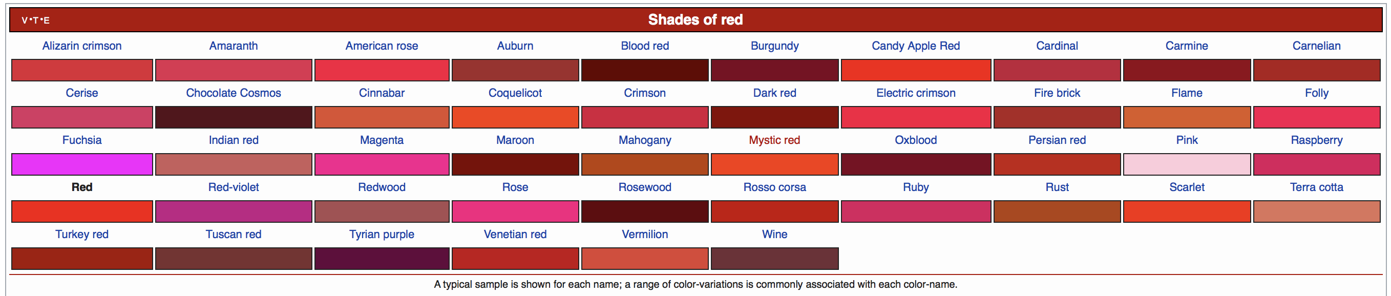
Wikipedia also had a chart of shades of red, which proved quite useful:
EXAMPLES OF RED IN DESIGN
I created a Pinterest board to see what inspiration I could gain: Red & Green Pinterest Board. I then carried further image searches using Google Images, some of the results can be seen below:
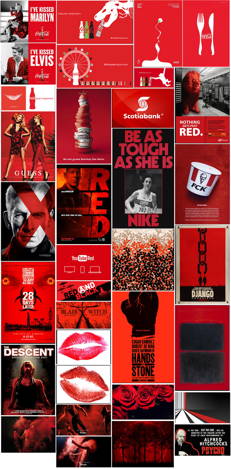
From these examples there were several thoughts that came to my mind, these included:
- Red is used for bold effect – it is not subtle – and this boldness is stronger when placed next to black.
- Red is used for advertising food products (it stimulates appetite) and horror genre films/adverts (the combination of red and black is ‘demonic’ according to Johannes Itten).
- The imaginative use of silhouettes, contrasting black/white against a red background, as in the Coca Cola adverts, draws the eye to that part of the composition.
- A popular technique is using grayscale photographs with specific objects colourised red.
I then researched specific artists that have utilised red in their paintings. I made notes for each one below the images:
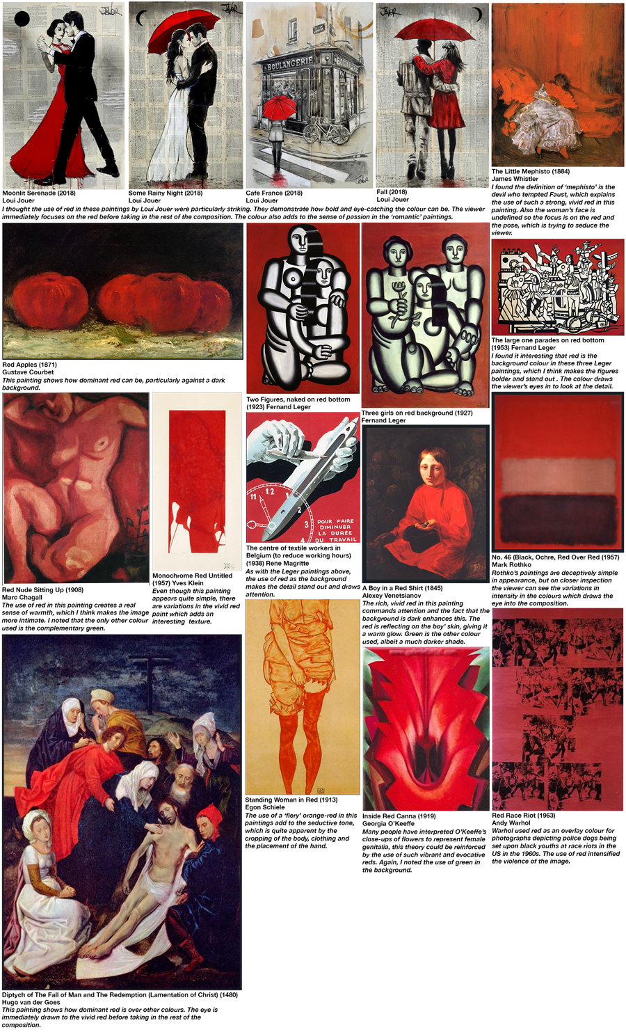
In summary, from the research carried out, I concluded that red is often associated with:
- attention
- boldness
- seduction
- passion/desire
- strength
- danger
- horror
- romance
- heat
The brief states that the colour should be ‘celebrated’, however, I do not consider red to really be a colour associated with ‘joy’ or happiness’ (such as yellow or orange could be), so I decided I would attempt to show red as strong, passionate and confident, but with an edge of danger to it.
DEVELOPING IDEAS
I began by drawing initial sketches of some ideas:
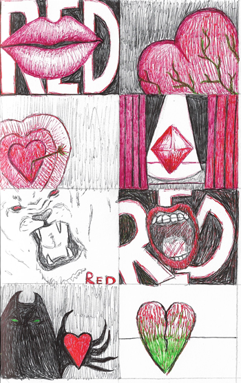
I thought the most workable ideas to build on were lips/hearts and the lioness roaring. I liked the way a heart can look like lips and this was something I could explore further. I was not too sure of how to incorporate green into the designs; I did consider using green to represent jealousy creeping into passion, but decided this was not really ‘celebrating’ the colour red. I liked the idea of using a lioness to represent red as they are associated with similar adjectives. When I searched for lips to use for reference, I was quite disappointed at how most were quite provocative and stereotypical, so I decided my lips would be ‘roaring’ like a lioness.
VISUALISING IDEAS
My first attempt was based on the ‘roaring’ red lips, to celebrate the boldness and strength of the colour. I created these in Illustrator:
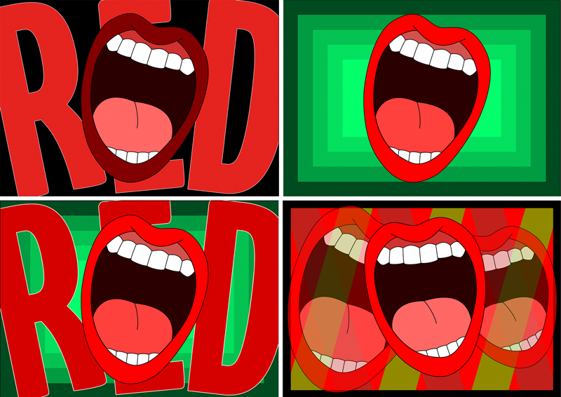
For this design I experimented with contrasting colours, scale and angle. I thought the top right design was the most successful of these as the contrast between the green and red creates vibrancy and scaling of the green squares enhances the ‘loudness’ of the red lips. I did not think the inclusion of the word ‘red’ was of any benefit to the two left designs, but I wanted to try using the red lips to ‘disrupt’ the letterforms, as in my initial sketch, which I thought was more effective than had I just used straight text.
Next, I wanted to explore the idea of using a lioness to represent the colour red. I did initially think of adding the word ‘red’, but decided against it as it was unnecessary and detracted from the design.

Once scanned, I then used Image Trace in Illustrator and tidied the images up.


Although I certainly enjoyed creating these illustrations, I was not really sure what to do with them in terms of ‘celebrating’ red. I just thought that a lioness roaring personified the colour red. I then decided to use a stock photo of a red rose from Pexels, which I used as a background and, using blend modes in Photoshop, placed one of the lionesses on top. I thought some of these worked better than others – once the background got too dark the lioness ended up looking like the Devil, so although this may have been suitable for a horror film, it did not really show red in positive light. I also was not sure how I could incorporate green into these designs as it appeared too jarring.
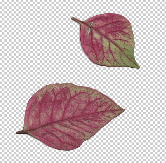
Next, I was interested in using the texture/colour of a leaf I found that was turning from red to green. This was influenced by some of the close up images of leaves I had pinned on my Pinterest board of red and green.
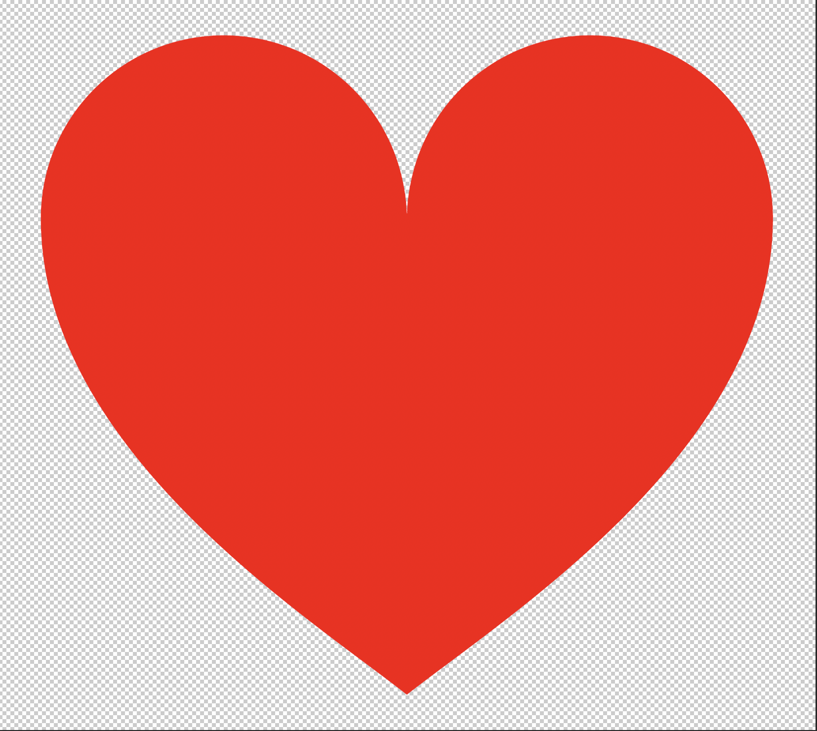
I then created a simple, recognisable shape of a heart, which is associated with red.
I took the scanned leaf into Photoshop and used a Layer Mask.
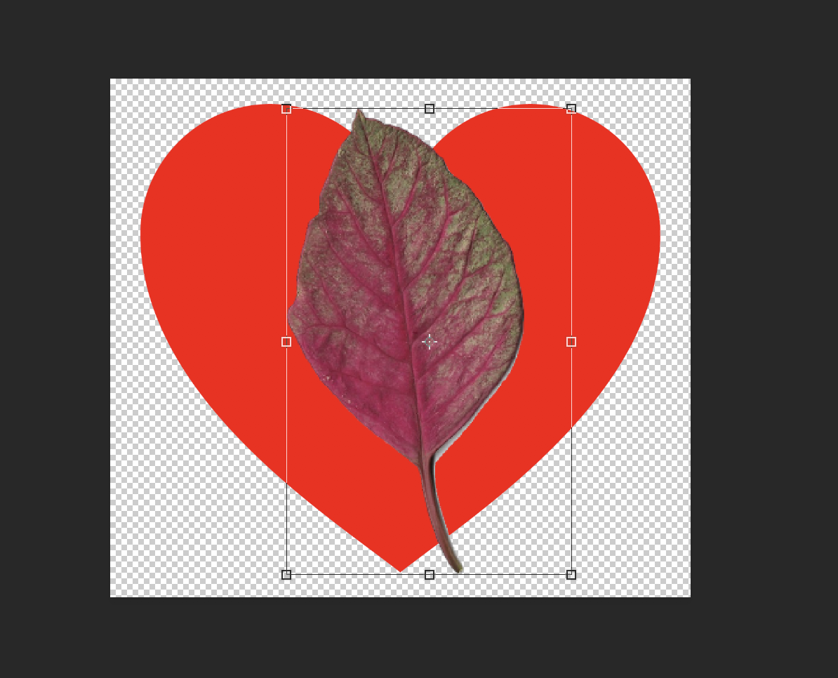
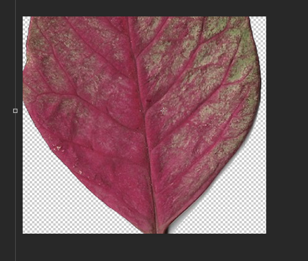

This ended up resembling one of my sketches, which I had thought could reference green envy/jealousy beginning to encroach on red passion. I then used different blend modes to create a variety of interpretations of the heart. Some of these resulted in the greenness being enhanced, so I thought these could resemble different stages of passion/jealousy. Although I did initially decide against this idea in my planning, I decided to see how it would develop.

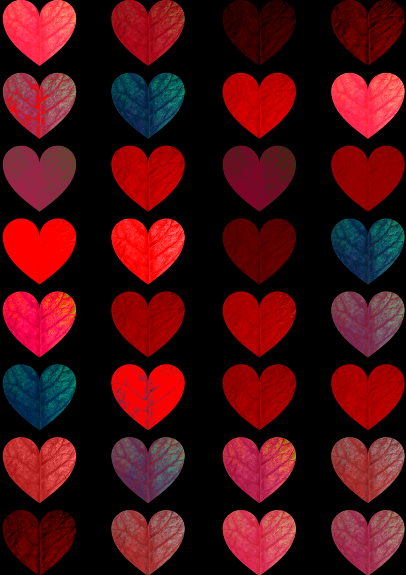
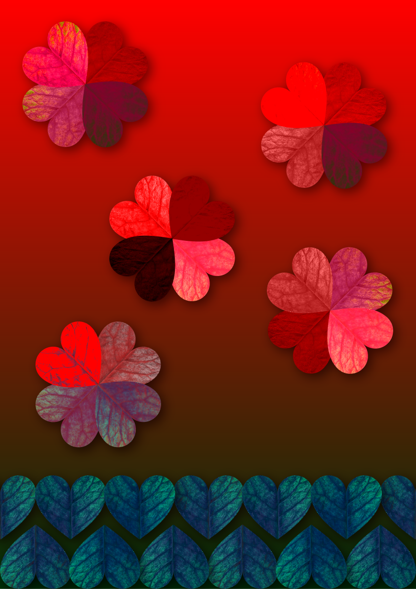
I thought the contrast created with black as the background really made the red appear bolder and made the designs more dramatic in appearance. I then discovered that the position of the stem and the smaller ‘veins’ of the leaf meant the hearts could also resemble lips, especially when rotated 90 degrees.

I was quite please with these designs, particularly the Large Leaf Hearts/Lips as I thought they captured the essence of red that I wanted to create. They were also more abstract than what I am normally used to producing, so it was an opportunity to step out of my comfort zone.
EXPERIMENTS
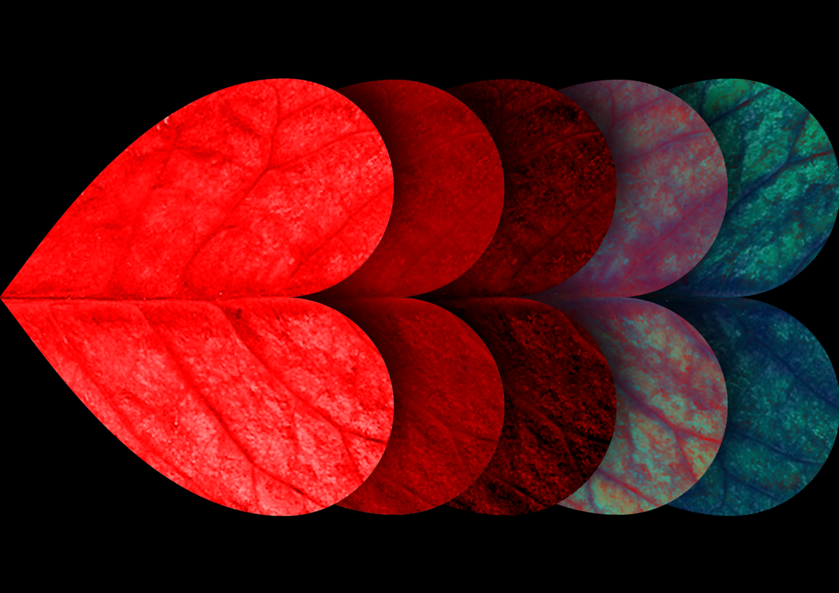
I played around with what I had created so far to see what else I could come up with. Initially I created a simple picture using the leaf hearts.
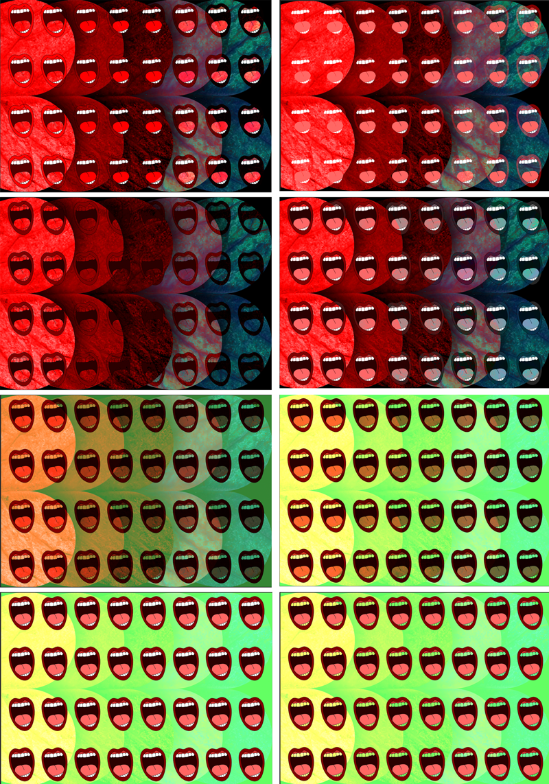
Then, I attempted to make a pattern design combining the illustrated lips with the leaf hearts as the background. I used different blend modes and tried turning off the green channel to see what affect this had.
FINAL DESIGN
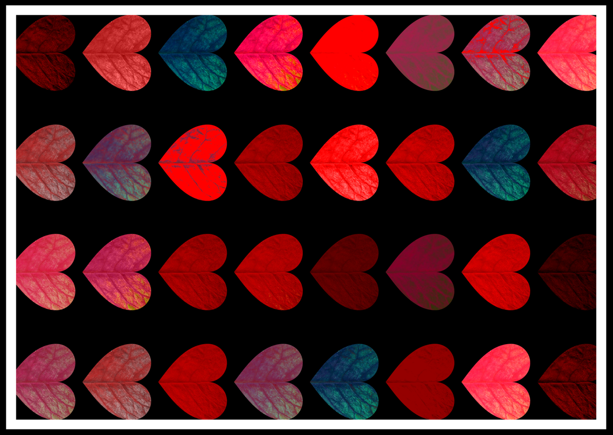
I decided that the most successful design was this one:
I liked that it had depth, is bold and there is a strong contrast between the colours. I proceeded to try a few variations based on this choice. I tried to consider scale, repetition and positioning.

The last three images above would have benefitted from being worked on in Photoshop to remove the ‘white dots’ on the the left hand side of the hearts as, when layered over one another, these are visually distracting.
EVALUATION
After initially being very unsure of where to take this assignment, partly due to having such an open brief, I used this as an opportunity to explore different ideas. This is something I needed to work on, rather than just fixating on one particular outcome, so having to create at least three variations was valuable. I enjoyed the research for this assignment, especially finding artists that have incorporated the colour red.
Out of the three different options, I was most pleased with the hearts as this was the most experimental, but resulted in the most striking design. I felt it achieved the goal of celebrating red, but not in a really obvious way. I probably could have been even more experimental, for example, by incorporating photomontage, but I was unsuccessful at visualising any ideas using this for the colour red.
This whole Unit has made me consider colour more carefully than I previously did and I hope this will prove beneficial as I progress.
RESOURCES
http://www.bbc.com/future/story/20140827-how-the-colour-red-warps-the-mind
https://www.colormatters.com/the-meanings-of-colors/red>
https://www.colormatters.com/color-and-vision/color-and-vision-matters
https://www.colormatters.com/the-meanings-of-colors/green>
https://www.incredibleart.org/lessons/middle/color2.htm
https://www.creativebloq.com/branding/amazing-uses-colour-6133196
http://www.bbc.co.uk/homes/design/colour_psychologyofcolour.shtml
http://www.fondationlouisvuitton.fr/en/expositions/exposition-les-clefs-d-une-passion/no-46-de-mark-rothko.html
https://www.hermitagemuseum.org/wps/portal/hermitage/digital-collection/01.+Paintings/28389/?lng=en
http://visual-arts-cork.com/paintings-analysis/nudes-against-red-background.htm
https://en.wikipedia.org/wiki/Shades_of_red
https://en.wikipedia.org/wiki/Red
https://en.wikipedia.org/wiki/Shades_of_green
https://www.lifewire.com/red-color-meanings-1073971
https://designshack.net/articles/graphics/duotone-color-tips-examples-for-this-vibrant-trend/
https://www.tate.org.uk/art/art-terms/c/complementary-colours
https://www.tate.org.uk/art/art-terms/f/fauvism
https://www.saatchiart.com/account/artworks/284005
https://www.wikiart.org/en/Search/red
https://www.smashingmagazine.com/2010/06/100-years-of-propaganda-the-good-the-bad-and-the-ugly/
https://www.pexels.com