Assignment 1: Introducing Yourself
Aim: To design at least 3 A6 size postcards that represent who I am, my interests in graphic design and my wider cultural influences or interests.
Following an initial discussion with my tutor, I understood that my designs needed to be visually comprehended by the target audience (i.e. someone who has never met me before). Similar to the picture charades exercise, the challenge was to use a static image to communicate a message. The design has a function and purpose, not just to be aesthetically pleasing.
My initial thoughts were questioning how to avoid making the designs too obvious, I’m not really drawn to the abstract, but I was not sure how to successfully convey a message with no verbal or written explanation, without being obvious and to the point.
INFLUENCES
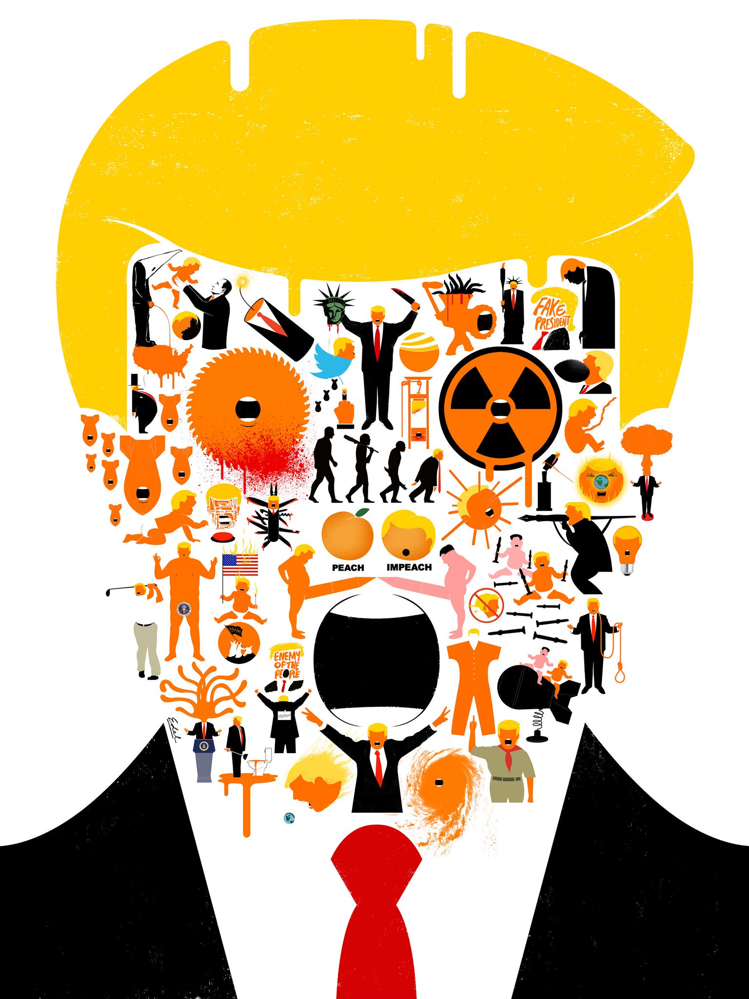
I admire design that is seemingly simplistic, minimalistic and clean, as it usually conveys the intended messages with clarity. An example of an artist who I believe demonstrates this is Edel Rodriguez, in particular his current political artwork referencing Donald Trump. Rodriguez has reduced Trump to his basic elements (orange skin, yellow hair, an open mouth) and this enables the artist not only use these elements on the ‘suited body’ of Trump but also to apply them onto other objects, such as a guillotine or nuclear bomb, and it is still evident who and what is being represented. I think the use of a limited palette enhances this. I respect Rodriguez’s imagination for conveying the message of each design clearly.
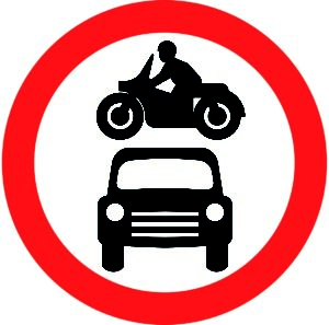
In addition I’m interested in the area of graphic design that includes pictograms. In particular, I looked into the work of Margaret Calvert who, in the 1960s, was responsible for co-creating the roads signs in Great Britain (which are still in use today). The intended message of these designs has to be processed within seconds by motorists often travelling at speed.
Looking further into iconography and pictograms, I read about the history of their use at various Olympics, which is another example of the need for concise design to enable people of all different nationalities, ages, etc to understand what is being represented.
PLANNING
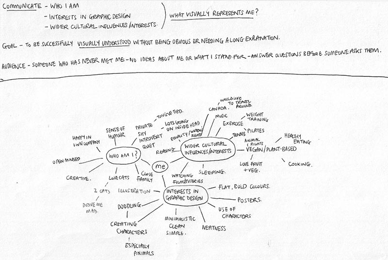
I decided to mind map ‘me’ in order to get some ideas down on paper and see what I could focus on. This activity really helped to clarify my thoughts and I could keep referring back to this visual aid on a regular basis.
PROCESS OF CREATING THE POSTCARDS
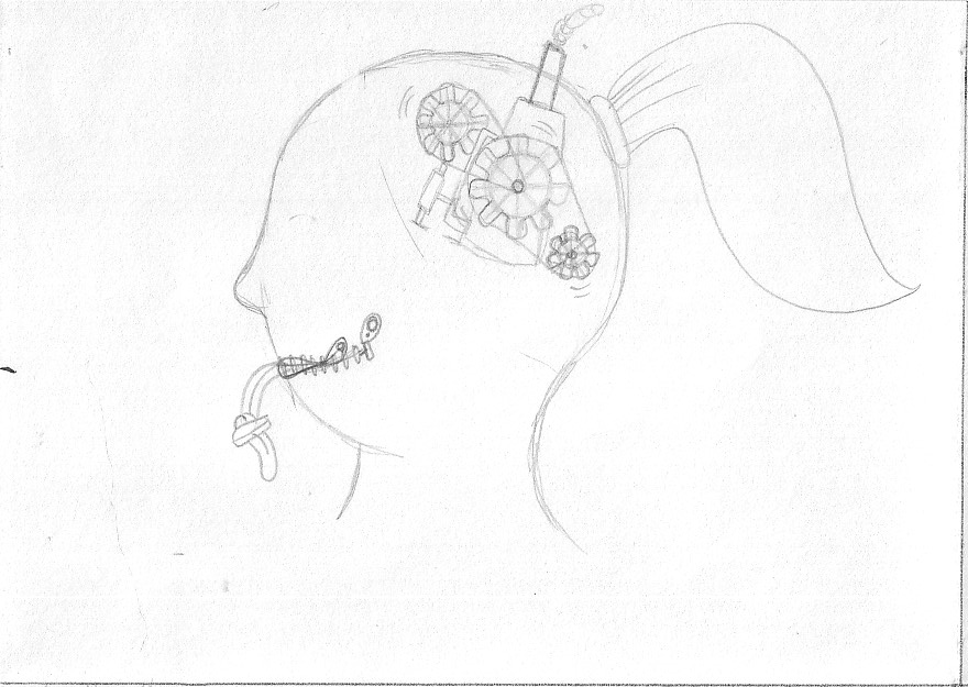
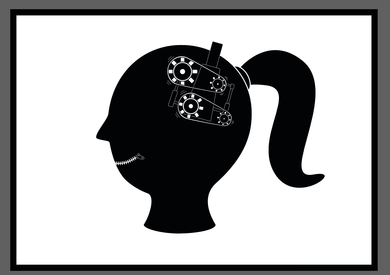
POSTCARD 1
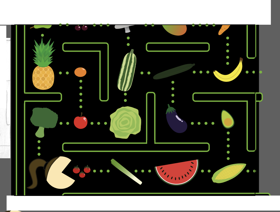
I decided to base the first postcard on one of the first things that most people pick up on when meeting me – my quietness. However, being an introvert, although I may not produce much noise on the outside I always have a great deal going on in my head (on an industrial scale!).
I had a very clear and definite design in mind for this postcard. I wanted to keep the design simple, using clean lines and restricting the palette to black and white. I feel this enhanced the visual idea of seeing the inner workings of my head.
I found that I could easily and quickly recreate my initial idea in the design of this card. I was relatively happy with the result and feel it is definitely representative of me.
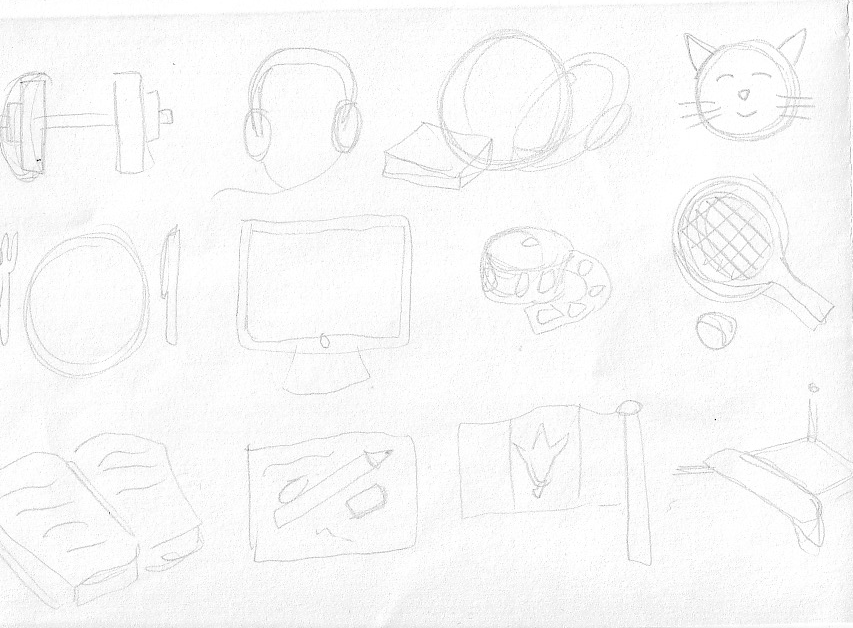
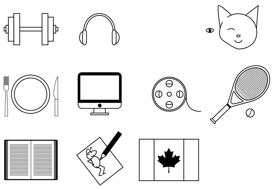
POSTCARD 2
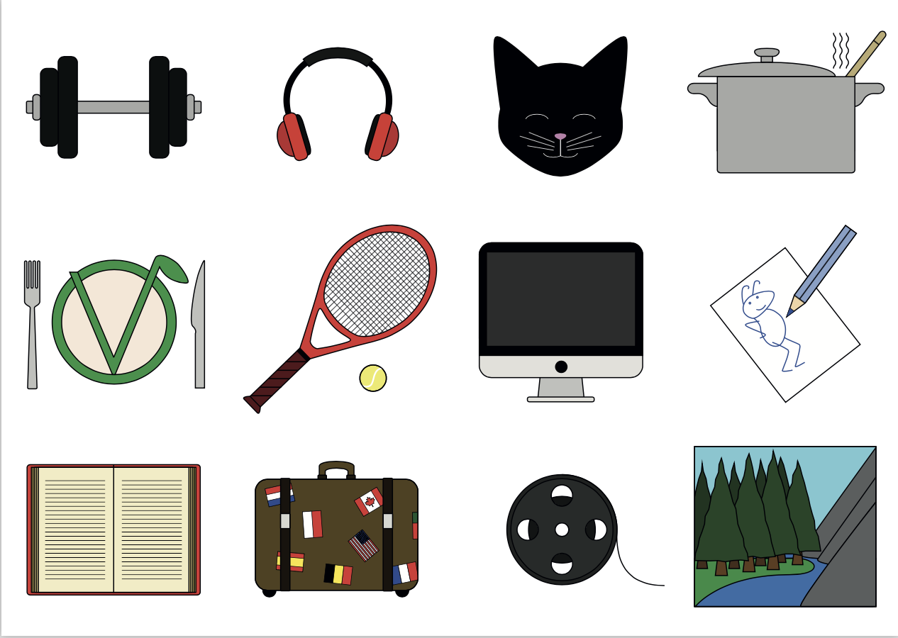
For the second postcard I wanted to build on the picture charades exercise and also incorporate my interest in pictograms. I decided to illustrate twelve of my hobbies and interests, which I hope will be succinct enough that the audience will be able to interpret the meaning relatively fast and effortlessly. The intention was for this postcard to be the one that most obviously reflected my personal style of design and illustration.
I spent quite a bit of time rearranging each visual element as I wanted to ensure there was a balanced distribution of the different shapes throughout the design. I also was not initially sure whether I would use colour or not, but decided that this would enhance most, if not all, of the visual elements (in particular, I felt the Canadian flag, the small flags and the vegan ‘V’ were all more readable with the addition of colour).
POSTCARD 3
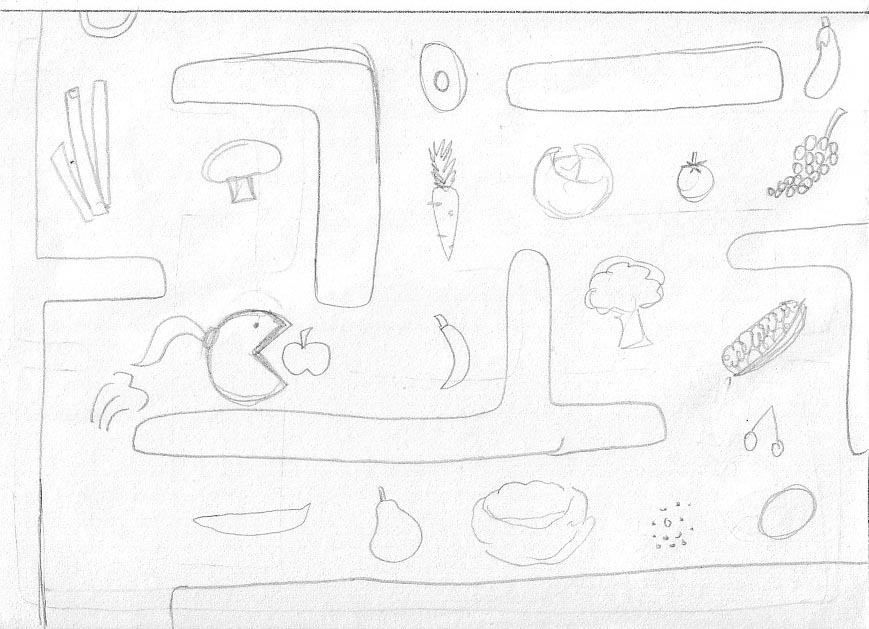
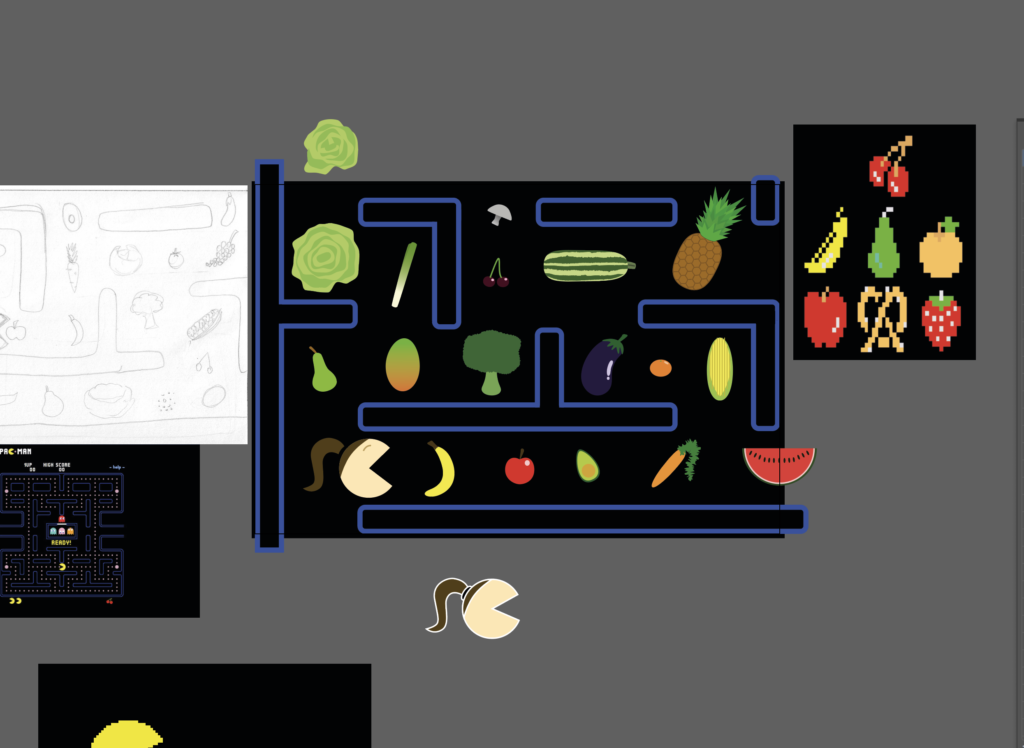
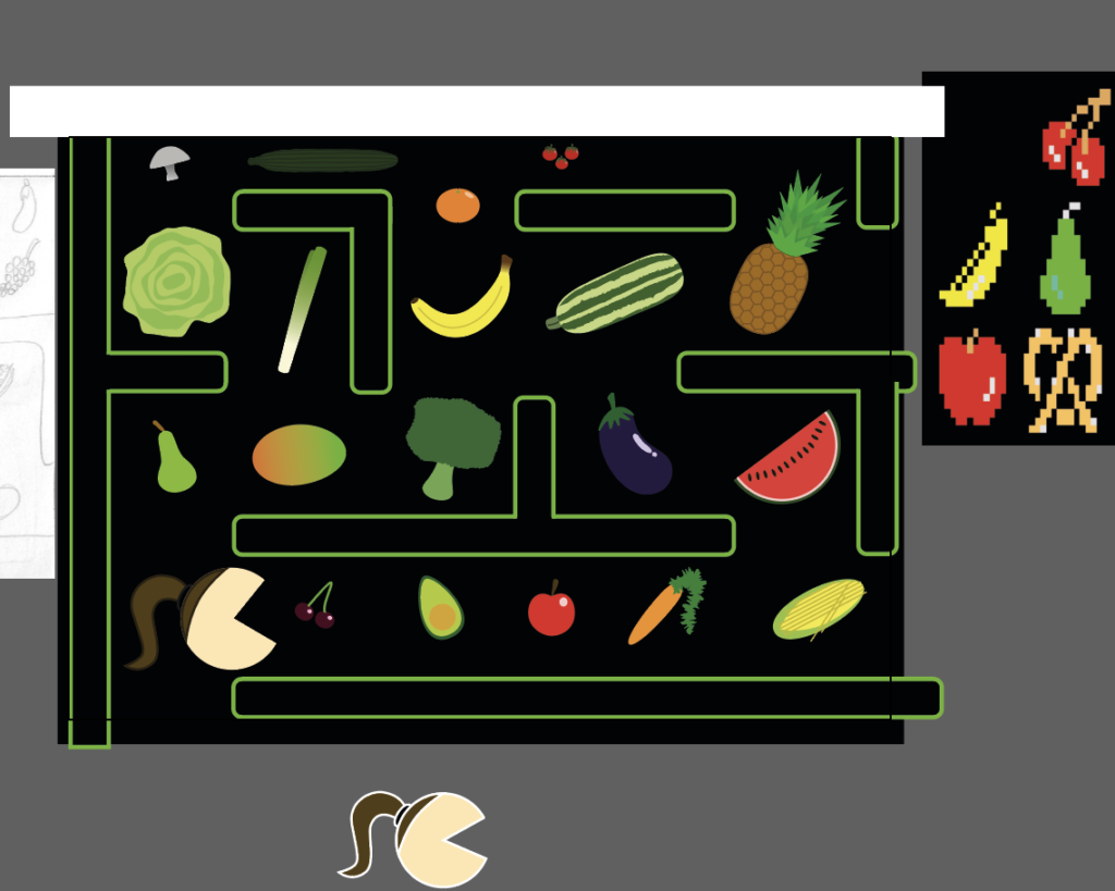
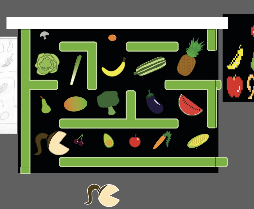
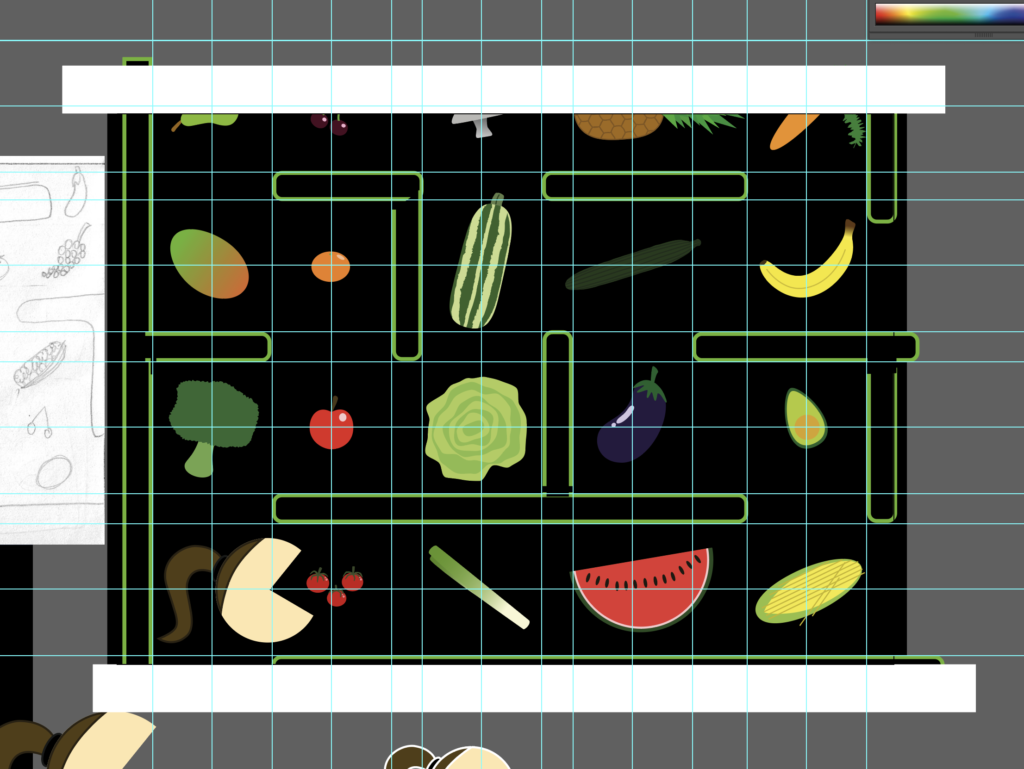
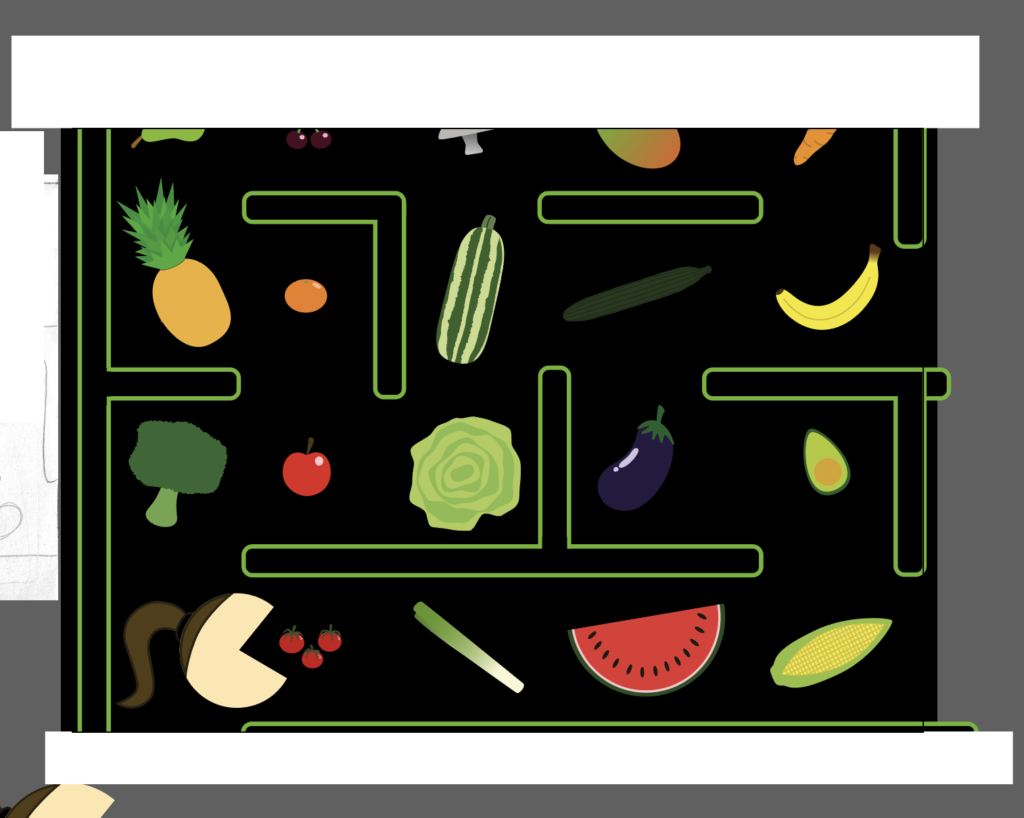
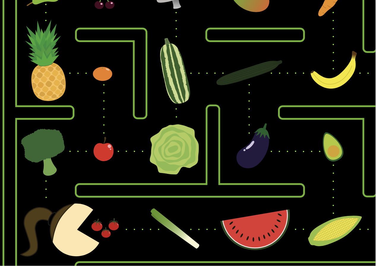
Based on the 1980s arcade game Pac-Man, I planned to replicate the design of the game, but replace Pac-Man with a version of me (the design of which would be recognisable from Postcard 1). Instead of yellow dots and the occasional fruit item, I would be ‘chomping’ my way through various fruit and vegetables. As can be seen from my mind map, I eat a plant-based diet and so this would illustrate my substantial consumption of fruit and vegetables. I also realised that the original game was released in the decade I was born in, which may be picked up on by those familiar with the game, and would provide additional information about me to the audience.
This postcard unexpectedly proved to be the hardest and time-consuming of the three to create. I wanted the visual elements to be balanced in the layout, so spent a great deal of time rearranging them. Creating the various fruit and vegetables from scratch also took longer than expected as I was determined they would be of a high standard. I also did not want the ‘walls’ to overpower the rest of the design, so reduced the stroke width. In addition, I changed the colour of these from the original blue to a ‘plant’ green. Initially I was not going to use the dots between the fruit and vegetables, but it seemed the design was missing something and the addition of them strengthened the visual association with the original Pac-Man graphics.
FINAL DESIGNS
EVALUATION
As this was the first assignment for the course I was quite apprehensive about how to begin as well as the fact that the content was quite personal and I’m not someone who finds it easy to focus on myself. I found that mind mapping was an excellent planning tool and I will definitely use this for future projects. I found the hardest part of this assignment was knowing whether I was on the right track and if I could keep to the the deadline. However, once I had clear concepts and drafts for each of the cards I was able to approach the creative process with more confidence.
Encouraged by my attempt at the picture charades exercise, I embraced the challenge of looking at my designs from the viewpoint of the audience, trying to ensure that what appears obvious to me is just as clear to others. I also liked using Adobe Illustrator, as it allows me to create my favoured style of illustration and hope this is reflected in my designs. I made use of the grid and guide tools, which were of great assistance with trying to line up visual elements and balance the design.
As previously stated I am not familiar with many graphic designers, so this assignment has begun to open my eyes to the styles that appeal to me and I am looking forward to researching these artists (and others) in greater depth in the future. I attempted to incorporate some influences from the aforementioned artists in my cards, but this is something I will be working on for future assignments.
Overall I am fairly happy with the final designs and I believe they achieve their objective of representing me. I found this assignment to be an excellent introduction to the course and working through each stage from start to completion has been a valuable exercise which I will build on in the future.