Exercise: Visualising Your Ideas
BRIEF
Using an A4 sheet of paper (or larger), design a leaflet for an organisation, inviting people to volunteer for a task. In addition to a title the information has been broken down into four chunks each of about 120 words. You will also need to leave space for contact and address details. Explore the different format for leaflets that are possible – find a way to make the people want to pick up the leaflet. Will the leaflet be put in racks, handed out or sent in the post. Ignore the actual words and sub-headings.
INITIAL SKETCHES
To start off this exercise I decide to sketch out thumbnails of as many different folds I could come up with. It proved quite tricky once I had covered the most obvious choices.

RESEARCH
Once I had exhausted my initial ideas for folding paper, I decided to research examples of leaflets and paper folding:

Many of the leaflets I found seemed to be A5 in size and were not folded.

In terms of creativity with folding, I did not find these examples very inspiring, so I set up a Pinterest board: Paper Folding/Leaflet Designs, which shows some rather more impressive examples. Many leaflets seem to rely on typography and colour to be eye-catching, rather than the paper folding. I’m not sure whether this brief allows for the use of scissors as it only mentions folding. If this was allowed, I think there would be many more creative options available.
I then started thinking about using origami style folding, but although these can look great, I’m not sure I would be able to include the text, etc in a readable format and the crease lines, once the paper was unfolded, could run through text/images. Also, they could be difficult to display in a rack or to post. Perhaps they could be handed to people on the street and these might catch their eye more than a traditional leaflet.
PROTOTYPES
I found working on a smaller scale easier to compare the different results:


I then sketched out rough layouts of text and images based on some of the prototypes.

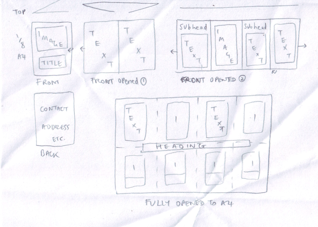
Although I liked the design of the last one above, I discovered that the text would have to be very small to fit on the pages, which would probably put some people off reading it.
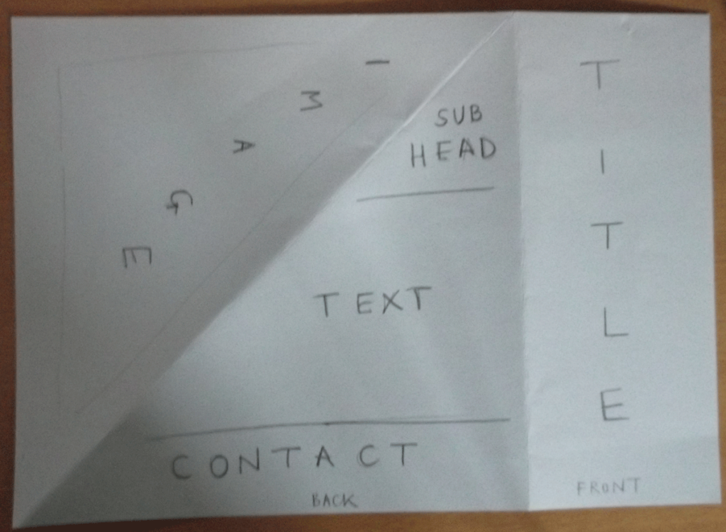
Therefore, I decided that leaflet number 3 above was the best in terms of balancing practicality and creativity. I made a A4 version using thicker paper, which was much better for durability if the leaflet were to be posted.


EVALUATION
I found this exercise much harder than I thought I would, particularly in terms of visualising how much space the blocks of text would take up – if I had done the mock-ups on a computer I could have used Lorum Ipsum text to get more of an idea.
I also found it quite difficult to come up with imaginative ideas whilst being practical in terms of layout, e.g. how the crease lines would affect text/images.
If cutting was allowed for this brief there would have been more possibilities to consider, but if the leaflets were to be mass produced this would have time and cost implications. I believe thicker and higher quality paper would also add to the leaflet’s appeal.