Working with a contemporary news event, create an illustration that comments on it from a satirical perspective. Think about how you structure this image. What information do you need to give the viewer in order for them to understand the context in which this image should be read? In other words, how do you connect your image to your chosen event? Think about how you use symbolism and metaphor in the image.
You might want to take a lead from William Hogarth, James Gillray or George Cruikshank on this, either by using well-established metaphors or making the connection between the contemporary and historical moment.
Use caricature to help you identify who is in your illustration. You may want to use collage to do this or work with your drawing skills.
Initial Thoughts
After the previous exercise I decided I wanted to choose an individual (or a group) that I would find easier to be satirical about and politicians provide the perfect opportunity for this. I recently finished reading the book The cartoon century: modern Britain through the eyes of its cartoonists (2007) by Timothy Benson, which contains examples of political cartoons from each year of the past century. Although I was not too familiar with many of the characters and stories, it was certainly a very educational read and demonstrated the range of styles that artists have used to portray world leaders. The book also demonstrates how the political opinion of the publication in which the cartoons were printed, along with that of the artist, is very influential in the narrative of the cartoon and, therefore, the point that was being put across to the audience (who are generally of a similar political leaning).
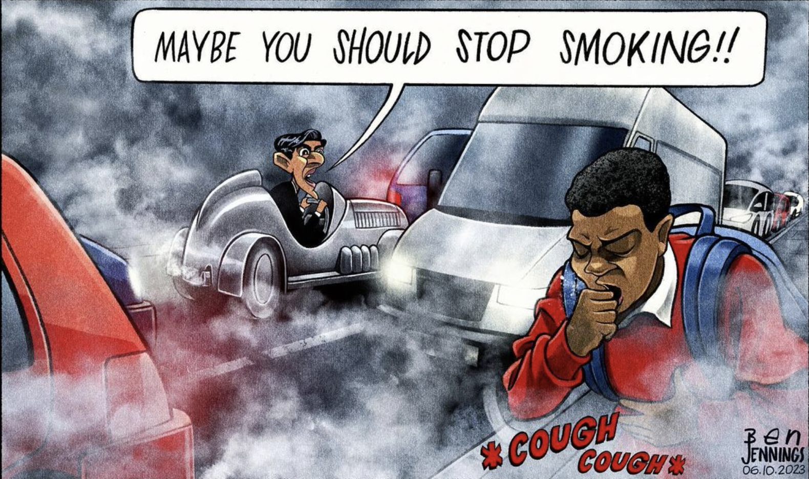
An example of a modern day political cartoonist that I really like both in terms of visual style and clarity of the message being portrayed is Ben Jennings.
Choosing a Contemporary News Event
At the time of undertaking this exercise, one of the major news stories is that Rishi Sunak has decided to weaken the climate pledges that the Conservative government had previously identified as being part of their ‘net zero strategy’. Additionally, he has green-lighted the Rosebank oil field in the North Sea, as well as issuing licences for new oil and gas field exploration.
Considering that the UN has declared a climate emergency several times (and never mind that scientists have been warning of the effects of global warming for decades), I am not really able to comprehend the logic of governments that make the active choice to ignore these warnings.
I felt that this topic was one that had plenty of potential so I decide to move onto thinking about some possible ideas.
Generating Ideas
To begin with the planning of this exercise, I noted down some possible ideas that came to mind, which included:
- Politicians dressed as clowns on a stage, performing to an audience or with a splatted planet on the ground and the clowns pointing at one another to allocate the blame.
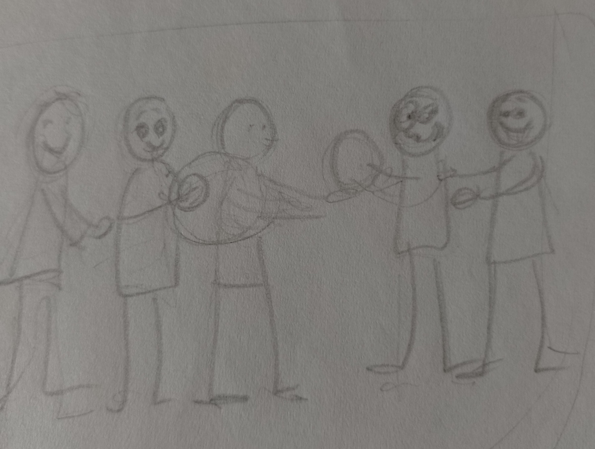
- Politicians trying to deal with a hot potato (which would actually be a burning planet), passing it from one to another to avoid getting burnt.
- Politicians playing football and one of them has kicked the ball (the planet) miles away – ‘not our problem’.
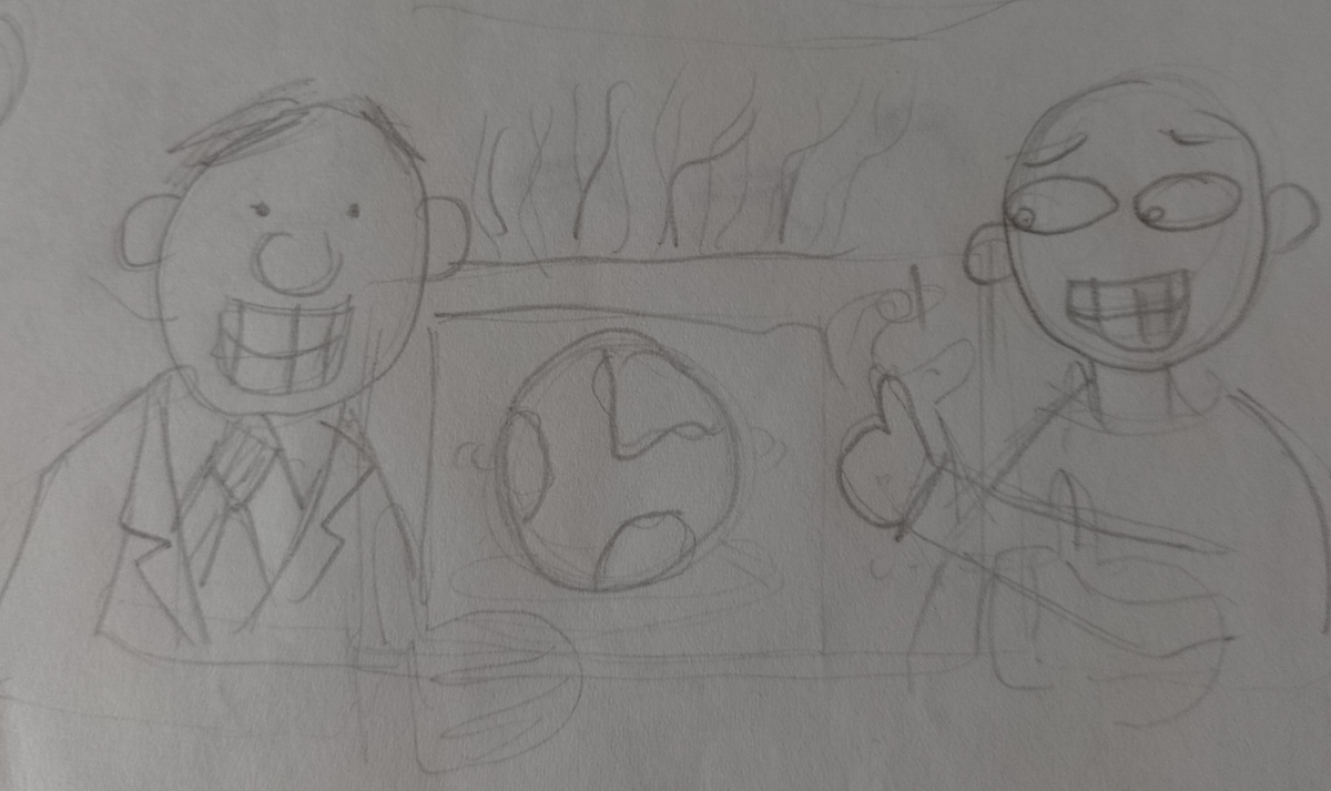
- Politicians cooking the planet in a microwave – maybe exploded from the heat.
- Great British Bake Off style set-up with politicians as contestants and the judges assessing their cakes (planets) – e.g. exploded, burnt, etc.
- Politicians lined up on scorched earth with heads ‘buried in the sand’.
- Hot air from politicians used as renewable energy source.
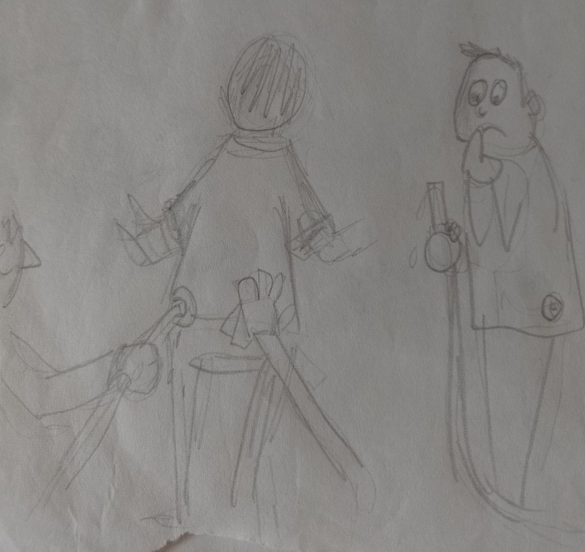
- Politicians as robots, switched to ‘election mode’. Sunak powered by oil, Starmer holding oil pipe looking confused.
- Sunak as a crash test dummy, smashing into Earth – “I’m on the side of drivers!”
One of the key visual concept for all the ideas was that the politician/s would always have a fixed smile on their face.
At this point I felt I had quite a few solid concepts that I might be able to develop. I found it quite therapeutic to think of these and was a good way of releasing some of my frustrations regarding the subject of climate change/the environment and the ineptitude of those ‘in charge’.
Thumbnails/Sketches of Ideas
Next, I drew out some extremely rough sketches of ideas based on some of the above.
The first one, below, shows politician kicking the planet into the future.
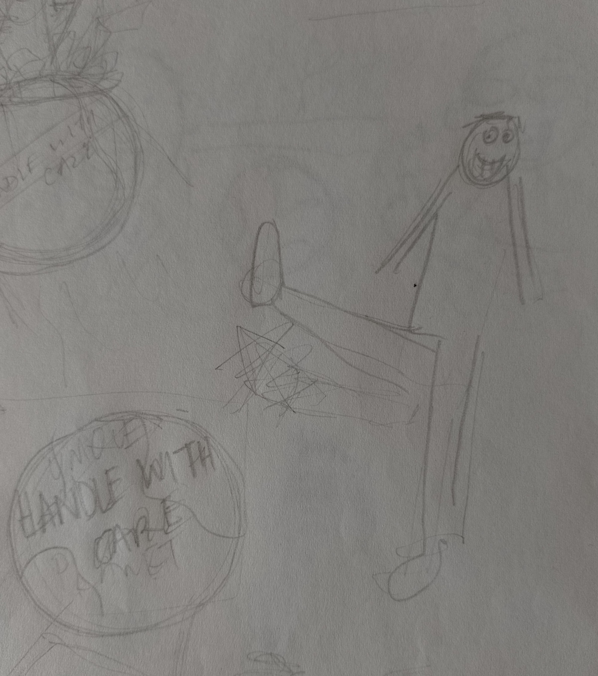
The sketch below shows politicians passing the ‘hot potato’ planet along the line.
The next image shows the planet in a microwave, with smoke coming out of the top, and two politicians standing either side. One of them would be turning the temperature up.
The drawing below is based on the idea of politicians going into ‘election mode’, with Sunak being connected to an oil pipe and money being put in his back pocket (relating to lobbying/donors) and Starmer standing next to him with a confused expression, not sure what to do with the pipe he is holding.
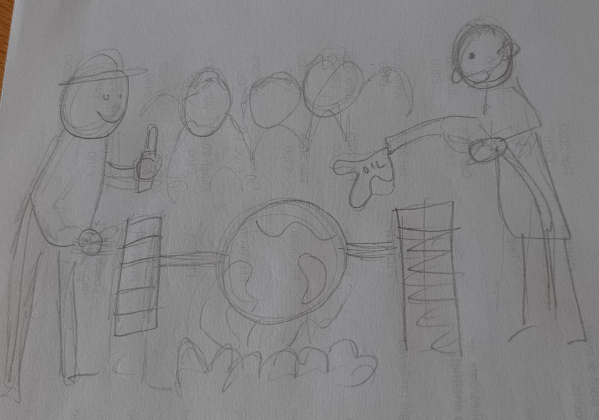
I then moved onto a couple of ideas that I felt were among the strongest. The first, below, shows the Earth being turned over a barbecue, with the politicians gathered around, one of them turning the spit and the other adding more fuel to the fire. I thought this idea was vaguely influenced by Jame’s Gillray’s The Plum Pudding in Danger (1805).
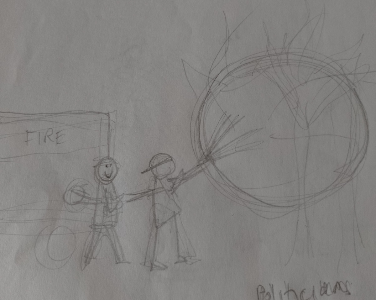
The second concept, which I felt had the most potential, shows the politicians as firefighters, but instead of spraying water onto the burning Earth, they are using oil.
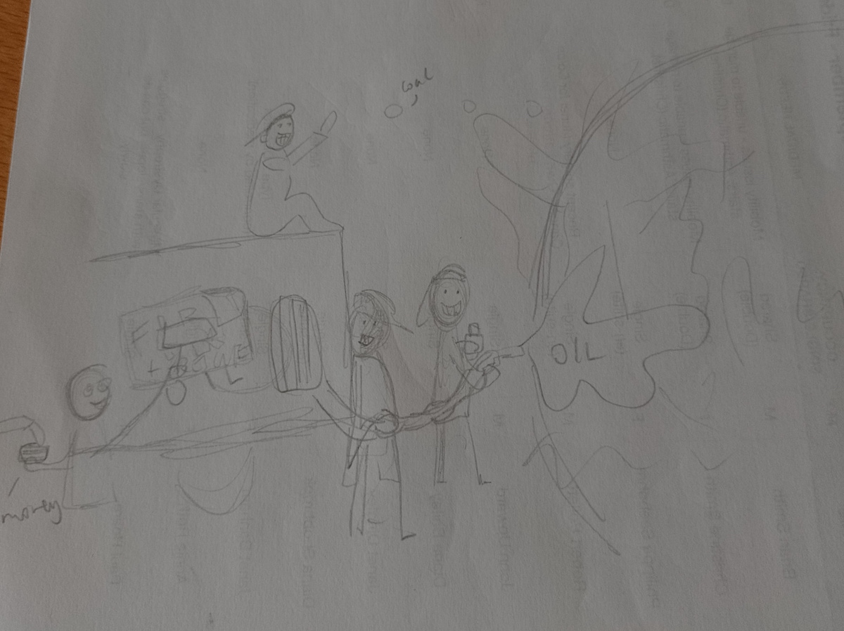
I expanded on this idea, below, and thought that perhaps the fire engine could be an oil tanker in disguise, with a politician pasting the ‘fire’ sign onto the side of it.
Developing the Idea and Producing Draft Versions
I felt most inspired by the last idea so I decided to take one this forward and draw a clearer, more developed, draft. There are plenty of world leaders who say one thing with regards to ‘tackling’ climate change and continue as they have always done (such as green-lighting new fossil fuel exploration, even in areas of environmental significance…), but I had to limit myself to the number I would include in my drawing, otherwise it would become slightly overwhelming!
In the end, I picked five: Rishi Sunak (UK), Joe Biden (US), Justin Trudeau (Canada), Xi Jinping (China), and Narendra Modi (India). Rather than have them ‘putting out’ an actual burning planet Earth, which was not very logical, I decided to show them attending an implied wildfire.
I drew this initial version very loosely, using various photographs of each politician for reference (not just copying a single image) and tried to pick on features that could be exaggerated for each one, for example, Sunak’s rather large ears and Biden’s wonky smile.
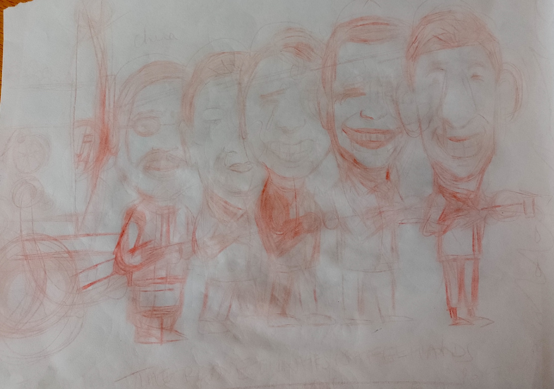
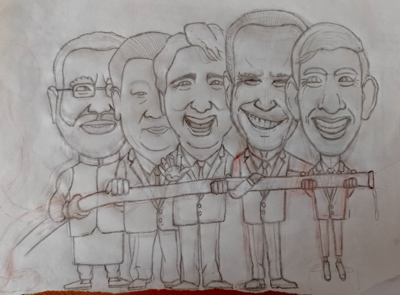
I felt quite happy with my progress at this stage, but now came the challenging part where I had to try to draw recognisable versions of the five politicians! I lost track of how long I spent on producing the pencil version, below. Overall, I was quite happy with it, but it was incredibly difficult to make them at least vaguely look like the real-life counterparts. I found Biden particularly tricky, especially his eyes and mouth. As a side observation, I was pleased with the folds/creases in the trousers as I really had tried make these quite realistic. Hopefully, it was worth the effort.
Generally, I tend to end up preferring the pencil versions of my drawings rather than those I go on to produce using ink. I think this is partly due to feeling looser when I use pencil and then restricting my strokes when I proceed to create a clean line version using pen. I wanted to try and avoid this outcome for this exercise.
For the first pen version I used a 0.1 fineliner (and a lightbox) to draw a draft in ink. I was not happy with the feet in the pencil version – I find the angle/perspective of front facing shoes are not easy to capture on paper, but I preferred the attempts in the pen version, below, to the previous one. I was not too sure about the illustration at this point, I felt Jinping in particular had lost something in this draft.
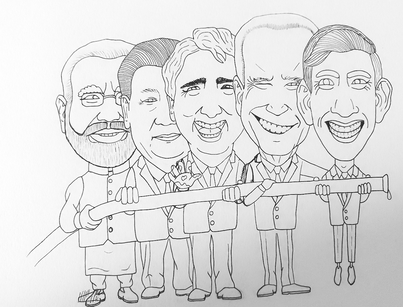
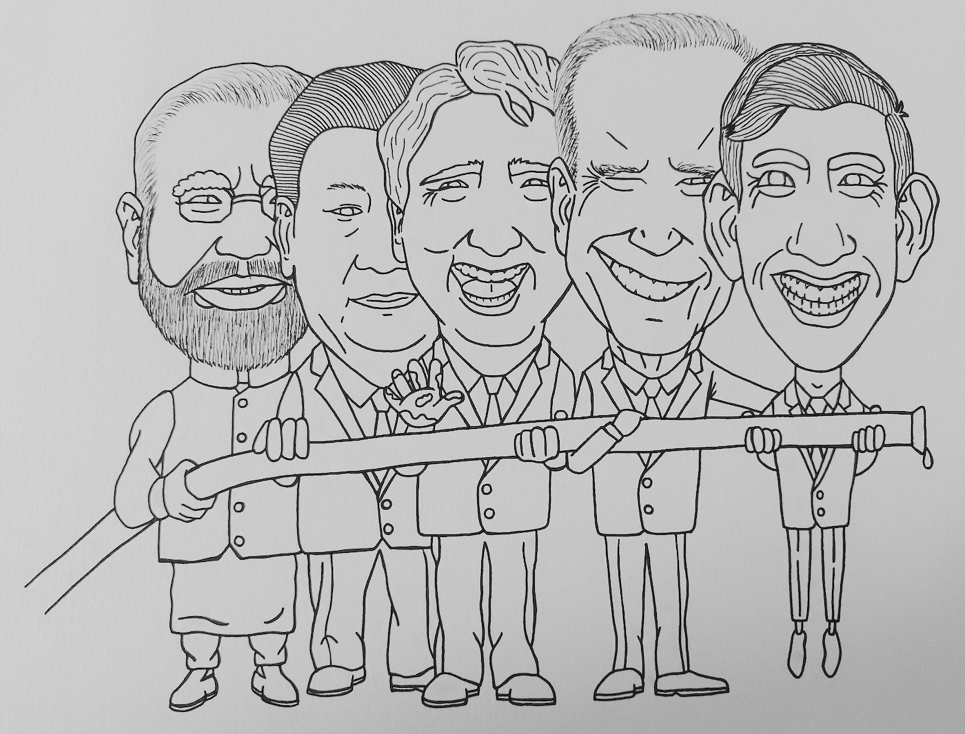
Once I was as content as I could be with the first pen draft, I moved on to produce another version, this time using a 0.3 fineliner and tried to keep it as clean as possible. To be frank, I was a bit disappointed with the outcome and felt that they no longer looked as much like their real-life counterparts. On the other hand, I should have been pleased that I had managed to produce human-like characters that were in proportion with one another.
(click on image for larger version, opens in new tab).
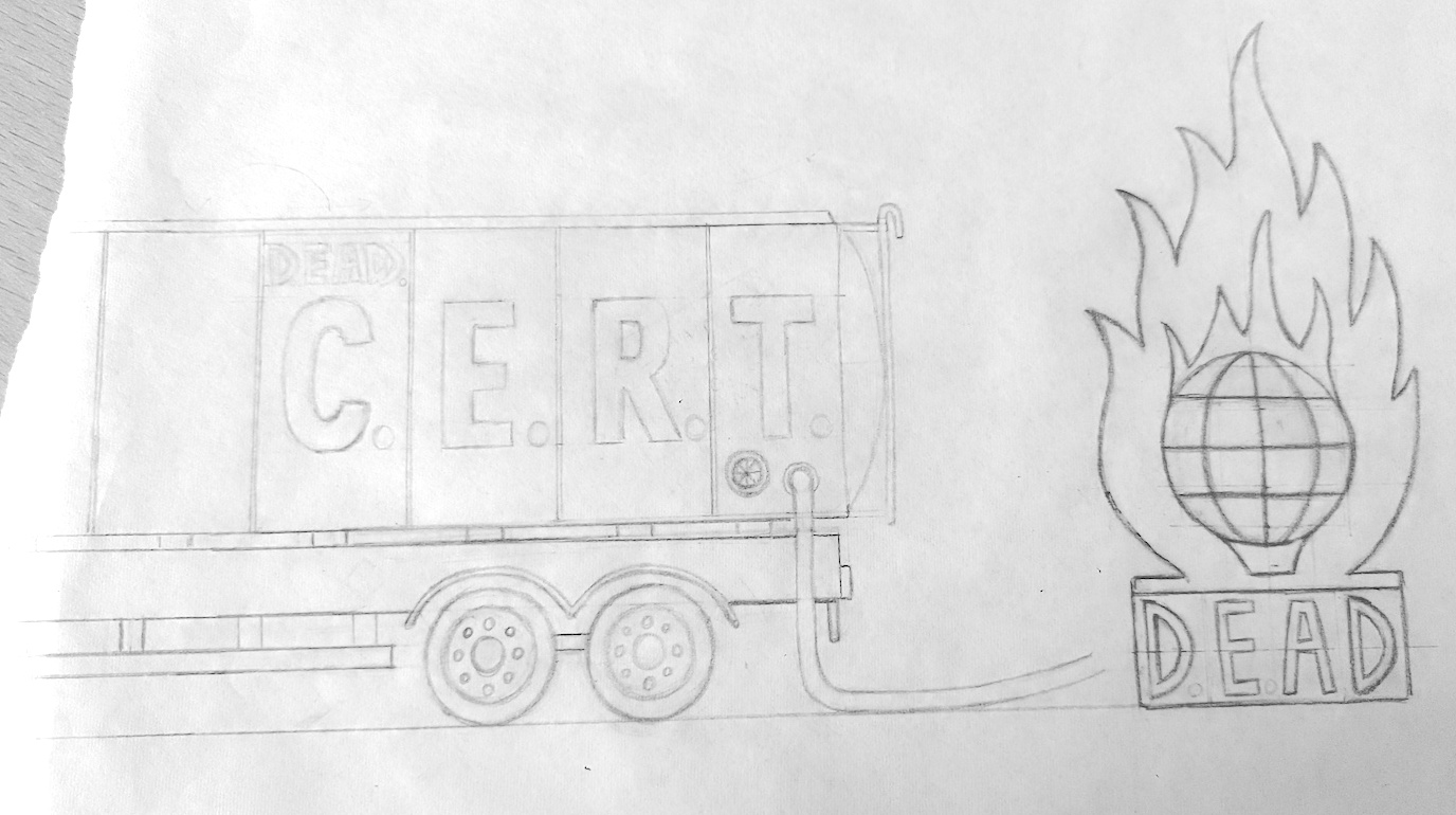
I had not really taken into consideration the other main component in my original concept for the illustration – the oil tanker/fire engine. I usually try to avoid drawing cars or any type of vehicle as they tend to look like those I drew in infant school, so I did procrastinate slightly. Finally, I settled down and took the plunge, using a selection of images from an online search to produce the simple drawing below.
(click on image for larger version, opens in new tab).
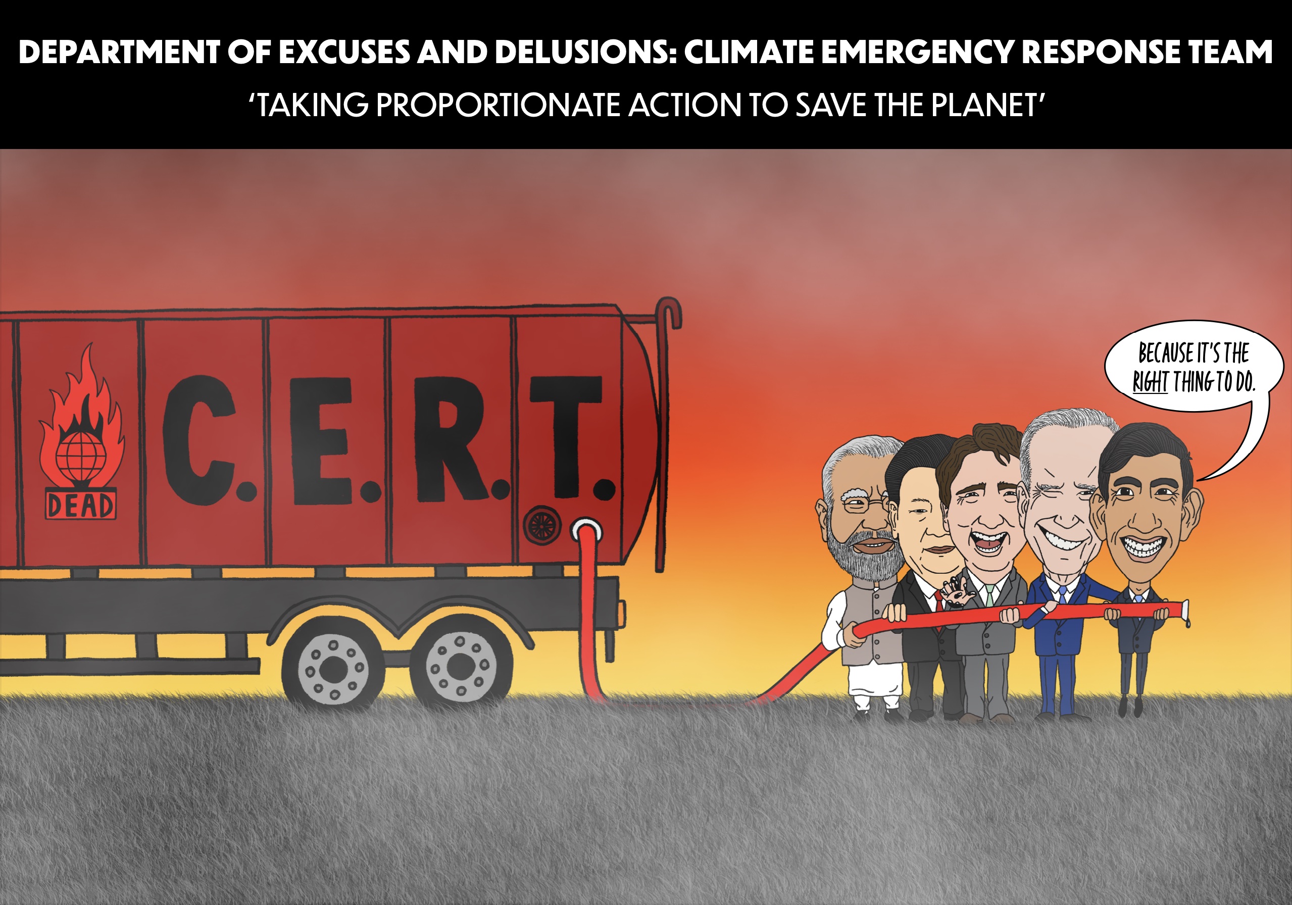
Whilst I was doing this, rather than using a real world oil company logo (and being sued?), I came up with the idea of a logo/title that that summed up my opinion of the world leaders’ action on climate change. There would be a government department called The Department of Excuses and Delusions and this faction would be one of the ‘Climate Emergency Response Team‘s. I then came up with logo, which I was quite pleased with, showing a generic globe icon surrounded by a flame. The acronym DEAD seemed appropriate, and, alongside the other acronym CERT, which can be used in speech to describe something that will inevitably happen, produces the words ‘dead cert’ – implying that it is dead certain that the end of the world is nigh if left in the hands of these nitwits.
Next, as with the politicians, I drew a version using a fineliner, firstly a 0.1 pen and then going over these lines using a 0.3 pen.
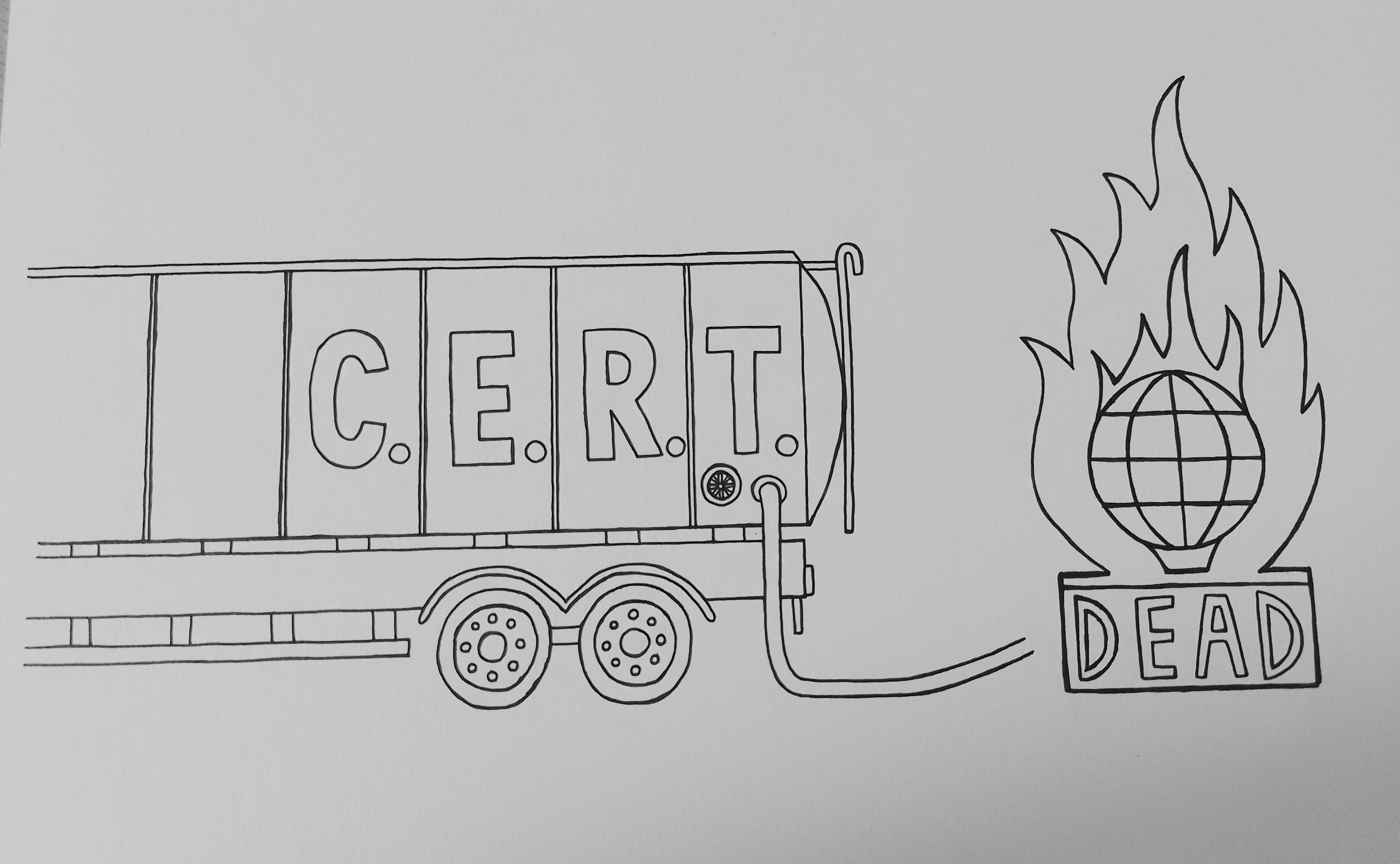
(click on image for larger version, opens in new tab).
Moving into Photoshop
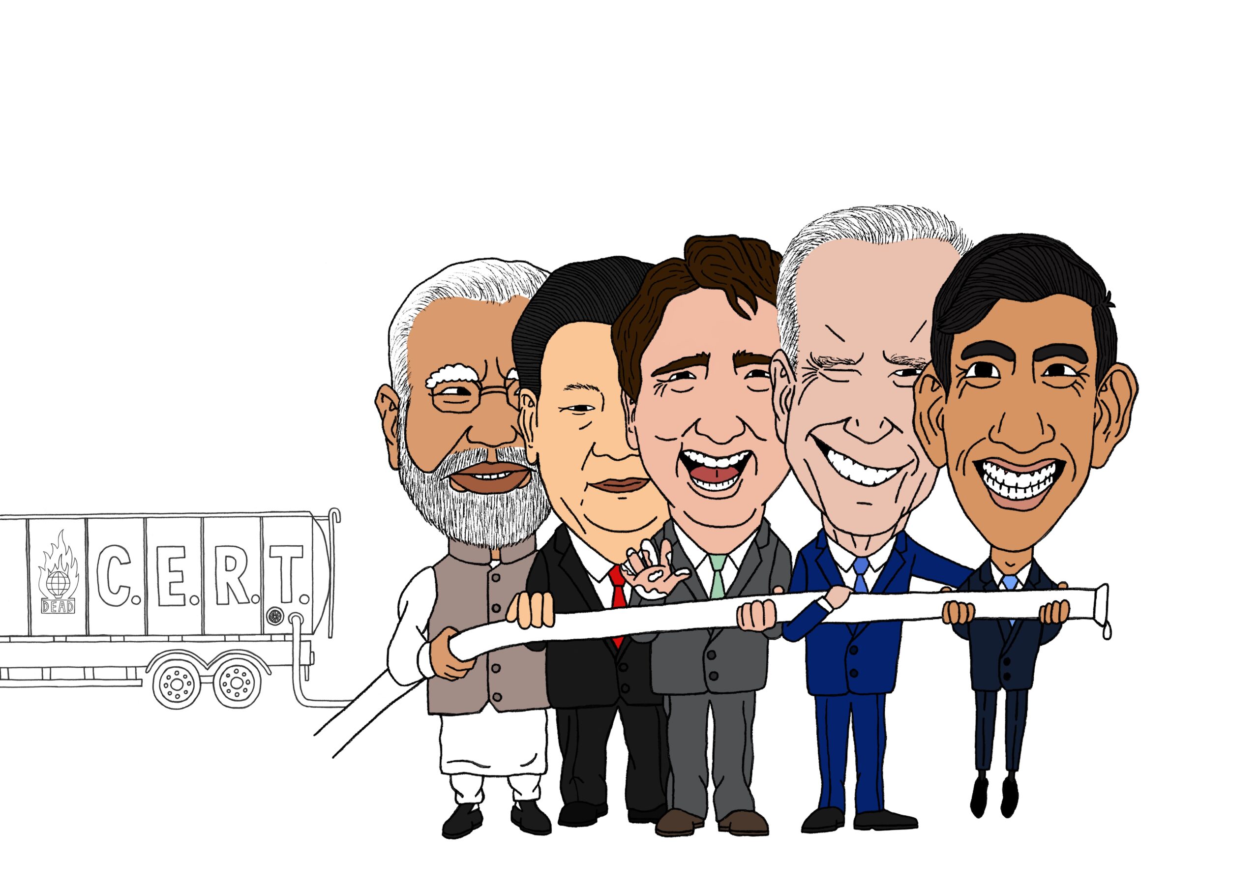
I scanned the drawings into Photoshop, cleaned up the lines and added a few details as required. I then used photographs as reference and proceeded to add colour to the politicians. It was quite challenging trying to find the right skin colour/tone for each of them.
I did feel that adding colour revived some of the likeness into the illustration, although I was not sure if Biden looks like he is smiling, winking or twitching.
(click on image for larger version, opens in new tab).
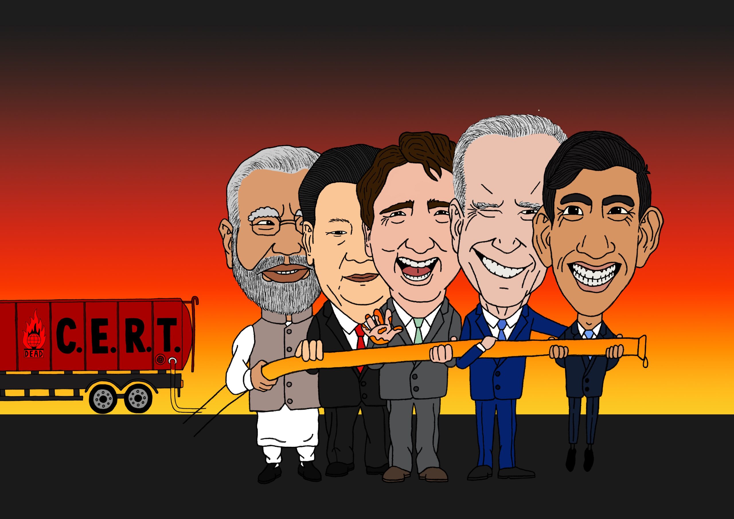
The next aspect I had to consider was the background. There were several factors that influenced my final decision with respect to this. Firstly, the amount of time, yet again, that I had spent on this exercise so far was a bit excessive, so to start working on a complex background would have increased this immensely. Secondly, I felt that a simpler background would not distract from the main elements, that is the politicians and the tanker, as a more complicated one might. I did consider adding a few silhouette of dead trees, but decided against this when I attempted to work out the proportions/perspective.
In the end, I kept it simple with a gradient that was intended to imply an inferno, which I felt was quite visually effective. I also added a basic ground, but I wanted to improve this as it did not look right. I also was not happy with the scale of the politicians and the tanker so I needed to work on this as well.
With reference to the oil tanker, I felt quite confident in my colour choices as red, in Western culture, is associated with danger/warning and therefore appropriate in this context. I contrasted this with black for the letters to produce a bold, eye-catching combination.
(click on image for larger version, opens in new tab).
Originally, I had intended to have the politicians placed in the foreground with the tanker placed further back, and the two connected by the pipeline that the group are holding. If I had drawn the whole illustration as one drawing rather than two (or three), it would have been easier to create this composition. As it turned out, I could not get the scale to work, along with the perspective of the pipeline going backwards to the tanker. Also, I found it quite difficult drawing this using a drawing tablet, it would probably be simpler if I could have drawn directly onto the screen, which would resemble drawing onto paper.
To save on time, and frustration, I opted to scale down the politicians and place them alongside the tanker, where it was easier to complete and thus connect the pipeline between the two.
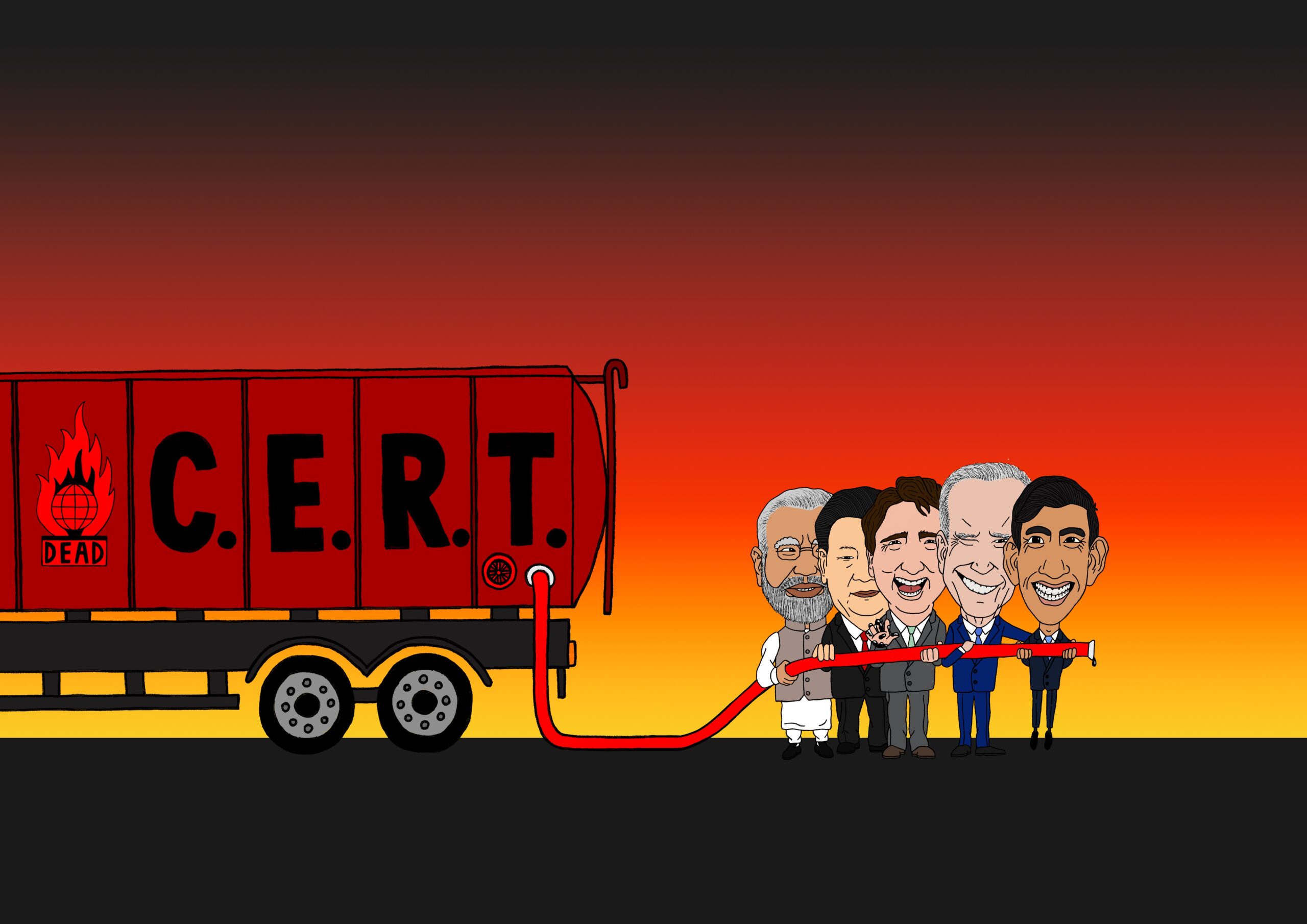
(click on image for larger version, opens in new tab).
When I reached a point where I was fairly happy with the overall look of the illustration, after some further scaling and cropping, I wanted to work on the ground as the flat rectangle was too simplistic, even for me. I decided to take the opportunity to begin experimenting with brushes in Photoshop and found one that resembled grass. I played with the brush settings and scale before I settled on one that looked acceptable.
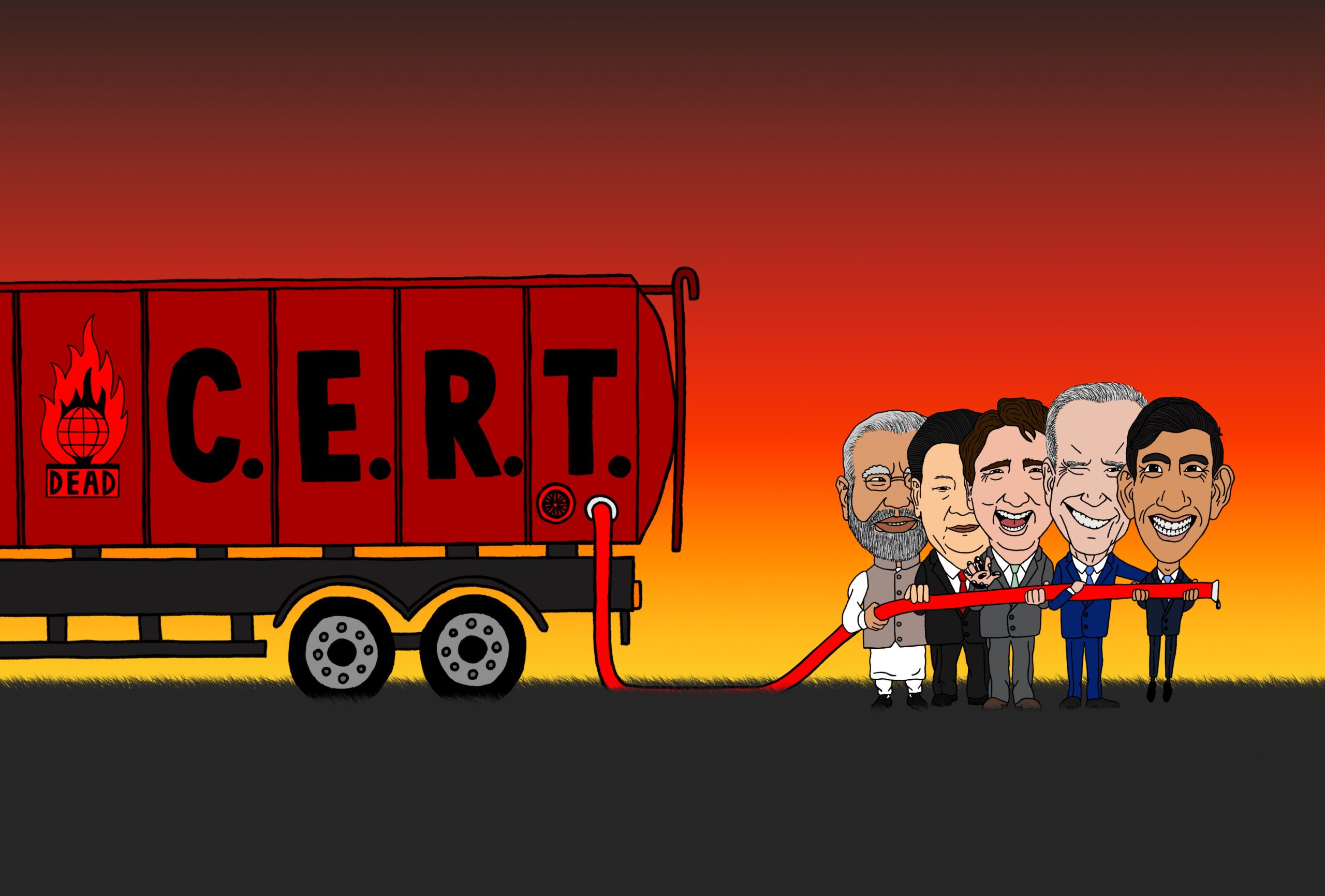
(click on image for larger version, opens in new tab).
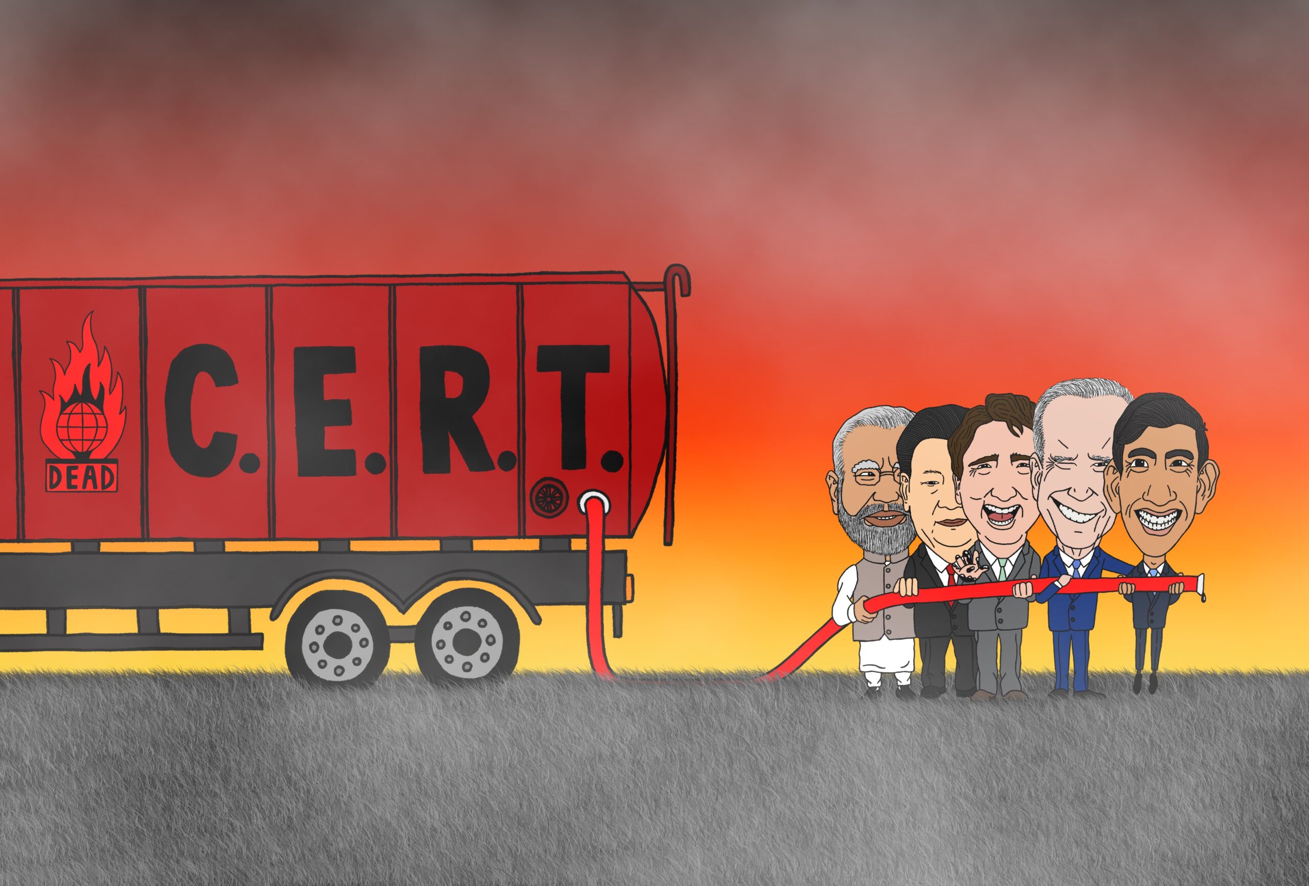
I continued playing with the grass brush to add more texture and depth using different tones of grey. I also wanted to make it so it looked like the politicians, pipeline and tanker were embedded within the grass and not floating within it.
The final addition I made in Photoshop was to create a smoke effect over the top of the illustration, to make it so there was no doubt as to what I was implying was happening out of view, i.e. a fire. I made this effect based on a YouTube tutorial I found online by Glyn Dewis and it involved using the cloud filter on a new layer, cropping a small selection of this, scaling it up, adjusting the levels and changing the blend mode to ‘screen’. I then created a mask layer and was able to remove areas of the smoke that were obscuring the focal points, i.e. the politicians and tanker.
(click on image for larger version, opens in new tab).
Overall, I was mostly happy with what I had managed to produce so far, especially when I reflected on how the idea started as an extremely rough sketch.
Adding Finishing Touches in Illustrator
For the final stage of this exercise, I exported the image into Illustrator and added a title, which explained the acronyms, with the addition of a motto. I also could not resist adding a speech bubble to Sunak as it was the right thing to do.
Final Thoughts
Overall, I was surprisingly pleased with the final outcome of this exercise. Of course, there are improvements that could be made, which will be addressed below, but I believe that I managed to more or less successfully fulfil the brief.
I am currently reading the book Creativity Inc.(2014) by Ed Catmull, one of the founders of Pixar Animation, and a key point that he makes with regards to striving for creative success is to always reflect upon what went well and what could be improved upon going forward – even for projects that are considered to have performed excellently. He suggests listing five observations for each category, and I am planning to implement this technique for every remaining exercise and assignment.
What went well:
- I began with quite a large selection of ideas, which meant I had more options to explore and narrow down, as several of the concepts overlapped in terms of imagery and content.
- My ideas were based on a subject that I feel quite strongly about, which fuelled my enthusiasm and motivation as I progressed through the exercise.
- I was not precious about the initial rough sketches/thumbnails – in earlier exercises I tended to fret about how amateurish they might look, but I have begun to genuinely understand that these first drawings are meant as visual notes and prompts for my benefit as I develop my ideas.
- I feel I managed to capture a likeness with each of the politicians (hopefully) and my drawing skills are steadily improving as I progress through the course. I was pleased that I was able to draw the characters without focusing on, and therefore copying, a single reference photo, but rather taking visual cues from a selection of these instead.
- I also believe my confidence in using, exploring and experimenting in Photoshop is gradually increasing.
What could have been improved:
- I need to improve my time management so that, for example, I am able to reach the colour stage with enough time to try adding shadows and highlights, or any other ‘cosmetic’ element (such as grey streaks in Sunak’s hair).
- It would have been helpful to have had more of a plan in terms of what I wanted to do with the background. Although it seems to have worked out well in this example, there will be future projects in which it would be detrimental to leave it to the latter stages and not have clear idea of the whole composition.
- Similarly to the previous point, this exercise demonstrated that I should have considered the drawing as more of a whole rather than in separate parts as it was quite challenging to figure out a a way to connect the two elements via the oil pipeline due to scale and positioning.
- I made a start experimenting with brushes in Photoshop during this exercise and this is an area I am keen to continue to develop and experiment with on a regular basis.
- I noticed, at the end of this exercise, that I had forgotten to finish drawing the glasses on Modi, so it looks like they are just balancing on his nose.
I thoroughly enjoyed this exercise and feel I have been introduced to and improved on quite a few creative areas as I worked through it, which I hope to expand on as I move forward with the next tasks.
Bibliography
Benson, T. S. (2007) The cartoon century: modern Britain through the eyes of its cartoonists. London: Random House.
Catmull, E. and Wallace, A. (2014) Creativity, Inc: overcoming the unseen forces that stand in the way of true inspiration. London: Bantam Press.
Francis, S. (2023) Rishi Sunak delays petrol car ban in major shift on green policies – BBC News. Available at: https://www.bbc.co.uk/news/uk-politics-66871457 (Accessed 8 September 2023).
Glyn Dewis (2022) TRY THIS for adding SMOKE, FOG, MIST and CLOUDS into your pictures using Photoshop. Available at: https://www.youtube.com/watch?v=3Ty3q1RpC7Q&t=312s (Accessed 14 September 2023).
Instagram (2023) Ben Jennings (@bjenningsuk) – Instagram. Available at: https://www.instagram.com/bjenningsuk/ (Accessed 8 September 2023).
McCool, M. and Rutherford, N. (2023) Rosebank oil field given go-ahead by regulators – BBC News. Available at: https://www.bbc.co.uk/news/uk-scotland-scotland-business-66933346 (Accessed 8 September 2023).
McGrath, M. (2023) Climate change: UN calls for radical changes to stem warming – BBC News. Available at: https://www.bbc.co.uk/news/science-environment-66753909 (Accessed 8 September 2023).