Develop a small self-published book based on an idea from your sketchbooks. Produce a small, photocopied fanzine or a one-off artist’s book.
Look at your sketchbooks for ideas of work that could be developed into a self-contained narrative or collected together to form a publication. For example, it could be a character you have developed, a particular style of working or a series of drawings on a similar theme.
How would you title your work and how does this title feed back into the development of your idea?
Reflect on your finished publication. What sort of audience do you think would be interested in your work?
Initial Idea
I decided to create a zine for this exercise as I had looked into these for the previous Research Point. I found it quite difficult to select work from my sketchbooks that I wanted to use for this, but then an idea did start to form in my mind based on a combination of two pieces of work.
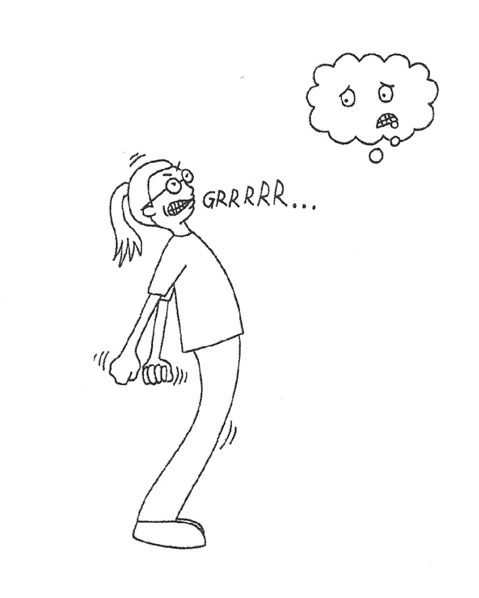
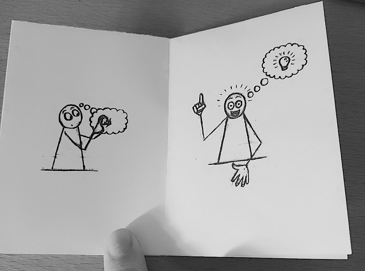
The first was an exercise I undertook for the Graphic Fiction unit – Make a Mini-Comic. The simple concept I devised for that project was to have a character, loosely based on me, struggling to come up with an idea and the conflict she has with her long-suffering thought bubble.
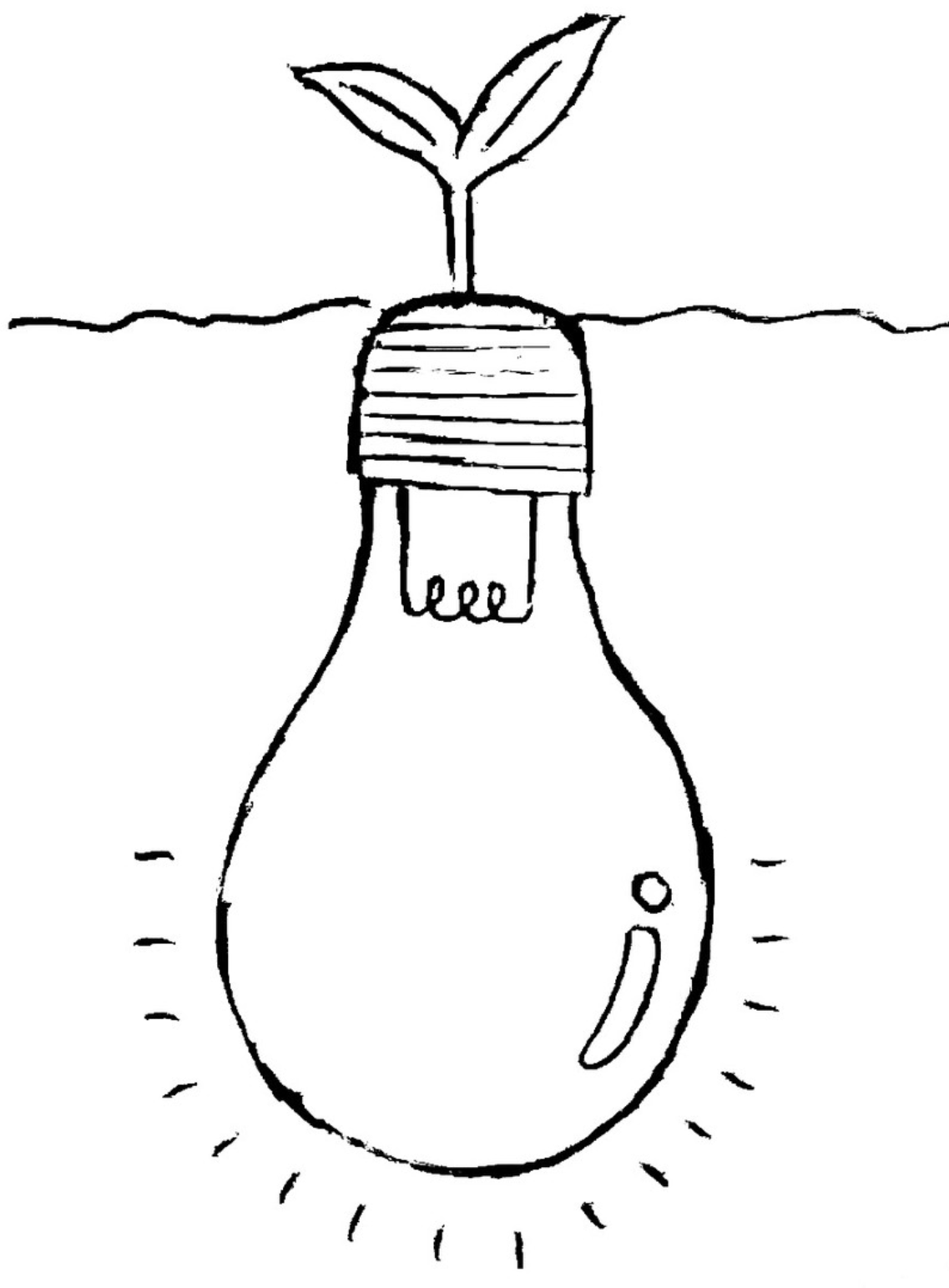
The other influencing piece of work was a simple sketch I did for the #randomfriday weekly challenge set by @illoca22 on Instagram, which was based on the word ‘bulb’. My illustration was of a lightbulb in the soil with a green shoot protruding out of the surface.
With these two sources in mind, I began to develop a simple concept for my zine:
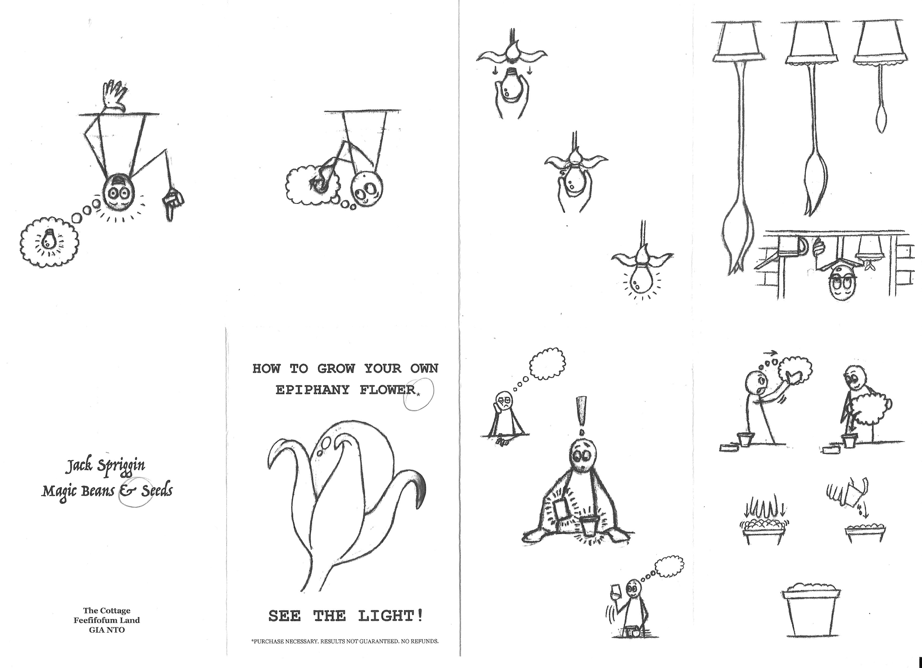
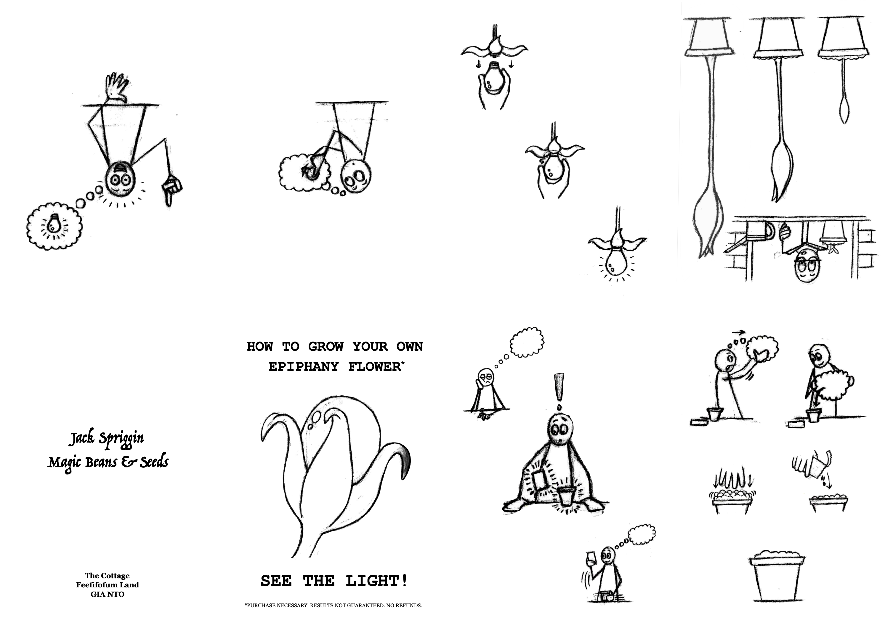
The planting of a seed that would grow into lightbulb. This could then be placed in an empty thought bubble, thus giving the bubble’s ‘owner’ a bright idea.
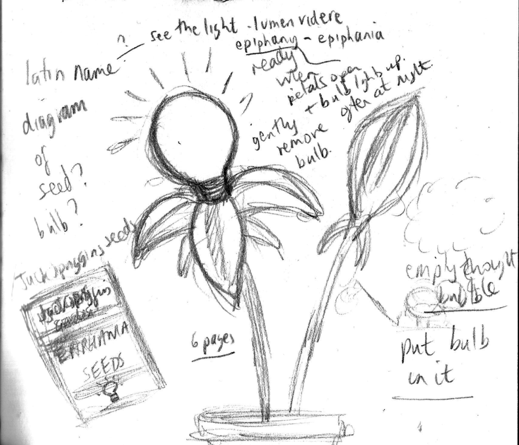
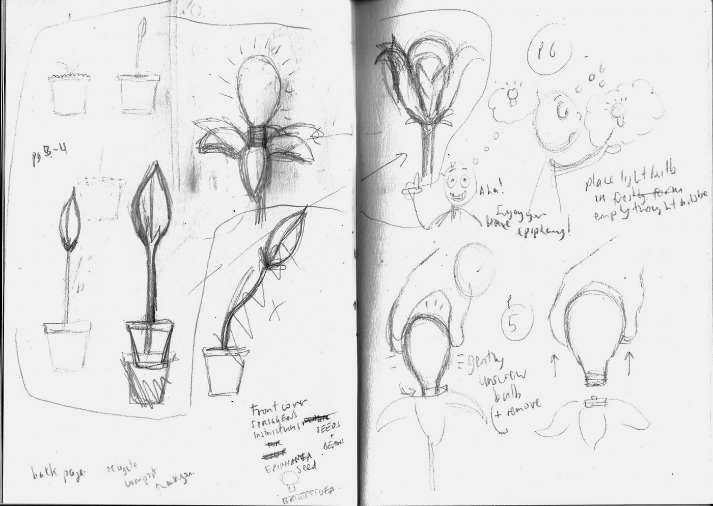
I produced my first sketch of this, below, along with a few notes.
(click on image for larger version, opens in new tab)
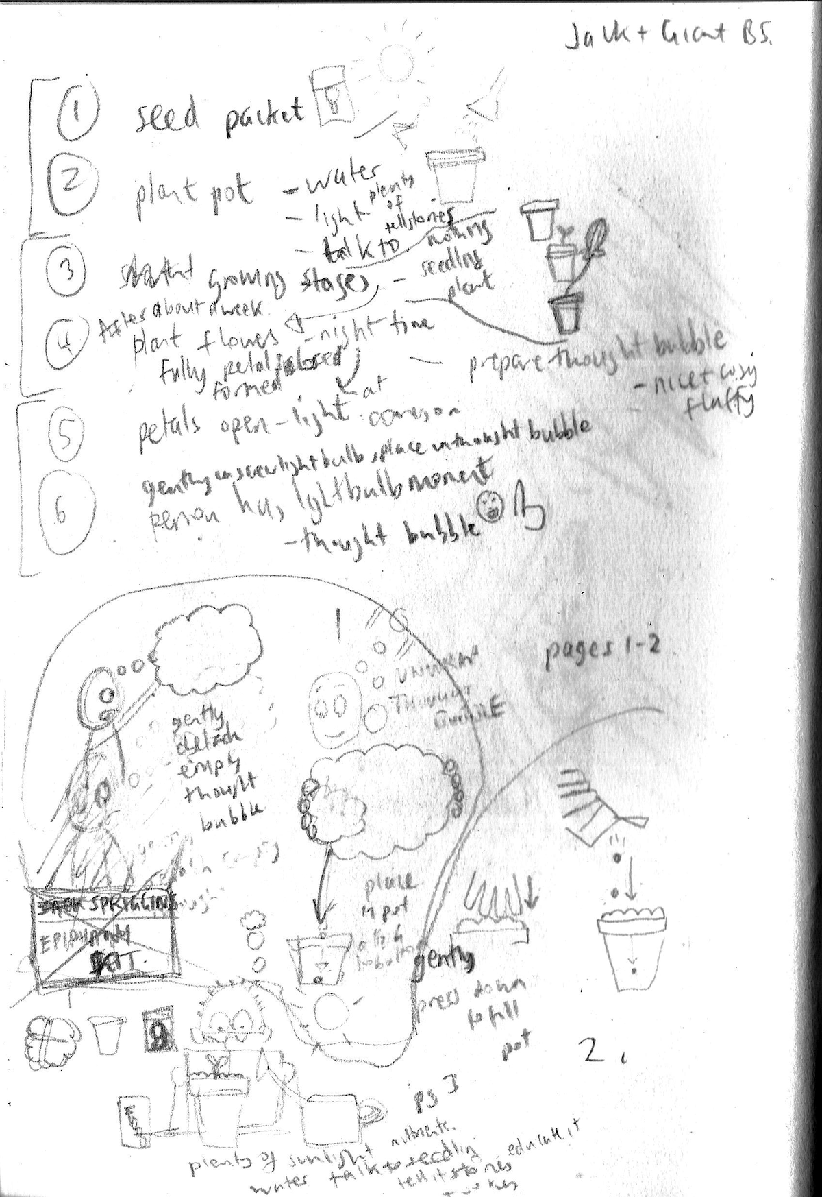
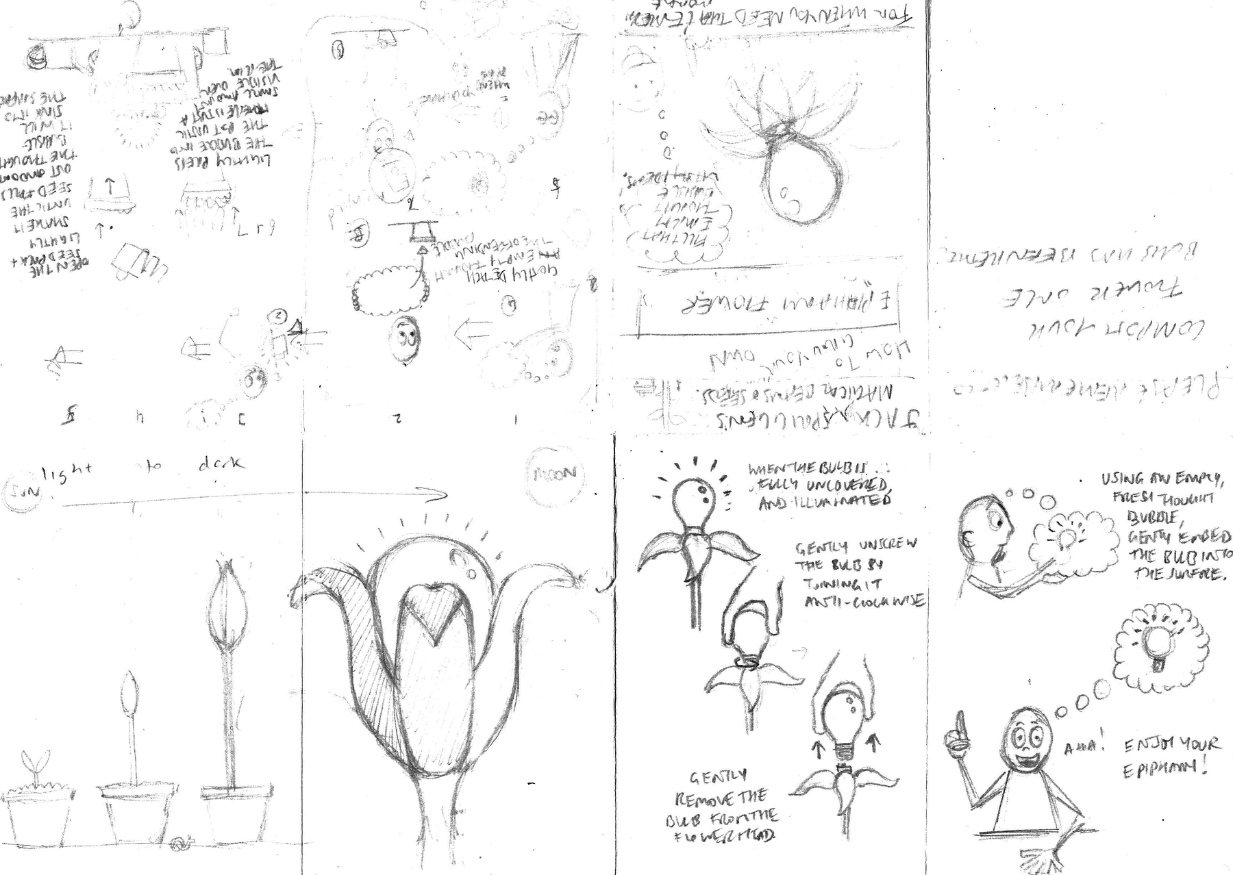
This seemed like quite a solid foundation to work from so I moved onto making some rough notes and sketches to flesh the idea out.
Note: my writing tends to become less decipherable when I scribble down ideas in a hurry (i.e. as they occur), but hopefully it is not too bad in the pages shown here.
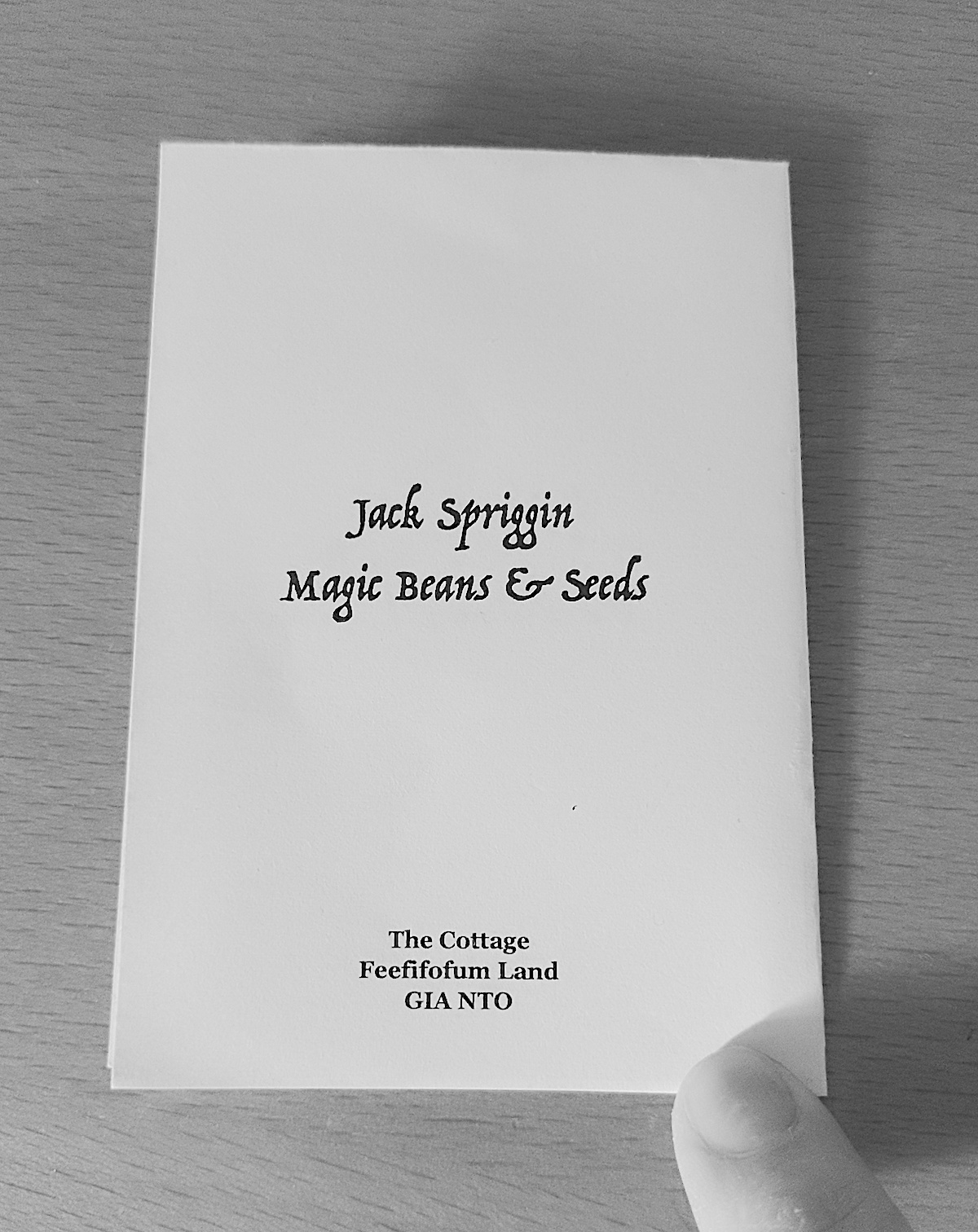
Note II: Jack Spriggins refers to the title character in Jack and the Giant Beanstalk, which I thought would tie in nicely with the idea of a magical seed. I was considering using this name as the that of the company that sells packets of the ‘Epiphany Flower’ seed.
Developing the Idea
After devoting a great deal of time and effort to the previous two exercises in this section, I wanted to keep my zine quite simple. I opted for a single page one, the design of which I found impressive and also allowed for easy reproduction (i.e. photocopying and folding one sheet of paper is much easier than having to compile and combine several). To refresh my memory, I rewatched a Youtube video I had found that demonstrates how to do this.
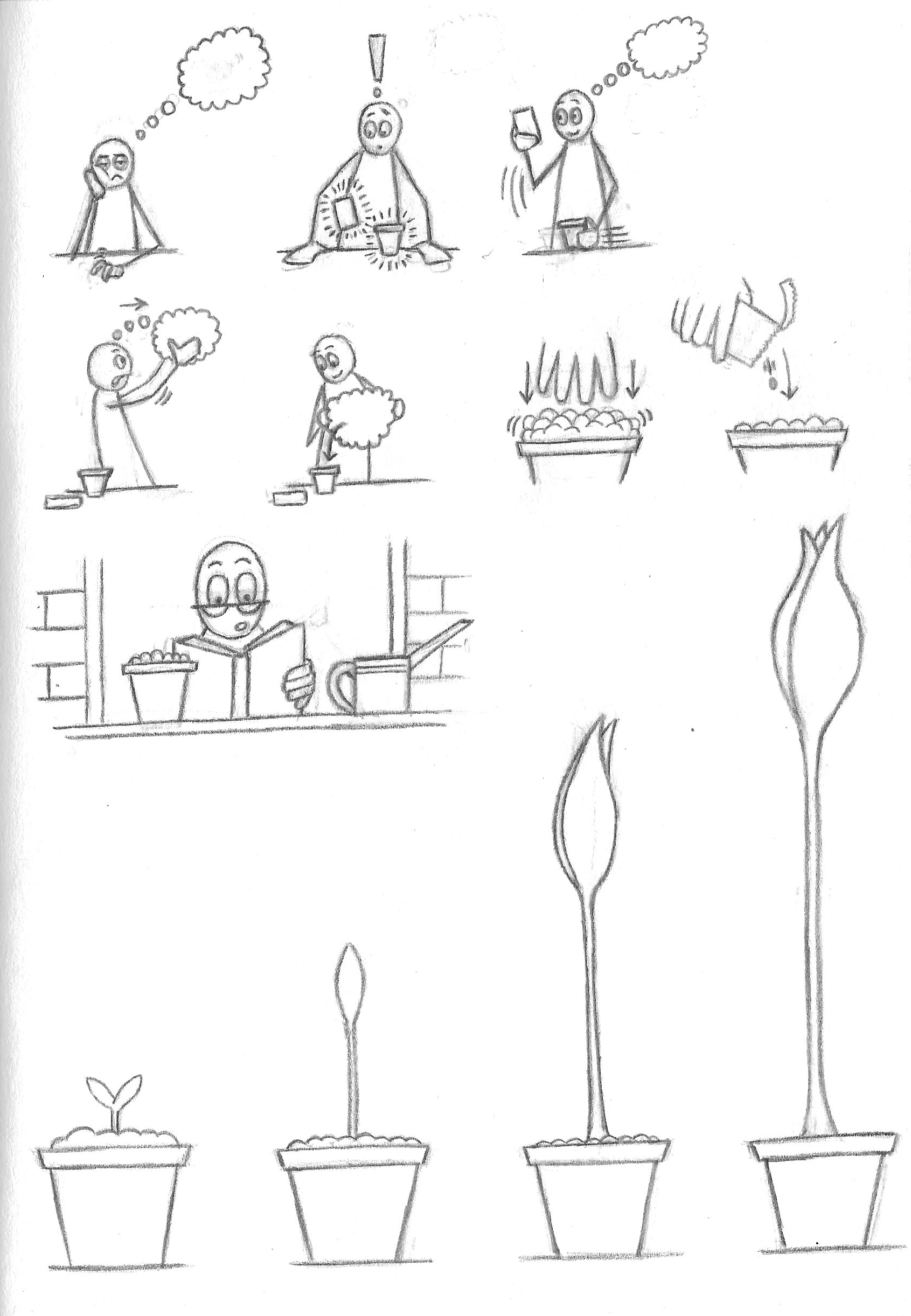
The process of expanding on the idea was a task that involved lots of head-scratching, but I was eventually able to extract enough material to move forward.
(click on image for larger version, opens in new tab)
(click on image for larger version, opens in new tab)
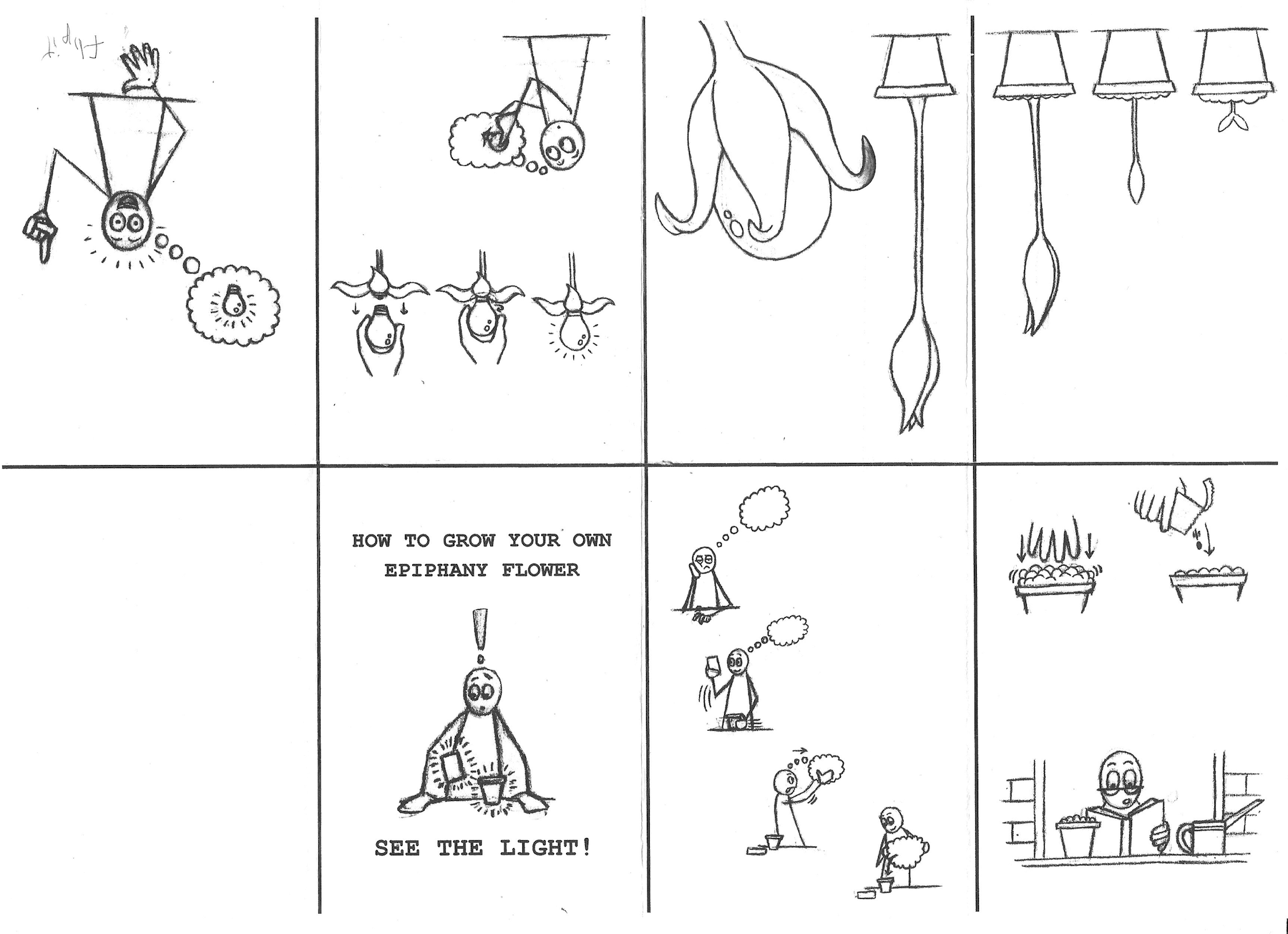
Clean Versions
The next step was to draw out neater versions of each of the illustrations, which I did using a graphite pencil. I went for a very basic style, but I was fairly happy with the continuity I managed to keep between the images. I was also pleased with the expressions, as this is an aspect I have been trying to improve in my drawing. This stage did involve a fair amount of erasing, but I was satisfied with the final outcome.
As a side note, I did find drawing on the sketchbook paper much more rewarding than printer paper, which I have used in some previous exercises. I liked the way the pencil ‘caught’ on the surface as this result in a more textured appearance of the lines. I suppose it depends on the required ‘look’ for whatever the particular project may be.
(click on image for larger version, opens in new tab)
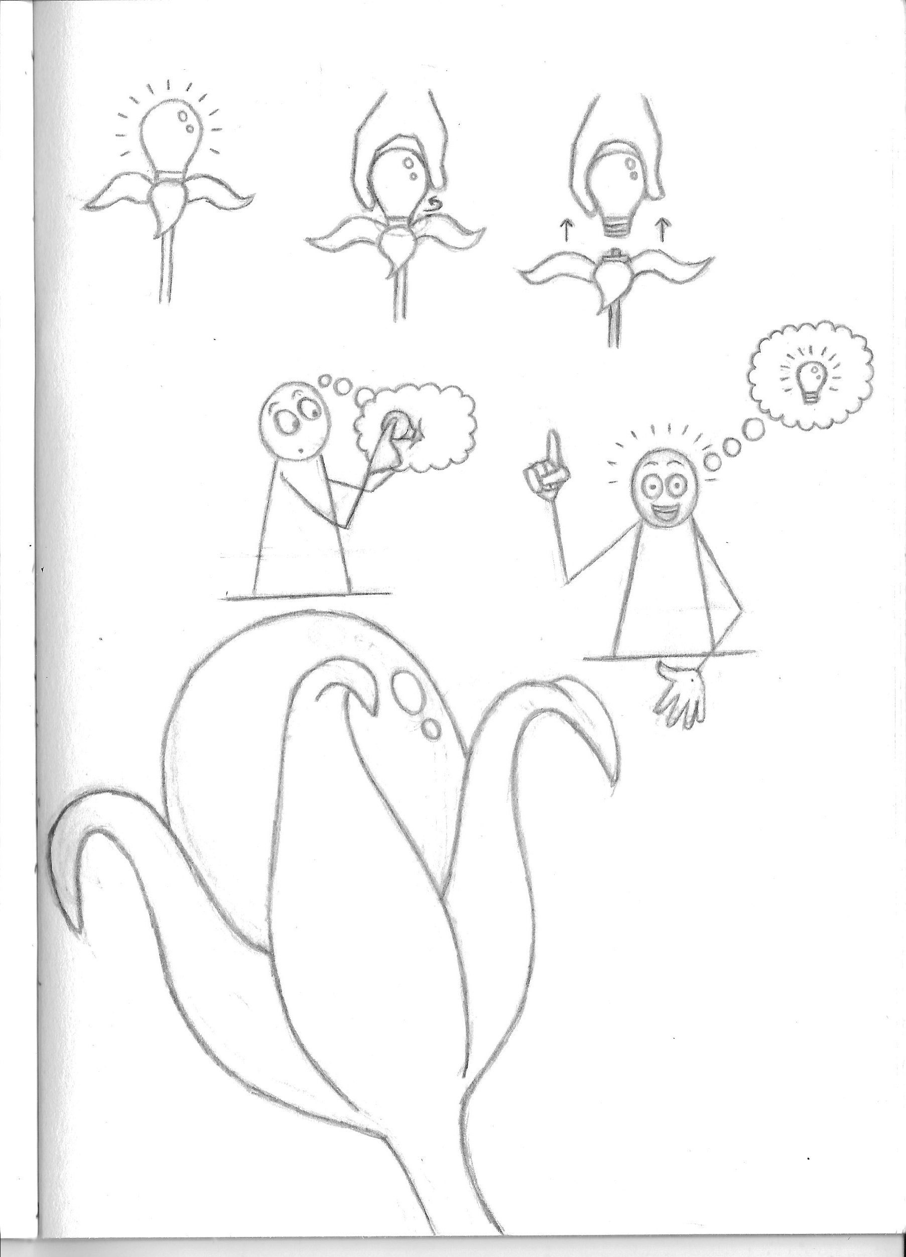
(click on image for larger version, opens in new tab)
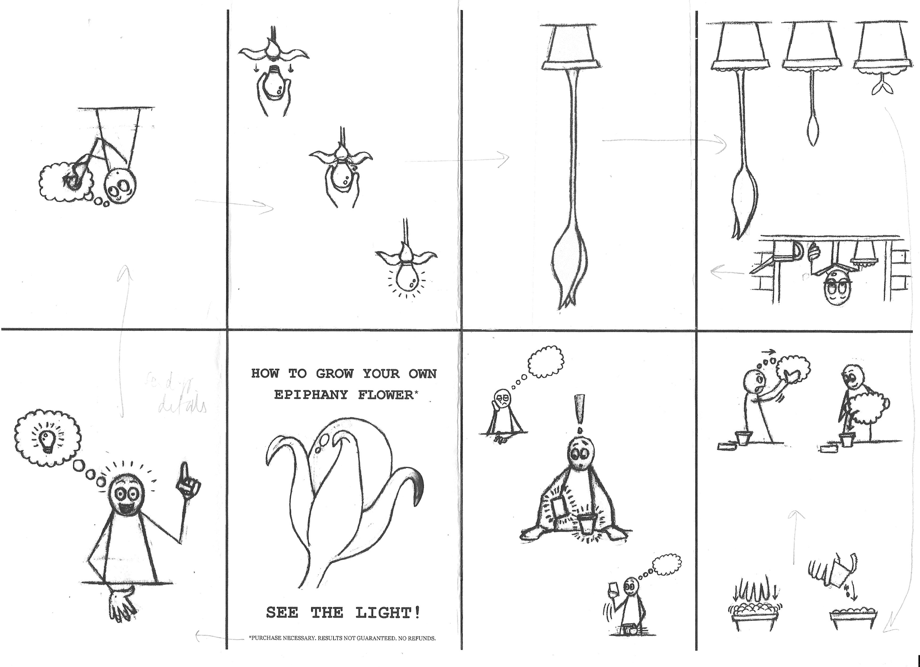
Planning the Layout of the Zine
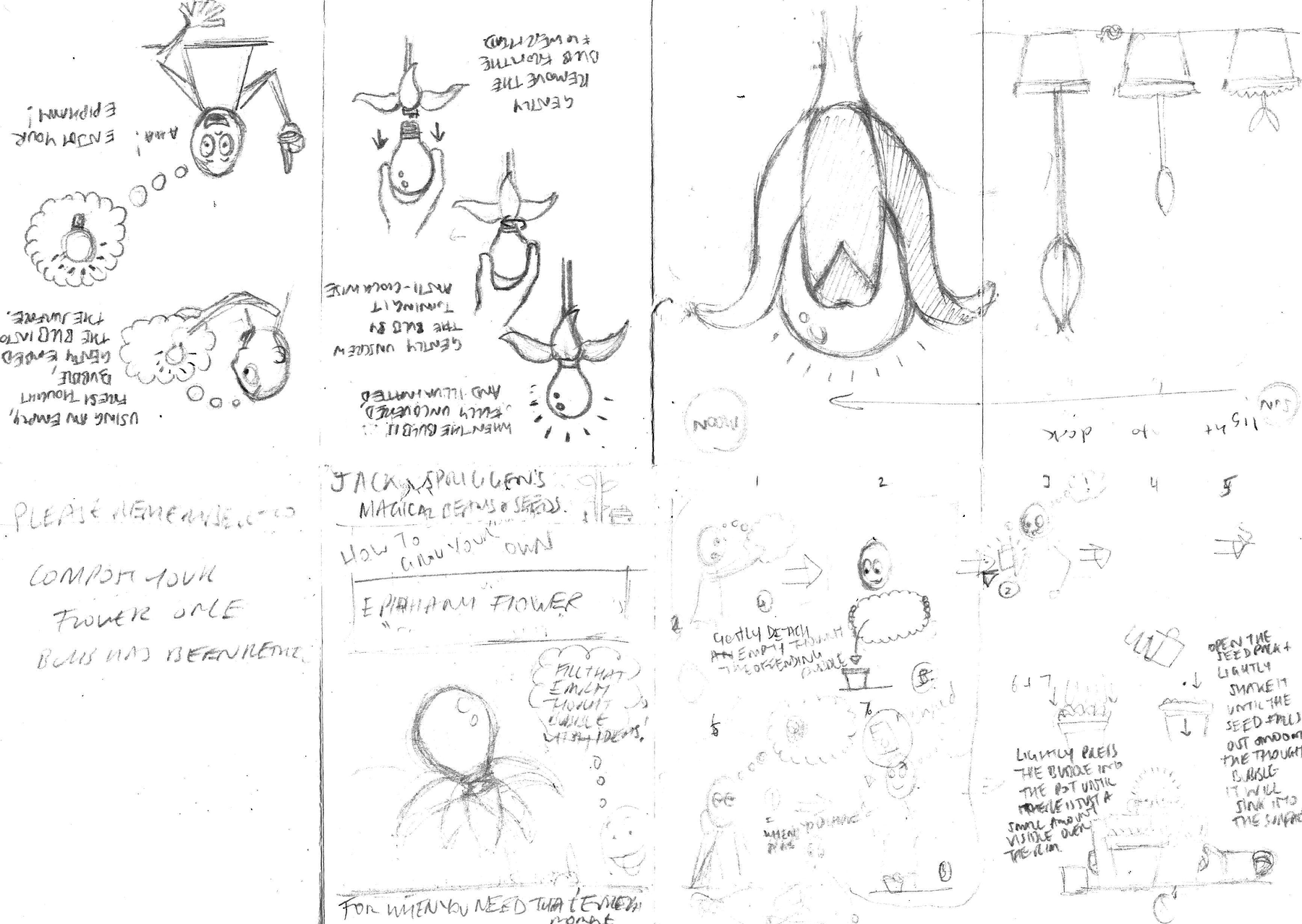
The next task was to try and work out the layout of the illustrations on each of the pages – this was probably the most mind-boggling part of the exercise! I practised folding the pages as per the Youtube video mentioned earlier and then noted which section of the piece of paper would be which page in the sequence.
I then roughly sketched the appropriate illustrations on each page, but I could not find a way of making them flow logically.
I was weighing up adding text to the pages, such as ‘instructions’ to grow the flower. There were two issues I had with this, firstly, I could not find the right words to use and, secondly, I preferred the pages without the text – I felt it was distracting and cluttered the space.
(click on image for larger version, opens in new tab)
(click on image for larger version, opens in new tab)
I had a vague idea of the arrangement, so opted to move on with the intention of clarifying this in the next stage.
Going Back To Basics
I scanned in the neat, pencil versions of the illustrations with a plan to manipulate and clean these up in Photoshop, before moving into InDesign for the layout, but my computer had other ideas. I spent about two hours trying to get Photoshop to work, or even to open for starters…
Once my anger and frustration subsided, I became proactive and went back to basics. I used Preview to adjust the image settings (e.g. desaturated, changed exposure and contrast) to make the lines black and darker. I also discovered that it is possible to select sections of the images freeform, and not just using the default set square or circle selections. This was extremely helpful as it meant I could cut out each of the drawings and paste them into separate files.
(click on image for larger version, opens in new tab)
As previously stated, I originally wanted to clean up the drawings using Photoshop, but I actually grew to like the style of the illustrations as shown above. I felt the effect of darkening the pencil lines with ‘blemishes’ and fuzzy edges made them look like they had been produced using a printing method rather than pencil. I thought this would fit with the overall design and aesthetic of the zine.
Using Pages for the Layout
My next challenge was to work out the layout. For this I used Pages and created a blank landscape A4 page. I set up guides (lines) to divide the page into eight equal sections. I did keep in mind that when I printed the page, these guides may not be exact due to the printer settings, which is exactly what happened when I printed the page and tried folding it.
Pages has very rudimental tools for positioning and the like, but I managed to work with these and tried various layouts of the drawings within each section of the page. I printed these and folded the paper to see how the composition worked in terms of the narrative’s flow and visual appeal.
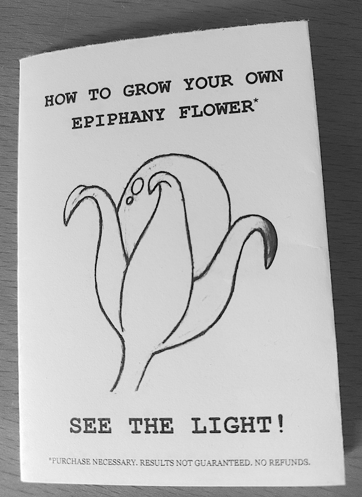
At this point I made the decision to not include text due to the size of zine and space. I also did not feel it was necessary as the drawings seemed fairly self-explanatory. I did, however, add text to the front cover as this was required to give the zine context and a ‘purpose’.
(click on image for larger version, opens in new tab)
I continued experimenting with the layout, adding notes to the printed versions and making the adjustments in Pages.
(click on image for larger version, opens in new tab)
It was certainly quite a challenge to work out the position of elements in Pages, but added to this was the complication of half the page being upside down! I used the flip tool to help with this, but then ended up noticing that this had (obviously) reversed some of the drawings so that they no longer made sense and I had to reverse them.
(click on image for larger version, opens in new tab)
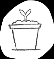
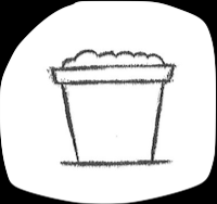
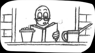
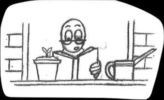
When I respositioned the last three pots under the window and moved the first one to the previous page, I realised that it no longer made sense. There now was a seedling growing in the latter, but then not one growing in the pot on the window sill. To resolve this I copied the solitary pot and pasted this over the empty window one, adjusting size and position as necessary. I then used white shapes (squares and a triangle) to cover the other seedling as best as possible using the simple tools available.
(click on image for larger version, opens in new tab)
As I became happier with the layout, I noticed a few details that I wanted to change, such as the spacing and positioning of some of the text, as shown below.
(click on image for larger version, opens in new tab)
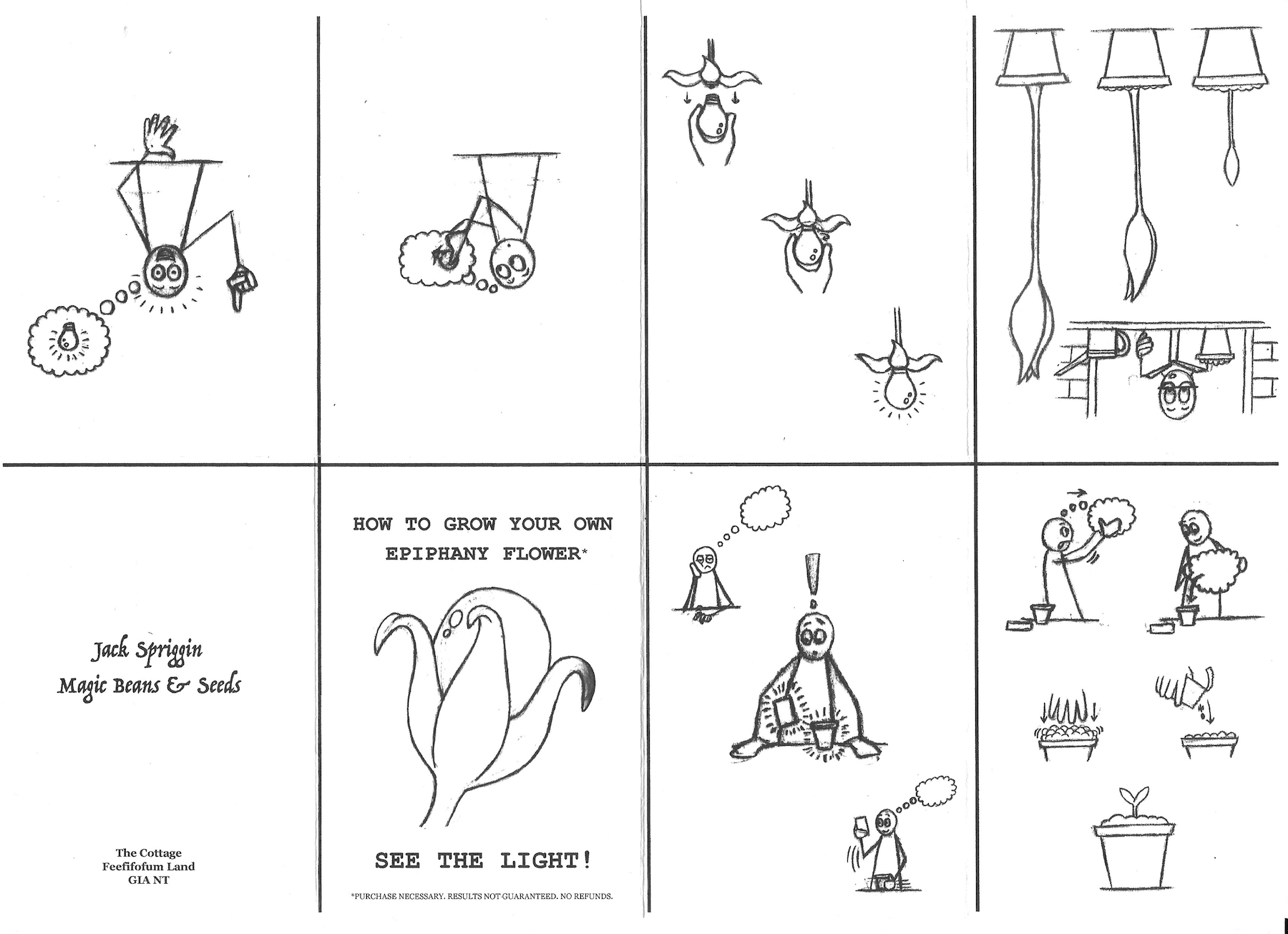
Final Version of Zine
At this point in the exercise I felt more or less happy with my mini-zine. I had been quite restricted in terms of what I could do to the images due to my technology issues, but I believe I dealt with this quite well and the final version, below, turned out to be acceptable and met my initial expectations.
(click on image for larger version, opens in new tab)
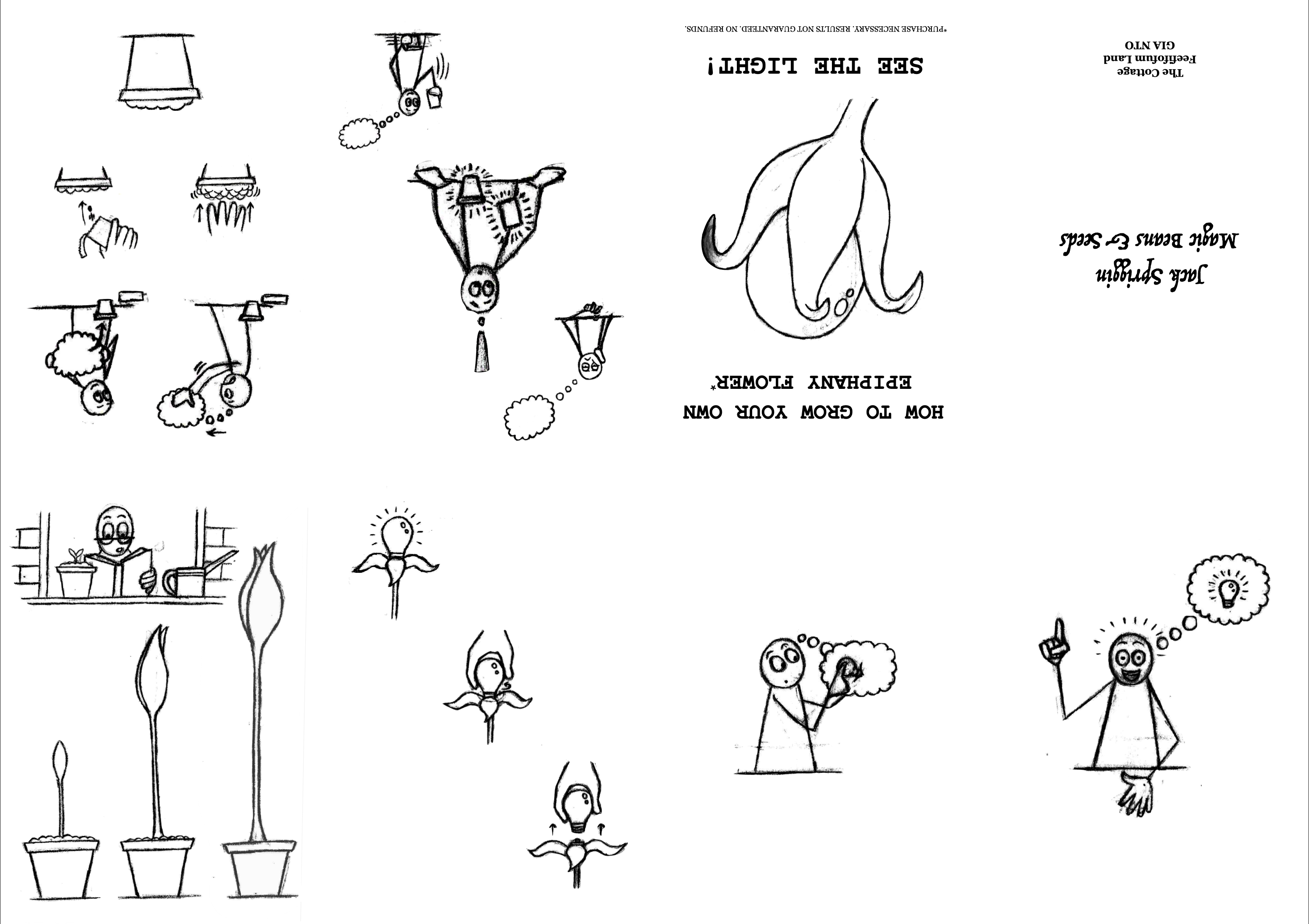
(click on image for larger version, opens in new tab)
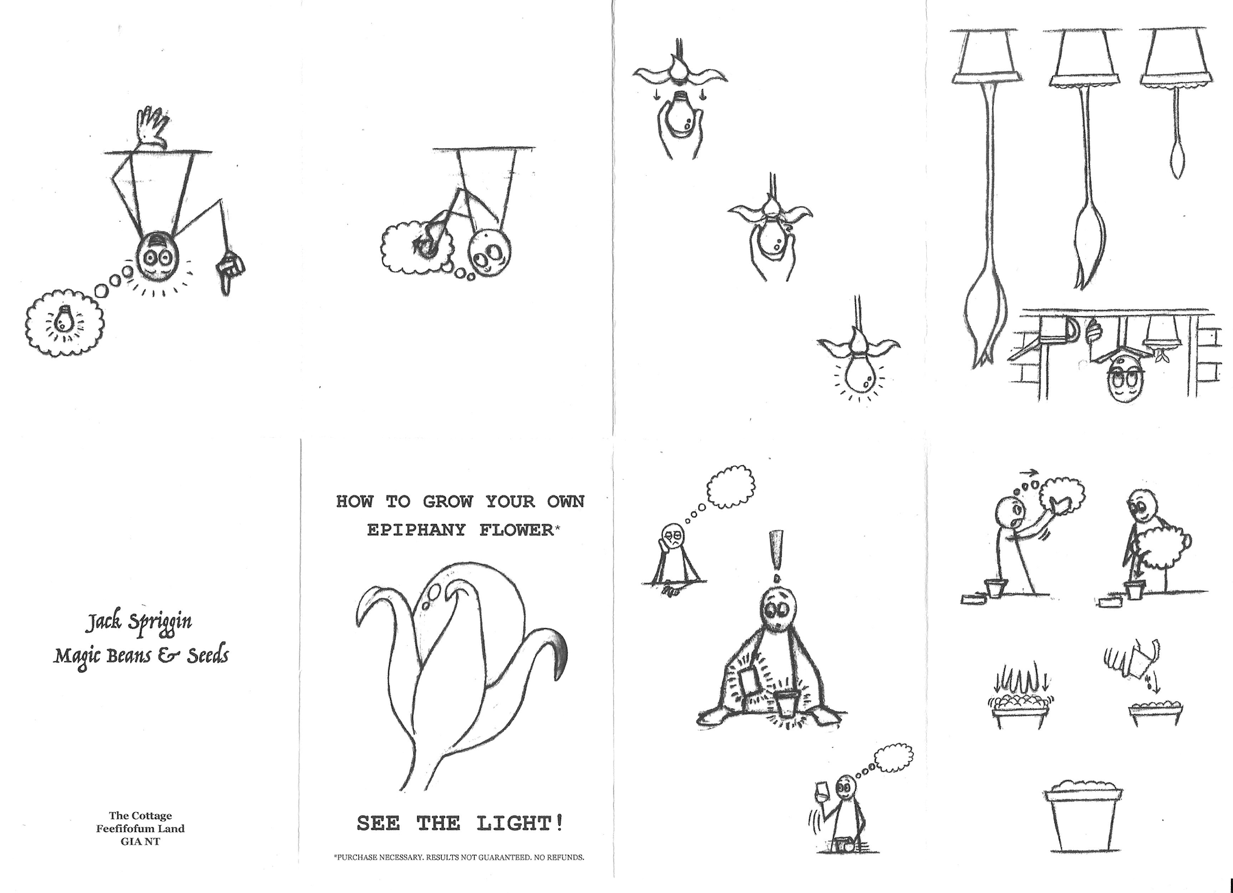
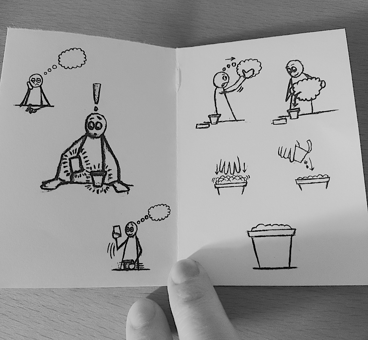
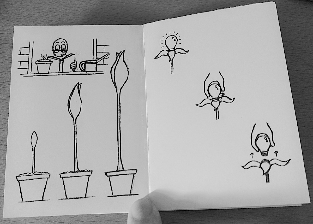
Please see images of the printed and folded version of the zine below.
(click on image for larger version, opens in new tab)
(click on image for larger version, opens in new tab)
(click on image for larger version, opens in new tab)
(click on image for larger version, opens in new tab)
(click on image for larger version, opens in new tab)
Final Thoughts
When compared to the previous two exercises, I found his one to be much less intense (despite the technological issues). This was partly a self-made decision as I opted for a fairly simple, single page zine, with a very basic narrative and no text. I am quite sure that nobody would be interested in having the zine I have created or that there is a target audience. I consider it more of a novelty piece of work, but it was a good to have a go at making a zine and that the content reflects my imagination, style of drawing and sense of humour. I like trying to produce work that does not require much verbal or written explanation, hence one of my hesitancies regarding adding text, and I hope that the images in the zine do communicate clearly enough by themselves.
What went well:
- Despite the frustrations with my computer, I believe that being forced to use the basic applications, Preview and Pages, was quite apt for this exercise as it added to sense of it being ‘home-made’ rather than ‘professionally’ created.
- Once I had a clear head and made the decision to use the above applications, I felt I adapted well to the detour and this led me to further understand the concept that it is not necessarily the tools that are most important factor when working on a project.
- As previously stated, I was mostly pleased with the expressions of my simple character. I also felt the body language was quite well defined to communicate his emotions.
- Managing to produce a narrative that was quite creative and also fit within the limited number of pages available in the single page zine format.
- A very small achievement, but I became much better at folding paper in a neat, clean manner after testing several draft, printed versions of the zine.
What could have been improved:
- The level of co-operation from my computer and Adobe applications.
- I do not feel that the reference to Jack and Giant Beanstalk on the back of the zine worked as well as I hoped it would. It should probably have been more entwined in the narrative or referred to on the cover page, as in my initial sketched ideas.
- I would like to attempt to make a zine on a subject that interests me, such as those I discovered in the previous Research Point. I am still keen to create a more professional-looking zine, using colour and including some text, even if it was a version of the one produced for this exercise.
- I would also like to experiment with creating a zine that has more pages and/or is larger in format.
- THE LEVEL OF CO-OPERATION FROM MY COMPUTER AND ADOBE APPLICATIONS!
Bibliography
Kleon, A. (2020) How to make a zine from a single sheet of paper. Available at: https://www.youtube.com/watch?v=ab4O9SWNl9g (Accessed 20 September 2023).