The circus is coming to town! Create a poster advertising what’s on, where and when, but only use paper to do it. Use coloured paper, work with collage, cutting and layering, folding or sculpting. Be creative in your approach to image-making and typography. Scan or photograph your final piece and reflect on how the limitation of only being able to use one material has affected how creative you can be. Was this limitation a help or a hindrance?
Initial Thoughts
I was not particularly looking forward to this exercise as I am not the most practical person and I could foresee scenarios such as pieces of paper sticking in the wrong place and cutting out tiny shapes that somehow disappear into thin air!
Although I did feel inspired by the impressive range of paper art that I discovered in the previous Research Point, I was also realistic in my ambition for this exercise and knew that I would keeping it as simple as possible. This was also due to time limitations for this Unit.
Research
I began the exercise by collating some examples of similar work to that which I was being asked to produce. Most of the circus posters that I managed to find vintage in design, which I did not feel would be suited to my limited ability of using paper as a medium due to the tendency for these to be quite elaborate, or there was so much text on the poster that the thought of cutting out that many letters was a bit too overwhelming! I did, however, find a few mostly Polish circus posters which were more minimalistic and, in my opinion, visually interesting.
In the example below, Neugebauer has limited the colour palette to the complementaries, purple and yellow, and has considered the balance of the image, whilst not being afraid of white space. I found this composition and overall design to be aesthetically pleasing and it did not visually overwhelm me, as I often found with examples that were bursting with text and information.
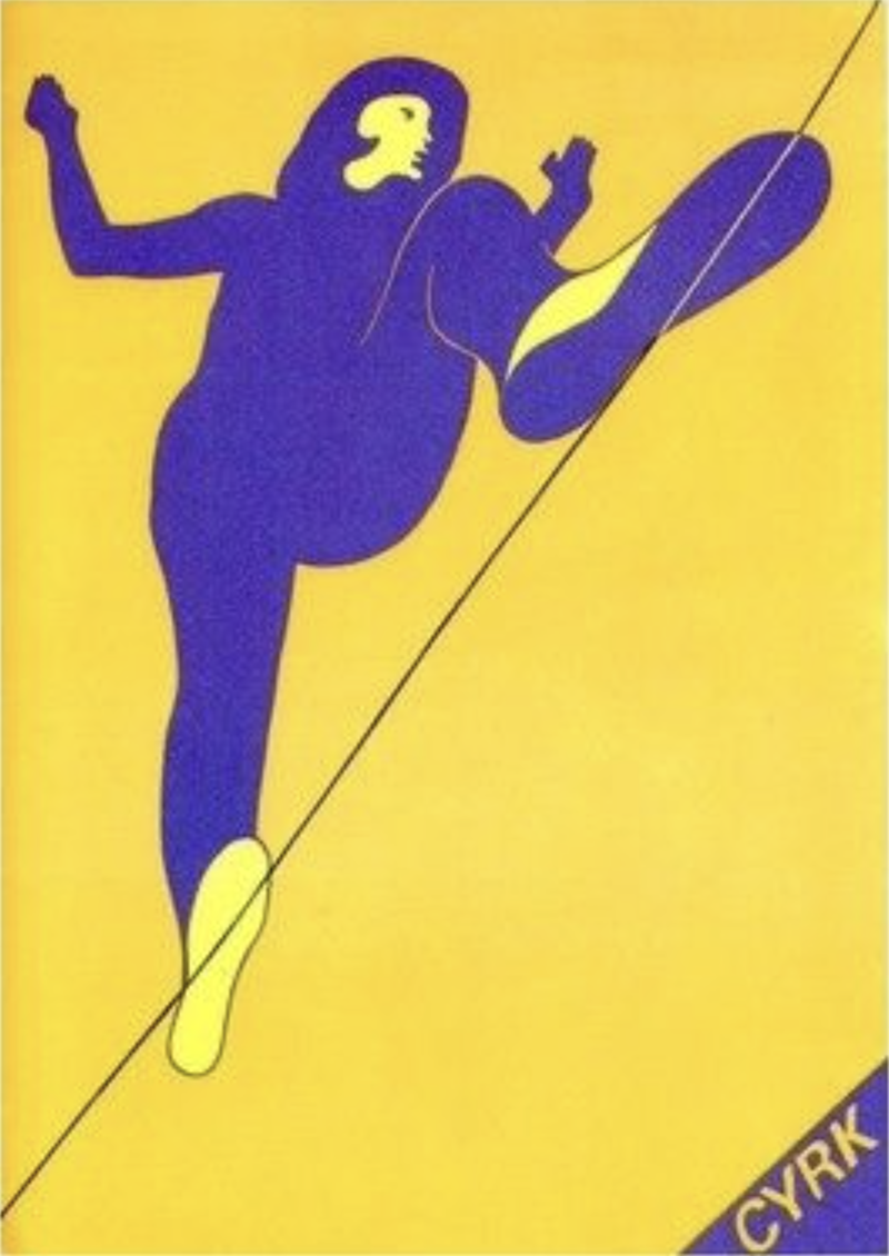
I found this minimalistic, limited colour palette approach to be encouraging and this was what I kept in mind as I moved onto considering my own potential ideas.
Mindmapping
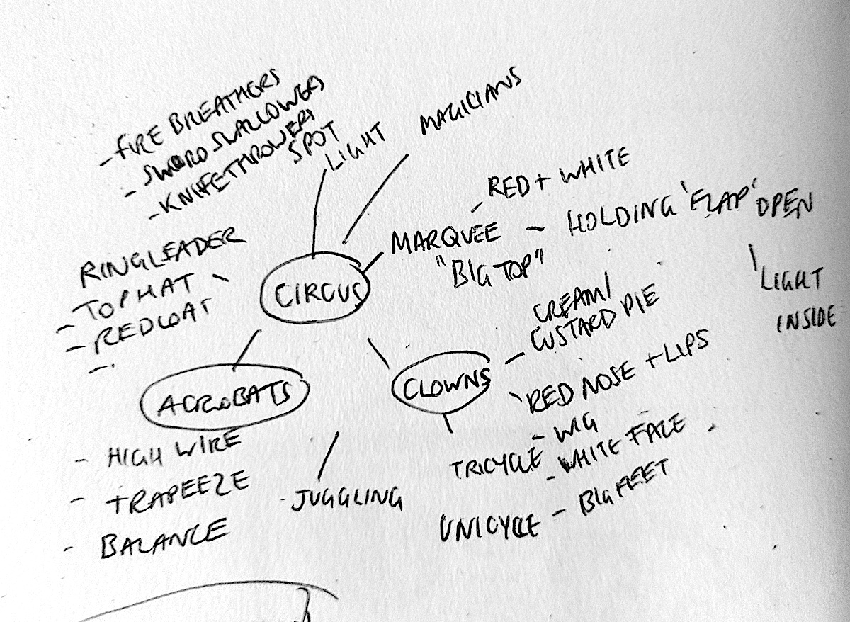
I began by producing a mind map of the main words that I connected with the term ‘circus’. I was expecting to come up with more than I did, but I seemed to have a slight mental block.
(click on image for larger version, opens in new tab).
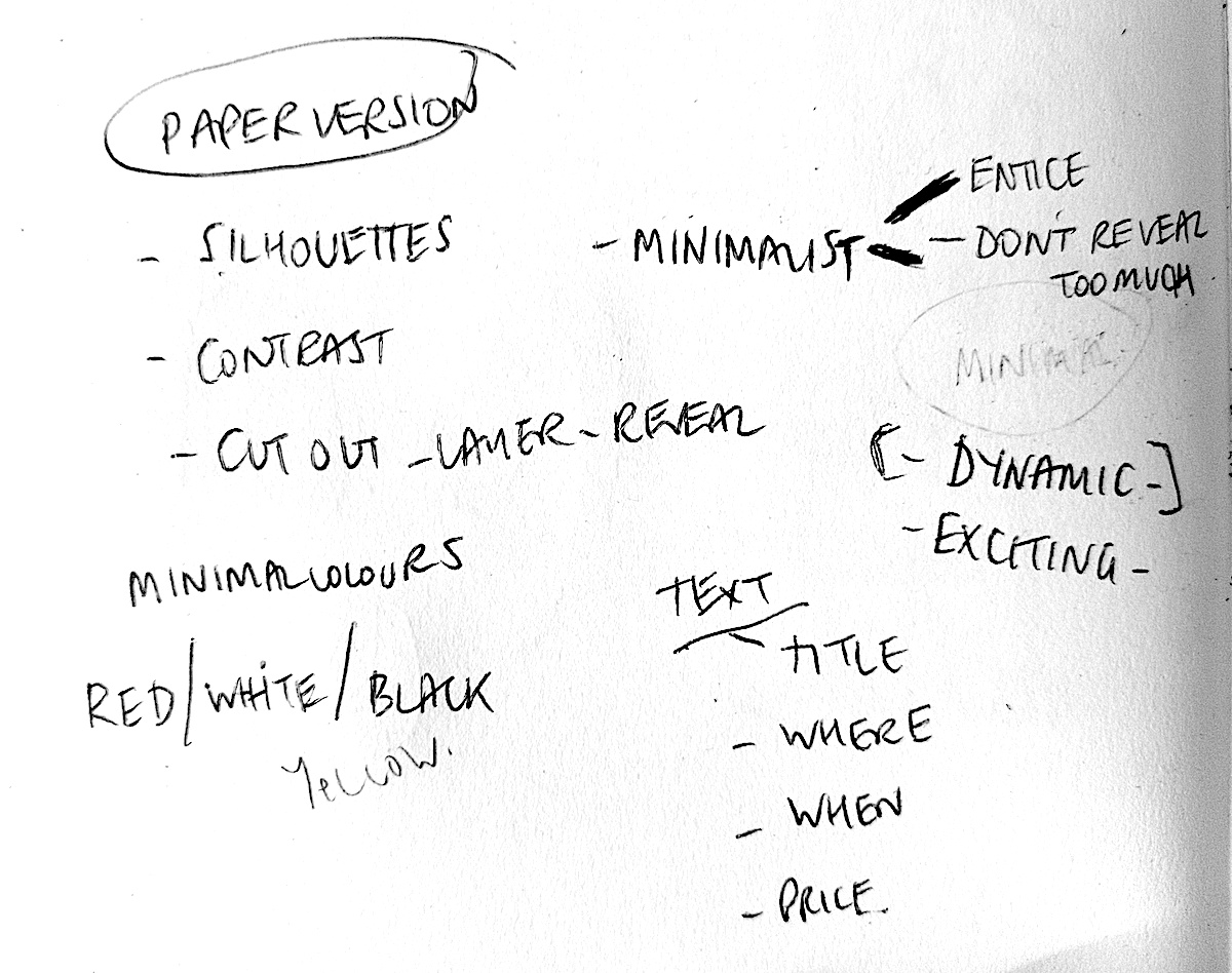
I then wrote down a few additional thoughts I had with regards to designing the poster. Although I would like to have tried out some of the three dimensional techniques I discovered in my research of paper art, I did not intend on using these for this exercise. At this point I was favourable towards to the idea of using silhouettes and shapes, overlaying paper, including cut out areas to reveal what is underneath. I was also intending to use the colours red and white (with black) as these are the two colours often associated with the circus – e.g. the ‘big top’.
(click on image for larger version, opens in new tab).
I felt my inclinations were not towards the ‘norm’ for a circus poster as I wanted to limit the visual information to only the necessary, whilst also hoping to produce a more sophisticated design.
Thumbnails
The next step was to sketch out some thumbnails of potential ideas.
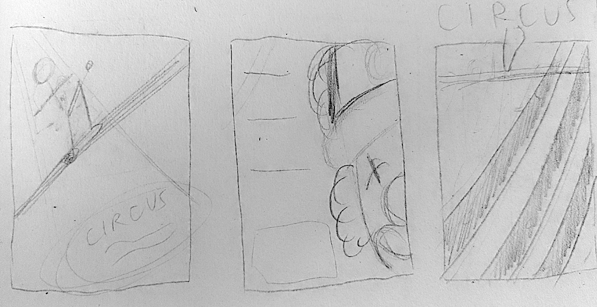
I was not keen on any of these so far, but the sketch in the centre with the silhouette of a performer (below) was more along the lines of what I was intending for my design.
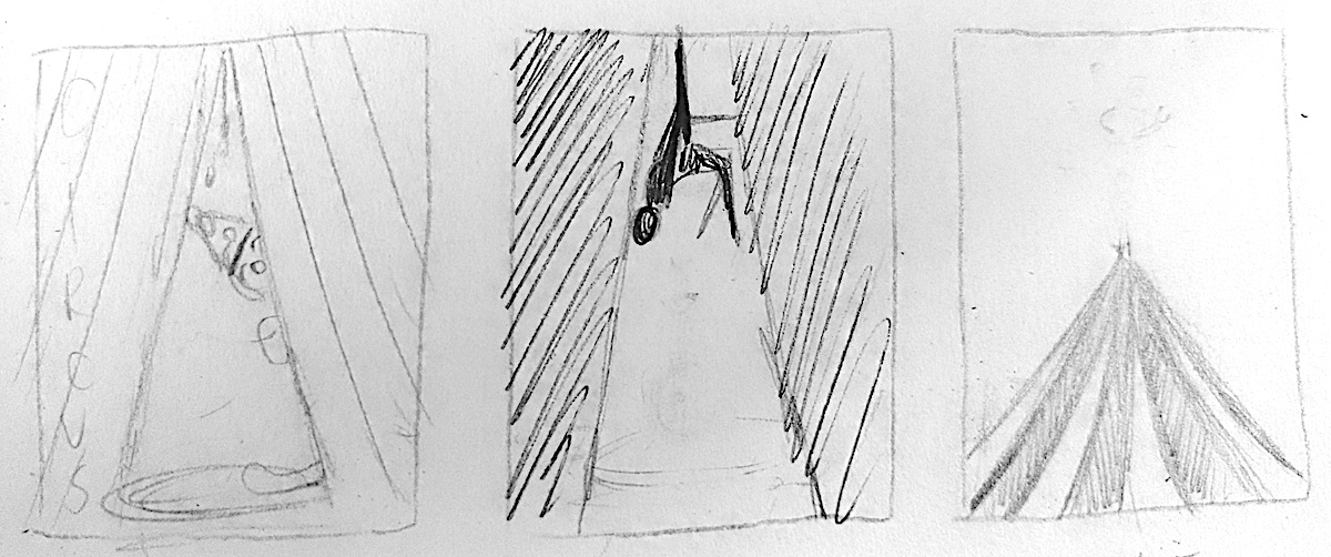
I did quite like the thumbnail of the top of a clown’s head on the right (below), but I was still more keen on the silhouette concept.
I finally came up with the thumbnail I felt was worth pursuing, as shown circled below. I thought this design had the most potential, although I was quite concerned about the adding of text requirement.
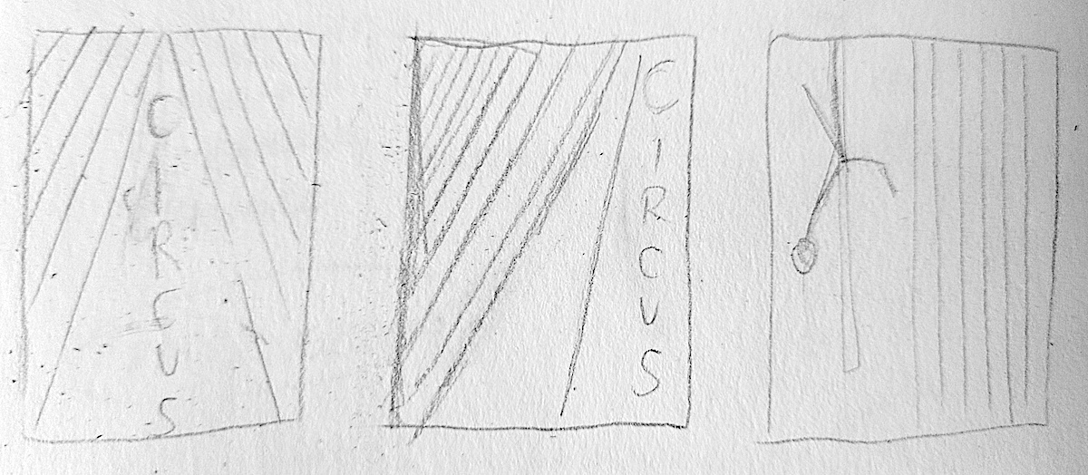
I then tried to a few further sketches that would just be stripes of red and white along with the necessary text. I thought these might have some potential, but they still were not quite right.
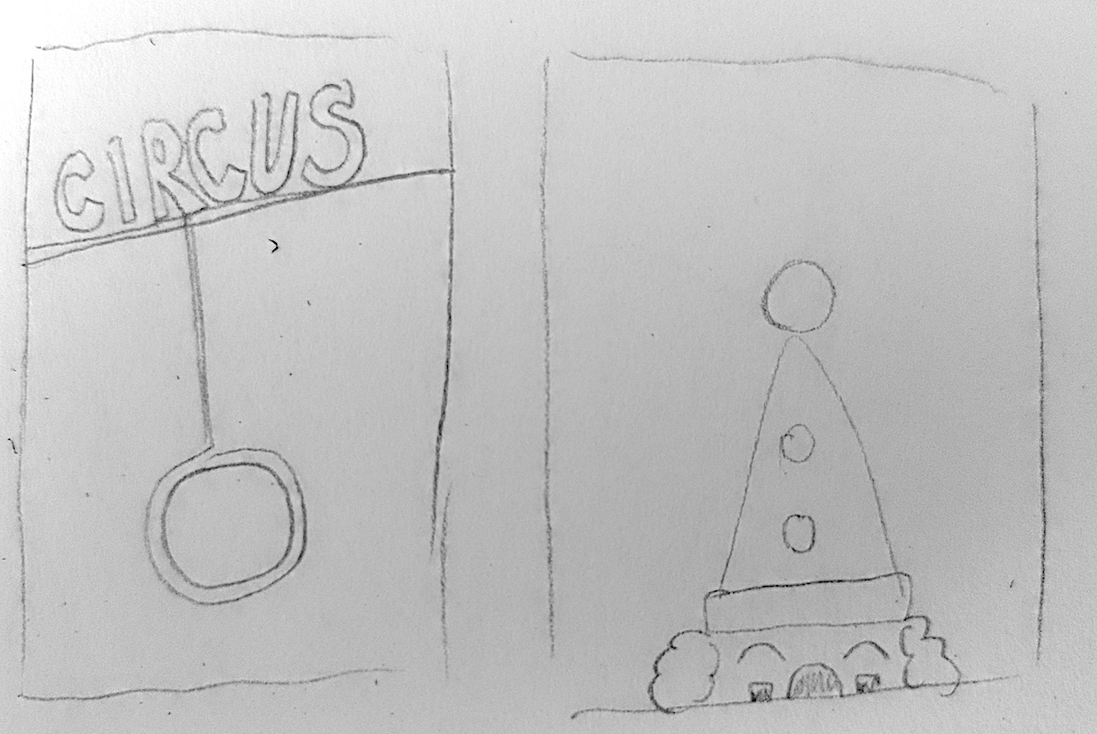
Draft Versions of the Poster
I made the decision to take the circled thumbnail forward and produced a slightly larger, neater version. I was quite pleased with the outline of the performer as it seemed to be in proportion and not too stiff.
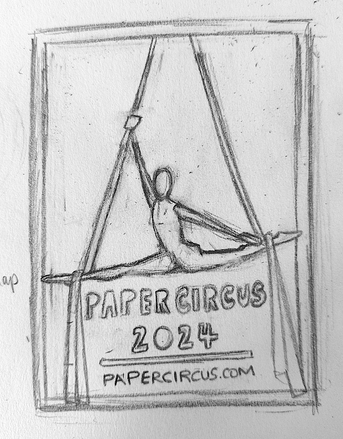
(click on image for larger version, opens in new tab).
I then scanned the above thumbnail into my computer, enlarged this to A4 and printed it.
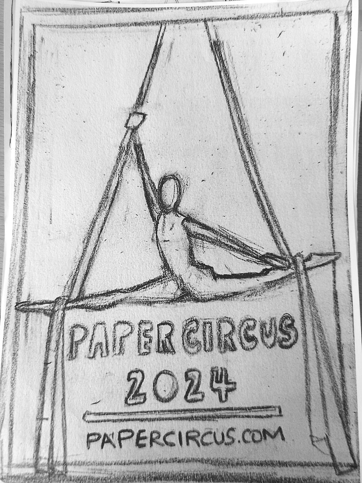
(click on image for larger version, opens in new tab).
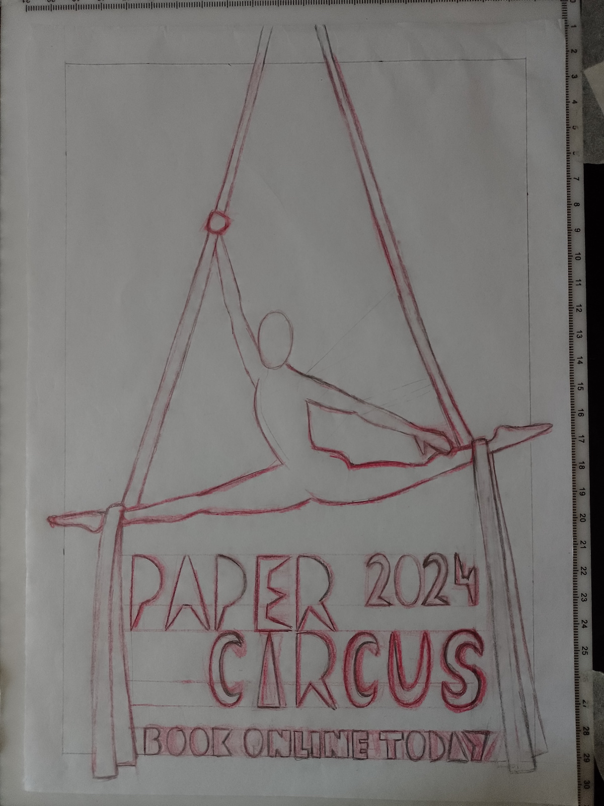
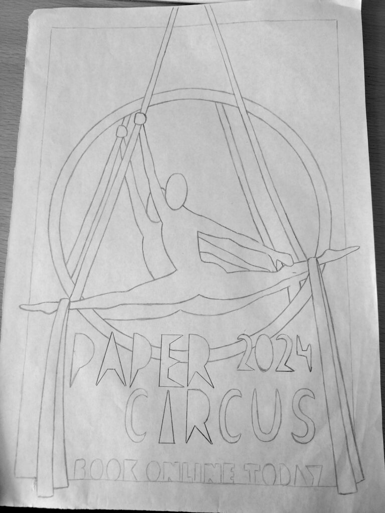
I attached the above, initial draft to my lightbox and proceeded to make a copy using a red coloured pencil. I drew more definitive lines over these using a graphite pencil. I also attempted to make the text look more interesting by drawing the letters as solid, angular shapes. Fonts are definitely not a strong point of mine, so I had been dreading this part of the exercise.
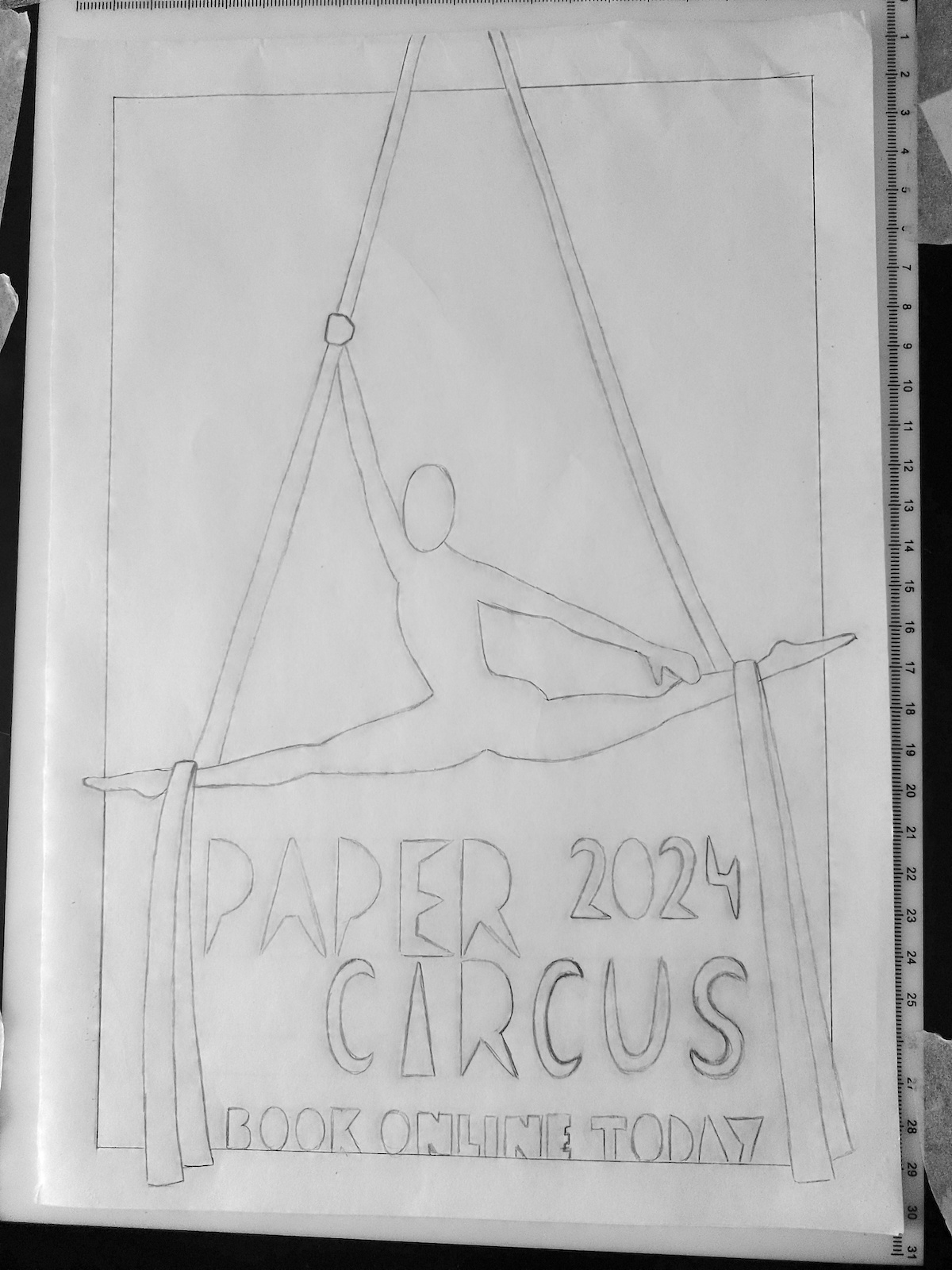
Using the above draft for guidance, I produced a neater pencil version. I was reasonably happy with the design at this point, but was not sure how it would translate into a paper version.
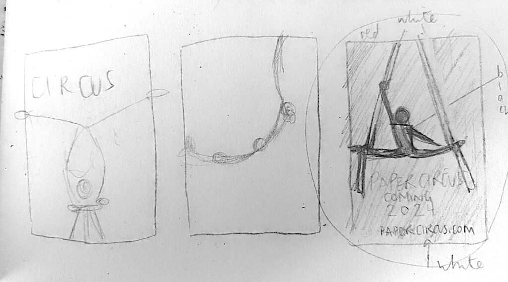
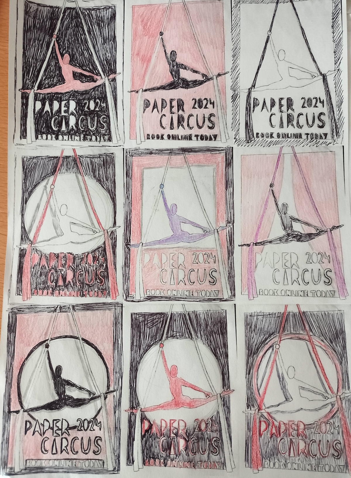
Thinking About Colour
Next, I wanted to think about colour combinations in the poster. I scanned the second draft into my computer and printed mini versions of this on an A4 page, so that I had nine blank designs to experiment with in terms of colour.
As previously stated, at this point I was intending on using just red, white and black as the palette. The top three versions below show different combinations of these colours, but I felt the poster still looked like something was missing – there was not enough ‘pop’ to it. I then had the idea of adding a circle behind the silhouette to represent a spotlight, which would make the figure stand out more on the page. Expanding on this, I thought it would be quite effective to have the indication of shadows behind the performer, which would add depth to the poster.
(click on image for larger version, opens in new tab).
I thought the two strongest designs were the ones on the left of the middle and bottom row, with the latter possibly having the most visual impact (with or without the added shadows).
Considering the Shadows
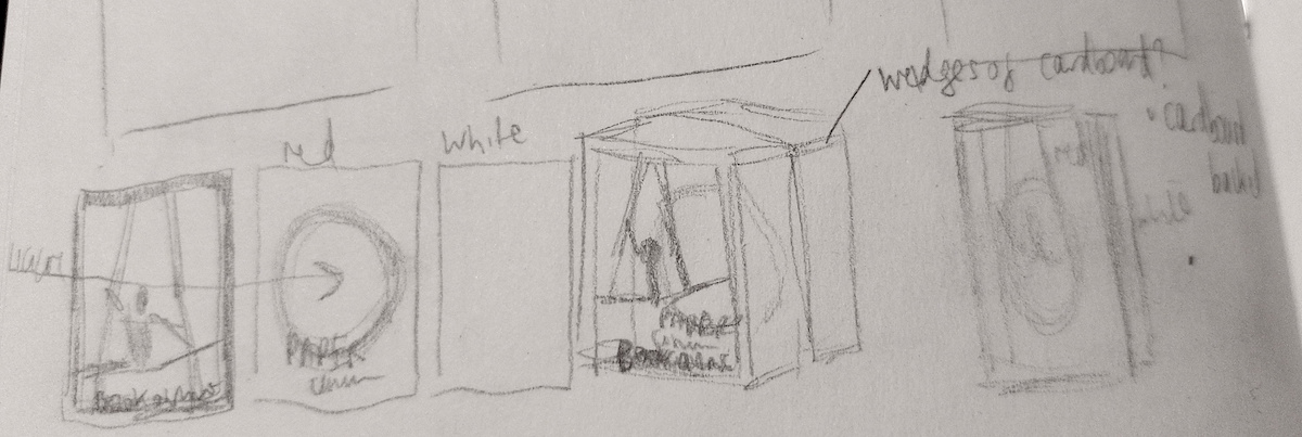
I was quite interested in the idea of having the shadows in the background, but I was unsure how effective this would be in the paper format that I was planning to use. I decided to put this idea to one side and explore it at a later stage.
(click on image for larger version, opens in new tab).
I did, however, come up with a rather more elaborate way of creating the poster, in a three dimensional form, as shown in the rough sketch below. This would involve creating three parts.
‘Simply’ put, the front layer would be the border and the silhouette of the performer and the silks. The middle layer would be the red background with a black-rimmed circle cut out of the centre. The back layer would be a plain white sheet. The three layers would be connected, perhaps with a cardboard frame, so that there was a reasonable gap between each one.
I would then project a light straight through so that from the front view there should be a shadow produced on the back two layers by the silhouettes at the front (in theory).
I am not sure where this mini brainwave came from or whether it would work, but I was quite impressed that I managed to think of it!
Producing the Paper Poster
I had now reached the point in the exercise where I had to transfer from the planning on paper to actually using paper as the medium. I had order a selection of coloured, thick paper and, of course, there was not any red paper included! Therefore, I had to divert from my original idea of using just red, white and black.
I soon discovered that I would, in fact, need an additional colour anyway as otherwise there might not be enough contrast to distinguish the different elements of the poster (for example, the silks against the spotlight, if these were both white).
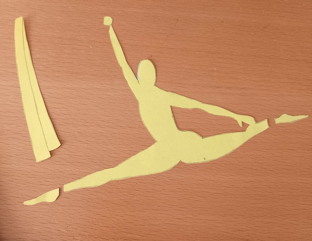
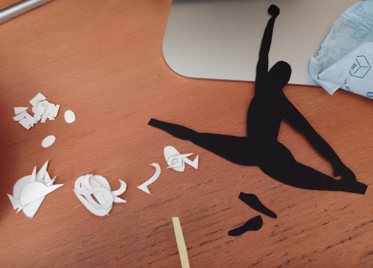
I made a start by using my lightbox to copy different sections of the design. As the coloured paper was quite thick, for example, in the case of the performer’s silhouette, which would be on black paper, I had to draw a copy of the design using thinner paper which I could then cut out and use as a template to trace around.
(click on image for larger version, opens in new tab).
I ended up with a selection of paper cut outs – the letters were so fiddly and I was not happy with the smoothness of these. Now that the silhouette of the performer had been cut out, it just kept reminding me of the Nike Air Jordan logo.
Instead of red, I opted for a rich purple as the main background colour. Purple is a colour often associated with magic, mystery and power, so I thought it would be well-suited to the type of circus show I wanted to promote on my poster.
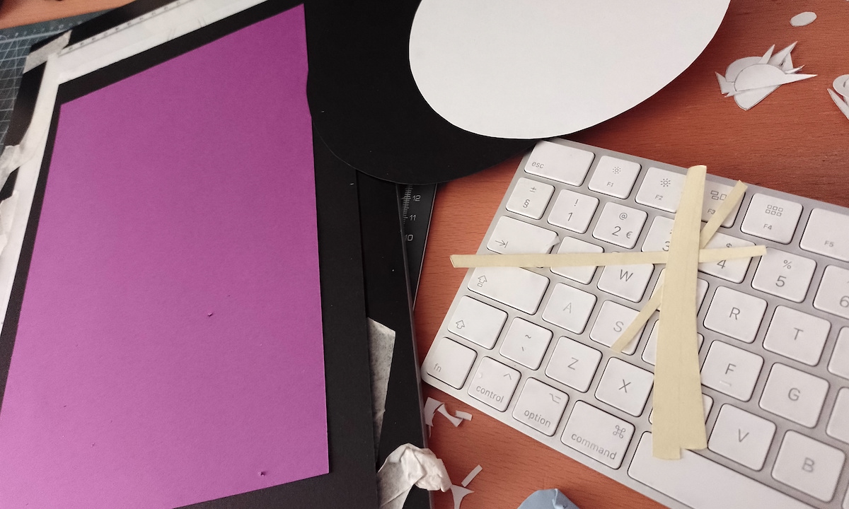
(click on image for larger version, opens in new tab).
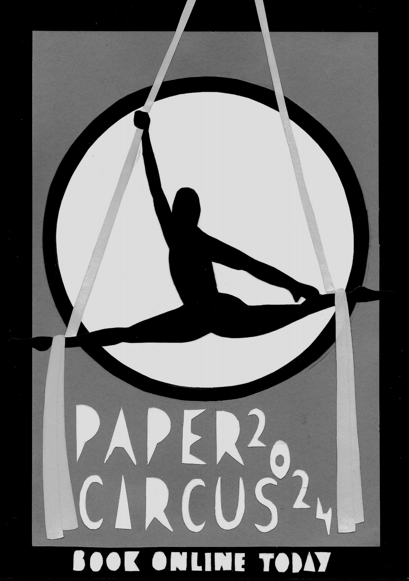
The Final Poster
If I had been able to show the process that went into assembling the different parts of the poster, it would probably be quite entertaining! In the end, I did manage to produce a result that looked like the original thumbnail, which was a relief. I was not happy with the positioning of the ‘2024’ on this version, however, but it was not possible to remove it without tearing the purple paper underneath.
Apart from this, I was as content as I felt I could be with the outcome, after all, at least I had achieved the main aim of the exercise, that is, using only paper, but it was not particularly creative or imaginative in terms of how I used the paper or the design of the letters, for example. I did feel the poster was quite strong visually and the colour choices worked well in contrasting, but not clashing with one another.
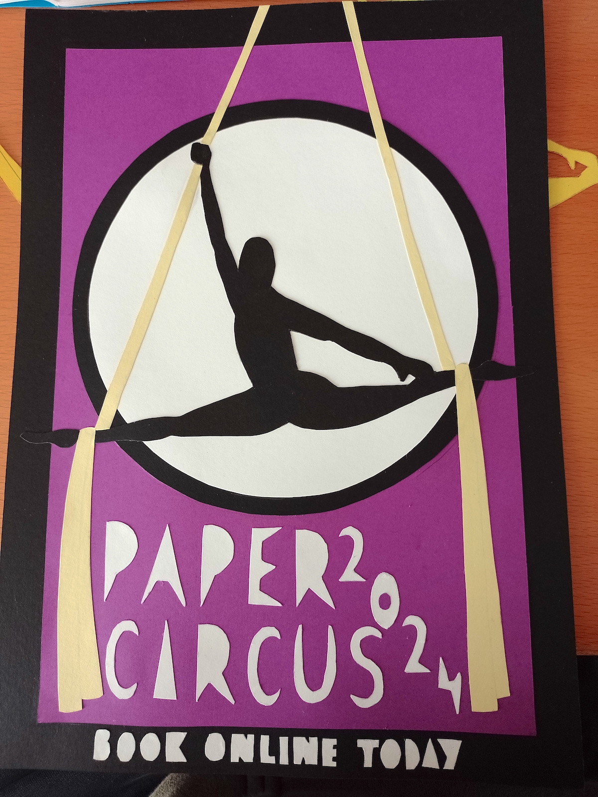
I scanned the design into my computer, but unfortunately this picked up tiny specks on the poster (even though I had wiped the scanner glass and dusted the poster itself), so that was quite frustrating. I could always go into Photoshop to try and remove these.
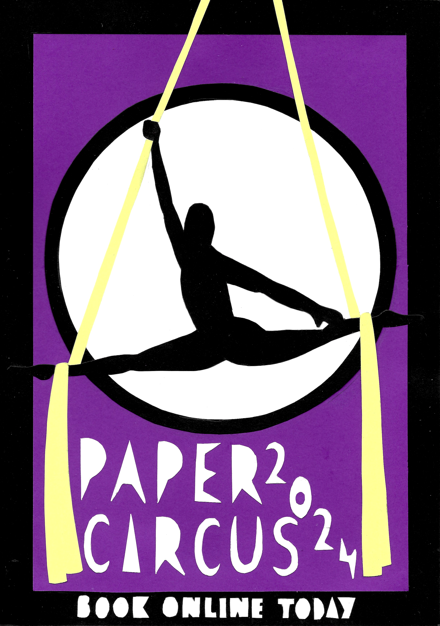
Out of interest, I reduced the saturation of the design so I could see the contrast of the poster without being distracted by the colour. I felt this demonstrated quite good decisions in this regard, apart from the toes of the performer, which ended up lost in the border. This was an ongoing problem throughout the poster’s production that I could not fathom a way of avoiding.
(click on image for larger version, opens in new tab).
Final Thoughts
This exercise was not one that I had been greatly looking forward to, but I think it turned out more successful than I expected. I had to really force myself not to clean up the edges and/or add the text digitally!
The exercise really challenged me to carefully consider the placement of the different elements within the poster and the nature of using paper as the medium meant I had to plan as much as possible before making a start.
I would like to have tried enhancing the design using digital tools, and this is perhaps something to explore, but overall I was relatively happy with what I managed to create using just paper.
What went well:
- As previously stated, I was pleased that I kept to the brief by only using paper as the medium for this exercise, no matter how tempted I was to do otherwise.
- This exercise genuinely forced me out of my comfort zone, but I was able to meet the basic brief requirements, which was an achievement.
- Although I was dealt a curveball in terms of not having red paper as per my original plans, I adapted to using purple instead and I felt that this was a successful choice, especially when contrasted with the yellow silks.
- In the planning stages I tried to sketch out as many thumbnails as possible, not being disheartened by the less successful ones. I also was pleased with how I tried out several different colour combinations in the thumbnail format, which also led to considering compositional changes as well.
- Font design is not an area I have any confidence in at all, so I was pleasantly surprised that I managed to produce a font that was fairly well-suited to the overall design, albeit a very simple one.
What could have been improved upon:
- I was definitely not experimental enough in my method of using paper as as the medium in this exercise, as described previously. I would like to take the time to explore this area in more depth at some point.
- I was not happy with the quality of my cutting out of the various shapes. I tried using both scissors and a craft knife for this, but I just could not manage smooth edges.
- It was frustrating that I could not easily try out out different compositions. This would have been much simpler in a digital format and could have led to an improvement in the composition – for example, I may have been more successful in the positioning of the text.
- Although I felt the ‘Paper Circus’ letters worked quite well, I was less happy with the ‘Book online today’ letters and annoyed with myself for changing the position of ‘2024’ and not being able to alter this.
- It was a shame that I could not figure out how to have the toes of the performer on show and instead they just blended into the border, which I felt affected the impact of the pose.
Bibliography
Creative Booster (2023) Meaning of Color Purple: What Does the Color Purple Mean? Available at: https://creativebooster.net/blogs/colors/purple-color-meaning?utm_content=cmp-true (Accessed 22 November 2023).
Orson and Welles (n.d.) Circus Posters. Available at: https://www.orsonandwelles.co.uk/collections/circus-posters (Accessed 19 November 2023).
Pinterest (n.d.) Pinterest. Available at: https://www.pinterest.co.uk/ (Accessed 19 November 2023).
Projekt 26 (n.d.) Vintage Polish Posters. Available at: https://www.projekt26.com/vintage-posters-circus (Accessed 19 November 2023).
Sorene, P. (2015) 25 Gorgeous Vintage Illustrations For The Polish Circus 1950s – 1970s. Available at: https://flashbak.com/25-gorgeous-vintage-illustrations-for-the-polish-circus-1950s-1970s-44338/ (Accessed 19 November 2023).
Wikipedia (n.d.) Air Jordan. Available at: https://en.wikipedia.org/wiki/Air_Jordan (Accessed 20 November 2023).