Barry Fantoni’s portraits of 70s and 80s television celebrities, while exaggerating facial features and expressions for comic effect, are centred on being able to represent the character accurately. Contemporary illustrator Thea Brine works in a similar way, hinting at caricature, but remaining true to the character. By comparison, the work of contemporary cartoonist Martin Rowson is a lot more exaggerated, more heavily loaded with symbolism and as a consequence had a lot more satirical bite – it is much sharper and closer to the bone than Fantoni’s and Brine’s warmer portrayals. Both approaches have their place in satirical cartooning.
Pick a well known television celebrity or personality who has a public persona on screen that might contrast with their private life or who has a particular reputation – for example, an aggressive interviewer, a philandering sports person or a vain actor. Your examples do not have to be negative, but caricature tends to focus on people’s failings rather than their successes.
Produce a character portrait of this personality. Aim to make the portrait recognisable. This can come both from the portrayal of the person and by adding other visual clues. You may want to work from photographic reference material as a starting point.
Then produce a much more satirical caricature of the same person in which you use exaggeration to hint at the other aspects of their personality you know about. Try a maintain a level of recognition, so people know who you are drawing.
Reflect on whether you have been successful in achieving this.
My first ever attempt at caricature was undertaken during the Graphic Fiction unit in which I drew Michael Portillo.
I enjoyed completing that exercise and I learned a great deal about how caricaturists work and that there is a real variety in the style of drawing these, some are much more polished and realistic in their rendering, whilst others are more ‘simplistic’, for example, using as few lines as possible to describe the individual – I was impressed by most of the work that I was introduced to during the exercise, but I was extra impressed with the latter.
Before starting this new exercise, I re-read through my write-up for the earlier one to refresh my memory of the key aspects I needed to keep in mind.
Character Portrait
Before attempting a caricature, however, I had to tackle a character portrait, which I was actually more apprehensive about. The first challenge was to decide on which famous personality I would choose. I am terrible at making decisions, so I spent far too long trying to pick someone, flip-flopping between potential subjects. I think that one of the stumbling blocks was being asked to select someone whose on-screen persona is in contrast with their private life and I focused on this far too much. I also was not that keen on focusing on negative aspects of someone’s personality. Additionally, I wanted to draw a famous female individual for this exercise, as I had previously used a man, Michael Portillo, as my subject.
In the end, I decided to just pick someone, ANYONE, and see what happened when I got to the caricature part of the exercise.
Initially I settled on Reese Witherspoon as I thought that she has quite distinctive features. I also like her as an actress and it is very impressive how she has managed to build up her own business empire off-screen.
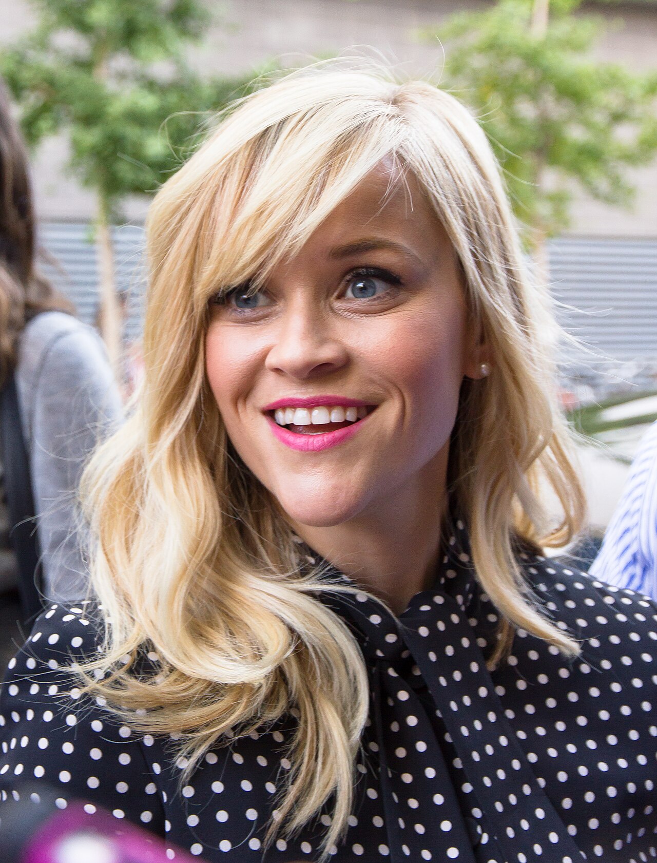
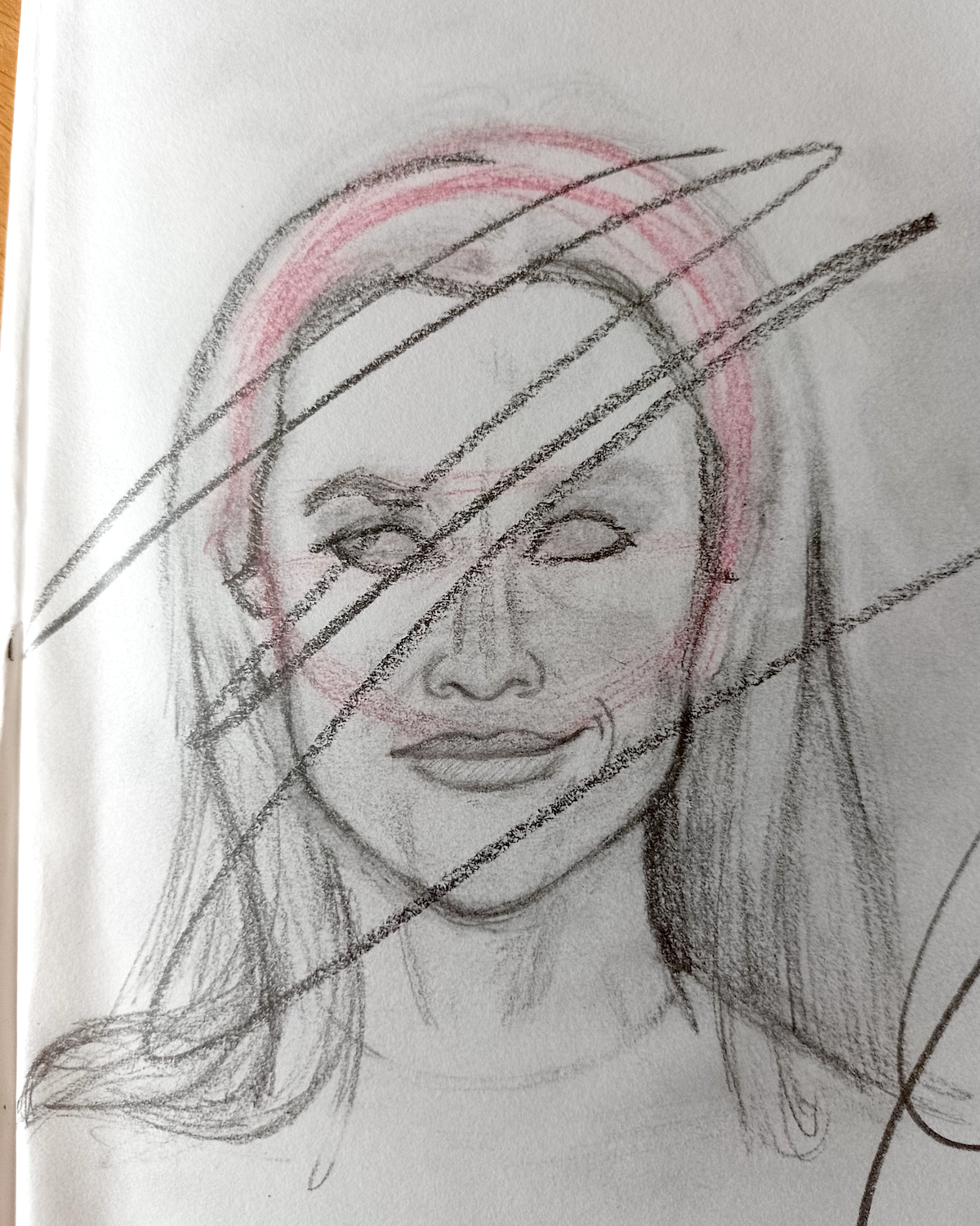
The brief states that I could use photographic reference as a starting point, whilst keeping in mind that copyright rules mean that I was not able to ‘simply’ copy directly from one particular photograph. Therefore I collated a range of images that I used for reference, rather than just focusing on a single one. I found this incredibly challenging and I discovered just how misleading photographs can be! For example, it is difficult to tell what angle the photo has been taken at, which completely changes the dimensions of the face/head. This can be so subtle that is is almost unnoticeable, but has a real impact when trying to draw someone.
Having to contend with this issue alongside attempting to recreate likeness in my drawing resulted in frustration and eventually giving up with this first attempt.
(click on image for larger version, opens in new tab)
On reflection, I can see that I was quite successful at drawing some of the individual facial features, such as the nose, mouth and chin, but the proportions were completely wrong. I also really struggle when trying to draw hair, so that was another problem I had to contend with.
At this point, I decided to betray my original intentions and try to draw a male famous person instead, as I usually find it ‘easier’ to draw men than women…
My next choice, after further internal debate, was Steve Carrell. Again, I thought he has quite distinctive features and there is certainly a contrast in his off-screen demeanour (quite reserved) compared to the range of characters he has portrayed.
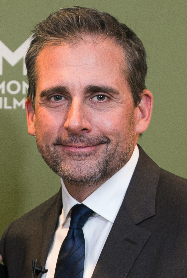
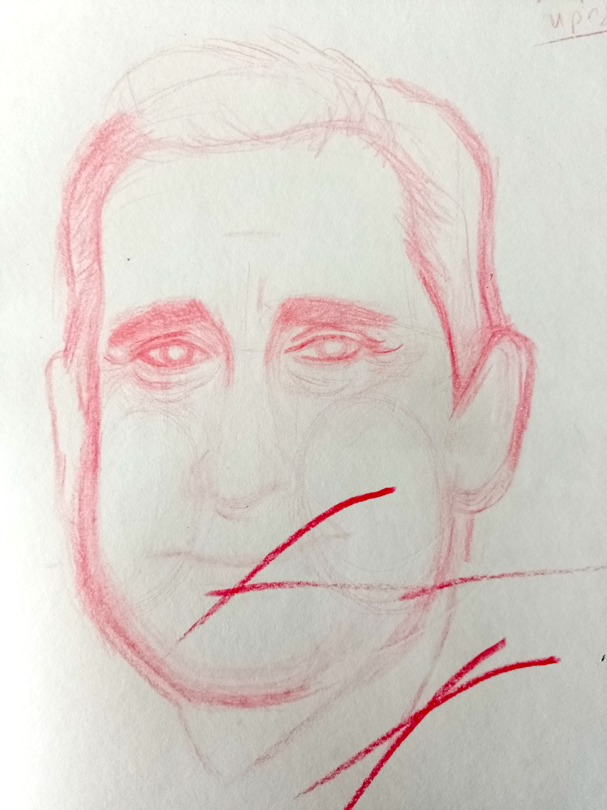
As before, I used a range of images to influence my drawing, although I gravitated to the one above. I faced similar issues and the only aspect that I was fairly happy with in the initial sketch was his eyes.
(click on image for larger version, opens in new tab)
After some consideration, I thought that perhaps I was trying to be too precise in the initial stages of trying to capture a likeness and maybe, instead, I should aim to get the overall structure in place first. I also felt that I should experiment with using a different media to see if this would help, as, so far, working with a pencil had not produced satisfactory results.
I started a fresh portrait of Carrell, this time I opted for oil pastels, which I rarely use. Initially, I found this way of working much less stressful as I could be quite free in applying the pastel. In fact, I was surprised just how much I enjoyed using this media. I liked how the colours blended (although my pastels are not very high quality) and were quite forgiving. I also discovered that it is possible to scrape of the pastel using a knife and work back into it.
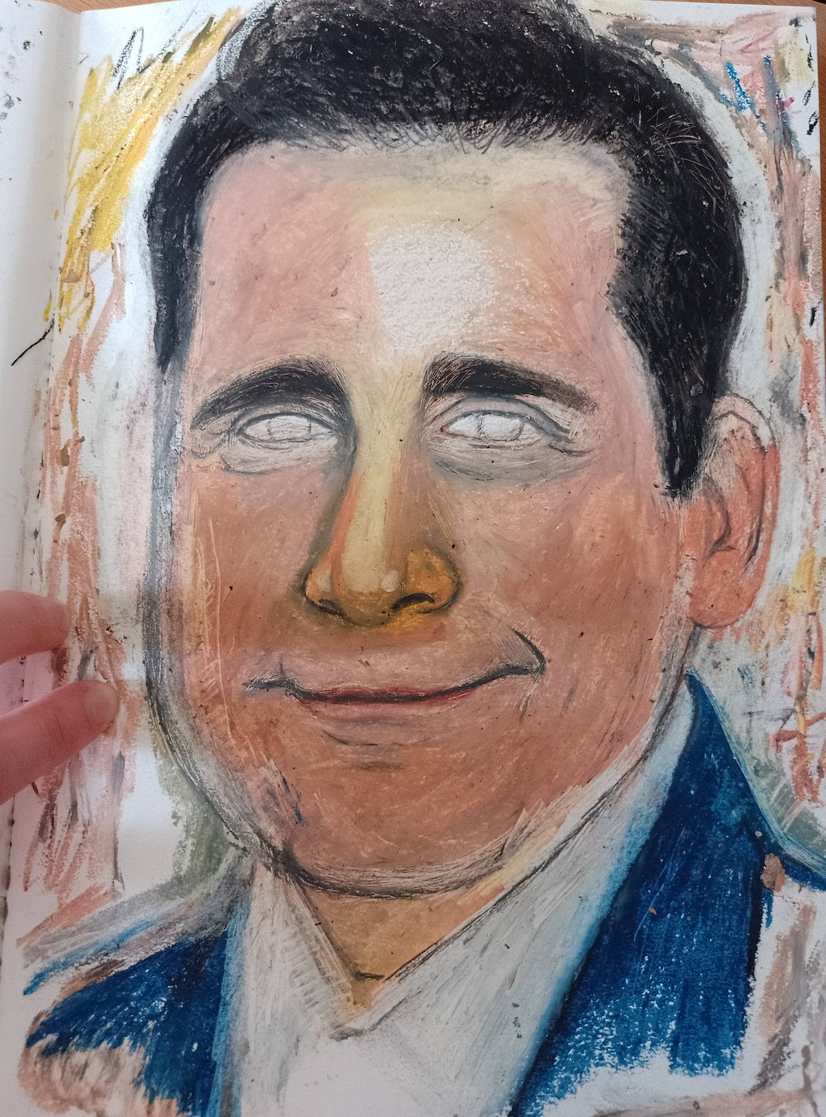
(click on image for larger version, opens in new tab)
Ultimately, however, I ended up with the same issues of proportion as before in that I felt some of the individual features were acceptable, but when added together they did not sit right. I found myself becoming really frustrated. I lost count of how long I spent on this portrait and how may times I tried to reshape the face. In my opinion, it looks more like Jake Gyllenhal than Steve Carrell. I was disappointed when I reached a stage at which I had to admit defeat and move on.
By now, I was feeling quite despondent, having already spent a great deal of time on this exercise and not even half way through it!
After sulking for a few hours, I decided to have another go. This time I picked the actress Rooney Mara. Although she may not have quite as obvious facial landmarks as with my previous two choices, she has striking features and I also like her as a person, which I will expand on in the caricature section.
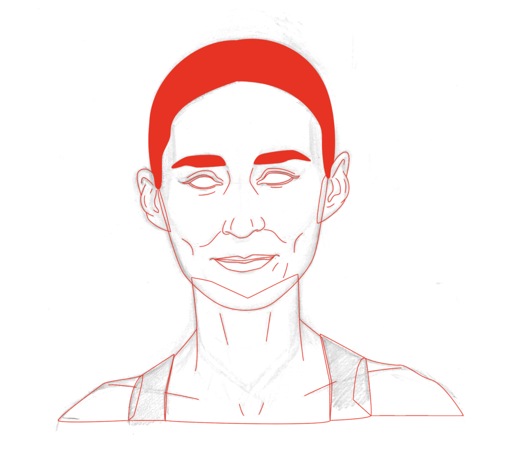
I wanted to approach this attempt with a positive mindset, so I took some of the pressure off myself and, after collecting a selection of images, I just drew what I saw. I opted for a face-on view as I think the 3/4 view was one of the main problems with the previous portrait.
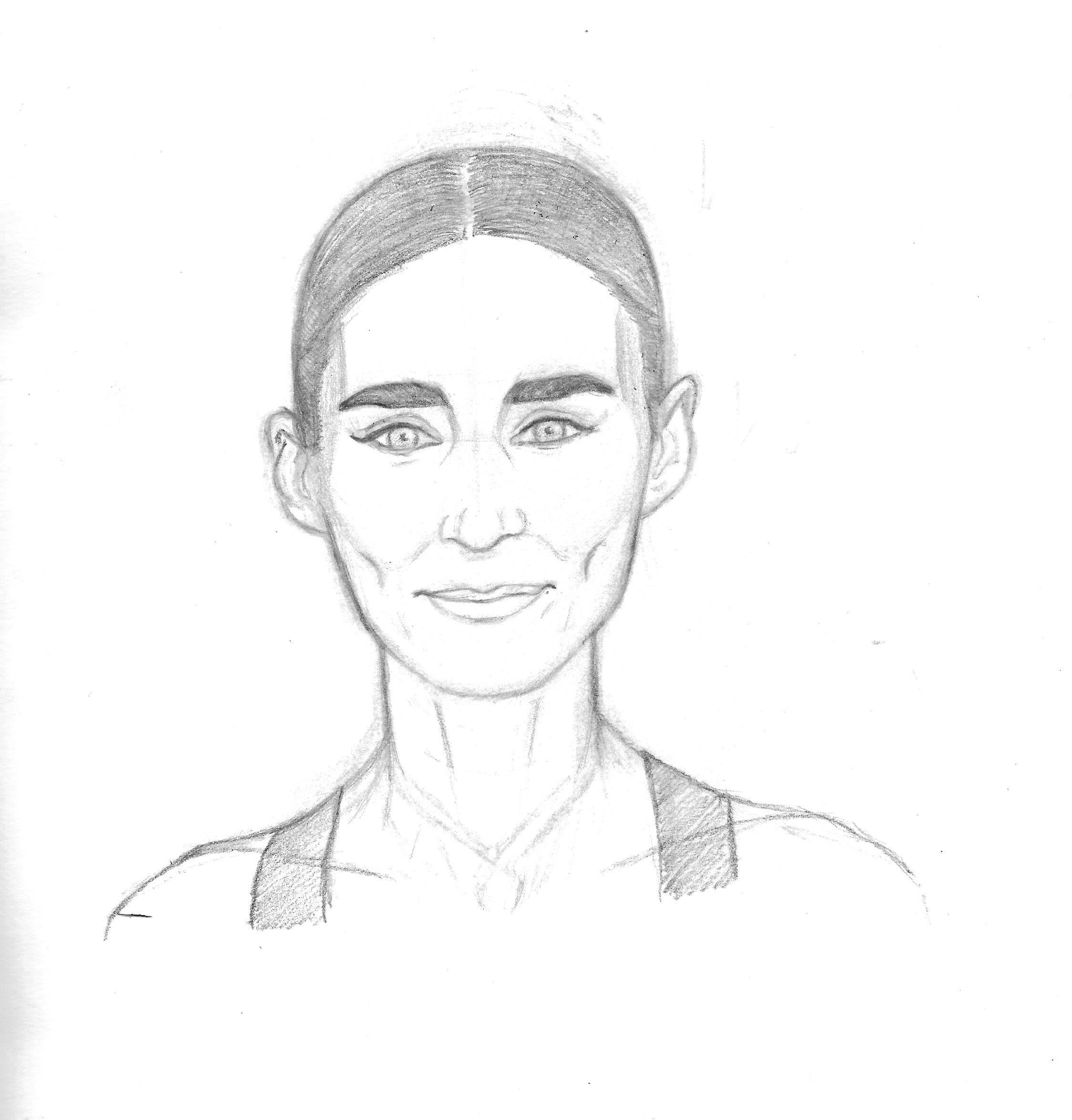
(click on image for larger version, opens in new tab)
Although I did not feel the drawing was particularly recognisable as being Rooney Mara, I was glad that I had managed to draw a head that was not too bizarre looking. After spending so long looking at someone, you really begin to notice how non-symmetrical people’s faces are, which sort of nullifies the effectiveness of learning to draw people using the exact, measuring approach suggested by Andrew Loomis, for example, and just use these as a guide instead. Ideally I would have someone’s head (still connected to their body, I hasten to add) to practice drawing from in real life rather than using photos/drawings for reference.
Moving into Illustrator
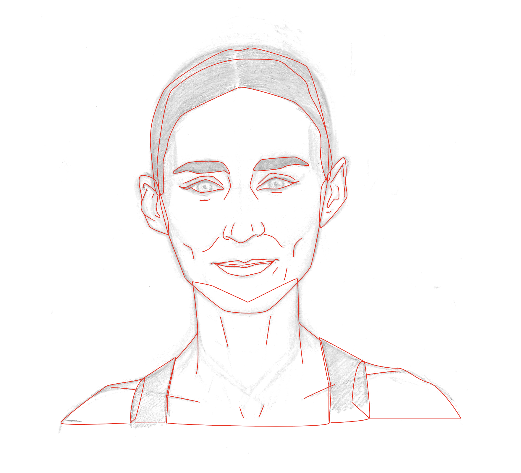
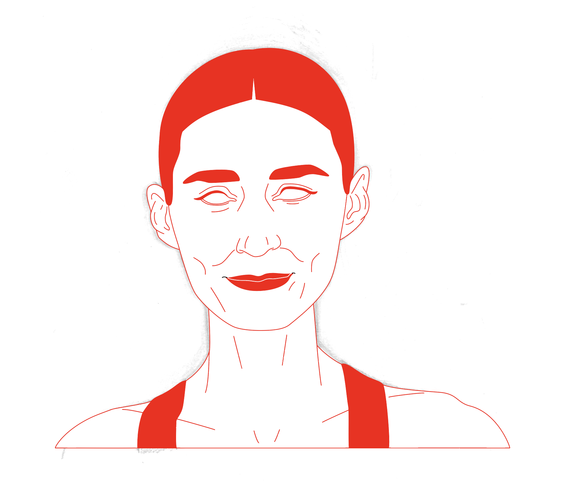
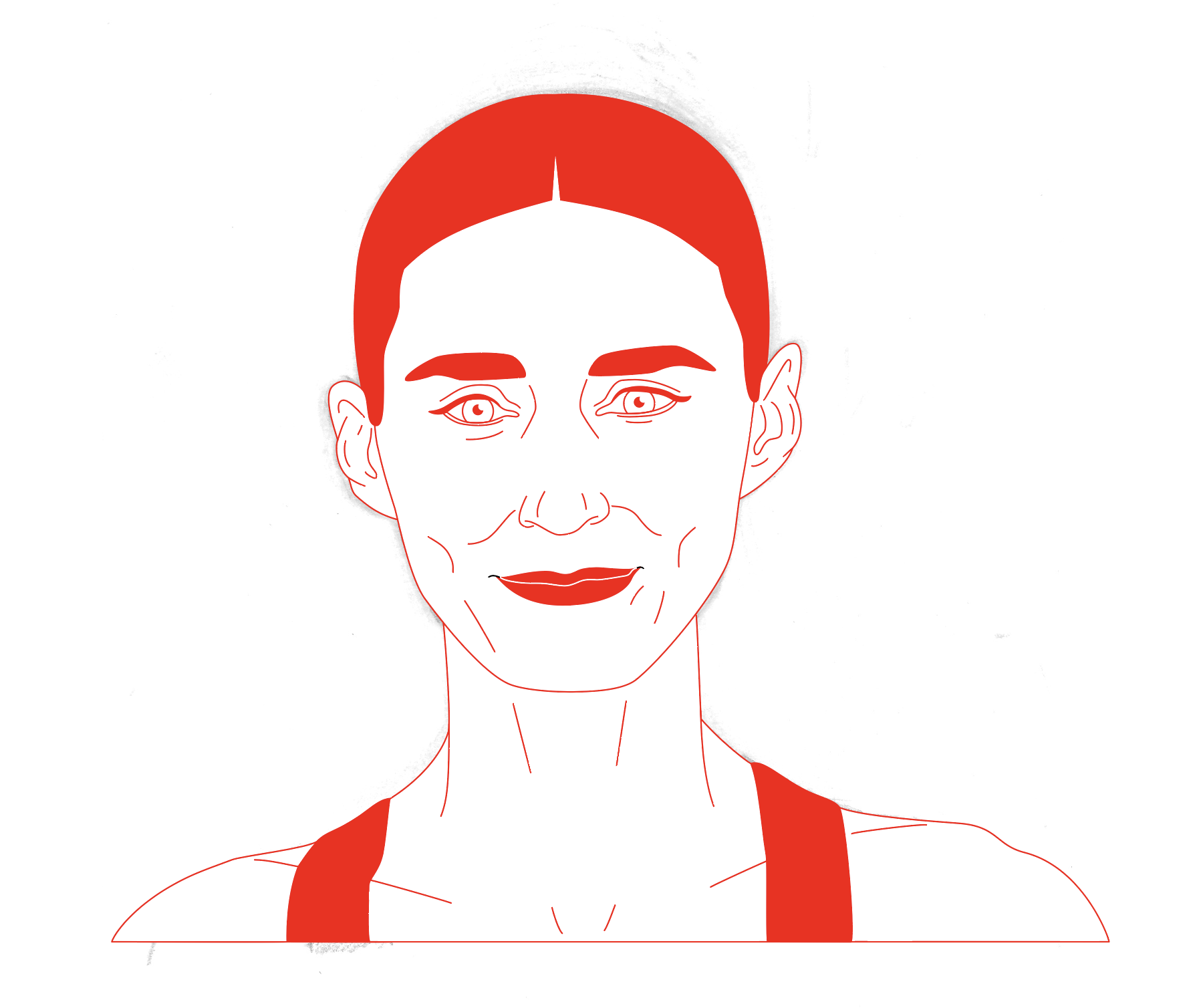
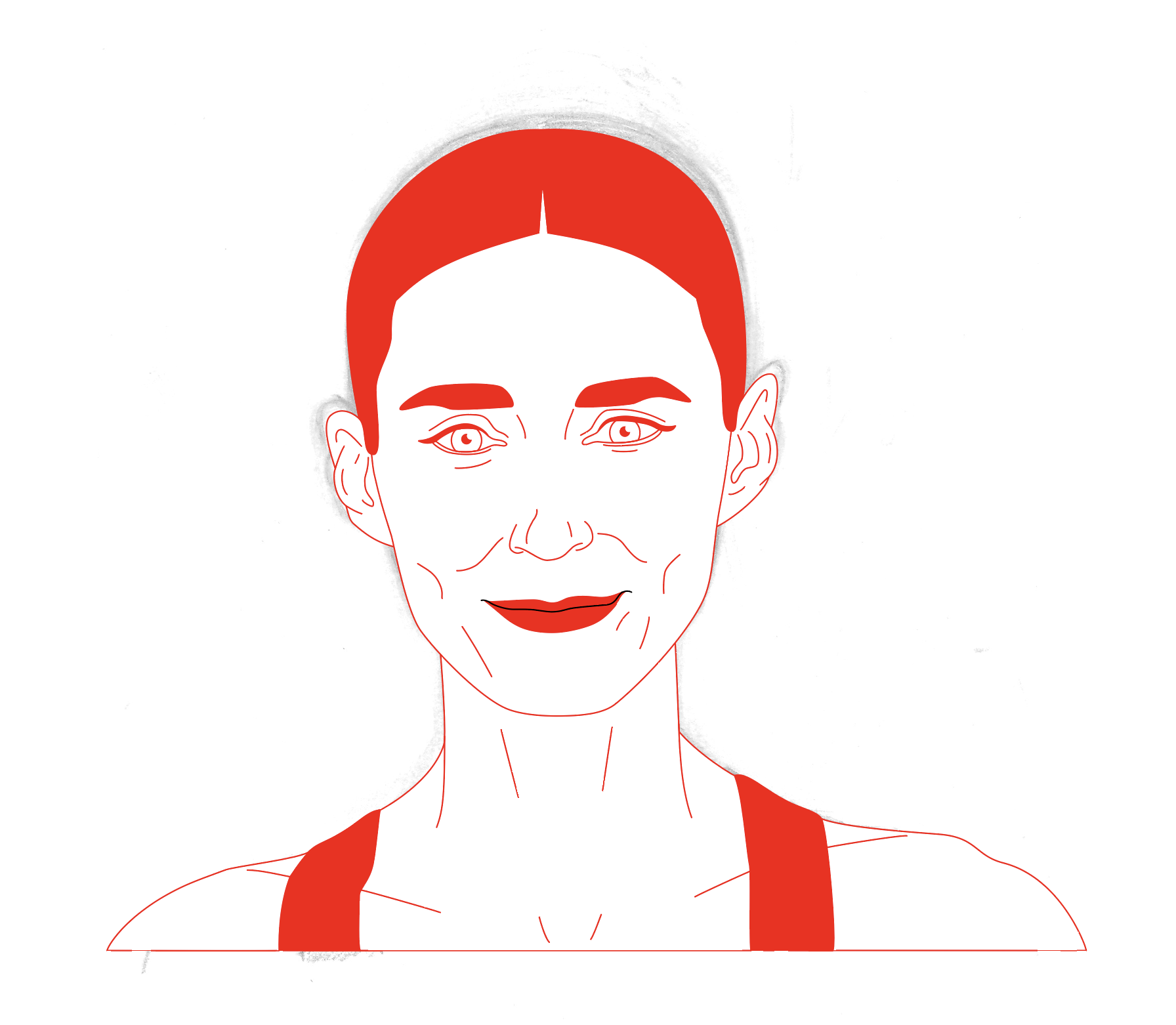
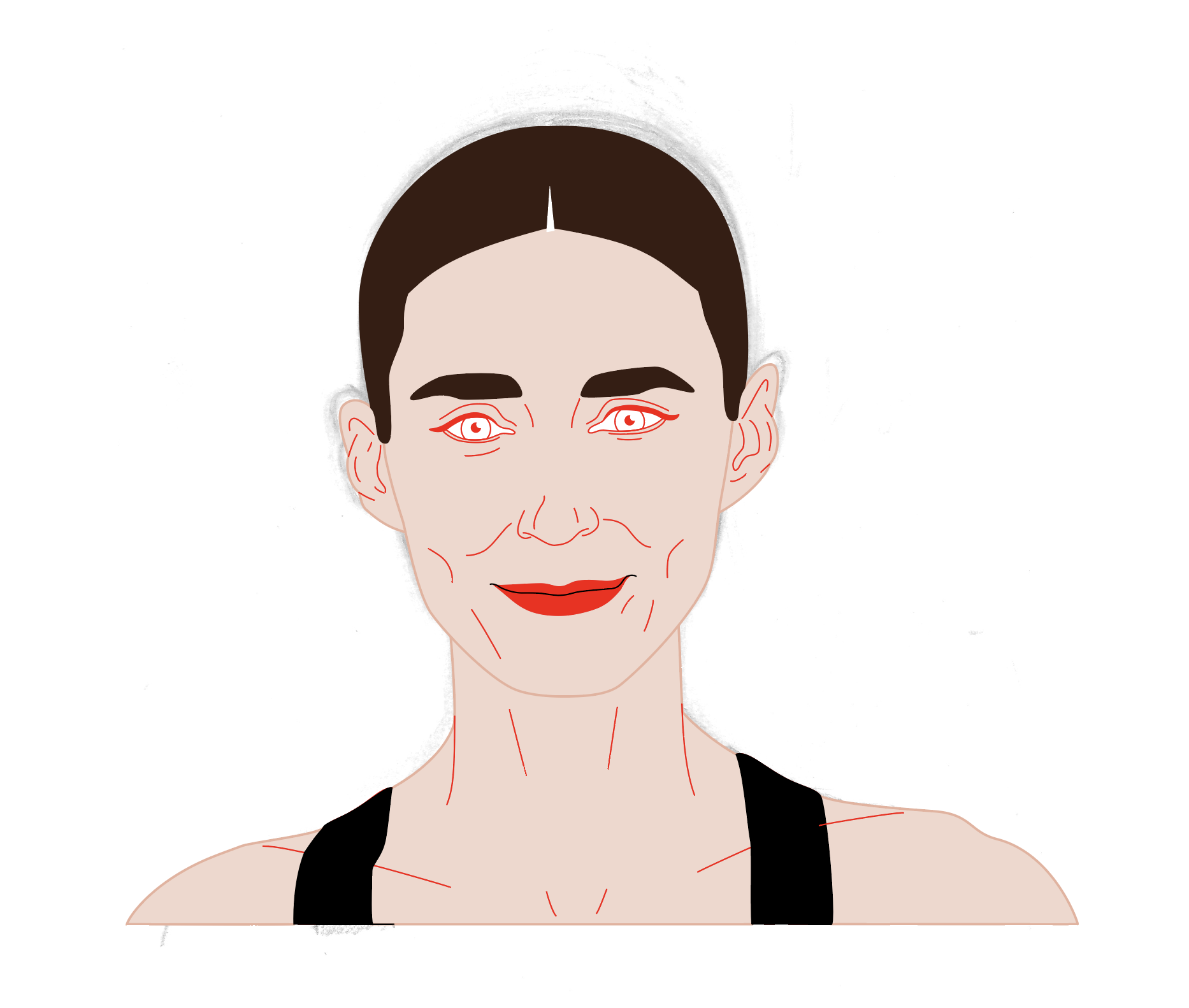
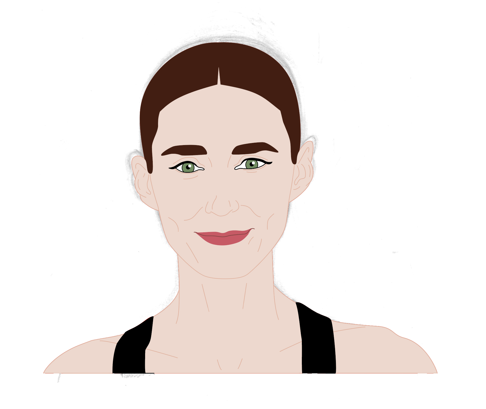
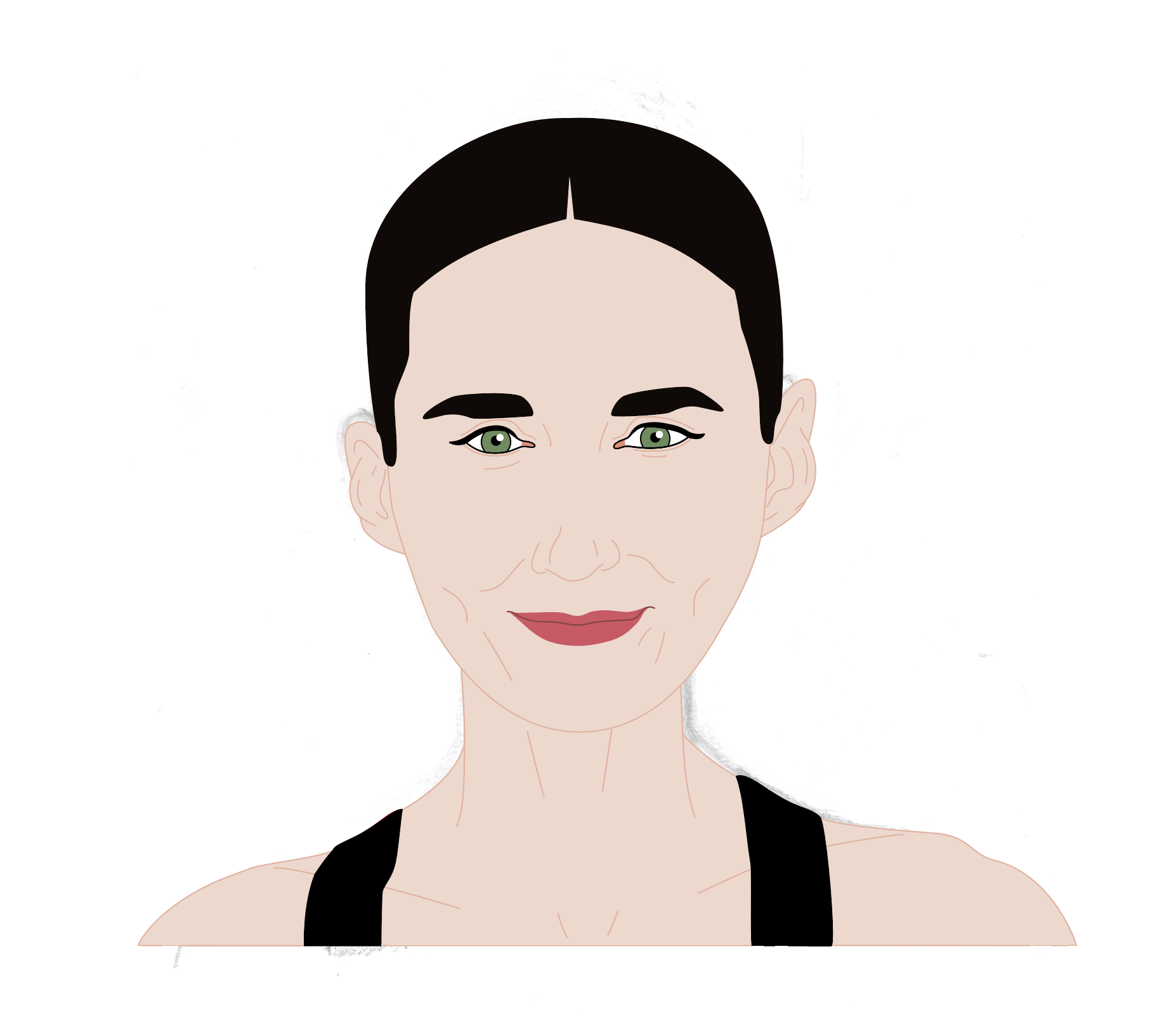
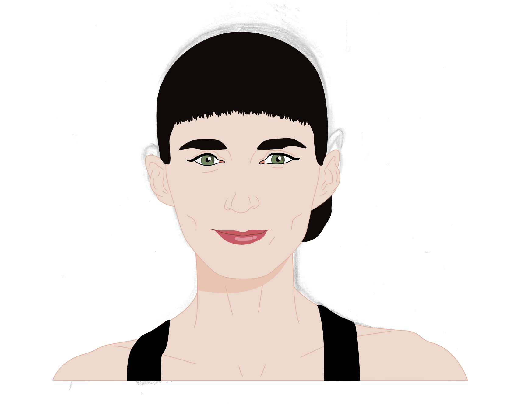
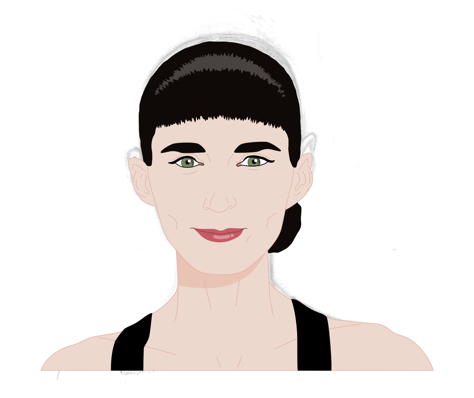
As I was not happy with the drawing in terms of being a character portrait of Rooney Mara, I decided to prolong the pain of this section of the exercise and scan the drawing into Illustrator. I spent an unspeakable amount of time fiddling around trying to get the image to resemble Mara.
(click on image for larger version, opens in new tab)
(click on image for larger version, opens in new tab)
(click on image for larger version, opens in new tab)
(click on image for larger version, opens in new tab)
(click on image for larger version, opens in new tab)
(click on image for larger version, opens in new tab)
(click on image for larger version, opens in new tab)
(click on image for larger version, opens in new tab)
(click on image for larger version, opens in new tab)
(click on image for larger version, opens in new tab)
(click on image for larger version, opens in new tab)
I was having such difficulty with the hairline, that I ended up just adding a fringe!
(click on image for larger version, opens in new tab)
(click on image for larger version, opens in new tab)
(click on image for larger version, opens in new tab)
(click on image for larger version, opens in new tab)
(click on image for larger version, opens in new tab)
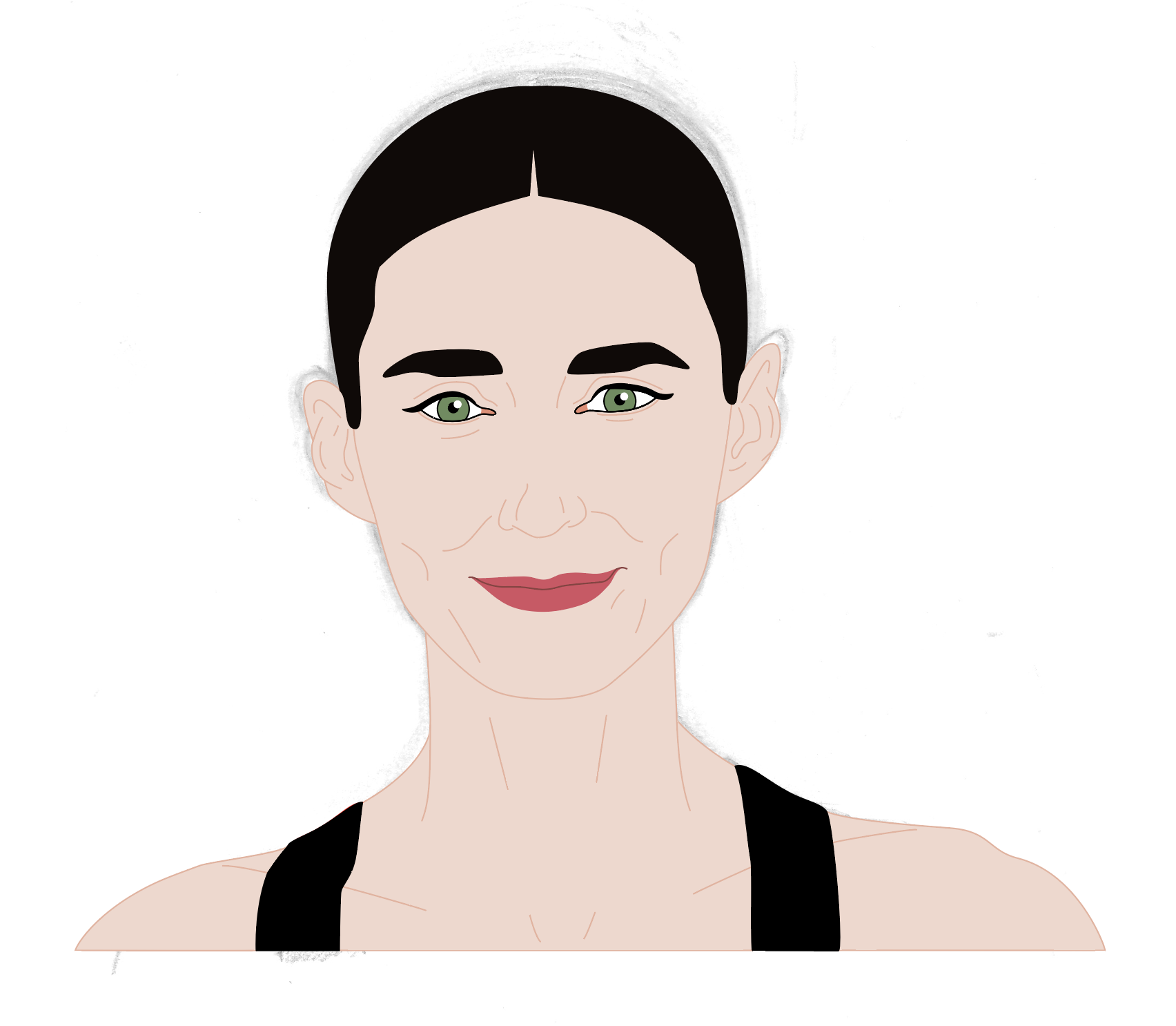
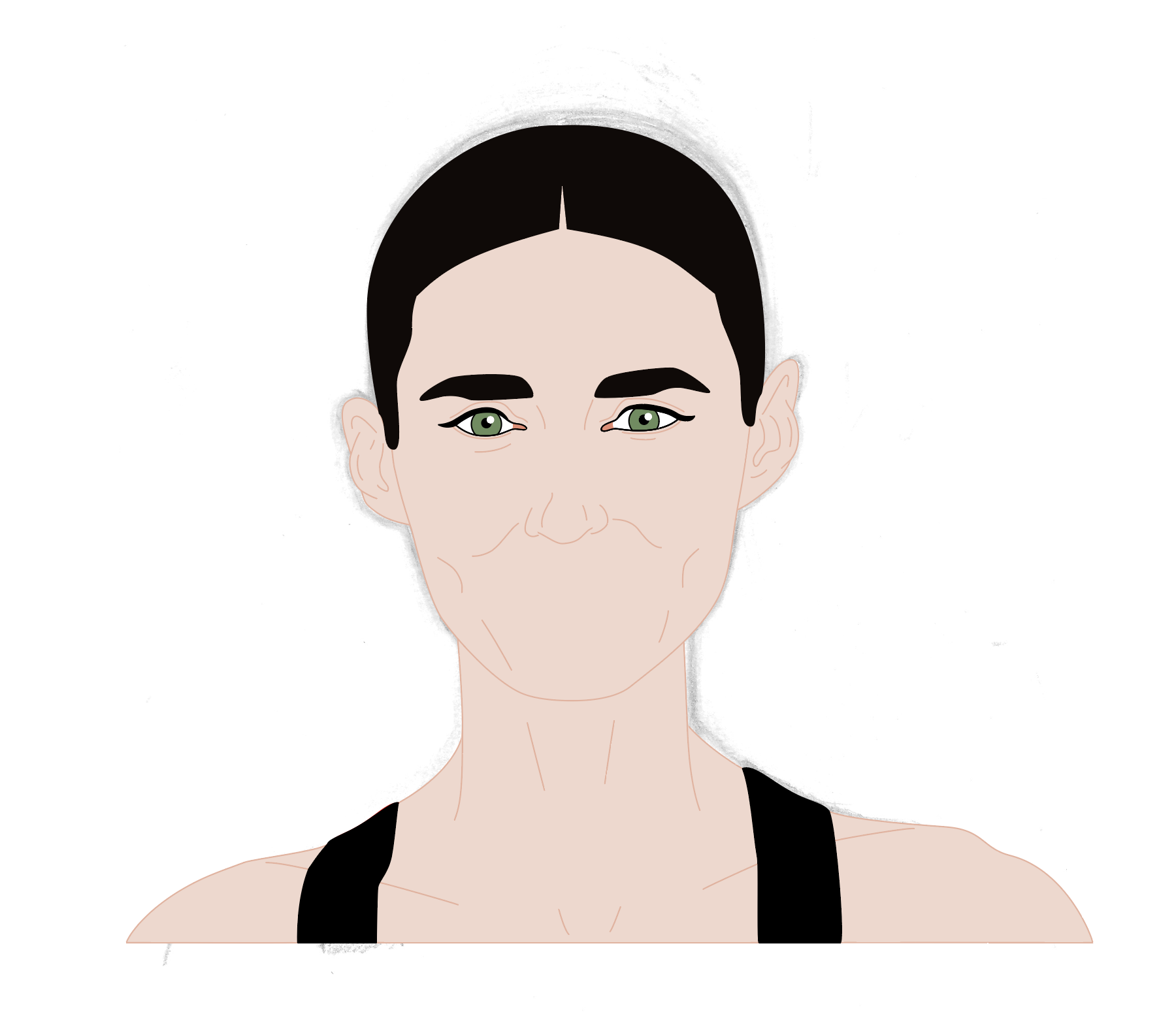
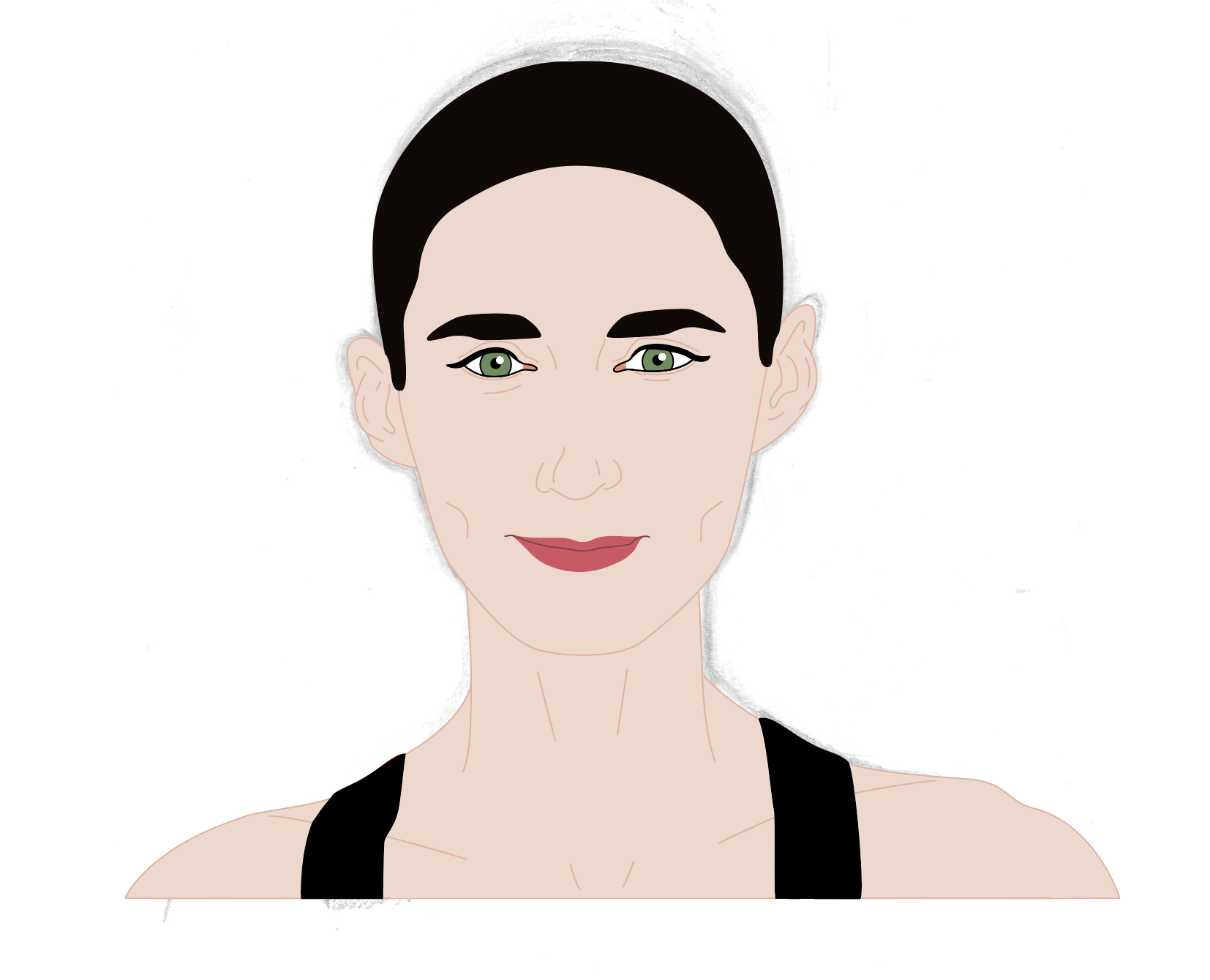
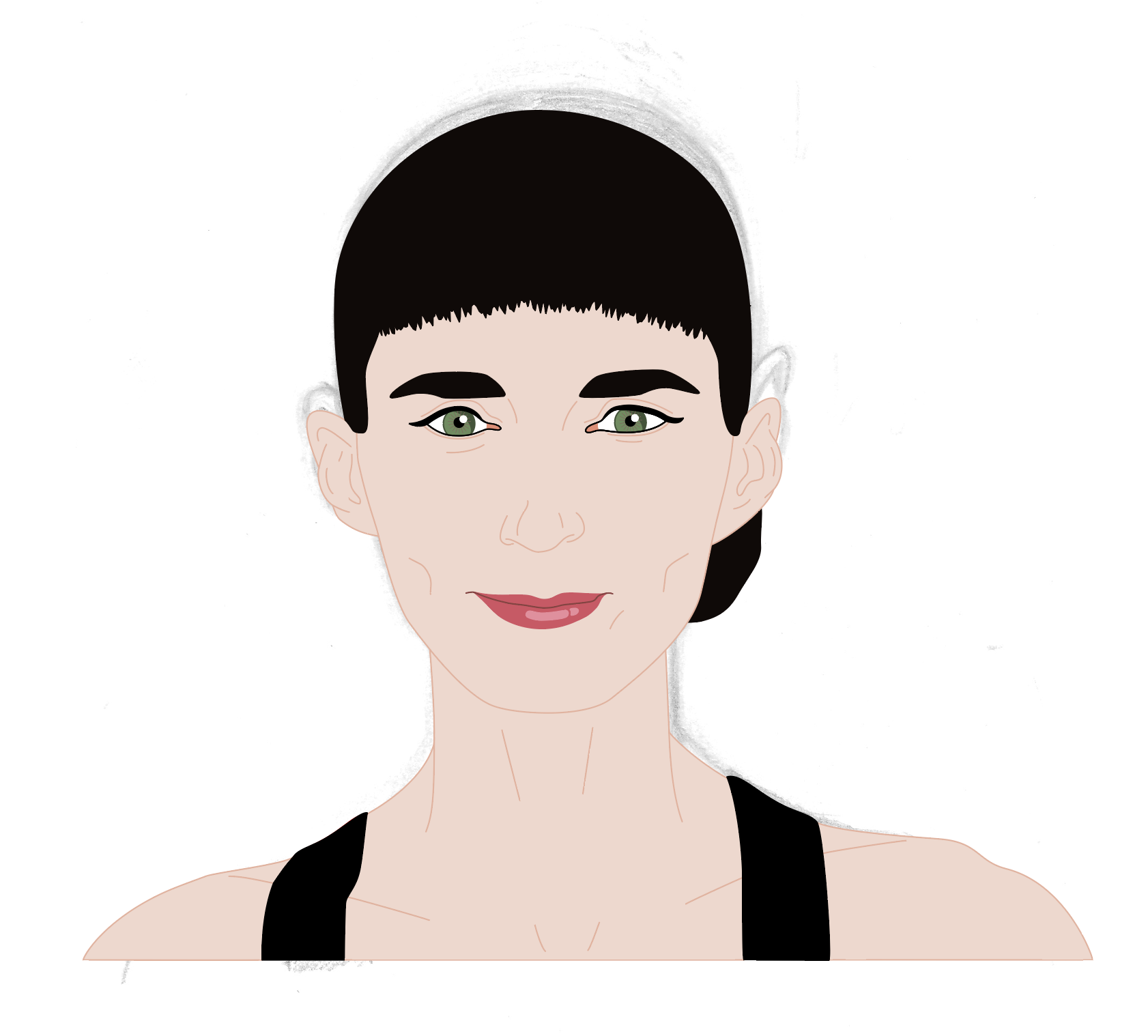
I eventually decided that I needed to stop and move on with the exercise, so the ‘final results can be seen below. Although I felt that this was possibly the best attempt at a portrait of a person I have done so far, it still does not look like Rooney Mara! I could not get the jawline, mouth and jawline to look right at all. At least it looks like a human being and I learnt so much during the process, so I had to accept this and move forward.
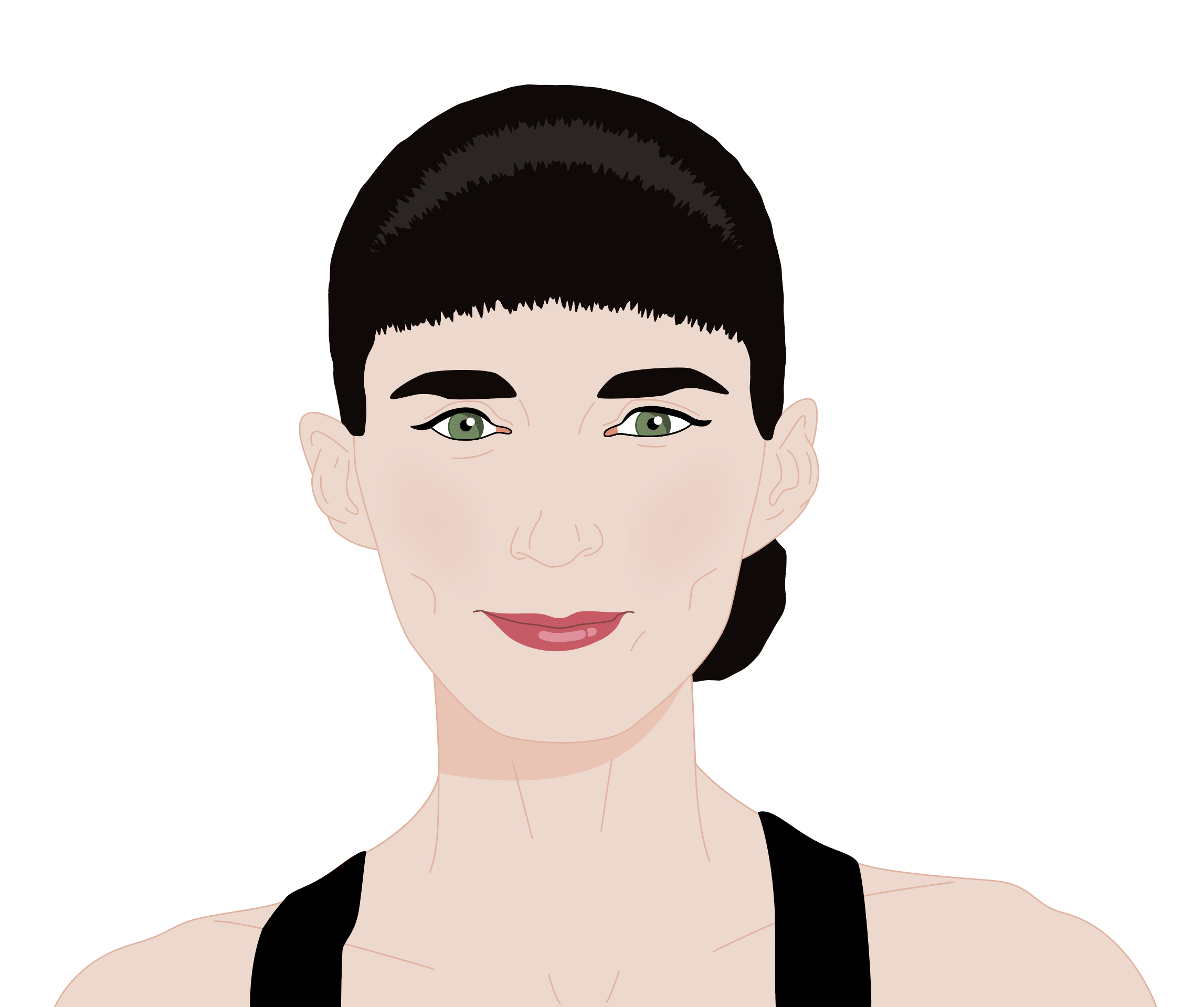
(click on image for larger version, opens in new tab)
Caricature
As with the caricature I produced of Michael Portillo, I considered the most distinctive facial features of Rooney Mara. As previously stated, however, I did not feel these were as obvious as with Portillo, for example. I did note some features that I thought were worth taking into account for potential exaggeration, including:
- Fairly thick, prominent eyebrows
- Small ears
- Rounded, high forehead
- Defined cheekbones
In terms of a contrast of personality, as an actress, Rooney Mara is able to portray different characters on film with ease. When you see her being herself (as much as is possible whilst still being filmed), in interviews for example, she is one of the shyest actors I have seen (and there are quite a few of them!). Mara describes herself as shy and an introvert, and when she was at school she spent a lot of time by herself as she ‘did not fit in’. Being similar to this myself, makes me a fan. Plus she is also a vegan and visits animal sanctuaries/campaigns, so she gets extra brownie points from me. I realise that this does not really comply with the brief that suggests examples that are a more negative aspect of the person’s personality, but technically it is still a contrast between the characters Mara plays and the ‘real-life’ version.
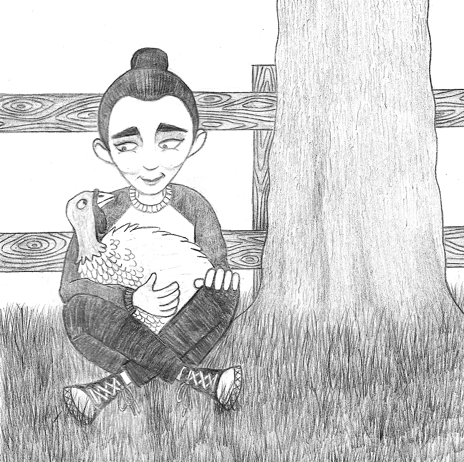
After spending so much time on the first part of this exercise, I wanted to approach this task in a more relaxed way, so I just started doodling using a pencil. I used two additional references images to provide some inspiration, one which shows the baseball hi-tops Mara was wearing at the Oscars in 2020 and another that shows Mara at an animal sanctuary with a rescued turkey.
I originally intended to draw a selection of thumbnails/rough sketches, but I became completely absorbed in the first one, so I just persevered with it. Compared to the portrait version, I thoroughly enjoyed this part of the exercise and the result can be seen below.
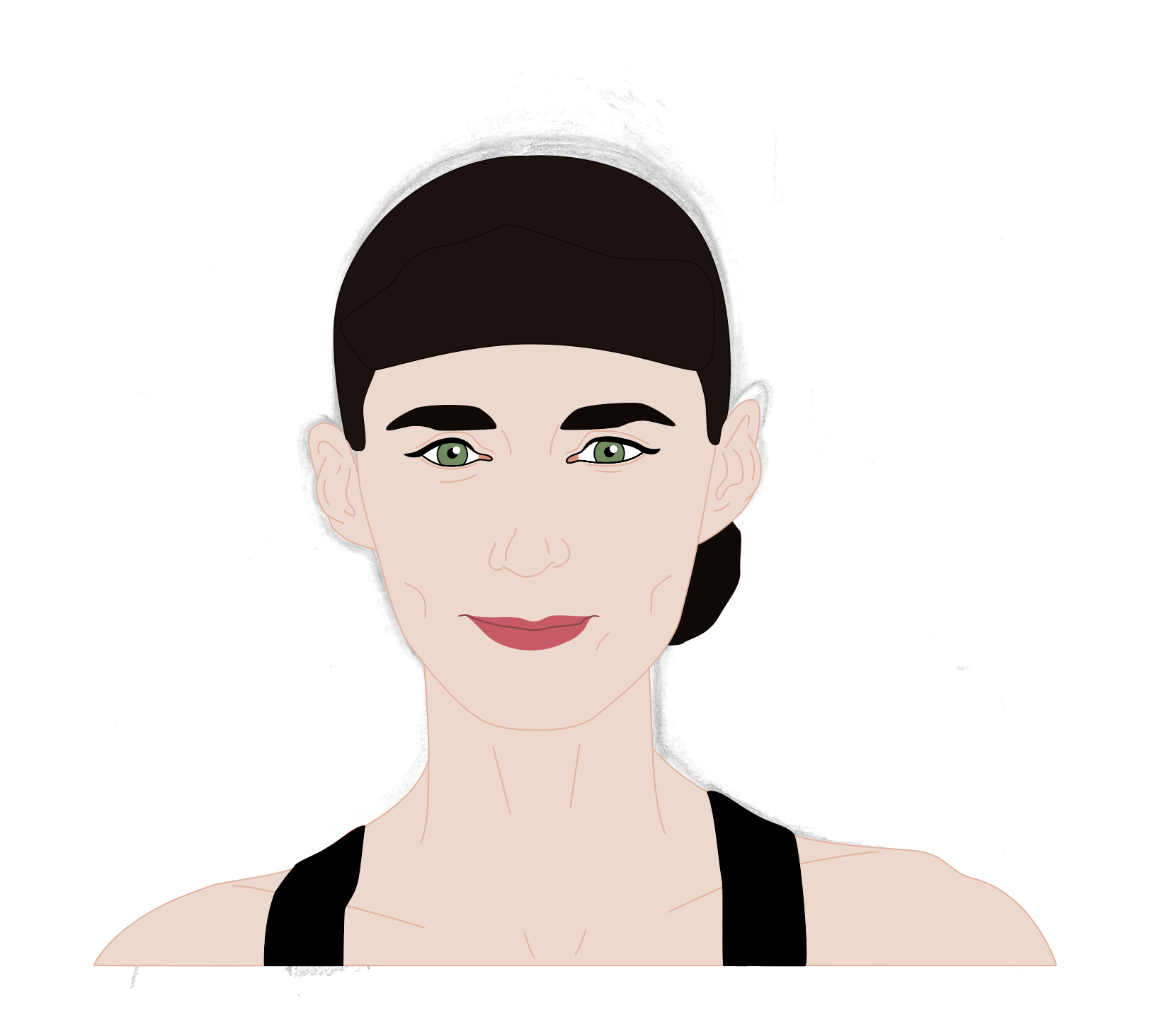
(click on image for larger version, opens in new tab)
Although it does not necessarily look like a traditional caricature, more like a cartoon, I do believe that I have managed to portray a better likeness due to studying Rooney Mara’s face for so long earlier in the exercise!
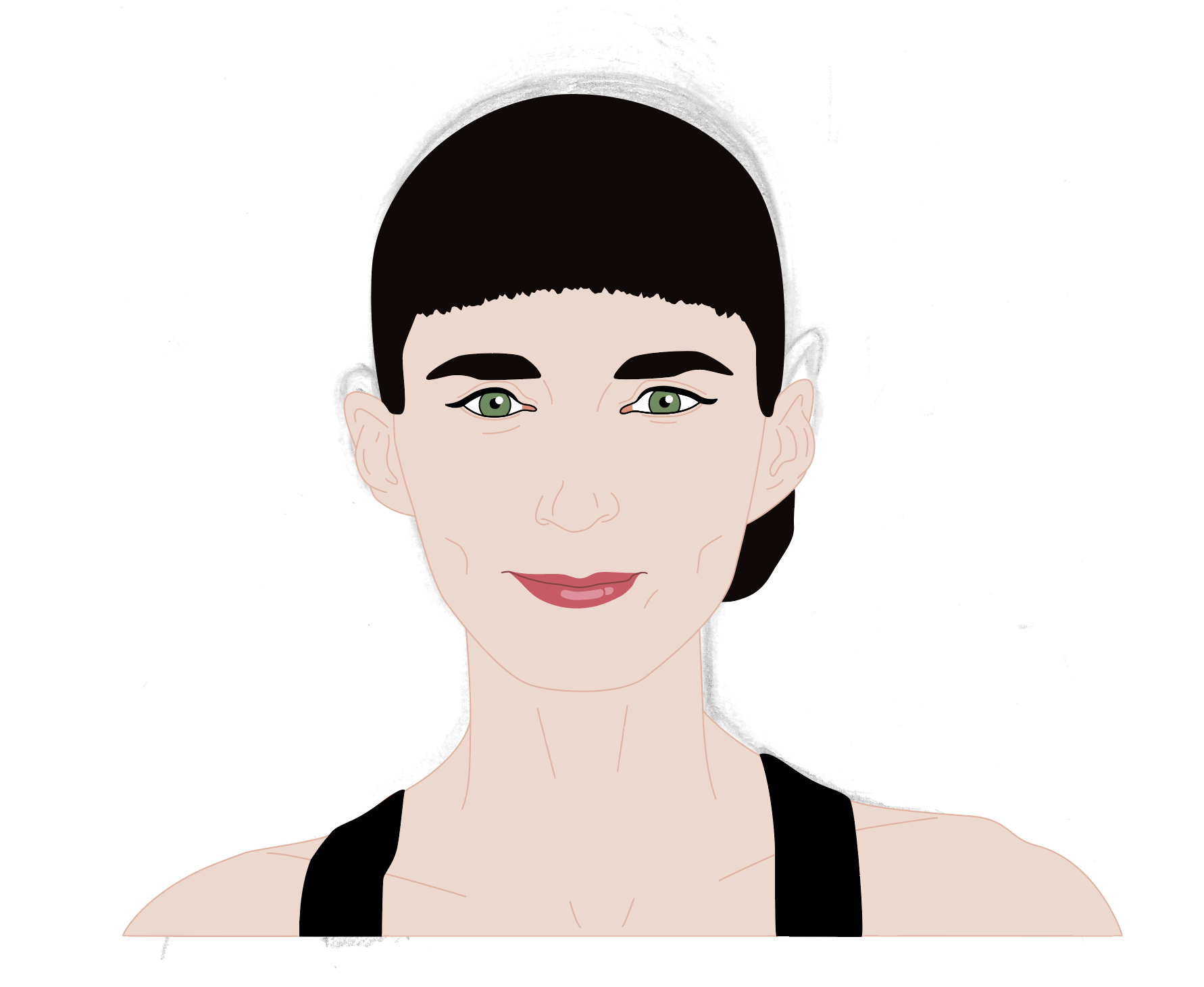
I did consider doing a black ink version of the drawing, but I am often disappointed with my attempts at this and usually prefer the pencil version, so I decided to just stop whilst I was ahead and feeling quite positive about the outcome. I did play around with the image on my computer and altered the contrast, exposure and saturation to create a ‘cheat’ black-outlined version of the caricature.
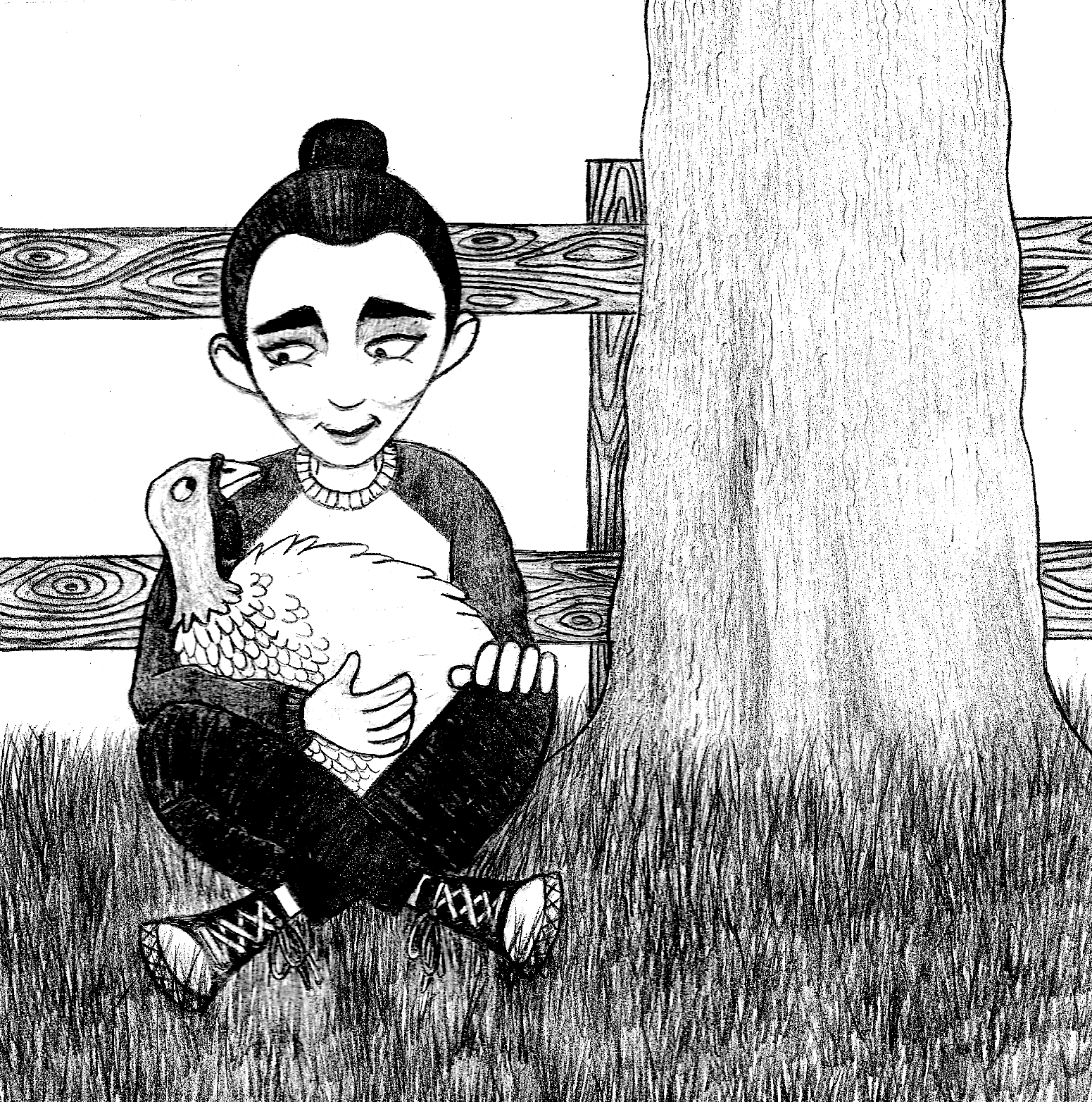
(click on image for larger version, opens in new tab)
Final Thoughts
I was expecting to enjoy completing this exercise more than I did, but I spent a high percentage of the time feeling quite frustrated and dissatisfied (when working on the first part of the exercise). Having said that, I do believe that I have learnt a great deal of valuable insights as I worked my way through the challenges presented to me. I have summarised a selection of these below:
- Photographs are not a reliable source when used as reference material to draw from, particularly when trying to produce a recognisable likeness of an individual. I have always been aware of the issues regarding working from photographs, but this exercise really emphasised their weakness. I do think, however, that if you are able to take your own reference photos, in a controlled environment, these would be preferable and could be used with greater confidence (plus you would avoid the issue of copyright infringement).
- Oil pastels are a versatile media to work with. I expect they work better on a larger scale as I used A4 and it became rather complicated when trying to add finer details. I should also look at getting some higher quality pastels.
- The brief suggested artists such as Barry Fantoni as a potential influence for my output in this exercise. I tried to create a more true to life representation for my character portrait, which was hard enough in itself. I believe that artists such as Fantoni are more than capable of producing realistic drawings and because they have this skill ‘in the bag’ they are then able to manipulate as desired and it still looks visually pleasing. If someone like me, who is still struggling with the realistic version, tries to do the same thing it just looks visually ‘wrong’.
- When you truly study a person’s face, even one that appears to be ‘perfect’, they are never symmetrical and noticing even the most subtle features can really make all the difference when trying to reproduce a likeness on paper.
- I found it really difficult to understand why I could not get the facial proportions to look right – even when I did measure the distance between the jawline and the mouth, I still could not get it to work! I still do not know where I went wrong with this, but I guess I just need to keep practicing. I do think that I perhaps draw the head too small and the features tend to be cramped.
- As previously mentioned, once I reached the caricature section (or cartoon in my case), I felt much more confident in my work and this is due to the more realistic work that I worked on beforehand. On reflection, I think this supports my previous observation regarding artists such Fantoni, that, in my opinion, it is important to the able to draw a subject in a believable and/or realistic style before moving on to experimenting with style and exaggeration (in most cases).
- As I worked with pencil in the second drawing, I tried to think about how I could differentiate the shading of the different sections of the drawing so that it did not just end up as one shade of grey – this was not easy to do and I do not feel I was overly successful at this. However, I was very pleased with the wooden texture I drew on the fence.
Overall, this exercise was another challenging one, but in hindsight I am pleased that I managed to create realistic portrait of a female (even if it does not really look like Rooney Mara). I was more pleased with the second drawing and I do feel it has a resemblance to Mara.
Bibliography
Bjornson, G. (2021) Joaquin Phoenix, Rooney Mara Encourage People to Adopt a Turkey. Available at: https://people.com/pets/joaquin-phoenix-rooney-mara-urge-people-to-adopt-turkeys-this-thanksgiving/ (Accessed 4 September 2023).
Chiorando, M. (2020) Joaquin Phoenix Celebrates Oscar Win with Vegan Burger. Available at: https://plantbasednews.org/news/joaquin-phoenix-oscar-win-vegan-burger/ (Accessed 4 September 2023).
Chris Beetles Gallery (2023) Barry Fantoni (born 1940). Available at: https://www.chrisbeetles.com/artists/fantoni-barry-born-1940.html (Accessed 1 September 2023).
Fasanella, A. (2022) Rooney Mara to Star in Audrey Hepburn Biopc – See How Their Styles Compare. Available at: https://news.yahoo.com/rooney-mara-star-audrey-hepburn-225241552.html (Accessed 2 September 2023).
The Creative Finder (n.d.) Thea Brine on The Creative Finder. Available at: https://thecreativefinder.com/thea (Accessed 1 September 2023).
Wikipedia (n.d.) Reese Witherspoon. Available at: https://en.wikipedia.org/wiki/Reese_Witherspoon (Accessed 2 September 2023).
Wikipedia (n.d.) Steve Carrell. Available at: https://en.wikipedia.org/wiki/Steve_Carell (Accessed 2 September 2023).