There’s a wealth of comic books, cartoons and graphic novel artists about there. Pick some examples of work that you find interesting. What’s the relationship between the narrative and the style of drawing being used? Which is most important in making the story work?
Before undertaking the Graphic Fiction unit at Level 1, I had not paid much attention to comics or graphic novels since I was a child. I think the main reason was that I wrongly associated the genre solely with superhero comics, which do not generally appeal to me (although I have enjoyed a selection of the film versions). However, during the unit I became slightly obsessed with graphic fiction and this has continued ever since. It opened my eyes to a new way of visually expressing character-driven narratives, which is my favourite creative domain.
As a result, I have since been regularly reading a range of graphic fiction and I have selected three of the ones that have so far had the greatest impact on me to analyse in the context of this Research Task.
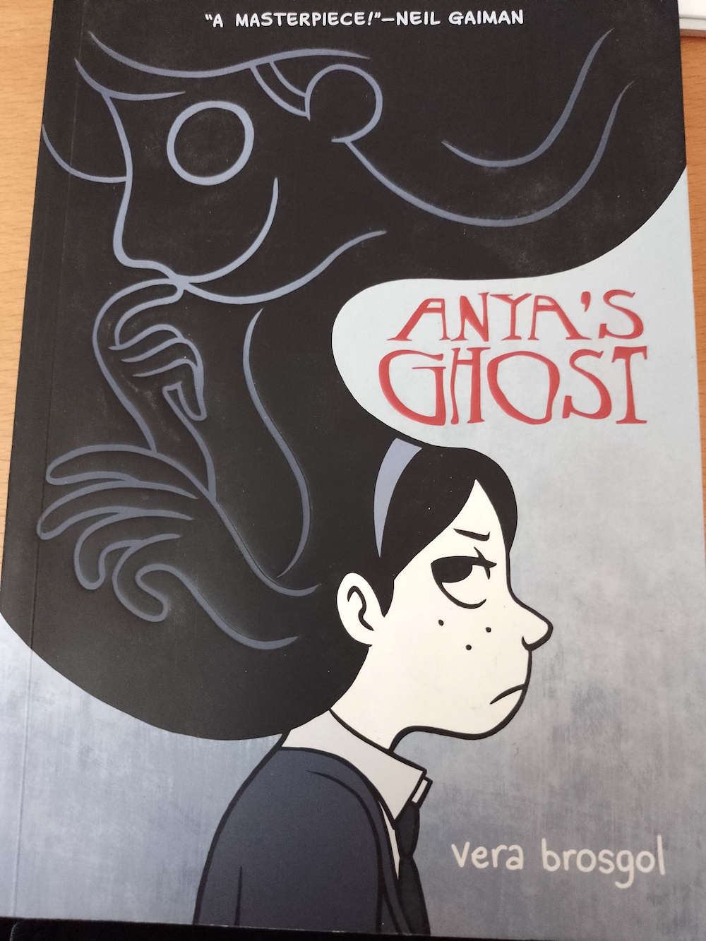
Anya’s Ghost by Vera Brosgol
My tutor on the GF unit suggested I looked at Anya’s Ghost by Vera Brosgol and it was therefore the first graphic novel I read. It instantly became a firm favourite of mine. In my opinion everything about it is superb – the story, the style of drawing, the limited use of colour and text, and the page layouts.
One conclusion I have made through reading a range of graphic fiction is that I do not enjoy those with excessive amounts of text, particularly in detailed description captions. I think this is partly why I am not keen on superhero comics as they tend to use these and my mind starts to drift. I feel the combination of image and text should work in balance, but the images should, generally, be able to convey a message without having to be explained via words. There should not be a ‘battle’ between the text and image to capture the reader’s attention.
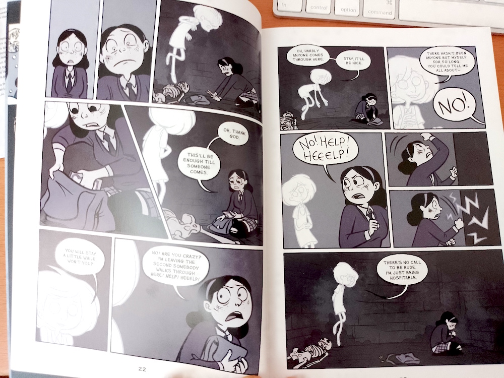
I have no doubt that Brosgol has this all figured out as she uses text sparsely, and then only for speech and sound effects. Instead, the thread of the narrative is communicated via extremely expressive and clear drawings. It is interesting to note that Brosgol works in animation as a storyboard artist, which clearly has influenced her style and ability to produce sequential images so accurately.
The main character, Anya, is in almost every panel throughout the book and the reader becomes involved in her plight – she has a really expressive face and body language so it is easy to interpret what she is feeling and thinking.
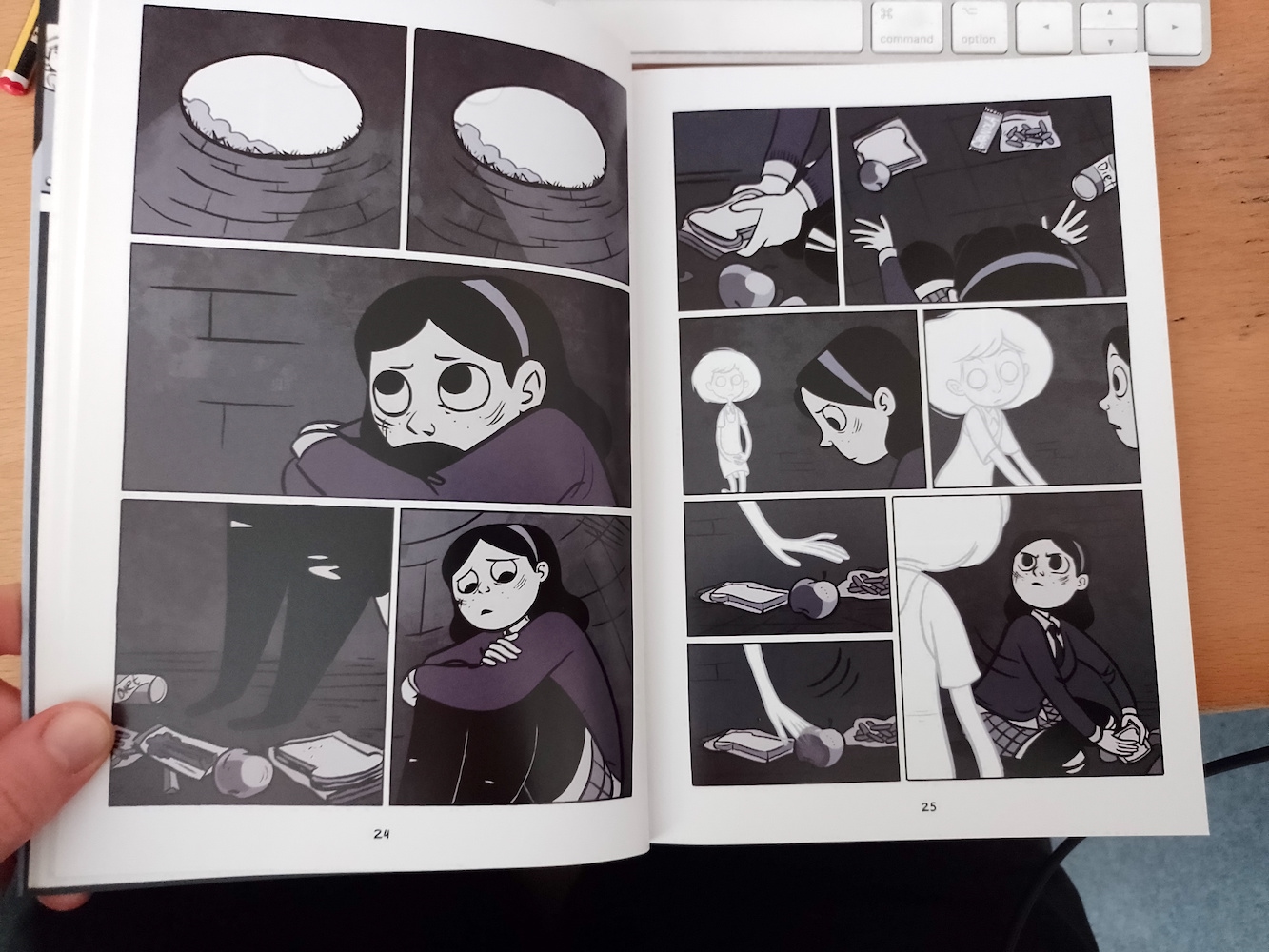
The fairly loose, ‘simplified’ style is also well-suited to the story as the characters are the main focus of the narrative, so the backgrounds are therefore lightly detailed and thus not a distraction. I also feel the limited colour palette of purple, black and white assists with this. The panels are also used to great effect both in terms of size, shape, and the positioning of them upon the page.
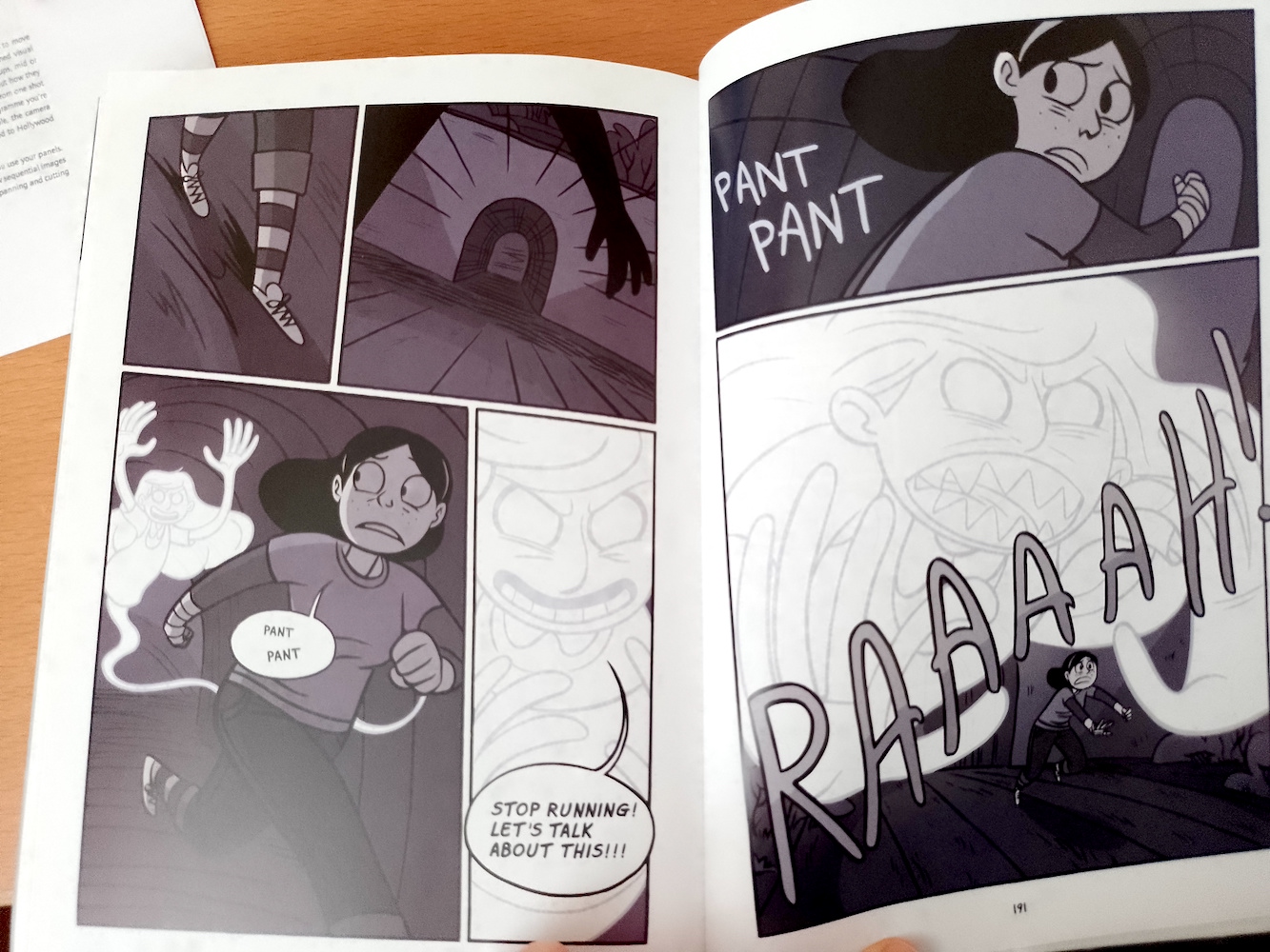
Overall, to my mind, the narrative of Anya’s Ghost has an easy flow to it created by the perfect balance between narrative and drawing style. It is an example of a graphic novel that I could read multiple times and not be bored with it.
The Arrival by Shaun Tan
In my opinion, Shaun Tan is one of the most talented artists I have come across as of yet. That he is able to create such incredible drawings using just graphite pencils is beyond my level of comprehension. The Arrival is a textless graphic novel about an immigrant arriving in a new country to find work and planning to eventually bring his family to join him. Although it is based in a fictional, fantasy location, it is clearly based on the real world (and a very current issue).
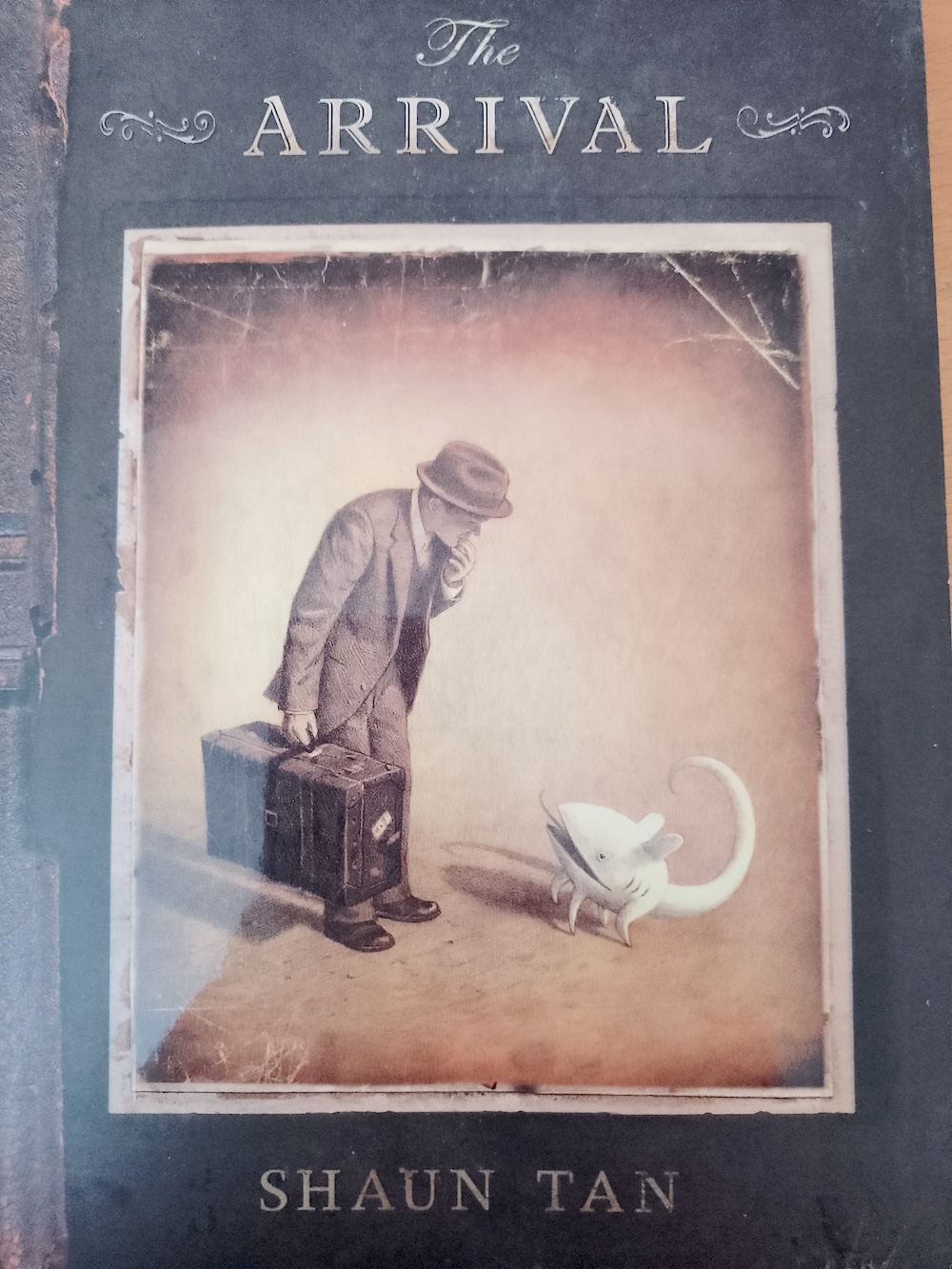
Tan’s ability to produce an emotive and cohesive narrative without the use of words is testament to his effective use of sequential drawings that can be interpreted and understood by the ‘reader’. I also thought this was pertinent with the content of the story as it removes any need to translate words – it can be understood without any language/reading barriers.
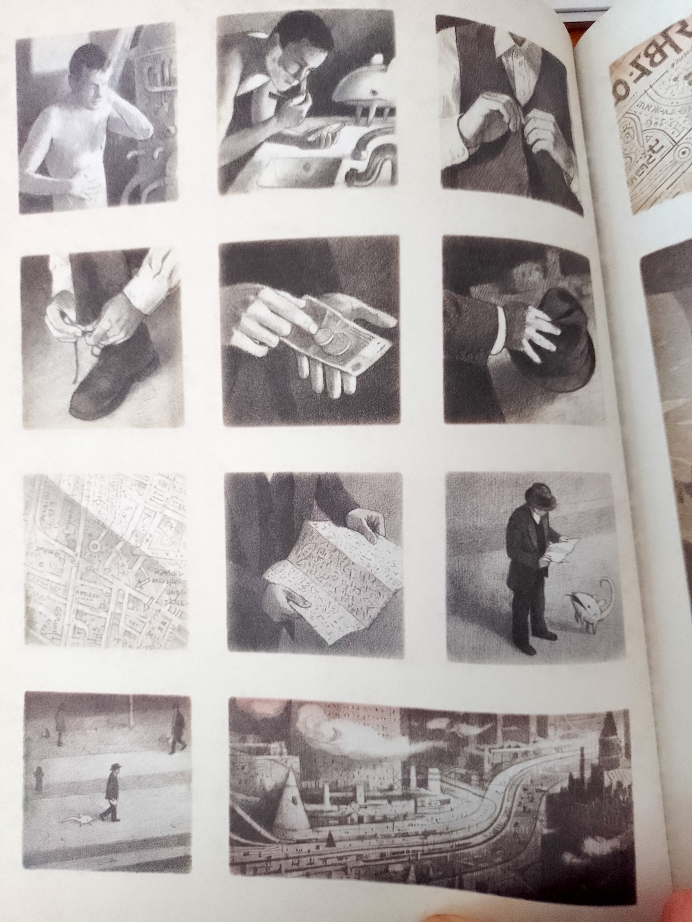
The style of the book is as though it is a record or photo album documenting keys moments of the man’s journey via snapshots, as well as allowing the reader to build up an understanding of the man on a personal level (as can be seen in the page below). The illustrations have a photographic quality to them although, unlike some illustrations that are more photo-realistic that can seem ‘hollow’, they still look like drawings and this adds a rich quality to them.
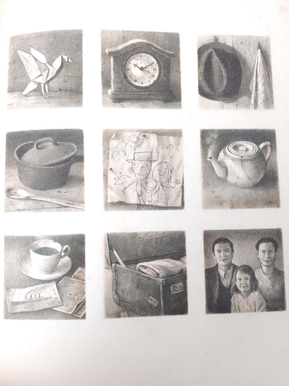
Tan has also used colour very effectively by restricting it solely to adding a slight hue of either blue, grey or yellow-brown (sepia) depending on the mood of at a certain point in the narrative. This is so subtle that it is barely noticeable and so does not disturb the flow, but subconsciously adds to the emotion of the story at a particular point.
Overall, I feel that The Arrival is an impeccable masterclass of producing a narrative without the need for text via relatable, clear and emotive illustrations.
My Favorite Thing Is Monsters by Emil Ferris
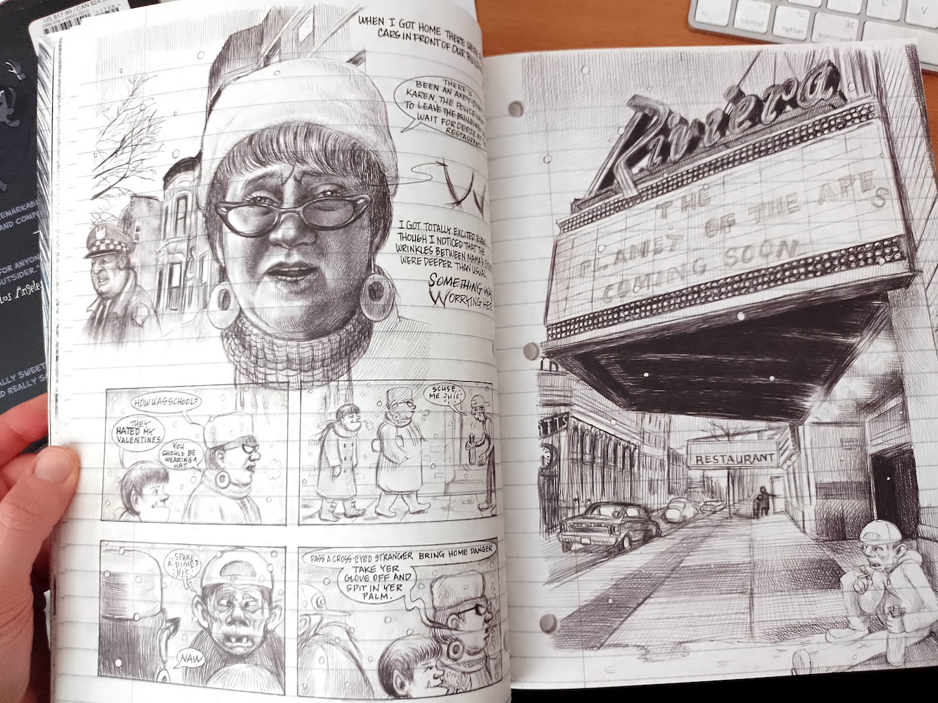
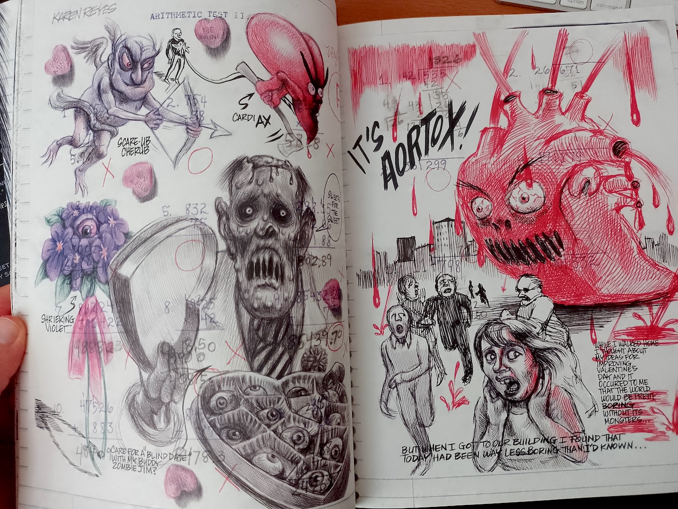
The final choice I have selected for this Research Task is My Favorite Thing Is Monsters by Emil Ferris. I have only just begun reading the fairly hefty book, but it has left a deep impression on me so far. How Ferris is able to produce such astonishing drawings using just biros on lined paper is mind-boggling.

The book is designed as though it is diary belonging to the protagonist of the story, a young girl, Karen, who has imagined that she has transformed into a monster. The pages are full of her ‘doodles’ (ha!) and thoughts as she investigates the murder of a neighbour.
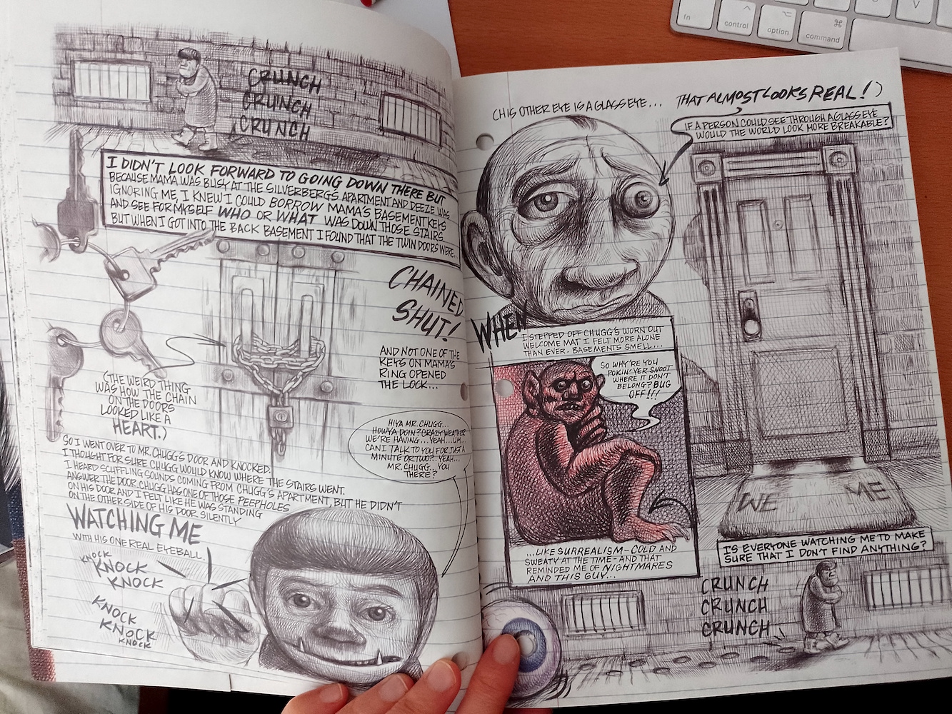
Although I previously stated that, in general, I am not that keen on graphic novels with a great deal of text, Ferris demonstrates how this can indeed be done in a creative and meaningful way. As the words are meant to be the thoughts and observations of Karen, and are written in first person, they are a crucial part of the narrative and not just waffle. The text complements the illustrations and thus adds to the story telling process.
Ferris uses a range of formats to display the images, from double-page spreads, to panels and vignettes, often overlapping one another, which adds to the illusion that this is indeed a diary (or sketchbook for that matter).
I really like the warped, vivid imagination on display in the drawings, which boosts the concept of it being devised by a young child (although it also could be considered slightly disturbed!). I remember being a similar age to Karen and doodling all sorts of things from my imagination, usually peculiar creatures.
Some pages have no text at all, but the narrative continues to flow. In the example below, depth has been created in the illustrations by reducing the amount of colour and, to a lesser degree, the detail applied as the eye moves further back in the scene (or up the page).
Overall, My Favorite Thing Is Monsters demonstrates how to successfully combine text and image to produce a compelling narrative that makes the reader want to invest the time and effort to read it. I believe there is a sequel being released shortly, so I am eagerly anticipating reading that as well.
Bibliography
Brosgol. V. (2011) Anya’s Ghost. First Second, New York.
Ferris, E. (2018) My Favorite Thing Is Monsters. Fantagraphics Books, Seattle.
Tan, S. (2006) The Arrival. Lothian Books, Sydney.