Look at a range of book or magazine covers that use illustration. How does the typography of the title, author and other details interplay with the illustration? What’s the relationship between type and image? Identify examples where the illustrator has created space in their image to accommodate the typography, and other examples where this relationship is less successful. Can you find examples where the type and image are pulling in the same direction – where they’ve supported each other successfully?
Pick a range of examples and discuss how the relationship between image and text works.
I used the Waterstones’s website as a resource to pick out some examples of book covers.
I felt the cover for The Lost Rainforests of Britain by Guy Shrubsole was an example where the illustration and type do not work that well together. I think the choice of a serif font for the title and author’s name reduces the readability of the text, which has to compete with a fairly complex background. Perhaps a bolder, sans serif choice would have reduced this conflict somewhat or the illustration could have been made simpler in this particular area to accommodate the text and allow more contrast between the two. I also felt that the type and image had been considered two completely separate entities and it seemed like there had been little thought regarding the visual impact of font choice.
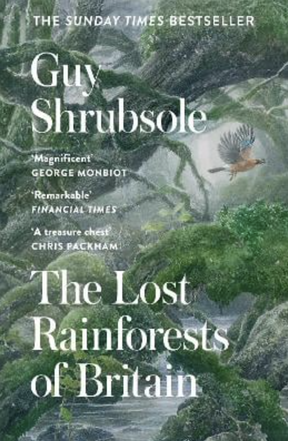
Source: Waterstones.
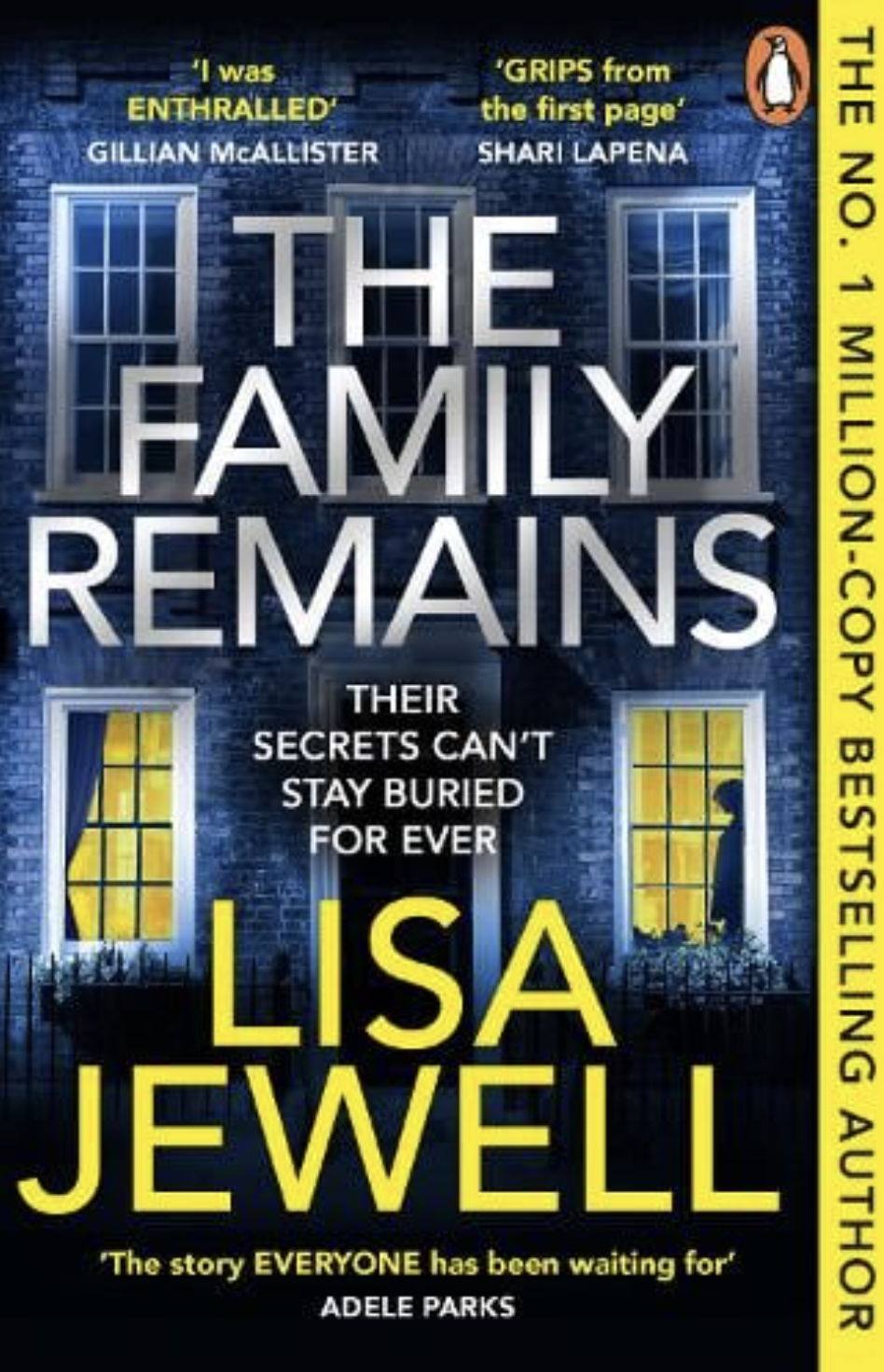
In contrast to the previous example, I considered the relationship between the type and illustration on cover for The Family Remains by Lisa Jewel, below, to be notably more successful. This cover feels balanced, both in terms of the placement of the different elements and the distribution of colour via the yellow text against the blue background. All of the text is readable and the use of a large, bold, sans serif font for the title and author’s name enhances this. The focal point within the illustration is the two lit windows, particularly the right one with the silhouette looking out at the viewer, neither of which is obstructed by the type.
It appears that the most visually important elements on this cover are those coloured yellow, which is quite interesting to consider. My eye was first drawn to the silhouette in the window, then the author’s name and the quote underneath this before moving up the vertical text on the right hand side. I then noticed the two quotes at the top of the cover until I looked at the cover as a whole and finally noticed the title and the smaller text beneath it!
The cover for Music in the Dark by Sally Magnusson, below, is an example where the type has been integrated within the illustration. The individual letters are layered over sections of the illustration, in this case the birds, and also interweave with the red lines. I felt that this design decision enhanced the appearance of the birds and lines flowing around the cover. I thought this idea could have been taken further, perhaps, by layering a couple of the birds over the edges of letters. I felt that the top two thirds of the cover generally worked well visually with the birds and lines swirling around the text, which remains readable. I did not think that the lower section worked as well, which may be partly due to the smaller font size making it slightly less readable. In my opinion, however, the birds appear to have been placed a bit haphazardly in this section and I did not consider these ones as visually effective as those in the foreground, higher up in the cover.
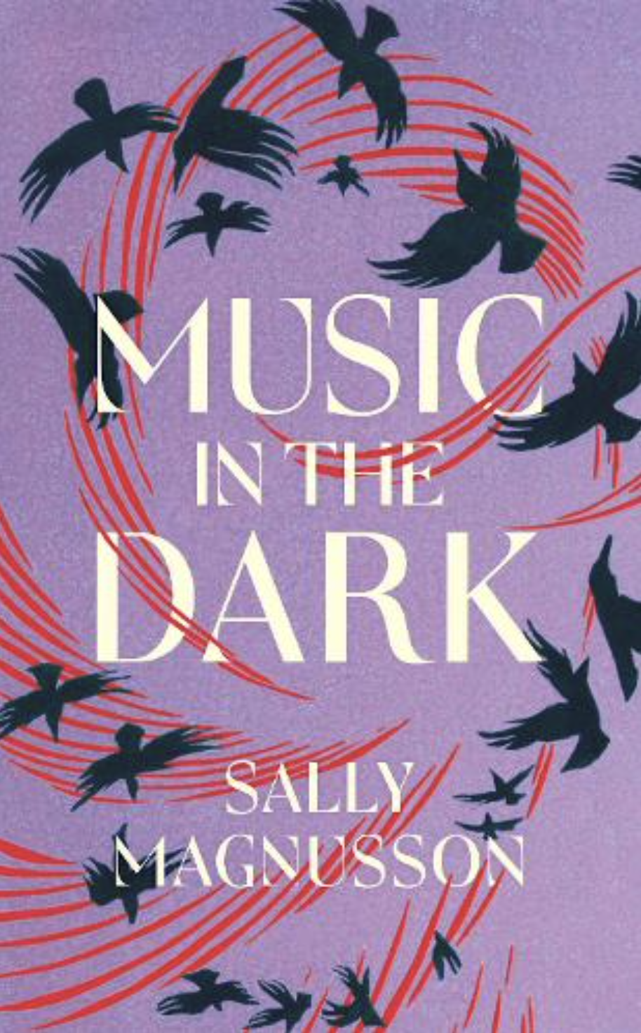
Source: Waterstones.
The next cover I selected was that for The Shadow Cabinet by Juno Dawson, shown below. I felt this cover was generally visually pleasing apart from the layering of the title over the illustration behind, which is greatly reduces its legibility. I concluded that the illustration is too intricately detailed to be layered in this way and prevents the reader from focusing on the text. I felt that if, perhaps, the illustration was changed from black to a less dominant colour, such as a variation of the blue background, it would not be visually competing with the text as much and would still retain its importance. However, the colour choices for the book appear to be CMYK, so using another colour or variation of the blue may not be possible, in which case I would rather separate the type from the illustration or try reversing the colours so that the former is black again a white illustration. In situations such as this maybe it comes down to what should be give ultimate priority – the readability or the design.
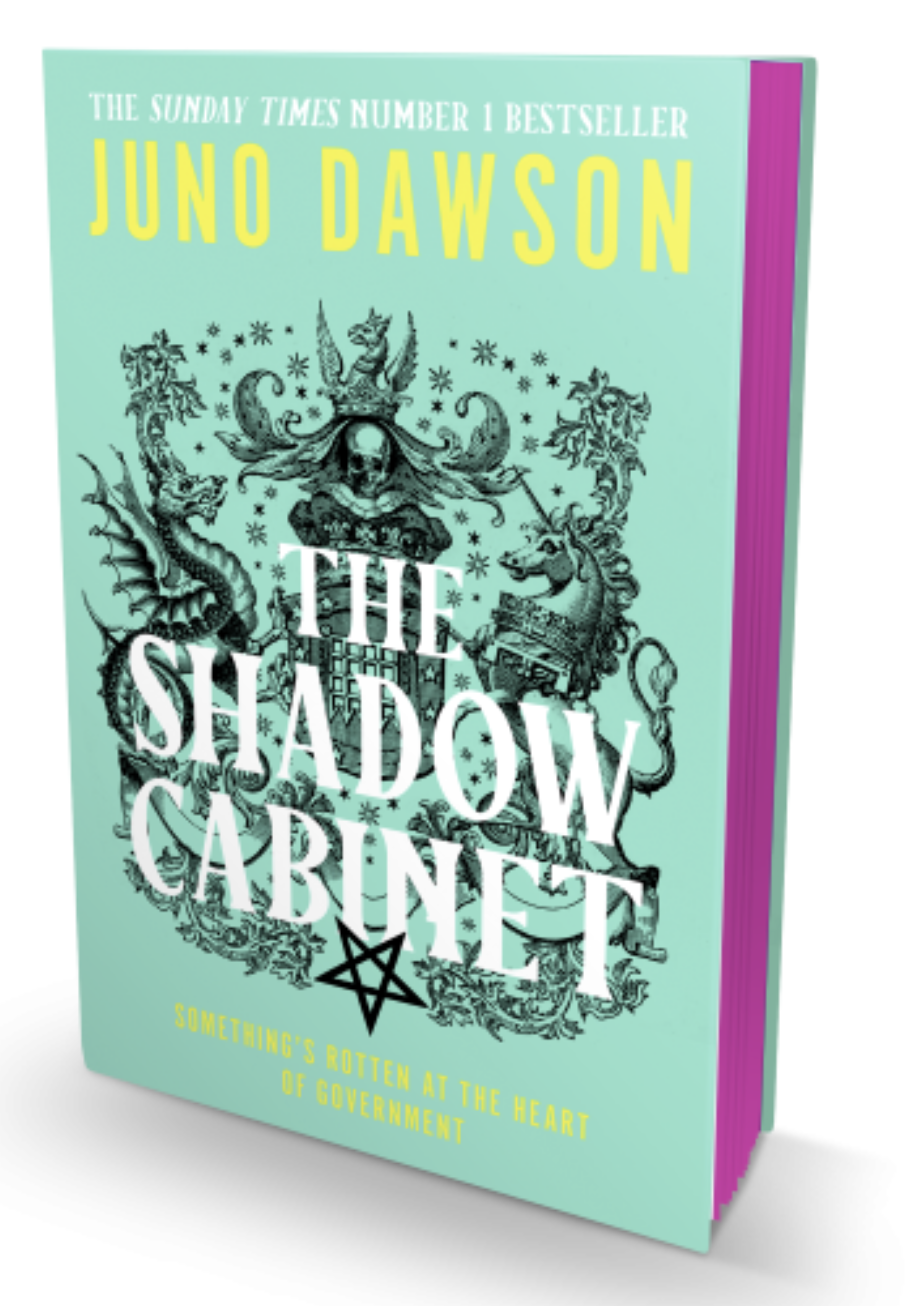
Source: Waterstones.
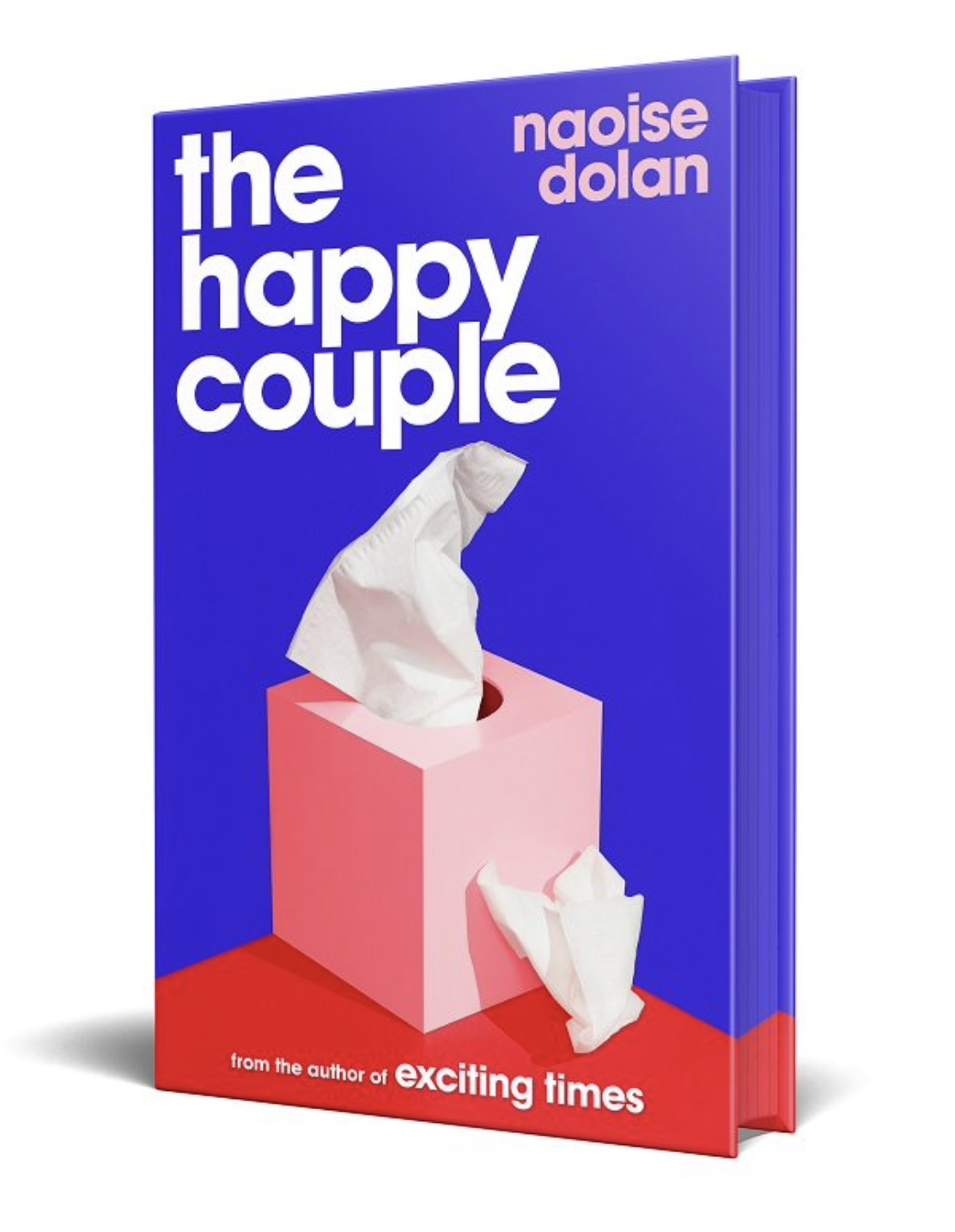
Compared to certain other examples, the design for the cover of The Happy Couple by Naoise Dolan, below, made me feel very calm! I really liked the clean layout, the font choice, the placement of the different elements and the colour choices. In my opinion there were no visual conflicts and the amount of white space used to allow room for each element was just right. I also liked the way the red table wrapped around the side of the book. This book cover certainly ticked the ‘good design box’ for me.
The cover for The Mortal Instruments 2: City of Ashes by Cassandra Clare is a good example where design has taken precedence, but for good reason. The type is still readable, but just not dominant on the composition. On closer inspection, the cover reveals that this is a collector’s edition, which is a valid reason to focus on the design. The text is integrated into the symbolic illustration through choice of colour, placement and orientation. It has also been allocated its own visual space. The only issue I have is that the words ‘city of ashes’ seems like it should be placed in the centre of the lines of the two circles, as per the author’s name. Overall, I thought this was an aesthetically interesting design that was well balanced and a good example of how to combine type and illustration for a particular purpose.
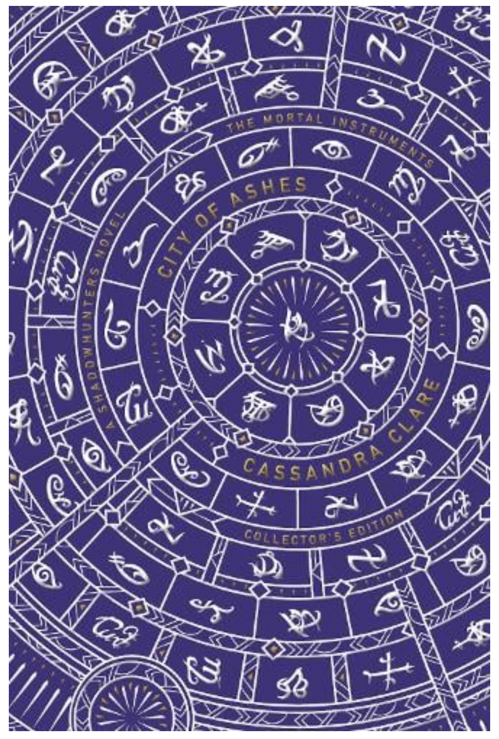
by Cassandra Clare. Source: Waterstones.
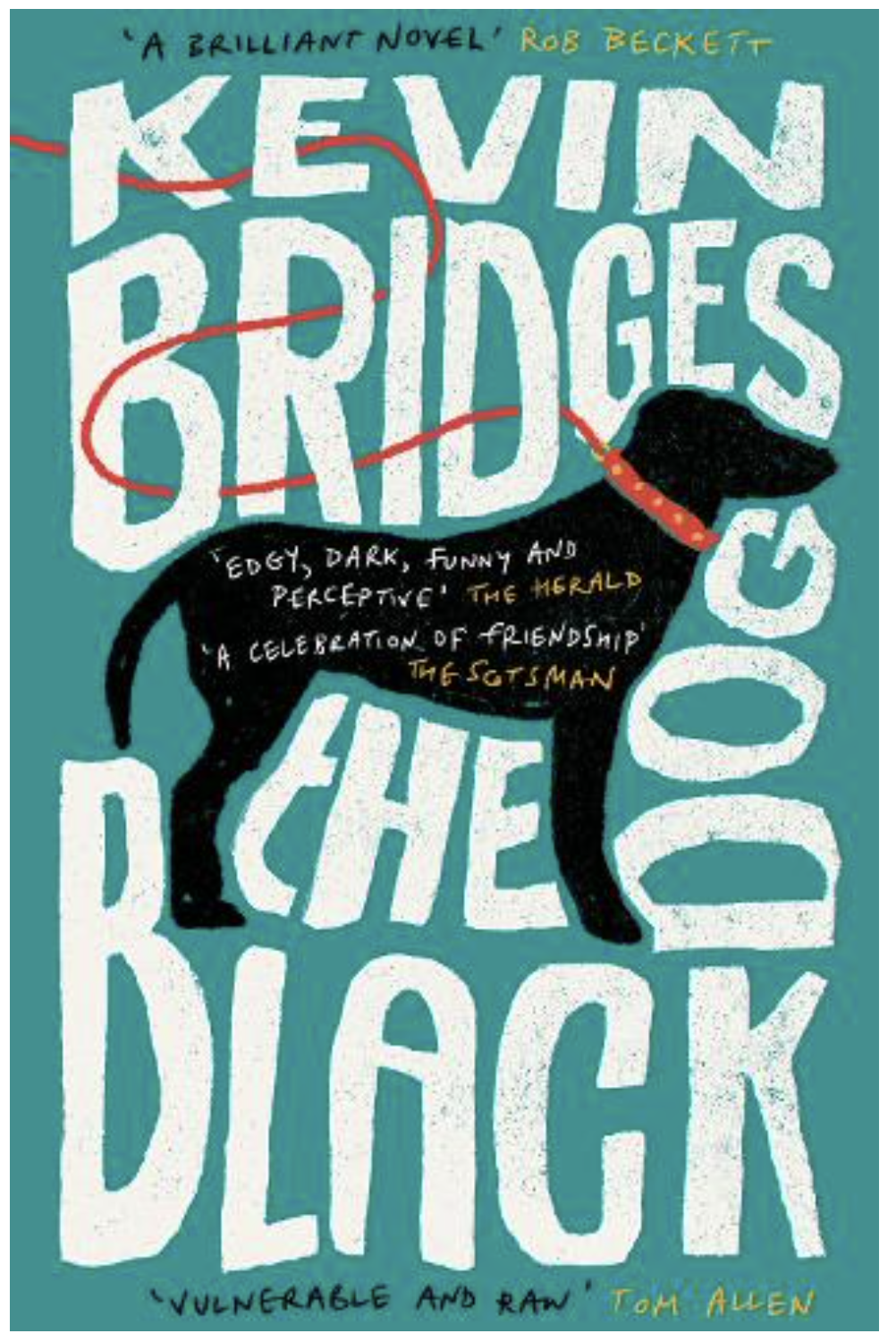
The final book cover I selected was that for The Black Dog by Kevin Bridges. I thought this was the possibly the most successful demonstration of combining type and illustration. The illustrator has managed to effectively integrate the type and the illustration so that both have equal importance within the composition. The black dog and red lead are the strongest elements, but it does not feel as though they are competing with the type. I also felt this cover demonstrates how type can be successfully laid over an illustration, as in the text placed over the dog’s body, by keeping it simple. I particularly liked how the letters for the title and author’s name are manipulated to fit around the central illustration, without the appearance of being cramped. The choice of illustration also links directly to the title of the book and the use of complementary colours, red and green, completes this aesthetically pleasing example.
Magazine Examples
I decided to take brief look at a few successful examples of combining illustration and type on magazine covers.
I was really impressed by several of the illustrated covers for The Big Issue. In terms of combining type with illustration, the example below expertly shows how a large volume of text can be moulded around a central image, along with slightly overlapping elements to indicate depth, and still allow the composition to breathe. I also liked the inclusion of a smaller version of the same magazine in Santa’s hand and the snow gathering on the title letters. Everything on this cover combines easily and so there are no visual clashes.
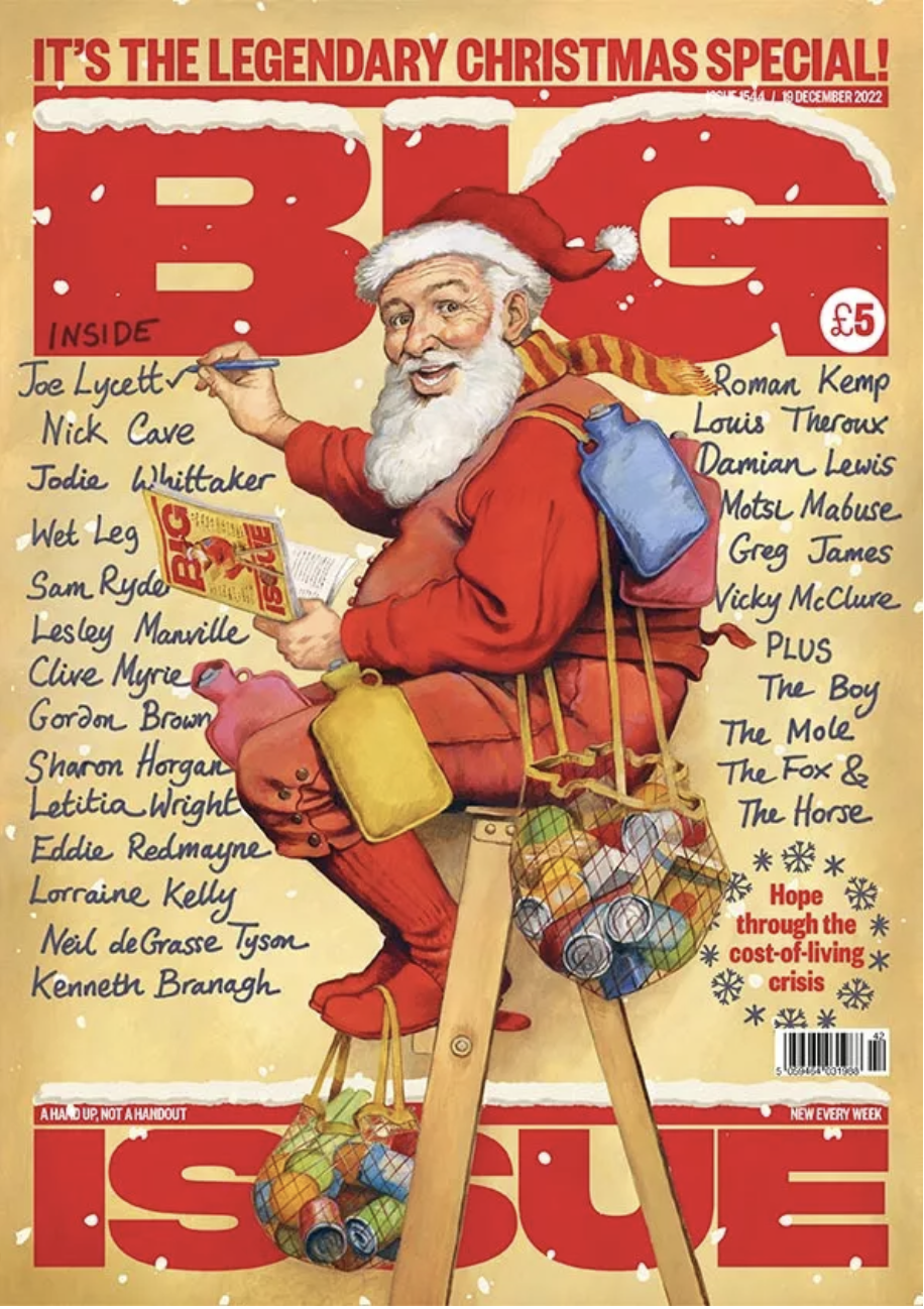
Source: The Big Issue.
The illustration on the cover below is the complete opposite in style to the previous example. It is bold, dynamic and limited to a primary colour palette, plus black and white. Two particular examples of integrating type and illustration that stood out to me were, firstly, the use of the letter ‘O’ to imitate a tunnel from which the train is emerging, and, secondly, the more subtle example where the left side slant of the ‘A’ in ‘BRITAIN’ is almost perfectly aligned with the edge of the blue streak. I found this cover to be very visually pleasing.
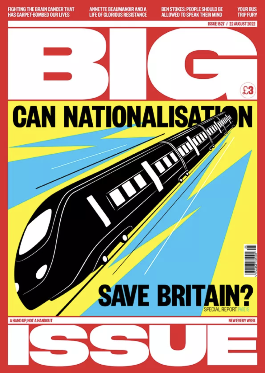
Source: The Big Issue.
The other magazine that I discovered, which I felt demonstrated imaginative ways of integrating type and illustration was Little White Lies, which is about films. Each cover relates to a different film and the style of illustration relates to this. In terms of text, which is the title of the film, I was really impressed with how this is placed within the illustration of each cover so that it appears to be part of it. In addition the choice of font also reflects the film.
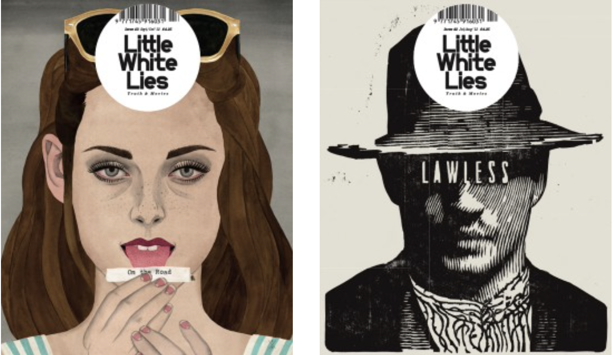
Source: Little White Lies.
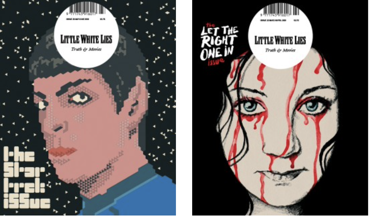
Source: Little White Lies.
Final Thoughts
I found this Research Task to be really beneficial as analysing the different ways of combining type and illustration allowed me to see some very good examples as well as those which could be considered less visually successful. I hope that this knowledge will encourage me to be braver when integrating the two in my own work and begin experimenting with compositions that I may not have otherwise imagined.
Bibliography
Coverjunkie (n.d.) Creative Review Archives – Coverjunkie. Available at: https://coverjunkie.com/magazines/creative-review/ (Accessed 10 May 2023).
Little White Lies (n.d.) Back Issues Archives. Available at: https://lwlies.com/back-issues/ (Accessed 10 May 2023).
Maine, S. (2021) The 20 best magazine covers of 2016. Available at: https://www.creativebloq.com/inspiration/the-20-best-magazine-covers-of-2016 (Accessed 10 May 2023).
McLaughlin, A. (2022) Magazine covers of the year. Available at: https://www.creativereview.co.uk/magazine-covers-2022/ (Accessed 10 May 2023).
The Big Issue (n.d.) Magazines Archives. Available at: https://www.bigissue.com/magazines/ (Accessed 10 May 2023).
Waterstones (n.d.) Waterstones. Available at: https://www.waterstones.com (Accessed 10 May 2023).